Chapter 1. Designing Experiences for People
“Anyone who slaps a ‘this page is best viewed with Browser X’ label on a Web page appears to be yearning for the bad old days, before the Web, when you had very little chance of reading a document written on another computer, another word processor, or another network.”
—TIM BERNERS LEE
The one constant on the Web is change. There’s always a new design fad; a new darling language, framework, or tool; a shiny new device to view it on; or new ideas of what it means to be “on the Web.”
It’s exceptionally difficult to wrap your head around an industry that is constantly in flux. It makes my head hurt, and if you’ve been working on the web for a while, I suspect you might feel the same.
Having worked on the Web for nearly two decades, I’ve seen the cycle play out over and over. Java applets, Shockwave, Flash, Prototype, jQuery, 960gs, Bootstrap, Angular, React.... Technologies come and go, but the Web remains. Screens went from tiny to huge and then back to tiny again, but the Web remains. Walled gardens were built and then torn asunder to make way for “app” stores and (yes) more walled gardens, but the Web remains.
The Web remains because it is not a fixed screen size. The Web remains because it is not a specific device. The Web doesn’t need to be installed. The Web is inherently resilient and infinitely malleable. The Web has the capacity to go anywhere, do anything, and reach anyone.
Smart Code, Dumb Phones
In early 2012, my company began working with a client who was struggling with the security of their mobile apps. They had numerous native apps that all followed the common convention of using a web service to authenticate users. They are a very security-conscious organization, and this setup was creating a bottleneck in deploying new security features. To roll out a new security feature to their users (for example, a security question like “What was the name of your first school?”), they had to go through an excruciatingly long, arduous, multistep process:
1. Implement the new security feature.
2. Expose it via the web service.
3. Update each app to use the new web service (which might include user interface changes, and so on).
4. Submit each app for approval.
5. Hope their users downloaded the new version of the app.
They brought us in to reimagine the authentication flow as a web-based process that would launch inside an app—they had separate iPhone, iPad, and Android apps—and handle letting the app know whether and when the user had successfully logged in. This approach meant they could roll out new security features immediately because the apps and the authentication flow would be loosely coupled. Letting users sign in through a web page within the native app would be a huge win for everyone involved.
Despite that the project was aimed at handling authentication for mobile apps on three specific platforms, we built the web pages without getting hung up on technology or screen sizes. Instead, we focused on the purpose of every interface component and every screen. The layouts were responsive from tiny screens all the way up to large ones, and we implemented HTML5 and JavaScript in completely unobtrusive ways. We wanted to take advantage of cool new things (such as native form validation) while still keeping the file sizes small and ensuring the pages would function in the absence of either technology.
A few months after completing the project, our client came back to us with a second project: They wanted to roll out the authentication flow to their “m-dot” users (people who visited their mobile-only website). They gave us a list of nearly 1,400 unique User Agent strings that had accessed the login screen over a two-day period and asked whether we could handle it. We parsed the list1 and were able to come up with a more manageable aggregate list of devices and device types to use in our testing. It was something like 25 devices that would cover roughly 97 percent of their 1,400 device spectrum. The last 3 percent was at the end of a long tail when it came to device usage, and we were comfortable assuming that fixing issues in the other 97 percent would likely cover them as well. That said, we were prepared to fix any additional issues when and if they cropped up.
1 With the help of a little script I cooked up: http://perma.cc/4EAE-Y9H5.
Our budget for adding support for 1,400 new devices, including some heinous old browsers (for example, BlackBerry 4 and Openwave), was about one-third the budget of the original project that targeted only three.
Let that soak in for a second.
Now here’s the kicker: When all was said and done, we came in at roughly half of our proposed budget, in terms of both actual hours billed and time to completion. It was awesome for us because we delivered ahead of schedule—which made us look good—and it earned our client contact major kudos from his bosses because he’d saved the company serious money on the project (which rarely happens in the corporate world).
It’s worth noting that this accomplishment had nothing to do with our bug-squashing prowess or our speed—we just followed the philosophy of progressive enhancement.
Progressive enhancement is a web design philosophy that embraces the very nature of the Web. It isn’t about devices or browsers, and it’s not about which version of HTML or CSS you can use. Using progressive enhancement means you craft experiences that serve your users by giving them access to content without technological restrictions.
It sounds pretty amazing, and anything that amazing must be a lot of work, right? Actually, it’s not. Once you understand how progressive enhancement works, or more importantly why it works, you’ll see it’s quite simple. As we often say, progressive enhancement just works.
During a presentation at the South by Southwest Interactive Festival in 2003, Steve Champion of the Web Standards Project offered the term progressive enhancement to describe his vision for a new way to think about web design—starting with the content and building out from there. Once you understand what progressive enhancement is all about, it’s hard to imagine approaching a project in any other way. It just makes sense. And yet, it took nearly a decade after the Web’s creation for this approach to web design to be proposed, let alone embraced.2
2 We’re still working on that one, which is the reason for this book.
When the Web Was Young
In the beginning there was text:3 the line mode browser.4 It has a black screen with green text (Figure 1.1). You know, it was the kind of program hackers use in the movies.
3 Well, technically, in the beginning there was a graphical browser called WorldWideWeb (later Nexus), but it was available only on the NeXT operating system and never made it into general use.
4 Some of my friends and colleagues ventured back to CERN in 2013 to re-create the line mode browser using modern web technologies. They wrote about it, and you can try it out at http://perma.cc/2UYR-HVWP.
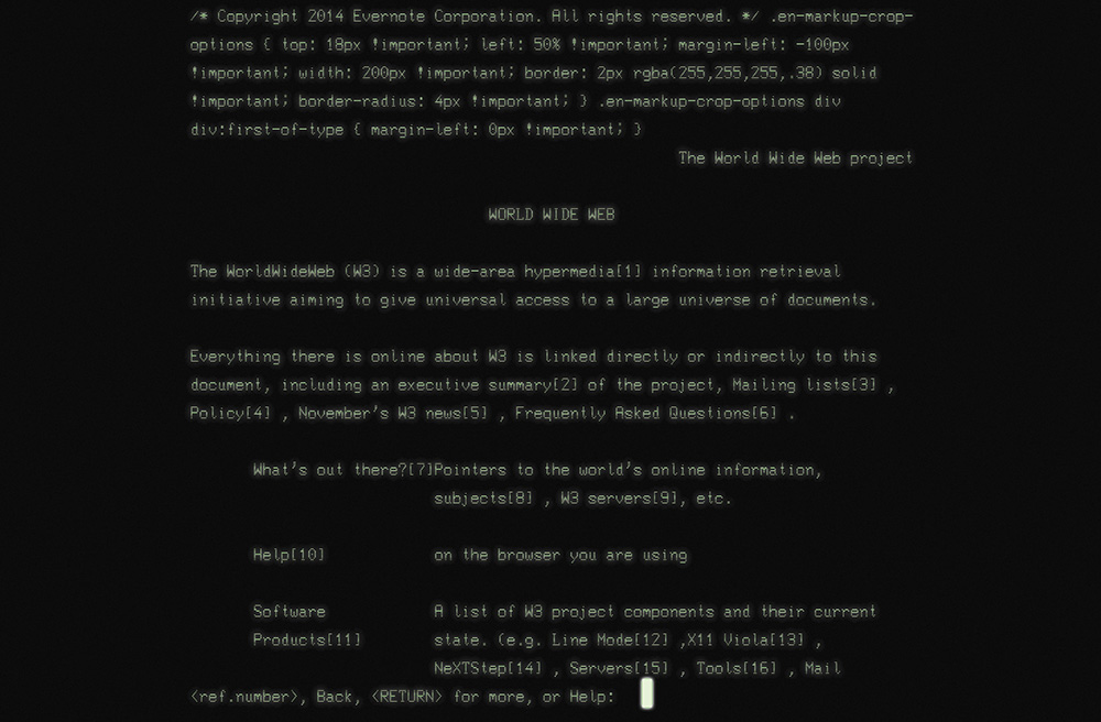
The line mode browser supported basic formatting such as indentation, centering, and the like, but that was about it. But it didn’t matter. It was 1990. The Web was an infant and was all about publishing and reading text-based content, so it didn’t need to look pretty.
By the time I got online five years later, things were a bit different. The National Center for Supercomputing Application’s Mosaic had brought the graphical side of the Web to the masses two years earlier, and Netscape’s Navigator was already a year old.5
5 Microsoft’s Internet Explorer had just been born.
But my experience of the Web in 1995 was not graphical. I was attending New College in Sarasota, Florida, and had to dial in to the campus’s server in order to access the Internet. It was all done over the command line, and I saw my first website—sony.com—in stark black and white (Figure 1.2).
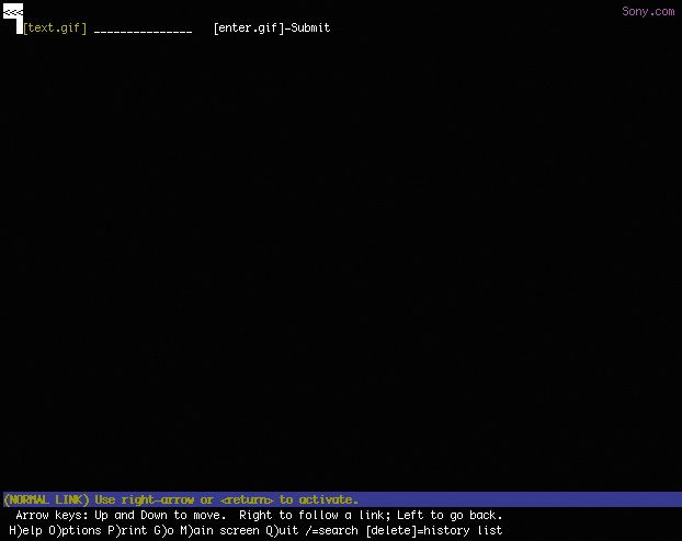
Figure 1.2 My best approximation of what I saw the first time I used Lynx to access sony.com: a black screen with white text saying nothing.
I thought to myself This web thing is bullshit! and quickly disconnected my modem in disgust.
You know what? I was right: That experience was bullshit! Here was a website whose purpose was to disseminate information about Sony products and musicians and it had—effectively—no content. In other words, its purpose was lost.
How did this happen? Well, the folks who designed that version of sony.com had used images instead of actual page content. All the page text was rendered in JPEGs and GIFs. When they assembled the images onto the page, they failed to author alt text that provided access to that content. Anyone who couldn’t partake of what I’m sure was the pinnacle of mid–1990s web design was pretty much screwed.
And so there I was, taking my first tentative steps onto the Web and I was denied access to a site because the technology I was using to access it was not advanced enough. I felt like the short kid at the amusement park, feigning disinterest in the Tilt-a-Whirl because I was the only one of my friends who was too small to ride it.
And just like my childhood height, my browser choice was not something I had control over. I couldn’t have just downloaded Mosaic or bought a copy of Netscape at my local Babbage’s and been on my merry way. Our school’s server didn’t support Point-to-Point Protocol (PPP) at the time, so I could browse only on the command line via Lynx.
That experience colored my perception of the Web and has stuck with me ever since, guiding my decisions as a web designer. I always think about my experience and the lack of accessibility the Web—well, sony.com specifically—had for me at the time. It sucked. I never want to make someone else feel like that.
Technology vs. Experience
When the Web was young, the technologies we used to create experiences for it were rapidly evolving. HTML was not standardized like it is today, and Microsoft and Netscape were taking turns adding new elements and behaviors in a seemingly eternal game of one-upmanship. We also had things like Java applets,6 RealMedia, Shockwave, Flash, and a host of other proprietary technologies that served only to complicate the page construction process and heaped additional requirements on our users.
6 Did you ever use one to make your content look like it was reflected in a pool of water? That was so cool!
As an industry, we adopted the engineering concept of graceful degradation, which ensures a system can continue to work with a reduced service level even when part of it is unavailable or destroyed. In other words, it’s a philosophy meant to avoid catastrophe. In practice on the Web, this meant we assumed older browsers, or those without the necessary plug-ins, would get a poor experience. We rarely made the time to test in these scenarios, so we erected signs for our users:
This page works best in Internet Explorer.
This page looks best in Netscape.
You need Flash to use our website.
Keep out ye undesirables!
The graceful degradation philosophy amounted to giving the latest and greatest browsers the experience of a full-course meal, while tossing a few scraps to the sad folk unfortunate enough to be using an older or less-capable browser.
And when we really didn’t feel like testing in a browser, we’d just read the User Agent string on the server and erect a roadblock (Figure 1.3).7 After all, we told ourselves, if we stop the user before they experience an error, we’re avoiding delivering a bad experience.
7 Of course, few of us even did that well. A lot of User Agent sniffing (as it’s called) is poorly done and results in false positives. It’s been the driving factor for the “evolution” of the User Agent string. Nicholas Zakas wrote a brilliant piece chronicling that: http://perma.cc/BR7M-JEDH.
But is no experience better than a less than ideal experience? I don’t think so.
Lessons Learned at the Bleeding Edge
Some time ago I worked on a Chrome app for WikiHow.8 As a Chrome app and a showpiece for the then-new Chrome Web Store, our client wanted it to have fancy CSS3 animations and transitions, web fonts, a WebSQL database, offline support, and lots of other “HTML5” bells and whistles. And, as our target was a single browser, we relented when asked to go the single-page app route. The app was built to degrade gracefully (it blocked non-WebKit browsers), but it was not progressively enhanced.
Skip ahead about a year and our client returned, asking us to add support for Firefox and Internet Explorer (IE) 9+. Oh boy.
Having built the site purely for WebKit, it was a bit of a challenge. In addition to implementation differences with the experimental CSS features, we also had to deal with the DOM (document object model) and JavaScript API (application programming interface) variance among the browsers. But the single biggest issue we ran into was the lack of WebSQL support in Firefox and IE.
You see, in the intervening year, WebSQL had been abandoned at the W3C (World Wide Web Consortium)—the organization that oversees most web standards—because of pushback (primarily from Mozilla and Microsoft). It was not available in either Firefox or IE, nor would it ever be. IndexedDB, the new replacement for WebSQL, had yet to be implemented in any production browser. So we ended up writing a wrapper on top of localStorage that looked a lot like SQL. Thankfully, that allowed us to avoid rewriting the bulk of the app. Incidentally, it also made the app a lot faster.
The total cost of the new compatibility project was around 40 percent of the budget to build the app the first time around. Without access to an alternate timeline, I can’t be certain, but my experience tells me it would have added less than 40 percent to the original project had we been given the leeway to build it using progressive enhancement. Plus, the end result would have been even better because it would have been able to function without JavaScript.
Based on conversations I’ve had with other designers, the 40 percent number seems pretty accurate—possibly even a bit low. I remember one conversation several years ago about Google Maps. When the team originally built Maps—in all of its Ajax-y glory—they didn’t make it accessible, and it required JavaScript. According to the source of this anecdote (who I have long forgotten), it took them almost twice as long to retrofit Maps as it would have taken had they built it from the ground up following progressive enhancement. As it’s purely anecdotal, you should take that with a grain of salt, but it’s food for thought.
Now consider this story in light of the one I shared earlier. Given the choice between a 40 percent budget increase to add support for 2 browsers and a 15 percent increase to add 1,400 browsers, I know which option I’d choose. Progressive enhancement does require a bit more thoughtful consideration up front. But the extra time required diminishes with practice, and the philosophy pays huge dividends in the long run. More reach, less overhead, fewer headaches.
Progressive enhancement trounces graceful degradation when it comes to reaching more browsers, devices, and (ultimately) users for less money (and fewer headaches). But how?
For starters, progressive enhancement recognizes that experience is a continuum.
You Can’t Please Everyone
Providing a pixel-perfect, wholly identical experience for each and every human being who tries to access your site would be impossible. There are simply far too many factors to consider.
On the technical side of things, you’ve got screen size, display density, CPU (central processing unit) speed, amount of RAM (random-access memory), sensor availability, feature availability, interface methods...breathe...operating system, operating system version, browser, browser version, plug-ins, plug-in versions, network speed, network latency, network congestion, firewalls, proxies, routers, and probably a dozen other factors my mind is incapable of plucking from the whirlwind of technological considerations.
And that doesn’t even take into account your users’ experiences interacting with your work.
When it comes to people, you have to consider literacy level, reading level, amount of domain knowledge, cognitive impairments such as learning disabilities and dyslexia, attention deficit issues, environmental distractions, vision impairment, hearing impairment, motor impairment, how much they understand how to use their device, how much they understand how to use their browser, how well-versed in common web conventions they are, and a ton of other “human factors.”
Every person is different, and everyone comes to the Web with their own set of special needs. Some needs develop over time and persist—blindness, for example. Others are transient, such as breaking your mousing arm. Still others are purely situational and dependent on the device you are using at the time and its technical capabilities or constraints.
Trying to devise one monolithic experience for each and every person to have in every context that considers every factor would be impossible. Given unlimited time and budget, you could probably make it happen, but how often do you get to work under those conditions?9 Designing for a monolithic experience is a form of arrogance—it assumes you will always know your users’ context and what’s best for them. In reality, you often know far less than you think you do.
9 If you do, in fact, get to work under these conditions, please let me know if you’re hiring.
And yet, Sir Tim Berners Lee—the guy who invented the World Wide Web—had a vision for a Web that was portable, capable of going anywhere.10 Was he delusional?
10 You can read his proposal here: http://perma.cc/H8HW-DACS.
Support the Past, Optimize for the Future
Back in middle school, I wrote every paper in Word for MS-DOS. It was a piece of software that did one thing really well: It allowed the user to focus on writing.11 You didn’t have a whole lot of options for formatting text, but it did what it needed to do, and it did it with aplomb.
11 In many ways, iA Writer—which I am using to write these very words—reminds me a lot of it.
More than two decades later, it’s next to impossible for me to read the DOC files Word created for me. As an application, Word long abandoned support for reading and editing that generation of the DOC format.
Now I’m not saying that the stuff I wrote in middle school is really worth reading today (I’m sure it’s not), but I am only one of millions of people who authored content in Word for DOS. That content is largely lost to history because the format evolved in a way that made newer versions of Word incapable of reading those older files.
And that’s just one piece of software. We see these sort of “breaking changes” all the time in software, even on the Web. The popular JavaScript framework Angular changed so much between its 1.0 and 2.0 versions that developers had to rewrite their apps almost entirely to take advantage of its new features.
This is a huge challenge for archivists because even if they manage to hang on to a copy of the programs that originally authored these files, they also need to maintain machines capable of running the software (which is equally challenging).
When he conceived of the World Wide Web, Sir Tim Berners Lee wanted to avoid this problem. He wanted content on the Web to be robust and future-proof, so he made that a guiding principle of the web’s lingua franca, HTML. To wit, the HTML 2.0 spec says this:12
To facilitate experimentation and interoperability between implementations of various versions of HTML, the installed base of HTML user agents supports a superset of the HTML 2.0 language by reducing it to HTML 2.0: markup in the form of a start-tag or end-tag, whose generic identifier is not declared is mapped to nothing during tokenization. Undeclared attributes are treated similarly. The entire attribute specification of an unknown attribute (i.e., the unknown attribute and its value, if any) should be ignored.
In other words, browsers are instructed to ignore what they don’t understand. This is fault tolerance (another carry-over term from the world of engineering), and it’s central to the design of HTML as a language and CSS as well.13
Both languages were designed to be “forward compatible,” meaning everything you write today will work tomorrow and next year and in ten years. These languages were designed to evolve over time. By ignoring anything they don’t understand, browsers give these languages room to grow and adapt without ever reaching a point where the content they encapsulate and style would no longer be readable or run the risk of causing a browser to crash.
Fault tolerance makes it possible to browse an HTML5-driven website in Lynx and allows you to experiment with CSS3 features without worrying about breaking Internet Explorer 6. Understanding fault tolerance is the key to understanding progressive enhancement. Fault tolerance is the reason progressive enhancement works and makes it possible to ensure all content delivered on the Web is accessible and available to everyone.
Maintaining Your Sanity
Trying to give everyone the same experience across the myriad device and browser combinations, especially considering the variety of human factors that affect how they interact with a page, would be a fool’s errand. It’s important to pick your battles. Web developer Brad Frost beautifully couched this approach as “support vs. optimization.”
Unless you want to hole yourself up in a cabin for the foreseeable future, you’re not going to be able to optimize your web experience for every single browser. What I’m really asking for here is consideration.
You don’t have to treat these browsers as equals to iOS and Android and no one is recommending that we have to serve up a crappy WAP site to the best smartphones on the market. It’s just about being more considerate and giving these people who want to interact with your site a functional experience. That requires removing comfortable assumptions about support and accounting for different use cases. There are ways to support lesser platforms while still optimizing for the best of the best.14
By following this approach, you enable your content to go as far as possible, unencumbered by the requirements of some particular technology or capability. You can do this rather easily by focusing on the content and building up the experience, layer by layer, because the browser and device can adequately support that experience.
Progressive enhancement isn’t about browsers or devices or technologies. It’s about crafting experiences that serve your users by giving them access to content without technological restrictions. Progressive enhancement doesn’t require that you provide the same experience to every user, nor does it preclude you from using the latest and greatest technologies; it simply asks that you honor your site’s purpose and respect your users by applying technologies in an intelligent way, layer upon layer, to craft an amazing experience.
Browsers, devices, and technologies will come and go. Marrying progressive enhancement with your desire to be innovative and do incredible things is entirely possible—as long as you’re smart about your choices and don’t allow yourself to be so distracted by the shiny and new that you lose sight of your site’s purpose or your users’ needs.
Serving More for Less
Of course, there are many folks who consider progressive enhancement—especially insofar as creating a non-JavaScript experience goes—a total waste of time. Take this comment a reader left on web developer Tim Kadlec’s blog post “Crippling the Web:”15
This is all fine and dandy, but not very real world. A cost-benefit analysis has to happen—what does that next user/visitor cost, and more importantly earn you? This idealistic approach would leave most broke if they had to consider “every user” when building a site. That’s why clothes come in small, medium, large, and extra-large. Most of us have to buy them that way because not everyone can afford a tailor made suit, much less an entire wardrobe. Your approach only works for those who can see the return.
Tim’s response was dead-on:
I think that’s where the difference between ‘support’ and ‘optimization’ comes into play. I’m certainly not saying to go out and buy every device under the sun, test on them, make sure things look and behave the same. You don’t necessarily have to optimize for all these different devices and scenarios (that’s where the cost-benefit analysis has to come in), but it’s often not very time consuming to at least support them on some level.
Progressive enhancement can get you a long way towards accomplishing that goal. Sometimes it’s as simple as doing something like ‘cutting the mustard’ to exclude older devices and browsers that might choke on advanced JS from having to try and deal with that. The experience isn’t the same, but if you’ve used progressive enhancement to make sure the markup is solid and not reliant on the JavaScript, it’s at least something that is usable for them.
You can’t test every scenario, every browser, and every device. There just aren’t enough hours in the day even if someone was willing to spend the money on doing it—and guess what, they aren’t. You need to balance your desired reach with your realistic resources.
This is why progressive enhancement is so helpful. You can provide a baseline experience that anyone can use and then look for ways to improve it on the browsers and devices that are part of your test matrix.
As an added bonus, you’ll be able to reach new devices as they roll out with little to no extra effort. Case in point: The TechCrunch redesign of 2013 did not prioritize the browsing experience on a tiny screen, but they allowed for it; as a result, the site looks and works just as well on a smart watch (Figure 1.4) as it does on a phone or a desktop screen.

Progressive enhancement is inherently future friendly.16
Universal Accessibility
Sir Tim’s vision for the Web was that content could be created once and accessed from anywhere. Disparate but related pieces of “hypermedia”17 scattered across the globe could be connected to one another via links. Moreover, they would be retrievable by anyone on any device capable of reading HTML. For free.
17 Sir Tim used the term hypermedia because he knew the Web would need to contain more than just text.
Ultimately, Sir Tim’s vision is about accessibility.
For a great many of us, ensuring our websites are accessible is an afterthought. We talk a good game when it comes to “user centered” this or that but often treat the word accessibility as a synonym for “screen reader.”
Sure, people with visual impairments often use a screen reader to consume content. But they might also use a braille touch feedback device or a braille printer. They probably also use a keyboard. Or they may use a touchscreen in concert with audio cues. Or they may even use a camera to allow them to “read” content via optical character recognition (OCR) and text-to-speech. And yes, visual impairment affects a decent percentage of the populace (especially as we age, which we all do), but it is only part of the “accessibility” puzzle.
We all benefit when designers consider accessibility. We all have special needs. “Accessibility” is about recognizing that fact and taking steps to address them.
People consume content and use interfaces in many different ways, some similar and some quite dissimilar to how you do it. Designing for universal accessibility means not imposing a certain world view—yours, your boss’s, or your client’s—on how or where someone is going to access your website, giving your users ultimate control on how they choose to consume your content.
The dimensions of interactive elements—links, buttons, and so on—and their proximity to one another is an important factor in ensuring an interface actually registers your intent. Have you ever injured your dominant arm and had to mouse with your other one? It’s frustrating, especially when links are small or buttons are too close together. Visual design is an accessibility concern.
The color contrast between text and the background is an important factor in ensuring content remains readable in different lighting situations. Some websites are nearly impossible to read on your phone while outside on a sunny day or when you’ve turned down the screen brightness to sip that last 5 percent of your battery life. Color choice is an accessibility concern.
The language you use on your sites and in your interfaces directly affects how easy it is for your users to understand what you do, the products you’re offering, and why it matters. It also affects how you make your users feel about themselves, their experience, and your company. Terms of service are a perfect example of this: No one reads them because they are alienating and unfriendly.18 Language is an accessibility concern.
18 Except Medium’s; they’re awesome! See http://perma.cc/EDS6-5VZC.
The size of your web pages and their associated assets has a direct effect on how long your pages take to download, how much it costs your customers to access them, and (sometimes) even whether the content can be reached. One time I unwittingly played 30 minutes of a high-definition video while tethered to my phone, traveling abroad, thanks to YouTube’s auto-play “feature.”19 It cost me about $30. Bandwidth use and performance are accessibility concerns.
I could keep going, but I’m sure you get the point.
To me, accessibility is ultimately about ensuring people have equal opportunity to access your content while simultaneously recognizing that we all have special needs—physical limitations, bandwidth limitations, device limitations—that may require each of us to have different experiences of the same web page.
When I load a website on my phone, for example, I am visually limited by my screen resolution (especially if I am using a browser that encourages zooming), and I am limited in my ability to interact with buttons and links because I am browsing with my fingertips, which are far larger and less precise than a mouse cursor. On a touchscreen, I may need the experience to be slightly different, but I still need to be able to do whatever it is I came to the page to do. I need an experience, but moreover, I need the appropriate experience.
Experience doesn’t need to be one hulking, monolithic ideal. It can be different for different people. That may be hard to wrap your head around at times, but embracing it will help you reach more people with fewer headaches.
Experience can—and should—be crafted as a continuum. Progressive enhancement embraces that continuum.
Thinking in Layers
One analogy I like to use for progressive enhancement are Peanut M&M’s (Figure 1.5). At the center of each Peanut M&M’s candy is, well, the peanut. The peanut itself is a rich source of protein and fat—a great food that everyone can enjoy (except those with an allergy, of course). In a similar sense, the content of your website should be able to be enjoyed without embellishment.

Slather that peanut with some chocolate and you create a mouthwatering treat that, like the peanut, also tastes great. So too, content beautifully organized and arranged using CSS is often easier to understand and certainly more fun to consume.
By coating your nutty confection with a sugary candy shell, the experience of this treat is improved yet again. In a similar sense, you can cap off your beautiful designs with engaging JavaScript-driven interactions that ease your user’s movement through the content or bring it to life in unique and entertaining ways.
This is, of course, an oversimplification of progressive enhancement, but it gives you a general sense of how it works. Technologies applied as layers can create different experiences, each one equally valid (and tasty). And at the core of it all is the nut: great content.
Progressive enhancement asks you to begin with the core experience that is universally accessible and improve that experience when you can. Benjamin Hoh eloquently put it this way:20
[Progressive enhancement] keeps the design open to possibilities of sexiness in opportune contexts, rather than starting with a ‘whole’ experience that must be compromised.
More often than not, experience begins with content. Clear, well-written, and well-organized content provides solid footing for any web project. It’s important to ensure that content is universally available too, which means it needs to be addressable via HTTP.21
21 As web developer Tantek Çelik puts it, “If it’s not curlable, it’s not on the Web.” See http://perma.cc/6Y8C-AZB6.
To enhance the meaning of your content, to make it more expressive, you use markup. Every element has a purpose. Some elevate the importance of a word or phrase, others clarify the role a selection of content is playing in the interface, and still others aggregate collections of elements into related sections of a document. Markup gives more meaning to your content.
Visual design is a means of establishing hierarchy on a page. Contrast, repetition, proximity, and alignment help to guide users through your content quickly and easily. Visual design also helps you reinforce your brand and provide the most appropriate reading experience given the amount of screen real estate available to you.
You can use interaction as a means of reducing the friction of an interface. Hiding content until it is needed, providing real-time feedback based on user input, and enabling your users to accomplish more on a single page without constant page refreshes go a long way in humanizing an interface. They help your users be more productive and, when done well, can even make your creations delightful to use.
These levels, when stacked upon one another, create an experience that grows richer with every step, but they are by no means the only experiences that will be had by a user. In fact, they are simply identifiable milestones on the path from the most basic experience to the most exceptional one (Figure 1.6). A user’s actual experience may vary at one or more points along the path and that’s all right; as long as you keep progressive enhancement in mind, your customers will be well served.

Figure 1.6 Progressive enhancement visualized: the user experience gets better as opportunity allows.
A website built following the philosophy of progressive enhancement will be usable by anyone on any device, using any browser. A user on a text-based browser like Lynx won’t necessarily have the same experience as a user surfing with the latest version of Chrome, but the key is that the user will have a positive experience rather than no experience at all. The content of the website will be available, albeit with fewer bells and whistles.
In many ways, progressive enhancement is a Zen approach to web design: Control what you can up until the point at which you must relinquish control and let go.
This Is a Philosophy
Progressive enhancement is a philosophy that pays huge dividends in terms of time, cost, and reach. It reminds you to embrace the Web’s inherent “webbiness” and helps you reach your users where they are, in the most appropriate way possible.
It all begins with embracing the concept of experience as a continuum. In the following chapters, you’ll explore what that means and how to integrate the progressive enhancement philosophy into your web design process.