
Behavior basics
Dreamweaver Technique: Incorporating Behaviors
Adding a behavior's event and action
Dreamweaver Technique: Modifying Behaviors
Looking at the standard behaviors
Behaviors are truly the power tools of Dreamweaver. With Dreamweaver behaviors, any Web designer can make AP elements appear and disappear, execute any number of rollovers, and even apply an advanced JavaScript effect — all without knowing even a snippet of JavaScript. In the hands of an accomplished JavaScript programmer, Dreamweaver behaviors can be customized or created from scratch to automate the most difficult Web effect.
Creating behaviors is one of the more challenging Dreamweaver features to master. Implementing these gems, however, is a piece of cake. This chapter examines the concepts behind behaviors and the reality of using them. It details the use of all the behaviors included with Dreamweaver, as well as some from notable third-party sources. This chapter also contains tips for managing your ever-increasing library of behaviors.
Here's a guarantee for you: After you get the hang of using Dreamweaver behaviors, your Web pages will never be the same.
A behavior, in Adobe parlance, is the combination of an event and an action. In the electronic age, you push a button (the event) and something (the action) occurs — such as changing the channel on the TV with your remote.
In Dreamweaver, events can be something as interactive as a user's click of a link or as automatic as the loading of a Web page. Behaviors are said to be attached to a specific element on your page, whether it's a text link, an image, or even the <body> tag.
Dreamweaver has simplified the process of working with behaviors by including default events in every object on the Web page. Instead of having to think about both how you want to do something and what you want to do, you only have to focus on the what — the action.
To understand the concept of behaviors and how they are structured, examine the four essential steps for adding a behavior to your Web page:
Pick a tag. All behaviors are connected to a specific HTML element (tag). You can attach a behavior to everything from the
<body>, to an<a>tag, to the<textarea>of a form, and so on. If a certain behavior is unavailable, it's because the necessary element isn't present on the page.Choose your target browser. Different browsers — and the various browser versions — support different events. Dreamweaver enables you to choose either a specific browser, such as Internet Explorer 6, or a specification such as HTML 4.01.
Select an action. Dreamweaver enables only those actions available to the specific elements on your page. You can't, for instance, choose the Show-Hide Elements action until you insert one or more AP elements. Behaviors guide you to the workable options.
Enter the parameters. Behaviors get their power from their flexibility. Each action comes with its own dialog box that contains parameters you can use to customize the JavaScript code output. Depending on the action, you can choose source files, set attributes, and enable/disable features. The parameter dialog box can even dynamically update to reflect your current Web page.
Dreamweaver CS4 comes with 26 cross-browser–compatible actions, and both Adobe and third-party developers have made many additional actions available. Behaviors greatly extend the range of possibilities for the modern Web designer — with no requirement to learn JavaScript programming. All you need to know about attaching behaviors is presented in the following section.
Note
Another approach to behaviors is to incorporate functionality from JavaScript frameworks such as jQuery or YUI. You can learn more about adding these types of enhancements in Chapter 17.
When you see the code generated by Dreamweaver, you understand why setting up a behavior is also referred to as attaching a behavior. As previously noted, Dreamweaver needs a specific HTML tag to assign the behavior (Step 1). The anchor tag <a> is often used because, in JavaScript, links can respond to several different events, including onClick. Here's an example:
<a href="#" onClick="MM_popupMsg('Thanks for coming!')">Exit Here</a>You're not restricted to one event per tag or even one action per event. Multiple events can be associated with a tag to handle various user actions. For example, you may have an image that does all the following things:
Highlights when the user's pointer moves over the image.
Reveals a hidden AP element in another area of the page when the user clicks the mouse button on the image.
Makes a sound when the user releases the mouse button on the image.
Likewise, a single event can trigger several actions. Updating multiple frames through a single link used to be difficult — but no more. Dreamweaver makes it easy by enabling you to attach several Go To URL actions to the same event, onClick. In addition, you are not restricted to attaching multiple instances of the same action to a single event. For example, in a site that uses a lot of multimedia, you can tie all the following actions to a single onClick event:
Begin playing an audio file (with the Play Sound action).
Move an AP element across the screen (with the Play Timeline action).
Display a second graphic in place of the first (with the Swap Image action).
Show the copyright information for the audio piece in the status bar (with the Set Text of Status Bar action).
You can even determine the order of execution for the actions connected to a single event.
With Dreamweaver behaviors, hours of complex JavaScript coding are reduced to a handful of mouse clicks and a minimum of data entry. All behavior assigning and modifications are handled through the Behaviors panel.
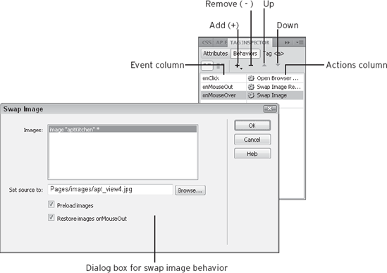
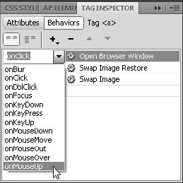
The Behaviors panel provides two columns (see Figure 11-1) that neatly sum up the behaviors concept in general: events and actions. After you attach a behavior, the triggering event (onClick, onMouseOver, and so on) is shown on the left, and its associated action — what exactly is triggered — is on the right. A down arrow between the event and action, when clicked, displays other available events for the current browser model. Double-click the action to open its parameter dialog box, where you can modify the action's attributes.
As usual in Dreamweaver, you have your choice of methods for opening the Behaviors panel:
Tip
The Behaviors panel can be closed by toggling it off with Shift+F4 or hidden along with all the other panels by pressing F4.
After you have attached a behavior to a tag and closed the associated action's parameter dialog box, Dreamweaver writes the necessary HTML and JavaScript code into your document. Because it contains functions that must be callable from anywhere in the document, the bulk of the JavaScript code is placed in the <head> section of the page; the code that links selected tags to these functions is written in the <body> section. A few actions, including Play Sound, place HTML code at the bottom of the <body>. However, most of the code — there can be a lot of code to handle all the cross-browser contingencies — is placed between <script> . . . </script> tags in the <head>.
The procedure for adding (or attaching) a behavior is simple. As noted earlier, you can assign only certain events to particular tags, and these options are further limited by the type of browser used.
Note
Even in the latest browsers, key events such as onMouseDown, onMouseOver, and onMouseOut work only with anchor tags. To circumvent this limitation, Dreamweaver can enclose an element, such as <img>, with an anchor tag that links to nowhere — src="javascript:;". Events that use the anchor tag in this fashion appear in parentheses in the drop-down list of events.
To add a behavior to an element in your Web page, follow these steps:
Select an object (element) in the Document window.
Tip
To assign a behavior to the entire page, select the
<body>tag from the Tag Selector (below the Document window).Open the Behaviors panel by choosing Window

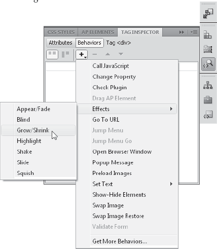
Click the Add (+) button to reveal the available options, as shown in Figure 11-2. Select one from the drop-down list.
Enter the desired values in the action's parameter dialog box.
Click OK to close the dialog box when you're finished.
Dreamweaver adds a line to the Behaviors panel displaying the attached event and its associated action.
A trigger — whether it's an image or a text link — may have multiple behaviors attached to it. One graphical navigation element can, for instance, perform a Swap Image when the user's mouse moves over it and a Swap Image Restore when the mouse moves away, and, when clicked, can show another Web page in an additional, smaller window with the Open Browser Window behavior.
Tip
Dreamweaver includes a Get More Behaviors menu option at the bottom of the Add (+) drop-down list. To use this feature, connect to the Internet and select Get More Behaviors in Dreamweaver. You are whisked away to the Dreamweaver Exchange, a service from Adobe with a huge selection of extensions of all flavors, including behaviors.
Every time Dreamweaver attaches a behavior to a tag, it inserts an event for you. The default event that is chosen is based on two criteria: the browser type and the selected tag. The different browsers in use have widely different capabilities, notably when it comes to understanding the various event handlers and associated tags.
For every specification or browser combination in the Show Events For submenu of the Add (+) drop-down list, Dreamweaver has a corresponding file in the ConfigurationBehaviorsEvents folder. Each tag listed in each file, such as IE 4.0.htm, has at least one event associated with it. The entries look like this:
<INPUT TYPE="Text" onBlur="*" onChange="" onFocus="" onSelect="">
The default event for each tag is marked with an asterisk; in the preceding example, onBlur is the default event. After you've selected an action and completed its parameter dialog box, the default event appears in the Events column of the Behaviors panel alongside the action in the Actions column.
Tip
If you find yourself changing a particular tag's default event over and over again to some other event, you might want to modify the appropriate Event file to pick your alternative as the default. To do this, open the HTML 4.01.htm file found in the Dreamweaver CS5ConfigurationBehaviorsEvents folder, switch to Code view, and move the asterisk to a different event for that particular tag. Resave the file and restart Dreamweaver to try out your new default behavior.
If you don't want to select the default event in a certain instance, you can easily choose another. To do so, click the down arrow next to the displayed event in the Behaviors panel and select the event you want in the drop-down list (see Figure 11-3).
Incorporating Behaviors
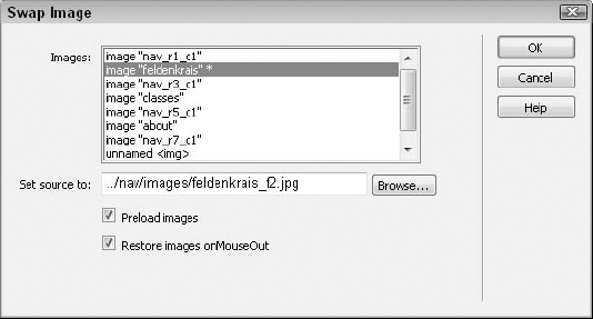
In this Technique, you add a series of Dreamweaver standard behaviors that display a different image whenever a link is moused over.
In the Files panel, switch to the Dreamweaver Bible working site previously created.
Go to Techniques11_Behaviors and open the file
behaviors_start.htm.Select the text Living Room beneath the picture.
In the Link field of the Properties panel, enter
javascript:;to create a link.Choose Window
In the Behaviors panel, click Add (+) and select Swap Image.
When the Swap Image dialog box opens, set the following parameters:
Select Browse and choose
apt_view1.jpgfrom the Techniques/images folder.Clear the Restore Images onMouseOut option.
Click OK when you're done. Note that the behavior has been added to the Behaviors panel with the default event,
onMouseOver.Select the text Kitchen North and repeat Steps 4–8, selecting
apt_view2.jpgas the file to show in the Swap Image behavior dialog.Select the text Kitchen South and repeat Steps 4–8, selecting
apt_view3.jpgas the file to show in the Swap Image behavior dialog.Save your page.
When you're done, each of the three links underneath the picture will have its own behavior; test the page in a browser to verify that the images change when your mouse rolls over the different links.
As of this writing, 25 standard actions ship with Dreamweaver CS4. Each action operates independently of and is different from the others, although many share common functions. Each action is associated with a different parameter dialog box to enable easy attribute entry.
The following sections describe the standard actions: what the actions do, what requirements must be met for them to be activated, what options are available, and most important of all, how to use the actions. Each action is written to work with all browser versions 4 and above. However, some actions do not work as designed in the older browsers: Netscape Navigator 3.0, for instance, cannot perform the AP element–related behaviors, and Internet Explorer 3.0 ignores almost all behaviors.
With Call JavaScript, you can execute any JavaScript function — standard or custom — with a single mouse click or other event. As your JavaScript savvy grows, you'll find yourself using this behavior again and again.
Call JavaScript is straightforward to use; simply type the JavaScript code or the name of the function you want to trigger into the dialog box. If, for example, you want to get some input from a visitor, you can use JavaScript's built-in prompt() method like this:
result = prompt('Whom shall I say is calling?','')When this code is triggered, a small dialog box appears with your query (here, 'Whom shall I say is calling?') and a blank space for an input string. The second argument in the prompt() method enables you to include a default answer — to leave it blank, just use an empty string (two single quotes with nothing in between), as shown in the preceding code snippet.
Note
You can use either single or double quotes in your Call JavaScript behavior; Dreamweaver automatically adjusts for whichever you choose. I find it easier to use single quotes because Dreamweaver translates double quotes into character entities; that is, " becomes ".
Naturally, you can use Call JavaScript to handle more complex chores as well. To call a specific custom function that is already in the <head> section of your page, just enter its name — along with any necessary arguments — in the Call JavaScript dialog box, shown in Figure 11-4.

Figure 11-4. Trigger any JavaScript function by attaching a Call JavaScript behavior to an image or text.
To use the Call JavaScript behavior, follow these steps:
Select the object to trigger the action.
From the Behaviors panel, click the Add (+) button and select Call JavaScript.
In the Call JavaScript dialog box, enter your code in the JavaScript text box.
Click OK when you're finished.
The Change Property action enables you to dynamically alter properties of each of the following tags:
<div><form><img><layer><select><span><textarea>
You can also alter the following <input> types:
checkboxpasswordradiotext
The tags, as well as the browser being targeted, determine exactly which properties can be altered. For example, the <div> tag and Internet Explorer 4.0 combination enables you to change virtually every style sheet option on-the-fly. The Change Property dialog box (see Figure 11-5) offers a list of the selected tags in the current page.

Figure 11-5. The Change Property dialog box enables you to alter attributes of certain tags dynamically.
Warning
It's important that you name the objects you want to alter so that Dreamweaver can properly identify them. Remember to use unique names that begin with a letter and contain no spaces or special characters.
This behavior is especially useful for changing the properties of forms and form elements. Be sure to name the form if you want to use Change Property in this manner. To use the Change Property action, follow these steps:
Select the object to trigger the action.
From the Behaviors panel, click the Add (+) button and select Change Property.
In the Change Property dialog box, choose the type of object whose property you want to change — FORM, DIV, INPUT/TEXT, and so on — from the Type Of Element drop-down list.
In the Element ID drop-down list, select the name of the object whose property you want to change.
Click the Select radio button. Select the target browser in the small list box on the far right and choose the property to change. If you don't find the property in the drop-down list box, you can type it yourself in the Enter text box.
Note
Many properties in the various browsers are read-only and cannot be dynamically altered. Those properties listed in the option list are always dynamic.
In the New Value text box, type the property's new value to be inserted when the event is fired.
Click OK when you're finished.
If certain pages on your Web site require the use of one or more plugins, you can use the Check Plugin action to see if a visitor has the necessary plugin installed. After Check Plugin has examined this, it can route users with the appropriate plugin to one URL and users without it to another URL. You can look for only one plugin at a time, but you can use multiple instances of the Check Plugin action, if needed.
By default, the parameter dialog box for Check Plugin (see Figure 11-6) offers five plugins: Flash, Shockwave, LiveAudio, QuickTime, and Windows Media Player. You can check for any other plugin by entering its name in the Enter text box. Use the name exactly as it appears in bold (without the version number) in Netscape's About Plug-ins area — for example, Nullsoft Winamp Plug-in for Gecko.
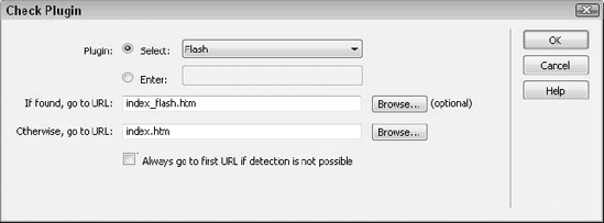
Figure 11-6. Running a media-intensive site? Use the Check Plugin action to divert visitors without plugins to alternative pages.
One very unfortunate hitch: Internet Explorer is pretty much crippled with respect to cross-browser plugin detection. In Windows, Internet Explorer can only detect Flash and Shockwave plugins. And on Macintosh platforms, Internet Explorer cannot detect any plugins at all. The best way to handle both browsers is to use both ActiveX controls and plugins.
Tip
If you use a particular plugin regularly, you may also want to modify the Check Plugin.js file found in your Actions folder. Add your new plugin to the PLUGIN_NAMES array (this holds "nice" plugin names as they appear in the parameter dialog box) and PLUGIN_VALUES array (this holds "internal" plugin names, as they appear in Netscape's About Plug-ins area) in the initGlobals() function.
To use the Check Plugin action, follow these steps:
Select the object to trigger the action.
From the Behaviors panel, click the Add (+) button and select Check Plugin.
Select a plugin from the drop-down list or type another plugin name in the Enter text box.
Note
The names presented in the drop-down list are abbreviated — more recognizable names — and not the formal names inserted into the code. For example, when you select Shockwave, Shockwave for Director is actually input into the code. On the other hand, any plugin name you enter manually into the Enter field is inserted verbatim.
If you want to send users who are confirmed to have the plugin to a different page, enter that URL (absolute or relative) in the If Found, Go To URL text box or use the Browse button to locate the file. If you want these users to stay on the current page, leave the text box empty.
In the Otherwise, Go To URL text box, enter the URL for users who do not have the required plugin.
Should the plugin detection fail — which, as explained earlier, happens regularly in Internet Explorer, whether or not the plugin is actually present — you can keep the user on the initial page. To do so, enable the Always Go To First URL If Detection Is Not Possible option. Otherwise, if the detection fails for any reason, users are sent to the URL listed in the Otherwise field.
Click OK when you're finished.
The Drag AP Element action provides some spectacular — and interactive — effects with little effort on the part of the designer. Drag AP Element enables your Web page visitors to move AP elements — and all that they contain — around the screen with the drag-and-drop technique. With the Drag AP Element action, you can easily set up the following capabilities for the user:
Enabling AP elements to be dragged anywhere on the screen
Restricting the dragging to a particular direction or combination of directions — a horizontal sliding AP element can be restricted to left and right movement, for instance
Limiting the drag handle to a portion of the AP element such as the upper bar or enabling the whole AP element to be used
Providing an alternative clipping method by enabling only a portion of the AP element to be dragged
Enabling changing of the AP elements' stacking order while dragging or on mouse release
Setting a snap-to target area on your Web page for AP elements that the user releases within a defined radius
Programming a JavaScript command to be executed when the snap-to target is hit or every time the AP element is released
Note
AP elements are some of the more powerful features in Dreamweaver. To get the most out of the AP element–oriented behaviors, familiarize yourself with AP elements by examining Chapter 10.
One or more AP elements must reside in your Web page before the Drag AP Element action becomes available for selection from the Add (+) drop-down list. You must attach the action to the <body> — you can, however, attach separate Drag AP Element behaviors to different AP elements to get different AP element-dragging effects.
Drag AP Element's parameter dialog box (see Figure 11-7) includes a Get Current Position button that puts the left and top coordinates of the selected AP element into the Drop Target Left/Top boxes. If you plan on using targeting, make sure to place your AP element at the target location before attaching the behavior.
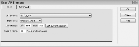
Figure 11-7. With the Drag AP Element action, you can set up your AP elements to be repositioned by the user.
To use the Drag AP Element action, follow these steps:
Make sure that you have one or more AP elements on your page; then select the
<body>tag.From the Behaviors panel, click the Add (+) button and select Drag AP Element.
If the Basic tab of the parameter dialog box is not selected, select it now.
In the AP Element drop-down list, select the AP element you want to make draggable.
To limit the movement of the AP element, change the Movement option from Unconstrained to Constrained. Text boxes for Up, Down, Left, and Right appear. Enter pixel values in the text boxes to control the range of motion:
To constrain movement vertically, enter positive numbers in the Up and Down text boxes and zeros in the Left and Right text boxes.
To constrain movement horizontally, enter positive numbers in the Left and Right text boxes and zeros in the Up and Down text boxes.
To enable movement in a rectangular region, enter positive values in all four text boxes.
To establish a location for a target for the dragged AP element, enter coordinates in the Drop Target: Left and Top text boxes. Click the Get Current Position button to fill these text boxes with the AP element's current location.
To set a snap-to area around the target coordinates where the AP element falls if released in the target location, enter a pixel value in the Snap If Within text box.
For additional options, select the Advanced tab of the parameter dialog box.
If you want the whole AP element to act as a drag handle, select Entire AP Element from the Drag Handle drop-down list. If, instead, you want to limit the area to be used as a drag handle, select Area Within AP Element from the Drag Handle drop-down list. L(eft), T(op), W(idth), and H(eight) text boxes appear. In the appropriate boxes, enter the left and top coordinates of the drag handle in pixels, as well as the dimensions for the width and height.
To control the positioning of the dragged AP element, set the following While Dragging options:
To keep the AP element in its current depth (that is, to avoid bringing it to the front when it is dragged), clear the checkbox for While Dragging: Bring AP Element To The Front.
To change the stacking order of the AP element when it is released, select the checkbox and pick either Leave On Top or Restore Z-index from the drop-down list.
To execute a JavaScript command while the AP element is being dragged, enter the command or function in the Call JavaScript text box.
To execute a JavaScript command when the AP element is dropped on the target, enter the code in the When Dropped: Call JavaScript text box. If you want the JavaScript to execute only when the AP element is snapped to its target, select the Only If Snapped option. This option requires that a value be entered in the Snap If Within text box in the Basic tab.
Click OK when you're finished.
Note
If you — or others on your team — have the requisite JavaScript programming skills, you can gather information output from the Drag AP Element behavior to enhance your pages. Dreamweaver declares three variables for each draggable AP element: MM_UPDOWN (the y coordinate), MM_LEFTRIGHT (the x coordinate), and MM_SNAPPED (true, if the AP element has reached the specified target). Before you can get any of these properties, you must get an object reference for the proper AP element. Another function, MM_findObj(AP elementname), handles that chore.
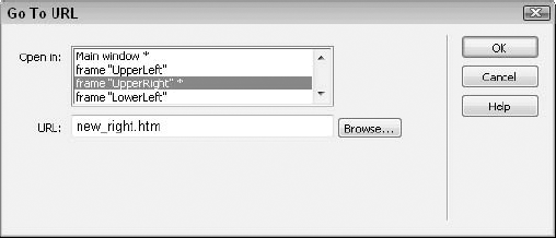
Dreamweaver brings the same power of links — with a lot more flexibility — to any event with the Go to URL action. One of the trickier tasks in using frames on a Web page is updating two or more frames simultaneously with a single button click. The Go to URL action handily streamlines this process for the Web designer. Go to URL can also be used as a preload router that sends the user to another Web page after the onLoad event has finished. The Go To URL dialog box (see Figure 11-8) displays any existing frames in the current page or frameset. To load multiple URLs at the same time, select the first frame from the Open In list and enter the desired page or location in the URL text box. Next, select the second frame from the list and enter its URL, and so on. If you select a frame to which a URL is already assigned, that address appears in the URL text box.
To use the Go to URL action, follow these steps:
Select the object to trigger the action.
From the Behaviors panel, click the Add (+) button and select Go to URL.
From the Go To URL dialog box, select the target for your link from the list in the Open In window.
Enter the path of the file to open in the URL text box or click the Browse button to locate a file. An asterisk appears next to the frame name to indicate that a URL has been chosen.
To select another target to load a different URL, repeat Steps 3 and 4.
Click OK when you're finished.
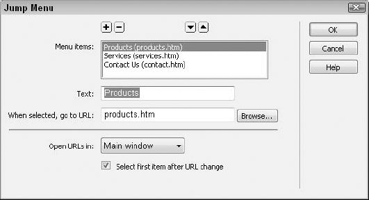
Although most behaviors insert original code to activate an element of the Web page, several behaviors are included to edit code inserted by a Dreamweaver object. The Jump Menu and Jump Menu Go behaviors both require a previously inserted Jump Menu object before they become active. The Jump Menu behavior is used to edit an existing Jump Menu object, and the Jump Menu Go behavior adds a graphic image as a Go button.
Note
To find out more about the Jump Menu object, see Chapter 14.
To use the Jump Menu behavior to edit an existing Jump Menu object, follow these steps:
Select the Jump Menu object previously inserted into the page.
In the Behaviors panel, double-click the listed Jump Menu behavior.
Make your modifications in the Jump Menu dialog box, as shown in Figure 11-9. You can alter the existing menu item names or their associated URLs, add new menu items, or reorder the list through the Jump Menu dialog box.
Click OK when you're finished.
To add a button to activate the Jump Menu object, follow these steps:
Select the image or form button you'd like to make into a Go button. A Jump Menu object must be on the current page for the Jump Menu Go behavior to be available.
From the Behaviors panel, select Jump Menu Go from the Add (+) drop-down list. The Jump Menu Go dialog box, shown in Figure 11-10, is displayed.
Select the name of the Jump Menu object you want to activate from the option list.
Click OK when you're finished.

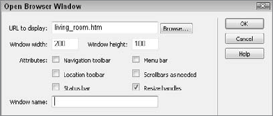
Want to display your latest design in a borderless, nonresizable browser window that's exactly the size of your image? With the Open Browser Window action, you can open a new browser window and specify its exact size and attributes. You can even set it up to receive JavaScript events.
You can also open a new browser window with a regular link by specifying target="_blank", but you can't control any of the window's attributes with this method. You do get this control with the parameter dialog box of the Open Browser Window action (see Figure 11-11). This dialog enables you to set the window width and height and select whether to display the Navigation Toolbar, Location Toolbar, Status Bar, Menu Bar, Scrollbars As Needed, and/or Resize Handles. You can also name your new window, a necessary step for advanced JavaScript control.
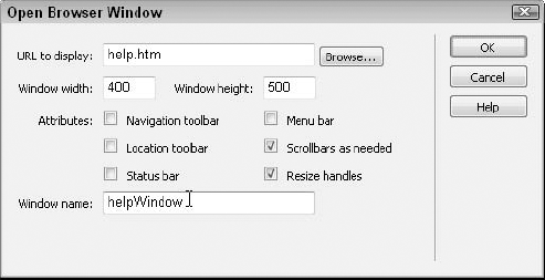
Figure 11-11. Use the Open Browser Window action to program a pop-up advertisement or remote control.
You have to explicitly select any of the attributes that you want to appear in your new window. Your new browser window contains only the attributes you've checked, plus basic window elements such as a title bar and a Close button.
Warning
Most modern browsers have pop-up blockers that will stop the Open Browser Window action from functioning. Although there is nothing you, as a page designer, can do to override the pop-up blocker, you might consider adding a note to your page indicating that pop-up windows are in use on your page.
To use the Open Browser Window action, follow these steps:
Select the object to trigger the action.
From the Behaviors panel, click the Add (+) button, and select Open Browser Window.
In the URL To Display text box, enter the address of the Web page you want to display in the new window. You can also click the Browse button to locate the file.
To specify the window's size, enter the width and height values in the appropriate text boxes. You must enter both a width and height measurement, or the new browser window opens to its default size.
Check the appropriate Attributes checkboxes to show the desired window features.
If you plan on using JavaScript to address or control the window, type a unique name in the Window Name text box. This name cannot contain spaces or special characters. Dreamweaver alerts you if the name you've entered is unacceptable.
Click OK when you're finished.
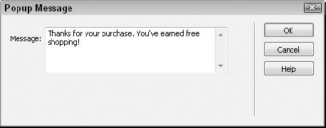
You can send a quick message to your users with the Popup Message behavior. When triggered, this action opens a JavaScript alert box that displays your specified message. You enter your message in the Message text box on the action's parameter dialog box (see Figure 11-12).
To use the Popup Message action, follow these steps:
Select the object to trigger the action.
From the Behaviors panel, click the Add (+) button and select Popup Message.
Enter your text in the Message text box.
Click OK when you're finished.
Tip
You can include JavaScript functions or references in your text messages by surrounding the JavaScript with curly braces. For example, you can incorporate today's date in a message like this:
Welcome to our site on {new Date()}!You could also pull data from a form into your alert-box message, as in this example:
Thanks for filling out our survey,i {document.surveyForm.firstname.value}.If you need to display a curly brace in a message, you must precede it with a backslash character, as in { or }.
Designs commonly require a particular image or several images to be displayed immediately when called by an action or a timeline. Because of the nature of HTML, all graphics are separate files that are normally downloaded when needed. To get the snappy response required for certain designs, graphics need to be preloaded or cached so that they are available. The Preload Images action performs this important service. You designate the images you want to cache for later use through the Preload Images parameter dialog box (see Figure 11-13).
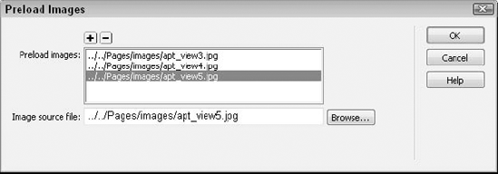
Figure 11-13. Media-rich Web sites respond much faster when images have been cached with the Preload Images action.
Note
You don't need to use the Preload Images action if you're creating rollovers. Both the Rollover object and the Swap Image action enable you to preload images from their dialog boxes.
To use the Preload Images action, follow these steps:
Select the object to trigger the action.
From the Behaviors panel, click the Add (+) button and select Preload Images.
In the Preload Images parameter dialog box, enter the path to the image file in the Image Source File text box, or click the Browse button to locate the file.
To add another file, click the Add (+) button and repeat Step 3.
Warning
After you've specified your first file to be preloaded, be sure to click the Add (+) button for each successive file you want to add to the list. Otherwise, the highlighted file is replaced by the next entry.
To remove a file from the Preload Images list, select it and click the Remove (−) button.
Click OK when you're finished.
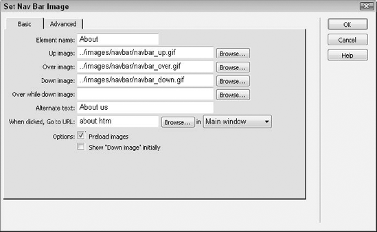
The Set Nav Bar Image action enables you to edit an existing implementation of a previous Dreamweaver object, the Navigation Bar object. This object consists of a series of designer-specified images acting as a group of navigational buttons. The Set Nav Bar Image action enables you to modify an existing Navigation Bar object by adding, reordering, or deleting images as buttons, as well as by setting up advanced rollover techniques.
The main aspect that sets a navigation bar apart from any other similar series of rollover images is that the navigation bar elements relate to one another. When you select one element of a navigation bar, by default, all the other elements are swapped to their up state. The Set Nav Bar Image action enables you to modify that default behavior to a rollover in another area or any other image swap desired. You can also use Set Nav Bar Image to include another image button in the navigation bar.
To modify an existing Navigation Bar object, follow these steps:
Choose any image in the Navigation Bar object.
From the Behaviors panel, double-click any of the Set Nav Bar Image actions displayed for the image. The same Set Nav Bar Image dialog box (see Figure 11-14) opens regardless of whether you select an action associated with the
onClick,onMouseOver, oronMouseOutevent.Make any desired edits — changing the Up, Over, Down, or Over While Down state for images or their respective URLs or targets — from the Basic tab of the dialog box.
To change any other images that interact with the current image, select the Advanced tab.
From the drop-down list in the Advanced category, choose the state for which you want to trigger changes:
Over Image or Over While Down Image
Down Image
Select the image you want to change from the Also Set Image list. Dreamweaver lists all the named images on the current page, not just those in the navigation bar.
Select the path of the new image to be displayed in the To Image File text field. An asterisk appears after the current image in the list box, signifying that a swap image has been chosen.
If you choose Over Image or Over While Down Image as the triggering event, an optional field (If Down, To Image File) enables you to specify another graphic to swap for the image of the down-state image.
To alter other images with the same triggering event, repeat Steps 6 through 8.
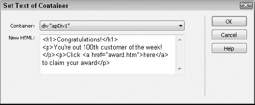
Dreamweaver has grouped together four similar behaviors under the Set Text heading. The first, Set Text of Container, enables you to do much more than change a word or two — you can dynamically rewrite the entire code for any containing element. You can even incorporate JavaScript functions or interactive information into the new content. The Set Text of Container behavior replaces the entire HTML contents of the target — and the target can be any tag with an ID.
Tip
Unlike another behavior in this group, Set Text of Frame, the Set Text of Container dialog box provides no button for getting the current HTML. Here's a workaround. Before invoking the behavior, switch to Code view and copy all the elements inside the desired element. Then you can paste your clipboard into the New HTML text area using the keyboard shortcut Ctrl+V (Cmd+V). Be careful not to select the surrounding element tag, such as the <div>; if you do, you are pasting one surrounding element in another.
To set the text of an AP element dynamically, follow these steps:
Make sure that the AP element you want to change has been created and named properly.
Select the object to trigger the action.
From the Behaviors panel, click the Add (+) button and choose Set Text
Select the element to modify from the Container drop-down list.
Enter the replacement code in the New HTML text area.
Click OK when you're finished.
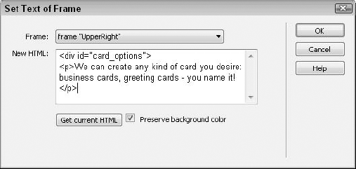
The Set Text of Frame action replaces all the contents of the <body> tag of a frame. Dreamweaver supplies a handy Get Current HTML button that enables you to easily keep everything you want to retain and change only a heading or other element. Naturally, you must be within a frameset to use this behavior, and the frames must be named correctly — that is, uniquely without special characters or spaces.
To change the content of a frame dynamically, follow these steps:
Select the triggering object.
From the Behaviors panel, click the Add (+) button and choose Set Text
Choose the frame you want to alter from the Frame drop-down list.
Enter the code for the changing frame in the New HTML text area. Keep in mind that you're changing not just a word or phrase, but all the HTML contained in the
<body>section of the frame.If you want to keep the majority of the code, click the Get Current HTML button and change only those portions necessary.
To maintain the frame's
<body>attributes, such as the background and text colors, select the Preserve Background Color option. If this option is not selected, the frame's background and text colors are replaced by the default values (a white background and black text).Click OK when you're finished.
Use the Set Text of Status Bar action to display a text message in the browser's status bar based on a user's action, such as moving the pointer over an image. The message stays displayed in the status bar until another message replaces it. System messages, such as URLs, tend to be temporary and visible only when the user's mouse is over a link.
Note
Some browsers, including Internet Explorer 6 and 7, will not display the change of status bar text without changing user preferences.
The only limit to the length of the message is the size of the browser's status bar; you should test your message in various browsers to make sure that it is completely visible.
Tip
To display a message only when a user's pointer is over an image or link, use one Set Text of Status Bar action, attached to an onMouseOver event, with your desired status-bar message. Use another Set Text of Status Bar action, attached to an onMouseOut event, that has a null string (" ") as the text.
You enter all text in the Message field of the Set Text of Status Bar parameter dialog box (see Figure 11-17).
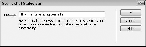
Figure 11-17. Use the Set Text of Status Bar action to guide your users with instructions in the browser window's status bar.
To use the Set Text of Status Bar action, follow these steps:
Select the object to trigger the action.
From the Behaviors panel, click the Add (+) button and select Set Text of Status Bar.
Enter your text in the Message text box.
Click OK when you're finished.
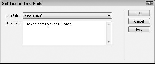
Set Text of Text Field, the final Set Text behavior, enables you to update any text or text area field, dynamically. A text field must be present on the page for the behavior to be available. To change the displayed text of a text or text area field, follow these steps:
From the Behaviors panel, click the Add (+) button and choose Set Text
Select the desired text field from the drop-down list.
Enter the new text and/or JavaScript in the New Text area.
Click OK when you're finished.
One of the key features of Dynamic HTML AP elements is their capability to appear and disappear on command. The Show-Hide Elements action gives you easy control over the visibility attribute for all elements with an ID in the current Web page. In addition to explicitly showing or hiding elements, this action can also restore elements to the default visibility setting.
The Show-Hide Elements action is often used to reveal or conceal a single element; however, you are not restricted to hiding or showing just one element at a time. The action's parameter dialog box (see Figure 11-19) shows you a list of all the elements with an ID in the current Web page from which you can choose as many as you want to show or hide.
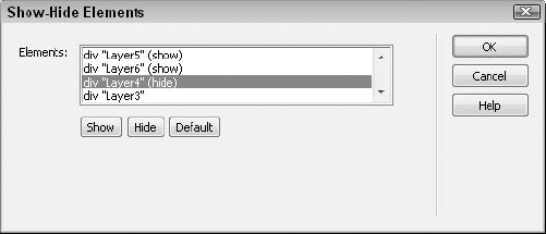
Figure 11-19. The Show-Hide Elements action can make any number of hidden elements visible, hide any number of visible elements, or both.
To use the Show-Hide Elements action, follow these steps:
Select the object to trigger the action.
From the Behaviors panel, click the Add (+) button and select Show-Hide Elements. The Show-Hide Elements parameter dialog box displays a list of the available elements in the current Web page.
To show a hidden element, select the element from the Elements list and click the Show button.
To hide a shown element, select its name from the list and click the Hide button.
To restore an element's default visibility value, select the element and click the Default button.
Click OK when you're finished.
Button rollovers are one of the most frequently used techniques in Web design today. In a typical button rollover, a user's pointer moves over one image, and the graphic appears to change in some way, seeming to glow or change color. Actually, the onMouseOver event triggers the almost instantaneous swapping of one image for another. Dreamweaver automates this difficult coding task with the Swap Image action and its companion, the Swap Image Restore action.
In recognition of how rollovers commonly work in the real world, Dreamweaver makes it possible to combine Swap Image and Swap Image Restore in one easy operation — as well as to preload all the images. Moreover, you can use a link in one frame to trigger a rollover in another frame without having to tweak the code as you did in earlier Dreamweaver versions.
When the dialog box for the Swap Image action opens (see Figure 11-20), it automatically loads a list of all the image names it finds in the current Web page. You select the image you want to change — which could be the same image to which you are attaching the behavior — and specify the image file you want to replace with the rolled-over image. You can swap more than one image with each Swap Image action. For example, if you want an entire submenu to change when a user rolls over a particular option, you can use a single Swap Image action to switch all the submenu button images.
Note
If the Restore Images onMouseOut option was selected in the Swap Image parameter dialog box, Dreamweaver adds two lines to the Behaviors panel: Swap Image and Swap Image Restore.
If you choose not to enable the Restore Images onMouseOut option, which changes the image back to the original, you attach the Swap Image Restore action to another event. The Swap Image Restore action can be used only after a Swap Image action. No parameter dialog box exists for the Swap Image Restore action — just a dialog box confirming your selection.
Warning
If the swapped-in image has different dimensions than the image it replaces, the swapped-in image is resized to the height and width of the first image.
To use the Swap Image action, follow these steps:
Select the object to trigger the action.
From the Behaviors panel, click the Add (+) button and select Swap Image.
In the Swap Image parameter dialog box, choose an available image from the Images list.
In the Set Source To text box, enter the path to the image that you want to swap. You can also click the Browse button to locate the file. An asterisk appears at the end of the selected image name to indicate an alternative image has been selected.
To swap additional images using the same event, repeat Steps 3 and 4.
To preload all images involved in the Swap Image action when the page loads, make sure the Preload Images option is checked.
To cause the selected images to revert to their original source when the user mouses away from the selected object, make sure that the Restore Images
onMouseOutoption is selected.Click OK when you're finished.
When you set up a form for user input, you establish each field with a purpose. The name field, the e-mail address field, and the ZIP Code field all have their own requirements for input. Unless you are using a CGI program specifically designed to check the user's input, form fields usually accept input of any type. Even if the CGI program can handle it, this server-side method ties up server time and is relatively slow. The Dreamweaver Validate Form action checks any text field's input and returns the form to the user if any of the entries are unacceptable. You can also use this action to designate any text field as a required field.
Validate Form can be used to check either single or multiple text fields in a form. If you attach a Validate Form action to a single text box, you alert the user to any errors as he is filling out this field. To check multiple form fields, the Validate Form action must be attached to the form's <form> tag.
The Validate Form dialog box (see Figure 11-21) enables you to designate any text field as required, and you can evaluate its contents. You can require the input of a text field to be a number, an e-mail address (for instance, [email protected]), or a number within a range. The number range you specify can include positive whole numbers, negative numbers, or decimals.
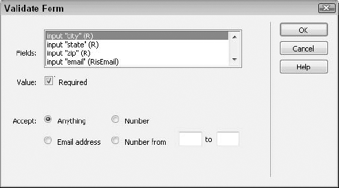
Figure 11-21. The Validate Form action checks your form's entries client-side, without CGI programming.
To use the Validate Form action, follow these steps:
Select the form object to trigger the action: a single text field or the
<form>tag (use the Tag Selector) for multiple text fields.From the Behaviors panel, click the Add (+) button and select Validate Form.
If you are validating an entire form, select a text field from the Fields list. If you are validating a single field, the selected form object is chosen for you and appears in the Fields list.
To make the field required, select the Value: Required checkbox.
To set the kind of input expected, select one of the following Accept options:
Anything — Accepts any input.
Number — Enables any sort of numeric input in the range of zeros through nines. You cannot mix text such as parentheses or hyphens and numbers, however, as in a telephone number such as (212) 555-1212.
Email Address — Looks for an e-mail address with the @ sign. (This is not a foolproof e-mail address check because it validates illegal addresses such as human@somewhere, @somewhere.com, [email protected], and so on.)
Number From — Enables you to enter two numbers, one in each text box, to define the number range.
Click OK when you're finished.
As part of the Spry framework, Adobe has included a series of seven effects in Dreamweaver's standard behaviors. These behaviors add a whole new level of interactivity to the Web designer's palette without requiring any additional hand-coding. Now designers can easily fade text in or out, make an image for a photo album appear to grow out of the page, smoothly slide a submenu in, and much, much more.
Each of the effects depends on an external JavaScript file, SpryEffects.js. The needed reference for this file is automatically added to the page and the file is placed in the SpryAssets folder in your site root the first time an effect is added. You'll need to publish the JavaScript file to your site along with your page for the effects to work properly. The seven effects, detailed in the following sections, are:
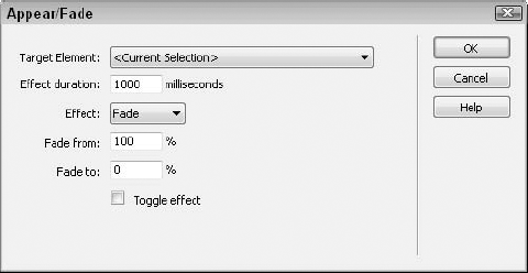
As you might expect, the Appear/Fade effect causes a targeted page element to appear or fade over a set period of time. You could, for example, fade in an AP element with additional information when a user clicks a Help icon. Likewise, because the behavior allows the effect to be toggled, the AP element could fade out with another click of the same icon.
Like most other Dreamweaver effects, Appear/Fade requires a tag with an assigned ID as the target element; most frequently, you'll target a <div> tag with an ID. You'll be able to control the duration of the fade as well as its percentage; you could, for example, fade an image from 100% to 40% over 3,000 milliseconds (3 seconds).
To use the Appear/Fade effect, follow these steps:
Make sure that the element you want to affect is contained within a tag with an ID on your page.
Select the object to trigger the effect.
From the Behaviors panel, click the Add (+) button and select Effect
In the Appear/Fade dialog box (see Figure 11-22), select the tag with an ID you want to appear or fade.
Enter the length of the effect (in milliseconds) in the Effect Duration field (1000 milliseconds equals one second).
Choose whether you'd like the targeted element to Appear or Fade from the Effect list.
If you chose Appear:
Set the starting opacity percentage in the Appear From field.
Set the ending opacity percentage in the Appear To field.
If you chose Fade:
Set the starting opacity percentage in the Fade From field.
Set the ending opacity percentage in the Fade To field.
If you'd like the reverse effect to occur the next time the trigger is selected, click the Toggle Effect checkbox.
Click OK when you're done.
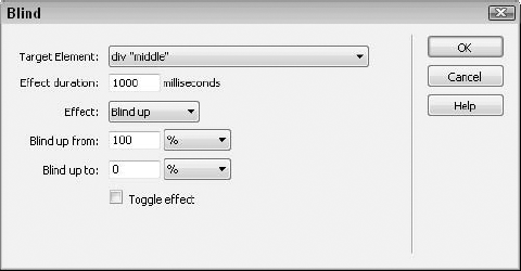
The Blind effect emulates window blinds raising and lowering. However, these particular types of blinds are attached to the bottom of the windowsill, not the top, so the content is hidden when the blinds go up and revealed when the blinds go down.
To use the Blind effect, follow these steps:
Make sure that the element you want to affect is contained within a tag with an ID on your page.
Select the object to trigger the effect.
From the Behaviors panel, click the Add (+) button and select Effect
In the Blind dialog box (see Figure 11-23), select the tag with an ID you want to hide or reveal.
Enter the length of the effect (in milliseconds) in the Effect Duration field (1000 milliseconds equals one second).
If you'd like the targeted element to be hidden, choose Blind Up from the Effect list; to reveal a previously hidden element, choose Blind Down.
If you chose Blind Up:
Set the starting percentage in the Blind Up From field.
Set the ending percentage in the Blind Up To field.
If you chose Blind Down:
Set the starting percentage in the Blind Down From field.
Set the ending percentage in the Blind Down To field.
If you'd like the reverse effect to occur the next time the trigger is selected, click the Toggle Effect checkbox.
Click OK when you're done.
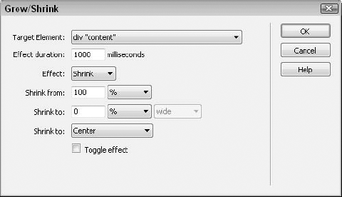
The Grow/Shrink effect reduces or enlarges the targeted content. This effect can be used to temporarily make an image bigger when the page visitor mouses over a thumbnail and smaller when the visitor moves the mouse off the thumbnail. In addition to controlling the duration of the effect, you also have the option of growing or shrinking from the center of the target or from the upper-left corner.
Tip
To achieve the aforementioned effect of the thumbnail growing and shrinking according to the mouse position, apply the Grow/Shrink effect twice: first, grow the image slightly with an onMouseOver event and then second, shrink it back to its original dimensions with an onMouseOut event.
To use the Grow/Shrink effect, follow these steps:
Make sure that the element you want to affect is contained within a
<div>tag with an ID on your page.Select the object to trigger the effect.
From the Behaviors panel, click the Add (+) button and select Effect
In the Grow/Shrink dialog box (see Figure 11-24), select the tag with an ID you want to grow or shrink.
Enter the length of the effect (in milliseconds) in the Effect Duration field (1000 milliseconds equals one second).
From the Effect list, choose whether you'd like the targeted element to Grow or Shrink.
If you chose Grow:
Set the starting opacity percentage in the Grow From field.
Set the ending opacity percentage in the Grow To field.
Choose the desired direction (Center or Top Left Corner) from the Grow From list.
If you chose Shrink:
Set the starting opacity percentage in the Shrink From field.
Set the ending opacity percentage in the Shrink To field.
Choose the desired direction (Center or Top Left Corner) from the Shrink To list.
If you'd like the reverse effect to occur the next time the trigger is selected, click the Toggle Effect checkbox.
Click OK when you're done.
The fading highlight, one of the earliest Web 2.0 techniques, was first implemented by Web application developers 37Signals (www.37signals.com). In this technique, a certain event (such as a page loading or a user tabbing into a form element) triggers a sudden burst of color behind a section of text, which quickly fades away. The effect works well to momentarily bring the page visitor's attention to a particular page element without disrupting the final layout. You can accomplish this same result — with many variations — by applying the Highlight effect.
To use the Highlight effect, follow these steps:
Make sure that the element you want to affect is contained within a tag with an ID on your page.
Select the object to trigger the effect.
From the Behaviors panel, click the Add (+) button and select Effect
In the Highlight dialog box (see Figure 11-25), select the tag with an ID you want to highlight.
Enter the length of the effect (in milliseconds) in the Effect Duration field (1000 milliseconds equals one second).
Choose the initial background color from the Start Color swatch.
Choose the background color the initial color fades to from the End Color swatch.
Choose the background color displayed after the fade is completed from the Color After Effect swatch.
If you'd like the reverse effect to occur the next time the trigger is selected, click the Toggle Effect checkbox.
Click OK when you're done.

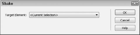
If you've ever mistyped your password on the login screen on Mac OS X, you've experienced the Shake effect. Shake moves the targeted element back-and-forth several times in a side-to-side manner. This effect is a sure attention grabber when used sparingly. The Dreamweaver implementation does not offer any user-selectable parameters such as duration or distance; you can only select the targeted tag.
To use the Shake effect, follow these steps:
Make sure that the element you want to affect is contained within a tag with an ID on your page.
Select the object to trigger the effect.
From the Behaviors panel, click the Add (+) button and select Effect
In the Shake dialog box (see Figure 11-26), select the tag with an ID you want to shake.
Click OK when you're done.
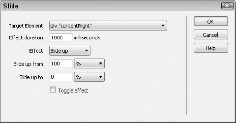
The Slide effect is similar to the Blind effect in that the content in both is either hidden or revealed. However, with Slide, the content itself appears to move in or out of view. Slide is different from all the other effects in another way: Slide requires an outer <div> tag with an ID that surrounds another tag with an ID. For example, the relevant code might look like this:
<div id="wrapper">
  <div id="content">
    <p>Content to slide</p>
  </div>
</div>
The Slide effect targets the surrounding <div> tag; in this example, the targeted tag would be <div id="wrapper">.
To use the Slide effect, follow these steps:
Make sure that the element you want to affect is contained within a tag with an ID on your page.
Select the object to trigger the effect.
From the Behaviors panel, click the Add (+) button and select Effect
In the Slide dialog box (see Figure 11-27), select the tag with an ID you want to hide or reveal.
Enter the length of the effect (in milliseconds) in the Effect Duration field.
If you'd like the targeted element to be hidden, choose Slide Up from the Effect list; to reveal a previously hidden element, choose Slide Down.
If you chose Slide Up:
Set the starting percentage in the Slide Up From field.
Set the ending percentage in the Slide Up To field.
If you chose Slide Down:
Set the starting percentage in the Slide Down From field.
Set the ending percentage in the Slide Down To field.
If you'd like the reverse effect to occur the next time the trigger is selected, click the Toggle Effect checkbox.
Click OK when you're done.
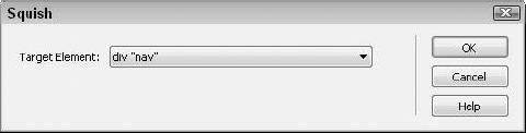
The Squish effect is similar to a specialized use of the Grow/Shrink effect. When a Squish effect is triggered, the targeted page element shrinks from 100% to 0% in the element's upper-left corner; trigger the effect again and the element grows to 100% in the opposite direction. Like Shake, the only user-defined parameter is the choice of the target element.
To use the Squish effect, follow these steps:
Make sure that the element you want to affect is contained within a tag with an ID on your page.
Select the object to trigger the effect.
From the Behaviors panel, click the Add (+) button and select Effect
In the Squish dialog box (see Figure 11-28), select the tag with an ID you want to squish.
Click OK when you're done.
The standard behaviors that come with Dreamweaver are indeed impressive, but they're really just the beginning. Because existing behaviors can be modified and new ones created from scratch, you can continue to add behaviors as you need them.
To install a new Dreamweaver behavior, follow these steps:
Locate the behavior, which must be packaged as an MXP extension file; for example:
alignLayer.mxp,cleanupPage.mxp, and so on.Warning
The Web site for this book (
www.wiley.com/go/dreamweavercs5bible) contains several useful MXP behavior extension files. In addition, you can find a large selection of MXP extension files on the Dreamweaver Exchange site, which you can reach by choosing HelpTo install the extension in Dreamweaver (or in Fireworks or Flash, for that matter), either double-click the MXP extension file, or choose Help
Note
Depending on your browser, you might be given the choice of installing a Dreamweaver Exchange extension file directly from the Exchange site or to save it first to disk and install it from there. If you choose to install the extension file directly from the Exchange site, the Extension Manager handles the installation automatically. If you choose to save the extension file to disk, a good place to save it is the Downloaded Extensions folder within your Dreamweaver CS5 folder.
Figure 11-29. Use the Extension Manager to install, remove, and temporarily enable/disable MXP extension files from Dreamweaver, Fireworks, or Flash.
You can alter any of the attributes for your inserted behaviors at any time. To modify a behavior you have already attached, follow these steps:
Select the object in the Document window or the tag in the Tag Selector to which your behavior is attached.
Double-click the action that you want to alter. The appropriate dialog box opens, with the previously selected parameters.
Make any modifications to the existing settings for the action.
Click OK when you are finished.
When you have more than one action attached to a particular event, the order of the actions is often important. For example, you should generally implement the Go to Timeline Frame action ahead of the Play Timeline action to make sure the timeline is playing from the correct frame. To specify the sequence in which Dreamweaver triggers the actions, reposition them as necessary in the Actions column. To do this, simply select an action and use the up and down arrow buttons (refer to Figure 11-1) to reposition it in the list.
To remove a behavior from a list of behaviors attached to a particular event, simply highlight the behavior and click the Remove (−) button.
Modifying Behaviors
To further reveal the power of Dreamweaver's standard behaviors, add another series of behaviors to your practice page. In the process, you'll get a chance to adjust attributes of an applied behavior.
From the Files panel, re-open the
behaviors_start.htmfile you previously worked upon.Place your cursor anywhere in the Living Room link.
From the Behaviors panel, click Add (+) and select Open Browser Window.
In the Open Browser Window dialog, set the following parameters:
Click the Browse button and choose
living_room.htmfrom the dialog box.In the Window Width field, enter
200.In the Window Height field, enter
100.Select the Resize Handles option.
Click OK when you're done.
A second behavior is added to the link in the Behaviors panel, with the default event of onClick.
Save your file and press F12 (Option+F12) to preview the page in your primary browser.
Click the Living Room link to test the behavior.
You'll notice that the window height is too small for the text; you can easily make the adjustment. In Dreamweaver's Behaviors panel, double-click the Open Browser Window event to re-open the dialog box.
Change the Window Height value to 150; click OK when you're done.
To verify that the change is sufficient, test the page in the browser as before.
In Dreamweaver, repeat Steps 2–5 for the Kitchen North link and set the Browser Window behavior to open
kitchen.htmwith a width of 200 pixels and height of 150 pixels.Repeat Steps 2–5 for the Kitchen South link and again set the Browser Window behavior to open
kitchen.htmwith a width of 200 pixels and height of 150 pixels.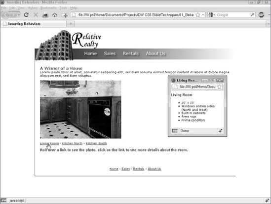
Save your page.
Test your page in the browser to verify that all the windows open as expected.
Dreamweaver behaviors can greatly extend the Web designer's palette of possibilities — even if the Web designer is an accomplished JavaScript programmer. Behaviors simplify and automate the process of incorporating common and not-so-common JavaScript functions. The versatility of the behavior format enables anyone proficient in JavaScript to create custom actions that can be attached to any event. When considering behaviors, keep the following points in mind:
Behaviors are combinations of events and actions.
Behaviors are written in HTML and JavaScript and are completely customizable from within Dreamweaver.
Different browsers support different events. Dreamweaver enables you to select a specific browser or a specification, such as HTML 4.01, on which to base your event choice.
Dreamweaver includes 25 standard actions. Some actions are not available unless a particular object is included, and selected, on the current page.
In the next chapter, you learn how to work with tables and structured data.