
Forms overview
Including forms in your Web page
Using text fields and text areas
Enabling options with radio buttons, checkboxes, and drop-down lists
Dreamweaver Technique: Building a Form, Part 1
Dreamweaver Technique: Building a Form, Part 2
Building a jump menu
Incorporating buttons in forms
Adding hidden fields and password fields
Making forms accessible
Combining CSS with forms
A form, in the everyday world as well as on the Web, is a type of structured communication. When you apply for a driver's license, you're not told to randomly write down personal information; you're asked to fill out a form that asks for specific information, one piece at a time, in a specific manner. Web-based forms are just as precise, if not more so.
Dreamweaver has a robust and superior implementation of HTML forms — from the dedicated Forms category in the Insert panel to various form-specific Property inspectors. In addition to their importance as communication tools connecting the browsing public to Web server applications, forms are an integral part of building some of Dreamweaver's own objects. Forms also serve as major tools for Web developers because they can be altered on-the-fly; it's possible, for example, for a selection in one drop-down list to determine the contents of another. The dynamic aspects of forms are covered in Chapter 22.
Dreamweaver also includes another robust method of implementing forms: Spry. Once you understand how to set up a form and how the various form elements are applied, you learn how Spry form widgets are put to use in Chapter 16.
In this chapter, you learn how forms are structured and then created within Dreamweaver. Each form object is explored in detail — text fields, radio buttons, checkboxes, menus, list boxes, command buttons, hidden fields, file fields, image fields, and password fields.
Forms are a pretty complex, but essential, part of the Web. If you're already familiar with the ins and outs of forms and just want to get going in Dreamweaver, here's how you get started:
Place your cursor where you want your form to appear on your page.
In the Insert panel, switch to the Forms category and click Form.

Insert whatever form elements you need — text field, checkbox, radio buttons, and so on — within the
<form>tag.Add validation, either through the Spry Validation form elements or via Dreamweaver behaviors.
Select the
<form>tag and add the Action, Method, and Enctype in the Property inspector.Make sure your server-side coding such as ColdFusion, PHP, ASP, or CGI, is in place to process the submitted form.
Feel free to use the rest of the chapter as a reference guide as you build your forms to gather information from your Web visitors.
Forms have a special function in HTML: They support interaction. Virtually all HTML elements apart from forms are concerned with layout and presentation — delivering the content to the user, if you will. Forms, on the other hand, enable the user to read information passively from the screen and to send information back. Without forms, the Web would be a one-way street.
Forms have numerous uses on the Web, such as for surveys, electronic commerce, guest books, polls, and even real-time custom graphics creation. For such feedback to be possible, forms require an additional component beyond what is seen onscreen so that each form can complete its function. Every form needs some type of connection to a Web server, whether it is through one of the Dreamweaver server models or a common gateway interface (CGI) script.
Forms, such as HTML tables, are self-contained units within a Web page. All the elements of a form are contained within the form tag pair <form> and </form>. You cannot nest forms as you do tables, although there's nothing to stop you from having multiple forms on a page.
The most commonly used attributes of the <form> tag include the following:
method— Tells the browser and the Web server how to present the form contents to the application that will process the form. The two possiblemethodvalues aregetandpost. Thegetmethod passes the attached information with a URL; this method places limitations on the amount and format of data that can be passed to the application. Thepostmethod enables the application program to receive the information as standard input and imposes no limits on the passed data.action— Determines what should be done with the form content. Most commonly,actionis set to a URL for running a specific Web application or for sending e-mail.
Typical HTML for a <form> tag looks something like the following:
<form method="post" action="http://www.idest.com/_cgi-bin/mailcall.pl">
Note
The .pl extension in the preceding example form tag stands for Perl, a scripting language often used to create CGI programs. Perl can be edited in any regular text editor.
Within each form is a series of input controls — text fields, radio buttons, checkboxes, and so on. Each type handles a particular sort of input; in fact, the main tag for these elements is the <input> tag. With one exception, the <textarea> tag, all form input types are implemented by specifying the type attribute. The text box tag, for example, is written as follows:
<input type="text" name="lastname">
All form input tags must have a name attribute, which identifies the control. In the preceding example, name is assigned a value of "lastname". Information input by the user in a control, such as a text field, is sent to the server along with the value of that control's name attribute. Thus, if I were to fill out a form with a text box asking for my last name, such as the one produced by the foregoing tag, part of the message sent to the server would include the following string:
lastname=Lowery
Note
Form fields can also contain an ID or class attribute that permit them to be styled by CSS. See the "Styling Forms with CSS" section of this chapter to learn more.
Servers send all the information from a form in one long text string to whatever program or address is specified in the action attribute. It's up to the program or the recipient of the form message to parse the string. For instance, if I were to fill out a small form — with my name, e-mail address, and a short comment such as "Good work!" — the server would send a text string similar to the following:
lastname=Lowery&[email protected]&comment=Good+work%21
As you can see, the various fields are separated by ampersands (&), and the individual words within the responses are separated by plus signs. Most non-alphanumeric characters — such as the exclamation mark in the example — are represented by their hexadecimal values. Decoding this text string is called parsing the response.
Tip
To ease maintenance of your code, choose a name that is descriptive, but that is not a reserved word. For example, it is better to name a text field lastname than just name.
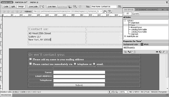
A form is inserted just like any other object in Dreamweaver. Place the cursor where you want your form to start and then either click the Form button in the Forms category of the Insert panel (see Figure 13-1) or choose Insert
Note
If you can't see the outline of the form, choose View
If you have the Property inspector open, the Form Property inspector appears when you insert a form. As Figure 13-1 shows, you can specify several values regarding forms; in addition to the Action and the Method, which correspond to the attributes previously discussed, you can also specify a Form Name, Enctype value, and Target.
Because of the interactive nature of forms, Web programmers often use them to gather information from the user. To do this, programmers must specify a form name, which enables them to reference a form using JavaScript or other languages.
In the Action text box, you can directly enter a URL or mailto address, or you can select the folder icon and browse for a file.
Note
Sending your form data via a mailto address is not without its problems. Some browsers, most notably Internet Explorer, are set to warn the user initially whenever a form button using mailto is selected. Although many users let the mail go through, they do have the option to stop it from being sent. However, there is no way to detect whether users have an e-mail client such as Outlook or Thunderbird installed on their systems, which is a necessary element for the mailto technique to work.
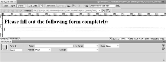
Figure 13-1. Inserting a form creates a dashed, red outline of the form and, if the Property inspector is open, displays the Form Property inspector with form specific properties.
The method defaults to post, the most commonly used option. You can also choose get or default, which leaves the method up to the browser. In most cases, you should leave the method set to post.
Enctype stands for encoding type; this value tells the server in what format the data is being sent. For more information, refer to the "Declaring the Encoding Type (Enctype)" sidebar in this chapter.
Finally, the Target field tells the server which frame or window to use when displaying a response to the form. If you don't specify a target, any response displays in the current frame or window.
Forms cannot be placed inline with any other element such as text or graphics. Keep in mind the following additional considerations when it comes to mixing forms and other Web-page elements:
Forms expand as objects are inserted into them; you can't resize a form by dragging its boundaries.
The outline of a form is invisible in a browser; there is no border to turn on or off. You can, however, use CSS to set a border or background color for the entire form.
Forms and tables can be used together only if the form either completely encloses the table or is completely enclosed inside the table. In other words, you can't have a form spanning part of a table.
Forms can be inserted within AP elements, and multiple forms can be in multiple AP elements. However, the AP element must completely enclose the form. As with forms spanning tables, you can't have a form spanning two or more AP elements. (A workaround for this limitation is discussed in Chapter 10.)
Anytime you use a form to gather text information typed in by a user, you use a form object called a text field. Text fields can hold any number of alphanumeric and punctuation characters. The Web designer can decide whether the text field is displayed in one line or several. When the HTML is written, a multiple-line text field uses a <textarea> tag, and a single-line text field is coded with <input type="text">.
To insert a single-line text field in Dreamweaver, you can use any of the following methods:
From the Forms category of the Insert panel, click the Text Field button to place a text field at your current cursor position.
Choose Insert
Drag the Text Field button from the Insert panel to any existing location in the Document window and release the mouse button to position the text field.
Tip
You can use any of these methods to insert text fields in either Design view or Code view. When you insert a text field or most other form controls in Code view, the Tag Editor for the <input> tag opens automatically, enabling you to specify any attributes for the tag.
When you insert a text field, the Property inspector, when displayed, shows you the available attributes (see Figure 13-2). You measure the size of a text field by the number of characters it can display at one time. You can change the length of a text field by inserting a value in the Char Width text box or by declaring a width value for an applied CSS style; the latter is, by far, the recommended approach. By default, Dreamweaver inserts a text field approximately 20 characters wide. The "approximately" is important here because the final size of the text field is ultimately controlled by the browser used to view the page. Unless you limit the number of possible characters by entering a value in the Max Chars text box, the user can enter as many characters as desired, but not all the characters will necessarily be visible at one time; the text scrolls horizontally in the box as the user types.

Note
The value in Char Width determines the visible width of the field; the value in Max Chars actually determines the number of characters that can be entered.
The Init Value text box on the Text Field Property inspector is used to insert a default text string. The user can overwrite this value, if desired. Should you need to display some text but not allow users to enter their own text, choose the Read-Only option. This property will most likely come into play only when you're displaying dynamic data already recorded that you don't want to change.
You can also, with the check of the Disabled option, lock your text field from entry and change its appearance. Browsers interpret the disabled property differently: Internet Explorer grays out the text by reducing the opacity, whereas Firefox adds a light-blue background color. To control the appearance, use a style rule with an CSS attribute selector — set in square brackets — like this:
input[disabled] {
  background-color: white;
  color: #ccc;
  border: solid 1px #ccc;
}Typically, any text entered into text fields is displayed as you expect — programmers refer to this process as echoing. You can turn off echoing by selecting the Password option in the Text Field Propertty inspector. When a text field is designated as a password field, all text entered by the user shows up as asterisks or dots.
Use the password field when you want to protect the user's input from prying eyes (just as your PIN is hidden when you enter it at an ATM, for instance). The information entered in a password field is not encrypted or scrambled in any way, and when sent to the Web application, it is received as regular text.
Only single-line text fields can be set as password fields. You cannot make a multiline <textarea> tag act as a password field without employing JavaScript or some other programming language.
Note
Making sure that your user fills out the form properly is called validating the input. Dreamweaver includes a standard form validation behavior, covered in Chapter 11.
When you want to give your users a generous amount of room to write, you can expand not just the width of the text area, but also its height. Dreamweaver gives you the following options for creating a multiline text area:
Insert a single-line text field on the page as previously described and convert the field to multiple lines by choosing the Multi line option in the Text Field Property inspector.
Directly insert the Textarea form element using the Insert panel or Insert menu. To do this, position your cursor where you want to insert the text area and choose Insert
Figure 13-3 shows a typical multiline text field embedded in a form.
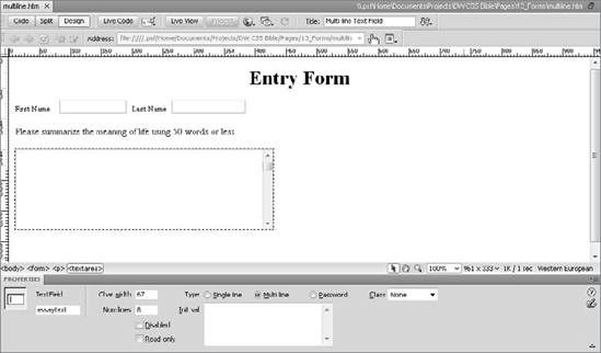
Figure 13-3. The Multi line option of the Text Field Property inspector opens up a text area for more user information.
The text area that is initially created is approximately 18 characters wide and 3 lines high, with horizontal and vertical scroll bars. You control the width of a multiline text area by entering a value in the Char Width text box of the Text Field Property inspector, just as you do for single-line text fields. The height of the text area is set equal to the value in the Num Lines text box. As with the default single-line text field, the user can enter any amount of text. Unlike the single-line text field, in which you can restrict the number of characters that can be input through the Max Chars text box, you cannot restrict the number of characters the user enters into a multiline text area.
Constructing Neat Forms
Although they are especially good when you are working on a larger, complex form, I find that tables and forms are made for each other — even in this age of CSS. Besides the speed of layout, another advantage that tables offer is the capability to right-align text labels next to your text fields; it's worth noting that the align attribute for the <td> tag is still valid HTML. The top form in the following figure uses preformatted text to get different-sized form fields to line up properly, whereas the bottom form in the figure uses a table.
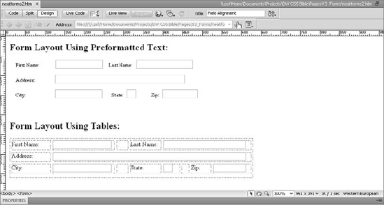
Combining different-sized text fields on a single row — for example, when you're asking for a city, state, and ZIP Code combination — can make the task of lining up your form even more difficult. Most often, you spend a fair amount of time in a trial-and-error effort to make the text fields match. Be sure to check your results in the various browsers as you build your form.
Tables are just the beginning stage in creating a clean, easy-to-read form. For greater control, be sure to read "Styling Forms with CSS" later in this chapter.
When you place a multiline text field on a form, you can specify how text entered into that field should wrap. You indicate this using the Wrap field in the Property inspector. You can select one of the following options:
Default: The browser determines the scrolling characteristics of the multiline text field. Browsers and browser versions vary in their default handling of wrapping.
Off: Text entered into a multiline text field does not wrap when it reaches the right edge of the text area; rather, it keeps scrolling until the user presses Enter (Return).
Virtual: Text on the screen wraps when it reaches the right edge of the text area, but not when the response is submitted to the server; the text is sent as one long string without hard carriage returns.
Physical: Text wraps on the screen and converts the soft returns on the screen to hard returns when the data is submitted to the server.
Note
The wrap attribute is not supported consistently between browsers or even between different versions of the same browser. For example, Netscape 6.0 ignores any value of the wrap attribute and simply never wraps text, whereas Netscape Navigator 4.61 does respect the wrapping options.
Another option when creating multiline text fields is to preload the text area with any default text you like. Enter this text in the Init Val text box of the Text Field Property inspector. When Dreamweaver writes the HTML code, this text is not entered as a value, as it is for the single-line text field, but rather goes in between the <textarea> . . . </textarea> tag pair.
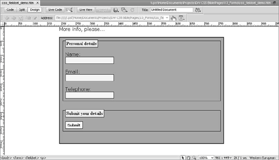
Grouping Form Controls
In desktop applications, you may be used to seeing related controls grouped together, with a thin border around them. You can achieve a similar effect in your HTML forms by enclosing the related form elements within the <fieldset> . . . </fieldset> tag pair, as shown in the following code:
<fieldset>
  <legend>Address</legend>
    <label>Street <input type="text" name="street" ></label>
    <label>City <input type="text" name="city" ></label>
    <label>State <input type="text" name="state" ></label>
    <label>Zip <input type="text" name="zip"></label>
</fieldset>
In this example, the <fieldset> tags group the text fields, and the <legend> tag creates a label describing the group of controls. In the most recent browsers, the legend appears as a label above the control group, as shown in the following figure.
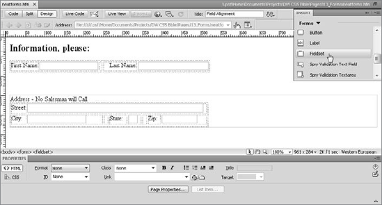
In Dreamweaver's Code view, you can add the <fieldset> and <legend> tags by selecting a set of existing controls that you'd like to group and then clicking the Fieldset button in the Forms category of the Insert panel. If you are in Design view when you click the Fieldset button, Dreamweaver automatically switches to the split view and makes Code view active. However, it is best to apply the <fieldset> tag in Code view so you can be sure you have correctly selected all the HTML tags to be grouped.
Note that the <fieldset> tag is not supported in all browsers, but Dreamweaver renders it just fine.
When you want your Web page user to choose between a specific set of options in your form, you can use either checkboxes or radio buttons. Checkboxes enable you to offer a series of options from which the user can pick as many as he wants. Radio buttons, on the other hand, restrict your user to only one selection from a number of options.
Note
You can achieve the same functionality as checkboxes and radio buttons with a different look by using drop-down lists and menu boxes. These methods for presenting options to the user are described shortly.
Checkboxes are often used in a "Select All That Apply" type of section, when you want to enable the user to choose as many of the listed options as desired. You insert a checkbox in much the same way you do a text field: Select or drag the CheckBox object from the Insert panel or choose Insert
Like other form objects, checkboxes can be given a unique name in the Checkbox Property inspector (see Figure 13-4). If you don't provide a name, Dreamweaver inserts a generic one, such as checkbox4.
In the Checked Value text box, fill in the information you want passed to a program when the user selects the checkbox. By default, a checkbox starts out unchecked, but you can change that by changing the Initial State option to Checked.
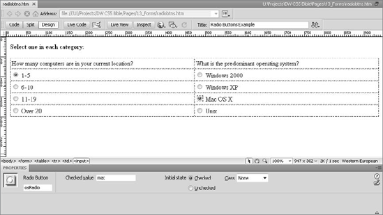
Radio buttons on a form provide a set of options from which the user can choose only one. If a user changes his or her mind after choosing one radio button, selecting another one automatically deselects the first choice. Dreamweaver gives you the following options for inserting radio buttons:
To insert radio buttons one at a time, select or drag the Radio Button button from the Forms category of the Insert panel, or choose Insert
To insert several related radio buttons at one time, select or drag the Radio Group button from the Forms category of the Insert panel, or choose Insert
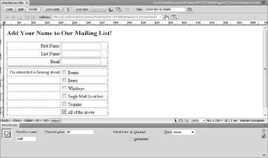
Figure 13-4. Checkboxes are one way of offering the Web page visitor any number of options to choose from.
Unlike checkboxes and text fields, each radio button in the set does not have a unique name — instead, each group of radio buttons has a name. If you give the entire set of radio buttons the same name, browsers can assign one value to the radio button set. That value is determined by the contents of the Checked Value text box in the Property inspector. Figure 13-5 shows two different sets of radio buttons. The figure shows the Property inspector for one of the radio buttons in the osRadio group, on the right. In this example, each button in the group is assigned the name osRadio.
To designate the default selection for each radio button group, you select the particular radio button and make the Initial State option Checked instead of Unchecked. In the form shown in Figure 13-5, the default selection for the osRadio group is Mac OS X.
Tip
Because you must give all radio buttons in the same set the same name, you can speed up your work a bit by creating one button, copying it, and then pasting the others. Don't forget to change the Checked Value for each button, however.
Building a Form, Part 1
In this Technique, you create a form that eventually incorporates most of the form elements. You add the form to the page, the table to hold the form elements, and the first of the form objects: text fields and radio buttons.
For this Technique, make sure the Accessibility options are disabled by opening Edit
In the Files panel, switch to the Dreamweaver Bible working site that you created previously.
Go to Techniques13_Forms and open the file
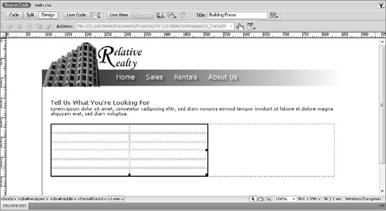
forms_start.htm.Place your cursor at the end of the first paragraph under the Tell Us What You're Looking For heading and press Enter (Return) to create a new line.
In the Insert panel, switch to the Forms category and click the Form object.
With your cursor inside the red form outline, change to the Common category and choose Table.
When the Insert Table dialog box opens, insert a 6-row, 2-column table that is 400 pixels wide with 0 for border thickness.
Select all the cells in the first column and, from the Property inspector's Style list, choose formLabel. The formLabel CSS rule makes the content in the designated cells bold and right-aligned.
Place your cursor in the first cell, first column and enter I want to: . Be sure to leave a space after the colon to add separation between the label and the form elements.
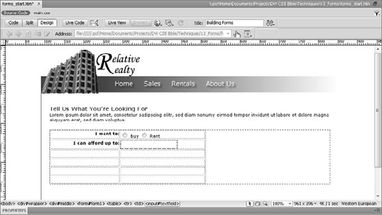
Switch back to the Forms category in the Insert panel and drag a Radio Button into the first row, second column.
With the radio button still selected, enter buyRentRB into the Name field of the Property inspector and buy in the Value field.
Move your cursor to the right of the radio button and add the text Buy.
Repeat Steps 9–11 to add a second radio button. Use the same name (buyRentRB), a different value (rent), and a corresponding label (Rent).
In the second row, first column, enter the text I can afford up to: . Again, be sure to leave a space after the colon to add separation between the label and the form elements.
From the Insert panel's Forms category, drag a Text Field into the adjacent cell.
With the text field selected, enter affordText in the Property inspector's Name field.
Save your page.
In the next Technique, you complete the form, adding the remaining form elements.
You can create an entire set of radio buttons at one time using the Radio Group command. When you select the Radio Group button from the Forms category of the Insert panel, or choose Insert
Follow these steps to set up your radio button group in the Radio Group dialog box:
In the Name text box, replace the default name with a meaningful name for your new set of radio buttons.
Each entry in the list represents a separate radio button in the group; the dialog box opens with two filler buttons as an example. Click the first entry in the Label list and replace the word Radio with the label for the first button in your group. Press Tab to move to the Value column, and replace the default with the appropriate value for your button; this is the data that is sent to the server when the radio button is selected.
Repeat this step for the second radio button in your set.
If you have more than two radio buttons in your set, click the Add (+) button to add another item to the list and fill out the appropriate value, as explained in Step 2.
Specify whether you want your radio buttons inserted on separate lines using the
<br>tag, or automatically formatted in a table.

Another way to offer your user options, in a more compact form than radio buttons and checkboxes, is with form lists and menus. Both objects can create single-line entries in your form that expand or scroll to reveal all the available options. You can also determine how deep you want the scrolling list to be — that is, how many options you want displayed at one time.
A drop-down menu should be familiar to everyday users of computers: The menu is initially displayed as a single-line text box with an arrow button at the right end; when the button is clicked, the other options are revealed in a list or menu. (Whether the list pops up or drops down depends on its position on the screen at the time it is selected. Normally, the list drops down, unless it is close to the bottom of the screen.) After the user selects one of the listed options and the mouse is released, the list closes, and the selected value remains displayed in the text box.
Insert a drop-down menu in Dreamweaver as you would any other form object, with one of the following actions:
From the Forms category of the Insert panel, select the List/Menu button to place a drop-down menu at the current cursor position.
Choose Insert
Drag the List/Menu button from the Insert panel to any location in the Document window and release the mouse button to position the drop-down menu.
With the List/Menu object inserted, make sure the Menu option (not the List option) is selected in the Property inspector, as shown in Figure 13-7. You can also name the drop-down menu by typing a name in the Name text box; if you don't, Dreamweaver supplies a generic "select" name.
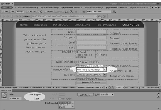
The HTML code for a drop-down menu uses the <select> . . . </select> tag pair surrounding a number of <option> . . . </option> tag pairs. Dreamweaver gives you a straightforward user interface for entering labels and values for the options on your menu. The menu item's label is what is displayed on the drop-down list; its value is what is sent to the server-side processor when this particular option is selected.
To enter the labels and values for a drop-down menu — or for a scrolling list — follow these steps:
Select the menu for which you want to enter values.
From the List/Menu Property inspector, click the List Values button. The List Values dialog box appears (see Figure 13-8).
In the Item Label column, enter the label for the first item. Press the Tab key to move to the Value column.
Enter the value to be associated with this item. Press the Tab key.
Continue entering items and values by repeating Steps 3 and 4.
To delete an item's label and value in the List Values dialog box, highlight it and click the Delete (−) button at the top of the list. To delete either the item's label or value, but not both, highlight either the label or the value and press the Delete or Backspace key.
To continue adding items, click the Add (+) button or continue using the Tab key.
To rearrange the order of items in the list, select an item and press the up or down arrow button to reposition it.
Click OK when you're finished.
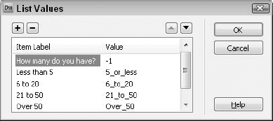
If you haven't entered a value for every item, the server-side application receives the label instead. Generally, however, it is a good idea to specify a value for all items.
You can preselect any item in a drop-down menu so that it appears in the list box initially and is highlighted when the full list is displayed. Dreamweaver enables you to make your selection from the Initially Selected menu in the Property inspector. The Initially Selected menu is empty until you enter items through the List Values dialog box. You can preselect only one item for a drop-down menu.
Tip
To clear the selection in the Initially Selected list, hold down the Ctrl (Command) key as you click the highlighted item.
A scrolling list differs from a drop-down menu in three respects. First, and most obvious, the scrolling list field has up and down arrow buttons, rather than an option arrow button; and the user can scroll the list, showing as little as one item at a time, instead of the entire list. Second, you can control the height of the scrolling list, enabling it to display more than one item — or all available items — simultaneously. Third, you can enable the user to select more than one item at a time, as with checkboxes.
A scrolling list is inserted in the same manner as a drop-down menu — through the Insert panel by choosing Insert
Enter items for your scrolling list just as you do for a drop-down menu, by starting with the List Values button in the Property inspector and filling in the List Values dialog box. Figure 13-9 shows a sample list box, as it appears in the Document window.
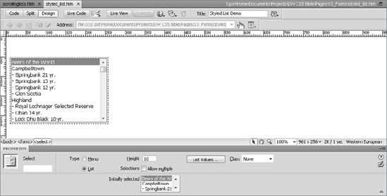
By default, the Selections checkbox for Allow Multiple is cleared in the List/Menu Property inspector. When you enable multiple selections (by selecting the Allow Multiple checkbox), the user can select more than one item in the list by using two keyboard modifiers, the Shift and Ctrl (Command) keys:
To select several adjacent items in the list, the user must click the first item in the list, press the Shift key, and select the last item in the list.
To select several nonadjacent items, the user must hold down the Ctrl (Command) key while selecting the items.
Other than the highlighted text, no acknowledgment (such as a checkmark) appears in the list. As with drop-down menus, the Web designer can preselect options by highlighting them in the Initially Selected menu. Use the same techniques with the Shift and Ctrl (Command) modifier keys as a user would.
Keep in mind several factors as you are working with scrolling lists:
If you disable the Allow Multiple Selections box and set a Height value of 1 or clear the Height field entirely, the list appears as a drop-down menu.
With Allow Multiple Selections enabled, if you do not set a Height value at all, the browser determines how many items appear onscreen. Internet Explorer, by default, shows four items at a time; Netscape Navigator displays all the items in your list. In the Dreamweaver Document window, only one item is displayed. To exercise control over your scrolling list, it is best to insert a Height value.
The number of characters in the longest label determines the width of both the scrolling list and the drop-down menu. To widen the List/Menu object, you must directly enter additional spaces (
) in the HTML code; Dreamweaver does not recognize additional spaces entered through the List Values dialog box. For example, to expand the example Favorite Beer List/Menu object, use the Code inspector or another editor to change
<option value="oatmeal">Oatmeal Stout</option>
to the following:
<option value="oatmeal">Oatmeal Stout </option>
Building a Form, Part 2
Now you're ready to complete the form started earlier in this chapter.
For this Technique, make sure the Accessibility options are disabled by opening Edit
In the Files panel, re-open the
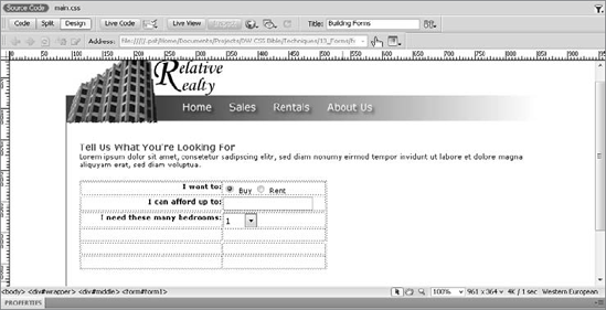
forms_start.htmfile you previously worked on.In the first column of the third row, enter this label: I need this many bedrooms: . Be sure to leave a space after the colon to match the other labels.
From the Insert panel's Forms category, drag a List/Menu object into the second column of the third row.
In the Property inspector's Name field, enter roomList.
Click List Values in the Property inspector.
When the List Values dialog box opens, enter the following Item Label/Value pairs:
Item Label
Value
1
1
2
2
3
3
4
4
5+
5+
Click OK when you're done to close the dialog.
From the Initially Selected list in the Property inspector, choose the first value, 1.
Place your cursor in the first column of the next row and enter the label I need: .
From the Insert panel, drag a checkbox object into the second column of the same row.
In the Property inspector name field, enter laundryCB.
Move to the right of the checkbox, add a space and enter the label Laundry Room; press Shift+Enter (Shift+Return) to create a line break.
Repeat Steps 9–11 twice more to insert one checkbox with the name garageCB and labeled Garage and another named viewsCB and labeled Views.
To adjust the position of the associated label, you'll need to change the vertical alignment of the table cell.
Place your cursor next to the I need: label and, from the Property inspector's Vert list, choose Top.
In the second-to-last row, first cell, enter the label My special needs are: .
From the Insert panel, drag a Textarea object into the second column of the same row.
In the Property inspector's Name field, enter needsArea.
Drag a Submit button from the Insert panel to the second column in the last row.
In the Property inspector's Value field, enter Send Info.
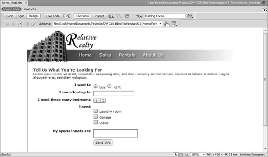
Save your page.
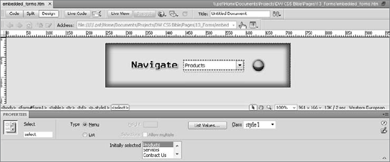
It's not always practical to use a series of buttons as the primary navigation tool on a Web site. For sites that want to offer access to a great number of pages, a jump menu can be a better way to go. A jump menu uses the menu form element to list the various options; when one of the options is chosen, the browser loads — or jumps to — a new page. In addition to providing a single mechanism for navigation, a jump menu is easy to update because it doesn't require laying out the page again. Because they are JavaScript-driven, jump menus can even be updated dynamically.
Dreamweaver includes a Jump Menu object that handles all the JavaScript coding for you — all you have to provide is a list of item names and associated URLs. Dreamweaver even drops in a Go button for you, if you choose. The Jump Menu object is easily used in a frame-based layout for targeting specific frames. After the object is inserted, you can modify the Jump Menu object like any other list object, through the List/Menu Property inspector. To insert a jump menu, follow these steps:
Position your cursor in the current form (if one exists), where you'd like the jump menu to appear. If you haven't already inserted a form, don't worry, Dreamweaver automatically inserts one for you.
From the Forms category of the Insert panel, click the Jump Menu button. The Insert Jump Menu dialog box, shown in Figure 13-10, is displayed.
In the Insert Jump Menu dialog box, enter the label for the first item in the Text field. When you confirm your entry by tabbing out of the field, Dreamweaver updates the Menu Items list.
Enter the path and filename of the page you want opened for the current item in the When Selected, Go To URL field; alternatively, you can click the Browse button to select your file.
To add additional jump menu items, click the Add (+) button and repeat Steps 3 and 4.
You can adjust the positioning of the items in the jump menu by selecting an item in the Menu Items list and using the up and down arrows to move it higher or lower.
From the Open URLs In list, pick the destination target for the page. Unless you're working in a frameset, you have only one option — Main Window. When a Jump Menu object is added in a frameset, Dreamweaver displays all frame names, as well as Main Window, as options.
To reset the menu selection to the top item after every jump, choose Select First Item After URL Change.
Click OK when you're finished.

Dreamweaver inserts the new jump menu with the appropriate linking code.
After you've inserted your Jump Menu object, you can modify it in one of two ways: through the standard List/Menu Property inspector or through the Jump Menu behavior. Whereas the List Property inspector uses a List Value dialog box, editing the Jump Menu behavior opens a dialog box similar to the one used to insert the Jump Menu object.
To alter the items in an existing jump menu via the List/Menu Property inspector, select the jump menu and click the List Values button. In the List Values dialog box, the jump menu labels are on the left and the URLs are on the right. You can add, move, or delete items as you would with any other list.
Note
One caveat for adding new URLs to the jump menu through the Property inspector: Any filenames with spaces or special characters should be URL-encoded. In other words, if one of your filenames is about us.htm, it should be entered using the hexadecimal equivalent for a space (%20): about%20us.htm. Also, if you enter a filename or URL that contains special characters in the List Values dialog box, the resulting code translates the special characters into their HTML codes, thus breaking the URL. Most notably, an ampersand (&) entered in the List Values dialog box is encoded as &.
If you'd prefer to work in the same environment as you did when creating the Jump Menu object, go the Behaviors panel route. Select the jump menu. Then, from the Behaviors panel, double-click the Jump Menu action. The Jump Menu dialog box opens — it's identical to the Insert Jump Menu dialog box except that the Go button option is not available.
Wrapping Graphics Around a Jump Menu
Jump menus are useful in many circumstances, but as a raw form element, they often stick out of a Web page design like a sore thumb. Some designers solve this dilemma by including their jump menu within a specially constructed graphic. The easiest way to create such a graphic is to use a program such as Fireworks, which enables a single image to be sliced into separate parts. The slices are then exported to an HTML file and reassembled in a table.
When you create your graphic, leave room for the jump menu to be inserted in Dreamweaver. Reserving space for a jump menu usually entails designating one slice as a nongraphic or text-only slice in your graphics program. After you bring the HTML into Dreamweaver, insert the Jump Menu object in the empty table cell.
Here are a few pointers for wrapping a graphic around a jump menu:
Use a flat color — not a gradient — as the background for the menu.
Work with Web-safe colors in the graphics program; they're far easier to match in Dreamweaver.
Set the background color of the graphic to be the background color of the cell of the table holding your jump menu.
Make sure you leave enough height in your graphic to accommodate the jump menu in all browsers. Netscape displays a standard list/menu form element approximately 24 pixels high on a PC; try leaving about 30 pixels in your graphic.
Form elements are drawn by the user's operating system and are vastly different on each platform. Test your designs extensively.
Integrate your Go button, if you're using one, right in the graphic. Be sure to set it as its own slice so that it comes in as a separate image and can be activated with a Jump Menu Go behavior. In the following figure, a graphical Go button appears to the right of the jump menu.
The Dreamweaver jump menu is activated immediately whenever a user makes a selection from the list. So why would you want a Go button? The Go button, as implemented in Dreamweaver, is useful for selecting the first item in a jump menu list. To ensure that the Go button is the sole means for activating a jump selection, you need to remove an attached behavior. Select the jump menu item, open the Behaviors panel, and delete the Jump Menu event.
Tip
Some Web designers prefer to use a non-URL option for the first item, such as Please Select A Department. When entering such a non-URL option, set the Go To URL (or the value in the List Value Properties) to javascript:; to create a null link.
The generic Go button is a nice convenience, but it's a little, well, generic. To switch from a standard Go button to a graphical Go button of your choosing, follow these steps:
Insert the image that you want to use as your new Go button next to the jump menu.
With the new graphic selected, open the Behaviors panel.
Select Jump Menu Go from the Add Event drop-down list. Dreamweaver displays a dialog box showing all available jump menus.
Choose the name of the current jump menu from the Jump Menu Go dialog box list and click OK when you're finished.
If necessary, delete the Dreamweaver-inserted Go button.
Buttons are essential to HTML forms. You can place all the form objects you want on a page, but until your user clicks that Submit button, there's no interaction between the client and the server. HTML provides three basic types of buttons: Submit, Reset, and Command.
A Submit button sends the form to the specified action (generally the URL of a server-side program or a mailto address) using the noted method (generally post). A Reset button clears all the fields in the form. Submit and Reset are both reserved HTML terms used to invoke specific actions.
A Command button permits the execution of functions defined by the Web designer, as programmed in JavaScript or other languages.
To insert a button in Dreamweaver, follow these steps:
Position the cursor where you want the button to appear. Then either select Button in the Forms category of the Insert panel, or choose Insert
In the Button Property inspector, select the button Action type. In Figure 13-11, the Property inspector indicates that the Submit Form button action is selected (this is the default). To make a Reset button, select the Reset Form option. To make a Command button, select the None option.
To rename a button as you want it to appear on the Web page, enter the new name in the Label text box.
When working with Command buttons, it's not enough to just insert the button and give it a name. You have to link the button to a specific function. A common technique is to use JavaScript's onClick event to call a function detailed in the <script> section of the document:
<input type="BUTTON" name="submit2" value="yes"
oznClick="doFunction()">
HTML doesn't limit you to the browser-style default buttons. You can also use an image as a Submit, Reset, or Command button. Dreamweaver has the capability to add an image field just like other form elements: Place the cursor in the desired position and choose Insert
When the user clicks the picture that you've designated as an image field for a Submit button, the form is submitted. Any other functionality, such as resetting the fields, must be coded in JavaScript or another language and triggered by attaching an onClick event to the button. This can be handled through the Dreamweaver behaviors, covered in Chapter 11, or by hand-coding the script and adding code for the onClick event to the button.
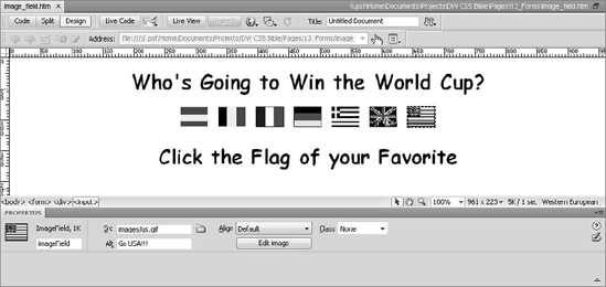
Figure 13-12. Each flag in this page is more than an image; it's an image field that also acts as a Submit button.
In fact, when the user clicks a graphical button, not only does it submit your form, but it passes along the x, y coordinates of the image. The x coordinate is submitted using the name of the field with an .x attached; likewise, the y coordinate is submitted with the name of the field with a .y attached. Although this latter feature isn't often used, it's always good to know all the capabilities of your HTML tools.
Another technique is involved if you want to include more graphical buttons than a single Submit button on your form. Because only one image field can be used as a Submit button, a standard image is inserted, and JavaScript handles the programming chores required for submitting or resetting the form. An advantage to this technique is that the image can even be set up as a rollover, meaning that the image changes as the user moves the mouse over the button.
To use an image for a Submit or Reset button, follow these steps:
Choose Insert
In the Insert Image dialog box, enter the path to your image or select the folder icon to locate the file. The image can be in GIF, JPEG, or PNG format.
Give the image a name and, if you want, alternative text using the appropriate text boxes in the Property inspector.
In the Link field of the Property inspector, enter the following code for a graphical Submit button:
javascript:document.form1.submit()
Similarly, enter this code for a Reset button:
javascript:document.form1.reset()
Note
Be sure to change the code to reflect your specifics: the name of your form as well as the name of your images.
Using Hidden and File Fields
You should also be aware of two other special-purpose form fields, the hidden field and the file field, which are supported by all major browsers. The hidden field is extremely useful for passing variables to your Web application programs, and the file field enables users to attach a file to the form being submitted.
The hidden input type
When passing information from a form to a CGI program, the programmer often needs to send data that should not be made visible to the user. The data could be a variable needed by the CGI program to set information on the recipient of the form, or it could be a URL to which the server program redirects the user after the form is submitted. To send this sort of information unseen by the form user, you can use a hidden form object.
The hidden field is inserted in a form much like the other form elements. Place your cursor in the desired position and choose Insert
The hidden object is another input type, just like the text, radio button, and checkbox types. A hidden variable looks like the following in HTML:
<input type="hidden" name="recipient" value="[email protected]">
As you would expect, this tag has no representation when it's viewed through a browser. However, Dreamweaver does display a Hidden Form Element symbol in the Document window. You can turn off the display of this symbol by deselecting the Hidden Form Field option from the Invisible Elements category of Preferences.
The file input type, which enables any stored computer file to be attached to the form and sent with the other data, is rarely used. Formerly, it was used primarily to enable the easy sharing of data. The file input type has now been largely supplanted by modern e-mail methods, which enable files to be attached to messages.
The file field is inserted in a form much like the other form elements. Place your cursor in the desired position and choose Insert
You can do several things to make your HTML forms more accessible to people with visual impairments who may be using a nonvisual browser or a screen reader. Many of these options are also useful for users accessing the page visually.
Dreamweaver makes it easy for Web page authors to improve the accessibility of their Web forms by setting an option in the Accessibility category of the Preferences dialog box.
To turn on the accessibility controls for forms, choose Edit
Note
The Input Tag Accessibility Attributes dialog box does not appear when you insert jump menus or radio groups. However, it does appear when you insert individual radio buttons.
In the Input Tag Accessibility Attributes dialog box, you first have an option to enter an ID; the ID is referenced by the <label> tag for attribute, described later in this section. Next, the Label field associates a textual label with the form object you are inserting. It does this by inserting <label> . . . </label> tags in your form. This label is visible in the browser window. By using the <label> tag, you can explicitly associate the text with a particular control. You have two options for achieving this association:
Wrap with label tag: This option encloses the form element within the
<label>. . .</label>pair. Here's an example of its construct:
<label>First Name
  <input type="text" name="mytextfield">
</label>
Attach label tag using 'for' attribute: This option adds an attribute to the
<label>tag that matches theidattribute of the form element. Choose this option, for example, when you use a table to align form elements, and the label and control appear in separate table cells. Here's an example that illustrates the use of theforattribute:
<label for="mytextfield">First Name</label>
  <input type="text" name="textfield2" id="mytextfield">

Figure 13-13. The Input Tag Accessibility Attributes dialog box is displayed only when you have enabled the Form Objects option in the Accessibility category of Preferences.
Tip
You can also insert a <label> . . . </label> pair by clicking the Label button in the Forms category of the Insert panel. This button is best used in Code view.
Although you may visually achieve the same effect by simply typing the text in the Document window, a nonvisual browser cannot associate plain text with any particular object. This effect is also what happens if you choose the No Label Tag option.
The final option you have when inserting a label is whether it should appear before or after the form element you are inserting.
In the Access Key field of the Input Tag Accessibility Attributes dialog box, type a single letter that serves as a shortcut to the form element. When users press the shortcut key for a given control, focus goes to that form element. Depending on their browsers and operating systems, users may have to hold down an additional key, referred to as a modifier key, such as Ctrl, Alt, or Command, for the shortcut to work.
The final control in the Input Tag Accessibility Attributes dialog box is the Tab Index. It adds the tabindex attribute to the <input> HTML tag. In this field, type a positive number indicating the order in which the control should receive focus when the user is tabbing through the form. Lower numbers receive focus first in the tabbing order; if items have the same number, the form element that appears first in the page receives focus first. Form elements with a tabindex of zero or with no tabindex specified appear last in the tab order.
In many ways, forms are the real workhorses of the Web — but that doesn't mean they have to be plain. Until CSS use became prevalent, little could be done to alter the way forms and form elements looked on the Web. Standardizing text field sizes between PC and Macintosh was a problem because the different operating systems interpreted character width differently; moreover, the field sizes may vary from browser to browser.
CSS gives the form designer much more flexibility, both to integrate and isolate the form and form elements. Text fields, for example, can take on a shade of a site's background color or adopt the same typeface used on the page. Similarly, you can draw attention to the form itself by giving it a contrasting background; this enables you to format lengthy drop-down lists for easy reading.
Note
If you're not familiar with CSS in general or, specifically, how it is applied in Dreamweaver, see Chapter 6.
The <form> tag is a containing element that, like the <div> tag, is not rendered by default. Both tags, in fact, can be styled with CSS — you can even position a form on the page via CSS declarations. Browser support varies for some of the more esoteric CSS properties applied to the form tag, but more common attributes such as background color and border are rendered properly in most cases. Best of all, if CSS does not support certain attributes, these attributes are just ignored and the form renders plainly.
Frequently, a Web page contains only a single form. In these situations, styling the <form> tag itself will have the desired results. For example, this CSS rule gives the entire form a bright orange background and a blue border:
form {
    background: #FF9900;
    border: thin solid #0000FF;
    padding: 10px;
}
Padding is added to move the form elements in from the edges, as shown in Figure 13-14.
Should your page contain more than one form and you want to style each one differently, create a CSS ID selector for each form. In this situation, choose the Advanced selector in the New CSS Rule dialog box and enter a unique ID — such as form#topform or form#bottomform — in the Selector field. Also set the ID of the form tag when using this method.
One way in which the <form> and <div> tags differ in regard to CSS is in the matter of inheritance. Elements within a form do not inherit the CSS properties of the form, but elements within a <div> tag do inherit the div's CSS attributes. You must, therefore, take another route for styling all the text fields in a given form. The best way to affect multiple form elements all at once is to style the <input> tag. You may recall that the <input> tag is used to create text fields, radio buttons, checkboxes, and Submit buttons.
For example, this CSS rule gives all the input elements a uniform background color as well as a specific color, font, and size for the text fields:
input {
    background-color: #F5F5F5;
    color: #660099;
   font: 10px Verdana, Arial, Helvetica, sans-serif;
   }
CSS styles the text fields for initial text as well as text entered by the user, as shown in Figure 13-15, as previewed in Dreamweaver's Live View.
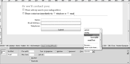
Figure 13-15. Keep the text in your text fields looking like the rest of your page through CSS styling of the input tag.
Note
Remember that a multiline text field is really a different tag — textarea — than the single-line text field. You have to create a CSS rule for both input and textarea tags.
One of the best uses for CSS and text fields is setting the width. This method is far more flexible and responsive than using the Char Width field on the Property inspector for each individual text field. It is best to set the width on a CSS class rather than alter it directly in the CSS rule for the input tag. Why? The width setting not only affects all the single-line text fields, but it also alters checkboxes and radio buttons — which are also input tags. After the CSS rule is defined, set the class of a selected text field from the Property inspector.
The select list/menu object is composed of two tags: <select> and <option>. The <select> tag is the overall container for the list items; use <select> to style the width, typeface, and font size of all drop-down lists on the page uniformly. Individual list items can be styled by setting a class on the separate option tags. Although this operation must be performed by hand and is somewhat tedious, it does open the door to many possibilities.
If you have a very long drop-down list that includes a wide range of items organized by category, with judicious CSS styling, main category headings can be in one color and subitems in another, as shown in Figure 13-16.

A form is more than a collection of text fields and checkboxes; labels play an equally important role in form organization and usability. Form labels are often applied in one of two ways. The standard technique is to place most of the labels in a single column of a table, with the form elements in another. Designers are also increasingly using the <label> tag as a means of enhancing accessibility. A Dreamweaver CSS methodology is available for whichever route you take when labeling your forms.
In a situation where all the labels are arranged in a table column, it's best to create a CSS class for your labels and apply it to the <td> tags. The most efficient way to do this is to first select the column containing the labels, and then choose the desired class from the Style list on the Property inspector. Dreamweaver applies the selected class to each of the <td> cells in the column.
If your layout uses <label> tags, CSS control is even easier. Add a specific CSS style for the <label> tag to create a uniform appearance for all your labels. Note that you may still need to adjust the dimensions of the label column separately because setting the width in CSS for the <label> tag has no effect.
Two other form-related tags — <fieldset> and <legend> — are available for CSS styling. As described earlier in this chapter in the sidebar "Grouping Form Controls," the two are used together to visually associate related form elements. Style the <fieldset> tag to alter the outlining border or add padding from the edge of the border. Change the <legend> style when you want to give it a separate background color and/or border, as shown in Figure 13-17.
Want to spotlight the interactivity of a form? CSS includes a pseudo-element selector (so called because it is valid only when an element is in a particular state) that takes effect when a form element is selected. The CSS selector is :focus and it works with <input>, <select>, and <textarea> tags.
To create a :focus selector, follow these steps:
Select New CSS Rule from the CSS Styles panel.
In the New CSS Rule dialog box, select the Compound selector option.
Enter the name of the tag you want to affect followed by :focus in the Selector field. For example, if you wanted to alter all the text fields, radio buttons, checkboxes, and buttons when they receive focus, enter input:focus.
Click OK to close the New CSS Rule dialog and open the CSS Rule Definition dialog.
Choose the desired styles from the various categories and click OK when you're finished.
Preview the page in a compatible browser such as Mozilla Firefox, Internet Explorer 7 or better, Safari, and so on to experience the CSS changes (see Figure 13-18).

HTML forms provide a basic line of communication from Web page visitor to Web site applications. With Dreamweaver, you can enter and modify most varieties of form inputs, including text fields and checkboxes. When adding forms to your Web pages, keep these points in mind:
For the most part, a complete form requires two working parts: the form object inserted in your Web page and a CGI program stored on your Web server.
To avoid using a server-side script, you can use a mailto address, rather than a URL pointing to a program in a form's
actionattribute. However, you still have to parse the form reply to convert it to a usable format.The basic types of form input are text fields, text areas, radio buttons, checkboxes, drop-down menus, and scrolling lists.
Dreamweaver includes a Jump Menu object, which uses a drop-down list as a navigational system.
After a user completes a form, it has to be sent to the server-side application, usually through a Submit button on the form. Dreamweaver also supports Reset and user-definable Command buttons.
You can gain a lot more control of how your form integrates into your Web page by applying CSS styles to the form elements — including the form itself.
In the next chapter, you learn how to use Dreamweaver to create bulleted and numbered lists.