
3. CSS Basics
Lesson Overview
• CSS (cascading style sheets) terms and terminology
• The difference between HTML and CSS formatting
• How the cascade, inheritance, descendant, and specificity theories affect how browsers apply CSS formatting
• How CSS can format objects
• New features and capabilities of CSS3
Cascading style sheets control the look and feel of a webpage. The language and syntax is complex, powerful, and endlessly adaptable; it takes time and dedication to learn and years to master. A modern web designer can’t live without them.
What is CSS?
HTML was never intended to be a design medium. Other than bold and italic, version 1 lacked a standardized way to load fonts or format text. Formatting commands were added along the way up to version 3 of HTML to address these limitations, but these changes still weren’t enough. Designers resorted to various tricks to produce the desired results. For example, they used HTML tables to simulate multicolumn and complex layouts for text and graphics, and they used images when they wanted to display typefaces other than Times or Helvetica.
 Note
Note
If you have not already downloaded the project files for this lesson to your computer from your Account page, make sure to do so now. See “Getting Started” at the beginning of the book.
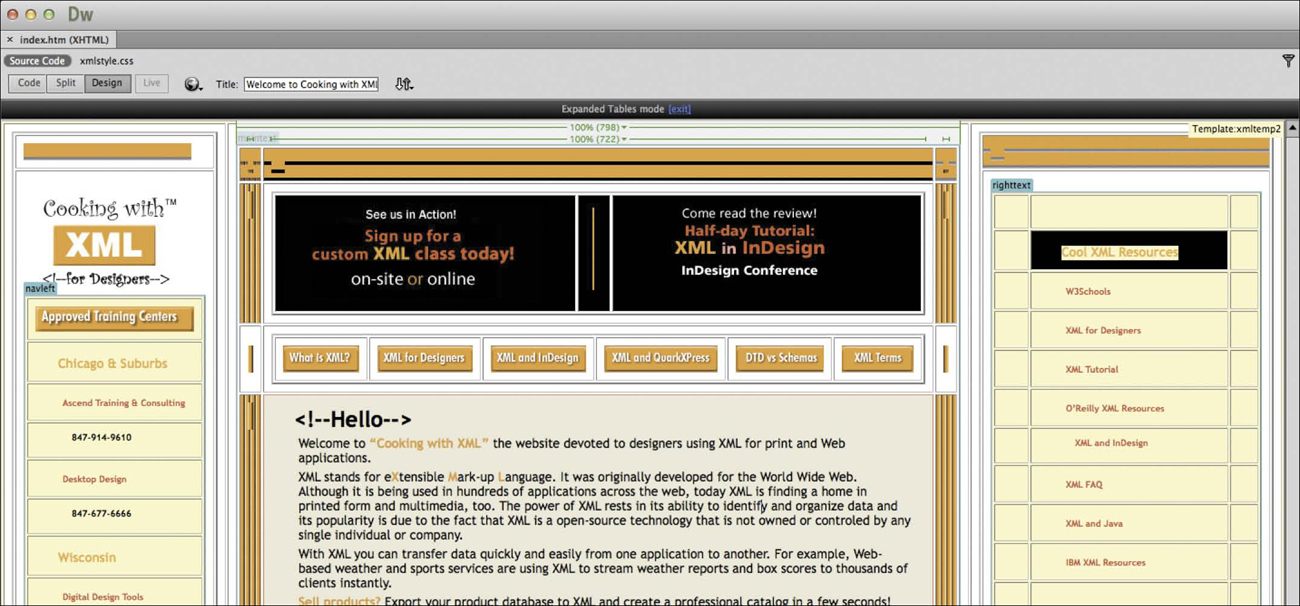
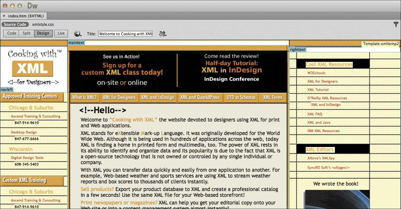
Using the expanded table mode in Dreamweaver (top), you can see how this webpage relies on tables and images to produce the final design (bottom).
HTML-based formatting was so misguided a concept that it was deprecated from the language less than a year after it was formally adopted, in favor of cascading style sheets (CSS). CSS avoids all the problems of HTML formatting, while saving time and money, too. Using CSS lets you strip the HTML code down to its essential content and structure and then apply the formatting separately, so you can more easily tailor the webpage to specific applications.
HTML vs. CSS formatting
When comparing HTML-based formatting to CSS-based formatting, it’s easy to see how CSS produces vast efficiencies in time and effort. In the following exercise, you’ll explore the power and efficacy of CSS by editing two webpages, one formatted by HTML, the other by CSS.
Note
If you are completing this lesson separately from the rest of the lessons in book, see the detailed “Jumpstart” instructions in the “Getting Started” section at the beginning of the book. Then, follow the steps in this exercise.
1. Launch Dreamweaver, if it is not currently running.
2. Choose File > Open.
3. Navigate to the Lesson03 folder and open HTML_formatting.html.
4. Click the Split view button. If necessary, choose View > Split Vertically to split the Code view and Design view windows vertically, side by side.
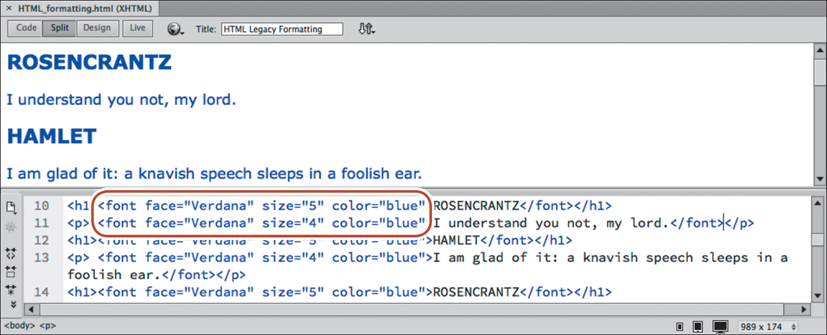
Each element of the content is formatted individually using the deprecated <font> tag. Note the attribute color="blue" in each <h1> and <p> element.
5. Replace the word blue with green in each line in which it appears. Click in the Design view window to update the display.
The text displays in green now. As you can see, formatting using the obsolete <font> tag is not only slow, but prone to error, too. Make a mistake, like typing greeen or geen and the browser will ignore the color formatting altogether.
6. Open CSS_formatting.html from the Lesson03 folder.
7. If it’s not currently selected, click the Split view button.
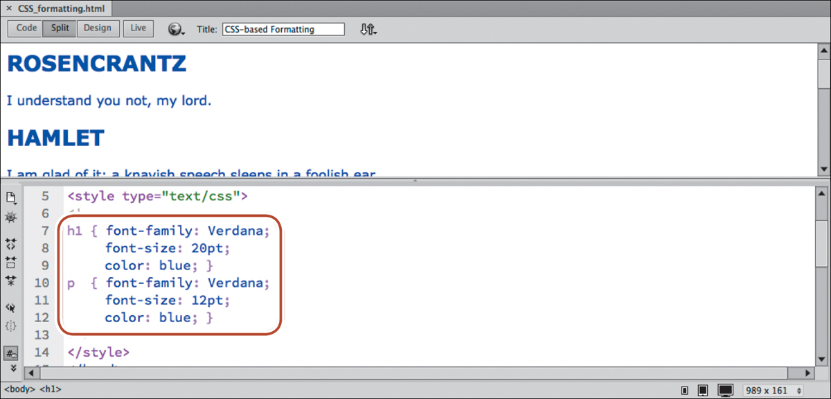
The content of the file is identical to the previous document, except that it’s formatted by CSS. The code that formats the HTML elements appears in the <head> section of this file. Note that the code contains only two color: blue; attributes.
8. Select the word blue in the code h1 { color: blue; } and type green to replace it. Click in the Design view window to update the display.
In Design view, all the heading elements display in green. The paragraph elements remain blue.
9. Select the word blue in the code p { color: blue; } and type green to replace it. Click in the Design view window to update the display.
In Design view, the paragraph elements have changed to green.
In this exercise, CSS accomplished the color change with two simple edits, whereas the HTML <font> tag required you to edit every line. Are you beginning to understand why the W3C deprecated the <font> tag and developed cascading style sheets? This exercise highlights just a small sampling of CSS formatting power and productivity enhancements that can’t be matched by HTML alone.
HTML defaults
Each of the nearly 100 HTML 4 tags comes right out of the box with one or more default formats, characteristics, or behaviors. So even if you do nothing, the text will already be formatted in a certain way. One of the essential tasks in mastering CSS is learning and understanding these defaults. Let’s take a look.
1. Open HTML_defaults.html from the Lesson03 folder. If necessary, select Design view to preview the contents of the file.
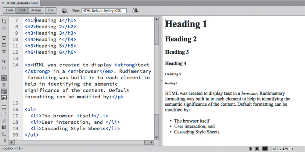
The file contains the full range of HTML headings and text elements. Each element exhibits basic styling for traits such as size, font, and spacing, among others.
2. If necessary, click the Split view button. In the Code view window, locate the <head> section, and try to identify any code that may be formatting the HTML elements.
A quick look will tell you that there is no obvious styling information in the file, but the text still displays different kinds of formatting. So where does it come from? And what are the settings?
The answer is: It depends. HTML 4 elements draw characteristics from multiple sources. The first place to look is the W3C, the web standards organization that establishes Internet specifications and protocols. The default style sheet at www.w3.org/TR/CSS21/sample.html defines the standard formatting and behaviors of all HTML 4 elements. This is the style sheet on which all browser vendors base their default rendering of HTML elements.
HTML5 defaults?
Over the last decade, there has been a consistent movement on the web to separate “content” and “styling.” At the time of this writing, the concept of “default” formatting in HTML is officially dead. Technically speaking, there are no default styling standards for HTML5 elements. If you look for a default style sheet for HTML5 on w3.org, you won’t find one. But for the time being, browser manufacturers are still honoring and applying HTML 4 default styling to HTML5-based webpages. Confused? Join the club. What this means is that, in the future, HTML elements may not display any formatting at all by default, but at least for the moment your HTML5 webpages will still display the same default styling used for HTML 4, even if you forget to apply CSS formatting.
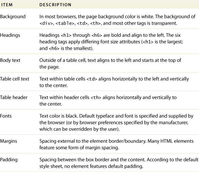
To save time and give you a bit of a head start, the following table pulls together some of the most common defaults:
The next task is to identify the browser (and its version) that is displaying the HTML. That’s because browsers frequently differ in the way they interpret, or render, HTML elements and CSS formatting. Unfortunately, even different versions of the same browser can produce wide variations from identical code.
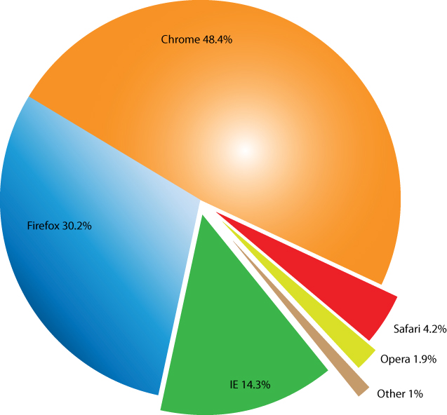
The best practice is to build and test your webpages to make sure that they work properly in the browsers employed by the majority of web users—especially the browsers preferred by your own visitors. In January 2013, the W3C published the following statistics identifying the most popular browsers:
Knowing which browsers are the most popular among the general public is nice, but before building and testing your pages, identifying the browsers that visitors in your target audience use is crucial.
Be aware, however, that multiple versions of each browser are still in use, which is important to know because older browser versions are less likely to support the latest HTML and CSS features and effects. To make matters more complicated, although these statistics are valid for the Internet overall, the statistics for your own site may vary wildly.
CSS box model
The browser normally reads the HTML code, interprets its structure and formatting, and then displays the webpage. CSS does its work by stepping between HTML and the browser, redefining how each element should be rendered. It imposes an imaginary box around each element and then enables you to format almost every aspect of how that box and its contents are displayed.
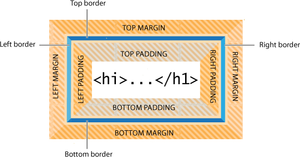
The box model is a programmatic construct imposed by CSS that enables you to format, or redefine, the default settings of any HTML element.
CSS permits you to specify fonts, line spacing, colors, borders, background shading and graphics, margins, and padding, among other things. In most instances these boxes are invisible, and although CSS gives you the ability to format them, it does not require you to do so.
1. Launch Dreamweaver, if necessary. Open boxmodel.html from the Lesson03 folder.
2. Click the Split view button to divide the workspace between the Code view and Design view windows.
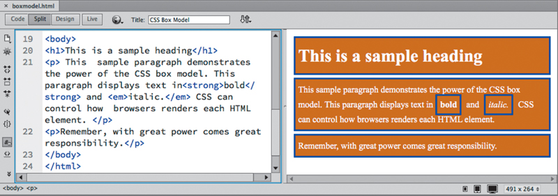
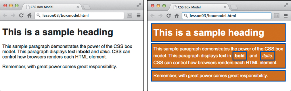
The file’s sample HTML code contains a heading and two paragraphs with sample text that is formatted to illustrate some of the properties of the CSS box model. The text displays visible borders, background colors, margins, and padding.
The working specifications found at www.w3.org/TR/css3-box describe how the box model is supposed to render documents in various media.
Multiples, classes, and IDs, oh my!
By taking advantage of the cascade, inheritance, descendant, and specificity theories, you can target formatting to almost any element anywhere on a webpage. But CSS offers a few more ways to optimize and customize the formatting even further.
Applying formatting to multiple elements
To speed things up, CSS allows you to apply formatting to multiple elements at once by listing each in the selector, separated by commas. For example, the formatting in these rules:
h1 { font-family: Verdana; color: blue; }
h2 { font-family: Verdana; color: blue; }
h3 { font-family: Verdana; color: blue; }
can also be expressed like this:
h1, h2, h3 { font-family: Verdana; color: blue; }
which saves three lines of unnecessary code.
Creating class attributes
Frequently, you will want to create unique formatting to apply to objects, paragraphs, phrases, words, or even individual characters appearing within a webpage. To accomplish this, CSS allows you to make your own custom attributes, called class and ID.
Note
Dreamweaver will warn you when you enter a name that’s inappropriate.
Class attributes may be applied to any number of elements on a page, whereas ID attributes may appear only once. If you are a print designer, think of classes as similar to a combination of Adobe InDesign’s paragraph, character, table, and object styles. Class and ID names can be a single word, an abbreviation, any combination of letters and numbers, or almost anything, but they may not start with a number or contain spaces. Although not strictly prohibited, avoid using HTML tag or attribute names for class and ID names.
To declare a CSS class selector, insert a period before the name within the style sheet, like this:
.intro
.copyright
Then, apply the CSS class to an entire HTML element as an attribute, like this:
<p class="intro">Type intro text here.</p>
or to individual characters or words inline, like this:
Here is <span class="copyright">some text</span> formatted differently.
Creating ID attributes
HTML designates ID as a unique attribute. Therefore, a specific ID should not be assigned to more than one element per page. In the past, many web designers used ID attributes to point at specific components within the page, such as the header, the footer, or articles. With the advent of HTML5 elements—header, footer, aside, article, and so on—the use of ID and class attributes for this purpose is less necessary than it was. But IDs can still be used to identify specific text elements, images, and tables to assist you in building powerful hypertext navigation within your page and site. You will learn more about using IDs this way in Lesson 9, “Working with Navigation.”
To declare an ID attribute in a style sheet, insert a number sign, or hash mark, before the name, like this:
#contact_info
#disclaimer
You apply the CSS ID to an entire HTML element as an attribute, like this:
<div id="contact_info"></div>
<div id="disclaimer"></div>
Formatting text
You can apply CSS formatting in three ways: inline, embedded (in an internal style sheet), or linked (via an external style sheet). A CSS formatting instruction is called a rule. A rule consists of two parts—a selector and one or more declarations. The selector identifies what element, or combination of elements, is to be formatted; the declaration, or declarations, contains the formatting specifications. CSS rules can redefine any existing HTML element, as well as define “class” and “ID” attributes.
A rule can also combine selectors to target multiple elements at once or to target specific instances within a page where elements appear in unique ways, such as when one element is nested within another.
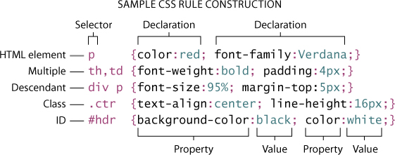
These sample rules demonstrate some typical constructions used in selectors and declarations. The way the selector is written determines how the styling is applied and how the rules interact with one another.
Applying a CSS rule is not a simple matter of selecting some text and applying a paragraph or character style, as in Adobe InDesign or Adobe Illustrator. CSS rules can affect single words, paragraphs of text, or combinations of text and objects. A single rule can affect an entire webpage. A rule can be specified to begin and end abruptly, or to format content continuously until changed by a subsequent rule.
There are many factors that come into play in how a CSS rule performs its job. To help you better understand how it all works, the exercises in the following sections illustrate four main CSS concepts, which we’ll refer to as theories: cascade, inheritance, descendant, and specificity.
Cascade theory
The cascade theory describes how the order and placement of rules in the style sheet or on the page affects the application of styling. In other words, if two rules conflict, which one wins out? Let’s take a look at how cascade influences CSS formatting.
1. Open cascade.html from the Lesson03 folder.
The file contains HTML headings and text formatted by the default HTML styling.
2. Click the Split view button, if necessary, and observe the <head> section in the Code view window for any CSS rules.
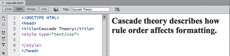
Note that the code contains a <style> section but no CSS rules.
3. Insert the cursor between the beginning <style> and end </style> tags.
Note
CSS does not require line breaks between rules, but breaks do make the code easier to read
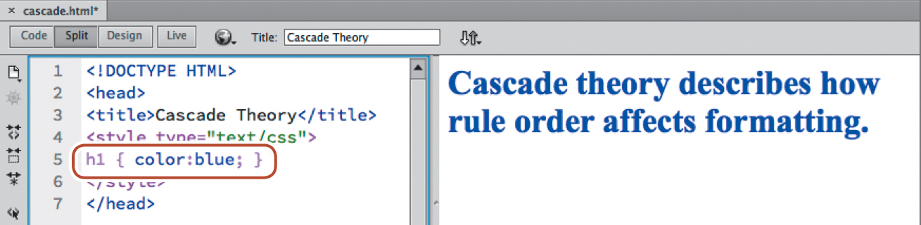
4. Type h1 { color:blue; } and click in the Design view window to refresh the display.
Note
Each declaration must end with a semicolon (;). The rule will not function at all without it and may break subsequent rules if it is missing.
The h1 heading now displays in blue. The rest of the text continues with the default formatting. Congratulations, you wrote your first CSS rule.
5. In Code view, insert the cursor at the end of the new CSS rule. Press Return/Enter to create a new line.
6. Type h1 { color:red; } and click in the Design view window to refresh the display.
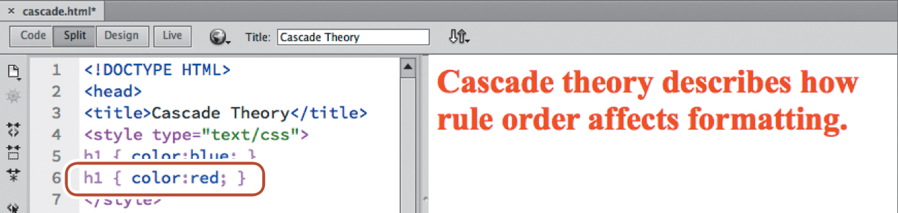
The h1 heading now displays in red. The styling of the new rule superseded the formatting applied by the first. Realize that the two rules are identical except that they apply different colors: red or blue. Both rules want to format the same elements, but only one will be honored.
Obviously, the second rule won. Why? Because the second rule is the last one declared, which makes it the closest one to the actual content. In CSS, a style applied by one rule may be overridden by commands declared subsequently.
7. Select the h1 { color: blue; } rule.
8. Choose Edit > Cut.
9. Insert the cursor at the end of the h1 { color: red; } rule.
10. Choose Edit > Paste.
You have switched the order of the rules.
11. Click in the Design view window to refresh the preview display.
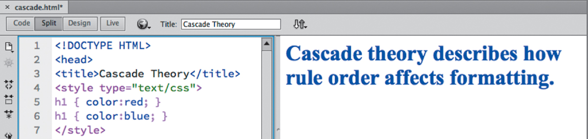
The headings now display in blue.
Both proximity and the order in which rules appear within the markup are powerful factors in how CSS is applied. When you try to determine which CSS rule will be honored and which formatting will be applied, browsers typically use the following order of hierarchy, with number 3 being the most powerful.
1. Browser defaults.
2. External or embedded (in the <head> section) style sheets. If both are present, the one declared last supersedes the earlier entry in conflicts.
3. Inline styles (within the HTML element itself).
Inheritance theory
The inheritance theory describes how one rule can be affected by one or more previously declared rules. Inheritance can affect rules of the same name as well as rules that format parent elements or elements that nest one inside another. Let’s take a look at how inheritance influences CSS formatting.
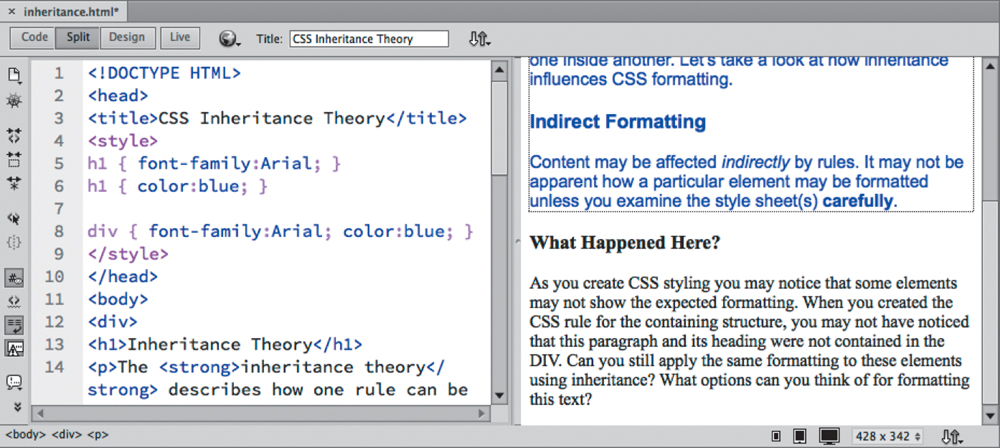
1. Open inheritance.html from the Lesson03 folder. In Split view, observe the HTML code.
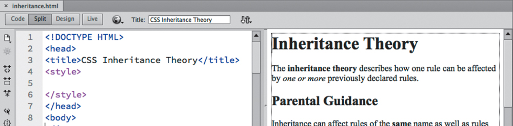
The webpage contains multiple headings and paragraph elements, as well as internal bold and italic all in HTML defaults. The page contains no CSS rules.
2. Insert the cursor between the beginning <style> and end </style> tags.
3. Type h1 { font-family: Arial; } and click in the Design view window to refresh the display.
The h1 element appears in Arial. The other content remains formatted by default styling.
4. In the Code view, insert the cursor at the end of the h1 rule. Press Enter/Return to create a new line.
5. Type h1 { color: blue; } and refresh the Design view display.
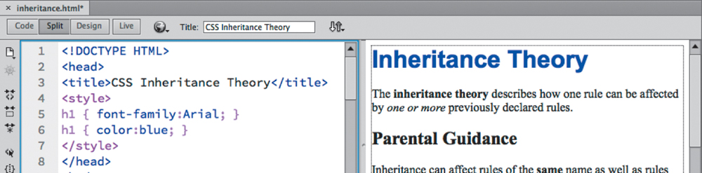
Now, there are two CSS rules that format the <h1> element. Can you tell, by looking at the Design view window, which of the rules is formatting the <h1> text? If you said both of them, you’re the winner.
At first glance, you may think that there are two separate rules for <h1>. (And, technically, that’s true.) But if you look closer, you’ll see that the second rule doesn’t contradict the first. It’s not resetting the color attribute as you did in the previous exercise; it’s declaring a new, additional attribute. In other words, since both rules do something different, both will be honored, or inherited, by the <h1> element. All <h1> elements will be formatted as blue and Arial.
Far from being a mistake or an unintended consequence, the ability to build rich and elaborate formatting using multiple rules is one of the most powerful and complex aspects of cascading style sheets.
6. Insert the cursor after the last h1 rule. Insert a new line in the code.
7. Type h2 { font-family: Arial; color: blue; } and click in the Design view window to refresh the display.
The h2 element appears in Arial and blue. Rules often contain multiple declarations.
8. After the h2 rule, enter the following code:
h3 { font-family: Arial; color: blue; }
p { font-family: Arial; color: blue; }
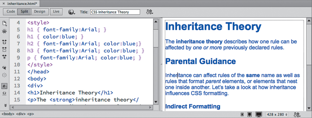
9. Refresh the Design view window display.
All the elements now display the same formatting—including the bold and italic text—but five rules were needed to format the entire page. Although CSS styling is far more efficient than the obsolete HTML-based method, inheritance can help you optimize your styling chores. For example, all the rules include the statement {color: blue; font-family: Arial; }. Avoid redundant code like this whenever possible. It adds to the size of the each webpage as well as to the download and processing time. By using inheritance, sometimes you can create the same effect with a single rule. One way is to apply styling to a parent element instead of to the elements themselves.
10. Create a new line in the <style> section and type the following code:
div { font-family: Arial; color: blue; }
This rule applies the style to the element that contains much of the content. If inheritance works as described, you should be able to delete some of the CSS rules.
11. Select and delete the rule: h2 { font-family: Arial; color: blue; }. Refresh the Design view window display.
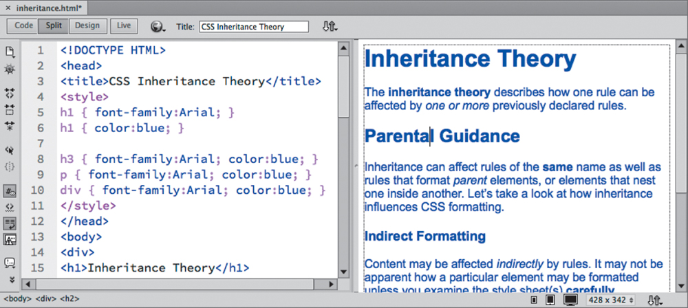
The h2 element remains formatted as blue Arial. The rule formatting the <div> element can even replace the two rules formatting the h1.
12. Select and delete both h1 rules. Refresh the Design view display.
The styling has not changed. The h1 and h2 elements are both contained within a <div> element and inherit the formatting correctly. But the page also includes some content outside the <div>. Can you guess what’s going to happen if you delete the rules formatting the h3 and p elements?
13. Select and delete the h3 and p rules. Refresh the Design view display.
The content contained in the <div> remains formatted. The text outside the <div> has returned to the default formatting. This is the way inheritance works. You could simply recreate the rules that format all h3 and p elements, but there’s an alternative. Can you figure out a way to still use inheritance to format all the content on the page the same way? Look carefully at the entire structure of the webpage.
If you thought about using the <body> element, you win again. The <body> element contains all the visible content on the webpage and therefore is the parent of all of them.
14. Change the rule selector from div to body and refresh the Design view display.
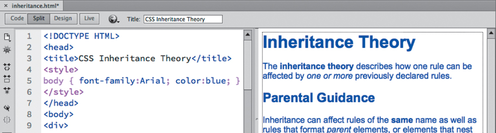
All the text displays in blue Arial. One rule is now formatting all the content at once: body { color: blue; font-family: Arial; }.
Descendant theory
The descendant theory describes how formatting can target a particular element based on its position relative to other elements. By constructing a selector using multiple elements, in addition to ID and class attributes, you can target the formatting to specific instances of text as it appears within your webpage. Let’s take a look at how descendant selectors influence CSS formatting.
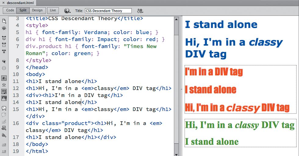
1. Open descendant.html from the Lesson03 folder. In Split view, observe the structure of the HTML content.
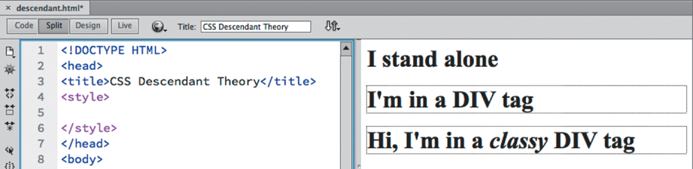
The page contains three h1 elements. The elements appear in three different ways: alone, within a <div>, and within a <div> that features an applied class attribute. You will learn how to create descendant CSS rules that will target styling to each element.
2. In Code view, insert the cursor within the <style> </style> element.
3. Type the following code: h1 { font-family: Verdana; color: blue; } and refresh the Design view display.
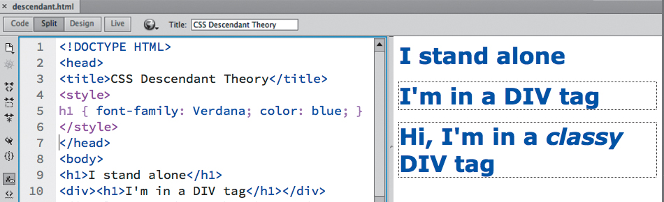
All three h1 elements display in blue Verdana. Although two of the headings appear in separate, stand-alone <div> elements, they still respond to the CSS styling applied by the h1 rule. In other words, a rule formatting h1 elements formats all such elements on the page no matter where they appear. But, by using descendant selectors you can target CSS styling to specific relationships by using that very HTML structure.
4. Create a new line after the new h1 rule and type the following code:
div h1 { font-family: Impact; color: red; }
Inserting the h1 immediately after the <div> element in the selector tells the browser to format h1 elements that are children, or descendants, of <div> elements. Remember, child elements are elements contained or nested within another element.
5. Refresh the Design view display.
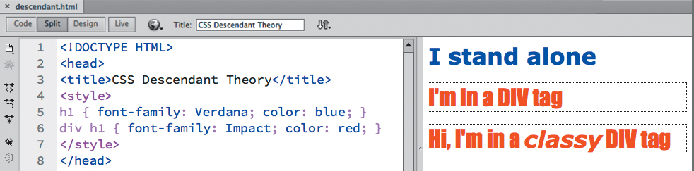
Both headings that appear within <div> elements display now in red Impact. By adding the text div to the selector, you are telling the browser to display all h1 elements contained within div elements in red Impact. The first rule is still being inherited, but wherever the two rules conflict the descendant rule wins, overriding and applying its formatting instead.
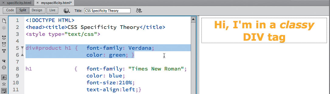
So far, you’ve learned that you can create a CSS rule that formats specific HTML elements and rules that can target specific HTML structures or relationships. In some instances, you may want to apply unique formatting to an element that is formatted by an existing rule. In such cases, you could use CSS classes or ID attributes to differentiate the element. In our example, the last h1 is assigned a class attribute of product; by adding the attribute value to the selector name, you can target the CSS styling to the specific element.
6. Create a new line after the div h1 rule. Type the following code:
div.product h1 { font-family: "Times New Roman"; color: green; }
and refresh the Design view display.
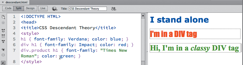
The last heading appears in green Times New Roman. By adding the text div.product to the selector, you are telling the browser to display all h1 elements contained within div elements that have a class attribute of "product" in green Times New Roman. In CSS syntax, the period “.” refers to a class attribute, the hash “#” mark means ID. Again, what’s important to understand here is that the other two CSS rules are still being inherited. It’s just that the descendant selector based on the class attribute is more powerful. It overrides any conflicting commands and applies its formatting instead. Why? We’ll explain that later.
Understanding descendant selectors
CSS formatting can be very confusing for designers coming from the print world. These designers are accustomed to applying styles directly to text and objects one at a time. In some cases, styles can be based on one another, but this relationship is intentional. On the other hand, CSS formatting of one element can overlap or influence another unintentionally.
Thinking of it as if the elements are formatting themselves may be helpful. Formatting is not intrinsic to the element, but to the entire page and the way the code is structured. You don’t apply the formatting to the element per se, as much as the elements adopt styling from their position within the code. The following exercise is designed to help you understand this concept.
Note
The best way to select HTML elements is to use the tag selectors appearing at the bottom of the document window.
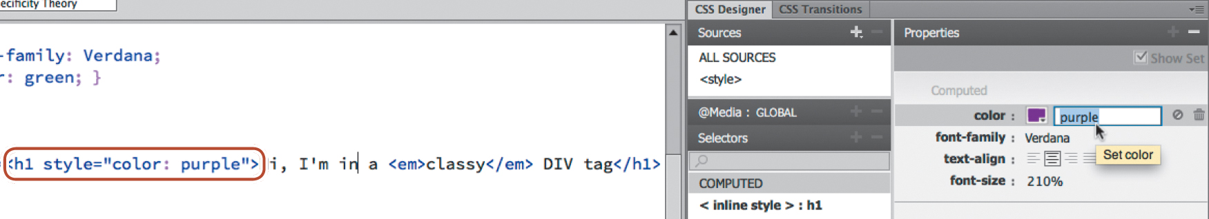
1. In the Code view window, select the entire first <h1> element, including the opening and closing tags.
2. Choose Edit > Copy.
3. Insert the cursor after the closing tag of the code <h1>I'm in a DIV tag</h1>.
4. Choose Edit > Paste. Click in the Design view window to refresh the display.
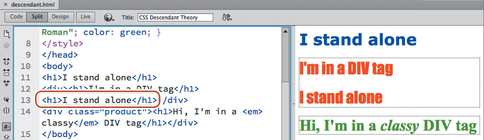
The new <h1> element appears, formatted as red Impact, exactly like the other <h1> element within the same <div>. What happened to blue Verdana? The CSS automatically differentiates stand-alone h1 elements from those that appear within a <div>. In other words, you don’t have to apply a special format or change an existing one. Just move the element into the proper structure or location within the code, and it formats itself. Cool. Let’s try it again.
5. In the Code view window, insert the cursor after the closing tag of
<h1>Hi, I'm in a <em>classy</em> DIV tag</h1>.
6. Choose Edit > Paste. Click in the Design view window to refresh the display.
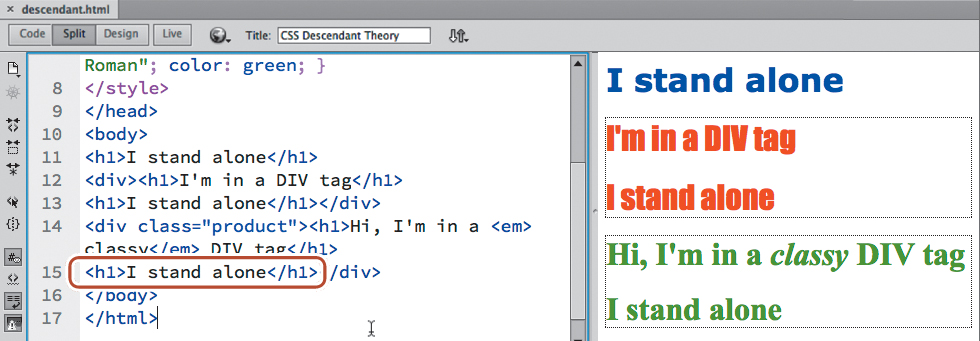
The <h1> element appears, formatted as green Times New Roman. Once again the pasted text matches the formatting applied to the other h1 element within the <div>, its original styling ignored altogether. But this behavior also works in reverse. You can copy the text inside the div elements and paste it elsewhere; it will automatically adopt the styling appropriate for that structure or location.
7. Select the code <h1>Hi, I'm in a <em>classy</em> DIV tag</h1> and copy it.
8. Paste the code two times, once after the first h1 element and then into the second <div>. Refresh the Design view display.
The h1 elements automatically adopt the formatting appropriate for their position within the page structure. The ability to separate the content from its presentation is an important concept in modern web design. It allows you great freedom in moving content from page to page and structure to structure without worrying about the effects of residual or latent formatting. Since the formatting doesn’t reside with the element itself, it’s free to adapt instantly to its new surroundings.
Specificity theory
Specificity describes how browsers determine what formatting to apply when two or more rules conflict. Some refer to this as weight—giving certain rules more priority based on order (cascade), proximity, inheritance, and descendant relationships. Such conflicts are the bane of most web designers’ existence and can waste hours of time in troubleshooting errors in CSS formatting. Let’s take a look at how specificity affects the weight of some sample rules.
1. Open specificity.html from the Lesson03 folder. In Split view, observe the CSS code and the structure of the HTML content. Then, note the appearance of the text in the Design view window.
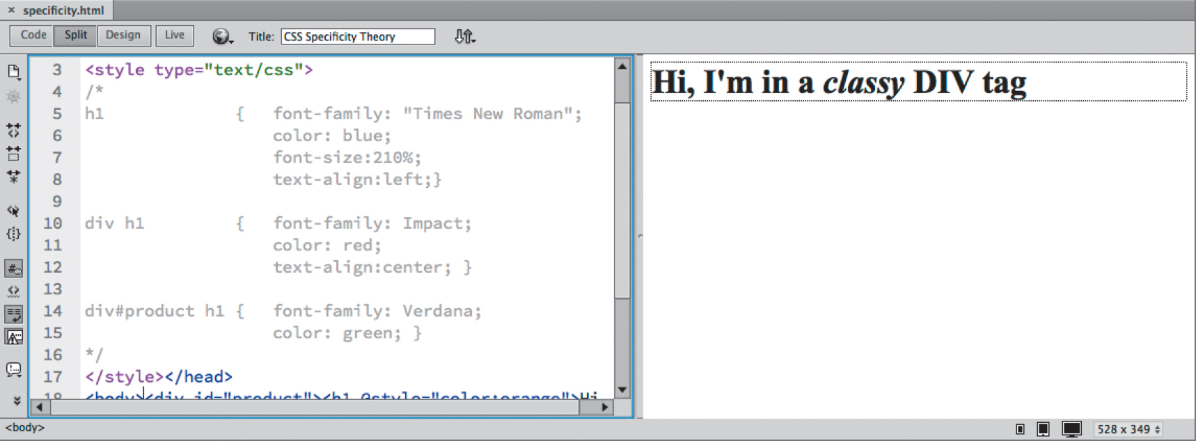
The <head> section of the file has three CSS rules. All of them potentially could format the <h1> element on the page. But, at the moment, none of the rules is actually formatting the text.
Do you see the slash and asterisk (/*) at the beginning of the CSS markup? This notation is used to create a comment within CSS code and effectively disables the rules that follow. The commented code ends with a similar notation reversing the order of the slash and the asterisk (*/). In Dreamweaver, commented code usually appears dimmed.
Also, note that the opening tag of the <h1> element features an attribute: @style. This inline CSS style markup has been disabled by appending the @ symbol to the beginning of the word. You can re-enable all the CSS styling by merely deleting the /* and */ notations, along with the @ symbol within the attribute.
But before you do this, can you determine—based on the syntax and order of the rules—what formatting will apply to the sample text? For example, will the text appear in Times New Roman, Impact, or Verdana? Will it be blue, red, green, or orange? Let’s see.
2. Select the notation /* at the beginning of the CSS code and delete it.
3. Select the notation */ at the end of the CSS code and delete it.
4. Select the @ symbol in the <h1> attribute and delete it.
5. Click in the Design view window to refresh the display. Save the file as myspecificity.html.
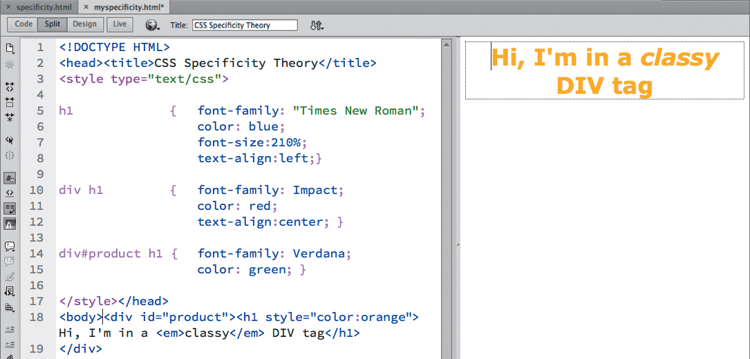
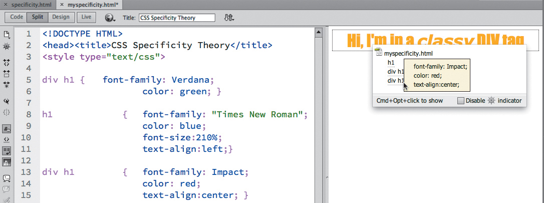
Did you say the text was going to be formatted by all the rules? If you did, then you won, and you go to the head of the class. In fact, each rule contributes some aspect of the final formatting. Where two or more rules conflict, specificity spells out which rule or portion of a rule wins.
For example, inline styles usually trump formatting applied by other means, but the inline style attribute supplies only the final color to this text. The div#product rule is the next most specific and supplies the final font-family. The div h1 rule then supplies the text alignment, and the h1 rule supplies the font-size. As this file demonstrates, CSS rules often don’t work alone. They may style more than one HTML element at a time and may overlap or inherit styling from one another.
Each of the theories described here has a role to play in how CSS styling is applied through your webpage and across your site. When the style sheet is loaded, the browser will use the following hierarchy—with number 4 being the most specific—to determine how the styles are applied, especially when rules conflict:
1. Cascade
2. Inheritance
3. Descendant structure
4. Specificity
Of course, knowing this hierarchy doesn’t help much when you are faced with a CSS conflict on a page with dozens or perhaps hundreds of rules. In such cases, Dreamweaver comes to the rescue with a fantastic feature named Code Navigator.
Code Navigator
Code Navigator is a Dreamweaver editing tool that allows you to instantly inspect an HTML element and assess its CSS-based formatting. When activated, it displays all the embedded and externally linked CSS rules that have some role in formatting an element, and it lists them in the order of their cascade application and specificity. Code Navigator works in both Code view and Design view.
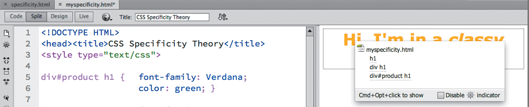
1. If necessary, open myspecificity.html as modified in the previous exercise. In Split view, observe the CSS code and the structure of the HTML content.
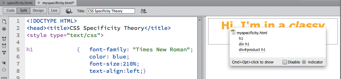
Although this file is simple in nature, it features three CSS rules that may format the <h1> element. In an actual webpage, the possibility of styling conflicts grows with each new rule added. But with Code Navigator, sussing out such problems becomes child’s play.
2. In Design view, insert the cursor in the heading text.
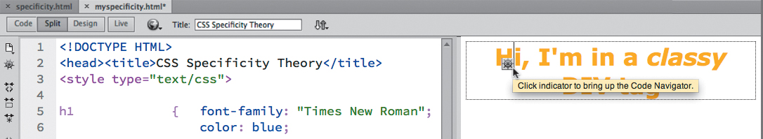
The Code Navigator ( ) icon provides instant access to Code Navigator.
3. Click the Code Navigator icon or press Ctrl-Alt-N/Cmd-Option-N.
Note
You can also access Code Navigator by right-clicking the element and choosing it from the context menu or by choosing View > Code Navigator.
A small window displays a list of three CSS rules that apply to this heading. If you position the cursor over each rule, Dreamweaver displays any properties formatted and their values. Unfortunately, it doesn’t show styling applied via inline styles, so you’ll have to calculate the effect of inline styles in your head. Otherwise, the sequence of rules in the list indicates both their cascade order and their specificity. When rules conflict, rules farther down in the list override rules that are higher up. Remember, elements may inherit styling from one or more rules, and default styling—that is not overridden—may still play a role in the final presentation. Code Navigator doesn’t display what, if any, default styling characteristics may be in effect.
Note
Code Navigator doesn’t display inline CSS rules. Since most CSS styling is not applied this way, it’s not much of a limitation, but you should still be aware of this blind spot as you work with your pages.
The div.product h1 rule appears at the bottom of the Code Navigator window, indicating that its specifications are the most powerful ones styling this element. But many factors can influence which of the rules may win. Sometimes it’s simply the order (cascade) in which rules are declared in the style sheet that determines which one is actually applied. As you saw earlier, changing the order of rules can often affect how the rules work. There’s a simple exercise you can perform to determine whether a rule is winning because of cascade or specificity.
4. In the Code view window, select the entire div#product h1 rule and choose Edit > Cut.
5. Insert the cursor in front of the h1 rule.
6. Choose Edit > Paste. Press Enter/Return, if necessary, to insert a line break.
7. Click in the Design view window to refresh the display.
The styling did not change.
8. In Code view, insert the cursor into the text of the <h1> element. Activate Code Navigator.
Although the rule was moved to the top of the style sheet, the display of rules did not change, because the div#product h1 rule has a higher specificity than the other two rules. In this instance, it would win no matter where it was placed in the code, but its specificity can easily be changed by modifying the selector.
9. In Code view, select and delete the #product ID notation in the selector.
10. Click in the Design view window to refresh the display.
Did you notice how the styling changed?
11. Insert the cursor in the heading and activate Code Navigator.
By removing the ID notation from its selector, the rule now has equal value to the other div h1 rule, but since this rule is the last one declared in the code, it now takes precedence by virtue of its cascade position. Is it starting to make more sense? Don’t worry—it will over time. Until that time, just remember that the rule appearing last in Code Navigator has the most influence on any particular element.
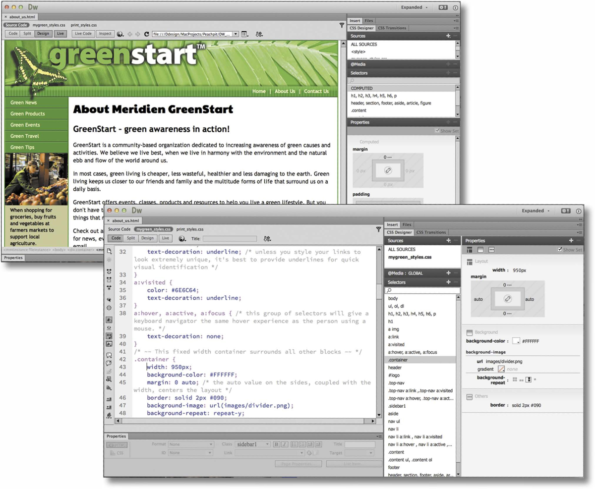
CSS Designer
Code Navigator was introduced in Dreamweaver CS4 and has been an invaluable aid for troubleshooting CSS formatting. But a new tool may supersede it in the hearts of the Dreamweaver faithful. The CSS Designer provides all the features of Code Navigator with a couple of additional benefits.
Like Code Navigator, CSS Designer displays all the rules that pertain to any selected element and allows you to see all the properties affected, but with several key advantages. With Code Navigator you still have to access and assess the effect of all the individual rules to determine the actual final effect. Since some elements can be affected by a dozen or more rules, this can be a daunting task for even a veteran web coder. CSS Designer eliminates this pressure altogether by providing a separate Properties panel that computes the final CSS display for you. It also shows you the effect of inline styling, which Code Navigator ignores altogether.
If this feature wasn’t enough all by itself, CSS Designer also allows you to access CSS rules individually to edit existing properties or add new ones much more efficiently than before. It’s a great addition to the program.
1. Open specificity.html. Save the file as myspecificity2.html.
2. If necessary, switch to Split view.
3. In the <style> section, delete the /* and */ markup to remove the commenting from the CSS code. Delete the @ symbol from the inline style attribute. Save the file.
By removing the comment markup, the CSS styling becomes active again.
4. If necessary, choose Window > CSS Designer.
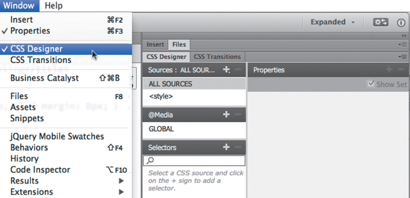
The CSS Designer appears. It displays four panes: Sources, @Media, Selectors, and Properties. At the moment, the windows are mostly blank.
5. Insert the cursor in the word “Hi”.
The Selectors pane of the CSS Designer displays a list of the rules and properties applied to or inherited by the h1 element.
6. In the CSS Selectors pane, click the h1 rule.
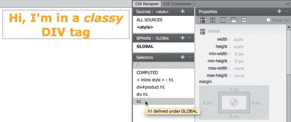
The Properties pane of CSS Designer displays a list of all the properties that you can style for this element. This can be confusing as well as inefficient. For one thing, it’ll be difficult to identify the properties actually assigned. Luckily, you can limit the display to only the ones applied.
Note
The Show Set option may be selected by default.
7. At the top of the Properties pane, click the Show Set option to enable it.
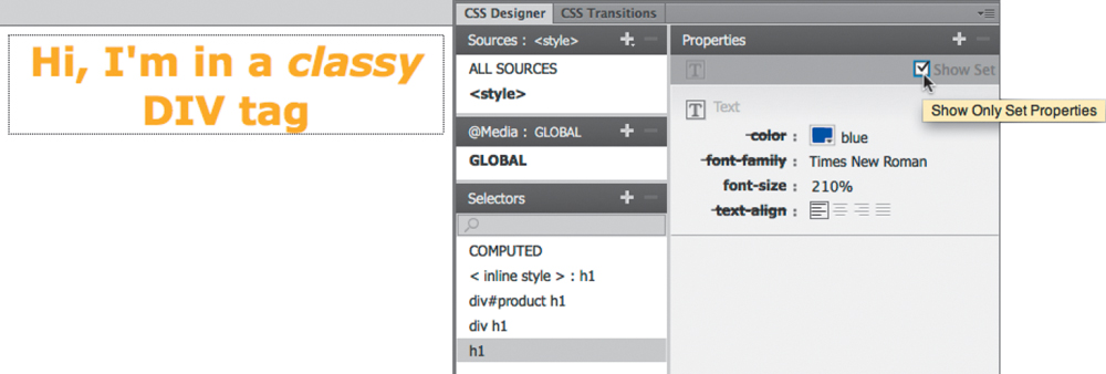
When enabled, the Properties pane shows only the items that have been set in a CSS rule and that affect the selected element.
Note
The COMPUTED option will show styling results only when the cursor is inserted in a styled element on the page. Otherwise it will be blank.
8. Select each rule that appears in the CSS Selectors pane and observe the properties set by each one. To see the expected result of all the rules combined, select the COMPUTED option.
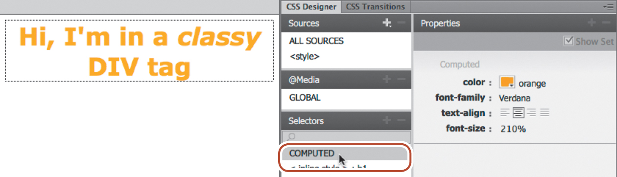
The COMPUTED option analyzes all the CSS rules and generates a list of properties that should be displayed by any browser or HTML reader. By displaying a list of pertinent CSS rules and then computing how the CSS should render, the CSS Designer does the Code Navigator one step better. But, it doesn’t stop there. Whereas Code Navigator allows you to select a rule to edit it in Code view, the CSS Designer lets you edit the CSS properties right inside the panel itself. And, best of all, it can even compute inline styles, too.
9. Select COMPUTED from the CSS Selectors pane. In the Properties pane, change the color: property from orange to purple. Press Return/Enter to complete the change.
The text displays in purple. What you may not have noticed is that the change was actually entered directly in the rule that contributed the styling. In this case, the color was applied by the inline style.
10. In Code view, observe the inline style property.
As you can see, the color was changed within the inline code. The CSS Designer is like an amalgam of the Code Navigator and the old CSS Styles panel. In upcoming exercises, you’ll get the chance to experience all aspects of the CSS Designer as you learn more about cascading style sheets.
Formatting objects
You may think that CSS styling of text is perplexing and difficult to understand. But, in fact, the last concept you’ll explore in this lesson is even more complex and prone to display inconsistencies and error: object formatting. Consider object formatting as specifications directed at modifying an element’s size, background, borders, margins, padding, and positioning. Since CSS can redefine any HTML element, object formatting basically can be applied to any tag, although it’s most commonly directed at the <div> element and other containers.
CSS can control all of these default constraints and lets you size, style, and position elements almost any way you want them.
Size is one of the most basic specifications for an HTML element. CSS can control both the width and the height of an element with varying degrees of success. All specifications can be expressed in absolute terms (pixels, inches, points, centimeters, and so on) or in relative terms (percentages, ems, or exs).
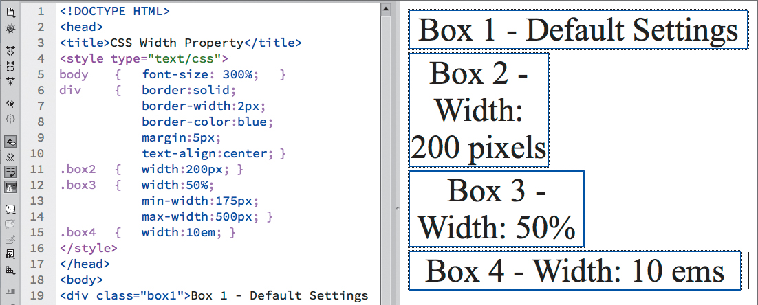
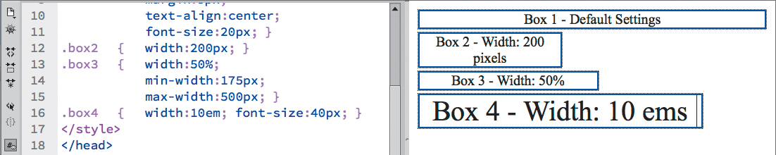
1. Open width.html from the Lesson03 folder. Save the file as mywidth.html.
2. View the page in Split view, and observe the CSS code and HTML structure.
By default, block elements occupy 100 percent of the width of the browser window.
Fixed Widths
The file contains four <div> elements that have some basic CSS formatting applied but no width or height specifications. Each has a custom class assigned to it so you can format them individually. As block elements they currently occupy 100 percent of the width of the browser window, by default. CSS allows you to control the width by applying absolute (fixed) or relative measurements.
1. If necessary, open mywidth.html. In the Code view, insert the cursor in the <style> section after the existing div rule.
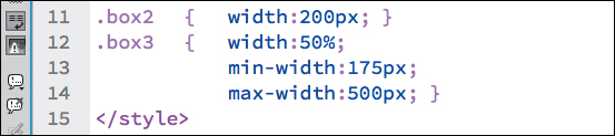
2. Type .box2 { width: 200px; } and press Return/Enter to create a new line. Save the file.
3. If necessary, refresh the Design view display.
Box 2 now occupies only 200 pixels in width; the other boxes are unchanged. By using pixels you have set the width of Box 2 by an absolute, or fixed, measurement, which means the box will maintain its width regardless of changes to the browser window or screen orientation.
4. Select the dividing line between Code and Design view and drag it to the left and right and observe how the <div> elements react.
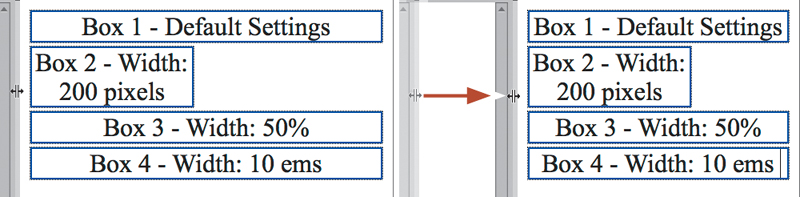
Boxes 1, 3, and 4 adapt automatically to the change in screen size displaying at the full width automatically. Box 2 remains 200 pixels in width no matter what size the screen assumes. Fixed widths are very popular all over the Internet, but in some cases, you’ll want elements to change or adapt as the screen size does. CSS provides three methods for setting widths using relative measurements: em, ex, and percentage (%).
Relative widths
Relative measurements set by percentage (%) are the easiest to define and understand. The width is set in relation to the size of the screen: 100% is the entire width of the screen, 50% is half, and so on. If the screen or browser window changes, so does the width of the element. Percentage-based designs are popular because they can adapt instantly to different displays and devices. But they are also problematic because changing the width of a page layout dramatically can also play havoc with your content. In response to these problems, new properties of min-width and max-width were created to limit the amount of change permissible.
1. If necessary, open mywidth.html. Insert the cursor after the.box2 rule and type the following code: .box3 { width:50%; }
2. Press Return/Enter to create a new line and save the file. Refresh the Design view display.
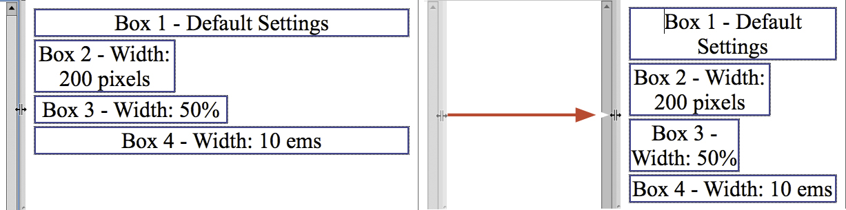
Box 3 displays at 50 percent of the width of the screen. It will adapt automatically to any changes to the screen size.
3. Select the dividing line between Code and Design view and drag it to the left and right and observe how the <div> elements react.
Box 2 remains at a fixed width. Box 3 scales larger and smaller, continuing to occupy 50 percent of the screen width no matter what size it becomes, even to the point that the text wraps within the element several times. Note how when the <div> shrinks to the size of the largest word it will finally stop scaling. Many designers forego the use of percentage-based settings for this reason. Although they like that <div> scales to fit the browser window, they’d prefer it to stop scaling when it affects the content detrimentally. This is the reason for which the property min-width was created.
4. Insert the cursor after the width:50%; notation and type min-width: 175px; and save the file.
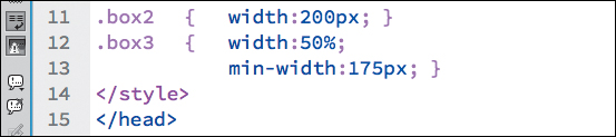
By setting min-width it prevents the element from scaling smaller than 175 pixels. Note how the min-width specification uses units in “pixels.” When combining the width setting with min-width or max-width, using differing measurement units is recommended.
5. Refresh the Design view display, drag the dividing line between Code and Design view left and right, and observe how the <div> elements react.
Box 3 displays at 50 percent of the screen width until you scale it smaller than 175 pixels. When the screen becomes narrower than 175 pixels, Box 3 stops scaling and remains at a fixed width of 175 pixels. You can also add the property max-width to limit scaling at the upper end.
Note
You can type CSS declarations on one line or insert line breaks between properties. The styling works the same either way.
6. Insert the cursor after the min-width property, type max-width:500px; and save the file.
7. Refresh the Design view display and drag the dividing line between Code and Design view left and right.
Box 3 displays at 50 percent of the screen between the widths of 175 pixels and 500 pixels where it stops scaling at the specified dimension.
It’s all relative, or not
Ems and exs are kind of a hybrid cross between fixed and relative systems. The em is a measurement that is more familiar to print designers. It’s based on the size of the typeface and font being used. In other words, use a large font and the em gets bigger; use a small font and the em gets smaller. It even changes based on whether the font is a condensed or expanded face. This type of measurement is typically used to build text-based components, like navigation menus, where you want the structure to adapt to user actions that may increase or decrease the font size on a site.
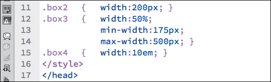
1. If necessary, open mywidth.html. Insert the cursor after the.box3 rule and type the following code: .box4 { width:10em; }
2. Press Return/Enter to create a new line and save the file. Refresh the Design view display.
Box 4 displays at the width of 10 ems. Although ems are considered a relative measure, they work differently from widths set in percentages.
3. Drag the dividing line between Code and Design view left and right and observe how the <div> elements react.
Box 4 displays like it’s set with a fixed measurement: The box doesn’t change size as you make the screen bigger and smaller. That’s because the “relative” nature of the measure isn’t based on screen size but on the “font” size.
4. In the body rule, change the font-size: 200%; property to font-size: 300%; and refresh the Design view display.
Widths specified in ems allow your page elements to adapt to user requests for increases or decreases in font size.
The text scales larger. In Box 2 and Box 3 the text has to wrap to fit within each <div>. Note how Box 4 scales larger to accommodate the larger text. By using em measurements you can build containers that scale automatically to adapt to user requests for larger font sizes via browser controls.
But there’s one small caveat when you use ems. The measurement is based on the base font size of the nearest parent element, which means it can change any time the font-size changes within the element’s HTML structure. The size of the em can also be influenced by inheritance.
5. In the div rule, add the following notation: font-size:20px;
6. Save the file and refresh the Display view.
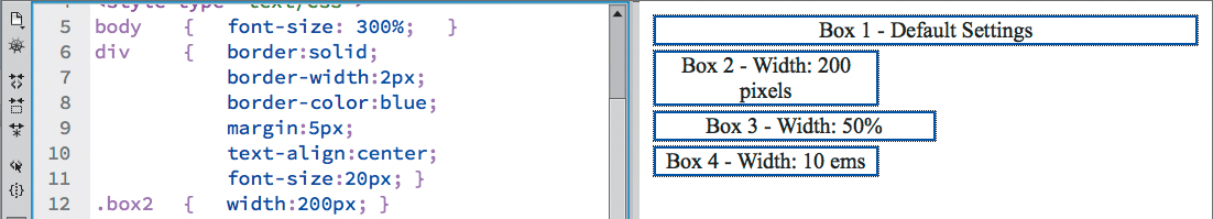
The text in all the <div> elements displays at 20 pixels, but only Box 4 changes width to reflect the size of 10 ems based on 20 pixels. If you want to ensure a certain width, set the font-size directly on the element. This is suggested even if the element contains no text at all.
7. In the.box4 rule, add the font-size:40px; notation.
Box 4 enlarges to adapt to the new larger font specification. If the specification uses a fixed unit, the width should not react to other changes in other elements.
Height
Height settings are not specified as frequently as width. That’s mainly because the height of an element or component is determined by its content, plus any margins and padding that may be assigned. In some cases, setting a fixed height could result in undesirable effects, truncating or clipping text or pictures. Most designs actually allow the height of an element to fluctuate freely to the size and type of content it contains. At times you may want to set the height of an element directly; in that case you can use either fixed or relative measurements.
Fixed height
Ideally, you should be able to specify the height of all elements the same way you do the width. Unfortunately, the reality is not so simple. Past browser support for the height property was not consistent or reliable. Today, modern browsers shouldn’t present many surprises if you’re working in absolute measurements, like pixels, points, inches, and so on. Relative measurements in ems or exs probably won’t disappoint either. But measurements in percentages require a small workaround, or hack, to make most browsers honor them.
1. Open height.html from the Lesson03 folder. Save the file as myheight.html. Display the file in Split view, and observe the CSS and HTML code.
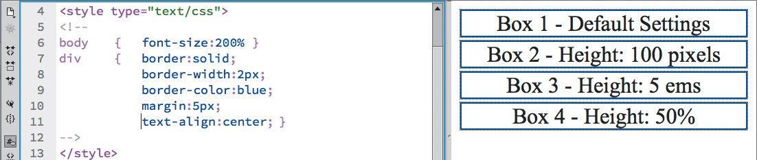
The file contains four <div> elements that have a width specification but no height. Heights set in fixed units are the most predictable.
2. In Code view, insert the cursor after the div rule in the <style> section.
3. Create a new line, if necessary, and type .box2 { height:150px; }
4. Save the file and refresh the Display view.
Box 2 displays at a fixed height of 150px. The other <div> elements display at a height determined by the amount and the size of content they contain. The height of these elements is not affected by the size of the browser window.
5. Drag the bottom edge of the program or document window up and down to adjust the vertical size, and then right and left to observe how the <div> elements react.
None of the elements react to the changing size of the window. You’ll get a similar response using em measurements.
6. Insert the cursor after the.box2 rule. Create a new line if necessary and type
.box3 {height:5em; }
7. Save the file and refresh the Display view.
Box 3 displays at a fixed height of 5 ems, based on the default font size. Remember ems, like measurements in pixels, don’t react to changes in the screen size.
8. Drag the bottom edge of the program or document window up and down to adjust the vertical size and right and left to observe how the <div> elements react.
Like Box 2, Box 3 maintains its height of 5 ems regardless of changes to the screen. But ems do react to changes in the font size.
9. In the body rule, change the font-size: 200%; property to font-size: 300%; save the file and refresh the Design view display.
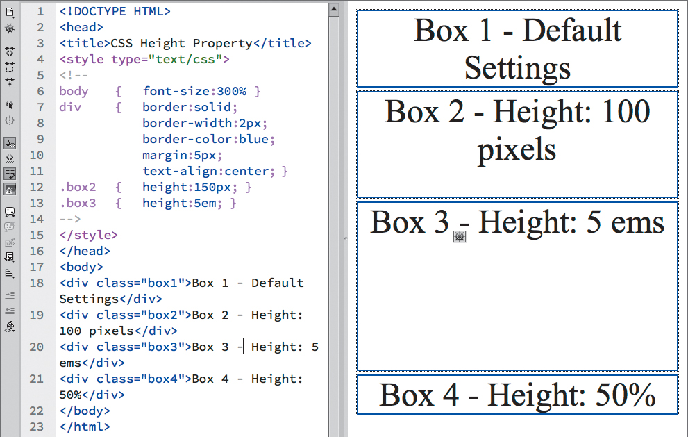
Box 3 expands in height to reflect the change of the base-font size. As with width, heights set in ems will also change any time the font-size changes within the element’s structure.
Relative or not, here we come
So far, so good. The height property seems to be pretty straightforward and works as expected in the first three elements. But Box 4 is the one that’s going to cause all the trouble. Let’s set it to a height of 50% and see what happens.
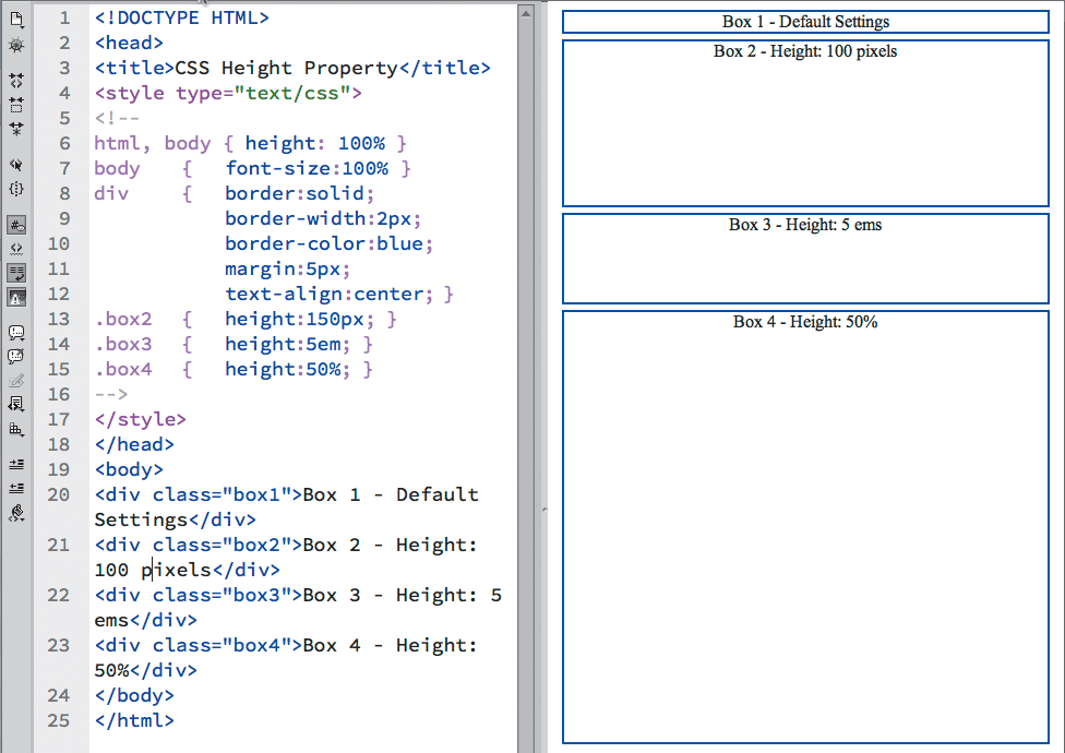
1. If necessary, open mywidth.html. In the body rule, change the font-size: 300%; property to font-size: 100%; and then save the file. Refresh the Design view display.
The boxes resize to accommodate the new base font size.
2. Insert the cursor after the.box3 rule. Create a new line, if necessary, and type .box4 { height:50%; }
3. Save the file and refresh the Display view.
Nothing changes. You probably expected it to be taking up half the height of the screen, right? But, as you can see in the Design view window, it’s no taller than Box 1. What’s the problem?
Most browsers, and even the Dreamweaver Design view window, ignore heights set in percentages. The reasons for this have to do with how browsers calculate the size of the page window. Basically, browsers calculate width but don’t calculate height. This behavior doesn’t affect fixed measurements or measurements set in ems or exs, but it does mess up percentages. To make Dreamweaver and most browsers honor percentage-based heights, you can use a simple CSS hack.
4. Insert the cursor at the beginning of the CSS <style> section.
5. Type html, body { height: 100%; } and save the file.
Adding the height property to the root and body elements of your webpage gives the browser the information it needs to calculate any heights set in percentages. But to see the results, you’ll have to use Live view or preview the page in an actual browser.
6. Click the Live view button to enable Live view.
Note
In most applications, height won’t be strictly observed by any element. By default, it is intended to be a fluid specification that allows an element to automatically adapt to the space requirements of its content.
Box 4 now occupies 50 percent of the height of the Design view window.
Although browser support is much better today, it’s vital to test all your design settings in all the popular browsers to ensure that the pages display properly.
Margins and padding
Margins create spacing outside an element—between one element and another; padding adds spacing between the content of an element and its border, whether or not it’s visible. The effective use of such spacing is vital in the overall design of your webpage.
1. Open margins_padding.html from the Lesson03 folder.
2. Save the file as mymargins_padding.html.
3. Display the file in Split view, and observe the CSS and HTML code.
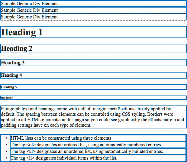
The file contains several <div> elements stacked one on top of the other, sample text headings, paragraph, and even list elements. All the elements display the default HTML formatting for margins and padding. Borders have been applied to all the elements to make the spacing effects easier to see.
Adding margins
To add spacing between the <div> elements, you can add a margin specification.
1. Insert the cursor in the CSS section of the code. Type div { margin: 30px; }
2. Click to refresh the Design view window.
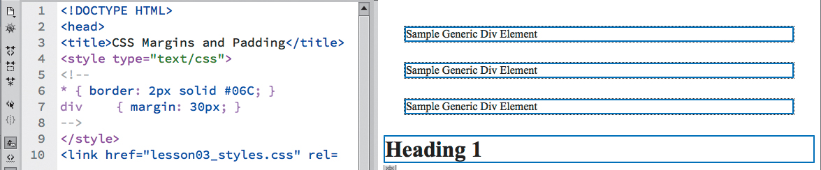
The <div> elements are now spaced 30 pixels apart.
By using the margin: 30px notation, you added 30 pixels to all four sides, but don’t expect to see 60 pixels between the elements. Spacing doesn’t always add up. When two adjacent elements both have margins, the settings don’t combine; instead, browsers use only the larger of any two settings. Dreamweaver can give you a visual display of the new setting.
3. In Design view, click the edge of one of the <div> elements to select it.
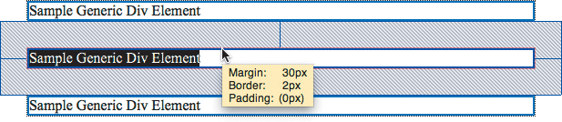
Design view highlights the element and displays a hashed pattern to show the margin specifications.
Adding padding
Padding is used to put spacing between an element’s content and its border.
1. In the div rule, insert the cursor after margin: 30px;
2. Type padding: 30px; and save the file.
3. Refresh the Design view window.
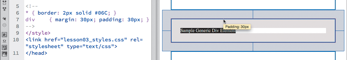
You can see 30 pixels of padding appear within each <div> element.
Since padding is applied within the element boundaries, it will combine with margin settings to affect the overall spacing that appears between elements. Padding can also affect the specified width of an element and must be factored into the design of your page components.
Unlike the <div> element, text elements, such as <p>, <h1> through <h6>, <ol>, and <ul>, already have margin settings applied to them, as you can see from the sample text within the page. Many designers abhor these default specifications, especially because they vary among browsers. Instead, they start off most projects by purposely removing these settings in a technique that’s called normalization. In other words, they declare a list of common elements and reset their default specifications to more desirable, consistent settings, as you’ll do now.
4. In the CSS section, create a new line after the div rule.
5. Type p, h1, h2, h3, h4, h5, h6, li { margin: 0px } and save the file.
The comma means “and” in CSS syntax, meaning you want to format all the tags listed.
6. Refresh the Design view window.
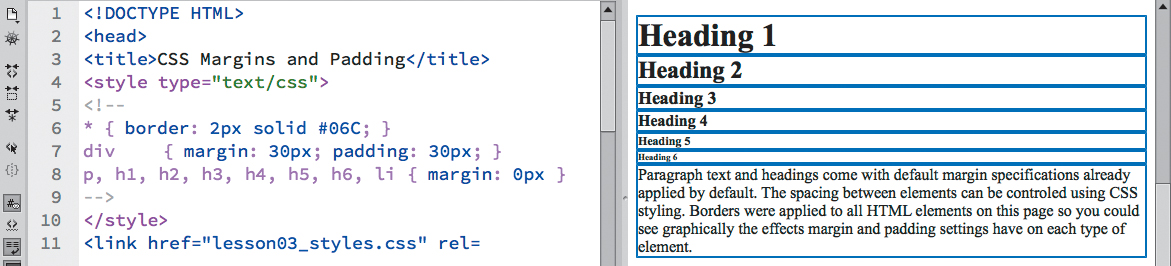
The text elements now display without the default spacing. Using zero margins may be a bit extreme for your own tastes, but you get the picture. As you become more comfortable with CSS and webpage design, you can develop your own default specifications and implement them in this way.
Positioning
By default, all elements start at the top of the browser screen and appear consecutively one after the other from left to right, top to bottom. Block elements generate their own line or paragraph breaks; inline elements appear at the point of insertion.
CSS can break all these default constraints and let you place elements almost anywhere you want them to be. As with other object formatting, positioning can be specified in relative terms (such as left, right, center, and so on) or by absolute coordinates measured in pixels, inches, centimeters, or other standard measurement systems. Using CSS, you can even layer one element above or below another to create amazing graphical effects. By using positioning commands carefully, you can create a variety of page layouts, including popular multicolumn designs.
1. Open positioning.html from the Lesson03 folder. Save the file as mypositioning.html. Display the file in Split view, and observe the CSS and HTML code.
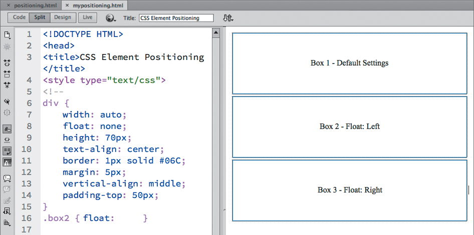
The file contains three <div> elements; they are stacked one on top of the other and occupy the full width of the Design view window, in the default manner of all block elements. Using CSS, you can control the placement of these elements and even place them side-by-side. But first, you’ll have to reduce the width of the elements so that more than one item can fit on the same line.
2. In the div rule, change the width:auto; property to width:30%; and save the file.
3. Refresh the Design view display.
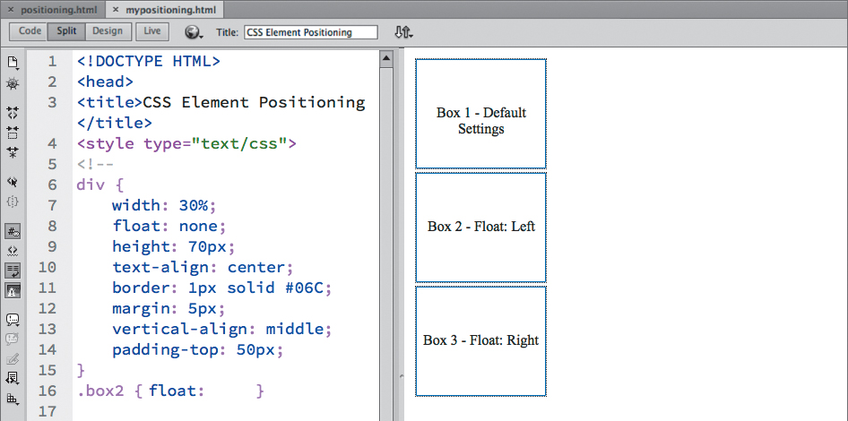
The <div> elements resize but remain stacked. Remember, block elements always stack no matter how small they may be. Several methods can change this behavior, but the float method is by far the most popular.
4. In the div rule, change the float:none; property to float:left; and save the file.
 Tip
Tip
If your boxes do not appear side by side, open the Design view window wider to provide more space.
5. Refresh the Design view display.
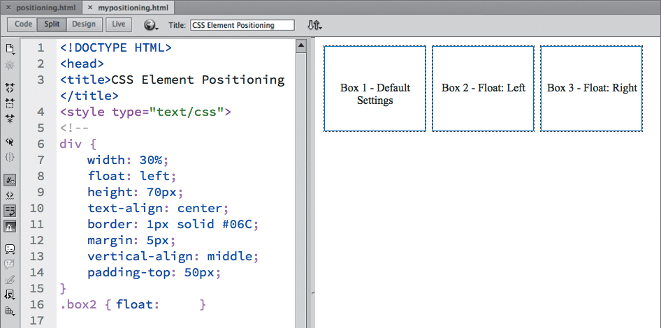
All three <div> elements now display in a single row, side by side. Using class attributes, you can control each <div> individually.
6. In the div rule, change the property float:left; to float:none;
7. In the.box2 rule, change the property float:none; to float:left;
8. In the.box3 rule, change the property float:none; to float:right;
9. Save the file. Refresh the Design view window.
The page now contains a mix of default and float specifications. Box 1 displays on a line of its own in the default manner. Box 2 appears on the next line, aligned to the left side of the screen as specified. Box 3 appears on the right side of the screen, but on the same line as Box 2.
In subsequent lessons, you will learn how to combine different float attributes with various width, height, margin, and padding settings to create sophisticated layouts for your website designs.
Unfortunately, as powerful as CSS positioning seems to be, it is the one aspect of CSS that is most prone to misinterpretation by the various browsers in use today. Commands and formatting that work fine in one browser can be translated differently or totally ignored—with tragic results—in another. In fact, specifications that work fine on one page of your website can fail on another page containing a different mix of code elements.
Borders and backgrounds
Each element can feature four individually formatted borders (top, bottom, left, and right). These are handy for creating boxed elements, but you can also place them at the top or bottom (or both) of paragraphs in place of <hr/> (horizontal rule) elements to separate text areas.
1. Open borders.html from the Lesson03 folder. Display the file in Split view, and observe the CSS and HTML code.
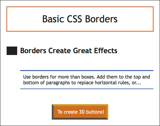
The file contains four examples of text elements formatted with varying border specifications. As you can see, borders can be used for creating boxes and other effects. Here you see them used as graphical accents to paragraphs and even to simulate a three-dimensional button effect.
Note that there is no extraneous markup within the actual content; all the effects are generated by CSS code alone. That means you can quickly adjust, turn on and off effects, and you can move the content easily without having to worry about graphical elements cluttering up the code.
By default, all element backgrounds are transparent, but CSS enables you to format them with colors, images, or both. If both are used, the image will appear above, or in front of, the color. This behavior allows you to use an image with a transparent background to create layered graphical effects. If the image fills the visible space or is set to repeat, it may obscure the color entirely.
2. Open backgrounds.html from the Lesson03 folder. Display the file in Split view, and observe the CSS and HTML code.
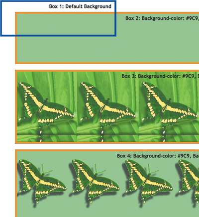
The file contains several examples of CSS background effects. Borders have been added to the <div> elements to make the effects easier to see.
Box 1 displays the default HTML transparent background. Box 2 depicts a background with a solid color. Box 3 shows a background image that repeats in both directions along the x-axis and y-axis. It also features a background color, but it’s completely obscured by the repeating image. Box 4 also shows a background image, but its transparency and drop-shadow effect allow you to see the background color around the edges of the image.
Be sure to fully test any background treatments. In some applications, CSS background specifications are not fully supported or are supported inconsistently.
CSS3 overview and support
The Internet doesn’t stand still for long. Technologies and standards are evolving and changing constantly. The members of the W3C have been working diligently to adapt the web to the latest realities, including powerful mobile devices, large flat-panel displays, and HD video—all of which seem to get better and cheaper every day. This is the urgency currently driving the development of HTML5 and CSS3.
Although these standards have not been officially adopted, browser vendors are racing to implement many of the features and techniques. The current plan by W3C is to formally adopt HTML5 and CSS3 sometime in 2014. In the meantime, if you feel adventuresome and would like to live on the edge, Dreamweaver won’t leave you in the lurch. While adoption in the industry is continuing, Dreamweaver hasn’t waited either. The latest version provides many new features based on these evolving standards, including ample support for the current mix of HTML5 elements and CSS3 formatting. As new features and capabilities are developed, you can count on Adobe to add them to the program as quickly as possible.
As you work through the upcoming lessons, you will be introduced to many of these new and exciting techniques and actually implement many of the more stable HTML5 and CSS3 features within your own sample pages.
CSS3 features and effects
There are over two dozen new features in CSS3. Many are ready now and have been implemented in all the modern browsers; others are still experimental and are supported less fully. Among the new features, you will find
• Rounded corners and border effects
• Box and text shadows
• Transparency and translucency
• Gradient fills
• Multicolumn text elements
All these features and more can be implemented via Dreamweaver today. The program will even assist you in building vendor-specific markup when necessary. To give you a quick tour of some of the coolest features and effects brewing, we’ve provided a sample file of CSS3 styling.
1. Open css3_demo.html from the Lesson03 folder. Display the file in Split view, and observe the CSS and HTML code.
Many of the new effects can’t be previewed directly in Design view, so you’ll need to use Live view or preview the page in an actual browser.
2. Click the Live view button to preview all the CSS3 effects.
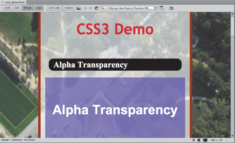
The file contains a hodgepodge of features and effects that may surprise and even delight you—but don’t get too excited. Although many of these features are already supported in Dreamweaver and will work fine in modern browsers, a lot of the older hardware and software out there can turn your dream site into a nightmare. And, there’s at least one additional twist.
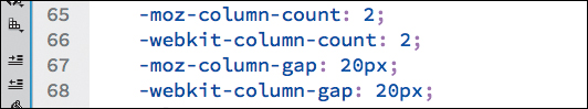
Some of the new CSS3 features have not been standardized, and certain browsers may not recognize the default markup generated by Dreamweaver. In these instances, you may have to include specific vendor commands to make them work properly. These commands are preceded by a vendor prefix, such as –ie, –moz, and –webkit. If you look carefully in the code of the demo file, you’ll be able to find examples of these within the CSS markup.
Additional CSS support
CSS formatting and application is so complex and powerful that this short lesson can’t cover all aspects of the subject. For a full examination of CSS, check out the following books:
• Bulletproof Web Design: Improving Flexibility and Protecting Against Worst-Case Scenarios with HTML5 and CSS3 (3rd edition), Dan Cederholm (New Riders Press, 2012) ISBN: 978-0-321-80835-6
• CSS: The Missing Manual, David Sawyer McFarland (O’Reilly Media, 2009) ISBN: 978-0-596-80244-8
• Stylin’ with CSS: A Designer’s Guide (3rd edition), Charles Wyke-Smith (New Riders Press, 2012) ISBN: 978-0-321-85847-4
• The Art & Science of CSS, Jonathan Snook, Steve Smith, Jina Bolton, Cameron Adams, and David Johnson (SitePoint, 2007) ISBN: 978-0-975-84197-6
Review questions
1. Should you still use HTML-based formatting?
2. What does CSS impose on each HTML element?
3. True or false? If you do nothing, HTML elements will feature no formatting or structure.
4. What four “theories” affect the application of CSS formatting?
5. What is the difference between block and inline elements?
6. True or false? CSS3 features are all experimental, and you should not use them at all.
Review answers
1. No. HTML-based formatting was deprecated in 1997 when HTML 4 was adopted. Industry best practices recommends using CSS-based formatting instead.
2. CSS imposes an imaginary box on each element and can then apply borders, background colors and images, margins, padding, and other types of formatting.
3. False. Even if you do nothing, many HTML elements feature built-in formatting.
4. The four theories that affect CSS formatting are cascade, inheritance, descendant, and specificity.
5. Block elements create stand-alone structures; inline elements appear at the insertion point.
6. False. Many CSS3 features are already supported by modern browsers and can be used today.