Chapter 2
Raising your IQ
How to improve your image quality
We naturally all want our photographs to look their very best when they are printed on the page. In this chapter we wanted to start by looking at some of the ways you can help guarantee getting the best digital results from your camera. As you will read later, we carried out a few tests to show how different ways of shooting and the choice of lens can affect sharpness. More importantly, we wanted to show some of the key benefits of using Camera Raw to carry out the initial image processing. You'll also find tips in this chapter on ways to curb noise and add midtone contrast.
Camera Raw’s history
Thomas Knoll, the co-author of Photoshop, is the founder and principal engineer of Camera Raw. Camera Raw 1.0 was released as a stand-alone product for Photoshop 7 and sold for $99. Camera Raw 2 was bundled with Photoshop CS which was released in October 2003. Contributing engineers are Zalman Stern and Eric Chan. Mark Hamburg has also contributed to the Camera Raw processing pipeline and was the founder of Adobe Photoshop Lightroom, which built upon and added to Camera Raw's processing.
Optimizing images
Camera Raw or Photoshop?
When Adobe launched Camera Raw it was designed as a raw file format import plug-in that allowed Photoshop to access raw digital captures. It can now be argued that Camera Raw has been turned into it's own editing domain called ‘parametric editing’ and, in some ways, challenges Photoshop for image editing of digital photographs. But don't lose sight of the fact that Camera Raw's main role is still to open images into Photoshop.
Inevitably, there will be a degree of confusion about what to do to images in which domain: parametric or pixel editing. The answer is really rather simple — use the best tool for the task at hand. Using Camera Raw is optimal for raw capture tone curve adjustments because you are working with the entire linear tone range of the raw capture. Waiting to do that in Photoshop would mean leaving image quality

Figure 2.1 Camera Raw version 1.0 in Photoshop 7 released February 19th, 2003.
on the table. The same holds true for adjusting the white balance of a raw capture. Nothing in Photoshop can rival the accuracy and efficiency of Camera Raw's white balance tool. If your camera sensor has a dust spot, you can use the spot removal tool to remove a spot on one or one hundred captures. Doing these tasks in Camera Raw is more efficient than in Photoshop. Yet for all of its strengths, Camera Raw is not a pixel editor (the adjustment brush and gradient filter not withstanding). When you need pixel accurate masks or image composites, you need Photoshop.
The best approach is to devise a strategy and employ the correct tactics to achieve it. The strategy we like to use is the 80–20 rule (also called the Pareto principle) where the majority of the work can be done with the least amount of effort. So, Camera Raw is tactically employed to make mass adjustments accurately, quickly and efficiently while Photoshop is tactically employed on only a few select images that are truly worthy of the extra effort.

Figure 2.2 Camera Raw version 5.2 in Photoshop CS4 released November 25th, 2008.

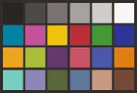
Figure 2.4 A synthetic ColorChecker card made in ProPhoto RGB.
Camera Profiles in Camera Raw
When Camera Raw was introduced, one of the more controversial aspects of image quality was the Camera Raw default color rendering. Many thought the color was inaccurate (or at least didn't match the color produced by the camera JPEG or camera software). Adobe took heed and introduced the DNG Profile addition to the DNG specification with DNG version 1.2. When Camera Raw version 5.2 shipped, the final versions of the DNG Profiles were also released. Whether you were in the camp that thought Camera Raw's color rendering was fine or the camp that thought it sucked is moot — the DNG Profiles have now changed the Camera Raw rendering. If you want the same color rendering as your camera JPEG, you can pretty much match it. Figure 2.3 shows the Camera Calibration panel of Camera Raw (version 5.2 and above). The new default color profile is the Adobe Standard profile. This profile is designed to be colorimetrically accurate and an improvement on the previous table-based profiles (shown as ACR 4.4 and 4.3). The profiles starting with the name ‘Camera’ are designed to emulate the in-camera settings available as designed by the camera maker (although the actual names will vary). The drop-down menu in Figure 2.3 is for a Canon EOS1DS Mk III. Other cameras will have names that align with their own camera ‘looks’. For comparison, Figure 2.4 shows a synthetic Macbeth ColorChecker card. The bottom figure shows shots of a mini ColorChecker card shot in daylight. The far left image
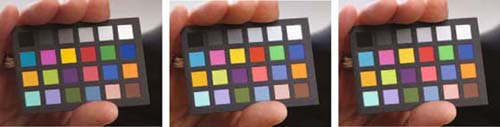
Figure 2.5 Comparisons of the Adobe Standard profile (left), the Camera Standard profile (middle) and a camera-produced JPEG file (right).
of Figure 2.5 was rendered using the Adobe Standard DNG Profile. The middle image was rendered using the Camera Standard profile and the image on the right was a camera JPEG with the camera set to sRGB. As you can see, the Camera Standard and JPEG are a close match. However, in terms of accuracy, the Adobe Standard rendering is a closer match to what the ColorChecker colors are supposed to produce. What does this prove? That color rendering from raw files is open for interpretation — there really is no single ‘right’ answer but there may be more accurate answers.
It doesn't really end here either. Adobe has released a free software utility called DNG Profile Editor which enables users to create their own DNG Profiles through manual editing or by using shots of ColorChecker charts. The documentation available is extensive so if you are interested we suggest you download the DNG Profile Editor from http:// labs.adobe.com and try it yourself (be sure to read the documentation). For real world examples of the different renderings using the vender matching profiles see Figure 2.6 below.
Figure 2.6 This shows comparisons of the DNG Profile rendering. Note: the naming convention will vary by camera manufacturer and not all cameras will have all variations.

Highlight checking
In Camera Raw there are several ways you can check that the important highlight information is preserved. One way is to click the highlight clipping warning in the Camera Raw histogram (circled in Figure 2.7). Alternatively, if you hold down the ![]() key as you drag the Exposure or Recovery sliders, you will see the preview image change to show a threshold mode display, in which the clipped areas will appear colored (indicating which colors are clipped), or white (to indicate that all colors are clipped). You can use this as a guide to make sure important detail isn't clipped. Lastly, you can move the cursor over the highlight areas of the image and check the RGB values to see if these fall within an acceptable range for print output. Here, you usually want to make sure that the brightest areas of highlight detail don't go lighter than, say, 245, 245, 245.
key as you drag the Exposure or Recovery sliders, you will see the preview image change to show a threshold mode display, in which the clipped areas will appear colored (indicating which colors are clipped), or white (to indicate that all colors are clipped). You can use this as a guide to make sure important detail isn't clipped. Lastly, you can move the cursor over the highlight areas of the image and check the RGB values to see if these fall within an acceptable range for print output. Here, you usually want to make sure that the brightest areas of highlight detail don't go lighter than, say, 245, 245, 245.
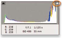
Figure 2.7 The Camera Raw histogram.
Optimizing the image tones
This section deals with a few of the ways you can finetune images in Photoshop to improve their appearance. If you want to learn more about the basics of Photoshop image editing, then we do recommend you read the Image editing essentials chapter in Adobe Photoshop CS4 for Photographers. To start with though, we thought it worth making a few points about how to optimize the shadows and highlights and dispel a few myths.
Optimizing an image in Camera Raw
A lot of people have got confused about how you are supposed to set the shadow and highlight points in Camera Raw and Lightroom, and why you don't have the same type of Levels controls as you do in Photoshop. Basically, you will sometimes read that the black point output levels should be set to an RGB value like 12, 12, 12, and the white output levels should be set to, say, 245, 245, 245. There are sound, historical reasons for such advice, because you don't want the blacks to clip to 0, 0, 0, when you send a file to be printed, since any blacks that are darker than a certain value will all clip to black. Likewise, you need to ensure that essential highlight information doesn't all burn out to paper white when printed. Yet in Camera Raw there are no output levels settings. This is because they are not needed when editing images for RGB output and we'll explain why here.
When it comes to optimizing the highlights, you only need to worry about the non-specular highlights, which are basically the brightest whites that contain important tonal detail. With specular, or shiny whites, you can safely let these clip. So although you do have to be careful, in practice most pictures contain specular highlights and if you set the highlight clipping to clip these the important detail highlight information will usually be safely preserved within a margin of safety. Where there are bright areas in a picture that contain important detail, we first make sure that the threshold clipping display confirms that these areas are not significantly clipped and then use the Recovery slider in Camera Raw to make sure the highlight detail is preserved in these areas.
Optimizing the highlights
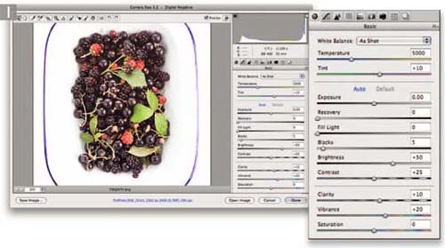
1 Here you can see a photograph opened in Camera Raw with the default Camera Raw settings. Although the photograph appears rather bright, I would say that it has been captured at an optimum exposure from which to process a tone corrected image.

2 This shows the tone corrected version in which I adjusted the Exposure, Recovery, Fill Light, Blacks, Brightness and Contrast sliders to apply the best combination of settings to achieve a nice level of contrast without blowing out the highlights. The important thing to note here is that I was extremely careful to make sure that the highlight detail in the white bowl was well within range to print OK. It mattered less to me that the white backdrop tone values were in this case clipped.

Optimizing the blacks
When it comes to adjusting the Blacks slider, the choice is simple: where are the blackest blacks and how much do you wish to clip them? Just as there is no one CMYK space that fits all, there is no one setting for the black point that will correctly set the blacks for every type of print output. Where you read advice to set the blacks lighter than 0, 0, 0, this dates back to the time before Photoshop 5, when there was no other way to ensure that the blacks in a photograph would print correctly without clipping. With the advent of ICC-based color management now being built into Photoshop, this preparation step is no longer required and it is fairly easy to prove why.
The photograph on the page opposite is of my daughter Angelica, and was shot against a black velour backdrop. In the accompanying steps I describe how I adjusted the settings in Camera Raw to deliberately clip the blacks so that the backdrop detail went completely to black. Some people have expressed concern that Camera Raw only allows you to adjust the input levels in this way (to set the input clipping levels) and that you don't have a Levelstype control for setting the output levels to something higher than 0, 0, 0. In reality, an output levels control is not necessary these days, since the profile conversion takes care of this for you and does it all automatically. For example, in Figure 2.8 I opened the Camera Raw processed photograph of Angelica in Photoshop and set the histogram display to Luminosity. The top histogram shows the Photoshop histogram for the Camera Raw processed RGB image. Below that you can see the luminosity histogram for a CMYK converted image and below that a conversion to a glossy inkjet profile, followed by a matte inkjet paper profile. In these screen shots of the output converted histograms you can see that the black point has been automatically indented. This shows how the profile conversion takes the guesswork out of setting the blacks, as well as how the amount of black point compensation will actually vary for each different type of print output.
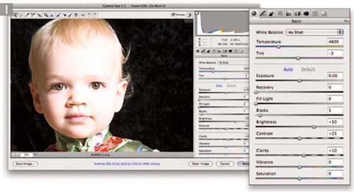

2 In this version you can see that I reduced the Exposure slightly and added some Recovery, but the main thing I did was to increase the Blacks amount until I had successfully clipped all of the shadow detail in the backdrop. In cases like this it does not really matter if you clip the blacks a lot, since it is not always important that you preserve every bit of shadow detail.
Optimizing both the highlights and blacks
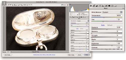
1 To complete this section on optimizing images in Camera Raw I have selected here a photograph where, as in the previous example, the blacks needed to be clipped, but it was OK to clip the highlights as well.

2 In this corrected version, I raised the amount for the Blacks slider to darken the backdrop to black. I also dragged the Exposure slider to the left to darken the image and used the Recovery slider to help preserve some of the highlight detail. In this particular image it was not necessary to preserve the extreme highlights, since I wanted to let the bright reflections clip and burn out to white.
Cut-outs against a white background
Subjects that are photographed against a white background deserve careful treatment. Ideally you want the white background to print as pure white on the paper, but not at the expense of losing image detail in important highlight areas elsewhere in the photograph. When preparing cut-out images against white, the levels should first be adjusted with consideration for the subject only and the background should then be adjusted separately without compromising the tonal range of the subject. The following steps suggest one way that you might like to add a pure white backdrop to a photograph, while ensuring that you preserve the fine detail in the edges of the subject.
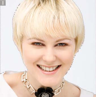
1 Whenever I need to cut out the background to white in a photograph, I'll often start by creating a mask for the background. This doesn't necessarily have to be a super-accurate mask, just so long as it adequately selects the areas that I want to turn white. With subjects like this the trick was to make sure that the cut-out did not begin and end abruptly, and the goal was to achieve a smooth transition along the edges of the subject. In this first step, I went to the Channels panel and loaded an alpha channel mask of the backdrop area as a selection.

Figure 2.9 This shows the lighting setup used to shoot the photograph shown here.

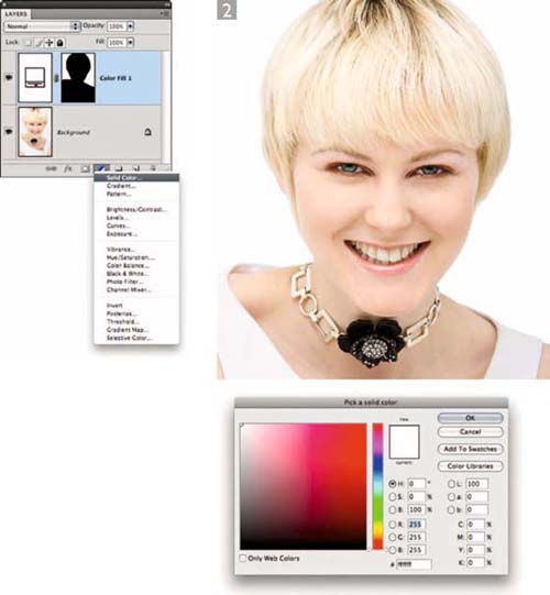

3 The only problem now is that the edge of the Solid Color fill layer mask was too harsh. To address this, I made sure that the pixel layer mask was selected still, then went to the Masks panel and clicked on the Mask Edge' button (circled). This opened the Refine Mask dialog shown on the right, where I adjusted the settings to achieve a softer edge for the Solid Color fill layer mask. I adjusted the Contract/ Expand slider so that the mask was slightly wider than the subject, plus I used the Radius and Feather sliders to achieve the desired softening of the mask. The key thing here was to make sure there was a gentle transition at the edges between the light areas and the pure white backdrop. The left image shows the before version with the sharp edge, and the right image shows what it looked like with the modified mask edge.

Essential image editing steps
With so many tools and ways to edit photographs, it is easy to get confused when working out what is the best way to edit an image in Photoshop. This book offers advice and tips on how to improve the look of your pictures, but at the end of the day we find that 90% of the photographs we take can mostly be improved by applying a simple six-stage image editing routine, namely: crop, color, tone, finesse, capture sharpen and noise reduction. We do this all in Camera Raw when processing our raw photos, because we find it to be the most efficient workflow available. We know some people have been put off shooting raw because they think it makes things complicated, but when you study the Basic controls in Camera Raw and Lightroom, they really aren't that difficult to master. In fact it seems to us quite odd that people are happy to shoot JPEG because it's ‘simpler’, yet they then end up jumping through all sorts of complicated hoops in Photoshop to perfect their images.
Camera Raw allows you to work both smarter and faster so you can spend more time taking pictures rather than getting bogged down in making endless photo adjustments. Plus you don't just save time editing single photographs. Get one photograph to look good and it's easy to synchronize all the adjustments across other images taken in the same sequence. Essentially, our message is this. Why make things more difficult for yourself? The controls in Camera Raw are expressly designed to make the photo editing process easier to understand, while offering the ultimate in image quality as well as flexibility. Simple doesn't mean you have to compromise on quality. Adobe have devoted the best part of six years to enhancing the Camera Raw editing process because in this day and age it makes more sense to carry out the color and tone editing working from the raw capture data. As Camera Raw has got better we have ended up doing all our major tone and color corrections in Camera Raw or Lightroom, leaving Photoshop as the program we use for the major retouching work.
As we say, nine times out of ten we can edit a photograph completely in Camera Raw using the following steps. For the remaining 10% of images we either make fuller use of the other Camera Raw tools such as the Tone Curve, HSL and Lens Corrections panels or the special techniques that we use in Photoshop such as the Midtone contrast techniques featured at the end of this chapter which, while similar to the Clarity adjustment in Camera Raw, allow you to carry out more precise types of localized contrast adjustments.
To help explain our approach, we'll show the complete process used for editing a single image in Camera Raw. Figure 2.10 isn't a particularly special photograph — it's a snapshot that was taken in Rome that can adequately be used to demonstrate how you can edit a typical image in six simple stages. You can access this image from the DVD, but you should be able to apply the steps shown here to almost any raw photograph you choose to edit in Camera Raw.
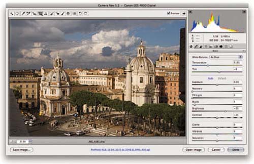
Figure 2.10 This shows the uncropped before version using the default Basic panel settings.
Crop
When you work in Camera Raw, there is no particular order that you must follow. That's the beauty of Camera Raw, it's a non-destructive process and you can undo and redo the adjustments as many times as you like. You can start with the tone and color editing and end with a crop, although we reckon it is always best to carry out the tone and color editing first before you decide how to capture sharpen.
We simply suggest you crop the photograph first because once you have cropped an image you get a better feel for how the final image can look before you make the tone and color adjustments. It doesn't matter if you crop last, but generally you'll find the crop can sometimes change the whole feel of an image and you may end up having to revise your earlier adjustment settings.
In Figure 2.11 we cropped the photograph more tightly to remove some of the objects in the foreground. We also rotated the crop very slightly so the cropped photo was more level with the horizon.

Figure 2.11 Cropping the image.
Color
Next, we come to the color adjustment stage. The white balance controls are placed first at the top of the list of Basic controls, so we'll start here first. In Figure 2.12 the photograph was shot with the camera using a set daylight white balance setting. The ‘As Shot’ white balance didn't look too bad, but by selecting the white balance tool we were able to click on the white marble of one of the buildings in the photograph and thereby choose an improved white balance setting for the whole photograph. That's just one way you can do this. Other methods include selecting a preset white balance setting from the Color Temperature menu, or choosing the Auto option to let Camera Raw work out the optimum setting, or you can manually drag the Temperature and Tint sliders to create a manual white balance setting. Usually, once you have got the white balance right, all the other colors will easily fall into place.

Figure 2.12 Setting the white balance.
Tone
We were now ready to tone adjust the image. There are four main sliders that you can use here: Exposure, Recovery, Fill Light and Blacks.
Exposure
We recommend that you start with the Exposure slider first and use this to gauge how much you wish to lighten or darken the picture. The one rule we would apply here is to always adjust the Exposure first before you adjust the Brightness (which we'll come onto shortly). In Figure 2.13 you can see an Exposure adjustment being applied. As you adjust the Exposure you can also use the Histogram to be your guide here to make sure that you don't push the Exposure slider too far so that you clip the highlights. You can also use the highlight clip warning here as well, or hold down the ![]() key as you drag the Exposure slider and check the appearance of the Threshold preview shown on the screen.
key as you drag the Exposure slider and check the appearance of the Threshold preview shown on the screen.

Figure 2.13 Setting the overall Exposure and highlight clipping point.
Recovery
The next step is to make sure that there is no significant clipping in important areas of highlight detail. This is something that we touched on earlier in the optimizing image tones section. When it comes to making Camera Raw adjustments the best advice is to use the Exposure slider first to adjust the overall brightness. As you do so, you will want to check the appearance of the extreme highlight detail as well as the RGB numbers to make sure these don't go too high. Quite often you'll find that as you set the Exposure, you can get both the brightness and highlight clipping right in one go. However, you shouldn't have to restrict the Exposure adjustment, because the Recovery slider can be used to preserve detail in the highlights, but without altering the effect of the Exposure adjustment (see Figure 2.14). So basically, you should adjust Exposure to expand the tones, making the image brighter or darker. Where you see signs of highlight detail clipping, use Recovery to bring back detail.
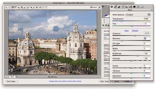
Figure 2.14 Adjusting the Recovery to protect the highlight details from clipping.
Blacks
We’ll skip the Fill Light slider and look at setting the Blacks next. If you refer to the section earlier on setting the black clipping point, you will recall how we advise you to simply clip the blackest blacks in the picture as you see fit. There is no need to concern yourself with setting the output levels for the black point, since this can all be handled automatically in Photoshop when you send a file to print or make a CMYK conversion.
Because of the way Camera Raw calculates its tone adjustments, small incremental Blacks adjustments will produce a much more noticeable shift in tone adjustment compared to corresponding Exposure adjustments. The default Blacks setting in Camera Raw is 5, which is usually about right for a lot of photographs, and our advice is to not take the Blacks slider any lower than 2 or 3. Or, you can increase the Blacks clipping if you feel it would be useful to hide some of the shadow detail and make these tones all clip to solid black. In the Figure 2.15 example, we raised the Blacks clipping to 10.
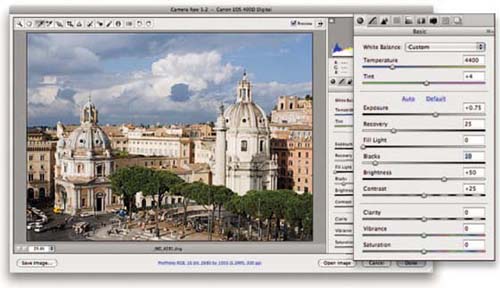
Figure 2.15 Setting the Blacks clipping point.
Fill Light
It is usually best to add Fill Light after you have set the Blacks. Fill Light can be used to lighten the shadows and reveal more detail. As with Recovery, it's not necessary for every picture, but for this example we added +15 Fill Light.
Brightness
The one rule we do urge here is to adjust the Exposure first before you adjust the Brightness. In the steps shown so far, we used the Exposure and Recovery to expand the tones in the photograph and fine-tune to avoid clipping. In the Figure 2.16 step you'll notice how the Brightness adjustment was applied last to adjust the ‘relative brightness’ of the photograph. In this instance, the Brightness adjustment had little effect on the highlight clipping, but essentially shifted the midtone levels point left or right. You can think of the Brightness slider as behaving just like the Gamma slider in Photoshop Levels.
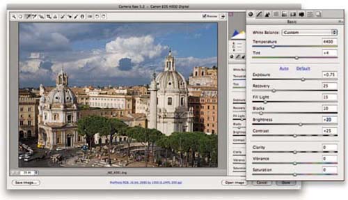
Figure 2.16 Setting the Fill Light and Brightness.
Contrast
The preceding steps all essentially affect the image's global contrast, with the Exposure and Blacks sliders in particular having the greatest effect. The Contrast slider in the Basic panel can therefore be used at this stage to modify the contrast. Basically, after you have set the highlights and blacks and adjusted the brightness, what do you think of the image? Does it look too flat at this stage or too contrasty? The Contrast slider provides a simple, yet effective means to adjust the global contrast. In the Figure 2.17 example we reckoned the photograph could have done with a little added contrast. The default setting is +25, but here we chose to raise this to +55.
Of course, you can also go to the Camera Raw Tone Curve panel and adjust the contrast. While we both like using the Tone Curve there is a lot to be said for the simplicity of the Contrast slider. You don't have to switch panels to carry on editing the image and a simple slider adjustment is often all you need to get the contrast right initially.
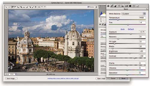
Figure 2.17 Setting the Contrast.
Finesse
This step is about adding polish to the image. It's not obligatory, but something that we do to quite a number of our images. You could extend what's done in this step to include things like HSL panel adjustments or use of the gradient filter to selectively darken a portion of the picture. We wanted to keep this section simple, so we'll focus on just the Clarity and Vibrance sliders in the Basic panel.
Clarity
The Clarity slider provides a nice, easy to use adjustment for adding midtone contrast to an image. A little later on in this chapter we'll be showing two different Photoshop techniques that can be used to add variable midtone contrast. The Clarity slider combines a bit of both of these techniques and is an effective tool for enhancing detail contrast (as opposed to sharpness) in areas of flat tone. Most photographs can benefit from adding at least +10 Clarity; in the Figure 2.18 example we set the Clarity to +25.
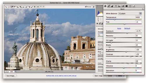
Figure 2.18 The Clarity adjustment step.
Vibrance
Just below Clarity we have the Vibrance and Saturation sliders. Saturation has been around since version 1 of Camera Raw and provides a basic method for boosting saturation in a photograph as it applies a ‘linear’ type saturation adjustment to every image. This means that it boosts the saturation of all colors evenly, including those colors that are already quite saturated. The downside of this is that it is very easy to clip some of the already saturated colors when applying even just a modest saturation boost. The Vibrance control, on the other hand, applies a nonlinear saturation adjustment in which the least saturated colors get the biggest saturation boost, while the already saturated colors receive less of a saturation boost. Vibrance also tends to filter out skin tone colors so that these are more protected as you increase the Vibrance. In Figure 2.19 we applied a +20 Vibrance which enriched the colors in the scene, but without clipping the richer colors such as the treetops in the foreground.
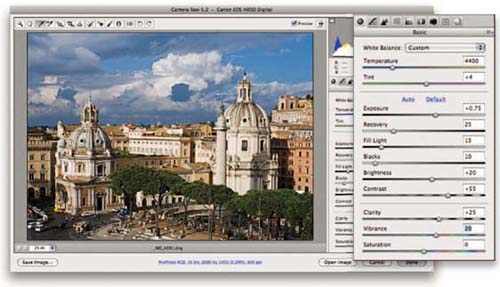
Figure 2.19 The Vibrance adjustment step.
Capture sharpening
Finally, we come to the capture sharpening step in which we go to the Detail panel in Camera Raw and fine-tune the four Sharpening sliders according to the sharpening needs of the image. When you first go to the Detail panel you'll see the default settings of 25 Amount, 1.0 Radius, 25 Detail and 0 Masking. These settings offer a reasonable starting point for most images, so even if you do nothing Camera Raw applies an appropriate level of capture sharpening.
Amount and Radius
The Amount and Radius need to be adjusted in tandem. The Amount determines how much sharpening is applied, while the Radius lets you decide how wide you want the halo edges to be. Basically, a Radius of 1.0 will work well for most edges. Fine detailed subjects will benefit from a smaller Radius setting and soft detailed subjects such as portraits can use a wider radius of, say, 1.1–1.3. In the Figure 2.20 example we applied an Amount of 45 with a small Radius of 0.8 pixels.

Figure 2.20 The Amount and Radius sharpening step.
Detail and Masking
The Detail and Masking sliders act like suppression controls for the sharpening. Setting the Detail slider to an amount lower than 100 allows you to suppress the halo artifacts. With soft detailed subjects (such as portrait photographs) it is preferable to use a low Detail setting. With detailed photographs such as this it was OK to increase the Detail setting and not suppress the halos quite so much, which allowed us to apply a stronger sharpening effect. The Masking slider can be used to apply a mask based on the image content that filters the capture sharpening effect. With detailed subjects we leave the Masking set to zero, but for other types of images it is worth raising the masking, as this can help protect some of the soft detailed areas from being over-sharpened. In Figure 2.21 we applied a Detail of 60 and left the Masking set to 0.
Noise reduction
The noise reduction consists of a Luminance slider to suppress the grain-like effects of extreme camera noise,
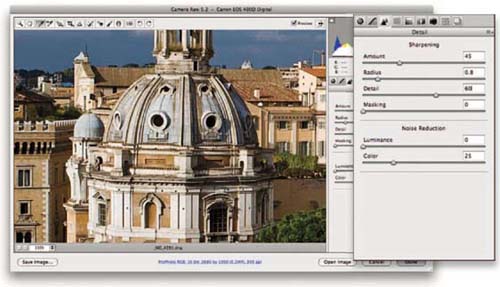
Figure 2.21 The Detail sharpening step
as well as a Color slider for suppressing the color speckle artifacts that are also a consequence of high ISO capture with some digital cameras. For most low to medium ISO captures we tend to stick with the default settings, but for high ISO captures, where more noise is usually visible, we tend to increase the Color slider first to remove the color speckles and then see if it is necessary to increase the Luminance noise reduction to smooth out noise artifacts. We'll be looking at other ways to reduce noise a little later in this chapter, but for now Figure 2.22 compares the finished photograph with the version we started out with.
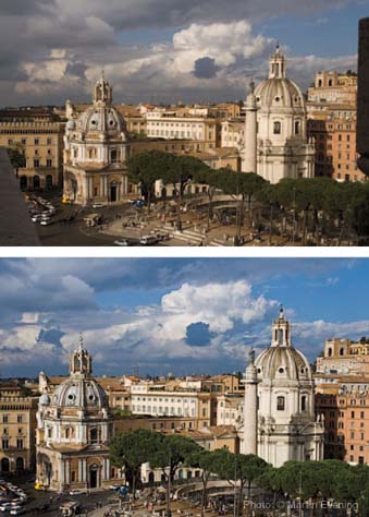
Figure 2.22 Here you can compare the before version (top) and the edited version below.
Perspective corrections with Camera Raw
One of the top requests for Camera Raw and Lightroom has been to include perspective corrections, so that users can apply perspective corrections to raw images. There is no doubt that this would be a neat feature to have; the only downside is that perspective correction adjustments would be memory-intensive and such a feature could potentially slow down the preview redraw times. This might not always be such a problem for Camera Raw users, but it could slow things down in Lightroom if you had synchronized a perspective correction setting across a hundred images or more.
Leaving all this aside, it so happens there is already a method in Camera Raw and Photoshop that will allow you to correct the perspective of a raw photograph while keeping the image in its original raw file state. Here's how it can be done.
1 To correct the perspective in a raw image, I opened it in Camera Raw and held the ![]() key down so that the Open Image button switched to display Open Object. I then clicked on this button to open the raw image as a Smart Object in Photoshop.
key down so that the Open Image button switched to display Open Object. I then clicked on this button to open the raw image as a Smart Object in Photoshop.

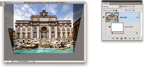
3 In the layers panel you can see the Lens Correction has been applied as a Smart Filter to the raw Smart Image layer. Next, I selected the crop tool so that I could crop the lens corrected image.


5 As you can see, I still had access to the raw original without the Lens Correction filter and crop that I had applied in Photoshop. I was now able to adjust the Camera Raw settings and update the Smart Object accordingly.
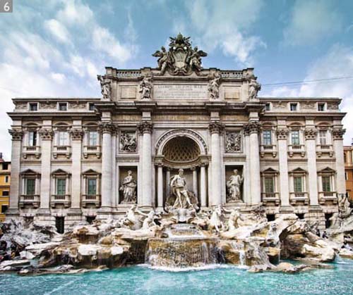
6 Here you can see how the finished image looked after I had updated the settings in Camera Raw. As you will have gathered by now, the Smart Object layer references an embedded raw version of the image and this allows you to edit not only the Camera Raw settings but the Lens Correction filter settings, as many times as are needed. You can of course use the Lens Correction filter to compensate for barrel/pin cushion distortions as well as perspective control. There are just a few caveats to bear in mind here. Firstly, although you can add extra filters to this Smart Object layer you shouldn't attempt to edit the Smart Filter opacity of blending mode settings, since this is a filter adjustment that should either be on or off. Secondly, once you start adding retouch layers in Photoshop, you will want to lock down the Smart Object settings so that you don't accidentally re-edit them. Perhaps the best policy is to save this as a master version and create a flattened duplicate copy to retouch on.

Capture sharpening workflow
In the ‘old days’ the common wisdom was to only sharpen images at the end prior to printing. That worked ‘OK’ but was far from optimal. Our good friend and colleague Bruce Fraser had devised a two-stage sharpening approach back in Photoshop 3.0 days, but updated his thinking while working on PixelGenius' PhotoKit SharpenerTM. The scheme was to break down the sharpening into three phases: ‘Capture Sharpening’ upon first opening an image, ‘Creative Sharpening’ for addressing local sharpening or smoothing, and ‘Output Sharpening’ at the last stage when the final size and resolution of an image is known.
The creative and output stages are well covered by PhotoKit Sharpener, but it's the capture stage that still mystifies some people. Capture sharpening depends on both the source of the image as well as the content. The content part of the equation is critical. For optimum sharpening, you need to adjust for the edge frequency — a higher radius for low frequency and a lower radius for high frequency edges. Figure 2.23 is an example of a low edge frequency image and shows the Detail settings used. While
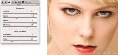
Figure 2.23 With the image at a 100% zoom, the aim is to adjust the image till it looks ‘good’ at that zoom. The Radius was set to 1.5 which is appropriate for a portrait containing low edge frequency.
setting the Radius correctly is the first big step, it's really deploying the edge Masking that allows proper sharpening to be applied to those areas that need it, such as the eyes, lips and hair. Figure 2.24 shows the result of the masking preview. The white areas represent the edges which we want to sharpen and the black areas the surface areas which we don't. Setting the Radius and Masking properly allows using a more aggressive amount, which will optimize the detail in the image.
For a portrait, it's also useful to lower the Detail slider to kick in the halo suppression it provides while reducing the emphasis on high frequency detail (the other thing the Detail slider does). The higher the Detail settings the more the sharpening concentrates on detail and allows stronger halos — which are not ‘bad’ as long as they are invisible when zoomed to 100%. The other thing to pay attention to is while there are four sliders called ‘Sharpening’, there's really a fifth slider that comes into play and needs to be properly set: Luminance noise reduction. Most images need at least some slight noise reduction even though it's off by default.

Figure 2.24 This shows the Figure 2.23 image with the Masking preview (hold down the ![]() key while moving the slider) showing the edges and surfaces of the image. The Masking slider is set here to 70, which is a common setting for portraits.
key while moving the slider) showing the edges and surfaces of the image. The Masking slider is set here to 70, which is a common setting for portraits.
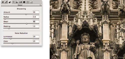
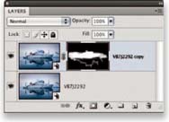
Figure 2.26 The image has been opened in Photoshop as a Smart Object. The bottom layer has been duplicated using Layer ➯ Smart Objects ➯ New Smart Object via Copy and a layer mask has been applied so the copy layer will only be blended in the center.
For images with high frequency edges — which are common for landscapes — the radius should be lowered and often the Detail slider increased. Figure 2.25 shows the result of aggressive Detail and Amount settings. The image is sharp, but without halos that would interfere with subsequent sharpening rounds in later phases (although the odds of needing creative sharpening are not high).
So that's all well and good if your image falls neatly into one of these two categories, but what about an image that has a mix of frequencies that puts it squarely in between? Well, you could compromise and adjust the settings to the middle ground but that's not really optimal. For cases where capture sharpening needs a blend of two types of sharpening — high and low frequencies — the best option is to optimize for both and blend the results. Creating two differently capture-sharpened copies of the raw file as Smart Objects allows us to blend between them. (See Figure 2.26). Figure 2.27 shows the two different settings used: one optimized for low frequency edges and the second for high frequencies. Figure 2.28 shows the combined result.

Figure 2.27 Within each Smart Object different Sharpening settings have been made to deal with low frequency detail, shown on the left (and placed at the bottom of the layer stack), and high frequency (finer) detail on the right, and placed above. Note that the Radius was higher and the Detail slider lower for the low frequency image with masking set to 30. Also note that the Luminance noise reduction was set to 40 to kill noise in the sky and water. The top layer needed a lower Radius, a higher Detail setting, and less Masking and Luminance noise reduction.
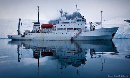
Figure 2.28 The final result of the Smart Object capture sharpen blend. The original image was shot at dusk with a Canon EOS 1Ds MII with a 24–70mm F2.8 lens.
Improving camera capture sharpness
It is all very well devising a sharpening workflow that includes capture sharpening, but it's also important to ensure that the images you capture are as sharp as they can be.
Choice of camera lens
The most obvious factor that affects sharpness will be the quality of the image optics used on the camera. In the past, camera lenses have been designed to meet the specific needs of film. This is not to say that film-designed lenses are no longer any good. Many of the classic lenses are indeed well suited for digital photography, but there are certain limitations you need to be aware of.
First of all, the lenses for 35 mm film cameras were designed to resolve well enough so as to capture a sharp image on a 24 mm × 36 mm area of film emulsion. Even when using the finest grain film emulsion processed under ideal conditions, the ultimate resolving power of 35 mm film cannot even begin to compare to the amount of detail that can be captured by the sensors found in some of today's digital SLR cameras. So, lenses that might have been great or OK ten years ago are not going to allow you to get the most out of the resolving power of, say, a 16 or 22 megapixel camera. Even if you use a good quality zoom lens, there may not be any point capturing anything more than 16 megapixels of data. However, if you use a modern prime lens, you should certainly see a definite improvement in capture sharpness. At the end of the day, 11 megapixels of data captured on an average zoom lens is plenty enough pixels for most reproduction quality work, but if you need extra detail, and want to make the most of what the sensor can offer, then you do need to think carefully about the lenses you shoot with.
Another consideration is the fact that film lenses were designed to resolve a color image to three separate (red, green and blue sensitive) film emulsion layers which overlaid each other. Consequently, film lenses were designed to focus the red, green and blue wavelengths at fractionally different distances and at even further distances

Image stabilizing lenses
Image stabilization can be achieved in two main ways. Image stabilizing lenses use gyroscopic motors to move the lens elements in an effort to keep the image steady. If you look through the camera and move the lens about quickly, you'll hear the motors whirring as they compensate for camera shake type movement and you'll sometimes notice how the image jumps every now and then as you do so. Some cameras can stabilize the image by using motors to move the sensor instead and the advantage of this is that you are not limited to working with specific image stabilizing lenses only. In either case, image stabilization can help you shoot sharp pictures at slower shutter speeds and this can effectively buy you a couple stops of exposure, where without image stabilization you would be forced to shoot at a higher ISO setting in order to get sharp pictures.
Setting the camera to mirror-up mode
This can be tricky with some cameras, as it is often a custom user setting that is buried deep in the camera settings menus. With the latest Canon EOS cameras it is now possible to make the mirror-up mode a custom favorite setting that you can access more easily when out on location shooting.
apart towards the corner edges of the film emulsion area. Since the red, green and blue photosites are all in the same plane of focus on a digital sensor, lenses that are specifically designed for digital capture will now focus the red, green and blue wavelengths to a single plane of focus.
Shooting with a tripod vs. hand-held
There are some obvious benefits to shooting with the camera fixed to a tripod, especially when shooting in low light conditions where you would otherwise be forced to use a slower shutter speed or higher ISO setting. One thing you do have to be careful of is to not use image stabilization when shooting on a tripod since with some older lenses, the image stabilization can end up actually destabilizing the image.
Improved sharpness using mirror-up mode
The action of the mirror flipping up on a digital SLR or medium format camera will cause a small amount of internal vibration. This can be a problem when shooting with continuous light and where the time duration in which the camera body vibrates slightly makes up a significant proportion of the overall exposure. We therefore reckon this is more of an issue when using shutter speeds of around, say, a 1/15th to 1/125th of a second and when photographing close-up subjects, as opposed to landscape scenes shot with a wide-angle lens (see Figures 2.29 and 2.30). Ironically, the problem can be made worse when the camera is mounted on a tripod. This is because the vibration movement originates within the camera itself, whereas when you hand-hold a camera the mirror vibration can be absorbed through your hands. You could say that the photographer holding the camera is acting like a giant shock absorber!
Whenever we shoot non-moving exterior shots on a tripod or studio subjects lit with continuous lighting, we often use the camera in mirror-up mode when shooting close-up details. One of the nice features of the latest Canon EOS cameras is that it is now much easier to set up and access the mirror-up mode as a favorite camera setting.
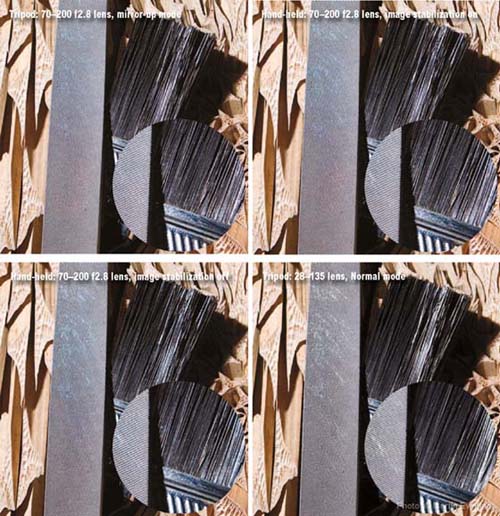
Figure 2.30 This shows the same subject that was shot in Figure 2.29, this time showing the difference between four methods of shooting, using the Canon EOS 1Ds MkIII at a 200 ISO setting with an exposure of 1/60th second at f7.1. The top left example was shot on a tripod using an EF 70–200 mm lens in mirror-up mode. Next to it, on the right, is a hand-held version shot with the lens image stabilization switched on and, bottom left, a shot taken with the image stabilization switched off. The bottom right picture shows the same subject photographed on a tripod, but with a less expensive Canon zoom lens.
Noise reduction
Noise is something that affects all digital images. If you shoot at the optimum ISO rating the chances are you won't even see any noise, but as you increase the ISO rating the noise will soon become noticeable. The presence of noise in an image is due to the fact that when you increase the ISO setting, this increases the gain sensitivity of the sensor (which bear in mind is actually an analog device). The amplification of the signal coming from the sensor increases its sensitivity (and therefore its ISO rating), but it also amplifies the random background noise and this is where we start to see more noise in our captures. There are two problems to address here. One is the random color speckles and the other is the clumpy grain-like pattern that you see when you inspect an image in close-up.
Photoshop noise reduction
There are two ways to address noise inside Photoshop. Firstly, there are the Detail panel noise reduction sliders in Camera Raw. These can remove noise from most types of images (the noise reduction algorithm has been much improved since Camera Raw 4.1). The other option is to process images in Photoshop directly using the Reduce Noise filter, which offers some extra fine-tuning controls to help combat noise. Overall, we reckon the Camera Raw Detail panel is the more appropriate tool to use as your first port of call. The Reduce Noise filter is suitable for treating any particularly noisy digital captures that Camera Raw can't fix. We also recommend the extra steps described over the next few pages which show how the Reduce Noise filter can be targeted more precisely to affect those areas that need noise reduction the most.
Third-party noise reduction
Although the tools in Photoshop are pretty good, they are still not a match for some of the third-plug-ins out there, such as Noiseware™ by Imagenomic® and Noise Ninja™ by PictureCode®. Most of our experience has been with using Noiseware, which is excellent at removing really tricky noise as well as reducing film grain.
Targeted noise reduction
The following steps are derived from a technique described by Bruce Fraser in his book Real World Sharpening with Adobe Photoshop CS2, published by Peachpit. These steps show you how to mask a Reduce Noise filter layer so that the edge detail is preserved and does not suffer from the softening effect of the noise reduction process.
1 Here is a close-up view of an underexposed and unsharpened digital capture that was shot at 1250 ISO. You can clearly see a lot of luminance and color noise in this picture.
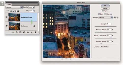
2 The first step was to make a duplicate copy of the Background layer (you can do this by dragging the Background layer down to the New Layer button). I then applied the Reduce Noise filter, adjusting the settings to remove as much of the luminance and color noise as possible. You have to be careful to not set the Reduce Color Noise setting too high, as this can cause strong colors to bleed slightly.
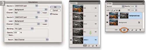
3 I now wanted to create a protection mask for the Background copy layer that would help preserve more of the edge detail. I chose Image ➯ Calculations and configured the dialog as shown here. Basically, I created a new Alpha channel that was a blend of the Red and Green channels, using the Pin Light blend mode. The Alpha 1 channel appeared in the Channels panel and I dragged this to the Make New Selection button to load as a selection, and clicked on the Add Layer Mask button (circled) in the Layers panel to convert this active selection into a layer mask for the Background copy layer.

4 The mask was now ready for editing. I went to the Filter ➯ Stylize menu and chose Find Edges. This was then followed by a Gaussian Blur filter of between 3–5 pixels plus a Curves adjustment, which lightened the mask slightly. The idea here is that darker shades of gray in the layer mask hide the layer contents and the lighter areas of the mask allow more of the layer to be revealed.
5 Here is the final result, in which the Background copy layer that had been processed using the Reduce Noise filter was masked by a layer mask that hid the edges more and kept these from being filtered.
Removing noise using multiple exposures
Here is an alternative technique for reducing noise that makes use of the Stacks feature in Photoshop, where you can blend a series of identically shot photographs to produce a single image where all the noise artifacts are smoothed out. Note: you can only use the following technique if you have the extended version of Photoshop CS3 or CS4 and this technique works best for those situations where you are shooting pictures of still-life subjects in low light conditions but don't have access to a tripod.
Here's how it works. Once you have aligned the photos using the auto-align method described here, the Median Stacks rendering method averages out the pixels at each point in the image. What you end up with is an image that will not only be noise-free, but may well appear to be smoother and sharper than the individual captures. This is because the rendering process will also smooth out those shots where there was a slight amount of blur. There is also another Stacks processing technique described later in Chapter 3, but this too can only work if you have the extended version of Photoshop.

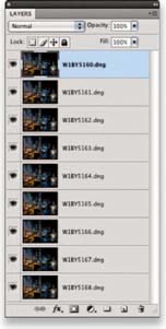
1 To begin with, I made a selection of nine photographs in Bridge that I wished to process as a Stacked layer image. These pictures were all shot at night where I had simply hand-held the camera and fired off a short sequence of captures.

2 The first step was to open these photographs up in Camera Raw (using ![]()
![]() ). I adjusted the White Balance plus other Basic panel adjustments and synchronized these settings with the other selected photos by choosing ‘Select All’ in the Camera Raw dialog, before clicking on the Synchronize… button. I then clicked the Done button to close the Camera Raw dialog and apply the settings.
). I adjusted the White Balance plus other Basic panel adjustments and synchronized these settings with the other selected photos by choosing ‘Select All’ in the Camera Raw dialog, before clicking on the Synchronize… button. I then clicked the Done button to close the Camera Raw dialog and apply the settings.

3 I then went to the Tools menu in Bridge and chose Photoshop ➯ Load files into Photoshop Layers… This opened the selected photos in Photoshop and added them as layers to a single image document. How the images were opened depended on the workflow settings I had set in Step 2 (circled). In this instance the photographs were all processed at their native resolution using ProPhoto RGB at a bit depth of 16-bits per channel.


4 Since the photographs had all been captured using the camera hand-held, it was important to make sure that the layers were aligned correctly. I selected all the layers in the Layers panel, went to the Edit menu and chose Auto-Align Layers… This opened the dialog shown here, where I checked the Auto option and clicked OK.

5 Here you can see the auto-aligned image. I now needed to go to the Layer menu and choose Smart Objects ➯ Convert to Smart Object. This created the single Smart Object layer you can see here on the left, but if I were to double-click the layer thumbnail I would see all the original layers that comprised my Smart Object.
I then went to the Layer menu again and chose Smart Objects ➯ Stack Mode ➯ Median. If you try this out for yourself, you may find the Stacks rendering will take a while to complete. How long it takes to apply the processing will depend of course on the size and number of layers, plus the bit depth of the image.

6 Once the processing was complete, you will notice how the Smart Object layer had a Stacks icon (circled) indicating that the Smart Object had been rendered using the Stacks feature. Here is a close-up view that shows a single exposure on the left and the Stacks rendered version on the right where the nine separate exposures were merged to produce a smoother, noise-free image. The Median rendering was used here because it analyzed the pixel values from the lowest to the highest that occurred at any one point and picked the middle value, thereby eliminating nearly all of the noisy pixels that were present on each of the separate layers.

Sculpting photos
Photography has always sought to represent three-dimensional scenes and objects in a two-dimensional medium. The most successful images tend to have an enhanced sense of shape and volume but mother nature doesn't always cooperate and provide the perfect light. Then it's up to the photographer to bring out the shape and volume using Photoshop. There are a lot of tools in Photoshop to help with that task, but sometimes it's best to use an alternative approach. Mac Holbert has perfected this technique (although others have used variations) to bring out the three-dimensional shape to images he prints for customers. It does employ a certain degree of brush work by hand (which always make me nervous since I can't draw) but if I can do it, pretty much anybody can. You're always able to use Photoshop's extensive array of selection techniques to help in the painting.
The sculpting technique uses a layer set to Overlay blend mode and filled with a 50% gray to start. Since overlay is a procedural blend, it screens when above 50% gray and multiplies below 50% gray. The starting gray layer does nothing until you paint with black or white. The key is to do so very gently in order to enhance the natural shape and forms already in the image. See Figure 2.31 for a before and after.
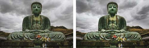
Figure 2.31 The image on the left is prior to sculpting. The image on the right is the result. The result of sculpting cannot be exactly duplicated using adjustment layers — it's really a unique solution for adding shape and volume to an image.

1 To begin with, I made a new empty layer on top of the Smart Object layer. The fact that the raw image was a Smart Object meant that I would always be free to go back to the raw image to tweak it (although I didn't need to here). The empty layer was filled with a 50% gray and the blend mode was set to Overlay. Thereafter, when I painted with white into the Overlay layer it would lighten by screening and darken when painting with black by multiplying the image data underneath.
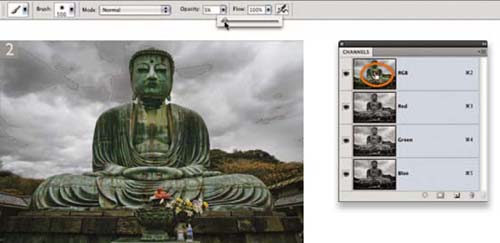
2 To allay my natural fear of painting, I started the process by making a luminance selection of the darker areas I wanted to enhance (to load the luminance as a selection hold the ![]() key and click on the RGB channel). Since the 50% gray layer was set to 100% opacity, I needed to work gently and set the brush flow to only 5%. Much of the subsequent work was actually done with the flow set to 1–3%. I started painting into the selection using white as the foreground color. I also inverted this selection and painted with black to increase the separation between the areas. I used the
key and click on the RGB channel). Since the 50% gray layer was set to 100% opacity, I needed to work gently and set the brush flow to only 5%. Much of the subsequent work was actually done with the flow set to 1–3%. I started painting into the selection using white as the foreground color. I also inverted this selection and painted with black to increase the separation between the areas. I used the ![]() key to toggle back and forth between painting with black or white as shown in Figure 2.32. Lightening an area tends to visually make it move closer while darkening makes it recede. Thus by lightening and darkening adjacent areas I could increase the appearance of dimensionality.
key to toggle back and forth between painting with black or white as shown in Figure 2.32. Lightening an area tends to visually make it move closer while darkening makes it recede. Thus by lightening and darkening adjacent areas I could increase the appearance of dimensionality.
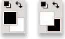
Figure 2.32 Setting the foreground color to black will darken the image while white will lighten. To toggle back and forth between the colors be sure to reset the colors then simply press the ![]() key to toggle back and forth.
key to toggle back and forth.


4 Not everything I needed to do could be done with a synthetic selection or by freehand painting. In this step I created a path to outline the Buddha and then made a selection from the path. The 1.2 feather radius was used to approximate the resolution of the edges in the image. If the selection was too sharp it would look like a cut-out and if too soft it would bleed the effects. A 1.2 feather radius matched the sharpness of the natural edge. By inverting the selection I could work on the sky or, by inverting again, work on the Buddha.

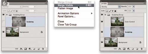
6 One of the inherent problems with using an Overlay blend mode to sculpt an image is that when increasing the contrast of an image, you may also get a boost in the color saturation. To control that I created a merged layer set to Color blend inside of a layer group. I deselected the Overlay layer and held the ![]() key when selecting the Merge Visible option in the Layers panel. Placing the Color Control layer above the Overlay layer essentially removed the color saturation boost. I didn't bother with a layer mask for the Sculpting layer because it was really easy to get rid of the black and white in the layer by changing the foreground color to a 50% gray and painting or filling to reduce the effect of the layer.
key when selecting the Merge Visible option in the Layers panel. Placing the Color Control layer above the Overlay layer essentially removed the color saturation boost. I didn't bother with a layer mask for the Sculpting layer because it was really easy to get rid of the black and white in the layer by changing the foreground color to a 50% gray and painting or filling to reduce the effect of the layer.


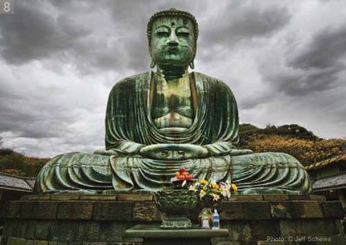
8 Here is the final result. The original image of the Diabusu Buddha in Kamakura, Japan, was shot with a Canon EOS 1Ds with a 16–35mm F2.8 lens.
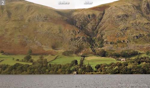
Improving midtone contrast
Normal image contrast adjustments affect the image globally, but if you wish to improve the contrast in the midtone areas you can use the following two techniques in Photoshop to add more presence to your images.
The first one is designed to specifically target the midtone areas by applying a small, soft halo edge to the midtones only. The second technique allows you to apply a wider, softer halo edge, which can help improve the contrast in areas that have soft detail. The Clarity slider in Camera Raw basically offers a hybrid of these two types of adjustment. By showing here the individual Photoshop methods that make up Clarity, you can learn how to apply more controlled Clarity type enhancements to your photographs. So instead of having just one slider to improve clarity, you can effectively have three slider controls at your disposal. We don't suggest you need to do this with every image, but you may find with subjects such as softly-lit landscape subjects that these steps give you added control to help make the detail stand out more.
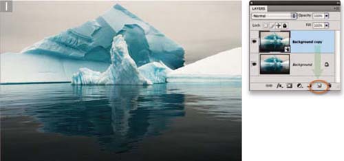
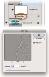
1 Here we wanted to demonstrate how the medium contrast technique could be applied to a photograph as a Smart Filter. To begin with, we dragged the Background layer to the New layer button in the Layers panel. We then went to the Filter menu and chose Convert for Smart Filters.


3 Now that we had applied the High Pass filter, we needed to change the layer blend mode setting to Overlay. To do this we double-clicked on the Background copy layer, targeting the blank space area (this is the area within the green box and not the thumbnail or the layer name itself). We set the blend mode to Overlay and, at the same time, went to the Blend If options at the bottom and adjusted the ‘This Layer’ sliders so that they were split as shown above: 50/100 150/200 (to set the sliders like this you have to hold down the ![]() key to split them apart).
key to split them apart).
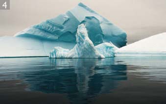
5 Here you can see a close-up view showing how the photograph looked after it had been processed using this technique, compared with how it looked before. The difference is quite subtle, but you should be able to see how it has enhanced the contrast in the midtone areas. Note how the ripples in the water are also better defined in the right half of the picture.
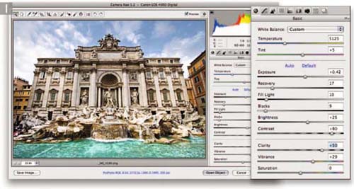
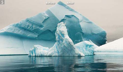
High radius Unsharp Mask technique
We know from experience that if we add contrast to a photograph we can make it stand out more. However, bumping up the contrast or adding an ‘S’ shaped curve can only do so much to improve the ‘global’ appearance of a photograph. If you add too much contrast, you can all too easily destroy the delicate tonal balance and ruin a perfectly good picture. The technique described here is one that will allow you to add contrast at a localized level.
It so happens that the human eye is more attuned to localized changes in contrast and it was knowledge of this phenomenon that led Thomas Knoll at Adobe to propose a localized contrast enhancement technique based around the formula of using a high Radius and low Amount setting in the Unsharp Mask filter dialog. This in turn led Thomas to devise the new Clarity control for Adobe Camera Raw 4.1 and Lightroom 1.1 (incidentally, Michael Reichmann has written an excellent article outlining this technique, and Thomas Knoll's thinking behind it, on the Luminous-Landscape.com website). As I mentioned on page 37, the Clarity adjustment combines the technique shown here with the midtone contrast technique described on pages 67–69. Even so, the ‘high Radius/low Amount’ is so effective when it's applied on its own that I thought it would be useful to share, especially since it is only in Photoshop that you have the ability to selectively apply the effect. In the following examples you can apply these as a Smart Filter and use the Smart Filter layer mask to hide or show the effect.
In the example shown opposite, I chose a photograph where the atmospheric haze had softened the detail on the shore and hillside in the distance. Here, you will notice how the low Amount setting combined with a high Radius created a soft shadow halo around the edges of the picture, which helped remove a lot of the haze.

1 The first step was to choose Filter ➯ Sharpen ➯ Unsharp Mask and set the Radius to a really high value, such as between 30 and 70. This is a much higher Radius value than you would use normally and the trick is to keep the Amount slider to a low setting so that you don't end up applying too strong an effect.

2 This shows a 100% view, where you can see on the left the before version and on the right how the photograph looked after I had applied the Unsharp Mask filter. The difference can be quite dramatic. In this particular example the end result was like lifting a veil from in front of the lens.