In this chapter we are going to create most of our Gatsby site, which includes the Navbar, the images, banner text, buttons, and the footer section. We are also going to deploy it to Netlify and show a nice Gallery section.
Navbar
We will start by creating the Navbar.
Basic Setup
Create a folder globals inside the components folder, and then add a navbar folder in it. Then create four files inside the navbar folder: Navbar.js, NavbarIcons.js, NavbarLinks.js, and NavbarHeader.js.
Put the content shown in Listing 2-1 in the Navbar.js file.
import React, { Component } from 'react'
import NavbarHeader from './NavbarHeader'
import NavbarLinks from './NavbarLinks'
import NavbarIcons from './NavbarIcons'
class Navbar extends Component {
render() {
return (
<nav>
<NavbarHeader />
<NavbarLinks />
<NavbarIcons />
</nav>
)
}
}
export default Navbar
Listing 2-1
New file Navbar.js
Next, add the following content in the NavbarIcons.js file. We are adding only the basic content now, as in shown in Listing 2-2.
import React, { Component } from 'react'
class NavbarIcons extends Component {
render() {
return (
<div>
component NavbarIcons
</div>
)
}
}
export default NavbarIcons
Listing 2-2
New file NavbarIcons.js
Next, add the content shown in Listing 2-3 in the NavbarLinks.js file.
import React, { Component } from 'react'
class NavbarLinks extends Component {
render() {
return (
<div>
component NavbarLinks
</div>
)
}
}
export default NavbarLinks
Listing 2-3
New file NavbarLinks.js
Next, put the content shown in Listing 2-4 into the NavbarHeader.js file.
import React, { Component } from 'react'
class NavbarHeader extends Component {
render() {
return (
<div>
component NavbarHeader
</div>
)
}
}
export default NavbarHeader
Listing 2-4
New file NavbarHeader.js
Now, because all the components are created, we will see the Navbar in the layout.js file. The updated code is shown in bold in Listing 2-5.
import React from "react"
import PropTypes from "prop-types"
import { createGlobalStyle } from 'styled-components'
import Navbar from "./globals/navbar/Navbar"
const Layout = ({ children }) => {
return (
<GlobalStyle />
<Navbar />
<main>{children}</main>
)
}
...
...
Listing 2-5
Updating layout.js to show Navbar
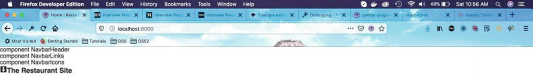
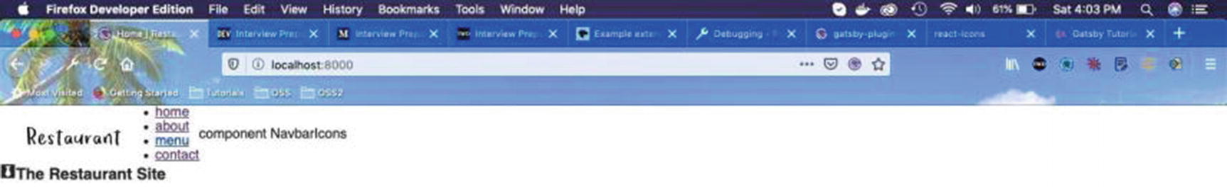
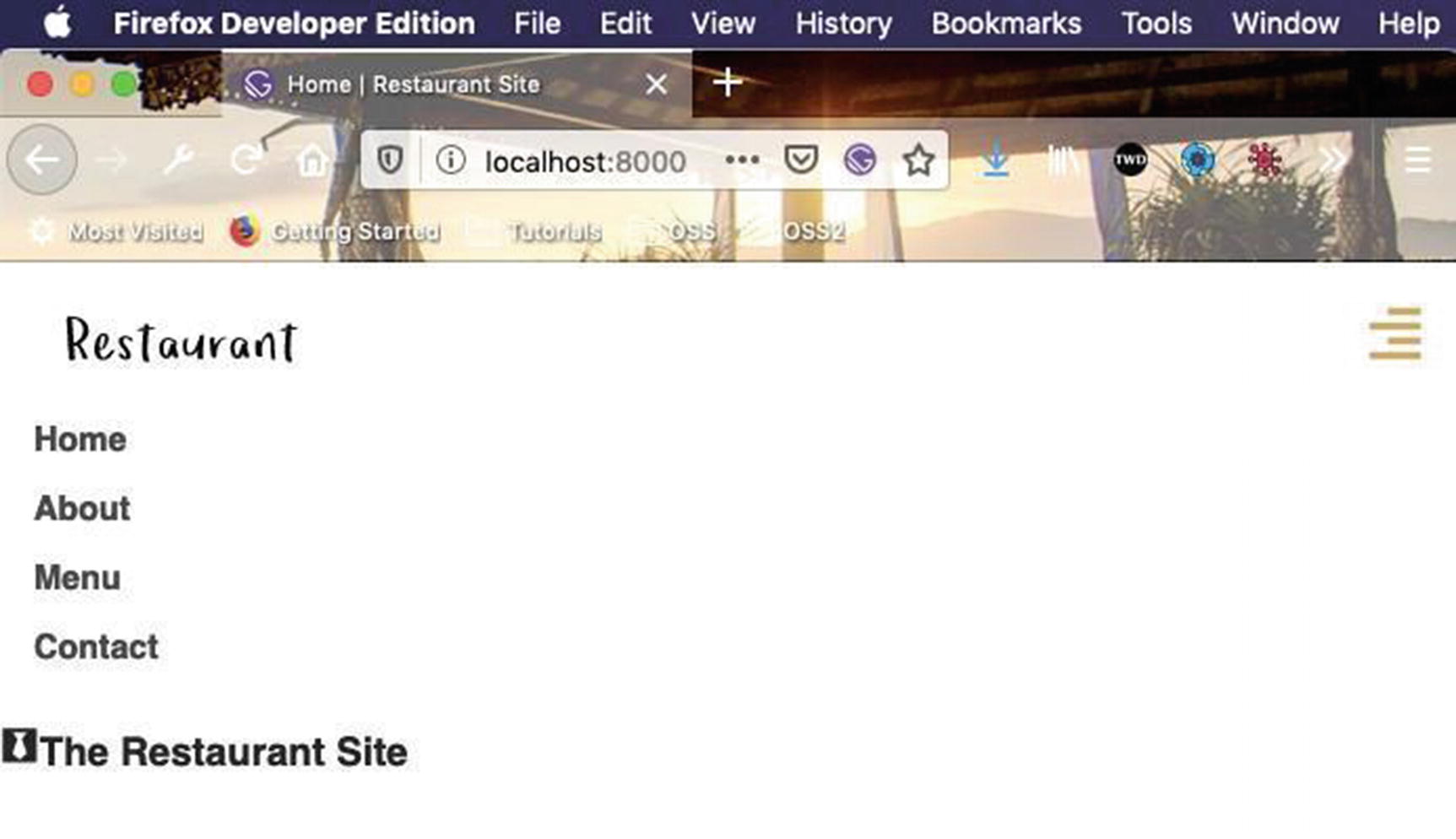
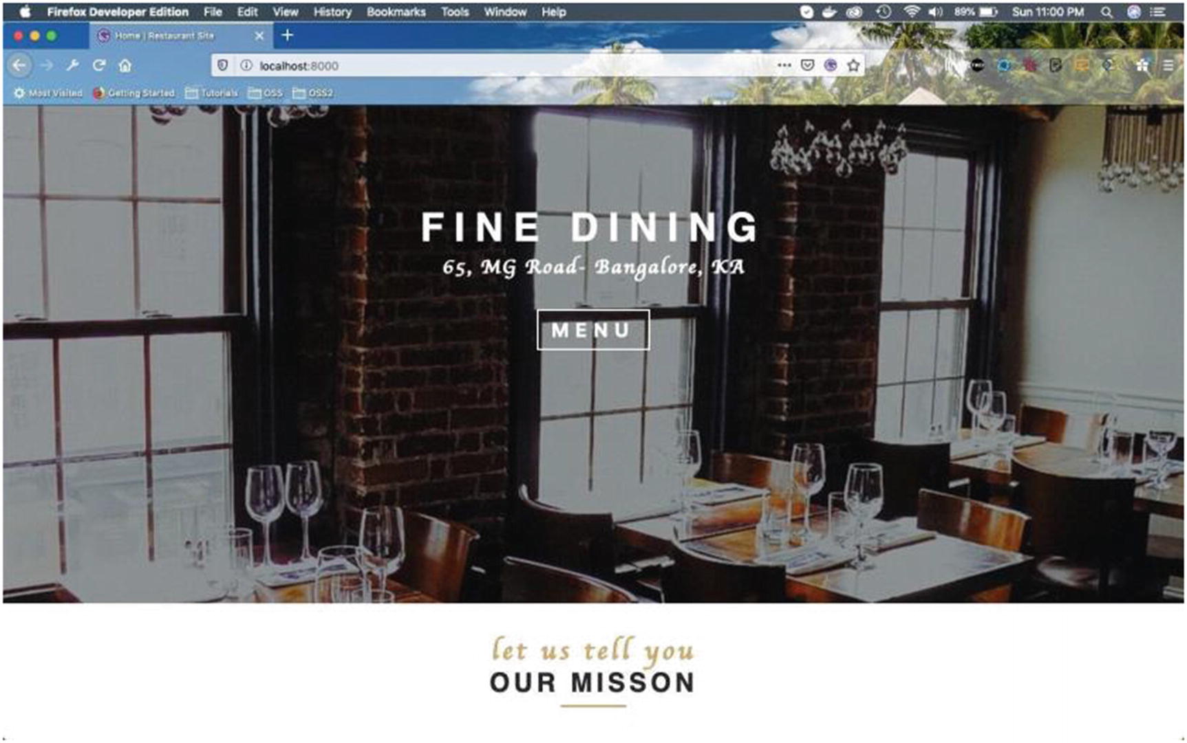
Our Navbar is showing perfectly in localhost (Figure 2-1).
Figure 2-1
localhost
Next, we will add NavWrapper styles for smaller screens in the Navbar.js file, by using styled-components.
We are also creating a state variable navbarOpen, which we are passing as props to the NavbarLinks component. We are also creating a function handleNavbar(), which has been used to set the state. We are passing it to the NavbarHeader component. The updated code is shown in bold in Listing 2-6.
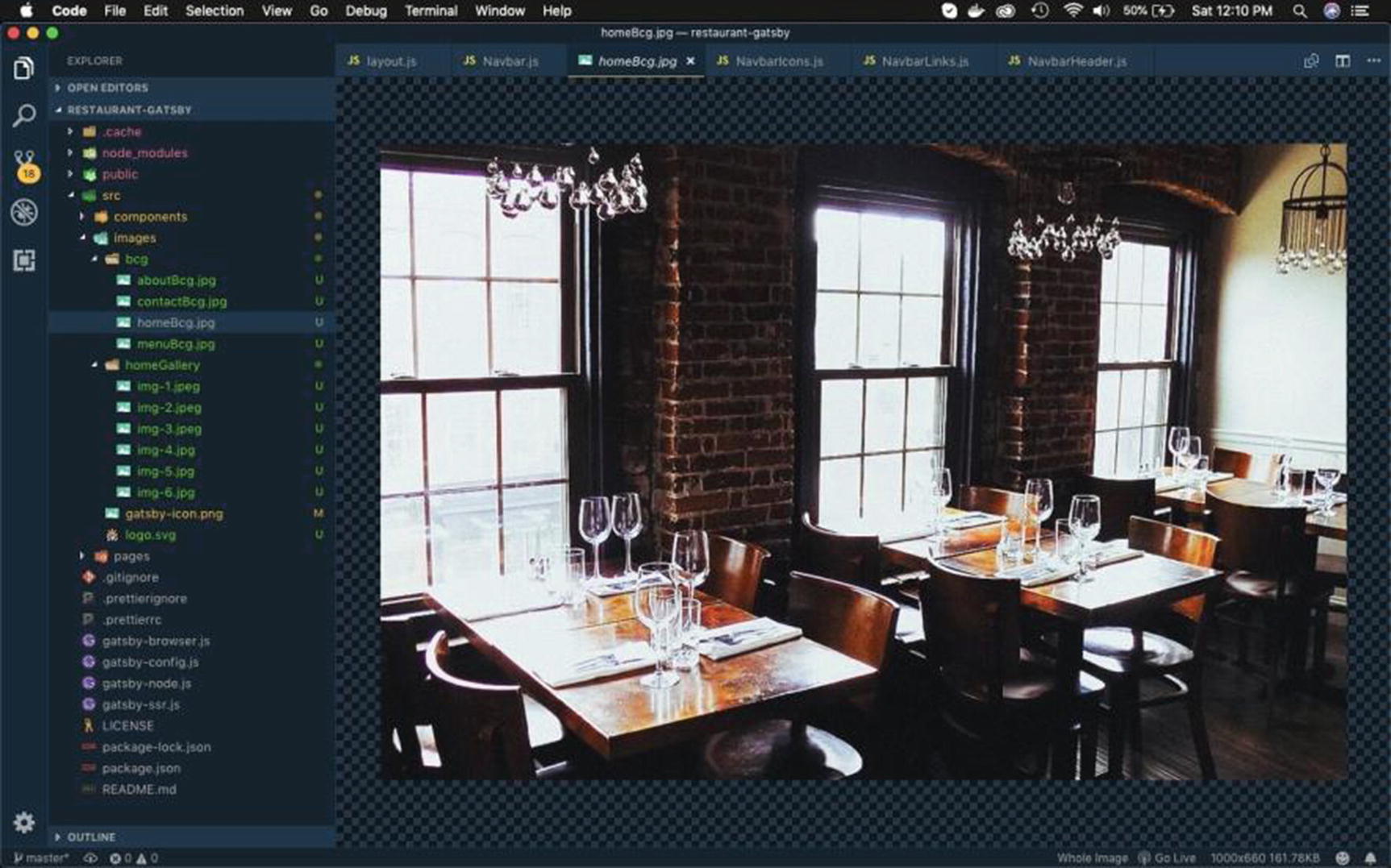
I have also added new pictures to the project in the images folder (Figure 2-2). You can take them from the GitHub link at the end of the post.
Figure 2-2
Images
NavbarHeader Component
Next, let’s complete our NavbarHeader component. Navigate to the NavbarHeader.js file and update the code as shown in Listing 2-7.
Here, we are getting the props handleNavbar and passing it as a callback function when we click on the FaAlignRight icon.
We have also added a styled component HeaderWrapper and inside it given styles for toggle-icon. Notice that we are not displaying the toggle-icon on larger screens.
import React from 'react'
import { Link } from 'gatsby'
import logo from '../../../images/logo.svg'
import { FaAlignRight } from 'react-icons/fa'
import styled from 'styled-components'
export default function NavbarHeader({ handleNavbar }) {
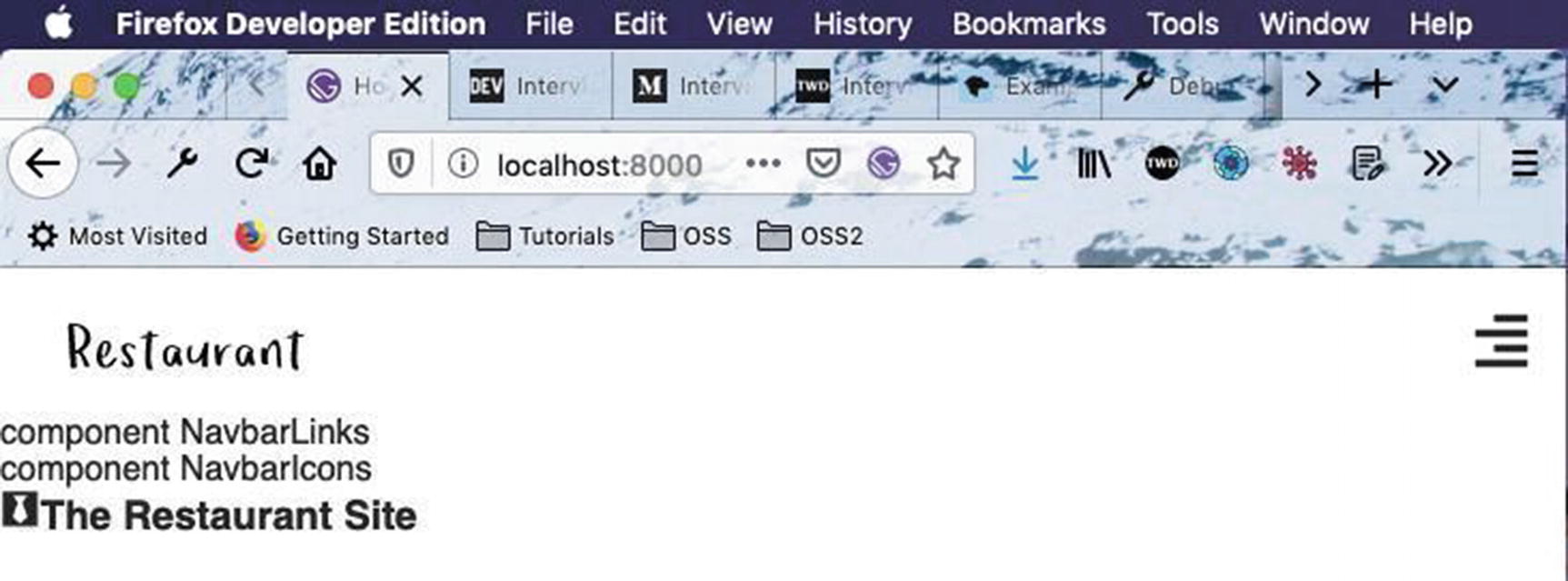
Now, our site looks like Figure 2-3 on larger screens.
Figure 2-3
Larger screens
Figure 2-4 shows how it will display on smaller screens. Notice that the toggle icon is displayed on this screen.
Figure 2-4
Smaller screens
We will start creating generic styled components here so that we don’t have to create different styles in each project. These styles are also reusable in other parts of the project.
Create a folder named utils inside the src folder. Create a file named styles.js inside the utils folder and add the content from Listing 2-8 in the file.
export const colors = {
mainWhite: `#fff`,
mainBlack: `#262626`,
mainYellow: `#d2aa5c`,
mainYellow2: `#F2AF29`,
mainGrey: `#474747`,
}
Listing 2-8
New file styles.js
We will soon have other files inside the utils folder. Create a root file index.js inside it and add the content shown in Listing 2-9 in it.
import * as styles from './styles'
export { styles }
Listing 2-9
New file index.js inside utils folder
Let’s now use the styles in the NavbarHeader.js file. The updated code is shown in bold in Listing 2-10.
...
import styled from 'styled-components'
import { styles } from '../../../utils'
export default function NavbarHeader({ handleNavbar }) {
return (
<HeaderWrapper>
...
...
</HeaderWrapper>
)
}
const HeaderWrapper = styled.div`
padding: 0.4rem 1rem;
display: flex;
align-items: center;
justify-content: space-between;
.toggle-icon {
font-size: 1.75rem;
color: ${styles.colors.mainYellow};
cursor: pointer;
}
@media (min-width: 768px) {
.toggle-icon {
display: none;
}
padding: 0.4rem 1rem;
}
`
Listing 2-10
Using new styles in NavbarHeader.js
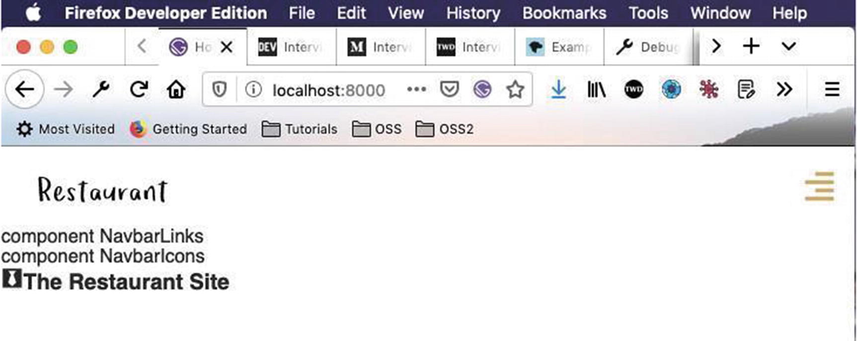
Now, the Toggle bar shows the mobile menu in yellow (Figure 2-5).
Figure 2-5
Toggle bar
NavbarLinks Component
Next, we will start working on the NavbarLinks.js file. We will first add some more imports and a new state variable in the file.
Next, we will render this state variable links by using a map. We are also using the props navbarOpen in the styled component LinkWrapper. The code for these is shown in Listing 2-11.
import React, { Component } from 'react'
import styled from 'styled-components'
import { Link } from 'gatsby'
import { styles } from '../../../utils'
class NavbarLinks extends Component {
state = {
links: [
{
id: 0,
path: '/',
name: 'home',
},
{
id: 1,
path: '/about/',
name: 'about',
},
{
id: 2,
path: '/menu/',
name: 'menu',
},
{
id: 3,
path: '/contact/',
name: 'contact',
},
],
}
render() {
return (
<LinkWrapper open={this.props.navbarOpen}>
{this.state.links.map(item => {
return (
<li key={item.id}>
<Link to={item.path} className="nav-link">
{item.name}
</Link>
</li>
)
})}
</LinkWrapper>
)
}
}
const LinkWrapper = styled.ul`
`;
export default NavbarLinks
Listing 2-11
Adding state and rendering it in NavbarLinks.js
It will show our new links on smaller screens (see Figure 2-6), but we need to style them.
Figure 2-6
Links displayed on a smaller screen
We will add simple styles for the menu including hover style in the styled component LinkWrapper as shown in Listing 2-12.
const LinkWrapper = styled.ul`
li {
list-style-type: none;
}
.nav-link {
display: block;
text-decoration: none;
padding: 0.5rem 1rem 0.5rem 1rem;
color: ${styles.colors.mainGrey};
font-weight: 700;
text-transform: capitalize;
cursor: pointer;
${styles.transDefault};
&:hover {
background: ${styles.colors.mainGrey};
color: ${styles.colors.mainYellow};
padding: 0.5rem 1rem 0.5rem 1.3rem;
}
}
`;
Listing 2-12
Styles for menu in NavbarLinks.js
We also need to add a new style for transitions in the styles.js file. The updated code is shown in bold in Listing 2-13.
It shows our menu correctly with a hover effect (Figure 2-7).
Figure 2-7
Hover effect
We will now add the logic to toggle the menu on a smaller screen. We will be using the open for this, which we are passing to the LinkWrapper styled component. The props navbarOpen is initially false and will change to true once we click the Menu button. The updated code is shown in bold in Listing 2-14.
The code is now working perfectly in localhost when the Menu button is clicked (Figure 2-8).
Figure 2-8
Gif
You can find the code for this project in the GitHub repo at https://github.com/nabendu82/restaurant-gatsby. We will continue working on the Navbar in this part, first by adding a transition to the styles.js file.
We are using es6 default parameters here, so if we pass an empty object we will get these default values. The updated code is shown in bold in Listing 2-16.
export const transObject = ({ property = 'all', time = '0.5s', type = 'ease-in-out' }) => {
return `transition:${property} ${time} ${type}`
}
Listing 2-16
Adding transObject in styles.js
Next, let’s use it in the NavbarLinks.js file. We are changing the time to 1s, and the property and the type fields will be taken from the default parameters. The updated code is shown in bold in Listing 2-17.
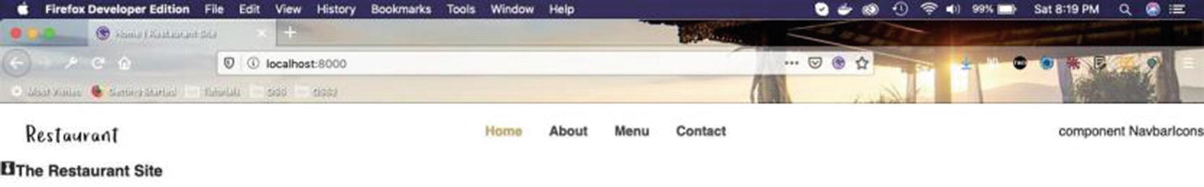
Styling Navbar for bigger screens in NavbarLinks.js
Now, our Navbar displays perfectly on bigger screens (Figure 2-9).
Figure 2-9
Navbar
NavbarIcons Component
Next, we will start with our NavbarIcons component, where we will add our social media links. Open your NavbarIcons.js file and make the updates that follow.
Here, we are using code similar to that used for the NavbarLinks component. We will first import some react-icons and styled components. Then we create a state object with three social media icons. After that, we loop through the icons and render it.
Next, we will add styles for these icons. We are not going to show these icons on small screens, so we will make display: none for it. The code for this is given in Listing 2-19.
import React, { Component } from 'react'
import { FaInstagram, FaTwitter, FaFacebook } from 'react-icons/fa'
Now, our project will look like Figure 2-10 on larger screens.
Figure 2-10
Larger screen display
Those icons will not be shown on smaller screens (Figure 2-11).
Figure 2-11
Smaller screens
Let’s create the pages for these new links. We will create basic content now and then to create the whole component later.
First create the fileabout.js in the pages folder and include the basic content shown in Listing 2-20 in it.
import React from "react"
import Layout from "../components/layout"
import SEO from "../components/seo"
const AboutPage = () => {
return (
<Layout>
<SEO title="About" />
<h3>About Page</h3>
</Layout>
)
}
export default AboutPage
Listing 2-20
New file about.js
Next, create a file namedcontact.js inside the pages folder and inclue the content in Listing 2-21 in it.
import React from 'react'
import Layout from "../components/layout"
import SEO from "../components/seo"
const ContactPage = () => {
return (
<Layout>
<SEO title="Contact" />
<h3>Contact Page</h3>
</Layout>
)
}
export default ContactPage
Listing 2-21
New file contact.js
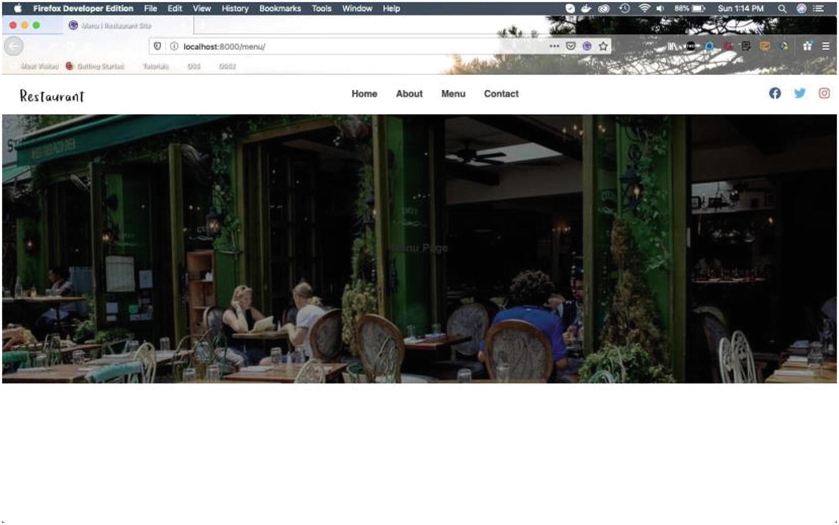
Next, create a file named menu.js inside the pages folder. Include the content shown in Listing 2-22 in the file.
import React from 'react'
import Layout from "../components/layout"
import SEO from "../components/seo"
const MenuPage = () => {
return (
<Layout>
<SEO title="Menu" />
<h3>Menu Page</h3>
</Layout>
)
}
export default MenuPage
Listing 2-22
New file menu.js
After checking, all four pages should be working perfectly (Figure 2-12).
Figure 2-12
Contact page
Displaying a Center Image
We will next start to work on displaying a center image on the home page. First add a new file Header.js inside the utils folder and include the content shown in Listing 2-23 in the file.
We are taking img and children as props and showing a styled-component IndexHeader. We are also importing the img and using it as default props at Line 18, which will allow you to show the image even if it is not supplied by the parent component.
Next, let’s add this HomeHeader to the index.js file inside the utils folder. The updated content is shown in bold in Listing 2-24.
import * as styles from './styles'
import { HomeHeader } from './Header'
export { HomeHeader, styles }
Listing 2-24
Exporting HomeHeader from index.js, inside the utils folder
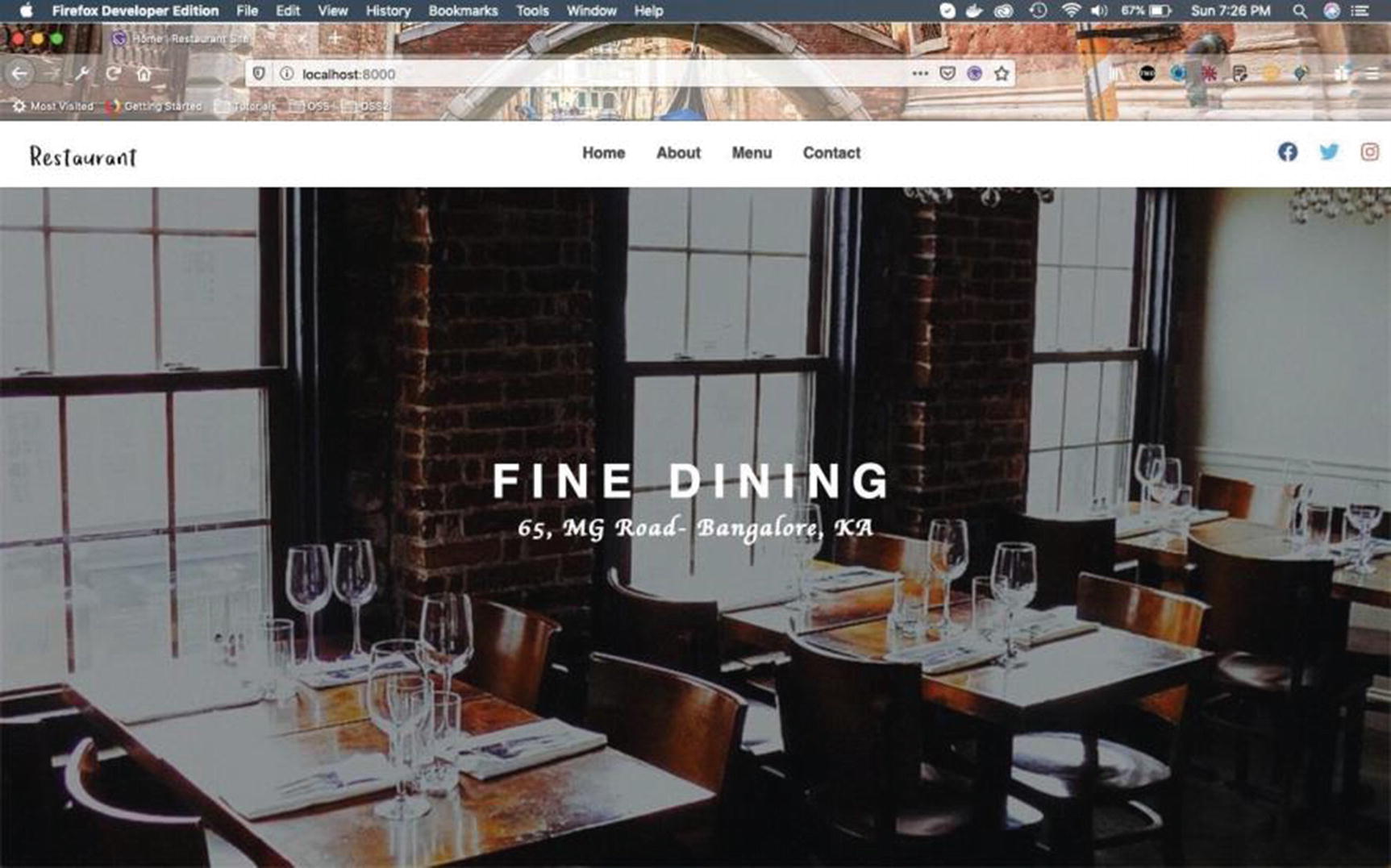
Now, we will use this in our index.js file inside the pages folder, to display it on the home screen. The updated content is shown in bold in Listing 2-25.
import React from "react"
import Layout from "../components/layout"
import { HomeHeader } from "../utils"
import img from '../images/bcg/homeBcg.jpg'
import SEO from "../components/seo"
const IndexPage = () => (
<Layout>
<SEO title="Home" />
<HomeHeader img={img}>
<h3>The Restaurant Site</h3>
</HomeHeader>
</Layout>
)
export default IndexPage
Listing 2-25
Adding HomeHeader in index.js inside the pages folder
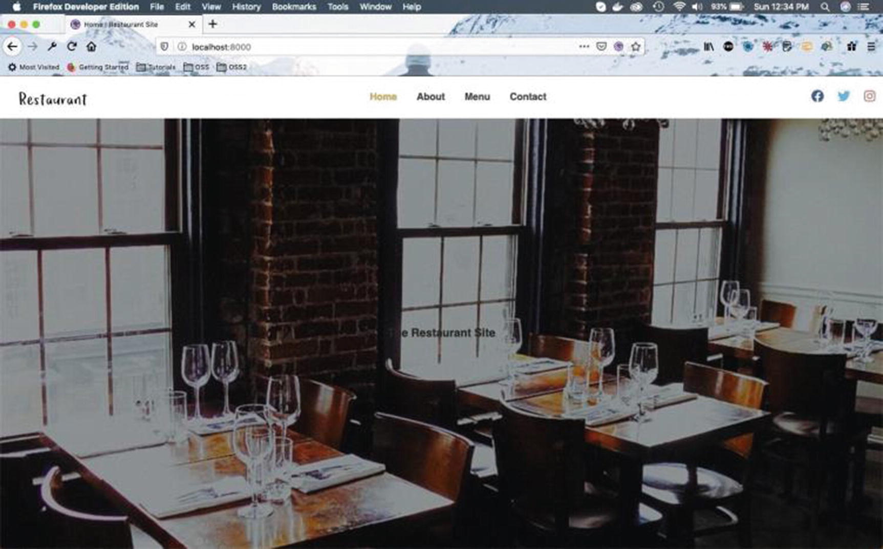
This displays the image on our home page, as shown in Figure 2-13.
Figure 2-13
Image displayed on the home page
Now, we will add the logic for other pages. Navigate to the Header.js file and add the changes shown in bold in Listing 2-26. We are adding a new component PageHeader, which is similar to HomeHeader but uses a different styled-component , DefaultHeader.
The styled-component DefaultHeader uses all the styles from IndexHeader except the minimum height.
After that, we are add PageHeader in default props and export. The updated content is shown in bold in Listing 2-26.
After that we add thePageHeader in the index.js file inside the utils folder. The updated content is shown in bold in Listing 2-27.
import * as styles from './styles'
import { HomeHeader, PageHeader } from './Header'
export { HomeHeader, PageHeader, styles }
Listing 2-27
Export PageHeader from index.js
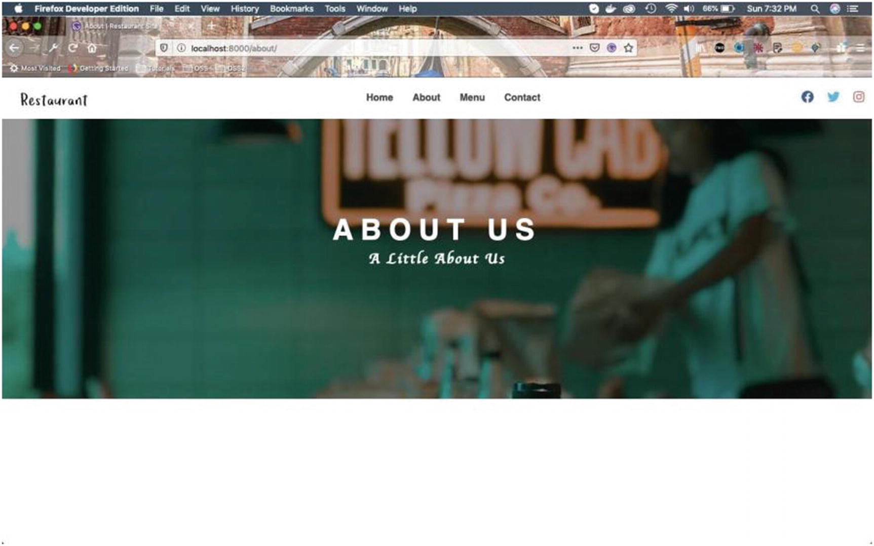
Next, let’s use the PageHeader in the about.js file inside the pages folder. The updated content is shown in bold in Listing 2-28.
import React from "react"
import Layout from "../components/layout"
import SEO from "../components/seo"
import { PageHeader } from "../utils"
import aboutImg from '../images/bcg/aboutBcg.jpg'
const AboutPage = () => {
return (
<Layout>
<SEO title="About" />
<PageHeader img={aboutImg}>
<h3>About Page</h3>
</PageHeader>
</Layout>
)
}
export default AboutPage
Listing 2-28
Using PageHeader in about.js
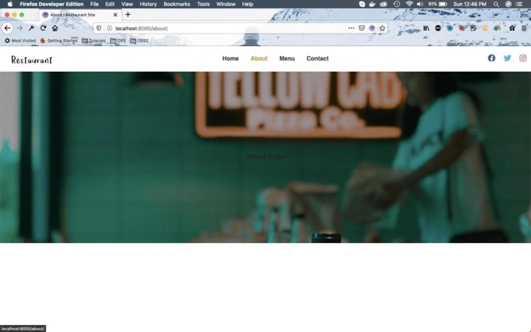
Now, our About page will show the image shown in Figure 2-14.
Figure 2-14
About page
Next, let’s use the PageHeader in the contact.js file inside the pages folder. The updated content is shown in bold in Listing 2-29.
import React from 'react'
import Layout from "../components/layout"
import SEO from "../components/seo"
import { PageHeader } from "../utils"
import contactImg from '../images/bcg/contactBcg.jpg'
const ContactPage = () => {
return (
<Layout>
<SEO title="Contact" />
<PageHeader img={contactImg}>
<h3>Contact Page</h3>
</PageHeader>
</Layout>
)
}
export default ContactPage
Listing 2-29
Using PageHeader in contact.js
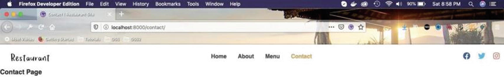
Now, our Contact page will display the contact image, as shown in Figure 2-15.
Figure 2-15
Contact page
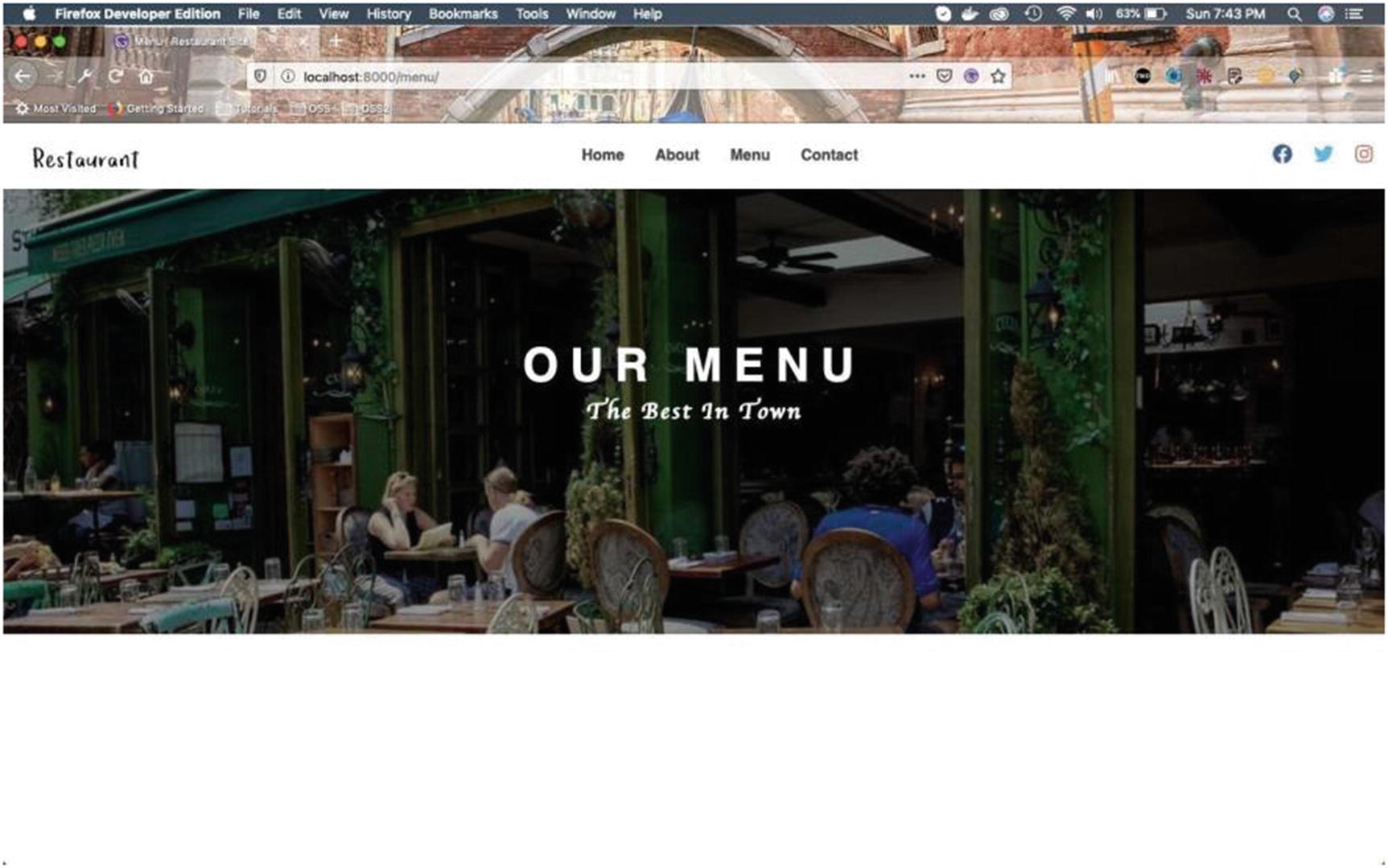
Next, let’s use the PageHeader in the menu.js file inside the pages folder. The updated content is shown in bold in Listing 2-30.
import React from 'react'
import Layout from "../components/layout"
import SEO from "../components/seo"
import { PageHeader } from "../utils"
import menuImg from '../images/bcg/menuBcg.jpg'
const MenuPage = () => {
return (
<Layout>
<SEO title="Menu" />
<PageHeader img={menuImg}>
<h3>Menu Page</h3>
</PageHeader>
</Layout>
)
}
export default MenuPage
Listing 2-30
Using PageHeader in menu.js
Our Menu page will show the menu image, as displayed in Figure 2-16.
Figure 2-16
Menu page
Banner Text and Button
In this section we will create components for banners and buttons. We are going to show these banners inside each image and will use buttons in multiple places.
Banner Component
We will now start creating banner components. This component will show the different text that is displayed inside each picture for each page.
Create a new file named Banner.js inside the utils folder and include the code shown in Listing 2-31 in the file. This component is quite similar to the Header component we created previously. We are taking three props—title, subtitle, and children—and displaying them in a styled-component BannerWrapper.
We are also using a default props for title, if not passed from the parent component. The content this file is given in Listing 2-31.
We are using some additional styles in this Banner.js file, so let’s create them in a styles.js file in the same folder. The updated content is shown in bold in Listing 2-32.
Next, let’s add this Banner to the index.js file inside the utils folder. The updated content is shown in bold in Listing 2-33.
import * as styles from './styles'
import { HomeHeader, PageHeader } from './Header'
import { Banner } from './Banner'
export { Banner, HomeHeader, PageHeader, styles }
Listing 2-33
Adding Banner component in index.js
Now, we will use this in our index.js file inside the pages folder to display it on the home screen. The updated content is shown in bold in Listing 2-34.
Now, the banner is showing perfectly on our home page, inside the photo (Figure 2-17).
Figure 2-17
Banner appearance on the home page
Next, let’s use the Banner in the about.js file inside the pages folder. The updated content is shown in bold in Listing 2-35.
import React from "react"
import Layout from "../components/layout"
import SEO from "../components/seo"
import { PageHeader, Banner } from "../utils"
import aboutImg from '../images/bcg/aboutBcg.jpg'
const AboutPage = () => {
return (
<Layout>
<SEO title="About" />
<PageHeader img={aboutImg}>
<Banner title="about us" subtitle="a little about us" />
</PageHeader>
</Layout>
)
}
export default AboutPage
Listing 2-35
Using Banner in about.js
Our About page will show the text we just added (Figure 2-18).
Figure 2-18
About page with text
Next, let’s use the Banner in the contact.js file inside the pages folder. The updated content is shown in bold in Listing 2-36.
import React from 'react'
import Layout from "../components/layout"
import SEO from "../components/seo"
import { PageHeader, Banner } from "../utils"
import contactImg from '../images/bcg/contactBcg.jpg'
const ContactPage = () => {
return (
<Layout>
<SEO title="Contact" />
<PageHeader img={contactImg}>
<Banner title="contact us" subtitle="let's get in touch" />
</PageHeader>
</Layout>
)
}
export default ContactPage
Listing 2-36
Using Banner in contact.js
Our Contact page will now display the contact text (Figure 2-19).
Figure 2-19
Contact page
Next, let’s use the Banner in the menu.js file inside the pages folder. The updated content is shown in bold in Listing 2-37.
import React from 'react'
import Layout from "../components/layout"
import SEO from "../components/seo"
import { PageHeader, Banner } from "../utils"
import menuImg from '../images/bcg/menuBcg.jpg'
const MenuPage = () => {
return (
<Layout>
<SEO title="Menu" />
<PageHeader img={menuImg}>
<Banner title="our menu" subtitle="The best in town" />
</PageHeader>
</Layout>
)
}
export default MenuPage
Listing 2-37
Using Banner in menu.js
Now, our Menu page will show the menu text added (Figure 2-20).
Figure 2-20
Menu page
Button Component
We will start this part by creating the banner button component. This will allow us to place a button within each picture below the banner text.
First, create a new file named Button.js inside the utils folder and include the content given in Listing 2-38 in the file. This is a simple component that has mainly a styled-component BannerButton.
We are using an additional style border in the this Button.js file, so let’s create it in styles.js in the same folder. Add the content in Listing 2-39 at the end of the styles.js file.
export const border = ({ width = '0.15rem', type = 'solid', color = 'white' }) => {
return `border:${width} ${type} ${color}`
}
Listing 2-39
New border style in styles.js
Next, let’s add this BannerButton to the index.js file inside the utils folder. The updated content is shown in bold in Listing 2-40.
Now, we will use BannerButton in our index.js file inside the pages folder to display it on the home page. Notice that we are using inline styling to center the button. The updated content for the same file is given in Listing 2-41.
import React from "react"
import Layout from "../components/layout"
import { HomeHeader, Banner, BannerButton } from "../utils"
Now, the banner button is displayed perfectly on our home page, inside the photo and below the banner text (Figure 2-21).
Figure 2-21
Banner button
Home Component
We will have different sections on our home page. Let’s create a folder named HomeComponents for it inside the components folder. After that, create a file named QuickInfo.js inside it and include the content in Listing 2-42 in the file.
import React, { Component } from 'react'
import { Section, Title } from '../../utils'
export default class QuickInfo extends Component {
render() {
return (
<Section>
<Title message="let us tell you" title="our misson" />
</Section>
)
}
}
Listing 2-42
New file QuickInfo.js
Next, we will create the Section component, which we are using in the QuickInfo component. Create a file named Section.js inside the utils folder and add the content given in Listing 2-43 in the file.
import styled from 'styled-components'
export const Section = styled.section`
padding: 2rem 0;
width: 90vw;
margin: 0 auto;
`
Listing 2-43
New utils file Section.js
Next, create a file named Title.js inside the utils folder and put the content given in Listing 2-44 in the file. We are taking the props message and title and styling them through a styled-component TitleWrapper.
Now, we will use QuickInfo in our index.js file inside the pages folder to display it on the home page. The updated content is shown in bold in Listing 2-46.
...
import SEO from "../components/seo"
import QuickInfo from '../components/HomeComponents/QuickInfo'
We will next create a button for the QuickInfo section. Let’s create a new button named SectionButton in the Button.js file in the utils folder. Here, we are reusing some of the styles from BannerButton and overriding some styles. The updated content is shown in bold in Listing 2-47.
Now, we will use SectionButton in our QuickInfo.js file inside the HomeComponents folder to display it on the home page. The updated content is shown in bold in Listing 2-49.
import React, { Component } from 'react'
import { Section, Title, SectionButton } from '../../utils'
export default class QuickInfo extends Component {
render() {
return (
<Section>
<Title message="let us tell you" title="our misson" />
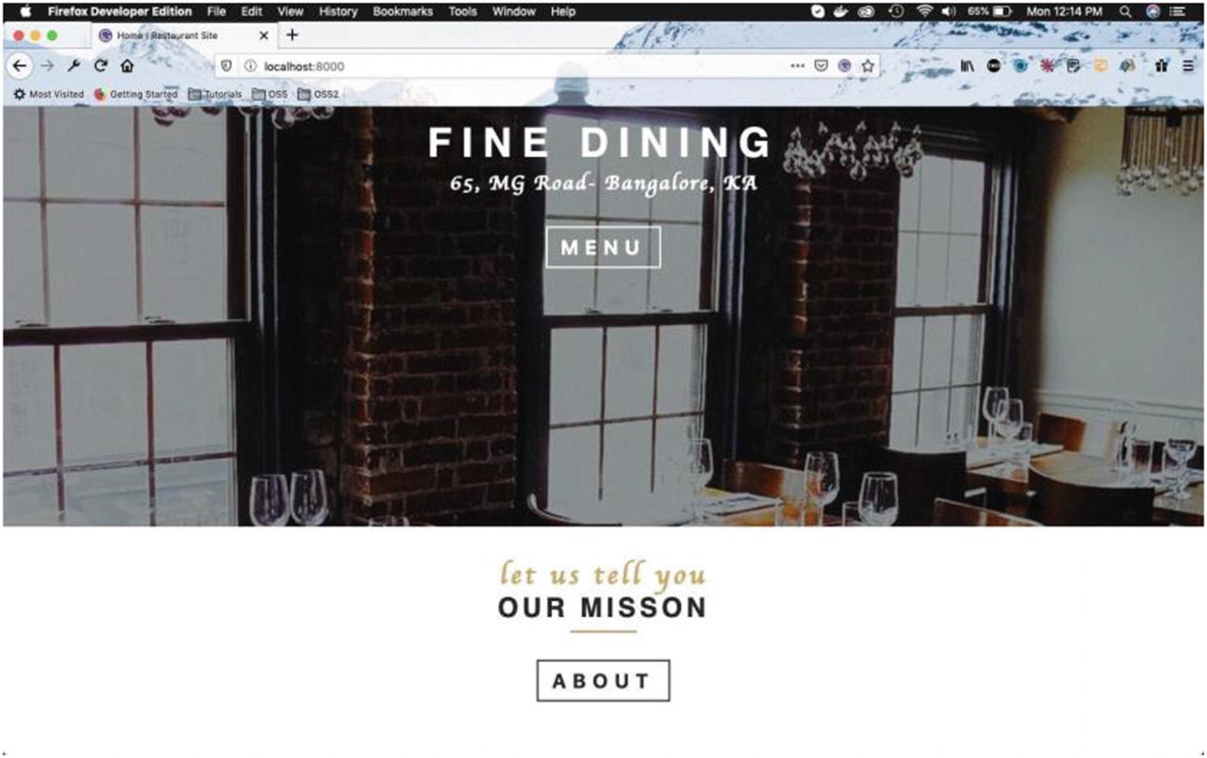
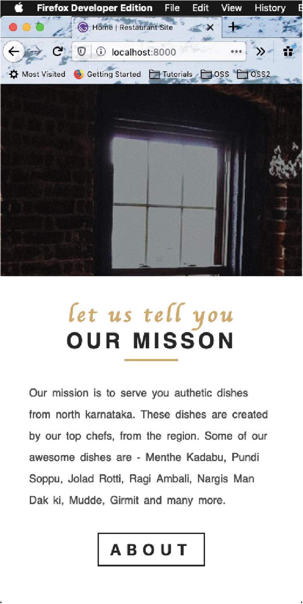
Now, the SectionButton will be displayed on our home page below the text (Figure 2-23).
Figure 2-23
About button
Next, we will create the text for this section. Update the QuickInfo.js file with the code shown in bold in Listing 2-50. We are adding imports for styled-component and the styles and also adding import for the Link. After that we are wrapping the text and the button created earlier in a new styled-component QuickInfoWrapper.
Next, we will create styles for the QuickInfoWrapper component. We have also created media queries for 768px and 992px.
import React, { Component } from 'react'
import { Section, Title, SectionButton } from '../../utils'
import styled from 'styled-components'
import { styles } from '../../utils'
import { Link } from 'gatsby'
export default class QuickInfo extends Component {
render() {
return (
<Section>
<Title message="let us tell you" title="our misson" />
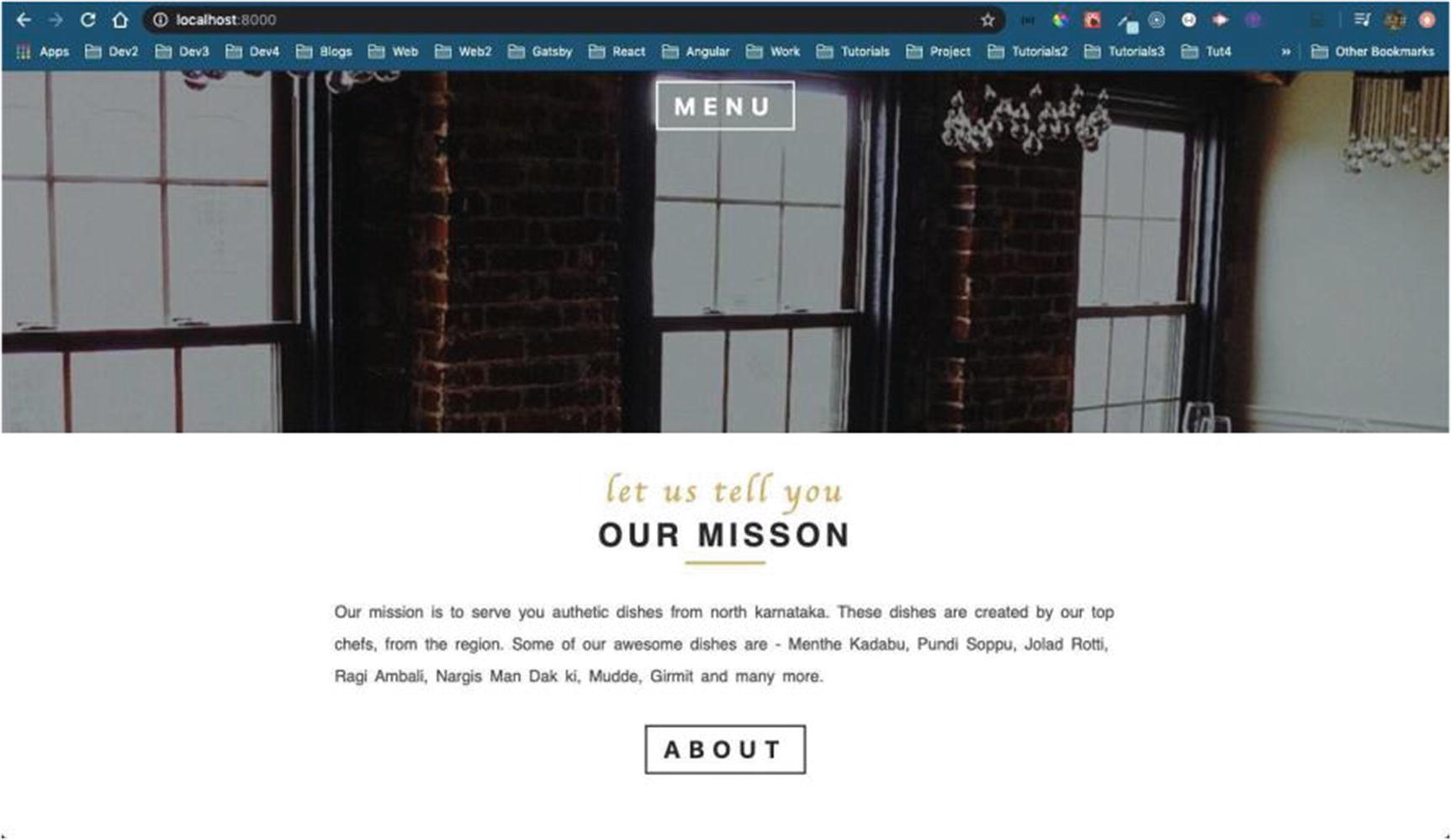
<QuickInfoWrapper>
<p className="text">
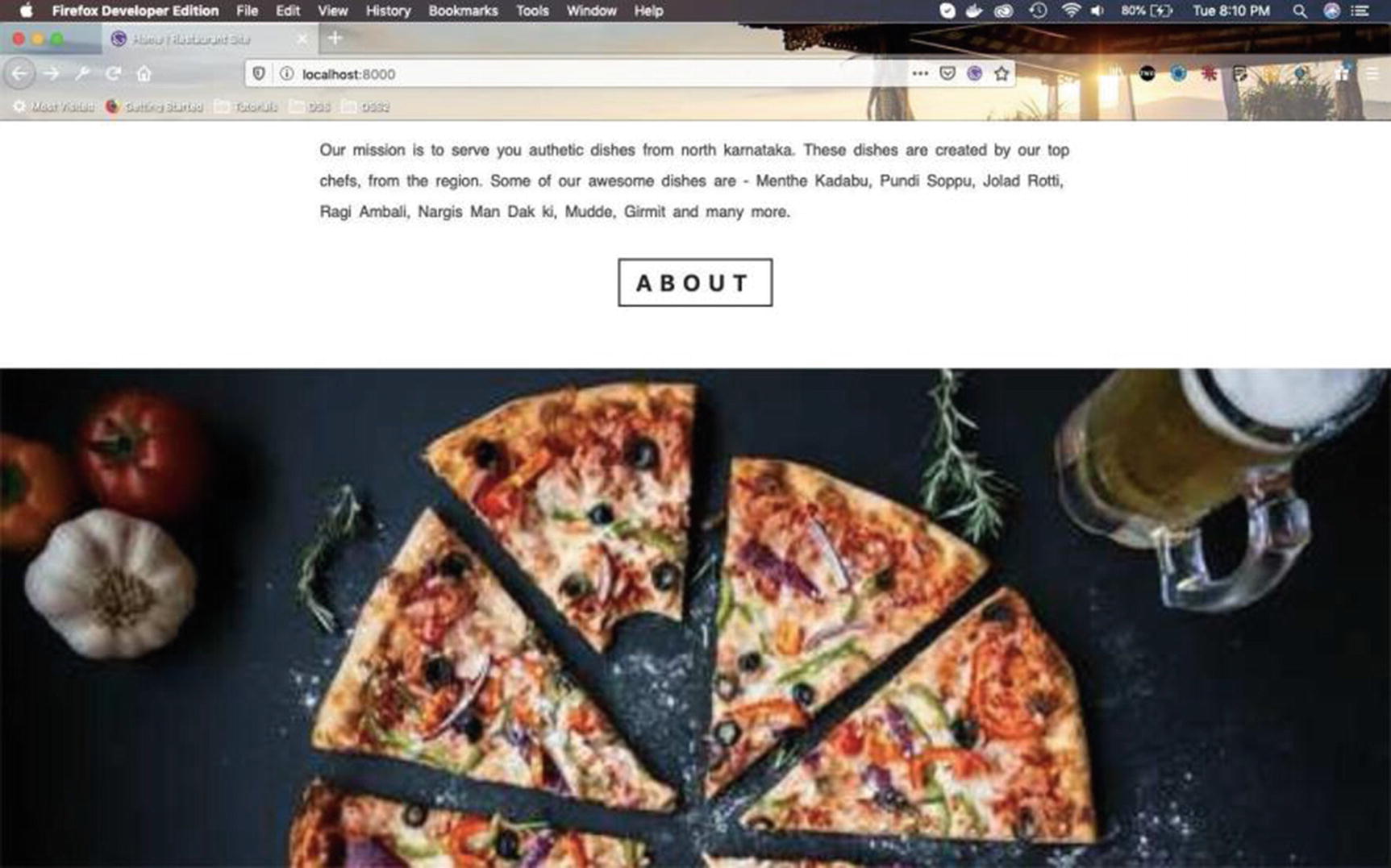
Our mission is to serve you authetic dishes from north karnataka.
these dishes are created by our top chefs, from the region.
Some of our awesome dishes are - Menther kadabu, Pundi Soppu, Jolad Rotti,
Ragi Ambali, Nargis Man Dak ki, Mudde, Girmit and many more.
So, at 992px and above it will appear as shown in Figure 2-24.
Figure 2-24
Display on larger screens
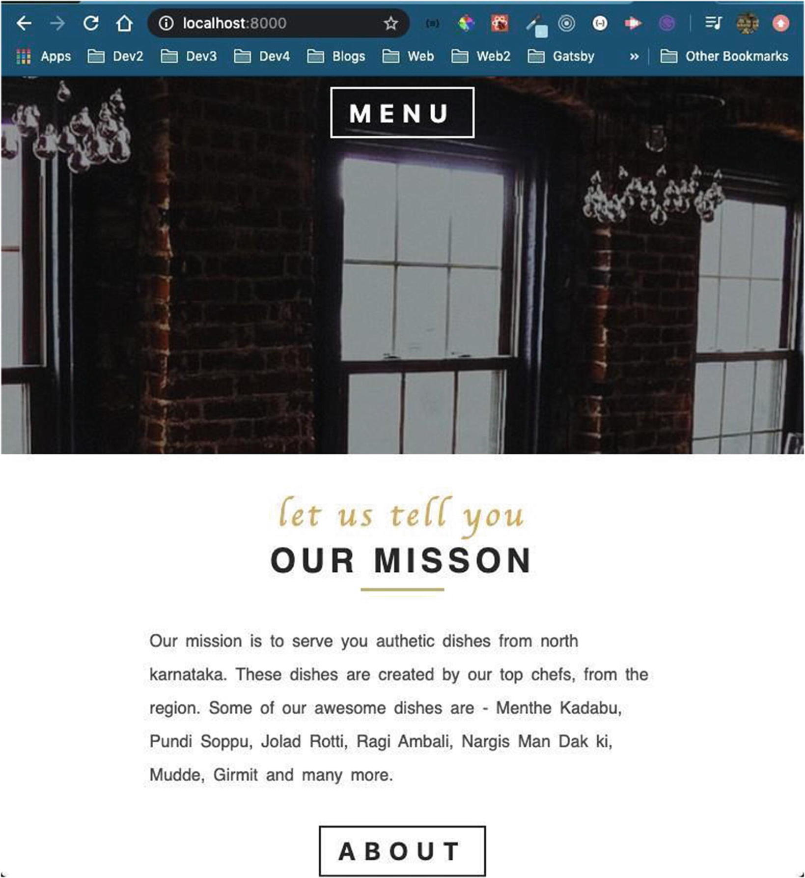
Between 768px and 992px, it appear as shown in Figure 2-25.
Figure 2-25
Display on medium-sized screen
It will appear as shown in Figure 2-26 on mobile screens.
Figure 2-26
Display on mobile screen
In the next section we’ll create a footer component.
Creating the Footer
We will create a footer now. Create a file named Footer.js inside the globals folder and include the content from Listing 2-51 in the file.
Here, we are importingstyled-components and our global style files. After that we are also importing react-icons for Facebook, Twitter, and Instagram.
We are creating a state variable icon, containing the three social icons as an array of objects.
We will now show the icons by looping through them and showing an anchor tag for each of them. We have also created a styled-component FooterWrapper, and we will complete the styles on FooterWrapper.
import React, { Component } from 'react'
import styled from 'styled-components'
import { styles } from '../../utils'
import { FaInstagram, FaTwitter, FaFacebook } from 'react-icons/fa'
Next, we will show this component in layout.js, as we need to show the footer on all pages. The updated content is shown in bold in Listing 2-52.
...
import Navbar from "./globals/navbar/Navbar"
import Footer from '../components/globals/Footer'
const Layout = ({ children }) => {
return (
<GlobalStyle />
<Navbar />
{children}
<Footer />
)
}
const GlobalStyle = createGlobalStyle`
...
...
`
Layout.propTypes = {
children: PropTypes.node.isRequired,
}
export default Layout
Listing 2-52
Adding Footer in layout.js
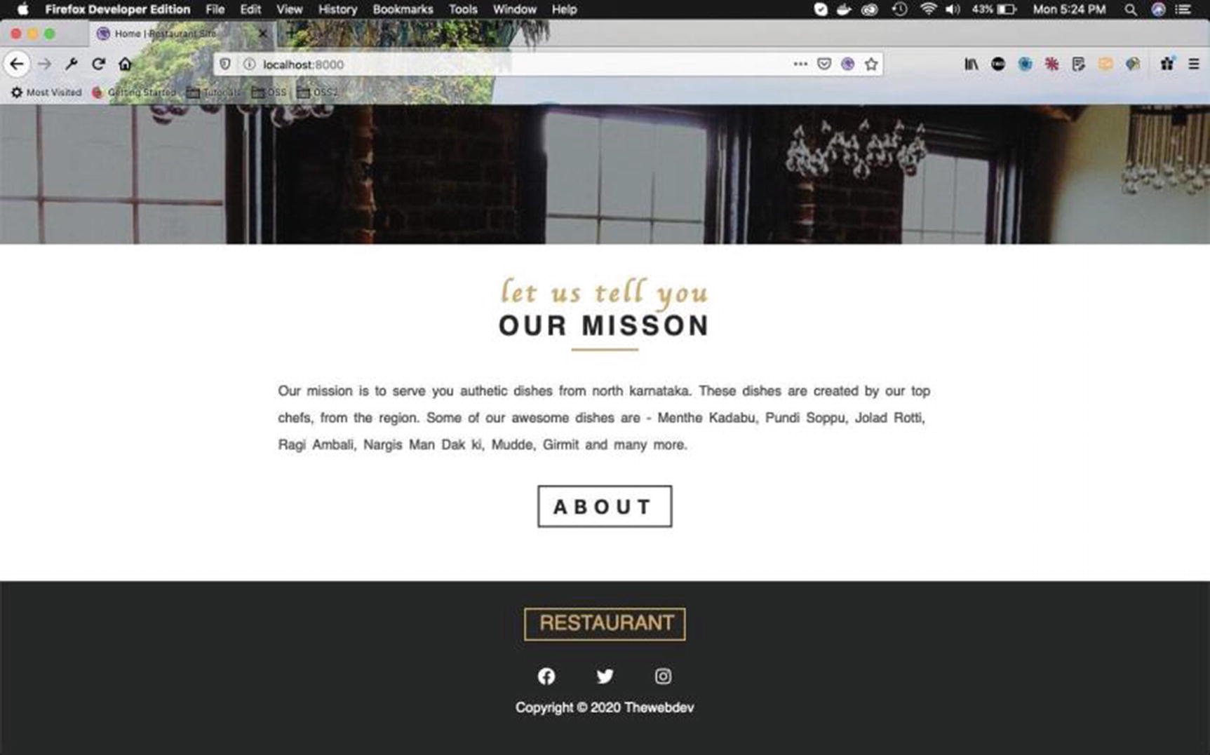
It will display our footer perfectly on our home page (Figure 2-27).
Figure 2-27
Home page with footer
Also, because we have put the code in layout.js, it is present on other pages, including the About page shown in Figure 2-28.
Figure 2-28
About page with text and footer
We have completed a large part of the project, so it’s time to deploy it in Netlify. I have already pushed all the code up to this part to GitHub.
Deploying in Netlify
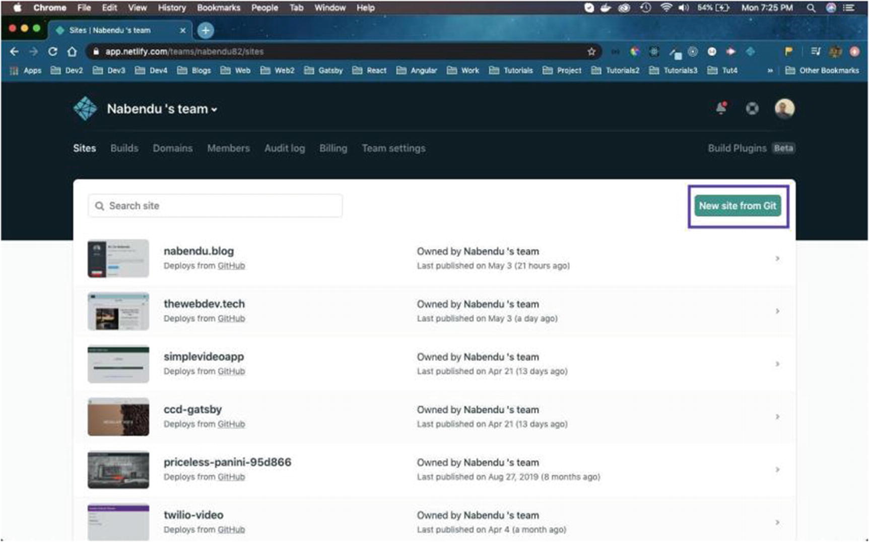
In this section, we will deploy our site to Netlify. Once I opened my Netlify dashboard, I was presented with the screen shown in Figure 2-29. Click New site from Git.
Figure 2-29
Creating a new site from Git
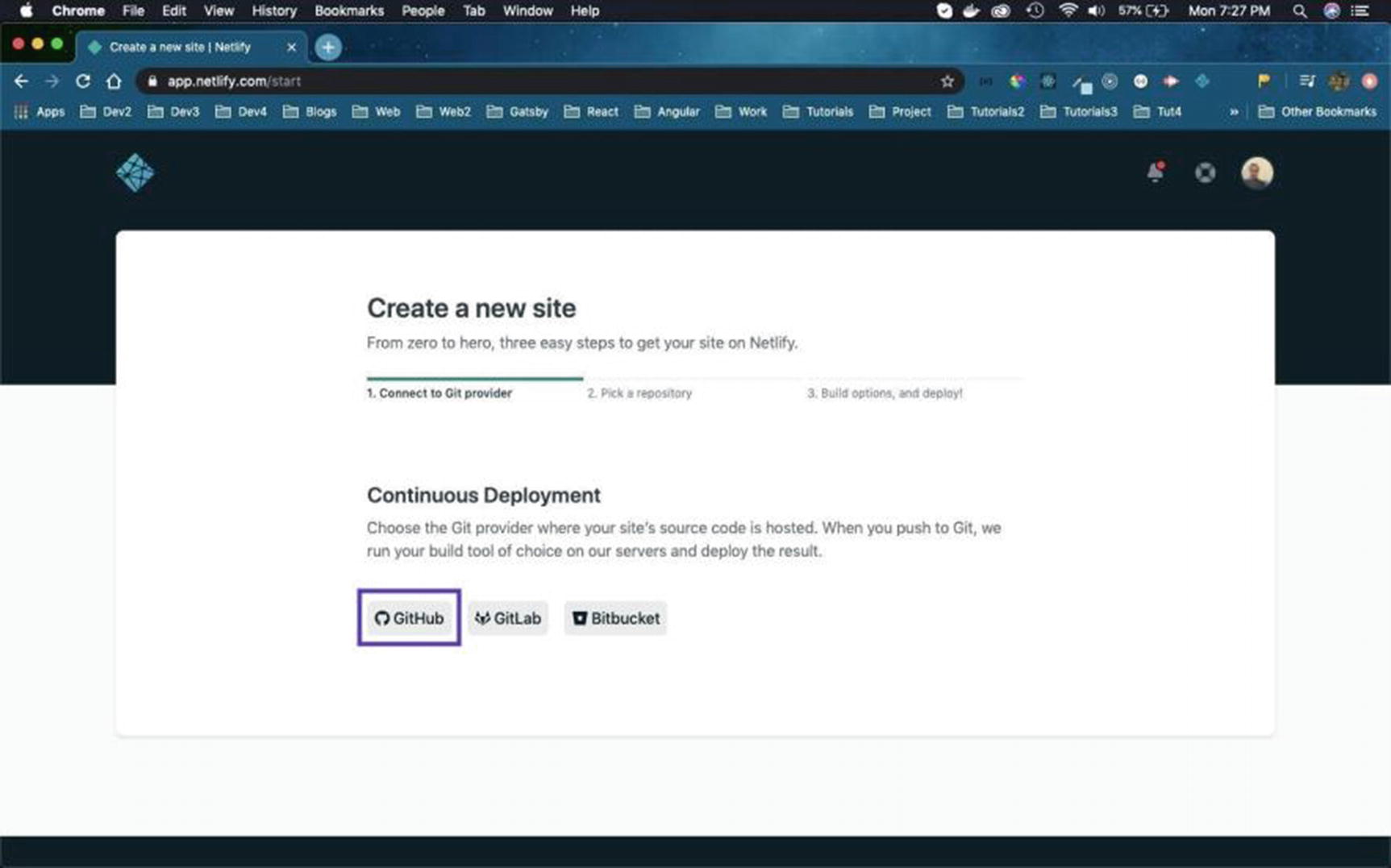
On the next screen, click on GitHub, as the code being used is in GitHub (Figure 2-30).
Figure 2-30
Click GitHub
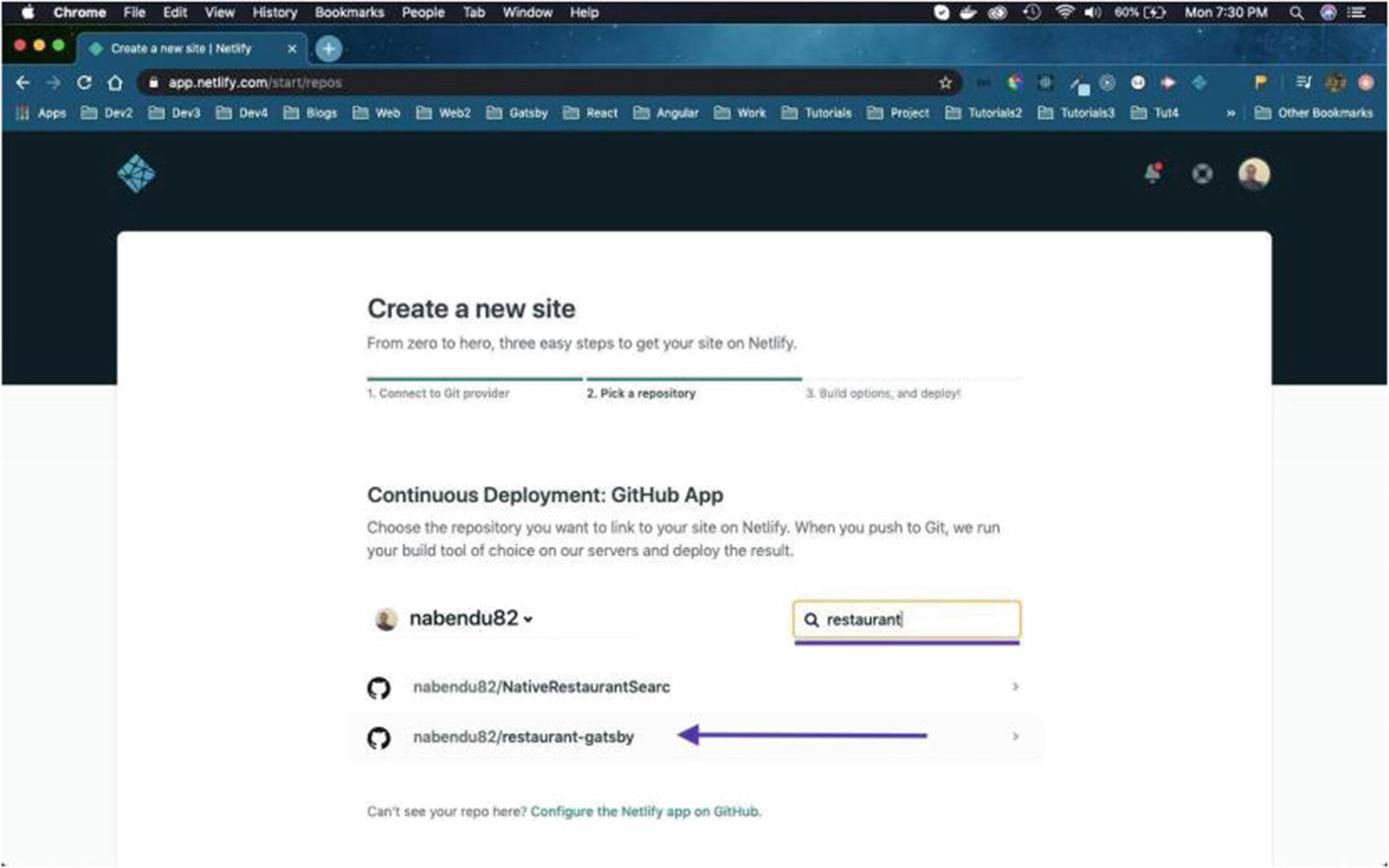
Because I had a lot of repos, I needed to search for the repo and click it (Figure 2-31).
Figure 2-31
Selecting restaurant-gatsby
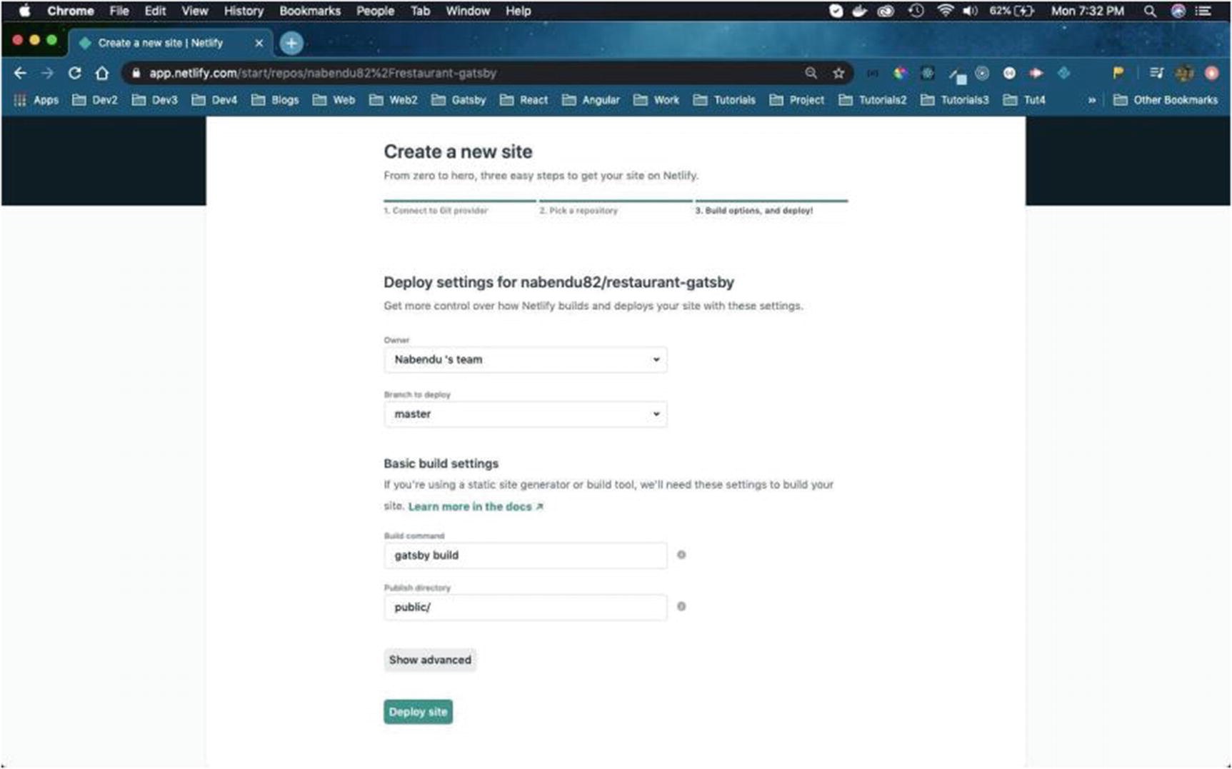
On the next screen we need to click Deploy Site (Figure 2-32).
Figure 2-32
Click Deploy site
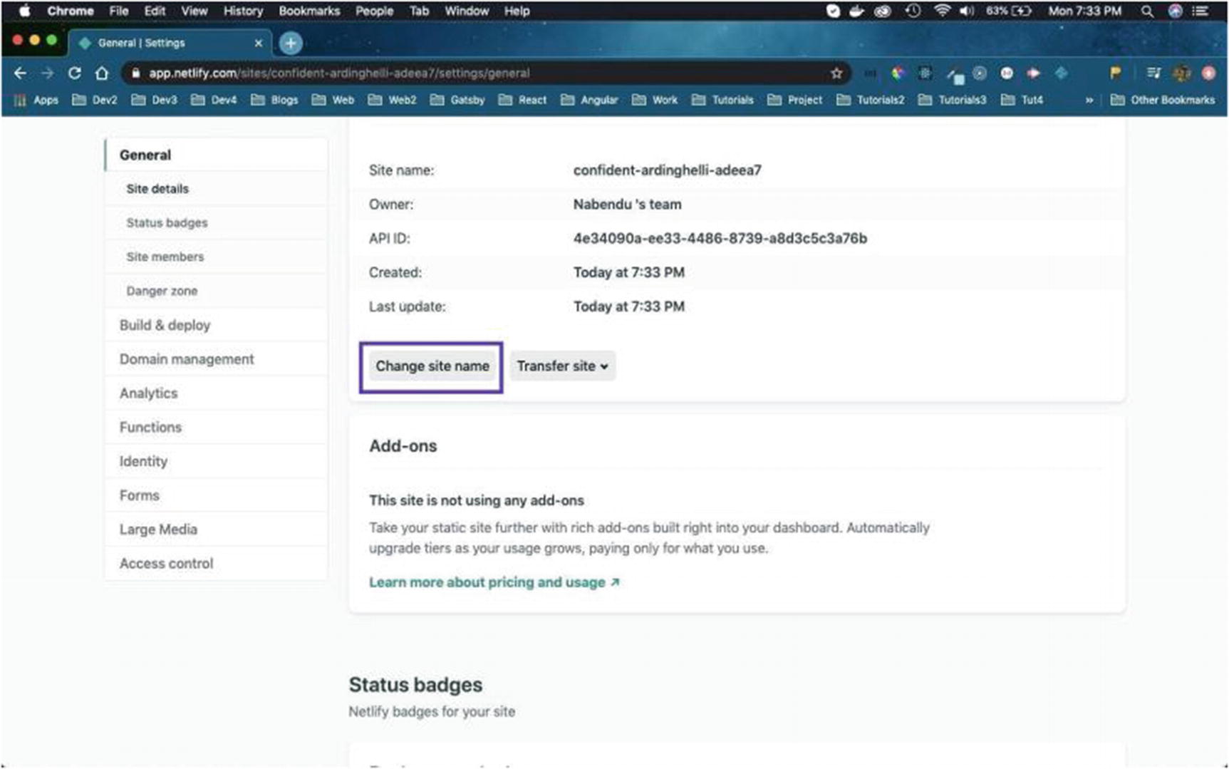
The deployment will begin next and assign a random name to our site. We can change it by clicking Site settings (Figure 2-33).
Figure 2-33
Changing the site name with Site settings
On the next screen, scroll down and click Change site name (Figure 2-34).
Figure 2-34
Changing the site name
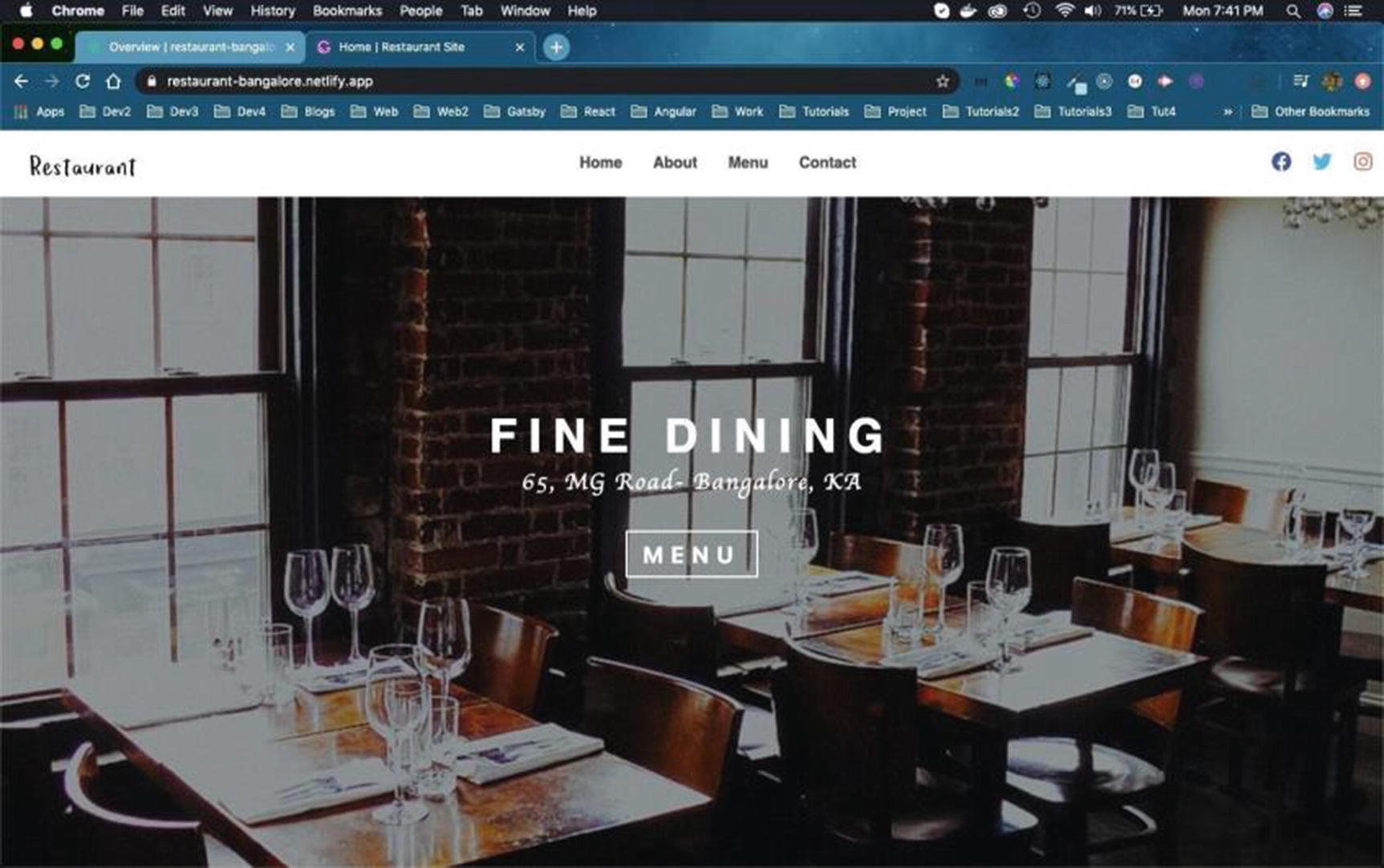
That will open a pop-up window in which you can provide the new site name. I tried using restaurant-gatsby first, but the name was already taken (Figure 2-35).
Figure 2-35
restaurant-gatsby
After several tries, I settled on restaurant-bangalore, as shown in Figure 2-36.
Next, we will start creating the Gallery component on the home page. Create a new file named Gallery.js in the HomeComponents folder and include the content given in Listing 2-53 in the file. We are using graphql and useStaticQuery to show the image stored in the homeGallery folder.
Now, let’s display thisGallery component on the home page, by adding it to the index.js file in pages folder. The updated content is shown in bold in Listing 2-54.
...
import QuickInfo from '../components/HomeComponents/QuickInfo'
import Gallery from '../components/HomeComponents/Gallery'
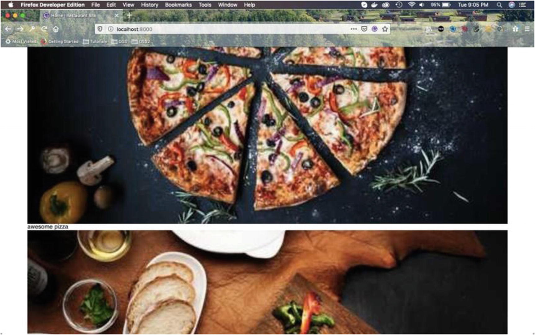
Now the image will be shown on our home page (Figure 2-38).
Figure 2-38
Home page with gallery
Next, we will add two more images in our Gallery.js file. For this we will add queries similar to the img1 query. Next, we will add three constants img1, img2 and img3 to get these three images.
After that, we will use the Section component to wrap everything. Within it, we use the Gallery-Wrapper styled-component, in which we are soon going to write code.
After that we use the image and text wrapped within a div. The updated content is shown in bold in Listing 2-55.
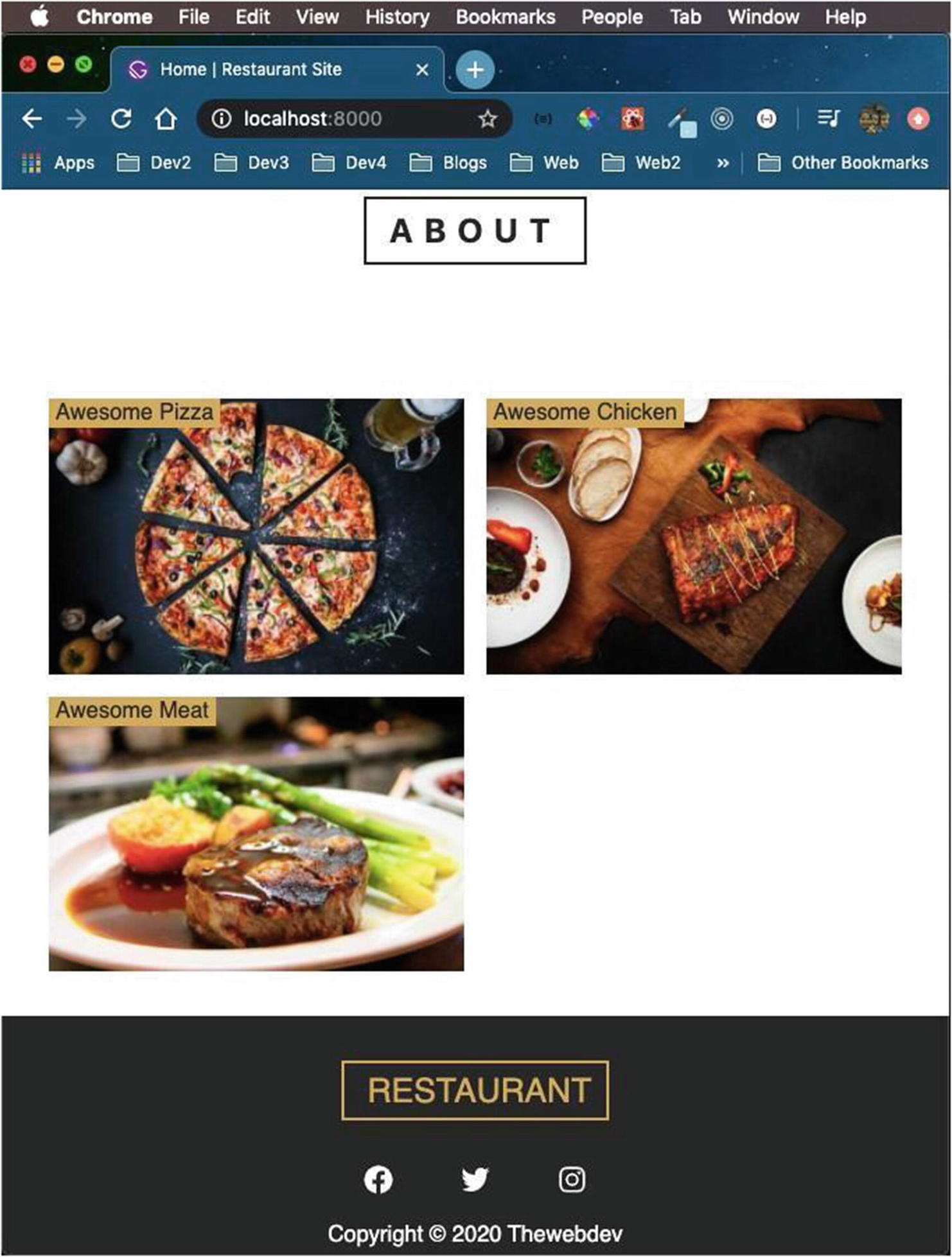
Now all the images and text are shown on our home page (Figure 2-39).
Figure 2-39
Home page gallery with images and text
Let’s write some styles now. We will first write the styles for mobile screens. The updated content is shown in bold in Listing 2-56.
const GalleryWrapper = styled.div`
display: grid;
grid-template-columns: auto;
grid-row-gap: 1rem;
.item {
position: relative;
}
.info {
position: absolute;
top: 0;
left: 0;
background: ${styles.colors.mainYellow};
padding: 0.1rem 0.3rem;
text-transform: capitalize;
}
`;
export default Gallery
Listing 2-56
Styles in Gallery.js
It will now display as shown in Figure 2-40 on mobile screens.
Figure 2-40
Site on a mobile screen
Now, we will add styles for two more screen sizes. The updated content is shown in bold in Listing 2-57.
const GalleryWrapper = styled.div`
display: grid;
grid-template-columns: auto;
grid-row-gap: 1rem;
.item {
position: relative;
}
.info {
position: absolute;
top: 0;
left: 0;
background: ${styles.colors.mainYellow};
padding: 0.1rem 0.3rem;
text-transform: capitalize;
}
@media (min-width: 576px) {
grid-template-columns: 1fr 1fr;
grid-column-gap: 1rem;
}
@media (min-width: 768px) {
grid-template-columns: repeat(3, 1fr);
}
`;
export default Gallery
Listing 2-57
Styles for medium screens in Gallery.js
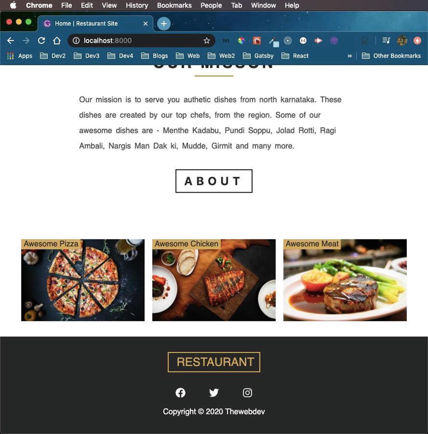
For screen sizes between 576px and 767px, our site will display in a two-column layout (Figure 2-41).
Figure 2-41
Medium screen display
For screen sizes between 768px and 991px, our site will display in a three-column layout (Figure 2-42).
Figure 2-42
Display on a slightly larger screen
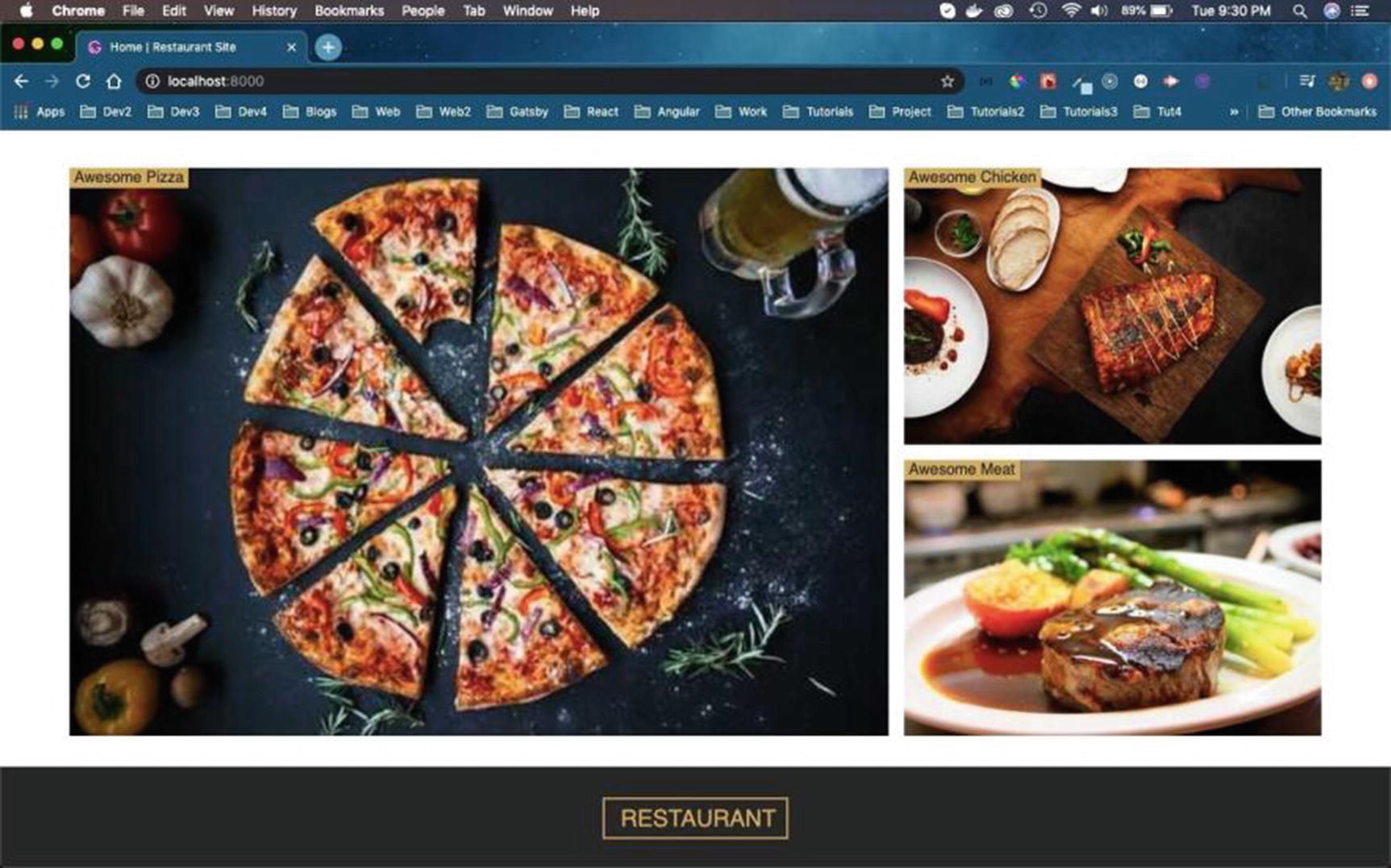
Finally, we will add styles for screen sizes greater and equal to 992px. We are using the concept of grid-template-areas here.
Now, we are using a lot of grid concepts in this part. You can learn all about CSS grids from my earlier series at https://thewebdev.tech/series/Grid-basics. The updated content is shown in bold in Listing 2-58.
const GalleryWrapper = styled.div`
...
...
@media (min-width: 576px) {
grid-template-columns: 1fr 1fr;
grid-column-gap: 1rem;
}
@media (min-width: 768px) {
grid-template-columns: repeat(3, 1fr);
}
@media (min-width: 992px) {
.gatsby-image-wrapper {
height: 100%;
}
grid-template-areas:
'one one two two'
'one one three three';
.item-1 {
grid-area: one;
}
.item-2 {
grid-area: two;
}
.item-3 {
grid-area: three;
}
}
`;
export default Gallery
Listing 2-58
Styles for larger screens in Gallery.js
It will display as shown in Figure 2-43 on normal desktop screens.
In this chapter we created the Navbar, the images, buttons, and a footer section. We also deployed it to Netlify and showed a nice gallery section. In the next chapter, we will learn to store our data in Contentful CMS and fetch data in our application from the CMS.