
4. Flag Quiz App
Objectives
In this chapter you’ll:
 Use
Use Fragments to make better use of available screen real estate in an Activity’s GUI on phones and tablets.
Display a settings icon on the app bar to enable users to access the app’s user preferences.
Automatically manage and persist an app’s settings via a PreferenceFragment.
Modify key–value pairs settings via a SharedPreferences.Editor.
Organize image resources in the app’s assets subfolders and manipulate them with an AssetManager.
Define an animation and apply it to a View.
Use a Handler to schedule a future task to perform on the GUI thread.
Use Toasts to display messages briefly to the user.
Launch a specific Activity with an explicit Intent.
Use collections from the java.util package.
Define layouts for multiple device orientations.
Use Android’s logging mechanism to log error messages.
4.2 Test-Driving the Flag Quiz App
4.2.1 Configuring the Quiz’s Settings
4.3.3 Fragment Lifecycle Methods
4.3.8 Supporting Different Screen Sizes and Resolutions
4.3.9 Determining the Device Orientation
4.3.10 Toasts for Displaying Messages
4.3.11 Using a Handler to Execute a Runnable in the Future
4.3.12 Applying an Animation to a View
4.3.13 Using ViewAnimationUtils to Create a Circular Reveal Animator
4.3.14 Specifying Colors Based on a View’s State Via a Color State List
4.3.16 Logging Exception Messages
4.3.17 Launching Another Activity Via an Explicit Intent
4.4 Creating the Project, Resource Files and Additional Classes
4.4.2 Blank Activity Template Layouts
4.4.3 Configuring Java SE 7 Support
4.4.4 Adding the Flag Images to the Project
4.4.5 strings.xml and Formatted String Resources
4.4.10 Creating the Flag Shake Animation
4.4.11 preferences.xml for Specifying the App’s Settings
4.4.12 Adding Classes SettingsActivity and SettingsActivityFragment to the Project
4.5.1 content_main.xml Layout for Devices in Portrait Orientation
4.5.2 Designing fragment_main.xml Layout
4.5.3 Graphical Layout Editor Toolbar
4.5.4 content_main.xml Layout for Tablet Landscape Orientation
4.6.1 package Statement and import Statements
4.6.3 Overridden Activity Method onCreate
4.6.4 Overridden Activity Method onStart
4.6.5 Overridden Activity Method onCreateOptionsMenu
4.6.6 Overridden Activity Method onOptionsItemSelected
4.6.7 Anonymous Inner Class That Implements OnSharedPreferenceChangeListener
4.7 MainActivityFragment Class
4.7.1 package and import Statements
4.7.3 Overridden Fragment Method onCreateView
4.7.10 Anonymous Inner Class That Implements OnClickListener
4.9 SettingsActivityFragment Class
Self-Review Exercises | Answers to Self-Review Exercises | Exercises
4.1 Introduction
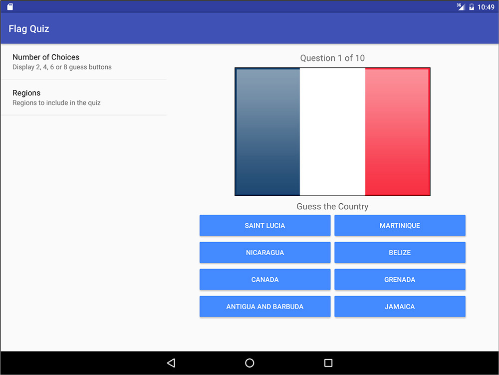
The Flag Quiz app tests your ability to correctly identify 10 flags from various countries and territories (Fig. 4.1). By default, the app presents a flag image and four country-name Buttons that you click to guess the answer—one is correct and the others are randomly selected, nonduplicated incorrect answers. The app displays the user’s progress throughout the quiz, showing the question number (out of 10) in a TextView above the current flag image.

As you’ll see, the app also allows you to control the quiz difficulty by specifying whether to display two, four, six or eight guess Buttons, and by choosing the world regions that should be included in the quiz. These options are displayed differently, based on the device that’s running the app and the orientation of the device—the app supports portrait orientation on any device, but landscape orientation only on tablets.
In portrait orientation, the app displays on the app bar a settings icon ( ). When the user touches this icon, the app displays a separate screen (another
 Activity) for setting the number of guess Buttons, and the world regions to use in the quiz. On a tablet in landscape orientation (Fig. 4.2), the app uses a different layout that always displays the app’s settings and the quiz at the same time.
First you’ll test-drive the app. Then we’ll overview the technologies we used to build it. Next, you’ll design the app’s GUI. Finally, we’ll present and walk through the app’s complete source code, discussing the app’s new features in more detail.
4.2 Test-Driving the Flag Quiz App
You’ll now test-drive the Flag Quiz app. To do so, open Android Studio, open the Flag Quiz app from the FlagQuiz folder in the book’s examples folder, then execute the app in the AVD or on a device. This builds the project and runs the app (Fig. 4.1 or Fig. 4.2).
4.2.1 Configuring the Quiz’s Settings
When you first install and run the app, the quiz is configured to display four guess Buttons and to select flags from all of the world’s regions. For this test-drive, you’ll change the app’s options to select flags only from North America and you’ll keep the app’s default setting of four guess Buttons per flag.
On a phone, a tablet or an AVD in portrait orientation, touch the settings icon () on the app bar (Fig. 4.1) to view the Settings screen (Fig. 4.3(a)). On a tablet device or tablet AVD in landscape orientation, the app’s settings appear at the left side of the screen (Fig. 4.2). Touch Number of Choices to display the dialog for selecting the number of Buttons that should be displayed with each flag (Fig. 4.3(b)). (On a tablet device or tablet AVD in landscape orientation, the entire app is grayed out and the dialog is centered on the screen.) By default, 4 is selected—we used this default setting. To make the quiz easier, you could select 2, or to make the quiz more challenging, you could select 6 or 8. Touch CANCEL (or touch the screen outside the dialog) to return to the Settings screen.

Next, touch Regions (Fig. 4.4(a)) to display the checkboxes representing the world regions (Fig. 4.4(b)). By default, all regions are enabled when the app first executes, so every flag we provide with the app can be selected randomly for a quiz. Touch the checkboxes next to Africa, Asia, Europe, Oceania (Australia, New Zealand and the islands in that vicinity) and South America to uncheck them—this excludes those regions’ countries from the quiz. Touch OK to save your settings. On a phone, a tablet or an AVD in portrait orientation, touch the back button ( ) to return to the quiz screen and start a new quiz with your updated settings. On a tablet device or tablet AVD in landscape orientation, a new quiz with the updated settings is immediately displayed at the right side of the screen.

Fig. 4.4 | Flag Quiz settings screen and the Regions dialog (after unchecking Africa, Asia, Europe, Oceania and South America).
4.2.2 Taking the Quiz
A new quiz starts with the number of answer choices you selected and flags only from the region(s) you selected. Work through the quiz by touching the guess Button for the country that you think matches each flag.
Making a Correct Selection
If the choice is correct (Fig. 4.5(a)), the app disables all the answer Buttons and displays the country name in green, followed by an exclamation point at the bottom of the screen (Fig. 4.5(b)). After a short delay, the app loads the next flag and animates the flag and a new set of answer Buttons onto the screen. The app transitions from the current quiz question to the next with a circular reveal animation:
• First, a large-diameter circle shrinks onto the screen until its diameter is zero, thus hiding the current quiz question’s flag and guess Buttons.
• Then, the circle’s diameter grows from zero until the new question’s flag and guess Buttons are fully visible on the screen.

Making an Incorrect Selection
For each incorrect country-name Button you touch (Fig. 4.6(a)), the app
• disables the corresponding country name Button
• uses an animation to shake the flag horizontally and
• displays Incorrect! in red at the bottom of the screen (Fig. 4.6(b)).
Continue guessing until you get the correct answer for that flag.
Completing the Quiz
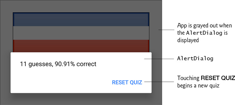
After you select the 10 correct country names, a popup AlertDialog displays over the app, showing your total number of guesses and the percentage of correct answers (Fig. 4.7). This is a modal dialog, so you must interact with it to dismiss it—for a non-modal dialog, touching the AVD’s or device’s back button () will dismiss the dialog. When you touch the dialog’s RESET QUIZ Button, Android dismisses the dialog and a new quiz begins, using the same number of guess options and region(s) as the quiz you just completed.

4.3 Technologies Overview
This section introduces the features you’ll use to build the Flag Quiz app.
4.3.1 Menus
When you create an app’s project in the IDE, the MainActivity is configured to display an options menu ( ) at the right side of the action bar. In this app, you’ll display the options menu only when the app is in portrait orientation. Touching the icon expands a menu that, by default, contains only a Settings menu item—this typically is used to display an app’s settings to the user. For this app, we’ll modify the menu’s XML file by providing an icon () for the Settings menu item and specifying that the icon should be displayed directly on the app bar. This will enable the user to touch once to view the app’s settings, rather than having to first open the options menu, then touch Settings. You’ll use Android Studio’s Vector Asset Studio to add the material design settings icon to the project. In later apps, you’ll see how to create additional menu items.
The options menu is an object of class Menu (package android.view). You override Activity method onCreateOptionsMenu (Section 4.6.5) and use the method’s Menu argument to add the menu items—either programmatically or by inflating an XML document that describes the menu items. When the user selects a menu item, Activity method onOptionsItemSelected (Section 4.6.6) responds to the selection.
4.3.2 Fragments
A fragment typically represents a reusable portion of an Activity’s user interface, but may also represent reusable program logic. This app uses fragments to create and manage portions of the app’s GUI. You can combine several fragments to create user interfaces that make better use of tablet screen sizes. You also can easily interchange fragments to make your GUIs more dynamic—you’ll do this in Chapter 9.
Class Fragment (package android.app) is the base class of all fragments. When using subclasses of AppCompatActivity with Fragments you must use the Android Support Library’s version of this class from package android.support.v4.app. The Flag Quiz app defines the following direct and indirect Fragment subclasses:
• Class MainActivityFragment (Section 4.7)—a direct subclass of Fragment—displays the quiz’s GUI and defines the quiz’s logic. Like an Activity, each Fragment has its own layout that’s typically defined as an XML layout resource file (GUIs also can be created dynamically). In Section 4.5.2, you’ll build MainActivityFragment’s GUI. You’ll create two layouts for MainActivity—one for devices in portrait orientation and one only for tablets in landscape orientation. You’ll then reuse the MainActivityFragment in both layouts.
• Class SettingsActivityFragment (Section 4.9) is a subclass of Preference-Fragment (package android.preference), which automatically maintains an app’s user preferences in a file associated with the app. As you’ll see, you create an XML file describing the user preferences, then class PreferenceFragment uses that file to build an appropriate preferences GUI (Figs. 4.3–4.4). We discuss preferences more in Section 4.3.5.
• When you finish a quiz, the app creates an anonymous subclass of DialogFragment (package android.support.v4.app) and displays an AlertDialog (introduced in Section 4.3.15) containing the quiz results (Section 4.7.10).
Fragments must be hosted by an Activity—they cannot execute independently. When this app runs in landscape orientation on a tablet, the MainActivity hosts all of the Fragments. In portrait orientation (on any device), the SettingsActivity (Section 4.8) hosts the SettingsActivityFragment and the MainActivity hosts the others.
4.3.3 Fragment Lifecycle Methods
Like an Activity, each Fragment has a lifecycle and provides methods that you can override to respond to lifecycle events. In this app, you’ll override
• onCreate—This method (which you’ll override in class SettingsActivityFragment) is called when a Fragment is created. The MainActivityFragment and SettingsActivityFragment are created when the app inflates their parent activities’ layouts. The DialogFragment that displays the quiz results is created and displayed dynamically when the user completes a quiz.
• onCreateView—This method (which you’ll override in class MainActivityFragment) is called after onCreate to build and return a View containing the Fragment’s GUI. As you’ll see, this method receives a LayoutInflater, which you’ll use to programmatically inflate a Fragment’s GUI from the components specified in a predefined XML layout.
Fragments can add their own menu items to a host Activity’s menu. Like class Activity, Fragments also have lifecycle method onCreateOptionsMenu and event-handling method onOptionsItemSelected.
We’ll discuss other Fragment lifecycle methods as we encounter them throughout the book. For the complete lifecycle details, visit
4.3.4 Managing Fragments
An Activity manages its Fragments via a FragmentManager (package android.app)—accessible via Activity’s getFragmentManager method. If the Activity needs to interact with a Fragment that’s declared in the Activity’s layout and has an id, the Activity can call FragmentManager method findFragmentById to obtain a reference to the specified Fragment. As you’ll see in Chapter 9, a FragmentManager can use FragmentTransactions to dynamically add, remove and transition between Fragments.
For backward compatibility, subclasses of AppCompatActivity must use the Android Support Library’s version of FragmentManager from package android.support.v4.app, rather than the one in package android.app. Class AppCompatActivity inherits method getSupportFragmentManager from the Android Support Library’s FragmentActivity class to obtain the correct FragmentManager.
4.3.5 Preferences
In Section 4.2.1, you customized the quiz by changing the app’s settings. These settings are stored persistently in a file as key–value pairs—each key enables you to quickly look up a corresponding value. The keys in the file must be Strings, and the values can be Strings or primitive-type values. Such a file is manipulated via an object of class SharedPreferences (package android.content) and the file is accessible only to the app that creates the file.
A PreferenceFragment uses Preference objects (package android.preference) to manage app settings and stores those settings in a file via a SharedPreferences object. This app uses Preference subclass ListPreference to manage the number of guess Buttons displayed for each flag and Preference subclass MultiSelectListPreference to manage the world regions to include in the quiz. A ListPreference creates mutually exclusive radio buttons in which only one can be selected (Fig. 4.3(b)). A MultiSelectListPreference creates a GUI containing checkboxes, any number of which can be selected (Fig. 4.4(b)). You’ll use a PreferenceManager object (package android.preference) to access and interact with the app’s default SharedPreferences file.
You’ll also interact directly with the app’s default SharedPreferences file:
• When starting a quiz, you’ll query the app’s preferences to determine the number of guess Buttons to display and the region(s) from which to select flags.
• When the user changes the regions preference, the app will ensure that at least one region is selected; otherwise, there would be no flags to include in the quiz. If none is selected, the app edits the regions preference to select North America.
To modify a SharedPreferences file’s contents, you’ll use a SharedPreferences.Editor object (Section 4.6.7).
4.3.6 assets Folder
This app’s flag images are loaded into the app only when needed and are located in the app’s assets folder.1 To add the images to the project, we copied each region’s folder from our file system into the assets folder in the Project window (Section 4.4.4). The images are located in the images/FlagQuizImages folder with the book’s examples.
1. We obtained the images from http://www.free-country-flags.com.
Unlike an app’s drawable folders, which require their image contents to be at the root level in each folder, the assets folder may contain files of any type and they can be organized in subfolders—we maintain the flag images for each region in a separate subfolder. Files in the assets subfolders are accessed via an AssetManager (package android.content.res), which can provide a list of all of the file names in a specified subfolder and can be used to access each asset.
4.3.7 Resource Folders
In Section 2.4.4, you learned about the drawable, layout and values subfolders of an app’s res folder. In this app, you’ll also use the menu, anim, color and xml resource folders. Figure 4.8 overviews these folders as well as the animator and raw folders.

4.3.8 Supporting Different Screen Sizes and Resolutions
In Section 2.5.1 you learned that Android devices have various screen sizes, resolutions and pixel densities (dots per inch or DPI). You also learned that you typically provide images and other visual resources in multiple resolutions so Android can choose the best resource for a device’s pixel density. Similarly, in Section 2.8, you learned how to provide String resources for different languages and regions. Android uses resource folders with qualified names to choose the appropriate images, based on a device’s pixel density, and the correct language strings, based on a device’s locale and region settings. This mechanism also can be used to select resources from any of the resource folders discussed in Section 4.3.7.
For this app’s MainActivity, you’ll use minimum screen width and orientation qualifiers to determine which layout to use—one for portrait orientation on phones and tablets and another only for tablets in landscape orientation. To do this, you’ll define two layouts that present MainActivity’s contents:
• content_main.xml is the default layout that displays only the MainActivityFragment.
• content_main.xml (sw700dp-land) is used only on devices (i.e., tablets) when the app is in landscape (land) orientation.
Qualified resource folder names (on disk) have the format:
name-qualifiers
where qualifiers consists of one or more qualifiers separated by dashes (-). There are currently 19 qualifier types that you can use to designate when Android should choose specific resource files. We’ll explain other qualifiers as we use them throughout the book. For a complete description of all the res subfolder qualifiers and the rules for the order in which they must be defined in a fully qualified folder’s name, visit
4.3.9 Determining the Device Orientation
In this app, we display the Menu only when the app is running on a phone-sized device or when it’s running on a tablet in portrait orientation (Section 4.6.5). To determine this, we’ll obtain an object of class Configuration (package android.content.res), which contains public instance variable orientation containing either ORIENTATION_PORTRAIT or ORIENTATION_LANDSCAPE for the device’s current orientation.
4.3.10 Toasts for Displaying Messages
A Toast (package android.widget) briefly displays a message, then disappears from the screen. Toasts are often used to display minor error messages or informational messages. We use Toasts as follows:
• To indicate that the quiz will be reset after the user changes the app’s settings.
• To indicate that at least one region must be selected if the user deselects all regions—in this case, the app sets North America as the quiz’s default region.
4.3.11 Using a Handler to Execute a Runnable in the Future
When the user makes a correct guess, the app displays the correct answer for two seconds before displaying the next flag. To do this, we use a Handler (package android.os). Handler method postDelayed receives as arguments a Runnable to execute and a delay in milliseconds. After the delay has passed, the Handler’s Runnable executes in the same thread that created the Handler.

Operations that interact with or modify the GUI must be performed in the GUI thread (also called the UI thread or main thread), because GUI components are not thread safe.
4.3.12 Applying an Animation to a View
When the user makes an incorrect choice, the app shakes the flag by applying an Animation (package android.view.animation) to the ImageView. We use AnimationUtils static method loadAnimation to load the animation from an XML file that describes the animation’s options. We also specify the number of times the animation should repeat with Animation method setRepeatCount and perform the animation by calling View method startAnimation (with the Animation as an argument) on the ImageView.
4.3.13 Using ViewAnimationUtils to Create a Circular Reveal Animator
Animations can make an app more visually appealing. In this app, shortly after the user makes a correct choice, the app animates the flag and answer Buttons off the screen and the next flag and answer Buttons onto the screen. To do this, in Section 4.7.9, you’ll use the ViewAnimationUtils class to create a circular reveal Animator object by calling the createCircularReveal method. You’ll then set the animation’s duration and start the animation by calling Animator methods setDuration and start, respectively. The animation appears as a shrinking or expanding circular window that displays part of a UI element.
4.3.14 Specifying Colors Based on a View’s State Via a Color State List
A color state list resource file defines a color resource that changes colors based on a View’s state. For example, you could define a color state list for a Button’s background color that specifies different colors for the Button’s pressed, unpressed, enabled and disabled states. Similarly, for a CheckBox, you could specify different colors for its checked or unchecked states.
In this app, when the user makes an incorrect guess, the app disables that guess Button, and when the user makes a correct guess, the app disables all the guess Buttons. In a disabled Button, the white text is difficult to read. To solve this issue you’ll define a color state list that specifies a Button’s text color, based on the Button’s enabled or disabled state (Section 4.4.8). For more information on color state lists, visit
4.3.15 AlertDialog
You can display messages, options and confirmations to app users via AlertDialogs (package android.app). An AlertDialog is a modal dialog—when it’s displayed, the user cannot interact with the app until the dialog is dismissed (closed). As you’ll see, you create and configure the AlertDialog with an AlertDialog.Builder object, then use it to create the AlertDialog.
AlertDialogs can display buttons, checkboxes, radio buttons and lists of items that the user can touch to respond to the dialog’s message. They can also display custom GUIs. A standard AlertDialog may have up to three buttons that represent:
• A negative action—Cancels the dialog’s specified action, often labeled with CANCEL or NO. This is the leftmost button when there are multiple buttons in the dialog.
• A positive action—Accepts the dialog’s specified action, often labeled with OK or YES. This is the rightmost button when there are multiple buttons in the dialog.
• A neutral action—This button indicates that the user does not want to cancel or accept the action specified by the dialog. For example, an app that asks the user to register to gain access to additional features might provide a REMIND ME LATER neutral button.
We use an AlertDialog at the end of a quiz to display the quiz results to the user (Section 4.7.10) and enable the user to touch a button to reset the quiz. You’ll implement the interface DialogInterface.OnClickListener (package android.content) to handle the button’s event. You can learn more about Android dialogs at
4.3.16 Logging Exception Messages
When exceptions occur or when you want to track important aspects of your code’s execution, you can log messages for debugging purposes with Android’s built-in logging mechanism. Android provides class Log (package android.util) with several static methods that represent messages of varying detail. Logged messages can be viewed in the bottom of the Android Device Monitor’s LogCat tab or with the Android logcat tool. You can open the Android Device Monitor window from Android Studio by selecting View > Tool Windows > Android Monitor. For more details on logging messages, visit
4.3.17 Launching Another Activity Via an Explicit Intent
As you learned in Section 3.7.4, Android uses a technique known as intent messaging to communicate information between activities within one app or activities in separate apps. Each Activity declared in the AndroidManifest.xml file can specify intent filters indicating actions the Activity is capable of handling. In each app so far, the IDE created an intent filter for the app’s only Activity indicating that it could respond to the predefined action named android.intent.action.MAIN, which specifies that the Activity can be used to launch the app to begin its execution. An Activity is launched by using an Intent that indicates an action to be performed and the data on which to perform that action.
Implicit and Explicit Intents
This app uses an explicit Intent. When this app runs in portrait orientation, its preferences are displayed explicitly in the SettingsActivity (Section 4.8)—the specific Activity that understands how to manage this app’s preferences. Section 4.6.6 shows how to use an explicit Intent to launch a specific Activity in the same app.
Android also supports implicit Intents for which you do not specify explicitly which component should handle the Intent. For example, you can create an Intent to display the contents of a URL and allow Android to launch the most appropriate activity (a web browser), based on the type of data. If multiple activities can handle the action and data passed to startActivity, the system will display a dialog in which the user can select the activity to use (possibly one of several browsers the user has installed). If the system cannot find an activity to handle the action, then method startActivity throws an ActivityNotFoundException. In general, it’s a good practice to handle this exception to prevent your app from crashing. You can also prevent this exception from happening by first using Intent method resolveActivity to determine whether there is an Activity to handle the Intent. For a more information on Intents, visit
4.3.18 Java Data Structures
This app uses various data structures from the java.util package. The app dynamically loads the image file names for the enabled regions and stores them in an ArrayList<String>. We use Collections method shuffle to randomize the order of the image file names for each new game (Section 4.7.7). We use a second ArrayList<String> to hold the image file names for the countries eligible to be used in the current quiz. We also use a Set<String> to store the world regions included in a quiz. We refer to the ArrayList<String> object with a variable of interface type List<String>.
 Software Engineering Observation 4.1
Refer to collection objects using variables of the corresponding generic interface type, so you can change data structures easily without affecting the rest of your app’s code.
4.3.19 Java SE 7 Features
Android fully supports Java SE 7. For a complete list of the features introduced in Java SE 7, visit
This app uses the following Java SE 7 features:
• Type inference for generic instance creation—If the compiler can infer a generic object’s type from the context, you can replace <type> with <> when creating the object. For example, in the Flag Quiz’s MainActivityFragment code, the instance variable quizCountriesList is declared to be of type List<String>, so the compiler knows the collection must contain Strings. Thus, when we create the corresponding ArrayList object, we can use Java SE 7’s diamond operator <> as in the following statement, and the compiler infers that <> should be <String>, based on quizCountriesList’s declaration:
quizCountriesList = new ArrayList<>();
• The try-with-resources statement—Rather than declaring a resource, using it in a try block and closing it in a finally block, you can use the try-with-resources statement to declare the resource in the try block’s parentheses and use the resource in the try block. The resource is implicitly closed when program control leaves the try block. For example, in the Flag Quiz’s MainActivityFragment code, we use an InputStream to read the bytes of the app’s flag images and use them to create Drawables (Section 4.7.7):
try (InputStream stream =
assets.open(region + "/" + nextImage + ".png")) {
// code that might throw an exception
}
4.3.20 AndroidManifest.xml
As you learned in Chapter 3, the AndroidManifest.xml file is created for you when you create an app. All activities in an Android app must be listed in the app’s manifest file. We’ll show you how to add additional activities to the project. When you add the SettingsActivity to the project (Section 4.4.12), the IDE will also add it to the manifest file. For the complete details of AndroidManifest.xml, visit
We’ll cover various other aspects of the AndroidManifest.xml file in subsequent apps.
4.4 Creating the Project, Resource Files and Additional Classes
In this section, you’ll create the project and configure the String, array, color and animation resources used by the Flag Quiz app. You’ll also create additional classes for a second Activity that enables the user to change the app’s settings.
4.4.1 Creating the Project
Follow the steps in Section 2.3 to create a new project. Specify the following values in the Create New Project dialog’s New Project step:
• Application name: Flag Quiz
• Company Domain: deitel.com (or specify your own domain name)
For the remaining steps in the Create New Project dialog, use the same settings as in Section 2.3, but this time in the Add an activity to Mobile step, select Blank Activity rather than Empty Activity and check the Use a Fragment checkbox. Keep the default names provided for the Activity Name, Layout Name, Title and Menu Resource Name, then click Finish to create the project. The IDE will create various Java and resource files, including
• a MainActivity class
• a Fragment subclass called MainActivityFragment that’s displayed by the MainActivity
• layout files for the MainActivity and MainActivityFragment, and
• a menu_main.xml file that defines MainActivity’s options menu.
Also, follow the steps in Section 2.5.2 to add an app icon to your project.
When the project opens in Android Studio, the IDE displays content_main.xml in the layout editor. Select Nexus 6 from the virtual-device drop-down list (Fig. 2.11)—once again, we’ll use this device as the basis for our design.
4.4.2 Blank Activity Template Layouts
The Blank Activity template is a backward-compatible app template (for Android 2.1 and higher) that uses features of the Android Design Support Library. This template can be used with or without a Fragment. When you choose to use the Fragment option, the IDE creates layouts named activity_main.xml, content_main.xml and fragment_main.xml.
activity_main.xml
The layout in activity_main.xml contains a CoordinatorLayout (from the package android.support.design.widget in the Android Design Support Library). The CoordinatorLayout layouts defined Android Studio’s app templates typically contain an app bar, defined as a Toolbar (package android.support.v7.widget). The templates define the app bar explicitly for backward compatibility with early Android versions that did not support app bars. CoordinatorLayouts also help manage material-design-based interactions with nested views—such as moving a portion of a GUI out of the way when a view animates onto the screen and restoring the GUI to its original location when a view animates off the screen.
The default activity_main.xml layout embeds (via an <include> element in the XML) the GUI defined in content_main.xml. The default layout also contains a FloatingActionButton—a round image button from the Android Design Support Library that has a higher elevation than the GUI’s other components, so it “floats” over the GUI. A FloatingActionButton typically emphasizes an important action that the user can perform by touching the button. Each app based on the Blank Activity template includes a FloatingActionButton and other material design features. You’ll use FloatingActionButtons starting in Chapter 7.
content_main.xml
The content_main.xml layout defines the portion of MainActivity’s GUI that appears below the app bar and above the system bar. When you choose the Blank Activity template’s Fragment option, this file contains only a <fragment> element that displays the MainActivityFragment’s GUI defined in fragment_main.xml. If you do not choose the template’s Fragment option, this file defines a RelativeLayout containing a TextView, and you’d define MainActivity’s GUI here.
fragment_main.xml
The fragment_main.xml layout is defined only when you choose the Blank Activity template’s Fragment option. When using a Fragment, this is where you define the main GUI.
Preparing to Design the GUI
We don’t need the FloatingActionButton for this app, so open the activity_main.xml layout and delete the bright pink button in the layout’s bottom-right corner. Also, select the CoodinatorLayout in the Component Tree and set the layout’s id to coordinatorLayout. Open the fragment_main.xml layout and remove the Hello World! TextView defined by the app template.
4.4.3 Configuring Java SE 7 Support
We use Java SE 7 programming features in this app. By default, a new Android Studio project uses Java SE 6. To use Java SE 7:
1. Right click the project’s app folder and select Open Module Settings to open the Project Structure window.
2. Ensure that the Properties tab is selected at the top of the window.
3. In both the Source Compatibility and Target Compatibility drop-down lists, select 1.7, then click OK.
4.4.4 Adding the Flag Images to the Project
Follow these steps to create an assets folder and add the flags to the project:
1. Right click the app folder in the Project window and select New > Folder > Assets Folder. In the Customize the Activity dialog that appears, click Finish.
2. Navigate to the folder on disk containing the book’s examples and copy all of the folders located in the images/FlagQuizImages folder.
3. Click the assets folder in the Project window, then paste the folders you copied in the preceding step. In the Copy dialog that appears, click OK to copy the folders and their images into your project.
4.4.5 strings.xml and Formatted String Resources
In Section 3.4.5, you learned how to create a String resource using the Resources dialog. For this app, we’ll create the String (and many other) resources in advance, then use them as we design the GUI and from the program’s code. You’ll now create new String resources using the Translations Editor that you first saw in Section 2.8:
1. In the Project window, expand the res/values node, then open strings.xml.
2. In the editor’s upper-right corner, click the Open Editor link to open the Translations Editor.
3. In the upper-left corner of the Translations Editor, click the Add Key button ( ).
).
4. In the dialog that appears, enter number_of_choices for the Key and Number of Choices for the Default Value, then click OK to create the new resource.
5. Repeat Step 4 for each of the remaining string resources listed in the table (Fig. 4.9).

The Android design guidelines indicate that text displayed in your GUI should be brief, simple and friendly with the important words first. For details on the recommended writing style, see http://developer.android.com/design/style/writing.html.

Format Strings as String Resources
The results and question resources are format Strings. When a String resource contains multiple format specifiers, you must number them for localization purposes. In the results resource
%1$d guesses, %2$.02f%% correct
the notation 1$ in %1$d indicates that the first value to insert in the String should replace the format specifier %1$d. Similarly, 2$ in %2$.02f indicates that the second value to insert in the String should replace the format specifier %2$.02f. The d in the first format specifier formats an integer and the f in the second one formats a floating-point number. In localized versions of strings.xml, the format specifiers %1$d and %2$.02f can be reordered as necessary to properly translate the String resource. The first value to insert will replace %1$d—regardless of where it appears in the format String—and the second value will replace %2$.02f regardless of where it appears in the format String.
4.4.6 arrays.xml
Technically, all of your app’s resources in the res/values folder can be defined in the same file. However, to make it easier to manage different types of resources, separate files are typically used for each. For example, by convention array resources are normally defined in arrays.xml, colors in colors.xml, Strings in strings.xml and numeric values in values.xml. This app uses three String array resources that are defined in arrays.xml:
• regions_list specifies the names of the world regions with their words separated by underscores—these values are used to load image file names from the appropriate folders and as the selected values for the world regions the user selects in the SettingsActivityFragment.
• regions_list_for_settings specifies the names of the world regions with their words separated by spaces—these values are used in the SettingsActivityFragment to display the region-name checkboxes to the user.
• guesses_list specifies the Strings 2, 4, 6 and 8—these values are used in the SettingsActivityFragment to display the radio buttons that enable the user to select the number of guess Buttons to display.
Figure 4.10 shows the names and element values for these three array resources.

To create arrays.xml and configure the array resources, perform the following steps:
1. In the project’s res folder, right click the values folder, then select New > Values resource file to display the New Resource File dialog. Because you right-clicked the values folder, the dialog is preconfigured to add a Values resource file in the values folder.
2. Specify arrays.xml in the File name field and click OK to create the file.
3. Android Studio does not provide a String resource editor for String arrays, so you’ll need to edit the XML to create the String array resources.
Each String-array resource has the following format:
<string-array name="resource_name">
<item>first element value</item>
<item>second element value</item>
...
</string-array>
Figure 4.11 shows the completed XML file.
1 <?xml version="1.0" encoding="utf-8"?>
2 <resources>
3
4 <string-array name="regions_list">
5 <item>Africa</item>
6 <item>Asia</item>
7 <item>Europe</item>
8 <item>North_America</item>
9 <item>Oceania</item>
10 <item>South_America</item>
11 </string-array>
12
13 <string-array name="regions_list_for_settings">
14 <item>Africa</item>
15 <item>Asia</item>
16 <item>Europe</item>
17 <item>North America</item>
18 <item>Oceania</item>
19 <item>South America</item>
20 </string-array>
21
22 <string-array name="guesses_list">
23 <item>2</item>
24 <item>4</item>
25 <item>6</item>
26 <item>8</item>
27 </string-array>
28
29 </resources>
Fig. 4.11 | arrays.xml defines String array resources used in the Flag Quiz app.
4.4.7 colors.xml
This app displays correct answers in green and incorrect answers in red. As with any other resource, color resources should be defined in XML so you can easily change colors without modifying your app’s Java source code and so you can use Android’s resource-choosing capabilities to provide colors resources for various scenarios (different locales, night and day colors, and so on). Typically, colors are defined in the file colors.xml, which is created for you by most of Android Studio’s app templates or created when you define colors using the technique shown in Section 2.5.7; otherwise, you must create the file.
The Blank Activity app template already contains a colors.xml file that defines the theme’s primary, primary dark and accent color resources. Here you’ll add color resources for the correct and incorrect answers and modify the app’s accent color. To do so, you’ll edit the XML directly, rather than using the Theme Editor to modify theme colors, as you did in Section 3.5.
Open colors.xml (Fig. 4.12) from the project’s res/values folder and add lines 6 and 7. Also, change the hexadecimal value for the color named colorAccent (line 5) from #FF4081 (the default bright pink defined by the app template) to #448AFF (a lighter shade of blue than those used for colorPrimary and colorPrimaryDark). Notice in the IDE that the XML editor shows a color swatch to the left of each color.
1 <?xml version="1.0" encoding="utf-8"?>
2 <resources>
3 <color name="colorPrimary">#3F51B5</color>
4 <color name="colorPrimaryDark">#303F9F</color>
5 <color name="colorAccent">#448AFF</color>
6 <color name="correct_answer">#00CC00</color>
7 <color name="incorrect_answer">#FF0000</color>
8 </resources>
Fig. 4.12 | colors.xml defines the app’s color resources.
4.4.8 button_text_color.xml
As we discussed in Section 4.3.14, when a color state list resource is provided for a Button color (either foreground or background), the appropriate color from the list of colors is selected, based on the Button’s state. For this app you’ll define colors for the answer Buttons’ text color in the enabled and disabled states. To create the color state list resource file:
1. Right click the project’s res folder, then select New > Andorid resource file to display the New Resource File dialog.
2. Specify button_text_color.xml as the File name.
3. In the Resource type drop-down, select Color. The Root element will automatically change to selector and the Directory name will automatically change to color.
4. Click OK to create the file. The button_text_color.xml file will be placed in a res/color folder, which the IDE automatically creates with the file.
5. Add the text shown in Fig. 4.13 to the file.
The <selector> element (lines 2–10) contains <item> elements that each specify a color for a particular Button state. In this color state list, we specify the android:state_enabled property in each <item>—once for the enabled state (true; lines 3–5) and once for the disabled state (false; lines 7–9). The android:color property (lines 4 and 8) specifies the color for that state.
1 <?xml version="1.0" encoding="utf-8"?>
2 <selector xmlns:android="http://schemas.android.com/apk/res/android">
3 <item
4 android:color="@android:color/primary_text_dark"
5 android:state_enabled="true"/>
6
7 <item
8 android:color="@android:color/darker_gray"
9 android:state_enabled="false"/>
10 </selector>
Fig. 4.13 | button_text_color.xml defines a button’s text color for the enabled and disabled states.
4.4.9 Editing menu_main.xml
In the test-drive, you touched the () icon to access the app’s settings. Here, you’ll add this icon to the project, then edit menu_main.xml to display this icon on the app bar. To add the icon to the project:
1. Select File > New > Vector Asset to display the Vector Asset Studio—this tool enables you to add to your project any of Google’s recommended material design icons (https://www.google.com/design/icons/). Each icon is defined as a scalable vector graphic that smoothly scales to any size.
2. Click the Choose button, then in the dialog that appears, scroll to locate the () icon, select it and click OK. The IDE updates the Resource name automatically to match the selected icon—you can edit this name if you wish. Keep the other settings in the dialog as is.
3. Click Next, then Finish to add to the res/drawable folder the icon’s scalable representation—ic_settings_24dp.xml.
4. By default, each icon you add to the project in this manner is black, which would be difficult to see against the dark blue app bar background. To change this, open ic_settings_24dp.xml and change the <path> element’s android:fillColor attribute to white, as in
android:fillColor="@android:color/white"
Next, you’ll add the icon to menu_main.xml:
1. Open menu_main.xml in the editor—this file is located in the res/menu folder.
2. In the <item> element, add the following android:icon attribute (a preview of the icon appears in the gray margin to the left of the line):
android:icon="@drawable/ic_settings_24dp"
3. You can force a menu item to display on the app bar, in which case it’s known as an action. By default, the action is displayed as the menu item’s icon (if there is one); otherwise, the menu item’s text is displayed. To force the menu item to appear as an action on the app bar, change the <item> element’s app:showAsAction attribute to
app:showAsAction="always"
In the next chapter, you’ll see how to specify that menu items should be shown on the app bar only if there is room.
4.4.10 Creating the Flag Shake Animation
In this section, you’ll create the animation that shakes the flag when the user guesses incorrectly. We’ll show how the app uses this animation in Section 4.7.10. To create the animation:
1. Right click the project’s res folder, then select New > Android resource file to open the New Resource file dialog.
2. In the File name field, enter incorrect_shake.xml.
3. In the Resource type drop-down, select Animation. The IDE changes the Root element to set and the Directory name to anim.
4. Click OK to create the file. The XML file opens immediately.
The IDE does not provide an editor for animations, so you must modify the XML contents of the file as shown in Fig. 4.14.
1 <?xml version="1.0" encoding="utf-8"?>
2
3 <set xmlns:android="http://schemas.android.com/apk/res/android"
4 android:interpolator="@android:anim/decelerate_interpolator" >
5
6 <translate android:duration="100" android:fromXDelta="0"
7 android:toXDelta="-5%p" />
8
9 <translate android:duration="100" android:fromXDelta="-5%p"
10 android:toXDelta="5%p" android:startOffset="100" />
11
12 <translate android:duration="100" android:fromXDelta="5%p"
13 android:toXDelta="-5%p" android:startOffset="200" />
14 </set>
Fig. 4.14 | incorrect_shake.xml defines a flag animation that’s played when the user makes an incorrect guess.
In this example, we use View animations to create a shake effect that consists of three animations in an animation set (lines 3–14)—a collection of animations that make up a larger animation. Animation sets may contain any combination of tweened animations—alpha (transparency), scale (resize), translate (move) and rotate. Our shake animation consists of a series of three translate animations. A translate animation moves a View within its parent. Android also supports property animations in which you can animate any property of any object.
The first translate animation (lines 6–7) moves a View from a starting location to an ending position over a specified period of time. The android:fromXDelta attribute is the View’s offset when the animation starts and the android:toXDelta attribute is the View’s offset when the animation ends. These attributes can have
• absolute values (in pixels)
• a percentage of the animated View’s size
• a percentage of the animated View’s parent’s size.
For the android:fromXDelta attribute, we specified an absolute value of 0. For the android:toXDelta attribute, we specified the value -5%p, which indicates that the View should move to the left (due to the minus sign) by 5% of the parent’s width (the p indicates “percent”). To move by 5% of the View’s width, simply remove the p. The android:duration attribute specifies how long the animation lasts in milliseconds. So the animation in lines 6–7 will move the View to the left by 5% of its parent’s width in 100 milliseconds.
The second animation (lines 9–10) continues from where the first finished, moving the View from the -5%p offset to a %5p offset in 100 milliseconds. By default, animations in an animation set are applied simultaneously (i.e., in parallel), but you can use the android:startOffset attribute to specify the number of milliseconds into the future at which an animation should begin. This can be used to sequence the animations in a set. In this case, the second animation starts 100 milliseconds after the first. The third animation (lines 12–13) is the same as the second, but in the reverse direction, and it starts 200 milliseconds after the first animation.
4.4.11 preferences.xml for Specifying the App’s Settings
In this section, you’ll create the preferences.xml file that the SettingsActivityFragment uses to display the app’s preferences. To create the file:
1. Right click the project’s res folder, then select New > Android resource file to open the New Resource File dialog.
2. In the File name field enter the name preferences.xml.
3. In the Resource type drop-down list, select XML. The Root element will automatically change to PreferenceScreen, which represents a screen in which preferences are displayed. The Directory name will automatically change to xml.
4. Click OK to create the file. The preferences.xml file will be placed in the xml folder, which is created automatically.
5. If the IDE did not open res/xml/preferences.xml automatically, double click the file to open it.
You’ll now add two types of preferences to the file, a ListPreference and a MultiSelectListPreference. Each preference has properties that we explain in Fig. 4.15 for ListPreference and Fig. 4.16 for MultiSelectListPreference. To add the preferences and their properties to the file, you’ll need to edit the XML. Figure 4.17 shows the completed XML file.


1 <?xml version="1.0" encoding="utf-8"?>
2 <PreferenceScreen
3 xmlns:android="http://schemas.android.com/apk/res/android">
4
5 <ListPreference
6 android:entries="@array/guesses_list"
7 android:entryValues="@array/guesses_list"
8 android:key="pref_numberOfChoices"
9 android:title="@string/number_of_choices"
10 android:summary="@string/number_of_choices_description"
11 android:persistent="true"
12 android:defaultValue="4" />
13
14 <MultiSelectListPreference
15 android:entries="@array/regions_list_for_settings"
16 android:entryValues="@array/regions_list"
17 android:key="pref_regionsToInclude"
18 android:title="@string/world_regions"
19 android:summary="@string/world_regions_description"
20 android:persistent="true"
21 android:defaultValue="@array/regions_list" />
22
23 </PreferenceScreen>
Fig. 4.17 | preferences.xml defines the preferences displayed by the SettingsActivityFragment.
4.4.12 Adding Classes SettingsActivity and SettingsActivityFragment to the Project
In this section, you’ll create the SettingsActivity class (discussed in Section 4.8) and the SettingsActivityFragment class (Section 4.9) by adding to the project a new Blank Acitivity that uses a Fragment. To add the SettingsActivity and SettingsActivityFragment (and their layouts) to the project, perform the following steps:
1. Right click the app folder and select New > Activity > Blank Activity to open the New Android Activity dialog.
2. In the Activity Name field, enter SettingsActivity. The Layout Name and Title will automatically update based on what you enter in the Activity Name field.
3. Specify Settings in the Title field to add a new String resource to strings.xml that will be displayed in the SettingsActivity’s app bar.
4. Check Use a Fragment which will create the SettingsActivityFragment class and its corresponding layout.
5. Select MainActivity as the Hierarchical Parent of the new SettingsActivity (use the ... button to the right of the drop-down list). This tells Android Studio to generate code that places in the activity’s app bar a button that the user can touch to return to the parent activity (i.e., MainActivity). This button is known as the up button.
6. Click Finish to create the new classes and layouts.
The IDE creates the layout files activity_settings.xml, content_settings.xml and fragment_settings.xml in the app’s res/layout folder, and the code files SettingsActivity.java and SettingsActivityFragment.java in the app’s Java package folder. Open the activity_settings.xml layout and delete the FloatingActionButton as you did in Section 4.4.2 for activity_main.xml.
4.5 Building the App’s GUI
In this section, you’ll build the Flag Quiz app’s user interface. In the two previous chapters, you saw how to create a GUI and configure component properties, so Sections 4.5.1–4.5.4 focus primarily on new features. Many of the component properties you need to set are specified in tables.
4.5.1 activity_main.xml Layout for Devices in Portrait Orientation
In the two prior apps, you defined the app’s GUI in activity_main.xml. When working with Fragments, an Actvity’s GUI typically displays one or more Fragments’ GUIs. In this app, the layout for MainActivity—activity_main.xml—uses an <include> element in the XML to include in MainActivity’s layout the GUI defined in content_main.xml. The content_main.xml layout, in turn, displays MainActivityFragment for which the GUI is defined in fragment_main.xml. All three layout files were created by the IDE when you created the project in Section 4.4.1.
The content_main.xml file defined by the IDE contains a <fragment> element as its root layout. At runtime, the MainActivityFragment’s GUI will fill the part of the screen occupied by this <fragment> element.
According to the Android design guidelines, 16dp is the recommended space between the edges of a device’s touchable screen area and the app’s content; however, many apps (such as games) use the full screen.
We work with multiple Fragments in this app’s code. To make the code more readable when obtaining references to these Fragments, we changed this <fragment> element’s id property. To do so:
1. Open content_main.xml in the Design tab.
2. In the Component Tree window select fragment—the default id created by the IDE.
3. In the Properties window, set the id to quizFragment.
4. Save content_main.xml.
4.5.2 Designing fragment_main.xml Layout
You’ll typically define a layout for each of your Fragments, though you will not need to define one for this app’s SettingsActivityFragment—its GUI will be auto-generated by the capabilities inherited from its superclass PreferenceFragment. This section presents the MainActivityFragment’s layout (fragment_main.xml). Figure 4.18 shows the MainActivityFragment GUI’s id property values—you should set these id values as you add the components to the layout.

Fig. 4.18 | Flag Quiz GUI’s components labeled with their id property values—the components are arranged in a vertical LinearLayout.
Using the techniques you learned in Chapter 3, you’ll build the GUI in Fig. 4.18. Recall that it’s often easiest to select a particular GUI component in the Component Tree window. You’ll start with the basic layout and controls, then customize the controls’ properties to complete the design.
Step 1: Changing from a RelativeLayout to a LinearLayout
As in the activity_main.xml layouts for the two prior apps, the default layout in fragment_main.xml is a RelativeLayout. Here, you’ll change this to a vertical LinearLayout for this app’s design:
1. Open the fragment_main.xml file, and switch to the Text tab.
2. In the XML, change RelativeLayout to LinearLayout.
3. Switch back to the Design tab.
4. In the Component Tree select LinearLayout.
5. In the Properties window, set the LinearLayout’s orientation to vertical.
6. Ensure that layout:width and layout:height are set to match_parent.
7. Set the LinearLayout’s id to quizLinearLayout for programmatic access.
By default, the IDE set the layout’s Padding Left and Padding Right properties to a predefined dimension resource named @dimen/activity_horizontal_margin—located in the dimens.xml file of the project’s res/values folder. This resource’s value is 16dp, so there will be 16dp of padding on the layout’s left and right sides. The IDE created this resource when you created the app’s project. Similarly, the IDE sets the Padding Top and Padding Bottom properties to @dimen/activity_vertical_margin—another predefined dimension resource with the value 16dp. So there will be 16dp of padding above and below the layout. Thus, all of MainActivityFragment’s GUI will be inset 16dp from the rest of MainActivity’s GUI.
Step 2: Adding the questionNumberTextView to the LinearLayout
Drag a Medium Text component from the Palette’s Widgets section onto the quizLinearLayout in the Component Tree window, then set its id property to questionNumberTextView. Use the Properties window to set the following properties:
• layout:gravity center: horizontal—Centers the component horizontally within the layout.
• layout:margin: @dimen/spacing—Set this only for the bottom margin to add 8dp of space below this component. Create this dimension resource using the techniques you learned in Section 2.5.6.
• text: @string/question—To set this property, click the text property’s field, then click the ellipsis (...) button. In the Resources dialog’s Project tab (Fig. 4.19), select the question resource, then click OK.
Step 3: Adding the flagImageView to the LinearLayout
Drag an ImageView component from the Palette’s Widgets section onto the quizLinearLayout in the Component Tree window, then set its id property to flagImageView. Use the Properties window to set the following properties:
• layout:width: match_parent
• layout:height: 0dp—This will let the View’s height be determined by the layout:weight property.
• layout:gravity center: both
• layout:margin bottom: @dimen/spacing—Adds 8dp of space below this component.
• layout:margin left and right: @dimen/activity_horizontal_margin—Adds 16dp of space to the left and right of this component, so the complete flag displays during the flag-shake animation that moves the flag left and right.
• layout:weight: 1—Setting the layout:weight of this component to 1 (the default is 0 for all components) makes the flagImageView more important than the other components in the quizLinearLayout. When Android lays out the components, they’ll use only the vertical space they need and the flagImageView will occupy all remaining vertical space. Setting flagImageView’s layout:height to 0dp is recommended by the IDE to help Android lay out the GUI faster at runtime.

• adjustViewBounds: true—Setting this property to true (by checking its checkbox) indicates that the ImageView maintains its image’s aspect ratio.
• contentDescription: @string/image_description
• scaleType: fitCenter—This indicates that the ImageView should scale the image to fill either the ImageView’s width or height while maintaining the original image’s aspect ratio. If the image’s width is less than the ImageView’s, the image is centered horizontally. Similarly, if the image’s height is less than the ImageView’s, the image is centered vertically.
Recall that it’s considered a best practice in Android to ensure that every GUI component can be used with TalkBack. For components that don’t have descriptive text, such as ImageViews, set the component’s contentDescription property.
Step 4: Adding the guessCountryTextView to the LinearLayout
Drag a Medium Text component from the Palette’s Widgets section onto the quizLinearLayout in the Component Tree window, then set its id property to guessCountryTextView. Use the Properties window to set the following properties:
• layout:gravity center: horizontal
• text: @string/guess_country
Step 5: Adding the Buttons to the LinearLayout
For this app, we add the Buttons to the layout in rows—each row is a horizontal LinearLayout containing two Buttons. You’ll set the properties of the eight Buttons in Step 7. Follow these steps to add the eight Buttons to the layout:
1. Drag a LinearLayout (Horizontal) from the Palette’s Layouts section to the quizLinearLayout in the Component Tree and set its id to row1LinearLayout and its layout:height to wrap_content.
2. Drag a Button from the Palette’s Widgets section onto the row1LinearLayout in the Component Tree. You do not need to set its id because the Buttons are not referenced by their ids in this app’s Java code.
3. Repeat Step 2 for the other Button in the first row.
4. Repeat Steps 1–3 for the three remaining LinearLayouts and set their ids to the values shown in Fig. 4.18 to create the last three rows of buttons.
Step 6: Adding the answerTextView to the LinearLayout
Drag a Medium Text component from the Palette’s Widgets section onto the quizLinearLayout in the Component Tree window, then set its id property to answerTextView. Use the Properties window to set the following properties:
• layout:gravity: Check bottom and set center to horizontal.
• gravity: center_horizontal—This centers the TextView’s text when it displays as two or more lines.
• textSize: @dimen/answer_size—This changes the text’s size to 36sp. Create this dimension resource using the techniques you learned in Section 2.5.6.
• textStyle: bold
This TextView’s text property will be set programmatically. At this point, the Component Tree window should appear as shown in Fig. 4.20.
Step 7: Setting the Properties of the Buttons
Once you’ve completed Step 6, configure the properties of the Buttons with the values shown in Fig. 4.21—you can select all eight Buttons in the Component Tree, then set these properties to configure all the Buttons at the same time:
• Setting each Button’s layout:width to 0dp and layout:weight to 1 enables the Buttons in a given LinearLayout to divide the horizontal space equally.
• Setting each Button’s layout:height to match_parent sets the Button’s height to the LinearLayout’s height.

• Setting each Button’s lines property to 2 ensures that all of the Buttons are the same height for country names that take up different numbers of lines—if a Button’s text is too long, any text that does not fit in two lines is simply truncated.
• Setting the style property to @android:style/Widget.Material.Button.Colored causes the Button to take on a colored appearance, based on the colors of the app’s theme. The Buttons’ color will be the app’s accent color, which you specified in Section 4.4.7. To set this property, click the ellipsis (...) to open the Resources dialog, then select Widget.Material.Button.Colored from the System tab and click OK.
• Setting the textColor property to the @color/button_text_color color state list you defined in Section 4.4.8 ensures that the text changes color based on each Button’s enabled/disabled states.

4.5.3 Graphical Layout Editor Toolbar
You’ve now completed the MainActivityFragment’s GUI. The layout editor’s toolbar (Fig. 4.22) contains various buttons that enable you to preview the design for other screen sizes and orientations. In particular, you can view thumbnail images of many screen sizes and orientations. To do so, first open content_main.xml, then click the virtual device drop-down at the top of the layout editor and select Preview All Screen Sizes. Figure 4.23 overviews some of the buttons in the layout editor’s toolbar.


4.5.4 content_main.xml Layout for Tablet Landscape Orientation
As we mentioned previously, MainActivity’s default content_main.xml layout displays the MainActivityFragment’s GUI. You’ll now define MainActivity’s layout for tablets in landscape orientation, which will show both the SettingsActivityFragment and the MainActivityFragment side-by-side. To do so, you’ll create a second content_main.xml layout that Android will use only on appropriate devices.
Creating content_main.xml for Tablets in Landscape Orientation
To create the layout, perform the following steps:
1. Right click the project’s res/layout folder, and select New > Layout resource file.
2. Enter content_main.xml in the File name field of the New Resource File dialog.
3. Ensure that LinearLayout is specified in the Root element field.
4. In the Available qualifiers list, select the Smallest Screen Width qualifier, then click the >> button to add the qualifier to the Chosen Qualifiers list and set its value to 700—the layout is meant for screens that are at least 700 pixels wide.
5. In the Available qualifiers list, select the Orientation qualifier, then click the >> button to add the qualifier to the Chosen Qualifiers list and set its value to Landscape.
6. Click OK.
This creates the new content_main.xml file, which is stored in a res subfolder named
layout-sw700dp-land
indicating that the layout should be used only on a device with a minumum screen width (sw) of 700dp and only when the device is in landscape (land) orientation. Android uses the qualifiers sw and land to select appropriate resources at runtime.
In Android Studio, the Project window does not show the separate layout and layout-sw700dp-land folders that you’ll see if you explore the project’s folders on disk. Instead, it combines both layouts into a single node content_main.xml (2) node in the Project window’s res/layout folder—(2) indicates that there are two layouts in the node. Expanding this node shows
• content_main.xml and
• content_main.xml (sw700dp-land).
The layout without qualifiers in parentheses is the default layout. The one with qualifiers is used only if appropriate. After creating the file, Android Studio opens the layout in the layout editor. The Design view presents the layout in layout orientation.
Creating the Tablet Layout’s GUI
Next, you’ll build the tablet layout’s GUI:
1. Select LinearLayout (vertical) in the Component Tree window and set the orientation property to horizontal.
2. Click <fragment> in the Palette’s Custom section. In the Fragments dialog, select SettingsActivityFragment, and click OK. Then click the LinearLayout node in the Component Tree window. This adds the <fragment> to the layout. Set the id of the <fragment> to settingsActivityFragment.
3. Repeat the preceding step, but this time select MainActivityFragment. Also, set the id of this <fragment> to quizFragment.
4. Select the settingsActivityFragment node in the Component Tree window. Set layout:width to 0dp, layout:height to match_parent and layout:weight to 1.
5. Select the quizFragment node in the Component Tree window. Set layout:width to 0dp, layout:height to match_parent and layout:weight to 2. MainActivityFragment’s layout:weight is 2 and SettingsActivityFragment’s is 1, so the total of the weights is 3 and MainActivityFragment will occupy two-thirds of the layout’s horizontal space.
6. Switch to the Text tab and add the following two lines to the opening LinearLayout tag to ensure that the top of the layout appears below the app bar, rather than behind it:
xmlns:app="http://schemas.android.com/apk/res-auto"
app:layout_behavior="@string/appbar_scrolling_view_behavior"
Selecting a Fragment to Preview in the Layout Editor’s Design View
The layout editor’s Design view can show a preview of any fragment(s) displayed in a layout. If you do not specify which fragment to preview, the layout editor displays a "Rendering Problems" message. To specify the fragment to preview, right click the fragment—either in Design view or in the Component Tree—and click Choose Preview Layout.... Then in the Resources dialog, select the name of the fragment layout.
4.6 MainActivity Class
Class MainActivity (Sections 4.6.1–4.6.7) hosts the app’s MainActivityFragment when the app is running in portrait orientation, and hosts both the SettingsActivityFragment and MainActivityFragment when the app is running on a tablet in landscape orientation.
4.6.1 package Statement and import Statements
Figure 4.24 shows the MainActivity package statement and import statements. Lines 6–19 import the various Android and Java classes and interfaces that the app uses. We’ve highlighted the new import statements, and we discuss the corresponding classes and interfaces in Section 4.3 and as they’re encountered in Sections 4.6.2–4.6.7.
1 // MainActivity.java
2 // Hosts the MainActivityFragment on a phone and both the
3 // MainActivityFragment and SettingsActivityFragment on a tablet
4 package com.deitel.flagquiz;
5
6 import android.content.Intent;
7 import android.content.SharedPreferences;
8 import android.content.SharedPreferences.OnSharedPreferenceChangeListener;
9 import android.content.pm.ActivityInfo;
10 import android.content.res.Configuration;
11 import android.os.Bundle;
12 import android.preference.PreferenceManager;
13 import android.support.v7.app.AppCompatActivity;
14 import android.support.v7.widget.Toolbar;
15 import android.view.Menu;
16 import android.view.MenuItem;
17 import android.widget.Toast;
18
19 import java.util.Set;
20
Fig. 4.24 | MainActivity package statement and import statements.
4.6.2 Fields
Figure 4.25 shows class MainActivity’s fields. Lines 23–24 define constants for the preference keys you created in Section 4.4.11. You’ll use these to access the preference values. The boolean variable phoneDevice (line 26) specifies whether the app is running on a phone—if so, the app will allow only portrait orientation. The boolean variable preferencesChanged (line 27) specifies whether the app’s preferences have changed—if so, the MainActivity’s onStart lifecycle method (Section 4.6.4) will call the MainActivityFragment’s methods updateGuessRows (Section 4.7.4) and updateRegions (Section 4.7.5) to reconfigure the quiz, based on the new settings. We set this boolean to true initially so that when the app first executes, the quiz is configured using the default preferences.
21 public class MainActivity extends Activity {
22 // keys for reading data from SharedPreferences
23 public static final String CHOICES = "pref_numberOfChoices";
24 public static final String REGIONS = "pref_regionsToInclude";
25
26 private boolean phoneDevice = true; // used to force portrait mode
27 private boolean preferencesChanged = true; // did preferences change?
28
Fig. 4.25 | MainActivity declaration and fields.
4.6.3 Overridden Activity Method onCreate
Fig. 4.26 shows the overridden Activity method onCreate—we removed the predefined event handler for the FloatingActionButton, which is not used in this app. Line 33 calls setContentView to set MainActivity’s GUI. Recall that activity_main.xml embeds in its layout the contents of the file content_main.xml, and that this app has two versions of that file. When inflating activity_main.xml, Android embeds the default content_main.xml file from the app’s res/layout folder unless the app is running on a devices that’s at least 700 pixels wide in landscape orientation—in that case, Android uses the version in the res/layout-sw700dp-land folder. Lines 34–35 were generated by the IDE to set the Toolbar defined in MainActivity’s layout as the app bar (formerly called the action bar)—again, this is the backward-compatible manner in which an app displays an app bar.
Setting the Default Preference Values and Registering a Change Listener
When you install and launch the app for the first time, line 38 sets the app’s default preferences by calling PreferenceManager method setDefaultValues—this creates and initializes the app’s SharedPreferences file using the default values that you specified in preferences.xml. The method requires three arguments:
29 // configure the MainActivity
30 @Override
31 protected void onCreate(Bundle savedInstanceState) {
32 super.onCreate(savedInstanceState);
33 setContentView(R.layout.activity_main);
34 Toolbar toolbar = (Toolbar) findViewById(R.id.toolbar);
35 setSupportActionBar(toolbar);
36
37 // set default values in the app's SharedPreferences
38 PreferenceManager.setDefaultValues(this, R.xml.preferences, false);
39
40 // register listener for SharedPreferences changes
41 PreferenceManager.getDefaultSharedPreferences(this).
42 registerOnSharedPreferenceChangeListener(
43 preferencesChangeListener);
44
45 // determine screen size
46 int screenSize = getResources().getConfiguration().screenLayout &
47 Configuration.SCREENLAYOUT_SIZE_MASK;
48
49 // if device is a tablet, set phoneDevice to false
50 if (screenSize == Configuration.SCREENLAYOUT_SIZE_LARGE ||
51 screenSize == Configuration.SCREENLAYOUT_SIZE_XLARGE)
52 phoneDevice = false; // not a phone-sized device
53
54 // if running on phone-sized device, allow only portrait orientation
55 if (phoneDevice)
56 setRequestedOrientation(
57 ActivityInfo.SCREEN_ORIENTATION_PORTRAIT);
58 }
59
Fig. 4.26 | MainActivity overridden Activity method onCreate.
• The preferences’ Context (package android.content), which provides access to information about the environment in which the app is running and allows you to use various Android services—in this case, the Context is the Activity (this) for which you are setting the default preferences.
• The resource ID for the preferences XML file (R.xml.preferences) that you created in Section 4.4.11.
• A boolean indicating whether the default values should be reset each time method setDefaultValues is called—false indicates that the default preference values should be set only the first time this method is called.
Each time the user changes the app’s preferences, MainActivity should call MainActivityFragment’s methods updateGuessRows or updateRegions to reconfigure the quiz. MainActivity registers an OnSharedPreferenceChangedListener (lines 41–43) so that it will be notified each time a preference changes. PreferenceManager method getDefaultSharedPreferences returns a reference to the SharedPreferences object representing the app’s preferences, and SharedPreferences method registerOnSharedPreferenceChangeListener registers the listener (defined in Section 4.6.7).
Configuring a Phone Device for Portrait Orientation
Lines 46–52 determine whether the app is running on a tablet or a phone. Inherited method getResources returns the app’s Resources object (package android.content.res) for accessing an app’s resources and determining information about its environment. Method getConfiguration returns a Configuration object (package android.content.res) containing public instance variable screenLayout, which specifies the device’s screen-size category. To do so, first you combine the value of screenLayout with Configuration.SCREENLAYOUT_SIZE_MASK using the bitwise AND (&) operator. Then, you compare the result to the constants SCREENLAYOUT_SIZE_LARGE and SCREENLAYOUT_SIZE_XLARGE (lines 50–51). If either is a match, the app is running on a tablet-sized device. Finally, if the device is a phone, lines 56–57 call inherited Activity method setRequestedOrientation to force the app to display MainActivity in only portrait orientation.
4.6.4 Overridden Activity Method onStart
Overridden Activity lifecycle method onStart (Fig. 4.27) is called in two scenarios:
• When the app first executes, onStart is called after onCreate. We use onStart in this case to ensure that the quiz is configured correctly based on the app’s default preferences when the app is installed and executes for the first time or based on the user’s updated preferences when the app is launched subsequently.
• When the app is running in portrait orientation and the user opens the SettingsActivity, the MainActivity is stopped while the SettingsActivity is displayed. When the user returns to the MainActivity, onStart is called again. We use onStart in this case to ensure that the quiz is reconfigured properly if the user made any preference changes.
In both cases, if preferencesChanged is true, onStart calls MainActivityFragment’s updateGuessRows (Section 4.7.4) and updateRegions (Section 4.7.5) methods to reconfigure the quiz. To get a reference to the MainActivityFragment so we can call its methods, lines 68–70 use inherited AppCompatActivity method getSupportFragmentManager to get the FragmentManager, then call its findFragmentById method. Next, lines 71–74 call MainActivityFragment’s updateGuessRows and updateRegions methods, passing the app’s SharedPreferences object as an argument so those methods can load the current preferences. Line 75 resets the quiz and line 76 sets preferencesChanged back to false.
60 // called after onCreate completes execution
61 @Override
62 protected void onStart() {
63 super.onStart();
64
65 if (preferencesChanged) {
66 // now that the default preferences have been set,
67 // initialize MainActivityFragment and start the quiz
68 MainActivityFragment quizFragment = (MainActivityFragment)
69 getSupportFragmentManager().findFragmentById(
70 R.id.quizFragment);
71 quizFragment.updateGuessRows(
72 PreferenceManager.getDefaultSharedPreferences(this));
73 quizFragment.updateRegions(
74 PreferenceManager.getDefaultSharedPreferences(this));
75 quizFragment.resetQuiz();
76 preferencesChanged = false;
77 }
78 }
79
Fig. 4.27 | MainActivity overridden Activity method onStart.
4.6.5 Overridden Activity Method onCreateOptionsMenu
Overridden Activity method onCreateOptionsMenu (Fig. 4.28) initializes the Activity’s options menu—this method and method onOptionsItemSelected (Section 4.6.6) were autogenerated by Android Studio’s Blank Activity template. The system passes in the Menu object where the options will appear. In this app, we want to show the menu only when the app is running in portrait orientation, so we modified this method to check the device’s orientation. Line 84 uses the Activity’s Resources object (returned by inherited method getResources) to obtain a Configuration object (returned by method getConfiguration) that represents the device’s current configuration. This object’s public instance variable orientation contains either Configuration.ORIENTATION_PORTRAIT or Configuration.ORIENTATION_LANDSCAPE. If the device is in portrait orientation (line 87), line 89 creates the menu from menu_main.xml—the default menu resource that the IDE defined when you created the project. Inherited Activity method getMenuInflater returns a MenuInflater on which we call inflate with two arguments—the resource ID of the menu resource that populates the menu and the Menu object in which the menu items will be placed. Returning true from onCreateOptionsMenu indicates that the menu should be displayed.
80 // show menu if app is running on a phone or a portrait-oriented tablet
81 @Override
82 public boolean onCreateOptionsMenu(Menu menu) {
83 // get the device's current orientation
84 int orientation = getResources().getConfiguration().orientation;
85
86 // display the app's menu only in portrait orientation
87 if (orientation == Configuration.ORIENTATION_PORTRAIT) {
88 // inflate the menu
89 getMenuInflater().inflate(R.menu.menu_main, menu);
90 return true;
91 }
92 else
93 return false;
94 }
95
Fig. 4.28 | MainActivity overridden Activity method onCreateOptionsMenu.
4.6.6 Overridden Activity Method onOptionsItemSelected
Method onOptionsItemSelected (Fig. 4.29) is called when a menu item is selected. In this app, the default menu provided by the IDE when you created the project contains only the Settings menu item, so if this method is called, the user selected Settings. Line 99 creates an explicit Intent for launching the SettingsActivity. The Intent constructor used here receives the Context from which the Activity will be launched and the class representing the Activity to launch (SettingsActivity.class). We then pass this Intent to the inherited Activity method startActivity to launch the Activity (line 100).
96 // displays the SettingsActivity when running on a phone
97 @Override
98 public boolean onOptionsItemSelected(MenuItem item) {
99 Intent preferencesIntent = new Intent(this, SettingsActivity.class);
100 startActivity(preferencesIntent);
101 return super.onOptionsItemSelected(item);
102 }
103
Fig. 4.29 | MainActivity overridden Activity method onOptionsItemSelected.
4.6.7 Anonymous Inner Class That Implements OnSharedPreferenceChangeListener
The preferencesChangeListener objec (Fig. 4.30) is an anonymous-inner-class object that implements the OnSharedPreferenceChangeListener interface. This object was registered in method onCreate to listen for changes to the app’s SharedPreferences. When a change occurs, method onSharedPreferenceChanged sets preferencesChanged to true (line 111), then gets a reference to the MainActivityFragment (lines 113–115) so that the quiz can be reset with the new preferences. If the CHOICES preference changed, lines 118–119 call the MainActivityFragment’s updateGuessRows and resetQuiz methods.
104 // listener for changes to the app's SharedPreferences
105 private OnSharedPreferenceChangeListener preferencesChangeListener =
106 new OnSharedPreferenceChangeListener() {
107 // called when the user changes the app's preferences
108 @Override
109 public void onSharedPreferenceChanged(
110 SharedPreferences sharedPreferences, String key) {
111 preferencesChanged = true; // user changed app settings
112
113 MainActivityFragment quizFragment = (MainActivityFragment)
114 getSupportFragmentManager().findFragmentById(
115 R.id.quizFragment);
116
117 if (key.equals(CHOICES)) { // # of choices to display changed
118 quizFragment.updateGuessRows(sharedPreferences);
119 quizFragment.resetQuiz();
120 }
121 else if (key.equals(REGIONS)) { // regions to include changed
122 Set<String> regions =
123 sharedPreferences.getStringSet(REGIONS, null);
124
125 if (regions != null && regions.size() > 0) {
126 quizFragment.updateRegions(sharedPreferences);
127 quizFragment.resetQuiz();
128 }
129 else {
130 // must select one region--set North America as default
131 SharedPreferences.Editor editor =
132 sharedPreferences.edit();
133 regions.add(getString(R.string.default_region));
134 editor.putStringSet(REGIONS, regions);
135 editor.apply();
136
137 Toast.makeText(MainActivity.this,
138 R.string.default_region_message,
139 Toast.LENGTH_SHORT).show();
140 }
141 }
142
143 Toast.makeText(MainActivity.this,
144 R.string.restarting_quiz,
145 Toast.LENGTH_SHORT).show();
146 }
147 };
148 }
Fig. 4.30 | Anonymous Inner class that implements OnSharedPreferenceChangeListener.
If the REGIONS preference changed, lines 122–123 get the Set<String> containing the enabled regions. SharedPreferences method getStringSet returns a Set<String> for the specified key. The quiz must have at least one region enabled, so if the Set<String> is not empty, lines 126–127 call the MainActivityFragment’s updateRegions and resetQuiz methods.
If the Set<String> is empty, lines 131–135 update the REGIONS preference with North America set as the default region. To obtain the default region’s name, line 133 calls Activity’s inherited method getString, which returns the String resource for the specified resource ID (R.string.default_region).
To change a SharedPreferences object’s contents, first call its edit method to obtain a SharedPreferences.Editor object (lines 131–132), which can add key–value pairs to, remove key–value pairs from, and modify the value associated with a particular key in a SharedPreferences file. Line 134 calls SharedPreferences.Editor method putStringSet to store the contents of regions (the Set<String>). Line 135 commits (saves) the changes by calling SharedPreferences.Editor method apply, which immediately makes the changes to the in-memory representation of the SharedPreferences, and asynchronously writes the changes to the file in the background. There is also a commit method that writes the writes the changes to the file synchronously (immediately).
Lines 137–139 use a Toast to indicate that the default region was set. Toast method makeText receives as arguments the Context on which the Toast is displayed, the message to display and the duration for which the Toast will be displayed. Toast method show dis-plays the Toast. Regardless of which preference changed, lines 143–145 display a Toast indicating that the quiz will be reset with the new preferences. Figure 4.31 shows the Toast that appears after the user changes the app’s preferences.
