
7. App Widgets
Part of the charm of using the Android platform is the ability to customize your experience. This can be done by moving and adjusting applications as well as adding widgets to your home and lock screens. Widgets were originally introduced in Android 1.5 (Cupcake) and have been a hit ever since. As newer versions of Android have been released, improvements have been made to how widgets (also known as app widgets) are placed, formatted, and displayed. In this chapter, you learn how app widgets are created.
A simple way to classify app widgets is as useful extensions of a full application. That is not to say that they must come bundled with a full application, but by doing so you can offer a fully functional detailed application along with streamlined widgets.
Widgets are not limited to only providing information; they can house several different views and can be used as controls for other applications by listening for and responding to different Intents. When working with Android 4.2+, app widgets are not limited to the home screen but can be added to the lock screen as well. This allows users the ability to see summaries, get quick information, and more, without having to unlock their device.
Note
Due to specific interaction that is already used by the main UI, widgets are limited to vertical scrolling and tapping only. Keeping this in mind will help you create a better widget and save you from trying to implement gestures and interactions that will not be possible.
When creating an app widget, you need to follow four steps:
1. Create a layout XML for the app widget.
2. Create an AppWidgetProviderInfo object via XML.
3. Create an AppWidgetProvider class file to contain widget logic.
4. Modify the application manifest to support the widget.
There is not a specific order in which the preceding steps must be implemented, but all four must be completed for an app widget to work.
Tip
Using Android Studio allows you to create all the necessary files for an app widget in just a few clicks:
1. Create a new base application.
2. Right-click the res folder and choose New, Widget, App Widget.
3. Name the widget and choose your placement, resizable option, width, and height.
4. A new AppWidgetProvider class file, an XML layout file, and AppWidgetProvider object XML will be generated and placed in your project; your application manifest will also be updated automatically.
App Widget Layouts
In the same way that a standard application has a layout XML file, app widgets also take advantage of a layout XML file. This file is generally stored in the same location as the application XML file. When you’re working with Android Studio, this means that the file will be found in /res/layout. Naming the file is personal preference, but to keep things consistent, it should be named after the app widget, similarly to how the application layout is named after the Activity that it represents.
Just like the layout for an application or Activity, the app widget layout file is used to display various layout containers. Unlike standard Activities or views, app widgets are based on Remote Views and, as such, are limited to the following layout containers:
FrameLayout
LinearLayout
RelativeLayout
GridLayout
They also are limited to the following widgets and views:
AnalogClock
Button
Chronometer
ImageButton
ImageView
TextView
ViewFlipper
ListView
GridView
StackView
AdapterViewFlipper
To put this together, Listing 7.1 demonstrates an app widget layout XML file.
Listing 7.1 Sample Layout XML File for an App Widget
<RelativeLayout xmlns:android="http://schemas.android.com/apk/res/android"
android:layout_width="match_parent" android:layout_height="match_parent"
android:padding="@dimen/widget_margin" android:background="#A4C639">
<TextView android:id="@+id/appwidget_text"
android:layout_width="wrap_content"
android:layout_height="wrap_content" android:layout_centerHorizontal="true"
android:layout_centerVertical="true" android:text="@string/appwidget_text"
android:textColor="#ffffff" android:textSize="24sp"
android:textStyle="bold|italic"
android:layout_margin="8dp"
android:contentDescription="@string/appwidget_text"
android:background="#A4C639" />
</RelativeLayout>
On the first line of Listing 7.1, you can see that a RelativeLayout element is used with some basic settings to help shape the appearance of the widget. You should take special note of the android:padding="@dimen/widget_margin" property. By default, this is set to 8dp; however, because the reference here, the value will change based on the screen size of the device. This is done by pulling the value from the res/values/dimens.xml, res/values-v14/dimens.xml, and res/values-w820dp/dimens.xml files.
Prior to API 14 (Android 4.0 Ice Cream Sandwich), app widget margins were not automatically configured and margins could extend from edge to edge, from widget to widget, and to the entire screen. Because this could potentially lead to a poor user experience, an 8dp margin is added to app widgets by the system for API 14+. To make your app widget work on as many devices as possible and still retain proper style standards, you can create two resources and invoke them based on the API that the device running your app widget is currently on. The first resource should be placed in the file /res/values/dimens.xml. This file should contain the following:
<resources>
<dimen name="activity_horizontal_margin">16dp</dimen>
<dimen name="activity_vertical_margin">16dp</dimen>
<dimen name="widget_margin">8dp</dimen>
</resources>
The addition of the dimen element with a property of name="widget_margin" sets a global value of 8dp that is used by all. Because this is a global setting, you need to add another file that is used by Android devices running API level 14+. This is done by adding another resource located at /res/values-v14/dimens.xml. This should contain the following:
<resources>
<dimen name="widget_margin">0dp</dimen>
</resources>
This value overwrites the previous global and will allow the Android system to apply the correct margins to the app widget.
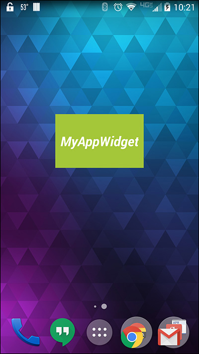
With the RelativeLayout element for the app widget taken care of, let’s look at the TextView found in Listing 7.1. This TextView has several properties that should be read over carefully. Properties such as android:layout_centerVertical="true" and android:layout_centerHorizontal="true" have been added. These properties have been applied to help keep content where it should be. App widgets by nature should be forgiving due to being resized and needing to accommodate devices with varying pixel densities. By using a centering technique, you can be sure that your app widget will appear nearly the same on every device that it is shown on.
Figure 7.1 demonstrates how this app widget renders on an Android device.
The layout for the app widget is only one of half of how the widget is displayed. The AppWidgetProviderInfo object contains other options that change how your app widget is displayed.
The AppWidgetProviderInfo Object
The AppWidgetProviderInfo object is an XML metadata file located in the /res/xml/ folder. It is used to contain the following settings and information for the app widget:
Minimum width
Minimum height
Update frequency
Preview image
Widget category
Initial layout for home screen
Initial layout for lock screen
Option to resize
App Widget Sizing
The recommended and default maximum width and height for a widget is 4×4 cells. It is possible to program your layout to be larger than this, but you will run into compatibility problems when running on the app widget on different devices. You can set the minimum width and height of your app widget by using the properties android:minWidth and android:minHeight. Because there are so many devices with different resolutions, screen sizes, and pixel densities, you should use dp units when setting the values for these properties.
You can use the following formula to figure out how many dp units should be placed in these properties to match a cell unit:
Number of cells = (i*70) – 30
In this formula, i is the number of cells you would like to use. Using this formula, you can determine the following sizing information:
2 cells = 110dp
3 cells = 180dp
4 cells = 250dp
With that information, you can create an app widget that fits the layout you want. For example, if your layout looks best at 2 cells wide by 1 cell tall, you would set the size by using android:minWidth="110dp" android:minHeight="40dp".
Update Frequency
The android:updatePeriodMillis property is used to adjust how often your app widget will run through the onUpdate() method. This setting does not guarantee that the update method will be run at the exact moment you specify, but it will run near when specified. It should be noted that no matter how small of a number you place as the value for the property, the system will not run the update more than once every 30 minutes (180,000ms).
This setting should be handled with care because it will impact the user’s battery. The recommendation is to set your update to at least 60 minutes. No matter what update timing you use, the update will schedule a job for the device to run around the specified time. This means that even if the device is sleeping, it will be forced to wake up, execute the update, and then wait to become idle before sleeping again.
If you would like to let the device sleep and only update when awake, it is possible to set this property to 0 and use an alarm Intent with the AlarmManager set as type RTC or ELAPSED_REALTIME to control the updating frequency of the app widget.
Preview Image
The previewImage property was added in API 11 (Android 3.0 Honeycomb) and allows you to specify a drawable asset that will be used on the widget selection screen as a preview of what your widget will look like. Figure 7.2 shows the widget selection screen on a device.

Figure 7.2 Creating a preview that matches what your app widget looks like will help users decide which widget to use.
There is a utility installed by default in the Android emulator called Widget Preview. When you open this application, you are given the option of selecting a widget that is installed on the device. After you have picked your widget, it is then displayed and you are given the option of taking a snapshot or emailing the preview image. Figure 7.3 shows the widget selection and preview screens of this application.
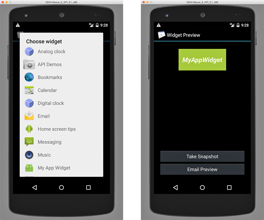
Figure 7.3 Your widget should appear on the list (left). Once selected, the widget is rendered and can be saved (right).
If you do not have an account set up on your emulator, the application may crash when you attempt to email the asset to yourself. If you save the preview, it will be saved to the Download folder on the emulated device. You can use the adb command from terminal to pull the file to your desktop.
Once the asset has been saved, you can place it in the /res/drawables folder of your project. It can then be referenced by setting the value to it like so:
android:previewImage="@drawable/example_appwidget_preview"
You are not limited to providing a resource that looks exactly like your widget; however, for the best user experience, try to match the preview to what your widget will look like.
Widget Category
App widgets originated on the home screen, but starting with API 17 (Android 4.2 Jelly Bean) app widgets were allows to be added to the lock screen. To accommodate this addition, the android:widgetCategory property is used. This property can accept the following values:
home_screen
keyguard
home_screen|keyguard
The home_screen value is the standard setting that allows the app widget to be placed on the main UI screen. Using a value of keyguard will place the widget only on the lock screen. When you specify this value, the app widget will not appear as an option to be placed on the home screen. Using a value of home_screen|keyguard allows your widget to be placed on both the home screen and the lock screen.
Warning
Be careful with what a widget is allowed to do and display when allowing access from the lock screen. If personal or private information is displayed through your app widget, it will show on the lock screen, potentially compromising user data should the device ever be misplaced or stolen.
Widget Category Layout
When providing the app widget access to the home screen and/or lock screen, it makes sense that you may want to offer a different layout. This can help with displaying sensitive information or by providing a layout that is more streamlined for a quick glance without extra interaction.
To specify a specific layout for the home screen and lock screen, you use the android:initialLayout and android:initialKeyguardLayout properties. If you want both to use the same layout, you would set the properties to the same value, like so:
android:initialLayout="@layout/my_app_widget"
android:initialKeyguardLayout="@layout/my_app_widget"
By using @layout/my_app_widget, the layout stored in /res/layout/my_app_widget.xml will be used for displaying and positioning elements on the widget. To change layout based on screen, you just need to reference another file for the value.
Note that the property contains the word “initial,” because you have the ability to programmatically change the layout file that is used, but when the app widget is first rendered, it will use the file listed as the value of this property.
Resizable Mode
The ability to resize widgets was added in API 11 (Android 3.0 Honeycomb). This was when the ability to tap and hold an app widget to resize it was introduced. Not all widgets will resize, and the option of allowing the resize is based on the value placed in the android:resizeMode property.
The android:resizeMode property can accept none, horizontal, and vertical. Beginning with API 12 (Android 3.1 Honeycomb), another option was introduced allowing resizing to occur on both axes by supplying the value of horizontal|vertical.
Sample AppWidgetProviderInfo Object
Now that you have seen what goes into an AppProviderWidgetInfo object, you should be familiar with the following sample file:
<?xml version="1.0" encoding="utf-8"?>
<appwidget-provider xmlns:android="http://schemas.android.com/apk/res/android"
android:minWidth="110dp" android:minHeight="40dp"
android:updatePeriodMillis="86400000"
android:previewImage="@drawable/example_appwidget_preview"
android:initialLayout="@layout/my_app_widget"
android:resizeMode="horizontal|vertical"
android:widgetCategory="home_screen"
android:initialKeyguardLayout="@layout/my_app_widget"></appwidget-provider>
Note that in the previous widget layout, the android:initialKeyguardLayout attribute is set. This does not need to be defined when working with a home screen–only widget, but is included here because Android Studio currently includes the value when creating a widget. If you do not plan on creating a lock screen widget, this attribute can be safely removed.
This file can be named anything you want, but should reside in the /res/xml folder. As per XML guidelines, the file should begin with an XML declaration and then any document elements. The <appwidget-provider> is then declared with a namespace of http://schemas.android.com/apk/res/android. Inside, you will find all the previously mentioned properties that help define how your app widget is displayed.
The AppWidgetProvider Class
The AppWidgetProvider class should reside in your source package and can be named anything that makes sense to you. For ease of maintenance and development, I recommend naming it after the app widget you are creating.
As an example, I have created an application named “MyAppWidget” with an Activity named MainActivity. This means that both MainActivity.java and MyAppWidget.java will be found at src/main/java/com/dutsonpa/appwidget/. Note that your package name should replace mine in the path.
The class file should extend AppWidgetProvider and contain at least the onUpdate() method. The following methods may be used:
onUpdate(): Runs during the update lifecycle of the app widget
onAppWidgetOptionsChanged(): Runs on widget creation and every time the widget is resized
onDeleted(Context, int[]): Runs whenever an app widget is removed
onEnabled(Context): Runs when the first instance of a widget is added
onDisabled(Context): Runs when the last instance of a widget is removed
onReceive(Context, Intent): Not generally needed, but will run for every broadcast and before any other callback methods
Among the listed callback methods, the onUpdate() method is paramount because it is where Intents are parsed and executed. This is also where you attach click events by using setOnClickPendingIntent(int, PendingIntent). You should also consider setting up services within this method to handle any long polling or web requests. Because AppWidgetProvider is an extension of BroadcastReceiver, it may be shut down at any time. By using the services within the onUpdate() method, you can avoid application crashes caused by Application Not Responding (ANR) errors.
Listing 7.2 shows a sample AppWidgetProvider class that could be used as a starting point for working with an app widget.
Listing 7.2 Sample AppWidgetProvider Class
package com.dutsonpa.myappwidget;
import android.appwidget.AppWidgetManager;
import android.appwidget.AppWidgetProvider;
import android.content.Context;
import android.widget.RemoteViews;
public class MyAppWidget extends AppWidgetProvider {
@Override
public void onUpdate(Context context,
AppWidgetManager appWidgetManager, int[] appWidgetIds) {
// Loop to make sure all widgets are updated
final int N = appWidgetIds.length;
for (int i = 0; i < N; i++) {
// add widget logic here
updateAppWidget(context, appWidgetManager, appWidgetIds[i]);
}
}
@Override
public void onEnabled(Context context) {
// Code here will run on launch of app widget
}
@Override
public void onDisabled(Context context) {
// Code here will run when the last widget is disabled
}
static void updateAppWidget(Context context,
AppWidgetManager appWidgetManager,
int appWidgetId) {
// Set widget text
CharSequence widgetText = context.getString(R.string.appwidget_text);
// App widgets use RemoteViews to manipulate widget view data
RemoteViews views = new RemoteViews(context.getPackageName(),
R.layout.my_app_widget);
views.setTextViewText(R.id.appwidget_text, widgetText);
// Pass updates to the widget
appWidgetManager.updateAppWidget(appWidgetId, views);
}
}
The class file should feel familiar; it starts with the required imports, moves to the class declaration, and extends AppWidgetProvider. You can then see that several methods have been set up with comments to help guide you through each section.
The onUpdate() method contains a for loop that identifies if more than one of your widgets has been added to the user’s screen. By using the for loop, you can be sure that logic changes and updates that should be executed will be, instead of only happening on one app widget. Other logic, such as click events, services, and Intent handling, should happen here.
The onEnabled() method is added so that if you need to set anything up for initialization, you may do so here. Note that this is a run-once method, and after being called and executed, it will not run again until all instances of the app widget are removed and one is added again.
The onDisabled() method is added so that logic from either onUpdate() or onCreate() can be executed to clean up any local variables, temp files, or databases.
A method named updateAppWidget() is also created to pass updates to the widget. This method will generally be called from onUpdate(). Remember that app widgets do not use standard views, but use RemoveViews instead. This is why the updateAppWidget() method uses them to change the text that is displayed in the widget.
Tip
The onAppWidgetOptionsChanged() method is used to change settings and options whenever the app widget is resized. You can get current information from the app widget by using getAppWidgetOptions().
Application Manifest Entries
The final piece that takes an app widget from idea to implementation is to modify your application manifest XML file. The modification consists of adding a <receiver> with an <intent-filter> element and a <meta-data> element.
The <receiver> should contain an android:name property with a value of your AppWidgetProvider class. A child <intent-filter> should then contain an <action> with a property and value of android:name="android.appwidget.action.APPWIDGET_UPDATE".
A <meta-data> element should be added as a sibling to the <intent-filter> element. This is a self-closing element, but it should contain the android:name="android.appwidget.provider" and android:resource properties. The value of android:resource should be set to the AppWidgetProviderInfo object XML file. As an example, if I had created an XML file named my_app_widget_info.xml in the res/xml folder, the property would read as follows:
android:resource="@xml/my_app_widget_info"
The following shows an example of what would be added to your Application Manifest XML:
<receiver android:name=".MyAppWidget" >
<intent-filter>
<action android:name="android.appwidget.action.APPWIDGET_UPDATE" />
</intent-filter>
<meta-data
android:name="android.appwidget.provider"
android:resource="@xml/my_app_widget_info" />
</receiver>
Summary
In this chapter, you learned about what app widgets are and the four basic steps involved in creating one. You learned about how layouts work with app widgets and how you can create two layouts that are used for the lock screen and home screen.
You learned about creating an XML file that houses information that the app widget uses to control interaction and meta information as an AppWidgetProviderInfo object. You also learned about creating a class to control widget logic and where it is placed in your application.
Finally, you learned how to modify your Application Manifest XML to contain the elements needed for the app widget to receive Intents and how to tie together the class and object file to relay resources between the app widget on the screen and the underlying logic that makes it function how you want.