
| 1 | Introduction |
Chapter Objectives
In this chapter you will:
Understand the features of Android.
Learn the differences between Java and Android Java.
Examine the Android project structure.
Build a basic application using Android Studio.
Learn about the Model-View-Controller design.
■ 1.1 Android Platforms
When the first-generation Android phones were released in 2008, they did not include many of the features that users are familiar with today. For example, the first commercial version of Android seen on the HTC Dream did not incorporate multitouch capabilities or even a virtual onscreen keyboard. Since 2008, Android has been enhanced in a multitude of ways, improving its performance, the user interface design, and adding many features, such as voice searching. By October 2014, Google released a version of Android comprising a powerful core of set standards that work on virtually every device, along with a refined visual component. By 2015, Android applications were including fluid animations, bold color palettes, and sophisticated multitasking menus that featured voice interactions.
Table 1-1 shows the evolution of Android, beginning with Android 1.0, the first commercial version used on the HTC Dream. With each subsequent version of Android, features from previous versions were improved and enhancements were made that targeted overall performance.
As each major version of Android is released, it is identified by a code name, organized in alphabetical order; all of the code names are the names of desserts. The first publicly code-named version of Android appeared in 2009 and was given the name Cupcake. In addition to the code name, each version of Android is given an API (application program interface) number and platform version number. Updates are designed so that a new API remains compatible with earlier versions of the API. The API identification is important to developers, as well as to Google Play, because it allows the Google Play store to filter applications so that users can easily download applications that are compatible with their devices. New versions of Android also bring a collection of new APIs for developers, such as notification controls or aids to make applications more memory efficient.
TABLE 1-1 Common Android Platforms

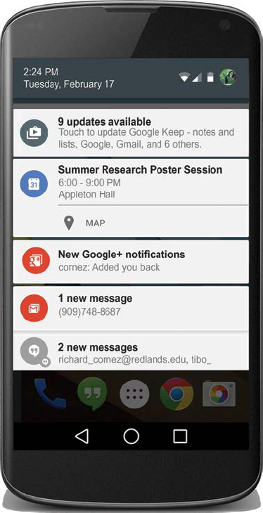
Google services have been integrated into the Android operating system since the first installment. Two of the most substantial inclusions of Android 1.0 were Google Maps and Notifications, which supported a pull-down window that revealed announcements and messages. The Notifications feature remains an important part of the Android user interface. In current releases of Android, this feature has been refined to include chat messages and calendar events that support synchronization across all Android devices, as shown in Figure 1-1.
By the time Cupcake appeared in 2009, such refinements as the inclusion of self-refreshing widgets and copy-and-paste had been implemented. One of the most significant features that emerged with Cupcake was the introduction of a soft keyboard, which also brought the first forms of keyboard skins. Created by third-party developers, keyboard skins provide enhancements to an existing soft keyboard. Unique to Android, skins allow users to personalize their keyboards, for example, by choosing a background texture, an icon set, and a color palette. When Google releases its latest version of Android, device manufacturers typically customize that software for their brand of phone and tablets. Skins have evolved alongside Android and have shifted beyond basic appearance and into more extensive behavior than originally seen in Cupcake. Today, Android device manufacturers regularly offer skins that enhance the user experience by adding functionality to the design.
Created in 2010, Android 2.2 was able to execute far faster than previous versions because of the new Dalvik Just-In-Time (JIT) compiler, first seen on Froyo. Dalvik, which will be discussed in more detail in the next section, allowed for better CPU performance, which significantly enhanced processing power. Along with the bolstered speed, Froyo’s browser came with a new JavaScript engine, making Internet browsing nearly three times faster than the previously released version of Android. Froyo also brought native support for tethering. This built-in feature, along with mobile hotspot support, gave users the ability to turn their phone into a wireless modem and a Wi-Fi hotspot for the first time.
Gingerbread became the prevailing version of Android from 2011 through most of 2012. It was the first version of Android that backed multicore processing on mobile devices. For application developers, Gingerbread brought support for new technologies, such as NFC (Near Field Communication) and SIP (Session Initiation Protocol). The SIP API provides developers with tools to create applications that perform video conferencing and instant messaging.
Honeycomb was released as the first version of Android specifically implemented for tablets. Prior to Honeycomb, Android tablets were running on phone operating systems that were stretched to fit the screen of a larger tablet.
With the release of Ice Cream Sandwich, Android was rebuilt to combine the best characteristics of Gingerbread and Honeycomb into a single operating system that would work for tablets and phones. Ice Cream Sandwich was able to bring many of the design elements of Honeycomb to smartphones, while refining the Android experience. The UI was notably more refined and stylish. In addition, navigation buttons became available as soft keys, and the voice input engine provided an open-microphone experience.
When Jelly Bean was released in 2012, it was the fastest and smoothest of all the Android versions. Along with its Google Voice Search feature, Jelly Bean was a jump in magnitude of performance. This version of Android was often referred to as a turning point for Android, where services and customization options met responsive design guidelines. KitKat looked similar to Jelly Bean; however, because of its size of 512 MB, it was able to run on a much larger array of devices. Previously, Android required 1 GB to 3 GBs to run.
As of early 2015, Lollipop is the latest version of Android used by developers. Lollipop and 64-bit chips provide enhanced performance with graphics, decoding and encoding of high-resolution video, and algorithms for facial recognition and speech interaction.
With so many versions of Android currently being supported, it is often difficult to choose the appropriate target version for which to compile an application. In fact, the latest version of Android is not always the most common version installed on Android phones and tablets. The ability to build an application that runs on multiple versions of Android is an important requirement for developers. For example, in early 2015, the most common version of Android was Jelly Bean, with KitKat a close second. However, Ice Cream Sandwich and Gingerbread were still being used on a small, but significant, number of the mobile devices worldwide. Targeting popular earlier versions of Android therefore allows developers to reach a larger number of users, but there can be tradeoffs. An application may require functionality that an older platform cannot support. In this case, an application developer should target a newer platform when building an application.
■ 1.2 Java vs. Android Java
Java is the recommended language for developing Android applications. In this textbook, all Android apps will be developed with Java. It is essential that readers know how to program and have a familiarity with Java libraries before continuing. A large number of Java libraries are available in the Android platform. As any Java programmer knows, Java comes with a library of classes providing a collection of utility functions that most Java programs cannot do without. This class library, called the Java API, has several thousand classes, with tens of thousands of methods that can be used in Android programs.
Android applications use Java, along with the extension libraries that Android provides in the Android software development kit (SDK). The SDK includes a comprehensive set of development tools, including a debugger, software libraries, and an emulator for an Android device.
Important differences distinguish the Java API from the Android API. To understand Android Java, we first need to understand what characterizes Java. Java differs from other programming languages in several noteworthy ways; the crucial difference is platform independence. One reason Java is so popular is that Java programs can be run on any computer with an installed Java Runtime Environment (JRE). Figure 1-2 illustrates Java’s platform independence. Java files are compiled to an intermediate representation rather than directly to a platform-specific machine code. This intermediate representation, Java bytecode, is analogous to machine code. The major difference between bytecode and machine code is that bytecode instructions are interpreted by a virtual machine (VM) written specifically for the host hardware. A virtual machine is a software implementation of a machine (i.e., a computer) that executes programs like a physical machine.
To run non-Android Java programs, a Java compiler must translate the source code files into class files. These files can then be executed on a Java virtual machine (JVM), which interprets the intermediate language on a target computer. By preparing a JVM for each platform, a program translated into the intermediate language can be run on many different computers. The Java virtual machine is called “virtual” because it is an abstract computer defined by a specification. Each Java application runs inside a runtime instance of some concrete implementation of the abstract specification of the JVM. The JVM runs on all kinds of hardware executing the Java bytecode without changing the Java execution code. Java bytecode runs in a JRE, which is composed of the Java API and the JVM.

There is no Java virtual machine in the Android platform; instead, there is Dalvik, which is a specialized virtual machine. Once Java has been compiled into bytecode by the Java compiler, it is compiled again into a proprietary bytecode, as illustrated in Figure 1-3. The bytecode loaded by the Dalvik virtual machine should not be confused with Java bytecode. The dex bytecode is a compact Dalvik executable format designed for Android systems, which are constrained in terms of memory and processor speed. The Android Software Development Kit includes the Dalvik dx tool, used to translate Java bytecode into Dalvik bytecode.
Dalvik is referred to a JIT (Just-In-Time) engine because it compiles bytecode in real time. A new Android Run Time (ART) was introduced in 2014 that takes advantage of current hardware advances. ART relies on an AOT (Ahead of Time) compiler, which compiles bytecode before execution. The ART virtual machine is the default of Lollipop and compiles an application to native machine code when installed on a user’s device. ART is designed to be fully compatible with Dalvik’s existing bytecode format.
Dalvik and ART do not align to all Java class library profiles. Specifically, Abstract Window Toolkit and Swing are not supported by Dalvik and ART. Instead, Android user interfaces are built using the View framework, which is similar to Swing. This framework will be discussed in detail in Chapter 2.

■ 1.3 Android Studio IDE
Android applications are often built to take several forms, such as phone, tablet, Wear, and Google Glass. In addition, the project structure of an application consists of many moveable pieces. These factors lead to a complex project structure. To make the development process easier, it is recommended that developers use an integrated development environment (IDE) to build applications. This textbook relies on Android Studio.
Based on IntelliJ, Android Studio is the official IDE for building Android applications. Developed by Google, this environment focuses exclusively on Android development and comes bundled with the Android Software Development Kit (SDK). The SDK provides developers with a packaged set of developer tools and API libraries for building complete applications, testing them on virtual devices, and performing debugging and optimization.
For readers intent on finding an alternative to Android Studio, it is possible to install a stand-alone SDK tool set that does not include a complete development environment. This option allows developers to access the core SDK tools from a command line or possibly from another IDE, such as Eclipse. This approach is not recommended for first-time developers.
Android Studio is available for download from Android’s developer website:
developer.android.com/sdk/installing/studio.html
Updates and improvements are made frequently to Android Studio, as well as to the required plug-ins. You may find that your version of Android Studio looks somewhat different from the images you will see in this text. The core functionality remains the same.
Android Studio requires the Java Development Kit (JDK) for building applications and components. One of the most important tools in the JDK is the Java compiler. Java code featured in this textbook has been compiled with JDK 7.
The following development components are included in Android Studio, or must be added, just as newly released versions of an SDK should be added:
Java Editor |
The Java programming language editor contains common IDE features, such as compile-time syntax checking, auto-completion, and integrated documentation for the Android framework APIs. |
Layout Editor |
Android Studio includes a graphical layout editor for building and editing user interface files. Specifically, this graphical layout editor allows for easy drag-and-drop functionality for designing and previewing user interfaces. |
Android SDK |
The Android SDK is a collection of API libraries, tools, scripts, and documentation. The SDK separates tools, platforms, and other components into packages that can be downloaded as needed. As new SDK versions and tools become available, they should be added to Android Studio. The Android SDK archive initially contains the basic SDK tools. It does not contain an Android platform or third-party libraries. In order to start developing applications, you must install the platform tools and at least one version of the Android platform, using the SDK Manager. Platform tools contain build tools that are periodically updated to support new features in the Android platform. |
AVD |
To run the Android Emulator, an Android Virtual Device (AVD) is constructed to define the characteristics of the device on which an application can be tested. This includes the system image and screen size, the hardware, data storage, etc. To test an application on multiple Android devices, a unique AVD device must be created for emulation. In Tutorial 1 of this chapter, you will create an AVD to test a simple application. |
Gradle |
Gradle is the build system used by Android Studio. Provided as a plug-in to Android Studio, it can also be used to build Android apps from the command line. The build configuration of a given Android project is defined inside simple text files that use options from Gradle. |
■ 1.4 The Basics of App Design
In the early days of mobile devices, very few apps existed. A mildly interesting and useful application had a fairly decent chance of becoming successful during the first years of Android devices. Today, the competition is far more intense. It is not enough to produce an interesting and useful app, particularly if similar apps are on the market. In addition to a good idea, a promising Android application must perform well, be more interesting than a competing application, and offer a user experience that is highly appealing.
Designing an outstanding application involves considerable thought and analysis of usability and user interface design. These two elements require attention both before and during the development process. In addition to performance, usability and the user experience can often be indicators of the success or failure of an application.
The process for building an application, as depicted in Figure 1-4, begins with an initial idea. Sometimes, research follows to determine the value and demand of an app idea. The initial concept for an application can be somewhat vague at the beginning stage, even if some specifications have been outlined. To evolve design concepts into a workable model, it is advisable to generate a user narrative that recreates a user’s experience, given the technical constraints of the application.
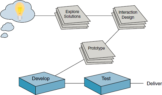
Design ideas are generated from the exploration of user experiences. Ideas can start with a simple sketch on paper and evolve into cutout prototypes. Sketches can include design usage scenarios to explore ideas for structuring a navigation system related to the aesthetic qualities of interaction. Cutout prototypes, as shown in Figure 1-5, can serve as micro experiments to explore strengths and weaknesses that involve actual tactile handling. These can also influence technical decisions.

■ 1.5 The Anatomy of an Android Project
A certain amount of technical machinery is necessary in Android to write even the simplest applications. As you learn to develop apps, we will sometimes give you a preliminary explanation and you will have to wait for more complete detail in a later chapter.
The Android SDK tools expect that your project will follow a specific structure so it can compile and package the application correctly. Gradle is at the foundation of the Android SDK build system and is used to automate the building, testing, publishing, and deployment of Android apps.
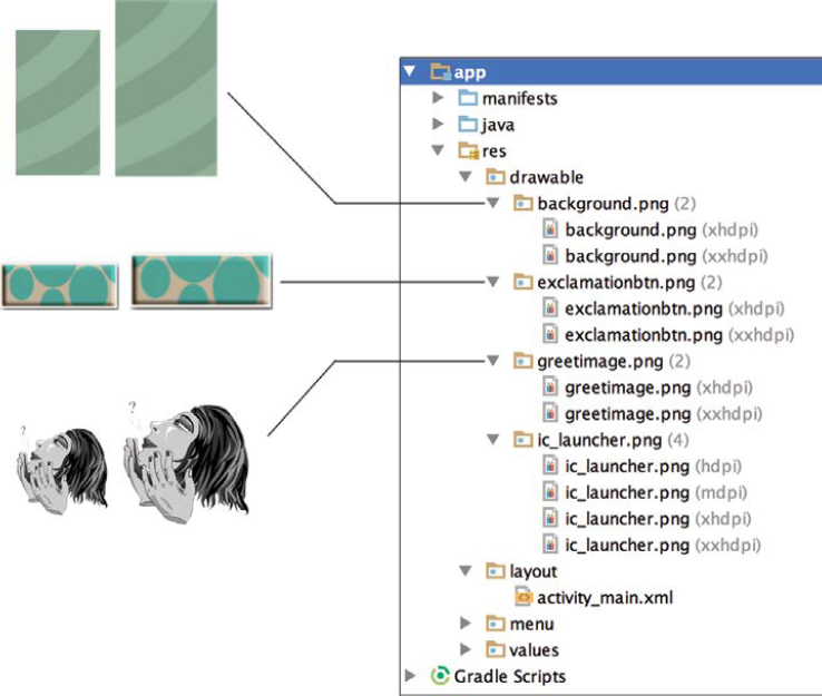
A project built in Android Studio will be structured similarly to Figure 1-6. The project structure is organized by source code, the application’s resources, manifest settings, and build files. All of these files are eventually packaged into an apk (Android application package) file, which represents the final application that will be installed and then run on an Android-powered device.

Many of the application files and directories shown in Figure 1-6 are automatically generated and contain default content. Additional files have been generated and hidden from view. At this early stage, it is important that we understand the following six components found in the project structure. Once we understand the purpose of these files, the development process will fit into a more comprehensible context and will be easier to implement.
1.5.1 Android Manifest File
An AndroidManifest.xml, is required for every Android application. This file uses XML code to define specific application information. The information can include general application-wide settings, such as the application’s style and launch icon. In the example AndroidManifest.xml code shown below, Line 6 sets the launch icon to a graphic image stored in the drawable folder. Line 7 sets the style of the application so that it has a black background and utilizes a full screen.
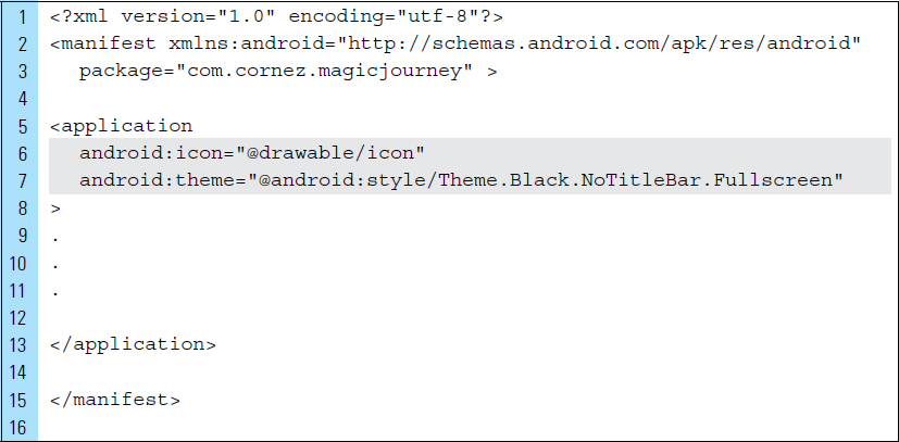
The AndroidManifest file is also used to specify an application’s hardware requirements or special permissions. A permission system is part of the Android security model. For example, permissions can be used to grant or deny services, such as location services, access to external storage, and SMS.
The following example of XML code is used in an AndroidManifest file to require that a device include a camera in order to run the application. In addition, two permissions are requested: camera permission and the ability to write to external storage to save a photograph.

1.5.2 Java Source Code and Activity Class Files
The Java source code of an application is placed in the java directory of the project structure. A main file, often named MainActivity or sometimes MyActivity, is a Java file that is auto-generated when the project is first built. It may have a different name, depending on the Android Studio version you are using. This Java file represents an application activity and is important because it controls the behavior of the application when it is first launched. An Android activity corresponds with a single, focused activity that the user can perform. Applications are made up of one or more Activities. For example, consider a banking application that requires the user to log into the account securely before it is possible to access the account information. The login screen would be represented by one activity, while the account overview would be represented by a separate activity.
Each Activity is represented by a visual interface to the user, called a layout, along with source code, such as MainActivity.java, that drives it.
Activities are essentially defined using two types of files:
Java class determines the behavior of the activity.
Layout determines the visual layout of the activity.
When an application is designed with multiple activities, one activity must be designated as the main activity when the application is launched for the first time. By default, this activity is the one first created and named when the application project is first set up.
1.5.3 Drawable Resources
The drawable folder is located in the res directory, which contains the application resources. Drawable resources are image files, such as application icons, buttons, and background textures. Mobile applications typically require many visual elements, which are often managed as drawable resources. For example, in a chess game application, the chess pieces are drawable image files imported into the application project. The most common drawable resource used in an application is a PNG file. Android recommends the use of graphics that are not interlaced and are stored with a 24-bit depth. Images and icons do not need to be restricted to web-safe colors.
Android runs on a variety of devices, ranging from low-density small screens to high-density large screens. A density-independent pixel (dp) is a virtual pixel unit that is equivalent to one physical pixel on a 160-dpi (dots per inch) screen. This is the baseline density assumed by the system for a medium-density screen. The conversion of dp units to screen pixels (px) is:
px = dp × (dpi/160)
For example, on a 240-dpi screen, 1 dp equals 1.5 physical pixels.

Because of the diversity in Android devices, it can be a challenge to construct perfect-looking drawables for all existing Android-powered devices. When creating drawables, it is highly common for app designers to give strong consideration to screen density. For example, developers often create three to five images for the following generalized screen sizes:
extra-large screens are at least 960 dp × 720 dp
large screens are at least 640 dp × 480 dp
normal screens are at least 470 dp × 320 dp
small screens are at least 426 dp × 320 dp
To achieve a high level of graphics quality on all screen densities, developers should provide bitmap resources that are properly scaled to each of the generalized density buckets: low, medium, high, and extra-high density. Figure 1-7 illustrates screen densities created for an application launch icon.
To properly scale application images, it is best to start with a raw resource in vector format and generate the images for each density using the following size scale:
xxhdpi: |
3.0 |
xhdpi: |
2.0 |
hdpi: |
1.5 |
mdpi: |
1.0 (baseline) |
This means that if a 300 × 300 image is built for xxhdpi devices, the same drawable image should be built in 200 × 200 image for xhdpi, 150 × 150 for hdpi, and 100 × 100 for the mdpi devices. It should be noted that this textbook features a collection of apps designed for exploration. To keep the focus on concepts, we have minimized the time required to build the lab applications. This means that with the exception of Chapter 1, only baseline drawable images are made available for lab applications.
1.5.4 Layout XML Files
In an Android application, the user interface screens are visually designed and coded as XML layout files. An application can have many screen designs, as illustrated in Figure 1-6. These files are stored in the res/layout directory of the project structure. A layout is the visual representation of a given interface screen containing all the visual objects on display. As shown in Figure 1-8, the design and arrangement of the elements on the screen are implemented using XML code in a layout file.
When a layout appears on the screen, it is managed by an Activity. An Activity is a Java class that drives the actions and movements that will occur on the screen. Chapter 2 will explore techniques for designing various screen layouts.

1.5.5 Value Resources
The res/values directory within an Android project is used to manage value resources for the application. This includes strings, colors, dimensions, and styles used by the application. Value resources are implemented as XML files.
Android encourages the separation of functionality and resources. This philosophy of keeping values separate from functions can be very helpful for developers. For example, when developing an application that will be translated into multiple foreign languages, string values can be changed without affecting the deployment of the app. The application can be translated from the first language to a second language by recustomizing the strings.xml file. In this way, the application apk can remain intact.
Value resource files are organized by the various types of data they contain. A collection of text strings is stored as strings.xml, while color definitions can be stored in colors.xml.
1.5.6 Gradle Scripts
The Gradle Scripts directory stores the application’s build files. These files allow developers to configure build settings, override, edit, and add custom build options.
For example, the following build.gradle project file is used to configure the build settings of an app named Test Application. The minimum SDK version is set to an API level of 16, corresponding to JellyBean. As the name suggests, the minimum API level defines the minimum version of Android on which the application can function. This definition is also used by Play Store to detect if the application is compatible with the user’s device.
The target SDK version is specified as API level 23, Lollipop. This is the build target against which Android Studio will build. When building against API level 23, the application will still be able to run on API level 16, as long as the source code does not rely on any APIs that are not available on API level 16.
The build system can also generate multiple apk files with different build configurations for the same module. This is used to build different versions of an application.

■ 1.6 Building Basic Applications in Android Studio
When Android Studio is launched for the first time, the Setup Wizard, as shown in Figure 1-9, will install a current Android SDK and configure the development environment settings. In addition, an optimized emulator will be created for testing applications.

When building a first application in Android Studio, a certain amount of step-by-step guidance is useful. The following two tutorials will demonstrate the basics of getting started and creating simple applications. Read both tutorials thoroughly to help you understand the anatomy of an application and get acclimated to the development process. In addition, the tutorials will help you with future lab work by providing an important sense of how much background information is assumed about the development process.
■ Tutorial 1: Hello World
Since 1974, it has been a tradition for budding programmers to write an introductory program that displays the greeting “Hello World.” Even though Android programmers are not budding programmers, we will preserve that tradition in this step-by-step tutorial with a slight modification. We will create an interactive greeting application named Hello Goodbye. As shown in Figure 1-10, the user will be presented with a single button, “Exclamation.” When the user clicks the button, the app will respond by displaying the “Hello” greeting in a text field. When the user clicks a second time, the app will respond with “Goodbye.” Each subsequent click will toggle the displayed output between “Hello” and “Goodbye.”
This first tutorial provides an opportunity to explore the basics for constructing an application using Android Studio. The specific objectives for this tutorial are as follows:
1. Illustrate the process of constructing a simple Android app from beginning to end.
2. Discuss the idea and importance of the Layout Manager Editor.
3. Introduce the basic anatomy of an Android Java source file.
4. Build a virtual device.
5. Test the application on a physical device and a virtual device.
The tutorial is broken into multiple sections:
Part 1: |
The Conceptual Design |
Part 2: |
Verifying the Required SDKs for Android Studio |
Part 3: |
Creating the Application Project |
Part 4: |
Adding and Editing Application Resources |
Part 5: |
Constructing the User Interface of the Application |
Part 6: |
Coding the Activity for the Application |
Part 7: |
Packaging the App and Running on a Physical Device |
Part 8: |
Building an Android Virtual Device |
Part 9: |
Testing the Application on an Emulator |
Part 10: |
Optimizing and Improving a Project |
Part 1: The Conceptual Design
The storyboard for the Hello Goodbye application highlights the user experience, as shown in Figure 1-10. This conceptual design consists of a rough sketch of the user interface and illustrates the user’s interactive experience after each click of the button. In addition to the interface elements on the screen, the rough sketch also provides specific design attributes, such as color choices, font sizes, and graphic images.
At its most basic, a project storyboard provides a blueprint outlining three elements that will be considered in the final project:
1. Output
2. UI Interaction
3. Design requirements

Part 2: Verifying the Required SDKs for Android Studio
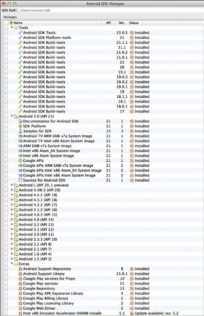
Android Studio requires SDKs to develop an application. SDK tools and packages are often updated or new versions are released. To properly configure an Android project, Android Studio may need to install these tools and packages. In this part of the tutorial, the SDK manager will be used to verify the installation of the required SDKs.
Step 1: |
Launch Android Studio. A window similar to Figure 1-11 should appear. |
Step 2: |
Select Configure from the Quick Start window. The Configure window allows you to perform a variety of configurations in addition to installing SDKs. For this application, readers can verify the Java compiler version in Preferences. The compiler version used by this text is Javac 1.7. Plug-ins—such as an embedded terminal, GitHub, and Google Cloud—are not required for this application, but they can be useful for future lab examples. The SDK Manager can be used at any time to update and install tools and packages. |


Step 3: |
Select SDK Manager from the Configure window, shown in Figure 1-12. The SDK manager categorizes tools, platforms, and other components into packages. For example, all the Android SDK build tools are stored in the Tools folder. The Android platform components are stored in folders labeled with the version and API number of the platform. |
Step 4: |
Verify that the elements shown in Figure 1-13 have been installed, specifically API versions 16 through 23. We strongly recommend installing the most recent version available. Once the SDKs have been installed, return to the Quick Start window shown in Figure 1-11. |
Part 3: Creating the Application Project
The application project will have an initial structure. In this part of the tutorial, the preliminary settings and structure for the |
|
Step 1: |
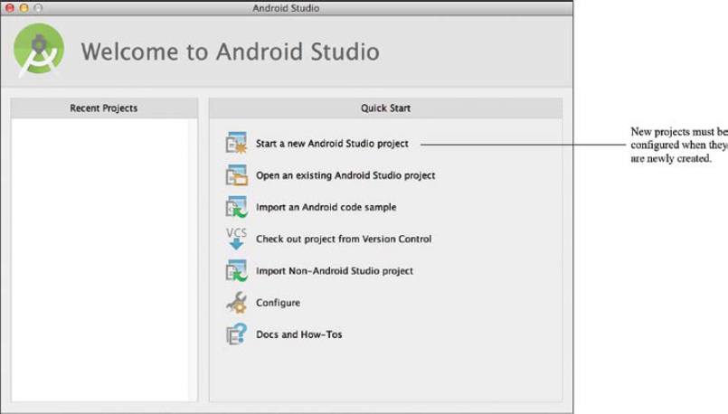
Select Start a new Android Studio project from the Android Studio Quick Start panel, shown in Figure 1-14. |
In Steps 2–3, you will configure the name and location of your Android project, as shown in Figure 1-15. |
|
Step 2: |
Specify the application name as The application name is used by Android Studio to give it a unique identification. It is also the title that will appear in the Play Store and is the title of your application launcher icon once it is installed on a device. In general, it is important that the application name be unique within the workspace. If you enter a name that is already in use, Android Studio will simply add a version number to the end of the name. |
Step 3: |
Specify the company domain name. All the applications built in this text will use the company domain By default, Android Studio constructs a package name based on the application name and the company domain. This package name is the namespace for your application’s code files and is added as the package attribute in your application’s Android manifest file. This manifest value serves as the unique identifier for your application app when you distribute it to users. The package name follows the same rules as packages in the Java programming language. The name is the reverse domain name of your company, in addition to any identifiers. |
Step 4: |
Set a new location, or use the default location, of your Android project. Click Next. |

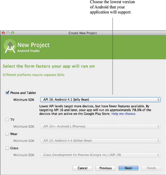
In Steps 5–6, you will specify the Android form your application will run on, such as a phone or tablet, a wearable, Google Glass, or TV. In addition, a minimum SDK platform is identified prior to creating the Android project shell. When developing applications, developers often want to target as many devices as possible. Specifying the lowest possible version of Android will achieve the most number of devices. For example, by specifying Froyo 2.2, API 8, as the minimum SDK, an application will run on almost all devices on the market. However, there are some disadvantages to specifying a low API version, such as a lack of critical features supported by an older platform. The choice of a minimum SDK level should be one that supports the features your application needs, while also trying to reach as many users as possible. The Help me choose link, shown in Figure 1-16, provides a cumulative distribution chart of the current API market. |
|
Step 5: |
Specify Phone and Tablet as the device form, as shown in Figure 1-16. |
Step 6: |
Specify API 16, Android 4.1 (Jelly Bean) as the minimum required SDK. Click Next. |
Application templates can be used to create various Android applications, as shown in the template image models in Figure 1-17. These templates are available when a new Android project is created. You can also apply these templates to a new activity that is being added to an existing project. The Blank Activity application template is a simple application template that follows Android Design guidelines. This template design is used when a basic, minimal application is the starting point for an Android project. Other common templates are Google Maps Activity, FullScreen Activity, and Master/Detail Flow. FullScreen Activity is a template that provides an implementation of an activity, which alternates between a primary, full-screen view and a view with standard user interface controls. User interface controls can include a notification bar and application title bar. The full-screen view is the default for this template. The user can activate the standard view simply by tapping the touchscreen. The Master/Detail Flow template is primarily used for data-driven applications. This template creates a responsive layout for a collection of items, the master list, and the details of each item on the list. |
|
Step 7: |
Choose Blank Activity from the Create New Project window. Click Next. |

The Blank Activity template creates a blank Activity, which is implemented as a Java source file. This Activity is the main activity for the application and is immediately launched when the user first opens the application. The main activity of the application is linked by default to an XML layout file, which implements the Activity’s visual appearance on the screen. The names for each of these files are specified in Steps 9–11, as shown in Figure 1-18. |
|
Step 8: |
The activity name is set to |
Step 9: |
The layout name is set to |
Step 10: |
Title and Click Finish. Once the project is created, its structure is generated. For a Blank Activity application, the structure will look similar to the one shown in Figure 1-19. Default versions of required files are automatically generated. The collection of related files will eventually be built into an apk file that you install onto a device. |

|
The The graphic named The |


 FIGURE 1-20
 ic_launch.png is automatically generated as the default launch icon.
The Android robot is reproduced or modified from work created and shared by Google and used according to terms described in the Creative Commons 3.0 Attribution License.
Step 11: |
Examine |
|
|
This file will not be altered for this first application. The XML code for |
|
|
Lines 2–3: |
The Android Application Manifest file is made up of a root manifest tag with a package attribute set to the project’s package, |
|
Lines 5–20: |
A manifest can contain only one application node. This uses attributes to specify the metadata for the Android application, such as title, launch icon, and theme. The application tag also serves as a container for the application’s activities. |
|
Lines 10–19: |
A manifest can contain many activity nodes. The |

Part 4: Adding and Editing Application Resources
Before we can build a user interface and code the application, we need to add the required resources to the project structure. The resources for a basic application will typically consist of text values, graphic files, data values, and color definitions. All resources should be identified during the conceptual design phase of the application, such as the one we will use from Figure 1-6.
This Hello Goodbye application will require three types of resources as follows:
Drawables: |
Three graphic files will be added to the project structure to enhance the application visually. |
String values: |
Text strings will be used to store the exclamations (“hello” and “goodbye”) and the text that appears on the button. |
Color values: |
A color definition that will be used to color the “Hello” and “Goodbye” text generated and displayed by the application. |
Step 1: |
Assemble the drawable resources to be used in the application. |
||
|
Before constructing the application project, make sure that you have all necessary external application elements. For this tutorial, there will be three image files used in the application: a background image, a button image, and a small graphic for decoration. These elements, shown in Figure 1-21, can be found in the textbook resources. All image file names must contain only lowercase letters. |
||
|
Within the |
||
|
xxhdpi |
extra-extra-high-density screens |
(approximately 320 dpi) |
|
xhdpi |
extra-high-density screens |
(approximately 240 dpi) |
|
Providing different images will reduce artifacts from images being scaled up and down. All of the images in your project will be installed with your app, and the operating system will choose the best one for that specific device. |
||
Step 2: |
Drag the xxhdpi version of |
||
|
If the file cannot be dragged, perform a copy/paste. |
||
Step 3: |
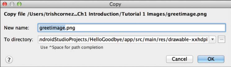
Select the xxhdpi destination directory, as shown in Figure 1-23. |
||
Step 4: |
Choose the name of the file, as shown in Figure 1-24. |
||
Step 5: |
Verify |
||
Step 6: |
Add the xhdpi version of |
||


|
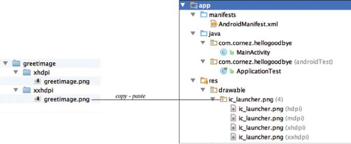
Once two versions of the same image are added to the |
Step 7: |
Add the xhdpi and xxhdpi versions The complete Strings are important components in every Android application. The external file strings.xml is automatically constructed at the start of a new application and routinely stores the text strings for the application name, action settings, and hello world. |

As a value resource file, |
|
Step 8: |
Open |

|
We will leave the existing text strings intact and simply add the four additional strings our application will require. String values are entered as key/value pairs. This can be done using the Translation Editor feature or entering the XML code. The authors prefer entering resources in the XML code, but you may choose either method. |
Step 9: |
Use the following XML code listing as a guide and enter the string values shown on Lines 8–16. Save the file. |

It is often necessary and practical to create additional resource files that contain values that the application will use. Color is such a file. Our application will use a color, called dusty rose, for the exclamations generated when the user hits the As with any other resource, color resources should be defined in an external file so that you can easily change colors without modifying your app’s source code. Often, colors are declared in an XML file named colors.xml. We will create this file in this step. |
|
Step 10: |
Right-click the Choose New > XML > Values XML file, as shown in Figure 1-29. |

Step 11: |
Specify the name of the values file as Click Finish to create the file. Android Studio will open the new file in the XML view. Verify colors.xml appears in the project structure in the values folder, as shown in Figure 1-31. |
Step 12: |
Use the following XML code listing as a guide to add color for “dusty_rose,” shown on Line 3. Save the file. |


Part 5: Constructing the User Interface of the Application
Layout files use XML code to define the placement of visual objects, including buttons, text, and images, on the canvas that represents the application screen. When an application is first created, a default layout, activity_main.xml, is automatically generated. We will modify this layout.
In this part of the tutorial, we use the Graphical Layout Editor to build the application user interface by dragging and dropping visual elements onto a canvas that represents our application screen. Finally, we will explore how to customize the properties of each of the visual elements that have been added.
Step 1: |
Open The Graphical Layout Editor is automatically launched and |

The Graphical Layout Editor provides the following features for building the layout. It is important to become familiar with these features before continuing.
Canvas |
The canvas represents the screen that will eventually hold visual elements. The canvas is the area where you can drag and drop display objects, such as user interface components, to design a layout. |
Palette |
The Palette contains icons representing visual elements that can be added (dragged/dropped) to the canvas. Icons are organized into categories, such as Form Widgets, Text Fields, and Images & Media. |
Android Version |
An Android version can be specified for rendering layouts in Eclipse. |
Device |
A device configuration can be specified by name, such as Galaxy Nexus or Nexus One, or by dimensions. Each of the devices listed in this drop-down menu has its own look and feel. The canvas renders the appropriate look based on the device setting, along with the Android version. |
Orientation |
The orientation of the application can be configured by selecting portrait or landscape. It is also possible to choose a UI Mode, such as Television or Car Dock. |
AppTheme |
The configuration theme of an application is a specification of style. For example, an application screen can be all black or occupy the full screen with no title. Each theme has a unique identifying name, which can be selected from a menu listing from AppTheme. |
Outline |
The Outline panel provides a hierarchical list of the visual elements placed on the layout file. This ordered structure is very useful when inspecting the structure of the design and selecting specific components. At the moment, the root element, a RelativeLayout container, is the only object in the file. These containers will be explored in Chapter 2. |
Properties |
Each visual object placed on the canvas has a collection of context-sensitive properties that can be set. For example, the color of a text field can be set to dusty_rose or the width of a button can be adjusted. |
Mode Tabs |
The two modes for building the user interface of a given layout are Graphical Layout and the XML code. Click one of the mode tabs to be able to toggle between these two modes. |
|
When building user interface screens, you may use a variety of approaches. A good approach is to use the Graphical Layout Editor to drag and drop visual elements to the screen and then fine-tune the attributes within the XML code file. In Step 2, we will add a textured background to our user interface screen. |
Step 2: |
Select |

|
Once Many of the visual elements located on the canvas, including the |
Step 3: |
Locate the background within the Properties panel, shown in Figure 1-33. Briefly familiarize yourself with the set of properties that can be applied to a visual object on the screen. This can be done with a quick scroll through the other properties in the list. |
Step 4: |
From the background property, click in the box to the right of the divider and select the |
Step 5: |
When the Resources chooser window appears, as shown in Figure 1-34, locate and select the file named Click OK. |
 button.
|
The value stored in the background property for the root |
|
When you double-click a specific item on the canvas or in the Component Tree panel, a context-sensitive selection of properties will appear in an independent window. This method can also be used to set properties. |

In Steps 6 and 7 we will examine the XML code of the |
|
Step 6: |
Select the Text mode in the Layout Editor, as shown in Figure 1-36. The “Hello World” string is always generated for the main layout in new Android projects. As a throwaway element, it will need to be removed. In this next step, we will remove it from the interface by deleting its XML tag code. |
Step 7: |
As shown in Figure 1-36, select the complete |
Step 8: |
Return to the Design mode of the Layout Editor and verify that “Hello World” has been removed. |

The purpose of this application is to generate a “hello” or a “goodbye” exclamation when the user taps a button on the screen. A text field element is required for displaying this text.
In Steps 9–12, we will add a |
|
Step 9: |
Drag the Large Text element from the Widgets palette to the canvas. Drop it so that it is centered horizontally (see centerHorizontal) at the top of the canvas, as shown in Figure 1-37. Once the |
Step 10: |
Double-click the Large Text element that was just added to the canvas. The text/id dialog box, shown at the top of Figure 1-38, will appear on the screen. |

Step 11: |
Click the The Resources chooser window will appear, as shown in Figure 1-38. |
Step 12: |
Locate and select the Click OK. The value stored in the text property for the In Steps 13–15, we will edit the color of |
Step 13: |
Select |
Step 14: |
Click in the box to the right of the divider and click the The color Resources chooser window will appear. |
Step 15: |
Locate and select Click OK. Colors can also be selected from a set of system values or the color palette provided by Android Studio. |

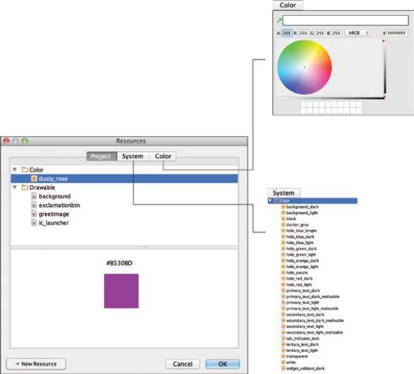
|
The value stored in the textColor property for The sizes of graphical user interface (GUI) components and text can be specified in various measurement units, such as dp and sp. The notation dp is used to specify a density-independent pixel. Defining GUIs enables the Android platform to scale the GUI based on the pixel density of a given device’s screen. One dp pixel is equivalent to one pixel on a 160-dpi screen. On a 240-dpi screen, each dp pixel will be scaled by a factor of 240/160. A component that is 100 dp pixels wide is scaled by a factor of 120/160. The sp measurement of the same component will be 75 actual pixels wide. The notation sp is used to describe a scale-independent pixel. Scale-independent pixels are scaled like density-independent pixels and are the user’s preferred font size (as specified in the device’s settings). In Steps 16–17, we will edit the text size of |
Step 16: |
Select |
Step 17: |
Enter 60sp to the right of the divider. At this point, |

|
In Steps 18–25, we will add a decorative image element to the canvas. The main purpose of adding this element is to illustrate how it is done and to add interest to the application screen. |
Step 18: |
Unselect any canvas elements that are currently selected. |
Step 19: |
Locate the ImageView component in the Widgets palette. |
Step 20: |
Drag and drop the ImageView to the center of the canvas, as shown in Figure 1-41. Note the centerHorizontal and centerVertical location indicators that appear. A small nub will appear on the canvas. |
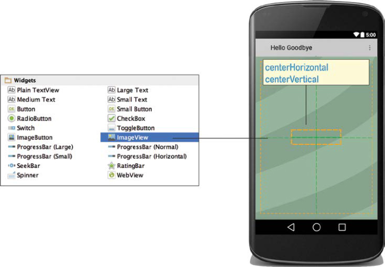
Step 21: |
Double-click the nub that appears on the canvas and click the The Resources chooser window will appear with a list of drawable elements to choose from. |
Step 22: |
Locate and select Click OK. |


|
Your layout will look similar to Figure 1-44. Once the ImageView object appears on the canvas, it will also appear in the Component Tree panel. As with all objects added to the canvas, it will be given a unique identifying name. In this instance, the unique id is Image components added to the canvas should have a content description describing the content of an image. A warning, in the form of a small yield symbol, will appear until this task is performed. |
Step 23: |
With |
Step 24: |
Click the |
Step 25: |
When the Resource chooser window appears, select Click OK. The property settings for |

|
In Steps 26–30, we will add a button to the canvas and customize it. When the user taps the button, a toggle string will appear in |
Step 26: |
Locate Button from the Widgets palette and drag and drop it onto the canvas, as shown in Figure 1-45. Once the button appears on the canvas, it will also appear in the Component Tree panel with a unique identifying name, |
Step 27: |
Locate and select the text property for |
Step 28: |
When the Resources chooser window appears, select Click OK. |

|
The value stored in the text property for Verify that “Exclamation” appears as the label for the button on the canvas. Buttons can be configured with background images, colors, and styles. In Step 29, we will set a new button background. |
Step 29: |
Locate and select the background property for |
Step 30: |
When the Resources chooser window appears, select Click OK. The final property settings for button are shown in Figure 1-47. The authors encourage readers to browse the list of properties associated with |


|
The user interface screen is now complete. Save |

|
In the final step for this segment of the tutorial, we will examine the generated XML code. If minor errors exist or arrangement changes need to be made, these tasks can be performed in the Text mode of the Layout Editor. |
Step 31: |
Select the Text mode in the Layout Editor. |
Step 32: |
Examine the code below and make necessary changes to fix any errors you may have. Note that positioning information of your graphic images will differ from the following code based on where your objects were placed. Save your file. Property values can easily be modified in the XML mode, such as changing the margin values, correcting id names, and so forth. If your code differs to a great extent from the code segment that follows, it is important that you make the necessary changes. Many of the XML tags are self-explanatory. Tags related to Android will be discussed in Chapter 2. To study XML in more detail, you may want to consult an XML reference source. |

Part 6: Coding the Activity for the Application
Once the application resources have been added and the user interface screen has been built, the Java source code can be written. In this tutorial, the controller element of the application will be implemented as an Android Activity. The Activity class will be explored in more detail in Chapters 3 and 4.
The two objectives for the main Activity in this example are:
1. Inflate the user interface layout.
2. Control and respond to the UI elements located on the user interface layout.
Step 1: |
Open the |
|
|
|
|
|
To gain a better understanding of the anatomy of our application activity source file, we will examine the code file. |
|
Step 2: |
Edit the file from its original content using the code outline below. |
|
|
Lines 3–6: |
Import statements for Activity, Bundle, Menu, and MenuItem will be needed for this application. |
|
Lines 7–9: |
A |
|
|
The |
|
Line 11: |
|
|
|
This line defines |
|
Line 14: |
A |
|
Lines 19–34: |
As the name suggests, |
|
Line 23: |
The |
|
Line 26: |
A reference to |
|
Lines 32–33: |
A |
|
|
An |
|
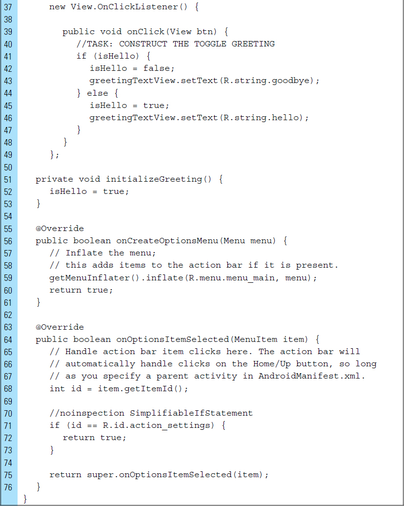
Lines 36–49: |
It is not uncommon to implement listener classes as inner classes. There are two advantages to this. First, listener classes tend to be short; therefore, it is highly readable to locate them where they are needed. This is an inner class because it is declared inside another class. Second, inner classes have access to instance variables and methods of the surrounding class. As an inner class, we do not have to pass the constructor or method arguments for them to perform their jobs. This is very convenient. |
|
|
When the user taps on the button, an |
|
|
Lines 43 and 46 set the text of the |

Part 7: Packaging the App and Running on a Physical Device
Testing your applications on physical devices is an important part of application development. In this part of the tutorial, you will set up your device to run the Hello Goodbye application.
Step 1: |
Configure your device for development. To test your application on a physical device, you will need to enable it for development. This will allow it to accept applications that are not from Google Play. On devices running Android 4.1 or earlier, open the device’s Settings and go to Applications. Make sure that Unknown sources is checked. On devices running Android 4.2 or later, go to Settings > Security to find the Unknown sources options. |
Step 2: |
Enable USB debugging on the device. On devices running versions below Android 4.0, go to Settings > Applications > Development. Find the option to enable USB debugging. On devices running Android 4.0 or 4.1, go to Settings > Developer options. Enable USB debugging. On devices running 4.2 or later, Developer options may not be visible. To enable this option, go to Settings > about Table/Phone and press Build seven times. Developer options should now be visible. Locate the option to enable USB debugging. |
Step 3: |
In Android Studio choose Build > Rebuild Project. During the build process, your Android project is compiled and then packaged into an .apk file. This .apk file contains all of the information necessary to run your application, such as compiled .dex files (.class files converted to Dalvik byte code), a binary version of the AndroidManifest.xml file, compiled resources and un-compiled resource files for your application. |

|
The components involved in building and running an application are shown in Figure 1-49. To run an application on an emulator or physical device, the application must be signed. A debug keystore will allow you to sign an In this tutorial, we will rely on an The build process requires a collection of tools to generate intermediate files that will be packaged into the
Java files are then compiled by the Java compiler to produce .class files. The dex tool converts the .class files to Dalvik bytecode. Any third-party libraries and .class files are also converted into dex files. The compiled dex resources and the noncompiled resources, such as drawables, are sent to an apkbuilder tool, which packages them into the final |
Step 4: |
Connect the Android device to your system. |
Step 5: |
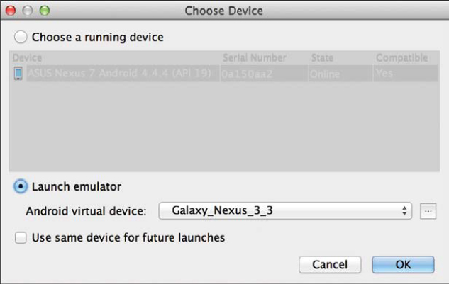
Choose Run > Run ‘app’. If you are developing on a Mac, your system should recognize the device right away. On Windows, you may need to install the ABD (Android Debug Bridge) driver. If Windows cannot find the ABD driver, then download one from your device’s manufacturer website. When your device is recognized, it will appear in the Choose Device window, as shown in Figure 1-50. |
Step 6: |
Select the device. Click OK. If code errors do not exist, the |

Part 8: Building an Android Virtual Device
Testing on as many unique physical devices as possible is often advisable during the development of an application. It is impossible to test on all devices. The advantage of an emulator is the ability to construct a variety of virtual devices, particularly nonmainstream devices, on which to test applications. For example, Figure 1-51 shows a virtual device containing a physical keyboard. This Android virtual device emulates one of the few QWERTY devices released for Android.
Before you can run your application on the Android Emulator, you must create an Android Virtual Device, called an AVD. The Android SDK includes a virtual mobile device emulator that runs on your computer. The emulator lets you prototype, develop, and test Android applications without using a physical device. In this part of the tutorial, you will use the AVD Manager to build a very basic AVD.
The Android emulator mimics all of the hardware and software features of a typical mobile device, except that it cannot place actual phone calls. It can be configured in multiple ways to provide navigation and control. Touchscreens are emulated using your mouse or keyboard to generate events for your application. In addition to your application, the emulator screen can display other active Android applications.
Step 1: |
Choose Tools > Android > AVD Manager, as shown in Figure 1-52. The AVD Manager provides an easy-to-use user interface to manage your AVD configurations. |


Step 2: |
Select Create Virtual Device from the AVD Manager, as shown in Figure 1-53. |
Step 3: |
Choose Phone from Category. A set of standard Android devices can be emulated. These are listed in the Virtual Device Configuration window, as shown in Figure 1-54. Each of these device types can be further configured. In this tutorial, the most basic emulator will be built. |

Step 4: |
Choose 3.3” WQVGA as shown in Figure 1-54. This small 3.3-inch device has a resolution of 240 × 400 with a low-density setting. Click Next. |

Step 5: |
Choose API 19 KitKat Android 4.4.2 armeabi-v7a, as shown in Figure 1-55. The AVD must have an API level equal to or greater than the API level that your application compiles against. Android can run on several different computer architectures. EABI is an embedded-application binary interface. The armeabi-v7a refers to a device that uses ARM architecture and conventions supported by EABI. The v7a specifies support for hardware floating point operations. Click Next. |

Step 6: |
Provide the identifying name for the AVD as Galaxy_Nexus_3.3. |
|
|
Not all devices have the same natural orientation. This can be configured in an AVD. |
|
Step 7: |
Specify the orientation of the device as Portrait. |
|
Step 8: |
Set the Host GPU for the emulated performance. |
|
|
A Snapshot will resume the execution of a previous application when the AVD is relaunched. This can lead to a faster load. |
|
Step 9: |
Select Advanced Settings and make the following edits: |
|
|
Custom skin definition: |
No Skin |
|
|
Each Android platform has its own set of skins. For emulators that have performance issues, it is recommended that default skins, rather than custom skin definitions, be used. |
RAM: |
512 MB |
VM heap: |
16 MB |
Internal Storage: |
200 MB |
Camera Front: |
None |
Camera Back: |
None |
Keyboard: |
To not enable keyboard input. If an AVD requires a hardware keyboard, click the Keyboard option on. |
Network Speed: |
Full |
Network Latency: |
None |
Click Finish. |
|

Part 9: Testing the Application on an Emulator
In this part of the tutorial, we will run the Hello Goodbye application on the previously defined AVD. In the course of developing an Android application, it will be necessary to compile and run an application multiple times on many AVDs. Each AVD functions as an independent device, with its own private storage for user data, SD card, and so on. When you launch the emulator with an AVD configuration, it automatically loads the user data and SD card data from the AVD directory. By default, the emulator stores the user data, SD card data, and cache in the AVD directory.
It should be noted that an emulator can be useful, but testing on a real device provides developers with more accurate results.
Step 1: |
Select Run > Run ‘app’. A list of devices identified as compatible configurations for the application will appear. |
Step 2: |
Choose Galaxy_Nexus_3.3, as shown in Figure 1-57. The first time the emulator launches, it can load rather slowly. It is useful to keep the emulator running between tests rather than quitting and relaunching the virtual device. Once your application is running on the emulator, it can use the services of the Android platform to invoke other applications, access the network, play audio and video, store and retrieve data, notify the user, and render graphical transitions and themes. |
Step 3: |
Test the application by tapping the Exclamation button. Several screens produced by the AVD are illustrated in Figure 1-58. The emulator also includes a variety of debug capabilities, which will be discussed in the next part of the tutorial. Multiple AVDs should be constructed to test applications. For example, an AVD can be built for each platform and screen type with which your application is compatible. |

Part 10: Optimizing and Improving a Project
In this part of the tutorial, we will use an Android Studio analysis tool to inspect the project and analyze performance. In addition to testing your Android application, it is important to ensure that your project is structurally sound and it runs as efficiently as possible.
Step 1: |
Select Analyze > Inspect Code. |
Step 2: |
Select Whole project from the Inspection Scope window, as shown in Figure 1-59. Click OK. |

|
The inspection results appear in the Inspection Profile window. Android Lint is a code analysis tool that checks project source files for possible structural flaws. Lint can be used to provide suggestions for a specific issue. For example, it is possible to restrict the issues by checking and assigning a severity level for those issues. Lint can be configured to check for issues for an entire project or for specific elements such as a project module, file, Java class, method, and so forth. In addition to detecting flaws, Lint will also provide suggestions on how to improve optimization or fix structural problems. This tool has a command-line interface, which allows it to integrate easily into automated testing. |
Step 3: |
Open the items in Android Lint, as shown in Figure 1-60. |
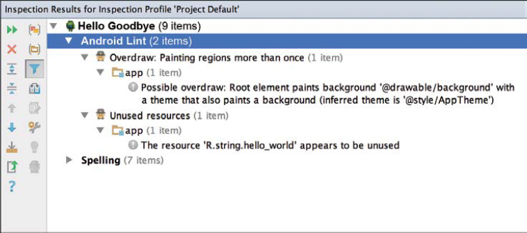
|
Android Lint detects two issues associated with the |
Step 4: |
Open the file |
Step 5: |
Modify the XML code by adding Lines 5–6, as shown below. Lines 5–6 show a custom |

|
The drawable |
Step 6: |
Open |

|
The second issue detected by Lint is an unused resource in the |
Step 7: |
Open In general, unused resources can make applications larger and will often slow down builds. |

■ 1.7 Model-View-Controller
Android applications tend to rely on the Model-View-Controller design architecture. This architecture assigns one of three roles that objects can play in an application. For example, an object can be a Model, View, or Controller. By establishing their specific purpose, given these assigned roles, it is easier to define how they will communicate with each other.
Model objects are used to encapsulate the data in an application. They can also define the logic and computation that manipulate and process that data. For example, a model object might represent the data associated with a character in a game. A Model object should have no explicit connection to the View object, which visually presents its data and allows the user to interact with that data. This means that Model objects should not be concerned with user-interface and presentation issues.
View objects are visual display objects. These are objects that users can see and will often use interactively. For example, a TextView element is a View object that displays text on the screen. A Button element is a View object that can respond to user actions.
A Controller object acts as an intermediary between one or more of an application’s View objects and one or more of its Model objects. For example, an Activity is a controller object in an Android application. In Tutorial 1, MainActivity was used to respond to user actions made on a View object, specifically the clicking of a button.
In a Model-View-Controller design architecture, the Controller communicates new or changed data to the Model object. When a Model object changes, a controller object communicates that new data to the View objects so that they can display it. View objects are always notified about changes in Model data through the application’s controller objects.
Figure 1-61 illustrates the lines of communication between the Controller, Model, and View objects. The Controller receives user-initiated actions, such as clicking a button or entering text into a text field. The controller then updates data in the Model. The Controller also receives notification of processed data from the Model and responds by updating a View object to the results.

■ Tutorial 2: The Tap Button Counter App
Tutorial 2 explores the construction of an application that uses the Controller-View-Model design architecture. In addition, this tutorial will provide an introduction to common features that were not demonstrated in Tutorial 1.
Part 1: The Design
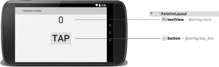
A button tap counter is the application that will be built in this tutorial. The application storyboard, illustrating the user experience, is shown in Figure 1-62. At first launch, the application user interface will appear in landscape orientation. This orientation will be enforced during the entire execution of the application.
The interface screen will display a “Tap” button and a count number, which is initialized to 0. The objective of the app is to count how many times the user taps the button. The count result will be displayed in a text field and updated after each tap on the button. When the user exits the application and then relaunches it, the last count value will appear on the screen. The number can never be reset back to 0.
The objectives for this tutorial are as follows:
1. Add an orientation attribute to the Manifest file.
2. Construct a new user interface file.
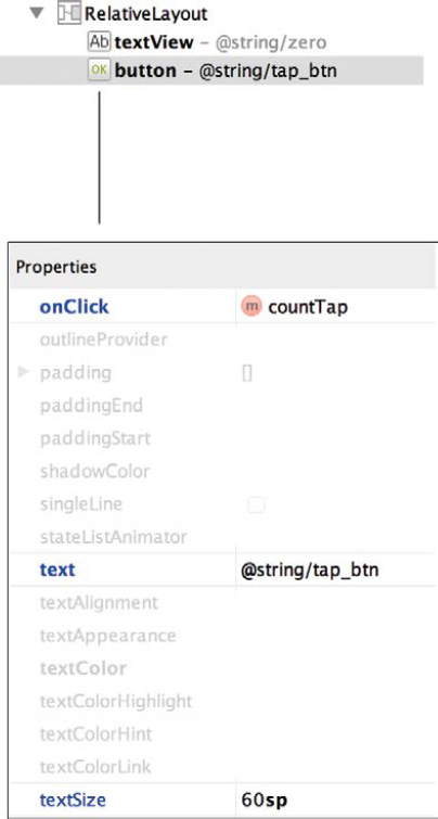
3. Use the onClick property for a button in the layout file.
4. Employ the Model-View-Controller architecture.
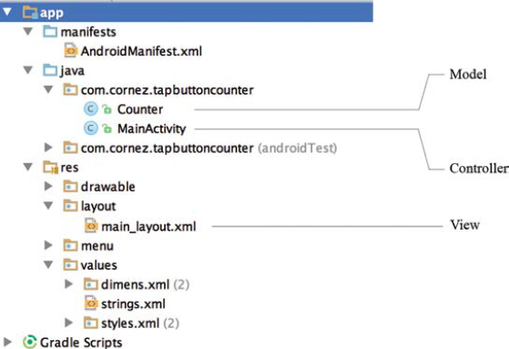
The final project structure for the Tap Button Counter app is shown in Figure 1-63. The Java source file named Counter will serve as the Model blueprint of the application. A Counter object will represent the data related to the count of taps on the button. The main_layout.xml file is the layout file that contains the View objects of the application. These objects are the visual display objects: the interactive button and the text field showing the number of counts.

MainActivity is the Controller acting as the conduit between the Counter object and the visual display objects of the user interface. The Controller will intercept button actions, communicate the new count data to the Counter object, and update the text field in the user interface.
Part 2: Creating the Android Project Shell
Step 1: |
Launch Android Studio. |
||||||||||||
Step 2: |
Select Start a new Android Studio project from the Quick Start panel. |
||||||||||||
Step 3: |
Configure the new project using the following application settings.
| ||||||||||||
Step 4: |
Choose the Blank Activity template. |
||||||||||||
Step 5: |
Specify the following file name options:
|
Part 3: Edit the Manifest and Add the String Value Resources
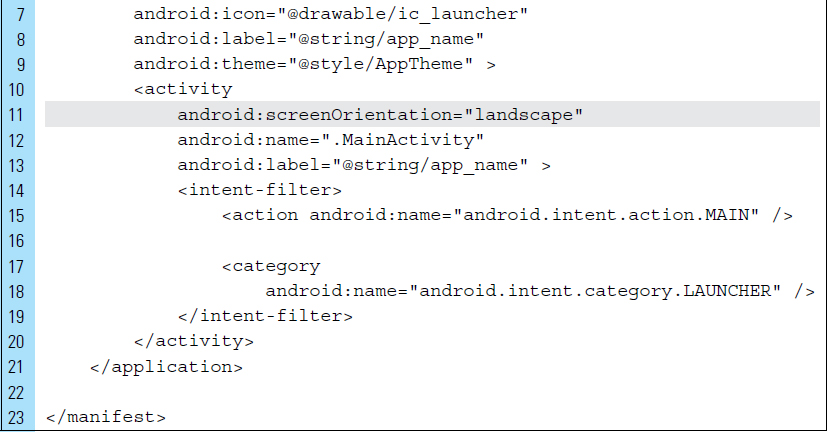
The Tap Button Counter application will be restricted to a landscape orientation. When the user rotates the screen, the orientation will remain in landscape mode. This setting can be enforced within the AndroidManifest.xml file. As mentioned previously, an application can have more than one Activity. Each Activity can have a different orientation requirement. This means that orientation must be set for a specific Activity.
Step 1: |
Open |
Step 2: |
Add the screen orientation setting for landscape, shown on Line 11 of the code below. Save the file. |

|
The only value resources that will be used by the application are strings. As shown in the storyboard sketch of the application, two text elements will appear on the user interface. The button contains the string “Tap” and the initial count value, 0. Both of these strings will be added to |
Step 3: |
Open |
Step 4: |
Use the following XML code listing as a guide, and add the strings shown on Lines 8–9. |

Part 4: Constructing the User Interface of the App
In this part of the tutorial, we will construct a new layout file, main_layout.xml, rather that altering the existing activity_main.xml file. We are creating this new layout file simply for demonstration. It will be necessary for readers to build multiple layout files in future applications.
Step 1: |
Right-click the All layout files are resources and must be located in the |
Step 2: |
Choose New > XML > Layout XML file, as shown in Figure 1-64. |

|
|
Step 3: |
Enter The root tag of a layout file describes the type of container that will hold the UI elements on the screen. In this application, a |
Step 4: |
Enter Click Finish. A blank layout will be rendered in the Graphical Layout Editor. In a previous step, the |

Step 5: |
Select Design mode in the Graphical Layout Editor. |
Step 6: |
Use the Orientation icon to set the device orientation to a landscape appearance. Verify the change in the generated image of the device. In Step 7, the user interface for |
Step 7: |
Use Figure 1-66 as a guide for placing a Plain TextView Widget and a Button Widget on the layout. Configure these elements using the skills you learned in Tutorial 1. The text and id for both elements must be set as shown in the figure. It is important to be able to perform these tasks on your own before continuing. |
Step 8: |
The |
Step 9: |
View the The user interface screen is now completed. Save your file. |

Part 5: Coding the Application
Applications designed for Android are best modeled after the Model-View-Controller architecture. The Model blueprint in this application is the Counter class.
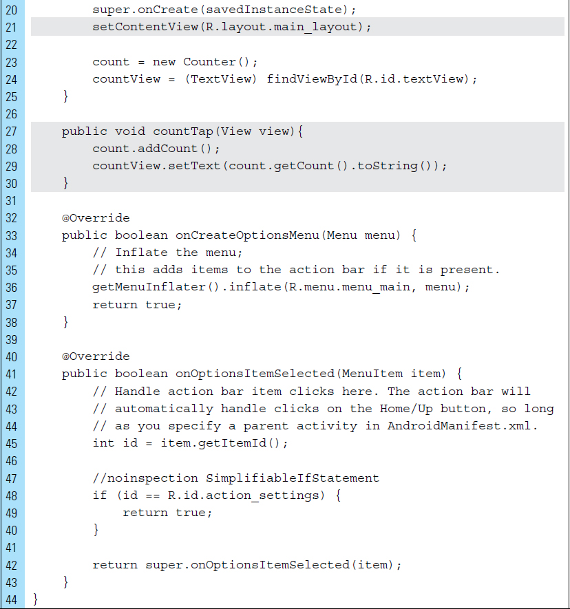
Step 1: |
Add the This class contains a single data member, The Java code listing for The controller used by the application is |


Step 2: |
Edit
|

Step 3: |
Build and run the project. |
Step 4: |
Test the application on an AVD or physical device. |
■ 1.8 Debugging Android Applications
Debugging an application, as well as ensuring that it performs well, is a crucial part of development. Android Studio and the Android SDK provide a collection of features and tools for debugging and optimizing applications. In addition to the Lint tool, which analyzes an application to test for structural problems, Android Studio enables a debugging mode.

An application must be running on a physical device or in an emulator to be debugged. An adb device daemon runs on the device or emulator and provides a means for the adb host daemon to communicate with the device or emulator. The DDMS (Dalvik Debug Monitor Service), shown in Figure 1-68, interacts with the debugger and communicates with the physical device, or emulator, through adb. DDMS is an invaluable tool for development because it can capture screenshots and record video of an application currently running; it can also provide state information, such as memory usage and package information.
When an Android application is running while connected through abd, various system messages are generated and provide output to a real-time system log. For developers, this log information can be useful for detecting bugs. The abd logcat is a feature that provides functionality by filtering the system log messages based on priority.
In Android Studio, logcat is integrated into DDMS. Log messages are obtained using the android.util.Log class, which sends log messages to a shared system-level log system. Messages can range from debug builds to stack traces produced by throw exceptions. Figure 1-68 shows log messages produced from the Tap Button Counter application. These messages were output during the application execution while connected to the development machine via USB cable.
Sending output to logcat is as simple as calling the corresponding Log method. The logging facilities provide the following five distinct levels of logging:
Log.e(): |
e() is error-level logging that is used when something fatal has happened. This includes occurrences that will have user-visible consequences and cannot be recovered without explicitly deleting data. This level is always logged. Issues produced at this level should be considered for reporting to a statistics-gathering server. |
Log.w(): |
w() is warning-level logging. Warning-level errors are recoverable error-type logs that do not produce data loss. This level is always logged. |
Log.i(): |
i() is informative-level logging and is used to inform of a high-impact condition. For example, an application that has successfully connected to a server will report this condition as an information-level log. |
Log.d(): |
d() is debug logging. This type of log is used to report unexpected behaviors. This level will be logged, even on applications that are released on the Play Store. |
Log.v(): |
v() is verbose logging, recording more information than usual, and should be used for all other types of logging. This level will only be logged on applications in debug builds. |
While logging reports are helpful to developers, they can have a negative impact on performance and quickly lose their usefulness if messages are not kept reasonably concise. Wherever possible, messages should be restricted to a single line. Line lengths up to 80–100 characters are perfectly acceptable, but lengths longer than 130–160 characters should be avoided if possible.
In addition to DDMS, Android Studio provides a Debugging mode that can be applied to an application executing on an emulator or a physical device. Debugging mode can be activated by selecting Debug ‘app’ from the Run menu. The Debug icon will appear during the duration of application execution. Figure 1-69 shows the Debug pane displaying thread information for the Tap Button Counter application.
A Gradle console tool is available in Android Studio for viewing information about Gradle build tasks as they are executed. This information provides the details about the success or failure of a build. Figure 1-70 shows the complete Gradle Console output after Tap Button Counter was successfully built. This information is produced when Rebuild Project is selected from Run.
A command line, Terminal, is integrated within Android Studio, as shown in Figure 1-71. Terminal makes it easy to launch specific tasks from a Command Prompt or Mac OS Terminal interface. To display information about the built-in list of shell commands, type help. Multiple terminals can be launched to execute different commands.
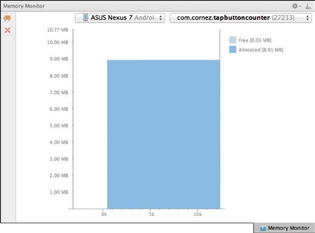
The Memory Monitor tool, shown in Figure 1-72, allows developers to monitor the memory usage of a running app over time. For example, the memory use of the Tap Button Counter application developed in Tutorial 1 remains at a fixed memory use of 8 MB, as shown in Figure 1-71. This information is useful in tracking heap (memory reserved for data created at runtime) usage at a certain point in time during the execution of your app. Additional memory-profiling features are planned for Android Studio in future releases.


■ 1.9 Sharing Your Android Applications
To share applications you have built, or to place them on Google Play, Android requires that the application be digitally signed with a certificate. Android uses this certificate to identify the author. Android apps typically use self-signed certificates in which the app developer holds the certificate’s private key.
Developers can sign an application in debug mode or in release mode. During development, an app is signed in debug mode. Android Studio signs your app in debug mode automatically when you run or debug your project. Once the application is ready to be distributed to users, it must be signed in release mode. The Android SDK generates a certificate to sign apps in debug mode. To sign the final product in release mode, developers will need to generate their own certificate.
The following steps outline the process for signing an application for the first time. Once the app has been signed, it can be emailed or shared with others. To follow these steps, you must be using Android Studio and working on the development of an application, such as Tap Button Counter from Tutorial 2.
Step 1: |
Choose Build > Generate Signed APK … |
Step 2: |
Select app from Module, as shown in Figure 1-73. |
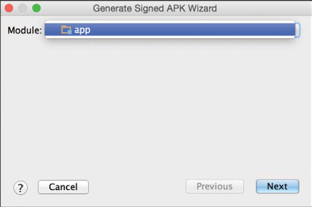
|
An APK key must be created for the first time. Once an APK key has been created, it can be used for other Android applications the developer wishes to build. |
Step 3: |
Click Create new … from the APK Wizard, shown in Figure 1-74. The keystore creates a certificate with a private key and a password. You can run and debug your application without entering the password every time you make a change to your project. A keystore is a binary file that contains a set of private keys. A private key represents the entity, such as a person or a company, to be identified with the application. |

Step 4: |
Enter the required information as shown in Figure 1-75. Once a key is created, it can be used to sign app updates. The same key can be used throughout the lifespan of the application. |

FIGURE 1-75 A keystore password, an alias, and a key password must be provided before a Signed APK certificate can be generated.
Step 5: |
Enter the required information in the Generate Signed APK Wizard window, as shown in Figure 1-76. |

Step 6: |
Enter a master password, as shown in Figure 1-77. |

|
You can run and debug an application signed in debug mode on the emulator and on devices connected via USB to your development machine. You cannot distribute an application signed in debug mode. |
Step 7: |
On the next window, select a release build type. In release mode, an apk file will be generated in the APK Destination Folder, as shown in Figure 1-78. This apk file represents the application file that will be installed on devices. |
Step 8: |
The window shown in Figure 1-79 will appear when a signed APK has been successfully generated. Once the apk file has been packaged for distribution, it will appear in the app folder of the application, as shown in Figure 1-80. This file can be shared with users without requiring them to connect to the development machine via USB. |
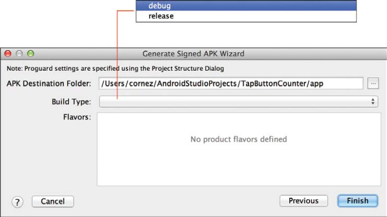
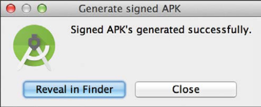
|
It is not uncommon to send applications through email as an attachment. |
Step 9: |
Send an email containing the In order for an Android device to download and install an Android application from a source other than the Play Store, the Device Administrator must be set to Unknown sources. |
Step 10: |
Using the physical device, select Settings > Security. Make sure to check Unknown sources to allow the installation of applications from sources outside of the Play Store. |
Step 11: |
Select the attachment from your email app or mobile browser. |
Step 12: |
Choose the Downloads widget (shown in Figure 1-81) to download and install the app. The window shown in Figure 1-82 will appear when a signed application has been successfully installed. Its launch icon can be activated. |


■ Exercises
Dalvik code is produced by the ________________.
Dalvik is a(n) __________________ engine.
What is KitKat’s most notable feature?
Name two Android development environments.
List the important Android development components.
What is a drawable?
The role of the JVM is to read the Java application through the ___________________.
True or False: ADT Bundle is a streamlined development version of Eclipse IDE.
True or False: You can generate App design ideas by exploring interaction designs using specific usage scenarios.
What is the conversion of dp units to screen pixels?
Identify the basic components of an Android application.
Describe the Model-View-Controller pattern design.
Bytecode is interpreted by a ________________.
Java programs can run on any computer with an Installed __________________.
JVM stands for __________________.
Identify the Android platforms.
Briefly describe the differences between KitKat and Jelly Bean.
ADT stands for __________________.
An application file is represented as a(n) __________________ file and can be installed on an Android device.
A density-independent pixel (dp) is a virtual pixel unit that is equivalent to one physical pixel on a(n) __________________ dpi screen.
True or False: The Abstract Window Toolkit and Swing are not supported in Dalvik.
True or False: For Android, the dex compiler recompiles Java bytecode into proprietary Dalvik bytecode.
True or False: There is a virtual machine in the Android platform.