Planning Your App
Just like any movie or television show has to have a script, you should have a plan before you start programming an application. While you may be familiar with Android development for phones and tablets, there are many things you need to consider when creating content for the TV, depending on whether you are making a game, utility, or media application. In this chapter we will look at some of the design considerations that come into play when your users are experiencing your app from across a room rather than in their hands, and what you should think about when building your user interface to support the basic Android TV controller.
Android TV Home Screen
The first thing your users will see when they turn on their Android TVs is the home screen, which acts as the gateway to their televisions by providing various ways to discover content and interact with their apps. When applicable, you will want to take advantage of as many of these features as you can in order to make your app more visible to your users. At the very least, you will want to use an app icon specifically made for Android TV that easily identifies your app for your users.
The home screen is displayed to users in a row format that should look somewhat familiar from the Hello World application in the previous chapter (see Figure 2-1). The section above the top row contains the time and a Search button that can be selected or activated through the microphone button on a physical Android TV remote or in the official Android TV mobile remote control application from the Play Store (see Figure 2-2). The second row displays a list of recommended content generated from installed applications. Below the recommendations section are two rows—the top displays all installed applications that are not configured to be playable games and the bottom displays all games. Below the list of installed applications is the settings and system information row.

Figure 2-1. The Android TV home screen
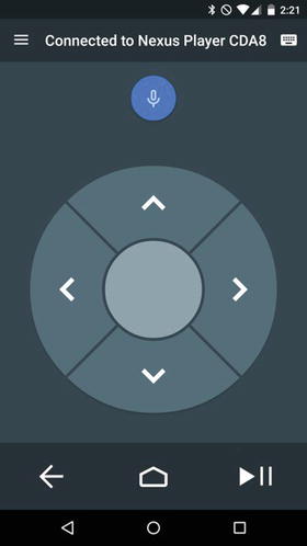
Figure 2-2. The Android TV remote control Android app
The most common way users will access your application is by selecting it from the list of installed apps on their TVs. This means that using a correctly sized and styled launcher icon is incredibly important for helping users find your application once it is installed on their devices. Since Android TV does not display the name of apps below their icons, you must include the name of your app in the launcher icon. Your launcher icon should be sized at 320px x 180px in order to be displayed correctly by the home screen. Once you have an asset created for your launcher icon, you will need to apply it to your launch activity in your AndroidManifest.xml file similarly to a standard Android application. It should be noted that the category option will use a LEANBACK_LAUNCHER instead of a standard LAUNCHER in order to display the TV launcher icon. If you are building a game, you will also need to add the isGame="true" property to the application node so that the home screen places your launcher icon in the games row.
<application
        android:label="@string/app_name"
        android:icon="@mipmap/ic_launcher"
        android:theme="@style/AppTheme">
        <activity
            android:name="MainActivity"
            android:label=“@string/app_name">
            <intent-filter>
                <action android:name="android.intent.action.MAIN" />
                <category android:name="android.intent.category.LEANBACK_LAUNCHER" />
            </intent-filter>
        </activity>
</application>
The Recommendations Row
The recommendations row is the first row on the Android TV home screen, as seen back in Figure 2-1, and is the easiest way to gain user interest for your app. There are three categories of content that a developer can recommend: continuation, related, and new. When you create the list of recommendations from your app to be displayed on the home screen recommendations row, you should determine what to display based on relevancy to past consumption behavior. If your users previously watched a show in your app, you can present a continuation recommendation that displays an episode that they did not finish, or recommend the next episode in that show. You can also display a related recommendation that introduces new content that your user may enjoy based on previously viewed media. The last type of content that can be recommended falls under the new category. This is an excellent spot to highlight featured media and introduce content that your users may enjoy. When displaying new content recommendations, you should be careful not to accidentally give away any spoilers that may ruin interest. You should also be mindful with related and continuation recommendations, as the related row is visible to all users on the Android TV, and therefore should be appropriate for all ages.
Android TV uses a simple and easy-to-digest card format across the platform for displaying information to users, as seen in Figure 2-3.

Figure 2-3. Recommendation card. The number 1 designates the large icon, 2 is the title, 3 is the content text, and 4 is the small icon
While this format is already set for you, you still have the ability to customize the cards to fit the feel of your own application. Each card contains of a single display image that should describe the recommendation at a glance. This display image should be 176dp or higher height, and the width should be in a ratio of 2/3 to 4/3 the height. When the users scroll over the recommended content, the highlighted item will expand to display the rest of the card. You can change the card background color, though it should complement white text well. You will also want to add a small icon to the card that represents your application. This small icon should be a 16dp x 16dp PNG with a transparent background and foreground in #EEEEEE.
There are two pieces of textual information that you can display with a recommendation card: a title and a content text. The title should be the primary descriptor for the content, such as a song or movie title. The optional content text is where you can tell your users some information about the content, such as why it is being displayed to them. One example where the content text may be useful is when displaying a video feed from a sporting event. If the event is currently in progress, or if the event has already finished and you can play back a recording, are excellent pieces of information that users may want to know about and interest them enough to open your app.
In addition to the display card, you can also change the background on the home screen based on the highlighted recommendation. This not only allows you to give your app recommendation a stylish piece of flair, but also provides another way to intrigue your users by giving them more information about the content. Using large background images to paint a picture for your users can go much further in gaining their interest than a paragraph describing the content. This image should be 2016px x 1134px (1920 x 1080 with a 5% margin), and different than your standard display image. It should be noted that if the image is not sized correctly, the system will attempt to scale it to fit, which may have undesirable consequences, such as lower image quality.
Once your users have started viewing media from your app, you can provide a Now Playing card that looks identical to a standard recommendation card, but also includes a progress bar. Not only does this card provide useful information to your users, but it also appears as the first card in the recommendation row, helping maintain user engagement. When used well, the recommendations row provides a powerful way to get users to open your app as they see what content is available to enjoy. Later in this book you will learn how to implement a simple recommendation service in a working media application.
When the users have some idea of what they’re looking for, such as a specific movie, it can be cumbersome to find an app that has that content available. Luckily, Android TV provides a search option that can search across multiple apps at the same time so users can quickly find what they are looking for. By pressing the microphone button on the remote control app, or by navigating to the search globe at the top of the home screen, users can enter into a search UI where they can say or type in what they’re looking for (see Figure 2-4). When the user performs the search, all apps that are searchable on the Android TV will run the query and return related content, if any. Once the results are shown to the users, they may be selected to link directly to the desired media. By making your application searchable, you can add visibility to your app in order to drive user engagement.
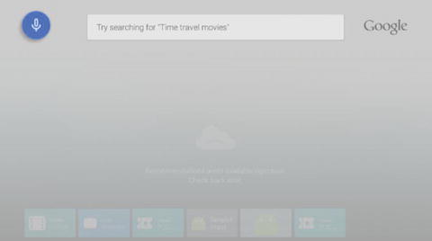
Figure 2-4. Android TV home screen search box
User Experience Guidelines
Now that you are aware of how you can use the home screen to draw users to your app, you will need to have a well-designed app that is easy to use and visually appealing in order to keep them engaged. It is important to realize that televisions have been around for a lot longer than smart phones and tablets, so users come with a predefined expectation on how their experience with the television should go. Google recommends that your apps follow three main ideas: allow for casual consumption, provide a cinematic experience, and keep things simple.
The key difference between a smart phone or tablet and the television is that the television is designed to be used specifically as an entertainment device. In order to fit into the ideal use-case for the TV, you should understand the overall goal of your application and help your users reach that goal as quickly as possible. If your application is meant to display media, then you should design your app to only take a few clicks to get to content that your users would want to see and start playing it. If you are building a game, then you should give your users an immersive experience that lets them play your game without distracting them with a lot of content not directly related to gameplay. Applications that are geared toward interacting with multiple people in a single room, such as a party game or karaoke app, should provide the users with information they need while letting them focus on the more important thing, the other people in the room.
You want your users to be immersed in your applications. When possible, use audio and visual cues to inform your users what’s going on in your app rather than telling them through text. For example, if your user reaches the end of a list, Android tends to provide a glowing effect with a bounce on the last item. You can also provide an audible ding to add more flair to the experience. Because Android TV devices all run a minimum of Lollipop (SDK 21), there’s a wide range of animations and transitions that you can use to delight your users as they go through your app. While the animations may be enjoyable, you should attempt to provide as much content as possible on each screen and limit the number of screens your users have to view in order to reach their goal.
Keep It Simple
This is the most important of the design guidelines, and the overarching theme when it comes to designing for Android TV. When your users sit down in front of their televisions, they want to be able to quickly find something to watch or start playing a game. In order to help out your users, keep the number of screens between entering your app and enjoying content to a minimum. Try to avoid requiring any kind of text entry, and always provide a voice input option in those situations where you must enter data. Remember that most users will interact with their TVs using a simple D-pad controller with a selection button from either a remote included with their Android TV or from the remote control app. UI patterns should be easy to navigate with only a few available buttons. Make sure you do not just copy the UI from a touch screen device, but instead try to use the list of rows pattern as seen on the home screen. What works on phones and tablets may not translate well to the television. The simpler your application, the happier your users.
Designing Your Layout
One of the most defining factors between what feels like a well or poorly designed app for the television is how cluttered the screen looks. How you space out your content, how many items are on the screen, and the size of those items all contribute to the cleanliness of your UI. While televisions continue to get larger and support higher resolutions, it is always better to stick to fewer visible items that are of higher quality than many items that are not as appealing. All of your layouts should always be designed to work in landscape mode, as most home televisions do not support portrait viewing. Along these same lines, any navigation UI components should occupy the left or right of the screen so that vertical spacing can be saved for displaying content. Finally, you should always ensure that you have enough margin space so that items are not against or outside the edges of the screen.
The general rule is to add 10% margins to the edge of your layout to account for overscan, which is an area of the television that may be outside of the visual borders of the screen. While this may seem like a lot to account for, if you’re building a media playback app the Android Leanback Support library already takes the layout design guidelines into consideration and handles them for you.
While computer monitors and mobile devices tend to be fairly consistent when displaying colors across different devices, televisions do not offer that luxury and special precautions should be taken when choosing colors for your apps. Different types of TVs, such as plasma or LCD, may vary in how they display colors due to inherent properties of the technology or applied sharpening and smoothing filters. On top of that, subtle differences in brightness or hue can be either indistinguishable or over-emphasized on some devices. Avoid using the color white (#FFFFFF) on large areas of the screen, as it can be harsh on eyes when displayed on a bright screen. You should also check very dark or highly saturated colors against various televisions and settings to ensure they meet your expectations. Google recommends using a color that is two to three levels darker than those used on a mobile device. It also suggests choosing colors from the 700-900 range from the Google color palette found at www.google.com/design/spec/style/color.html#color-color-palette.
While text should generally be avoided to maintain an immersive experience, there will be a few places where it is a necessity. Given that users on average sit roughly ten feet (three meters) away from their television sets, styling text so that it is readable is important. You will want to break text into small chunks so that it is easy to read. Text should be preferably a light color on a darker background and you should avoid thinner fonts like Roboto Light, for example, since television settings may make them unreadable. While the smallest size you should use is 12sp, the recommended default size for Android TV is 18sp. Google has also put together a set of recommended sizes for different sections of a media app:
- Titles on cards should use Roboto Condensed at 16sp
- Subtitles on cards should use Roboto Condensed at 12sp
- Titles on a browse screen should use Roboto Regular at 44sp
- Category titles on a browse screen should use Roboto Condensed at 20sp
- Content titles on a media detail screen should use Roboto Regular at 34sp
- Description text on a detail screen should use 14sp
You should notice that all font sizes are listed in sp, which is a density-independent sizing quantifier specifically for text. This allows the operating system to determine what size is appropriate on a given device. While this may seem like a lot to remember, the Leanback Support library classes contain their own styles that will handle that logic for you.
Other Considerations
While understanding design guidelines is important, there are other things that you need to consider before building your application.
- If you are building a game for Android TV, you may want to investigate Google Play Game Services, as Google has put together an impressive set of utilities to make game development faster and easier: developers.google.com/games/services/.
- If you are building a media application, you should think about where your media is coming from. Are you hosting all content on your own server, or are you aggregating multiple services? How do you handle contingencies like no Internet connection, or a server not returning content? You will also need to think about how your content is formatted to ensure that it can be played back on an Android TV device. You can find a list of supported media formats for Android on Google’s official documentation page: developer.android.com/guide/appendix/media-formats.html.
- If your content is through a proprietary third party that requires the use of its own media player software, you will need to ensure that it supports the use of the Android TV D-pad controller.
- If you need to support Digital Rights Management (DRM), then you may find the Android DRM documentation useful: source.android.com/devices/drm.html.
Once you are aware of all of your requirements, you can choose how you will display your content. While your requirements may exclude the possibility, Google does offer an excellent open source media player called ExoPlayer that supports features not currently available in the MediaPlayer class: developer.android.com/guide/topics/media/exoplayer.html.
While these topics are beyond the scope of this book, they are important to review to make sure your time is well spent when developing your final product.
Summary
In this chapter you learned about the various sections of the Android TV home screen and how to catch the interest of users for your app. You also learned about design principles in relation to Android TV and the recommendations from Google for making your apps visually appealing. In the next chapter you will begin building a very basic media playback application to learn about some of the key parts of the Leanback Support library, and how you can use them to build an Android TV app.