
Chapter 3. Modeling and Predicting
Anomaly detection is based on predictions derived from models. In simple terms, a model is a way to express your previous knowledge about a system and how you expect it to work. A model can be as simple as a single mathematical equation.
Models are convenient because they give us a way to describe a potentially complicated process or system. In some cases, models directly describe processes that govern a system’s behavior. For example, VividCortex’s Adaptive Fault Detection algorithm uses Little’s law1 because we know that the systems we monitor obey this law. On the other hand, you may have a process whose mechanisms and governing principles aren’t evident, and as a result doesn’t have a clearly defined model. In these cases you can try to fit a model to the observed system behavior as best you can.
Why is modeling so important? With anomaly detection, you’re interested in finding what is unusual, but first you have to know what to expect. This means you have to make a prediction. Even if it’s implicit and unstated, this prediction process requires a model. Then you can compare the observed behavior to the model’s prediction.
Almost all online time series anomaly detection works by comparing the current value to a prediction based on previous values. Online means you’re doing anomaly detection as you see each new value appear, and online anomaly detection is a major focus of this book because it’s the only way to find system problems as they happen. Online methods are not instantaneous—there may be some delay—but they are the alternative to gathering a chunk of data and performing analysis after the fact, which often finds problems too late.
Online anomaly detection methods need two things: past data and a model. Together, they are the essential components for generating predictions.
There are lots of canned models available and ready to use. You can usually find them implemented in an R package. You’ll also find models implicitly encoded in common methods. Statistical process control is an example, and because it is so ubiquitous, we’re going to look at that next.
Statistical Process Control
Statistical process control (SPC) is based on operations research to implement quality control in engineering systems such as manufacturing. In manufacturing, it’s important to check that the assembly line achieves a desired level of quality so problems can be corrected before a lot of time and money is wasted.
One metric might be the size of a hole drilled in a part. The hole will never be exactly the right size, but should be within a desired tolerance. If the hole is out of tolerance limits, it may be a hint that the drill bit is dull or the jig is loose. SPC helps find these kinds of problems.
SPC describes a framework behind a family of methods, each progressing in sophistication. The Engineering Statistics Handbook is an excellent resource to get more detailed information about process control techniques in general.2 We’ll explain some common SPC methods in order of complexity.
Basic Control Chart
The most basic SPC method is a control chart that represents values as clustered around a mean and control limits. This is also known as the Shewhart control chart. The fixed mean is a value that we expect (say, the size of the drill bit), and the control lines are fixed some number of standard deviations away from that mean. If you’ve heard of the three sigma rule, this is what it’s about. Three sigmas represents three standard deviations away from the mean. The two control lines surrounding the mean represent an acceptable range of values.
One of the assumptions made by the basic, fixed control chart is that values are stable: the mean and spread of values is constant. As a formula, this set of assumptions can be expressed as: y = μ + ɛ. The letter μ represents a constant mean, and ɛ is a random variable representing noise or error in the system.
In the case of the basic control chart model, ɛ is assumed to be a Gaussian distributed random variable.
Control charts have the following characteristics:
-
They assume a fixed or known mean and spread of values.
-
The values are assumed to be Gaussian (normally) distributed around the mean.
-
They can detect one or multiple points that are outside the desired range.
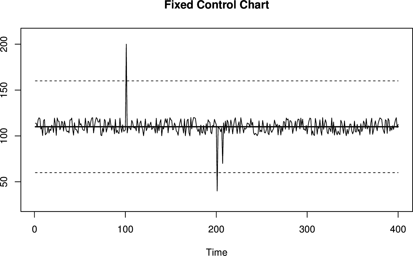
Figure 3-2. A basic control chart with fixed control limits, which are represented with dashed lines. Values are considered to be anomalous if they cross the control limits.
Moving Window Control Chart
The major problem with a basic control chart is the assumption of stability. In time series analysis, the usual term is stationary, which means the values have a consistent mean and spread over time.
Many systems change rapidly, so you can’t assume a fixed mean for the metrics you’re monitoring. Without this key assumption holding true, you will either get false positives or fail to detect true anomalies. To fix this problem, the control chart needs to adapt to a changing mean and spread over time. There are two basic ways to do this:
-
Slice up your control chart into smaller time ranges or fixed windows, and treat each window as its own independent fixed control chart with a different mean and spread. The values within each window are used to compute the mean and standard deviation for that window. Within a small interval, everything looks like a regular fixed control chart. At a larger scale, what you have is a control chart that changes across windows.
-
Use a moving window, also called a sliding window. Instead of using predefined time ranges to construct windows, at each point you generate a moving window that covers the previous N points. The benefit is that instead of having a fixed mean within a time range, the mean changes after each value yet still considers the same number of points to compute the mean.
Moving windows have major disadvantages. You have to keep track of recent history because you need to consider all of the values that fall into a window. Depending on the size of your windows, this can be computationally expensive, especially when tracking a large number of metrics. Windows also have poor characteristics in the presence of large spikes. When a spike enters a window, it causes an abrupt shift in the window until the spike eventually leaves, which causes another abrupt shift.
Figure 3-3. A moving window control chart. Unlike the fixed control chart shown in Figure 3-2, this moving window control chart has an adaptive control line and control limits. After each anomalous spike, the control limits widen to form a noticeable box shape. This effect ends when the anomalous value falls out of the moving window.
Moving window control charts have the following characteristics:
-
They require you to keep some amount of historical data to compute the mean and control limits.
-
The values are assumed to be Gaussian (normally) distributed around the mean.
-
They can detect one or multiple points that are outside the desired range.
-
Spikes in the data can cause abrupt changes in parameters when they are in the distant past (when they exit the window).
Exponentially Weighted Control Chart
An exponentially weighted control chart solves the “spike-exiting problem,” where distant history influences control lines, by replacing the fixed-length moving windows with an infinitely large, gradually decaying window. This is made possible using an exponentially weighted moving average.
EWMAs are continuously decaying windows. Values never “move out” of the tail of an EWMA, so there will never be an abrupt shift in the control chart when a large value gets older. However, because there is an immediate transition into the head of a EWMA, there will still be abrupt shifts in a EWMA control chart when a large value is first observed. This is generally not as bad a problem, because although the smoothed value changes a lot, it’s changing in response to current data instead of very old data.
Using an EWMA as the mean in a control chart is simple enough, but what about the control limit lines? With the fixed-length windows, you can trivially calculate the standard deviation within a window. With an EWMA, it is less obvious how to do this. One method is keeping another EWMA of the squares of values, and then using the following formula to compute the standard deviation.

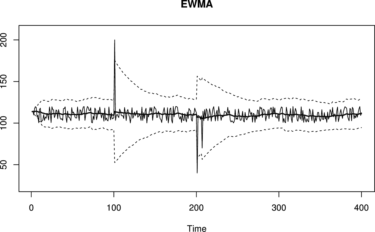
Figure 3-4. An exponentially weighted moving window control chart. This is similar to Figure 3-3, except it doesn’t suffer from the sudden change in control limit width when an anomalous value ages.
Exponentially weighted control charts have the following characteristics:
-
They are memory- and CPU-efficient.
-
The values are assumed to be Gaussian (normally) distributed around the mean.
-
They can detect one or multiple points that are outside the desired range.
-
A spike can temporarily inflate the control lines enough to cause missed alarms afterwards.
-
They can be difficult to debug because the EWMA’s value can be hard to determine from the data itself, since it is based on potentially “infinite” history.
Window Functions
Sliding windows and EWMAs are part of a much bigger category of window functions. They are window functions with two and one sharp edges, respectively.
There are lots of window functions with many different shapes and characteristics. Some functions increase smoothly from 0 to 1 and back again, meaning that they smooth data using both past and future data. Smoothing bidirectionally can eliminate the effects of large spikes.
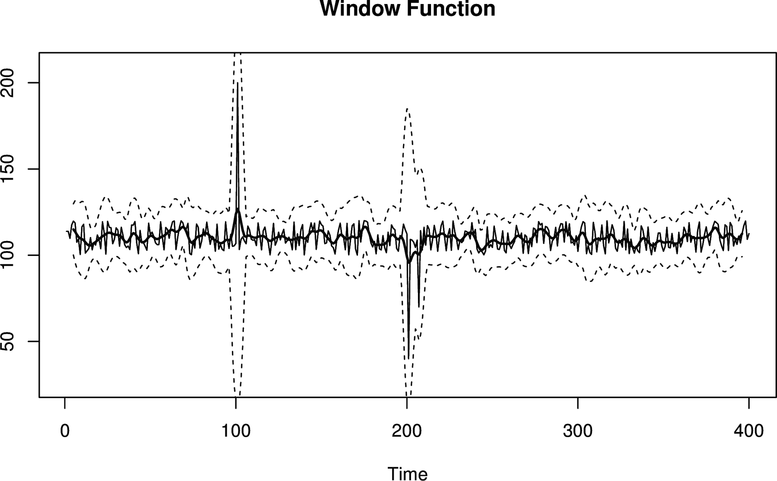
Figure 3-5. A window function control chart. This time, the window is formed with values on both sides of the current value. As a result, anomalous spikes won’t generate abrupt shifts in control limits even when they first enter the window.
The downside to window functions is that they require a larger time delay, which is a result of not knowing the smoothed value until enough future values have been observed. This is because when you center a bidirectional windowing function on “now,” it extends into the future. In practice, EWMAs are a good enough compromise for situations where you can’t measure or wait for future values.
Control charts based on bidirectional smoothing have the following characteristics:
-
They will introduce time lag into calculations. If you smooth symmetrically over 60 second-windows, you won’t know the smoothed value of “now” until 30 seconds—half the window—has passed.
-
Like sliding windows, they require more memory and CPU to compute.
-
Like all the SPC control charts we’ve discussed thus far, they assume Gaussian distribution of data.
More Advanced Time Series Modeling
There are entire families of time series models and methods that are more advanced than what we’ve covered so far. In particular, the ARIMA family of time series models and the surrounding methodology known as the Box-Jenkins approach is taught in undergraduate statistics programs as an introduction to statistical time series. These models express more complicated characteristics, such as time series whose current values depend on a given number of values from some distance in the past. ARIMA models are widely studied and very flexible, and form a solid foundation for advanced time series analysis. The Engineering Statistics Handbook has several sections4 covering ARIMA models, among others. Forecasting: principles and practice is another introductory resource.5
You can apply many extensions and enchancements to these models, but the methodology generally stays the same. The idea is to fit or train a model to sample data. Fitting means that parameters (coefficients) are adjusted to minimize the deviations between the sample data and the model’s prediction. Then you can use the parameters to make predictions or draw useful conclusions. Because these models and techniques are so popular, there are plenty of packages and code resources available in R and other platforms.
The ARIMA family of models has a number of “on/off toggles” that include or exclude particular portions of the models, each of which can be adjusted if it’s enabled. As a result, they are extremely modular and flexible, and can vary from simple to quite complex.
In general, there are lots of models, and with a little bit of work you can often find one that fits your data extremely well (and thus has high predictive power). But the real value in studying and understanding the Box-Jenkins approach is the method itself, which remains consistent across all of the models and provides a logical way to reason about time series analysis.
Predicting Time Series Data
Although we haven’t talked yet about prediction, all of the tools we’ve discussed thus far are designed for predictions. Prediction is one of the foundations of anomaly detection. Evaluating any metric’s value has to be done by comparing it to “what it should be,” which is a prediction.
For anomaly detection, we’re usually interested in predicting one step ahead, then comparing this prediction to the next value we see. Just as with SPC and control charts, there’s a spectrum of prediction methods, increasing in complexity:
-
The simplest one-step-ahead prediction is to predict that it’ll be the same as the last value. This is similar to a weather forecast. The simplest weather forecast is tomorrow will be just like today. Surprisingly enough, to make predictions that are subjectively a lot better than that is a hard problem! Alas, this simple method, “the next value will be the same as the current one,” doesn’t work well if systems aren’t stable (stationary) over time.
-
The next level of sophistication is to predict that the next value will be the same as the recent central tendency instead. The term central tendency refers to summary statistics: single values that attempt to be as descriptive as possible about a collection of data. With summary statistics, your prediction formula then becomes something like “the next value will be the same as the current average of recent values.” Now you’re predicting that values will most likely be close to what they’ve typically been like recently. You can replace “average” with median, EWMA, or other descriptive summary statistics.
-
One step beyond this is predicting a likely range of values centered around a summary statistic. This usually boils down to a simple mean for the central value and standard deviation for the spread, or an EWMA with EWMA control limits (analogous to mean and standard deviation, but exponentially smoothed).
-
All of these methods use parameters (e.g., the mean and standard deviation). Non-parametric methods, such as histograms of historical values, can also be used. We’ll discuss these in more detail later in this book.
We can take prediction to an even higher level of sophistication using more complicated models, such as those from the ARIMA family. Furthermore, you can also attempt to build your own models based on a combination of metrics, and use the corresponding output to feed into a control chart. We’ll also discuss that later in this book.
Prediction is a difficult problem in general, but it’s especially difficult when dealing with machine data. Machine data comes in many shapes and sizes, and it’s unreasonable to expect a single method or approach to work for all cases.
In our experience, most anomaly detection success stories work because the specific data they’re using doesn’t hit a pathology. Lots of machine data has simple pathologies that break many models quickly. That makes accurate, robust6 predictions harder than you might think.
Evaluating Predictions
One of the most important and subtle parts of anomaly detection happens at the intersection between predicting how a metric should behave, and comparing observed values to those expectations.
In anomaly detection, you’re usually using many standard deviations from the mean as a replacement for very unlikely, and when you get far from the mean, you’re in the tails of the distribution. The fit tends to be much worse here than you’d expect, so even small deviations from Gaussian can result in many more outliers than you theoretically should get.
Similarly, a lot of statistical tests such as hypothesis tests are deemed to be “significant” or “good” based on what turns out to be statistician rules of thumb. Just because some p-value looks really good doesn’t mean there’s truly a lot of certainty. “Significant” might not signify much. Hey, it’s statistics, after all!
As a result, there’s a good chance your anomaly detection techniques will sometimes give you more false positives than you think they will. These problems will always happen; this is just par for the course. We’ll discuss some ways to mitigate this in later chapters.
Common Myths About Statistical Anomaly Detection
We commonly hear claims that some technique, such as SPC, won’t work because system metrics are not Gaussian. The assertion is that the only workable approaches are complicated non-parametric methods. This is an oversimplification that comes from confusion about statistics.
Here’s an example. Suppose you capture a few observations of a “mystery time series.” We’ve plotted this in Figure 3-6.
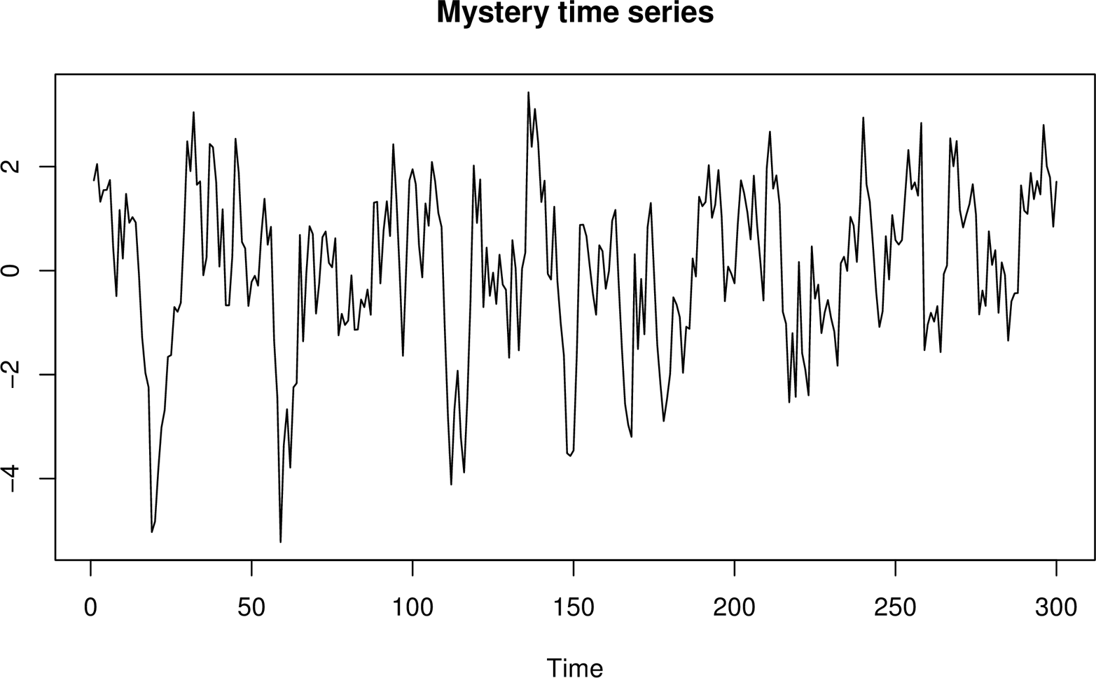
Figure 3-6. A mysterious time series about which we’ll pretend we know nothing.
Is your time series Gaussian distributed? You decide to check, so you start up your R environment and plot a histogram of your time series data. For comparison, you also overlay a normal distribution curve with the same mean and standard deviation as your sample data. The result is displayed in Figure 3-7.
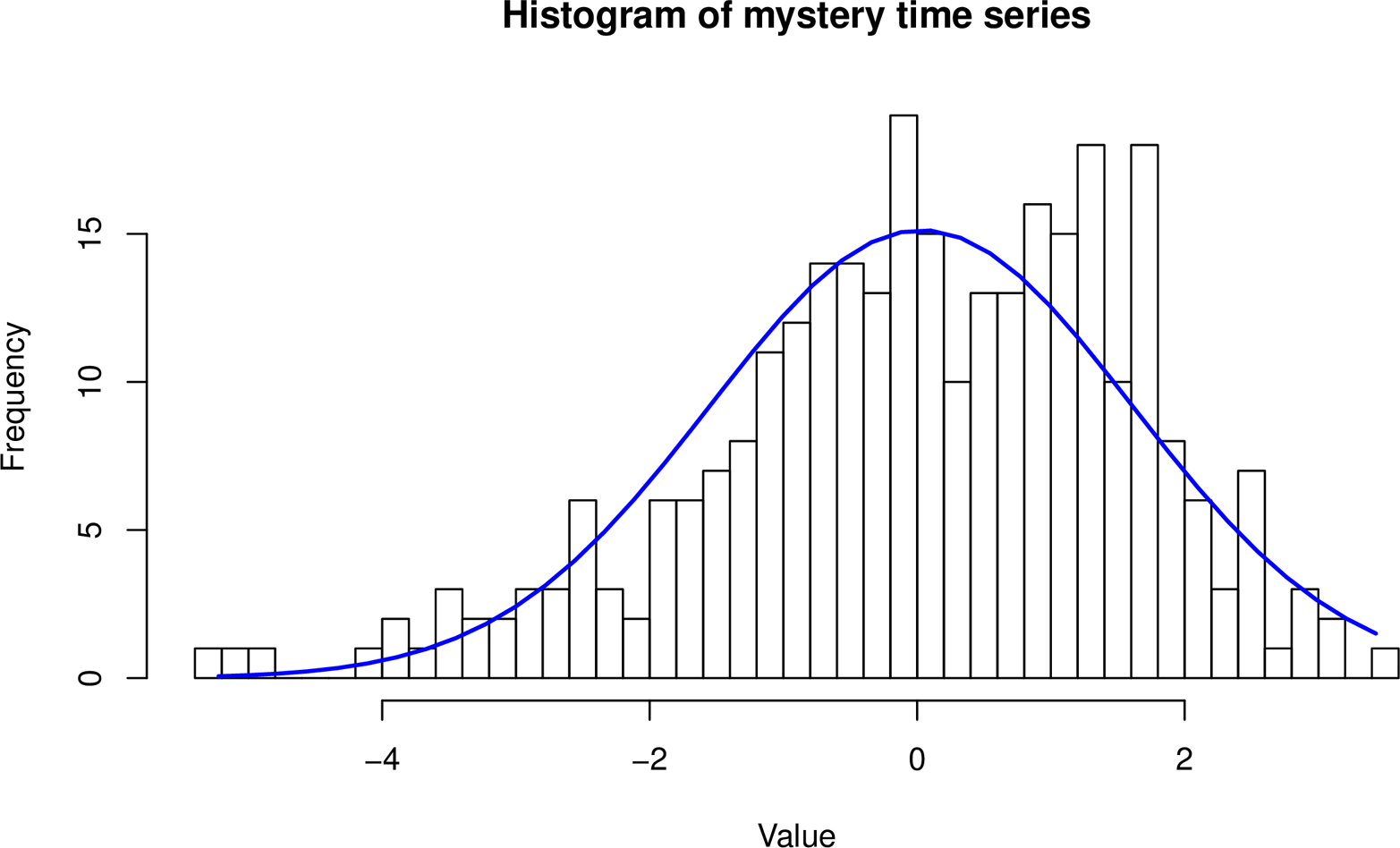
Figure 3-7. Histogram of the mystery time series, overlaid with the normal distribution’s “bell curve.”
Uh-oh! It doesn’t look like a great fit. Should you give up hope?
No. You’ve stumbled into statistical quicksand:
-
It’s not important that the data is Gaussian. What matters is whether the residuals are Gaussian.
-
The histogram is of the sample of data, but the population, not the sample, is what’s important.
Let’s explore each of these topics.
The Data Doesn’t Need to Be Gaussian
The residuals, not the data, need to be Gaussian (normal) to use three-sigma rules and the like.
What are residuals? Residuals are the errors in prediction. They’re the difference between the predictions your model makes, and the values you actually observe.
If you measure a system whose behavior is log-normal, and base your predictions on a model whose predictions are log-normal, and the errors in prediction are normally distributed, a standard SPC control chart of the results using three-sigma confidence intervals can actually work very well.
Likewise, if you have multi-modal data (whose distribution looks like a camel’s humps, perhaps) and your model’s predictions result in normally distributed residuals, you’re doing fine.
In fact, your data can look any kind of crazy. It doesn’t matter; what matters is whether the residuals are Gaussian. This is super-important to understand. Every type of control chart we discussed previously actually works like this:
-
It models the metric’s behavior somehow. For example, the EWMA control chart’s implied model is “the next value is likely to be close to the current value of the EWMA.”
-
It subtracts the prediction from the observed value.
-
It effectively puts control lines on the residual. The idea is that the residual is now a stable value, centered around zero.
Any control chart can be implemented either way:
-
Predict, take the residual, find control limits, evaluate whether the residual is out of bounds
-
Predict, extend the control lines around the predicted value, evaluate whether the value is within bounds
It’s the same thing. It’s just a matter of doing the math in different orders, and the operations are commutative so you get the same answers.7
The whole idea of using control charts is to find a model that predicts your data well enough that the residuals are Gaussian, so you can use three-sigma or similar techniques. This is a useful framework, and if you can make it work, a lot of your work is already done for you.
Sometimes people assume that any old model automatically guarantees Gaussian residuals. It doesn’t; you need to find the right model, and check the results to be sure. But even if the residuals aren’t Gaussian, in fact, a lot of models can be made to predict the data well enough that the residuals are very small, so you can still get excellent results.
Sample Distribution Versus Population Distribution
The second mistake we illustrated is not understanding the difference between sample and population statistics. When you work with statistics you need to know whether you’re evaluating characteristics of the sample of data you have, or trying to use the sample to infer something about the larger population of data (which you don’t have). It’s usually the latter, by the way.
We made a mistake when we plotted the histogram of the sample and said that it doesn’t look Gaussian. That sample is going to have randomness and will not look exactly the same as the full population from which it was drawn. “Is the sample Gaussian” is not the right question to ask. The right question is, loosely stated, “how likely is it that this sample came from a Gaussian population?” This is a standard statistical question, so we won’t show how to find the answer here. The main thing is to be aware of the difference.
Nearly every statistical tool has techniques to try to infer the characteristics of the population, based on a sample.
As an aside, there’s a rumor going around that the Central Limit Theorem guarantees that samples from any population will be normally distributed, no matter what the population’s distribution is. This is a misreading of the theorem, and we assure you that machine data is not automatically Gaussian just because it’s obtained by sampling!
Conclusions
All anomaly detection relies on predicting an expected value or range of values for a metric, and then comparing observations to the predictions. The predictions rely on models, which can be based on theory or on empirical evidence. Models usually use historical data as inputs to derive the parameters that are used to predict the future.
We discussed SPC techniques not only because they’re ubiquitous and very useful when paired with a good model (a theme we’ll revisit), but because they embody a thought process that is tremendously helpful in working through all kinds of anomaly detection problems. This thought process can be applied to lots of different kinds of models, including ARIMA models.
When you model and predict some data in order to try to detect anomalies in it, you need to evaluate the quality of the results. This really means you need to measure the prediction errors—the residuals—and assess how good your model is at predicting the system’s data. If you’ll be using SPC to determine which observations are anomalous, you generally need to ensure that the residuals are normally distributed (Gaussian). When you do this, be sure that you don’t confuse the sample distribution with the population distribution!
3 History of the Normal Distribution
5 https://www.otexts.org/fpp/8
6 In statistics, robust generally means that outlying values don’t throw things for a loop; for example, the median is more robust than the mean.
7 There may be advantages to the first method when dealing with large floating-point values, though; it can help you avoid floating-point math errors.