This section brings together a range of drawing techniques and drawing types, all of which have been explored in earlier parts of the book. It arranges drawings into three clusters, according to the kinds of places they represent: interiors, landscapes and urban settings.
While acknowledging that this simple grouping is reductive, in the sense that it overlooks other kinds of drawings and places, it is nevertheless useful in terms of being able to establish a broad framework for the idea that architectural drawing is ultimately concerned with the creative exploration of a place and the communication of the qualities of that place. This section is about architectural drawings that represent a place where something happens, that has a physical presence, an orientation and a dialogue with its context.
In a sense, bringing together the variety of drawing techniques and drawing types in this way is an important counterpoint to seeing architectural drawing in terms of aesthetics alone. Unlike fine art, an architect’s drawings have a necessary and often pragmatic purpose; they are grounded in the physical world, and are artefacts that construct a transition between the formal and the material imagination, and the eventual constructed place for human events.
An obvious consideration in the way we develop ideas for architecture is the physical and cultural context in which we are working; making images that are concerned with place distinguishes architectural drawings from those of the engineer – for the architect, the specificity of place matters.
Consequently, a great number of architectural drawings are concerned with physical context, and the parts of this section that deal with urban drawings and landscape drawings use computer-generated or physical models extensively to show how the proposed buildings relate to their surroundings.
It is more difficult to visualize how the building responds to a specific cultural context, but this is where architectural representation needs to look again at stage or film-set design, which often creates a world that reflects non-visible aspects of the narrative.
Interiors
The interior is a significant genre in architectural representation. These drawings are distinct from the drawings of the architect–decorator, which have a different focus; drawings of architectural interiors tend to situate internal spaces as part of a sequence and aim to understand the building as a whole with respect to the urban/landscape context and its culture. Historically, drawings of interiors were not represented in terms of an independent aesthetic. Rather the architectural interior was traditionally more like a canvas, a container for paintings, frescoes and hangings that represented a matrix of symbolic references, pointing to the physical and cultural context and its historical depth.
TIP SPACE
Concentrate on understanding interior space through light and material surface. This will lead on to textures and colour.
Such interiors are replete with distortions and multiple viewing angles and are almost collage-like in the manner in which they first hold and then open space, mediating between the symbolic interior and external landscape or city. Non-perspectival interiors emerge again in modern times most clearly with collages. As we have seen, the collage can be used to bring together more complex sets of relationships that may inform an interior. The work of the photographer Georges Rousse is relevant here. Rousse’s final product is the photograph, but the interchange between interior/photograph and drawing is a creative journey that opens up unexpected relationships and challenges the dominance of our perspectival understanding of interior.
Like the etchings of Giovanni Battista Piranesi or the watercolours of Joseph Michael Gandy, Rousse’s photographs reveal the deep significance of light in our representation of interiors. Visually, interior depth is represented in a drawing by increasing the darkness of the image as the space recedes. In working a drawing by hand, this structure tends to be established first, in mid tones. Without it, the more detailed elements of the drawing are more difficult to balance. Lights and darks are worked into and out of this basic structure.
The way light works in more detail in an interior is a complex phenomenon. By hand it is possible to swiftly establish a broad structure, but computerrendering software can more quickly take the depiction of light towards photorealism, as radiosity algorithms now allow for multiple reflections of light off a room’s surfaces. These packages can be useful both at the design development stage and as an illustrative device.

Gillian Lambert’s detail rendering of the House at Galleon’s Reach is evocative of intermediate, partially enclosed space.

1. This is a preliminary pencil and crayon study by Eric Parry for the vestibule that gives access to the Crypt space of St Martin-in-the-Fields, London. Here the interior is understood as setting up a relationship with the church, the view to which provides an essential orientation during the journey to the underground space.

This group of prints is a creative interpretation by the artist Anne Desmet of the Great Court at the British Museum and explores how light works in the space.
2a. British Museum Series No. 1 is a wood engraving printed in black ink on Japanese Gampi Vellum off-white paper. This image was developed from photographs taken by the artist in daylight hours. The desired image was scaled up on a photocopier to the size of the end-grain boxwood engraving block and the outline structure traced from a mirror-image photocopy onto the block using a selection of fine engraving tools. In the cutting, the artist exaggerated various light effects observed in the building – in this instance, to suggest an idea of how the building might look at night with only one directed light source from one side – and also enhanced the intensity of the shadow fretwork cast onto the curving perimeter wall of the library by the lattice roof.

2b. British Museum Series No. 4 is also a wood engraving printed in black ink on Japanese Gampi Vellum off-white paper. This image was a reworking of the engraved block for British Museum Series No. 1 and there were a further two developments of this same block before the final stage was reached. The engraving already on the block was reworked and further engraved using a selection of fine engraving tools. In the cutting, the artist exaggerated various light effects observed in the building – in this instance, to suggest an idea of the silvery light of the building in bright daylight. She retained the area of deep shadow along the right-hand side of the curved library building to give a sense of the structure’s three-dimensionality within the Great Court space.

2c. British Museum Diagonal Light is a wood engraving collaged on card. This collage was made by first printing an impression of British Museum Series No. 4 onto semi-transparent, buff-coloured, Japanese Kozu-shi paper. Once dry, the print was carefully measured into thin diagonal strips of equal width (each strip was only around 3–4 mm or ⅛ in wide), which were carefully cut out using a sharp scalpel and a steel rule – but leaving a very thin, uncut edge so that the print was sliced but still all in one piece. The image was then laid onto card and glued down, allowing a tiny gap to open up between each slice to suggest shafts of light slanting down across the building. To enhance this effect, a few of the print ‘slices’ were cut out completely, reversed and transposed from left to right to make use of the light effect generated by the paper being semi-transparent. This allowed the printed image to show through on the reverse side in a silver-grey tone, in contrast to the stronger black printing on the front. The idea was to experiment with some of the effects of Op Art and also to explore the strong sense of interrupted light within the Great Court.
This sequence by Ian Henderson illustrates the process of changing light effects in an interior image.

1Main exterior light source. Set up a direct light to act as the sun and position to provide pleasing rays cast through exterior wall apertures. A direct light is used because rays cast from this light are parallel, thus best replicating the sun’s rays and the formation of shadows cast.
Adjust the direct light’s multiplier value to suit the scene.
Use V-Ray Shadows for cast shadow type.
Increase the Subdivs value under the V-Ray Shadow Parameters tab to improve the quality of the shadows cast and reduce noise.

2Exterior ambient light. Additional lights are required to simulate ambient light entering the interior. Outside each wall aperture a V-Ray rectangular area light was placed. Physical dimensions of the light should be big enough to cover the extent of the aperture. Increase subdivisions of light to improve quality of shadows and reduce noise. Adjust multiplier value to suit.

3Bounced light. To simulate bounced light, use global illumination. Adjust quality to suit scene and image size. Test using the different Irradiance Map presets, beginning with the lowest quality first.
First bounce was calculated using an Irradiance Map and was set to Medium.
Second bounce was calculated using Direct Computation.

4Environmental light. To simulate additional daylight entering the space via the wall apertures, the V-Ray GI Environment and Reflection/Refraction Environment light was used to provide more ambient illumination. Adjust multiplier value to suit scene.

5Interior lights. Interior artificial lights were added to illuminate specific areas of the scene. Standard spotlights were used with V-Ray shadows.

6Additional lights are required to simulate ambient light entering the interior.
To simulate additional daylight entering the space via the wall apertures the V-Ray GI Environment and Reflection/Refraction Environment light was used to provide more ambient illumination.
Adjust multiplier value to suit scene.
To simulate bounced light use global illumination.
Adjust quality to suit scene and image size. Test using the different Irradiance map presets, beginning with the lowest quality first.
This section covers drawings of architecture situated in natural landscapes, architecture intrinsically tied to the land or the gardens it frames. These relationships, once the subject of great paintings, frescoes and tapestries, continue to inspire architectural strategy and detail. Large-scale topographical plans, sections and models of landscapes are among the drawings that situate building proposals.
Representation of landscape is itself a major area of study for contemporary visual artists, and architects can certainly draw on the wealth of these studies. At the same time, the focus of the architect’s drawing is often not the landscape itself, but rather a reiteration of an age-old dialogue between nature and artifice: constructed landscape, rather than the landscape as a whole.
It is interesting to note how layering of colours is part of the technique traditionally used to depict landscapes. As far back as the tempera paintings of the Middle Ages and early Renaissance, for instance, we find woods (nature) were first painted with several layers of black, and then over-painted with thin glazes of the transparent pigment Terre Verde (Earth Green). Perhaps this gaze into deep shadows, representing the mystery of the natural landscape, is echoed in the layered glazed surfaces of oil and watercolour seen in the later great paintings.

A carefully judged ‘digital render’ by A.E. Lee. The ambiguity of this constructed landscape is achieved by balancing render settings of the original model and layering other effects in Photoshop.

This carefully rendered digital drawing by Morphosis represents the structure in its landscape setting, creating the impression of real engagement with the terrain that is important to many architectural proposals.

1. Perry Kulper’s drawing is a particularly rich exploration of landscape at a strategic level. The contoured topography gives rise to a poetic interpretation that appears to be part landscape and part emerging construct. The drawing overlays the plan of the real landscape with a delicate, layered set of lines and tones. This image operates at two levels: first, there is an overall arrangement of boundaries and surfaces, drawn in dark pencil on mylar (film) and potential enclosures are emphasized in Naples Yellow, pinks and Sienna Earth; second, there is an intricate world of detail that negotiates boundaries between the constructed and the explicit landscape, visible through the translucent surface of the mylar. The layering of the drawing in this way expresses a depth of landscape and at the same time presents the image as a vehicle for imaginative interpretation. This kind of drawing is only in part a conveyor of information; it is also a drawing that provokes reflection about landscape and architecture.

2. In this sequence of plans and sections, Sophia Cole describes a project for a municipal archive in Princes Risborough, UK (see also pages 104 and 122). The ‘forgotten history’ of this small town is evident on the site of The Mount, beneath which is buried the ruins of a medieval manor built for the Black Prince in 1344. The proposal references the original manor with spaces that link past and present volumes within the typology of a town hall.
The drawings above describe a concept for the material and architectural expression of this new civic landmark, and derive from the process of archaeological digs. The underlying geologies of clays and chalk that have been removed through the careful excavation of the manor house are utilized in the material composition of the internal structural elements and the façade. The extrusion of the footprint of the old manor house and the inversion and abstraction of the excavated area create the form and skin of the building. The spaces within the building have been developed using parameters set from existing excavation scars in the landscape.
2a, short section: The section cuts through the geological build-up of the earth surrounding the building and, within the building, the archive and sculpture levels and the Council Chamber/ Auditorium. 2b, upper floor plan: The upper floor plan shows the Council Chamber/Auditorium and council offices, which are suspended within the void of the building. 2c, Worm’s-eye view: The drawing is a wide-angle view taken 20 metres below basement level, looking up into the building.

3. Stephenson Bell’s rendering of their proposal for a visitor and education centre at the Messel Pit, near Frankfurt (a UNESCO World Heritage Site), is equally evocative, and maintains a high level of detail and clarity. As part of the development of the scheme, the architects visited the site and undertook a photographic study with a Canon 350D digital camera. The muted palette of the snow-covered landscape was emphasized by converting the images into black and white, with the contrast and brightness adjusted (so that all the images were consistent). They were then ‘stitched’ together with Photoshop to create a continuous background for the computer render of the proposed building. The background images were faded out at the perimeters to blend in with the sky and ground.
The proposal was modelled with 3ds Max and rendered with V-Ray, with the camera angles being set up early to enable the background and foreground to be developed while the model was being created. Textures were taken from existing elements on the site photographs (which were adjusted in Photoshop to avoid any repetitive tiling). Particular attention was given to the lighting to achieve a soft diffuse light, replicating the winter haze apparent in the site photographs. The ground levels were modelled to form the right shadows when the ground falls away from the projecting walkway, and together with the soft light the appropriate shadows were created.


4a, b. The view of Queen’s Walk, London (in winter), by West 8 has a similar delicacy in the way that the landscape is rendered. The image combines clarity with a visual impression of the character of the landscape proposal. By contrast there is a more diagrammatic feel to the isometric view (at night) of the overall proposal.

1This exploratory sketch is based on a landscape study at the early stages of the design process, where the medium of watercolour is a means of thinking through preliminary ideas of location and a response to the flatness and scale of the context. An abstract pencil sketch is not intended to be representative of the specific landscape, but instead fixes certain ideas about measurements and scale.

2The first washes overlay Burnt Sienna and Raw Umber (natural) onto Payne’s Grey to represent a sense of the landscape setting. The washes are loose and are used to find possible ideas for the eventual structure.

3Importing the watercolour sketch into Photoshop, a foreground texture is added in a new layer and trimmed using the Pen tool. Some of the washes are lightened by wetting the page and then reducing the colour with a sponge.

4Photoshop is used to complete the sketch image for the new structure in the landscape.
In the following sequence, architect Maria Vasdeki illustrates an effective way of building an exterior scene in Photoshop from a basic CAD-rendered output. The final render focuses on the external landscape that the building creates, rather than the building alone. The drawing is intended to explore the character and scale of the landscape, and set up the conditions for further development and resolution. For these purposes detailed articulation is less important than a sense of light, orientation, scale and material quality.

1A very basic render is brought into Photoshop. The unwanted background is selected and removed with the Magic Wand tool.

2Having placed an image of a tree in the file, and removed unwanted areas using the Lasso and Magic Wand tools, the tree layer is then duplicated and desaturated via Image>Adjustments>Black & White.

3The Find Edges filter is applied to the layer, Filters>Stylize>Find Edges.

4The grey areas are selected using the Magic Wand tool, and filled with white using the Paintbucket.

5The layer is duplicated and a Motion Blur filter applied, Filters>Blur>Motion Blur.

6The white layer’s Blending Mode is set to Multiply and the blurred copy’s Blending Mode is set to Hard Light. Their order is then swapped, placing the blurred copy between the white layer and the original tree layer.

7Another copy of the original tree layer is made, then placed on top of all other layers. Its Saturation and Hue values are then adjusted (Image>Adjustments>Hue/Saturation).
This layer’s Blending Mode is set to Exclusion.

8An image of tree branches is brought into the file. The semi-transparent parts result from using the Eraser tool with lowered Opacity and Flow values. The Opacity of the branches layer is lowered to 60%.
All steps so far will help add some depth to the final tree composition.

9A brown tree-shaped vector is created, its Blending Mode set to Overlay and its Opacity lowered to 60%.

10All other trees are created following the same steps, with slight variations in the Hue/Saturation values.

11The background layer is then duplicated and desaturated. Its Fill is set to 60% and its Blending Mode set to Overlay.

12Textures are placed in the file and cut into the appropriate shapes to act as materials. All the new layers have lowered Fill values but their Blending Modes are set to Normal.

13The background hill is added and then a yellow texture for the sky. The yellow texture’s Blending Mode is set to Hard Light and its Opacity to 60%.

14After adding the rock and its reflection, a wooden bench is created using an appropriate texture. The layer is given the necessary perspectival distortion via Edit>Transform>Distort.

15The shadows are now created. For example, the shadow on the floor is created in a new empty layer by selecting the appropriate areas and filling them with black using the Paintbucket.

16The Blending Mode is set to Multiply and the Fill set to 55%. A mask is created by clicking the Mask button at the bottom of the Layers panel. With the Gradient tool selected and its fill set to From Foreground to Background, a linear gradient is applied on the mask.

17The sky layer is duplicated and brought on top of all other layers. Using the Lasso tool and the Layer via Cut option from the Layer tab, the sky layer is cut into two separate layers, one in the shape of the original render layer and the other covering everything else in the composition.
The former’s Opacity is set to 51% and the latter’s to 23%, with both layers’ Blending Modes set to Overlay.

18The final composition.
Urban situations produce a wealth of diverse architectural drawings, varying in scale from strategic studies of a city, its metabolism, topography and culture, to relational studies of more immediate context – the block or the street – and finally through to specific spatial studies that negotiate boundaries, transitions, structure and materiality.
The range and complexity of issues is matched by the diversity of ‘urban drawing types’ and approaches to design in urban contexts. During the process of urban design, drawings are the vital component in terms of the way they can open up the debate and engage others. ‘Urban drawings’ are key drivers for the design team, in the eventual resolution of the city’s often-conflicting demands. The role of the urban drawing is two-fold: first, to synthesize; second, to communicate.
Urban drawings incorporate wide-ranging specialist inputs and bring together the perspectives of diverse stakeholders. While software can facilitate information management, these complex design decisions still require judgment based on a deep understanding of the city and, like any other architectural situation, will need to be worked out through drawings, models and artefacts at a range of scales.
One of the dominant kinds of urban drawings today is the perspective, and computer-generated modelling enables building forms to be placed in context with photographic precision. With perspective comes the ability to see the city as a unified scene and also to demonstrate explicit formal relationships. The computer facilitates the ‘designing’ of the city and allows it to be visualized in three dimensions.
At the same time, however, the expectation of these photorealistic images should not preclude other, perhaps more subtle, studies that foreground less tangible aspects of urban life – drawings that capture, for instance, the performance, metabolism and life of the city.

Matera towards Evening, a linocut by the artist Anne Desmet, is about simple observation of the city and light. Printed in blue-black and cream inks on Somerset Satin paper, it is a direct development of a small, detailed, pencil and grey wash drawing (made on site) of part of the ancient town of Matera, in southern Italy. The sun is just hitting the scene and the drawing emphasizes the way that buildings merge into the shadows, the rocks from which they came. Two printing blocks were used: the key block, printed in blue-black, carried all the structure of the composition; the second block (the same size as the first) was uncut, but inked in a transparent cream tone over the first printing in order to imbue the image with a sense of the yellow warmth of the stone and sunlight in contrast to the bright whiteness of the printing paper.
TIP OBSERVATION
Use drawings and other media over a period of time to develop an understanding of changing conditions and different patterns of inhabitation.
TIP CONTEXT
In drawings that show context for a specific building, concentrate on careful observation, measurement and visualization of the immediate surroundings. Detail seen from a further distance matters less.


Zaha Hadid Architects, Kartal-Pendik masterplan, Istanbul (see also pages 111 and 126). This project began by weaving in and out of the existing fabric to create a soft grid that forms the generating plan for a three-dimensional developmental framework (right). Topologies were developed through scripting software that responded to the perceived demands of different districts. The masterplan image (above) was made by taking this adaptable model and rendering it using a range of software including Rhino, Autodesk and Maya.
TIP URBAN SPACE
Use plans, sections and models to understand three-dimensional patterns of urban space.

1. This rendered CAD model, seen at the right of the image, was made as part of the design process for the Lausanne Opera House by Devanthéry & Lamunière to show the proposed building in its urban context.

2. It is interesting how the hand-drawn sketch still remains a key tool with which to synthesize and articulate ideas, even in the complex environment of the contemporary city. This study by Eric Parry shows an urban plan and two elevations for 5 Aldermanbury Square in London. The pencil sketch establishes, at an early stage, preliminary ideas of strategic importance to the development – in plan, the idea of a generous public space linking urban spaces to either side of the building at ground floor. The scale of this is indicated in the base of the first elevation. On the second elevation another idea – the inward canting of the upper parts of the elevations which is key to the final project – first appears. This device reduces the impression of the scale of the building at street level. In this sense this simple sketch is a synthesis of ideas about the life and experience of the city with strategic and detailed decisions about form, arrangement and structure.

3. Zaha Hadid Architects, CAD image of the Groninger Forum, showing the proposed building in the context of the existing fabric. The effectiveness of the drawing is partly in the way it limits the use of colour to highlight the proposal. The rest of the city is rendered in a blue/grey tone and, while giving the background context, it does not detract from the dramatic building that appears as a light plane cutting diagonally across the image from the bottom right. This composition and carefully judged play of light and movement are key to the power of the drawing.

4. This soaring project for ‘A Caravan Park in an Urban Environment’ (the refurbishment of Centre Point, London) by Yakim Milev was interrogated via readings of a temporary, rentable space through the prism of a kinetic network of self-assembling parts. The building is an adaptive system of platforms, which create a network based on the preferences of the people that occupy it. This idea is brilliantly captured in the upward gaze of the exaggerated perspective, rising through its urban context. The image combines a detail wireframe model with rendering and overlays to create the impression of change and movement. Starting with the structural hierarchy of the existing building, the internal, shifting, spatial definition was developed through scripting in Grasshopper. The final image was completed in Photoshop.
In this sequence of images by Ian Henderson a photograph of an existing urban environment is manipulated to show how a proposed architectural intervention would look on the site.

1Photo. Refine the photograph for best results with colour-correction techniques using layer or image adjustments such as Levels, Curves, Photo Filter, Hue/Saturation and so on. Make sure that any unwanted marks and dust spots are removed using the Clone Stamp and Heal Brush tools. Sharpen if necessary, using either the Unsharp Mask or Smart Sharpen filters.

2Model. Create a new group and rename. Drag the CG element into the new group in the working document with the Move tool, holding down Shift so that it lands in the correct location.
Rename the new layer with the CG element. Select the group and apply a layer mask. Using the Brush tool, paint on the layer mask with black and white to hide and reveal appropriate parts of the building layer so that it sits well in the photograph.
The CG element was colour-corrected to match the tonal values of the photograph using layer or image adjustments such as Levels, Curves, Photo Filter and Hue/Saturation.

3Background. Work on the background to mask out any unwanted areas of the photograph. Add trees and bushes to the background using groups, layers and layer masks. Create a new layer and clone areas of the sky to cover up the existing building. To blend the new CG road with the existing road, copy and clone areas of the existing road onto a new layer until the two elements join correctly.

4Shadows. To make sure the CG element sits properly in the photograph, trace the shadows cast by the existing buildings using the Quick Mask mode to paint and create a selection. With the existing shadows traced and selected, create a new layer and rename. Fill the selected area with black using the Paint Bucket tool. Set the opacity of the Shadow layer to match the value of the existing shadows.

5Reflections. Create a new group and rename it. With the Polygon Lasso tool, select the windows. Create a layer mask for the group from the selection. Drag, drop, scale and position images that closely represent what could be reflected in the glass into the new group. Ideally use photographs taken from the other side of the road to provide an accurate reflection; this will require careful planning in advance. Colour-correct the reflection images and use layer blends and opacity values to create convincing reflections.

6Vegetation. Create a new group and rename it. Drag, drop, scale and position the vegetation in the scene. Colour-correct the vegetation to match the tonal values of the photograph using layer or image adjustments such as Levels, Curves, Photo Filter and Hue/Saturation.

7People. Create a new group and rename it. Drag, drop, scale and position the people in the scene. Colour-correct the people to match the tonal values of the photograph using layer or image adjustments such as Levels, Curves, Photo Filter and Hue/Saturation.

8Shadows of people. To create shadows for a person, duplicate the layer. Using the Hue/Saturation adjustment, create a silhouette from the duplicate layer by setting the Saturation and Lightness values to -100.
Use the Distort function from the Transform tool to manipulate the silhouette to form a shadow. Take care that the shadows lie in the same direction as those in the photograph. Move the Shadow layer beneath the Person layer. Set the opacity of the shadow to match the tonal values of the shadows in the photograph. Use the Gaussian Blur filter to soften the shadow if required.

9Final image.
These diagrams, drawings and digital models were made as part of the design process for the transformation/renovation of the TSR Tower, Geneva, by Devanthéry & Lamunière.


1A photograph and two diagrammatic sketches show the existing tower in context and illustrate the three-dimensional intentions as they look to ‘open the form’ of the existing tower, ‘passing from an “I” volume to a “Z” volume, or from a solitary form to a form that merges more interestingly with the environment’.


3The final contextualized rendered model of the proposal.
In the following sequence, Yakim Milev brilliantly illustrates how drawing can be produced through scripting in Grasshopper. The drawing technique was particularly suited to his project, which explored the changing nature of temporary rentable space within an existing structure. Grasshopper and other scripting tools are creative devices designed to generate new spatial patterns and organizational strategies. The systems they generate can be tested against other drawings that explore the real conditions of the spatial proposal.
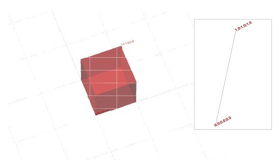
1Take the space diagonal within a box of any size; here it is a box with edges of 1 unit length.

2Move the end points of the space diagonal 1 unit in the Y and Z directions, so that their new positions coincide with the corners of the box. This can be done by either extracting the edges of the bounding box or by switching the Z value in the first point with the Z value of the second point and the Y value of the second point with the Y value of the first point (Decompose Point and Point XYZ operators in Grasshopper).

3Move the original points only halfway by dividing the Y and Z values by 2, and create a line that is a space diagonal for a box which has half the thickness of the original box. This time, switch the Y and Z values – instead of Z and Y – of the starting points so you can create the opposite edges of the bounding box.

4Repeat the part of the definition used in the second step for the points created in the third.

5Repeat the part of the definition used in the third step. This creates a recursive process, which fragments the space at a constant rate at every step.

6This script can be applied to any form that is defined as lines. To use it, take any form, map any network of lines to it and substitute the space diagonal with the set of lines from the network (this part of the definition is available on the grasshopper3d.com website).

7The script adapts automatically to changes in the original form, as in almost all Grasshopper cases.

8When applied within a three-dimensional grid, the definition creates an alternative organizational system based on the positions of the points of the 3D grid.

9The bounding box around each individual space diagonal can serve as a source for planes that create the actual enclosures. This is done by exploding the box and selecting the desired face.

10In this particular project, a 3D grid derived from various sources of geospatial information was superimposed on the Centre Point tower in London.

11The project was based on the creation of clusters within the building, so each of the centres of those volumes was connected to all the points on the 3D grid within a given range.

12Those lines became the base for the analysis and construction of the separate clusters.

13The clusters were re-inscribed within the volume of the original building.

14The separate clusters were also superimposed on each other, thus creating the final form.