[ 1 ]
Great Designers Are Great Communicators
Have you ever had to make changes to your design work you disagreed with? Me too! It’s not easy to talk about design, especially with people who aren’t designers. The ability to effectively articulate design decisions is critical to the success of a project, because the most articulate person usually wins. In fact, I would say that the difference between a good designer and a great designer is in their ability to not only solve problems with design, but to also articulate how their solution solves it in a way that’s compelling, fosters agreement, and gets the support needed to move forward. That’s what this book is about: getting support for your design decisions.
Lots of people are involved in the design process. What was once relegated to a visual aesthetic is now the center of everyone’s attention. People from all over the organization see the value of creating a great user experience, and they all want to participate. Marketing, executives, developers, product management, even people in accounting will want to tell you how they think it should work. People are excited about user experience (UX) because they recognize the long-term effect it has on the product, the business, and the bottom line. The good news? You’re a very popular person!
The Big Meeting
One Sunday in January, I had to catch a late flight to San Francisco for a client meeting the next morning. But this wasn’t just any meeting. About a dozen people from different areas of the company were all presenting designs to the CEO of a large retail website. Vice presidents, directors, product owners, and UX designers were all involved in putting together a three-hour event that would lay the groundwork for an entire season’s worth of projects, as long as they could get this one executive’s support.
After working with several product managers and attending several meetings, I understood the body of work I was presenting and began preparing my slides. The Friday before, I sat in on a four-hour conference call, during which everyone on the team practiced their presentation to a VP, who provided feedback and suggestions for how to best present their ideas to the CEO.
It all centered around one thing: presenting design ideas to a CEO for the purpose of getting his support and buy-in. There were more meetings about the meeting, discussions about what he might say, late nights getting everything just right, and rearranging schedules to make it happen. I personally would spend 16 hours traveling, 2 nights in a hotel, and a full day in a conference room just for this one meeting. Fortunately, the meeting went well. The CEO was very receptive, provided great feedback, and everyone set to implementing the work they had designed.
But that’s not the important part of this story.
What struck me about this whole thing was the amount of effort that was going into just communicating design ideas to one person. The amount of time the other designers spent actually creating the mockups was trivial compared to the time and energy that went into finding the best way of communicating them. Communicating about the designs was more important than the designs themselves.
You may not be on a large team like this or you may not be working with a large company for which a meeting with the CEO is such a big deal, but the principle is still the same. The way we talk about design to our stakeholders is critical to the success of our projects.
Design Is Subjective...Sort Of
When I interview designers for a role on my team, I always ask them, “What makes a good design good?” The way people answer this question tells me a lot about how they think about design and, in particular, UX. Most of the answers are predictable, but they often tend to sound something like this: “a good use of space,” “simplicity,” or one of my favorites, “when you can’t remove anything else.” Now, there’s nothing wrong with those answers. They express how a lot of people approach design, but they aren’t truly what make a design good in the eyes of a business. It’s not the approach I want for designers on my team because they speak to subjectivity—to an aesthetic that not everyone will agree on.
I’m not exactly sure where these designers come up with definitions that sound like something straight out of a Jonathan Ive memoir. I don’t think they learned it in art school. What concerns me is that I think they picked these catchphrases up from a social-media design phenomenon where “UX” means “something that looks as cool as an iPhone.” They’ve adopted it from a popularity-contest mentality that believes pretty things are the same as usability. It’s the same culture that causes well-intentioned designers to create a “redesign” mockup of any popular website or app without any clue as to what that business’s needs are. It’s less about solving problems and more about likes.
The truth is, all design is subjective. What one person likes, another person hates. What seems obvious to me might not be obvious to you. What works in one context could fail miserably in another. This is why design is such a difficult thing to talk about, especially with people who aren’t designers. There is little common understanding of what design is or should be.
Too Many Cooks
It would be easy to create designs if it weren’t for the fact that other people on the project might disagree with our decisions. Actually, they will!
There are a lot of people who may know little or nothing about design, yet who have the authority to oversee and dictate our design practice. They have a vested interest in participating in the conversation, but they aren’t trained designers, and they don’t have the same depth of knowledge in design or technology that we do.
What’s more, these people will often gladly admit that they aren’t the experts. They know that they don’t know, yet they still insist their ideas and opinions are right. This is one of the most bizarre parts of our relationship with stakeholders! People will readily admit they are not good at our jobs, yet insist on making changes that we believe will be detrimental to the user experience. They say that they trust us as experts and yet frequently overrule us. It can be incredibly demeaning and confusing, but the problem may not lie entirely with them.
These stakeholders have to be part of our process, but we struggle with including them in a way that’s helpful and doesn’t derail our objectives. This is what we need to figure out.
Everyone Is a Designer!
Everyone knows good design when they see it, even if they don’t know how to create it. That sounds frustrating (even ridiculous), but it’s actually true. The same can be said for other arts, such as music. I may not know how to play an instrument, but I can decide what music I like (and don’t like). Although there may be different preferences, we’re all able to choose music we want to listen to, regardless of whether we know how to reproduce those sounds ourselves.

Andy Zelman, Skeleton Claw Comics. (Used with permission: http://skeletonclaw.com)
The Interface Is Your Interface
Because design work is so often visual, people care about the part that they see, feel, or interact with. They care about the interface. However, when your job is to create the user interface, everyone is going to care about everything that you do! All of your work is exposed, so it naturally conjures more opinions and ideas than many other areas in the organization.
Our work is critical to the success of our company’s products, so we must take responsibility for showing people how and why our work is so valuable. That part doesn’t come automatically. It takes work, it takes practice, but more importantly…it takes good communication.
There Is No U or X in Team
Collaboration seems like it should be the pinnacle of great design work: different opinions coming together to form the best possible solution. That’s what everyone really wants. The image is of a handful of respectful intellectuals, passionately debating the right solutions, ultimately leading to a collaborative discussion and an ideal design that no one could have thought of on their own. Teamwork at its best! Everyone leaves satisfied, fulfilled, and respected—ready to take on the next design challenge, right? We think we want that kind of collaboration, but it becomes far more complicated when we disagree with one another. When we disagree, we tend to become defensive. When we become defensive, we fail to focus on the real issues. The meeting ends, not with collaboration, but with grumbling compromise and, often, a crippled user experience.
In situations like this, meetings can easily turn into design-by-committee. Everyone has a suggestion for how to solve a problem. We hear different opinions on every side and are unable to defend our own choices against this barrage of feedback. One suggestion evolves into an idea for something else. That idea spurs a thought about something different. Unchecked, the conversation can spiral out of control into a hodgepodge of well-intentioned tweaks that collectively spell doom for the overall goals of the project. The thing we came together to accomplish has been muddied by groupthink and mob mentality. Remember, teamwork always ends with work.
The CEO Button
Because of this, we see things like the CEO button.
The CEO button is an unusual or otherwise unexpected request from an executive to add a feature that completely destroys the balance of a project and undermines the very purpose of a designer’s existence.
It’s funny because it’s true. You might spend weeks or months building the best possible app. Your team has poured in all the best practices. You’ve done usability testing to prove it works. And yet, one executive can come in and blow up the whole thing. We want to avoid this.
Home Page Syndrome
Another common problem is the home page syndrome.
The home page syndrome is a condition whereby the home screen of an application or website becomes a catchall for everything, creating a garage sale of links, buttons, and banner ads that unravels the fabric of usability, causing designers to cry themselves to sleep.
You see, sometimes no matter how hard we try, the home page just becomes a huge mess. Everyone wants their business unit represented on the home page. It’s as if something doesn’t exist if it isn’t on the home page. That new thing we’re launching? Put it on the home page. And that other thing that isn’t performing well? Maybe if we put it on the home page, it will get better. Sound familiar? We have to learn to deal with this phenomenon.
Communication Is the Job
The good news is that it doesn’t have to be this way. It’s possible to avoid the disruption and compromise that happens so frequently in organizational design through better communication with our stakeholders. I’ve found that the majority of issues or concerns that our stakeholders bring to our attention are often just a matter of misunderstanding or miscommunication. The way that we talk to them about our designs is the key to ensuring that we always end up with the best possible user experience.
It makes sense when you think about it. All human relationships are really nothing more than a series of bound-up understandings and misunderstandings. We don’t always have control over how other people understand us in the beginning. Everyone brings their past experiences into conversations we have with them on a daily basis. We do, however, have control over how we communicate with them in order to influence those future understandings. The way that we talk to people and the things we say will influence their response.

I know you were told your job was to design stuff, but really communication is the job!
Good Communicators Win
Overall, being a better communicator will give you more opportunities. I’m amazed at the number of designers who apply for a job yet lack basic communication skills. People will send me a resume without explanation, forget about interviews, or fail to follow instructions. Ultimately, I’m only going to pursue candidates who can communicate well, and so the poor communicators are passed over very quickly.
It’s common for my leaders or clients to express that one of the reasons they hired me was because it’s so hard to find people who are reliable and can communicate effectively. I’ve heard many stories about former designers who simply weren’t good at setting expectations, following instructions, or clearly articulating their work. The need to work with other people on the project, particularly developers and managers, is quite often the thing that sets apart good designers from bad ones. It’s not about whether you can create the most innovative design, but whether you can work with people in a way that gives them confidence in you and your expertise.
Your job will be easier if you’re a good communicator. Strangely enough, that may be all it takes to set yourself apart from other designers—even designers who might be more artistically talented than you. Very simply: good communicators win.
Being Articulate Means Success
It’s more than just using words, though. We have to turn those words into something that will enact change or compel people to support our decisions. We have to explain why we did what we did. It’s not just using words with a frequency or persistence; it’s about using them in a way that is compelling and convincing. It’s about being articulate.
The key to being articulate is to understand both the message you want to communicate as well as the response you want in return. If you can learn to craft your messages in such a way that they yield the desired response, you’ll find that you’re much more successful at getting the things that matter to you.
The Best Ideas (Don’t Always) Win
It might seem like the best ideas should always win, or that great design should speak for itself, but that’s not how these situations play out in real life. It’s too altruistic to believe that the best ideas are the ones that will get picked. They should, perhaps, but this is reality, and humans are part of the equation. The best ideas (unfortunately) get stuffed into an amalgamation of meetings where competing needs vie for attention. The person who can convince the other that they’re right is the one who gets their way. Your design might be revolutionary, but an aggressive and well-spoken salesperson is more likely to get support if they can convince your boss that they’re right.
Designers lacking the ability to explain why they did what they did end up on the losing side of the argument, forced to make changes they disagree with simply because they were unable to fend them off. This is not to say that the stakeholder relationship is adversarial. No, these discussions can feel very much like good, solid teamwork. But the inability to speak up and articulate your side will often land you in the position of making changes that won’t yield the best results.
Alternately, being articulate about our designs:
Imparts intelligence
You’re smart, you know what you’re talking about, you have expertise in this area, and you can be trusted with the solution.
Demonstrates intentionality
You’ve thought about it, pursued it, and are logical in your approach. This isn’t just a random idea; there is purpose and focus.
Expresses confidence
You know what you want and how to get it done. Having a solid argument shows that you’re not wishy-washy and you mean what you say.
Shows respect
You value everyone’s opinions and time enough that you’re well prepared. You’re not wasting time or disregarding others.
The way to be articulate about design is to offer a message that communicates why we did what we did in order to help stakeholders understand our rationale. More than that, we can present our work in such a way that it appeals to their needs and expectations too. We build trust with stakeholders by showing our expertise through logic and reason, and by delivering it to them in a way that makes sense to them. So, we need to harness the power of communication, be articulate, and use these skills to help people see that our decisions provide the best possible solution. Being articulate will help us be successful.
Becoming a Great Designer
To hone in on the best practices for articulating design decisions, let’s look at what makes a design successful, because that will form the basis for how we communicate about it. Let’s boil down UX to its very core. We must understand the fundamentals of what makes a great experience so that we can reproduce that thinking and approach.
The Big Three
Let’s return to the question: What makes a good design good? We could debate the answer, but when it comes to creating the user experience, a design is really only good when it solves a problem. Mostly, we are trying to solve problems for the business; we’re trying to accomplish some goal that will help the business grow. But, if we’re practicing a user-centered design approach, we must also make our designs easy to use for the people who will use it.
However, one thing that we often forget is that there are other people involved who have influence over our project. It’s not enough to simply create an incredible app; we also have to get the support of our team. Without their support, our project can’t move forward.
The difference between a good designer and a great designer is the ability to not only solve the problem, but also to articulate how the design solves it in a way that is compelling and fosters agreement. If you can do that, you’re a great designer.
So, I would say there are three things that every design needs to be successful:
- It solves a problem.
- It’s easy for users.
- It’s supported by everyone.
These are the basics of creating a great user experience that the average person (such as your stakeholders) can understand. Projects that fail are usually lacking in one of these areas. If you can do all three of these, your project will be a success.
Let’s look at each one in more detail.
Solve the Problem
Of all the things we’re trying to accomplish with our work, we have to solve problems: business goals, engagement, conversion, interaction, feedback. Whatever the problem is, our job is to find a solution and measure its success. How will we know if we’ve done our job? By looking at the results before and after, tracking some specific metric, and watching it improve.
Hopefully, you and your team have already established these goals, metrics, or key performance indicators (KPIs) for your project. If not, I recommend doing them yourself so that you have a measuring stick to use in all of your conversations. Projects without goals will surely languish because there is no way to convince someone else that you’re right if you have nothing by which to measure its success. It just becomes a matter of opinions, and subjectivity will make it difficult to move forward. Therefore, if your team isn’t set up to establish these in the beginning, do it now for your own sanity. Find out what the most important factors are for your stakeholders—impressions, conversion, account sign-ups—and then pick one or two measurable issues that you’d like to improve and write them down. Set this as your goal and use it to your advantage when talking to other people.
Although we’re certainly adept at approaching these problems to find creative solutions, we’re not always in tune with our own thought process to help other people understand why we did what we did. This is where our intuition becomes so vital, and this is what makes us good designers: we know how to solve problems with design. It’s often natural for us to see a solution without giving it much thought. Other times, we might wrestle with a solution through trial and error. Either way, we’re making changes over time, morphing our ideas into something that will add value. The hard part, though, is figuring out what drives that intuition. What makes this “feel right” so that we can help other people see our perspective? How does this combination of small moves result in the right solution? The practice of solving problems with design must also be accompanied by an awareness that will help us explain our decisions to other people.
When you’re working on a design, you need to make yourself consciously aware of every decision you’re making and why. You need to be constantly asking yourself, “What problem am I trying to solve with this?” Chapter 7 will list some of the most common ways I describe my own solutions, but for now just consider that you need to be aware of all the changes you’re making, all the new things you’re adding, and all the rearranging that goes into finding the right interface. Those unconscious choices hold the key to explaining your designs to other people and ensuring that your expert perspective remains at the center of the final decision process.
The best way is to write them down. There is something about moving your unconscious thought to a more tangible form that allows you to remember everything you’ve done. Because you have measurable problems you’re trying to solve, write down the problem and then list your solutions next to it. Do whatever it takes to document your own thought process.
I am a list maker, so I love to type lists and sync them across all my devices. Some people prefer to put pen to paper and allow their hand to make the physical movements necessary to connect their thoughts to the real world. You can do this with simple notes or more complex sketches. Make a list on paper of your solutions or even draw a storyboard that demonstrates the before and after effects of your designs. The method you use for writing down your answers doesn’t matter. The point is to get you thinking about your decisions in concrete ways.
Here are a few examples from my own work:
|
PROBLEM |
PROPOSED SOLUTION |
|
Users don’t realize the filter controls have updated the list of results because it’s instantaneous. |
|
|
Users do not proceed to the next steps from the marketing landing page. |
|
|
Users are not adding to their carts from the “search results” list view. |
Reduce the number of actions required to add an item to the cart from search. One-tap add:
|
It can also be useful to describe your designs using only words. So much of our work is purely visual that it can be difficult to understand what that “sounds like” in a world without pictures. Because our end goal is to tell other people about it, why not attempt to describe every detail in sentence form and assume that the reader doesn’t have the ability to see it? How would you describe your designs to someone on the phone? Or by email? Writing down how you see your work will reveal many of your motivations, some of which you never realized were there. The purpose of this exercise is to help you uncover your thought process and articulate your decisions first to yourself. It’s not intended to be a substitute for demonstrating your designs visually.
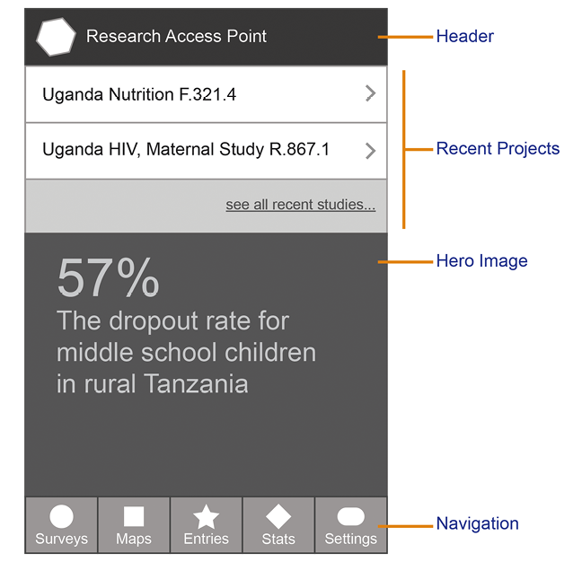
Here’s an example from one of my projects:
The list view is sorted alphabetically by country by default. The standard sort menu is available in the top right. I made each item in the list exactly the right height for a mobile touch target. On the far left of each item is that country’s flag. We thought that would make them more easily identifiable to people. Next to the flag is the name of the country in bold and then a short description of the project directly underneath, in smaller gray type. A quick reference to the report title. On the far right of these controls are two things: (1) a summary of the data for the report type the users has selected. For example, it will show the percentage, like 34 percent for infection rate or the total in short form like 1.5 m. (2) A disclosure arrow to indicate that there is more content “to the right” if the user taps this item. The flag will make it quick for the user to find the right country and the short snippet of data will help him know if he needs to tap for a more detailed report. With this design, users should be able to quickly browse the list to find the correct report.
It doesn’t need to be long, and it shouldn’t be time-consuming. This isn’t busywork. Do whatever it takes to help you identify your thinking. For example, if you find yourself comparing your designs to another popular platform, it’s a good sign that your decision was based on solving a problem that the other platform might have already addressed. “When you tap the button, it loads the next set of results the same way that SocialApp does.” It’s okay to make decisions based on another app, but it doesn’t always make the best case. What it will do, however, is allow you to go through a new series of questions to get to the bottom of your thinking: Why does SocialApp do it this way? Is our context similar enough? Does SocialApp have any data? Were they intentional about this choice? Every time you’re able to describe your designs, you’ll uncover a part of your thought process that can help you find the best ways to talk about it.
You do not have to share these notes with your client or stakeholder. They may never see them, and that’s OK. For now, this is more about practicing being intentional than it is about communicating with others. The takeaway here is that the process of writing about what you create will help your brain to connect the dots between the problem you’re working on and how your designs solve it. The better you are at making those connections, the better prepared you’ll be to talk about them with others. Whatever works for you, the goal here is to find a way to turn your thought process into something real, shareable, and visible, to uncover the words that will help you to explain yourself to other people in a way that makes sense.
Make It Easy
Obviously, if we’re taking a user-centered design approach, we have to create something that is easy for users. While we know that usability is the core challenge with design, it can be difficult to explain that to other people. I assume you already understand something about usability. The purpose is not to tell you how to make your interfaces easy to use, but to help you think through your approach to usability so you can talk to other people about it.
Just as you were solving problems and making yourself aware of your decisions, you must also do the same thing here. At every step of the process, for every decision you make, ask yourself, “How does this affect the user?” The trick to answering this question is that often we simply don’t know how our decisions will affect our users. We can only make our best guess, try it out, and then draw conclusions from what we observe. Like the previous section, write it down. You need to be able to answer this question first to yourself so that you’re prepared to give that answer to stakeholders.
One way that I capture how my designs affect users is to write a story that is either based on a user session I observed or loosely based on the overall use case. Here are some examples:
|
DESIGN CHANGES |
HOW IT AFFECTS THE USER |

|
Having two similar buttons for Login and Sign Up next to each other is confusing to some users. We’ve observed users hesitate when deciding which button they should choose because the buttons are so similar. Because Sign Up is the most common case in this context, I’ve made that button the full width of the container and changed the Login button to a text link. This should make it easier for new users to sign up while still facilitating easy login for existing users. Most existing users will go directly to their account page by being automatically logged in. This should reduce confusion and increase conversion. |
|
When researchers are in the field, they need quick access to their data without having to navigate through the app. So, rather than keep the hero image at the top of the home screen, we’re moving it down in favor of a “Recent Projects” list at the top. Users can still see this important information, but their reports are more easily available to them because that’s their primary use of the app after they’ve already accessed the projects. |
Simplified, usability is about two things: common sense and research. When you’re first beginning a project, you may not have much to work with as far as data or user observation. You really have no choice but to make your best guess about what will work for the user. As a usability expert, you have experience designing interfaces, so you’re able to make informed assumptions based on what you believe will create the simplest experience. This is where common sense comes to play. There really is no reason to overthink it. Create the easiest solution you can think of. Do what makes sense and move on.
Of course, what you think makes sense and what a user does are quite often two different things. That’s why we have research. After we’ve made some informed guesses, we need to test our ideas by using real people. Research can take many forms, but the most common tools are either analytics or a usability study. We will talk more about this in Chapter 6, but let me say here that the challenge with analytics is that it can only tell us what the users did. It cannot tell us why they did it. The only way to actually know how your decisions affect users is to observe them. So make your best guess with the data you have, but then verify your designs with real people and make notes. You may be surprised by the results, and you’ll be in a much better position to defend your decisions.
Get Support
It’s not enough to solve problems and make our app easy to use, because if a stakeholder won’t support us, we aren’t going to get anywhere at all. You could have the most innovative design in the world, but if no one on your team understands what you’re trying to do, you’re not going to be successful at implementing it.
What happens if you don’t get support? You’ll constantly rehash the same conversations over and over again. When people don’t remember why you did what you did (because your explanation wasn’t compelling or memorable), they’ll bring it up again at the next meeting. “Now, why did we agree to do this again?” When people aren’t convinced that you’re right, they’ll continue to think of alternatives to suggest. The project scope will increase over time as people propose adding more things: a simple control, one more button, a new menu. As a result, you won’t be able to move as fast as you need to because you’ll be bogged down managing requests. In the end, you might have to ship a product with a compromised user experience, all because you couldn’t get stakeholders on board with your solution.
Getting the support of everyone on your team is the primary focus of this book. We aren’t going to be able to get anywhere unless we’re able to get everyone on the same page and agree to move in the right direction. That’s what getting support is all about: convincing people to trust us with the solution. You need to create an environment where everyone understands what you’re doing, believes in your expertise, and supports your choices, so that you can move on to the next thing.
I’m intentional about using the word support, rather than, say, approval or agreement. We will not get everyone to agree on a specific solution. Approval isn’t the point either because it implies a certain amount of consensus. That’s okay because that’s not what we’re looking for. We’re looking for their support—of us, our expertise, our solution, or our plan for moving forward. It’s possible to get stakeholder support even if they disagree with our solution. In that way, what we’re looking for is agreement to move forward, not agreement on the solution. Forward momentum is the goal, not consensus. We simply need their support.
To gain the support we need, we have to understand our designs by asking ourselves, “Why is this better than the alternative?” Implicit in this question is that we know what the alternatives are, we’ve considered them or even tried them, and we’re prepared to explain why our solution is better.
Everything we design has another way of doing it. For each design we create, there is an alternate, often opposing, way of solving the same problem. This is the reason why we have disagreements about the solutions to begin with and a key problem with articulating design decisions. Designers can be really good at coming up with a solution for the problem, but we’re less adept at understanding all of the solutions to the problem. We become so myopic when we think we’ve found it.
Eureka! Our solution seems so obvious that there is very little need to waste time considering any other approach. (After all, we’re on a tight sprint and need to get something to the client by the end of the day.) Yet, this thinking almost always creates a conversation that we’re not prepared to deal with: when the client suggests an alternate idea that we haven’t considered.
Ironically, we are usually cognitively aware of some of the other alternatives. We probably tried them, moved stuff around, and eventually landed on the solution we believe is best. But it’s all those little movements that we failed to make ourselves consciously aware of, and so we’re less prepared to help other people understand our thought process. Likewise, we often know what our clients are going to suggest. If you’ve worked with your stakeholders before, you can make a pretty good guess about how they’ll react (this is addressed at length in Chapter 3). Yet if you can guess how they’ll react but you fail to consider those alternatives and understand why your solution is better, you will have a difficult time winning them over.
The point is this: be consciously aware of why your design decisions are better than the alternatives. Just like the previous two questions, write down your answers. Make a list of the other ways that you could solve this problem. Create a bunch of alternative designs, don’t throw them away, and have them available if you need them. With those alternatives, make a short list of why you think they don’t solve the problem as well as your proposed design. Thinking critically about these other options will help you to be prepared to discuss your decisions with other people.
Sometimes, I create very simple wireframes of the alternatives in addition to my recommendation. When the client begins asking questions about my proposed solution, I can quickly show these to visually demonstrate the differences.

Make It Happen
If we’re going to be successful at communicating with people about our designs, we must be able to answer these three questions about our work:
- What problem does it solve?
- How does it affect the user?
- Why is it better than the alternative?
The purpose of answering these questions is more of an exercise in getting you to understand your choices than it is a prescriptive method for documenting them. Don’t worry too much about the details of how you write them down. If you can answer these three questions, you’ll be well on your way to defending your decisions with the people who have influence over your project. These answers will form the basis of your response to every stakeholder concern about your designs.
Your ability to be thoughtful about a problem and articulate any solution is more important than your ability to design the perfect solution every time. When other people realize that you’ve put thought into it and are being intentional, they’re more willing to trust you, even if they disagree. That’s how you become a great designer: by describing and expressing your designs to other people in a way that makes sense to them.
In that sense, being a great designer is just as much about communication skills as it is about design chops. You need to understand your decisions and then articulate them to someone else who doesn’t know design as well as you do. Using these questions as our guide, you can find better ways to explain your design decisions for the purpose of convincing people you’re right and ensuring the best experience for users.
Even though it’s easy to see exactly how being more articulate will help us succeed, in practice, it’s far more difficult and complicated than that. Being articulate is more than just learning to say the right things, because nothing we say will have any effect if we don’t first consider our audience. Recognizing the importance of communication in design makes it natural for us to take the next step on this path toward being a great designer: to begin seeing things from the perspective of our stakeholders.
