In the previous chapters, we have covered all the nuts and bolts of Python. We have used some financial examples to illustrate in finance. In this chapter, we will dive more in everyday finance tasks. My goal here is to show you a practical use of Python and to get you started so you could write your own code. Also, you should regard this book as your first step in Python learning and continue your education by reading the Pandas and other libraries’ documentation, follow professional blogs, and master Python by practicing. There will never be a magical function or a preset solution to solve all real-life challenges. So use the examples in the chapter to build a base for your own projects.
NumPy Financial
I would like to begin this chapter with elementary financial functions every student learns in the first year of business college. The future value of money, internal rate of return, present value, and net present value of future cash flows are the pillars of financial analysis. Knowing Python basics, you can write the formulas and calculate these measures from scratch, yet to save us some time and effort, there is a Numpy-Financial package. Numpy-Financial does all the necessary work for you, providing clean results with no bugs.
To get started with Numpy-Financial, you need to install it in the Terminal. As a reminder, you can find the Terminal in Anaconda Navigator Environments by clicking the base (root) menu. Make sure that you are installing the package into a new Terminal shell and not interfering with the working Kernel.
pip install numpy-financial
After you see the message that Numpy-Financial was successfully installed, the Terminal can be closed, and you can import the package in a new Jupyter Notebook:
import numpy_financial as npf
I do not want to spend a lot of time explaining the financial metrics in detail and their importance in financial analysis, but rather concentrate on their implementation in the Numpy-Financial functionality.
Numpy-Financial is a small library that has only ten essential functions (Table 6-1).
Table 6-1
Numpy-Financial functions
Function
Description
fv(rate, nper, pmt, pv[,when])
Compute the future value
ipmt(rate, per, nper, pv[,fv,when])
Compute the interest portion of a payment
irr(values)
Return the internal rate of return (IRR)
mirr(values,finance_rate,reinvest_rate)
Modified internal rate of return
nper(rate, pmt, pv[,fv,when])
Compute the number of periodic payments
npv(rate, values)
Return the NPV (Net Present Value) of a cash flow series
pmt(rate, nper, pv[,fv,when])
Compute the payment against loan principal plus interest
ppmt(rate, per, nper, pv[,fv,when])
Compute the payment against loan principal
pv(rate, nper, pmt[,fv,when])
Compute the present value
rate(nper, pmt, pv, fv[,when, guess,tol,...])
Compute the rate of interest per period
As you have seen it is not necessary to memorize all functions and their arguments. All you have to do is to run dir(npf) to see objects’ available methods and help() to learn a particular function arguments.
Future Value fv( )
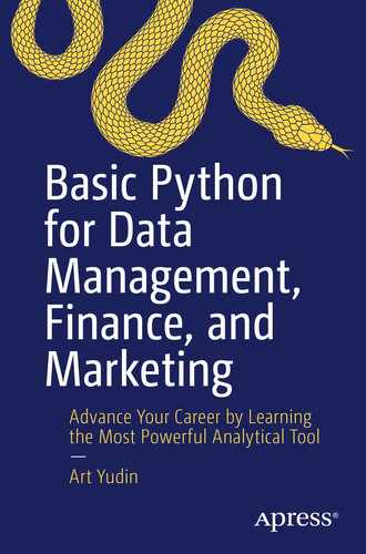
The value of money is the first thing you learn in Finance 101. Let’s take a look at a classic problem. Suppose you have a choice to get $3000.00 today earning 3% annually or agree to be paid $3300.00 three years from now. We will solve the problem with the pv() function. The given statements will be saved under variable names deposit, annual_interest, and years:
deposit = 3000
annual_interest = 0.03
years = 3
future_value = npf.fv(annual_interest, years, 0, -deposit)
print("Future value of ${:.2f} is ${:.2f}".format(deposit, future_value))
I use a minus sign before deposit as an argument because we can regard that as an investment. If you do not use a minus sign, then the result will come out as a negative number.
As a result of the calculation, we see that $3300.00 would be a better deal than earning 3% annually on the deposit of $3000.00 (Figure 6-1).
Figure 6-1
Future value calculation with the fv() function
Present Value pv( )
The opposite of the future value of money formula is the present value of money. An amount of money today is worth more than the same amount in the future. But how much more exactly? Numpy-Financial will help us to answer that question with the function pv().
Continuing with the preceding example, we can assume that you have a choice to receive $3300 in three years, or you can claim them now. We will leave an interest rate at 3% annually.
The pv() function takes the interest rate, number of periods, and future value as arguments. The interest rate could be passed as an annual or monthly value. The number of periods would depend on the annual or monthly interest. We will define future_value as $3300; annual_rate and years values stay the same:
print("Present value of ${:.2f} is ${:.2f}".format(future_value, present_value))
The present value of $3300.00 is $3019.97 according to the result we have returned by the pv() formula (Figure 6-2).
Figure 6-2
Calculating the present value of money with the pv() function
Net Present Value npv( )
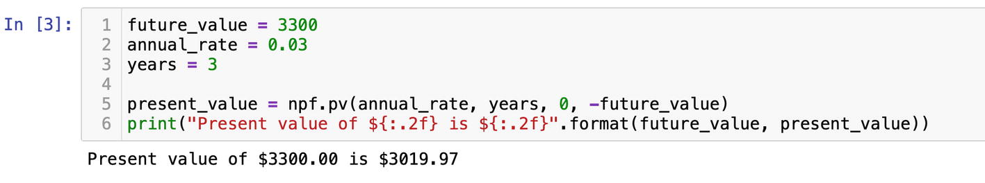
Numpy-Financial can help to determine priority between investment projects based on profitability using the Net Present Value of future cash inflows discounted at the cost of capital rate. The function npv() returns the Net Present Value of a cash flow series. It is easy to use; all we need is a cost of capital or opportunity cost of capital and future expected cash flows. Expected cash flows should be passed as an array. According to the documentation, investments have to be negative floats and inflows should be passed as positive numbers.
Suppose there is a company planning to expand and choosing between two investment opportunities. One choice is to expand production and invest $100,000 in new facilities and equipment. The production expansion will bring $25,000 of annual income in the next five years. Another investment alternative is to buy securities yielding 5% annually. We assume that the risks are equal for simplicity of the example.
Based on the assumptions, we will calculate NPV (Net Present Value) of the expansion project. We will define investment as a negative value and cash_flows as a Python list holding future cash flows:
print("Net Present Value of the project is ${:.2f} ".format(net_present_value))
The Net Present Value of the project is $8236.92 (Figure 6-3).
Figure 6-3
Calculating the Net Present Value of a project
Using the same npv() function, we can compare two projects. Also, we can run scenarios for a range of discounted interest rates and see how project profitability would be affected by changing interest rates.
The second project we want to compare to would have the same initial investment of $100,000 and gradually increasing inflows of $5000, $10,000, $40,000, $40,000, and $40,000 in the next five years, respectively.
The discounted rates can be presented as a range of floats stored in a Python list:
The first initial investment number in cash_flows_project_one and cash_flows_project_two is negative because we invested that amount, and it represents a cash outflow.
We need to initialize two empty lists to store the outcomes of scenario analysis:
npv_project_one =[]
npv_project_two =[]
Finally, to calculate NPV for projected cash flows, we would need to dynamically pass each rate from the discount_rates list. A for loop will iterate through the list of discount_rates and will send a value by value into the npv() function. The outcomes will be temporarily stored under variables npv_one and npv_two and appended to npv_project_one and npv_project_two lists:
Now that we have run scenarios for different discount rates and saved the NPV results, we can plot them.
Besides the Matplotlib library, we would need the Shapely package to find an intersection of two plotted lines representing the NPV values.
Open a Terminal or a command prompt and download and install Shapely:
pip install shapely
Shapely is a Python library to analyze geometric objects.1 Of course, we could have found the intersection coordinates without the help of Shapely, but it would require many lines of code. The Shapely method intersection() would do a better job more precisely.
After you have installed Shapely, import it and Matplotlib on top of the Jupyter Notebook:
import numpy_financial as npf
import matplotlib.pyplot as plt
from shapely.geometry import LineString
I want my graph to have perfectly scaled axes, and I’ll set x and y axes’ limits as 0.0 and 0.25:
plt.xlim(0.0, 0.25)
The Matplotlib method xlim() sets the x limits of the current axis based on the start and end points. We can hardcode them as 0.0 and 0.25 discount rates or make them change based on the values in the discount_rates list. That means assigning the start point as the first value from the list discount_rates[0] and the end point as the last value from the same list discount_rates[-1]:
plt.xlim(discount_rates[0], discount_rates[-1])
Y axes will be scaled using the Matplotlib method ylim(), and we will pass the start and end points as the last value from the NPV results stored in the npv_project_two list:
plt.ylim(npv_project_two[-1],npv_project_two[0])
After that, we can plot the NPV results using discount rates as the x axis:
The NPV values will be plotted as two lines when you run the cell. The intersection point of two lines or, as it is called in finance, the crossover rate can be precisely calculated and marked on the plot.
The Shapely function LineString will convert the x and y coordinates into a straight geometrical object:
The values from discount_rates, npv_project_one, and npv_project_two we have used as x and y coordinates in the plot have to be combined with the help of the Python built-in function zip(). The function zip() will package them as a list of tuples and pass into the LineString() function.
Let me step back and say a couple of words about the function zip(). Very often, we need to map values that came from different sources. For example, the names of cities and population. Both come as lists where population values are in millions:
cities = ["New York", "Chicago", "Huston"]
population = [8.3, 2.7, 2.3]
The function zip() will match the population value to a city in the cities list:
zip(cities, population)
The function zip() as many other functions in Python returns an object:
<zip at 0x7fe2366e4700>
To unpack the zip object, we need either to iterate through it with a for loop and get pairs one by one or to wrap the zip object as a list:
list(zip(cities, population))
Now we can see pairs stored as tuples in the list:
Getting back to our NPV example, the result of the LineString operation is stored under the line1 and line2 variables. The method intersection will get us coordinates of that crossing point:
point = line1.intersection(line2)
The object point now has x and y coordinates that can be plotted on the graph as point.x and point.y attributes. The point.x and point.y give the exact dollar amount and interest rate at the intersection on NPV values of two evaluated projects.
We can mark the intersection on a graph as a red dot with dashed lines dropping on x and y axes:
As you can see, to plot a dot, we use the same plot() function we have practiced in the previous chapter. The difference is the style. Now we use a marker. There are many preset markers in the function plot(). You can find the one you like with help(plt.plot).
Matplotlib functions hline() and vline() will plot horizontal and vertical lines based on x and y coordinates:
The Matplotlib functions hline() and vline() are similar to other plotting methods we have been working before. The straight lines go from the origin of the point that is defined as xmax=point.x and ymax=point.y. X and y limits are identified as 0.0 on x and –40000 on y axes.
The final touch is grids and labels:
plt.grid()
plt.legend()
plt.title("NPV profile")
plt.xlabel("Discount Rate")
plt.ylabel("NPV (Net Present Value)")
The full solution and the graph are shown in Figures 6-4 and 6-5.
Figure 6-4
Calculating and plotting NPV of two projects
Figure 6-5
Plot of the crossover rate of NPV of two projects
Value at Risk (VAR)
Financial regulation became tougher over the past years, and these days compliance managers have to use modern tools to generate tons of reports working with huge data sets. This is where Python comes to the rescue.
Value at risk is a very popular statistical measure to evaluate the level of financial risk for an investment. In VAR (value at risk), the risk is defined as the maximum loss at a specified time.
Here, we will take a look at how to calculate the parametric VAR model based on a normal distribution and volatility.
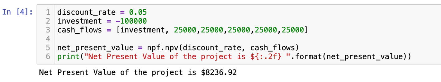
Suppose we have a portfolio of common stocks. In our portfolio, we hold positions in the following stocks: Microsoft, Apple, and IBM. For simplicity of the example, let’s say we hold 100 shares of each company.
To make future assumptions, we would need to get historic prices for the stock in the portfolio. I hope you have already installed the Pandas-Datareader library; if not, in Chapter 4 we have discussed the installation and the purpose of the package in detail.
Import NumPy, Pandas, Matplotlib, and Pandas-Datareader on the top of a new Jupyter Notebook:
import numpy as np
import pandas as pd
import matplotlib.pyplot as plt
import pandas_datareader.data as web
To fetch historic prices, we need to place the stock symbols into a Python list. The variable name portfolio would perfectly reflect the list purpose:
portfolio = [ "MSFT","AAPL","IBM"]
We will need a DataFrame to store the historic prices for our stocks, so we initialize one under the variable name prices:
prices = pd.DataFrame()
Using Pandas-Datareader, get historic prices from Yahoo for each stock by its symbol. You can specify any period range as a string format:
Keep in mind that Pandas-Datareader returns a DataFrame containing columns for open, high, low, close, volume, and adjusted close prices. The adjusted close price, which reflects a stock price after splits and dividends, is what we need. We grab it from each DataFrame by column name ["Adj Close"]. Using the dictionary notation, we add the ["Adj Close"] column to the DataFrame we have defined before. The variable stock holding a value from the portfolio list will set the symbol for each company as a column name in prices while we iterate through the list.
At the end of the day, we should have the prices DataFrame filled with historic prices. You can check them with msft_prices.head().
The method head() will reveal the first five rows of the DataFrame with historic prices (Figure 6-6).
Figure 6-6
Retrieving historic prices for the portfolio of stocks
We can visualize the historic prices by plotting them. It would be difficult to plot and compare stocks with different values, like AAPL at 27.45 and IBM at 137.77. We would need to normalize the prices using 100 as a base on the first date of data. prices.iloc[0] will get us the prices on the first date in the DataFrame:
first_date = prices.iloc[0]
normalized_prices = prices/first_date * 100
The plotting part is easy; we have done it before in Chapter 5:
I use the DataFrame index as the x axis since it contains dates. normalized_prices is my y axis. The [line1,line2,line3] list is used purely for labels to differentiate what line is what stock.
The historic performance of three stocks can be seen in Figure 6-7.
Figure 6-7
Normalized historic prices
The VAR calculation begins with historic stock returns. There are two methods how you can do that. The first one is using the Pandas method shift() that shifts a row by a specific number:
stocks_return = prices/prices.shift(1)-1
Or to be more precise, you can calculate logarithmic returns with the NumPy function log():
stocks_return = np.log(prices/prices.shift(1))
The second option is to use the method pct_change(). Pct_change() also accepts an argument for a number of periods. In our case, it is one day or one row:
return = prices.pct_change(1)
No matter what approach you use, stocks_return and return should have the same results. The first value in both cases is NaN (not a value), and we will eliminate it with the dropna() method:
return.dropna(inplace=True)
In case you forgot, inplace is an argument that saves changes within the object.
Visualization of returns will help us better comprehend the numbers. The Matplotlib function hist() will present the picture in the form of histograms.
We can plot all three stocks on the same graph. The keyword argument will make them transparent:
plt.hist(return["MSFT"], alpha=0.5, bins=100)
plt.hist(return["AAPL"], alpha=0.5, bins=100)
plt.hist(return["IBM"], alpha=0.5, bins=100);
Or if the graph is too busy to understand anything, you can plot each stock return individually (Figure 6-8). I have mentioned before that the Pandas DataFrame supports Matplotlib, and you can apply the method hist() directly to return:
return.hist()
Figure 6-8
Plotting historic stock returns
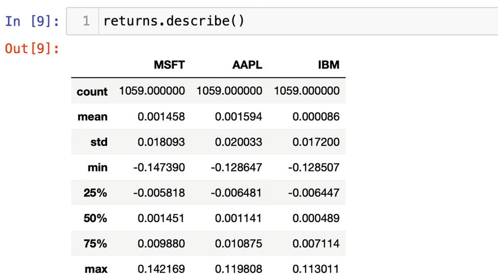
The Pandas Series has a method describe(). The method describe() could be applied only to a Series or columns in a DataFrame holding numeric values:
return.describe()
Figure 6-9 displays statistical measures of the stock returns the method describe() computed.
Figure 6-9
The method describe() returns statistical measures
After we have applied the describe method to the historic returns, we can see where a mean of the data set is and how big is a spread of std (standard deviation). Min and max values indicate the boundaries of the data set. Besides, we can see 25%, 50%, and 75% percentiles.
The describe() method is a very useful tool to get statistical measures of any set of numeric values on the fly.
For our VAR calculation, we will need the mean and standard deviation of the portfolio. We can grab the mean value from the describe() method:
return.describe().loc["mean"]
or use the special mean() method:
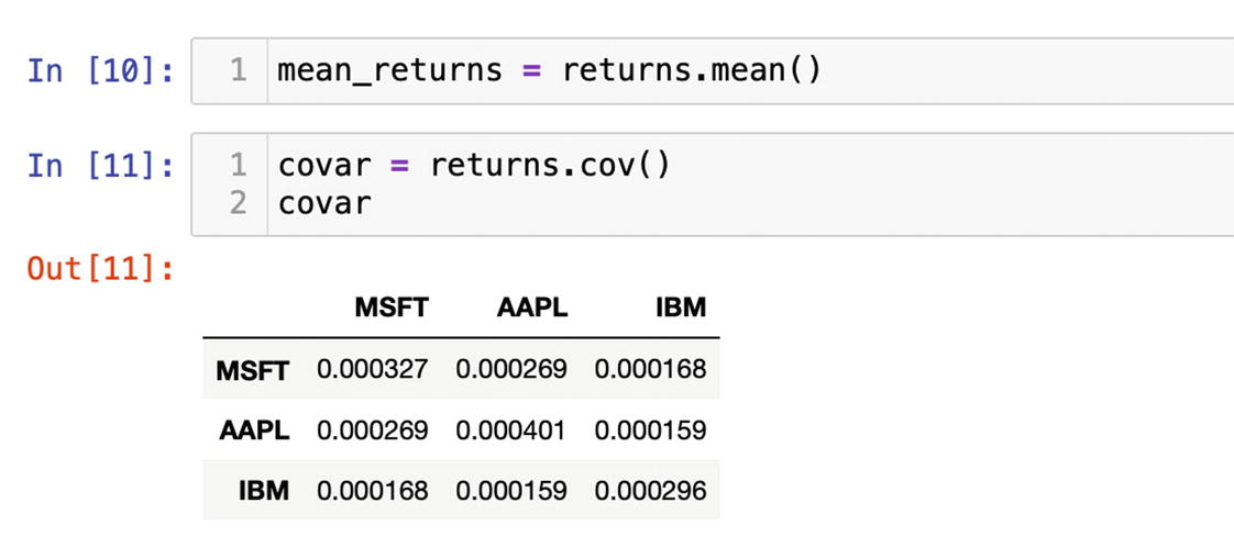
mean_return = return.mean()
The standard deviation of a portfolio or volatility would require a covariance between each pair of stocks. In Pandas, we can create a covariance matrix on the returns with the function cov():
covar = return.cov()
Figure 6-10 displays a covariance matrix of the portfolio we will use to get the volatility of the portfolio.
Figure 6-10
Covariance matrix
Additionally, we would need the percentage of each stock within the portfolio. For the simplicity of this example, we assume that we have invested 50% of the total dollar value of the portfolio into Microsoft, 25% in Apple, and 25% in IBM. This assumption has to be saved in the NumPy array:
weights = np.array([0.5,0.25,0.25])
The NumPy array can be regarded as a vector. Also, the NumPy array is used as a core in the Series and DataFrame. That means we can derive the dot product or single numerical value out of the vector.
The variable mean_return holds the mean of historic returns of three stocks, and we would need to normalize them again in portfolio stock percentages with the method dot():
portfolio_mean = mean_return.dot(weights)
The standard deviation is the square root of the variance, and we can get it with the NumPy sqrt() method:
The capital T is a transpose method; it changes the relative position of a vector or a matrix. If you run dir() on an array, Series, or DataFrame, it always would be the first one in the list.
Additionally, the mean and standard deviation have to be calculated for the total value of the portfolio. Here, we will assume that the total value of the portfolio is $1,000,000:
After we have all the necessary values at hand, we can calculate the inverse of the normal cumulative distribution. For that, we would need ppf(), percent point function, from the SciPy (science Python) package. SciPy is included in Anaconda, and all we need is to import it at the beginning of the file:
import scipy.stats as scs
The ppf() method uses default values for the mean, 0, and standard deviation, 1, which are standard for a normal bell distribution. We will overwrite them with investment_mean and investment_volatility. A risk manager will need to pass the confidence level into ppf(); usually, it is 95%:
The final step is to subtract the inverse of the normal cumulative distribution from the portfolio value:
var = portfolio_value – normsinv
You can round down the result to two figures after the decimal point:
np.round(var,2)
The final result is 25088.94 (Figure 6-11). After all these calculations, we can say with 95% degree of certainty that a portfolio with MSFT, AAPL, and IBM shares currently valued at $1,000,000 may lose $25,088.94 in one day.
Figure 6-11
The value at risk calculation
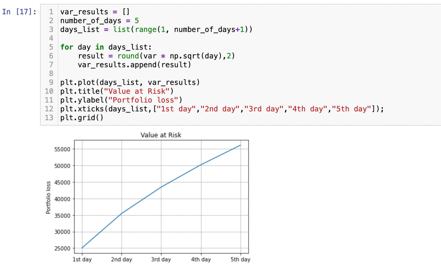
If you need to project what VAR will be over five days, you can multiply one day VAR by a square root of the number of days.
We will place the var * np.sqrt(day) expression into the for loop within a range of days. Initialize an empty list to store the results. We will plot them:
var_results = []
number_of_days = 5
days_list = list(range(1, number_of_days+1))
for day in days_list:
result = var * np.sqrt(day)
var_results.append(result)
We need to add 1 to number_of_days since in the function range, the stop point is exclusive.
We can see that losses double over the period of five days (Figure 6-12).
Figure 6-12
Projecting VAR over a five-day period
Monte Carlo Simulation
Using the same historic stock prices, we can forecast the performance of the portfolio and simulate probable outcomes using the Monte Carlo simulation technique.
The Monte Carlo approach is to generate random outcomes for expected returns and expected volatility for the portfolio. Pretty much like rolling dice over and over again.
To save the outcomes for expected returns and expected volatility, we need to initialize two lists:
mc_return = []
mc_volatility = []
Randomly changing the percentages of each position in the portfolio, we will calculate the expected returns and expected volatility. The NumPy function random() will generate random numbers in the shape of an array. The size and dimensions of an array would depend on the number passed as an argument. In our case, we need an array that would match the number of positions in the portfolio.
The portfolio list we used at the beginning of the example currently contains three stocks. In the future, we might add a couple more, so it would be smart to store the length of the list under the variable num_assets:
For each iteration of the for loop, the method random() generates random weights of assets in the portfolio. The total percentage of all assets always has to be exactly 100%; that is why we divide weights by sum() of weights. Next, we generate expected returns and volatility and normalize the results by the number of trading days in a year (Figure 6-13).
Figure 6-13
Running the Monte Carlo simulation on a portfolio of stocks
We will plot the outcomes as a scatter, but before that we need to convert mc_return and mc_volatility lists into NumPy arrays:
expected_return = np.array(mc_return)
expected_volatility = np.array(mc_volatility)
In the end, we plot expected_return and expected_volatility:
The Matplotlib show() method is optional. I have included it in case you would want to run the code in Matplotlib "notebook" mode or use the operational system to generate the plot.
This example is an illustration of Harry Markowitz’s Modern Portfolio Theory.2 The higher return on investment you want to get, the higher volatility you should expect (Figure 6-14).
Figure 6-14
Plotting Monte Carlo simulation results
The curve in Figure 6-14 connects all of the most efficient outcomes, the optimal combination of risk and return, and it is called the efficient frontier.
Efficient Frontier
The preceding example has demonstrated that you can build any statistical or financial model from scratch. However, if you are too busy and require a key-turn solution, there is a professional Python package PyPortfolioOpt that implements portfolio optimization methods, including efficient frontier techniques and other solutions for risk management.3 PyPortfolioOpt comes with built-in risk models and plotting. Unfortunately, for now PyPortfolioOpt is not a part of the Anaconda package, and we will need to install it with the pip command. We have gone through the installation process many times, and I am sure that by now you know where to find the Terminal, so run
pip install pyportfolioopt
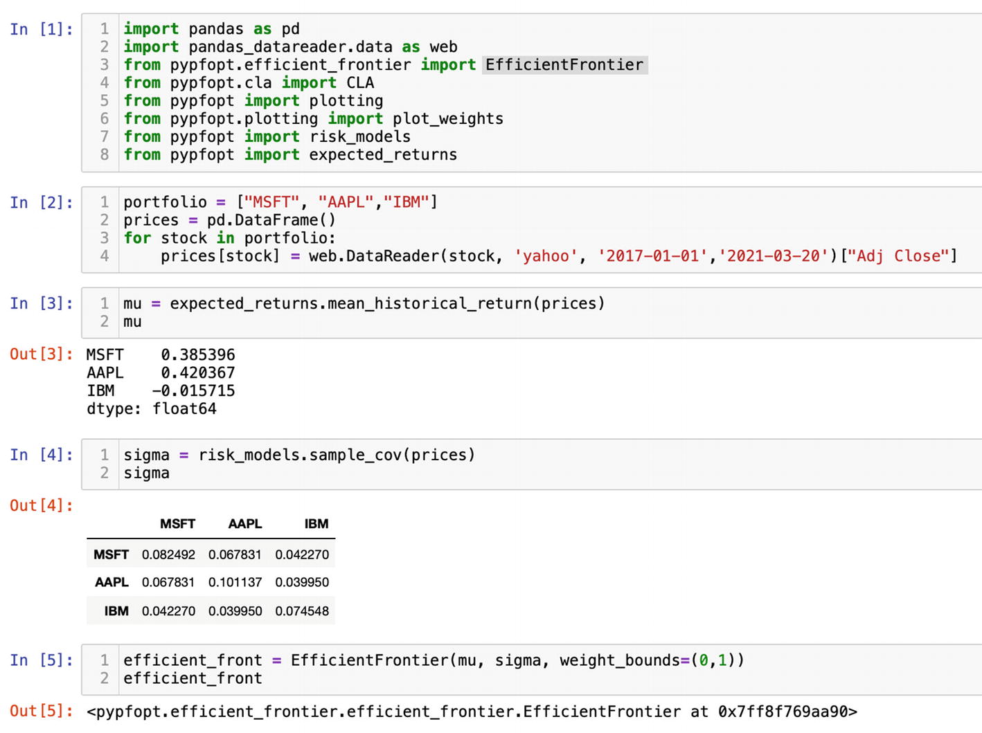
We will use PyPortfolioOpt to find the efficient frontier for our portfolio. For the following example, you would need to open a new Jupyter Notebook and import the following functions from PyPortfolioOpt:
import pandas as pd
import pandas_datareader.data as web
from pypfopt.efficient_frontier import EfficientFrontier
from pypfopt.cla import CLA
from pypfopt import plotting
from pypfopt.plotting import plot_weights
from pypfopt import risk_models
from pypfopt import expected_return
I will explain all of the imported functions as we move through the example. Our goal is to generate and plot the efficient frontier of a portfolio. Also, find optimal portfolios using the Critical Line Algorithm as implemented by Marcos Lopez de Prado and David Bailey.4
We will be using the same portfolio from the previous example, and we will need to get the historic prices again since we are in a different notebook. At the same time, feel free to use your own favorite equities or add more stocks to the default list:
Similar to the previous case, PyPortfolioOpt calculates the expected returns by extrapolating historic returns. There is the expected_return module, we have imported it, as the name implies it generates annualized mean returns. Run it on the historic prices we have gathered with Pandas-Datareader:
mu = expected_return.mean_historical_return(prices)
To quantify the asset risk, PyPortfolioOpt includes risk models. One of them is the covariance matrix. Before, we have used the Pandas method cov(); this time, we will run sample_cov() from the risk_models module we have imported at the beginning of the file:
sigma = risk_models.sample_cov(prices)
The sample_cov() function takes prices and returns annualized results. Compared to the previous example, there is no need to multiply the results by 252 trading days. It is already included in sample_cov().
Based on the expected returns and covariance, we can calculate the efficient frontier function we have imported, EfficientFrontier.
Besides returns and covariance, you may provide weight boundaries for all your equities in the form of a list of tuples. In the previous example, we assumed that in the portfolio we held 50% of MSFT and 25%, respectively, of AAPL and IBM. If the goal is to set the exact values, then we pass weight_bounds =[(0.5,0.5),(0.25,0.25),(0.25,0.25)] as a keyword argument. Otherwise, all positions in a portfolio would be defaulted to (0,1), meaning each asset minimum value could be 0 and maximum weight within a portfolio 100%. If a portfolio includes a short position, then weight_bounds should be set to (-1,1). I suggest we leave a default value of (0,1) and see what would be the optimal outcome:
The EfficientFrontier function always returns an object (Figure 6-15).
Figure 6-15
Generating the efficient frontier for a portfolio of stocks
The job of PyPortfolioOpt is to optimize a portfolio of stocks. In other words, PyPortfolioOpt provides us with a guidance on how to better structure a portfolio to achieve the investment goals.
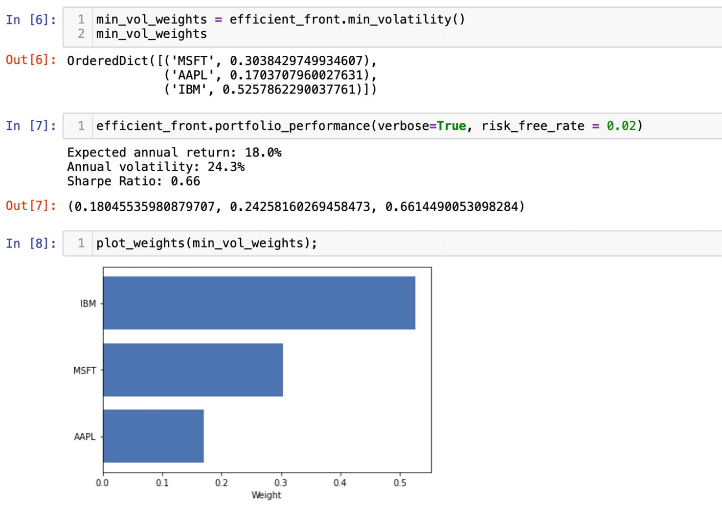
For instance, if our investment goal is to reduce volatility to a minimum, we would get the proposed allocation of assets within a portfolio with an attribute of the efficient frontier object min_volatility():
According to PyPortfolioOpt, an allocation of 52% of all assets in IBM, 17% in AAPL, and 30% in MSFT will provide us with a maximum return at the lowest level of volatility (Figure 6-16).
Figure 6-16
Calculating weights of stocks in a portfolio to minimize volatility
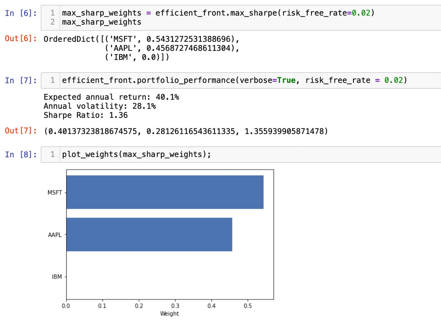
In contrast, if the goal is to drive the risk-adjusted return to a maximum, we can choose to maximize the Sharp ratio option with the max_sharp() method. By default, the risk-free rate is 2%, but you can set it to the current market:
Maximizing the Sharp ratio choice will return a completely different picture and recommend to drive up MSFT and AAPL shares to 54% and 45%, respectively, and completely eliminate IBM holding (Figure 6-17).
Figure 6-17
Maximizing the Sharp ratio of the investment portfolio
Depending on our assumptions and investment goals, the portfolio_performance() method will calculate the expected return, annual volatility, and Sharp ratio. The only thing you have to keep in mind is that portfolio_performance() would return the expected returns and volatility from the last operation you have performed on a portfolio. For the clarity of the example, we would need to wipe out the memory of the notebook we are working in. You can do it by choosing the option "Restart & Clear Output" in the upper Kernel menu of a Jupyter Notebook. Then you would need to rerun the cells for where all the packages are imported, historic prices are gathered with Pandas-Datareader, and we had calculated expected returns and covariance matrix. Finally, you choose the scenario you want to get returns and volatility, for instance, maximizing the Sharp ratio, and run that cell. Afterward, you can get the portfolio performance by running portfolio_performance() on the instance of the efficient frontier:
There are two arguments verbose and risk_free_rate we can pass into the portfolio_performance() method. The verbose argument means the returned values would be printed with explanation. By default, verbose is set to False and returns a tuple with raw numbers; a True option would print all values with explanation (Figure 6-18). The risk_free_rate argument would impact the expected return and volatility; thus, it should reflect the market rates of future assumptions.
Figure 6-18
Getting the expected performance of a portfolio with a maximized Sharp ratio
Additionally, we may plot the suggested weights from the max_sharpe() method with the plotting method we have imported, plot_weights() (Figure 6-19):
plot_weights(max_sharp_weights);
Figure 6-19
Plotting weights of a portfolio with a maximized Sharp ratio
Consequently, to get the expected performance of a portfolio with a low volatility, we would need to clear all outputs again and restart the Kernel. Then rerun the cells and apply the min_volatility() method to the instance of the efficient frontier. In this case, the portfolio_performance() method returns a completely different set of performance measures (Figure 6-20).
Figure 6-20
Getting the expected performance of a portfolio with a minimizing volatility
The visualization of the weights after minimum volatility optimization would make it easier to understand the asset allocation. Plot them with the plot_weights() function (Figure 6-21):
plot_weights(min_vol_weights);
Figure 6-21
Plotting the weights of a portfolio with a minimizing volatility
As I have mentioned before, PyPortfolioOpt comes with plotting tools to help us visualize the entire efficient frontier. The plotting() function would not work if you had run min_volatility() or max_sharpe() methods. We would need to reinstate the instance of the original efficient frontier by clearing the memory and resetting the Kernel. After that, rerun all the cells except the ones with min_volatility() and max_sharpe() methods.
With one line of code and plotting() function we have imported before, plot the curve:
The show_assets argument will make sure the equities are also mapped on the plot (Figure 6-22).
Figure 6-22
Plotting the efficient frontier of a portfolio
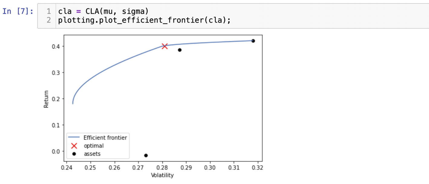
There is an alternative to the classic mean-variance optimization – CLA (the Critical Line Algorithm). CLA is an optimization solution to find the optimal portfolio on the curve. It is quite popular in portfolio management due to the fact that it is the only algorithm specifically designed for inequality-constrained portfolio optimization. It is implemented in PyPortfolioOpt as the CLA() function. The CLA() function requires expected returns and covariance matrix to get the optimal portfolio. Pass the values we have generated before into CLA() and plot it (Figure 6-23):
cla = CLA(mu, sigma)
plotting.plot_efficient_frontier(cla);
Figure 6-23
Plotting the optimal portfolio with CLA
The PyPortfolioOpt library is irreplaceable in investment portfolio management. It is easy to use and well documented. My advice is to keep an eye on the documentation (https://pyportfolioopt.readthedocs.io/en/latest/index.html) for new features or changes. There are some additional features we have not touched in the chapter such as implementing your own optimizers. I believe after the preceding examples, you have a better understanding of how to operate PyPortfolioOpt.
Fundamental Analysis
There are numerous ways you can access corporate financial information these days. One of them is the Alpha Vantage API we discussed in Chapter 4. Here, I would like to demonstrate another Python package Fundamental Analysis for acquiring and analyzing balance sheets, income statements, cash flows, and other substantial information of publicly traded companies.
We need to install the Fundamental Analysis library with the pip command:
pip install FundamentalAnalysis
In a new Jupyter Notebook, import Fundamental Analysis, Pandas, Requests, and Matplotlib to plot data:
import FundamentalAnalysis as fa
import matplotlib.pyplot as plt
import pandas as pd
import requests
Fundamental Analysis is a small Python wrapper around the Financial Modeling Prep API that gathers fundamental information of publicly traded companies. According to the documentation, it obtains detailed data on more than 13,000 companies.5
In order to start using the Financial Analysis package, you need to secure an API Key from https://financialmodelingprep.com/developer/docs/. Register and choose a free plan or a paid plan for premium APIs and 30+ years of historic data. After you select a plan, go to the dashboard in the upper menu where you can find your API Key.
We can start exploring Financial Analysis capabilities after you receive an API Key. The API Key I’ll be using in this example will be disabled.
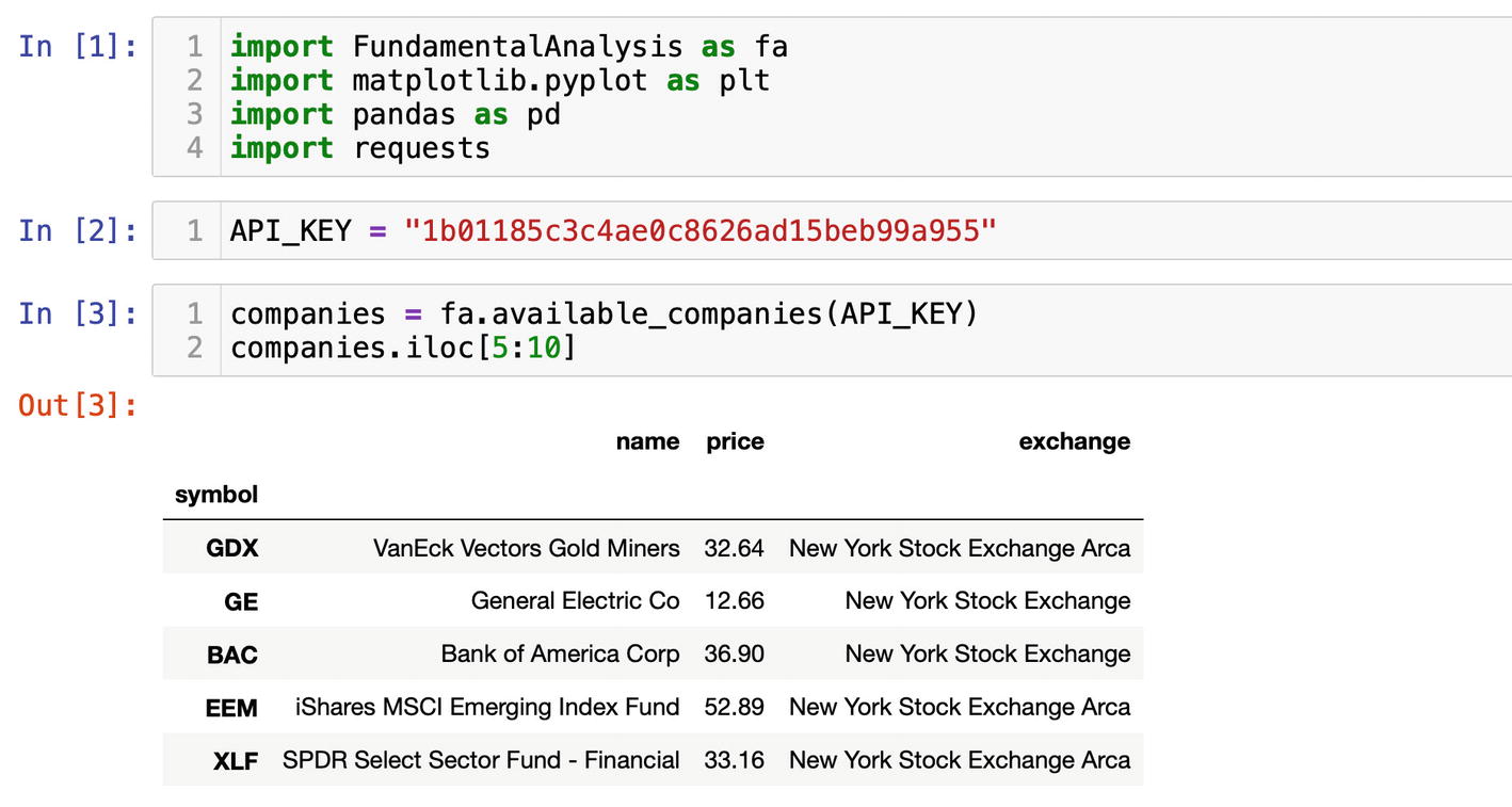
For starters, let’s get the list of all available companies and ETFs (exchange-traded funds):
API_KEY = "1b01185c3c4ae0c8626ad15beb99a957"
companies = fa.available_companies(API_KEY)
The data received from the available_companies() function as well as all other functions comes as a DataFrame. Using the iloc[] method, we can move through the rows (Figure 6-24):
companies.iloc[5:10]
Figure 6-24
Browsing through the list of available companies
If you have a favorite company, use its exchange symbol. I’ll use Exxon Mobil Corporation. The symbol of Exxon Mobil on New York Stock Exchange is XOM. The function profile() will get us essential information about any publicly traded company (Figure 6-25):
ticker = "XOM"
profile = fa.profile(ticker, API_KEY)
Figure 6-25
Receiving a profile of the XOM ticker
A valuation is an important piece of information, and Financial Analysis provides it with the function enterprise() for the five-year period with free plans and for longer periods with a paid plan (Figure 6-26):
entreprise_value = fa.enterprise(ticker, API_KEY)
entreprise_value
Figure 6-26
Valuation of Exxon Mobil Corp
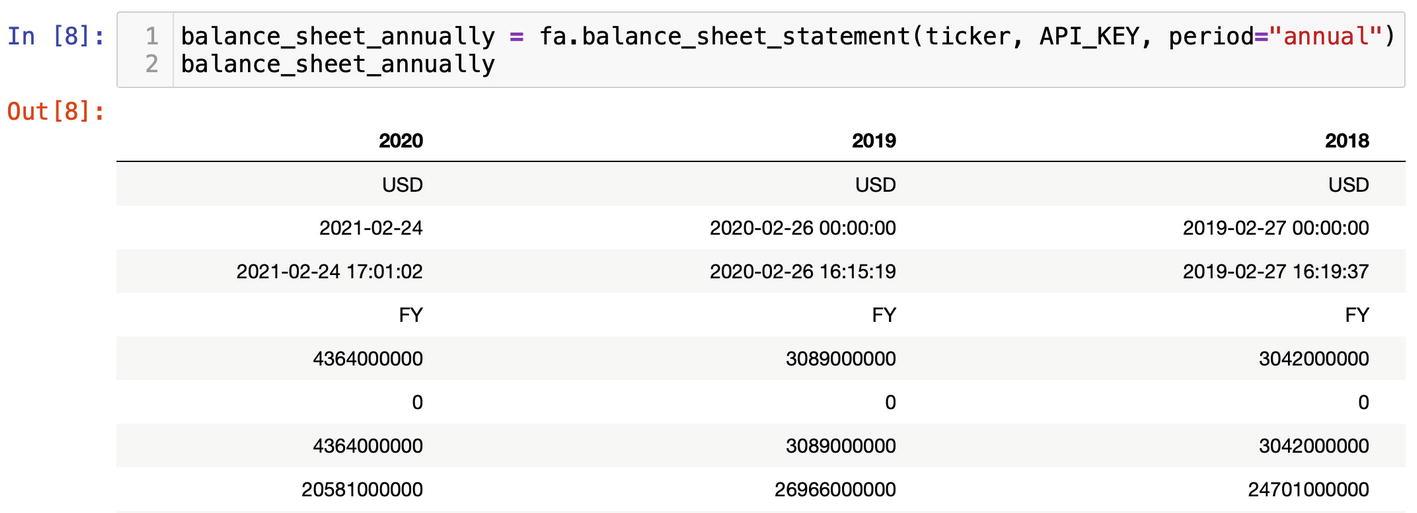
They called it Fundamental Analysis for a reason; with the function balance_sheet_statement(), we can fetch balance sheets of a publicly traded company for a several year period (Figure 6-27). The keyword argument period could be set either to the "annual" or "quarter" option. Besides the assets and liabilities, balance_sheet_statement() returns the links to SEC (US Securities and Exchange Commission) filings so you could go right to the source.
Figure 6-27
Balance sheets of Exxon Mobil Corp
Along with a balance sheet, you can get an income statement and a cash flow statement:
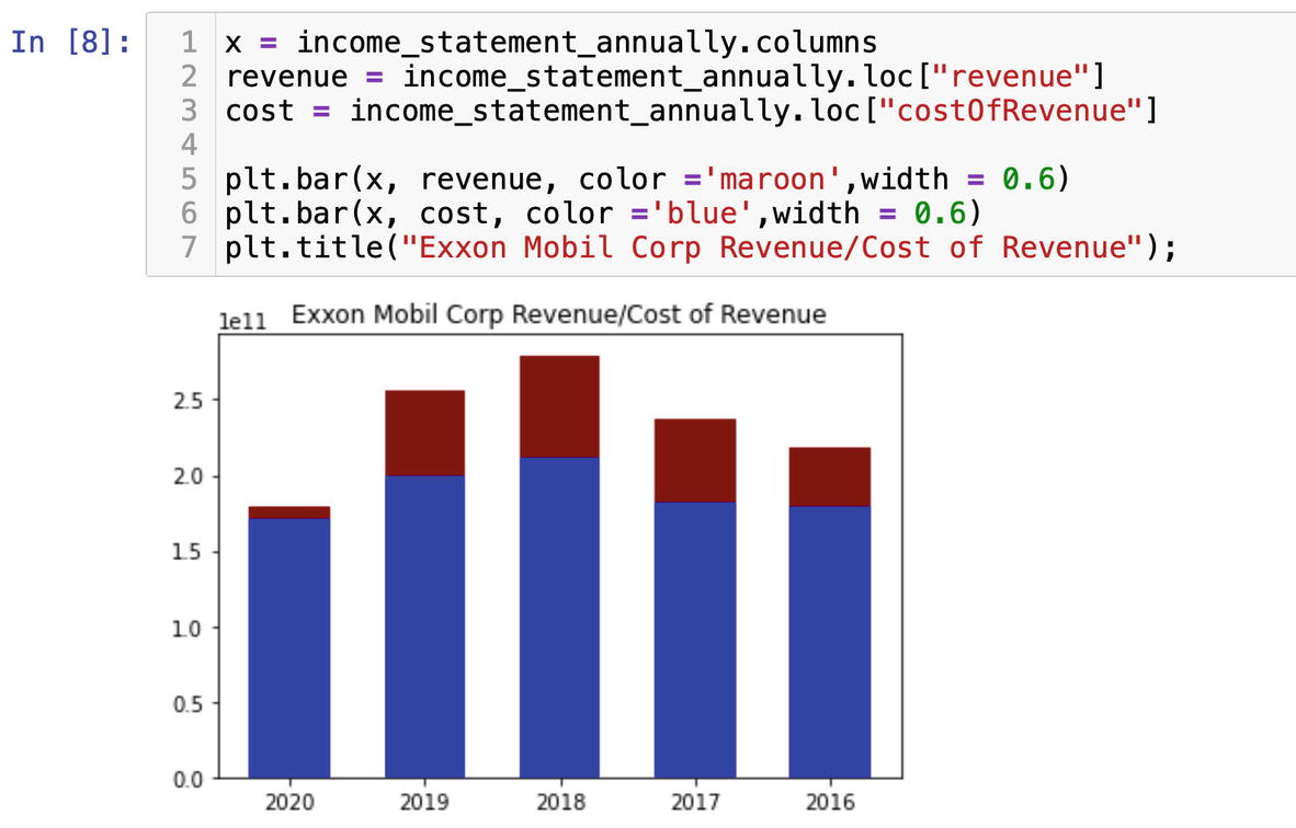
We can visually analyze the data with Matplotlib. Gross profit is an important component of a Fundamental Analysis, and we will visualize it by plotting the revenue and cost of revenue numbers as bars.
On the x axis of the graph, we will plot years:
x = income_statement_annually.columns
and we will grab the numbers from the income statement for the revenue and cost of revenue:
The bar chart as other Matplotlib figures requires coordinates for x and y axis arguments. Along with that, we will specify the color and width of bars arguments:
plt.bar(x, revenue, color ='maroon', width = 0.6)
plt.bar(x, cost, color ='blue', width = 0.6)
plt.title("Exxon Mobil Corp Revenue/Cost of Revenue");
Based on the visual analysis, we see that 2020 was a tough year for Exxon Mobil Corp (Figure 6-28).
Figure 6-28
Visualization of gross profit
With Financial Analysis, you can get the raw data from the US Securities and Exchange Commission (SEC) or key financial ratios.
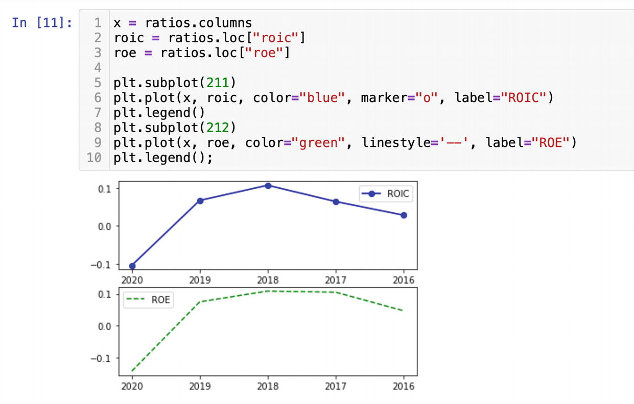
The function key_metrics() will deliver all the main measures like the current ratio of return on equity:
ratios = fa.key_metrics(ticker, API_KEY)
Using the subplot() function from Matplotlib, we will plot the return on investment capital and return on equity from ratios on the same figure but in the separate windows. We set the x axis as years from ratios.columns and y values will be roic and roe from the rows. We get the rows by labels with the DataFrame method loc[]:
The numbers 211 and 212 in the method subplot represent the grids, where the first number 2 means the number of rows, and the second number 1 is the number of columns; each subplot has just one column. The last number shows a position of a subplot within the whole figure.
The plot gets us two subplots on the same figure where each graph displays separate values (Figure 6-29).
Figure 6-29
Plotting ROIC and ROE ratios
Financial Ratios
Another set of ratios are financial ratios. Fiancial ratios help investors important information about a company health and help to compare companies performance within an industry. We can get them with the function financial_ratios():
fin_ratios = fa.financial_ratios(ticker, API_KEY)
One of the financial ratios we have received that I want to plot is the inventory turnover.
An inventory turnover shows how fast a company sells its inventory. The high inventory turnover ratio in 2016 points to higher sales, which probably reflects high oil prices (Figure 6-30).
Figure 6-30
Plotting the inventory turnover ratio
Financial Analysis is a very convenient package to grab financial information with just a few lines of code.
As we have seen in this chapter, you can build a solution from scratch or use a third-party library with Python. It is entirely up to you what road to take. If you are an algorithmic trader, you would probably prefer a custom-built high-tuned solution. On the other hand, if you need to get the numbers fast, then you can always find a Python package that does the job. In my opinion, Python is a great tool for any kind of financial analysis.