© Jalil Villalobos Alva 2021
J. Villalobos AlvaBeginning Mathematica and Wolfram for Data Sciencehttps://doi.org/10.1007/978-1-4842-6594-9_8

8. Machine Learning with the Wolfram Language

Jalil Villalobos Alva1  
(1)
Mexico City, Mexico
 

The section will consist of the introduction of the gradient descent algorithm as an optimization method for linear regression; the corresponding computations will be shown as well as the concept of the learning curve of the model. Later, we will see how to use the specialized functions of the Wolfram Language for machine learning such as Predict, Classify and ClusterClassify, in the case of linear regression, for logistic regression and for cluster search. Adding to this, the different objects and results that these functions generate as well as the metrics to measure the model will be shown for these functions. In each case, we will explain which parts of the model are fundamental for the correct construction using the Wolfram Language. For this part of the book we will use examples of known datasets such as the Fisher's Irises dataset, Boston housing dataset, and the Titanic dataset.

Gradient Descent Algorithm

The gradient descent is an optimization algorithm that consists in finding the minimum of a function through an iterative process. To build the process, the squared error loss function is minimized with the linear model hypothesis of the shape f(xl) = θ0+θ1*Xj, around the point Xj. The loss function is given by the following expression.
$$ Jleft(	heta 
ight)=frac{1}{2ast N}ast sum limits_{j=1}^N{left(fleft({x}_j
ight)-{y}_j
ight)}^2 $$
The iterative process of the algorithm consists of the calculation of the coefficients until convergence is obtained. The coefficients are given by the following expressions.
$$ {displaystyle egin{array}{l}{	heta_0}^{i+1}={	heta_0}^i-frac{alpha }{N}ast sum limits_{j=1}^Nleft({	heta_0}^i+{	heta_1}^iast {x}_j-{y}_j
ight)\ {}{	heta_1}^{i+1}={	heta_1}^i-frac{alpha }{N}ast sum limits_{j=1}^Nleft({	heta_0}^i+{	heta_1}^iast {x}_j-{y}_j
ight)ast {x}_jend{array}}, $$

where the summations are obtained from partial derivatives with respect to θ0 and θ1. The term α corresponds to the learning rate, which is a parameter that minimizes error when the learning process is constructed. For more mathematical depth about the method and demonstrations, see the book Artificial Intelligence: A Modern Approach by Stuart Russell and Peter Norvig (2010, Upper Saddle River, NJ: Prentice Hall).
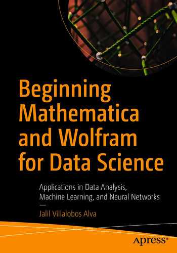
Getting the Data

To start we first define our data with the RandomReal function and establishing a seed. This is to maintain the reproducibility of the data, in case of practicing the same example.
In[1]:=
SeedRandom[888]
x=RandomReal[{0,1},50];
y=-1-x+0.6*RandomReal[{0,1},50];
Therefore, lets observe the data with a 2D scatter plot Figure 8-1.
In[2]:= ListPlot[Transpose[{x,y}],AxesLabel→{"X axis","Y axis"},PlotStyle→Red]
Out[2]=
../images/500903_1_En_8_Chapter/500903_1_En_8_Fig1_HTML.jpg
Figure 8-1

2D scatter plot of the random generated data

Algorithm Implementation

Let us now proceed to the implementation of the algorithm with the Wolfram Language. The algorithm will consist of defining the constants, the number of iterations, and the learning rate. Then we will create two lists containing initial values of zero, in which the values of the coefficients for each iteration will be stored. Later, we will perform the calculation of the coefficients through a loop with Table, which will not end until we reach the number of iterations. In our case, we will establish a number of iterations of 250 with a learning rate of 1.

In[3]:= itt=250;(*Number of iterations*)

α=1;(*Learning rate*)

θ0=Range@@{0,itt};(* Array for values of Theta_0*)

θ1=Range@@{0,itt};(* Array for values of Theta_1*)

Table[{

θ0[[i+1]]=θ0[[i]]- $$ frac{alpha }{mathrm{Length}@mathrm{x}};mathrm{x} $$ *Sum[(θ0[[i]]+θ1[[i]]* x[[j]]-y[[j]]),{j,1,Length@x}];

θ1[[i+1]]=θ1[[i]]- $$ frac{alpha }{mathrm{Length}@mathrm{x}};mathrm{x} $$ *Sum[( θ0[[i]]+θ1[[i]]*x[[j]]- y[[j]])*x[[j]],{j,1,Length@x}];},{i,1,itt}];

Since we have determined the calculation of the coefficients, we will build the linear adjustment equation by constructing a function and using the coefficient values of the last iteration, which are in the last position of the lists θ0 y θ1.
In[4]:= F[X_]:= θ0[[Length@ θ0]]+ θ1[[Length@ θ1]]*X
To know the shape of the best fit, we add the X variable as an argument. This will give us the form: F(X) = θ0+θ1*X.
In[5]:= F[X]
Out[5]= -0.707789-0.923729 X
Let us look at how the line fits the data in Figure 8-2.
In[6]:= Show[{Plot[F[X],{X,0,1},PlotStyle→Blue,AxesLabel→{"X axis","Y axis"}],ListPlot[Transpose[{x,y}],PlotStyle→Red]}]
Out[6]=
../images/500903_1_En_8_Chapter/500903_1_En_8_Fig2_HTML.jpg
Figure 8-2

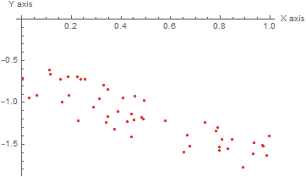
Adjusted line to the data

Since we have built the linear model, we can make a graphical comparison of the variation of the learning rate with the number of iterations and the loss value given by the function J.

But first we must declare the loss function J. For the summation we can either use the special symbols of sigma or write $$ {sum}_{i=1}^{mathrm{imax}} expr $$ or Sum [expr, {i,imax}].
In[7]:=J[Theta0_,Theta1_]:=1/(2*Length[x])*Sum[(Theta0 + (Theta1*x[[i]]) - y[[i]])^2,{i,1,Length@x}]

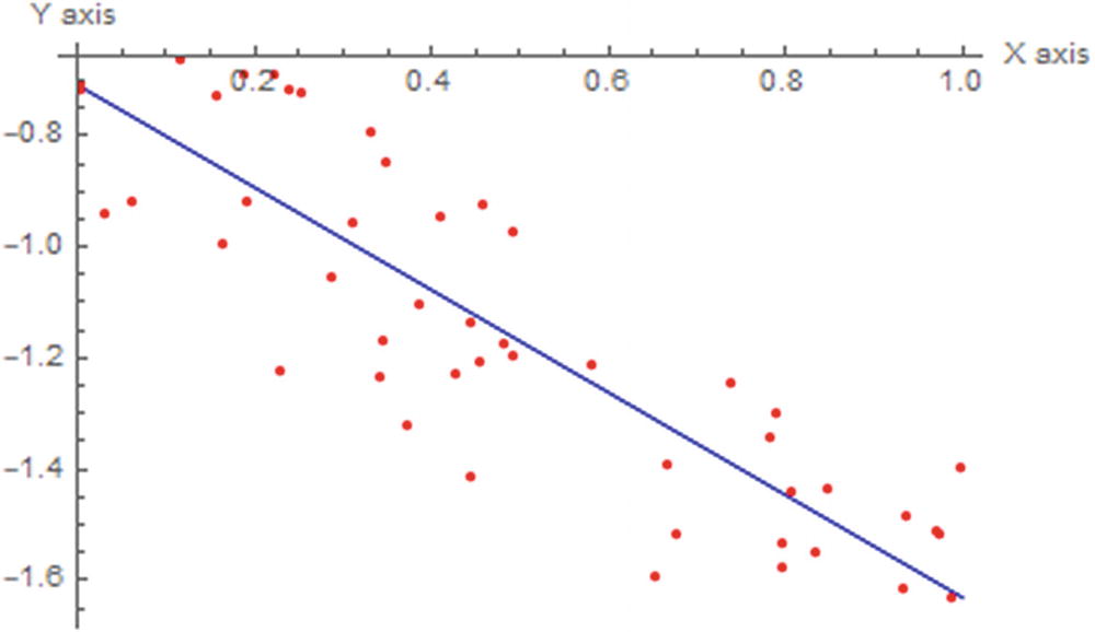
Below is the graph of loss vs. each interaction for learning rate values of α1=1, α2=0.1, α3=0.01, α4=0.001, and α5=0.001, when repeating the process Figure 8-3.

Multiple Alphas

Having seen the previously constructed process, we can repeat the process for different alphas. Following is the graph of loss vs. each interaction for learning rate values of α1=1, α2=0.1, α3=0.01, α4=0.001, and α5=0.001, when repeating the process.
In[8]:=
α1=Transpose[{Range[0,itt], J[θ0,θ1]}];
α2=Transpose[{Range[0,itt], J[θ0,θ1]}];
α3=Transpose[{Range[0,itt], J[θ0,θ1]}];
α4=Transpose[{Range[0,itt], J[θ0,θ1]}];
α5=Transpose[{Range[0,itt], J[θ0,θ1]}];
Graph with ListLinePlot and visualize the learning curve for different alphas (Figure 8-3). When changing the value of alpha, try to check how also the adjusted line changes.
In[9]:= ListLinePlot[{α1,α2,α3,α4,α5},FrameLabel→{"Number of Iterations","Loss Function"},Frame→True,PlotLabel→"Learning Curve",PlotLegends→SwatchLegend[{Style["α=1",#],Style["α=0.1",#],Style["α=0.01",#],Style["α=0.001",#],Style["α=0.0001",#]},LegendLabel→Style["Learning rate",White],LegendFunction→(Framed[#,RoundingRadius→5,Background→Gray]&)]]&[White]
Out[9]=
../images/500903_1_En_8_Chapter/500903_1_En_8_Fig3_HTML.jpg
Figure 8-3

Learning curve for the gradient descent algorithm

In the previous graph (Figure 8-3) we can visualize the size of iterations with respect to cost and how it varies depending on the value of alpha. With a high learning rate, we can cover more ground at each step, but we risk exceeding the lowest point. To know whether the algorithm works, we must see that the loss function is decreasing in each new iteration. The opposite case would be an indicator that the algorithm is not working properly; this can be attributed to various factors such as a code error or an incorrect value of the learning rate. As we see in the graph, adequate values of alpha correspond to small values between a scale of 1 to 10-4. It is not necessary to have to use these same values; you can use values that are within this range. Depending on the form of the data it is possible that the algorithm may or may not converge with different alpha values as the same for the iteration steps. If we choose very small alpha values, the algorithm can take a long time to converge, as we can see for alpha values 10-3 or 10-4.

Linear Regression

Despite being able to build the algorithms to perform a linear regression, the Wolfram Language has a specialized function for machine learning. In the case of a linear regression problems, there is the Predict function. The Predict function can also work with different algorithms, not only regression task algorithms.

Predict Function

The Predict function helps us predict values by creating a predictor function using the training data. It also allows us to choose different learning algorithms, the purpose of which is to be able to predict a numerical, visual, categorical value or a combination. The methods to choose from are decision tree, gradient boosted tree, linear regression, neural network, nearest neighbors, random forest, and gaussian process. For each method, there are options within it; the options vary depending on the algorithm chosen to train the predictor function. Let us look at the linear regression method. The input data for Predict can be in the form of a list of rules, associations, or a dataset.

Boston Dataset

Let’s look at the first example loading the Boston Homes data from the Wolfram Data Repository (Figure 8-4). The Boston dataset contains information about housing in the Boston Mass area. To look for more in-depth information, visit the article by David Harrison, and Daniel Rubinfeld, “Hedonic Housing Prices and the Demand for Clean Air” which appears in the. Journal of Environmental Economics and Management, (1978; 5[1], 81-102. https://doi.org/10.1016/0095-0696(78)90006-2) or the book Regression Diagnostics: Identifying Influential Data and Sources of Collinearity: 546 by David Belsley, Edwin Kuh, and Roy Welsch, (2013; Wiley-Interscience).
In[1]:= Bstn=ResourceData[ResourceObject["Sample Data: Boston Homes"]]
Out[1]=
../images/500903_1_En_8_Chapter/500903_1_En_8_Fig4_HTML.jpg
Figure 8-4

Boston housing price dataset

Try using the scroll bars to have a complete view of the dataset. Let’s look at the descriptions of the columns and show them in TableForm.
In[2]:= ResourceData[ResourceObject["Sample Data: Boston Homes"],"ColumnDescriptions"]//TableForm
Out[2]//TableForm=
Per capita crime rate by town
Proportion of residential land zoned for lots over 25000 square feet
Proportion of non-retail business acres per town
Charles River dummy variable (1 if tract bounds river, 0 otherwise)
Nitrogen oxide concentration (parts per 10 million)
Average number of rooms per dwelling
Proportion of owner-occupied units built prior to 1940
Weighted mean of distances to five Boston employment centers
Index of accessibility to radial highways
Full-value property-tax rater per $10000
Pupil-teacher ratio by town
1000(Bk-0.63)^2 where Bk is the proportion of Black or African-American residents by town
Lower status of the population (percent)
Median value of owner-occupied homes in $1000s

Model Creation

We will try to create a model that is capable of predicting housing prices in the Boston area through the number of rooms in the dwelling. To achieve this, the columns of interest correspond to RM (average number of rooms per dwelling) and MEDV (median value of owner-occupied homes), since we want to find out if there is a linear relationship between the number of rooms and the price of the house. Applying a bit of common sense, the houses with the largest number of rooms are larger and therefore have the capacity to store more people, making the price go up.

Start by taking a look at the MEDV and RM scatter plot Figure 8-5.
In[3]:= MEDVvsRM=Transpose[{Normal[Bstn[All,"RM"]],Normal[Bstn[All,"MEDV"]]}];
ListPlot[MEDVvsRM,PlotMarkers→"OpenMarkers",Frame→True,FrameLabel→{Style["RM",Red],Style["MEDV",Red]},GridLines→All, PlotStyle→Black,ImageSize→500]
Out[3]=
../images/500903_1_En_8_Chapter/500903_1_En_8_Fig5_HTML.jpg
Figure 8-5

2D scatter plot

As seen in Figure 8-5, as the average number of rooms increases, the house price also increases. This suggests that there is possibly a directly proportional relationship between these two variables. Given what is seen in the graph, let us see the value of the correlation between these variables. We will show this through a correlation matrix, by first computing the correlation of the values, assigning the ticks names, and plotting it with MatrixPlot (Figure 8-6).
In[4]:= CorreLat=SetPrecision[Correlation[Transpose[{Normal[Bstn[All,"RM"]],Normal[Bstn[All,"MEDV"]]}]],2];
XTicks={{1,"RM"},{2,"MEDV"},{1,"RM"},{2,"MEDV"}};
YTicks={{1,"RM"},{2,"MEDV"},{1,"RM"},{2,"MEDV"}};
PostionsValues={Text[#1,{0.5,1.5}],Text[#1,{1.5,0.5}],Text[#2,{1.5,1.5}],Text[#2,{0.5,0.5}]}&[CorreLat[[1,1]],CorreLat[[1,2]]];
MatrixPlot[CorreLat,ColorFunction→"DarkRainbow",FrameTicks→{ XTicks,YTicks,XTicks,YTicks},Epilog→{White,PostionsValues},PlotLegends→BarLegend[{"DarkRainbow",{0,1}},4],ImageSize→180]
Out[4]=
By observing the matrix plot (Figure 8-6), it can be concluded that there is a good linear relationship between RM and MEDV.
../images/500903_1_En_8_Chapter/500903_1_En_8_Fig6_HTML.jpg
Figure 8-6

Matrix plot combined with a correlation matrix

Let’s now shuffle the dataset randomly and establish a list of rules with Thread; this is because the data to be entered in the predictor function must be as follows: {x → y}—in other terms, input and target value.
In[5]:=
NewData=RandomSample[Thread[Normal[Bstn[All,"RM"]]→Normal[Bstn[All,ssss"MEDV"]]]];
Once randomly sampled, we will select the first 354 elements (70%), this will be the training set and the rest 152 (30%) will be the test set.
In[6]:={training,test}={NewData[[;;354]],NewData[[355;;]]};
We proceed to train the model, a predictor for the average values of owner-occupied homes (MEDV) as a target. As a method we choose linear regression. When training a model, specification of the option of training report includes Panel (dynamical updating of the panel), Print (periodic information including time, training example, best method, current loss), ProgressIndicator (simple progress bar), SimplePanel (dynamic update panel with no plots), and None. Panel is the default option (Figure 8-7).
In[7]:=
PF=Predict[training,Method→"LinearRegression",TrainingProgressReporting→"Panel"]
Out[7]=
../images/500903_1_En_8_Chapter/500903_1_En_8_Fig7_HTML.jpg
Figure 8-7

PredictorFunction object of the trained model

When entering the code, depending on the option added to TrainingProgressReporting, a progress bar and panel report should appear (Figure 8-8). The time of the panel displayed depends on the training time of the model. To set a specific time for the training time, add as an option TimeGoal, which specifies how long the training should last for the model. Time values are seconds of CPU time—that is, the number with no units. With units of time (seconds, minutes, and hours), the use of Quantity command is needed, like TimeGoal → Quantity [“time magnitude”, #] & / @ {“Second”, “Minute”, “Hour”}.
../images/500903_1_En_8_Chapter/500903_1_En_8_Fig8_HTML.jpg
Figure 8-8

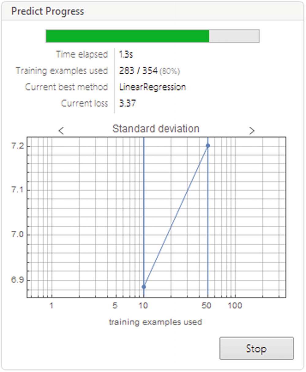
Progress report of the PredictorFunction

Back to the model: as seen in Figure 8-7, the return object is a predictor function (try using Head to verify it). When having assigned a name to the predictor function, additional information about the model can be obtained for this; the command Information is used (Figure 8-9). Information works for every other expression, not just for machine learning purposes.
In[8]:= Information[PF]
Out[8]=
../images/500903_1_En_8_Chapter/500903_1_En_8_Fig9_HTML.jpg
Figure 8-9

Information report of the trained model

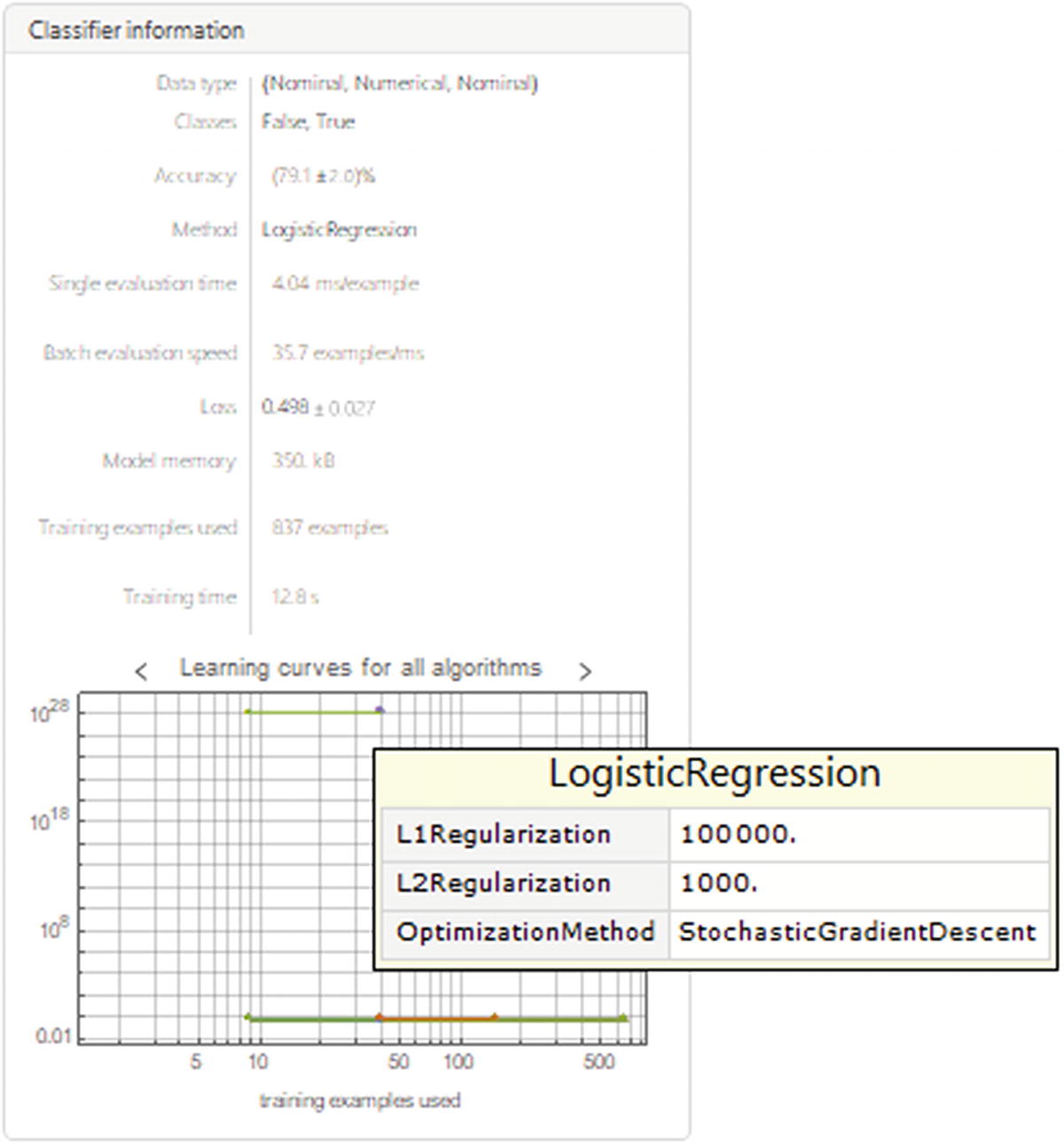
The information panel (Figure 8-9) includes data type, root mean squared (StandardDeviation), method, batch evaluation speed, loss, model memory, number of examples for training, and training time. The graphics at the bottom of the panel are for standard deviation, model learning curve, and learning curve for the other algorithms. If you hover the cursor pointer over the numerical parameters, it will show the confidence intervals and units. If it’s done by the name of the method, it will show the parameters of the linear regression method. Since we did not select a specific optimization algorithm within the LinearRegression method, Mathematica tries to search through the algorithms for the best one (this can be viewed in the learning curve for all algorithms). We will see how to access these options further down the line.

Note

Every method that can be used in the Predict function has options and suboptions; to see full customization use the Wolfram Language Documentation Center.

Table 8-1 shows the different common options that can be used for model training, as well as their definition and possible values for the training process of a PredictorFunction.
Table 8-1

Most Common Options for Predict Function

Option

Definition

Method

Algorithm

Possible values: DecisionTree, GradientBoostedTrees, LinearRegression, NearestNeighbors. NeuralNetwork, RandomForest and GaussianProcess.

PerformanceGoal

Performance optimization

Possible values: DirectTraining, Memory, Quality, Speed, TrainingSpeed, Automatic. Combination of values is supported (P PerformanceGoal→ {val1, val2}).

RandomSeeding

Seed for the pseudorandom number generator

Possiblevalues: Automatic. “custom seed,” Inherited (random seed used in previous computations).

TargetDevice

Specify a device to perform the training or test process

Possible values: CPU or GPU. If a GPU is installed, the automatic target device will be the GPU:

TimeGoal

Time spent for the training process

TrainingProgressIndicator

Progress report

Possible values: Panel, Print, ProgressIndicator, SimplePanel, None.

Model Measurements

Once the model is built, we must observe and analyze the performance of the predictor function in the test set. To carry out this, we must do it within the PredictorMeasurments command. The predictor function goes in the argument (Figure 8-10), followed by the test set, followed by the property or properties to add.
In[9]:= PRM=PredictorMeasurements[PF,test]
Out[9]=
../images/500903_1_En_8_Chapter/500903_1_En_8_Fig10_HTML.jpg
Figure 8-10

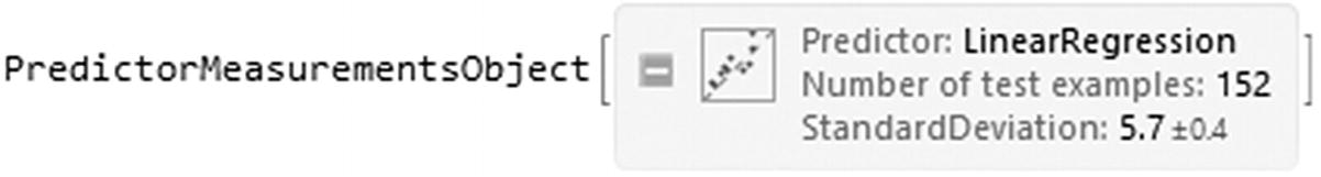
PredictorMeasurements object of the tested model

The returned object is called PredictorMeasurementsObject (Figure 8-10). We can add the properties from the PredictorMeasurements command. We can assign a variable to the object to access it more simply. Let's look at the model report with the test set (Figure 8-11).
In[10]:= PRM["Report"]
Out[10]=
../images/500903_1_En_8_Chapter/500903_1_En_8_Fig11_HTML.jpg
Figure 8-11

Report of tested model

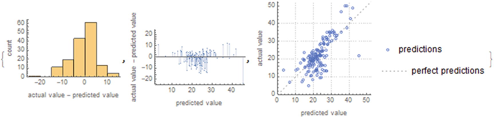
This report (Figure 8-11) shows different parameters, such as the root mean square (standard deviation), mean cross entropy, among others. And it shows us a graph of the fit of the model along with the current values and predicted values. We see that the model is good for most cases, with the exception that there are still some outliers that affect performance.

To better understand the precision of the model, let’s look at the root mean squared error (RMSE) and RSquared (coefficient of determination) shown in Figure 8-12. To display the associated uncertainties, use the option ComputeUncertainty with true value.
In[11]:= Dataset[AssociationMap[PRM[#,ComputeUncertainty→True]&,{"StandardDeviation","RSquared"}]]
Out[11]=
../images/500903_1_En_8_Chapter/500903_1_En_8_Fig12_HTML.jpg
Figure 8-12

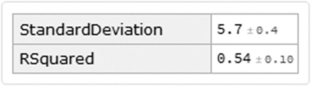
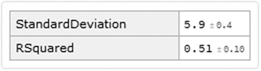
Standard deviation and r-squared values

This gives us a slightly high RMSE value and not a good r-squared value. Remembering that the value of r squared indicates how good the model is for making predictions. These two values would indicate that although there may be a linear relationship between the number of rooms and prices, this is not necessarily explained by a linear regression. These observations are also consistent, remembering that we obtained a correlation value of 0.7.

Model Assessment

The graphs made within the model are the model graph and the target variable (ComparisonPlot). To check the distribution of the variance, use the ResidualHistogram function, and to check the residual plot, use ResidualPlot. These are shown in Figure 8-13.
In[12]:= PRM[#]&/@{"ResidualHistogram","ResidualPlot","ComparisonPlot"}
Out[12]=
../images/500903_1_En_8_Chapter/500903_1_En_8_Fig13_HTML.jpg
Figure 8-13

ResidualHistogram, ResidualPlot, and ComparisonPlot

To find out all the properties of the Predictor Measurements object, we write Properties as an argument. These properties can vary between methods.
In[13]:= PRM["Properties"]
Out[13]= {BatchEvaluationTime,BestPredictedExamples,ComparisonPlot,EvaluationTime,Examples,FractionVarianceUnexplained,GeometricMeanProbabilityDensity,LeastCertainExamples,Likelihood,LogLikelihood,MeanCrossEntropy,MeanDeviation,MeanSquare,MostCertainExamples,Perplexity,PredictorFunction,ProbabilityDensities,ProbabilityDensityHistogram,Properties,RejectionRate,Report,ResidualHistogram,ResidualPlot,Residuals,RSquared,StandardDeviation,StandardDeviationBaseline,TotalSquare,WorstPredictedExamples}
In the event that we are not satisfied with the chosen methods or hyperparameters, retraining the model can be done by configuring the new values for the hyperparameters. We access the values of the current method with the help of the Information command and adding the properties of Method (shows us the method used to train the model), MethodDescription (description of the method used), and MethodOption (method options).
In[14]:= Information[PF,"MethodOption"]
Out[14]= Method→{LinearRegression,L1Regularization→0,L2Regularization→0.00001,OptimizationMethod→NormalEquation}

As we can see, there are terms such as L1Regularization, L2Regularization, and OptimizationMethod. The first two terms are associated with regularization methods, and L1 refers to the Lasso regression name and L2 to the Ridge regression name. Regularization is used to minimize the complexity of the model, in addition to reducing the variation; it also improves the precision of the model, solving problems of overfitting. This is accomplished by adding a penalty to the loss function; this penalty is added to the sum of the absolute value of the coefficient $$ {lambda}_1ast {sum}_{i=0}^{mathrm{N}}left|{	heta}_i
ight| $$, whereas for L2, it is given by the expression $$ left({lambda}_2/2
ight)ast {sum}_{i=0}^{mathrm{N}}{	heta_i}^2 $$, where the function to minimize is the loss function $$ left(1/2
ight)ast {sum}_{i=0}^{mathrm{N}}{left({y}_i-fleft(	heta, {x}_i
ight)
ight)}^2 $$. For more mathematical depth, visit Artificial Intelligence: A Modern Approach. by Stuart Russell and Peter Norvig (2010 Upper Saddle River, NJ: Prentice Hall) and An Introduction to Statistical Learning: With Applications in R by Gareth James, Trevor Hastie, Robert Tibshirani, and Daniela Witten (2017; 1st ed. 2013, Corr. 7th printing 2017 ed.: Springer). The third term is the option of which optimization method we want to choose; the existing methods are NormalEquation, StochasticGradientDescent, and OrthantWiseQuasiNewton. That said, it must be emphasized that when using the vector of coefficients with the L1 and L2 standards, this is known as an Elastic Net regression model. Elastic Net might be used in circumstantces when there is correlation in the parameters. For more theory, use the next reference, The Elements of Statistical Learning: Data Mining, Inference, and Prediction, Second Edition by Trevor Hastie, Robert Tibshirani, and Jerome Friedman(2nd 2009, Corr. 9th Printing 2017 ed.: Springer).

Retraining Model Hyperparameters

As discussed later, let’s retrain the model but with the values of L1 → 12, L2 → 100 and the optimization algorithm OptimizationMethod → StochasticGradientDescent, TrainingProgressReporting → None, PerformanceGoal → “Quality”, RandomSeeding → 10000, TargetDevice → “CPU”.
In[15]:= PF2=Predict[training,Method→{"LinearRegression","L1Regularization"→ 12,"L2Regularization"→100,"OptimizationMethod"→ Automatic},TrainingProgressReporting→None,PerformanceGoal→"Quality",RandomSeeding→10000,TargetDevice→"CPU"];

To see the properties related to an example, type properties after the input data for the Predictorfunction—for example, PF2[“example”, “Properties”].

Now, let’s compare the performance of the new model by showing the graphs and metrics like before (Figure 8-14 and Figure 8-15).
In[16]:= PRM2=PredictorMeasurements[PF2,test];
PRM[#]&/@{"ResidualHistogram","ResidualPlot","ComparisonPlot"}
Dataset[AssociationMap[PRM2[#,ComputeUncertainty→True]&,{"StandardDeviation","RSquared"}]]
Out[16]=
../images/500903_1_En_8_Chapter/500903_1_En_8_Fig14_HTML.jpg
Figure 8-14

Plots of the retrained model

../images/500903_1_En_8_Chapter/500903_1_En_8_Fig15_HTML.jpg
Figure 8-15

New values for RMSE and r squared

Out[16]=

Making observations in the graphs, we see the model merely decrease to a certain degree; this agrees with the new value of r squared, which decreases to 0.51. However, it is still a poor model when it comes to making future predictions. This can be attributed to the optimization choice, the L1 and L2 parameters choice.

Logistic Regression

Logistic regression is a technique commonly used in statistics, but it is also used within machine learning. The logistic regression works considering that the values of the response variable only take two values, 0 and 1; this can also be interpreted as a false or true condition. It is a binary classifier that uses a function to predict the probability of whether or not a condition is met, depending on how the model is constructed. Usually, this type of model is used for classification, since it has the ability to provide us with probabilities and classifications, since the values of the logistic regression oscillates between two values. In logistic regression, the target variable is a binary variable that contains encoded data. For further view visit Introduction to Data Science: A Python Approach to Concepts, Techniques and Applications by Laura Igual, Santi Seguí, Jordi Vitrià, Eloi Puertas, Petia Radeva, Oriol Pujol, Sergio Escalera, Francesc Dantí, and Lluis Garrido (2017 ed.: Springer).

Titanic Dataset

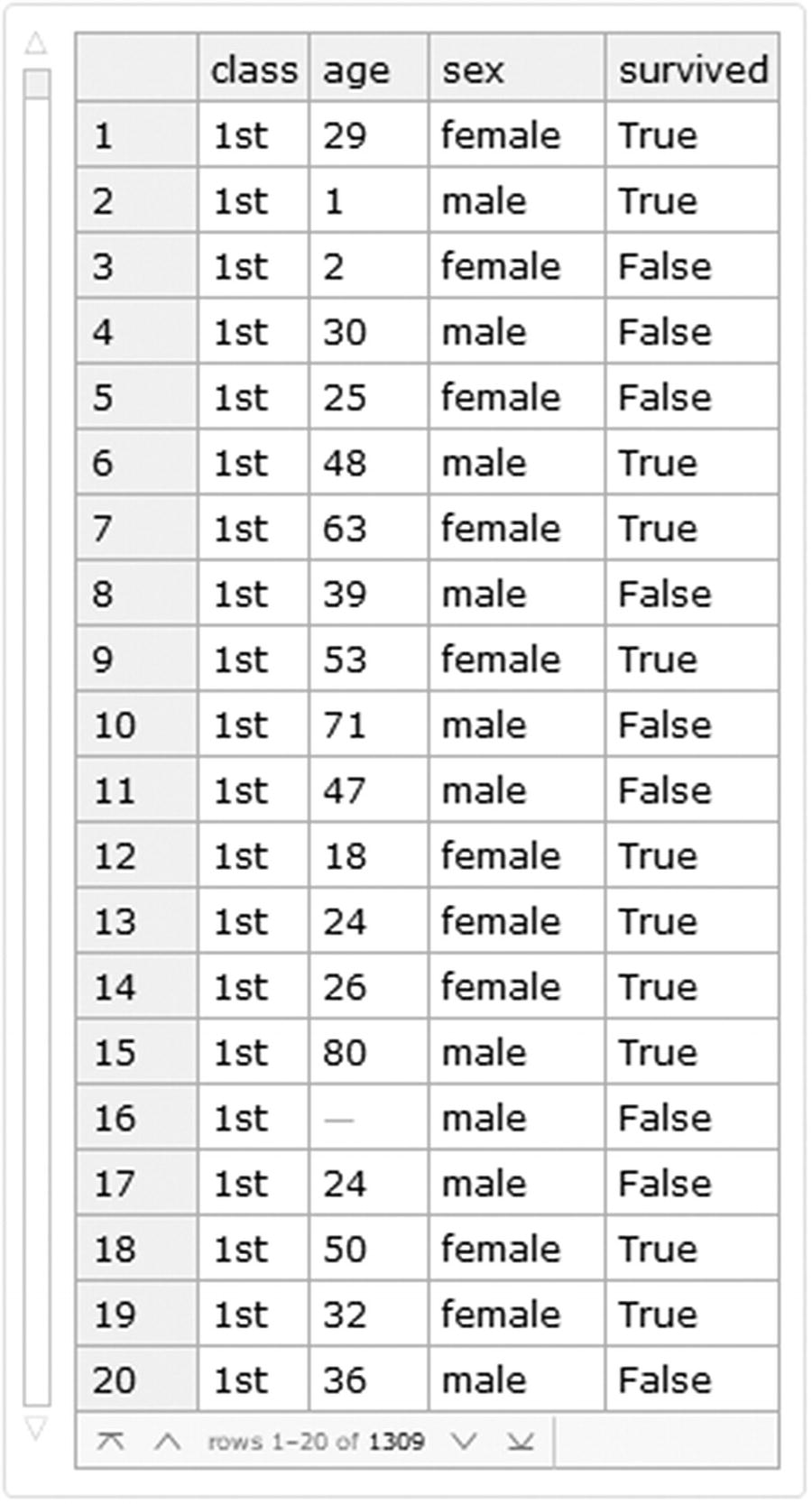
For the following example we will use the titanic dataset , which is a dataset that describes the survival status of the passengers. The variables used are class, age, sex, and survival condition. We will load the data directly as a dataset (Figure 8-16) from the ExampleData and enumerate the rows of the dataset.

Note

This section will be entirely constructed with the use of Query language so that the reader can understand how to use it more deeply inside datasets.

In[1]:= Titanic=Query[AssociationThread[Range[Length@#]→Range[Length@#]]][ExampleData[{"Dataset","Titanic"}]]&[ExampleData[{"Dataset","Titanic"}]]
Out[1]=
../images/500903_1_En_8_Chapter/500903_1_En_8_Fig16_HTML.jpg
Figure 8-16

Titanic dataset

Let’s look at the dimensions of the data using the Dimensions command.
In[2]:= Dimensions@Titanic
Out[2]= {1309,4}
Interpreting the result, we see that the dataset comprises 1309 rows by 4 columns. Looking at the dataset, there are four columns classified by class, age, sex, and survived status. If we use the space bar we see that there are some elements that do not register data entry. To see which columns contain missing data, execute the following code by counting the number of elements that correspond to the pattern Missing in each of the columns.
In[3]:= Query[Count[_Missing],#]@Titanic&/@{"class","age","sex","survived"}
Out[3]= {0,263,0,0}
This gives us as a result that there are 263 missing values within the age column and zero for the others. Let’s remove the rows that contain this missing data, but first we will extract the row numbers from the missing data by selecting the elements from the age column that are equal to Missing, then extracting the row IDs.
In[4]:= Query[Select[#age==Missing[]&]][Titanic];
Normal@Keys@%
Out[5]= {16,38,41,47,60,70,71,75,81,107,108,109,119,122,126,135,148,153,158,167,177,180,185,197,205,220,224,236,238,242,255,257,270,278,284,294,298,319,321,36,4,383,385,411,470,474,478,484,492,496,525,529,532,582,596,598,673,681,682,683,706,707,757,758,768,769,776,790,796,799,801,802,803,805,806,809,813,814,816,817,820,836,843,844,853,855,857,859,866,872,873,875,877,880,883,887,888,901,902,903,904,919,921,922,923,924,927,928,929,930,931,932,941,943,945,946,947,949,955,956,957,958,959,962,963,972,974,977,983,984,985,988,989,990,992,994,995,998,999,1000,1001,1002,1003,1004,1005,1006,1007,1010,1013,1014,1015,1017,1019,1023,1024,1028,1029,1030,1031,1033,1034,1035,1036,1037,1038,1039,1040,1042,1043,1044,1045,1053,1054,1055,1056,1070,1071,1072,1073,1074,1075,1077,1078,1079,1081,1082,1086,1096,1110,1115,1116,1117,1122,1123,1124,1125,1129,1133,1136,1137,1138,1139,1150,1151,1152,1155,1156,1160,1163,1164,1165,1167,1168,1169,1171,1173,1174,1175,1176,1177,1178,1179,1180,1181,1185,1186,1187,1194,1195,1196,1198,1199,1200,1201,1203,1213,1214,1215,1216,1217,1220,1222,1242,1243,1244,1246,1247,1248,1250,1251,1254,1256,1263,1269,1283,1284,1285,1292,1293,1294,1298,1303,1304,1306}
These numbers represent the rows that contain the missing data for the age column. To eliminate them we use the DeleteMissing command, considering that there is missing data at level 1. The final dataset is seen in (Figure 8-17)
In[5]:= Titanic=DeleteMissing[Titanic,1,1]
Out[5]=
../images/500903_1_En_8_Chapter/500903_1_En_8_Fig17_HTML.jpg
Figure 8-17

Titanic dataset without missing values

To corroborate that there is no longer any missing data, you could apply the same code with counts or by looking at the keys of the removed rows, for example.
In[6]:= Titanic[Key[16]]
Out[6]= Missing[KeyAbsent,16]

This means that there is no content associated with key 16. If you want to check all keys, use the row list of the missing data.

Data Exploration

Once we have removed the missing data , we can count the number of elements that consist of each class, sex, and survival status (Figure 8-18).
In[7]:= Dataset@
<|
"Class"→Query[Counts,"class"]@Titanic,"Sex"→ Query[Counts,"sex"]@Titanic,
"Survival status"→Query[Counts,"survived"]@Titanic
|>
Out[7]=
../images/500903_1_En_8_Chapter/500903_1_En_8_Fig18_HTML.jpg
Figure 8-18

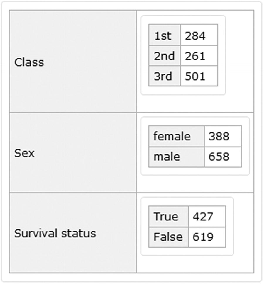
Basic elements count for class, sex, and survival status

After eliminating the rows with the missing elements, we see that the dataset consists of 284 elements in first class, 261 in second class, and 501 in third class (Figure 8-19). Also note that more than half of the registered passengers were male and that there were more deaths than survivors. It is possible to verify this graphically by showing the percentages (Figure 8-19). The same approach is applied to the columns class and sex.
In[8]:= Row[{PieChart[{N@(#[[1]]/Total@#),N@(#[[2]]/Total@#)}&[Counts[Query[All,"survived"][Titanic]]], PlotLabel→Style["Percentage of survival",#3,#4], ChartLegends→ {"Survived", "Died"}, ImageSize→#1,ChartStyle→#2,LabelingFunction→(Placed[Row[{SetPrecision[100#,3],"%"}],"RadialCallout"]&)],
PieChart[{N@(#[[1]]/Total@#),N@(#[[2]]/Total@#)}&[Counts[Query[All,"sex"][Titanic]]], PlotLabel→Style["Percentage by sex",#3,#4], ChartLegends→{"Female", "Male"}, ImageSize→#1,ChartStyle→#2,LabelingFunction→(Placed[Row[{SetPrecision[100#,3],"%"}],"RadialCallout"]&)],
PieChart[{N@(#[[1]]/Total@#),N@(#[[2]]/Total@#),N@(#[[3]]/Total@#)}&[Counts[Query[All,"class"][Titanic]]], PlotLabel→Style["Percentage by class",#3,#4], ChartLegends→{"1st", "2nd","3rd"}, ImageSize→#1,ChartStyle→#2,LabelingFunction→(Placed[Row[{SetPrecision[100#,3],"%"}],"RadialCallout"]&)]},"----"]&[200,{ColorData[97,20],ColorData[97,13],ColorData[97,32]},Black,20]
Out[8]=
../images/500903_1_En_8_Chapter/500903_1_En_8_Fig19_HTML.jpg
Figure 8-19

Pie charts for class, sex, and survival status

For this case , we are going to predict the survival of the Titanic passengers. We will build a model that will classify whether the given class, age, and sex will survive or not. The features will be class, age, and sex, and the target will be the survival status. We are going to use these variables as the features, which the model will then use to classify whether their class, age, and sex survive or not, which is our target variable. For this we divide the dataset into 80% training (837 elements) and 20% test (209 elements). To split the dataset, first we will do a random sampling; after we will extract the keys of the IDs and create the new dataset divided by train and test set (Figure 8-20).
In[9]:= BlockRandom[SeedRandom[8888];
RandomSample[Titanic]];
Keys@Normal@Query[All][%];
{train,test}={%[[1;;837]],%[[838;;1046]]};
dataset=Query[<|"Train"→{Map[Key,train]},"Test"→{Map[Key,test]} |> ][Titanic]
Out[9]=
../images/500903_1_En_8_Chapter/500903_1_En_8_Fig20_HTML.jpg
Figure 8-20

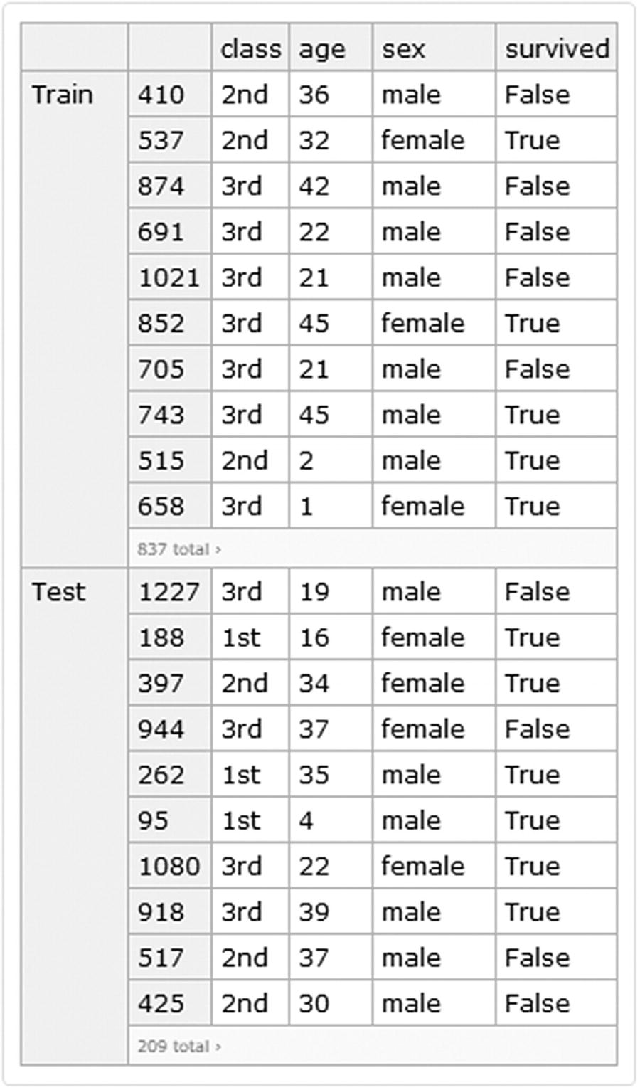
Titanic dataset divided by train and test set

Classify Function

The Classify command is another super function used in the Wolfram Language machine learning scheme. This function can be used in tasks that consist of solving a classification problem. The data that this function accepts are numerical, textual, sound, and image data. The input data of this function can be in the same way as with the Predict function {x → y}. However, it is also possible to enter data as a list of elements, as an association of elements, or as a dataset. In this case we will introduce it as a dataset.

In this case we will extract the data from the dataset format by specifying that the columns input (class, age, sex) pointing to the target (survived). Now let’s build the classifier function (Figure 8-21), with the following options, Method → {LogisticRegression, L1 → Automatic, L2 → Automatic}. When choosing Automatic, we let Mathematica choose the best combination of L1 and L2 parameters. For the OptimizationMethod set the StochasticGradientDescent method. And for performance goal set Quality. Finally, choosing a seed with a value of 100,000 and the CPU unit as the target device.

The optimization methods for the logistic regression are limited memory Broyden-Fletcher-Goldfarb-Shanno algorithm (LBFGS), StochasticGradientDescent (stochastic gradient method) and Newton (Newton method). These are for estimating the parameters of logistic function. The rule construction will be done from the data inside the dataset using the query language.
In[10]:= CF=Classify[Flatten[Values[Normal[Query["Train",All,All,{#class,#age,#sex}→ #survived&][dataset]]]],Method→{"LogisticRegression","L1Regularization"→ Automatic,"L2Regularization"→ Automatic,"OptimizationMethod"→"StochasticGradientDescent"},PerformanceGoal→"Quality",RandomSeeding→100000,TargetDevice→"CPU",TrainingProgressReporting→None]
Out[10]=
../images/500903_1_En_8_Chapter/500903_1_En_8_Fig21_HTML.jpg
Figure 8-21

ClassifierFunction object

After training, like with the Predict function, the Classify function returns a classifier function object (Figure 8-21) instead of a predictor function. Inspecting the classifier function we can see the input data types, which are two—nominal and numerical. The classes, which is the survival status—either false or true. The method used (Logistic Regression); and the number of examples (837). To obtain information on the model use the Information command. Let’s look at the model report (Figure 8-22).
In[11]:= Information[CF]
Out[11]=
../images/500903_1_En_8_Chapter/500903_1_En_8_Fig22_HTML.jpg
Figure 8-22

Information about the trained classifier function

Note

If you click the arrows above the graphs, three plots will be shown: Learning curve, Accuracy, and Learning curve for all algorithm. If you hover the pointer over the line of the last one, a tooltip appears with the corresponding parameters along with the method used, as shown in Figure 8-23.

../images/500903_1_En_8_Chapter/500903_1_En_8_Fig23_HTML.jpg
Figure 8-23

Algorithm specifications tooltip from the method logistic regression

We see that the model’s accuracy is approximately 78%. We also observe by clicking arrows of the plots that the learning curve and accuracy show no signs of improvement from 500 examples and more. To access all the properties of the trained model, add Properties as an option in Information.
In[12]:= Information[CF,"Properties"]
Out[12]= {Accuracy,BatchEvaluationSpeed,BatchEvaluationTime,Classes,ClassNumber,ClassPriors,EvaluationTime,ExampleNumber,FeatureNames,FeatureNumber,FeatureTypes,FunctionMemory,FunctionProperties,IndeterminateThreshold,L1Regularization,L2Regularization,LearningCurve,MaxTrainingMemory,MeanCrossEntropy,Method,MethodDescription,MethodOption,OptimizationMethod,PerformanceGoal,Properties,TrainingClassPriors,TrainingTime,UtilityFunction}
Note

Depending on the method used, properties may vary.

Let's see what the probabilities are for the data: class = 3rd, age = 23, and sex = male. Probability → name or number of class or TopProbabilities → number of most likely classes.
In[13]:= CF[{"3rd",23,"male"},{"Probability"→ False,"TopProbabilities"→ 2}]
Out[13]= {0.839494,{False→0.839494,True→0.160506}}

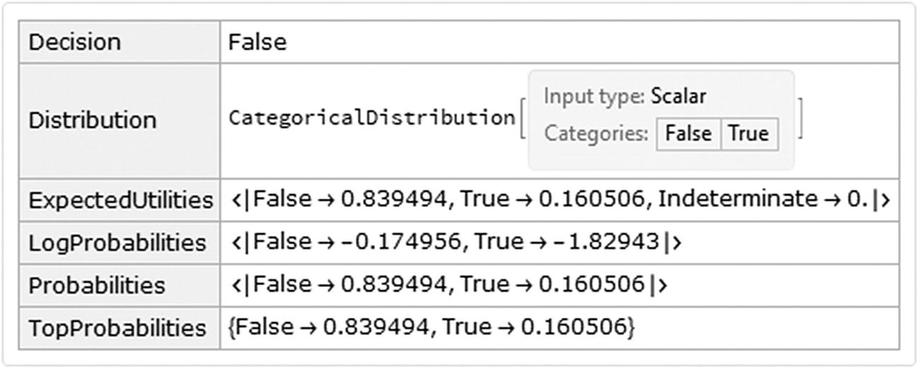
The probabilities of the latter example show that survival status of the passenger may be more inclined to the False status.

To see the full properties of a new classification, type the example followed by Properties. The properties included are Decision (best choice of class according to probabilities and its utility function) and Distribution (categorical distribution object). Probabilities of each class are displayed as associations, ExpectedUtilities (expected probabilities), LogProbabilities (natural logarithm probabilities), Probabilities(probabilities of all classes), and TopProbabilities (most likely class). This is displayed in the following dataset (Figure 8-24).
In[14]:= Dataset@
AssociationMap[CF[{"3rd",23,"male"},#] &,{"Decision","Distribution","ExpectedUtilities","LogProbabilities","Probabilities","TopProbabilities"}]
Out[14]=
../images/500903_1_En_8_Chapter/500903_1_En_8_Fig24_HTML.jpg
Figure 8-24

Properties for the classifier function of the trained model

Note

To check the logarithm result, use the Log command, Log[“base”, “number”].

Testing the Model

We will now test the model on the test data using the ClassifierMeasurements (Figure 8-25) command, adding the function and the test set as arguments and the computation of the uncertainty.
In[15]:= CM=ClassifierMeasurements[CF,Flatten[Values[Normal[Query["Test",All,All,{#class,#age,#sex}→ #survived&][dataset]]]],ComputeUncertainty→True,RandomSeeding→8888]
Out[15]=
../images/500903_1_En_8_Chapter/500903_1_En_8_Fig25_HTML.jpg
Figure 8-25

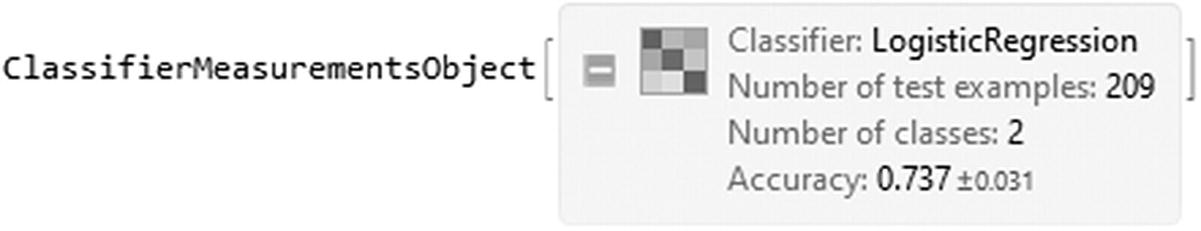
ClassifierMeasurements object of the classifier function

The object returned is called a ClassifierMeasurementsObject (Figure 8-25), which is used to look for the properties of the ClassifierFunction after testing the test set. Let’s now look at the report (Figure 8-26).
In[16]:= CM["Report"]
Out[16]=
../images/500903_1_En_8_Chapter/500903_1_En_8_Fig26_HTML.jpg
Figure 8-26

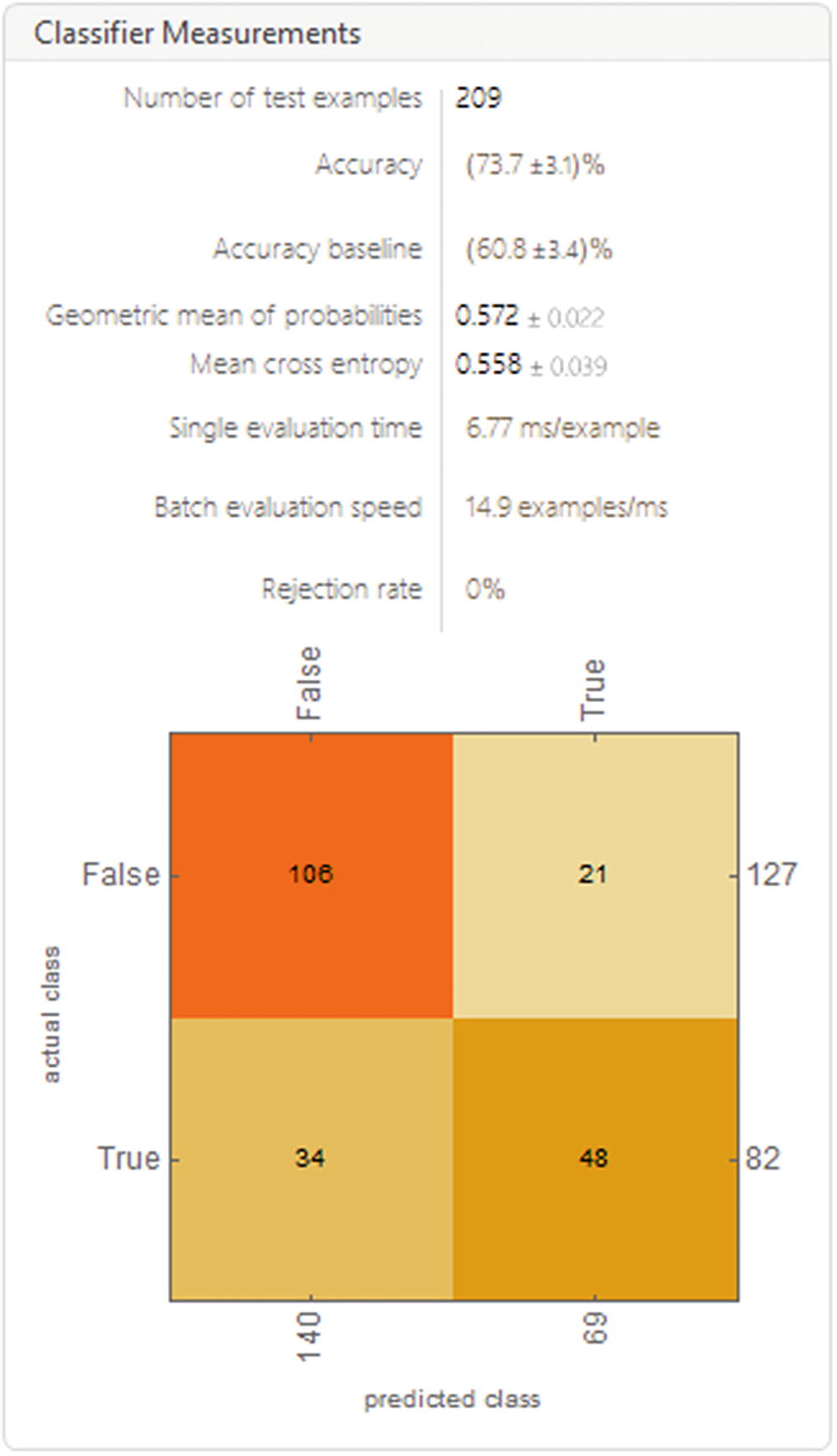
Report of the tested model

The report seen in the figure shows information such as the number of test examples, the accuracy, and the accuracy baseline, among others. It also shows us the confusion matrix, which shows us the prediction results for the classification model, showing the number of correct and incorrect predictions; these being broken down by class in this case return either false or true, which gives us an idea of the errors the model is making and the type of error it is making. Basically, it shows us the true positives and true negatives and false-positives and false-negatives for each class.

Let’s look at the graph (confusion matrix) in a concrete way (Figure 8-27).
In[17]:= CM["ConfusionMatrixPlot"]
Out[17]=
../images/500903_1_En_8_Chapter/500903_1_En_8_Fig27_HTML.jpg
Figure 8-27

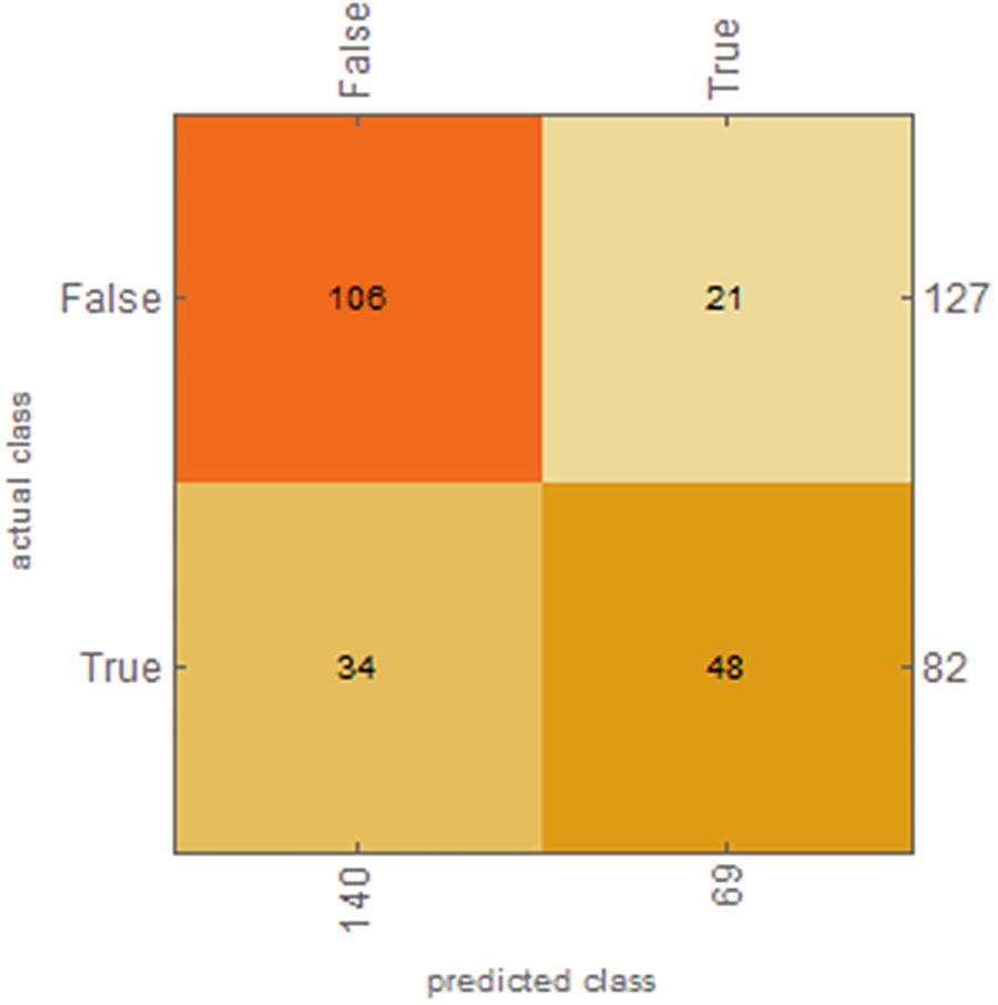
Confusion matrix plot of the tested model

To get the values of the confusion matrix, use CM[“ConfusionMatrix”] or class CM[“ConfusionFunction”].

Looking at the plot, we see that the model classified, starting from left to right at the top, 106 examples of false correctly classified, 21 examples of false as true, 34 examples of true as false, and 48 examples of true correctly. To better visualize the performance, let’s look at the ROC curves (Figure 8-28) for each class, their respective values, and the Matthews correlation coefficient and AUC values.
In[18]:= {CM["ROCCurve"],Dataset@<|{"AUC"→CM["AreaUnderROCCurve"]},{"MCC"→CM["MatthewsCorrelationCoefficient"]}|>}
../images/500903_1_En_8_Chapter/500903_1_En_8_Fig28_HTML.jpg
Figure 8-28

ROC curves for each class along with AUC and MCC values

Apparently the two classes have the same values, but compared to the ROC curve we can see that the class False had better classification than the True class; let’s see the least certain examples so we can see that the True class has worst certain examples than False. With this we can show the less accurate results of the model, which have the highest entropy distribution and mean cross-entropy for each class.
In[19]:= CM[{"LeastCertainExamples","ClassMeanCrossEntropy"}]
Out[19]= {{{3rd,39,female}→False,{3rd,38,female}→True,{3rd,37,female}→False,{3rd,37,female}→False,{3rd,36,female}→True,{3rd,32,female}→False,{1st,4,male}→True,{3rd,30,female}→False,{3rd,28,female}→False,{3rd,27,female}→True},<|False→0.363541,True→0.85931|>}
To get the values of the MCC coefficient, use the following properties: FalseDiscoveryRate, FalsePositiveRate, FalseNegativeRate (false-positive and false-negative discovery rate for each class), FalseNegativeExamples, FalseNegativeNumber (true negatives), FalsePositiveExamples and FalsePositiveNumber (true positive). These are shown in a short form here.
In[20]:= CM[#]&/@{"FalseDiscoveryRate","FalseNegativeRate","FalsePositiveRate"}
Out[20]= {<|False→0.242857,True→0.304348|>,<|False→0.165354,True→0.414634|>,<|False→0.414634,True→0.165354|>}
Another way to see if the model behaves consistently in predictions is to look at key metric values like Accuracy, Recall, F1Score Precision, and the Accuracy rejection plot (Figure 8-29). Let’s look at these metrics for the model.
In[21]:= CM[{"Accuracy","Recall","F1Score","Precision","AccuracyRejectionPlot"}]//TableForm
Out[21]//TableForm=
../images/500903_1_En_8_Chapter/500903_1_En_8_Fig29_HTML.jpg
Figure 8-29

TableForm for the values of Accuracy, Recall, F1Score, Precision, and AccuracyRejectionPlot

To see related metrics about the accuracy, type the following properties: Accuracy (number of correctly classified examples), AccuracyBaseline (accuracy of predicting the common class), and AccuracyRejectionPlot (ARC plot, accuracy rejection curve). However, to find information about probability and the predicted class of the test set, use the following properties: DecisionUtilities (value of the utility function for every example in the test set), Probabilities (probabilities for every example in the test set), and ProbabilityHistogram (histogram of class probabilities).

Let’s see how the probability behaves by plotting the probability of a passenger survival status (Figure 8-30). Remembering that the false state means that a passenger did not survive, and True means that a passenger did survived.
In[22]:= TruPlot=
{Plot[{CF[{#1,age,#4},"Probability"→ #6 ],CF[{#2,age,#4},"Probability"→ #6 ],CF[{#3,age,#4},"Probability"→ #6 ]}, {age,0,90},PlotLegends→{"Male in 1st class", "Male in 2nd class ", "Male in 3rd class"},FrameLabel→ {Style["Age in years",Bold,15], Style["Probability",Bold,15]}, Frame→#6,FrameTicks→#7,GridLines→ {{20,40,60,80}},ImageSize→#8],Plot[{CF[{#1,age,#5},"Probability"→ #6 ],CF[{#2,age,#5},"Probability"→ #6 ],CF[{#3,age,#5},"Probability"→ #6 ]}, {age,0,90},PlotLegends→{"Female in 1st class", "Female in 2nd class ", "Female in 3rd class"},FrameLabel→ {Style["Age in years",Bold,15], Style["Probability",Bold,15]}, Frame→#6,FrameTicks→#7,GridLines→ {{20,40,60,80}},ImageSize→#8]}&["1st","2nd","3rd","male","female",True,All,250];
FalsPlot={Plot[{CF[{#1,age,#4},"Probability"→ #6 ],CF[{#2,age,#4},"Probability"→ #6],CF[{#3,age,#4},"Probability"→ #6]}, {age,0,90},PlotLegends→{"Male in 1st class", "Male in 2nd class ", "Male in 3rd class"},FrameLabel→ {Style["Age in years",Bold,15], Style["Probability",Bold,15]}, Frame→True,FrameTicks→#7,GridLines→ {{20,40,60,80}},ImageSize→#8],Plot[{CF[{#1,age,#5},"Probability"→ #6 ],CF[{#2,age,#5},"Probability"→ #6 ],CF[{#3,age,#5},"Probability"→ #6]}, {age,0,90},PlotLegends→{"Female in 1st class", "Female in 2nd class ", "Female in 3rd class"},FrameLabel→ {Style["Age in years",Bold,15], Style["Probability",Bold,15]}, Frame→True,FrameTicks→#7,GridLines→ {{20,40,60,80}},ImageSize→#8]}&["1st","2nd","3rd","male","female",False,All,250];
Headings={Style["True class",Black,20,FontFamily→"Arial Rounded MT"],Style["False class",Black,20,FontFamily→"Arial Rounded MT"]};
Grid[{{Headings[[1]],Headings[[2]]},{TruPlot[[1]],FalsPlot[[2]]},{TruPlot[[2]],FalsPlot[[1]]}},Alignment→{{Center,Center},{None,None}},Dividers→{False,1}]
Out[22]=
../images/500903_1_En_8_Chapter/500903_1_En_8_Fig30_HTML.jpg
Figure 8-30

Probabilities of each class, depending on the class, age, and sex

In the graphs shown in Figure 8-30, clearly it is seen that the probability of survival decreases for males as the age goes up, to even hit values below 20% of chance, whether 1st, 2nd, and 3rd class. This is contrary to the probability of survival for females, where it starts with values above 60% of chance and decreases as age increases too, hitting values above 50% for 1st class.

Data Clustering

The data clustering method is a type of unsupervised learning, as referenced by M. Emre Celebi, and Kemal Aydin in Unsupervised Learning Algorithms (2018; Softcover Reprint of the Original 1st 2016 ed. ed.: Springer). It is generally used to find structures and characteristics of data clusters, where the points to be observed are divided into different groups by which they are compared based on unique characteristics.

In the following example, we will create a bivariate data series and plot the list of points (Figure 8-31). To find clusters, there is the Find Clusters command; this command makes a partition of the points according to their similarities.
In[1]:= BlockRandom[
SeedRandom[321];
RndPts=Table[{i,RandomReal[{0,1}]},{i,1,450}];]
ListPlot[RndPts,PlotRange→All,PlotStyle→Directive[Thick,Blue],Frame→True,FrameTicks→All]
Out[1]=
../images/500903_1_En_8_Chapter/500903_1_En_8_Fig31_HTML.jpg
Figure 8-31

2D scatter plot of random data

Clusters Identification

The FindClusters function is used to detect partitions within a set of data with similar characteristics. This function gathers the cluster elements into subgroups that the function finds. When you do not add options to the Find Clusters command, the cluster identification parameters will be set automatically by Mathematica. Some options that are used for other machine learning methods can also be used for this command. For example, PerformanceGoal, Method, and RandomSeeding, among others.
In[2]:= Clusters=FindClusters[RndPts,PerformanceGoal→"Speed",Method→Automatic,DistanceFunction→Automatic,RandomSeeding→1234];
Short[Clusters,4]
Out[2]//Short= {{{1,0.924416},{2,0.695055},{5,0.715785},{8,0.951038},<<137>>,{372,0.895003},{395,0.917268},{410,0.974659},{422,0.962478}},{<<1>>},{{236,<<19>>},<<166>>}}
Let's see how many clusters were identified. We will use the Length command; this way we will obtain the general form of the list.
In[3]:= Length[Clusters]
Out[3]= 3
We see that the result is three. This can be interpreted as follows: the list contains three elements (that is, three sublists), each list represents a cluster, and within each cluster there is a sublist, which contains the points of each identified cluster. To find out how many elements are included in each cluster, we use the Map command, and we apply the Dimension command at the specification level.
In[4]:= Map[Dimensions,Clusters,1]
Out[4]= {{145,2},{138,2},{167,2}}
This tells us that the first cluster contains 145 elements, the second cluster contains 138 elements, and the third cluster contains 167 elements; these are the same number of points we created earlier, which equal 450. Each cluster is comprised of a two-point coordinate system. The FindClusters command returns the points where it identifies the clusters. Let's see the plot of the clusters generated; this is exhibited in Figure 8-32.
In[5]:= ListPlot[Clusters,PlotStyle→{Red,Blue,Green},PlotLegends→Automatic,Frame→True,FrameTicks→All,PlotLabel→Style["Cluster Plot",Italic,20,Black],Prolog→{LightYellow,Rectangle[Scaled[{0,0}],Scaled[{1,1}]]}]
Out[5]=
../images/500903_1_En_8_Chapter/500903_1_En_8_Fig32_HTML.jpg
Figure 8-32

2D scatter plot of the three clusters identified

As we can see, Find Clusters automatically found the clusters and colored them. To explicitly establish the number of clusters to search, we add the desired number as the second argument—that is, in the form FindCluster [“points”, “number of clusters”]. In the previous example we set the method option to automatic. The different methods for finding the clusters are shown here. Agglomerate (which is the algorithm of single linkage clustering), density-based spatial clustering of applications with noise (DBSCAN), NeighborhoodContraction (nearest-neighbor chain algorithm), JarvisPatrick (Jarvis[Dash]Patrick clustering algorithm) , KMeans (k-means clustering), MeanShift (mean-shift clustering), KMedoids (k-medoids partitioning), SpanningTree (minimum spanning tree clustering), Spectral (spectral clustering), and GaussianMixture (Gaussian mixture model).

Choosing a Distance Function

In addition to the method option, there is also the DistanceFunction , which was given the value of Automatic. This option is used to define how the distance between the points is calculated. In general when we choose automatic, the square Euclidean distance is used ( ∑ (yi − xi)2, SquaredEuclideanDistance). There are also other values for the distance function, EuclideanDistance $$ left(sum sqrt{{left({y}_i-{x}_i
ight)}^2}
ight) $$, ManhattanDistance (∑|x _ {i} − y _ {i}|), ChessboardDistance, or ChebyshevDistance (max(|x _ {i} − y _ {i}|)), among others.

Now that we know how the clusters are identified, we want to know the centroid of each one. For this it is necessary to calculate the mean of the points of the clusters. The centroid of a series of points is obtained from the following expression, $$ mu =sum frac{x_i}{n} $$, which can be interpreted as the average of the points. For the calculation, we extract the data from each cluster and calculate its arithmetic mean.
In[6]:= {Cluster1Centroid,Cluster2Centroid,Cluster3Centroid}={N@Mean@Clusters[[1,All]],N@Mean@Clusters[[2,All]],N@Mean@Clusters[[3,All]]}
Out[6]= {{182.807,0.815713},{115.935,0.300888},{353.108,0.39227}}
Let´s plot the clusters together with their centroids to visualize how the points are classified with respect to each centroid (Figure 8-33).
In[7]:= ClusterPlot=ListPlot[Clusters,PlotStyle→{Red,Blue,Green},PlotLegends→{"Cluster 1","Cluster 2","Cluster 3"}];
CentroidPlot=ListPlot[{Cluster1Centroid,Cluster2Centroid,Cluster3Centroid},PlotStyle→Black];
Show[{ClusterPlot,CentroidPlot},Prolog→{LightYellow,Rectangle[Scaled[{0,0}],Scaled[{1,1}]]},Frame→ True,FrameTicks→ All,PlotLabel→Style["Cluster Plot",Italic,20,Black]]
Out[7]=
../images/500903_1_En_8_Chapter/500903_1_En_8_Fig33_HTML.jpg
Figure 8-33

2D scatter plot of the three clusters identified with their respective centroids

To make sure the first cluster corresponds to the red points, try using ListPlot to plot the points contained in Clusters[[1, All]], as well as those in the second cluster (blue) and third cluster (green).

As an alternative we can highlight the area of the centroids by adding the option Epilog to the plot. Epilog is another graphic option like Prolog, but we will use it to highlight the area of the centroid points (Figure 8-34).
In[8]:= Show[{ClusterPlot,CentroidPlot},Prolog→{LightYellow,Rectangle[Scaled[{0,0}],Scaled[{1,1}]]},Frame→ True,FrameTicks→ All,Epilog→{Opacity[0.2],PointSize[0.1],Point[Cluster1Centroid],Point[Cluster2Centroid],Point[Cluster3Centroid]}]
Out[8]=
../images/500903_1_En_8_Chapter/500903_1_En_8_Fig34_HTML.jpg
Figure 8-34

2D scatter plot of the three clusters identified with their respective centroids

Identifying Classes

Once we have our clusters identified by the command FindClusters, we can use the ClusteringComponents command to label or identify the different classes that were found. We must specify the number of clusters and the specification of where to look for the clusters within the ClusteringComponents command, since there are several ways to use ClusteringComponents.
In[9]:= Classes=ClusteringComponents[Clusters,3,2,Method→Automatic,DistanceFunction→Automatic,RandomSeeding→ 1234,PerformanceGoal→"Speed"]
Out[9]= {{1,1,1,1,1,1,1,1,1,1,1,1,1,1,1,1,1,1,1,1,1,1,1,1,1,1,1,1,1,1,1,1,1,1,1,1,2,1,1,2,1,2,1,2,2,1,1,1,1,2,1,1,2,1,1,2,1,2,2,2,2,1,1,2,2,1,2,2,2,2,2,2,1,2,2,2,2,1,2,2,2,2,2,2,2,2,2,2,2,2,2,2,2,2,2,2,2,2,2,2,2,2,2,2,2,2,2,2,2,2,2,2,2,2,2,2,2,2,2,2,2,2,2,2,2,2,2,2,2,2,2,2,2,2,2,2,2,2,2,2,2,2,2,2,2},{1,1,1,1,1,1,1,1,1,1,1,1,1,1,1,1,1,1,1,1,1,1,1,1,1,1,1,1,1,1,1,1,1,1,1,1,1,1,1,1,1,1,1,1,1,1,1,1,1,1,1,1,1,1,1,1,1,1,1,1,1,1,1,1,1,1,1,1,1,1,1,1,1,1,1,1,1,1,1,1,1,1,1,1,1,1,1,1,1,1,1,1,1,1,3,1,1,3,1,3,1,1,1,1,1,1,1,1,1,3,1,3,3,1,3,1,1,3,1,1,1,1,3,1,3,1,1,1,3,3,1,1,3,3,3,3,3,3},{2,3,2,3,3,3,3,3,3,3,3,3,3,2,3,3,3,3,3,2,3,3,3,3,3,3,3,2,3,3,3,3,3,3,3,2,3,3,3,3,3,3,3,3,3,3,3,3,3,3,3,3,2,3,3,3,3,3,3,3,3,3,2,2,2,3,2,2,3,3,2,3,3,3,2,3,3,3,3,3,2,3,2,3,3,3,3,2,3,3,2,3,3,2,2,3,3,3,3,3,3,2,2,2,3,3,3,3,3,3,3,3,3,3,3,2,3,3,3,2,3,3,2,2,3,2,3,3,3,3,3,2,3,3,3,3,3,2,3,3,3,2,3,3,3,2,3,2,2,3,2,3,3,2,2,3,3,2,2,2,3,3,3,3,2,3,3}}
In this way, numbers that correspond to the three classes appear. The command only identifies that there are three types of classes; it does not mention what each class means. This is because cluster methods are often performed on unlabeled data, so interpretation is performed as part of the analysis. Let's count how many elements of each class we have.
In[10]:= Flatten[Classes]//Counts
Out[10]= <|1→174,2→132,3→144|>

The command returns us that class one contains 174, class two contains 132, class three contains 144. One point to clarify is that why the clusters identified with FindClusters and ClusteringCompnents defer. Well, this is because by setting the automatic option in the distance function, we are telling Mathematica to find the optimal distance function. And depending on the data one function might gather elements in different forms as we will see later on.

K-Means Clustering

At the moment we have seen how to search for clusters in a generic way. In this part we will focus on the K-means method.

The K-means is a technique to find and classify groups (k) of data so that the elements that share similar characteristics are grouped together and in the same way for the opposite case (not similar characteristics). To distinguish whether the data contain similarities or not, the method calculates the distance between the data with respect to a centroid. The elements that have less distance between them will be those that share similarities. This technique is carried out as an iterative process in which the groups are adjusted until they reach a convergence. Basically, the K-means method, which is a simple algorithm, consists of making a classification by means of specific partitions, in different groups, where each point or observation belongs to the group. Clustering is done by minimizing the sum of the distances between each object and the centroid of its group. The k-means clustering technique tries to build the clusters so that they have the least variation within a group. This is done by minimizing the expression $$ Jleft({C}_i
ight)={sum}_{x;jin {C}_i}^N{left|left|{x}_j-{mu}_i
ight|
ight|}^2 $$, where Ci represents the i-th cluster, xj represents the points, and ?? represents the centroid of each cluster Ci. The square term of the function is the distance function; the most used is the square Euclidean distance, as in this case. To learn more about the mathematical foundation behind this technique, consult the reference An Introduction to Statistical Learning: With Applications in R by Gareth James, Daniela Witten, Trevor Hastie, and Robert Tibshirani. (1st ed. 2013, Corr. 7th printing 2017 ed.: Springer).

In the following example we will use the Fisher’s Irises dataset found in ExampleData. Remembering the features that this dataset has, execute the following code.
In[11]:= ExampleData[{"Statistics","FisherIris"},"ColumnDescriptions"]
Out[11]= {Sepal length in cm.,Sepal width in cm.,Petal length in cm.,Petal width in cm.,Species of iris}
Let’s extract the dataset and assign the variable iris to it.
In[12]:= iris=ExampleData[{"Statistics","FisherIris"}];
Take a look at the dataset.
In[13]:= Short[iris,6]
Out[13]//Short= {{5.1,3.5,1.4,0.2,setosa},{4.9,3.,1.4,0.2,setosa},{4.7,3.2,1.3,0.2,setosa},{4.6,3.1,1.5,0.2,setosa},{5.,3.6,1.4,0.2,setosa},{5.4,3.9,1.7,0.4,setosa},{4.6,3.4,1.4,0.3,setosa},{5.,3.4,1.5,0.2,setosa},{4.4,2.9,1.4,0.2,setosa},{4.9,3.1,1.5,0.1,setosa},{5.4,3.7,1.5,0.2,setosa},{4.8,3.4,1.6,0.2,setosa},<<126>>,{6.,3.,4.8,1.8,virginica},{6.9,3.1,5.4,2.1,virginica},{6.7,3.1,5.6,2.4,virginica},{6.9,3.1,5.1,2.3,virginica},{5.8,2.7,5.1,1.9,virginica},{6.8,3.2,5.9,2.3,virginica},{6.7,3.3,5.7,2.5,virginica},{6.7,3.,5.2,2.3,virginica},{6.3,2.5,5.,1.9,virginica},{6.5,3.,5.2,2.,virginica},{6.2,3.4,5.4,2.3,virginica},{5.9,3.,5.1,1.8,virginica}}

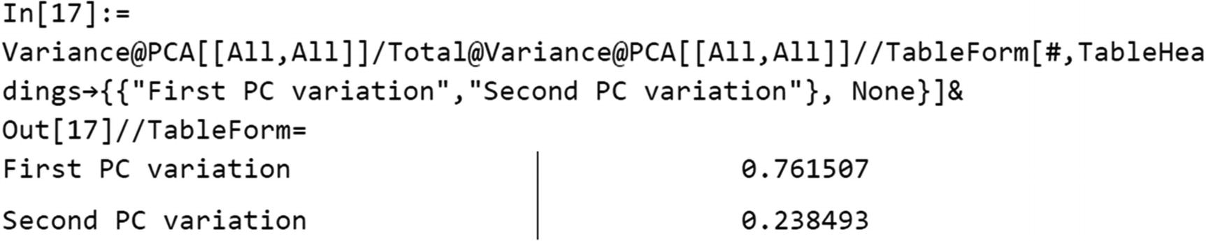
Dimensionality Reduction

Since the iris dataset consists of four features that are classified into three types of species , we will use the PCA method, as this method is used to reduce high-dimensionality problems. In this case, what we want is to represent these features through two main components. For this we proceed to standardize the data—that is, they have zero mean and standard deviation 1, since the variables with larger variance are more likely to affect the PCA.
In[14]:= ST=Standardize[iris[[All,{1,2,3,4}]]];(*Showing only the first 4 terms*)
%[[1;;4]]//TableForm
Out[14]//TableForm=
-0.897674    1.0156       -1.33575      -1.31105
-1.1392      -0.131539    -1.33575      -1.31105
-1.38073     0.327318     -1.3924       -1.31105
-1.50149     0.0978893    -1.2791       -1.31105
There are two ways to do the process, either using the DimensionReduce command or the DimensionReduction command, which are used to reduce the dimensions of the data. The difference between the two is that the first returns the values as a list. The second returns a DimensionReducerFunction (Figure 8-35) as output as in the case of Predict and Classify. Both belong to the Wolfram Language special functions for machine learning. For this case we will use the DimensionReduction command. Since we have the data, we introduce the standardized data as arguments, followed by specified target dimensions (2), with the as “PrincipalComponentAnalysis” method. This will give us the DimensionReducerFunction that will assign us the name of DR.
In[15]:= DR=DimensionReduction[ST,2,Method→"PrincipalComponentsAnalysis"]
Out[15]=
../images/500903_1_En_8_Chapter/500903_1_En_8_Fig35_HTML.jpg
Figure 8-35

DimensionReductionFunction object

The properties of the function are “ReducedVectors” (list of reduced vectors), “OriginalData” (deduction from the original data list given the reduced vectors), “ReconstructedData” (data reconstruction by reduction and inversion), “ImputedData” (missing values replaced by imputed ones). We call the function for the standardized data values, showing the first five. The coordinates x and y will be for the principal components 1 and 2, respectively.
In[16]:= PCA=DR[ST,"ReducedVectors"];
TableForm[%[[1;;5]],TableHeadings→{None, {"First Principal Component","Second Principal Component"}},TableAlignments→Center]
Out[16]//TableForm=
First Principal Component        Second Principal Component
             -2.2647                      0.480027
            -2.08096                     -0.674134
            -2.36423                     -0.341908
            -2.29938                     -0.597395
            -2.38984                      0.646835

This calculates the variance of each component , followed by the total to find the proportion of variance explained. Observing that PC1 seems to represent 76% of the data dispersion, and PC2 seems to represent 23%. To obtain the accumulated percentage we add the variations of each component. To view more depth about the proportion of variation refer to An Introduction to Statistical Learning: With Applications in R (James, G., Witten, D., Hastie, T., & Tibshirani, R. ; 1st ed. 2013, Corr. 7th printing 2017 ed.: Springer).

../images/500903_1_En_8_Chapter/500903_1_En_8_Figa_HTML.jpg
We look at the plot (Figure 8-36) of the main components made by the previous process. If you look over the complete iris data from the ExampleData, the first 50 elements correspond to the setosa specie, the next 50 to versicolor, and the last 50 to virginica.
In[18]:= Labels={Style["First principal component",Black,Bold],Style["Second Principal component",Black,Bold]};
ListPlot[{PCA[[1;;50]],PCA[[51;;100]],PCA[[100;;150]]},PlotLegends→Placed[{Placeholder["setosa"],Placeholder["versicolor"],Placeholder["virginica"]},Right],PlotMarkers→"OpenMarkers",GridLines→All,Frame→True,Axes→False,FrameTicks→All,FrameLabel→Labels]
Out[18]=
../images/500903_1_En_8_Chapter/500903_1_En_8_Fig36_HTML.jpg
Figure 8-36

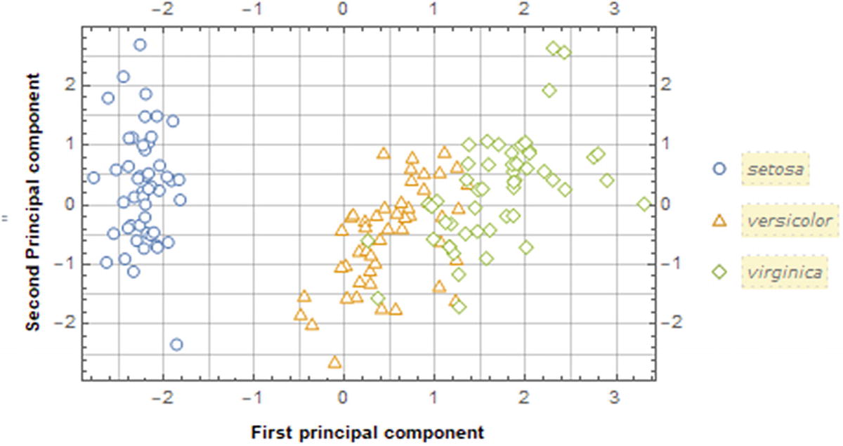
Scatter plot of the two principal components

Applying K-Means

Now let’s find the clusters with K-means, using the Manhattan distance. By specifying to look for three clusters; we are making the assumption that the data can be divided into three clusters. This is because we know that the original data belongs to three species (setosa, versicolor, and virginica). The plot of the clusters is shown here (Figure 8-37), with their respective centroids. When choosing the k-means method, suboptions can be added, like InitialCentroids. Costume start centroids (a list of centroid coordinates) can be typed or we can leave the automatic option. To enter the centroids coordinates, we use the following form Method → {“KMeans”,”InitialCentroids” → {{x1,y1}, {x2,y2}, {x3,y3} ... }}, where x1, y1 represent the centroid of the C1 (cluster 1). Initial centroids will not be given to the command FindClusters to keep some sort of randomness.
In[19]:= Clstr=FindClusters[PCA,3,Method→"KMeans",DistanceFunction→SquaredEuclideanDistance,RandomSeeding→8888];
ListPlot[Clstr,PlotRange→All,Frame→True,AspectRatio→0.8,Axes→False,PlotStyle→{ColorData[97,1],ColorData[97,2],ColorData[97,3]},PlotLabel→Style["K-means clustering for K=3",FontFamily→"Times",Black,20,Italic],FrameTicks→All,PlotLegends→Placed[{Placeholder[Style["Cluster 1",Bold,Black,10]],Placeholder[Style["Cluster 2",Bold,Black,10]],Placeholder[Style["Cluster 3",Bold,Black,10]]},Right],PlotMarkers→ "OpenMarkers",FrameLabel→Labels,GridLines→All,Epilog→{Opacity[1],PointSize[0.01],Point[Mean@Clstr[[1,All]]],Point[Mean@Clstr[[2,All]]],Point[Mean@Clstr[[3,All]]]}]
Out[19]=
../images/500903_1_En_8_Chapter/500903_1_En_8_Fig37_HTML.jpg
Figure 8-37

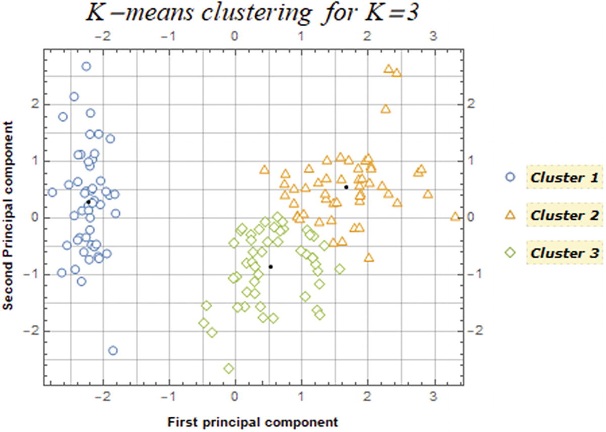
3 clusters identified of the two principal components

In Figure 8-37, it appears that the method clearly identifies the left points as a single cluster (setosa specie), whereas some of the points between clusters 2 and 3 might be misclassified.

Chaining the Distance Function

Changing the DistanceFunction can modify how the clusters are arranged, the next code shows the plot for k = 3 and choosing a different distance function. In the next block of code, the computation of the clusters is made for the same k (3), with a different distant function and stored into their respective variables. Then the clusters are plotted (Figure 8-38) for each of the different distance functions, and finally they are displayed within a graphic grid.
In[20]:= {ED,MhD,ChD,CosD}={FindClusters[PCA,3,PerformanceGoal→#1,Method→#2,DistanceFunction→EuclideanDistance,RandomSeeding→#3],FindClusters[PCA,3,PerformanceGoal→#1,Method→#2,DistanceFunction→ManhattanDistance,RandomSeeding→#3],FindClusters[PCA,3,PerformanceGoal→#1,Method→#2,DistanceFunction→ChessboardDistance,RandomSeeding→#3],FindClusters[PCA,3,PerformanceGoal→#1,Method→#2,DistanceFunction→CosineDistance,RandomSeeding→#3]}&["Quality","KMeans",8888];
{EDplt,MhDplt,ChDplt,CosDplt}={
ListPlot[ED,Frame→#1,AspectRatio→#2,PlotMarkers→#3,PlotStyle→#4,GridLines→#5,PlotRange→#6,ImageSize→#7,FrameLabel→#8,Axes→#9,FrameTicks→#10,
Epilog→{Opacity@#11,PointSize@#12,Point[Mean@ED[[1,All]]],Point[Mean@ED[[2,All]]],Point[Mean@ED[[3,All]]]},PlotLabel→ Style["Euclidean Distance",Black]],
ListPlot[MhD,Frame→#1,AspectRatio→#2,PlotMarkers→#3,PlotStyle→#4,GridLines→#5,PlotRange→#6,ImageSize→#7,FrameLabel→#8,Axes→#9,FrameTicks→#10,
Epilog→{Opacity@#11,PointSize@#12,Point[Mean@MhD[[1,All]]],Point[Mean@MhD[[2,All]]],Point[Mean@MhD[[3,All]]]},PlotLabel→ Style["Manhattan Distance",Black]],
ListPlot[ChD,Frame→#1,AspectRatio→#2,PlotMarkers→#3,PlotStyle→#4,GridLines→#5,PlotRange→#6,ImageSize→#7,FrameLabel→#8,Axes→#9,FrameTicks→#10,
Epilog→{Opacity@#11,PointSize@#12,Point[Mean@ChD[[1,All]]],Point[Mean@ChD[[2,All]]],Point[Mean@ChD[[3,All]]]},PlotLabel→ Style["Chessborad Distance",Black]],
ListPlot[CosD,Frame→#1,AspectRatio→#2,PlotMarkers→#3,PlotStyle→#4,GridLines→#5,PlotRange→#6,ImageSize→#7,FrameLabel→#8,Axes→#9,FrameTicks→#10,
Epilog→{Opacity@#11,PointSize@#12,Point[Mean@CosD[[1,All]]],Point[Mean@CosD[[2,All]]],Point[Mean@CosD[[3,All]]]},PlotLabel→ Style["Cosine Distance",Black]]
}&[True,0.8,"OpenMarkers",{ColorData[97,1],ColorData[97,2],ColorData[97,3]},All,Automatic,300,Labels,False,All,1,0.03];
LegendsText={Placeholder[Style["Cluster 1",Bold,Black,10]],Placeholder[Style["Cluster 2",Bold,Black,10]],Placeholder[Style["Cluster 3",Bold,Black,10]]};
Labeled[Legended[GraphicsGrid[{{EDplt,MhDplt},{ChDplt,CosDplt}},Frame→All,Background→White,Spacings→1],PointLegend[{ColorData[97,1],ColorData[97,2],ColorData[97,3]},LegendsText,LegendMarkers→"OpenMarkers"]],Style["K-means clustering for K=3",FontFamily→"Times",Black,20,Italic],Top]
Out[20]=
../images/500903_1_En_8_Chapter/500903_1_En_8_Fig38_HTML.jpg
Figure 8-38

K-means clustering for K = 3, for different distance functions

As seen in Figure 8-38, the clusters can have different arrangements with different distance functions; one thing to note also is that the clusters centroids change in each of the subfigures (Figure 8-38).

Different K’s

Having seen that for different distance functions the clusters can vary, let’s now construct the process but with different K’s—that is, for k= 2, 3, 4, and 5, as exhibited in Figure 8-39.
In[21]:= {K2,K3,K4,K5}={FindClusters[PCA,2,PerformanceGoal→#1,Method→#2,DistanceFunction→#3,RandomSeeding→#4],FindClusters[PCA,3,PerformanceGoal→#1,Method→#2,DistanceFunction→#3,RandomSeeding→#4],FindClusters[PCA,4,PerformanceGoal→#1,Method→#2,DistanceFunction→#3,RandomSeeding→#4],FindClusters[PCA,5,PerformanceGoal→#1,Method→#2,DistanceFunction→#3,RandomSeeding→#4]}&["Speed","KMeans",SquaredEuclideanDistance,8888];
{PK2,PK3,PK4,PK5}={
ListPlot[K2,Frame→#1,AspectRatio→#2,PlotMarkers→#3,PlotStyle→#4,GridLines→#5,PlotRange→#6,ImageSize→#7,FrameLabel→#8,Axes→#9,FrameTicks→#10,
Epilog→{Opacity@#11,PointSize@#12,Point[Mean@K2[[1,All]]],Point[Mean@K2[[2,All]]]},PlotLabel→ Style["K=2",Black]],
ListPlot[K3,Frame→#1,AspectRatio→#2,PlotMarkers→#3,PlotStyle→#4,GridLines→#5,PlotRange→#6,ImageSize→#7,FrameLabel→#8,Axes→#9,FrameTicks→#10,
Epilog→{Opacity@#11,PointSize@#12,Point[Mean@K3[[1,All]]],Point[Mean@K3[[2,All]]],Point[Mean@K3[[3,All]]]},PlotLabel→ Style["K=3",Black]],
ListPlot[K4,Frame→#1,AspectRatio→#2,PlotMarkers→#3,PlotStyle→#4,GridLines→#5,PlotRange→#6,ImageSize→#7,FrameLabel→#8,Axes→#9,FrameTicks→#10,
Epilog→{Opacity@#11,PointSize@#12,Point[Mean@K4[[1,All]]],Point[Mean@K4[[2,All]]],Point[Mean@K4[[3,All]]],Point[Mean@K4[[4,All]]]},PlotLabel→ Style["K=4",Black]],
ListPlot[K5,Frame→#1,AspectRatio→#2,PlotMarkers→#3,PlotStyle→#4,GridLines→#5,PlotRange→#6,ImageSize→#7,FrameLabel→#8,Axes→#9,FrameTicks→#10,
Epilog→{Opacity@#11,PointSize@#12,Point[Mean@K5[[1,All]]],Point[Mean@K5[[2,All]]],Point[Mean@K5[[3,All]]],Point[Mean@K5[[4,All]]],Point[Mean@K5[[5,All]]]},PlotLabel→ Style["K=5",Black]]
}&[True,0.8,"OpenMarkers",{ColorData[97,1],ColorData[97,2],ColorData[97,3],ColorData[97,4],ColorData[97,5]},All,Automatic,260,Labels,False,All,1,0.015];
LegendsText2={Placeholder[Style["Cluster 1",Bold,Black,10]],Placeholder[Style["Cluster 2",Bold,Black,10]],Placeholder[Style["Cluster 3",Bold,Black,10]],Placeholder[Style["Cluster 4",Bold,Black,10]],Placeholder[Style["Cluster 5",Bold,Black,10]]};
Labeled[Legended[GraphicsGrid[{{PK2,PK3},{PK4,PK5}},Frame→All,Background→White,Spacings→1],PointLegend[{ColorData[97,1],ColorData[97,2],ColorData[97,3],ColorData[97,4],ColorData[97,5]},LegendsText2,LegendMarkers→"OpenMarkers"]],Style["K-means clustering for K=2,3,4,5",FontFamily→"Times",Black,20,Italic],Top]
Out[21]=
../images/500903_1_En_8_Chapter/500903_1_En_8_Fig39_HTML.jpg
Figure 8-39

K-means for K from 2 to 5

As seen in the Figure 8-39, the arrangement of the clusters also depends on the number of k’s. Complementing with ClusteringComponents, we can count the number of labels register for a k = 3.
In[22]:=ClusteringComponents[Clstr,3,2,Method→"KMeans",DistanceFunction→SquaredEuclideanDistance,RandomSeeding→8888]
Out[22]={{1,1,1,1,1,1,1,1,2,1,1,1,1,1,1,1,1,1,1,1,1,1,1,1,1,2,1,1,1,1,1,1,1,1,1,1,1,1,1,1,1,2,1,1,1,2,1,1,1,1},{3,3,3,3,3,3,3,3,3,3,3,3,3,3,3,3,3,3,3,3,3,3,3,3,3,3,3,3,3,3,3,3,3,3,3,3,3,3,3,3,3,3,3,3,3,3,3,3,3,3,3},{2,3,2,2,2,2,3,2,3,2,3,2,3,2,3,3,3,3,3,2,2,2,2,3,2,3,2,2,2,3,2,2,2,2,2,3,2,2,3,2,3,3,3,3,3,3,3,3,3}}
In[23]:= Counts[Flatten[%]]
Out[23]= <|1→46,2→29,3→75|>
Essentially, given a clustering problem, k-means technique is meant to be used for unlabeled data—that is, data without defined categories. Some factors that can alter the operation of the method include the following.
  • The spread, or how far apart the points are. This is reflected if the data contains outliers, which can be erroneously classified as part of a cluster, when visually the opposite is observed.

  • The dimensionality of the data. Given that more information and features are often added to the model, the number of dimensions grows. This type of problem can be solved using data transformation methods, as in the example seen from PCA, but with some restrictions, since the PCA method can have a loss of sensitive information on the features.

  • The value of k is determined manually, but when there are high values of the cost function, it can be interpreted that the intervariation of the clusters is high, and with low values of the cost function the intervariation of the clusters is low. The last two assumptions can also be attributed to the fact that for lower values of k, many observations can be grouped into large individual clusters, and for high values of k observations they can be a proper group.

Cluster Classify

Another command that belongs to the cluster functions is called ClusterClassify (Figure 8-40). This command works in the same way as Classify does. In the next example we will use this command to see how the k-means cluster classifies the species based on two features: Sepal length and Sepal width. We will split the data into halves when we randomly sample.
In[24]:=
 BlockRandom[
SeedRandom[88888];
RandomSample[iris[[All,{1,2}]]];
]
TrS=%[[1;;75]];
TsT=%%[[76;;150]];
In[25]:= CC=ClusterClassify[TrS,3,Method→"KMeans",DistanceFunction→Automatic,PerformanceGoal→"Speed",RandomSeeding→8888 ]
Out[25]=
../images/500903_1_En_8_Chapter/500903_1_En_8_Fig40_HTML.jpg
Figure 8-40

ClassifierFunction of the cluster classification model

Getting the classifier function (Figure 8-40), we can see the details of the classifier, and we can see the input vector is a numerical vector, the number of classes (three), the method, and the number of training examples.

Note

To correctly use the -means method, the number of clusters needs to be specified; otherwise the command will not execute correctly.

To see information about the classifier function, use Information (Figure 8-41).
In[26]:= Information[CC]
Out[26]=
../images/500903_1_En_8_Chapter/500903_1_En_8_Fig41_HTML.jpg
Figure 8-41

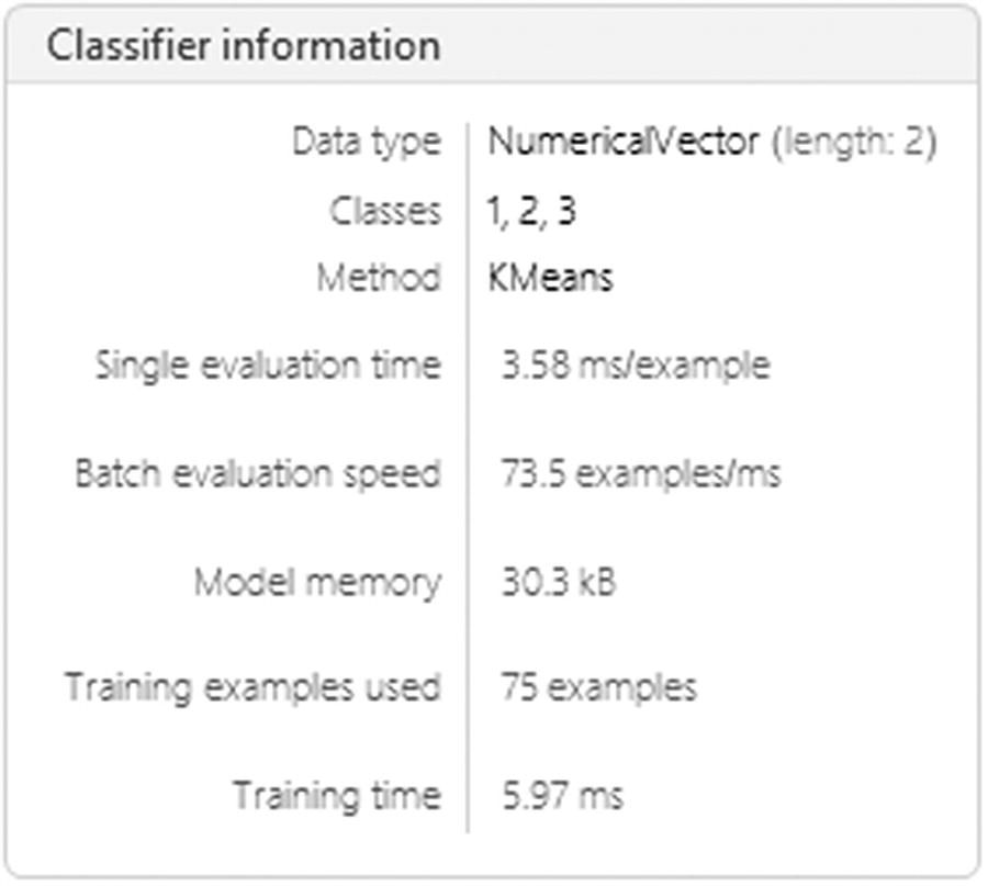
Classifier information for K-means

More detailed information about the classifier function is shown in Figure 8-41. To get the full list of properties, type “Properties”as a second argument. Many metrics, such as BatchEvaluationSpeed, BatchEvaluationTime, and TrainingTime, can be used to compare times with different methods.
In[27]:= Information[CC,"Properties"]
Out[27]= {BatchEvaluationSpeed,BatchEvaluationTime,Classes,ClassNumber,ClassPriors,DistanceFunction,EvaluationTime,ExampleNumber,FeatureNames,FeatureNumber,FeatureTypes,FunctionMemory,FunctionProperties,IndeterminateThreshold,LearningCurve,MaxTrainingMemory,Method,MethodDescription,MethodOption,PerformanceGoal,Properties,TrainingClassPriors,TrainingTime,UtilityFunction}
Let’s now get the information about the classes identified from the cluster classifier, the number of classes, distance function, feature names, and the training class probabilities.
In[28]:= Information[CC,#]&/@{"Classes","ClassNumber","DistanceFunction","FeatureNames","TrainingClassPriors"}
Out[28]= {{1,2,3},3,EuclideanDistance,{f1},<|1→0.373333,2→0.293333,3→0.333333|>}
We can see that there are three classes: class 1, class 2 and class 3. The distance function used is EuclideanDistance, and the numeric vector features are referred to by the name f1. A simple example is used, by choosing a sepal length of 1 and sepal width of 2, to show the different properties that can be used when testing the data; this is shown in the dataset form (Figure 8-42). The example is first written followed by the properties Decision (cluster that belongs the example), Distribution (categorical distribution object for histogram plots), ExpectedUtilities (expected probabilities and indeterminate threshold), LogProbabilities (log probabilities), Probabilities (probabilities of the test data based on classes), and TopProbabilities (best probabilities for the test data).
In[29]:= Dataset[AssociationMap[CC[{1,2},#]&,{"Decision","Distribution","ExpectedUtilities","LogProbabilities","Probabilities","TopProbabilities"}]]
Out[29]=
../images/500903_1_En_8_Chapter/500903_1_En_8_Fig42_HTML.jpg
Figure 8-42

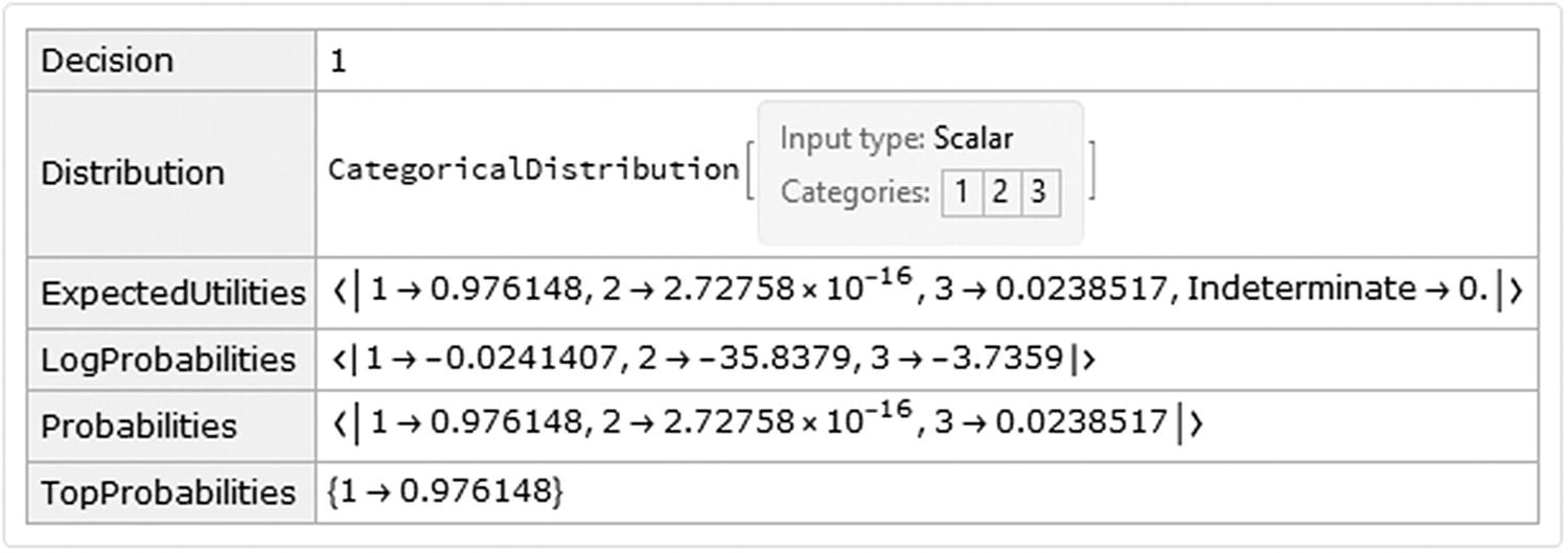
Dataset of the simple example

We can see that the example belongs to the third cluster and that the associated probability is 1 → 0.976148. Let’s look at the rest of the data and plot the cluster classification.

The classified data plot is shown in Figure 8-43.
In[30]:= ListPlot[Pick[TsT,CC[TsT],#]&/@{1,2,3},PlotMarkers→"OpenMarkers",GridLines→Automatic,PlotLegends→{Placeholder[Style["Cluster 1",Bold,Black,10]],Placeholder[Style["Cluster 2",Bold,Black,10]],Placeholder[Style["Cluster 3",Bold,Black,10]]},Frame→True,FrameTicks→All,FrameLabel→{"Sepal Lenght","Sepal Width"}]
Out[30]=
../images/500903_1_En_8_Chapter/500903_1_En_8_Fig43_HTML.jpg
Figure 8-43

Cluster classification on the example of the iris data for the first two features

As a complement, a probability restriction for values below an established probability value can be added, with IndeterminateThreshold, as depicted in Figure 8-44.
In[31]:= ListPlot[Pick[TsT,CC[TsT,IndeterminateThreshold→ 0.6],#]&/@{1,2,3,Indeterminate},PlotMarkers→ "OpenMarkers",PlotLegends→{Placeholder[Style["Cluster 1",Bold,Black,10]],Placeholder[Style["Cluster 2",Bold,Black,10]],Placeholder[Style["Cluster 3",Bold,Black,10]],Placeholder[Style["Indeterminate",Bold,Black,10]]},Frame→True,FrameTicks→All,FrameLabel→{"Sepal Lenght","Sepal Width"},GridLines→Automatic]
Out[31]=
../images/500903_1_En_8_Chapter/500903_1_En_8_Fig44_HTML.jpg
Figure 8-44

Cluster classification on the example of the iris data for the first two features with a probability restriction

..................Content has been hidden....................

You can't read the all page of ebook, please click here login for view all page.
Reset
3.15.175.101