Chapter 1. Gaining Early Insights from Textual Data
One of the first tasks in every data analytics and machine learning project is to become familiar with the data. In fact, it is always essential to have a basic understanding of the data to achieve good and robust results. Descriptive statistics provides valueable insights and helps to assess data quality and distribution.
Considering texts, frequency analysis of words and phrases is one of the main methods for data exploration. Though absolute word frequencies usually are not very interesting, relative or weighted frequencies are. When analyzing a text about politics, the most common words will probably contain many obvious and unsurprising terms such as “people”, “country”, “government”, etc. But if you compare relative word frequencies in texts from different political parties or politicians even from the same party, you can learn a lot from the differences.
Chapter 1. What you will learn and what we will build
This chapter presents blueprints for the statistical analysis of text. It gets you started quickly and introduces basic concepts which you will need to know in subsequent chapters. We will start by analyzing categorical metadata and then focus on word frequency analysis and visualization.
After studying this chapter you will have basic knowledge about text processing and analysis. You will know how to tokenize text, filter stop words, and analyze textual content with frequency diagrams and word clouds. We will also introduce TF-IDF weighting as an important concept that will be picked up later in the book for text vectorization.
The blueprints in this chapter focus on quick results and follow the KISS principle: “Keep it simple, stupid!” Thus, we primarily use Pandas as our library of choice for data analysis in combination with regular expressions and Python core functionality. Advanced linguistic methods for data preparation will be discussed in [Link to Come].
Exploratory Data Analysis
Exploratory data analysis denotes the process of systematically examining data on an aggregated level. Typical methods include summary statistics for numerical features as well as frequency counts for categorical features. Histograms and boxplots are used to illustrate the distribution of values, time-series plots to show their evolution.

Figure 1-1. Statistical Features for Text Data Exploration
A dataset consisting of text documents like news, tweets, emails, or service calls is called a corpus in natural language processing. The statistical exploration of such a corpus has different facets. Some analyses focus on metadata attributes while others deal with the textual content. Figure 1-1 shows typical attributes of a text corpus, some of which are included in the data source while others could be calculated or derived. The document metadata comprise multiple descriptive attributes, which are useful for aggregation and filtering. Time-like attributes are essential to understand the evolution of the corpus. If available, author-related attributes allow us to analyze groups of authors and to benchmark these groups against each other.
Statistical analysis of the content is based on frequencies of words and phrases. With the linguistic data preprocessing methods described in [Link to Come], we will extend the space of analysis to certain word types and named entities. Besides that, descriptive scores for the documents could be included in the data set or derived by some kind of feature modeling. For example, the number of replies to a user’s post could be taken as a measure of popularity. And finally, interesting soft facts like sentiment or emotionality scores can be determined by one of the methods described later in this book.
Note that absolute figures are generally not very interesting when working with texts. The mere fact that the word “problem” appears 100 times does not contain any relevant information. But the fact that the relative frequency of “problem” has doubled within a week can be very remarkable.
Introducing the Dataset
Analysis of political texts, be it news or programs of political parties or parliamentary debates, can give interesting insights on national and international topics. Often, texts from many years are publicly available, so that an insight into the zeitgeist can be gained. So let’s jump in to the role of a political analyst who wants to develop a first feeling for the analytical potential of such a data set.
In this chapter, we will work with the UN General Debate dataset. The corpus consists of 7,507 speeches held at the annual sessions of the United Nations General Assembly from 1970 to 2016. It was created in 2017 by Mikhaylov, Baturo, and Dasandi from Harvard “for understanding and measuring state preferences in world politics”1. Each of the almost 200 countries in the U.N. has the opportunity to present its views on global topics like international conflicts, terrorism or climate change at the annual General Debate.
The original data set on Kaggle is provided in form of two CSV files, a big one containing the speeches and a smaller one with information about the speakers. To simplify matters at this point, we prepared a single zipped CSV file containing all information. The code for the preparation as well as the resulting file can be found in our Github repository2.
In Pandas, a CSV file can be loaded with the pd.read_csv(). Let’s load the file and display two random records of the data frame (see [Link to Come]).
file=f"{BASE_DIR}/data/un-general-debates/un-general-debates-blueprint.csv.gz"df=pd.read_csv(file)df.sample(2,random_state=53)
The first two columns, session number and year make can be considered the primary key of the table. Column county contains a standardized three letter country ISO code and is followed by a the textual description. Then we have two columns about the speaker and his position. The last column contains the actual text of the speech.
Our data set is small, it contains only a few thousand records. This is very good to learn and experiment as we do not run into performance problems. If your data set is larger, check out the side bar on “Working with Large Data Sets” for options.
Blueprint: Getting an Overview of the Data with Pandas
In our first blueprint we use only metadata and record counts to explore data distribution and quality; we do not yet look at the textual content. We work through the following steps:
- Calculate summary statistics
- Check for missing values
- Plot distributions of interesting attributes
- Compare distributions across categories
- Visualize developments over time
Before we can start analyzing the data, we need at least some information about the structure of the data frame. Table 1-1 shows some important descriptive properties resp. functions. We will frequently use df.columns to retrieve the column names.
df.columns |
list of column names | |
df.dtypes |
tuples (column name, data type) | strings are represented as object below Pandas 1.0 |
df.info() |
dtypes plus memory consumption | use with memory_usage='deep' for good estimates on text |
df.describe() |
summary statistics | use with include='O' for categorical data |
Calculating Summary Statistics for Columns
Pandas’ describe function computes statistical summaries for the columns of the data frame. It works on a single series as well as on the complete data frame. The default output in the latter case is restricted to numerical columns. Currently, our data frame only contains the session number and the year as numerical data. Let’s add a new numerical column to the data frame containing the text length to get some additional information about the distribution of the lengths of the speeches. We recommend to transpose the result with describe().T to switch rows and columns in the representation.
df['length']=df['text'].str.len()df.describe().T
| count | mean | std | min | 25% | 50% | 75% | max | |
|---|---|---|---|---|---|---|---|---|
| session | 7507.00 | 49.61 | 12.89 | 25.00 | 39.00 | 51.00 | 61.00 | 70.00 |
| year | 7507.00 | 1994.61 | 12.89 | 1970.00 | 1984.00 | 1996.00 | 2006.00 | 2015.00 |
| length | 7507.00 | 17967.28 | 7860.04 | 2362.00 | 12077.00 | 16424.00 | 22479.50 | 72041.00 |
| no_tokens | 7507.00 | 1465.25 | 630.51 | 186.00 | 994.00 | 1343.00 | 1829.50 | 5618.00 |
describe() without additional parameters computes the total count of values, their mean and standard deviation as well as a five-number summary3 of only the numerical columns. The data frame contains 7,507 entries for session, year and length. Mean and standard deviation do not make much sense for year and session, but minimum and maximum are still interesting. Obviously, our data set contains speeches from the 25th to the 70th UN General Debate sessions, spanning a time range from 1970 to 2015.
A summary for non-numerical columns can be produced by specifying include='O' (alias for np.object). In this case, we also get the count, the number of unique values, the top-most element (or one of them if there are many with the same number of occurrences) and its frequency. As the number of unique values is not useful for textual data, let’s just analyze the country and speaker columns.
df[['country','speaker']].describe(include='O').T
| count | unique | top | freq | |
|---|---|---|---|---|
| country | 7507 | 199 | JPN | 46 |
| speaker | 7507 | 5429 | unkown | 27 |
The data set contains data from 199 unique countries and apparingly 5428 speakers. The number of countries is valid, as this column contains standardized ISO codes. But counting unique values of text columns like speaker usually does not give valid results as we will show in the next section.
Checking for Missing Data
By looking at the counts in table above we can see that the speaker column has missing values. So let’s check all columns for null values by df.isna() (alias to df.isnull()) and compute a summary of the result:
df.isna().sum()
session            0
year               0
country            0
country_name       0
speaker            0
position        3005
text               0
length             0
tokens             0
no_tokens          0
bigrams            0
dtype: int64
Good to know that we need to be careful using the speaker and position columns, as this output tells us that is not always available! To prevent any problems, we could substitute the missing values with some generic value like “unknown speaker” or “unknown position” or just the empty string. Pandas supplies the function df.fillna() for that purpose.
df['speaker'].fillna('unkown',inplace=True)
But even the existing values can be problematic, because the same speaker is sometimes spelled differently or even ambiguously. The following statement computes the number of records per speaker for all documents containing “Bush” in the speaker column:
df[df['speaker'].str.contains('Bush')]['speaker'].value_counts()
George W. Bush        4
Mr. George W. Bush    2
Mr. George W Bush     1
George Bush           1
Bush                  1
Name: speaker, dtype: int64
Any analysis on speaker names would produce wrong results unless we’d resolve these ambiguities. Knowing this, we will ignore speaker information here. So you better check the column values for categorical attributes.
Plotting Value Distributions
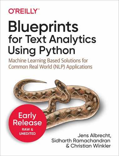
One way to visualize the five-number summary of a numerical distribution is a boxplot4. It can be easily produced by Pandas built-in plot functionality. Let’s have a look at the box plot for the length column:
df['length'].plot(kind='box',vert=False)
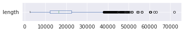
As illustrated by this plot, 50% percent of the speeches (the box in the middle) have a length between roughly 12,000 and 22,000 characters with the median at about 16,000 and a long tail with many outliers to the right. The distribution is obviously left-skewed. We can get some more details by plotting a histogram:
df['length'].plot(kind='hist',bins=30)
For the histogram, the value range of the length column is divided into 30 intervals of equal width, the bins. The y-axis shows the number of documents falling into each of these bins.
Comparing Value Distributions across Categories
Peculiarities in the data often become visible when different subsets of the data are examined. Nice visualizations to compare distributions across different categories is Seaborns catplot5.
We show box and violin plots to compare the distributions of the speech length of the five permanent members of the U.N. security council (Figure 1-2). Thus, the category for the x-axis of sns.catplot is country.
where=df['country'].isin(['USA','FRA','GBR','CHN','RUS'])sns.catplot(data=df[where],x="country",y="length",kind='box')sns.catplot(data=df[where],x="country",y="length",kind='violin')

Figure 1-2. Box plots (left) and violin plots (right) visualizing the distribution of speech lengths for selected countries
The violin plot is the “smoothed” version of a box plot. Frequencies are visualized by the width of the violin body, while the box is still visible inside the violin. Both plots reveal that the dispersion of values, in this case the lengths of the speeches, for Russia is much larger than for Great Britain. But the existence of multiple peaks as in Russia only becomes apparent in the violin plot.
Visualizing Developments over Time
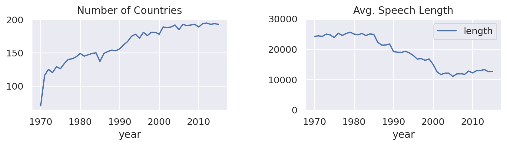
If your data contains date or time attributes, it is always interesting to visualize some developments within the data over time. The first plot shows the number of speeches per year. Pandas grouping function size() can be used to return the number of rows per group. By simply appending plot() we can visualize the resulting data frame ([Link to Come] left):
df.groupby('year').size().plot(title="Number of Countries")
The timeline basically reflects the development of the number of countries in the U.N., as each country is eligible for only one speech per year. Actually, the U.N. has 193 members today. Interestingly, the speech length needed to decrease with more countries entering the debates, as the following analysis reveals ([Link to Come] right):
df.groupby('year').agg({'length':'mean'}).plot(title="Avg. Speech Length",ylim=(0,30000))
Note
Note, that Pandas data frames can not only be easily visualized in Jupyter notebooks, but also be exported to Excel (xlsx), HTML, CSV, Latex and many other formats by built-in functions. There is even a to_clipboard() function. Check the documentation6 for details.
Blueprint: Building a Simple Text Preprocessing Pipeline
The analysis of metadata like categories, time, authors and other attributes gives some first insights on the corpus. But it’s much more interesting to dig deeper into the actual content and explore frequent words in different subsets or time periods. In this section, we will develop a basic blueprint to prepare text for a quick first analysis consisting of a simple sequence of steps (Figure 1-3). As the output of one operation forms the input of the next one, such a sequence is also called a processing pipeline which transforms the original text in to a number of tokens.

Figure 1-3. Simple Preprocessing Pipeline
The pipeline presented here consists of three steps: Case-folding into lower case, tokenization and stop word removal. These steps will be discussed in depth and extended in [Link to Come], where we make use of spaCy. To keep it fast and simple here, we build our own tokenizer based on regular expressions and show how to use an arbitrary stop word list.
Tokenization with Regular Expressions
Tokenization is the process of extracting words out of a sequence of characters. In western languages, words are often separated by whitespaces and punctuation characters. Thus, the simplest and fastest tokenizer is Pythons native str.split() method which splits on whitespace. A more flexible way is to use regular expressions.
Regular expressions and the Python libraries re and regex will be introduced in more detail in [Link to Come]. Here, we want to apply a simple pattern that matches words and discards numbers. Words in our definition consist of at least one letter as well es digits and hyphens. Numbers are skipped because they almost exclusively represent dates or speech resp. session identifiers in this corpus.
The frequently used expression [A-Za-z] is not a good option for matching letters because it misses accented letters like ä or â. Much better is the POSIX character class p{L} which selects all unicode letters. Note, that we need the regex library instead of re to work with POSIX character classes. The expression below matches tokens consisting of alphanumeric characters (w includes digits, letters and underscore) and hyphens which contain at least one letter.
importregexasredeftokenize(text):returnre.findall(r'[w-]*p{L}[w-]*',text)
Let’s try it with a sample sentence from the corpus:
text="Let's defeat SARS-CoV-2 together in 2020!"tokens=tokenize(text)("|".join(tokens))
Let|s|defeat|SARS-CoV-2|together|in
Treating Stop Words
The most frequent words in texts are very common words like determiners, auxiliary verbs, pronouns, adverbs and so on. These words are called stop words. Stop words usually don’t carry much information but hide interesting content because of their high frequencies. Therefore, stop words are often removed before the actual analysis or model creation.
In this section, we will discard stop words contained in a predefined list. Common stop word lists are available for many languages and integrated in almost any NLP library. Note that filtering frequent words or filtering based word types (part-of-speech), as illustrated in later chapters, are in many cases better methods.
The method to remove stop words from a given list, wrapped into a simple function below, consists of a simple list comprehension. We will work with NLTK’s set of stop words here, but you could use any set of words as a filter10. If you need a list for lookup, you should always convert it to a set. Sets are hash-based structures like dictionaries with constant lookup time. For the check, tokens are converted to lower-case as NLTK’s list contains only lower-case words.
importnltkstopwords=set(nltk.corpus.stopwords.words('english'))defremove_stop(tokens):return[tfortintokensift.lower()notinstopwords]
Often you’ll need to add domain-specific stop words to the predefined list. For example, if you are analyzing emails, the terms “dear” and “regards” will probably appear in almost any document. On the other hand you might want to treat some of words in the predefined list as non-stop words. We can add additional stop words and exclude others from the list using Python’s set operators | (union/or) and - (difference).
include_stopwords={'dear','regards','must','would','also'}exclude_stopwords={'against'}stopwords|=include_stopwordsstopwords-=exclude_stopwords
In addition to or instead of a such fix list of stop words it can be helpful to treat every word that appears in more than e.g. 80% of the documents as a stop word. Such common words make it difficult to distinguish content. The parameter max_df of the Scikit-Learn vectorizers which will be introduced in [Link to Come] does exactly this.
The stop word list from NLTK is very conservative and contains only 179 words. Surprisingly, would is not considered a stop word, while wouldn’t is. This illustrates a common problem with predefined stop word lists: inconsistency. Be also aware that removing stop words can significantly affect the performance of semantically targeted analyses as explained in the sidebar.
Processing a Pipeline with one Line of Code
Let’s get back to the data frame containing the documents of our corpus. We want to create a new column tokens containing the lower-cased, tokenized text without stop words for each document. For that, we use an extensible pattern for a processing pipeline. In our case, we will change all text to lower case, tokenize it and remove stop words. Other operations can be added by simply extending the pipeline.
pipeline=[str.lower,tokenize,remove_stop]defprepare(text,pipeline):tokens=textfortransforminpipeline:tokens=transform(tokens)returntokens
If we put all this into a function, it becomes a perfect use case for Pandas map respectively apply operation. Functions like map and apply which take other functions as parameters are called higher-order functions in mathmatics and computer science.
Series.map |
works element by element on a Pandas Series |
Series.apply |
same as map but allows additional parameters |
DataFrame.applymap |
element by element on a Pandas DataFrame (same as map on Series) |
DataFrame.apply |
works on rows or columns of a DataFrame and supports aggregation |
Pandas supports the different higher-order functions on series and data frames (Table 1-2).
These functions not only allow to specify a series of functional data transformations in a comprehensible way but they can also be easily parallelized. The Python package pandarallel11 for example provides parallel versions of map and apply.
Scalable frameworks like Apache Spark12 support similar operations on data frames even more elegantly. In fact, the map and reduce operations in distributed programming are based on the same principle of functional programming. Besides that, many programming languages, including for example Python and JavaScript, have a native map operation for lists or arrays.
Using one of Pandas higher-order operations, applying a functional transformation becomes a one-liner:
df['tokens']=df['text'].apply(prepare,pipeline=pipeline)
The tokens column now consists of Python lists containing the extracted tokens for each document. Of course, this additional column basically doubles memory consumption of the data frame, but it allows to quickly access the tokens directly for further analyses. Nevertheless, the following blueprints are designed in such a way that the tokenization can also be performed “on-the-fly” during analysis. In this way, performance can be traded for memory consumption: either tokenize once before analysis and consume memory or tokenize on the fly and wait.
We also add another column containing the length of the token list for later summarizations:
df['no_tokens']=df['tokens'].map(len)
Note
tqdm (pronounced taqadum for progress in Arabic) is a great library for progress bars in Python. It supports conventional loops, e.g. by using tqdm_range instead of range, and Pandas by providing progress_map and progress_apply operations on data frames. Check out the documentation13 for details. Our accompanying notebooks use these operations, but we stick to plain Pandas in the book.
Blueprints for Word Frequency Analysis
Frequently used words and phrases can give us some basic understanding of the discussed topics. However, word frequency analyses ignore the order and the context of the words. This is the idea of the famous bag-of-words model (see also [Link to Come]): All the words are thrown into a bag where they tumble into a jumble. The original arrangement in the text is lost, only the frequency of the terms is taken into account. This model does not work well for complex tasks like sentiment analysis or question answering, but it works surprisingly well for classification and topic modeling. And it’s a good starting point for understanding what the texts are all about.
In this section we will develop a number of blueprints to calculate and visualize word frequencies. As raw frequencies overweight unimport but frequent words, we will also introduce TF-IDF weighting in the last subsection. We implement the frequency calculation by using a Counter because it is very simple and extremely fast. In fact, this approach is very similar to how Scikit-Learn’s CountVectorizer resp. TfIdfVectorizer classes work internally.
Blueprint: Counting Words with a Counter
Python’s standard library has a built-in class Counter which does exactly this: counting things14. The easiest way to work with a counter is to create it from a list of items, in our case strings representing the words or tokens. The resulting counter is basically a dictionary object containing those items as keys and their frequencies as values. Let’s illustrate its functionality with a simple example.
fromcollectionsimportCountertokens=tokenize("She likes my cats and my cats like my sofa.")counter=Counter(tokens)(counter)
Counter({'my': 3, 'cats': 2, 'She': 1, 'likes': 1, 'and': 1, 'like': 1, 'sofa': 1})
The counter requires a list as input, so any text needs to be tokenized in advance. What’s nice about the counter is that it can be incrementally updated with a list of tokens of a second document:
more_tokens=tokenize("She likes dogs and cats.")counter.update(more_tokens)(counter)
Counter({'my': 3, 'cats': 3, 'She': 2, 'likes': 2, 'and': 2, 'like': 1, 'sofa': 1, 'dogs': 1})
To find the most frequent words within a corpus, we need to create a counter from the list of all words in all documents. A naive approach would be to concatenate all documents into a single, giant list of tokens, but that does not scale for larger datasets. It is much more efficient to call the update function of the counter object for each single document.
counter=Counter()df['tokens'].map(counter.update)
We do a little trick here and put the counter.update in the map function. The magic happens inside the update function under the hood. The whole map call runs extremely fast, it takes only about 3s for the 7,500 UN speeches and scales linearly with the total number of tokens. The reason is that dictionaries in general and counters in particular are implemented as hash tables. And a single counter is pretty compact compared to the whole corpus: It contains each word only once, along with its frequency.
Now we can retrieve the most common words in the text with the respective counter function:
(counter.most_common(5))
[('nations', 124508),
 ('united', 120763),
 ('international', 117223),
 ('world', 89421),
 ('countries', 85734)]
For further processing and analysis, it is much more convenient to transform the counter into a Pandas data frame and this is what the following blueprint function finally does.
The tokens make up the index of the data frame while the frequency values are stored in a column named freq. The rows are sorted so that the most frequent words appear at the head.
defcount_words(df,column='tokens',preprocess=None,min_freq=2):# process tokens and update counterdefupdate(doc):tokens=docifpreprocessisNoneelsepreprocess(doc)counter.update(tokens)# create counter and run through all datacounter=Counter()df[column].map(update)# transform counter into data framefreq_df=pd.DataFrame.from_dict(counter,orient='index',columns=['freq'])freq_df=freq_df.query('freq >= @min_freq')freq_df.index.name='token'returnfreq_df.sort_values('freq',ascending=False)
The function takes as first parameter a Pandas data frame and as second parameter the column name containing the tokens or the text. As we already stored the prepared tokens in the column tokens of the data frame containing the speeches, we can use the following to lines of code to compute the data frame with word frequencies and display the top five tokens.
freq_df=count_words(df)freq_df.head(5)
| freq | |
|---|---|
| token | |
| nations | 124508 |
| united | 120763 |
| international | 117223 |
| world | 89421 |
| countries | 85734 |
If we don’t want to use precomputed tokens for some special analysis, we could tokenize the text on the fly with a custom preprocessing function as third parameter. For example, we could generate and count all words with 10 or more characters with this on-the-fly tokenization of the text:
count_words(df,column='text',preprocess=lambdatext:re.findall(r"w{10,}",text))
The last parameter of count_words defines a minimum frequency of tokens to be included in the result. Its default is set to 2 to cut down the long tail of hapaxes, i.e. tokens occuring only once.
Blueprint: Creating a Frequency Diagram
There are dozens of ways to produce tables and diagrams in Python. We prefer Pandas with its built-in plot functionality because it is easier to use than plain Matplotlib. We assume a data frame freq_df generated by the previous blueprint for visualization. Creating a frequency diagram based on such a data frame now becomes basically a one-liner. We add two more lines for formatting:
ax=freq_df.head(15).plot(kind='barh',width=0.95)ax.invert_yaxis()ax.set(xlabel='Frequency',ylabel='Token',title='Top Words')
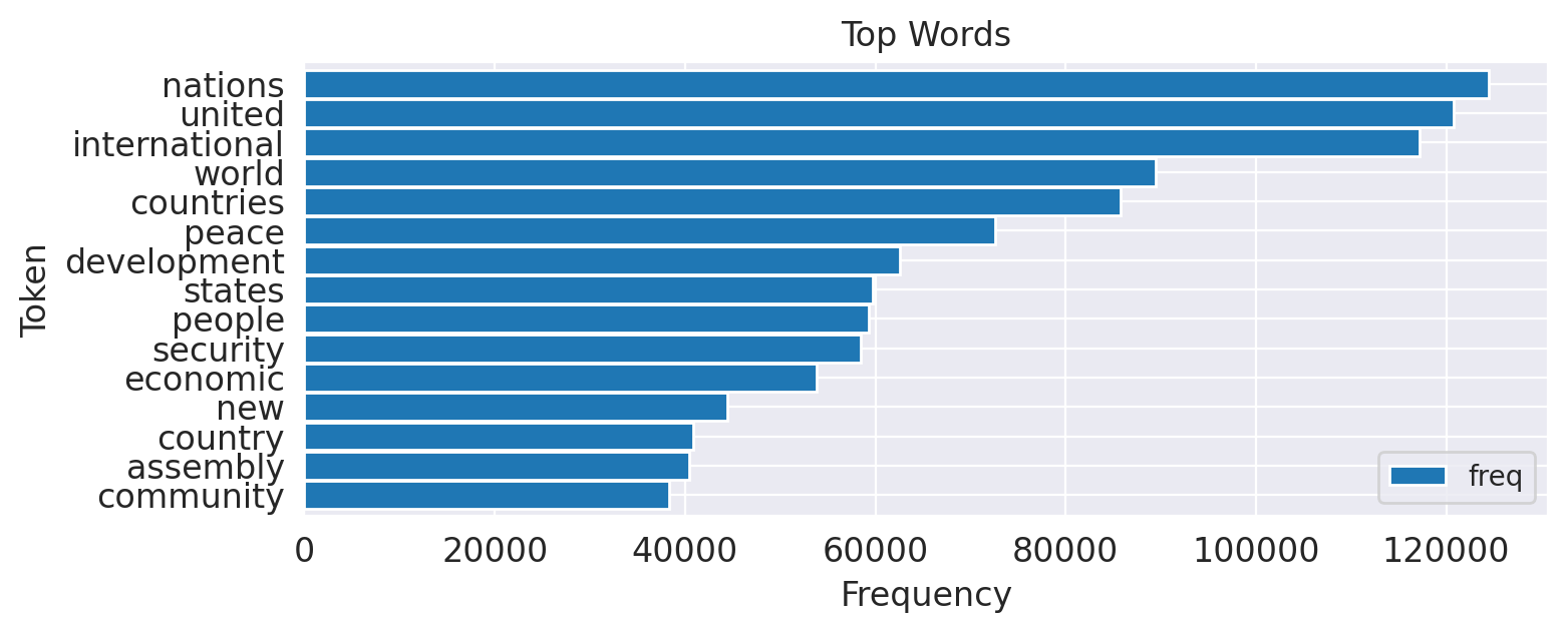
Using horizontal bars (barh) for word frequencies greatly improves readability, because the words appear horizontally on the y-axis in a readable form. The y-axis is inverted to place the top words at the top of the chart. Axis labels and title can optionally be modified.
Blueprint: Creating Word Clouds
Plots of frequency distributions like the ones above give detailed information about the token frequencies. But it is quite difficult to compare frequency diagrams for different time periods, categories, authors etc. Word clouds, in contrast, visualize the frequencies by different font sizes. They are much easier to comprehend and to compare, but lack the precision of tables and bar charts. You should keep in mind that long words or words with capital letters get unproportional high attraction.
The Python module wordcloud15 generates nice word clouds from texts or counters. The most simple way to use it is to instantiate a word cloud object with some options like the maximum number of words and a stop word list and let the wordcloud module handle tokenization and stop word removal. The following code shows how to generate a word cloud for the text of the USA speech of 2015 and display the resulting image with Matplotlib.
fromwordcloudimportWordCloudfrommatplotlibimportpyplotasplttext=df.query("year==2015 and country=='USA'")['text'].values[0]wc=WordCloud(max_words=100,stopwords=stopwords)wc.generate(text)plt.imshow(wc,interpolation='bilinear')plt.axis("off")
However, this only works for a single text and not a possibly large set of documents. For the latter use case, it is much faster to create a frequency counter first and then use the function generate_from_frequencies().
Our blueprint is a little wrapper around this function to support also Pandas series containing frequency values as created by count_words. The WordCloud class itself already has a magnitude of options to fine-tune the result. We use some of them in the function below to demonstrate possible adjustments, but you should check the documentation for details.
defwordcloud(word_freq,title=None,max_words=200,stopwords=None):wc=WordCloud(width=800,height=400,background_color="black",colormap="Paired",max_font_size=150,max_words=max_words)# convert data frame into dictiftype(word_freq)==pd.Series:counter=Counter(word_freq.fillna(0).to_dict())else:counter=word_freq# filter stop words in frequency counterifstopwordsisnotNone:counter={token:freqfor(token,freq)incounter.items()iftokennotinstopwords}wc.generate_from_frequencies(counter)plt.title(title)plt.imshow(wc,interpolation='bilinear')plt.axis("off")
The function has two convenience parameters to filter words. skip_n skips the top n words of the list. Obviously, in a UN corpus word like “united”, “nations”, or “international” are heading the list. It may be more interesting to visualize what comes next. The second filter is an (additional) list of stop words. Sometimes it is helpful to filter out specific frequent but uninteresting words only for the visualization only.16
So let’s have a look at the 2015 speeches (Figure 1-4). The left wordcloud visualizes the most frequent words unfiltered. The right wordcloud instead treats the 50 most frequent words of the complete corpus as stop words.
freq_2015_df=count_words(df[df['year']==2015])plt.figure()wordcloud(freq_2015_df['freq'],max_words=100)wordcloud(freq_2015_df['freq'],max_words=100,stopwords=freq_df.head(50).index)

Figure 1-4. Word clouds for the 2015 speeches including all words (left) and without the 50 most frequent words (right)
Clearly, the right word cloud without the most frequent words of the corpus gives a much better idea of the 2015 topics, but there are still frequent and unspecific words like “today” or “challenges”. We need a way to give less weight to those words, as shown in the next section.
Blueprint: Ranking with TF-IDF
As illustrated in Figure 1-4, visualizing the most frequent words usually does not reveal much insight. Even if stop words are removed, the most common words are usually obvious domain specific terms which are quite similar in any subset (slice) of the data. But we would like to give more importance to those words that appear more frequently in a given slice of the data than “usual”. Such a slice can be any subset of the corpus, e.g. a single speech, the speeches of a certain decade or the speeches from one country.
We want to identify certain key words, i.e. words whose actual word frequency in a slice is higher than their total probability would suggest. There is a number of algorithms to measure the “surprise” factor of a word. One of the simplest but best working approaches is to complement the term frequency with the inverse document frequency (see sidebar).
So let’s define a function to compute the IDF for all terms in the corpus. It is almost identical to count_words, except that each token is only counted once per document (counter.update(set(tokens))) and the IDF values are computated after counting. The parameter min_df serves as a filter for the long tail of infrequent words. The result of this function is again data frame.
defidf(df,column='tokens',preprocess=None,min_df=2):defupdate(doc):tokens=docifpreprocessisNoneelsepreprocess(doc)counter.update(set(tokens))# count tokenscounter=Counter()df[column].map(update)# create data frame and compute idfidf_df=pd.DataFrame.from_dict(counter,orient='index',columns=['df'])idf_df=idf_df.query('df >= @min_df')idf_df['idf']=np.log(len(df)/idf_df['df'])+0.1idf_df.index.name='token'returnidf_df
The IDF values need to be computed once for the entire corpus (do not use a subset here!) and can then be used in all kinds of analyses. We create a data frame containing the idf values for each token (idf_df) with this function:
idf_df=idf(df)
As both, IDF and frequency data frame have an index consisting of the tokens we can simply join the data frames and calculate the TF-IDF score for the terms:
freq_df=freq_df.join(idf_df)freq_df['tfidf']=freq_df['freq']*freq_df['idf']
Let’s compare the word clouds based on word counts (term frequencies) alone and TF-IDF scores for the speeches of the first and the last year in the corpus. We removed some more stop words that stand for the numbers of the respective debate sessions.
freq_1970=count_words(df[df['year']==1970])freq_2015=count_words(df[df['year']==2015])freq_1970['tfidf']=freq_1970['freq']*idf_df['idf']freq_2015['tfidf']=freq_2015['freq']*idf_df['idf']#wordcloud(freq_df['freq'], title='All years', subplot=(1,3,1))wordcloud(freq_1970['freq'],title='1970 - TF',stopwords=['twenty-fifth','twenty-five'])wordcloud(freq_2015['freq'],title='2015 - TF',stopwords=['seventieth'])wordcloud(freq_1970['tfidf'],title='1970 - TF-IDF',stopwords=['twenty-fifth','twenty-five','twenty','fifth'])wordcloud(freq_2015['tfidf'],title='2015 - TF-IDF',stopwords=['seventieth'])
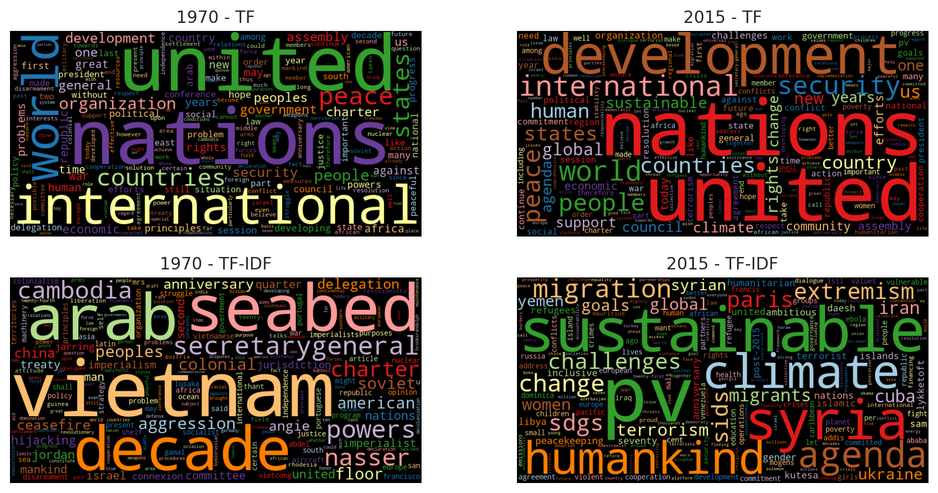
Figure 1-5. Words weighted by plain counts (upper) and TF-IDF (lower) for speeches in two selected years
The word clouds in Figure 1-5 impressively demonstrate the power of TF-IDF weighting. While the most common words are almost identical in 1970 and 2015, the TF-IDF weighted visualizations emphasize the differences of political topics.
The experienced reader might wonder why we implemented functions to count words and compute IDF values ourselves instead of using the classes CountVectorizer and TfidfVectorizer of Scikit-Learn. Actually, there two reasons: First, the vectorizers produce a vector with weighted term frequencies for each single document instead of arbitrary subsets of the data set. Second, the results are matrices (good for machine learning) and not data frames (good for slicing, aggregation and visualization). So we would have to write about the same number of code lines in the end to produce the results in Figure 1-5 but miss the opportunity to introduce this important concept from scratch. The Scikit-Learn vectorizers will be discussed in detail in [Link to Come].
Blueprint: Finding a Keyword in Context (KWIC)
Word clouds and frequency diagrams are great tools to visually summarize textual data. However, they also often raise questions about why a certain term appears so prominently. For example, the 2015 TF-IDF word cloud from above shows the terms pv, sdgs or sids, and you probably do not know their meaning. To find that out we need a way to inspect the actuall occurrences of those words in the original, unprepared text. A simple yet clever way to for such an inspection is the Keyword-in-Context (KWIC) analysis. It produces a list of text fragments of equal length showing the left and right context of a keyword. Here is a sample of the KWIC list for sdgs which gives us an explanation of that term:
5 random samples out of 73 contexts for 'sdgs':
 of our planet and its people. The   SDGs   are a tangible manifestation of th
nd, we are expected to achieve the   SDGs   and to demonstrate dramatic develo
ead by example in implementing the   SDGs   in Bangladesh. Attaching due impor
the Sustainable Development Goals (  SDGs  ). We applaud all the Chairs of the
new Sustainable Development Goals (  SDGs  ) aspire to that same vision. The A
Obviously, sdgs is the lower-cased version of SDGs standing for Sustainable Development Goals. With the same analysis we can learn that sids stands for small island developing states. That is important information to interpret the topics of 2015! pv, however, is a tokenization artifact. It is actually the remainder of citation references like (A/70/PV.28) which stands for Assembly 70, Process Verbal 28, i.e. speech number 28 of the 70th assembly.
Note
Always look into the details when you encounter tokens which you do not know or which do not make sense to you! Often they carry important information (like sdgs), that you as an analyst should be able to interpret. But similarly frequent you’ll find artifacts like pv. Those should be discarded if irrelevant or treated correctly.
KWIC analysis is implemented in NTLK and textacy. We will use textacy’s KWIC function19 because it is very fast and works on the untokenized text. Thus, we can search for strings spanning multiple tokens like “climate change” while NLTK can not. Both, NLTK and textacy’s KWIC functions work on a single document only. To extend the analysis to a number of documents in a data frame, we provide the following function:
fromtextacy.text_utilsimportKWICdefkwic(doc_series,keyword,window=35,print_samples=5):defadd_kwic(text):kwic_list.extend(KWIC(text,keyword,ignore_case=True,window_width=window,print_only=False))kwic_list=[]doc_series.map(add_kwic)ifprint_samplesisNoneorprint_samples==0:returnkwic_listelse:k=min(print_samples,len(kwic_list))(f"{k} random samples out of {len(kwic_list)} "+f"contexts for '{keyword}':")forsampleinrandom.sample(list(kwic_list),k):(re.sub(r'[ ]',' ',sample[0])+' '+sample[1]+' '+re.sub(r'[ ]',' ',sample[2]))
The function iteratively collects the keyword contexts by applying the add_kwic function to each document with map. This trick, which we already used in the word count blueprints, is very efficient and enables KWIC analysis also for larger corpora. By default, the function returns a list of tuples of the form (left context, keyword, right context). If print_samples is greater than 0, a random sample of the results is printed20. Sampling is especially useful when you work with lots of documents, because the first entries of the list would otherwise stem from a single or a very small number of documents.
The keyword-in-context list for sdgs from above was generated by this call:
kwic(df[df['year']==2015]['text'],'sdgs',print_samples=5)
Blueprint: Analyzing N-Grams
Just knowing that climate is a frequent word does not tell us too much about the topic of discussion, because for example “climate change” and “political climate” have completely different meanings. Even “change climate” is not the same as “climate change”. It can therefore be very helpful to extend frequency analyses from single words to short sequences of two or three words.
Basically, we are looking for two types of word sequences: Compounds and collocations. A compound is a combination of two or more words with a separate meaning. In English, we find compounds in closed form, like “earthquake”, hyphenated form like “self-confident”, and open form like “climate change”. Thus, we may have to consider two tokens as a single semantic unit. Collocations are words which are generally used together. Often, they consist of an adjective or verb and a noun, like “red carpet” or “united nations”.
In text processing, we usually work with bigrams (sequences of length two), sometimes even trigrams (length three). n-grams of size one are single words, also called unigrams. The reason to stick to is that the number of different n-grams increases exponentially with respect to n while their frequencies decrease in the same way. By far the most trigrams appear only once in a corpus.
The following function produces elegantly the set of n-grams for a sequence of tokens21.
text="the visible manifestation of the global climate change"tokens=tokenize(text)defngrams(tokens,n=2,sep=' '):return[sep.join(ngram)forngraminzip(*[tokens[i:]foriinrange(n)])]("|".join(ngrams(tokens,2)))
the visible|visible manifestation|manifestation of|of the|the global|global climate|climate change
As you can see, by far most of the bigrams contain stop words like prepositions and determiners. Thus it is advisable to build bigrams without stop words. But we need to be careful: If we remove the stop words first and then build the bigrams, we generate bigrams that don’t exist in the original text as “manifestation global” in the example. Thus, we create the bigrams on an all tokens but keep only those which do not contain any stop words with this modified ngrams function:
defngrams(tokens,n=2,sep=' ',stopwords=set()):return[sep.join(ngram)forngraminzip(*[tokens[i:]foriinrange(n)])iflen([tfortinngramiftinstopwords])==0]tokens=prepare(text,[str.lower,tokenize])# keep full list of tokens("Bigrams:","|".join(ngrams(tokens,2,stopwords=stopwords)))("Trigrams:","|".join(ngrams(tokens,3,stopwords=stopwords)))
Bigrams: visible manifestation|global climate|climate change
Trigrams: global climate change
Using this ngrams function, we can add a column containing all bigrams to our data frame and apply our word count blueprint to determine the top five bigrams.
df['bigrams']=df['text'].apply(prepare,pipeline=[str.lower,tokenize]).apply(ngrams,n=2,stopwords=stopwords)count_words(df,'bigrams').head(5)
| freq | |
|---|---|
| token | |
| united nations | 103236 |
| international community | 27786 |
| general assembly | 27096 |
| security council | 20961 |
| human rights | 19856 |
You may have noticed that we ignored sentence boundaries during tokenization. Thus, we will generate nonsense bigrams with the last word of one sentence and the first word of the next. Those bigrams will not be very frequent, so they don’t really matter for data exploration. If we wanted to prevent this, we would need to identify sentence boundaries which is much more complicated than word tokenization and not worth the effort here.
Now let’s extend our TF-IDF-based unigram analysis from the previous section and include bigrams. We add the bigram IDF values and then compute the TF-IDF-weighted bigram frequencies for all speeches from 2015.
# concatenate existing IDF data frame with bigram IDFsidf_df=pd.concat([idf_df,idf(df,'bigrams',min_df=10)])freq_df=count_words(df[df['year']==2015],'bigrams')freq_df['tfidf']=freq_df['freq']*idf_df['idf']
As we can see in Figure 1-6 left, “climate change” was a frequent bigram in 2015. But to understand the different contexts of “climate”, it may be interesting to have a look at the bigrams containing “climate” only. We can use a text filter on “climate” to achieve this and plot the result again as wordcloud (Figure 1-6 right):
wordcloud(freq_df['tfidf'],title='all bigrams',max_words=50)where=freq_df.index.str.contains('climate')wordcloud(freq_df[where]['freq'],title='"climate" bigrams',max_words=50)
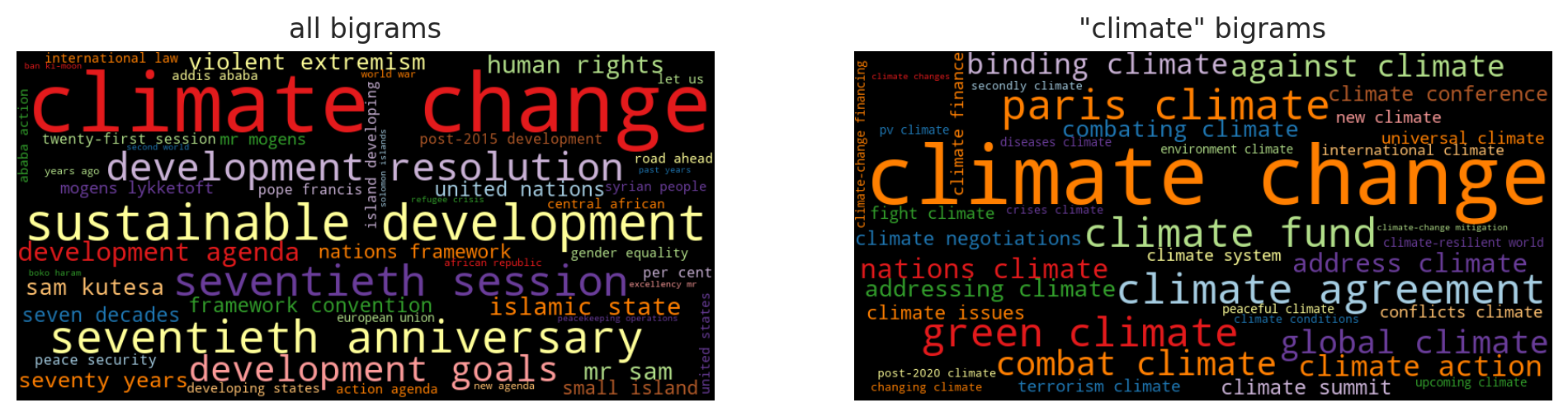
Figure 1-6. Word clouds for all bigrams and bigrams containing “climate”
The approach presented here creates and weights all n-grams that do not contain stop words. For a first analysis, the results look quite good. We just don’t care about the long tail of infrequent bigrams. More sophisticated but also computationally expensive algorithms to identify collocations are available for example in NLTK’s collocation finder22 We will show alternatives to identify meaningful phrases in [Link to Come] and [Link to Come].
Blueprint: Comparing Frequencies across Time-Intervals and Categories
You surely know Google Trends23 where you can track the development of a number of search terms over time. This kind of trend analysis computes frequencies by day and visualizes them with a line chart. We want to track the development of certain keywords over the course of the years in our UN Debates data set to get an idea about the growing or shrinking importance of topics like climate change, terrorism, or migration (Figure 1-7). In fact, you can use the blueprint to compare word frequencies across any discrete attribute of a given data frame, e.g. country, category, author - you name it. We will use the attribute year as grouping criterion in our examples.
Creating Frequency Timelines
Our approach is to calculate the frequencies of given keywords per document and then aggregate those frequencies using Pandas groupby function. The following function is for the first task: It extracts the counts of given keywords from a list of tokens.
defcount_keywords(tokens,keywords):tokens=[tfortintokensiftinkeywords]counter=Counter(tokens)return[counter.get(k,0)forkinkeywords]
Let’s demonstrate the functionality with a small example:
keywords=['nuclear','terrorism','climate','freedom']tokens=['nuclear','climate','climate','freedom','climate','freedom'](count_keywords(tokens,keywords))
[1, 0, 3, 2]
As you can see, the function returns a list resp. vector of word counts. In fact, it’s a very simple keyword count vectorizer. If we apply this function to each document in our data frame we get a matrix of counts. The blueprint function count_keywords_by below does exactly this as a first step. The matrix is then again converted into a data frame which is finally aggregated and sorted by the supplied grouping column.
defcount_keywords_by(df,by,column='tokens',keywords=keywords):freq_matrix=df['tokens'].apply(count_keywords,keywords=keywords)freq_df=pd.DataFrame.from_records(freq_matrix,columns=keywords)freq_df[by]=df[by]# copy the grouping column(s)returnfreq_df.groupby(by=by).sum().sort_values(by)
This function is very fast, because it only has take care of the keywords. Counting the four keywords from above in the UN corpus takes just two seconds on a laptop. Let’s have a look at the result:
freq_df=count_keywords_by(df,by='year',keywords=keywords)
| nuclear | terrorism | climate | freedom | |
|---|---|---|---|---|
| year | ||||
| 1970 | 192 | 7 | 18 | 128 |
| 1971 | 275 | 9 | 35 | 205 |
| ... | ... | ... | ... | ... |
| 2014 | 144 | 404 | 654 | 129 |
| 2015 | 246 | 378 | 662 | 148 |
46 rows × 4 columns
Note
We could also produce counts per country or any other attribute of the original data frame instead of year. In fact, we could even specify a list of grouping attributes to compute for example counts per country and year.
The resulting data frame is alreay perfectly prepared for plotting as we have one data series per keyword. Using Pandas’ plot function, we get a nice line chart similar to Google Trends (Figure 1-7).
freq_df.plot(kind='line')
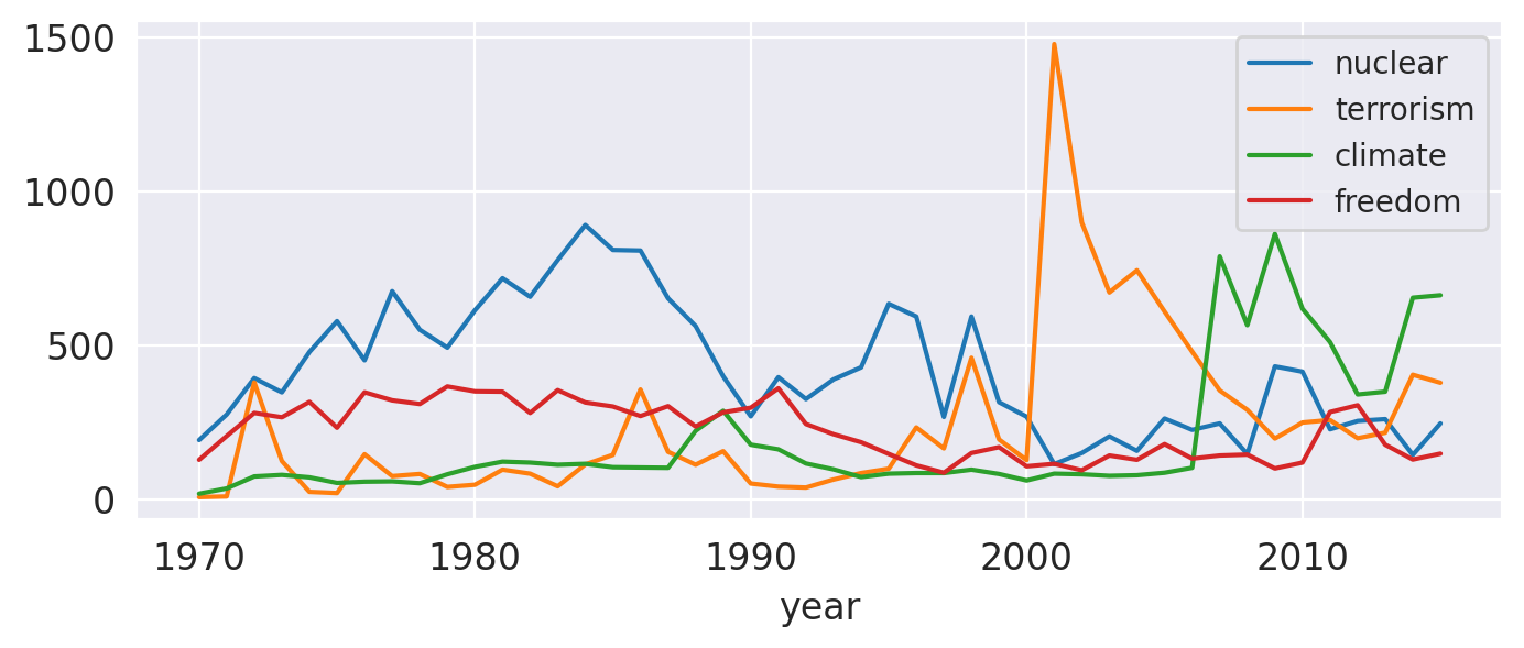
Figure 1-7. Frequencies of selected words per year
Note the peak of “nuclear” in the 80’s indicating the arms race and the high peak of terrorism in 2001. And it is somehow remarkable that the topic “climate” already got some attention in the 70’s and 80’s. Has it really? Well, if you’d check with a KWIC analysis (“Blueprint: Finding a Keyword in Context (KWIC)”), you’d find out that the word “climate” in those decades was almost exclusively used in figurative sense.
Creating Frequency Heat Maps
Consider we want compare analyze the historic developments of global crises like the cold war, terrorism and climate change. We could pick a selection of words significant words and visualize their timelines by line charts as in the previous example. But line charts become confusing if you have more than four or five lines. An alternative visualization without that limitation are heat maps as provided by the Seaborn library. So let’s add a few more of keywords to our filter and display the result as a heatmap (Figure 1-8).
keywords=['terrorism','terrorist','nuclear','war','oil','syria','syrian','refugees','migration','peacekeeping','humanitarian','climate','change','sustainable','sdgs']freq_df=count_keywords_by(df,by='year',keywords=keywords)# compute relative frequencies based on total number of tokens per yearfreq_df=freq_df.div(df.groupby('year')['no_tokens'].sum(),axis=0)# apply square root as sublinear filter for better contrastfreq_df=freq_df.apply(np.sqrt)sns.heatmap(data=freq_df.T,xticklabels=True,yticklabels=True,cbar=False,cmap="Reds")
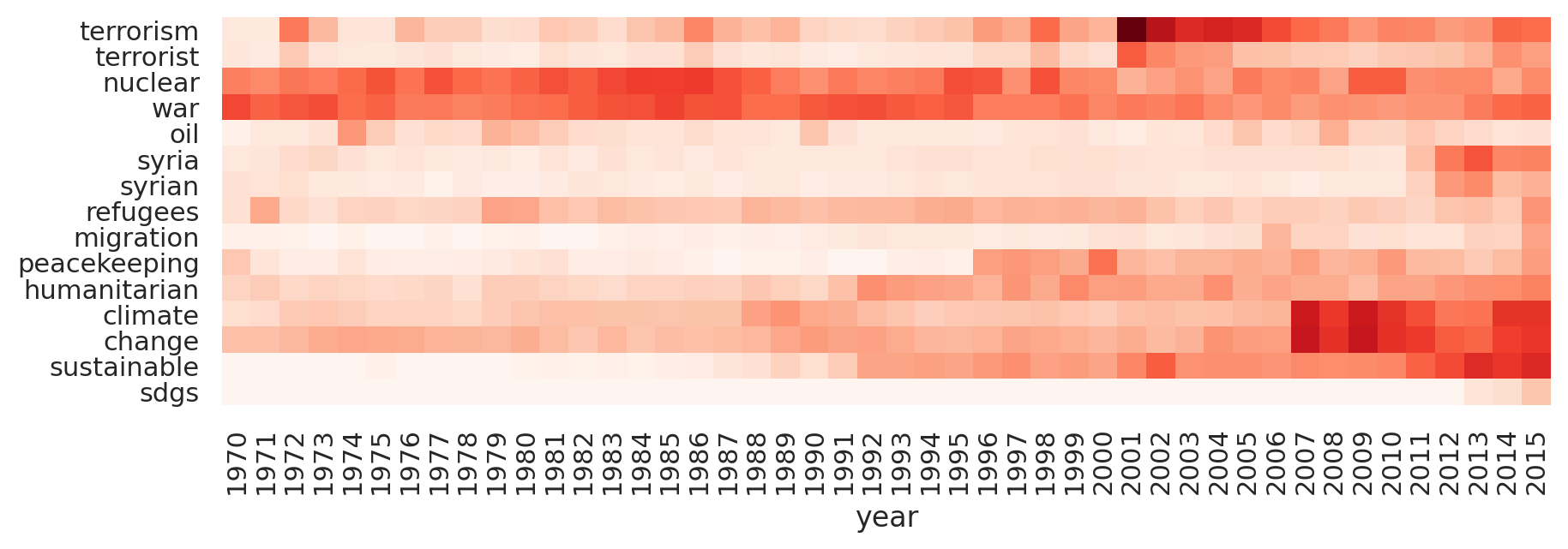
Figure 1-8. Word frequencies over time as heatmap
Note, that there are a few things you should think of with this kind of analysis:
- Prefer relative frequencies for any kind of comparison. Absolute term frequencies are problematic, if the total the total number of tokens per year or category is not stable. For example, absolute frequencies naturally go up if more countries are speaking year after year in our example.
- Be careful with the interpretation of frequency diagrams based on keyword lists: Although the chart looks like a distribution of topics, it is not! There may be other words representing the same topic but not included in the list. Keywords may also be use in different meanings (e.g. “climate of the discussion”). Advanced techniques like topic modeling ([Link to Come]) and word embeddings ([Link to Come]) can help here.
- Use sublinear scaling: As the frequency values differ greatly, it may be hard to see any change for less frequent tokens. Therefore, you should scale the frequencies sublinearly (we applied the square root
np.sqrt). The visual effect is similar to lowering contrast.
Closing Remarks
We have demonstrated how to get started analyzing textual data. The process for text preparation and tokenization was kept very simple to get quick results. In [Link to Come], we will introduce more sophisticated methods and discuss advantages and disadvantages of different approaches.
Data exploration should not only provide initial insights, but actually help to develop confidence in your data. One thing you should keep in mind is that you should always identify the root cause for any strange tokens popping up. The KWIC analysis is a good tool to search for such tokens.
For a first analysis of the content, we introduced several blueprints for word frequency analysis. The weighting of terms is based either on term frequency alone or on the combination of term frequency and inverse document frequency (TF-IDF). These concepts will be picked up later in [Link to Come], because TF-IDF weighting is a standard method to vectorize documents for machine learning.
There are many aspects of textual analysis which we did not cover in this chapter:
- Author-related information can help to identify influential writers, if that is one of your project goals. Authors can be distinguished by activity, social scores, writing style etc.
- Sometimes, it is interesting to compare authors or different corpora on the same topic by their readability. The library
textacyhas a function calledtextstatswhich computes different readability scores and other statistics in a single pass over the text24. - An interesting tool to find and visuale distinguishing terms between categories (e.g. political parties) is Jason Kesslers library
Scattertext25. - Besides plain Python you can also use interactive visual tools for data analysis. Microsoft’s PowerBI has a nice wordcloud add-on and lots of other options to produce interactive charts. We mention it because it is free to use in the desktop version and supports Python and R for data preparation and visualization.
- For larger projects, we recommend to set up a search engine like Apache SOLR or Tantivy. Those platforms create specialized indexes (also using TF-IDF weighting) for fast full-text search. Python APIs are available for both.
1 https://dataverse.harvard.edu/dataset.xhtml?persistentId=doi:10.7910/DVN/0TJX8Y
2 https://github.com/blueprints-for-text-analytics-python
3 https://en.wikipedia.org/wiki/Five-number_summary
4 https://en.wikipedia.org/wiki/Box_plot
5 https://seaborn.pydata.org/generated/seaborn.catplot.html
6 https://pandas.pydata.org/pandas-docs/stable/reference/frame.html#serialization-io-conversion
7 See https://pandas.pydata.org/pandas-docs/stable/reference/series.html#api-series-dt for a complete list.
8 https://docs.python.org/3/library/datetime.html#strftime-and-strptime-format-codes
9 https://pandas.pydata.org/pandas-docs/stable/reference/api/pandas.DataFrame.resample.html
10 You can address spaCy’s list similarly with spacy.lang.en.STOP_WORDS.
11 https://pypi.org/project/pandarallel
12 https://spark.apache.org
13 https://github.com/tqdm/tqdm#pandas-integration
14 The NLTK class FreqDist is derived from Counter and just adds some convenience functions.
15 https://amueller.github.io/word_cloud
16 Note, that the wordcloud module ignores the stop word list if generate_from_frequencies is called. Therefore, we apply an extra filter.
17 E.g. Scikit-Learn’s TfIdfVectorizer adds +1.
18 Another option is to add in the denominator to prevent a division by zero for unseen terms with . This technique is called smoothing.
19 https://chartbeat-labs.github.io/textacy/api_reference/text_processing.html#textacy.text_utils.KWIC
20 The parameter print_only in textacy’s KWIC function works similarly, but does not sample.
21 See http://www.locallyoptimal.com/blog/2013/01/20/elegant-n-gram-generation-in-python for an explanation.
22 http://www.nltk.org/howto/collocations.html
23 http://trends.google.com
24 https://chartbeat-labs.github.io/textacy/api_reference/misc.html
25 https://github.com/JasonKessler/scattertext