
“If you can’t manage it, you can’t improve it.”
—Peter Drucker
One afternoon in late 2015 I was visiting with some executives from a large consumer packaged goods (CPG) company at their office about 20 minutes down the road from Walmart’s corporate headquarters in Bentonville, Arkansas. This company had become one of our early brand clients in the spring of that year, using our product to help reduce their out-of-stock rates on Walmart.com.
The meeting got off to a rocky start. I had trouble getting on the company’s Wi-Fi network. Plus, I had been using my phone’s map to help me navigate to their office and had used up the battery. I was getting worried that I wouldn’t have much to show. The thought crossed my mind that I might have traveled almost 2,000 miles just to have the meeting cut short because of technical issues.
Fortunately, one of the account managers in the room helped me out. He set me up with a connection to the hotspot on his phone. I breathed a sigh of relief, and a few minutes later I had a bunch of reports pulled up on my screen.
Back then, our reports didn’t have the streamlined, business-focused interface that our customers have come to know and love. We were monitoring all kinds of key performance indicators, from content health to pricing and from share of search to share of shelf , but I was showing the results as literally hundreds of rows of data. After a few minutes of reading through these tables of data with me and nodding diplomatically, one of their senior executives went to the whiteboard. It would turn out to be a pivotal moment in our company’s history.
He drew on the whiteboard a chart at the top with a set of boxes below, each box representing a key metric he wanted us to measure. If we could update those metrics every day, he said, and present them in the form of a Dashboard with color-coded cards and trend analysis baked into the charts, that would be invaluable to him. It would be something he and his team could report across the organization, and it would give him insight into his business much faster than the static reports he was receiving at that time.
There in front of me was the Dashboard we had been wanting to build but had had a hard time envisioning. It was right before Thanksgiving. I asked him if we could come back and see him after building the Dashboard to get his feedback on it. He laughed and said sure thing. On the flight home, I wireframed the Dashboard and wrote a bunch of notes about it for our user interface designer and product manager. Early the next week it was over to our engineering team for development. Our team worked through the holidays, and just under eight weeks later the Content Analytics Dashboard was live in production. We finally had the Dashboard that clients had been asking for.
Since then, many of our clients have provided invaluable input into the design and evolution of the Dashboard. The Dashboard is now used by Clorox, L’Oréal, Mattel, Samsung, and many other market leaders. We’ve made it easy to configure so that business goals specific to each supplier can be baked in and metrics that aren’t relevant for a category, such as minimum advertised price (MAP), can be taken out. The Dashboard is truly a product capability that was designed by suppliers for suppliers. All we did was write the software.
Dashboard Overview—SPARCS
The purpose of the Content Analytics Dashboard is to be the control center for all your retail-related business activities, both online and offline. The Dashboard supports the display and analysis of sales and inventory data, share of voice, content quality, and a host of other key performance indicators (KPIs).
The Dashboard provides insight into six key areas that we call SPARCS.
Sales
Pricing
Assortment and availability
Ratings and reviews
Content
Shelf and search
The Dashboard can show you a snapshot in time to tell you how you did yesterday (see Figure 3-1). It can also chart time-series data so you can see your data trended over time. It can help you answer questions such as how am I doing this week compared with last week? How am I doing this month relative to last month?

Figure 3-1. The Dashboard
It can also show you how you’re doing on one retailer site relative to another or how two brands are doing relative to each other. If you market two different brands of shampoo, for example, you might want to see how their performance compares across the different metrics or average their performance so you can see how you’re doing in the shampoo category overall.
The Dashboard supports alerting so you proactively can get notified of urgent issues (say, when products go out of stock) and receive regular status updates (such as how your sales performance this week compares to your sales performance last week) direct to your inbox.
A great Dashboard brings together many different data sources—from retailer data feeds to supplier-provided data to data crawled from the Web (the true shopper view of your products)—all in one place. And that’s exactly what the Content Analytics Dashboard provides.
The Dashboard comes set up with a default configuration, but we normally work closely with clients to configure their Dashboard for their specific needs. We also provide regular updates based on customer, market, and feature changes. The Dashboard supports multiple retailers, including Amazon.com, Walmart.com, Target.com, and many more. You can look at your performance on one retailer or group them together to get a rolled-up view. This is helpful when you want to create, say, a region-specific group of retailers .
The Dashboard supports threshold color-coding, making it easy to see at a glance which metrics are literally in the red versus in the green. Underlying the Dashboard are a series of detailed reports called Insights Reports that let you drill down into every area the Dashboard supports, from out-of-stock issues to MAP violations to share of shelf and share of search.
Tied to the Insights Reports are comprehensive alerts. Alerts notify you when a threshold is passed (sales are above or below a certain level, for example) or simply provide a daily update to your inbox (here’s how you did on share of shelf this week compared with last week). The benefit of alerts is that they’re a proactive way to notify you when something needs your attention or when there’s an update you need to know about.
The Dashboard comes in two views.
A roll-up view with charting at the top and summary cards for each reporting segment below
A detailed view with charting at the top and individual cards for every metric reported on
It’s easy to toggle between the two views.
We’re also able to develop custom views of the Dashboard based on supplier-specific requirements. For custom Dashboards, we typically use much of the same data (although new data can always be incorporated) but present the data in the supplier-requested layout and format. Now let’s look at each of the key metrics that the Dashboard reports on.
Your Content Analytics Score
Your Content Analytics score rolls up all the component metrics on your Dashboard into one overall score. You can use this metric to track your performance over time as well as to compare performance across retailers, groups of retailers, and regions. You can also chart your Content Analytics score for trend analysis. We’ll spend the rest of this chapter drilling into the component metrics that make up this score, why those metrics matter, and how to use them.
Sales Reporting
The Content Analytics platform supports integrated sales reporting. You can see your sales data alongside all your other key business metrics.
We’ve found that a lot of clients use separate services, tools, or homegrown spreadsheets and charts to do sales reporting. This approach makes it hard to see everything in one place. It also creates a lot of unnecessary work for suppliers who need to load in data and maintain specialized reports. What’s more, because sales data comes in different formats for each retailer, suppliers must convert each retailer’s sales data into a format their tools or custom spreadsheets can handle.
Content Analytics simplifies the entire sales reporting process. We retrieve sales data from retailers and internal systems, perform the necessary conversions, and display the sales data directly in the Content Analytics Dashboard .
Note
Content Analytics simplifies the entire reporting process by bringing many different data sources together into one easy-to-use interface.
You can view sales metrics alongside your other key business metrics such as share of voice, content health , in-stock reporting, and ratings and reviews summary data. So if you run a campaign to improve content health, increase reviews, or reduce out-of-stock products, you can easily see the impact of that campaign right on your Dashboard.
We can also estimate what your sales will be for the entire week or month based on current sales data. We can present that projection in an easy-to-digest visual form available on both your desktop and your mobile device—so it’s easy to see how you’re likely to do for the week (and if you need to make any immediate adjustments) even while you’re on the go. It’s a lot easier than trying to open an Excel sheet with a bunch of hidden rows and columns from your smartphone!
Pricing
Keeping tabs on prices is important anywhere, but it’s especially important online, where price comparisons are so easy to do. Retailers employ dynamic pricing algorithms that re-price items automatically to keep prices competitive with other retailers. Just like automated trading algorithms in the stock market, sometimes these algorithms get out of whack and raise prices too high or drop them too low.
Other times, third-party sellers come in and sell a product at a price lower than a retail site’s direct price. Conversely, if a retailer runs out of an item, marketplace sellers come in and charge a much higher price, creating disenchanted customers and lost sales.
The Pricing + MAP report provides ongoing price tracking. It can report on prices on a weekly, daily, or hourly basis. It provides a history of the most recent changes (Figure 3-2). You can easily export the history for detailed analysis.

Figure 3-2. Price change history for an individual product
You can also export the price changes for all products in the report, giving you comprehensive pricing data to inform future pricing strategies. The Pricing + Map report supports built-in charting capabilities, giving you easy access to a visual representation of price changes over time (Figure 3-3).

Figure 3-3. Pricing chart showing price changes over time
The system can even track prices across multiple retailers. This can help you understand which retailer is driving price changes and how different retailers are pricing your products. If one retailer is consistently pricing much lower or much higher than the competition, there may be a problem in the channel.
Note
The Price Movement alert is a great way to see which products are changing in price. By default, products are included in the alert when they’ve changed by more than 5 percent, but it’s easy to change the threshold to meet your needs.
MAP Violations
The minimum advertised price is the lowest price a retailer may advertise a supplier’s product at. According to the Small Business Administration, “Under typical MAP agreements, online retailers can’t ‘display’ any prices that fall below the MAP price .”1 (Note that once a product is added to the shopping cart , however, the retailer can sell it for a lower price—because the shopping cart is not considered advertising space.) Although suppliers have agreements with retailers not to advertise below the agreed upon minimum price, many retailers violate that policy.
Suppliers need a mechanism to check for MAP violations on a regular basis and enforce MAP policy if needed. The Dashboard can report on the percentage of products on a retailer’s site that are being advertised in violation of the MAP pricing agreement. The supplier provides us with a list of product IDs (such as UPCs) and the corresponding MAP prices. Our system then checks each of those products, typically on a daily basis, to see whether the advertised price is below the MAP price. It calculates the percentage of products that are being advertised at below the MAP price and displays that percentage on the Dashboard. The user can click to see and download the specific list of products that are violating the MAP price.
MAP price violation information is also available as an alert; suppliers can receive alerts in their inboxes with a list of products that are below MAP, by how much, and what the MAP and actual advertised prices are. The combination of alerts and the Dashboard means that suppliers can get notified right away when there’s a pricing problem, and they can track pricing status over time via the Dashboard. Enforcing MAP pricing is a separate issue. We’ll cover that in detail in the next chapter when we discuss how to use the drill-down reports that underlie each of the Dashboard metrics.
MAP violations are hard to track if you’re not constantly on the lookout for them. It’s virtually impossible to do, even if you have only a few products for sale online. New sellers are constantly coming and going. Third parties selling below MAP are one of the primary reasons that suppliers lose the Buy Box . The other reason is when their products go out of stock. MAP reporting helps with the former; out-of-stock reporting helps with the latter.
In addition to MAP reporting directly on the Dashboard, the detailed MAP violations can give you insight into every single one of your products. Simply upload your list of products and their MAP prices, and the system will automatically start reporting on them, showing you which products are for sale below the MAP price (Figure 3-4) on a given retailer’s web site.

Figure 3-4. MAP Violations report
Alerts are flexible, so you can set them to be sent only if the price falls below the MAP price by a certain percent or absolute value threshold.
Authorized Resellers Report
Hand in hand with MAP reporting goes the Authorized Resellers report. This report indicates which resellers are authorized and which are not, along with the corresponding price at which the reseller is selling the product.
With this report, the system identifies those third-party marketplace sellers on sites such as Amazon and Walmart that are not authorized to sell your products.
The Authorized Resellers report is easy to set up. Simply upload your list of authorized resellers and the system will automatically check the marketplace sellers against that list to identify those that are authorized and those that aren’t. This makes it easy to identify unauthorized resellers and talk with your retailer partners about them.
Price Visibility
In the area of pricing, one other element that bricks-to-clicks suppliers want to track, at least in certain categories, is price visibility. Price visibility is a measure of how many of the supplier’s products on a given retailer’s site require the supplier to add the product to the cart to see the price.
Some retailers use the “add this item to cart to see the price” approach to get around MAP pricing. They can’t advertise the lower price they really want to advertise because of MAP agreements, and by not showing the price at all, the theory goes, they don’t risk scaring shoppers away with a price that’s too high. Bricks-to-clicks suppliers dislike the “hidden price” approach for two reasons. First, it’s used to circumvent MAP. Second, they believe it reduces the likelihood that a shopper will make a purchase. If shoppers, who are now laser focused on price because of the ease with which they can comparison shop across different sites, can’t see the price of a product, they’re unlikely to go to the extra effort of adding the item to the cart to see the item’s price.
If they monitored only MAP violations, suppliers would be alerted only to those products that the retailer is advertising below the MAP price . By also monitoring products for which no price is shown (price visibility), bricks-to-clicks suppliers get a complete picture of how retailers are selling their products, including those products for which no price is advertised. The combination of price visibility and MAP violation metrics gives bricks-to-click s suppliers the comprehensive view they require .
Availability
The Content Analytics Dashboard provides comprehensive out-of-stock, inventory, and Buy Box reporting.
Out of Stock
When we talk about in stock and out of stock, we’re referring to what the retailer’s web site says is in or out of stock. This data comes directly from crawling the retailer’s site—that is, going to an item page on the site and seeing whether the site shows the item as in or out of stock. That can include looking at all the variants of a given product in its different sizes, colors, and models.
Crawled data is the true shopper view. It’s as if you had a person on your team go to an item page and check a product’s status, by hand, and write down the result and then repeat that process for every product you care about. Without crawled data, you’re flying blind; you really have no idea what shoppers are seeing when they go to a web site and try to find and buy your products.
In addition to providing the true shopper view, the other great thing about automating the collection and reporting of out-of-stock data is that it requires no integration. We simply load your product list, start crawling those products, and can very quickly tell you which products are available for purchase and which aren’t, every day, day in and day out. Even better, you no longer have to go to a given web site manually to check those products—you can get an e-mail alert delivered right to your inbox to tell you which products are out of stock.
Out-of-stock data is reported on the Dashboard as a percentage and can be easily toggled between displaying in-stock and out-of-stock data as the displayed value.
One CPG client we work with has implemented the innovative concept of a never-out-of-stock list. That means that none of the products on the never-out-of-stock list should ever be out of stock. They should always be available for shoppers to purchase.
That begs the question—why do products go out of stock at all? The reason is often subtle changes in item configurations. In one instance, products that should be set to auto-replenish don’t get reordered. The cause can be a system glitch, human oversight, or an unexpected run on a product. As an example, if an item had a specific end date set when it was originally set up, the marketer wants the product to keep on selling but does not update the end date, and that end date passes, then the product goes out of stock. It’s no longer available for purchase even though the company selling it wants it to be.
Another example is when a product gets unexpected visibility, causing faster than expected sales of a given product. In physical stores, product layouts are planned well in advance based on long-standing models. Products are placed on shelves based on the layouts, and then the shelf layouts remain static. If you’ve ever walked down an aisle after there’s been a run on a particular product, you’ve seen empty shelf space—quite often prime shelf space located at eye level.
Online, in contrast, shelf space is almost always fully used. If a product that was located in the first position for a particular search result, like “television,” sells out, that product’s pole position is immediately taken by the next product, and that product’s position is taken by the next product, and so on. So in our example, if three extremely highly ranked televisions sell out and your television was previously ranked fourth, all of a sudden your television is ranked first.
Simply by virtue of being ranked first for a given search result, all of a sudden your product will receive a lot more sales. That’s great news in the short term because a product that might not have generated a lot of sales will generate a huge amount of sales. The flip side is that your product will suddenly sell out—unexpectedly—and you may not learn about the product being out of stock for days, weeks, or even months. Suddenly that product that was generating more sales is instead causing a shortfall in revenue because it’s out of stock!
As a supplier, you might not find out about this issue for days or weeks. The name of the game in e-commerce is speed. If you receive, let’s say, a weekly download regarding the number of items of inventory your retailer partner has on hand, you’re not only running blind but also missing out on millions of dollars in sales. The alerts give you immediate notification when something is not right; the Dashboard lets you track your metrics over time so you can see how things are trending—and how you’re doing in reaching your overall goals.
Out-of-stock reporting can be extremely nuanced. Unlike in-store stock reporting, where a product is either on the shelf or not, products can be in varying states of out of stock online. For example, for an omnichannel retailer, a product might not be available for delivery but may be available for pickup in the store, or vice versa. We work closely with clients to determine exactly what out of stock means for them and then calculate percentage (and flag specific items) on that basis.
Buy Box Ownership
The Buy Box is the box on a retailer’s web site where a shopper can click to add an item to their shopping cart . On both Amazon.com and Walmart.com, this is recognizable as the Add to Cart button. Because both sites support multiple sellers for each item, sellers can compete for the Buy Box. The web site itself can be the seller when the user clicks the Add to Cart button. That means the shopper is buying directly from the web site, such as Amazon or Walmart. Or, the seller can be a third-party seller. Third-party sellers are sellers like BJ’s Electronics for electronics, Wayfair for furniture, and many others. In this case, the sale goes to the third-party seller. (These sellers often sell direct on their own e-commerce web sites in addition to selling as a marketplace seller on Amazon or Walmart.)
Many large suppliers organize their business units/revenue streams by retailer. For example, a large electronics supplier might segment revenue by Amazon, Walmart, Best Buy, Home Depot, and a number of long-tail retailers. Therefore, they are interested to know how often they are owning the Buy Box (that is, the site itself is the direct seller of the product to the shopper) on a given site. If a supplier/the retailer site owned the Buy Box for a particular item only 75 percent of the time, that would mean that one or more third-party sellers owned the Buy Box the other 25 percent of the time. That’s 25 percent of sales that are being made by another channel that are not counting toward the revenue of the first-party channel, such as Amazon or Walmart.
Third-party sales can be great for smaller marketplace sellers who are selling their own products through the marketplace. But for big brands it’s another story. Instead of only the retailer taking some of the margin (in exchange for selling the product to the shopper), both the retailer and the marketplace seller are taking a cut of the action. So, not only are the supplier’s retailer sales teams not getting compensated for their efforts, the company overall is losing out on margin .
The root cause of losing the Buy Box is typically either price or out-of-stock issues (or both). If a first-party (1P) seller’s price is higher than a marketplace (3P) seller, the 3P seller will win the Buy Box. Similarly, if the retailer sells out of a given product and the product is available only from 3P sellers, one of those sellers—the one with the lowest price—is going to win the Buy Box. So, it’s critically important to track ownership of the Buy Box on sites like Amazon and Walmart that support marketplace sellers.
Losing the Buy Box a large portion of the time is often indicative of a bigger problem in a supplier’s business. If third parties are constantly undercutting the supplier on price, that means they’re not adhering to their pricing agreements with the supplier or they’ve found another source of the product that enables them to sell at a lower price. Alternatively, if a supplier is losing the Buy Box because their products keep going out of stock, that means the retailer isn’t stocking enough of their product and they need to discuss with their buyer keeping more product in stock. Either way, bricks-to-click s suppliers track their Buy Box percentages daily so they know if they have a problem and can take action to correct it.
Assortment
Assortment goes hand in hand with out-of-stock reporting. When suppliers think about an assortment measure on the Dashboard , what they’re usually looking to understand is how many of the products that they think should be carried on a given site are actually carried on that site. It’s not a measure of whether those products are in or out of stock. It’s a measure of whether the retailer is carrying those products at all.
When might there be a disconnect between what a supplier thinks their assortment is on a site and what it is? There are a few potential scenarios. First, an item might never have been set up. A retailer agreed to carry the item, the supplier agreed to sell it to the retailer, but the item never made it through item setup. Perhaps it never got submitted to be set up. Or perhaps it was submitted but there was a problem with the setup information. Or perhaps there’s a technical issue with the site—the item is there but because of a technical glitch, it’s just not showing up in the results.
For the assortment measure, we receive a specific list of products from the supplier and then compare that with the items available on the site. Bricks-to-click s suppliers are adamant about ensuring that the products that should be available on a retailer’s site actually are.
Ratings and Reviews
More than half of online purchasers read reviews before making a buying decision.2 Ratings and reviews are critical measures of how much (or how little) shoppers like an individual product—and taken together they are good measures of how happy consumers are with a brand. Ratings and reviews can also be an early indicator of a product issue. If a product that has typically had four-star and better reviews suddenly receives a lot of one- and two-star reviews, that often indicates there’s a production, packaging, or shipping issue that the brand needs to correct quickly.
Bricks-to-clicks suppliers carefully monitor reviews of their products, both as a measure of overall consumer happiness with their brand but also to know quickly whether they have an issue. When it comes to ratings and reviews, we typically measure two key metrics: the number of reviews and the star rating. Bricks-to-clicks suppliers want to see at least one review and ideally at least 21 reviews for every single product. One measure we track is review-coverage percentage, meaning the percent of a supplier’s products that have at least one review. We also track ratings: bricks-to-click s suppliers want to see an average of four stars or better for their products on a one to five scale. Any lower than that and shoppers are unhappy with their products.
Bricks-to-clicks suppliers want to be able to track and be alerted to the following:
New negative reviews—so they can take action quickly
Products that have low review counts—so they can look at ways to increase review counts
Products that are being reviewed especially well—so they can identify patterns and trends that may help with other products
The Product Ratings report (shown in Figure 3-5) provides detailed reporting on which products are doing well when it comes to reviews and where the opportunity is.
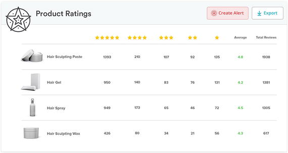
Figure 3-5. Product Ratings report showing review counts and distribution
When launching new products, some large bricks-to-click s suppliers leverage review campaigns to gain reviews for their products. On Amazon.com, this program is known as Amazon Vine. Most other sites don’t have authorized reviewer programs like Amazon does, but companies such as BzzAgent, a word-of-mouth marketing company, will run review campaigns using a network of consumers who review products in exchange for receiving those products for free.
Especially when launching new products, it’s helpful to be able to track improvement in reviews for specific products over time. That’s exactly the kind of reporting that the Ratings Trends report provides. It’s especially useful because you can see not only how your overall review counts are changing but how they’re changing at each rating level.
Content Health
Another key area we measure is related to the health of your online product content. We’ve spent a lot of time discussing content in previous chapters—the Dashboard rolls up that information into a few key content metrics that you can track on an ongoing basis.
Content health is important because it’s a measure of how well your items are presented online on the individual item pages. If an item page for your product has no image, for example, in the best case, shoppers aren’t going to have the information they need to evaluate the item, and in the worst case, shoppers are going to mistakenly think the physical item has a problem or is out of stock. Either way, a missing image, poor image, or lack of multiple images is bad for your brand and your items.
We factor a variety of individual measures into the overall content health score. We normally split the content health score into the percentage of items with high-priority issues, medium-priority issues, and items that are missing enhanced content.
We can also look at criteria such as the following:
Does the primary image for an item, as displayed on a retailer’s site, match the master primary image that the supplier has provided? (A master image can be an image we received from the supplier; it can also be imagery on another retailer site where a provider thinks they have especially strong content.)
What percentage of the secondary/alternate images on a retailer match the master images that the supplier wants to see displayed for that item?
What percent of items contain at least one keyword in the product title for the category or subcategory that the item is in? For example, does a diapers item contain the word diaper in the product title?
What percent of items contain at least one keyword in the product description for the category or subcategory that the item is in? Similarly, for a diaper item, is the word diaper mentioned in the product description?
Ultimately we roll up these metrics into a score (which can be calculated with no weighting or with extra weighting given to certain factors), and that becomes the supplier’s content health score .
Figure 3-6 shows an example Content Health report. The score inside the circle indicates the overall health of your items. You can click any row to see the specific items on which you should take action. Content Health reports can be customized by business segment, product list, department and category and generated for virtually any retailer.

Figure 3-6. Content Health report
If you have multiple product lines, brands, or business segments, you can split them up into different lists, and you can select multiple lists to see how you’re doing on content health across the board.
Within the Content Health report, we group items by issue type: high priority, medium priority, and those items that are in good content health. The system is set up with a default set of rules, based on our extensive experience with retailers and suppliers, that determine how issues are classified and the importance of any given issue. Those rules can be easily configured based on specific requirements. For example, if you want to increase the minimum threshold for the number of images or make videos a requirement to get a good content health score, it’s easy to do (Table 3-1). It’s also easy to configure rules specifically for each retailer, such as if you want to adhere to a certain minimum image count on Amazon.com but a different minimum image count on Walmart.com.
Table 3-1. Content Health Best Practices
Segment | Best Practice | Rationale |
|---|---|---|
Images | 3 or more high-resolution images | When a customer can see a clear picture of the product they’re planning to purchase, it significantly increases their willingness to buy. |
Product description | 150 words or more | Longer descriptions are better—they help with search engine listings and provide more information to customers to inform purchase decisions. |
Product title | 50 to 70 characters | Titles longer than 70 characters are hard to read on mobile devices. Titles less than 25 characters are often missing critical information. |
Enhanced content | At least 1 piece of enhanced content | Videos, PDFs, and comparison tables have been shown to increase conversion rates. |
Reviews | 21 or more reviews | More reviews increase conversion rates. Products benefit the most once they receive at least 21 reviews. |
High-priority issues typically refer to elements such as missing images and product descriptions that are less than 25 words in length. That’s because these are essential. If an item is missing an image or has just a couple of words for a description, it’s not going to do well in the search results, and even if a shopper does find it, they’re not likely to buy it because of the poor quality of the content. (All thresholds are customizable.)
Medium-priority issues refer to content segments such as the number of images, whether those images are high-resolution images (so they can be zoomed in), whether the descriptions are sufficiently long (not just meeting the minimum requirements), and whether the items include enhanced content such as videos.
As part of content health, we can also measure factors such as whether an item page includes enriched content or has videos, 360 views, or PDFs embedded directly on the page. These metrics factor into the Rich Media card.
Bricks-to-click s suppliers track, at a minimum, the percentage of their items with high-priority issues and then work diligently to get that percentage down as low as possible.
Share of Shelf
Share of shelf and share of search appear on the Dashboard in the Search and Shelf section. Think of the last time you shopped for a new television online. There are two ways you could have gotten to the set of products you were interested in evaluating. One way was to use site navigation, first clicking Electronics, then clicking Televisions, and then maybe even drilling down into a hot new area like “4K TVs.” From there you would have seen results on a shelf page, a page specific to a department/category/subcategory in the site’s hierarchy. Shelf pages refer to pages that shoppers navigate to, typically using the left navigation bar on a retailer’s web site.
Your share of shelf refers to the percentage of the items on the digital shelf that belong to your brand or your company. Suppose that when you browsed to that television page there were 20 total results on the first page, and that of those 20 results, five belonged to your brand. Therefore, your share of shelf would be 5 out of 20, or 25 percent .
Now suppose that there are separate shelf pages for televisions, portable televisions, high-definition televisions, and curved televisions. In this case, to measure your share of shelf, we calculate your share for each individual shelf page and then average those together to produce your overall share of shelf measure. The Dashboard can still display your share for each individual page, but at a high level you’re probably more interested in knowing first how you’re doing across the broader set of shelf pages and then drilling down into the details. This overall percentage is your share of shelf.
We can even run this calculation for shelf pages across multiple web sites, say Amazon.com, Walmart.com, Target.com, and Bestbuy.com, to calculate your share of shelf for televisions across all four sites. We can compare this measure with your offline share, with a specific goal you’ve set or both. And we can trend this over time to show you whether your share is improving, staying the same, or getting worse. We can also look at a more granular analysis of shelf results, looking at, say, only the first three positions, the first ten positions, the first page, or the first few pages of results. Most clients want their share of shelf to be based on the first page of results or on the first three or first ten results only.
Based on your share, we might suggest changes to your content or the addition of a paid campaign to supplement your position in the shelf results. But the first step is doing what leading bricks-to-click s suppliers do, which is to track your share on at least one retailer site, followed by tracking your share across multiple sites so you can see how your share compares across retail channels.
Share of Search
The other way you could have gotten to a set of televisions to evaluate is by typing, say, “4K televisions” into the search box on the retailer’s web site. This would have produced a set of results related to that search term. Put simply, instead of navigating, you would have been searching, using a search term, much like you might search for something in a search engine like Google.
If you don’t have a meaningful share of search results, shoppers will never see your products. Statistics show that products in the first three search positions for any given search receive more than 60 percent of all clicks.3 Comprehensive share of search reporting includes tracking for at least a few dozen search terms (in the case of televisions, that might include terms like “televisions,” “TVs,” “4K TVs,” “UHD TVs,” “curved TVs,” and so on). More typically, share of search tracking is done based on hundreds of search terms for a segment (such as televisions, tablets, mobile phones, and appliances).
As with share of shelf , we can always look at share for individual search terms, but we usually start by looking at share of search across a large group of search terms first. We can evaluate just the first three search results, the first ten results, the entire first page, or multiple pages. Most clients have us measure share for the first ten results or the first page. By monitoring share of search, we can often spot valuable opportunities, such as products that should be showing up on the first page of search results but aren’t .
Right on the Dashboard you can turn over the cards and see your share of search for each search term that makes up your overall score. That lets you know right away where you’re doing well and where you need to invest.
Like out-of-stock reporting, share of search and share of shelf have nuances to the way they’re measured. For example, suppose that when a shopper searches for “diapers” on a site that supports both first-party and third-party (marketplace ) sellers, should items in the results that are only available from marketplace sellers be counted in the share of shelf and share of search results?
Or, should only 1P items be counted? Some brands (or, more specifically, some teams at those brands) want to see results only for 1P items. 3P sales for a big brand don’t count toward the sales for the retailer team at a given brand, like the Walmart.com team or the Amazon.com team. Therefore, they only want 1P results to be included in their share calculations. But at other brands we work with, they feel that any item that matches their brand, whether it comes from a 3P seller or is sold directly by the site itself, should be included.
We refer to the brand-based share calculations as just that: brand-based share. We refer to the alternate way of calculating share as list-based share because the calculations are based on a specific list of products .
Both approaches are valid. Most bricks-to-click s retailers have a view on which approach they’d prefer us to present on their Dashboard. In some cases, they’ve asked us to include cards for both sets of calculations so they compare and track both sets of results.
While the Dashboard provides roll-up reporting of your search terms, the Insights Share of Search report provides detailed reporting for your search terms. It shows you not only your own share but your competitors’ share as well. You can easily see how many and which keywords your products are ranking for.
Note
Rankings refers to the number of desired items appearing in search results for a given keyword. Rankings are also referred to as placements.
You can do a one-time export or create regularly scheduled exports. Scheduled exports are especially useful for large data exports that need to be generated on a regular basis. You can chart your share of search for easy viewing. As an example, bar chart mode (Figure 3-7) provides a snapshot in time, while trend analysis view makes it easy to see how you’re doing over the course of a given time period.

Figure 3-7. Share of search snapshot view
You can easily export any of the charts (as well as the raw data) for inclusion in presentations and business reports .
Taxonomy
Bricks-to-click s suppliers segment the view of their data in the Dashboard in several ways. Smaller suppliers stick with lists of items called product lists. These are simply lists of URLs, where each URL corresponds to an item page on a retailer’s web site. Examples of lists are Spring 2017 Collection, Televisions, Top 300 Items, and so on. Lists are the easiest way to organize products on the Dashboard . Lists of URLs can be easily generated from UPC codes, tool IDs (in the case of Walmart.com), ASINs (in the case of Amazon), TCINs (in the case of Target), and other codes and IDs.
Companies with multiple divisions or business units often use a more comprehensive taxonomy approach for their Dashboard. The taxonomy can be broken down by department, category, subcategory, and brand, and search terms for share of search can be associated with specific groups within the taxonomy (such as diaper-related keywords for diaper brands and shaving-related keywords for shaving brands). Taxonomy views are especially helpful for understanding how a business unit is doing and performing comparisons across business units. Managers can quickly identify, for example, which brands have the biggest opportunity for improvement and focus their efforts on those brands.
Custom Dashboard s
Based on our work with suppliers, we’ve developed a comprehensive Dashboard that is now used by category captains like P&G, L’Oréal, Samsung, Levi’s, Mattel, Clorox, and many others. The development of the Dashboard has been a true collaboration with our suppliers, with them providing ongoing input into the metrics they care about and the way they want to see key data presented (both on the Dashboard and in alerts).
That said, some suppliers want custom views of the Dashboard that are specific to their business. As an example, one supplier we work with has developed their own internal methodology for reporting on some of the key metrics we’ve discussed through this chapter. They rolled the metrics up into a group of key categories with one card for each metric. And, they have a unique overall score calculation based on the component metrics they’ve selected as relevant to their business. We developed their custom Dashboard for them, based on our existing capabilities, in about a month.
Other suppliers have specific time requirements. As an example, one supplier we work with reports to their leadership team first thing Monday morning. They use Saturdays as the benchmark for the week, so we gather and generate their reports for them on Saturdays. During the week, we still collect all the day-to-day data, but the data they report on is from our Saturday run.
Global View
Global bricks-to-click s suppliers require a global view of their business. That’s why our Dashboard supports global reporting across many different countries. Being global not only means we collect performance data on many retailer web sites across the globe but also means that we can present that data in the Dashboard.
Using the Dashboard, you can look at data for one individual retailer site, for all the sites within a country, for all the countries in a region, and across the entire globe. We can roll up the results and show the average, or you can compare two sites, countries, or regions side by side.
Heatmaps
Throughout this chapter we’ve covered many different reporting segments. Charting is useful for trend analysis, but another visual presentation format—the heatmap—is even more useful for understanding performance across your business. Suppose you want to see the performance of all your business segments on a retailer according to each key performance indicator. Using our built-in heatmap support we can show you all your brands side by side and how they’re each doing for a particular reporting segment.
Without a heatmap, you’d have to go through each brand and note the brand’s performance for each relevant segment. Using the heatmap you can quickly pinpoint which brands are doing well and where there are opportunities for improvement.
External Reporting
Bricks-to-click s suppliers not only use the Dashboard for internal reporting but for external reporting as well. Many of our suppliers bring the Dashboard to their buyer meetings and use the Dashboard for year beginning meetings (YBMs) and quarterly business reviews (QBRs). This lets them highlight specific areas where the supplier is outperforming—and areas where they would like the retailer to improve.
For example, in the Walmart ecosystem, there is a special focus on delivering high-quality content. Some suppliers started out with poor content health (missing images, few images, or poor image quality) often because they traditionally sold in-store only. They’ve since made a concerted effort to improve their content, and their content health scores have improved as a result. They want to highlight this progress—tracked over time for context—to their buyer.
In another example, a supplier might want to show a buyer that the buyer needs to order more products on a regular basis. If the supplier’s out-of-stock rate has remained steady over the course of several months or quarters, the buyer needs to know about it. Showing a trended analysis of out-of-stock rates to a buyer is a powerful way to help convince the buyer that they need to be placing bigger orders and stocking more inventory of the supplier’s product.
Summary
This chapter covered the many metrics that bricks-to-clicks suppliers are tracking and optimizing to get the most sales for their business. Not only do bricks-to-clicks suppliers use the Dashboard to report on their e-commerce metrics, they also use it to report on in-store sales performance so that they can have all their data in one place. They’ve made it the control center for their business operations.
Combined with this, they’ve configured alerts (or had us configure alerts for them) to let them know when they urgently need to take action (such as when products go out of stock) and so they can receive performance updates straight in their inboxes. The bricks-to-click s suppliers have recognized that having a Dashboard enables them to do the following:
Understand the key metrics that matter to their business in one place, including consolidating multiple sources of data (web, retailer, and internal) and data across multiple retailers and regions
Get a snapshot of business performance and view trend analysis
Easily see where there are opportunities for improvement
Set business goals and use the Dashboard to manage them
Report to their leadership on business performance
Bricks-to-clicks suppliers that use the Content Analytics system not only can gain insight into their business but can also take action to improve, producing meaningful improvements in sales as a result.