
Choosing Colors
When choosing colors for a painting, let’s start with a basic color wheel. The primary colors are red, yellow, and blue. As you may also recall from childhood, mixing two primary colors makes what are called secondary colors. Orange, green, and purple are secondary colors.

While in theory all of this is correct, there are actually many different paints out there with different properties. These different properties will affect how they mix together and how the colors appear.
For example, the purest paints are made up of a single pigment. There are also designer colors, which contain a combination of pigments that create a custom color. The benefit of single-pigment paints is that you can more easily customize your own colors to match your needs.
Natural versus Synthetic
Many paints are actually synthetic versions of organic or inorganic paints. A long time ago, most paints were derived from natural minerals and dyes. Today, synthetic paints are manufactured in all of the traditional colors, as well as a variety of new modern colors that you often see in urban and man-made environments. If a paint says “hue” in its name, it is the synthetic version of that pigment.

That being said, you can still find and use natural paints, if preferred. Natural organic paints are derived from plant or animal matter including dyes and carbons. Natural inorganic paints are derived from minerals, such as cobalt, cadmium, and nickel. In general, organic paints, whether natural or synthetic, are more transparent than opaque inorganic paints. Examples of organic paints are lakes, quinacridone, phthalo, and azo.
Value
Value is the lightness or darkness of a color. On a gray value scale, “1” would be white and “10” would be black. All colors in between would be various shades of gray with the center midway between black and white.

This chart has five values.
Now take a color like red, and you can mix many combinations by adding more white or black paint. Adding white to a color is called a tint. Adding black to a color is called a shade.

As you might have guessed, different colors fall on different places on the value scale. For example, yellow is close to “1” or white, and ultramarine blue is closer to “10” or black.
One can also mix different colors together to lighten or darken a color. In fact, sometimes adding another color is a better way to change the value. By adding another color, rather than simply white or black, the colors stay bright and saturated. Practice will help you decide the right amounts and colors to mix to achieve desired results.

Mixing yellow into red and blue creates a variety of browns.
Hue
Hue is the basic color of a paint, such as red, yellow, or blue. One can mix colors so that they still remain a majority of one color, such as turquoise blue and teal blue.
Warm colors fall on the red and yellow side of the color wheel. They are the colors of fire, heat, and sunsets. Cool colors have a cool tone to them that looks and feels cool visually. Some colors that you might think are warm can have a cool chroma (see here to learn more about chroma), such as neon yellow (a cool color) and ultramarine blue (a warm color). Sometimes comparing a color to a neutral tone, such as white paper or black paper, can help you decide if a color is warm or cool.
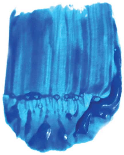
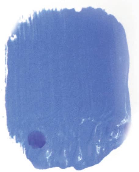
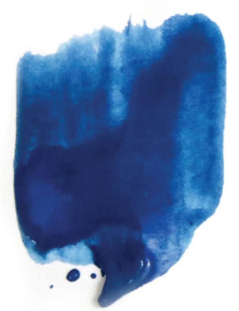
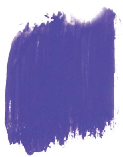
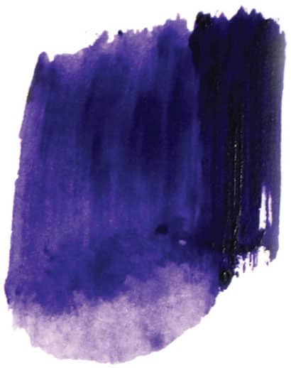
A selection of blue paints out of the tube
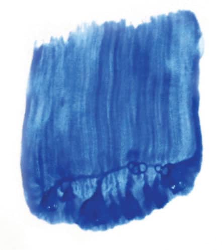
Cerulean blue

Ultramarine blue
Manganese blue hue
Ultramarine blue light
Cerulean blue deep
Light violet

Amethyst
Dioxazine purple
Chroma
Chroma is the intensity of a color. Not all colors in a painting should be supersaturated and intense. Too many saturated colors may overwhelm the artwork. It’s often best to tone down most of the colors to soft pastels and warm and cool grays.

Color Chart Examples
The color charts at left and below show how adding white or another color can create a whole range of new colors. These charts can be expanded further by mixing each of the colors in turn with each other in varying proportions to create new color combinations.

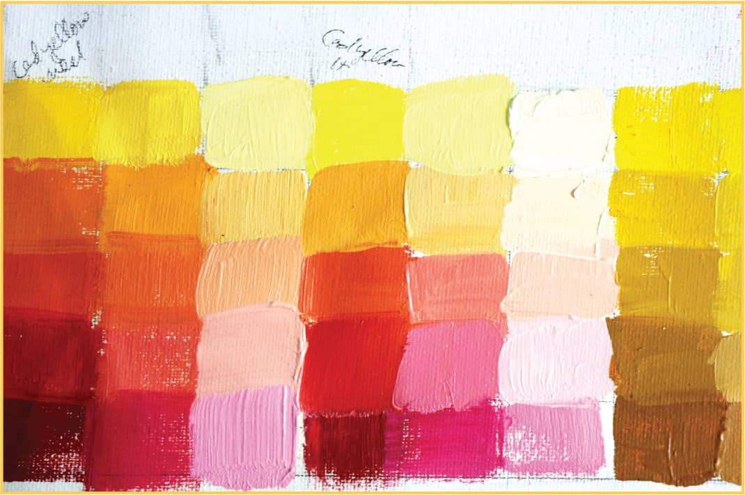
While this exercise is not required before starting a painting, it’s a fun and educational way to learn more about each paint property. It’s also a nice guide when looking to mix a certain color. You can find the desired color on your color chart and know what core colors to use in order to recreate it.

Pigments
You may have had experience with the natural dyes in food, such as wine or grape juice staining more than milk. The same staining properties are in pigments. Some pigments are more “staining” than others and don’t require as much paint within mixes. They can overpower other colors even in small amounts. I call them bullies. Phthalo blues and greens fit this category. The benefit is that they can also make amazing, intense blues and greens.
Phthalo green is darker and much more intense and staining than cadmium green. It also stays very bright when white is added to it. In other words, a little goes a long way.

2-D versus 3-D
The world we live in is 3-D. When we paint, we are working in 2-D. Have you ever wondered how paintings can sometimes pull you into a scene or even jump off of the canvas? By using certain techniques, one can create the feeling of depth on a flat surface. One can do this by creating an illusion through the planes of paint.

Think for a moment of the cut facets of a diamond. Layering paint colors in flat planes of different shades or tints can create a 3-D effect. One must paint with well-mixed paints and leave no streaks to create this dimension.
To bring colors forward in a painting, use more intense colors closer to the foreground and more muted tones toward the background of the subject. This is most dramatic where the subject matter features a large amount of space, such as in a landscape.

Another way to create the 3-D effect is to add more detail near the focal point of a painting. Keep the other parts of the painting looser and more abstract or even left unpainted. Think about how your brain works. Say you are looking at the grass on the ground. You see the grass, but not each individual blade in focus.
You can also create thick, sculpted layers of paint on the canvas. While this is often a great idea, it’s best to create the 3-D effect from the flat plane, rather than a sculpture on top of your canvas. In general, I use thicker brushstrokes loaded with paint for lighter colors and thinner washes for darker colors.
More on Colors
All values and tones are relative. Have you heard of the game “What’s the Difference?” Within a group of objects, you have to find the one that’s different. Think about this when making a painting. For example, if all of the colors are neutral and one is bright pink, it may stand out too much. Of course, with art, that may be the desire. But for more traditional paintings, it may look out of place. It’s good to remember the relative nature of your chosen colors. It’s also good to plan and understand the goals and desires for your painting.
Along with hues, values can also be relative. A gray or brown can be used in place of black if the rest of the values are very light. And vice-versa, a gray or mid-tone value can be used as highlights for a mostly dark painting. You don’t need to use the darkest darks or the lightest whites for every painting.

The lime hue looks cooler next to red and yellow, but warmer next to blue. The lime looks lighter next to the red and blue because the yellow is a lighter value.

Some may think more colors on the paint palette are better than fewer. This is not always the case. It’s sometimes easier to create color harmony with fewer paint colors. In fact, in many professional art schools and ateliers, young artists may use only black and white for a whole year. Then, as the art students progress, they may add one more color their second year, and so forth. This helps artists pay more attention to the values within their paintings. It shows that not every color of the rainbow is needed to create a masterpiece.

Mixing Colors
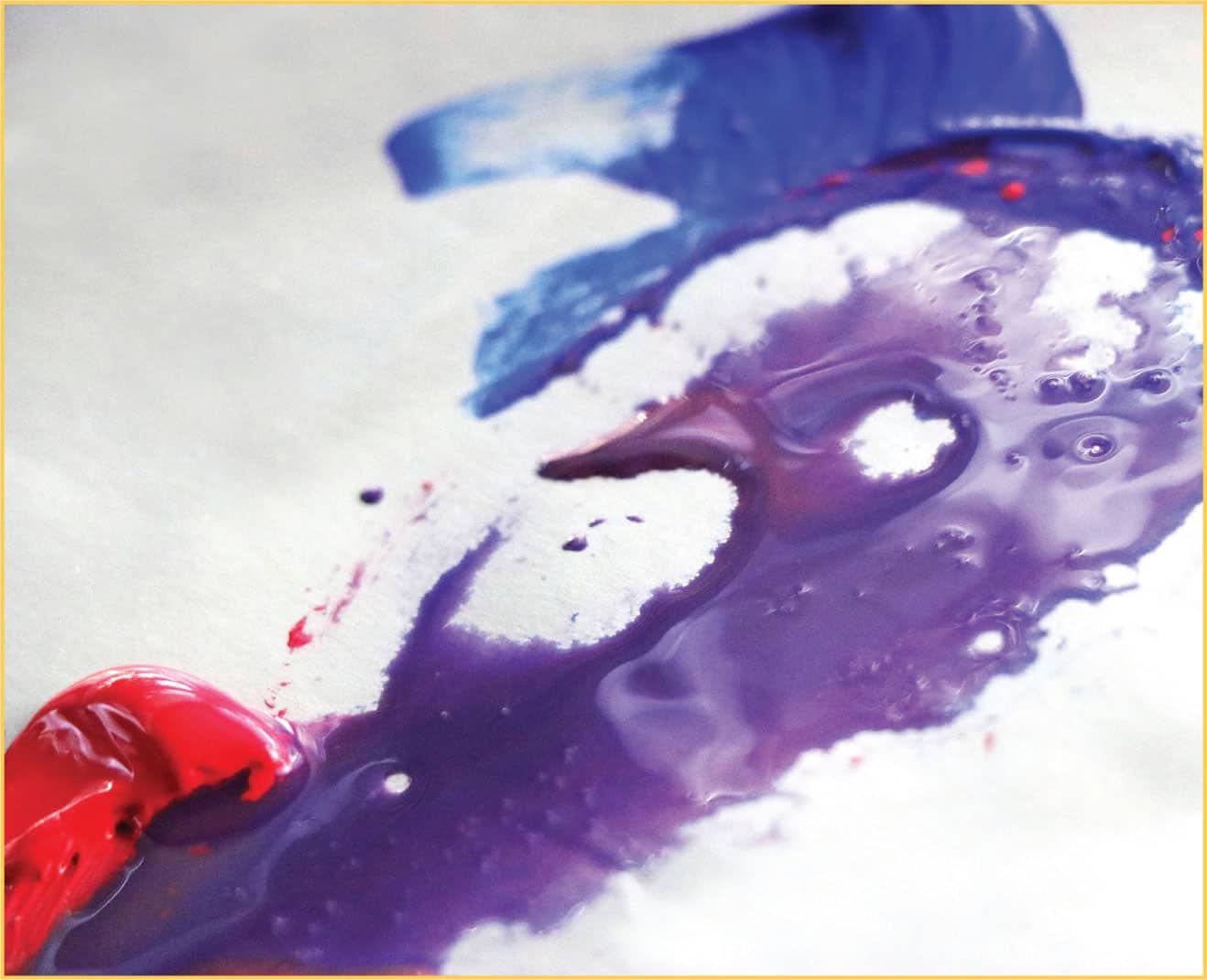
Mixing colors is almost like chemistry. It can be really fun and exciting, but also sometimes frustrating learning about the properties of each paint. For example, we know there is red, yellow, and blue in the color wheel. We also know red and blue make purple. But some reds and blues make more vibrant purples than others. For example, cerulean blue chromium and cadmium red make a muddied, almost-brown purple, while ultramarine blue and quinacridone red mix to a vibrant violet-purple.

Cerulean blue chromium + Cadmium red

Ultramarine blue + Quinacridone red
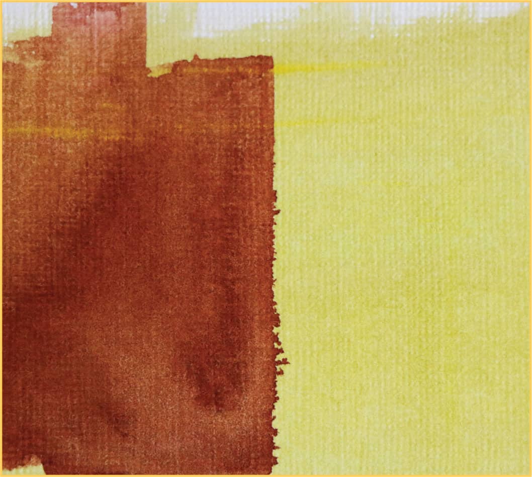
To tone down the chroma of a color and make it less saturated, add in some of its complement. The complement is the color that will make up a total of red, yellow, and blue. For example, the complement of orange (red + yellow) is blue. The complement of purple (red + blue) is yellow. The complement of green (blue + yellow) is red.

The complement of orange (red + yellow) is blue.
I like to create the darker, shadowed side of an object by adding its complement. Not only does it tone down the chroma, it also darkens the color. The exception to this darkening effect would be if the complement is yellow. Since yellow is high on the light values, it wouldn’t darken but would still tone down its complement, purple.

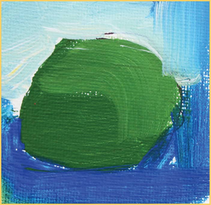
Red ball with its complement (green) added to the shadowed side and white added to the light side.
Colored Circles
Paint a circle with a brush of your choosing using watered down, unmixed paints. Notice how some colors are lighter or brighter than others. Some colors may also appear more transparent than others.


Two-toned Swatches
Try various combinations of colors and values of your choosing and notice how the paints appear and behave in different combinations. For example, paint a swatch of yellow paint; once dry, paint over the yellow with a darker color. You can also paint light over dark. These are layering effects.

Light over dark
Dark over light