
Now that we’ve established the “why” of a design system and learned how to think about design as a language, the next step is to begin implementation. In this section, we will start by assessing your organization, building a support system, and understanding the state of your product. You will learn how to build a predictable architecture that supports the multiple areas that make up your system. Once there is a clear foundation, you can begin designing, building, and implementing components while ensuring to clearly document decisions along the way. We’ve provided three case studies to help ground the discussion and provide real-world scenarios for how to implement a system based on individual needs.
Assessing Your Organization
The way you tackle your design system will largely depend on your organization. Begin by assessing the type of organization, your stakeholder buy-in, and your team size, to understand the challenges you face, as well as how to best begin implementation.
Type of Organization
Is your organization a product shop or an agency? You’ll want to approach your design system differently depending on whether you are building one or multiple products.
When working on one application, start by defining your layout and styles. These guidelines will establish the foundation needed for all components.
Agencies, on the other hand, often have multiple clients. Their design system has to adapt to different themes and functionality to support multiple clients and products. Start by defining or identifying the critical components that are used throughout all of your products. Create a layout system that is driven by a central set of variables. In programming, variables are used to represent a value that can change depending on the information or conditions.1 When building interfaces, these variables include values for spacing that can be customized on a product-by-product basis. Starting from a flexible layout will give you a solid foundation that allows the freedom to customize each product and project.

Flexible styles can transform the same component, giving it a completely different visual language while maintaining the same foundation
Stakeholder Buy-In
The support you have from others within your organization will play a critical role in how you build out your system. If you do not have buy-in from key stakeholders, you will have to be more strategic in approaching implementation. While helpful, it is not necessary to have stakeholder buy-in to start implementing your system. Carve out time to start defining your elements and documenting your guidelines as a first step. Keep track of how these improvements are helping you work faster and smarter to build the business case. As these become more concrete, the perceived value of your system will grow over time, and the business case will be more evident to the organization.
Note
For more information on how to gain stakeholder buy-in, review Chapter 3.
Team Size
A small team typically struggles to find the necessary time to build out a fully functioning system, while a large organization may grapple with getting ahead of the inconsistencies that have built up over the years. The problems you experience will vary, depending on the size of the team. Remain aware of the challenges your organization is facing and be prepared to come up with a game plan to address these problems at the start of implementation.
Review the case studies at the end of this chapter for real-world insight into how your type of organization, stakeholder buy-in, and team size can all affect your design system.
Gathering a Support System
Once you’ve assessed your organization, begin to gather support from co-workers. Some organizations are lucky enough to form dedicated design system teams that comprise designers, engineers, and product managers. However, this is relatively uncommon when first beginning. It is more likely that you will start on your own, with the help of a few co-workers you may have to recruit.
Clearly articulate what a design system is when talking with your peers. One common misconception is that a design system is solely a place to house the visual aspect of each component. To address this misconception, explain that a design system encompasses all areas of your platform: from design principles and usability guidelines, to live component examples, and technical rules.
Build enthusiasm among those who show interest in learning more about your effort. These will be your most reliable allies throughout the process. If you don’t have a technical background, it is crucial to form a relationship with the members of your team who can assist with the technical implementation. Without them, you will struggle to make headway on completing your design system.
Research best practices.
Make an interface inventory.
Design and define your layout, styles, and components.
Document guidelines.
Review documentation.
Build and implement components.
Iterate and refine.
Evangelize your efforts across your organization.
Assessing Your Product
Creating systematic design requires a structured approach. If you jump straight into creating new components for your product without first understanding the current state of your interface, you will fall into the trap of continuously redesigning the same components. Begin by understanding where your problem areas are in order to create a system that brings focus and efficiency.
Utilize an Interface Inventory
Inconsistencies within your product can lead to confusing experiences for your users. To help understand the current state of your product or application, create an interface inventory. An inventory will surface inconsistencies and lay the groundwork for correcting them.
Note
If your product is brand new, you may choose to forgo creating an interface inventory at this time.
To begin, capture and record all of the elements and components used within your UI. The easiest way to do this is to screenshot each one. You don’t need to log every instance, simply document each unique design. Include typography, inputs, radios, buttons, etc. Be meticulous. Every individual element and component used throughout your product should be recorded. Navigate page by page until you feel confident that you have grabbed each one.
An interface inventory showing icon inconsistencies
Use your interface inventory as a jumping-off point. Now that you have everything recorded, you’ll be able to use this to start working toward a comprehensive component library. Knowing the current state of your product will allow you to successfully break down your design system into intuitive categories.
Creating a Predictable Architecture
How you organize your system is crucial to the success of your design system. Breaking your system down into predictable categories will keep your content easily discoverable. Remain open to adjusting the architecture as you build out and expand on your system.
Categorizing to Improve Discoverability
Layout: Defined measures that make up your spacing and grid system.
Styles: Core aspects of your visual language. These include colors, iconography, and typography.
Components: Core elements of an interface. These include buttons and form fields.
Regions: Overarching design paradigms, such as navigation or search.
Content: Information regarding the voice and tone, as well as punctuation guidelines. Content can also include terminology if your product has a specific vocabulary.
Usability: Rules that define accessibility and internationalization.
Breaking your system down into sections will provide a sense of organization, making it easier to find the information required to complete a specific task.
Using the preceding six categories as a base, begin to piece together the structure for your system. Your system should consider all areas, but they will vary in size depending on your organization. Don’t get stuck on conforming to a set of categories or rules that don’t work for your organizational goals or user needs. Categories will help to communicate different areas of focus, but keep in mind that your design language needs room to grow and evolve over time.
Card Sorting
As your design system expands, you may not always be sure where specific content should live. When this happens, utilize a card-sorting technique to determine what should be grouped together. You may find that you need to add a new category, or change a category name, to fit new content.
How to Perform a Card Sort
- 1.
If you’ve already begun creating your design system, start by capturing the different parts that make up your system. Include any new components or guidelines you are looking to add. Use your interface inventory to incorporate components you have identified. Drag-and-drop interactions, common terms, and filters are perfect examples of what you may be looking to categorize.
Note
You will want to limit the number of cards you create to reduce fatigue during the study. This may mean that not all elements or guidelines are captured in your research. Aim to be broad enough so that you can use the findings to categorize cards that didn’t make it into the test. Alternatively, if you don’t have enough cards to test, it will be difficult for users to find parallels between them. Try to keep your number of cards between 30 and 50.
- 2.
Recruit seven to ten participants to take part in your card sort.
- 3.
For each participant, mix up the order of your cards and allow them to organize the content into any categories they choose. Give the participant the opportunity to write their own category names. This will give you more insight into how they would structure and define the content.
- 4.
After every participant has finished their sorting, analyze how often the same cards were grouped together, as well as how often the same categories were created.
- 5.
Use your analysis to tweak the information architecture of your system as needed.
Layout
A foundational aspect included in your system is the layout, which includes guidelines for both your spacing and grid. These provide a solid base from which you can create components and build interfaces.
Remember: If you are creating a system for multiple products, consider creating a series of variables that allow you to customize your layout for each one.
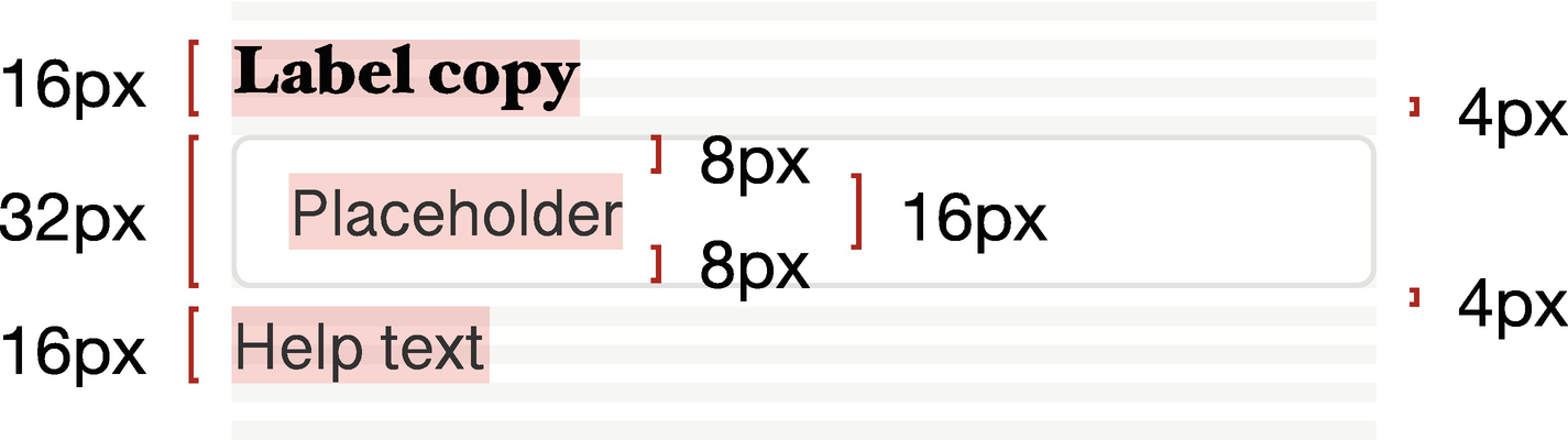
Spacing
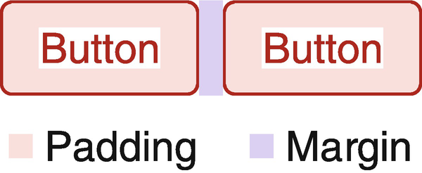
Padding is used to add space between the text and borders of the buttons, while margin makes up the space between components
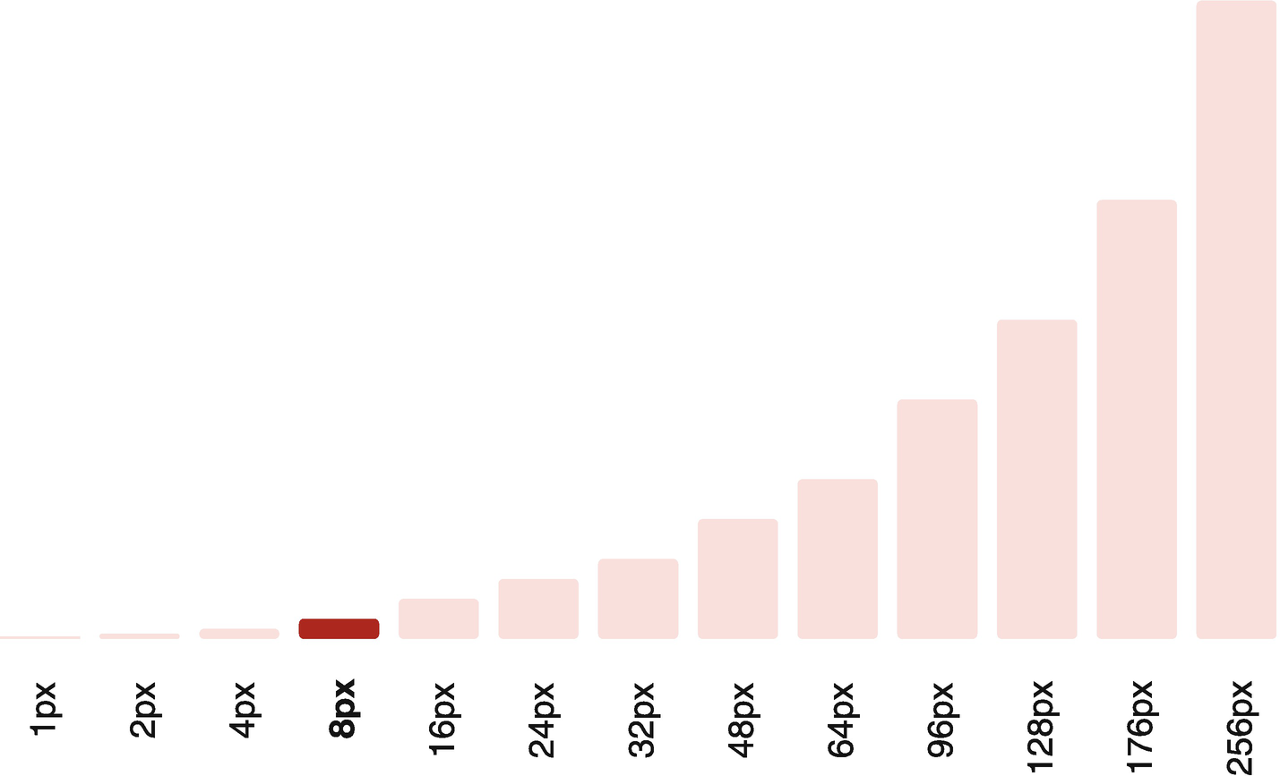
A spacing system using a mathematical progression with a starting base of 8px
In the end, you will have to determine the most appropriate starting number for your needs, as well as the increments to use across your product.
Grid
There are multiple types of grids, most commonly column and baseline grids. Column grids are regularly used within web development to separate discontinuous content. Equal spacing between columns keeps content divided uniformly, allowing users to digest information quickly. Column grids can also be rearranged to accommodate different screen sizes, making them ideal for implementing a responsive design. While column grids are useful in many layouts, they may not always be appropriate in others. A complex web app may require more flexibility than column grids allow. High-density information, for example, would benefit from implementing a strict measurement system that could be used in place of, or in addition to, column grids.
Further, utilizing a baseline grid will keep your units horizontally aligned to one another. Baseline grids align all of your text to a horizontal grid. The x-height2 of each letter is anchored onto this grid, keeping content legible and reducing the guesswork when building out new user interfaces. With consistent spacing, you can ensure that the hierarchy of your content is well-defined and easy to determine.
Components placed on a baseline grid of 4px
Styles
Your styles make up your visual language and include typography, colors, and icons. As you define these elements, be sure to reference the design principles you created for your organization. This will help to align your overall visual language with the design language you are crafting.
If you are working with one product, you only need to define your styles once. However, if you are building a system for multiple products or clients, you will need to create a theming system that allows you to customize the visual language of each unique product.
Creating a Typographic System
Typography that functions well, conforms to user needs, and aligns with your baseline grid can be a challenge to get right. To ensure that your typography aligns with your baseline grid and has readable line-heights, we have found that it is useful to break down your typography into two categories: UI typography and long-form typography.
The UI typography within the input box uses a line-height of 16px. This is a multiple of the starting unit 8, chosen in the illustrated spacing system
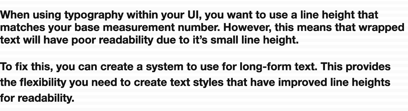
Line-heights for UI typography are too small for readable text when used for long-form text
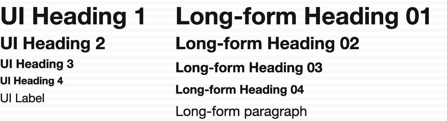
UI typography vs. long-form typography
Aligning your typography with your baseline grid and measurement system is one of the more frustrating parts to get right. It can take a lot of trial and error. Take time to experiment. Nailing down a typographic system that aligns with your layout makes the remainder of your visual decisions a breeze.
An Accessible Color System
Colors are an important consideration when determining the aesthetic of your product or projects. Because they do not affect layout or functionality, your color palette can be iterated freely. This makes your color system an easy first choice if you are struggling with where to begin once you start technical implementation.
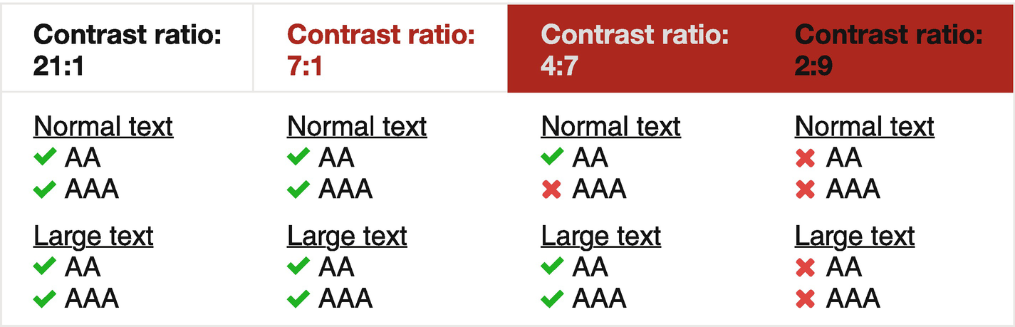
Color combinations and their corresponding rating, according to the WCAG

A series of shades that make up a palette. This provides flexibility and the ability to define primary, secondary, and tertiary options.
Our experience
If you choose to create an expansive color system, implement color priorities to reduce your decision making during the design process. You can achieve color priorities by creating a system similar to font weights. Assign your colors a numbered value that corresponds to the hierarchy in which they should be used.
Uniform Iconography
Not all products will require their own set of icons. You can take advantage of multiple open source icon fonts. However, one primary benefit of creating your own set of icons is the ability to align them with your distinct visual language. If you are creating your own icon set, remember to document your process thoroughly. Establish an icon grid and core shapes in order to maintain proportions and visual consistency across icons. The rest of your team should understand the structure that makes up your icons, as well as how to export and include them within your application. If necessary, get the help of your engineering team to create an icon viewer that allows your organization to search for existing icons quickly. For ease of use, include a way to copy the source code or download a vector version.
Components
As you begin to design and define components, look back at what was included within your interface inventory. Establish a structure that mimics the way components will be implemented. A systematic approach will bring your design and engineering teams closer together while ensuring that components stay DRY and reusable.
Creating a Component Library
Building a component library will help your design team to visually see how layout and style guidelines apply to each component. Often, your component library will start within a design tool, but it can also be created directly in code.
You can use your component library as a playground when first determining your primary set of guidelines. Remember to think about your specific product and start by creating the components that are most relevant to your needs.
Review your inventory and choose the ten most widely used components to get started. This most often will mean starting with the basic components that make up your interface: buttons, inputs, labels, tool tips, etc. Beginning with these will create a solid foundation on which to build more complex component groups as you work through your interface inventory.
Tooling
Design software : Tools, such as Sketch or Figma, give your design team the flexibility to play with applying different guidelines to your components.
Front-end frameworks: Many front-end teams use frameworks as a base for their component structure that can then be easily modified to fit unique styles. Bootstrap and Foundation are common web frameworks used by many teams.
UI development environments: Your team may also choose to use an interactive UI development environment, such as Storybook. Tools like these allow developers to build components in an isolated setting, providing a way to easily test each component independently of your product.
Choosing tools can be an arduous task, especially considering the number of options available for designers and engineers today. It is easy to get caught up in the latest tool, turning progress into tool churn.
Tools are always evolving, but it’s important to keep in mind that constant change may slow progress. Evaluate your tools carefully and decide what is best for your team at this moment. Don’t get caught up in a niche toolset that may disappear in a few months. Look at numerous aspects, such as performance, scalability, and reliability. The tools and technologies you use to create your library are meant to help your team create your design system, not act as the solution.
Building Components
In Chapter 4, we talked about how to build up elements to create components, component groups, and regions. This systematic structure is important to keep in mind throughout the process of building your component library. Thinking about your interface in this way will mimic the way in which your product is built by your engineering team.
There are many other methodologies that exist to help structure design in a systematic way. You may choose whichever methodology works for you, so long as you are thinking about your interface as building blocks. If this is a new concept for you, be sure to bring in engineers early and get their perspective often. Doing so will strengthen your design language and propel implementation.
Remember: All your components should adhere to the rules you have previously defined in other sections. If you are working for an agency and do not yet have a set of flexible styles, create a series of components with base styles that you can apply themes to later.
Regions
Your system needs a place for documentation related to larger paradigms that go beyond your components. These areas are often reused throughout your product and have specific guidelines that relate to the region as a whole.
For example, you may choose to classify a search bar as a component. However, if search plays a primary role within your product, has many interactions, and is reused often, consider categorizing search as a region. By setting it apart from an individual component, you recognize that the region has guidelines that are made up of more than its building blocks.
Regions provide the space to expand on interactions specific to your product. For example, if your application has different user permissions, you can include guidelines related to how they affect your interface and user experience. You may choose to add rules for logged-in vs. logged-out users. Regions also typically consist of rules that apply to your navigation structure, such as guidelines for global and contextual navigation or a complex hierarchical structure. What you decide to include as a region will largely depend on what product you are building.
Content
Like regions, your content section will rely on the needs of your product. This is a place for you to capture the voice and tone you want to portray in your application. Collaborate with marketing to create a shared writing style and include useful terminology that is specific to your organization.
If you are working for an agency, this section will provide the space needed to create guidelines that help propel new projects. If your clients are similar, you can create a standardized voice to reference across projects. However, if your clients are varied, this section will act as a reference point for different scenarios. Create guidelines that are useful for your agency to consider when taking on new clients. This could include the voice you want to portray when working with a client who caters to children vs. one who works primarily with mortgage brokers. One will be fun and friendly, while the other will be more professional. Every product is unique, so the documentation you write in this section should be solely guidelines to reference and help get you started on new projects.
Usability
How usable your product is will define its success. Users should be able to familiarize themselves with your user interface quickly and without too much prompting. They should be able to achieve their objectives directly and with as little friction as possible. Upon returning to your product, they should be able to recall how to navigate and perform familiar actions. When building out your design system, include guidelines that will improve the usability of your product. Two common usability concerns include accessibility and internationalization.
Accessibility
Regardless of whether you are working for a product shop or an agency, your design system should include accessibility guidelines. If you haven’t considered accessibility concerns, this is the perfect time to introduce this way of thinking into your organization.
There are various levels of accessibility, such as visual, hearing, and cognitive impairments, as well as motor disabilities. Keeping these at the forefront of your mind while designing will improve the overall experience for your users.
Depending on your audience, you will have to consider all accessibility concerns and document the most appropriate action for your organization to take. Should your product work with screen readers? Do your colors pass WCAG contrast ratio standards? Do your touch points on mobile have large enough targets? Is your font readable? In nearly all circumstances, your design system should take into account how your product will support these usability concerns.
To show your commitment to accessibility, include a statement of compliance. This statement should include your commitment to maintaining an accessible product, as well as the level of compliance to which you aim to conform. It is important to create guidelines for your individual product. It is not always necessary to conform to all levels of compliance. Understand your user needs and create a statement of compliance that functions well for your intended audience.
Our experience
The Information Technology Industry (ITI) Council produces a Voluntary Product Accessibility Template (VPAT) that you can use to assess the compliance of your product. While this document may be overwhelming at first, it is invaluable in learning the leading accessibility standards while also showcasing where your product can improve.
Internationalization
If you are delivering content to users around the world, internationalization is something you will have to account for and document. Supporting multiple languages will mean including translation mechanisms, changes in word alignment (right to left vs. left to right), as well as line-height and letter-spacing changes. Cultural differences should also be accounted for. Language and imagery should be tailored to best suit the culture of the region it is being delivered to.
Technical Implementation
Defining, designing, and implementing your system can happen simultaneously. Begin by defining your layout, styles, and components. As you start to feel confident in your new guidelines, work closely with front-end engineers to begin implementing them in your design system. As you work in parallel, issues will surface. Working together will allow you to fix unexpected problems earlier in the process.
If you created your component library using design software, use this as a tool to help communicate. Once you have begun to build your system using live code, this will become the primary reference for your organization. Involve product, design, and engineering in the decision making and understand that changes and additions along the way are inevitable.
A Single Source of Truth
One of the most difficult challenges teams face is the technical implementation of their design system. Think about your system as a dependency for your product; it should be the single source of truth that manages the state of your components. The components within your design system should all utilize the same code that make up the building blocks of your product.
To build your components, you and your engineering team will use a series of programming tools to implement the markup (HTML), styling (CSS), and functionality (JavaScript) that you’ve defined in your guidelines.3 Think of these programming tools as associated assets that are consumed by both your design system and your product. When used in this way, you are ensuring that your design system is the single source of truth for your product.
It is common for edge cases to become apparent when your designs are applied to real-world scenarios. Take the necessary time to fix problems and iterate along the way. As you continue to build and implement the components within your system, you will want to manage revisions that are made over time. This workflow, known as version control,4 allows you to compare old versions of your components with new changes. In the event of a mistake, you can reference previous decisions or even revert to older versions. Using a version control system ultimately ensures your entire team knows which version of your component is most recent and up-to-date.
Incremental Implementation
Replace one element throughout the entire product,
Replace elements page by page.
Replacing a component throughout your entire product is excellent for maintaining consistency. However, if you have a large application, this method can be overwhelming. Components affect other components, and if you are changing your entire typography or spacing system, this will have a cascading effect. On the other hand, replacing elements one page at a time can hinder the user experience. You don’t want to confuse users by having multiple interactions for the same component.
Which method you choose will depend on how large your product is, how much time your team can dedicate towards implementing these changes, and the complexity of your product. Most often, it will be more realistic to use a combination of both methods. For example, implement your typography system page by page. While you work on implementing your typography across your product, you can also replace a simple component, such as inputs, all at once.
Our experience
You won’t be able to implement all your components immediately. If you already have a product built, don’t waste time documenting guidelines for components you are going to replace. Instead, spend your energy on creating rules for new components you’ve defined in your component library. While this means that your design system will reference guidelines that are not implemented, it will create a single source of truth for what your product should be utilizing.
Documentation
As we discussed in Chapter 4, there are many guidelines that must be documented. These guidelines, as well as live code examples, will make up the primary documentation for your design system.
Provide clearly defined rules for how each component will be used. Readers should be able to answer the what, when, where, and why of each component you have documented. You will need to include any implementation rules that assist in using your components. This means including class names and code snippets. Providing live code examples will tie together usage guidelines with the technical rules, providing a visual representation of how the component should look and function. Avoid including static images that can easily become out of date over time.
As you implement your system iteratively, it is beneficial to call out the state of each component. Create a page that shows each component status. Include whether it is upcoming, in progress, or stable and ready for use. Tag components as “new” if they’ve been recently added to your design system. Providing visibility into the status of each component gives your team a clear overview of the progress being made to your system.
Establish a System That Self-Documents
Writing documentation is a challenge, and keeping documentation up to date is even tougher. By following the recommendations in this chapter, you will have created a structure that utilizes the same component for both your design system and your product. When a change is made to a component, the effect will be seen in both places. This keeps your components up to date without having to manually make changes. Change the code in one place, and your design system will update along with your product.
Searchability
You can vastly improve the usability of your design system by including a way for your team to search through documentation. Finding the piece of documentation that you need can be difficult and time-consuming. Make it easier for your organization to use the documentation that you have worked so hard on by adding the ability to search the content you have created.
Tying It All Together
To start implementing your design system, you must first assess your organization. Come to understand how your type of organization will affect the decisions you must make when building your system. Learn whether you have stakeholder buy-in or if this is something you will have to develop over time. Recruit peers who show an interest in learning more and participating in the creation of your design system.
While you build a support network, assess the state of your current product. Utilize an interface inventory if your product is already underway. Begin to break down your product into the following six areas: layout, styles, components, regions, content, and usability. These categories will keep your design system organized, but don’t be afraid to create your own. Use a card-sorting technique to better understand how to group different information within your system.
Define a set of layout guidelines and styles that can be applied to your components. If you are working with multiple products, create flexible styles that allow you to theme your system based on each brand’s unique visual language. Determine which regions are essential to document and include unique content rules, such as voice and tone. Last, ensure that usability is at the forefront of your mind. Document accessibility guidelines and include internationalization rules if that is relevant to your organization.
Work closely with your engineering team to make your design system the single source of truth for your organization. Implement a version control system that allows your team to reference previous iterations of your components. Make documentation a part of your creative process, and you will ensure that your system remains useful to your entire organization.
Case Studies
On the following pages, you will find examples of the different scenarios you may experience. Bear in mind that there are countless combinations, and every organization is unique. Use the following case studies as a starting point toward understanding the unique challenges your organization is facing and how your team can navigate those during the beginning of your process.
A Single Product with a Large Team
Organization Type
You work for a quickly growing organization that ships new features to users regularly. There are tight deadlines, and you ship fast, which sometimes means the user experience is not what you would like it to be. Engineers work closely with designers to ensure that you ship the best first iteration in the time allotted. The executive team doesn’t quite see the benefit of a design system. However, as long as you continue to ship product, it doesn’t get in the way of creating one.
Team Description
You are on a large team that consists of a half-dozen designers and roughly 30 front-end engineers. The product designers were hired after the application had begun to be implemented. All designers have a decent grasp of their visual language, even though it has never been deliberately defined.
Challenges
There are numerous inconsistencies throughout the application that have grown over the years. You are aware of them but can’t quite seem to get ahead.
Where to Begin
Begin by documenting what you already know intuitively. You may have typography already established but not yet defined. Write down everything that is widely known to create your foundation. Then, begin to use this documentation to surface inconsistencies in your components. Don’t forget to utilize an interface inventory! Work component-by-component to integrate any documented changes into your product.
The Initial Benefit of a Design System
Over time, inconsistencies will begin to disappear as you start to document and implement your system.
An Agency With a Medium Team
Organization Type
You work for an agency that brings in new clients throughout the year. Most projects are similar, and you are typically working on multiple projects at the same time. You move around from project-to-project as organizational needs shift and new clients come on board. Stakeholders are not concerned with a design system because they do not see how it could help clients.
Team Description
You are part of a team with three designers and ten front-end engineers. The first UX designer was hired shortly after the engineers came on board. Client demand increased, so two more designers were hired. As a team of three, you started a team component library, to keep components consistent throughout your design tool. This made it easier to reuse components from client-to-client. However, it is common for designers to add new components without updating or cleaning up old ones, and this has made upkeep difficult. The library is in jeopardy of being abandoned.
Challenges
The team library is not scaling with the team. It is becoming unwieldy and not useful. You aren’t sure how to keep it up to date as you continue to work on new projects.
Where to Begin
Begin by creating an interface inventory for your past three projects. This will help establish the primary components you use across projects. With a component library already started, you are in an excellent position to update your existing files using strict rules. After you have a clear inventory to work from, create base components that you can apply different styles to depending on the client. Getting your system implemented will be imperative since updating styles for each product will be much easier when you have theming in place.
The Initial Benefit of a Design System
Starting your design system will increase productivity. It will also close gaps within your team and free up time spent on dealing with old, outdated design files from dead projects.
A Single Product With a Small Team
Organization Type
You work for a small startup that is just getting off the ground. This is your first job as a user-experience designer, and you are learning the ropes as quickly as you can. Your boss is invested in your learning but is more focused on both business and product.
Team Description
You are a team of one designer and four engineers. The team was hired around the same time, at the start of the project. Because you are the sole designer, there are not many inconsistencies in the product. However, you are not in constant communication with the engineers, and therefore, not all your designs translate as expected during the implementation phase.
Challenges
With limited development background, your designs may not always come out as expected. You struggle to speak in the same language as your engineering team.
Where to Begin
Begin by working closely with your front-end team to understand all the components being used within your product. Sit down with them and make a list of the top-ten components used and start applying a set of defined styles to them. Work to shape a shared design language that both you and your front-end team will understand.
The Initial Benefit of a Design System
As your design system begins to form, you will start to have more power over the experiences you are creating. You’ll gain a better understanding of implementation limitations and be more adept at designing experiences that translate well to code. As the implemented design becomes more predictable and familiar to you, the overall user experience will improve as well.