Creating a single-page application is crucial if you want to develop an application with a well-performing and productive user experience. But it can be complicated and hard to maintain if you do not approach the development correctly.
Blazor can support you by providing all the necessary tools to create a successful application, as I describe in this chapter. Still, it is essential when designing your application to use the appropriate patterns and choose the correct tools in the right places.
Starting with the components, the core of all modern UI frameworks, you must learn how to separate functionalities and make them reusable. In a business application, where you collect data from the user, it is important to provide a good experience for data entry that includes validation and helps the user not to make errors.
In addition, to create a single-page application, you need a single page. The navigation between the pages takes place with the routing functionality that allows you to show a component based on user interaction or at the end of an operation. You also need to communicate with the back-end, using the HTTP protocol, and exchange information with the front-end. Last but not least, you must manage the security in your application, authenticating users and allowing them to do only certain operations.
Finally, you cannot forget to create code that is maintainable, testable, and straightforward. Using design patterns can help you, but they can solve only generic problems, and you still have to adapt them to your needs.
Everything Is a Component
Everything in your user interface is a component. In the previous chapters, you learned what a component is in Blazor, so now it is time to understand their importance.
A component is a piece of your user interface. Imagine a typical business application where you have a main menu, a footer, and the central area where you show a table of items (Figure 3-1). How many components do you see in it?
Figure 3-1
Typical business application structure
There are at least three main components: one for the main menu, one for the footer, and one for the table. Do you agree? This number is probably correct, but components in Blazor have a specific definition. A component must have the following characteristics:
They can be contained, or they can contain other components.
They can neither too big nor too small.
They are reusable.
They are customizable.
They can be independent of other components.
They must have logic.
Component Tree
From the structure of the components and their relationships, we must be able to create a tree of components with a root from which we extend the structure into leaves. Then we need a root component that contains our user interface. Blazor does not limit us to a single tree, and therefore to a single root container, but it is a good idea to manage our application from the point of view of the navigation.
Each component can contain other components, creating a parent-child relationship between them. Since we have to create a tree, a component cannot contain a child that is already its own parent. This would create a circular dependency, which would create a stack overflow, so it is not permitted.
Component Size
The size of a component depends on its purpose, but it is easy to get it wrong. Let’s take as an example the main menu of the application, which can be a component. What about the menu items? We could create a component for a single menu item and use a set of them in the main menu component. If your menu item has an icon, should it be a component? We could continue like this down to a single character of each string in your interface.
Choosing the size of a component requires experience and a good knowledge of the domain, but you can use some general rules to start with. In software engineering, there is a rule called the single responsibility principle. It is directly connected to the separation of concerns and says that each element of a software system should perform only one task, which means it must have only one responsibility. When you think about your components, think about their responsibilities and create a component for each responsibility. Most of the time, this will be the right choice.
For example, take the list/details management aspect of an entity in your domain. Creating a component for the list management and one for the details management can be a good idea, but there may be cases where the simplicity of the data, like an entity with only one identifier and description, makes the use of two components an example of over-engineering. Context is king always.
Reusability, Customization, and Independence
Beyond the context, however, if you need to reuse a piece of the interface in different use cases, you can be sure that it is a component. Returning to the previous example, if there are other use cases in your application where you need the details form of an entity, it is surely a component separated from the list.
Imagine you have a list of articles and a list of article categories and you need to create a new article in which the category is not yet present in the list. To improve the user experience, you can show a button next to the category field in the article form and use it to create a new category on the fly and choose it for the article. In this case, you can reuse the details component of the category that is already used in managing the categories. Perhaps it would be better to show the component in a modal window instead of in the central area of the application. See Figure 3-2.
Figure 3-2
Reusing a component in different use cases
To allow this scenario, you need to make the component independent of its container and make it customizable. Modal forms generally have their owner title and buttons area, so it is necessary, for example, to check the visibility of the title and buttons to manage it differently in the two cases.
Being independent of the container also means controlling the behaviors of the user interaction with the component, which means, in the previous example, having the ability to do different actions when the user clicks the buttons. If you are in the article categories details form, after saving or clicking the Cancel button, you must return to the list of categories; therefore, in the modal form, you need to close the window and select the item created as a category for the current article.
Component Logic
Creating a component requires the generation of a class instance, which affects the performance of the application. Each component has its own state that requires memory space, and the Blazor framework must check each of the components for changes to update the state of the user interface. So, if a component has no logic, it makes no sense that it is a component.
For example, the footer component of our example probably contains only one string with the copyright information or the version of the application. You can show this information directly in the container component instead of its own component, simplifying the structure and saving resources.
Creating the Application Structure
Following the instructions provided in the previous chapters, we can create the basic structure of a single-page application project from scratch. You can apply all the concepts discussed in this chapter in both Blazor Server and Blazor WebAssembly, but we will use Blazor WebAssembly in this book; I will point out the differences from the Server version when relevant.
Suppose you want to create an article manager, a single-page application to manage the articles of a blog, and want to simplify the domain to manage only the articles and its categories. Let’s start by creating a web application with the .NET CLI, calling it article-manager (dotnet new web -o article-manager-wasm), and referencing the needed packages, as illustrated in Chapter 2.
To simplify the layout, you can use version 4.3 of the Bootstrap CSS framework, referencing it by a CDN or downloading it into your project (https://getbootstrap.com/docs/4.3/getting-started/download/). If you prefer to have all the project dependencies offline, create a subfolder of the wwwroot folder named css and place in it the bootstrap.min.css file and an empty file named site.css, where you can place the custom CSS rules of the project.
While the project grows, it needs to import various namespaces that we can centralize for the Razor components in a file named _Imports.razor placed in the application’s root folder. This allows us not to repeat them in each Razor file (Listing 3-1).
@using System.Net.Http
@using Microsoft.AspNetCore.Components.Forms
@using Microsoft.AspNetCore.Components.Routing
@using Microsoft.AspNetCore.Components.Web
@using Microsoft.JSInterop
@using article_manager_wasm
Listing 3-1
The _Imports.razor File Content, with All the Namespaces for the Project
We also need a container component, usually named App.razor, that for now will contain a welcome message (Listing 3-2).
<div class="container">
<h2>Article Manager</h2>
<p>Welcome to the article manager app.</p>
</div>
Listing 3-2
The Container App.razor Component Code
The single page index.html, placed in the wwwroot folder, references the CSS files and the app component, as shown in Listing 3-3.
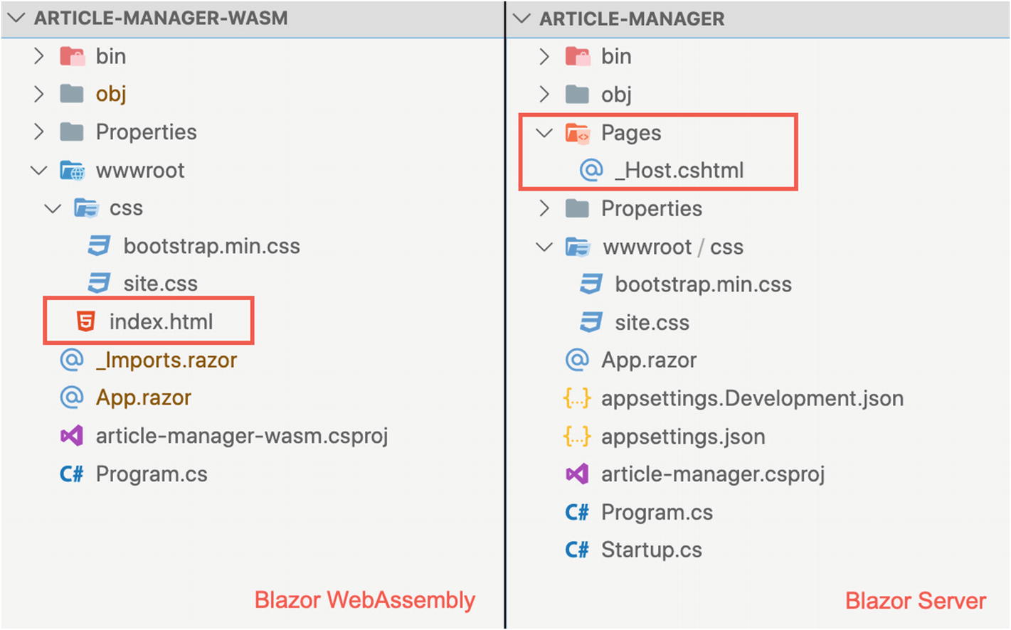
You can see the project structure for both Blazor Server and Blazor WebAssembly in Figure 3-3. The Blazor Server structure is slightly different, as described in Chapter 2. The most important difference is the index.html in the wwwroot folder on Blazor WebAssembly versus the corresponding _Host.cshtml file in the Pages folder on Blazor Server. In addition, for the Blazor WebAssembly project, I deleted the appsettings files, because we do not need any server-side configuration in this kind of project.
Figure 3-3
Project structure for Blazor WebAssembly and Blazor Server
In Figure 3-4, you can see the result of executing the project (dotnet run in the CLI or F5 in Visual Studio), which is the same for both Blazor Server and Blazor WebAssembly. The user result is the same, but with the WebAssembly version, all the code runs in the browser. By contrast, for the Blazor Server version, the back-end provides the HTML and keeps it updated via SignalR.
We are now ready to compose the application by creating the right components and hosting them, starting from the app container. To simplify this first attempt to use the components and to understand the role of the routing for the page navigation, we will not use the routing components yet; we will add them after learning how to structure the user interface from scratch.
Figure 3-4
The article manager application execution result
The Main Menu Component
The main menu of the application is an excellent candidate to be a component: it contains a single functionality, its content depends on the context and current user, and it can be reused in various scenarios and applications. It is also a useful example to introduce the parametrization of a component because you can specify the menu items and capture the click on one of them.
Let’s create a Shared folder in the project root, which we can use for all components shared with all sections of the application, and then create a file named MainMenu.razor containing the markup in Listing 3-4 and the code in Listing 3-5.
In this component, I use the navbar widget of bootstrap. The menu items are in a public property named MenuItems and decorated with the attribute [Parameter]. This attribute allows the container component to pass a value for the property, leaving Blazor to keep track of any changes.
@code {
[Parameter]
public EventCallback<MenuItem> OnMenuItemClick { get; set; }
[Parameter]
public MenuItem[] MenuItems { get; set; }
}
Listing 3-5
The Code of the Main Menu component
The property MenuItems is an array of a custom MenuItem class, which contains, for now, two properties: Caption, a string with the label of the menu item, and Active, a Boolean value that is true if the menu item is the current item and that is false otherwise (Listing 3-6). Usually, I place this kind of class in a folder named Models that represents the data model of the user interface.
public class MenuItem
{
public string Caption { get; set; }
public bool Active { get; set; }
}
Listing 3-6
The Code of the Main Menu Component
We are using the MenuItems array in a foreach loop and using the current element in the cycle to set the caption and the active class on the <li> element. If the user clicks the item, we capture this event (@onclick on the anchor element) and raise a custom event called OnMenuItemClick, passing the clicked item as an argument. OnMenuItemClick is another parameter of the MainMenu component, which is of type EventCallback<MenuItem>, an event handler delegate provided by the framework to simplify the definition of a custom event.
We are ready to use the MainMenu component in the App component, as shown in Listing 3-7 and Listing 3-8. All the public properties decorated with the attribute [Parameter] are visible on the MainMenu component, and we can use them directly in the markup (Listing 3-7). The App component and MainMenu components are in different folders, which means they have different namespaces. To allow the visibility of the MainMenu namespace to the App component, you need to add the namespace in the _Imports.razor file.
The Markup of the Main Menu Component in the App Component
As an example, we have used an array of MenuItems initialized statically in a private method called loadMenuItems(). Here, there is a personal styling choice: I prefer to improve the code readability by using private and public methods that separate each operation in the components, but you are free to do this initialization inline with the declaration or the class constructor.
Regarding the constructor, a component provides you with many hooks to perform operations at various times of the component lifecycle. One of these is the OnInitialized method that you can override to do operations as soon as the component creation is complete. You can use it instead of the constructor to reduce the impact on the component creation time. It can be a useful optimization based on the complexity of the initialization operations, because if you place the same operations in the constructor, the component is created only at the end of them, with a delay of the user interface visualization. You can learn more about the component lifecycle hooks in the official documentation: https://docs.microsoft.com/en-US/aspnet/core/blazor/lifecycle?view=aspnetcore-3.1.
@code {
public MenuItem[] MenuItems { get; set; }
protected override void OnInitialized()
{
this.loadMenuItems();
}
public void MenuItemClick(MenuItem item)
{
foreach (var menuItem in MenuItems)
{
menuItem.Active = false;
}
item.Active = true;
}
private void loadMenuItems() {
this.MenuItems = new MenuItem[] {
new MenuItem()
{ Caption = "Article Categories", Active = true },
new MenuItem()
{ Caption = "Articles", Active = false }
};
}
}
Listing 3-8
The Code That Manages the Main Menu Component in the App Component
Note the method MenuItemClick(), called when the OnMenuItemClick custom event is raised: the code sets the Active property of the MenuItems array to false and also sets the Active property of the item clicked to true. The change detection of Blazor notes this change and updates the user interface, setting the active class on the item clicked. The fascinating aspect is the way it executes the update: Blazor knows the state of the user interface, so when the code wants to change it, the framework computes the difference between the actual state and the new state and applies the difference only to the DOM of the browser. This technique, also used by many JavaScript frameworks, speeds up the update of the user interface significantly.
In Figure 3-5, you can see the result of our work. Using the OnMenuItemClick event, we can show or hide other components, simulating the page navigation. By doing it this way, besides being too laborious, we would also miss out on advanced navigation features, which we can get for free by using the routing features made available by the framework.
Figure 3-5
The main menu component in action
Page Navigation with Blazor
When creating a single-page application, the navigation between pages is crucial. Blazor provides specific components for this purpose that manage for us essential aspects of the routing, such as updating the browser history, managing a page not being found, and updating the URL.
To introduce Blazor routing, I need to highlight the difference between the components that are part of the page and the components that represent a specific page of the application. Usually, in a Blazor application, there is a folder called Pages that contains the components that are pages of the application; meanwhile, all the other components are in a Shared folders.
Let’s create a Pages folder and create a file named Index.razor that represents your home page. Move a piece of App.razor onto this page, as shown in Listing 3-9.
@page "/"
<h2>Article Manager</h2>
<p>Welcome to the article manager app</p>
Listing 3-9
The Home Page Component
From a syntactical point of view, the difference between a component and a page is the directive @page, which creates the path/component pair, called a route. You can think of the root as the URL for navigating to the page.
Now you can add two more pages in the Pages folder, Article.razor and ArticleCategories.razor, with a simple title and the directive @page. You can use the code in Listing 3-10, where the first two rows are for the file Article.razor and the last two are for the file ArticleCategories.razor.
@page "/articles"
<h2>Articles</h2>
@page "/articlecategories"
<h2>Article Categories</h2>
Listing 3-10
The Article Category and Articles Pages
Now you have three pages, and it is time to decide in which area of your application you want to show a page when the user selects the corresponding route. In the Shared folder, create a MainLayout.razor component and put in it the code of Listing 3-11. MainLayout is not a page but a simple component that extends a base component of the framework, named LayoutComponentBase, that permits the router component to use it as a layout template. We can decide where the framework places the current page using the @Body placeholder, in the same way that you use it in the _Layout.cshtml file of a classical ASP.NET MVC application.
@inherits LayoutComponentBase
<MainMenu MenuItems="MenuItems" />
<div class="container mt-3">
@Body
</div>
Listing 3-11
The Main Layout Component Markup
We need to change the MenuItem class to add the Href property and to indicate which path we can use for each menu item (Listing 3-12).
As you can see, you no longer need the custom click event, because the navigation and the active class management are responsibilities of the framework. MainMenu now only has the parameter MenuItems, which is the only thing you need.
You can use the framework’s NavLink component in MainMenu instead of the anchor. The main difference is the ability to use the Match property. If you need to specify whether a menu item is the current one (with the active class applied) when the route entirely matches the current URL, you must use the value NavLinkMatch.All. If you need it to match any prefix of the current URL, use the value NavLinkMatch.Prefix, which is the default value. When using NavLink, you do not need the property Active because the component sets the class on the generated anchor automatically (Listing 3-13). Your App.razor component now must contain the Router component, like in Listing 3-14, so when the application starts, the router can control the application navigation.
The New App Component with the Router Component Markup
The router inspects the current assembly (AppAssembly parameter) to retrieve all the routes defined in the application using the @page directive.
If the router finds the requested route (Found element), it shows the page passing the route data and the default layout (the MainLayout defined previously); otherwise, it shows the layout with a message (NotFound element). If you have experience using JavaScript frameworks, you will appreciate this approach very much; the routing configuration is usually more complicated. In Figure 3-6, you can see the results of the refactoring, which include updating the URLs, updating the browser history, and activating the correct menu item to navigate between the pages.
Figure 3-6
The Blazor routing in action
Managing CRUD Operations
The base structure is ready, so it is time to implement the application functionalities, such as the create, read, update, delete (CRUD) operations, on the article categories. We can generalize the activities, but for now, we’ll focus on the separation of concerns, particularly on the Blazor components’ responsibilities.
We need to show the list of categories and allow the user to add, modify, or delete a single item. Based on the requirements, we could have one component for the list and one for the details, or we could have one element for both operations. We already have a page component, so we can use it to implement all the activities. Still, I prefer to have a substantial difference between pages and UI components, implemented by following this simple rule: a UI component accepts input parameters to obtain the data to manage and raise events, with output parameters to notify the actions. A page, instead, uses the UI components to implement page functionalities and manage the flow of the operations.
For the CRUD operations in the article categories, we can have a category list component that accepts the items to show and that raises events when the user clicks the create, update, or delete button. We can place this component in the article category page, where we can subscribe to the event parameters to decide when to show a details component. A details component is a form that allows the user to change the category data, accepts an input parameter, and raises events when the user clicks the Save or Cancel button. It is important that the UI components do not perform any operations but notify the page component of the user intentions.
Let’s change the previously created ArticleCategories.razor to match Listing 3-15. You can see the two UI components, placed in a folder called Components, managing the list and the details for the article categories with their parameters. We show the list component if an attribute currentCategory is null; otherwise, we show the ArticleCategory component that represents the category details.
The ArticleCategoriesList component is a simple table created with a foreach loop on the parameter ArticleCategoryListItems, like the MainMenu, with three buttons connected to the OnAddClick, OnEditClick, and OnDeleteClick events (Listing 3-16). Basing on these events, the code sets a value for the currentCategory attribute to manage the ArticleCategory component’s visibility.
Before describing how to implement these operations, we need to talk about the single responsibility principle again. In this case, we do not want to implement the data CRUD operations physically in the page component. To understand the reason, you can move the data operations somewhere else, remembering that a component is a piece of the user interface and that a page is also a component.
The physical CRUD operations belong to the business layer, and we are on the presentation layer. In our case, this distinction is crucial, because if we use Blazor WebAssembly, we need to call an API to require the operations, but if we use Blazor Server, we can have direct access to the database context to execute the CRUD operations. The component must not know anything about this, so we need to encapsulate the operation invocation in a separate service class. We can abstract the operations with a generic interface, like in Listing 3-17, using T for the list item type and K for the detail item type. We should design the operation to be asynchronous, using the .NET Task libraries (include the System.Threading.Tasks namespace) to be sure that the operations do not lock the current thread.
using System.Threading.Tasks;
public interface ICRUDService<T, K>
{
Task<T[]> GetList();
Task<K> Get(int id);
Task Create(K item);
Task Update(K item);
Task Delete(int id);
}
Listing 3-17
The CRUD Definition Interface
You could have more implementations of this interface. For example, you could have an implementation based on the HTTP client that calls the corresponding REST APIs or an implementation that uses the entity framework database context for the Blazor Server version of the application. For testing purposes, you could also have an implementation that uses an in-memory collection, by registering the correct implementation for your case and using the native .NET Core dependency injection support in the ConfigureServices() method of the .NET Core Startup class (Listing 3-18).
public void ConfigureServices(IServiceCollection services)
The CRUD Service Configuration for Article Categories
You can use the registered implementation of the service directly in the Blazor component, thanks to the new @inject directive introduced with .NET Core. In the article categories page, you can add the @inject instruction shown in Listing 3-19, where you specify the interface with the correct parameter for your case.
@page "/articlecategories"
@inject ICRUDService<ArticleCategoryListItem, ArticleCategoryItem> service
Listing 3-19
The CRUD Service Injection in the Page Component
ArticleCategoryListItem and ArticleCategoryItem, placed in the Model folder, define the data used in the list (Id and Name) and the detail form (Id, Name, and Description). The ArticleCategoryItem class shows a powerful way to implement the data validation, already known by .NET programmers: .NET data annotations (Listing 3-20).
using System.ComponentModel.DataAnnotations;
public class ArticleCategoryItem
{
public int Id { get; set; }
[Required]
[StringLength(50, ErrorMessage = "Name is too long.")]
public string Name { get; set; }
public string Description { get; set; }
}
Listing 3-20
The Validation Rules Definition with .NET Data Annotations
Yes, you can use .NET data annotations with the Blazor framework to implement form validation. Let’s see them in action by creating the component ArticleCategory.razor in the Components folder to manage the form details. In Listing 3-21, you can see the markup of this new component that uses specific Blazor components to simplify the management of a form.
The Validation Rules Definition with .NET Data Annotations
In Blazor, you can define a form in the EditForm component element, for which you can set a model and subscribe to an event raised when the user submits the form. If you subscribe to the OnValidSubmit event, your code runs only when the form is valid, and the validation follows the rules of the .NET data annotations of the specified model. To enable model validation based on data annotations, you need to include the component DataAnnotationsValidator in the form. The framework provides you with the ValidationSummary component to show a summary of the failed validations, along with the ValidationMessage component to show the validation error of a specific field. The framework provides specific components to help you show the correct input element and bind it with the corresponding Model property using @bind-Value.
Let’s see how to manage the events of the components in the article categories pages. In Listing 3-22, you can see an extract of the code that manages the currentCategory attribute.
The ShowList() method calls the service to obtain the list of categories and set the currentCategory to null to show the list. The service methods are asynchronous, so we need to use the async/await keywords and the asynchronous version of the OnInitialized component hook.
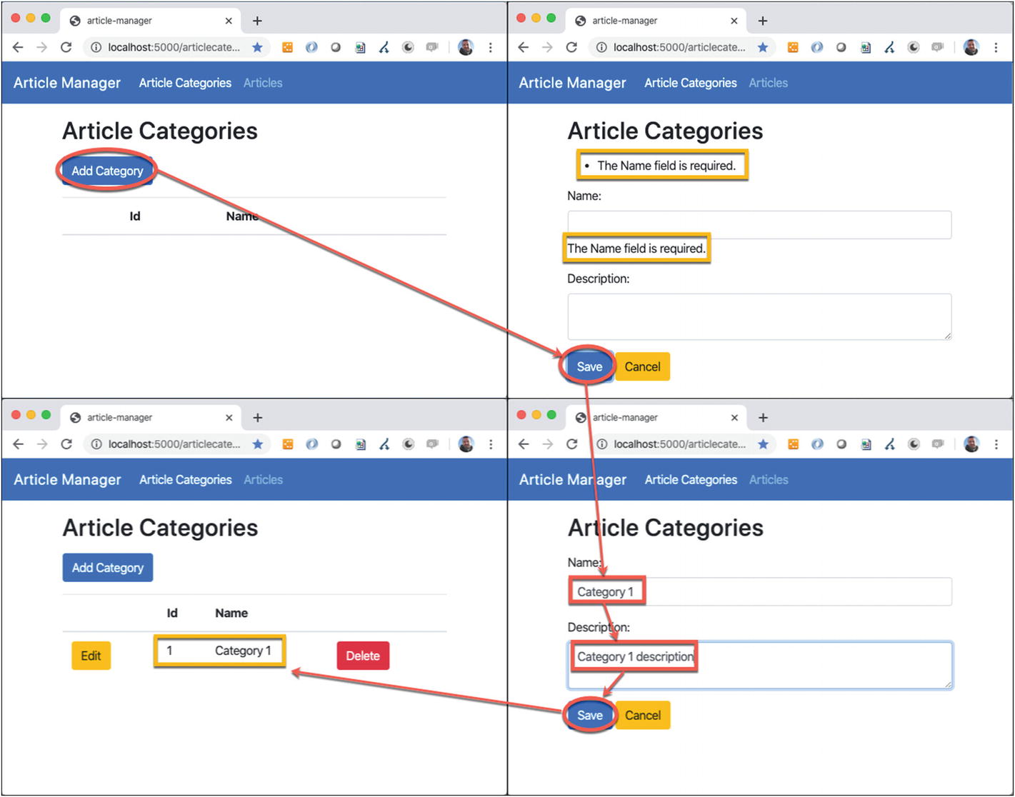
When the user clicks the Add Category button or the Edit button, we set the currentCategory attribute to a new object or to the requested item to edit. In the solution provided with the book, you will find the rest of the code that manages the save and delete events using a try { ... } catch { ... } block to show a possible error to the user. In Figure 3-7, you can see the user interface in action.
Figure 3-7
The article category CRUD in action
If you already know Microsoft web frameworks, all this information will seem familiar to you. This is the real power of Blazor for .NET developers.
Implementing CRUD Services
For testing purposes, I have created an in-memory implementation of the CRUD services. In a real application, you would need to store information in persistent storage, like a database. If you use Blazor Server, this is an effortless task, because you can inject the Entity Framework data context (or your preferred data access layer solution) in the CRUD service implementation and use it to execute all the operations.
If you use Blazor WebAssembly, you need to call REST APIs to allow the client to request the data storage. In this case, we have to create a CRUD service implementation that uses HttpClient (Listing 3-23).
using System.Net.Http.Json;
using System.Net.Http;
public class ArticleCategoriesService:
ICRUDService<ArticleCategoryListItem,
ArticleCategoryItem>
{
private readonly HttpClient httpClient;
private string baseUrl = "http://localhost:5002";
public ArticleCategoriesService(HttpClient httpClient)
{
this.httpClient = httpClient;
}
public Task<ArticleCategoryListItem[]> GetList()
{
return this.httpClient
.GetFromJsonAsync<ArticleCategoryListItem[]>
($"{baseUrl}/api/articlecategories");
}
...
}
Listing 3-23
The Code of the CRUD Service That Uses the HttpClient
To use HttpClient, we must add the System.Net.Http.Json NuGet packages to our solution and add the System.Net.Http namespace to our CRUD service implementation. The Blazor framework provides some HttpClient extensions (the HttpClientJsonExtensions class in the System.Net.Http.Json namespace) that help to send and receive .NET classes, converting them to JSON format. In Listing 3-23, we can see GetFromJsonAsync, which receives from the API the JSON array of the article categories and converts it to a .NET array of ArticleCategoryListItem.
We also need to add HttpClient manually to the services because it is no longer added for you by the framework. Then, in the Main method of the Program class, use the AddTransient() method (Listing 3-24) to properly configure the HTTP client.
public static async Task Main(string[] args)
{
var builder = WebAssemblyHostBuilder.CreateDefault(args);
The Configuration of the HttpClient as a Dependency Service
If we move the Model classes in a separate DLL and share this library with both the back-end and the front-end, the ASP.NET Core API on the back-end and the HTTP Client on the front-end will execute all the work for us, using JSON as the exchange format.
I suppose you already know how to save an entity with Entity Framework and how to create an API REST with .NET Core. In Listing 3-25, you can see the corresponding code of the API, but you can find the complete codebase used in these examples in the code provided with the book.
[ApiController]
[Route("api/[controller]")]
public class ArticleCategoriesController :
ControllerBase
{
private readonly ApplicationDbContext db;
public ArticleCategoriesController(
ApplicationDbContext db)
{ this.db = db; }
[HttpGet]
public IActionResult Get()
{
return Ok(this.db.ArticleCategories
.Select(x => new ArticleCategoryListItem()
{
Id = x.Id, Name = x.Name
}).ToList());
}
...
}
Listing 3-25
The Code of the ASP.NET Core API Used in Listing 3-23
The impressive aspect is that the components are agnostic about these implementations. We need only to register the correct version of the CRUD service in the .NET Core dependency injection engine.
Where to Place the Component Code
So far, we have seen the component code in the Razor file, using the @code section. For small components, like our components here, this can be a useful solution, but if you have enough code to handle and want to keep the system separate from the markup, you can place the component code in a different C# class.
For example, if you want to separate the code of the ArticleCategories page component from its markup, you have two ways to do this. The first way is to create a base class file with a name different from the page name, but I advise you to use a convention that retains the link between them. We can use, for example, ArticleCategoriesBase.cs, which contains a class named ArticleCategoriesBase that extends the framework class ComponentBase (Listing 3-26).
using Microsoft.AspNetCore.Components
public class ArticleCategoriesBase : ComponentBase
{
...
}
Listing 3-26
The Class Containing the Article Categories Code
This class is now our base class for the Razor component, thanks to the @inherits directive (Listing 3-27).
@inherits ArticleCategoriesBase
@page "/articlecategories"
Listing 3-27
The Component Markup Change to Inherit the Code Class
Now we can move the content of the @code section in the ArticleCategoriesBase class, with only two changes: the private properties must be protected, and the injection of the CRUD service happens with the Inject attribute on a specific property (Listing 3-28).
public class ArticleCategoriesBase : ComponentBase
private ICRUDService<ArticleCategoryListItem, ArticleCategoryItem> service { get; set; }
...
}
Listing 3-28
The Changes You Must Apply to the Code When Moving It into a Separate Class
Note
You cannot use the constructor to inject dependencies in a ComponentBase because the framework constructs the components for you. At the moment, the framework needs a constructor without parameters, so it provides the Inject attribute to solve the problem.
Another way to separate the code and markup of the component is to create a partial class. If you explore the obj folder generated during the build process, you will find a class for each component of your application. This class, generated by the compiler, is a partial class, so another partial class can be placed next to it. You can try this option with the Articles page, remembering that all the partial classes in the .NET Framework must have the same name (Listing 3-29) and you do not need to modify the visibility of the attributes used (at build time, partial classes with the same name become the same class). When you use a partial class to separate the code from the markup, it is common to name the file with the same name of the page, adding the .cs extension at the end. In this case, the file is named Article.razor.cs. Visual Studio uses this convention to show this file as a child of the page, grouping the two files as the same element. Visual Studio Code, instead, is not so smart.
public partial class Articles
{
private ArticleListItem[] articleListItems = new ArticleListItem[0];
private ArticleItem currentArticle;
private string error;
[Inject]
private ICRUDService<ArticleListItem, ArticleItem> service { get; set; }
}
Listing 3-29
The Class That Contains the Articles Code
In this case, you must add only the code for the injection of the CRUD services and remove the @inject directive from the markup file.
JavaScript Interoperability
Until there is a complete ecosystem that supports all the possible functionality for an application, sooner or later you will need to invoke a JavaScript function. You will probably also need to invoke a .NET function from JavaScript. These scenarios are both supported in Blazor and resolve all the main problems with legacy code integration for your application.
To call a JavaScript function from Blazor, we must define it on the browser window object. Adding the jQuery and Bootstrap JavaScript libraries to the project, you can create a js folder in wwwroot and add the references in the file. These libraries allow us to use the bootstrap widgets, such as the Modal component (see the official documentation at https://getbootstrap.com/docs/4.0/components/modal/).
Let’s add two JavaScript functions to the browser window object that open and hide a bootstrap modal, as shown in Listing 3-30. To simplify the example, I placed them in the index.html file, but in a real project you could place the JavaScript functions in a separate file and link to it.
<script src="js/jquery.min.js"></script>
<script src="js/bootstrap.min.js"></script>
<script>
window.showConfirmDelete = (id) => {
$('#' + id).modal('show');
};
window.hideConfirmDelete = (id) => {
$('#' + id).modal('hide');
};
</script>
Listing 3-30
JavaScript Functions to Show and Hide a Bootstrap Modal
Add the markup of a modal to the ArticleCategoriesList component, and set the modal to require the delete confirmation from the user (Listing 3-31).
To call the JavaScript functions previously defined, you need to inject the framework’s IJSRuntime interface in the component. You can do this by adding the directive @inject IJSRuntime JSRuntime at the top of the component definition. See Listing 3-32.
The Component Code That Calls the JavaScript Functions
The JSRuntime provides the method InvokeVoidAsync that we can use to call the JavaScript function and pass it the right parameters.
If the user clicks the Yes button, we invoke the event to require the category deletion and invoke the hideConfirmDelete JavaScript function. In Figure 3-8, you can see the confirmation modal in action.
Figure 3-8
The modal that confirms the deletion modal in action
Summary
In this chapter, you learned how to build a single-page application with Blazor to perform CRUD operations on business entities. You saw how to generalize the code, using the .NET Core dependency injection to quickly adapt everything to be used with both Blazor WebAssembly and Blazor Server. You also learned how to integrate JavaScript into Blazor, how to manage legacy scenarios, and how to take advantage of features that are not yet available in Blazor.
Much of the code in this chapter was deliberately repetitive, and some implementations are a little crude for educational reasons. Still, in the next chapter, you will see how to optimize the code, making the components even more generic, so that they can also be reused in different applications by packaging them in libraries of components.