
This section will show you how to prepare the data to be used in recommender models. Follow these steps:
- Select the relevant data.
- Normalize the data.
When we explored the data, we noticed that the table contains:
- Movies that have been viewed only a few times. Their ratings might be biased because of lack of data.
- Users who rated only a few movies. Their ratings might be biased.
We need to determine the minimum number of users per movie and vice versa. The correct solution comes from an iteration of the entire process of preparing the data, building a recommendation model, and validating it. Since we are implementing the model for the first time, we can use a rule of thumb. After having built the models, we can come back and modify the data preparation.
We will define ratings_movies containing the matrix that we will use. It takes account of:
- Users who have rated at least 50 movies
- Movies that have been watched at least 100 times
The preceding points are defined in the following code:
ratings_movies <- MovieLense[rowCounts(MovieLense) > 50, colCounts(MovieLense) > 100] ratings_movies
## 560 x 332 rating matrix of class 'realRatingMatrix' with 55298 ratings.
The ratings_movies object contains about half of the users and a fifth of the movies in comparison with MovieLense.
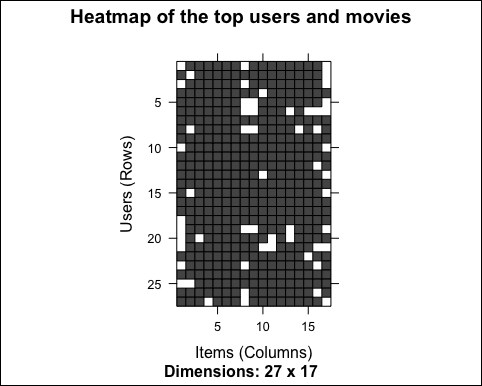
Using the same approach as we did in the previous section, let's visualize the top 2 percent of users and movies in the new matrix:
# visualize the top matrix
min_movies <- quantile(rowCounts(ratings_movies), 0.98)
min_users <- quantile(colCounts(ratings_movies), 0.98)
Let's build the heatmap:
image(ratings_movies[rowCounts(ratings_movies) > min_movies, colCounts(ratings_movies) > min_users], main = "Heatmap of the top users and movies")
The following image displays the heatmap of the top users and movies:
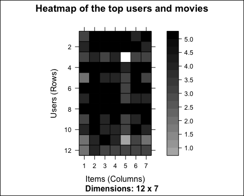
As we already noticed, some rows are darker than the others. This might mean that some users give higher ratings to all the movies. However, we have visualized the top movies only. In order to have an overview of all the users, let's take a look at the distribution of the average rating by user:
average_ratings_per_user <- rowMeans(ratings_movies)
Let's visualize the distribution:
qplot(average_ratings_per_user) + stat_bin(binwidth = 0.1) + ggtitle("Distribution of the average rating per user")The following image shows the distribution of the average rating per user:
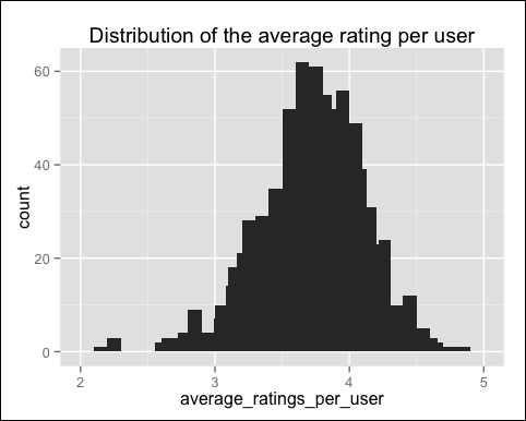
As suspected, the average rating varies a lot across different users.
Having users who give high (or low) ratings to all their movies might bias the results. We can remove this effect by normalizing the data in such a way that the average rating of each user is 0. The prebuilt normalize function does it automatically:
ratings_movies_norm <- normalize(ratings_movies)
Let's take a look at the average rating by users:
sum(rowMeans(ratings_movies_norm) > 0.00001)
## [1] 0
As expected, the mean rating of each user is 0 (apart from the approximation error). We can visualize the new matrix using image. Let's build the heat map:
# visualize the normalized matrix
image(ratings_movies_norm[rowCounts(ratings_movies_norm) > min_movies, colCounts(ratings_movies_norm) > min_users], main = "Heatmap of the top users and movies")
The following image shows the heatmap of the top users and movies:
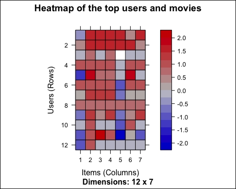
The first difference that we can notice is the colors, and this is because the data is continuous. Previously, the rating was an integer between 1 and 5. After the normalization, the rating can be any number between -5 and 5.
There are still some lines that are more blue and some that are more red. The reason is that we are visualizing only the top movies. We already checked that the average rating is 0 for each user.
Some recommendation models work on binary data, so we might want to binarize our data, that is, define a table containing only 0s and 1s. The 0s will be either treated as missing values or as bad ratings.
In our case, we can either:
- Define a matrix having 1 if the user rated the movie, and 0 otherwise. In this case, we are losing the information about the rating.
- Define a matrix having 1 if the rating is above or equal to a definite threshold (for example, 3), and 0 otherwise. In this case, giving a bad rating to a movie is equivalent to not having rated it.
Depending on the context, one choice is more appropriate than the other.
The function to binarize the data is binarize. Let's apply it to our data. First, let's define a matrix equal to 1 if the movie has been watched, that is if its rating is at least 1:
ratings_movies_watched <- binarize(ratings_movies, minRating = 1)
Let's take a look at the results. In this case, we will have black-and-white charts so that we can visualize a larger portion of users and movies, for example, 5 percent. Similarly, let's select this 5 percent using quantile. The row and column counts are the same as the original matrix, so we can still apply rowCounts and colCounts on ratings_movies:
min_movies_binary <- quantile(rowCounts(ratings_movies), 0.95)
min_users_binary <- quantile(colCounts(ratings_movies), 0.95)
Let's build the heat map:
image(ratings_movies_watched[rowCounts(ratings_movies) > min_movies_binary,colCounts(ratings_movies) > min_users_binary], main = "Heatmap of the top users and movies")
The following image shows the heat map of the top users and movies:
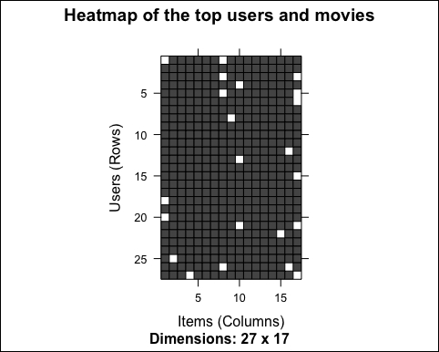
Only a few cells contain unwatched movies. This is just because we selected the top users and movies.
Let's use the same approach to compute and visualize the other binary matrix The cells having a rating above the threshold will have their value equal to 1 and the other cells will be 0s:
ratings_movies_good <- binarize(ratings_movies, minRating = 3)
Let's build the heat map:
image(ratings_movies_good[rowCounts(ratings_movies) > min_movies_binary, colCounts(ratings_movies) > min_users_binary], main = "Heatmap of the top users and movies")
The following image shows the heatmap of the top users and movies:
As expected, we have more white cells now. Depending on the model, we can leave the ratings matrix as it is or normalize/binarize it.
In this section, we prepared the data to perform recommendations. In the upcoming sections, we will build collaborative filtering models.