Introduction
I have a confession to make. There’s no such thing as a completely bulletproof Web site. Now, before you close the book and put it back up on the shelf (hopefully sticking out a bit further than the others, thanks), allow me to explain.
Just as a police officer straps on a bulletproof vest for protection, so too can we take measures that protect our Web designs. This book will guide you through several strategies for bulletproofing Web sites: improving flexibility and preparing for worst-case scenarios.
The Bulletproof Concept
Out in the nonvirtual world, a bulletproof vest never guarantees complete, 100% protection, but rather being bulletproof is something that’s constantly strived for. You’re far better off wearing a bulletproof vest than if you weren’t.
The same rule applies to Web design and the techniques described in this book. By increasing a page’s flexibility and taking the necessary steps to ensure that it’s readable in as many circumstances as possible, we’re making a real difference in our work. It’s an ongoing process, and one that becomes easier when utilizing Web standards such as semantic XHTML and CSS to construct compelling, yet adaptable, designs.
As the adoption of CSS-based layouts has steadily risen over the past several years, it’s become increasingly important to learn how to utilize CSS well. The goal is to harness the benefits that make the technology powerful from a design standpoint: less code, increased accessibility, and easier maintenance, to name a few.
But just using CSS and XHTML doesn’t necessarily mean things are automatically better. By embracing the flexibility that can be gained from separating the core content from the design, you’ll be well on your way to creating better designs for all the Web’s citizens. But what do I mean by flexibility exactly?
 Note
NoteI’m using the term bulletproof partly to describe flexibility—in other words, designs for the Web that can easily accommodate various text sizes and amounts of content, designs that expand or contract along with whatever is placed within them.
In addition, we can (and will) talk about flexibility from a editing, maintenance, or development view as well—improving the ease with which content is edited and code updated and maintained, while at the same time not hindering the design. This can be especially helpful and important for internationalization issues, where length of content can drastically vary between the various languages of the world.
And last, we’ll also talk about flexibility from an environment standpoint. How will designs impact the integrity of a Web site’s content and function? We’ll make sure that what we create can adapt to a variety of scenarios, be it a Web browser, screen reader, or mobile device. Designing with flexibility in mind means better interpretation by a wider range of devices and software.
Why It’s Important
Around the time that I began thinking about the topic for this book, I realized that there are two important pieces that make up great, compelling Web designs. One piece is the visual component—the piece that’s obvious to anyone just looking at the finished page. This is a combination of the graphic design, colors, and typography the designer chose. Just visit the CSS Zen Garden (www.csszengarden.com), and it becomes obvious that compelling visual design is certainly possible and thriving when XHTML and CSS are used.
The second (but equally important) piece to a building a great Web site is the bulletproof implementation. It’s this piece that the book will focus on: you’ve wisely decided to use XHTML and CSS to build Web sites to reap all of the benefits that come along with them. And now you’re ready to leverage those Web standards with some ingenuity to create visually compelling Web sites that are also as flexible, adaptable, and accessible as possible.
As the adoption of Web standards such as XHTML and CSS increases rapidly, it becomes more and more important to have resources that discuss how these standards can be utilized and implemented in the most optimal way.
The Book’s Structure
Each chapter of the book describes a certain bulletproof guideline. We’ll start by looking at an existing design from the Web, and we’ll note why it isn’t bulletproof. We’ll then rebuild the example using XHTML and CSS, with the goal of improving its flexibility and decreasing its code.
Many of these examples are specific components of the page, which makes it easier to talk about how they might be bulletproofed in chunks. In the final chapter, “Putting It All Together,” we’ll round up all of the techniques from previous chapters to create a full-page template—reminding ourselves along the way why we’ve chosen the bulletproof techniques, and illustrating how they all can work together in one place.
The step-by-step nature of each chapter’s examples should make it easy to follow along—even if you are new to using XHTML and CSS in your daily work. Along the way, I’ll explain why these Web standards are beneficial, and specifically how each chapter’s guideline can improve a Web site’s bulletproofness.
The Context of the Book’s Examples
All of the examples assume a basic page structure that surrounds them. In other words, what is shown in each chapter in terms of XHTML and CSS code happens within an assumed, existing HTML document in between the <body> and </body>.
For instance, the basic framework for the book’s examples could be set up like this:
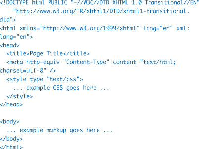
While the CSS is placed in the <head> of the page for convenience, it should eventually be hidden from old, tired browsers (Netscape Navigator 4.x, for example). This hiding is quite common, enabling designers to use advanced CSS for layout (as we do throughout the book), while offering older browsers that can’t handle it a fully readable, CSS-free view of the document.
I’m using the XHTML 1.0 Transitional DOCTYPE here, but you could choose any XHTML DOCTYPE flavor you’d like. Wondering what the heck a DOCTYPE is? Not to worry, I’ll talk more about them in the “How to validate” section of Chapter 6.
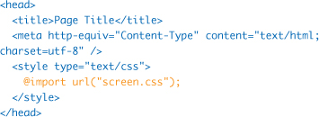
Hiding CSS from older browsers is commonly done by using the @import method for referencing external style sheets. For example, if we placed all of our styles into a file named screen.css, we could use the @import method to reference that external style sheet by its URL. Because older browsers (like Netscape 4.x) don’t understand @import, the styles contained within screen.css will be hidden to them.
Common Terms Used Throughout the Book
There are times throughout the book that I’ll refer to various browser versions by their abbreviations. For instance, it’s much easier to say IE5/Win than “Internet Explorer version 5 for Windows.” That said, here’s a little list of the shorthand browser version/platform conventions:
• IE5/Win = Internet Explorer version 5.0 and 5.5 for Windows
• IE6/Win = Internet Explorer version 6 for Windows
• IE7/Win = Internet Explorer version 7 for Windows
• IE5/Mac = Internet Explorer version 5 for Macintosh
When describing the common approaches found in the examples used for each chapter, I often refer to nested tables and spacer GIF shims. This describes the traditional techniques often used to build Web sites, in which tables are used to create pixel-perfect but inflexible beasts. Nesting tables inside one another made it easier to precisely align graphics and text, yet the result was a gigantic amount of code with accessibility problems galore.
The term spacer GIF shim refers to the use of a single transparent GIF image that’s stretched to various dimensions in order to create gaps, columns, and divisions throughout a page. An unbulletproof Web site will have these littered throughout its markup, adding code and creating a maintenance nightmare.
But there are better ways of accomplishing the same visual goal using lean, meaningful markup and CSS. By embracing these Web standards, we can still create compelling designs that at the same time are flexible and ready for whatever situation is thrown at them. This is Bulletproof Web Design.