
Chapter 1
Introducing WPF
IN THIS CHAPTER
 Taking a first look at WPF and what it can do for you
Working with XAML
Building your first WPF application
Comparing XAML to C#
WPF, or Windows Presentation Foundation, is a graphical system for rendering user interfaces. It provides great flexibility in how you can lay out and interact with your applications. With Common Language Runtime (CLR) at its core, you can use C# or any other CLR language to communicate with user-interface elements and develop application logic. The advantages of WPF for your application are its rich data binding and visualization support and its design flexibility and styling.
WPF enables you to create an application that is more usable to your audience. It gives you the power to design an application that would previously take extremely long development cycles and a calculus genius to implement. Now you can implement difficult things like graphics and animations in as few as three lines of code! This chapter introduces you to key WPF concepts as well as common application patterns used in the software industry today.
 You don’t have to type the source code for this chapter manually. In fact, using the downloadable source is a lot easier. You can find the source for this chapter in the
 CSAIO4D2EBK05CH01 folder of the downloadable source. See the Introduction for details on how to find these source files.
Understanding What WPF Can Do
WPF's graphics capabilities make it the perfect choice for data visualization. Take, for instance, the standard drop-down list (or combo box). Its current use is to enable the user to choose a single item from a list of items. For this example, suppose you want the user to select a car model for purchase.
The standard way of displaying this choice is to display a drop-down list of car model names from which users can choose. There is a fundamental usability problem with this common solution: Users are given only a single piece of information from which to base their decision — the text that is used to represent the item in the list.
For the power user (or car fanatic), this may not be an issue, but other users need more than just a model name to make an educated decision on the car they want to purchase. This is where WPF and its data visualization capabilities come into play.
You can provide a template to define how each item in the drop-down list is rendered. The template can contain any visual element, such as images, labels, text boxes, tooltips, drop shadows, and more!
Figure 1-1 shows a typical display of a combo box. This control has limitations: It can relay to the user only a single piece of information, the text used to represent the car model (yes, you could add graphics to the combo box using low-level programming techniques beyond the ken of mere mortals, but most people wouldn’t want to). It’s possible for you to display images of the car models in a separate control based on the selection in the list, but this still mandates users to make their selection before seeing exactly what it is they are choosing. In contrast, WPF has the flexibility to display many pieces of information in each combo box item, like a one-stop shop for all the information the user will need to make their decision. (See Figure 1-2 for a WPF combo box.)
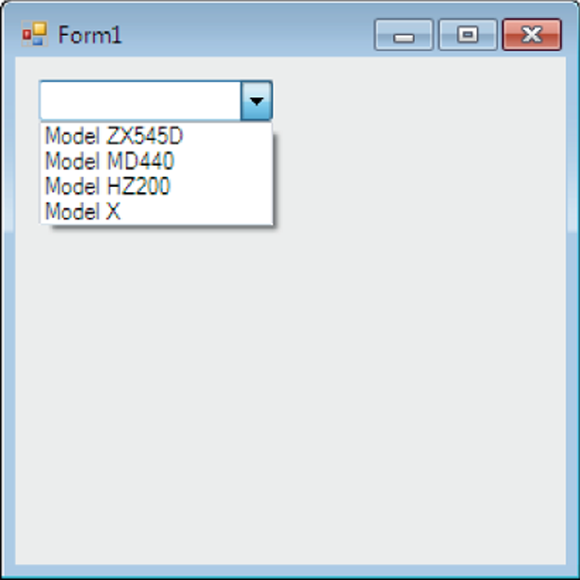
FIGURE 1-1: A typical combo box.
Figure 1-2 shows a sample combo box in WPF. The way the combo box item is rendered is defined using a data template. (Chapter 3 of this minibook covers data templates.) Each item in this combo box is rendered to provide the user with a visual cue along with multiple data fields. Displaying all this information enables users to make an educated decision about the choice they are making.

FIGURE 1-2: Visualizing data — a WPF combo box.
Introducing XAML
WPF enables you to build user interfaces declaratively. Extensible Application Markup Language (XAML; pronounced zammel) forms the foundation of WPF. XAML is similar to HTML in the sense that interface elements are defined using a tag-based syntax.
 XAML is XML-based, and as such, it must be well formed, meaning all opening tags require closing tags, and all elements and attributes contained in the document must validate strictly against the specified schemas.
By default, when creating a WPF application in Visual Studio 2010 and above, the following schemas are represented in generated XAML files:
http://schemas.microsoft.com/winfx/2006/xaml/presentation: This schema represents the default Windows Presentation Framework namespace.http://schemas.microsoft.com/winfx/2006/xaml: This schema represents a set of classes that map to CLR objects.
Most CLR objects can be expressed as XAML elements (with the exception of abstract base classes and some other nonabstract base classes used strictly for inheritance purposes in the CLR). XAML elements are mapped to classes; attributes are mapped to properties or events.
At runtime when a XAML element is processed, the default constructor for its underlying class is called, and the object is instantiated; its properties and events are set based on the attribute values specified in XAML. The next section reviews more XAML basics and gets you started on the path of WPF application development.
Diving In! Creating Your First WPF Application
Now it's time to get comfortable, so stop for a moment, go grab a caffeinated beverage, sit in a comfortable chair, pull up to your computer, and get ready to go! To create your first project, follow these steps:
- Open Visual Studio.
Click Create a New Project.
You see the list of available projects.
Select C#, Windows, and Desktop in the filter list.
Visual Studio presents a list of Windows Desktop project types.
Highlight WPF App (.NET Framework) and click Next.
You see the Configure Your New Project page of the wizard, shown in Figure 1-3.
Type MyFirstWPFApplication in the Project Name field, select Place Solution and Project in the Same Directory, and then click Create.
Visual Studio creates a new WPF project for you and displays both the designer and the Code Editor with a default application defined. The WPF Application template creates two XAML files along with their respective code-behind files:
App.xaml(App.xaml.cs) andMainWindow.xaml(MainWindow.xaml.cs), as shown in Figure 1-4. At this point, you can start adding code to the example application.
App.xaml represents the entry point of the application. This is where application-wide (globally scoped) resources and the startup window are defined (see Listing 1-1).
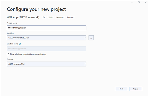
FIGURE 1-3: Configuring the WPF project.

FIGURE 1-4: WPF Application solution structure.
The resources are contained in a keyed collection of reusable objects. Resources can be created and retrieved using both XAML and C#. Resources can be anything — data templates, arrays of strings, or brushes used to color the background of text boxes. Resources are also scoped, meaning that they can be available to the entire Application (global), to the Window, to the User Control, or even to only a specific control.
LISTING 1-1 App.xaml
<Application x:Class="MyFirstWPFApplication.App"
             xmlns="http://schemas.microsoft.com/winfx/2006/xaml/presentation"
             xmlns:x="http://schemas.microsoft.com/winfx/2006/xaml"
             xmlns:local="clr-namespace:MyFirstWPFApplication"
             StartupUri="MainWindow.xaml">
    <Application.Resources>

    </Application.Resources>
</Application>
Listing 1-1 displays the XAML that was generated by the WPF App (.NET Framework) template in Visual Studio. Note that the WPF namespaces are defined. The namespace that represents the CLR objects will be distinguished in the XAML file with the x prefix.
The StartupUri value defines the window that will be displayed before the application is executed. In this case, the MainWindow.xaml window will be displayed.
The x:Class attribute defines the C# code-behind file of this XAML file. If you open App.xaml.cs, you see that its class name is App and it inherits from the Application class (which is the root element of the XAML file).
C# uses namespaces to organize and locate classes. To create objects from a specific namespace, you use the “using” syntax at the top of your class definitions. Similar to C#, XAML also requires you to declare which namespaces are used in the document. Namespaces are typically defined as an attribute within the root element of the document; the root element is the first XML tag in the XAML document. XAML uses XML syntax to define a namespace — “xmlns” means “XML namespace,” and it's typically followed by a colon (:) and then an alias. This alias is the shorthand reference to the namespace throughout the XAML document; it's what you use to instantiate an object from a class in that namespace.
For instance, if you want to add the namespace MyTemplates.DataTemplates from the assembly MyTemplates.dll, you could define the namespace as
xmlns:myDTs="clr-namespace:MyTemplates.DataTemplates;assembly=MyTemplates.dll"
You are then able to instantiate an object from the MyTemplates.DataTemplates namespace as follows:
<myDTs:myClass></myDTs:myClass>
Declaring an application-scoped resource
To help you understand the creation and use of a global application-scoped resource, this section shows you how to create a resource that holds a string used in the application. An application-scoped resource is available to all Windows and user controls defined in the project. Follow these steps:
- Add the
Systemnamespace located in themscorlib.dllassembly by adding the following namespace to theApp.xamlroot element (see Listing 1-2):xmlns:sys="clr-namespace:System;assembly=mscorlib"The
mscorlib.dllassembly is where theStringclass is located. TheStringclass is now available for use throughout theApp.xamldocument. - Create the resource between the
Application.Resourcetags; add the followingStringclass element:<sys:String x:Key="Purpose">Hello WPF World!</sys:String>This element instantiates an object of type
String, initialized to the valueHello WPF World!, and keyed off of the keyPurpose. This resource is now available throughout theMyFirstWPFApplicationapplication by requesting the resource “Purpose” (see Listing 1-2).
LISTING 1-2 Updated App.xaml with Resource and System Namespace Defined
<Application x:Class="MyFirstWPFApplication.App"
             xmlns="http://schemas.microsoft.com/winfx/2006/xaml/presentation"
             xmlns:x="http://schemas.microsoft.com/winfx/2006/xaml"
             xmlns:local="clr-namespace:MyFirstWPFApplication"
             xmlns:sys="clr-namespace:System;assembly=mscorlib"
             StartupUri="MainWindow.xaml">
    <Application.Resources>
        <sys:String x:Key="Purpose">Hello WPF World!</sys:String>
    </Application.Resources>
</Application>
You may observe that the Application.Resource tag looks kind of odd. Application.Resources doesn't define a class as most XAML elements do. It’s actually assigning a value to the Resources property of its containing Application object.
This type of tag is called a property element, an XML element that represents a property (or attribute) of an object. Property elements are used when complex objects are assigned to a property of an object that can't be expressed as a simple string value. Property elements must be contained within the tags of the parent element — in this case, within the Application tags.
Making the application do something
If you run the application as is, not much happens beyond the display of an empty window. The empty window is the one defined in MainWindow.xaml.
App.xaml is the entry point of the WPF application. Within App.xaml, the StartupUri value defines the window displayed on application startup. In this case, the StartupUri value is MainWindow.xaml.
Add a label to MainWindow.xaml that displays the purpose of the String you defined in Resources. Just follow these steps:
- Open
MainWindow.xaml. - Between the
Gridtags, define a grid with a single row and single column by adding the following XAML markup:<Grid.ColumnDefinitions>
<ColumnDefinition></ColumnDefinition>
</Grid.ColumnDefinitions>
<Grid.RowDefinitions>
<RowDefinition></RowDefinition>
</Grid.RowDefinitions>Each column and row is defined by the
ColumnDefinitionandRowDefinitionelement contained within theGrid.ColumnDefinitionsandGrid.RowDefinitionsproperties, respectively. If you want to add more columns, you simply add anotherColumnDefinitionelement to theGrid.ColumnDefinitionsProperty Entity. The same goes for adding rows: You add an additionalRowDefinitionelement to theGrid.RowDefinitionsProperty Entity. - Directly below the
Grid.RowDefinitionsProperty entity, create a label using the following XAML:<Label x:Name="lblPurpose" Content="{StaticResource Purpose}"
FontSize="25" Grid.Row="0" Grid.Column="0"/>This markup instantiates a WPF
Labelobject accessible to the code-behind file (MainWindow.xaml.cs) using the variablelblPurpose. TheContentattribute contains the text that is to be displayed in the label; in this case, you use the Application Resource that you defined in the preceding section by retrieving it using its key value, which isPurpose. The label text is rendered with a font size of 25 units and is to be located in the grid in the first row and first column.
WOW! That line of XAML really packs quite the punch! Here's some of what is going on in there:
x:Name: This attribute assigns a variable name to the object being created by the XAML tag. This enables you to access the object from the code-behind file. In this case, the variable name of the label object being instantiated islblPurpose.Content: The value assigned to this attribute can be of any type. By default, you can assign it astringvalue, and it will render as you would think a standard label would render. In the WPF reality,Contentcan be composed of anything: a string, an image, an instance of a user control, a text box, and so on. For more info, see Chapter 2 of this minibook.FontSize: The size of the font of the label. It is important to note that the size isn't denoted in points; it’s expressed in Device Independent Units. WPF gets away from the concepts of pixels and points and moves to a universal sizing strategy. Think of Device Independent Units as more of a relative size than a pixel. For instance, if the containing element of the label were 100 units by 100 units, the label would render as ¼ of that size.Grid.Row: Identifies the grid row in which to render the label. Grid row collections are zero based, meaning that the first row is row 0, the second row is row 1, and so on. You should also note that theLabelclass doesn't contain a property namedGrid. What you see here is the concept of attached properties. An attached property is a way to assign the context of a current control relative to the properties of a containing control. In this case, you assign the label to appear in the first row (row index 0) of its containing grid. Also observe that the label is located within theGridtags; this is how the containingGridelement is located.Grid.Column: Similar toGrid.Row, this attached property identifies the grid column in which to render the label. Together withGrid.Row, both properties identify the cell where the label is located. In this case, you assign the label to render in the first column of its containing grid. Grid column collections are also zero based.
Go ahead and run your application. You now see Hello WFP World! displayed in the label on your Window. Congratulations! You have just created your first WPF application!
Whatever XAML Can Do, C# Can Do Better!
Anything that you can implement using XAML can be implemented in C#. This is not true in reverse; not everything you can do in C# can be done in XAML. C# is the obvious choice for performing business logic tasks with procedural code that can't be expressed in XAML. In the following steps, you create an identical WPF application to the one you created in the preceding section, this time using C# to implement its functionality:
- Choose File⇒ Close Solution to close the current solution if necessary.
Click Create a New Project.
You see the list of available projects.
Select C#, Windows, and Desktop in the filter list.
Visual Studio presents a list of Windows Desktop project types.
Highlight WPF App (.NET Framework) and click Next.
You see the Configure Your New Project page of the wizard, shown in Figure 1-3.
Type MyFirstCodeOnlyWPFApplication in the Project Name field, select Place Solution and Project in the Same Directory and then click Create.
Visual Studio creates the Solution and Project structure.
- Open
App.xaml.cs. - Override the
OnStartupmethod to include the creation of the Purpose application resource by adding the following code to theAppclass:protected override void OnStartup(StartupEventArgs e)
{
// Create and add the Purpose application resource
string purpose = "Hello WPF World, in C#";
this.Resources.Add("Purpose", purpose);
base.OnStartup(e);
} - Open
MainWindow.xamland give theGridelement a name by adding the following attribute shown in bold:<Grid x:Name="gridLayout">
</Grid> - Open
MainWindow.xaml.cs, and in the default constructor, after theInitializeComponentsmethod call, add the following code shown in bold:public MainWindow()
{
InitializeComponent();
// Define grid column and row
this.gridLayout.ColumnDefinitions.Add(new ColumnDefinition());
this.gridLayout.RowDefinitions.Add(new RowDefinition());
// Obtain label content from the application resource, Purpose
string purpose = this.TryFindResource("Purpose") as string;
Label lblPurpose = new Label();
lblPurpose.Content = purpose;
lblPurpose.FontSize = 25;
// Add label to the grid
this.gridLayout.Children.Add(lblPurpose);
// Assign attached property values
Grid.SetColumn(lblPurpose, 0);
Grid.SetRow(lblPurpose, 0);
}
Run the application and observe that the resulting product is similar to that obtained in the section “Diving In! Creating Your First WPF Application,” earlier in this chapter.