
29. Silverlight and Rich Internet Applications
Objectives
In this chapter you’ll learn:
• How Silverlight relates to WPF.
• To use Silverlight controls to create Rich Internet Applications.
• To create custom Silverlight controls.
• To use animation for enhanced GUIs.
• To display and manipulate images.
• To use Silverlight with Flickr’s web services to build an online photo-searching application.
• To create Silverlight deep zoom applications.
• To include audio and video in Silverlight applications.
Had I the heavens’ embroidered cloths, Enwrought with gold and silver light.
—William Butler Yeats
This world is but a canvas to our imaginations.
—Henry David Thoreau
Something deeply hidden had to be behind things.
—Albert Einstein
Individuality of expression is the beginning and end of all art.
—Johann Wolfgang von Goethe
Outline
29.1 Introduction
29.2 Platform Overview
29.3 Silverlight Runtime and Tools Installation
29.4 Building a Silverlight WeatherViewer Application
29.4.1 GUI Layout
29.4.2 Obtaining and Displaying Weather Forecast Data
29.4.3 Custom Controls
29.5 Animations and the FlickrViewer
29.6 Images and Deep Zoom
29.6.1 Getting Started With Deep Zoom Composer
29.6.2 Creating a Silverlight Deep Zoom Application
29.7 Audio and Video
29.8 Wrap-Up
29.1 Introduction
Silverlight™ is Microsoft’s platform for building Rich Internet Applications (RIAs)—web applications comparable in responsiveness and rich user interactivity to desktop applications. Silverlight is a robust, cross-platform, cross-browser implementation of the .NET platform that competes with RIA technologies such as Adobe Flash and Flex and Sun’s JavaFX, and complements Microsoft’s ASP.NET and ASP.NET AJAX (which we discussed in Chapter 27). Developers familiar with programming WPF applications are able to adapt quickly to creating Silverlight applications.
The “sizzle” of Silverlight is multimedia—the use of images, graphics, animation, sound and video to make applications “come alive.” Silverlight includes strong multimedia support, including state-of-the-art high-definition video streaming. WPF and Silverlight, through the .NET class libraries, provide extensive multimedia facilities that enable you to start developing powerful multimedia applications immediately. Among these facilities is deep zoom, which allows the user to view high-resolution images over the web as if the images were stored on the local computer. Users can interactively “explore” a high-resolution image by zooming in and out and panning—while maintaining the original image’s quality. Silverlight supports deep zoom images up to one billion by one billion pixels in size!
[Note: The WeatherViewer and FlickrViewer examples require web service API keys from WeatherBug and Flickr, respectively, before you can execute them. See Sections 29.4–29.5 for details.]
29.2 Platform Overview
Silverlight runs as a browser plug-in for Internet Explorer, Firefox and Safari on recent versions of Microsoft Windows and Mac OS X. The system requirements for the runtime can be found at www.microsoft.com/silverlight/faq/#sys-req. Silverlight is also available on Linux systems via the Mono Project’s Moonlight (mono-project.com/Moonlight).
Like WPF applications, Silverlight applications consist of user interfaces described in XAML and code-behind files containing application logic. The XAML used in Silverlight is a subset of that used in WPF.
The subset of the .NET Framework available in Silverlight includes APIs for collections, input/output, generics, multithreading, globalization, XML, LINQ and more. It also includes APIs for interacting with JavaScript and the elements in a web page, and APIs for local storage data to help you create more robust web-based applications.
Silverlight is an implementation of the .NET Platform, so you can create Silverlight applications in .NET languages such as Visual C#, Visual Basic, IronRuby and Iron-Python. This makes it easy for .NET programmers to create applications that run in a web browser.
Silverlight’s graphics and GUI capabilities are a subset of the Windows Presentation Foundation (WPF) framework. Some capabilities supported in Silverlight include GUI controls, layout management, graphics, animation and multimedia. There are also styles and template-based “skinning” capabilities to manage the look-and-feel of a Silverlight user interface. Like WPF, Silverlight provides a powerful data-binding model that makes it easy to display data from objects, collections, databases, XML and even other GUI controls. Silverlight also provides rich networking support, enabling you to write browser-based applications that invoke web services and use other networking technologies.
29.3 Silverlight Runtime and Tools Installation
Silverlight runs in web browsers as a plug-in. To view websites programmed in Silverlight, you need the Silverlight Runtime plug-in from www.silverlight.net/getstarted/. After installing the plug-in, go to Microsoft’s Silverlight Showcase (www.silverlight.net/showcase/) to try some sample applications.
The examples in this chapter were built using the Silverlight 4 SDK, which is available from
bit.ly/SilverlightDownload
and Visual Web Developer 2010 Express, which is available from:
www.microsoft.com/express/web/
Additional information about Silverlight is available at:
www.silverlight.net
29.4 Building a Silverlight WeatherViewer Application
Silverlight is a subset of WPF, so the two share many capabilities. Since Silverlight produces Internet applications instead of desktop applications, the setup of a Silverlight project is different from that of WPF.
A Silverlight application created with the Silverlight Application project template has two XAML files—MainPage.xaml and App.xaml. MainPage.xaml defines the application’s GUI, and its code-behind file MainPage.xaml.cs declares the GUI event handlers and other methods required by the application. App.xaml declares your application’s shared resources that can be applied to various GUI elements. The code-behind file App.xaml.cs defines application-level event handlers, such as an event handler for unhandled exceptions. Content in the App.xaml and App.xaml.cs files can be used by all the application’s pages. We do not use App.xaml and App.xaml in this chapter. In Visual Web Developer 2010 and Visual Studio 2010 there is also a Silverlight Navigation Application project template for creating multipage Silverlight applications. We do not cover this template.
Differences Between WPF and Silverlight
To create a new Silverlight project in Visual Web Developer Express, select File > New Project.... In the Installed Templates pane under Visual C#, select the Silverlight option. Then in the Templates window, select Silverlight Application. After entering your project’s name (WeatherViewer) and selecting its location, click OK. A New Silverlight Application dialog appears, asking how you would like to host your application. Ensure that the Host the Silverlight application in a new Web site option is selected. In the New Web project type drop-down menu, select ASP.NET Web Application Project. Keep the default project name and click OK.
MainPage.xaml
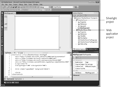
The MainPage.xaml file displayed in the XAML tab of Visual Studio (Fig. 29.1) is similar to the default XAML file for a WPF application. In a WPF application, the root XAML element is a Window. In Silverlight, the root element is a UserControl. The default User-Control has a class name specified with the x:Class attribute (line 1), specifies the namespaces (lines 2–5) to provide access to the Silverlight controls throughout the XAML, and has a width and height of 400 and 300 pixels, respectively. These numbers are system-independent pixel measurements, where each pixel represents 1/96th of an inch. Lines 9–11 are the default Grid layout container. Unlike a WPF application, the default Grid’s x:Name (the name used in code that manipulates the control) and Background attributes are set by default in a Silverlight application.
Fig. 29.1. New Silverlight application in Visual Studio.
.xap File
A compiled Silverlight application is packaged by the IDE as a .xap file containing the application and its supporting resources (such as images or other files used by the application). The web page that hosts the Silverlight application references the Silverlight plug-in and the application’s .xap file. The Silverlight plug-in then executes the application. The test web application that was created for you contains the file WeatherViewerTestPage.aspx, which loads and executes the Silverlight application.
A Silverlight application must be hosted in a web page. The Web Application Project is used to test the Silverlight application in a web browser. Building the solution automatically copies the compiled application into the Web Application Project. You can then test it using the built-in web server in Visual Studio. After the application is built in the IDE, this part of the application contains the .xap file that was described in the preceding paragraph.
Desiging Silverlight User Interfaces
As in WPF, you can use the Design view and the Properties window to design your user Silverlight interfaces, but the Visual Studio designer for WPF and Silverlight is not as robust as that provided by Microsoft Expression Blend. Expression Blend is beyond the scope of this chapter. Trial versions are available from www.microsoft.com/expression/.
Introduction to the WeatherViewer Application
Our WeatherViewer application (Fig. 29.2) allows the user to input a zip code and invokes a web service to get weather information for that location. The application receives weather data from www.weatherbug.com—a website that offers a number of weather-related web services, including some that return XML data. To run this example on your computer, you need to register for your own WeatherBug API key at weather.weatherbug.com/desktop-weather/api.html. This application uses LINQ to XML to process the weather data that is returned by the web service. The application also includes a custom control that we designed to display more detailed weather information for a day of the week selected by the user. Figure 29.2 shows the application after the user enters a zip code (Fig. 29.2(a)) then clicks Monday to see its weather details (Fig. 29.2(b)).
Fig. 29.2. WeatherViewer application displays a seven-day weather forecast. The program can also display detailed information for a selected day.
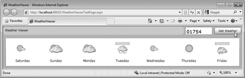
a)
b)
29.4.1 GUI Layout
The layout controls of WPF described in Chapter 24—Grid, StackPanel and Canvas—are also available in Silverlight. The XAML for the layout of the WeatherViewer application is shown in Fig. 29.3. This application uses nested Grid controls to lay out its elements.
Fig. 29.3. WeatherViewer displays day-by-day weather data (XAML).
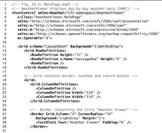
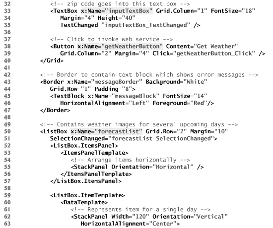
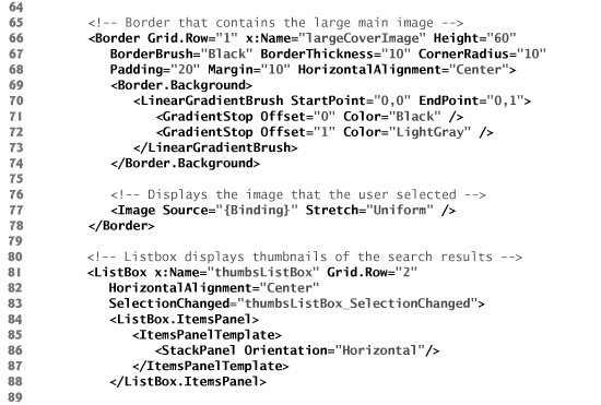
Lines 12–16 contain the RowDefinitions of the main Grid. Lines 20–24 contain the ColumnDefinitions of a nested Grid which displays the top row of the page containing the light gray title Border, the search TextBox and the search Button, as shown in Fig. 29.3.
Line 28 defines the Border’s Margin property, which specifies the amount of space between the Border and any adjacent elements. Lines 43–47 define a Border that contains a TextBlock in which we display an error message if the user enters an invalid zip code. Lines 49–75 define the ListBox used on the main page to display each day’s weather image. Line 55 defines the StackPanel that is used as a template by the ListBox’s Items-Panel, allowing the ListBox’s items to display horizontally. Lines 62–72 define a Stack-Panel for each individual item, displaying the weather Image and the TextBlock containing the day of the week in a vertical orientation. Lines 65 and 69 bind data from the web service’s XML response to the two elements that display weather information.
Lines 78–79 create a WeatherDetailsView custom control element. The code for the custom control is shown in Section 29.4.3. This control’s Visibility property is initially set to Collapsed, so it is not visible when the page loads. The Visibility of a control defines whether it is rendered on the screen. We also set the Grid.RowSpan property to 3. By taking up two rows, the GUI is blocked when the custom control is displayed, so the user can no longer interact with the main page until the control is closed. Notice that WeatherDetailsView is in the namespace Weather. This namespace (defined in line 3 of the XAML file) allows you to use the custom control in the application. The custom control must be referenced through the namespace since it is not a pre-defined control. If we did not define the namespace, there would be no way to reference WeatherDetailsView.
29.4.2 Obtaining and Displaying Weather Forecast Data
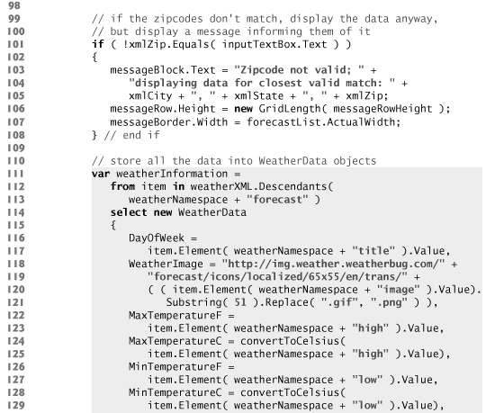
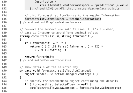
The WeatherViewer example uses Silverlight’s web services, LINQ to XML and data-binding capabilities. The application’s code-behind file appears in Fig. 29.4. You must insert your WeatherBug API key in line 18 in place of "YOUR API KEY HERE".
Fig. 29.4. WeatherViewer displays day-by-day weather data (code-behind).
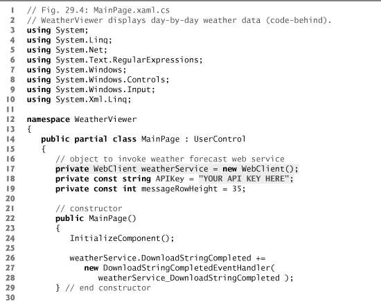
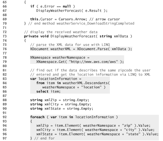
The code for the main page of the WeatherViewer invokes the WeatherBug web service and binds all the necessary data to the proper elements of the page. Notice that we imported the System.Xml.Linq namespace (line 10), which enables the LINQ to XML that is used in the example. You must also add a reference to the System.Xml.Linq assembly to the WeatherViewer Silverlight project. To do so, right click the WeatherViewer project in the Solution Explorer and select Add Reference.... In the dialog that appears, locate the assembly System.Xml.Linq in the .NET tab and click OK.
This application also uses the class WeatherData (line 114) that includes all the necessary weather information for a single day of the week. We created this class for you. It contains six weather information properties—DayOfWeek, WeatherImage, MaxTemperatureF, MinTemperatureF, MaxTemperatureC, MinTemperatureC and Description. To add the code for this class to the project, right click the WeatherViewer project in the Solution Explorer and select Add > Existing Item.... Find the file WeatherData.cs in this chapter’s examples folder and click OK. We use this class to bind the necessary information to the ListBox and the custom control in our application.
Using the WebClient Class to Invoke a Web Service
The application’s method for handling the getWeatherButton click grabs the zip code entered by the user in the TextBox and checks it against a regular-expression pattern to make sure it contains a five-digit number (line 36). If so, we store the five-digit number (lines 38–39). Next, we format the web service URL with the zip code (lines 43–46) and asynchronously invoke the web service (line 49). We use the WebClient class to use the web service and retrieve the desired information. We registered the event handler that handles the response in 26–28.
Line 49 calls the weatherService object’s DownloadStringAsync method to invoke the web service. The web service’s location must be specified as an object of class Uri. Class Uri’s constructor receives a String representing a uniform resource identifier, such as "http://www.deitel.com". In this example, the web service is invoked asynchronously. When the web service returns its result, the WebClient object raises the DownloadString-Completed event. Its event handler (lines 63–70) has a parameter e of type Download-StringCompletedEventArgs which contains information returned by the web service. We can use this variable’s properties to get the returned XML (e.Result) and any errors that may have occurred during the process (e.Error).
Using LINQ to XML to Process the Weather Data
Once the WebClient has received the response, the application checks for an error (line 66). If there is no error, the application calls the DisplayWeatherForecast method (defined in lines 73–136).The XML that the service returns contains information about the location the user specified, which can be used for error-checking. If the user enters an incorrect zip code, the service will simply provide data for the correct zip code which is the closest match to the one the user entered. A sample of the web service’s XML response appears in Fig. 29.5. The web service returns XML data that describes the high and low temperatures for the corresponding city over a period of several days. The data for each day also contains a link to an image that represents the weather for that day and a brief text description of the weather.
Fig. 29.5. Sample web service XML response.
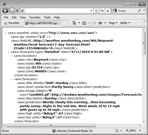
We use class XDocument’s Parse method (line 76) to convert a string—containing the contents of the XML response—to an XDocument to use in the LINQ to XML queries (lines 83–86 and 111–132). Lines 78–79 get the namespace for the XML returned by the web service. Each XML element in the response must be qualified with that name.
Error-Prevention Tip 29.1
When invoking a web service that returns XML, ensure that the namespace you specify in your code precisely matches the namespace specified in the returned XML. Otherwise, the elements in the returned XML will not be recognized in your code.
The first query pulls information from the document about the location the XML describes, which can be compared against the input string (line 101) to determine whether they denote the same location; if not, the input string is not a valid zip code, so we display an error message. We still display the data that is returned. The second query gathers the weather information and sets the corresponding values for a WeatherData object. The query gathers more information from the XML than is initially displayed on the main page of the application. This is because the selected object is also passed to the custom control where more detailed information about the weather is displayed. Also, the returned XML data only provides temperatures in Fahrenheit—getting them in Celsius would require a second invocation of the service with different parameters. As such, the program has a convertToCelsius method (lines 140–147) which converts a Fahrenheit temperature to Celsius as long as the temperature is numerical rather than two dashes "--" (the default when a temperature is not returned). If this is the case, convertToCelsius does nothing. The returned XML does not always provide both a maximum and minimum temperature for one day.
Using Data Binding to Display the Weather Data
We bind the results of the weatherInformation LINQ query (an IEnumerable<T> containing WeatherData objects) to the ListBox (line 135). This displays the summary of the weather forecast. When the user selects a particular day, we bind the WeatherData object for the selected day to the custom control, which displays the details for that day. The ListBox’s SelectionChanged event handler (lines 150–159) sets the DataContext of our custom control (line 155) to the WeatherData object for the selected day. The method also changes the custom control’s Visibility to Visible, so the user can see the weather details.
29.4.3 Custom Controls
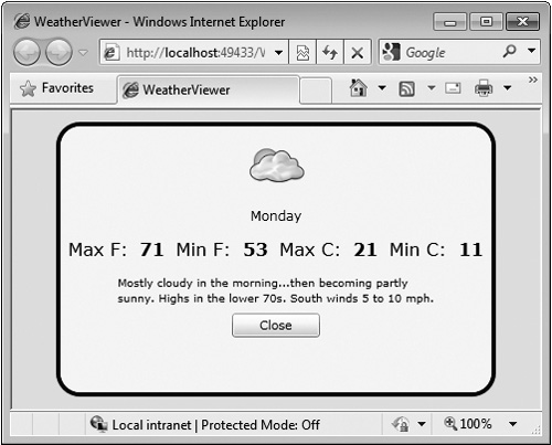
There are many ways to customize controls in Silverlight, including WPF’s Styles and ControlTemplates. As with WPF, if deeper customization is desired, you can create custom controls by using the UserControl element as a template. The WeatherViewer example creates a custom control that displays detailed weather information for a particular day of the week. The control has a simple GUI and is displayed when you change your selection in the ListBox on the main page.
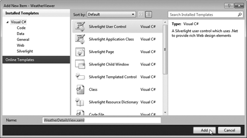
To add a new UserControl to the project, right click the project in the Solution Explorer and select Add > New Item.... Select the Silverlight User Control template and name the file WeatherDetailsView (Fig. 29.6).
Fig. 29.6. Adding a new UserControl to a Silverlight application.
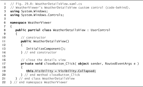
Once added to the project, the UserControl can be coded similar to any other Silver-light application. The XAML code for the custom control’s GUI appears in Fig. 29.7. This control contains two StackPanels embedded in a Grid. Since the aquamarine Rectangle (lines 12–13) in the background has an Opacity of 0.8, you can see that the control is treated as another element “on top of” the main page. Figure 29.8 shows the code-behind file for this control. The Button’s Click event handler collapses the control, so the user can continue interacting with the main page of the application.
Fig. 29.7. WeatherViewer’s WeatherDetailsView custom control (XAML).
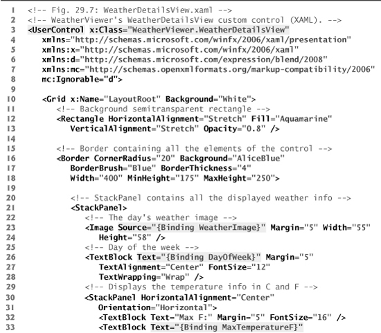
Fig. 29.8. WeatherViewer’s WeatherDetailsView custom control (code-behind).
29.5 Animations and the FlickrViewer
Animations in Silverlight are defined in Storyboards, which are created as Resources of a layout control and contain one or more animation elements. When a Storyboard’s Begin method is called, its animations are applied. Silverlight has several animation types, including DoubleAnimations, PointAnimations, and ColorAnimations.
FlickrViewer Example
Our FlickrViewer example (a sample screen capture is shown in Fig. 29.9) uses a web service provided by the public photo-sharing site Flickr. The application allows you to search by tag for photos that users worldwide have uploaded to Flickr. Tagging—or labeling content—is part of the collaborative nature of social networking. A tag is any user-generated word or phrase that helps organize web content. Tagging items with self-chosen words or phrases creates a strong identification of the content. Flickr uses tags on uploaded files to improve its photo-search service, giving the user better results. To run this example on your computer, you need to obtain your own Flickr API key at www.flickr.com/services/api/keys/ and add it to the MainPage.xaml.cs file (which we discuss shortly). This key is a unique string of characters and numbers that enables Flickr to track usage of their APIs.
Fig. 29.9. FlickrViewer allows users to search photos by tag.
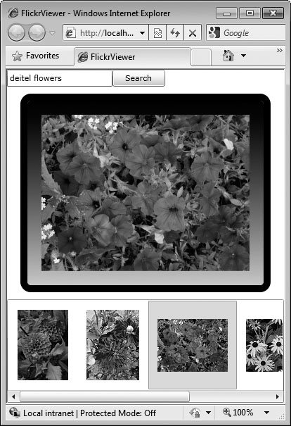
The application shows you thumbnails of the first 20 (or fewer if there are not 20) public results (as specified in the URL that invokes the web service) and allows you to click a thumbnail to view its full-sized image. As you change your selection, the application animates out the previously selected image and animates in the new selection. The Border shrinks until the current Image is no longer visible, then expands to display the new selected Image.
As shown in Fig. 29.9, you can type one or more tags (e.g., “deitel flowers") into the application’s TextBox. When you click the Search Button, the application invokes the Flickr web service, which responds with an XML document containing links to the photos that match the tags. The application parses the XML and displays thumbnails of these photos. The application’s XAML is shown in Fig. 29.10.
Fig. 29.10. FlickrViewer allows users to search for tagged photos (XAML).
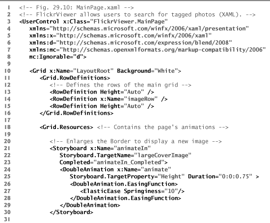
Lines 18–50 define the Grid’s Resources, which contain three Storyboard elements to facilitate various animations. The animateIn Storyboard (lines 21–30) contains a DoubleAnimation that animates the Height property of the largeCoverImage’s Border. Though this animation is a From/To/By animation, the To property is not set. We set this value in the C# code to allow the border to fill the available space in the window regardless of the browser window size. Lines 26–28 contain an EasingFunction. Silverlight animations provide smooth, linear change of an item’s attribute over a set period of time, but an EasingFunction allows animations to follow other patterns. This particular EasingFunction, ElasticEase, will cause animateIn to oscillate like it is attached to a spring. The animateOut Storyboard (lines 33–38) shrinks the Border until the image inside is no longer visible. Storyboards can also contain multiple animations; the buttonRotate Storyboard (lines 41–49) will rotate the button in all three dimensions when it’s clicked, but a separate DoubleAnimation must be declared for each dimension. Like animateIn, buttonRotate’s To property is set programmatically.
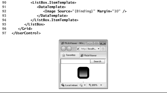
The rest of the layout is similar to that of the WeatherViewer. Lines 11–16 define the main Grid’s three rows. The first row contains a StackPanel with an embedded search TextBox and a Button (lines 53–63). To give the three-dimensional buttonRotate animation a target, the Button’s Projection must be declared and named; an item’s Projection lets you control its rotation in three dimensions. The second row contains the Border with an embedded Image (lines 66–78) to display the large version of the selected thumbnail. The third row contains the ListBox (lines 81–95), which displays the thumbnails of the photos returned from Flickr. This ListBox is organized and coded in the same way as in the WeatherViewer, except that the DataTemplate contains only one Image—one of the photos returned by the web service. The screen capture in Fig. 29.10 shows the empty layout of the FlickrViewer before the user enters a search query.
The C# code for the application can be seen in Fig. 29.11. This example uses web services and LINQ to XML.
Fig. 29.11. FlickrViewer allows users to search for tagged photos (code-behind).
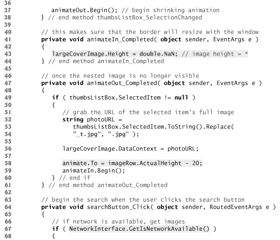
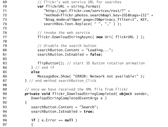
The library System.Net.NetworkInformation contains tools to check the status of the network. Using the NetworkInterface.GetIsNetworkAvailable function (line 67), the program attempts to connect to Flickr only if connected to a network (lines 67–84) and simply displays an error message otherwise (lines 85–86).
Line 16 defines a constant String for the API key that is required to use the Flickr API. To run this application insert your Flickr API key here.
Recall that the To property of the DoubleAnimation in the animateIn Storyboard is set programatically. Line 58 sets the To property to the Height of the page’s second row (minus 20 to account for the Border’s Margin), animating the Height to the largest possible value while keeping the Border completely visible on the page.
For animations to function properly, the properties being animated must contain numeric values—relative values "*" and "Auto" do not work. So before animateOut begins, we assign the value largeImageCover.ActualHeight to the Border’s Height (line 35). When the Border is not being animated, we want it to take up as much space as possible on screen while still being resizable based on the changing size of the browser window. Line 43 resets the Border’s Height back to Double.NaN, which allows the border to be resized with the window.
Notice that when you click a new picture that you have not previously viewed, the Border’s Height increases without displaying a new picture inside. This is because the animation begins before the application can download the entire image. The picture is not displayed until its download is complete. If you click the thumbnail of an image you’ve viewed previously, it displays properly, because the image has already been downloaded to your system and cached by the browser. Viewing the image again causes it to be loaded from the browser’s cache rather than over the web.
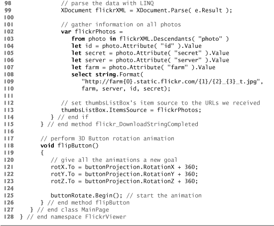
Lines 102–110 of Fig. 29.11 use a LINQ query to gather the necessary information from the attributes of the photo elements in the XML returned by the web service. A sample of the XML response is shown in Fig. 29.12. The four values collected are required to form the URL to the online photos. The thumbnail URLs are created in lines 108–110 in the LINQ query’s select clause. The "_t" before the ".jpg" in each URL indicates that we want the thumbnail of the photo rather than the full-sized file. These URLs are passed to the ItemsSource property of thumbsListBox, which displays all the thumbnails at the bottom of the page. To load the large Image, use the URL of the thumbnail and remove the "_t" from the link (lines 52–54), then change the source of the Image element in the Border (line 56). Notice that the data binding in lines 77 and 92 of Fig. 29.10 use the simple "{Binding}" syntax. This works because we’re binding a single String to the object rather than an object with several properties.
Fig. 29.12. Sample XML response from the Flickr APIs.
Method flipButton (lines 118–126) activates the buttonRotate Storyboard. The method sets the To property in all three dimensions to 360 degrees greater than its current value. When we call the Storyboard’s Begin method, the button rotates 360 degrees in each dimension.
Out-of-Browser Experience
Silverlight’s out-of-browser experiences enable you to configure a Silverlight application so that any user can download a local copy of it and place a shortcut to it on their desktop and in their Start menu. To configure the FlickerViewer application for an out-of-browser experience, perform the following steps:
- Right click the FlickerViewer project in the Solution Explorer and select Properties.
- Ensure that Enable running application out of the browser is checked.
- Click the Out-of-Browser Settings... button.
- In the Out-of-Browser Settings dialog (Fig. 29.13), you can configure the application’s settings, including the window’s title, width and height. You can also specify the shortcut name, the application’s description and icons to represent your application. In this case, we kept the default settings, but set the width and height of the window.
Fig. 29.13. Out-of-Browser Settings dialog.
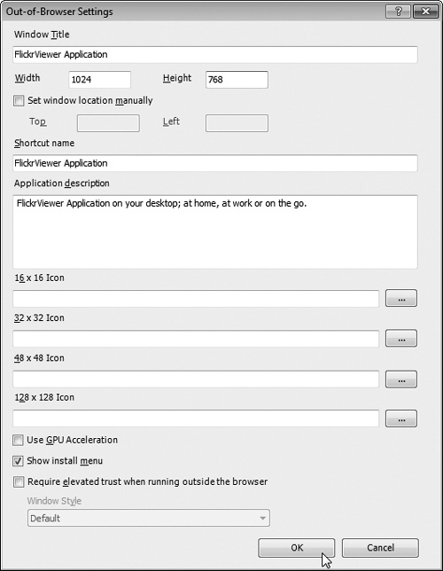
- Click OK to save your settings.
Once you’ve configured the application for an out-of-browser experience, the user can right click the application in the browser to see the menu in Fig. 29.14. Selecting Install FlickrViewer onto this computer... presents you with a dialog that allows you to choose where you want the shortcut for the application to be installed. After clicking OK, the application will execute in its own window. In the future, you can run the Silverlight application from its shortcut.
Fig. 29.14. Right-click menu for a Silverlight application that supports an out-of-browser experience.

29.6 Images and Deep Zoom
One feature in Silverlight that is not in WPF is the MultiScaleImage. In most desktop applications, you’ll have no trouble viewing and zooming in on a high-resolution image. Doing this over the Internet is problematic, however, because transferring large images usually takes significant time, which prevents web-based applications from having the feel of desktop applications.
This problem is addressed by Silverlight’s deep zoom capabilities, which use Multi-ScaleImages to allow you to zoom far into an image in a web browser while maintaining quality. One of the best demonstrations of this technology is the Hard Rock Cafe’s memorabilia page (memo.hardrock.com), which uses Silverlight’s deep zoom capabilities to display a large collage of rock and roll memorabilia. You can zoom in on any individual item to see its high-resolution image. The photographs were taken at such high resolution that you can actually see fingerprints on the surfaces of some of the guitars!
Deep zoom works by sending only the necessary image data for the part of the image you are viewing to your machine. To split an image or collage of images into the Silver-light-ready format used by MultiScaleImages, you use the Deep Zoom Composer (available from www.microsoft.com/uk/wave/software-deepzoom.aspx). The original images are split into smaller pieces to support various zoom levels. This enables the server to send smaller chunks of the picture rather than the entire file. If you zoom in close to an image, the server sends only the small section that you are viewing at its highest available resolution (which depends on the resolution of the original image). If you zoom out, the server sends only a lower-resolution version of the image. In either case, the server sends just enough data to give the user a rich image-viewing experience.
A MultiScaleImage’s Source is an XML document—created by Deep Zoom Composer. The MultiScaleImage uses the data in the XML to display an image or collage of images. A MultiScaleSubImage of a MultiScaleImage contains information on a single image in a collage.
The DeepZoomCoverCollage Example
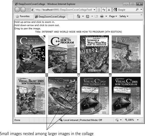
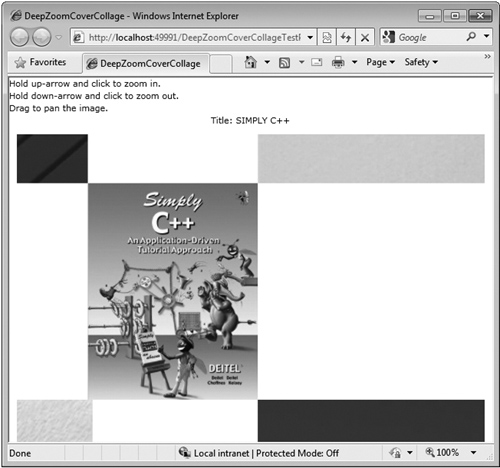
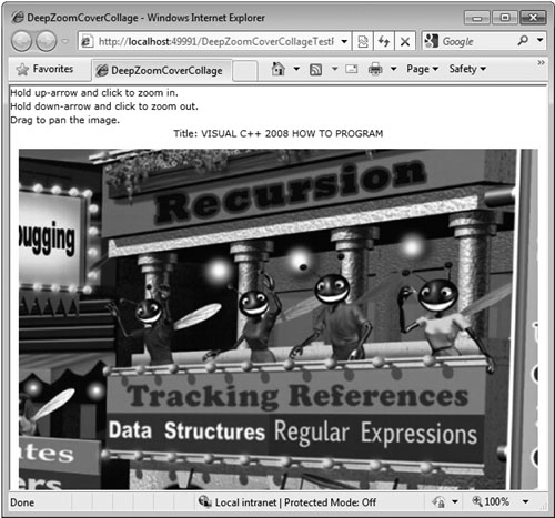
Our DeepZoomCoverCollage application contains a high-resolution collage of 12 of our book covers. You can zoom in and out and pan the image with simple keystroke and mouse-click combinations. Figure 29.15 shows screen captures of the application.
Fig. 29.15. Main page of the DeepZoomCoverCollage.
a)
b)
c)
Figure 29.15(a) shows the application when it’s first loaded with all 12 cover images displayed. Eight large images and three tiny images are clearly visible. One cover is hidden within one of these eleven covers. Test-run the program to see if you can find it. Figure 29.15(b) shows the application after we’ve zoomed in closely on the leftmost small cover image. As you can see in the second screen capture, the small cover image still comes up clearly, because it was originally created in the Deep Zoom Composer with a high-resolution image. Figure 29.15(c) shows the application with an even deeper zoom on a different cover. Rather than being pixelated, the image displays the details of the original picture.
29.6.1 Getting Started With Deep Zoom Composer
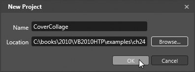
To create the collection of files that is used by MultiScaleImage, you need to import the image or set of images into Deep Zoom Composer. When you first open the program, create a new project through the File menu, and specify the project’s Name and Location. We named the project CoverCollage. Figure 29.16 shows the New Project dialog.
Fig. 29.16. Deep Zoom Composer’s New Project dialog.
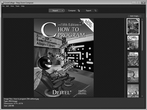
The Import tab in Deep Zoom Composer is displayed by default. It enables you to add the image(s) that you want in the collage. Click the Add Image... button to add your images. (We provided our book-cover images with this chapter’s examples in the Cover Images folder.) Once you’ve added your images, you’ll see their thumbnails on the right side of the window. A larger version of the selected image appears in the middle of the window. Figure 29.17 shows the window with the Import tab open after the book-cover images have been imported to the project.
Fig. 29.17. Deep Zoom Composer showing the imported image files.
For our CoverCollage example, we use high-resolution .jpg images. Deep Zoom Composer also supports .tif, .bmp and .png formats. After importing the images, you can go to the Compose tab to organize them on your collage.
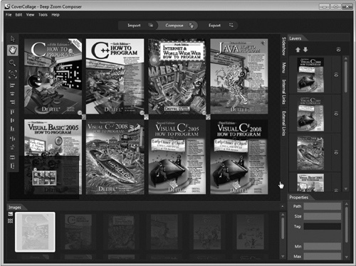
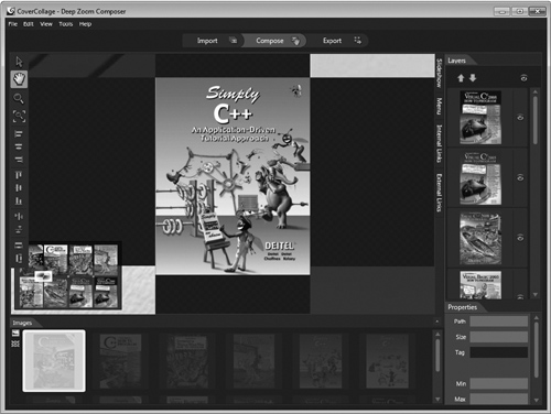
Drag the thumbnail of each desired image onto the main canvas of the window. When you drag a file into the collage, its thumbnail is grayed out in the side bar and you cannot add it to the collage again. Figure 29.18 shows what the composer looks like, once you bring files into the project.
Fig. 29.18. Deep Zoom Composer showing the editable composition.
a)
b)
When images are in the composition, you can move the images to the canvas and resize them to be as large or small as you want. Deep Zoom Composer has features such as snapping and alignment tools that help you lay out the images. Yellow pins throughout the collage in Fig. 29.18(a) indicate that there are small images at those locations. You can zoom in on the composition by scrolling the mouse wheel to see the smaller image. Figure 29.18(b) shows the smaller cover marked by one of the pins. A small screen in the bottom-left corner shows the entire collage and a white rectangle indicating the view displayed in the window.
The panel on the right showing all the images also has a Layer View option, which indicates the layer ordering of all the composition’s images. This view is used to control the order of overlapping images. The layers can be rearranged to allow you to place certain images on top of others.
Once you have a completed collage, go to the Export tab to export the files to be used by a MultiScaleImage in your application. Figure 29.19 shows the contents of the window when the Export tab is open.
Fig. 29.19. Deep Zoom Composer’s exporting capabilities.
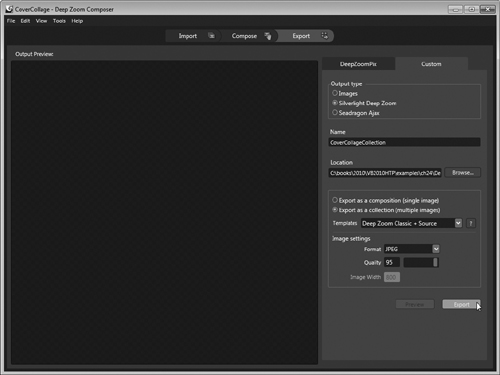
You’ll need to name the project. For this example, select the Custom tab, then name the project CoverCollageCollection and keep the default Export Location. The files are exported to a new folder inside the directory that you created earlier for the Deep Zoom Composer project. By default, Deep Zoom Composer selects the Export as Collection option using a JPEG file format. By exporting as a collection instead of a composition, subimage information is included in the output XML files. Keep the JPEG Quality at 95—lower values result in smaller file sizes and lower-quality images. From Templates, select the Deep Zoom Classic + Source option, then click Export. Once the project is done exporting, you’ll be ready to import these files into a Silverlight project and use them to create a deep zoom application.
29.6.2 Creating a Silverlight Deep Zoom Application
Deep zoom images are created in Silverlight Projects by using the MultiScaleImage element, which takes an XML file as its source. A MultiScaleImage can be treated in the XAML code similar to a simple Image element. Previously, we showed you screen captures of the DeepZoomCoverCollage example. Figure 29.20 is the XAML code that produces the layout of this application.
Fig. 29.20. DeepZoomCoverCollage employs Silverlight’s deep zoom (XAML).
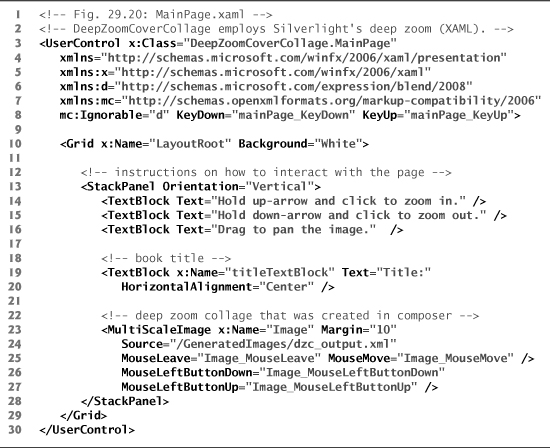
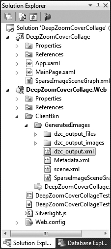
The main page contains only a StackPanel with TextBlocks that display instructions, a TextBlock to display the selected book’s title and the MultiScaleImage to display the collage we created in the previous section. To use the collage, you must add the entire GeneratedImages folder to your Silverlight project. If you kept the default Deep Zoom Composer export location, this folder can be found in the CoverCollage project’s folder under the subfolder Exported DatacovercollagecollectionDeepZoomProjectSiteClientBin. Copy the GeneratedImages folder into the ClientBin folder of the web application project by dragging it from Windows Explorer onto that folder in the Solution Explorer. If the CoverCollageCollection folder was copied correctly, you should see a GeneratedImages folder (Fig. 29.21). You can now refer to this collection in your application.
Fig. 29.21. Solution Explorer after the deep zoom files have been added to the project.
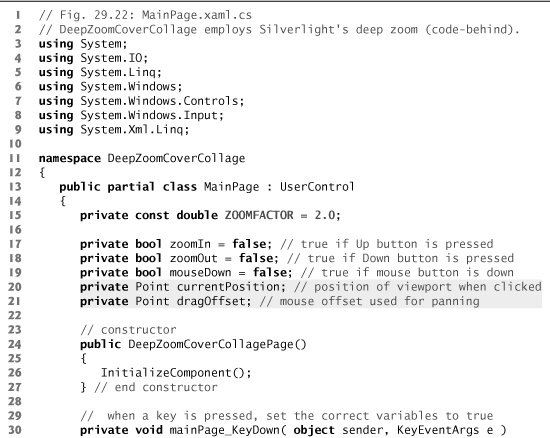
Once the necessary files are in the project, they can be used by the MultiScaleImage element that displays the deep zoom image. Line 24 of Fig. 29.20 defines the source of the MultiScaleImage to "/GeneratedImages/dzc_output.xml". The source address in this case is relative to the ClientBin, meaning that the application searches for the given path in the ClientBin folder of the project. Now that the MultiScaleImage is ready, we can program the application’s event handlers for zooming and panning the image, and for displaying a book’s title when its cover is clicked (Fig. 29.22). We use a LINQ query to find the title of the cover image the user selects. We have several instance variables that help us determine which operation is to occur when you click the mouse.
Fig. 29.22. DeepZoomCoverCollage employs Silverlight’s deep zoom (code-behind).
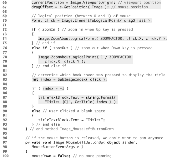
Zooming a MultiScaleImage
To zoom in or out with a MultiScaleImage, we call its ZoomAboutLogicalPoint method (lines 74 and 78–79), which takes a zoom factor, an x-coordinate and a y-coordinate as parameters. A zoom factor of 1 keeps the image at its current size. Values less than 1 zoom out and values greater than 1 zoom in. The method zooms toward or away from the coordinates passed to the method. The coordinates need to be absolute points divided by the entire collage’s Width. To convert the absolute coordinates raised by a mouse event to these coordinates, we use MultiScaleImage’s ElementToLogicalPoint method (line 70), which takes the Point’s absolute coordinates as parameters.
Panning a MultiScaleImage
The viewport of a MultiScaleImage represents the portion of the image that is rendered on screen. To pan, change the ViewportOrigin property of the MultiScaleImage (line 116). By keeping track of the offset between where the user initially clicked (line 67) and where the user has dragged the mouse, we can calculate where we need to move the origin (lines 110–115) to shift the image. Figures 29.23–29.24 demonstrate what values are returned by various MultiScaleImage properties. Assume the “container” of Fig. 29.23 is the viewport while the “image” is the entire collage.
Fig. 29.23. Various values used to by MultiScaleImage’s properties.
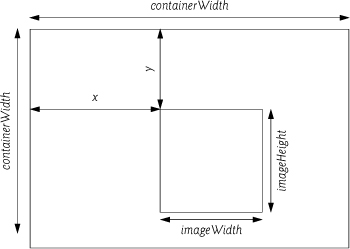
Fig. 29.24. Values returned by MultiScaleImage’s properties.
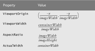
To determine the new x-coordinate of the ViewportOrigin, we first find the difference between the x-coordinates of the current mouse position (e.GetPosition(Image).X) and the mouse position where the user initially clicked (dragOffset.X), which we’ll refer to as the mouse offset. To convert this value to one we can use for the ViewportOrigin, we need to divide it by the width of the collage. The MultiScaleImage’s ViewportWidth returns the ratio of the viewport’s width and the collage’s width. A MultiScaleImage’s ActualWidth property returns the width of the piece of the collage rendered on-screen (viewport’s width). Multiplying the mouse offset by the ViewportWidth and dividing by the ActualWidth returns the ratio of the mouse offset and the collage’s width. We then subtract this value from the ViewportOrigin’s original x-coordinate to obtain the new value. A similar calculation is performed for the y-coordinate (keep in mind we still use ActualWidth in this calculation since ViewportOrigin’s coordinates are given in terms of the width).
Determining the Title of the Clicked Cover
To determine a clicked image’s book title requires the SparseImageSceneGraph.xml file created by Deep Zoom Composer. In the Solution Explorer, find this XML file in the collection folder we imported and drag the file to your Silverlight deep zoom project so that you can use it in a LINQ query later in the application. The file contains information on where each subimage is located in the collage.
To determine which cover the user clicked, we create a Rect object (lines 131–133) for each subimage that represents the on-screen area that the image occupies. A Rect defines a rectangular area on the page. If the Point returned by the mouse-click event is inside the Rect, the user clicked the cover in that Rect. We can use Rect method Contains to determine whether the click was inside the rectangle. If a cover was clicked, method SubImageIndex returns the index of the subimage. Otherwise the method returns -1.
A MultiScaleSubImage’s properties return the same ratios as a MultiScaleImage’s properties (Figs. 29.23–29.24), except that the “container” represents the entire collage while the “image” represents the subimage. Since the ElementToLogicalPoint method of a MultiScaleImage control returns points based on a scaled coordinate system with the origin at the top-left corner of the collage, we want to create Rect objects using the same coordinate system. By dividing the subimage’s ViewportOrigin by the subimage’s View-portWidth, we obtain coordinates for the top-left corner of the Rect. To find the Rect’s Width, we take the inverse of the subimage’s ViewportWidth. We can then use the subimage’s AspectRatio to obtain the Height from the Width.
Next, we use the subimage’s index in a LINQ to XML query (in method GetTitle) to locate the subimage’s information in the SparseImageSceneGraph.xml document (lines 151–155). Each subimage in the collage has a unique numeric ZOrder property, which corresponds to the order in which the images are rendered on screen—the cover with a ZOrder of 1 is drawn first (behind the rest of the covers), while the cover with a ZOrder of 12 is drawn last (on top of all other covers). This ordering also corresponds to the order of the subimages in the collection Image.SubImages and therefore corresponds with the index that we found in the SubImageIndex method. To determine which cover was clicked, we can compare the returned index with the ZOrder of each subimage in the collection using our LINQ to XML query. We add 1 to the returned index (line 154), because the indices in a collection start at 0 while the ZOrder properties of the subimages start at 1. We then obtain and return the title from the subimage’s original file name (lines 157–168) and display the title above the deep zoom image (lines 87–88). If none of the covers were clicked, then no title is displayed (line 92).
29.7 Audio and Video
Silverlight uses the MediaElement control to embed audio or video files into your application. A MediaElement’s source can be a file stored with the Silverlight application or a source on the Internet. MediaElement supports playback in many formats. For a list, see:
msdn.microsoft.com/en-us/library/cc189080(VS.95).aspx
Silverlight supports high-definition video. Microsoft’s Expression Encoder can be used to convert files into a supported format. Other encoders that can convert to Windows media format will work as well, including the free online media encoder at
media-convert.com/
MediaElements can be in one of the following states—Buffering, Closed, Paused, Opening, Playing or Stopped. A MediaElement’s state is determined by its CurrentState property. When in the Buffering state, the MediaElement is loading the media in preparation for playback. When in the Closed state, the MediaElement contains no media and displays a transparent frame.
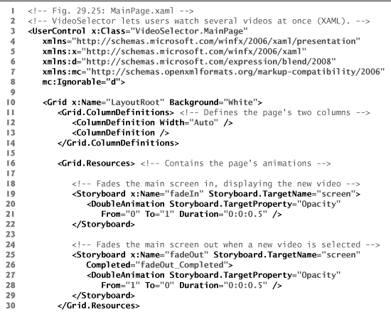
Our VideoSelector application (Fig. 29.25) shows some of Silverlight’s media-playing capabilities. This application obtains its video sources from a user-created XML file and displays small previews of those videos on the left side of the screen. When you click a preview, the application loads that video in the application’s main area. The application plays the audio only for the video in the main area.
Fig. 29.25. VideoSelector lets users watch several videos at once (XAML).
The videos for this example were downloaded from the Wikimedia Commons web-site (commons.wikimedia.org) and are in the public domain. This site contains many images and sound and video files that you can use in your programs—not all items are in the public domain. The videos in the screen capture in Fig. 29.25 were obtained under the science videos section at
commons.wikimedia.org/wiki/Category:Science_videos
The files were .ogg files that we converted to .wmv files using the online video converter at media-convert.com/.
The application displays one preview video on the side of the page for each source defined in a user-created XML file (discussed shortly). The GUI contains a Grid with two Columns. The first Column contains a ListBox that allows you to scroll through previews of the videos (lines 33–40). The second Column contains a Rectangle element with a VideoBrush for its Fill (lines 43–47). A VideoBrush displays a video as a graphics object’s Fill—similar to an ImageBrush. The SetSource method of VideoBrush takes a Media-Element as a parameter and sets the video to be played in the brush.
The Grid element contains two Storyboard Resources, which contain the main video’s fade-in and fade-out animations (lines 19–29). These animations are DoubleAnimations that target the Opacity property of the Rectangle that displays the video. To make the Rectangle display the selected video, we’ll change the VideoBrush’s source to the video the user clicks.
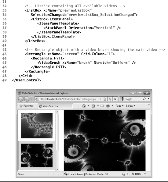
When the page loads, the application performs several initialization tasks. It first loads a new MediaElement for each source that is included in the sources.xml file (Fig. 29.26). We query this XML file using LINQ to XML. To specify your own list of videos, you must edit our sources.xml file, or create a new one and add it to the project. To do this, open a new XML file by right clicking the application project—in this case VideoSelector—in the Solution Explorer and go to Add > New Item.... Select Visual C# in the Categories section of the window, then select XML File in the Templates section. Change the file’s Name to sources.xml and click Add. Open the file to begin editing it. The sample file in Fig. 29.26 shows the format required to list the sources of the desired videos.
Fig. 29.26. VideoSelector’s list of video sources.
The XML document defines a videos element that may contain any number of video elements. Each video element contains a url element whose value is the source URL for commons.wikimedia.org/wiki/Category:Science_videos the corresponding MediaElement. Simply replace the value in the url tag(s) with the path to your video(s). These videos also need to be included in your Web Project’s ClientBin if you want to play them from the same location as the Silverlight application. If your source URLs link to online videos, then you’ll need to change the UrlKind in line 31 (Fig. 29.27). To add the local files, right click the ClientBin folder in the Web Project associated with your Silverlight application (VideoSelector.Web) in the Solution Explorer and select Add > Existing Item.... Locate the videos you want to add and click Add. Now that we’ve added the necessary files to the project, we can continue with the code-behind file shown in Fig. 29.27.
Fig. 29.27. VideoSelector lets users watch several videos at once.
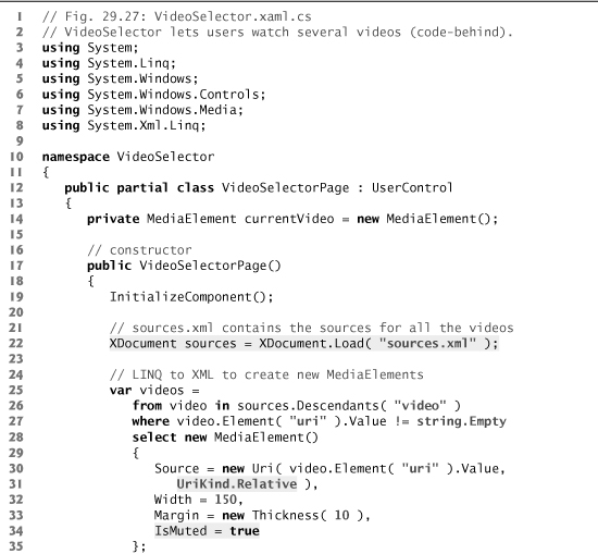
The VideoSelector uses LINQ to XML to determine which videos to display in the side bar. Line 22 defines the XDocument that loads sources.xml. Lines 25–35 contain a LINQ query that gets each video element from the XML file. For each video element that has a non-empty url element, the query creates a new MediaElement with that url as its relative Source. If your video is in the same location as the application or any subdirectory of that location, you may use a relative Source value. Otherwise, you need to use an absolute Source, which specifies the full path of the video. We set each element’s Width, Margin and IsMuted properties to specify how the videos appear and perform when the application loads. Setting a MediaElement’s IsMuted property to true (line 34) mutes its audio—the default value is False—so that we do not hear the audio from all videos at once. We then assign the videos to the ItemsSource (line 38) of the ListBox to display the preview videos.
The application uses previewListBox’s SelectionChanged event handler to determine which video the user wants to view in the main area. When this event occurs, we begin the fade-out animation (line 45). After the fade-out animation completes, the application determines which video was clicked by grabbing previewListBox’s SelectedItem object and stores it in a MediaElement variable (lines 55–56).
When a video has finished playing, it is placed in the Paused state. Lines 59–63 ensure that the selected video is restarted if it is in this state. We then mute the audio of the old video and enable the audio of the selected video (lines 65 and 66 respectively). Next, we set the source for the VideoBrush of the Rectangle’s Fill to the selected video (line 69). Finally, we begin the fade-in animation to show the new video in the main area (line 72).
29.8 Wrap-Up
In this chapter, you learned how to use Silverlight (a cross-platform, cross-browser subset of .NET) to build Rich Internet Applications (RIAs) in Visual Web Developer 2010 Express. We began by introducing the WeatherViewer application to portray some of the key features of a new Silverlight application. Silverlight and WPF have similar programming environments with slight minor variations. The GUI of any Silverlight page is created by a XAML file in the project. All event handlers and other methods are created in the code-behind files.
With the WeatherViewer example, we showed that you can use web services, LINQ to XML and data binding to create a web application with desktoplike capabilities. We also showed you how to create a custom control by using a UserControl as a template. Unlike Styles and ControlTemplates, custom controls allow you to manipulate the control’s functionality rather than just the visual aspects. The GUI and code-behind of a custom control are created in their own .xaml and .xaml.cs files.
We showed you our FlickrViewer example, which, similar to the WeatherViewer, shows how to use web services to enhance the capabilities of your application—specifically in this example with the Image control. This application combines a web service—provided by Flickr—and animations to create a photo-searching website. We also introduced Silver-light’s out-of-browser experience capabilities.
You learned about Silverlight’s deep zoom capabilities. You saw how to use Deep Zoom Composer and Silverlight to create your own deep zoom application. We showed how to implement zooming, panning, and subimage recognition in the code-behind file of your application using MultiScaleImage and MultiScaleSubImage.
Silverlight supports audio and video playback using the MediaElement control. This control supports embedding Windows media format files into the application. We introduced our VideoSelector application to show how to program MediaElements in your application. The example also showed the VideoBrush control being applied to the Fill of a Rectangle (applicable to any graphics object) to display the video within the graphic. In the next chapter, we begin presenting our object-oriented design case study.