
6. Enriching Forms
FORMS ARE ANOTHER ASPECT of a website that can involve interaction, and therefore they offer additional visual events that are ripe for enriching with CSS3.
By default, form elements themselves can differ drastically in appearance depending on the browser or operating system in which they’re viewed. Why not embrace that variation by choosing to apply the portions of CSS3 that work today to heighten the experience?
It’s important to strike a balance between subtle modification of form elements and maintaining the familiar to ensure usability for your forms. In other words, an input should still obviously appear as an input. Now that CSS is capable of deep styling of form elements (in most browsers), we have to be careful not to tamper with the most important part: the functionality.
That said, there’s a lot we can do with forms in regards to CSS3 to enrich the experience for browsers that support it now, while degrading that experience gracefully for browsers that don’t.
This chapter also gives us an excuse to talk about three portions of CSS3 that we haven’t yet touched on:
1. Powerful new selectors
2. CSS Gradients
3. CSS Animations
Again, we’ll use the moon example site as a launching pad to talk about how forms and CSS3 can work together in new and creative ways; specifically, the “New Thing Alerts” sign-up form that sits in the right sidebar (FIG 6.1).
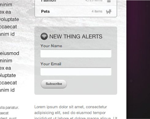
FIG 6.1: A simple form where users can subscribe to updates as new items are left on the moon.
Marking Up the Simple Sign-Up Form
In terms of HTML, this little form is about as simple as it gets. Just a few inputs with labels and a submit button.
<form action="/" id="thing-alerts">
  <fieldset>
    <label for="alerts-name">Your Name</label>
    <input type="text" id="alerts-name"  />
  </fieldset>

  <fieldset>
    <label for="alerts-email">Your Email</label>
    <input type="email" id="alerts-email" />
  </fieldset>

  <fieldset>
    <input type="submit" value="Subscribe" />
  </fieldset>
</form>
FIGURE 6.2 shows the form with the default browser styles (as viewed in Safari).

FIG 6.2: The form viewed in Safari, sans styles.
Adding Styles for Fieldset and Label
The first bits of CSS we’ll add to start sculpting this form are for the fieldset and label elements—just a bit of spacing between each row.
#thing-alerts fieldset {
  margin: 0 0 10px 0;
  }

#thing-alerts label {
  display: block;
  font-weight: bold;
  line-height: 1.4;
  color: #666;
  color: rgba(0, 0, 0, 0.6);
  text-shadow: 0 1px 1px #fff;
  }
Looking at FIGURE 6.3 you’ll notice we’ve added a 10px margin below each fieldset row, and we’ve set labels to display: block to put them on their own line. We’ve also assigned black at 60% transparency for the text, as well as a backup color of solid gray for browsers that don’t yet support RGBA. And we’ve applied a subtle white highlight with text-shadow, to make the text appear as though it’s inset on the background.

FIG 6.3: The fieldset and label elements are now styled.
Now while we have nice 10-pixel spacing between fieldset rows, because of the padding inside the gray box, we don’t need the 10-pixel margin under the last row (containing the submit button).
This is a common pattern: you have a list or succession of elements, each with the same styles applied, but you’d like to style the last element in that succession a little differently.
Instead of adding class="last" to the final element, why not take advantage of the :last-child pseudo-class in CSS3 to remove the bottom margin without having to touch the markup:
#thing-alerts fieldset {
  margin: 0 0 10px 0;
  }

#thing-alerts fieldset label {
  display: block;
  font-weight: bold;
  line-height: 1.4;
  color: #666;
  color: rgba(0, 0, 0, 0.6);
  text-shadow: 0 1px 1px #fff;
  }

#thing-alerts fieldset:last-child {
  margin: 0;
  }
Keep in mind that :last-child isn’t supported in IE8 and below, but for minor presentational adjustments like this one, it’s a great alternative to adding a class in the markup.
FIGURE 6.4 shows where we’re at currently, now with bottom margin on the last fieldset element removed by way of the :last-child pseudo-class.

FIG 6.4: With the bottom margin removed from the final fieldset, our form spacing is looking good.
More CSS3 selectors
While we’re making good use of :last-child, it’s a good time to point out that there are many more wonderfully convenient new selectors in CSS3.
I highly recommend Roger Johansson’s article on the subject, “CSS3 selectors explained” (http://bkaprt.com/css3-2/15/) where he demonstrates what they are and how they work. Support for CSS3 selectors varies across browsers, so be sure to reference Peter-Paul Koch’s thorough “CSS contents and browser compatibility” tables (http://bkaprt.com/css3-2/16/) and “CSS Compatibility and Internet Explorer” from Microsoft (http://bkaprt.com/css3-2/17/) to see who supports what.
Styling the Text Inputs
Next, let’s start adding the styles that turn default text inputs into something a bit more customized. This time we’ll use a CSS2.1 attribute selector to target the input type="text" elements only (and not the input type="submit" button).
If we simply declared:
#thing-alerts input
we’d be styling all inputs in the form (text and buttons), but if we modify that to:
#thing-alerts input[type="text"]
we’ll target the text inputs only.
Again, using a powerful selector in the stylesheet avoids having to add extra classes in the markup to style the various form elements separately. This is beautiful.
Keep in mind that while attribute selectors are supported in IE7 and above, they aren’t supported in IE6, but that’s OK since we’re just modifying the non-critical appearance of these form elements. IE6 will ignore these rules, and that’s perfectly acceptable in this case.
The following declaration applies a specific width, padding, and font-size, turns off default borders, adds a background-color, and rounds the corners of the inputs using our trusty border-radius stack.
#thing-alerts fieldset input[type="text"] {
  width: 215px;
  padding: 5px 8px;
  font-size: 1.2em;
  color: #666;
  border: none;
  background-color: #fff;
  -webkit-border-radius: 4px;
  -moz-border-radius: 4px;
  -o-border-radius: 4px;
  border-radius: 4px;
  }
FIGURE 6.5 shows our progress viewed in Safari (with similar results in other recent browsers). We now have flat, rounded text inputs, which look quite nice, but let’s add some depth to make them look more like a typical, editable input.

FIG 6.5: Flat, rounded text inputs.
Using CSS3 Gradients
One crafty way we can add some of that depth is by way of CSS gradients, which are new in CSS3. That is, create a gradient from one color to another without the use of any images. That sounds pretty enticing, doesn’t it?
CSS gradients are supported in Safari 4+, Chrome 2+, Firefox 3.6+, Opera 20+, and IE 10+, but again, for non-critical uses, it can be a flexible solution that degrades well.
CSS gradients can be assigned anywhere that an image can be declared in the stylesheet; in other words, background-image, list-style-image, border-image, and generated content.
The syntax for declaring CSS gradients differs slightly between Safari’s implementation and Firefox. The (very preliminary) spec, however, leans more toward the way Firefox handles things. Here’s a prime example of why vendor prefixing is an important part of the process: these two varying syntaxes can be correctly declared for each browser, while the official spec is still being hashed out.
I’ll be honest in saying that the syntax for either can be a tad bit confusing. There’s an immense amount of control possible in creating gradients, including the colors involved, color stops, direction of the gradient, etc.
For example, here is the syntax for creating a simple linear gradient for both WebKit and Mozilla-based browsers on the background of an element:
#foo {
  background-image: -webkit-gradient(linear, »
    0% 0%, 0% 100%, from(#fff), to(#999));
  background-image: -moz-linear-gradient(0% 100% »
    90deg, #fff, #999);
  }
It’s not entirely intuitive, and it’s also difficult to remember the differences for each vendor.
The best way I’ve found to come up with the right code is to use John Allsopp’s wonderful WYSIWYG editor (FIG 6.6, http://bkaprt.com/css3-2/18/).

FIG 6.6: The wonderful CSS gradients tool by John Allsopp.
Use this tool to visually create the gradients you want, then grab the appropriate syntax for both Safari and Firefox. John’s tool does all the heavy lifting for you. And this is extremely helpful as I haven’t been able to memorize the code (and the differences between browsers) yet.
Jonathan Snook has a helpful post on working your way through gradient syntax that might prove helpful as well: http://bkaprt.com/css3-2/19/.
The gradient we want to add to our text inputs is very subtle—just a little lip to make it look inset (FIG 6.7). After fiddling and entering some values into John Allsopp’s tool, we come up with two short lines of CSS:
#thing-alerts fieldset input[type="text"] {
  width: 215px;
  padding: 5px 8px;
  font-size: 1.2em;
  color: #666;
  border: none;
  background-image: -webkit-gradient(linear, »
    0% 0%, 0% 12%, from(#999), to(#fff));
  background-image: -moz-linear-gradient(0% 12% »
    90deg, #fff, #999);
  background-color: #fff;
  -webkit-border-radius: 4px;
  -moz-border-radius: 4px;
  -o-border-radius: 4px;
  border-radius: 4px;
  }

FIG 6.7: A zoomed view of the tiny gradient at the top of each text input that makes it look recessed.
We’re applying a linear gradient here, but radial gradients are also possible with CSS.
And here you can see how the syntax differs between -web-kit and -moz implementations. We’re essentially adding a small linear gradient that goes from light gray (#999) to white (#fff) for just 12% of the vertical height of the input. We’re applying the vendor-prefixed background-image rules to make that happen in Safari and Firefox.
FIGURE 6.8 shows the results, where you can see our rounded inputs now sporting a little inner shadow using no images.

FIG 6.8: Text inputs with the CSS gradient in place.
Browsers that don’t yet support CSS gradients will ignore those background-image rules and just be flat white. And that’s perfectly fine. But the adjustment, flexibility, and control that come along with CSS gradients is rather compelling. We’ll be using them a bit more in the next section regarding the submit button.
A Pure CSS3 Button
If there’s one UI element that can demonstrate how transformative CSS3 can be, it just may be the button. Combining many of the techniques we’ve already discussed throughout the book, we’ll turn an ordinary form submit button into something far more interesting—entirely with CSS (FIG 6.9).

FIG 6.9: The default submit button in Safari on the left vs. one styled with CSS3—no images!—on the right.
The beauty of applying CSS3 to style the button is that by not using images, we’re left with something far more flexible. If the browser doesn’t support the properties we’ll use to elevate this button visually, that’s OK. It’ll degrade nicely to a default form button in whatever browser the user happens to be using.
So let’s walk through the steps needed to take a default form button to the wonderfully shiny one on the right in FIGURE 6.9.
Base button styles
First, we’ll add some padding, change the font to Helvetica to match the rest of the design, turn off borders, and set the background color to white.
#thing-alerts input[type="submit"] {
  padding: 8px 15px;
  font-family: Helvetica, Arial, sans-serif;
  font-weight: bold;
  line-height: 1;
  color: #444;
  border: none;
  background-color: #fff;
  }
FIGURE 6.10 shows how things are looking in Safari with those simple base styles applied. And we already have something that looks nothing like a default input button.

FIG 6.10: A submit button with default borders and backgrounds removed.
Rounding to a pill shape
Next, let’s add a border-radius stack to get the button rounded down to a pill shape (FIG 6.11).
#thing-alerts fieldset input[type="submit"] {
  padding: 8px 15px;
  font-family: Helvetica, Arial, sans-serif;
  font-weight: bold;
  line-height: 1;
  color: #444;
  border: none;
  background-color: #fff;
  -webkit-border-radius: 50%;
  -moz-border-radius: 50%;
  border-radius: 50%;
  }

FIG 6.11: Rounding the submit button using border-radius.
Assigning 50% radius will ensure those perfectly round corners, regardless of the font size.
Applying a linear gradient
Now let’s apply a gradient of light gray (#bbb) from bottom up to white (#fff) at the top of the button. We’ll again rely on Mr. Allsopp’s gradient tool to spit out the correct rules for all browsers that support it.
#thing-alerts input[type="submit"] {
  padding: 8px 15px;
  font-family: Helvetica, Arial, sans-serif;
  font-weight: bold;
  line-height: 1;
  color: #444;
  border: none;
  background-image: -webkit-gradient(linear, »
    0% 0%, 0% 100%, from(#fff), to(#bbb));
  background-image: -moz-linear-gradient(0 100% »
    90deg, #bbb, #fff);
  background-color: #fff;
  -webkit-border-radius: 50%;
  -moz-border-radius: 50%;
  border-radius: 50%;
  }
FIGURE 6.12 shows the progress as viewed in Safari. Now we have a rounded button with a CSS gradient applied. So far, no images have been used and we’ve only added a few lines in our stylesheet.

FIG 6.12: The CSS gradient added to the submit button.
Adding text-shadow to let the type sink in
Let’s now add an almost-white text-shadow below the text that will make it look as if the text is stamped into the button.
#thing-alerts input[type="submit"] {
  padding: 8px 15px;
  font-family: Helvetica, Arial, sans-serif;
  font-weight: bold;
  line-height: 1;
  color: #444;
  border: none;
  text-shadow: 0 1px 1px rgba(255, 255, 255, 0.85);
  background-image: -webkit-gradient(linear, »
    0% 0%, 0% 100%, from(#fff), to(#bbb));
  background-image: -moz-linear-gradient(0 100% »
    90deg, #fff, #bbb);
  background-color: #fff;
  -webkit-border-radius: 50%;
  -moz-border-radius: 50%;
  border-radius: 50%;
  }
We’ll use RGBA to tone down pure white to 85%, letting the gray gradient show through just a tiny bit. We’re also specifying that the shadow sits directly under the text by one pixel, and blurring the shadow one pixel as well.
FIGURE 6.13 shows a close-up of the subtle shadow in place, as well as how the button is coming along so far.

FIG 6.13: A zoomed-in view of the subtle text-shadow we added to create an embossed look.
Adding a box-shadow to the button
Our last piece of CSS3 to add to this stylish little button is a very slight box-shadow to add just another hint of dimension. It’ll help it sit better on the gray background behind it.
Here’s a stack that adds the box-shadow to the browsers that currently support it, as well as future ones.
#thing-alerts input[type="submit"] {
  padding: 8px 15px;
  font-family: Helvetica, Arial, sans-serif;
  font-weight: bold;
  line-height: 1;
  color: #444;
  border: none;
  text-shadow: 0 1px 1px rgba(255, 255, 255, 0.85);
  background-image: -webkit-gradient(linear, »
    0% 0%, 0% 100%, from(#fff), to(#bbb));
  background-image: -moz-linear-gradient(0% 100% »
    90deg, #bbb, #fff);
  background-color: #fff;
  -webkit-border-radius: 50%;
  -moz-border-radius: 50%;
  border-radius: 50%;
  -webkit-box-shadow: 0 1px 2px rgba(0, 0, 0, 0.5);
  -moz-box-shadow: 0 1px 2px rgba(0, 0, 0, 0.5);
  box-shadow: 0 1px 2px rgba(0, 0, 0, 0.5);
  }
FIGURE 6.14 shows the results in Safari after adding a box-shadow to the button that’s just 1px from the top with a 2px blur. For color, we’re using black at 50% using RGBA, so that the shadow will have some transparency to it, letting the background behind it shine through.

FIG 6.14: A zoomed-in view of the small box-shadow added to the bottom of the button, lifting it off the background just a bit.
And that not only completes our button, but our entire form as well. Using a few extra lines of CSS3, we’ve molded an otherwise default-looking form into something a bit more stylized and in line with the rest of the page design. We’ve chosen to use CSS3 here instead of images, as it’s perfectly OK and harmless for browsers that don’t yet support these advanced rules. Let’s take a look to make sure.
What About Other Browsers?
If we view our form in Internet Explorer 7, a browser that has zero support for CSS3, we see a perfectly acceptable, functional form (FIG 6.15). And that’s great news! All the enhancements we added via a handful of CSS3 rules in the stylesheet have been safely ignored, leaving a bare-bones form that acts exactly as it should. Mission accomplished.

FIG 6.15: In IE7, the form looks like a normal form. And functions like one, too. This is good.
Using Box-Shadow to Create Focus States
We could go a step further in our enrichment of this form’s interactions by using the box-shadow property on the inputs’ focus state. It’s quick, easy, and like the aforementioned CSS3, degrades beautifully.
It requires simply creating a new declaration and adding the :focus pseudo-class to the attribute selector for text inputs.
(By the way, the preceding paragraph is a sure-fire pickup line, should you be in need of one. Thank me later.)
#thing-alerts input[type="text"]:focus {
  -webkit-box-shadow: 0 0 12px rgba(51, 204, 255, 0.5);
  -moz-box-shadow: 0 0 12px rgba(51, 204, 255, 0.5);
  box-shadow: 0 0 12px rgba(51, 204, 255, 0.5);
  }
This declaration includes a box-shadow stack applying a bright blue shadow at 50% opacity around the text inputs when they are focused. We see the results in FIGURE 6.16, where we’re mimicking the default OS behavior of focused inputs, but in creating our own we have much more control over the appearance.

FIG 6.16: A box-shadow is applied to the :focus state of the text inputs.
Browsers that don’t support box-shadow? Well they just get a normal input when focused. And I’ll bet you can guess what I’m about to say . . . yep, that’s perfectly OK.
Adding CSS Animations to Enrich Form Interactions
Going even a step further with the box-shadow on focus treatment, what if the shadow was animated as well, perhaps pulsing as if waiting for you to type. Let’s briefly take a dip into the world of CSS Animations to make that happen.
Like CSS Transforms and Transitions, CSS Animations were initially developed by the WebKit team, then folded back into a proposed standard at the W3C (http://bkaprt.com/css3-2/20/). They work in Safari 4+, Chrome 4+, Firefox 5+, IE 10+, and Opera 15+ (curiously supporting the -webkit- vendor prefix). The support adoption has been a bit slower for Animations, and because of that I don’t place as much attention on them (at least for now). And while they are powerful and exciting, it remains to be seen whether their adoption will be as comprehensive and swift as Transforms and Transitions have been, which already have decent (and growing) support.
Nonetheless, the concept and syntax for creating CSS Animations is rather straightforward, and for non-critical enhancements that only recent browsers will enjoy, it’s fun to inject them into appropriate places. Let’s add a simple animation to the focus state of the input to get a sense of how it all works.
Working with keyframes
The first part of building a CSS animation is to create a keyframes declaration. Those familiar with programming might relate this to building a function that can be called and referenced elsewhere in the stylesheet.
A keyframe is a specialized CSS at-rule. It’s similar to a normal CSS declaration, but allows you to name it with an identifier and specify CSS rules and changes over the duration with a list of percentage values (or the keywords “to” and “from”).
It’ll make more sense to just see one in practice, so let’s create a simple animation that will fade in and fade out the box-shadow we previously added to focused form inputs.
We’ll name it “pulse” and set three rules that differ slightly: one at the starting point (0%), one at the halfway point (50%), and one at the end (100%). Each percentage rule is just adjusting the level of opacity of the blue box-shadow, from 20% up to 90% and back down to 20%. This change, transitioned over time and looped, will create the appearance of the input pulsing when focused in WebKit-powered browsers.
@ keyframes pulse {
  0% {
    box-shadow: 0 0 12px rgba(51, 204, 255, 0.2);
    }
  50% {
    box-shadow: 0 0 12px rgba(51, 204, 255, 0.9);
    }
  100% {
    box-shadow: 0 0 12px rgba(51, 204, 255, 0.2);
    }
  }
Here I’m showing the non-vendor-prefixed version of the keyframe at-rule which recent versions of Firefox and IE will support. For Webkit and Opera browsers, we’ll want to duplicate with the -webkit- prefix.
@-webkit-keyframes pulse {
  0% {
    box-shadow: 0 0 12px rgba(51, 204, 255, 0.2);
    }
  50% {
    box-shadow: 0 0 12px rgba(51, 204, 255, 0.9);
    }
  100% {
    box-shadow: 0 0 12px rgba(51, 204, 255, 0.2);
    }
  }

@keyframes pulse {
  0% {
    box-shadow: 0 0 12px rgba(51, 204, 255, 0.2);
    }
  50% {
    box-shadow: 0 0 12px rgba(51, 204, 255, 0.9);
    }
  100% {
    box-shadow: 0 0 12px rgba(51, 204, 255, 0.2);
    }
  }
Referencing the keyframe
The second part of a CSS animation is referencing the keyframe by name using the animation property.
In this case, we want this pulsing of the box-shadow to run when a user focuses a text input in the form. Here we’ll call the keyframe by name, set a duration for the animation to run, loop it infinitely, and finally set the transition timing function of easing in and then easing out. You can see how the syntax for animation is similar to that of a transition.
#thing-alerts input[type="text"]:focus {
  -webkit-animation: pulse 1.5s infinite ease-in-out;
  animation: pulse 1.5s infinite ease-in-out;
  }
With that, we’re ensuring that the pulse animation runs only when the user focuses a text input on the form.
The result is quite stunning. And if technology enabled me to show you here on this piece of paper, I would. Instead, FIGURE 6.17 will hopefully give you a sense of what happens: a slow, animated fade in/out of the box-shadow as if the input is waiting to be interacted with.

FIG 6.17: If you move your eyes up and down this image—quickly—you just might get a sense of the animation that we’ve added to the :focus state of the text inputs.
I used the shorthand animation property to set the values for calling the animation all in one rule. Alternatively, you can specify each value with its own property like so (again, using the -webkit- vendor prefix first, then the non-prefixed rules):
#thing-alerts input[type="text"]:focus {
  -webkit-animation-name: pulse;
  -webkit-animation-duration: 1.5s;
  -webkit-animation-iteration-count: infinite;
  -webkit-animation-timing-function: ease-in-out;
  animation-name: pulse;
  animation-duration: 1.5s;
  animation-iteration-count: infinite;
  animation-timing-function: ease-in-out;
  }
Reusing the animation on button hover
One of the nice things about creating keyframes is that they can be reused throughout the stylesheet within multiple declarations. For example, we could apply that same “pulse” animation to the submit button when it’s hovered or focused, adding a Wii-like, blue-pulsing glow.
It’s as simple as adding that same animation rule to a new :hover/:focus declaration for the submit button, just as we did with the text inputs:
#thing-alerts input[type="submit"]:hover,
#thing-alerts input[type="submit"]:focus {
  -webkit-animation: pulse 1.5s infinite ease-in-out;
  animation: pulse 1.5s infinite ease-in-out;
  }
The pulse animation we previously created for text inputs fades in and out a blue box-shadow—but we can use it here on the button as well, where the effect also works nicely (FIG 6.18), glowing softly when hovered or focused, as if waiting for the user to submit.

FIG 6.18: An attempt at illustrating the pulsing of the shadow behind the button as it’s hovered.
What about older browsers?
While they won’t work in older browsers, CSS Animations are simple, require little overhead, and are safely ignored by browsers that don’t support them. What I’ve demonstrated here with animations is rather rudimentary, barely scratching the surface of what’s possible on screen with just markup and stylesheets. It’s exciting stuff, and for that reason alone it’s worth experimenting with.
Focus on Interaction
It’s rare when form elements are also crucial brand elements, and that’s precisely why forms are a fantastic opportunity to enhance with CSS3.
Form elements differ greatly in appearance depending on the user’s environment—but we can embrace those differences by choosing to enrich them with advanced CSS, knowing things will degrade to fully-functional, familiar, default form controls in older browsers that don’t support CSS3.