
7. Micro Layouts
I MENTIONED at the beginning of the book that we’re in need of a real layout solution with CSS. We’ve been bending the float property for over a decade to flexibly position content on the page, but lack a real system for laying out web pages. Which is kind of absurd when you think about it.
Fortunately there is much happening in CSS3 on the layout front. And in the spirit of the rest of this book, I’d like to share some CSS3 layout patterns that you can safely use today. Like the other examples in the book, if the browser doesn’t support the styles we’ll use, the user experience on your web page won’t suffer. We’ll focus on micro layouts rather than page structure—in other words, positioning individual components as opposed to columns and grids that make up entire pages.
By going through a few practical examples, you’ll have a good grasp on the following CSS3 modules:
1. Multi-Column Layout
2. Flexible Box Layout (or flexbox)
These two new modules can help make previously-difficult layout problems for the CSS craftsperson a breeze—with no floats! And most importantly, we’re going to use their awesome power in situations where the fallback is fine if the CSS3 properties are unsupported.
Multi-Column Layout
Of all the new layout efforts happening in the world of CSS3, multi-column layout is by far the simplest to grasp and implement. Again, we won’t be using it for structuring entire pages, but rather to enhance smaller chunks of a design.
The W3C explains the multi-column layout module (http://bkaprt.com/css3-2/21/):
By using functionality described in this document, style sheets can declare that the content of an element is to be laid out in multiple columns.
On the Web, tables have also been used to describe multi-column layouts. The main benefit of using CSS-based columns is flexibility; content can flow from one column to another, and the number of columns can vary depending on the size of the viewport. Removing presentation table markup from documents allows them to more easily be presented on various output devices including speech synthesizers and small mobile devices.
Well that sounds rather applicable to today’s design requirements, doesn’t it? Multi-column layout is especially good at flowing content into columns, while ensuring smooth fallback into a single column. Let’s dive in to some simple examples to get a handle on how it works.
Let’s say we have a <div> that contains multiple paragraphs in the Things We Left on the Moon example site. I’ll add a class on the <div> that we’ll apply the layout rules to:
<div class="multi">
  <p>Lorem ipsum dolor sit amet, consectetur adipisicing
elit, sed do eiusmod tempor incididunt ut labore     et
dolore magna aliqua. Ut enim ad minim veniam,  quis
nostrud exercitation ullamco laboris nisi ut  aliquip
ex ea commodo consequat.</p>
  <p>Duis aute irure dolor in …
  …
</div>
If we wished to lay out this particular group of paragraphs into multiple columns (FIG 7.1), we could add a bit of progressive enhancement here and apply a multi-column layout style that does just that: the column-count property. (Notice I’m specifying styles for Webkit and Mozilla browsers as well as an unprefixed property here.)
div.multi {
  -webkit-column-count: 3;
  -moz-column-count: 3;
  column-count: 3;
  }

FIG 7.1: A block of unstyled paragraphs.
FIGURE 7.2 shows the result: the paragraphs flow equally into three columns, resembling a newspaper article.

FIG 7.2: Three columns created by using the column-count property.
Pretty magical, and no floats! Additionally, we can specify a gutter between the columns using the column-gap property.
div.multi {
  -webkit-column-count: 3;
  -webkit-column-gap: 30px;
  -moz-column-count: 3;
  -moz-column-gap: 30px;
  column-count: 3;
  column-gap: 30px;
  }
FIGURE 7.3 shows the 30px gap in between columns—but only between them and not on the outside of the grouping. When I saw this implemented I did a little dance, for as you also probably know, assigning margins between floated columns but not the last column is always somewhat of a pain. This should be easy! And multi-column layout makes it so.

FIG 7.3: Adding gutters between the columns with column-gap.
Another feature of multi-column layout is the option of having a border separator between the columns. Let’s add a one-pixel, grey line between each column using the column-rule property, which takes values just like border does.
div.multi {
  -webkit-column-count: 3;
  -webkit-column-gap: 30px;
  -webkit-column-rule: 1px solid #ddd;
  -moz-column-count: 3;
  -moz-column-gap: 30px;
  -moz-column-rule: 1px solid #ddd;
  column-count: 3;
  column-gap: 30px;
  column-rule: 1px solid #ddd;
  }
Presto! Equal-height borders that magically appear in the center of the column gutters (FIG 7.4). All with a few simple CSS3 declarations.

FIG 7.4: Equal-height borders between columns using column-rule.
Spanning multiple columns
Now let’s say we had an element within <div class="multi"> that we wanted to span across all the columns, instead of flowing into one of them. For example, if we added a heading above the group of paragraphs.
<div class="multi">
  <h4>This spans the columns</h4>
  <p>Lorem ipsum …
  …
</div>
FIGURE 7.5 shows how the heading will be part of the first column, with the paragraphs flowing in after it, which isn’t what we want to have happen.
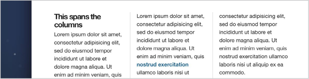
FIG 7.5: Adding a heading makes the paragraphs flow through the three columns.
If we apply the column-span property with a value of all, the heading will work as we’d like it to (FIG 7.6).

FIG 7.6: Use column-span to make an element defy the columns and span the full width.
div.multi h4 {
  -webkit-column-span: all;
  -moz-column-span: all;
  column-span: all;
  }
The spanning will work regardless of where the element falls in the markup. FIGURE 7.7 shows the header breaking through the columns in the middle of the grouping of paragraphs.

FIG 7.7: column-span will even work in within the multi-column layout.
What about browser support?
Multi-Column Layout is a W3C Candidate Recommendation and works in Safari 3+, Chrome 3+, Firefox 2+, Opera 11.1+, and IE 10+. Pretty excellent coverage in recent browsers—but again, since the fallback is just one column of text in this case, it’s a rather safe enhancement to make. If columns are crucial to the design and/or message the site is conveying, then you might opt for another solution.
For micro layouts that happen within larger page structures, multi-column layout is pretty darn handy and simple to fold in. Just be aware that using it for large amounts of text could force the reader to scroll up and down the multiple columns in order to read, which isn’t ideal. For micro layout patterns, however, multi-column layout is quite useful. Let’s look at another quick easy win in regards to forms.
Column-izing form elements
Here’s a simple example of using multi-column layout in a situation where it’s perfectly okay if the browser doesn’t support it. If we added a group of checkboxes to the “New Thing Alerts Form” on our case study site, we might mark them up in an unordered list like so:
<fieldset>
  <h4>Interested in...</h4>
  <ul class="options">
    <li>
      <label><input type="checkbox" /> Junk</label>
    </li>
    <li>
      <label><input type="checkbox" /> Conspiracies »
</label>
    </li>
    …
  </ul>
</fieldset>
FIGURE 7.8 shows how that list of seven checkbox options might look on the page.

FIG 7.8: The Thing Alerts form with checkbox options added.
Notice all the wasted space to the right of those short, one-word labels. This is a perfect pattern for applying a multi-column layout for browsers that support it. One long list is perfectly fine, but for efficiency, let’s make these items flow into two columns, with a 10px gutter between.
ul.options {
  -webkit-column-count: 2;
  -webkit-column-gap: 20px;
  -moz-column-count: 2;
  -moz-column-gap: 20px;
  column-count: 2;
  column-gap: 20px;
  }
FIGURE 7.9 shows the checkbox list putting each <li> into two columns, making better use of the space.

FIG 7.9: Multi-column layout is perfect for organizing form elements to maximize available space.
Again, this micro layout works perfectly fine as one column, but is enhanced and more efficient with two, should the browser support multi-column layout. Fortunately, most recent browsers do support it, so be on the lookout for situations where multiple columns may make your designs smarter.
Flexboxing the Future
I’m going to end this chapter (and the book in general) with a glimpse into the future. While the Flexible Box Layout Module—more commonly referred to as flexbox—is still a Working Draft at the W3C, it has gained a lot of momentum and can be a viable option for solving micro layout challenges. Recent browsers have introduced support for flexbox, and it clearly makes some of the impossible possible when it comes to CSS layout puzzles. It’s an exciting time, folks.
It’s important to note that flexbox is designed specifically for micro layouts (small modules within the page), while the forthcoming Grid Layout (http://bkaprt.com/css3-2/22/) will be meant for entire page layouts. (See Jake Archibald’s convincing argument for not using flexbox for page layout, where he describes how it can lead to unfortunate, shaky initial loading of the page: http://bkaprt.com/css3-2/23/.)
I’ll be barely scratching the surface here in terms of what flexbox can accomplish, but a few practical examples of how it can be used within a larger layout system should help you get off to the races.
So, just what is the Flexible Box Layout Module? Here’s what the W3C says about it (http://bkaprt.com/css3-2/24/):
In the flex layout model, the children of a flex container can be laid out in any direction, and can “flex” their sizes, either growing to fill unused space or shrinking to avoid overflowing the parent. Both horizontal and vertical alignment of the children can be easily manipulated.
Well hey, that actually makes sense… and it’s exciting! Horizontal and vertical alignment can be manipulated?! Like using <table>s for layout, but with semantic markup? This is the magic wand we’ve been waiting for, folks. The future is bright.
Flexbox is very powerful and far more complex than, say, Multi-Column Layout. Reading the spec throws a visual person such as myself into a state of confusion, but seeing examples in action makes it all palatable. So, we’ll be going through a few examples in this chapter to give you a primer on using flexbox in a few practical situations, and ones where the layout is non-critical and can fall back to something acceptable.
I can’t recommend Chris Coyier’s A Complete Guide to Flexbox enough (http://bkaprt.com/css3-2/25/). Chris has created the most comprehensive, yet easily understandable reference on using flexbox that I’ve found, which he describes as such:
The main idea behind the flex layout is to give the container the ability to alter its items’ width/height (and order) to best fill the available space (mostly to accommodate to all kind of display devices and screen sizes). A flex container expands items to fill available free space, or shrinks them to prevent overflow.
This expanding and shrinking of elements within a flex container can happen across multiple axes, as shown in the arguably decipherable diagram from the W3C in FIGURE 7.10.

FIG 7.10: The W3C’s explanation of the flexbox box model and how it names the various directions and sizing terms used to define how a container can apply flex to its children. Don’t worry about these terms just yet. (http://bkaprt.com/css3-2/26/)
So, the first thing to grasp here is that in order to implement flexbox, we’ll need a container to declare its contents as flexible items. And there are CSS properties that pertain to both the container and the items within it.
Vertical centering
Baffling front-end devs for over a decade, the lack of a true vertical centering mechanism in CSS has been an almost laughable omission. I recall several times trying to explain to non-designers that, “no, there’s really no reliable way to do that.” A blank stare of disbelief usually follows. Then, “well just use a <table>.”
Fortunately, flexbox finally solves this! Let’s go through an extremely simple example to demonstrate. FIGURE 7.11 shows a lovely purple container, with a box of content that’s centered both horizontally and vertically.

FIG 7.11: Behold! Vertical centering with CSS!
The markup for this little pattern could look something like this:
<div class="container">
  <div>
    <h5>Centering is easy!</h5>
    <p>Thanks to the magic of CSS3 and the wonder … </p>
  </div>
</div>
It’s essentially a container wrapped around a block of heading and paragraph. Simple stuff.
Now let’s add the flexbox magic here to get things centered. In this case, all of our flexbox properties will get applied on the container. I’m going to show the example using only the essential, non-prefixed properties and values for now, and we’ll loop back around to browser compatibility later.
div.container {
  height: 300px;
  display: flex;
  align-items: center;
  justify-content: center;
  }
So we have a box that’s 300px tall, and we want to the items within to be centered vertically and horizontally. The first rule we need on this container is display: flex; which tells the browser the contents of this element will be flexible. This enables flexbox on this particular container.
Secondly, align-items is a flexbox property that tells the browser how to align the contents of the container along the cross axis (vertical). We’ve set that to center here, but other values include flex-start, flex-end, stretch, and baseline. If we’d said align-items: flex-end;, for example, the items in the container would stick to the bottom of the box (FIG 7.12).

FIG 7.12: Using the flex-end value will stick items to the bottom of the container.
Lastly, justify-content: center; ensures the items in the container are centered horizontally.
And folks, that’s it for perfect centering in CSS3 using flexbox. Should the contents or dimensions of the box change, flexbox will keep it centered no matter what (FIG 7.13). As you can imagine, this is especially handy when dealing with flexible layouts on various device screen sizes.

FIG 7.13: Flexbox centering is ideal for adapting to various viewport widths.
Vendor prefixing flexbox
Using flexbox does require vendor prefixes, like most of the other examples in this book. Because the specification evolved over time, the prefixes are a bit more verbose in order to support the widest possible set of browsers, but only slightly more cumbersome than other CSS3 properties.
Let’s properly fill out our vertical centering example with all the necessary vendor-prefixed properties. The comments next to each line should give you a clear picture of why they’re necessary.
div.container {
  height: 300px;
  display: -webkit-box;   /* Old Safari, iOS, Android */
  display: -moz-box;      /* Old firefox */
  display: -ms-flexbox;   /* IE 10 */
  display: -webkit-flex;  /* Chrome 21-28, Safari 6.1+ */
  display: flex;          /* IE 11, Chrome 29+,
Opera 12.1+, Firefox 22+ */
  align-items: center;
  justify-content: center;
  }
Older versions of Webkit and Mozilla started using the -box value to trigger flexbox, while IE 10 started using -flexbox. Eventually, -flex was settled on as a standard. Because of this evolution, our stack gets a little tall, but this will ensure support over older, newer, and future browsers.
We’ll need to jump through similar hoops for the align-items and justify-content properties:
div.container {
  height: 300px;
  display: -webkit-box;  /* Old Safari, iOS, Android */
  display: -moz-box;     /* Old firefox */
  display: -ms-flexbox;  /* IE 10 */
  display: -webkit-flex; /* Chrome 21-28, Safari 6.1+ */
  display: flex;         /* IE 11, Chrome 29+,
Opera 12.1+, Firefox 22+ */
  align-items: center;
  justify-content: center;
  -webkit-box-align: center;
  -moz-box-align: center;
  -ms-flex-align: center;
  -webkit-align-items: center;
  align-items: center;

  -webkit-box-pack: center;
  -moz-box-pack: center;
  -ms-flex-pack: center;
  -webkit-justify-content: center;
  justify-content: center;
  }
As I’ve said earlier in the book, don’t be scared off by vendor prefixes! There’s a method to the madness, and it’s always worth the trouble. For more on flexbox properties and their corresponding prefixes, check out “Designing CSS Layouts With Flexbox Is As Easy As Pie” (http://bkaprt.com/css3-2/27/) by David Storey.
Note: For the next two flexbox examples, I’m going to refrain from showing the vendor prefixes so that it’s easier to grasp what’s happening. Just keep in mind you’ll need to add them in order to support more browsers.
Bulletproofing a search row
Here’s a simple example of how flexbox can aid in bulletproofing the widths of certain elements. FIGURE 7.14 shows a fairly common horizontal search input and button pattern. Notice how we have two variable width items (“Search” text and “Go” button) while the text input field fills out the rest of the remaining space. Without setting a specific fixed width on all the items, this is a difficult task. Flexbox makes this easy—and not only that, but also flexible—regardless of the text on either side or viewport width. Truly bulletproof.

FIG 7.14: A flexible search row that maximizes its horizontal space using flexbox.
The markup for the form is elementary here:
<form class="search">
  <label>Search</label>
  <input type="text" />
  <input type="submit" value="Go" />
</form>
I’m omitting the purely decorative styles attached here (and having read the previous chapters of the book, you’ll know how to do this anyway!). But without flexbox applied, we get a bit of a ragged string of elements, with the text input taking up an arbitrary amount of space (FIG 7.15).

FIG 7.15: Without flexbox, the form may not take advantage of all the available space.
Not exactly optimal, and the vertical alignment of the items is also a bit out of whack. Let’s flex some muscle.
First step is to “activate flex mode” (yes, my kids have been watching Power Rangers) on the form. While we’re at it, we’ll also set alignment of the items to center.
form.search {
  display: flex;
  align-items: center;
  }
Things are looking tighter in terms of vertical alignment (FIG 7.16). Hooray! Next, let’s use the flex-grow property on the text input to fill out any remaining space in the box.
form.search input[type="text"] {
  flex-grow: 1;
  }

FIG 7.16: Flexbox is already helping tighten up the vertical alignment.
By setting flex-grow with a value of 1, we’re telling it to take up as much space that’s available within the flex container (in this case, the form).
I like Chris Coyier’s lucid definition of the flex-grow property (http://bkaprt.com/css3-2/25/):
This defines the ability for a flex item to grow if necessary. It accepts a unitless value that serves as a proportion. It dictates what amount of the available space inside the flex container the item should take up.
If all items have flex-grow set to 1, every child will set to an equal size inside the container. If you were to give one of the children a value of 2, that child would take up twice as much space as the others.
So, since the text input is the only item we’re assigning flex-grow to, it will automatically fill in the remaining space available. If we changed the label and button text, the input would adjust as needed (FIG 7.17).

FIG 7.17: Flexbox makes bulletproof, full-width, form rows a snap to create.
Without flexbox here, we’d need to set pixel-based widths on everything, making a very rigid, inflexible system. With flexbox, we’re getting the visual layout we want, with the added flexibility of not relying on the content. As you can imagine, the flex here makes it also perfect for fluid layouts and/or those that can adapt to varying screen widths.
I like this example a lot because it’s a small, simple way you can start using flexbox that degrades nicely. If the older browser doesn’t support it, then the form is still functional and readable. It just doesn’t stretch to the grid. And that’s OK.
Flexing with “slats”
For the final example of the book, I’m going to share how flex-box makes it so much simpler to deal with slats. I call them slats, some call them media objects or modules. Regardless, it’s a common pattern of an avatar, image, or icon on the left, and text on the right, with each taking up a column.
FIGURE 7.18 shows a simple example within our case study site. We’d typically use float and specific widths and/or margins to achieve that, and while that works, flexbox can make this far easier and, like the previous search bar example, bulletproof and flexible in a variety of environments.

FIG 7.18: An example of the ubiquitous “slat” module.
The markup for our slat example might look something like the following:
<div class="slat">
  <img src="rover.jpg" width="200" class="slat-image" />
    <div class="slat-copy">
      <h5>This is a slat</h5>
      <p>Lorem ipsum dolor sit amet, consectetur …</p>
      …
  </div>
</div>
A container with an image, and another container for the text content. Notice I’m setting a width of 200px on the slat image. We’ll be adjusting that later to show the flexbox magic in action.
First, let’s activate flex mode on the slat container:
div.slat {
  display: flex;
  }
FIGURE 7.19 shows the results; the items appear side by side, but the image stretches to match the height of the content. That’s due to the default behavior of items within a flex container—they’ll stretch across the cross axis to fill out available space. Let’s fix that by using the flex-start value on align-items, which will override that default.
div.slat {
  display: flex;
  align-items: flex-start;
  }

FIG 7.19: The image is stretching to match the height of the copy, which isn’t what we want.
FIGURE 7.20 shows things looking a bit better, although the image width of 200px isn’t being reflected. Let’s fix that by adding the flex property to div.slat-copy container.
div.slat {
  display: flex;
  align-items: flex-start;
  }

div.slat div.slat-copy {
  flex: 1;
  }

FIG 7.20: Getting closer, but the image width still needs work.
The flex property is shorthand for the flex-grow, flex-shrink and flex-basis properties. What we’re saying when assigning a single value here is to set flex-grow and flex-shrink to 1, and set flex-basis (the initial width of the item before shrinking or growing) to 0.
FIGURE 7.21 shows the intended slat layout with those simple flexbox rules and no floats. Again, the advantage here is that should the image of the left change in width, the text column will adjust its width accordingly (FIG 7.22).
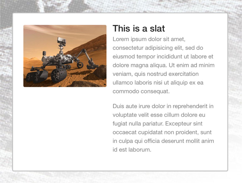
FIG 7.21: Flexbox makes it simple to create slat layouts regardless of the media’s width.

FIG 7.22: Swap in a different size image, and the layout automatically adjusts. Bulletproof!
The Future, Now
As I mentioned earlier in the chapter, the goal here was to give you a glimpse into the future of layout, but with a few examples that you can sink your teeth into today. Look for patterns where flexbox could make your life easier, but that won’t fall apart should the browser not support it. In the slat example, if the image and text are in one column rather than two, things are still readable and functional. And that’s the most important part.
I hope that this primer gets you excited to experiment with flexbox and gets you ready for the future, which appears to be a simpler, more flexible place.
For more on flexbox, I highly recommend Zoe Gillenwater’s presentation on the subject, which is filled with great practical examples (http://bkaprt.com/css3-2/28/) as well as Phillip Walton’s collection of flexbox solutions to common design patterns (http://bkaprt.com/css3-2/29/).
Conclusion
Okay, let’s come back down to earth now and decompress.
We’ve covered a lot of wonderful (if I may say so) ways to use CSS3 right now in your daily work. My hope is that by demonstrating how these techniques can enhance the experience layer in browsers that support them, while gracefully degrading in browsers that don’t, you’ll be inspired to use them every day, regardless of the project you’re working on.
The real promise of CSS3 is that it enables us to solve common design problems more efficiently, with less code and more flexibility. So long as you (and your clients and bosses) can accept that websites may look and be experienced differently in the browsers and devices that access them, then the sky’s the limit. Jump right in.
I mentioned back in Chapter 1 that I often hear, “I can’t wait to use CSS3—when it’s supported in all browsers.” My goal with this book was to prove that you don’t need to wait. Start experimenting with this stuff now. Begin using CSS3 for non-critical visual events in your designs. Now that you’re armed with what works, and—more importantly—how things degrade when they don’t, you can comfortably achieve what previously took more time and code, with only a few lines of CSS.
What about clients and bosses who don’t get it?
Another question I often get asked when talking about CSS3 is how to use it in client work. How do you educate clients on the benefits of using CSS3 over other solutions? It’s the education that’s most helpful. Show your clients how much less code and how many fewer images there are. Show them how the experience differs in browsers that don’t support CSS3. Explain the tradeoffs to them.
If that sounds like too much work, then just do it.
Start adding CSS3 to your daily work and let your clients and bosses happily discover it. The truth is, many of the examples I’ve demonstrated in this book are discoverable while experiencing the site: hovering, focusing, interacting, etc. That’s intentional, of course.
Often, with my own client work, I’ll add this experience enhancement into the project without saying a word about it, surprising and delighting the client when they stumble on it. And more importantly, surprising and delighting the client’s visitors when they stumble upon it.
Getting this to work in every browser imaginable? Well, that will cost extra. Ahem.
Looking ahead
What about the future? The whole of CSS3 encompasses much, much more than can be covered in this small book. I wanted to focus very squarely on what’s practically usable today, avoiding what’s still being hashed out in other modules that perhaps don’t have such widespread implementation.
But the track is a positive one. New property support is being added in almost every new iteration of WebKit, Mozilla, Opera, and Internet Explorer. This rapid adoption via vendor prefixing is what’s driving innovation. Keeping tabs on what’s new, and watching for a tipping point in implementation among these forward-thinking browsers, is what can educate you on real-world use.
Eventually, we’ll be able to rely on CSS3 not only for experience enhancement, but for those critical visual concepts as well (page layout being a primary example). It’s been a seemingly slow path to get there, but that’s necessary for things to unfold correctly. While on that slow path, don’t hesitate to grab hold and use what works in the present. You, your clients, and the web’s citizens will benefit.
Further Reading and Resources
• CSS3.info has long been rounding up news, examples, and developments: http://www.CSS3.info
• Also see their preview section for demos of specific properties: http://www.CSS3.info/preview
• Earlier, I told you not to read the specs; but for a relevant big picture view, to prepare for what’s ahead, and to see which modules are in what state (Working Draft, Candidate Recommendation, etc.), look here: http://www.w3.org/Style/CSS/current-work
• Or, go here for more on the modules themselves, how they’re broken up, and what they contain: http://www.w3.org/TR/CSS3-roadmap
The development blogs for all the major browsers are a fantastic place to keep up on what’s being implemented and when. I highly recommend subscribing to keep abreast of what’s being adopted, rejected, and experimented with:
• http://dev.opera.com/articles/css
Several sites have emerged to help understand browser compatibility and identify which versions support which properties:
• http://www.quirksmode.org/css/contents.html
• http://html5readiness.com Don’t let the URL fool you, as it contains CSS3 info as well.
A number of browser-based tools provide a visual environment for creating the currently supported syntax, and serve as great learning tools:
And finally, JavaScript solutions can assist in broadening the support for CSS3 to many additional browsers. For critical visual events that need to work everywhere using today’s CSS3, there are options:
• http://selectivizr.com/ A pseudo-class selector emulation for IE5.5-8.
Thanks for reading! Now go build wonderful things. Dream big and implement small.