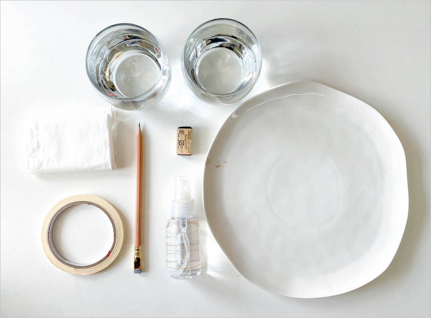
Tools & Materials
Just as an artist’s style evolves, so too will their supplies. It’s best to start with what’s economical when beginning your journey with watercolors. This will enable you to explore and focus on learning the techniques without the fear of ruining expensive materials. Eventually, as you become more confident and invested in your creative journey, you can choose to purchase professional-quality supplies.
Over the following pages, I’ve shared my recommended supply list. These are the materials I use every day in my studio that have offered me the best results. In my personal experience, investing in quality supplies enhances the joy of the process. But, having said that, I encourage you to work with whatever you have. Throughout the book I’ve included color swatches, and you’re welcome to find the closest match in your own color palette.
WATERCOLORS
If you’ve ever visited an art-supply store, you may remember that fine-art supplies are mostly divided into student- and professional-grade. What’s the difference between the two? They look similar, but the price point varies significantly. Here’s what you should know.
Professional-grade supplies are higher quality. For instance, a professional-grade watercolor will only have two components: pigment and binder. This makes these watercolors very transparent, luminous, and highly pigmented. Professional-grade watercolors will also offer a greater mixing experience. Student-grade comes with less pigment and fillers are added to compensate for that, which results in faded or chalky colors.
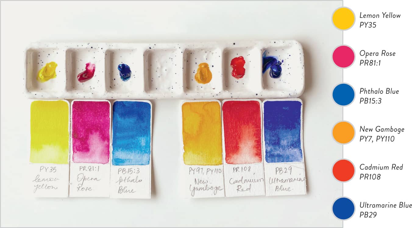
I recommend investing in professional-grade paints for the six pigments listed here (top right) to get the cleanest color-mixing experience and value out of your color explorations. To keep things simple and your choices limited, let’s use these six colors (warm and cool versions of every primary color): lemon yellow, opera rose, phthalo blue, new gamboge, cadmium red, and ultramarine blue.
Limiting your colors when you are just starting out ensures that you learn to mix colors intuitively. If you already have a watercolor set, look at the pigment information. You may find an exact match or something very similar to the swatches of primary colors I’ve shared here.
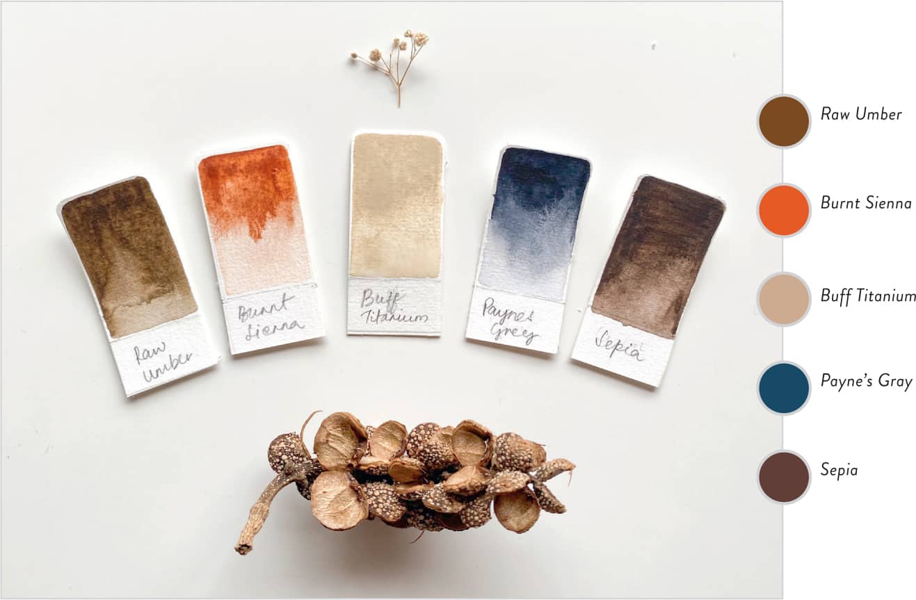
We will also use a white gouache, buff titanium (it’s fine if you don’t have this color; we can mix a similar one using white gouache), Payne’s gray, burnt sienna, raw umber (only for color-mixing purposes), as well as green, purple, and orange for convenience. Any standard 12-pan/tube watercolor set will include green, orange, and purple.
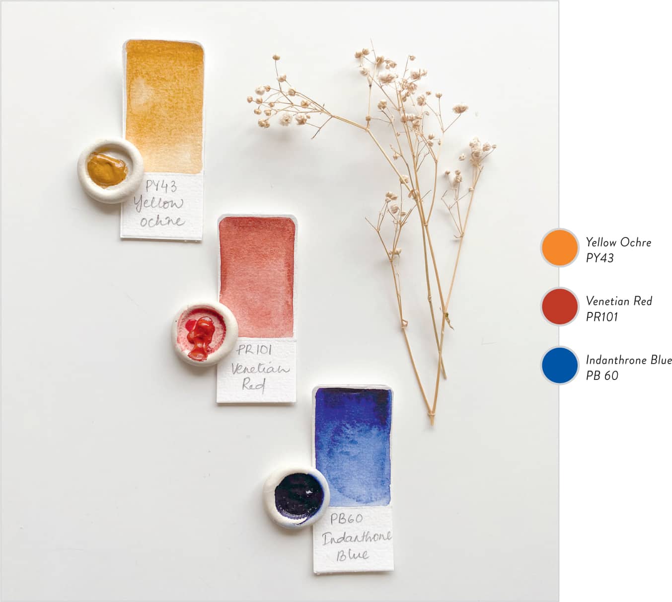
Optional: Just to offer a deeper understanding of color mixing, I’ll also be using an earth-toned primary set to demonstrate the unique color wheel that these hues can create together.
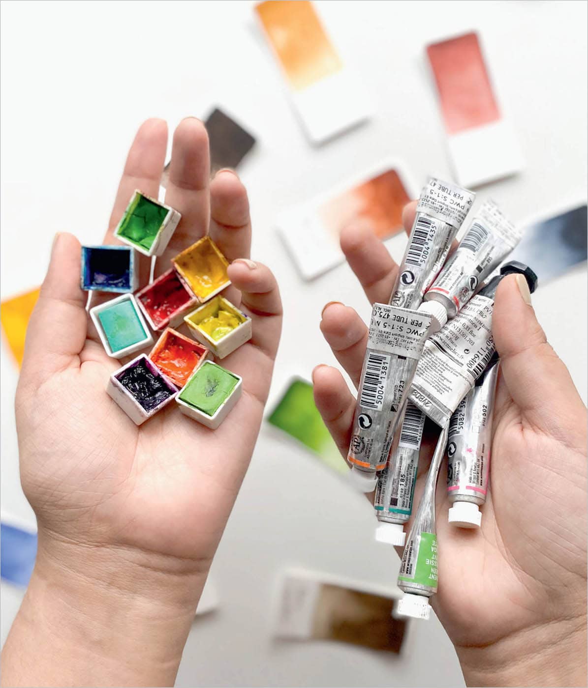
PANS VS. TUBES
I prefer working with tubes. This ensures that I am working with the purest pigment and that the integrity of a particular color is maintained throughout. When I work with watercolor pans and switch between colors, I often find myself dipping the brush in the wrong pigment, and this inadvertently adds the residual pigment to the new color. But if you’re less clumsy than me and can maintain the integrity of every color in a pan, then by all means, go for it!
BRUSHES
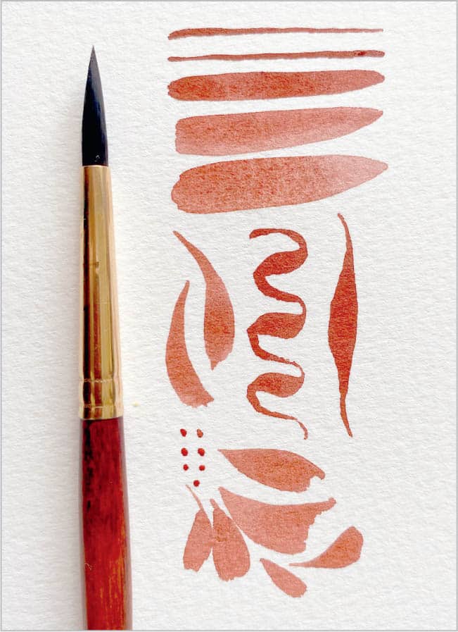
A vast variety of brushes is available for watercolors, each catering to a specific purpose. As you grow in your creative journey, you’ll find the ones that best suit your style. Over the years, I have found that I love using round, flat, and Filbert brushes in my work.
Round brush
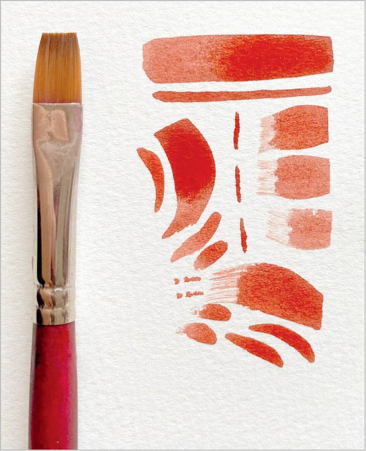
Flat brush
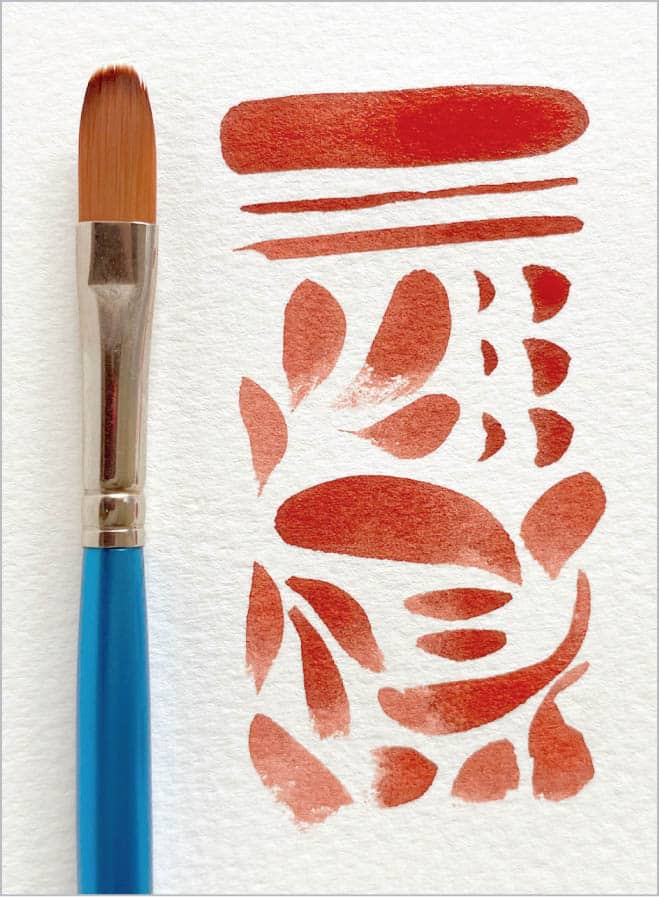
Filbert brush
PAPER
If I were in a bind and had to pick only watercolor brushes or paper to invest in, I would definitely choose paper! The very simple reason is that paper is the backbone of watercolors, and the right paper brings out the true potential of all watercolor techniques.
Texture Watercolor paper comes in three different textures: hot-pressed, cold-pressed, and rough. Hot-pressed paper is smooth and dries faster; cold-pressed paper has a lovely texture that allows pigment to settle in the crevices, offering beautiful results; and rough has a very heavy grain and texture.
I personally like to use cold-pressed paper for my work because it offers the most watercolor-esque feel to my creations.
Cellulose vs. Cotton Watercolor papers are usually made of cotton rags or plant fiber, aka cellulose. Cellulose-based paper is more affordable than a 100-percent cotton-based paper; however, in my personal experience, cotton-based paper handles water much better and provides the most delightful results.
Weight Also remain mindful of the weight of your paper. To get the best results, use a 140lb or 300gsm watercolor paper.
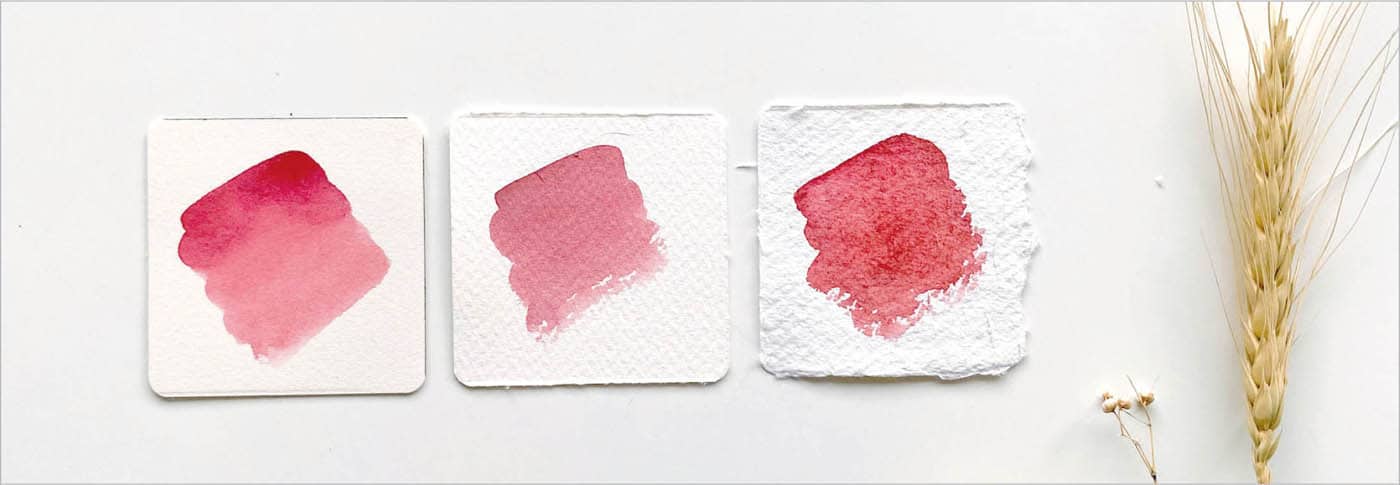
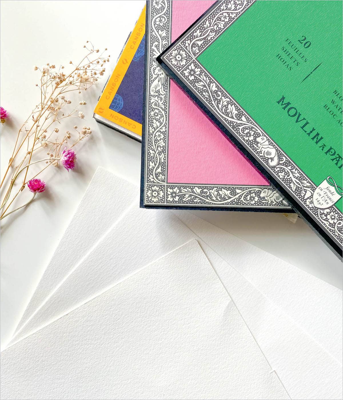
Block vs. Loose Sheets I prefer Arches®, Stonehenge® Aqua-Legion®, and Art Essentials 300gsm 100-percent cotton blocks of watercolor paper. The paper in a watercolor paper block won’t warp or curl with subsequent washes of color because it comes pre-stretched by the manufacturer. Blocks are basically stacks of stretched paper that are glued on all four sides with a small gap to remove the paper from the block once the painting dries. I usually use a bone folder to remove the painting from the block. Alternatively, if you are working with loose sheets of watercolor paper, then using masking tape on all four sides to tape down the edges of the paper offers similar results to a block.
PALETTE
Feel free to use any palette that you have on hand, whether it’s a plastic, metallic, or ceramic palette. For accurate color visibility, it’s best if it’s white. If you notice color beading in plastic or metal palettes, rub some toothpaste on the surface, and then wipe it off with a paper towel.
My personal favorites are ceramic palettes or salad/dinner plates. Ceramic palettes never stain, which gives you a clean white mixing surface after every wash. I usually squeeze out tiny blobs of paint from the tubes onto to the palette with about 1 inch between blobs.
A palette with multiple wells or sections enables you to prepare different values and color mixes without having to worry about colors running into each other.