The Joy of Exploring & Mixing Colors
We briefly looked at mixing colors when we mixed primaries to create secondary and tertiary colors. This section will expand and build upon that knowledge, enabling you to mix and create a variety of unique colors from your existing watercolor palette.


SETTING UP FOR THE EXERCISE
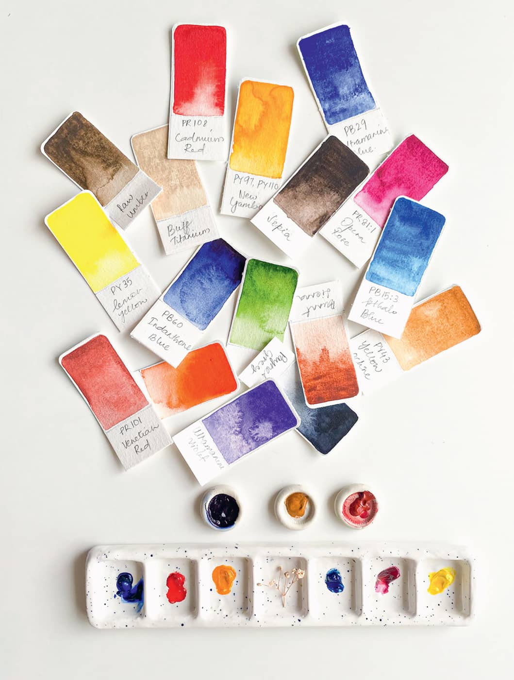
- 1. Identify the colors you’ll be using to create your color chart. I suggest starting small, and once you get the hang of the process, feel free to include more colors. For this exercise, I’m using nine colors: three cool primaries, three warm primaries, violet, Payne’s gray, and raw umber. Feel free to use any colors you like from your collection.
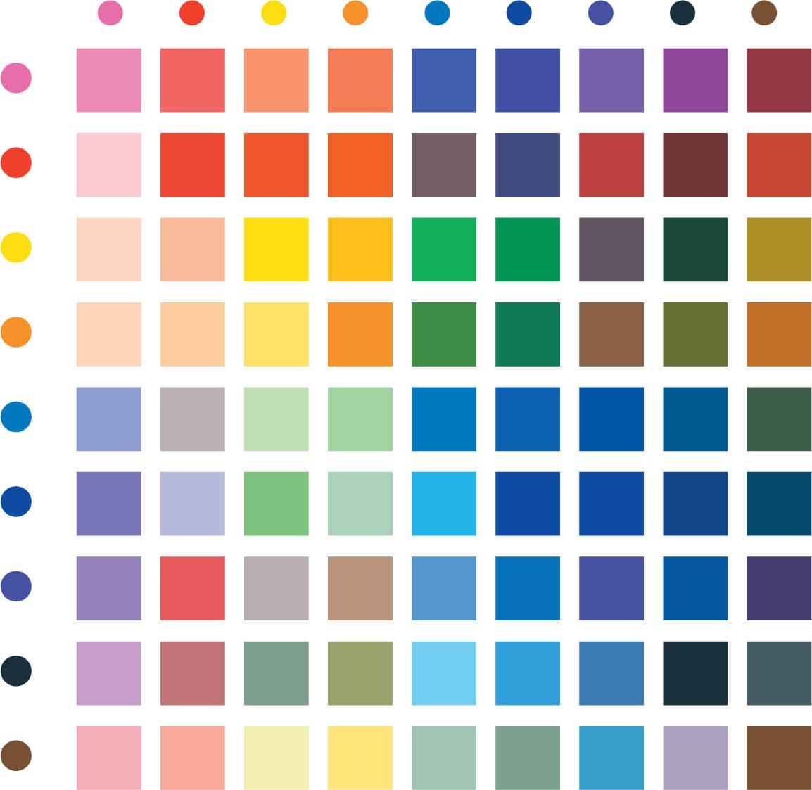
- 2. This chart works like a spreadsheet. If you’ve selected 9 colors, then you will multiply 9 x 9, which equals 81 colors in total. The chart has two axes. A horizontal one that runs from left to right will be the x-axis. To demonstrate how this chart works, let’s denote all the squares on the x-axis with letters from A to I, and then the squares on the y-axis can be numbered from 1 to 9. This chart allows you to easily see how to mix specific colors.

- 3. To create an aesthetically pleasing chart (something functional that can also adorn your creative space), the best way to arrange the colors is in the reverse order of VIBGYOR (see here). So, in this example, start with red, yellow, orange, and blue, followed by violet, Payne’s gray, and raw umber.

- 4. The template is provided below. Measure each square to 1 inch, leaving space for a border of about ¼ inch, which is where the masking tape will go.

- 5. You will use two versions of a color mix. For instance, 1B and 2A are colors made by mixing opera rose and cadmium red. On the top half of the grid (along the diagonal), you will use colors at their full strength; and on the bottom, you will use a diluted version. I recommend painting the top square first with full strength. Then give the brush a dip in clean water, remove any excess water, and you will have a diluted version of the same color that is ready to be painted in the bottom square.

CREATING THE CHART
- 1. Begin by adding pigment information from left to right. Write the color names (I’ve added pigment information too, but it’s optional) across the x-axis above the chart.
- 2. Next, repeat the process, but now, maintaining the order from top to bottom, write the colors down the y-axis next to the chart.
- 3. Going from top left to bottom right, along the diagonal line, paint the pure swatches of each selected color as labeled on both axes. Basically, you want to find the intersection of the color. Move down the x-axis and across the y-axis, and paint the color swatch at the intersection square.


- 4. Starting from the top left is the best way forward because it reduces the chance of accidentally palming the wet squares. Start by filling in the grid on either end of the diagonal. Let’s begin with squares 1B and 2A; as discussed, these will be filled with a mix of the same color, i.e., opera rose and cadmium red. 1B is painted at full strength and 2A after dipping the brush in water.
- 5. Repeat step 4 and continue mixing colors for each row and column for the entire grid.
- 6. Observe the colors you’ve created on the mixing chart. If you like a particular color or two, make a note in your color journal.

MIXING NEUTRAL, VINTAGE, PASTEL & MOODY COLORS
For a much-anticipated part of this book, let’s deepen our color mixing skills by exploring some techniques.
Before we begin, there are few things to keep in mind for a hassle-free experience.
- A large mixing area is a must—salad plates or dinner plates are great. I’ve used many of them as palettes, so they have dried mixing recipes on them, and then I just use water to reactivate the paints.
- Prepare your pigments by creating a milk consistency first, and then mixing them in varying proportions.
- When you’re mixing colors, always start with the lighter color first, and then add the darker color. Start with just a hint of the darker color and gradually increase the amount to get to the desired color. Too much of a darker color can overpower the mixture.
- Maintain a color recipe or mixing journal. As you mix and experiment, you will come across certain colors that speak to your heart, and when that happens, make a note of the names and ratios of colors you used. This will make recreating the colors you adore a breeze when you run out of the original color mix.
- Always swatch your colors first on a piece of scrap paper.

NEUTRALS
Let’s start with the basics! Grays are great for painting shadows and stormy skies, and since you don’t use white paint in watercolors, the white that you see in a watercolor painting is usually the white of the paper or a very diluted version of gray. Grays often come in handy when you want to imply shadows.
Mixing the three primaries together creates gray, and while you’re mixing them, be mindful of the ratios. Alternatively, mixing any two complementary colors also gives you gray. To shift the undertones of the resulting gray, experiment with the proportions of the complementary colors. You can make either warm or cool grays, depending on the complementary colors you use.
Here are some combinations of primaries that create beautiful grays. Notably, a smoky gray is mixed from ultramarine and burnt sienna.

EARTH BROWNS
While we primarily use browns for landscapes and portraits, you’d be surprised by the vital role they play in the colors that I love to paint with.
To mix brown, it can take a bit of trial and error to arrive at the desired shade. Start with the warm primaries (remember that they naturally produce muddy colors) and add some red into the yellow. You will have orange now. Then gradually add blue. By increasing one of the primaries, the brown automatically starts favoring that color, meaning it’ll have an undertone of that primary.
Here are swatches of the standard browns: raw umber, burnt umber, burnt sienna, and sepia. Since I use them heavily to mix unique colors in my palette, I have a tube of each for convenience; however, you can always mix the primary colors and get a very close match!

In this example, I’ve gradually added more of one primary into my initial mix. Each version of brown corresponds to the primary above it.

VINTAGE & MUTED COLORS
Here’s my secret to transforming any color into its desaturated, muted version: I always mix in a little bit of one of the browns; usually, it’s raw umber and sometimes sepia. The colors straight out of the tube can be quite vibrant. I prefer my paintings to be grounded and calming, and thus these muted, vintage-like colors lend the right feeling to my work.
You’ll also notice these colors feel very organic. I encourage you to experiment with adding browns to your existing colors. You’ll be amazed at the outcomes! Start by adding just a dab of raw umber to a color of your choice, and then add a bit more and see how the color shifts.
Another method that gets a similar result is to add a little bit of a color’s complement, again introducing the complementary color gradually. Otherwise, it can very quickly turn into a gray or muddy brown.

PASTELS
When painting with watercolors, the simplest and easiest way to create a pastel version of any color is to add more water. This achieves a lighter value of that color. In addition, there are two other methods for creating pastels.
The first method is by mixing in white gouache. A very tiny amount of gouache will turn any color into a pastel. Since gouache is more opaque than watercolor, it will reduce the translucency of the mix.
The second method involves mixing in buff titanium, a beautiful, off-white pigment that’s exceptional at creating soft pastels. Because buff titanium has hints of warm yellow in it, it will not only make a pastel version of the color of your choice, it’ll also alter the hue slightly. For example, if you mix cerulean blue with buff titanium, you get a pastel blue-green color.

EVOCATIVE OR MOODY COLORS
Remember the colors of the sky just before a storm or a flower garden at night? The colors appear very mysterious and complex.
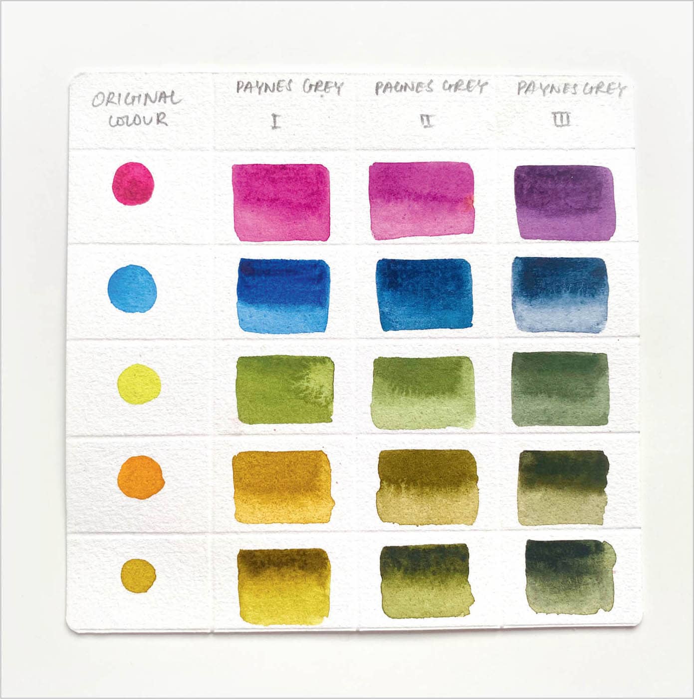
If you are drawn to smoky, moody colors, there’s an easy way to mix such colors: by adding a little bit of Payne’s gray.
To mix evocative colors, start with a base color, and gradually increase the value of Payne’s gray. In the mixes shown here, you can see how gradually adding Payne’s gray offers unique color mixes at each step. Also, mixing yellows with Payne’s gray gives you some of the most beautiful greens.
VIBRANT COLORS
To create the most vibrant colors that really “pop,” always try to mix single-pigment colors to ensure that you don’t end up mixing other colors into your intended mix. Mixing too many colors is the quickest way to end with mud.
Here is a split complementary color wheel that showcases some vibrant colors.