
Chapter 9. User Interface Components with Swing
• SWING AND THE MODEL-VIEW-CONTROLLER DESIGN PATTERN
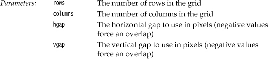
• INTRODUCTION TO LAYOUT MANAGEMENT
• MENUS
• SOPHISTICATED LAYOUT MANAGEMENT
The last chapter was primarily designed to show you how to use the event model in Java. In the process you took the first steps toward learning how to build a graphical user interface. This chapter shows you the most important tools you’ll need to build more full-featured GUIs.
We start out with a tour of the architectural underpinnings of Swing. Knowing what goes on “under the hood” is important in understanding how to use some of the more advanced components effectively. We then show you how to use the most common user interface components in Swing such as text fields, radio buttons, and menus. Next, you will learn how to use the nifty layout manager features of Java to arrange these components in a window, regardless of the look and feel of a particular user interface. Finally, you’ll see how to implement dialog boxes in Swing.
This chapter covers basic Swing components such as text components, buttons, and sliders. These are the essential user interface components that you will need most frequently. We cover advanced Swing components in Volume II.
Swing and the Model-View-Controller Design Pattern
As promised, we start this chapter with a section describing the architecture of Swing components. We first discuss the concept of design patterns and then look at the “model-view-controller” pattern that has greatly influenced the design of the Swing framework.
Design Patterns
When solving a problem, you don’t usually figure out a solution from first principles. Instead, you are likely to be guided by past experience, or you may ask other experts for advice on what has worked for them. Design patterns are a method for presenting this expertise in a structured way.
In recent years, software engineers have begun to assemble catalogs of such patterns. The pioneers in this area were inspired by the architectural design patterns of the architect Christopher Alexander. In his book, The Timeless Way of Building (Oxford University Press, 1979), Alexander gives a catalog of patterns for designing public and private living spaces. Here is a typical example:
Window Place
Everybody loves window seats, bay windows, and big windows with low sills and comfortable chairs drawn up to them . . . A room which does not have a place like this seldom allows you to feel comfortable or perfectly at ease . . .
If the room contains no window which is a “place,” a person in the room will be torn between two forces: (1) He wants to sit down and be comfortable, and (2) he is drawn toward the light.
Obviously, if the comfortable places—those places in the room where you most want to sit—are away from the windows, there is no way of overcoming this conflict . . .
Therefore: In every room where you spend any length of time during the day, make at least one window into a “window place.”
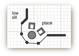
Each pattern in Alexander’s catalog, as well as those in the catalogs of software patterns, follows a particular format. The pattern first describes a context, a situation that gives rise to a design problem. Then, the problem is explained, usually as a set of conflicting forces. Finally, the solution shows a configuration that balances these forces.
In the “window place” pattern, the context is a room in which you spend any length of time during the day. The conflicting forces are that you want to sit down and be comfortable and that you are drawn to the light. The solution is to make a “window place.”
In the “model-view-controller” pattern, which we will describe in the next section, the context is a user interface system that presents information and receives user input. There are several forces. There may be multiple visual representations of the same data that need to be updated together. The visual representation may change, for example, to accommodate various look-and-feel standards. The interaction mechanisms may change, for example, to support voice commands. The solution is to distribute responsibilities into three separate interacting components: the model, view, and controller.
The model-view-controller pattern is not the only pattern used in the design of AWT and Swing. Here are several additonal examples:
• Containers and components are examples of the “composite” pattern.
• The scroll pane is a “decorator.”
• Layout managers follow the “strategy” pattern.
One important aspect of design patterns is that they become part of the culture. Programmers all over the world know what you mean when you talk about the model-view-controller pattern or the “decorator” pattern. Thus, patterns become an efficient way of talking about design problems.
You will find a formal description of numerous useful software patterns in the seminal book of the pattern movement, Design Patterns—Elements of Reusable Object-Oriented Software, by Erich Gamma et al. (Addison-Wesley, 1995). We also highly recommend the excellent book A System of Patterns by Frank Buschmann et al. (John Wiley & Sons, 1996), which we find less seminal and more approachable.
The Model-View-Controller Pattern
Let’s step back for a minute and think about the pieces that make up a user interface component such as a button, a checkbox, a text field, or a sophisticated tree control. Every component has three characteristics:
• Its content, such as the state of a button (pushed in or not), or the text in a text field
• Its visual appearance (color, size, and so on)
• Its behavior (reaction to events)
Even a seemingly simple component such as a button exhibits some moderately complex interaction among these characteristics. Obviously, the visual appearance of a button depends on the look and feel. A Metal button looks different from a Windows button or a Motif button. In addition, the appearance depends on the button state: When a button is pushed in, it needs to be redrawn to look different. The state depends on the events that the button receives. When the user depresses the mouse inside the button, the button is pushed in.
Of course, when you use a button in your programs, you simply consider it as a button, and you don’t think too much about the inner workings and characteristics. That, after all, is the job of the programmer who implemented the button. However, those programmers who implement buttons are motivated to think a little harder about them. After all, they have to implement buttons, and all other user interface components, so that they work well no matter what look and feel is installed.
To do this, the Swing designers turned to a well-known design pattern: the model-view-controller pattern. This pattern, like many other design patterns, goes back to one of the principles of object-oriented design that we mentioned way back in Chapter 5: Don’t make one object responsible for too much. Don’t have a single button class do everything. Instead, have the look and feel of the component associated with one object and store the content in another object. The model-view-controller (MVC) design pattern teaches how to accomplish this. Implement three separate classes:
• The model, which stores the content
• The view, which displays the content
• The controller, which handles user input
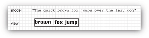
The pattern specifies precisely how these three objects interact. The model stores the content and has no user interface. For a button, the content is pretty trivial—just a small set of flags that tells whether the button is currently pushed in or out, whether it is active or inactive, and so on. For a text field, the content is a bit more interesting. It is a string object that holds the current text. This is not the same as the view of the content—if the content is larger than the text field, the user sees only a portion of the text displayed (see Figure 9–2).
Figure 9–2. Model and view of a text field
The model must implement methods to change the content and to discover what the content is. For example, a text model has methods to add or remove characters in the current text and to return the current text as a string. Again, keep in mind that the model is completely nonvisual. It is the job of a view to draw the data that is stored in the model.
 Note
NoteThe term “model” is perhaps unfortunate because we often think of a model as a representation of an abstract concept. Car and airplane designers build models to simulate real cars and planes. But that analogy really leads you astray when thinking about the model-view-controller pattern. In the design pattern, the model stores the complete content, and the view gives a (complete or incomplete) visual representation of the content. A better analogy might be the model who poses for an artist. It is up to the artist to look at the model and create a view. Depending on the artist, that view might be a formal portrait, an impressionist painting, or a cubist drawing that shows the limbs in strange contortions.
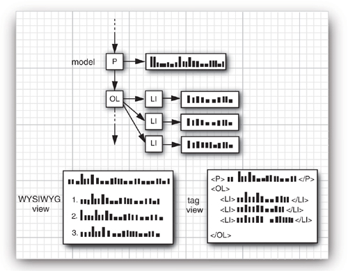
One of the advantages of the model-view-controller pattern is that a model can have multiple views, each showing a different part or aspect of the full content. For example, an HTML editor can offer two simultaneous views of the same content: a WYSIWYG view and a “raw tag” view (see Figure 9–3). When the model is updated through the controller of one of the views, it tells both attached views about the change. When the views are notified, they refresh themselves automatically. Of course, for a simple user interface component such as a button, you won’t have multiple views of the same model.
Figure 9–3. Two separate views of the same model
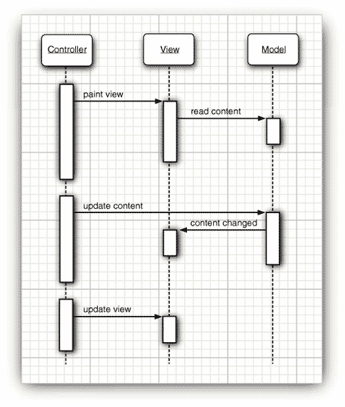
The controller handles the user-input events such as mouse clicks and keystrokes. It then decides whether to translate these events into changes in the model or the view. For example, if the user presses a character key in a text box, the controller calls the “insert character” command of the model. The model then tells the view to update itself. The view never knows why the text changed. But if the user presses a cursor key, then the controller may tell the view to scroll. Scrolling the view has no effect on the underlying text, so the model never knows that this event happened.
Figure 9–4 shows the interactions among model, view, and controller objects.
Figure 9–4. Interactions among model, view, and controller objects
As a programmer using Swing components, you generally don’t need to think about the model-view-controller architecture. Each user interface component has a wrapper class (such as JButton or JTextField) that stores the model and the view. When you want to inquire about the content (for example, the text in a text field), the wrapper class asks the model and returns the answer to you. When you want to change the view (for example, move the caret position in a text field), the wrapper class forwards that request to the view. However, occasionally the wrapper class doesn’t work hard enough on forwarding commands. Then, you have to ask it to retrieve the model and work directly with the model. (You don’t have to work directly with the view—that is the job of the look-and-feel code.)
Besides being “the right thing to do,” the model-view-controller pattern was attractive for the Swing designers because it allowed them to implement pluggable look and feel. The model of a button or text field is independent of the look and feel. But of course the visual representation is completely dependent on the user interface design of a particular look and feel. The controller can vary as well. For example, in a voice-controlled device, the controller must cope with an entirely different set of events than in a standard computer with a keyboard and a mouse. By separating out the underlying model from the user interface, the Swing designers can reuse the code for the models and can even switch the look and feel in a running program.
Of course, patterns are only intended as guidance, not as religion. No pattern is applicable in all situations. For example, you may find it difficult to follow the “window places” pattern to rearrange your cubicle. Similarly, the Swing designers found that the harsh reality of pluggable look-and-feel implementation does not always allow for a neat realization of the model-view-controller pattern. Models are easy to separate, and each user interface component has a model class. But the responsibilities of the view and controller are not always clearly separated and are distributed over a number of different classes. Of course, as a user of these classes, you won’t be concerned about this. In fact, as we pointed out before, you often won’t have to worry about the models either—you can just use the component wrapper classes.
A Model-View-Controller Analysis of Swing Buttons
You already learned how to use buttons in the previous chapter, without having to worry about the controller, model, or view for them. Still, buttons are about the simplest user interface elements, so they are a good place to become comfortable with the model-view-controller pattern. You will encounter similar kinds of classes and interfaces for the more sophisticated Swing components.
For most components, the model class implements an interface whose name ends in Model; thus the interface called ButtonModel. Classes implementing that interface can define the state of the various kinds of buttons. Actually, buttons aren’t all that complicated, and the Swing library contains a single class, called DefaultButtonModel, that implements this interface.
You can get a sense of what sort of data are maintained by a button model by looking at the properties of the ButtonModel interface—see Table 9–1.
Table 9–1. Properties of the ButtonModel Interface
Each JButton object stores a button model object, which you can retrieve.
JButton button = new JButton("Blue");
ButtonModel model = button.getModel();
In practice, you won’t care—the minutiae of the button state are only of interest to the view that draws it. And the important information—such as whether a button is enabled—is available from the JButton class. (The JButton then asks its model, of course, to retrieve that information.)
Have another look at the ButtonModel interface to see what isn’t there. The model does not store the button label or icon. There is no way to find out what’s on the face of a button just by looking at its model. (Actually, as you will see in “Radio Buttons” on page 388, purity of design is the source of some grief for the programmer.)
It is also worth noting that the same model (namely, DefaultButtonModel) is used for push buttons, radio buttons, checkboxes, and even menu items. Of course, each of these button types has different views and controllers. When using the Metal look and feel, the JButton uses a class called BasicButtonUI for the view and a class called ButtonUIListener as controller. In general, each Swing component has an associated view object that ends in UI. But not all Swing components have dedicated controller objects.
So, having read this short introduction to what is going on under the hood in a JButton, you may be wondering: Just what is a JButton really? It is simply a wrapper class inheriting from JComponent that holds the DefaultButtonModel object, some view data (such as the button label and icons), and a BasicButtonUI object that is responsible for the button view.
Introduction to Layout Management
Before we go on to discussing individual Swing components, such as text fields and radio buttons, we briefly cover how to arrange these components inside a frame. Unlike Visual Basic, the JDK has no form designer. You need to write code to position (lay out) the user interface components where you want them to be.
Of course, if you have a Java-enabled development environment, it will probably have a layout tool that automates some or all of these tasks. Nevertheless, it is important to know exactly what goes on “under the hood” because even the best of these tools will usually require hand-tweaking.
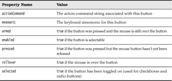
Let’s start by reviewing the program from Chapter 8 that used buttons to change the background color of a frame (see Figure 9–5).
Figure 9–5. A panel with three buttons
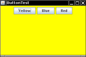
The buttons are contained in a JPanel object and are managed by the flow layout manager, the default layout manager for a panel. Figure 9–6 shows what happens when you add more buttons to the panel. As you can see, a new row is started when there is no more room.
Figure 9–6. A panel with six buttons managed by a flow layout
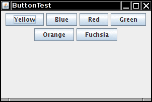
Moreover, the buttons stay centered in the panel, even when the user resizes the frame (see Figure 9–7).
Figure 9–7. Changing the panel size rearranges the buttons automatically
In general, components are placed inside containers, and a layout manager determines the positions and sizes of the components in the container.
Buttons, text fields, and other user interface elements extend the class Component. Components can be placed inside containers such as panels. Because containers can themselves be put inside other containers, the class Container extends Component. Figure 9–8 shows the inheritance hierarchy for Component.
Figure 9–8. Inheritance hierarchy for the Component class
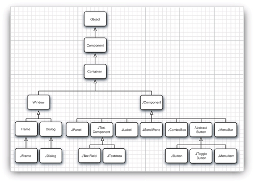
Unfortunately, the inheritance hierarchy is somewhat unclean in two respects. First, top-level windows such as JFrame are subclasses of Container and hence Component, but they cannot be placed inside other containers. Moreover, JComponent is a subclass of Container not Component, and therefore one can add other components into a JButton. (However, those components would not be displayed.)
Each container has a default layout manager, but you can always set your own. For example, the statement
panel.setLayout(new GridLayout(4, 4));
uses the GridLayout class to lay out the components in the panel. You add components to the container. The add method of the container passes the component and any placement directions to the layout manager.
• void setLayout(LayoutManager m)
• Component add(Component c)
• Component add(Component c, Object constraints) 1.1
• FlowLayout()
• FlowLayout(int align)
• FlowLayout(int align, int hgap, int vgap)
Border Layout
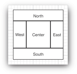
The border layout manager is the default layout manager of the content pane of every JFrame. Unlike the flow layout manager, which completely controls the position of each component, the border layout manager lets you choose where you want to place each component. You can choose to place the component in the center, north, south, east, or west of the content pane (see Figure 9–9).
For example:
frame.add(component, BorderLayout.SOUTH);
The edge components are laid out first, and the remaining available space is occupied by the center. When the container is resized, the dimensions of the edge components are unchanged, but the center component changes its size. You add components by specifying a constant CENTER, NORTH, SOUTH, EAST, or WEST of the BorderLayout class. Not all of the positions need to be occupied. If you don’t supply any value, CENTER is assumed.
The BorderLayout constants are defined as strings. For example, BorderLayout.SOUTH is defined as the string "South". Many programmers prefer to use the strings directly because they are shorter, for example, frame.add(component, "South"). However, if you accidentally misspell a string, the compiler won’t catch that error.
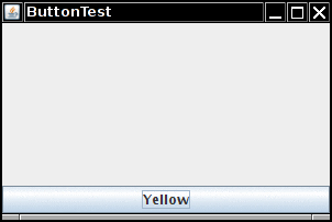
Unlike the flow layout, the border layout grows all components to fill the available space. (The flow layout leaves each component at its preferred size.) This is a problem when you add a button:
frame.add(yellowButton, BorderLayout.SOUTH); // don't
Figure 9–10 shows what happens when you use the preceding code fragment. The button has grown to fill the entire southern region of the frame. And, if you were to add another button to the southern region, it would just displace the first button.
Figure 9–10. A single button managed by a border layout
You solve this problem by using additional panels. For example, look at Figure 9–11. The three buttons at the bottom of the screen are all contained in a panel. The panel is put into the southern region of the content pane.
Figure 9–11. Panel placed at the southern region of the frame
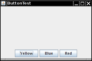
To achieve this configuration, first create a new JPanel object, then add the individual buttons to the panel. The default layout manager for a panel is a FlowLayout, which is a good choice for this situation. You add the individual buttons to the panel, using the add method you have seen before. The position and size of the buttons is under the control of the FlowLayout manager. This means the buttons stay centered within the panel, and they do not expand to fill the entire panel area. Finally, you add the panel to the content pane of the frame.
JPanel panel = new JPanel();
panel.add(yellowButton);
panel.add(blueButton);
panel.add(redButton);
frame.add(panel, BorderLayout.SOUTH);
The border layout expands the size of the panel to fill the entire southern region.
• BorderLayout()
• BorderLayout(int hgap, int vgap)
Grid Layout
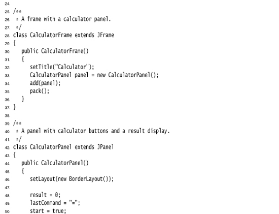
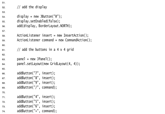
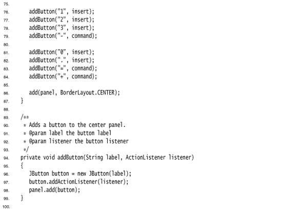
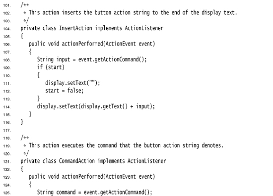
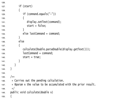
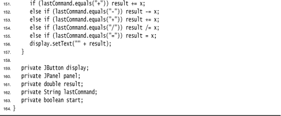
The grid layout arranges all components in rows and columns like a spreadsheet. All components are given the same size. The calculator program in Figure 9–12 uses a grid layout to arrange the calculator buttons. When you resize the window, the buttons grow and shrink, but all buttons have identical sizes.
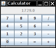
In the constructor of the grid layout object, you specify how many rows and columns you need.
panel.setLayout(new GridLayout(5, 4));
You add the components, starting with the first entry in the first row, then the second entry in the first row, and so on.
panel.add(new JButton("1"));
panel.add(new JButton("2"));
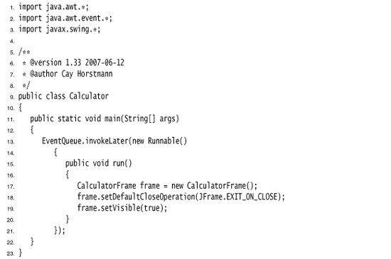
Listing 9–1 is the source listing for the calculator program. This is a regular calculator, not the “reverse Polish” variety that is so oddly popular in Java tutorials. In this program, we call the pack method after adding the component to the frame. This method uses the preferred sizes of all components to compute the width and height of the frame.
Of course, few applications have as rigid a layout as the face of a calculator. In practice, small grids (usually with just one row or one column) can be useful to organize partial areas of a window. For example, if you want to have a row of buttons with identical size, then you can put the buttons inside a panel that is governed by a grid layout with a single row.
• GridLayout(int rows, int columns)
• GridLayout(int rows, int columns, int hgap, int vgap)
• void pack()
Text Input
We are finally ready to start introducing the Swing user interface components. We start with components that let a user input and edit text. You can use the JTextField and JTextArea components for gathering text input. A text field can accept only one line of text; a text area can accept multiple lines of text. A JPasswordField accepts one line of text without showing the contents.
All three of these classes inherit from a class called JTextComponent. You will not be able to construct a JTextComponent yourself because it is an abstract class. On the other hand, as is so often the case in Java, when you go searching through the API documentation, you may find that the methods you are looking for are actually in the parent class JTextComponent rather than in the derived class. For example, the methods that get or set the text in a text field or text area are actually methods in JTextComponent.
javax.swing.text.JTextComponent 1.2
• String getText()
• void setText(String text)
• boolean isEditable()
• void setEditable(boolean b)
Text Fields
The usual way to add a text field to a window is to add it to a panel or other container—just as you would a button:
JPanel panel = new JPanel();
JTextField textField = new JTextField("Default input", 20);
panel.add(textField);
This code adds a text field and initializes the text field by placing the string "Default input" inside it. The second parameter of this constructor sets the width. In this case, the width is 20 “columns.” Unfortunately, a column is a rather imprecise measurement. One column is the expected width of one character in the font you are using for the text. The idea is that if you expect the inputs to be n characters or less, you are supposed to specify n as the column width. In practice, this measurement doesn’t work out too well, and you should add 1 or 2 to the maximum input length to be on the safe side. Also, keep in mind that the number of columns is only a hint to the AWT that gives the preferred size. If the layout manager needs to grow or shrink the text field, it can adjust its size. The column width that you set in the JTextField constructor is not an upper limit on the number of characters the user can enter. The user can still type in longer strings, but the input scrolls when the text exceeds the length of the field. Users tend to find scrolling text fields irritating, so you should size the fields generously. If you need to reset the number of columns at runtime, you can do that with the setColumns method.
 Tip
TipAfter changing the size of a text box with the setColumns method, call the revalidate method of the surrounding container.
textField.setColumns(10);
panel.revalidate();
The revalidate method recomputes the size and layout of all components in a container. After you use the revalidate method, the layout manager resizes the container, and the changed size of the text field will be visible.
The revalidate method belongs to the JComponent class. It doesn’t immediately resize the component but merely marks it for resizing. This approach avoids repetitive calculations if multiple components request to be resized. However, if you want to recompute all components inside a JFrame, you have to call the validate method—JFrame doesn’t extend JComponent.
In general, you want to let the user add text (or edit the existing text) in a text field. Quite often these text fields start out blank. To make a blank text field, just leave out the string as a parameter for the JTextField constructor:
JTextField textField = new JTextField(20);
You can change the content of the text field at any time by using the setText method from the JTextComponent parent class mentioned in the previous section. For example:
textField.setText("Hello!");
And, as was also mentioned in the previous section, you can find out what the user typed by calling the getText method. This method returns the exact text that the user typed. To trim any extraneous leading and trailing spaces from the data in a text field, apply the trim method to the return value of getText:
String text = textField.getText().trim();
To change the font in which the user text appears, use the setFont method.
• JTextField(int cols)
• JTextField(String text, int cols)
• int getColumns()
• void setColumns(int cols)
• void revalidate()
• void setFont(Font f)
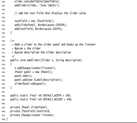
• void validate()
• Font getFont()
Labels and Labeling Components
Labels are components that hold text. They have no decorations (for example, no boundaries). They also do not react to user input. You can use a label to identify components. For example, unlike buttons, text fields have no label to identify them. To label a component that does not itself come with an identifier:
1. Construct a JLabel component with the correct text.
2. Place it close enough to the component you want to identify so that the user can see that the label identifies the correct component.
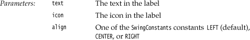
The constructor for a JLabel lets you specify the initial text or icon, and optionally, the alignment of the content. You use constants from the SwingConstants interface to specify alignment. That interface defines a number of useful constants such as LEFT, RIGHT, CENTER, NORTH, EAST, and so on. The JLabel class is one of several Swing classes that implement this interface. Therefore, you can specify a right-aligned label either as
JLabel label = new JLabel("User name: ", SwingConstants.RIGHT);
or
JLabel label = new JLabel("User name: ", JLabel.RIGHT);
The setText and setIcon methods let you set the text and icon of the label at runtime.
Beginning with Java SE 1.3, you can use both plain and HTML text in buttons, labels, and menu items. We don’t recommend HTML in buttons—it interferes with the look and feel. But HTML in labels can be very effective. Simply surround the label string with <html>. . .</html>, like this:
label = new JLabel("<html><b>Required</b> entry:</html>");
Fair warning—the first component with an HTML label takes some time to be displayed because the rather complex HTML rendering code must be loaded.
Labels can be positioned inside a container like any other component. This means you can use the techniques you have seen before to place labels where you need them.
• JLabel(String text)
• JLabel(Icon icon)
• JLabel(String text, int align)
• JLabel(String text, Icon icon, int align)
• String getText()
• void setText(String text)
• Icon getIcon()
• void setIcon(Icon icon)
Password Fields
Password fields are a special kind of text field. To avoid nosy bystanders being able to glance at a password, the characters that the user entered are not actually displayed. Instead, each typed character is represented by an echo character, typically an asterisk (*). Swing supplies a JPasswordField class that implements such a text field.
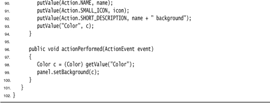
The password field is another example of the power of the model-view-controller architecture pattern. The password field uses the same model to store the data as a regular text field, but its view has been changed to display all characters as echo characters.
javax.swing.JPasswordField 1.2
• JPasswordField(String text, int columns)
• void setEchoChar(char echo)
• char[] getPassword()
Text Areas
Sometimes, you need to collect user input that is more than one line long. As mentioned earlier, you use the JTextArea component for this collection. When you place a text area component in your program, a user can enter any number of lines of text, using the ENTER key to separate them. Each line ends with a '
'. Figure 9–13 shows a text area at work.
In the constructor for the JTextArea component, you specify the number of rows and columns for the text area. For example,
textArea = new JTextArea(8, 40); // 8 lines of 40 columns each
where the columns parameter works as before—and you still need to add a few more columns for safety’s sake. Also, as before, the user is not restricted to the number of rows and columns; the text simply scrolls when the user inputs too much. You can also use the setColumns method to change the number of columns, and the setRows method to change the number of rows. These numbers only indicate the preferred size—the layout manager can still grow or shrink the text area.
If there is more text than the text area can display, then the remaining text is simply clipped. You can avoid clipping long lines by turning on line wrapping:
textArea.setLineWrap(true); // long lines are wrapped
This wrapping is a visual effect only; the text in the document is not changed—no '
' characters are inserted into the text.
Scroll Panes
In Swing, a text area does not have scrollbars. If you want scrollbars, you have to insert the text area inside a scroll pane.
textArea = new JTextArea(8, 40);
JScrollPane scrollPane = new JScrollPane(textArea);
The scroll pane now manages the view of the text area. Scrollbars automatically appear if there is more text than the text area can display, and they vanish again if text is deleted and the remaining text fits inside the area. The scrolling is handled internally in the scroll pane—your program does not need to process scroll events.
This is a general mechanism that works for any component, not just text areas. To add scrollbars to a component, put them inside a scroll pane.
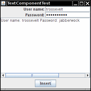
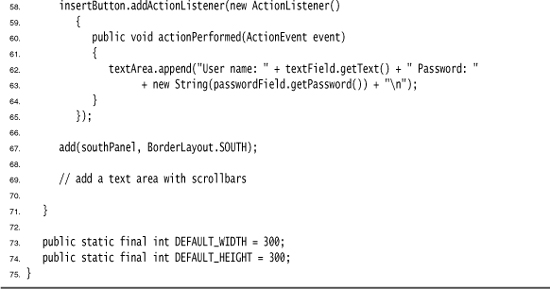
Listing 9–2 demonstrates the various text components. This program simply shows a text field, a password field, and a text area with scrollbars. The text field and password field are labeled. Click on “Insert” to insert the field contents into the text area.
The JTextArea component displays plain text only, without special fonts or formatting. To display formatted text (such as HTML), you can use the JEditorPane class that is discussed in Volume II.
Listing 9–2. TextComponentTest.java
• JTextArea()
• JTextArea(int rows, int cols)
• JTextArea(String text, int rows, int cols)
• void setColumns(int cols)
• void setRows(int rows)
• void append(String newText)
• void setLineWrap(boolean wrap)
• void setWrapStyleWord(boolean word)
• void setTabSize(int c)
• JScrollPane(Component c)
Choice Components
You now know how to collect text input from users, but there are many occasions for which you would rather give users a finite set of choices than have them enter the data in a text component. Using a set of buttons or a list of items tells your users what choices they have. (It also saves you the trouble of error checking.) In this section, you learn how to program checkboxes, radio buttons, lists of choices, and sliders.
Checkboxes
If you want to collect just a “yes” or “no” input, use a checkbox component. Checkboxes automatically come with labels that identify them. The user usually checks the box by clicking inside it and turns off the check mark by clicking inside the box again. To toggle the check mark, the user can also press the space bar when the focus is in the checkbox.
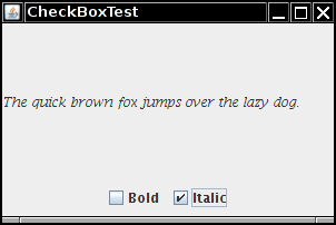
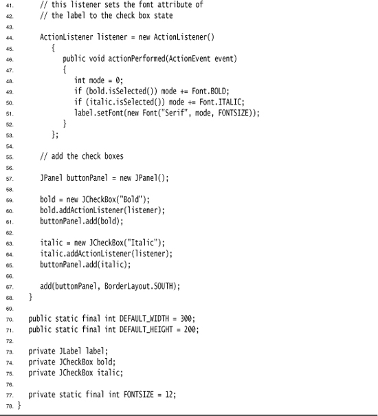
Figure 9–14 shows a simple program with two checkboxes, one to turn on or off the italic attribute of a font, and the other for boldface. Note that the second checkbox has focus, as indicated by the rectangle around the label. Each time the user clicks one of the checkboxes, the screen is refreshed, using the new font attributes.
Checkboxes need a label next to them to identify their purpose. You give the label text in the constructor.
bold = new JCheckBox("Bold");
You use the setSelected method to turn a checkbox on or off. For example:
bold.setSelected(true);
The isSelected method then retrieves the current state of each checkbox. It is false if unchecked; true if checked.
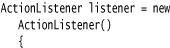
When the user clicks on a checkbox, this triggers an action event. As always, you attach an action listener to the checkbox. In our program, the two checkboxes share the same action listener.
ActionListener listener = . . .
bold.addActionListener(listener);
italic.addActionListener(listener);
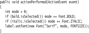
The actionPerformed method queries the state of the bold and italic checkboxes and sets the font of the panel to plain, bold, italic, or both bold and italic.
Listing 9–3 is the complete program listing for the checkbox example.
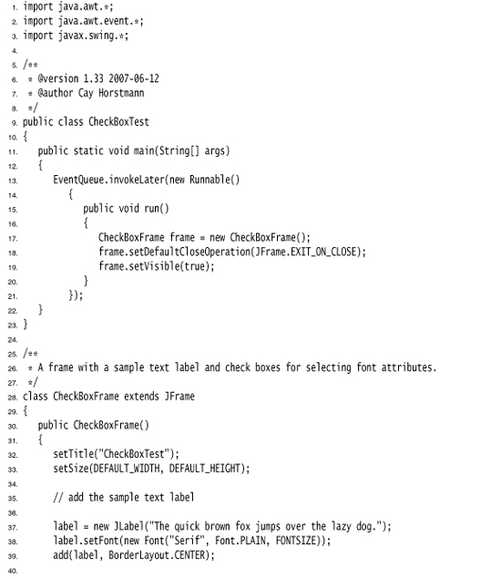
Listing 9–3. CheckBoxTest.java
• JCheckBox(String label)
• JCheckBox(String label, Icon icon)
• JCheckBox(String label, boolean state)
• boolean isSelected ()
• void setSelected(boolean state)
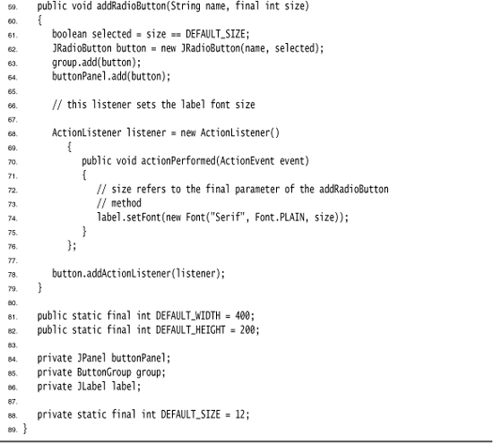
Radio Buttons
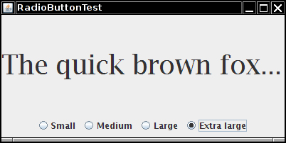
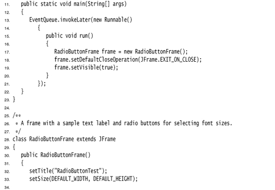
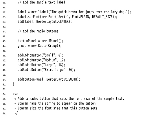
In the previous example, the user could check either, both, or neither of the two checkboxes. In many cases, we want to require the user to check only one of several boxes. When another box is checked, the previous box is automatically unchecked. Such a group of boxes is often called a radio button group because the buttons work like the station selector buttons on a radio. When you push in one button, the previously depressed button pops out. Figure 9–15 shows a typical example. We allow the user to select a font size from among the choices—Small, Medium, Large, and Extra large—but, of course, we will allow the user to select only one size at a time.
Figure 9–15. A radio button group
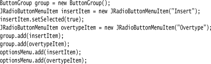
Implementing radio button groups is easy in Swing. You construct one object of type ButtonGroup for every group of buttons. Then, you add objects of type JRadioButton to the button group. The button group object is responsible for turning off the previously set button when a new button is clicked.
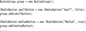
The second argument of the constructor is true for the button that should be checked initially and false for all others. Note that the button group controls only the behavior of the buttons; if you want to group the buttons for layout purposes, you also need to add them to a container such as a JPanel.
If you look again at Figures 9–14 and 9–15, you will note that the appearance of the radio buttons is different from that of checkboxes. Checkboxes are square and contain a check mark when selected. Radio buttons are round and contain a dot when selected.
The event notification mechanism for radio buttons is the same as for any other buttons. When the user checks a radio button, the radio button generates an action event. In our example program, we define an action listener that sets the font size to a particular value:
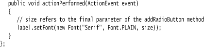
Compare this listener setup with that of the checkbox example. Each radio button gets a different listener object. Each listener object knows exactly what it needs to do—set the font size to a particular value. In the case of the checkboxes, we used a different approach. Both checkboxes have the same action listener. It called a method that looked at the current state of both checkboxes.
Could we follow the same approach here? We could have a single listener that computes the size as follows:
if (smallButton.isSelected()) size = 8;
else if (mediumButton.isSelected()) size = 12;
. . .
However, we prefer to use separate action listener objects because they tie the size values more closely to the buttons.
If you have a group of radio buttons, you know that only one of them is selected. It would be nice to be able to quickly find out which one without having to query all the buttons in the group. Because the ButtonGroup object controls all buttons, it would be convenient if this object could give us a reference to the selected button. Indeed, the ButtonGroup class has a getSelection method, but that method doesn’t return the radio button that is selected. Instead, it returns a ButtonModel reference to the model attached to the button. Unfortunately, none of the ButtonModel methods are very helpful. The ButtonModel interface inherits a method getSelectedObjects from the ItemSelectable interface that, rather uselessly, returns null. The getActionCommand method looks promising because the “action command” of a radio button is its text label. But the action command of its model is null. Only if you explicitly set the action commands of all radio buttons with the setActionCommand method do the models’ action command values also get set. Then you can retrieve the action command of the currently selected button with buttonGroup.getSelection().getActionCommand().
Listing 9–4 is the complete program for font size selection that puts a set of radio buttons to work.
Listing 9–4. RadioButtonTest.java
• JRadioButton(String label, Icon icon)
• JRadioButton(String label, boolean state)
• void add(AbstractButton b)
• ButtonModel getSelection()
• String getActionCommand()
javax.swing.AbstractButton 1.2
• void setActionCommand(String s)
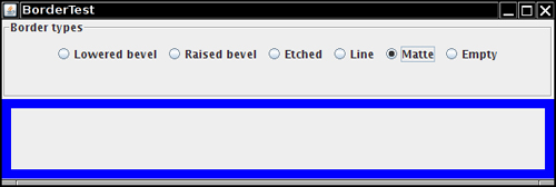
Borders
If you have multiple groups of radio buttons in a window, you will want to visually indicate which buttons are grouped. Swing provides a set of useful borders for this purpose. You can apply a border to any component that extends JComponent. The most common usage is to place a border around a panel and fill that panel with other user interface elements such as radio buttons.
You can choose from quite a few borders, but you follow the same steps for all of them.
1. Call a static method of the BorderFactory to create a border. You can choose among the following styles (see Figure 9–16):
• Lowered bevel
• Raised bevel
• Etched
• Line
• Matte
• Empty (just to create some blank space around the component)
Figure 9–16. Testing border types
2. If you like, add a title to your border by passing your border to BorderFactory.createTitledBorder.
3. If you really want to go all out, combine several borders with a call to BorderFactory.createCompoundBorder.
4. Add the resulting border to your component by calling the setBorder method of the JComponent class.
For example, here is how you add an etched border with a title to a panel:
Border etched = BorderFactory.createEtchedBorder();
Border titled = BorderFactory.createTitledBorder(etched, "A Title");
panel.setBorder(titled);
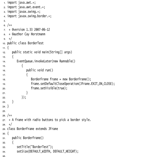
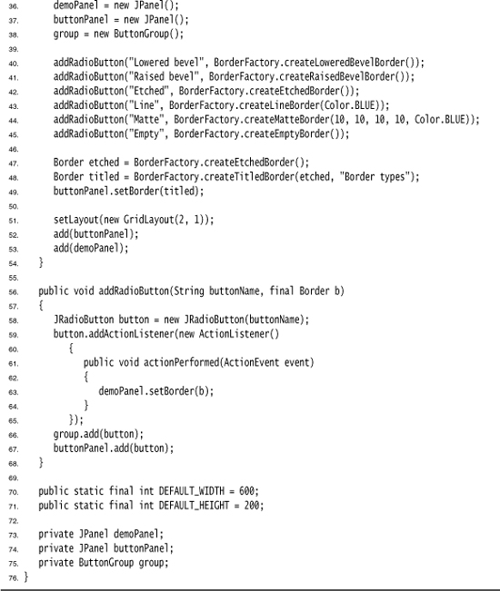
Run the program in Listing 9–5 to get an idea what the various borders look like.
The various borders have different options for setting border widths and colors. See the API notes for details. True border enthusiasts will appreciate that there is also a SoftBevelBorder class for beveled borders with softened corners and that a LineBorder can have rounded corners as well. You can construct these borders only by using one of the class constructors—there is no BorderFactory method for them.
• static Border createLineBorder(Color color)
• static Border createLineBorder(Color color, int thickness)
• static MatteBorder createMatteBorder(int top, int left, int bottom, int right, Color color)
• static MatteBorder createMatteBorder(int top, int left, int bottom, int right, Icon tileIcon)
• static Border createEmptyBorder()
• static Border createEmptyBorder(int top, int left, int bottom, int right)
• static Border createEtchedBorder()
• static Border createEtchedBorder(Color highlight, Color shadow)
• static Border createEtchedBorder(int type)
• static Border createEtchedBorder(int type, Color highlight, Color shadow)
• static Border createBevelBorder(int type)
• static Border createBevelBorder(int type, Color highlight, Color shadow)
• static Border createLoweredBevelBorder()
• static Border createRaisedBevelBorder()
• static TitledBorder createTitledBorder(String title)
• static TitledBorder createTitledBorder(Border border)
• static TitledBorder createTitledBorder(Border border, String title)
• static TitledBorder createTitledBorder(Border border, String title, int justification, int position)
• static TitledBorder createTitledBorder(Border border, String title, int justification, int position, Font font)
• static TitledBorder createTitledBorder(Border border, String title, int justification, int position, Font font, Color color)
• static CompoundBorder createCompoundBorder(Border outsideBorder, Border insideBorder)
javax.swing.border.SoftBevelBorder 1.2
• SoftBevelBorder(int type)
• SoftBevelBorder(int type, Color highlight, Color shadow)
javax.swing.border.LineBorder 1.2
• public LineBorder(Color color, int thickness, boolean roundedCorners)
• void setBorder(Border border)
Combo Boxes
If you have more than a handful of alternatives, radio buttons are not a good choice because they take up too much screen space. Instead, you can use a combo box. When the user clicks on the component, a list of choices drops down, and the user can then select one of them (see Figure 9–17).
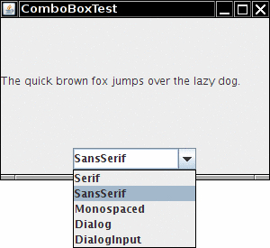
If the drop-down list box is set to be editable, then you can edit the current selection as if it were a text field. For that reason, this component is called a combo box—it combines the flexibility of a text field with a set of predefined choices. The JComboBox class provides a combo box component.
You call the setEditable method to make the combo box editable. Note that editing affects only the current item. It does not change the content of the list.
You can obtain the current selection or edited text by calling the getSelectedItem method.
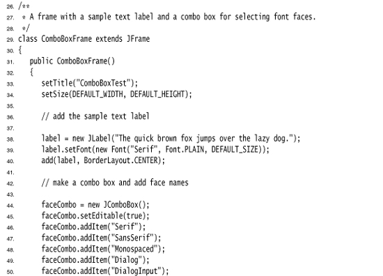
In the example program, the user can choose a font style from a list of styles (Serif, SansSerif, Monospaced, etc.). The user can also type in another font.
You add the choice items with the addItem method. In our program, addItem is called only in the constructor, but you can call it any time.
faceCombo = new JComboBox();
faceCombo.setEditable(true);
faceCombo.addItem("Serif");
faceCombo.addItem("SansSerif");
. . .
This method adds the string at the end of the list. You can add new items anywhere in the list with the insertItemAt method:
faceCombo.insertItemAt("Monospaced", 0); // add at the beginning
You can add items of any type—the combo box invokes each item’s toString method to display it.
If you need to remove items at runtime, you use the removeItem or removeItemAt method, depending on whether you supply the item to be removed or its position.
faceCombo.removeItem("Monospaced");
faceCombo.removeItemAt(0); // remove first item
The removeAllItems method removes all items at once.
If you need to add a large number of items to a combo box, the addItem method will perform poorly. Instead, construct a DefaultComboBoxModel, populate it by calling addElement, and then call the setModel method of the JComboBox class.
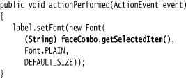
When the user selects an item from a combo box, the combo box generates an action event. To find out which item was selected, call getSource on the event parameter to get a reference to the combo box that sent the event. Then call the getSelectedItem method to retrieve the currently selected item. You need to cast the returned value to the appropriate type, usually String.
Listing 9–6 shows the complete program.
If you want to show a permanently displayed list instead of a dropdown list, use the JList component. We cover JList in Chapter 6 of Volume II.
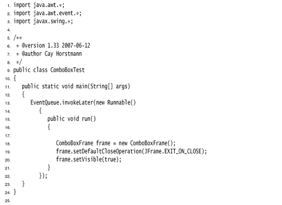
Listing 9–6. ComboBoxTest.java
• boolean isEditable()
• void setEditable(boolean b)
• void addItem(Object item)
• void insertItemAt(Object item, int index)
• void removeItem(Object item)
• void removeItemAt(int index)
• void removeAllItems()
• Object getSelectedItem()
Sliders
Combo boxes let users choose from a discrete set of values. Sliders offer a choice from a continuum of values, for example, any number between 1 and 100.
The most common way of constructing a slider is as follows:
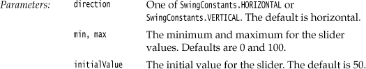
JSlider slider = new JSlider(min, max, initialValue);
If you omit the minimum, maximum, and initial values, they are initialized with 0, 100, and 50, respectively.
Or if you want the slider to be vertical, then use the following constructor call:
JSlider slider = new JSlider(SwingConstants.VERTICAL, min, max, initialValue);
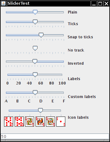
These constructors create a plain slider, such as the top slider in Figure 9–18. You will see presently how to add decorations to a slider.
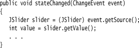
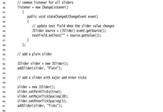
As the user slides the slider bar, the value of the slider moves between the minimum and the maximum values. When the value changes, a ChangeEvent is sent to all change listeners. To be notified of the change, you call the addChangeListener method and install an object that implements the ChangeListener interface. That interface has a single method, stateChanged. In that method, you should retrieve the slider value:
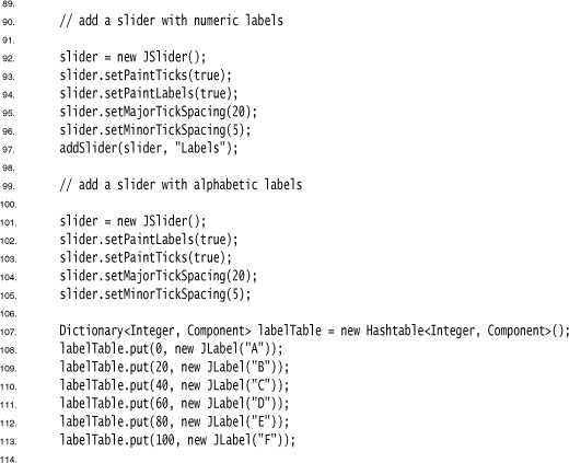
You can embellish the slider by showing ticks. For example, in the sample program, the second slider uses the following settings:
slider.setMajorTickSpacing(20);
slider.setMinorTickSpacing(5);
The slider is decorated with large tick marks every 20 units and small tick marks every 5 units. The units refer to slider values, not pixels.
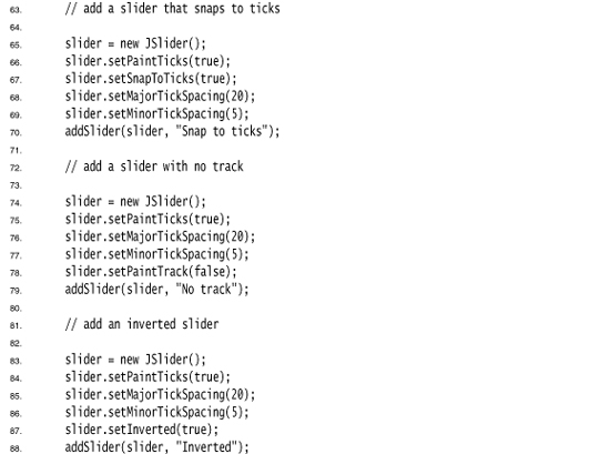
These instructions only set the units for the tick marks. To actually have the tick marks appear, you also call
slider.setPaintTicks(true);
The major and minor tick marks are independent. For example, you can set major tick marks every 20 units and minor tick marks every 7 units, but you’ll get a very messy scale.
You can force the slider to snap to ticks. Whenever the user has finished dragging a slider in snap mode, it is immediately moved to the closest tick. You activate this mode with the call
slider.setSnapToTicks(true);
 Caution
The “snap to ticks” behavior doesn’t work as well as you might imagine. Until the slider has actually snapped, the change listener still reports slider values that don’t correspond to ticks. And if you click next to the slider—an action that normally advances the slider a bit in the direction of the click—a slider with “snap to ticks” does not move to the next tick.
You can ask for tick mark labels for the major tick marks by calling
slider.setPaintLabels(true);
For example, with a slider ranging from 0 to 100 and major tick spacing of 20, the ticks are labeled 0, 20, 40, 60, 80, and 100.
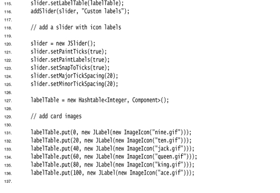
You can also supply other tick marks, such as strings or icons (see Figure 9–18). The process is a bit convoluted. You need to fill a hash table with keys of type Integer and values of type Component. (Autoboxing makes this simple in Java SE 5.0 and beyond.) You then call the setLabelTable method. The components are placed under the tick marks. Usually, you use JLabel objects. Here is how you can label ticks as A, B, C, D, E, and F:
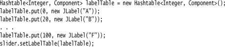
See Chapter 13 for more information about hash tables.
Listing 9–7 also shows a slider with icons as tick labels.
If your tick marks or labels don’t show, double-check that you called setPaintTicks(true) and setPaintLabels(true).
The fourth slider in Figure 9–18 has no track. To suppress the “track” in which the slider moves, call
slider.setPaintTrack(false);
The fifth slider has its direction reversed by a call to
slider.setInverted(true);
The example program shows all these visual effects with a collection of sliders. Each slider has a change event listener installed that places the current slider value into the text field at the bottom of the frame.
• JSlider()
• JSlider(int direction)
• JSlider(int min, int max)
• JSlider(int min, int max, int initialValue)
• JSlider(int direction, int min, int max, int initialValue)
• void setPaintTicks(boolean b)
• void setMajorTickSpacing(int units)
• void setMinorTickSpacing(int units)
• void setPaintLabels(boolean b)
• void setLabelTable(Dictionary table)
• void setSnapToTicks(boolean b)
• void setPaintTrack(boolean b)
Menus
We started this chapter by introducing the most common components that you might want to place into a window, such as various kinds of buttons, text fields, and combo boxes. Swing also supports another type of user interface element, the pull-down menus that are familiar from GUI applications.
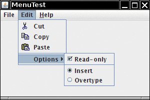
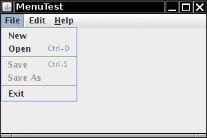
A menu bar on top of the window contains the names of the pull-down menus. Clicking on a name opens the menu containing menu items and submenus. When the user clicks on a menu item, all menus are closed and a message is sent to the program. Figure 9–19 shows a typical menu with a submenu.
Figure 9–19. A menu with a submenu
Menu Building
Building menus is straightforward. You first create a menu bar:
JMenuBar menuBar = new JMenuBar();
A menu bar is just a component that you can add anywhere you like. Normally, you want it to appear at the top of a frame. You can add it there with the setJMenuBar method:
frame.setJMenuBar(menuBar);
For each menu, you create a menu object:
JMenu editMenu = new JMenu("Edit");
You add the top-level menus to the menu bar:
menuBar.add(editMenu);
You add menu items, separators, and submenus to the menu object:
JMenuItem pasteItem = new JMenuItem("Paste");
editMenu.add(pasteItem);
editMenu.addSeparator();
JMenu optionsMenu = . . .; // a submenu
editMenu.add(optionsMenu);
You can see separators in Figure 9–19 below the “Paste” and “Read-only” menu items.
When the user selects a menu, an action event is triggered. You need to install an action listener for each menu item:
ActionListener listener = . . .;
pasteItem.addActionListener(listener);
The method JMenu.add(String s) conveniently adds a menu item to the end of a menu. For example:
editMenu.add("Paste");
The add method returns the created menu item, so you can capture it and then add the listener, as follows:
JMenuItem pasteItem = editMenu.add("Paste");
pasteItem.addActionListener(listener);
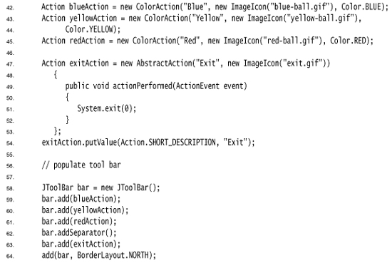
It often happens that menu items trigger commands that can also be activated through other user interface elements such as toolbar buttons. In Chapter 8, you saw how to specify commands through Action objects. You define a class that implements the Action interface, usually by extending the AbstractAction convenience class. You specify the menu item label in the constructor of the AbstractAction object, and you override the actionPerformed method to hold the menu action handler. For example:
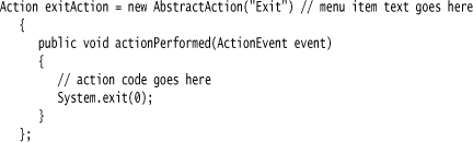
You can then add the action to the menu:
JMenuItem exitItem = fileMenu.add(exitAction);
This command adds a menu item to the menu, using the action name. The action object becomes its listener. This is just a convenient shortcut for
JMenuItem exitItem = new JMenuItem(exitAction);
fileMenu.add(exitItem);
In Windows and Macintosh programs, menus are generally defined in an external resource file and tied to the application with resource identifiers. In Java, menus are still usually built inside the program because the mechanism for dealing with external resources is far more limited than it is in Windows or Mac OS.
• JMenu(String label)
• JMenuItem add(JMenuItem item)
• JMenuItem add(String label)
• JMenuItem add(Action a)
• void addSeparator()
• JMenuItem insert(JMenuItem menu, int index)
• JMenuItem insert(Action a, int index)
• void insertSeparator(int index)
• void remove(int index)
• void remove(JMenuItem item)
• JMenuItem(String label)
• JMenuItem(Action a) 1.3
javax.swing.AbstractButton 1.2
• void setAction(Action a) 1.3
• void setJMenuBar(JMenuBar menubar)
Icons in Menu Items
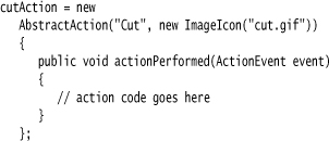
Menu items are very similar to buttons. In fact, the JMenuItem class extends the AbstractButton class. Just like buttons, menus can have just a text label, just an icon, or both. You can specify the icon with the JMenuItem(String, Icon) or JMenuItem(Icon) constructor, or you can set it with the setIcon method that the JMenuItem class inherits from the AbstractButton class. Here is an example:
JMenuItem cutItem = new JMenuItem("Cut", new ImageIcon("cut.jpg"));
In Figure 9–19 on page 406, you can see icons next to several menu items. By default, the menu item text is placed to the right of the icon. If you prefer the text to be placed on the left, call the setHorizontalTextPosition method that the JMenuItem class inherits from the AbstractButton class. For example, the call
cutItem.setHorizontalTextPosition(SwingConstants.LEFT);
moves the menu item text to the left of the icon.
You can also add an icon to an action:
cutAction.putValue(Action.SMALL_ICON, new ImageIcon("cut.jpg"));
Whenever you construct a menu item out of an action, the Action.NAME value becomes the text of the menu item and the Action.SMALL_ICON value becomes the icon.
Alternatively, you can set the icon in the AbstractAction constructor:
• JMenuItem(String label, Icon icon)
javax.swing.AbstractButton 1.2
• void setHorizontalTextPosition(int pos)
javax.swing.AbstractAction 1.2
• AbstractAction(String name, Icon smallIcon)
Checkbox and Radio Button Menu Items
Checkbox and radio button menu items display a checkbox or radio button next to the name (see Figure 9–19 on page 406). When the user selects the menu item, the item automatically toggles between checked and unchecked.
Apart from the button decoration, you treat these menu items just as you would any others. For example, here is how you create a checkbox menu item:
JCheckBoxMenuItem readonlyItem = new JCheckBoxMenuItem("Read-only");
optionsMenu.add(readonlyItem);
The radio button menu items work just like regular radio buttons. You must add them to a button group. When one of the buttons in a group is selected, all others are automatically deselected.
With these menu items, you don’t necessarily want to be notified at the exact moment the user selects the item. Instead, you can simply use the isSelected method to test the current state of the menu item. (Of course, that means that you should keep a reference to the menu item stored in an instance field.) Use the setSelected method to set the state.
javax.swing.JCheckBoxMenuItem 1.2
• JCheckBoxMenuItem(String label)
• JCheckBoxMenuItem(String label, boolean state)
javax.swing.JRadioButtonMenuItem 1.2
• JRadioButtonMenuItem(String label)
• JRadioButtonMenuItem(String label, boolean state)
javax.swing.AbstractButton 1.2
• boolean isSelected()
• void setSelected(boolean state)
Pop-Up Menus
A pop-up menu is a menu that is not attached to a menu bar but that floats somewhere (see Figure 9–20).
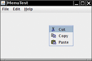
You create a pop-up menu similarly to the way you create a regular menu, but a pop-up menu has no title.
JPopupMenu popup = new JPopupMenu();
You then add menu items in the usual way:
JMenuItem item = new JMenuItem("Cut");
item.addActionListener(listener);
popup.add(item);
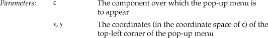
Unlike the regular menu bar that is always shown at the top of the frame, you must explicitly display a pop-up menu by using the show method. You specify the parent component and the location of the pop-up, using the coordinate system of the parent. For example:
popup.show(panel, x, y);
Usually you write code to pop up a menu when the user clicks a particular mouse button, the so-called pop-up trigger. In Windows and Linux, the pop-up trigger is the nonprimary (usually, the right) mouse button. To pop up a menu when the user clicks on a component, using the pop-up trigger, simply call the method
component.setComponentPopupMenu(popup);
Very occasionally, you may place a component inside another component that has a pop-up menu. The child component can inherit the parent component’s pop-up menu by calling
child.setInheritsPopupMenu(true);
These methods were added in Java SE 5.0 to insulate programmers from system dependencies with pop-up menus. Before Java SE 5.0, you had to install a mouse listener and add the following code to both the mousePressed and the mouseReleased listener methods:
Some systems trigger pop-ups when the mouse button goes down, others when the mouse button goes up.
• void show(Component c, int x, int y)
• boolean isPopupTrigger(MouseEvent event) 1.3
• boolean isPopupTrigger()
• JPopupMenu getComponentPopupMenu() 5.0
• void setComponentPopupMenu(JPopupMenu popup) 5.0
• boolean getInheritsPopupMenu() 5.0
• void setInheritsPopupMenu(boolean b) 5.0
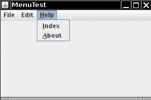
Keyboard Mnemonics and Accelerators
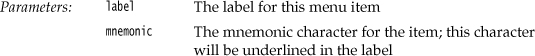
It is a real convenience for the experienced user to select menu items by keyboard mnemonics. You can specify keyboard mnemonics for menu items by specifying a mnemonic letter in the menu item constructor:
JMenuItem aboutItem = new JMenuItem("About", 'A'),
The keyboard mnemonic is displayed automatically in the menu, with the mnemonic letter underlined (see Figure 9–21). For example, in the item defined in the last example, the label will be displayed as “About” with an underlined letter “A”. When the menu is displayed, the user just needs to press the A key, and the menu item is selected. (If the mnemonic letter is not part of the menu string, then typing it still selects the item, but the mnemonic is not displayed in the menu. Naturally, such invisible mnemonics are of dubious utility.)
Figure 9–21. Keyboard mnemonics
Sometimes, you don’t want to underline the first letter of the menu item that matches the mnemonic. For example, if you have a mnemonic “A” for the menu item “Save As,” then it makes more sense to underline the second “A” (Save As). As of Java SE 1.4, you can specify which character you want to have underlined; call the setDisplayedMnemonicIndex method.
If you have an Action object, you can add the mnemonic as the value of the Action.MNEMONIC_KEY key, as follows:
cutAction.putValue(Action.MNEMONIC_KEY, new Integer('A'));
You can supply a mnemonic letter only in the constructor of a menu item, not in the constructor for a menu. Instead, to attach a mnemonic to a menu, you call the setMnemonic method:
JMenu helpMenu = new JMenu("Help");
helpMenu.setMnemonic('H'),
To select a top-level menu from the menu bar, you press the ALT key together with the mnemonic letter. For example, you press ALT+H to select the Help menu from the menu bar.
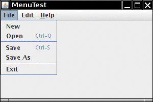
Keyboard mnemonics let you select a submenu or menu item from the currently open menu. In contrast, accelerators are keyboard shortcuts that let you select menu items without ever opening a menu. For example, many programs attach the accelerators CTRL+O and CTRL+S to the Open and Save items in the File menu. You use the setAccelerator method to attach an accelerator key to a menu item. The setAccelerator method takes an object of type Keystroke. For example, the following call attaches the accelerator CTRL+O to the openItem menu item:
openItem.setAccelerator(KeyStroke.getKeyStroke("ctrl O"));
When the user presses the accelerator key combination, this automatically selects the menu option and fires an action event, as if the user had selected the menu option manually.
You can attach accelerators only to menu items, not to menus. Accelerator keys don’t actually open the menu. Instead, they directly fire the action event that is associated with a menu.
Conceptually, adding an accelerator to a menu item is similar to the technique of adding an accelerator to a Swing component. (We discussed that technique in Chapter 8.) However, when the accelerator is added to a menu item, the key combination is automatically displayed in the menu (see Figure 9–22).
Under Windows, ALT+F4 closes a window. But this is not an accelerator that was programmed in Java. It is a shortcut defined by the operating system. This key combination will always trigger the WindowClosing event for the active window regardless of whether there is a Close item on the menu.
• JMenuItem(String label, int mnemonic)
• void setAccelerator(KeyStroke k)
javax.swing.AbstractButton 1.2
• void setMnemonic(int mnemonic)
• void setDisplayedMnemonicIndex(int index) 1.4
Enabling and Disabling Menu Items
Occasionally, a particular menu item should be selected only in certain contexts. For example, when a document is opened for reading only, then the Save menu item is not meaningful. Of course, we could remove the item from the menu with the JMenu.remove method, but users would react with some surprise to menus whose content keeps changing. Instead, it is better to deactivate the menu items that lead to temporarily inappropriate commands. A deactivated menu item is shown in gray, and it cannot be selected (see Figure 9–23).
Figure 9–23. Disabled menu items
To enable or disable a menu item, use the setEnabled method:
saveItem.setEnabled(false);
There are two strategies for enabling and disabling menu items. Each time circumstances change, you can call setEnabled on the relevant menu items or actions. For example, as soon as a document has been set to read-only mode, you can locate the Save and Save As menu items and disable them. Alternatively, you can disable items just before displaying the menu. To do this, you must register a listener for the “menu selected” event. The javax.swing.event package defines a MenuListener interface with three methods:
void menuSelected(MenuEvent event)
void menuDeselected(MenuEvent event)
void menuCanceled(MenuEvent event)
The menuSelected method is called before the menu is displayed. It can therefore be used to disable or enable menu items. The following code shows how to disable the Save and Save As actions whenever the Read Only checkbox menu item is selected:
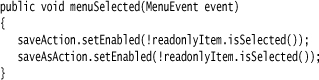
Disabling menu items just before displaying the menu is a clever idea, but it does not work for menu items that also have accelerator keys. Because the menu is never opened when the accelerator key is pressed, the action is never disabled, and it is still triggered by the accelerator key.
• void setEnabled(boolean b)
javax.swing.event.MenuListener 1.2
• void menuSelected(MenuEvent e)
• void menuDeselected(MenuEvent e)
• void menuCanceled(MenuEvent e)
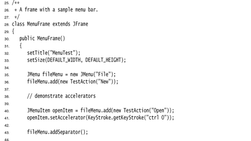
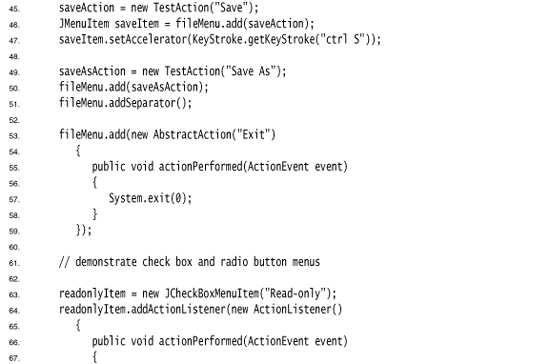
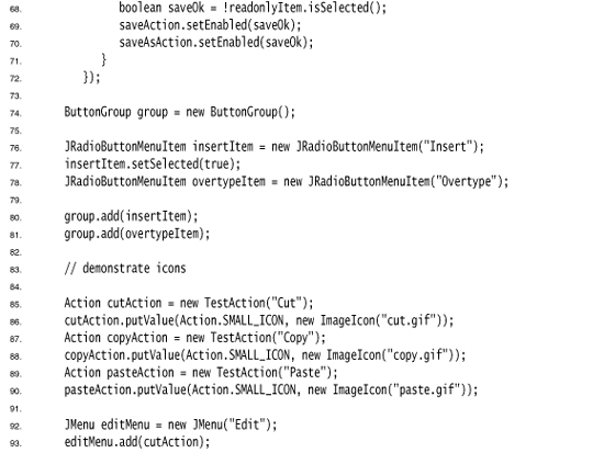
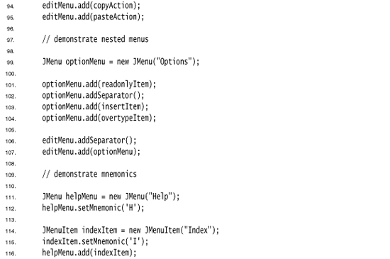
Listing 9–8 is a sample program that generates a set of menus. It shows all the features that you saw in this section: nested menus, disabled menu items, checkbox and radio button menu items, a pop-up menu, and keyboard mnemonics and accelerators.
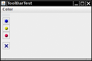
Toolbars
A toolbar is a button bar that gives quick access to the most commonly used commands in a program (see Figure 9–24).
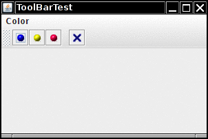
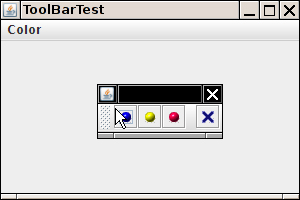
What makes toolbars special is that you can move them elsewhere. You can drag the toolbar to one of the four borders of the frame (see Figure 9–25). When you release the mouse button, the toolbar is dropped into the new location (see Figure 9–26).
Figure 9–25. Dragging the toolbar
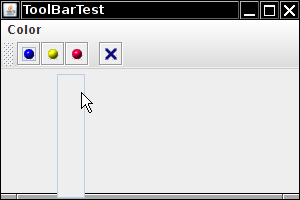
Figure 9–26. The toolbar has been dragged to another border
Toolbar dragging works if the toolbar is inside a container with a border layout, or any other layout manager that supports the North, East, South, and West constraints.
The toolbar can even be completely detached from the frame. A detached toolbar is contained in its own frame (see Figure 9–27). When you close the frame containing a detached toolbar, the toolbar jumps back into the original frame.
Figure 9–27. Detaching the toolbar
Toolbars are straightforward to program. You add components into the toolbar:
JToolBar bar = new JToolBar();
bar.add(blueButton);
The JToolBar class also has a method to add an Action object. Simply populate the toolbar with Action objects, like this:
bar.add(blueAction);
The small icon of the action is displayed in the toolbar.
You can separate groups of buttons with a separator:
bar.addSeparator();
For example, the toolbar in Figure 9–24 has a separator between the third and fourth button.
Then, you add the toolbar to the frame.
add(bar, BorderLayout.NORTH);
You can also specify a title for the toolbar that appears when the toolbar is undocked:
bar = new JToolBar(titleString);
By default, toolbars are initially horizontal. To have a toolbar start out as vertical, use
bar = new JToolBar(SwingConstants.VERTICAL)
or
bar = new JToolBar(titleString, SwingConstants.VERTICAL)
Buttons are the most common components inside toolbars. But there is no restriction on the components that you can add to a toolbar. For example, you can add a combo box to a toolbar.
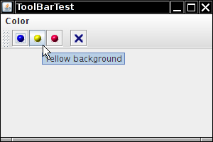
Tooltips
A disadvantage of toolbars is that users are often mystified by the meanings of the tiny icons in toolbars. To solve this problem, user interface designers invented tooltips. A tooltip is activated when the cursor rests for a moment over a button. The tooltip text is displayed inside a colored rectangle. When the user moves the mouse away, the tooltip is removed. (See Figure 9–28.)
In Swing, you can add tooltips to any JComponent simply by calling the setToolTipText method:
exitButton.setToolTipText("Exit");
Alternatively, if you use Action objects, you associate the tooltip with the SHORT_DESCRIPTION key:
exitAction.putValue(Action.SHORT_DESCRIPTION, "Exit");
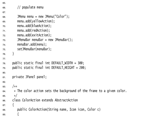
Listing 9–9 shows how the same Action objects can be added to a menu and a toolbar. Note that the action names show up as the menu item names in the menu, and the short descriptions as the tooltips in the toolbar.
• JToolBar()
• JToolBar(String titleString)
• JToolBar(int orientation)
• JToolBar(String titleString, int orientation)
• JButton add(Action a)
• void addSeparator()
• void setToolTipText(String text)
Sophisticated Layout Management
We have managed to lay out the user interface components of our sample applications so far by using only the border layout, flow layout, and grid layout. For more complex tasks, this is not going to be enough. In this section, we discuss advanced layout management in detail.
Windows programmers may well wonder why Java makes so much fuss about layout managers. After all, in Windows, layout management is not a big deal: First, you use a dialog editor to drag and drop your components onto the surface of a dialog, and then you use editor tools to line up components, to space them equally, to center them, and so on. If you are working on a big project, you probably don’t have to worry about component layout at all—a skilled user interface designer does all this for you.
The problem with this approach is that the resulting layout must be manually updated if the size of the components changes. Why would the component size change? There are two common cases. First, a user may choose a larger font for button labels and other dialog text. If you try this out for yourself in Windows, you will find that many applications deal with this exceedingly poorly. The buttons do not grow, and the larger font is simply crammed into the same space as before. The same problem can occur when the strings in an application are translated to a foreign language. For example, the German word for “Cancel” is “Abbrechen.” If a button has been designed with just enough room for the string “Cancel”, then the German version will look broken, with a clipped command string.
Why don’t Windows buttons simply grow to accommodate the labels? Because the designer of the user interface gave no instructions in which direction they should grow. After the dragging and dropping and arranging, the dialog editor merely remembers the pixel position and size of each component. It does not remember why the components were arranged in this fashion.
The Java layout managers are a much better approach to component layout. With a layout manager, the layout comes with instructions about the relationships among the components. This was particularly important in the original AWT, which used native user interface elements. The size of a button or list box in Motif, Windows, and the Macintosh could vary widely, and an application or applet would not know a priori on which platform it would display its user interface. To some extent, that degree of variability has gone away with Swing. If your application forces a particular look and feel, such as the Metal look and feel, then it looks identical on all platforms. However, if you let users of your application choose their favorite look and feel, then you again need to rely on the flexibility of layout managers to arrange the components.
Since Java 1.0, the AWT includes the grid bag layout that lays out components in rows and columns. The row and column sizes are flexible and components can span multiple rows and columns. This layout manager is very flexible, but it is also very complex. The mere mention of the words “grid bag layout” has been known to strike fear in the hearts of Java programmers.
In an unsuccessful attempt to design a layout manager that would free programmers from the tyranny of the grid bag layout, the Swing designers came up with the box layout. According to the JDK documentation of the BoxLayout class: “Nesting multiple panels with different combinations of horizontal and vertical [sic] gives an effect similar to GridBagLayout, without the complexity.” However, because each box is laid out independently, you cannot use box layouts to arrange neighboring components both horizontally and vertically.
Java SE 1.4 saw yet another attempt to design a replacement for the grid bag layout—the spring layout. You use imaginary springs to connect the components in a container. As the container is resized, the springs stretch or shrink, thereby adjusting the positions of the components. This sounds tedious and confusing, and it is. The spring layout quickly sank into obscurity.
In 2005, the NetBeans team invented the Matisse technology, which combines a layout tool and a layout manager. A user interface designer uses the tool to drop components into a container and to indicate which components should line up. The tool translates the designer’s intentions into instructions for the group layout manager. This is much more convenient than writing layout management code by hand. The group layout manager is now a part of Java SE 6. Even if you don’t use NetBeans as your IDE, we think you should consider using its GUI builder tool. You can design your GUI in NetBeans and paste the resulting code into your IDE of choice.
In the coming sections, we cover the grid bag layout because it is commonly used and is still the easiest mechanism for producing layout code for older Java versions. We will tell you a strategy that makes grid bag layouts relatively painless in common situations.
Next, we cover the Matisse tool and the group layout manager. You will want to know how the group layout manager works so that you can check whether Matisse recorded the correct instructions when you visually positioned your components.
We end the discussion of layout managers by showing you how you can bypass layout management altogether and place components manually, and how you can write your own layout manager.
The Grid Bag Layout
The grid bag layout is the mother of all layout managers. You can think of a grid bag layout as a grid layout without the limitations. In a grid bag layout, the rows and columns can have variable sizes. You can join adjacent cells to make room for larger components. (Many word processors, as well as HTML, have the same capability when tables are edited: you start out with a grid and then merge adjacent cells if need be.) The components need not fill the entire cell area, and you can specify their alignment within cells.
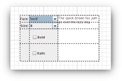
Consider the font selector of Figure 9–29. It consists of the following components:
• Two combo boxes to specify the font face and size
• Labels for these two combo boxes
• Two checkboxes to select bold and italic
• A text area for the sample string
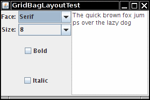
Now, chop up the container into a grid of cells, as shown in Figure 9–30. (The rows and columns need not have equal size.) Each checkbox spans two columns, and the text area spans four rows.
Figure 9–30. Dialog box grid used in design
To describe the layout to the grid bag manager, use the following procedure:
1. Create an object of type GridBagLayout. You don’t tell it how many rows and columns the underlying grid has. Instead, the layout manager will try to guess it from the information you give it later.
2. Set this GridBagLayout object to be the layout manager for the component.
3. For each component, create an object of type GridBagConstraints. Set field values of the GridBagConstraints object to specify how the components are laid out within the grid bag.
4. Finally, add each component with its constraints by using the call
add(component, constraints);
Here’s an example of the code needed. (We go over the various constraints in more detail in the sections that follow—so don’t worry if you don’t know what some of the constraints do.)
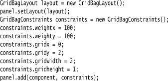
The trick is knowing how to set the state of the GridBagConstraints object. We go over the most important constraints for using this object in the sections that follow.
The gridx, gridy, gridwidth, and gridheight Parameters
The gridx, gridy, gridwidth, and gridheight constraints define where the component is located in the grid. The gridx and gridy values specify the column and row positions of the upper-left corner of the component to be added. The gridwidth and gridheight values determine how many columns and rows the component occupies.
The grid coordinates start with 0. In particular, gridx = 0 and gridy = 0 denotes the top-left corner. For example, the text area in our example has gridx = 2, gridy = 0 because it starts in column 2 (that is, the third column) of row 0. It has gridwidth = 1 and gridheight = 4 because it spans one column and four rows.
Weight Fields
You always need to set the weight fields (weightx and weighty) for each area in a grid bag layout. If you set the weight to 0, then the area never grows or shrinks beyond its initial size in that direction. In the grid bag layout for Figure 9–29 on page 426, we set the weightx field of the labels to be 0. This allows the labels to remain a constant width when you resize the window. On the other hand, if you set the weights for all areas to 0, the container will huddle in the center of its allotted area rather than stretching to fill it.
Conceptually, the problem with the weight parameters is that weights are properties of rows and columns, not individual cells. But you need to specify them in terms of cells because the grid bag layout does not expose the rows and columns. The row and column weights are computed as the maxima of the cell weights in each row or column. Thus, if you want a row or column to stay at a fixed size, you need to set the weights of all components in it to zero.
Note that the weights don’t actually give the relative sizes of the columns. They tell what proportion of the “slack” space should be allocated to each area if the container exceeds its preferred size. This isn’t particularly intuitive. We recommend that you set all weights at 100. Then, run the program and see how the layout looks. Resize the dialog to see how the rows and columns adjust. If you find that a particular row or column should not grow, set the weights of all components in it to zero. You can tinker with other weight values, but it is usually not worth the effort.
The fill and anchor Parameters
If you don’t want a component to stretch out and fill the entire area, you set the fill constraint. You have four possibilities for this parameter: the valid values are used in the forms GridBagConstraints.NONE, GridBagConstraints.HORIZONTAL, GridBagConstraints.VERTICAL, and GridBagConstraints.BOTH.
If the component does not fill the entire area, you can specify where in the area you want it by setting the anchor field. The valid values are GridBagConstraints.CENTER (the default), GridBagConstraints.NORTH, GridBagConstraints.NORTHEAST, GridBagConstraints.EAST, and so on.
Padding
You can surround a component with additional blank space by setting the insets field of GridBagConstraints. Set the left, top, right and bottom values of the Insets object to the amount of space that you want to have around the component. This is called the external padding.
The ipadx and ipady values set the internal padding. These values are added to the minimum width and height of the component. This ensures that the component does not shrink down to its minimum size.
Alternative Method to Specify the gridx, gridy, gridwidth, and gridheight Parameters
The AWT documentation recommends that instead of setting the gridx and gridy values to absolute positions, you set them to the constant GridBagConstraints.RELATIVE. Then, add the components to the grid bag layout in a standardized order, going from left to right in the first row, then moving along the next row, and so on.
You still specify the number of rows and columns spanned, by giving the appropriate gridheight and gridwidth fields. Except, if the component extends to the last row or column, you aren’t supposed to specify the actual number, but the constant GridBagConstraints.REMAINDER. This tells the layout manager that the component is the last one in its row.
This scheme does seem to work. But it sounds really goofy to hide the actual placement information from the layout manager and hope that it will rediscover it.
All this sounds like a lot of trouble and complexity. But in practice, the strategy in the following recipe makes grid bag layouts relatively trouble-free:
1. Sketch out the component layout on a piece of paper.
2. Find a grid such that the small components are each contained in a cell and the larger components span multiple cells.
3. Label the rows and columns of your grid with 0, 1, 2, 3, . . .. You can now read off the gridx, gridy, gridwidth, and gridheight values.
4. For each component, ask yourself whether it needs to fill its cell horizontally or vertically. If not, how do you want it aligned? This tells you the fill and anchor parameters.
5. Set all weights to 100. However, if you want a particular row or column to always stay at its default size, set the weightx or weighty to 0 in all components that belong to that row or column.
6. Write the code. Carefully double-check your settings for the GridBagConstraints. One wrong constraint can ruin your whole layout.
7. Compile, run, and enjoy.
Some GUI builders even have tools for specifying the constraints visually—see Figure 9–31 for the configuration dialog in NetBeans.
Figure 9–31. Specifying grid bag constraints in NetBeans
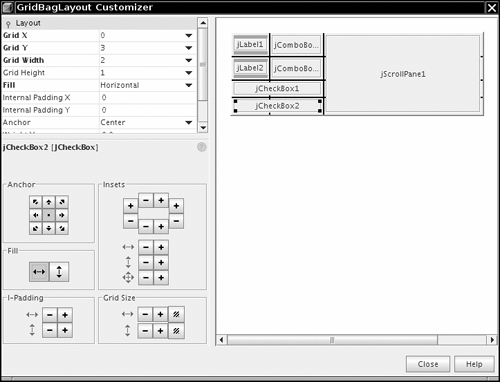
A Helper Class to Tame the Grid Bag Constraints
The most tedious aspect of the grid bag layout is writing the code that sets the constraints. Most programmers write helper functions or a small helper class for this purpose. We present such a class after the complete code for the font dialog example. This class has the following features:
• Its name is short: GBC instead of GridBagConstraints.
• It extends GridBagConstraints, so you can use shorter names such as GBC.EAST for the constants.
• Use a GBC object when adding a component, such as
add(component, new GBC(1, 2));
• There are two constructors to set the most common parameters: gridx and gridy, or gridx, gridy, gridwidth, and gridheight.
add(component, new GBC(1, 2, 1, 4));
• There are convenient setters for the fields that come in x/y pairs:
add(component, new GBC(1, 2).setWeight(100, 100));
• The setter methods return this, so you can chain them:
add(component, new GBC(1, 2).setAnchor(GBC.EAST).setWeight(100, 100));
• The setInsets methods construct the Insets object for you. To get one-pixel insets, simply call
add(component, new GBC(1, 2).setAnchor(GBC.EAST).setInsets(1));
Listing 9–10 shows the complete code for the font dialog example. Here is the code that adds the components to the grid bag:
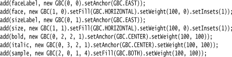
Once you understand the grid bag constraints, this kind of code is fairly easy to read and debug.
The Sun tutorial at http://java.sun.com/docs/books/tutorial/uiswing/layout/gridbag.html suggests that you reuse the same GridBagConstraints object for all components. We find the resulting code hard to read and error prone. For example, look at the demo at http://java.sun.com/docs/books/tutorial/uiswing/events/containerlistener.html. Was it really intended that the buttons are stretched horizontally, or did the programmer just forget to turn off the fill constraint?
Listing 9–10. GridBagLayoutTest.java
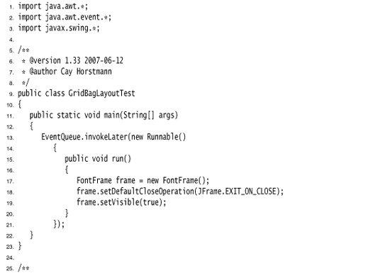
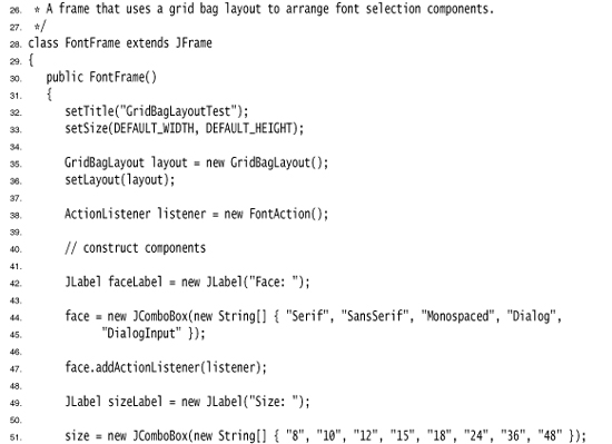
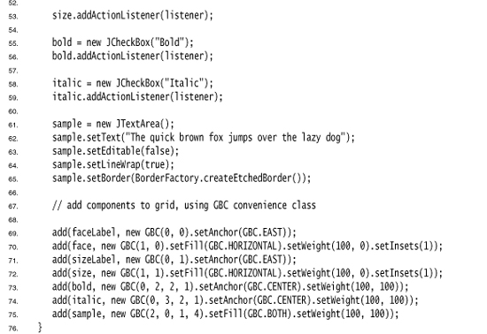
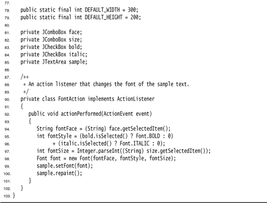
Listing 9–11 shows the code of the GBC helper class.
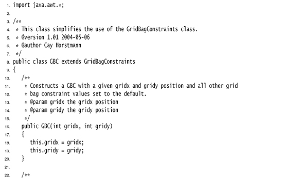
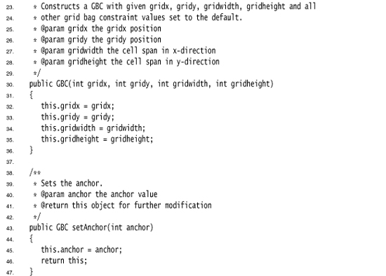
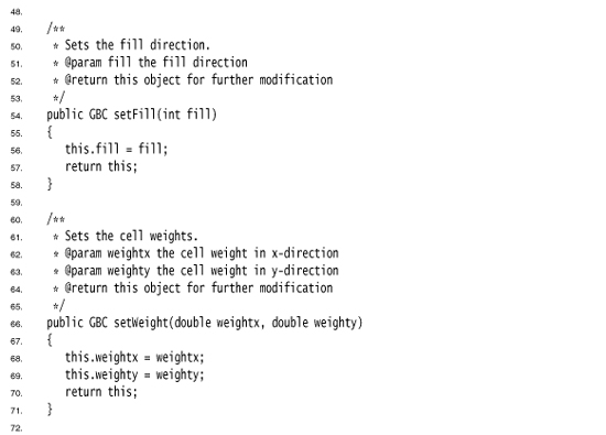
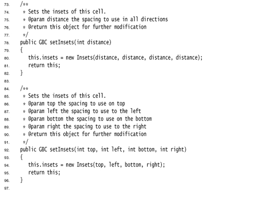
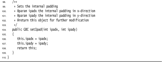
java.awt.GridBagConstraints 1.0
• int gridx, gridy
• int gridwidth, gridheight
• double weightx, weighty
• int anchor

• int fill
• int ipadx, ipady
• GridBagConstraints(int gridx, int gridy, int gridwidth, int gridheight, double weightx, double weighty, int anchor, int fill, Insets insets, int ipadx, int ipady) 1.2
Group Layout
Before discussing the API of the GroupLayout class, let us have a quick look at the Matisse GUI builder in NetBeans. We won’t give you a full Matisse tutorial—see http://www.netbeans.org/kb/articles/matisse.html for more information.
Here is the workflow for laying out the top of the dialog in Figure 9–13. Start a new project and add a new JFrame form. Drag a label until two guidelines appear that separate it from the container borders:
Place another label below the first row:
Drag a text field so that its baseline lines up with the baseline of the first label. Again, note the guidelines:
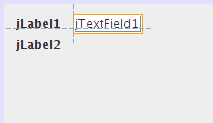
Finally, line up a password field with the label to the left and the text field above.
Matisse translates these actions into the following Java code:
That looks a bit scary, but fortunately you don’t have to write the code. However, it is helpful to have a basic understanding of the layout actions so that you can spot errors. We will analyze the basic structure of the code. The API notes at the end of this section explain each of the classes and methods in detail.
Components are organized by placing them into objects of type GroupLayout.SequentialGroup or GroupLayout.ParallelGroup. These classes are subclasses of GroupLayout.Group. Groups can contain components, gaps, and nested groups. The various add methods of the group classes return the group object so that method calls can be chained, like this:
group.addComponent(...).addPreferredGap(...).addComponent(...);
As you can see from the sample code, the group layout separates the horizontal and vertical layout computations.
To visualize the horizontal computations, imagine that the components are flattened so they have zero height, like this:
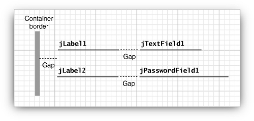
There are two parallel sequences of components, corresponding to the (slightly simplified) code:
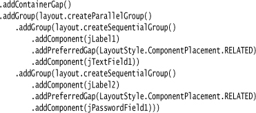
But wait, that can’t be right. If the labels have different lengths, the text field and the password field won’t line up.
We have to tell Matisse that we want the fields to line up. Select both fields, right-click, and select Align -> Left to Column from the menu. Also line up the labels (see Figure 9–32).
Figure 9–32. Aligning the labels and text fields in Matisse
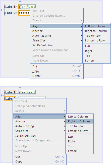
This dramatically changes the layout code:
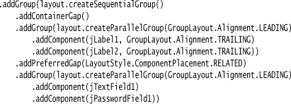
Now the labels and fields are each placed in a parallel group. The first group has an alignment of TRAILING (which means alignment to the right when the text direction is left-to-right):
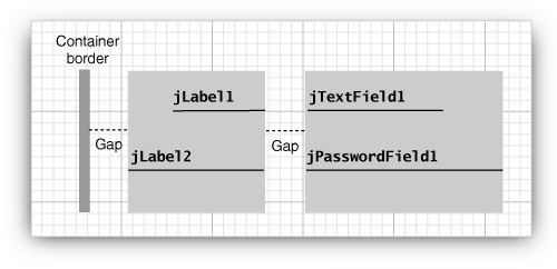
It seems like magic that Matisse can translate the designer’s instructions into nested groups, but as Arthur C. Clarke said, any sufficiently advanced technology is indistinguishable from magic.
For completeness, let’s look at the vertical computation. Now you should think of the components as having no width. We have a sequential group that contains two parallel groups, separated by gaps:
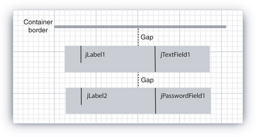
The corresponding code is
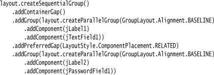
As you can see from the code, the components are aligned by their baselines. (The baseline is the line on which the component text is aligned.)
Accurate baseline alignment was not possible in earlier versions of Java. Finally, Java SE 6 added a getBaseline method to the Component class for determining the exact baseline of a component containing text.
You can force a set of components to have equal size. For example, we may want to make sure that the text field and password field width match exactly. In Matisse, select both, right-click, and select Same Size -> Same Width from the menu (see Figure 9–33).
Figure 9–33. Forcing two components to have the same width
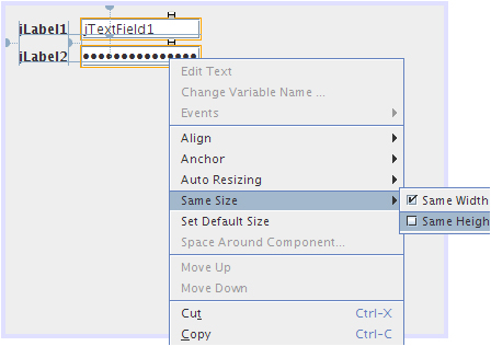
Matisse adds the following statement to the layout code:
layout.linkSize(SwingConstants.HORIZONTAL, new Component[] {jPasswordField1, jTextField1});
The code in Listing 9–12 shows how to lay out the font selector of the preceding section, using the GroupLayout instead of the GridBagLayout. The code may not look any simpler than that of Listing 9–10 on page 431, but we didn’t have to write it. We used Matisse to do the layout and then cleaned up the code a bit.
Listing 9–12. GroupLayoutTest.java
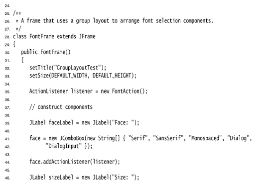
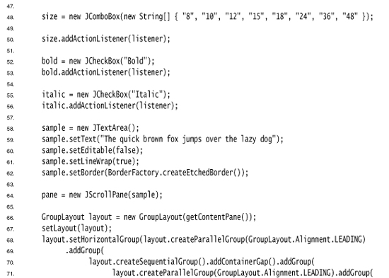
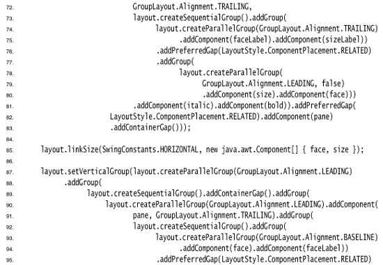
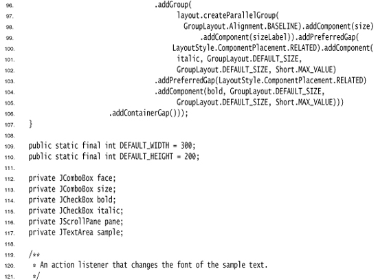
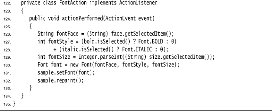
• GroupLayout(Container host)
• void setHorizontalGroup(GroupLayout.Group g)
• void setVerticalGroup(GroupLayout.Group g)
• void linkSize(Component... components)
• void linkSize(int axis, Component... component)
• GroupLayout.SequentialGroup createSequentialGroup()
• GroupLayout.ParallelGroup createParallelGroup()
• GroupLayout.ParallelGroup createParallelGroup(GroupLayout.Alignment align)
• GroupLayout.ParallelGroup createParallelGroup(GroupLayout.Alignment align, boolean resizable)
• boolean getHonorsVisibility()
• void setHonorsVisibility(boolean b)
• void setAutoCreateGaps(boolean b)
• boolean getAutoCreateContainerGaps()
• void setAutoCreateContainerGaps(boolean b)
• GroupLayout.Group addComponent(Component c)
• GroupLayout.Group addComponent(Component c, int minimumSize, int preferredSize, int maximumSize)
• GroupLayout.Group addGap(int size)
• GroupLayout.Group addGap(int minimumSize, int preferredSize, int maximumSize)
• GroupLayout.Group addGroup(GroupLayout.Group g)
javax.swing.GroupLayout.ParallelGroup
• GroupLayout.ParallelGroup addComponent(Component c, GroupLayout.Alignment align)
• GroupLayout.ParallelGroup addComponent(Component c, GroupLayout.Alignment align, int minimumSize, int preferredSize, int maximumSize)
• GroupLayout.ParallelGroup addGroup(GroupLayout.Group g, GroupLayout.Alignment align)
javax.swing.GroupLayout.SequentialGroup
• GroupLayout.SequentialGroup addContainerGap()
• GroupLayout.SequentialGroup addContainerGap(int preferredSize, int maximumSize)
• GroupLayout.SequentialGroup addPreferredGap(LayoutStyle.ComponentPlacement type)
Using No Layout Manager
There will be times when you don’t want to bother with layout managers but just want to drop a component at a fixed location (sometimes called absolute positioning). This is not a great idea for platform-independent applications, but there is nothing wrong with using it for a quick prototype.
Here is what you do to place a component at a fixed location:
1. Set the layout manager to null.
2. Add the component you want to the container.
3. Then specify the position and size that you want:
frame.setLayout(null);
JButton ok = new JButton("Ok");
frame.add(ok);
ok.setBounds(10, 10, 30, 15);
• void setBounds(int x, int y, int width, int height)
Custom Layout Managers
You can design your own LayoutManager class that manages components in a special way. As a fun example, we show you how to arrange all components in a container to form a circle (see Figure 9–34).
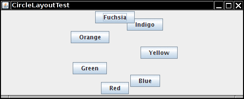
Your own layout manager must implement the LayoutManager interface. You need to override the following five methods:
void addLayoutComponent(String s, Component c);
void removeLayoutComponent(Component c);
Dimension preferredLayoutSize(Container parent);
Dimension minimumLayoutSize(Container parent);
void layoutContainer(Container parent);
The first two methods are called when a component is added or removed. If you don’t keep any additional information about the components, you can make them do nothing. The next two methods compute the space required for the minimum and the preferred layout of the components. These are usually the same quantity. The fifth method does the actual work and invokes setBounds on all components.
The AWT has a second interface, called LayoutManager2, with 10 methods to implement rather than 5. The main point of the LayoutManager2 interface is to allow the user to use the add method with constraints. For example, the BorderLayout and GridBagLayout implement the LayoutManager2 interface.
Listing 9–13 shows the code for the CircleLayout manager, which, amazingly and uselessly enough, lays out the components along a circle inside the parent.
Listing 9–13. CircleLayoutTest.java
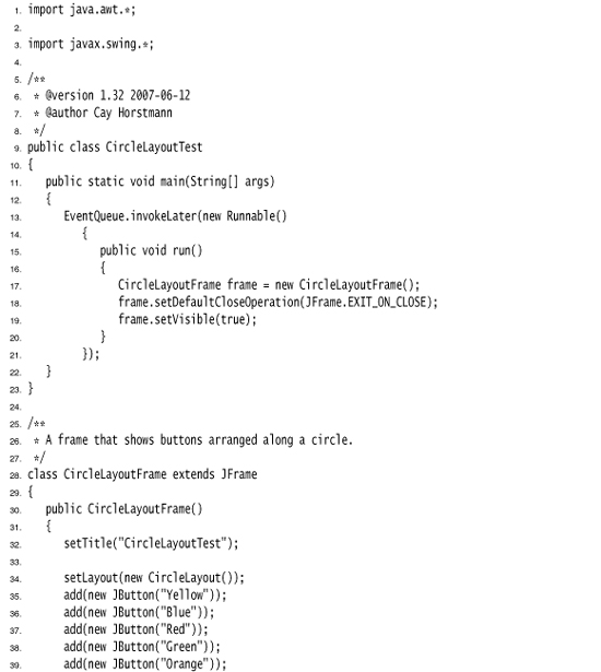
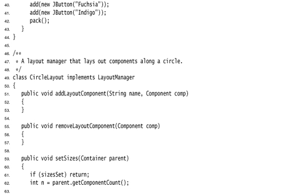
• void addLayoutComponent(String name, Component comp)
• void removeLayoutComponent(Component comp)
• Dimension preferredLayoutSize(Container cont)
• Dimension minimumLayoutSize(Container cont)
• void layoutContainer(Container cont)
Traversal Order
When you add many components into a window, you need to give some thought to the traversal order. When a window is first displayed, the first component in the traversal order has the keyboard focus. Each time the user presses the TAB key, the next component gains focus. (Recall that a component that has the keyboard focus can be manipulated with the keyboard. For example, a button can be “clicked” with the space bar when it has focus.) You may not personally care about using the TAB key to navigate through a set of controls, but plenty of users do. Among them are the mouse haters and those who cannot use a mouse, perhaps because of a handicap or because they are navigating the user interface by voice. For that reason, you need to know how Swing handles traversal order.
The traversal order is straightforward, first left to right and then top to bottom. For example, in the font dialog example, the components are traversed in the following order (see Figure 9–35):
 Face combo box
 Sample text area (press CTRL+TAB to move to the next field; the TAB character is considered text input)
 Size combo box
 Bold checkbox
 Italic checkbox
Figure 9–35. Geometric traversal order
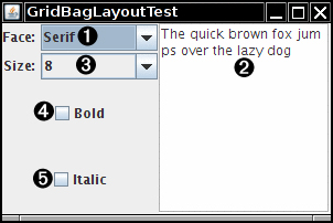
In the old AWT, the traversal order was determined by the order in which you inserted components into a container. In Swing, the insertion order does not matter—only the layout of the components is considered.
The situation is more complex if your container contains other containers. When the focus is given to another container, it automatically ends up within the top-left component in that container and then it traverses all other components in that container. Finally, the focus is given to the component following the container.
You can use this to your advantage by grouping related elements in another container such as a panel.
As of Java SE 1.4, you call
component.setFocusable(false);
to remove a component from the focus traversal. Previously, you had to override the isFocusTraversable method, but that method is now deprecated.
In summary, there are two standard traversal policies in Java SE 1.4:
• Pure AWT applications use the DefaultFocusTraversalPolicy. Components are included in the focus traversal if they are visible, displayable, enabled, and focusable, and if their native peers are focusable. The components are traversed in the order in which they were inserted in the container.
• Swing applications use the LayoutFocusTraversalPolicy. Components are included in the focus traversal if they are visible, displayable, enabled, and focusable. The components are traversed in geometric order: left to right, then top to bottom. However, a container introduces a new “cycle”—its components are traversed first before the successor of the container gains focus.
The “cycle” notion is a bit confusing. After reaching the last element in a child container, the focus does not go back to its first element, but instead to the container’s successor. The API supports true cycles, including keystrokes that move up and down in a cycle hierarchy. However, the standard traversal policy does not use hierarchical cycles. It flattens the cycle hierarchy into a linear (depth-first) traversal.
In Java SE 1.3, you could change the default traversal order by calling the setNextFocusableComponent method of the JComponent class. That method is now deprecated. To change the traversal order, try grouping related components into panels so that they form cycles. If that doesn’t work, you have to either install a comparator that sorts the components differently or completely replace the traversal policy. Neither operation seems intended for the faint of heart—see the Sun API documentation for details.
Dialog Boxes
So far, all our user interface components have appeared inside a frame window that was created in the application. This is the most common situation if you write applets that run inside a web browser. But if you write applications, you usually want separate dialog boxes to pop up to give information to or get information from the user.
Just as with most windowing systems, AWT distinguishes between modal and modeless dialog boxes. A modal dialog box won’t let users interact with the remaining windows of the application until he or she deals with it. You use a modal dialog box when you need information from the user before you can proceed with execution. For example, when the user wants to read a file, a modal file dialog box is the one to pop up. The user must specify a file name before the program can begin the read operation. Only when the user closes the (modal) dialog box can the application proceed.
A modeless dialog box lets the user enter information in both the dialog box and the remainder of the application. One example of a modeless dialog is a toolbar. The toolbar can stay in place as long as needed, and the user can interact with both the application window and the toolbar as needed.
We start this section with the simplest dialogs—modal dialogs with just a single message. Swing has a convenient JOptionPane class that lets you put up a simple dialog without writing any special dialog box code. Next, you see how to write more complex dialogs by implementing your own dialog windows. Finally, you see how to transfer data from your application into a dialog and back.
We conclude this section by looking at two standard dialogs: file dialogs and color dialogs. File dialogs are complex, and you definitely want to be familiar with the Swing JFileChooser for this purpose—it would be a real challenge to write your own. The JColorChooser dialog is useful when you want users to pick colors.
Option Dialogs
Swing has a set of ready-made simple dialogs that suffice when you need to ask the user for a single piece of information. The JOptionPane has four static methods to show these simple dialogs:
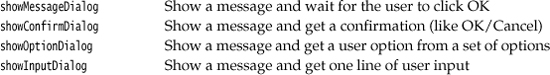
Figure 9–36 shows a typical dialog. As you can see, the dialog has the following components:
• An icon
• A message
• One or more option buttons
The input dialog has an additional component for user input. This can be a text field into which the user can type an arbitrary string, or a combo box from which the user can select one item.
The exact layout of these dialogs, and the choice of icons for standard message types, depend on the pluggable look and feel.
The icon on the left side depends on one of five message types:
ERROR_MESSAGE
INFORMATION_MESSAGE
WARNING_MESSAGE
QUESTION_MESSAGE
PLAIN_MESSAGE
The PLAIN_MESSAGE type has no icon. Each dialog type also has a method that lets you supply your own icon instead.
For each dialog type, you can specify a message. This message can be a string, an icon, a user interface component, or any other object. Here is how the message object is displayed:
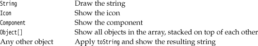
You can see these options by running the program in Listing 9–14 on page 455.
Of course, supplying a message string is by far the most common case. Supplying a Component gives you ultimate flexibility because you can make the paintComponent method draw anything you want.
The buttons on the bottom depend on the dialog type and the option type. When calling showMessageDialog and showInputDialog, you get only a standard set of buttons (OK and OK/Cancel, respectively). When calling showConfirmDialog, you can choose among four option types:
DEFAULT_OPTION
YES_NO_OPTION
YES_NO_CANCEL_OPTION
OK_CANCEL_OPTION
With the showOptionDialog you can specify an arbitrary set of options. You supply an array of objects for the options. Each array element is rendered as follows:
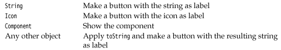
The return values of these functions are as follows:
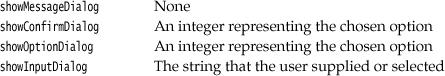
The showConfirmDialog and showOptionDialog return integers to indicate which button the user chose. For the option dialog, this is simply the index of the chosen option or the value CLOSED_OPTION if the user closed the dialog instead of choosing an option. For the confirmation dialog, the return value can be one of the following:
OK_OPTION
CANCEL_OPTION
YES_OPTION
NO_OPTION
CLOSED_OPTION
This all sounds like a bewildering set of choices, but in practice it is simple. Follow these steps:
1. Choose the dialog type (message, confirmation, option, or input).
2. Choose the icon (error, information, warning, question, none, or custom).
3. Choose the message (string, icon, custom component, or a stack of them).
4. For a confirmation dialog, choose the option type (default, Yes/No, Yes/No/Cancel, or OK/Cancel).
5. For an option dialog, choose the options (strings, icons, or custom components) and the default option.
6. For an input dialog, choose between a text field and a combo box.
7. Locate the appropriate method to call in the JOptionPane API.
For example, suppose you want to show the dialog in Figure 9–36. The dialog shows a message and asks the user to confirm or cancel. Thus, it is a confirmation dialog. The icon is a question icon. The message is a string. The option type is OK_CANCEL_OPTION. Here is the call you would make:
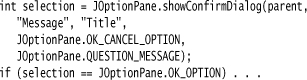
The message string can contain newline ('
') characters. Such a string is displayed in multiple lines.
The program in Listing 9–14 lets you make the selections shown in Figure 9–37. It then shows you the resulting dialog.
Listing 9–14. OptionDialogTest.java
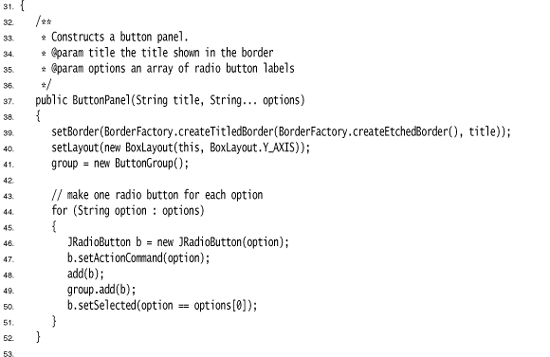
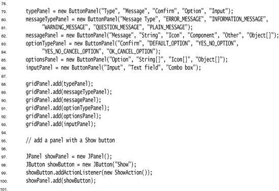
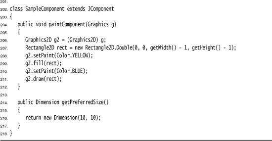
Figure 9–37. The OptionDialogTest program
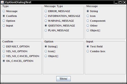
• static void showMessageDialog(Component parent, Object message, String title, int messageType, Icon icon)
• static void showMessageDialog(Component parent, Object message, String title, int messageType)
• static void showMessageDialog(Component parent, Object message)
• static void showInternalMessageDialog(Component parent, Object message, String title, int messageType, Icon icon)
• static void showInternalMessageDialog(Component parent, Object message, String title, int messageType)
• static void showInternalMessageDialog(Component parent, Object message)
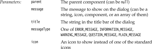
• static int showConfirmDialog(Component parent, Object message, String title, int optionType, int messageType, Icon icon)
• static int showConfirmDialog(Component parent, Object message, String title, int optionType, int messageType)
• static int showConfirmDialog(Component parent, Object message, String title, int optionType)
• static int showConfirmDialog(Component parent, Object message)
• static int showInternalConfirmDialog(Component parent, Object message, String title, int optionType, int messageType, Icon icon)
• static int showInternalConfirmDialog(Component parent, Object message, String title, int optionType, int messageType)
• static int showInternalConfirmDialog(Component parent, Object message, String title, int optionType)
• static int showInternalConfirmDialog(Component parent, Object message)
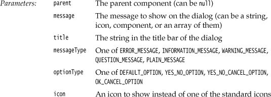
• static int showOptionDialog(Component parent, Object message, String title, int optionType, int messageType, Icon icon, Object[] options, Object default)
• static int showInternalOptionDialog(Component parent, Object message, String title, int optionType, int messageType, Icon icon, Object[] options, Object default)
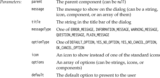
• static Object showInputDialog(Component parent, Object message, String title, int messageType, Icon icon, Object[] values, Object default)
• static String showInputDialog(Component parent, Object message, String title, int messageType)
• static String showInputDialog(Component parent, Object message)
• static String showInputDialog(Object message)
• static String showInputDialog(Component parent, Object message, Object default) 1.4
• static String showInputDialog(Object message, Object default) 1.4
• static Object showInternalInputDialog(Component parent, Object message, String title, int messageType, Icon icon, Object[] values, Object default)
• static String showInternalInputDialog(Component parent, Object message, String title, int messageType)
• static String showInternalInputDialog(Component parent, Object message)
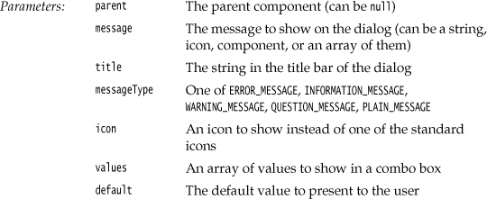
Creating Dialogs
In the last section, you saw how to use the JOptionPane class to show a simple dialog. In this section, you see how to create such a dialog by hand.
Figure 9–38 shows a typical modal dialog box, a program information box that is displayed when the user clicks the About button.
Figure 9–38. An About dialog box
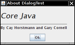
To implement a dialog box, you extend the JDialog class. This is essentially the same process as extending JFrame for the main window for an application. More precisely:
1. In the constructor of your dialog box, call the constructor of the superclass JDialog.
2. Add the user interface components of the dialog box.
3. Add the event handlers.
4. Set the size for the dialog box.
When you call the superclass constructor, you will need to supply the owner frame, the title of the dialog, and the modality.
The owner frame controls where the dialog is displayed. You can supply null as the owner; then, the dialog is owned by a hidden frame.
The modality specifies which other windows of your application are blocked while the dialog is displayed. A modeless dialog does not block other windows. A modal dialog blocks all other windows of the application (except children of the dialog). You would use a modeless dialog for a toolbox that the user can always access. On the other hand, you would use a modal dialog if you want to force the user to supply required information before continuing.
As of Java SE 6, there are two additional modality types. A document-modal dialog blocks all windows belonging to the same “document,” or more precisely, all windows with the same parentless root window as the dialog. This solves a problem with help systems. In older versions, users were unable to interact with the help windows when a modal dialog was popped up. A toolkit-modal dialog blocks all windows from the same “toolkit.” A toolkit is a Java program that launches multiple applications, such as the applet engine in a browser. For more information on these advanced issues, please see http://java.sun.com/developer/technicalArticles/J2SE/Desktop/javase6/modality.
Here’s the code for a dialog box:
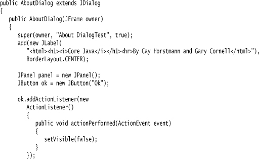
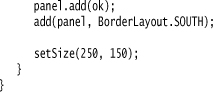
As you can see, the constructor adds user interface elements: in this case, labels and a button. It adds a handler to the button and sets the size of the dialog.
To display the dialog box, you create a new dialog object and make it visible:
JDialog dialog = new AboutDialog(this);
dialog.setVisible(true);
Actually, in the sample code below, we create the dialog box only once, and we can reuse it whenever the user clicks the About button.
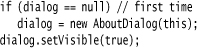
When the user clicks the Ok button, the dialog box should close. This is handled in the event handler of the Ok button:
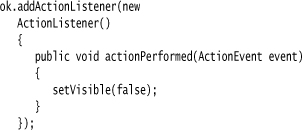
When the user closes the dialog by clicking on the Close box, then the dialog is also hidden. Just as with a JFrame, you can override this behavior with the setDefaultCloseOperation method.
Listing 9–15 is the code for the About dialog box test program.
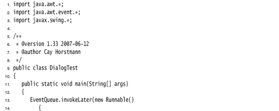
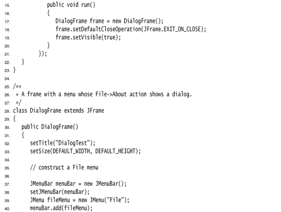
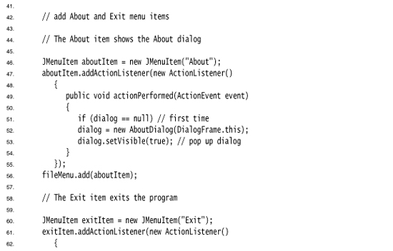
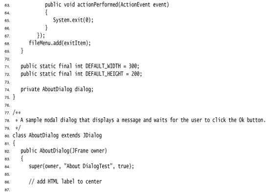
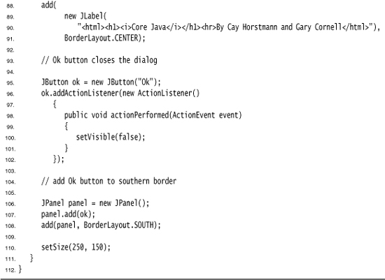
• public JDialog(Frame parent, String title, boolean modal)
Data Exchange
The most common reason to put up a dialog box is to get information from the user. You have already seen how easy it is to make a dialog box object: Give it initial data and then call setVisible(true) to display the dialog box on the screen. Now let us see how to transfer data in and out of a dialog box.
Consider the dialog box in Figure 9–39 that could be used to obtain a user name and a password to connect to some on-line service.
Figure 9–39. Password dialog box
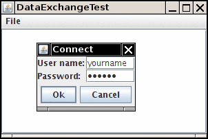
Your dialog box should provide methods to set default data. For example, the PasswordChooser class of the example program has a method, setUser, to place default values into the next fields:
Once you set the defaults (if desired), you show the dialog by calling setVisible(true). The dialog is now displayed.
The user then fills in the information and clicks the Ok or Cancel button. The event handlers for both buttons call setVisible(false), which terminates the call to setVisible(true). Alternatively, the user may close the dialog. If you did not install a window listener for the dialog, then the default window closing operation applies: The dialog becomes invisible, which also terminates the call to setVisible(true).
The important issue is that the call to setVisible(true) blocks until the user has dismissed the dialog. This makes it easy to implement modal dialogs.
You want to know whether the user has accepted or canceled the dialog. Our sample code sets the ok flag to false before showing the dialog. Only the event handler for the Ok button sets the ok flag to true. In that case, you can retrieve the user input from the dialog.
Transferring data out of a modeless dialog is not as simple. When a modeless dialog is displayed, the call to setVisible(true) does not block and the program continues running while the dialog is displayed. If the user selects items on a modeless dialog and then clicks “Ok,” the dialog needs to send an event to some listener in the program.
The example program contains another useful improvement. When you construct a JDialog object, you need to specify the owner frame. However, quite often you want to show the same dialog with different owner frames. It is better to pick the owner frame when you are ready to show the dialog, not when you construct the PasswordChooser object.
The trick is to have the PasswordChooser extend JPanel instead of JDialog. Build a JDialog object on the fly in the showDialog method:
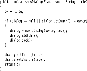
Note that it is safe to have owner equal to null.
You can do even better. Sometimes, the owner frame isn’t readily available. It is easy enough to compute it from any parent component, like this:
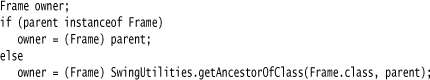
We use this enhancement in our sample program. The JOptionPane class also uses this mechanism.
Many dialogs have a default button, which is automatically selected if the user presses a trigger key (ENTER in most “look and feel” implementations). The default button is specially marked, often with a thick outline.
You set the default button in the root pane of the dialog:
dialog.getRootPane().setDefaultButton(okButton);
If you follow our suggestion of laying out the dialog in a panel, then you must be careful to set the default button only after you wrapped the panel into a dialog. The panel itself has no root pane.
Listing 9–16 is the complete code that illustrates the data flow into and out of a dialog box.
Listing 9–16. DataExchangeTest.java
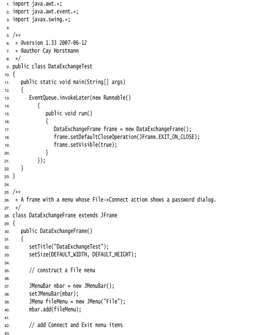
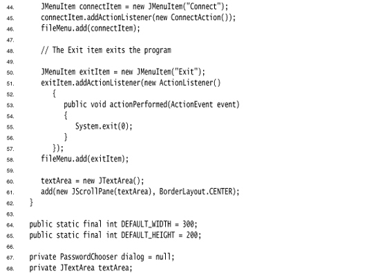
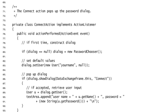
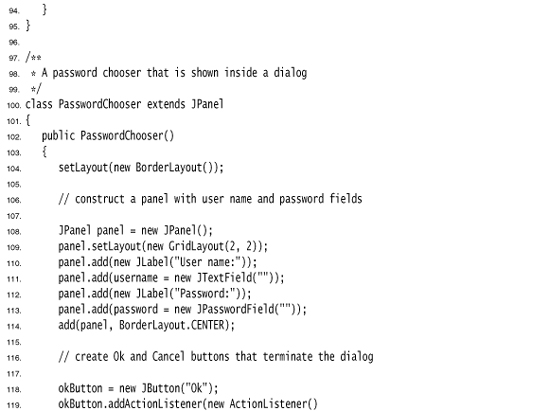
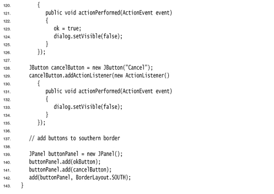
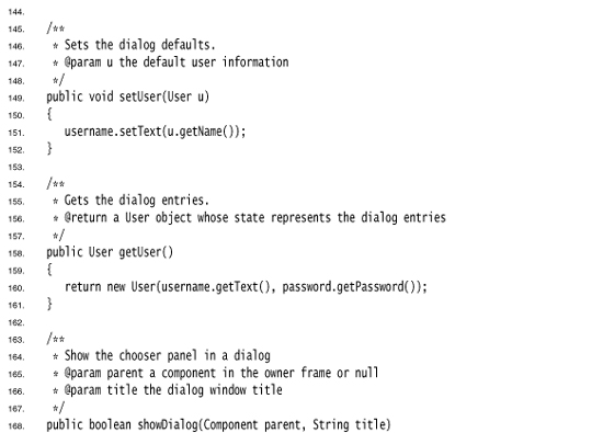
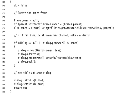
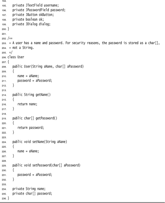
javax.swing.SwingUtilities 1.2
• Container getAncestorOfClass(Class c, Component comp)
• JRootPane getRootPane()
• void setDefaultButton(JButton button)
• boolean isDefaultButton()
File Dialogs
When you write an application, you often want to be able to open and save files. A good file dialog box that shows files and directories and lets the user navigate the file system is hard to write, and you definitely don’t want to reinvent that wheel. Fortunately, Swing provides a JFileChooser class that allows you to display a file dialog box similar to the one that most native applications use. JFileChooser dialogs are always modal. Note that the JFileChooser class is not a subclass of JDialog. Instead of calling setVisible(true), you call showOpenDialog to display a dialog for opening a file or you call showSaveDialog to display a dialog for saving a file. The button for accepting a file is then automatically labeled Open or Save. You can also supply your own button label with the showDialog method. Figure 9–40 shows an example of the file chooser dialog box.
Figure 9–40. File chooser dialog box
Here are the steps needed to put up a file dialog box and recover what the user chooses from the box:
1. Make a JFileChooser object. Unlike the constructor for the JDialog class, you do not supply the parent component. This allows you to reuse a file chooser dialog with multiple frames.
For example:
JFileChooser chooser = new JFileChooser();
Reusing a file chooser object is a good idea because the JFileChooser constructor can be quite slow, especially on Windows if the user has many mapped network drives.
2. Set the directory by calling the setCurrentDirectory method.
For example, to use the current working directory
chooser.setCurrentDirectory(new File("."));
you need to supply a File object. File objects are explained in detail in Chapter 12. All you need to know for now is that the constructor File(String filename) turns a file or directory name into a File object.
3. If you have a default file name that you expect the user to choose, supply it with the setSelectedFile method:
chooser.setSelectedFile(new File(filename));
4. To enable the user to select multiple files in the dialog, call the setMultiSelectionEnabled method. This is, of course, entirely optional and not all that common.
chooser.setMultiSelectionEnabled(true);
5. If you want to restrict the display of files in the dialog to those of a particular type (for example, all files with extension .gif), then you need to set a file filter. We discuss file filters later in this section.
6. By default, a user can select only files with a file chooser. If you want the user to select directories, use the setFileSelectionMode method. Call it with JFileChooser.FILES_ONLY (the default), JFileChooser.DIRECTORIES_ONLY, or JFileChooser.FILES_AND_DIRECTORIES.
7. Show the dialog box by calling the showOpenDialog or showSaveDialog method. You must supply the parent component in these calls:
int result = chooser.showOpenDialog(parent);
or
int result = chooser.showSaveDialog(parent);
The only difference between these calls is the label of the “approve button,” the button that the user clicks to finish the file selection. You can also call the showDialog method and pass an explicit text for the approve button:
int result = chooser.showDialog(parent, "Select");
These calls return only when the user has approved, canceled, or dismissed the file dialog. The return value is JFileChooser.APPROVE_OPTION, JFileChooser.CANCEL_OPTION, or JFileChooser.ERROR_OPTION
8. You get the selected file or files with the getSelectedFile() or getSelectedFiles() method. These methods return either a single File object or an array of File objects. If you just need the name of the file object, call its getPath method. For example:
String filename = chooser.getSelectedFile().getPath();
For the most part, these steps are simple. The major difficulty with using a file dialog is to specify a subset of files from which the user should choose. For example, suppose the user should choose a GIF image file. Then, the file chooser should only display files with extension .gif. It should also give the user some kind of feedback that the displayed files are of a particular category, such as “GIF Images.” But the situation can be more complex. If the user should choose a JPEG image file, then the extension can be either .jpg or .jpeg. Rather than coming up with a mechanism to codify these complexities, the designers of the file chooser supply a more elegant mechanism: to restrict the displayed files, you supply an object that extends the abstract class javax.swing.filechooser.FileFilter. The file chooser passes each file to the file filter and displays only the files that the file filter accepts.
At the time of this writing, two such subclasses are supplied: the default filter that accepts all files, and a filter that accepts all files with a given extension. Moreover, it is easy to write ad hoc file filters. You simply implement the two abstract methods of the FileFilter superclass:
public boolean accept(File f);
public String getDescription();
The first method tests whether a file should be accepted. The second method returns a description of the file type that can be displayed in the file chooser dialog.
An unrelated FileFilter interface in the java.io package has a single method, boolean accept(File f). It is used in the listFiles method of the File class to list files in a directory. We do not know why the designers of Swing didn’t extend this interface—perhaps the Java class library has now become so complex that even the programmers at Sun are no longer aware of all the standard classes and interfaces.
You will need to resolve the name conflict between these two identically named types if you import both the java.io and the javax.swing.filechooser package. The simplest remedy is to import javax.swing.filechooser.FileFilter, not javax.swing.filechooser.*.
Once you have a file filter object, you use the setFileFilter method of the JFileChooser class to install it into the file chooser object:
chooser.setFileFilter(new FileNameExtensionFilter("Image files", "gif", "jpg");
You can install multiple filters to the file chooser by calling
chooser.addChoosableFileFilter(filter1);
chooser.addChoosableFileFilter(filter2);
. . .
The user selects a filter from the combo box at the bottom of the file dialog. By default, the “All files” filter is always present in the combo box. This is a good idea, just in case a user of your program needs to select a file with a nonstandard extension. However, if you want to suppress the “All files” filter, call
chooser.setAcceptAllFileFilterUsed(false)
If you reuse a single file chooser for loading and saving different file types, call
chooser.resetChoosableFilters()
to clear any old file filters before adding new ones.
Finally, you can customize the file chooser by providing special icons and file descriptions for each file that the file chooser displays. You do this by supplying an object of a class extending the FileView class in the javax.swing.filechooser package. This is definitely an advanced technique. Normally, you don’t need to supply a file view—the pluggable look and feel supplies one for you. But if you want to show different icons for special file types, you can install your own file view. You need to extend the FileView class and implement five methods:
Icon getIcon(File f);
String getName(File f);
String getDescription(File f);
String getTypeDescription(File f);
Boolean isTraversable(File f);
Then you use the setFileView method to install your file view into the file chooser.
The file chooser calls your methods for each file or directory that it wants to display. If your method returns null for the icon, name, or description, the file chooser then consults the default file view of the look and feel. That is good, because it means you need to deal only with the file types for which you want to do something different.
The file chooser calls the isTraversable method to decide whether to open a directory when a user clicks on it. Note that this method returns a Boolean object, not a boolean value! This seems weird, but it is actually convenient—if you aren’t interested in deviating from the default file view, just return null. The file chooser will then consult the default file view. In other words, the method returns a Boolean to let you choose among three options: true (Boolean.TRUE), false (Boolean.FALSE), and don’t care (null).
The example program contains a simple file view class. That class shows a particular icon whenever a file matches a file filter. We use it to display a palette icon for all image files.
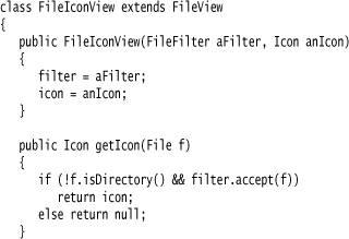
You install this file view into your file chooser with the setFileView method:
The file chooser will then show the palette icon next to all files that pass the filter and use the default file view to show all other files. Naturally, we use the same filter that we set in the file chooser.
You can find a more useful ExampleFileView class in the demo/jfc/FileChooserDemo directory of the JDK. That class lets you associate icons and descriptions with arbitrary extensions.
Finally, you can customize a file dialog by adding an accessory component. For example, Figure 9–41 shows a preview accessory next to the file list. This accessory displays a thumbnail view of the currently selected file.
Figure 9–41. A file dialog with a preview accessory
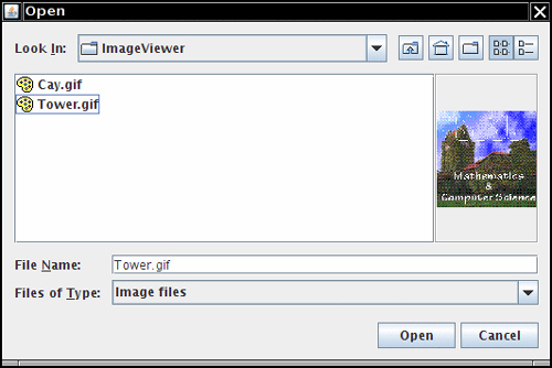
An accessory can be any Swing component. In our case, we extend the JLabel class and set its icon to a scaled copy of the graphics image:
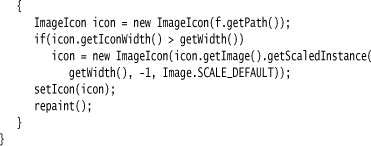
There is just one challenge. We want to update the preview image whenever the user selects a different file. The file chooser uses the “JavaBeans” mechanism of notifying interested listeners whenever one of its properties changes. The selected file is a property that you can monitor by installing a PropertyChangeListener. We discuss this mechanism in greater detail in Chapter 8 of Volume II. Here is the code that you need to trap the notifications:
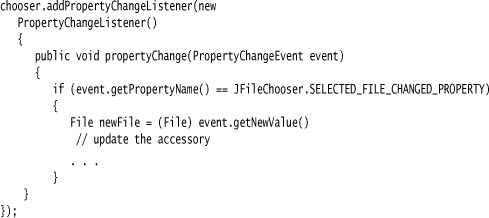
In our example program, we add this code to the ImagePreviewer constructor.
Listing 9–17 contains a modification of the ImageViewer program from Chapter 2, in which the file chooser has been enhanced by a custom file view and a preview accessory.
Listing 9–17. FileChooserTest.java
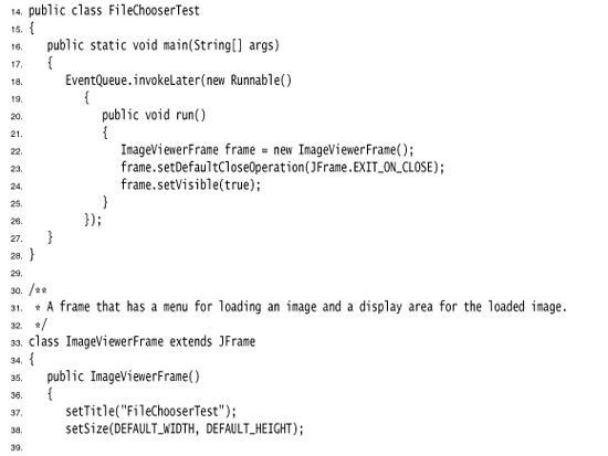
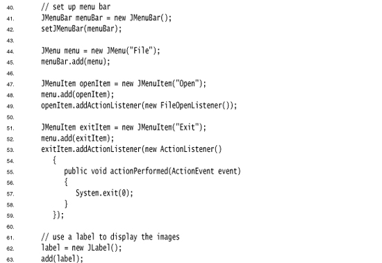
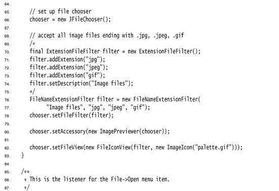
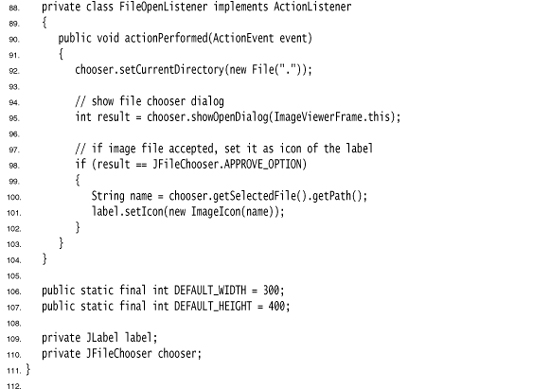
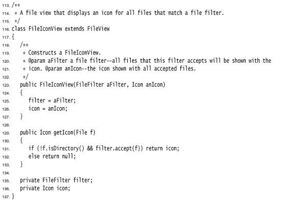
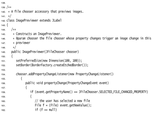
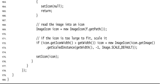
• JFileChooser()
• void setCurrentDirectory(File dir)
• void setSelectedFile(File file)
• void setSelectedFiles(File[] file)
• void setMultiSelectionEnabled(boolean b)
• void setFileSelectionMode(int mode)
• int showOpenDialog(Component parent)
• int showSaveDialog(Component parent)
• int showDialog(Component parent, String approveButtonText)
• File getSelectedFile()
• File[] getSelectedFiles()
• void setFileFilter(FileFilter filter)
• void addChoosableFileFilter(FileFilter filter)
• void setAcceptAllFileFilterUsed(boolean b)
• void resetChoosableFileFilters()
• void setFileView(FileView view)
• void setAccessory(JComponent component)
javax.swing.filechooser.FileFilter 1.2
• boolean accept(File f)
• String getDescription()
javax.swing.filechooser.FileNameExtensionFilter 6
• FileNameExtensionFilter(String description, String ... extensions)
javax.swing.filechooser.FileView 1.2
• String getName(File f)
• String getDescription(File f)
• String getTypeDescription(File f)
• Icon getIcon(File f)
• Boolean isTraversable(File f)
Color Choosers
As you saw in the preceding section, a high-quality file chooser is an intricate user interface component that you definitely do not want to implement yourself. Many user interface toolkits provide other common dialogs: to choose a date/time, currency value, font, color, and so on. The benefit is twofold. Programmers can simply use a high-quality implementation rather than rolling their own. And users have a common experience for these selections.
At this point, Swing provides only one additional chooser, the JColorChooser (see Figures 9–42 through 9–44). You use it to let users pick a color value. Like the JFileChooser class, the color chooser is a component, not a dialog, but it contains convenience methods to create dialogs that contain a color chooser component.
Figure 9–42. The Swatches pane of a color chooser

Figure 9–43. The HSB pane of a color chooser

Figure 9–44. The RGB pane of a color chooser

Here is how you show a modal dialog with a color chooser:
Color selectedColor = JColorChooser.showDialog(parent,title, initialColor);
Alternatively, you can display a modeless color chooser dialog. You supply the following:
• A parent component
• The title of the dialog
• A flag to select either a modal or a modeless dialog
• A color chooser
• Listeners for the “OK” and “Cancel” buttons (or null if you don’t want a listener)
Here is how you make a modeless dialog that sets the background color when the user clicks the OK button:
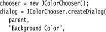
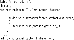
You can do even better than that and give the user immediate feedback of the color selection. To monitor the color selections, you need to obtain the selection model of the chooser and add a change listener:
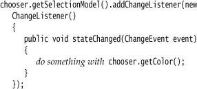
In this case, there is no benefit to the OK and Cancel buttons that the color chooser dialog provides. You can just add the color chooser component directly into a modeless dialog:
dialog = new JDialog(parent, false /* not modal */);
dialog.add(chooser);
dialog.pack();
The program in Listing 9–18 shows the three types of dialogs. If you click on the Modal button, you must select a color before you can do anything else. If you click on the Modeless button, you get a modeless dialog, but the color change only happens when you click the OK button on the dialog. If you click the Immediate button, you get a modeless dialog without buttons. As soon as you pick a different color in the dialog, the background color of the panel is updated.
Listing 9–18. ColorChooserTest.java
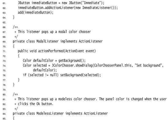
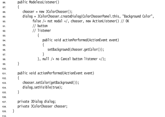
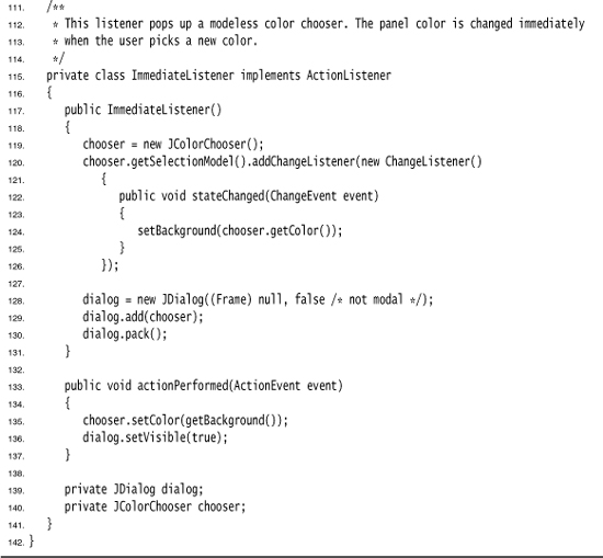
• JColorChooser()
• Color getColor()
• void setColor(Color c)
• static Color showDialog(Component parent, String title, Color initialColor)
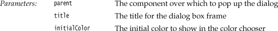
• static JDialog createDialog(Component parent, String title, boolean modal, JColorChooser chooser, ActionListener okListener, ActionListener cancelListener)
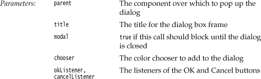
This ends our discussion of user interface components. The material in Chapters 7 through 9 showed you how to implement simple GUIs in Swing. Turn to Volume II for more advanced Swing components and sophisticated graphics techniques.