This chapter presents real-world case studies for implementing data science concepts. Three scenarios are considered: data science concepts for human emotion classification with EEG signals, image data, and Industry 4.0.
For human emotion classification, EEG signals of humans are extracted using a NeuroSky MindWave Mobile kit, and the EEG signals are received and analyzed in the Raspberry Pi. A NeuroSky MindWave Mobile kit and the Raspberry Pi can be connected via Bluetooth. In image data, data science steps are applied to preprocess the image data for further analysis. In the Industry 4.0 case study, the Raspberry Pi acts as a localized cloud. Here, many sensors are connected to the Raspberry Pi, and the signals from the sensors are converted to structured data for further analysis and visualization.
Case Study 1: Human Emotion Classification
An emotion is a feeling that is characterized by intense brain activity. A considerable amount of research has been focused on recognizing human emotions for a wide range of applications such as medical, health, robotics, and brain-computer interface (BCI) applications. There are a number of ways to recognize human emotions such as facial emotion recognition, tone recognition from speech signal, emotion recognition from EEG signals, etc. Among those, classification from EEG signals is a simple and convenient method. Also, EEG signals have useful information about human emotions. Thus, many researchers have focused on classifying human emotion using EEG signals. EEG signals are used to record the human brain activity by measuring electrical signals by placing electrodes on the scalp.
Let’s consider a simple emotion recognition system that uses a single electrode device, namely, a NeuroSky MindWave device for acquiring the EEG signals from participants and classifying their emotion as happy, afraid, or sad with the help of machine learning algorithms, namely, k-nearest neighbor (k-NN) and neural networks (NNs).
Methodology
The participants included are from different age groups, and they were subjected to the experiment separately by showing them images in different categories from the worldwide recognized database Geneva Affective Picture Database (GAPED). The images include images of babies, happy scenarios, animal mistreatments, human concerns, snakes, and spiders, each kindling different emotions in the participants. The dataset of features corresponding to the recorded EEG signals is then obtained for all the participants, and these features are then subjected to machine learning models like k-NN and NN, which classifies each signal into one of three emotions: happy, afraid, or sad.
Dataset
The two devices that are used for data collection are the NeuroSky MindWave Mobile device and a Raspberry Pi 3 board. The NeuroSky MindWave device can be used to safely record the EEG signals. The device consists of a headset, an ear clip, and a sensor (electrode) arm. The headset’s ground electrodes are available on the ear clip, whereas the EEG electrode is on the sensor arm that will rest on the forehead above the eye after putting on the headset. The device uses a single AAA battery, which can last for eight hours.
This device is connected to a Raspberry Pi 3 board via Bluetooth, as shown in Figure 9-1. It is a third-generation Raspberry Pi model that comes with a quad-core processor, 1GB of RAM, and a number of ports for connecting various devices. It also comes with wireless LAN and Bluetooth support, which can help to connect wireless devices like our MindWave Mobile. The software provided by the NeuroSky device vendor is installed on the Pi board to acquire the serial data from the device.
Figure 9-1
Raspberry Pi with MindWave Mobile connected via Bluetooth
Interfacing the Raspberry Pi with MindWave Mobile via Bluetooth
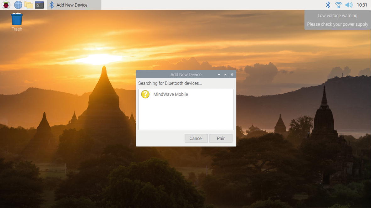
There are two ways to connect the MindWave Mobile with the Raspberry Pi. The first one is to connect the MindWave Mobile with the Raspberry Pi desktop. Initially switch on the Raspberry Pi, boot into the Raspberry Pi operating system, and then switch on the MindWave Mobile Bluetooth. Then click the Bluetooth symbol in the Raspberry Pi OS, which will show the devices that are ready to pair with the Raspberry Pi. In the list, the MindWave Mobile can be selected, and the pairing password 0000 as prescribed by the vendor can be used. Now, the MindWave Mobile device is paired with the Pi, as shown in Figure 9-2.
Figure 9-2
Raspberry desktop pairing with MindWave Mobile
The signals from the MindWave Mobile device can be extracted via this Bluetooth connection. Another way to connect the Raspberry with MindWave is by using Pypi 0.1.0. The steps are explained at https://github.com/cttoronto/python-MindWave-mobile. This link provides the data about alpha, beta, and gamma values of the brainwave signals. However, in this work, the dataset is developed from the EEG signals.
Data Collection Process
The participants are seated in a small, darkened room, which is also radio silent to prevent them from acoustic and visual disturbances. The terms and conditions are explained prior to the experiment, and they are instructed to stop the test if they have any discomfort. A manual score sheet was also provided to the participants to rate their emotions during each picture. There was a total of 15 participants, and 15 signals spread across three different emotions were recorded, thereby making a total of 15 × 3 = 45 EEG signals. The emotions were happy, afraid, and sad.
Initially, raw EEG signals were acquired from the user using a NeuroSky device. The raw EEG signal extracted from the brain cannot be directly used for further processing. As the subject is exposed to emotion stimulation based on the visual inputs for a specific duration, the resulting emotional reaction would be a time-varying one. It is essential therefore to identify the duration of peak activity of the brain and extract the features only for that duration so as to enhance the classification results. To achieve this, the recording is started exactly one minute after the start of experiment, which gives enough time to simulate the emotions of the participants using the image slides corresponding to the particular emotion. Also, to avoid dealing with large data, only 15 seconds of data with 512 samples per second are considered, thereby reducing the data size to just 15 × 512 =7680 samples, as illustrated in Figure 9-3. Figure 9-3 shows the signal for the entire duration of recording with the signal in the peak period of brain activity indicated in red, and Figure 9-4 shows this part separately.
Figure 9-3
Sample EEG signal for the entire recording duration
Figure 9-4
EEG signal extracted during peak activity of brain
Features Taken from the Brain Wave Signal
EEG signals are a rich source of brain function information. To get meaningful information from EEG signals, different attributes of the signals need to be extracted. A total of 9 different time domain attributes are extracted from the EEG signals, and these features are illustrated as follows.
The latency to amplitude ratio (LAR) is defined as the ratio of the maximum signal time to the maximum signal amplitude; see Equation 9-1.
(9-1)
Here, tsmax={t|s(t)=smax} is the time where the maximum signal value occurs, and smax=max{s(t)} is the maximum signal value.
The peak to peak signal value (PP) is defined as the difference between the maximum signal value and the minimum signal value and is shown in Equation 9-2.
spp = smax − smin (9-2)
Here, smax and smin are the signal maximum and minimum values, respectively.
The peak to peak time window (PPT) is defined as the difference between the maximum signal time and the minimum signal time and is shown in Equation 9-3.
tpp = ts max − ts min (9-3)
Here, ts max and ts min are the times at which the maximum and minimum signal values occur.
The peak to peak slope (PPS) is defined as the ratio of peak to peak signal value (PP) to the peak to peak time value (PPT) and is shown in Equation 9-4.
(9-4)
Here, spp is the peak to peak signal value, and tpp is the peak to peak time window.
The signal power (P) is defined as the signal that exists for infinite time for constant amplitude. The signal power is shown in Equation 9-5.
(9-5)
The mean value of signal (μ) is defined as the average of data samples between the end points of the selected area and displays the average value. The mean value of signal is given in Equation 9-6.
(9-6)
where N is total number of samples in signals.
Kurtosis (K) is the sharpness of the peak of a frequency-distribution curve and is given in Equation 9-7.
(9-7)
Here, m4 and m2 is the fourth moment and variance of signal.
Mobility (M) is defined as the ratio of first-order variance of signal to the variance of the signal and is given in Equation 9-8.
(9-8)
Complexity (C) is defined as the first derivative of mobility divided by mobility and is given in Equation 9-9.
(9-9)
The Python code for all these formulas for the nine time domain features is written as a single function that is later called in the main program. This function, which takes 15 seconds of EEG signal during the peak emotional activity of brain and the corresponding time samples, is illustrated here:
Now that we have a function to extract features from the EEG signal, the next step is to develop the code to get a structured dataset. First, the EEG signals of all 15 participants corresponding to three different emotions are loaded one by one using the pd.read_csv function inside a for loop. After an EEG signal is loaded as a dataframe, the timestamp is removed first, and then the amplitude values in the remaining column are converted to a NumPy array. The array obtained in each iteration is then stacked to a new variable thereby providing a final array consisting of 45 columns corresponding to the 45 different EEG signals. Then each column of this array is passed to the eegfeat function created earlier that provides nine features corresponding to each column (each signal) there by providing a final feature array of size 9×45. The dataset is given in Table 9-1 and saved as emotion_data1.xls in an Excel sheet. Finally, the features are scaled using the StandardScaler and fit function in the sklearns module. This scaling works by first computing the mean and standard deviation of each feature for all the 45 signals and then subtracting the mean from all the values and dividing this difference by the standard deviation. The following code illustrates the feature extraction process:
To check the shape of the data, use the following code:
print(emotion_data.shape)
Output:
(45, 10)
By using the below code, the datatypes in the emotion data can be displayed.
print(emotion_data.dtypes)
Output:
LAR float64
PP int64
PPT float64
PPS float64
Power float64
Mean float64
Kurtosis float64
Mobility float64
Complexity float64
Emotion Label object
dtype: object
The modifications in the dataset include dropping the columns and changing the data using the exploratory data analysis section in Chapter 8.
Figure 9-5 shows the visualization of a histogram of the mean data in the emotion dataset.
Figure 9-5
Histogram of mean for each emotion
Classifying the Emotion Using Learning Models
The next step after extracting the features is to apply a classification algorithm to identify the emotion corresponding to the signals. Since we are already aware of the emotions corresponding to each of the signals we have used, it is obviously better to go for a supervised learning algorithm for classification. Before that, another important task is to split our data into training and testing data. Out of the 15 signals for each emotion, let’s consider the data corresponding to first 12 signals for training and the data corresponding to the remaining 3 signals for testing. Also, the labels corresponding to the training and testing data should be created. For this, we are going to label the emotion happy as 1, fear as 2, and sad as 3. This splitting of data as well as the labels is illustrated in the following code:
Let’s first use the k-NN algorithm to classify the emotions based on the data. k-NN is a simple supervised machine learning algorithm that categorizes the available data and assigns new data to a particular category based on a similarity score. The k-NN algorithm works by finding the distance between the test data and the training data. After finding the distance to each training data, the training data is sorted in ascending order of the distance values. In this ordered data, the first k data is selected, and the algorithm will assign the most frequent label occurring in this to the test data. The Euclidean distance is the most commonly used distance measure for the k-NN algorithm, and the distance between two data points, xi and yi, is given by the following expression:
The k-NN classification is implemented using the KNeighborsClassifier package in the sklearn Python module. The emotion classification code using this package is illustrated here:
from sklearn.neighbors import KNeighborsClassifier
from sklearn.metrics import confusion_matrix, classification_report
classifier = KNeighborsClassifier(n_neighbors=16)
classifier.fit(x_train.T, y_train)
y_pred = classifier.predict(x_test.T)
cm=confusion_matrix(y_test, y_pred)
print("confusion matrix
",cm)
print("Accuracy:",(sum(np.diagonal(cm))/9)*100)
Output:
confusion matrix
[[1 0 2]
[1 2 0]
[2 0 1]]
Accuracy: 44.44444444444444
The parameter n_neighbors in the previous code indicates the value of k, which we have selected as 16. Therefore, 16 neighbors are considered for making the classification decision. First, the distance between the test data and all the other training data is computed. Then the training data points are sorted in ascending order of the computed distance. In the sorted data, the labels corresponding to the first 16 data are considered, and the label that occurs more out of the 16 is assigned to the test data. This is repeated for all nine test signals (three for each emotion), and the results are displayed using a confusion matrix, which could be better understood using the information in Table 9-2.
Table 9-2
Confusion Matrix for Emotion Classification Using k-NN
Happy
Fear
Sad
Happy
1
0
2
Fear
1
2
0
Sad
2
0
1
In the confusion matrix, the row headers can be treated as inputs, and column headers can be treated as outputs. For instance, if we consider the first row, only one of the three EEG signals corresponding to the “happy” emotion is identified correctly, and the remaining two signals are wrongly classified as “sad” emotion. Similarly, in the second row, two signals corresponding to the “fear” emotion are classified correctly, and in the third row, one signal corresponding to the “sad” emotion is identified correctly. To understand better, the diagonal elements in the confusion matrix represent the data that is classified correctly, and the remaining elements indicate misclassification. In total, four out of the nine test signals are classified correctly. giving the system an accuracy of 44.44 percent.
Case Study 2: Data Science for Image Data
Though digital equipment available today can capture images at a higher resolution and with more details than human vision, computers can only treat those images as an array of numerical values that represents colors. Computer vision refers to the techniques that can enable computers to understand digital images and videos. Computer vision systems can be thought of as a replication of the human vision system, enabling computers to process images and videos in the same way humans do. Computer vision systems are used in many applications such as face recognition, autonomous vehicles, healthcare, security, augmented reality, etc.
The first step in any computer vision system is to capture the images of interest. This can be done by many means such as cameras, microscopes, X-ray machines, radar, etc., depending on the nature of application. The captured raw images, however, cannot be used directly and require further processing. The raw images may not be of the desired quality due to the noise introduced by various reasons. It is therefore essential to enhance the captured raw images before further processing. To enable the computer to learn from the images, it is sometimes essential to extract useful information from the image using analysis techniques. In this section, we will see how to capture images using a camera interfaced to a Raspberry Pi board and discuss the steps involved in preparing the raw images for further processing.
The first step is to interface a USB web camera to our Raspberry Pi board, as shown in Figure 9-6.
Figure 9-6
Raspberry Pi with webcam
To do this, we have to enable SSH and Camera in the Pi configuration settings. Secure Shell (SSH) can help to connect with the Raspberry Pi remotely over your local network, whereas enabling the Camera configuration can help to interface a webcam with the Pi board. This can be done with the following steps:
1.
Type the command sudo raspi-config in the Terminal window of your Raspberry Pi OS. This will open the Software Configuration Tool window, as shown in Figure 9-7.
2.
Go to Interfacing Options, as shown in Figure 9-8, and enable both SSH and Camera.
3.
Reboot the Raspberry Pi device.
Figure 9-7
Software Configuration Tool window
Figure 9-8
Interfacing options for enabling Camera and SSH
Once the reboot is completed, run the lsusb command in the Terminal window and check whether the connected USB webcam is listed. Then open the Python IDE and type the following code to capture and save an image using the webcam:
import cv2
import pandas as pd
import numpy as np
import matplotlib.pyplot as plt
camera=cv2.VideoCapture( )
ret, img = camera.read( )
cv2.imwrite('image.png',img)
img= cv2.cvtColor(img,cv2.COLOR_BGR2RGB)
plt.imshow(img)
plt.axis('off')
plt.show( )
As shown in the code, the OpenCV package is used to work with images in Python. To capture an image, a VideoCapture object is created first. The read() function is used to capture the image using the created object and then stored in a variable 'img'. The captured image can then be saved using the imwrite() function. OpenCV displays an image in BGR format instead of the standard RGB format. Therefore, the image is first converted to an RGB image using the cv2.color function before displaying. To display the image, the imshow() function in the Matplotlib package can be used. Since the plots created with this package are enabled with an axis value by default, it is essential to remove the axis while displaying images. This can be done by setting the axis function in the Matplotlib package to the off state. Figure 9-9 shows a sample image captured using the previous code.
Figure 9-9
Image captured using a webcam interfaced to the Raspberry Pi board
Exploratory Image Data Analysis
The image shows a few stationary objects lying on white paper. To understand the acquired image data, it would be better to print the data type and size of the image, as illustrated here:
print(type(img))
print(img.shape)
Output:
<class 'numpy.ndarray'>
(719, 1206, 3)
The captured image is a NumPy array. The image captured using the webcam is usually in RGB form where there are three planes of pixels: Red, Blue, and Green. In other words, each pixel in the image is composed of three values that represent the proportion of red, blue, and green thereby leading to various colors in the visible spectrum. The number 3 in the shape of the image printed indicates the three planes; i.e., the image is composed of three planes corresponding to RGB, each with a size of 719× 1206 pixels. In many applications, other details such as edges, shapes, etc., in the image are more important than the color information. For instance, if our objective is to identify the stationary objects in the given image, the shape of the objects would be more important than the color. In such cases, the three-plane RGB image can be converted to a single-plane grayscale image using the following code:
gray = cv2.cvtColor(img, cv2.COLOR_BGR2GRAY)
plt.imshow(gray,cmap= 'gray')
plt.axis('off')
plt.show( )
print(gray.shape)
Output:
(719, 1206)
Figure 9-10 shows a single-plane grayscale image where the colors in the image are removed. This can be seen from the size of the image printed in the previous code. Now the size of the grayscale image is just 719×1206 in a single plane. In some cases, the captured image may have some missing values caused by defects in the image sensor. These values may be reflected in the grayscale image as well, and these values can be detected and treated by converting the image to a dataframe, as illustrated here:
df=pd.DataFrame(gray)
s=df.isnull( ).sum( ).sum( )
print(s)
if s!=0:
df=df.ffill(axis=0)
gray=df.to_numpy( )
Output:
0
The isnull( ) function can be used to detect the presence of missing values along the rows and columns of the image. The sum( ) function can be used to count the number of missing values in the dataframe along rows and columns. If the result of the sum( ) function is not equal to zero, then the image consists of missing values, and they can be treated using the ffill( ) function, which replaces each missing value with the pixel above it. This method of forward filling or backward filling will not cause any visible changes in the image because pixel values are often closely placed in an image except at edges in the image. As shown from the previous code, the number of missing values is 0; i.e., there are no missing values in the image. Once the image is checked and treated for missing values, the dataframe can be converted back to a NumPy array using to_numpy( ) in Pandas. Since the pixel values are closely placed, there may be repetition of same pixel values at many regions in the image. Because of this property, identification of duplicate values is irrelevant in the case of the image data.
Figure 9-10
Image converted to grayscale
Using a USB webcam or the Pi camera in natural lighting may often result in poor-quality images. So, the next step after treating missing values is to plot the histogram of the image. The histogram plot will give an idea about the contrast of the image, as shown in Figure 9-11. This is illustrated in the following code:
plt.hist(gray.ravel( ),bins=256)
plt.xlabel('bins')
plt.ylabel('No of pixels')
plt.show( )
Figure 9-11
Histogram of the grayscale image
The pixel values in a grayscale image range from 0 (representing black) to 255 (representing white). The hist( ) function in the previous code plots a bar chart of the count of each pixel value in this range. This plot gives insight about the contrast of the image that we are dealing with. Figure 9-7 shows the histogram of our grayscale image. It can be seen that the majority of the pixels are in the range (120,160). If the spread of pixels is concentrated in the lower bins, then we have a low-contrast image, and vice versa. So, depending on this plot, a decision can be made as to whether the image needs contrast adjustment.
The other cause for the poor quality of images may be the presence of noise induced by various factors. These noises can be visually perceived, while observing the captured images, in the form of grains. In such cases, these noises have to be removed before going for further processing. There are many different kinds of noises such as Gaussian noise, salt and pepper noise, etc., and there are many different types of filters that can be used to remove those noises that are beyond the scope of this book. Let’s just look at one particular filter used often in image processing called the averaging filter. It is a low-pass filter that can be used to remove high-frequency content from a digital image. This filtering works by passing a kernel of particular size, say 3×3, across the dimensions of the image, taking the average of all the pixels under the kernel area and replacing the central element with this average. The overall effect is to create a blurring effect. The following code illustrates the implementation of averaging filter to our image. Figure 9-12 shows the image obtained after filtering.
blur=cv2.blur(gray,(3,3))
plt.imshow(blur)
plt.axis('off')
plt.show( )
Figure 9-12
Image obtained by average filtering
Preparing the Image Data for Model
Once the preprocessing steps are completed, the next step is to analyze or prepare the image for a learning model. This can be done in two ways. The first way is to extract features that represent useful information and use them for modeling. The features extracted may be another transformed image, or they may be attributes extracted from the original image. There are numerous features that can be extracted from an image, and the selection of a particular feature depends on the nature of our application. A discussion of these numerous features is beyond the scope of this book. Instead, we will discuss one particular feature: edge detection.
Edges represent the high-frequency content in an image. Canny edge detection is an algorithm that uses a multistage approach to detect a wide range of edges in images. It can be implemented in Python by using the Canny( ) function in OpenCV, as illustrated in the following code. Figure 9-13 shows the image after the edge detection process.
edge_img=cv2.Canny(gray,100,200)
plt.imshow(edge_img,cmap='gray')
plt.axis('off')
plt.show( )
Figure 9-13
Image after edge detection
The second way is to directly feed the image to a deep learning model. Deep learning is a popular machine learning approach that is being increasingly used for analyzing and learning from images. This approach can directly learn the useful information from the image and does not require any feature extraction. The image may be resized to a different shape and then fed to the learning model, or the image array may be converted to a one-dimensional vector and then fed to the model.
Object Detection Using a Deep Neural Network
Object detection is a technique for identifying the objects in the real world like a chair, book, car, TV, flowers, animals, humans, etc., from an image or video. This technique detects, identifies, and recognizes multiple objects in an image for better understanding or for extracting the information from a real-world environment. Object detection plays a major role in computer vision applications like autonomous vehicles, surveillance, automation in industries, and assistive devices for visually impaired people. Many modules are available in the Python environment for object detection, and they are as follows:
Here, we have used a single-shot multibox detector to identify the multiple objects in an image or video. Single-shot multibox detectors were proposed by C. Szegedy et al. in November 2016. SSD can be explained as follows:
Single shot: In this stage, localization and classification of the image are done with the help of a single forward-pass network.
Multibox: This represents drawing the bounding boxes for multiple objects in an image.
Detector: This is an object detector that classifies the objects in an image or video.
Figure 9-14 shows the architecture of a single-shot multibox detector.
In the architecture, the dimension of the input image is considered as 300×300×3. The VGG-16 architecture is used as a base network, and the fully connected networks are discarded. The VGG-16 architecture is popular and has a strong classification ability with the transfer learning technique. Here, a part of the convolutional layers of the VGG-16 architecture is used in the earlier stages. A detailed explanation of SSD is available at https://towardsdatascience.com/understanding-ssd-multibox-real-time-object-detection-in-deep-learning-495ef744fab.
The multibox architecture is a technique for identifying the bounding box coordinates and is based on two loss functions such as confidence loss and location loss. Confidence loss uses a categorical entropy for measuring the confidence level of identifying the objects for the bounding box. Location loss measures the distance of the bounding box, which is away from the object in the image. For measuring the distance, the L2 norm is used. The multibox loss can be measured with the help of the following equation:
Multi-box loss=confidence Loss+α* Location Loss
This gives information about how far the bounding box landed from the predicted objects. The following code implements the SSD configure file with the DNN weights for detecting the objects in COCO names. The SSD configure file (i.e., ssd_mobilenet_v3_large_coco_2020_01_14.pbtxt) with the DNN weights (i.e., frozen_inference_graph.pb) for detecting the objects in COCO names can be downloaded from https://github.com/AlekhyaBhupati/Object_Detection_Using_openCV.
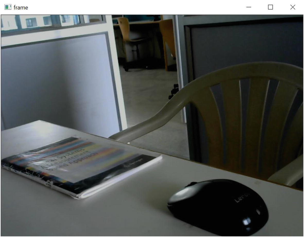
COCO names are called common objects in this context, and the dataset for the COCO names is available at the official website: https://cocodataset.org/#home. COCO has segmented common objects such as chair, car, animals, humans, etc., and these segmented images can be used to train the deep neural network. See Figure 9-15 and Figure 9-16.
When the code is executed, the frames in the video from the webcam are captured using the OpenCV capture functions. Then, each and every frame is inserted into the already trained SSD-DNN model for identifying the objects. The SSD-DNN model classifies the objects based on the COCO names and creates a bounding box on the detected images with a COCO name label and accuracy. The video file of Figure 9-15 was fed as the input to the previous program. The figure has the objects such as a chair, a book, and a mouse. From Figure 9-16, it can clearly be concluded that the SSD-based DNN model identifies the three objects with an accuracy of 72.53 percent for the chair, 67.41 percent for the book, and 81.52 percent for the mouse.
Case Study 3: Industry 4.0
Industry 4.0 represents the fourth revolution in the manufacturing industry. The first revolution in industry (i.e., Industry 1.0) was the creation of mechanical energy with the help of steam power to increase the productivity in assembly lines. The second revolution (i.e., Industry 2.0) incorporated electricity into the assembly line to improve productivity. The third revolution (i.e., Industry 3.0) incorporated computers for automating the industrial process. Currently, Industry 4.0 is adopting computers, data analysis, and machine learning tools for making intelligent decisions or monitoring the process with the help of data that is acquired with sensors. The Internet of Things (IoT) has recently played a major role in acquiring data and transmitting it for remote access.
Figure 9-17 describes the basic process flow in Industry 4.0. Initially, the physical system’s data is collected with the help of sensors and made into a digital record. Then the digital record of the physical systems is sent to a server system for real-time data processing and analysis. The data science techniques are applied in this stage for preprocessing and preparing the data. Then modern learning algorithms can be used for intelligent decision-making by predicting the output with the learned model. Moreover, visualization techniques are used to monitor the real-time data of the physical systems. Here, the Raspberry Pi can be used as a server or a localized cloud for real-time data processing.
Figure 9-17
Industry 4.0 block diagram
Raspberry Pi as a Localized Cloud for Industry 4.0
To implement Industry 4.0, a sophisticated computer is required to connect the devices, collect the data, and process the data. The collected data can be stored in a cloud service for further processing. However, these days, subscriptions of cloud services are costlier and suitable for highly profitable companies. Small-scale companies will want to implement a localized cloud for real-time processing. Further, a localized cloud approach can provide data security because it’s on-site and attackers are not able to invade via remote access.
As discussed in Chapter 3, the Raspberry Pi can act as a localized cloud that can connect sensors, IoT devices, other nearby computers, and mobile phones, as shown in Figure 9-18. Sophisticated computers also can act as a localized cloud, but they occupy a large space. Also, it is difficult to implement the computers in remote areas. The Raspberry Pi has the advantage of occupying less space and can be implemented in remote areas. Based on this, the Raspberry Pi is used as a localized cloud for the Industry 4.0 framework, as shown in Figure 9-19.
Figure 9-18
The Raspberry Pi as a localized cloud
Figure 9-19
Industry 4.0 framework with the Raspberry Pi
There are three modules available in the Industry 4.0 framework with the Raspberry Pi. The modules are collecting the data from the sensors, collecting the information using cameras, and connecting the Raspberry Pi with other computers.
Collecting Data from Sensors
We will use the temperature and humidity sensor to measure the temperature and humidity. Connect the DHT 11/22 sensor module to the Raspberry Pi, as shown in Chapter 3. The following code collects the temperature and humidity percentage for 100 seconds and stores the collected data as a CSV file.
import Adafruit_DHT
import time
from datetime import datetime
DHT_SENSOR = Adafruit_DHT.DHT11
DHT_PIN = 17
data = []
while _ in range(100):
humidity, temperature = Adafruit_DHT.read(DHT_SENSOR, DHT_PIN)
if humidity is not None and temperature is not None:
Timestamped Data from the Humidity and Temperature Sensors
17/05/2020 01:05:14
26.24
69.91
17/05/2020 01:10:14
26.24
70.65
17/05/2020 01:15:14
26.22
68.87
17/05/2020 01:20:14
26.15
70.11
17/05/2020 01:25:14
26.11
69.02
Preparing the Industry Data in the Raspberry Pi
We will use a dataset consisting of two columns of data recorded from the temperature and humidity sensor connected to a Raspberry Pi board; the data was recorded every 5 minutes over a duration of 28 hours. So, the dataset is essentially time-series data in .csv format. It is always better to get an understanding of the dataset before doing preprocessing. Therefore, the first step will be to read the file and print the contents, as illustrated here:
From the first five entries of the dataset printed, it is clear that the data needs to be cleaned before we start analyzing it. The first two columns consisting of the date and time of the entry are not needed for the analysis, and hence those columns can be dropped. The third and fourth columns consisting of the actual data are a mix of string and numbers. We have to filter out these inappropriate values and convert the dataset from string to float. These two operations can be performed as illustrated here:
The next step is to check for missing data in both columns. As discussed earlier, the missing data is normally in the form of NaN, and the function isna() from the Pandas package can be used to detect the presence of such data. The function where() from the NumPy data can be used along with the function isna() to get the location of the missing values in the respective columns, as illustrated here:
As we can see from the previous result, there is missing data in both the temperature column and the humidity column, and the location of the missing data is the same in both columns. The next step will be to treat the missing values. The method of treating the missing values can vary depending on the nature of data. In our dataset, since we are have temperature and humidity values measured every five minutes, it is safe to assume that there will not be much variation over the range of the missing values. Therefore, the missing values can be filled using the ffill method, which stands for “forward fill” where the missing values are replaced by the values in the previous row. This can be implemented using the fillna() function in the Pandas package. After the implementation of this filling process, this can be verified by using the isna().any() function, which will return false if there are no missing values in any of the columns, as illustrated here:
Now that the missing values are treated, the next step is to look for outliers in the data. For this, let’s use the Z-score we discussed earlier. Before computing the Z-score, the entries in the dataset should be converted to integers. The following code illustrates the detection and removal of outliers using the Z-score:
from scipy import stats
z=np.abs(stats.zscore(dataset))
df1=dataset[z>3]
print(df1)
dataset=dataset[(z<3).all(axis=1)]
Output:
Temperature Humidity
47 9.0 140.0
157 37.0 12.0
It can be seen from the previous illustration that there are two outliers corresponding to the row indices of 47 and 57. Rather than removing the outliers that correspond to the data points with a Z-score greater than 3, we retain all the data points with a Z-score less than 3.
Exploratory Data Analysis for the Real-Time Sensor Data
We discussed some of the fundamental plots used frequently by data scientists and demonstrated each plot with some readily available datasets. In this section, we are going to demonstrate some plots using real-time sensor data. Let’s take the same temperature and humidity sensor data that we used in Chapter 5 to discuss the concepts of preparing the data. As we already went through all the data cleaning steps in that chapter, the same code is provided here for preparing the data before going for plots:
Now that the data cleaning process is complete, the next step is to plot the data. The type of plot to be used depends on the nature of data as well as the requirements of the analysis procedure. Since we have taken the measurements of temperature and humidity over a duration of 28 hours, it is ideal to plot them with respect to time. But, to get a better understanding of the variation of these two parameters, the average value is taken every four hours, and these averages are plotted using a bar plot. If we want to visualize the distribution of temperature and humidity over the entire duration rather than their variation, then the range of temperature and humidity can be divided into bins, and a count of the values in each bin can be used to make a pie chart. These three types of plots are illustrated as follows:
# Taking average over every 4 hours
a=dataset.shape[0]
b=[]
c=[]
for i in np.arange(0,a-(a%12),48):
b.append(np.mean(dataset.Temperature[i:i+47]))
c.append(np.mean(dataset.Humidity[i:i+47]))
# Temperature vs Time over 28 hours
plt.subplot(221)
plt.plot(np.linspace(0,28,a),dataset.Temperature)
plt.title('Temperature vs Time')
# Humidity vs Time over 28 hours
plt.subplot(222)
plt.plot(np.linspace(0,28,a),dataset.Humidity)
plt.title('Humidity vs Time')
#Bar plot of average temperature over every 4 hours during the 28 hours
plt.subplot(223)
x=['1','2','3','4','5','6','7']
plt.bar(x,b)
plt.title('Average temperature over every 4 hours')
#Bar plot of average humidity over every 4 hours during the 28 hours
In Figure 9-20, the first two plots show the distribution of temperature and humidity where every sample of the data is plotted along the time axis, which is indicated in hours. We can see that the temperature and humidity are inversely proportional as expected. But the distribution over time is better expressed by taking the average of the samples every four hours and plotting the data in a bar chart, as shown in the third and fourth figures. The fifth and sixth figures show pie charts that focus on the distribution of temperature and humidity rather than their variation over time. Since the sensor data is recorded for only 28 hours, there will not be large variations in the data, and hence only four bins are used to plot the distribution. From these two figures, we can see that the temperature is mostly in the range of 15 to 20 during those 28 hours, and the humidity is mostly in the range of 19 to 25, respectively.
Figure 9-20
Variation and distribution of temperature and humidity
Report Generation by Reading Bar Codes Using Vision Cameras
Today many industries have documented their products with the help of barcodes and QR codes. Information about the product can be printed on the product for easy identification and documentation. Dedicative bar/QR code scanners are available on the market, but it requires human effort to scan the bar/QR code on the products. This may decrease productivity on the assembly line. Nowadays, vision systems are employed to automatically scan the bar/QR code on the products. This will improve productivity by eliminating the human effort and by reducing the time on the assembly line. Hence, a camera can be interfaced with the Raspberry Pi to scan the bar/QR code of the products on the assembly line.
We already discussed how to enable cameras on the Raspberry Pi in case study 2 of this chapter (refer to case study 2 for the steps to interface a webcam with the Raspberry Pi). The following code [30] continuously collects the images of the product on the assembly line, identifies the bar/QR code in the image, decodes the information in the bar/QR code, and displays the decoded information on the image screen.
# import the required packages
from imutils.video import VideoStream
from pyzbar import pyzbar
import argparse
import datetime
import imutils
import time
import cv2
# construct the argument parser and parse the arguments
The previous code acquires an image using a webcam and captures each and every frame using a while loop. Further, the frames are displayed continuously with the help of an infinite while loop. The 'q' key is used to break the infinite while loop. Then, the image acquisition can be released with the help of cap.release. In the program, each acquired frame is fed to the pyzbar module to identify the bar/QR code in the image and also to decode the data in the bar/QR code [30]. The decoded information is displayed in the corresponding frame. Figure 9-21 shows the output of the program.
Figure 9-21
Output of barcode and QR code scanner
Transmitting Files or Data from the Raspberry Pi to the Computer
In some scenarios, the data in the Raspberry Pi needs to be shared with nearby computers. Also, if the Raspberry Pi is somewhere else, it needs to be accessed via remote access. Many ways are available to transfer the data from the Raspberry Pi to other computers. One of the easiest and more efficient ways is to use the VNC viewer for sharing data and for remote access. VNC is the graphical desktop sharing application that allows you to control one system (i.e., the Raspberry Pi) from another system via remote access. This section discusses the installation procedure and usage of the VNC viewer for sharing files and controlling the Raspberry Pi from a remote desktop computer using VNC.
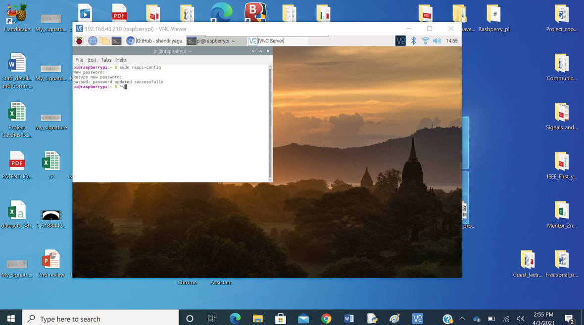
To install the VNC in Pi, the following code is used in the command window in the Raspberry Pi, as shown in Figure 9-22:
Installation of the VNC viewer in the Raspberry Pi
Meanwhile, VNC viewers need to be installed on a remote desktop computer. If the remote desktop computer has a different operating system (OS), VNC is compatible with all the OSs. After installing the VNC on the Pi, we have to enable the VNC server in the Raspberry Pi. The VNC server can be enabled graphically in the Raspberry Pi by following these steps:
1.
Go to the Raspberry Pi graphical desktop, and select Menu ➤ Preferences ➤ Raspberry Pi Configuration. The Raspberry Pi Configuration window will open, as shown in Figure 9-23.
Figure 9-23
Graphically enabling the VNC server on the Pi
2.
In the Raspberry Pi Configuration window, choose the Interfaces option and ensure that VNC is enabled. If VNC is not enabled, choose the Enable button in the window.
3.
After, enabling the VNC server, click the VNC logo in the upper-right corner of the Raspberry Pi graphical desktop. The VNC viewer app window will open. In it, the IP address of the Raspberry Pi is displayed, as shown in Figure 9-8. The IP address should appear only if the Raspberry Pi is connected to a network. Here, the Raspberry Pi is connected via a WiFi network using a WiFi dongle/mobile phone hotspot.
These procedures are for creating a private connection between a remote desktop with the Raspberry Pi. To create a private connection, both the remote desktop and the Raspberry Pi are connected in the same network. This will create a connection only within the campus of the company. If the user wants to upload the data to the cloud, then the user needs to sign in to the VNC viewer for connecting the Pi with the remote desktop, which can be anywhere in the world.
By opening the VNC viewer in another remote desktop, as shown in Figure 9-24, the IP address of the Raspberry Pi is entered at the space provided, and the VNC server establishes the connection between the computer and the Raspberry Pi. The login window will open, as shown in Figure 9-25, and ask for the username and password.
Figure 9-24
VNC viewer in Raspberry Pi
Figure 9-25
Establishing a connection from a desktop to the Pi using the VNC viewer
Typically, the username and password for the Raspberry Pi is pi. Enter pi for the username and password, and the Raspberry Pi desktop will appear on the remote desktop computer, as shown in Figure 9-26.
Figure 9-26
Raspberry Pi graphical desktop on the remote computer
Now, the Raspberry Pi desktop can access other computers remotely. Also, the files and data in the Raspberry Pi can be shared by using the file sharing option in the VNC viewer, as shown in Figure 9-27.


 (9-1)
(9-1) (9-4)
(9-4) (9-5)
(9-5)![$$ mu =frac{1}{N}sum limits_{i=1}^Nsleft[i
ight] $$](https://imgdetail.ebookreading.net/202109/3/9781484268254/9781484268254__9781484268254__files__images__496535_1_En_9_Chapter__496535_1_En_9_Chapter_TeX_IEq4.png) (9-6)
(9-6) (9-7)
(9-7) (9-8)
(9-8) (9-9)
(9-9)


 in the upper-right corner of the Raspberry Pi graphical desktop. The VNC viewer app window will open. In it, the IP address of the Raspberry Pi is displayed, as shown in Figure 9-8. The IP address should appear only if the Raspberry Pi is connected to a network. Here, the Raspberry Pi is connected via a WiFi network using a WiFi dongle/mobile phone hotspot.