Exploratory data analysis(EDA) is the process of understanding the data by summarizing its characteristics. This step is important before modeling the data for machine learning. From this analysis, the user can extract the information, identify the root cause of any issues in the data, and figure out the steps to initiate any policies for development. In simple terms, this type of analysis explores the data to understand and identify the patterns and trends in it. There is no common method for doing EDA; it depends on the data we are working with. For simplicity in this chapter, we will use common methods and plots for doing EDA.
Choosing a Dataset
To do the EDA, we’ll use the Boston housing dataset that can be imported from the Scikit-Learn library. This dataset was already described in Chapter 6. This dataset contains 506 samples under 13 different feature attributes such as per capita crime rate by town (CRIM), average number of rooms per dwelling (RM), index of accessibility to radial highways (RAD), etc., and a target attribute MEDV indicates the median value of owner-occupied homes in the thousands.
1.
Import the required libraries.
The first step is to load the required libraries for doing the EDA. In this chapter, we will use the packages such as Pandas, NumPy, and Matplotlib for plotting:
import matplotlib.pyplot as plt
import numpy as np
from sklearn.datasets import load_boston
2.
Import a dataset.
The Boston housing dataset can be imported from the Scikit-Learn library and saved as the boston_data variable, as given in the following code:
dataset = load_boston()
The more important thing is that most of the open source data is stored in a comma-separated format. This comma-separated format has difficulties fetching and analyzing the data. Thus, the comma-separated data can be converted into a dataframe using the Pandas package in Python.
Check the information about the data in a dataset.
Before doing data analysis, checking the information such as the data type and size of the data, describing the data, and knowing the amount of data available in a dataset are important steps because sometimes the numerical values in the dataset may be stored as string data types. It is difficult to plot and analyze numerical values stored as the string data type, so the string data type that is numerical should be converted into integers for better analysis. The size of the dataset can be viewed with the help of the following code:
boston_data.shape
Output:
(506, 13)
This output shows that the dataset has 506 rows and 13 columns. In other words, we can say that the dataset has 506 samples with 13 features.
Then, the information about the dataset can be viewed with the help of the following code:
boston_data.info()
Output:
<class 'pandas.core.frame.DataFrame'>
RangeIndex: 506 entries, 0 to 505
Data columns (total 13 columns):
# Column Count Non-Null Dtype
--- ------ -------------- -----
0 CRIM 506 non-null float64
1 ZN 506 non-null float64
2 INDUS 506 non-null float64
3 CHAS 506 non-null float64
4 NOX 506 non-null float64
5 RM 506 non-null float64
6 AGE 506 non-null float64
7 DIS 506 non-null float64
8 RAD 506 non-null float64
9 TAX 506 non-null float64
10 PTRATIO 506 non-null float64
11 B 506 non-null float64
12 LSTAT 506 non-null float64
dtypes: float64(13)
memory usage: 51.5 KB
boston_data.dtypes
Output:
CRIM float64
ZN float64
INDUS float64
CHAS float64
NOX float64
RM float64
AGE float64
DIS float64
RAD float64
TAX float64
PTRATIO float64
B float64
LSTAT float64
dtype: object
Moreover, with the help of describe() function, we can see the distribution of data such as minimum values, maximum values, mean, etc. The description of the Boston data can be viewed using the following code:
max 88.976200 100.000000 27.740000 ... 22.000000 396.900000 37.970000
Modifying the Columns in the Dataset
Modifications in the data such as removing unnecessary columns, adding dummy columns, dropping duplicate columns, encoding the column, and normalizing the data are required if the dataset needs to have preprocessing done. Dropping the unnecessary columns is more important when many columns are not used for analysis. Dropping those columns is the better solution to make the data lighter and reliable. Dropping the unnecessary columns in the Boston dataset can be done with the following code:
Identifying duplicates, dropping the duplicates, and detecting outliers were already discussed in the previous chapters.
Statistical Analysis
A better understanding of the data at hand can go a long way in simplifying the job of a data scientist, and this is where statistics can come in handy. Statistics can provide the tools necessary to identify structures in the data, and such insights can prove to be valuable in building a model to best fit our data. The role of statistics with respect to data can vary from simple analysis to creating self-learning models. In this section, we will introduce the various types of distributions, statistical measures of data, and ways to fit data to distributions.
Before discussing distributions, let’s first understand how data is associated with probability. When we consider a dataset, it normally represents a single sample from a population. For instance, if we have a dataset consisting of the height and weight of all the students in a school, the model developed from this data after some statistical analysis can be used to predict the height and weight of students from another school. The dataset in our hand is just one sample, whereas the population may consist of as many schools.
The numerical data that we encounter may be continuous or discrete in nature. The difference between the two is that the continuous data may take any value, whereas the discrete data can take only certain values. For example, data such as the number of cars manufactured per day, the number of feedback received from customers, etc., are discrete in nature, whereas data such as height, weight, humidity, temperature, etc., represents continuous data.
Probability distributions, a fundamental concept in statistics, provide a way to represent the possible values taken by a random variable and the respective probabilities. The probability mass function (PMF) denotes the discrete probability distribution, and the probability density function (PDF) denotes the continuous probability distribution. Some of the common distributions that a data scientist needs to be aware of are discussed in the following section.
Uniform Distribution
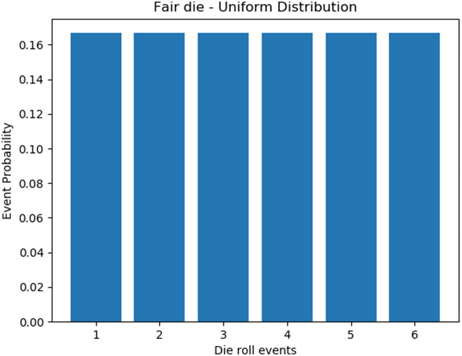
Uniform distribution, also called a rectangular distribution, has a constant probability. In other words, all the outcomes have the same probability of occurrence. The number of outcomes in the case of uniform distribution may be unlimited. The most common example for a uniform distribution is the roll of a fair die, where all six outcomes have an equal probability of 1/6. Let’s illustrate uniform distribution by plotting the probabilities of the outcomes for the fair die experiment. In other words, the probabilities of occurrence for each face of the die are equally likely. Figure 7-1 shows the distribution plot.
import numpy as np
import matplotlib.pyplot as plt
probabilities = np.full((6),1/6)
events = [1,2,3,4,5,6]
plt.bar(events,probabilities)
plt.xlabel('Die roll events')
plt.ylabel('Event Probability')
plt.title('Fair die - Uniform Distribution')
plt.show()
Figure 7-1
Uniform distribution of fair die experiment
If a histogram plot is made for a dataset by dividing the numerical data into a number of bins and all the bins are found to have equal distribution, then the dataset can be said to be uniformly distributed.
Binomial Distribution
As the name suggests, this distribution is used when there are only two possible outcomes. A random variable X that follows a binomial distribution is dependent on two parameters:
The number of trials n in the case of binomial distribution must be fixed, and the trials are considered to be independent of each other. In other words, the outcome of a particular trial does not depend on the outcomes of the previous trials.
There are only two possible outcomes for each event: success or failure. The probability of success, say p, remains the same from trial to trial.
Therefore, the binomial distribution function in Python normally takes two values as inputs: the number of trials n and the probability of success p. To understand binomial distribution, let’s look at the common experiment of tossing a coin:
from scipy.stats import binom
import matplotlib.pyplot as plt
import numpy as np
n=15 # no of times coin is tossed
r_values = list(range(n + 1))
x=[0.2,0.5,0.7,0.9] #probabilities of getting a head
k=1
for p in x:
dist = [binom.pmf(r, n, p) for r in r_values ]
plt.subplot(2,2,k)
plt.bar(r_values,dist)
plt.xlabel('number of heads')
plt.ylabel('probability')
plt.title('p= percent.1f' percentp)
k+=1
plt.show()
In the previous code, we have 15 trials for tossing the coin. The probability of getting a head remains the same for each trial, and the outcome of each trial is independent of the previous outcomes. The binomial distribution is computed using the binom.pmf function available in the stats module of the scipy package. The experiment is repeated for different probabilities of success using a for loop, and Figure 7-2 shows the resulting distribution plot.
Figure 7-2
Binomial distribution for tossing a coin 15 times
Figure 7-2 shows the binomial distribution for our coin toss experiment for different probabilities of success. The first subplot shows the binomial distribution when the probability of getting a head is 0.2. This implies that there is a 20 percent chance of getting a head. Twenty percent of 15 tosses is 3, which implies that there is a high probability of getting three heads in 15 tosses. Hence, the probability is at a maximum of 3. It can be seen that the binomial distribution has a bell-shaped response. The response is skewed to the left when the probability of success is low and shifts to the right with an increase in probability, as illustrated in the rest of the subplots.
Binomial distribution can be encountered in various domains of data science. For instance, when a pharmaceutical company wants to test a new vaccine, then there are only two possible outcomes: the vaccine works or it does not. Also, the result for an individual patient is an independent event and does not depend on other trials for different patients. Binomial distribution can be applied to various business issues as well. For example, consider people working in the sales department making calls all day to sell their company’s products. The outcome of the call is whether a successful sale is made or not, and the outcome is independent for each worker. Similarly, there are many other areas in a business with binary outcomes where binomial distribution can be applied, and hence it plays an important role in business decision-making.
Normal Distribution
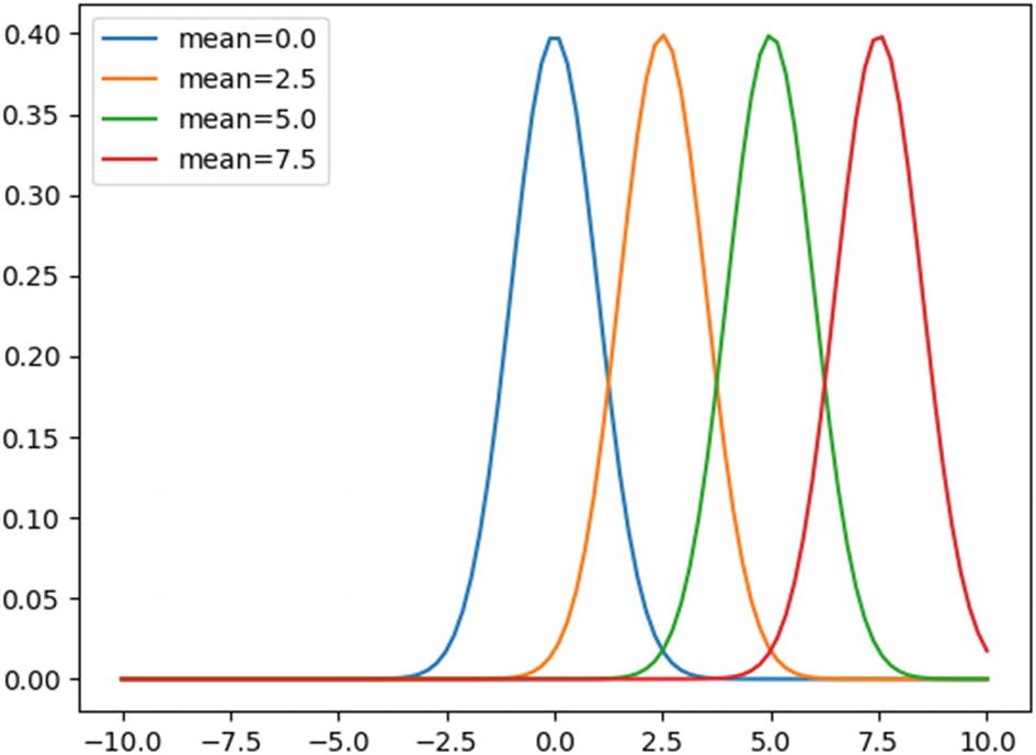
Normal distribution, also known as Gaussian distribution, is normally a bell-shaped curve centered at the mean where the probability is the maximum, and the probability reduces the further we move from the mean. This implies that the values closer to the mean occur more frequently, and the values that are further away from the mean occur less frequently. This distribution is dependent on two parameters: the mean (μ) of the data and the standard deviation (σ). The probability density function (pdf) for a normal distribution can be given as follows:
To illustrate the pdf function, consider the following code. An array x with 100 values in the range of -10 to 10 is created, and the pdf function of x is computed using the norm.pdf function in the stats module of the scipy package. The pdf function is computed for four different values of mean 0, 2.5, 5, and 7.5 using a for loop. If the mean value is not given, the norm.pdf function takes a default value of zero.
from scipy.stats import norm
import matplotlib.pyplot as plt
import numpy as np
mean=[0.0,2.5,5,7.5] # mean values for the normal distribution
x=np.linspace(-10,10,100) # array of 100 numbers in the range -10 to 10
for m in mean:
y=norm.pdf(x,loc=m)
plt.plot(x,y,label='mean= %.1f' %m)
plt.xlabel('x')
plt.ylabel('pdf(x)')
plt.legend(frameon=True)
plt.show()
Figure 7-3 shows that the normal distribution produces a bell-shaped curve that is centered on the mean value. That is, the curve is at the maximum at the point of mean, and it starts decreasing on either side as we move away from the mean value. Note that we have not specified the value of standard deviation. In that case, the norm.pdf function takes the default value of 1.
Figure 7-3
Normal distribution plot for different mean values
Similarly, let’s keep the value of the mean as constant and plot the distribution for different values of standard distribution using the following code:
from scipy.stats import norm
import matplotlib.pyplot as plt
import numpy as np
stdev=[1.0,2.0,3.0,4.0] # standard deviation values for the normal distribution
x=np.linspace(-10,10,100)
for s in stdev:
y=norm.pdf(x,scale=s)
plt.plot(x,y,label='stdev= %.1f' %s)
plt.xlabel('x')
plt.ylabel('pdf(x)')
plt.legend(frameon=True)
plt.show()
From Figure 7-4, we can see that all four curves are centered at the default mean value of zero. As the value of standard deviation σ is increased, the density is distributed across a wide range. In other words, the distribution of data is more spread out from the mean as the standard deviation value is increased and there is a high likelihood that more observations are further away from the mean.
Figure 7-4
Normal distribution plot for different values of standard deviation
An important property of the normal distribution that makes it an important statistical distribution for data scientists is the empirical rule. According to this rule, if we divide the range of observations in the x-axis in terms of standard deviation, then approximately 68.3 percent of the values fall within one standard deviation from the mean, 95.5 percent of the values fall within two standard deviation, and 99.7 percent of the values fall within three standard deviations, respectively. This empirical rule can be used for identifying outliers in the data if the data can be fit to a normal distribution. This principle is used in the Z-score for outlier detection, which we discussed earlier in Chapter 5.
Statistical Analysis of Boston Housing Price Dataset
Let’s take the Boston housing price dataset and try to identify the best features that can be used to model the data based on the statistical properties of the features. As we have already discussed, the Boston dataset consists of 13 different features for 506 cases (506 × 13). In addition to these features, the median value of owner-occupied homes (in the thousands) denoted by the variable MEDV is identified as the target. That is, given the 13 different features, the median value of a house is to be estimated. The features from the dataset are first converted to a dataframe using the Pandas package. Then the target variable is added to the last column of this dataframe, making its dimension 506 × 14. This is illustrated in the following code:
Once we have the data in hand, the best way to go about it is to plot the histogram of all the features so that we can get an understanding of the nature of their distribution. Rather than plotting the histogram of each feature individually, the hist function in the Pandas package can be used to plot them all in one go, as illustrated here:
fig, axis = plt.subplots(2,7,figsize=(16, 16))
boston_data.hist(ax=axis,grid=False)
plt.show()
From Figure 7-5, we can see that the distribution of the target variable MEDV is like a normal distribution.
Figure 7-5
Histogram plots of the Boston dataset features
Further, if we observe all the other parameters, the distribution for the parameter RM (which denotes the average number of rooms per dwelling) is also similar to the target MEDV. Therefore, the RM can definitely be used for modeling the dataset. Also, the parameters DIS (weighted mean of distances to five Boston employment centers) and LSTAT (percentage of lower status of the population) have similar distribution. The distribution of the parameter AGE (proportion of owner-occupied units built prior to 1940) is exactly the opposite of these two parameters. The rest of the parameters have less significant distribution compared to the target parameter. Since these three parameters seem to be related either positively or negatively, it is pointless to use all three for building the model. So, we have to see which of these three parameters are related to our target variable MEDV. The best way to do this is to measure the correlation between these parameters using the corr function in the Pandas package, as illustrated here:
cols=['RM','AGE','DIS','LSTAT','MEDV']
print(boston_data[cols].corr())
RM AGE DIS LSTAT MEDV
RM 1.000000 -0.240265 0.205246 -0.613808 0.695360
AGE -0.240265 1.000000 -0.747881 0.602339 -0.376955
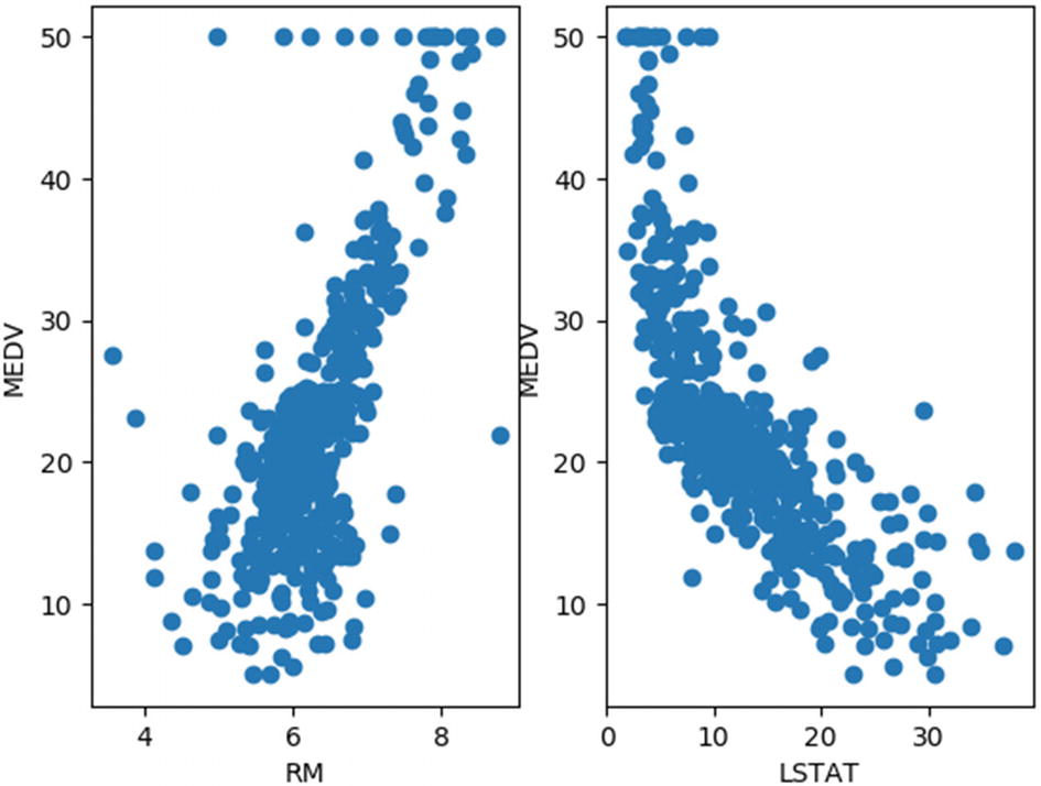
From these results, it can be seen that the diagonal elements are all 1s, which implies maximum correlation, and they represent the self-correlation values. If we look at the row corresponding to our target parameter MEDV, we can see that RM is positively more correlated with MEDV as we judged earlier looking at the histogram distribution. It can be also seen that the parameter LSTAT is negatively more correlated with MEDV, which implies that there will be an inverse relationship between these two parameters. A scatter plot of RM and LSTAT against MEDV, respectively, would give us a better understanding of this relationship, as illustrated here:
Figure 7-6 confirms our conclusions derived using the distribution graphs and the correlation values. It can be seen that RM and MEDV are positively correlated; i.e., the median value of owner-occupied homes increases with an increase in the average number of rooms per dwelling. Similarly, it can be seen that LSTAT and MEDV are negatively correlated; i.e., the median value of the owner-occupied home drops with an increase in the percentage of a lower status of population. Therefore, these two parameters are good choices to model the Boston housing dataset. It can also be seen from the figure that there are some outliers in the RM versus MEDV plot, which could be treated using the techniques discussed in Chapter 5 before further processing.