CAUSIN’ SOME TROUBLE: BREAKING EVERY RULE IN THIS BOOK
Don’t expect theory to determine how things look.
MICHAEL ROCK/DESIGNER AND EDUCATOR / Principal, 2x4, New York
Rules in graphic design exist as guidelines that provide context for evaluating work and serve to help designers avoid problems that interfere with communication. Hopefully, if you’ve spent time reviewing the material in the preceding chapters, you’ll see that most of these so-called rules make pretty good sense.
——
It is often said, however, that rules are made to be broken, and this is never truer than in design. No two projects are alike: Every project comes with different requirements; different ideas to be expressed; very specific kinds of content that demand lateral thinking; and often, audiences with very particular needs. Further, a designer’s personal point of view and formal sensibility are valid sources for visualization in their own right. No design approach should ever be considered out of bounds—“Thou shalt not, on pain of death!”—so long as (one might argue) the end result is clear and compelling communication.
——
It’s important for designers to evaluate the pros and cons of following a certain rule on a case-by-case basis. If adhering to the rule is creating a problem, test to see what will happen when the rule is broken. Some rules are less flexible than others, and there is likely to be a trade-off when breaking any rule: something will be gained, and something will be lost. The designer must decide whether the sacrifice is acceptable and ultimately be prepared to accept the consequence of the decision. Becoming confident enough in one’s understanding of how the rules of visual language really work takes time; once that happens, a designer can take new liberties in the way he or she approaches visualizing their projects and enjoy the process of experimentation. Some of the greatest innovations in visual communication happen when designers knowingly—and intelligently—throw the rule book away.
Sometimes, the content needs to speak with as little interference as possible. This is true in the case of pure information design—in forms, for example, where the content’s only requirement is to be understood very easily—but might also be true for other project types, as well. Being neutral and having no concept—presenting content very directly and efficiently, refining legibility and hierarchy, and using color and material to craft a refined artifact—is a concept unto itself. This approach can result in a quickly accessible, informative, and functionally user-centric experience, which is not without its appeal.
01
HAVE A CONCEPT

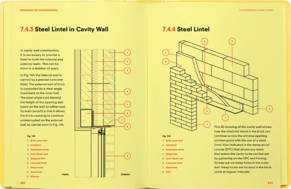
The design of this trade book approaches its subject as information to be delivered in a clear, concise, and neutral way—letting the content speak for itself. It is, after all, an instructional volume. The restrained presentation allows the book’s readers to access the content without interference.
CONOR & DAVID / IRELAND

02
COMMUNICATE—DON’T DECORATE
When the message warrants it, use form willy-nilly, without regard for its meaning. This, in itself, might be interpreted as a message and—on rare occasions—that message is appropriate as part of a design solution. A project concerning Baroque or Victorian aesthetics, for example, might very well benefit from extremely decorative treatments that would otherwise constitute a crime against nature.

A kaleidoscopic collage of varied form languages and image elements capture the experimental energy of a hip cultural event. Rather than attempt to parse the visual language for meaningful content, viewers will absorb the imagery’s exuberant color and movement to interpret an appropriate feeling.
VICTOR MATIK / ITALY
03
BE UNIVERSAL
Always tailor the message to the audience. For a subculture whose expectations of visual messaging are very specific—a hip-hop website, as opposed to a large-scale, general-public branding campaign—using visual metaphor, idiosyncratic stylistic treatments of type or image, and color that references their shared context will resonate more powerfully than images and color that are designed to speak to the world at large.
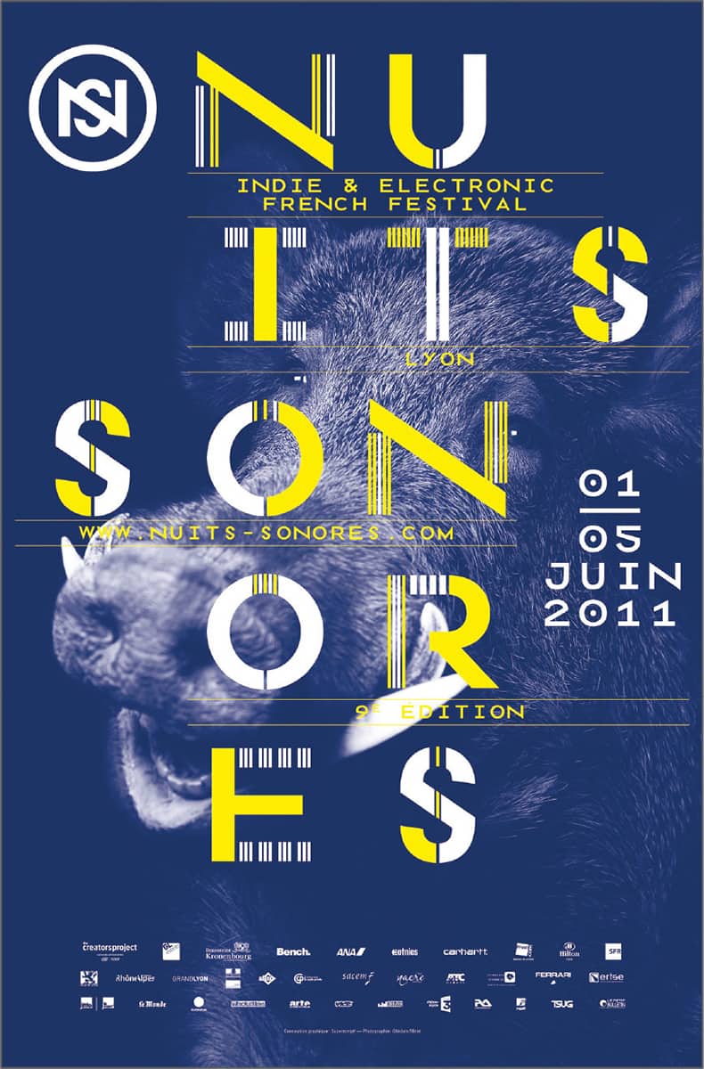
The audience targeted by this poster is young and interested in messages that speak to them obliquely, pose questions rather than answer them, or suggest ideas that may be antiestablishment, or discussed only within small segments of the population. While the formal manipulation of the type suggests some relationship to electronica, the image of the wild boar is a conceptual message inserted to provoke a reaction.
SUPERSCRIPT / FRANCE
04
SPEAK WITH ONE VISUAL VOICE
The quickest way to draw attention to a particular element is to make it different from everything else around it, and this can be highly effective as a communication strategy. Disharmony among visual elements, whether stylistic, compositional, or chromatic, is also a message unto itself.
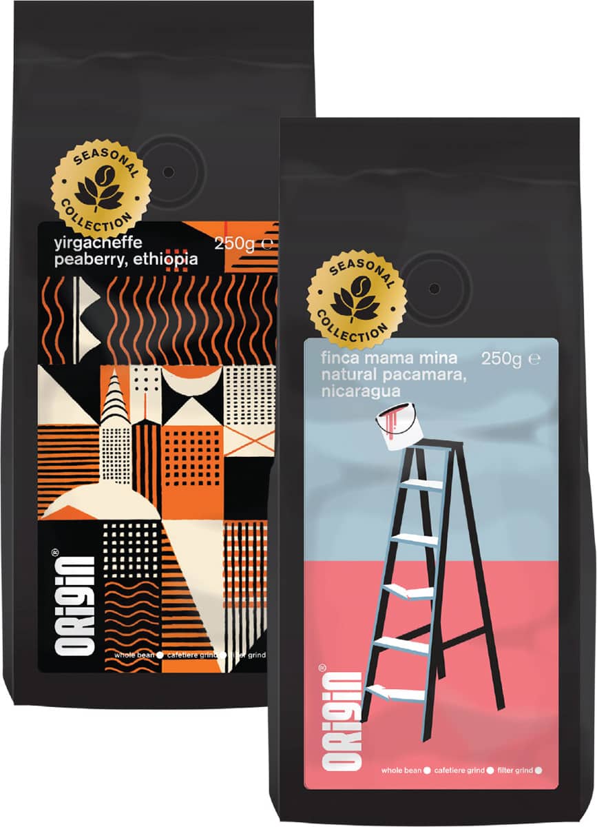
Unified by their shape and bold, black exteriors, these packages of coffee are each given a radically different style of illustration to more clearly differentiate each roast. In one sense, the consistent change of the visual language in each package becomes a kind of system unto itself.
A-SIDE / UNITED KINGDOM
05
LEARN TO LIVE WITH LESS
By all means, add extra stuff if it helps the message. Intricate, complicated, maze-like arrangements of form, even though somewhat daunting at first, will appeal to specific audiences. Including apparently unrelated forms or images, or creating an overload of form or texture, may add an important subtext that, in the end, helps support the project’s intent.

This poster trades on the vernacular of 19th-century circus posters and Hatch Show prints, invoking the busy, “undesigned” aesthetic of those predecessors to create a metaphorical context for a cultural event. The addition of multiple clusters of text information at different sizes, in different styles, together with overlapping images and surreal details captures the romance of the circus and its carnival-like multitasking quality of entertainment.
THE NATIONAL GRID [JONTY VALENTINE, MAX LOZACH, AND LUKE WOOD] / NEW ZEALAND
06
CREATE SPACE—DON’T FILL IT
Okay, there’s no good way to break this rule. An absence of negative space is a disaster and always will be. That said, allowing visual material in particular segments of a project to overwhelm the compositional space—on occasion, in response to other segments in which negative space is used liberally—can be an excellent strategy for introducing dramatic rhythm and helping focus attention on special material.
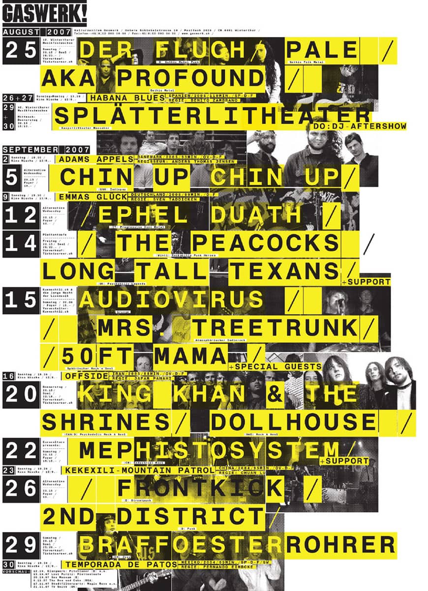
Similar to other examples presented in this section, this poster promotes its subject—alternative music performances, in this case—to a very specific, subcultural audience. The explosive rhythm of yellow, black, and white type and blocks of color that just about fills the poster’s format edge to edge conveys the visceral quality of the experience to be had and the wall of sound that attendees will expect.
HI [MEGI ZUMSTEIN+CLAUDIO BARANDUN] / GERMANY
07
GIVE ’EM THE ONE-TWO PUNCH
Presenting a multitude of items for simultaneous consideration gets the information out front quickly, leaving the viewers to decide what is most interesting or important at a particular moment—making them participate in getting the information, rather than handing it to them on a plate. If they have to work for it, they might enjoy it and remember it more easily later.

As a metaphor for a particular season’s fashion collection that celebrates repurposing of design gestures and materials, this advertising poster delivers multiple levels of information simultaneously—in essence, the scattering of image and text elements takes on the quality of detritus to be picked through as a source for ideas and style.
RÉGIS TOSETTI / UNITED KINGDOM
08
BEWARE OF SYMMETRY
Symmetry evokes a set of classical, Old World, elitist messages; it can, therefore, be powerfully exploited for formal, historical, and serious material—and as a foil to more dynamic content. Tension between spatial intervals, density and openness, and light and dark becomes critical in maintaining visual activity so that the symmetry becomes elegant, lively, and austere, rather than heavy handed, stiff, and dull.

The designer of this poster very skillfully navigates its symmetry and counters any potential static presentation with pattern and icon elements that are confrontationally large and introduce compositional tension; further, the patterns are distributed to the left and right of the central axis in alternating hues of different value and temperature, drawing the eye inward and outward from the axis with different degrees of emphasis.
DENNIS KOOT / NETHERLANDS
09
FIGHT THE FLATNESS
Proceed with caution. The primary danger here is causing viewers to disengage because it is the illusion of depth and movement that creates wonderment and makes them forget that they’re looking at a designed communication. Static arrangements of material, however, can be very focused and restful, an alternative to dramatic movement and deep spatial illusion, and in that sense can be useful at times. Optically flat arrangements can provide visual punctuation to aggressive presentation, and contrasting moments of focus and introspection. A pronounced lack of spatial experience creates an altogether different feeling in a project and, when it makes sense for the message, is quite appropriate.

Gigantic, flat semicircles and rectangles of white and black carve out a dramatic shape cluster in this poster that carves out the title and punches the illusory depth into an almost singular plane—and punches the viewer in the proverbial gut with its unapologetic and joyous confrontation. Small details created by negative spaces introduce rhythmic tension between the large forms.
SAWDUST / UNITED KINGDOM
10
PICK COLORS ON PURPOSE
Being more or less random—choosing colors whose usual association purposely conflicts with expectation—is a viable method that can achieve some surprising results. After a time, choosing color using familiar methods yields combinations that may be somewhat expected or, worse, completely uninteresting. Purposely selecting color combinations that feel awkward or disharmonious often presents unexpected options that somehow retain chromatic relationships. Additionally, a random color choice might sometimes aid in communication, depending on the nature of the project. Seeming randomness, like other messages, can be valid given the concept the designer intends to convey.
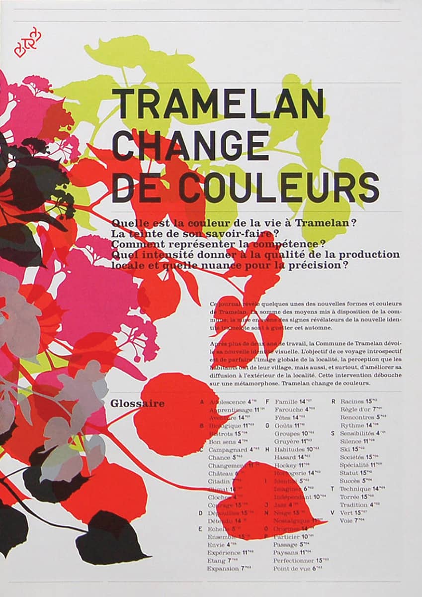
The designers of this publication—part of a European city’s branding program—chose colors not so much at random, but in terms of defaults: the process colors magenta and yellow, combined with two tones of black. The overlap of the red ink on the yellow ink—which has been slightly adjusted toward a greener hue—creates a jarring, random-like chromatic jumble, in concert with the middle-value neutral gray.
ONLAB / GERMANY
11
LESS COLOR IS MORE
As with all the rules, be careful and considerate when breaking this one—and always for a reason of communication. A firestorm of thousands of hues, of differing values and intensities, may not yield a specific color idea that viewers can commit to memory, but the experience of being overwhelmed by uncontrolled extravagance is surely not easily forgotten.
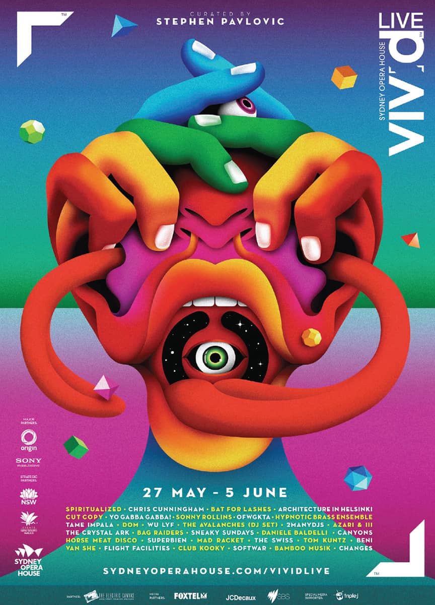
Rich, vibrant hues that transition through every part of the spectrum work to create a vividly sensuous support for the surreal illustration in this poster. One effect of the candy-like saturation and multiplicity of hues is that the image becomes possibly less threatening than it might be if it were rendered in a limited palette.
LA BOCA / UNITED KINGDOM
12
MASTER THE DARK AND THE LIGHT
A tonally quiet, soft presentation in which contrast between light and dark (or temperature and intensity) is minimized can be very effective in garnering attention, helping to separate viewers from surrounding, more active, visual activity. Low-contrast images and typography are perceived as more contemplative and elegant, rather than urgent or aggressive.

An extremely low-contrast range of dark-value tones creates a smoky, dreamlike nocturnal experience that reflects a theme of the fashion event that this poster promotes: “noir” or blackness. Although the poster’s typography is reversed out to white, it is of such small scale that it nearly is absorbed into the surrounding fields of gray, darker gray, and black texture. Adding a taste of luxury (as well as exacerbating the low-contrast near invisibility of the imagery), the poster is printed on a highly reflective metallic paper stock.
TSTO / FINLAND
13
FRIENDLY TYPE IS GOOD TYPE
As you might guess, the relative accessibility of type greatly depends on the message being conveyed. Making portions of type illegible, overbearing, aggressive, sharp and dangerous, nerve-wracking, or fragile is perfectly acceptable—indeed, preferable—when the job calls for it. There is no excuse for typography that doesn’t viscerally communicate in an appropriate way, even if this means frightening, frustrating, or confusing viewers in service of the right concept.

And—all of these attributes are present in this poster, which promotes a film festival that gives special attention to the work of directors who explore dark and disturbing themes. The typography may, in fact, be read by focusing on the boundaries where the individual lines of text meet, to find a kind of anchoring point; or, by viewing the poster from extreme angles so that the perspective renders the type more regular in appearance (much like crosswalk warnings printed in the street). The notion of “extreme viewing angle,” however, as well as the filmstrip like flicker, both communicate more about the poster’s subject than does the text itself.
RAF VANKAMPENHOUDT + JORIS VAN AKEN / NETHERLANDS
14
USE TWO FONTS, MAXIMUM
Complex text, with a great many parts, will be clarified by strong, varied changes in type style. Sometimes, you’ll need many different typefaces working together to create a kind of busy texture that conveys something important. Thinking outside the type box can be difficult, especially if you’re comfortable with a select set of typefaces: So take a deep breath, close your eyes, and click the font list at random.

This stylishly elegant magazine spread derives much of its beauty from the contrasts in width, weight, structural changes, and detailing within an astutely considered mix of some ten typefaces.
VRUCHTFLEES / NETHERLANDS
15
TREAT TYPE AS YOU WOULD IMAGE
There are always times when typography needs to shut up and get out of the way—especially when the type accompanies cataloged artwork or is acting in support of images that are carrying the brunt of the communication burden. In such instances, treat the type as quietly and as neutrally as possible. Even so, carefully consider its size, spacing, and stylistic presentation.

To prevent this book cover’s titling type from overpowering the fire image—which is presented quietly in a dithered texture and with relatively diminished contrast—the designers chose a lightweight sans serif and low-reflection metallic foil that would cause it to sink elegeantly into the surface. The type’s elegantly restrained quality is ehanced by a simple, flush left arrangement.
FINEST MAGMA / GERMANY
16
AVOID REDUNDANT REDUNDANCIES
The breaking of this rule is more of a practical issue, driven by the content of a given project: If you’re designing a magazine about travel, clearly the images will show what the text describes. Still, repetition of text content by image and vice-versa can be useful for making a point crystal clear. Subtle differences in the same subject or idea, presented verbally and visually, will add depth and richness.
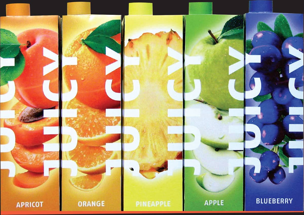
Food packaging is one of those types of project that almost requires visual/verbal redundancy: consumers want to see the food and understand its freshness or tastiness, even though the label tells them what’s inside the box. This packaging system explodes the images of the contents around the edges of the format in almost surreal supersaturation of color.
KREZIMIR MILOLOSA / CROATIA
17
CREATE IMAGES—DON’T SCAVENGE
True, finding an image to stick into a layout tends to be quicker; sometimes, however, purposely using banal, almost meaningless or kitsch images from stock sources can be great fun, especially if the project calls for a vernacular approach or conceptually refers to the ubiquity of image content and the influence of day-to-day pop culture. But the real benefit of scavenging is acquiring pieces and parts that can be used to create custom images. Even more intriguing is the possibility of revitalizing the understanding of familiar or time-worn content by creating an unexpected relationship with imagery that has been repurposed or pulled out of its expected context.

In this design of a cover for a master of highbrow literature, the designer appropriates low-culture comic book imagery to convey the disturbing political and emotional turmoil of Franz Kafka’s story.
BEN GRANDGENETT / UNITED STATES
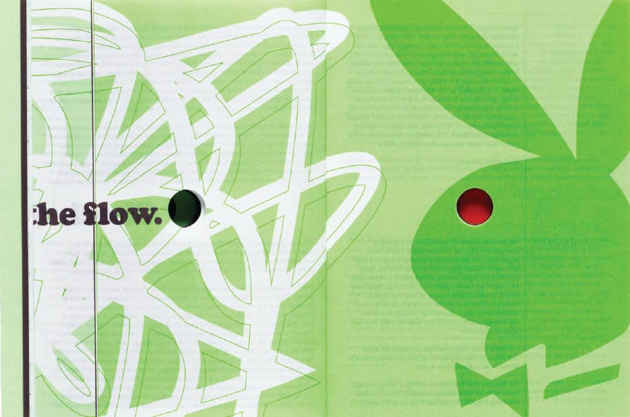
The design of this book that explores the musical work of DJ Spooky alludes to the practice of sampling and the ubiquity of branded messages in a current context.
COMA / NETHERLANDS
18
LOOK TO HISTORY—DON’T REPEAT IT
Don’t get me wrong: history is a treasure trove for designer and public alike. Books or exhibitions that focus on historical subjects, or invitations to period-themed events, for example, are perfect vehicles for exhuming visual style from the vaults of antiquity. The potential fun here is not so much copying the style outright as sampling portions thereof, adjusting them so they become new again.

This CD cover revels in its appropriation of period design style without succumbing to the wholly derivative—a difficult line to walk. The typography evokes the design sensibility of Blue Note jazz albums from the 1950s and 1960s in its use of slab serif typefaces and black/blue/yellow color scheme. The confrontational, close-up image is a decidedly contemporary gesture, making the layout fresh and inventive while still honoring a general style of photography from the period.
STEREOTYPE DESIGN / UNITED STATES
19
IGNORE FASHION. SERIOUSLY.
Riding the current stylistic trend has occasional benefits. In choosing to do so, a designer may opt to speak directly to an audience whose subcultural zeitgeist makes them likely to bypass visual material that doesn’t appear to speak to them. This is especially true when communicating to adolescents, who identify with very specific visual styles at any given moment and will ignore anything else.
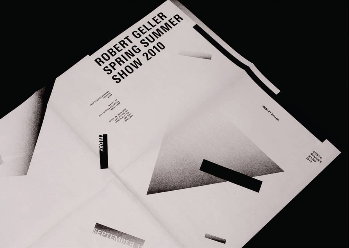
Because the fashion industry, in particular, is characterized by the shifting of trends, the fact that this runway show invitation is up to the minute in its trendy, retro 1980s style Swiss Punk aesthetic is quite appropriate. And, it’s visually engaging, showing a dynamic use of space and beautiful textural contrasts between type, flat geometry, and spray-painted stipple gradations.
STUDIO NEW WORK / UNITED STATES
20
DO IT ON PURPOSE, OR NOT AT ALL
Ambiguity can be a good thing. While clear visual and conceptual relationships are usually favored for the sake of quick, accessible communication, introducing mixed states of being among elements—elements that appear to be in the foreground, as well as in the background, as a simple example—can create an impulse on the part of the viewer to question and investigate more thoroughly. The gap between the concrete idea and the ambiguously presented image that refers to it can provide more complex avenues of interpretation and a rich, engaging experience that yields deeper, more complex understanding.
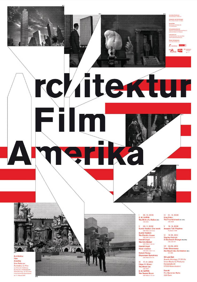
A caveat to start: the design of this poster is remarkably confident in its contrasts, scale relationships, and conceptual deconstruction of a flag image by planes that are both flat and three dimensional at the same time. What might normally be perceived as indecision—misalignments between text and image forms that appear to be very close to aligning, deep indents in text that begin to compromise the integrity of the text’s flush edges, and so on—here come off as the spontaneous results of intuitive image making. Discrepancies in these details fail to overshadow the more important aspects of a rich, ambiguous interplay between flat and spatial, solid and outline, and foreground and background.
2XGOLDSTEIN / GERMANY
