1
DRAWING
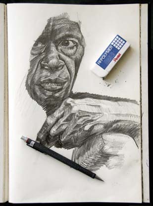
Figure 1.1 An unfinished drawing from my sketchbook.
© Angle Taylor, 2010.
Synopsis
If you are embarking on a creative path in your career, it is vitally important that you understand how to communicate using a visual language—that is, without the use of words. I believe that drawing is the best way to develop a strong, confident visual language. All good designers draw in some way or another. Not all of them are professional draftspeople. They may not use drawings as a technique in their finished work, but you can be sure that they all use drawing somewhere within their creative process. Some draw to improve their perception of the world around them, and others draw to develop their ideas and techniques. In other words, you don't need to be really good at drawing, but you do need to be prepared to give it a go and explore it as a means of developing what's referred to as an “artist's eye.” With an artist's eye you will learn to see and represent the world visually, without the use of words. It's a place where shapes, colors, textures, and light become your words.
Learning to See
Drawing is an art form in itself, especially when it is executed by somebody with good skills. But it's also an important exercise that should be performed solely for the purpose of developing your own unique way of interpreting the world. Through really looking at things and then attempting to draw them, we can prevent ourselves from doing what we're naturally inclined to do, which is to interpret everything we see with words.
The human race has naturally developed to be inclined toward verbal communication. At school we are encouraged to concentrate on learning grammar, spelling, and written communication skills. English is a compulsory subject in most schools; it's considered essential to learning to prepare ourselves for whichever career path we may choose. But unless we opt to take an art or design course, our visual communication skills are largely left for us to develop ourselves. So it's no surprise that we find it more difficult to communicate this way and often misinterpret the nuances of the visual language.
Later in this chapter, I'll share some of the exercises I did at art college that helped me to understand how to communicate visually and to develop my artist's eye, but for now, let's talk about why drawing is so important.
Why Sketching Is Important
Software applications provide new ways of creating imagery without the need for good drawing skills. Compositing imagery using software techniques will not give you the same understanding of form, light, and balance that you'll achieve by observing objects and then drawing them manually. When you source an image from the internet and adapt it, you don't have to think about the physical qualities such as weight, texture, or the form of the object. Instead, all you have to think about is whether it “looks right.”
Allow yourself to get hooked on the habit of regular drawing, and it will reward you with an expanded comprehension of the world around you. When you draw an object, person, or animal, you are forced to consider how it is constructed, what supports it, and how light interacts with it. This gives you a solid foundation for everything you do as a visual designer. It also gives you more originality, insight, and adaptability than a designer who cannot draw.
When I draw, I feel like I get lost in my own little world, where the only two things that exist are the subject of my drawing and me. It's a very intimate experience; after drawing an object or a person, I feel like I have a special relationship with it. I know this may sound weird, but I seem to remember every detail of everything that I've drawn. It's like the subject of my drawing has been channeled deeper inside my mind, into my own private library of special things that I can draw upon for inspiration.
Can Anybody Learn to Draw?
You may be thinking to yourself, “Oh no! I can't draw to save my life! I'll never be a great designer!” Don't worry; it's not too late! You can learn to draw. Learning these new skills will add a new dimension to your work as a designer. I'm not suggesting that your drawings need to form part of your designs but that they will help you to improve your skills and change the way you think about form, composition, and structure. This chapter is designed to teach those who can't draw the fundamental skills they'll need. In some ways you are lucky if you are a complete beginner because you won't have picked up any bad habits, plus you still have the joy and excitement of exploring virgin territory. Actually, I'm quite green with envy.
I also hope this chapter gives those of you who can draw some new ideas and exercises. I want to reignite your passion for drawing! In fact, my aim is to get every last one of my readers addicted to drawing and image creation. You may be thinking, well, what's the point of learning how to draw when I can create finished images using collage or software compositing techniques? It is true that software applications like Adobe® Photoshop, Gimp® (GNU Image Manipulation Program), and Corel's® Painter make it easy to create imagery using clip art, stock photography, and other sources. 3D applications also allow artists to create imagery by building 3D models and environments. Nevertheless, I urge you to go back to basics and pick up a sketchpad and some pencils. Practice drawing as a means of developing ideas for your digital creations. Every time you draw, you'll be improving your eye, and your work, including your digital work, will improve as a result.
The Universal Fallacy of “Talent”
I don't believe that “talent” is something you are just born with. I didn't come out of my mother's womb with a pencil in my hand and suddenly start drawing masterpieces. I was, however, lucky enough to be born with a natural curiosity for how things work. This was combined with parents who provided me with drawing materials at an early age and brothers and sisters around me who believed that art was something worthwhile.
I started drawing at an early age and was inspired to do so by watching cartoons, reading comics and watching my older brother draw. I felt inspired to keep practicing so I could be as good as my big brother. Eventually, I was rewarded by witnessing a continued improvement in my drawing skills. At school, I really loved art class and was told that I was “good at art.” I had a positive label that bolstered my confidence, so my skills continued to develop.
In my opinion, talent is a mixture of some beneficial personality traits, inspiration, support, confidence, and hard work. It's more about “how much you want it” than the luck of the draw (excuse the pun!). My mother is in her eighties and has just learned to draw and paint within the last three years (Figure 1.2). She always believed in the myth of talent and was constantly lamenting, “I've always wished I could draw.” After several years of me nagging and cajoling her, she eventually succumbed when her husband gave her a Japanese ink painting set as a birthday present. She started painting with it and found that its loose, edgy quality suited her “style.” She continued to experiment with it and gradually gained confidence. She is now painting with
Figure 1.2 One of my mother's first drawings. She didn't learn to draw until she was 77 years old. © Kathleen Hendry, 2007.
watercolors and has become a member of her local art group (Figure 1.3). I'm sure she would be the first person to tell you, “If I can do it, anyone can!”
So you see, it's largely about attitude. Even if you've never considered yourself to be good at drawing, be brave, take a leap, get a sketchbook, and try it for yourself. No one needs to see your drawings. Just through the act of drawing you'll find your eye, and your work will improve. If you already draw, then stretch yourself. Draw more often. Take on more challenging work. Show your work to friends, get feedback, and use it to help refine your skills. Practice and experience will always make you a better designer.

Figure 1.3 One of my mum's later drawings. Notice the improvements (although i have a real soft spot for the first one she did; it's hanging on my wall). © Kathleen Hendry, 2007.
Motivation
Having said all of this, it is not reasonable to expect to suddenly be able to draw after reading this book and doing the few exercises included. You wouldn't expect to be an expert golfer after reading a book on golf. You'll need to practice a lot to develop your drawing skills. Malcolm Gladwell, author of The Tipping Point and a regular contributor to The New Yorker, claims that it takes 10,000 hours of study to become a genius in your chosen field. This works out at about three hours per day practicing your skills. But don't be disillusioned by this. After all, you don't need to achieve the genius-level drawing skills of Leonardo da Vinci here! Even ten minutes a day would be a great start.
This chapter presents a few drawing exercises, tips, and tricks that you can use to develop and improve your drawing skills. Once you have completed these exercises, I'm hoping you will have the bug and will not be able to stop the immensely enjoyable and cathartic processes of drawing. There will be times when drawing becomes a chore. At these times, try not to pressure yourself too much, and carry on drawing regardless. When motivation is scarce, I find it helps to see drawing as a form of exercise, kind of like going to the gym. There will be times you enjoy it and get a thrill from the results, but there are other times you just won't want to do it. At times like this, just think about how good you'll feel once you've done it and what a brilliant artist you'll become as a result. Make it your mission to do one drawing per day as a minimum, even if it is a five-minute doodle over your morning coffee.
And don't be disillusioned if your drawings don't turn out exactly as you'd want them to. Like most artists, who are their own worst critics, most of my drawings disappoint me. You should always expect that 90 percent of your drawings will end up in the trash. As with every other art form, you need to produce a vast number of failures before finding your successes. Don't let this put you off. You'll learn just as much from your failures as your successes. It is just as important to learn what doesn't work as what does.
Drawing Materials
When you're starting out, you may want to experiment with different drawing implements and materials until you find the ones you like and feel happy using. You can choose from pencils, pens, markers, charcoal, paint, or crayons. Don't fall into the trap of feeling obliged to use materials you don't feel comfortable with. You'll find that friends and colleagues will want you to use their own favorite materials and implements. By all means, experiment with them, but don't allow yourself to be swayed by others. Find your own materials, and you'll find your own style as a result. You may want to use a material based on artwork that you like. If you try it and don't like it, then move on until you find the materials that are right for you.
I always felt like I wanted to use charcoal because I'd seen charcoal drawings that I really liked. But when I tried to draw with charcoal, I found it dirty, messy, and hard to control. (It also set my teeth on edge.) As a result, the drawings I did with charcoal were pretty terrible. So while you are trying to build your confidence, please avoid using materials that you find difficult. Once your skills improve, then you can begin to experiment more with them and extend your repertoire.
Sketchbooks
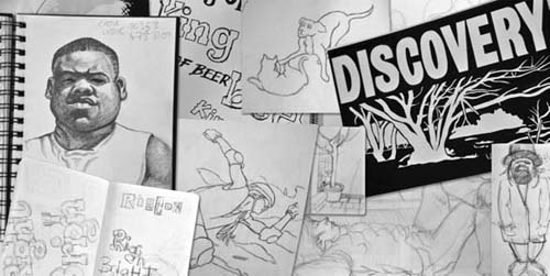
It's hard to find time in our busy lives to practice drawing. I recommend that you carry a small sketchbook around with you so you can practice on the train, in waiting rooms, or even during a walk with your dog. I usually carry a small, soft-covered A6 Moleskine sketch pad around with me in my back pocket (www.moleskine.co.uk).
It's good to treat yourself to quality drawing materials if you can afford it. You may actually be inspired to draw more often if the materials you use have a pleasing touch and feel. If you feel that Moleskin sketchbooks are too pricey for simple sketching, then you can buy very good A6 sketchbooks and notebooks very cheaply. In my studio, I have an A1 spiral-bound sketchbook that is great for creating big sketches on my drawing board. At home, I have an A3 sketchbook that is perfect for picking up to sketch out quick ideas or doing a detailed study of my dogs or the plants in my garden. I also have little sketchbooks beside my bed and in the bathroom just in case I feel inspired at an awkward moment (Figure 1.4).Chapter 2 offers more information about when and where to use various your sketchbook, plus some sketching tips and tricks.
Figure 1.4 Pages from various sketchbooks. © Angie Taylor, 2009.
Drawing Papers
Besides drawing on pages in your sketchbook, you may want to buy loose sheets of paper for creating mounted artwork. Paper is made from pulped wood or pulped materials such as cotton or linen (also referred to as rag). The more expensive papers tend to be made from rag and tend to have more interesting textures to draw on. The cheaper papers are usually made from wood pulp and tend to be smoother and less absorbent. Usually you get what you pay for with paper, but I have found decent cheaply priced papers. My advice is to shop around and try before you buy.
Paper comes in many varieties, ranging from the low-quality, inexpensive newsprint to the different weights and sizes of cartridge papers and handmade papers. Each of these papers has a different quality that you may want to explore. Cartridge papers range from very smooth-surfaced papers (good for creating precise pencil worked drawings) to highly textured, heavier papers, which lend themselves well to a rougher, freer style of drawing. There are also papers made for office use, such as photocopier paper and inkjet paper, which are smooth and better for drawing with pens.
I often use card or line-board for my drawing. I like to draw with ink, and these boards are designed for ink work. They provide the perfect surface for ink, and some of them are coated with china, which you can scrape away with a scalpel if you make a mistake. These boards are quite expensive, so you may want to use them only for finished line work. I recommend that you explore different materials. Keep looking until you find the one that works best for you. Sometimes you will be surprised to discover that a material you initially rejected encourages new, unexpected marks or techniques.
Pencils
I usually use a propeller pencil (Figure 1.5) for sketching when I'm on the move (sometimes known as a propelling pencil or a mechanical pencil). A propeller pencil is a pencil that looks more like a pen. It has a hard case, just like a pen that contains replaceable leads. There are several benefits to using a propeller pencil. You can buy different weights and qualities of leads, depending on your needs, and you don't have to carry a pencil sharpener because the lead always maintains a consistent width and weight. Rotring makes a great range of propeller pencils, including their Tikky range (www.rotring.com/).
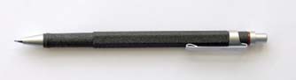
Figure 1.5 My propeller pencil
In my studio, I also have a complete collection of traditional wood-encased pencils, ranging from 6H to 6B. The lead in pencils is measured by letters and numbers that indicate the hardness and blackness of the graphite that's used to make the lead. The letter H represents the hardness of the lead. Harder graphite leads give you sharper lines, but the harder the lead, the lighter the marks. These hard pencils are perfect to use for precise edges and detailed technical drawings.
The letter B stands for blackness. Pencils with a high B factor have softer graphite leads that make blacker marks but softer, less-defined strokes. These are great for filling large areas of black and creating texture. They allow you to create dark lines without having to press hard with your pencil.
The following is the scale of the pencils I use, from the Hs (which are progressively harder and lighter as the H numbers increase) to the Bs (which get progressively softer and blacker as the B numbers increase). You can get even harder and softer pencils than this range, but I find these are usually sufficient for my needs.
6H 4H H 2H H HB B 2B 4B 6B
HB is the average-Joe of the pencil world. It has an equal amount of hardness and blackness. It is the most common, general-purpose pencil used for writing. You can find these in any shop. Art shops will stock a wider range of graphite pencils as well as all sorts of other pencils, crayons, charcoals, and chalks that you can use for drawing. Try experimenting with these to see what you feel the most comfortable with. You'll probably find that a particular medium may suit you better than another, so it's worth taking the time to find out what suits you best.
Pens
I personally enjoy drawing with pens because I like the clean, black lines I can achieve with them (Figure 1.6). Several types of pen are suitable for drawing. Rotring makes a great selection of drawing implements, including their excellent Tikki, Rapidograph, and Isograph pens. Most of their pens are refillable and are a good choice if you do a lot of ink drawing. If you use ink only occasionally, you may want to choose disposable pens, since these don't clog up if they are not used regularly (as refillable pens can sometimes be prone to do). Pilot makes a great range of disposable pens and propeller pencils with all sorts of different tips and ink types. I use a variety of tips for different uses. For example, I use marker pens for blacking in large areas but use finer
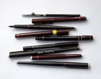
Figure 1.6 Some of the pens i use regularly for drawing.
fiber-tips or rollerballs for details (www.pilotpen.com/) I also like to use fountain-tipped pens as they allow me to create a variety of strokes with a single nib just by altering the angle of the pen.
Correction Fluid
Obviously, you can't easily erase pen marks in the same way that you can pencil marks. A solution to this is to use correction fluid (or liquid paper) such as Tip-ex to cover over any errors. Once the correction fluid has dried, you can then draw on the surface (www.liquidpaper.com/).
Ink
An alternative to prefilled pens is to use ink along with dipping pens and brushes to create lines and washes (Figure 1.7). Using ink in this way produces more organic lines and is less predictable than using the technical drawing pens. This can provide more style, character, and flexibility to your drawings. You can also mix the ink with water to dilute it, which allows you to create paler washes of color and shading.
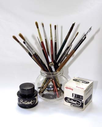
Figure 1.7 Ink, pens, and brushes used for drawing and painting with liquid ink.
Paint
There are also several types of paint you may want to experiment with for drawing and coloring your artwork.
Watercolor
Watercolor is probably the most familiar type of paint. It is a water-soluble, translucent paint that is fairly easy to use. Translucent paints allow you to see the color underneath them, which is ideal for building up paint in layers. It tends to be quite wet when applied, so it benefits from being applied to a dedicated watercolor paper, which is designed with the perfect amount of absorption and texture for this medium.
Masking Fluid
Because watercolor paint is translucent, painting white on top of the other colors will not cover the colors but rather only lighten them. To overcome this problem, watercolor artists use masking fluid to prevent the paint from bleeding into areas that they want to remain white. Challenges such as this mean that watercolor artists have to plan their paintings a little more than those who are using gouache or other opaque paints.
Gouache (and Poster Paint)
Gouache is a better option than watercolor for painting on standard papers because it can be applied using less water. Poster paint is very similar in characteristics to gouache, but it is slightly cheaper. These are both opaque paints, which means that each layer of color will cover the layer underneath it. This makes them less suitable than watercolors for combining colors on the page, but they tend to be better for painting clean, even areas of color. This is why these paints tend to be used for posters, illustrations, comics, and general graphic design work.
Acrylic
Acrylic is a very flexible paint. It is water based (like water-color and gouache), but it can be painted in a wide range of styles and consistencies using a wide range of implements. It can be watered down and sponged (or brushed) to create thin washes of color, or it can be painted thickly, like oil paints, using brushes, palettes, and knives. Acrylic paint dries very quickly, so it can't be reworked in the same way as oil paint over a long period of time. Unlike watercolor and gouache, it will become water resistant when it dries, so rewetting the paint is not possible. Mistakes must be painted over with new layers of paint or correction fluid. I personally like the immediacy and diversity of acrylic paint, but I'd recommend starting with gouache if you are new to painting.
Brushes
Literally thousands of different types of brushes are available for applying paint, ink, and other fluids to your drawings. Brushes can have either synthetic bristles (like nylon) or natural bristles (such as sable or hog's hair). As with pens and paper, different materials suit different paint types and techniques. Traditionally, sable brushes were always used for watercolor because sable hair is very soft and fine. Hog bristle brushes were typically used for oil brushes because they were firmer and more robust. You can now buy a diverse range of synthetic brushes that provide all the variety and quality you could possibly require, so there's really no need for animals to suffer for your art.
Brushes are described by shapes and sizes (Figure 1.8). The shapes include round, flat, fan, and angled. Sizes range from negative values denoted by 4/0 (can also be written as 0000) to positive values indicated by single numbers such as 4. Here are the most common sizes:
4/0, 3/0, 2/0, 0, 1, 2, 4, 6, 8, 10, 11, 12, 14, 16, 18, 20, 22, 24
You can find brush measurement charts at www.dickblick.com/info/brushmeasurement/.
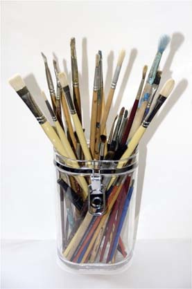
Figure 1.8 Paintbrushes of various shapes and sizes.
Erasers
You'll need a decent eraser to get rid of any mistakes you make (remember, you don't have an Undo option). Erasers can also be used as a drawing tool. Drawing doesn't only involve drawing dark strokes on white paper in an additive manner. You can do subtrac-tive drawing using an eraser on a shaded background or use the eraser to add texture or reflection to a surface. Erasers come in many different types; a plastic eraser is good for working with pencil, as are India rubber erasers. India rubber tends to be a bit rougher in texture, so is better for removing stubborn pencil marks, but it can also rub away too much of the paper surface. A plastic eraser tends to be smoother and better for general use. You can also use putty erasers, which are soft and pliable. These are particularly good for working with charcoal, chalks, and other dusty mediums. They're great to draw with, too, since you can manipulate them into interesting shapes.
Other Drawing aides
Other drawing aides can be useful to help you draw straight lines, edges, circles, curves, and angles that would be difficult to draw freehand. Most people are familiar with rulers for drawing straight edges and compasses, set squares, and protractors for drawing circles, creating right angles, and working out nonstan-dard angles, respectively. Not as many are familiar with French curves (Figure 1.9). These are usually made from plastic and have a selection of even and uneven curves that you can use as guides in your drawings. All of these can be picked up from your local art shop or online art supply store.
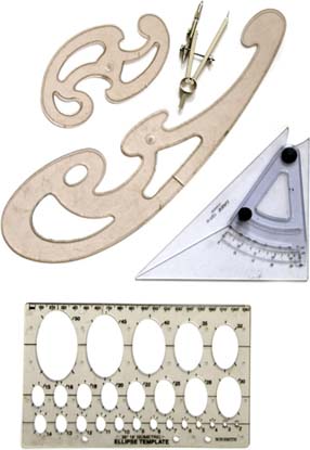
Figure 1.9 Other drawing aids, including my very well-worn French curves, compass, and set square.
Lessons
Okay, now you know what materials you can use, so let's get on with some drawing lessons that are designed to help you develop your basic drawing skills. Many of these are based on lessons I was taught at school or Art College. They have stuck with me because I found each of them helped me take my skills to a new level and made me think differently about the techniques I used.
Drawing Basic Shapes
All objects can be broken down into basic geometric shapes or combinations of geometric shapes. When children draw, they tend to represent everything they see with simple shapes and lines (Figure 1.10). This is how you should try to see objects when you start learning to draw. Study the things around you, and break them down into basic shapes. I've done this so much that it's now second nature. When I look at something, I automatically look for shapes, balance, colors, and patterns, much like when you try to see pictures in cloud formations.
Figure 1.10 shows two children's drawings of a house. Notice that the house on the left is made up of a series of square and
Figure 1.10 Two children's drawings of houses done by Matt (aged 5) and ryan (aged 7).
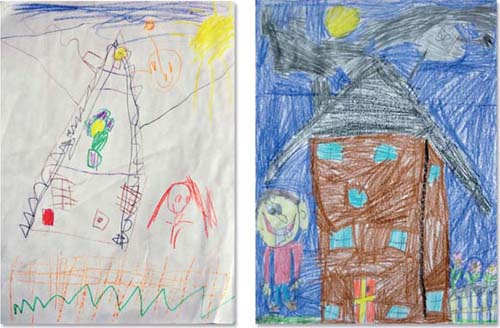
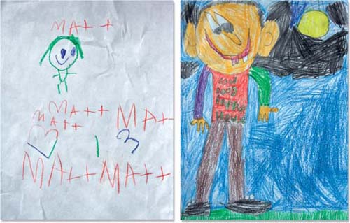
rectangular shapes, with a triangle representing the roof of the house. The drawing on the right has a lot more detail, such as perspective. In Figure 1.11, the face of the person in the drawing on the left (by Matt, the younger child) is represented by a circle, while the body is drawn with a series of lines. Notice in the drawing on the right, Ryan has used more solid geometric forms like rectangles and circles, and he has also used areas of solid color to represent the sky. When you begin a drawing, you should start by “mapping out” the scene with simple shapes. If you're new to drawing, start by trying to draw individual, simple-shaped objects. Avoid drawing difficult, complex subjects like the human form until you can master these simple shapes.
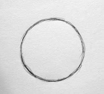
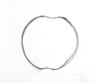
Here's a method for drawing basic shapes with the aide of a guide. We'll start with something easy like an apple. An apple is roughly circular in shape, so let's start as a child would: by drawing a circle. It's quite tricky to draw a circle freehand if you're new to drawing, so feel free to make it easy on yourself and use a compass. If you don't have a compass, trace around the bottom of a glass or other circular object to form your circle. In Figure 1.12, you can see a simple circular shape that I have drawn using a compass. It's fine to use aids like rulers, set squares, and compasses to help you create basic shapes, but I'd like to encourage you to learn how to draw these shapes freehand. Here's a good way of practicing.
Freehand Sketching
To get a feel for drawing a circle freehand, try sketching lightly over the line of the circle you've already drawn with your compass or other guide. The object here is to get a feel for drawing a circular shape using a series of short pencil strokes to make the line bolder. Don't try to draw the circle with one stroke, but use lots of little strokes to gradually build up the shape. Every now and then, step back from the drawing to look at what you've done, checking that the line is well-balanced.
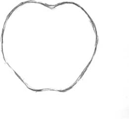
Figure 1.13 The top and bottom are shaped, and then the circle is erased.
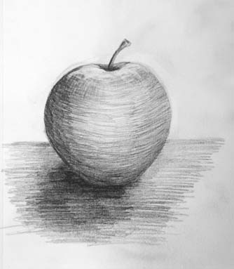
Very few apples are perfectly round. They're usually slightly fatter at the bottom than the top and have dimples from which the stalks protrude. To create these, you can use your eraser to remove the edges at the top and bottom as I've done in Figure 1.13. It's then a simple case of redrawing the shapes between the gaps so it looks more like a natural apple shape. The top will be slightly heavier, and the bottom will be narrower (Figure 1.14). Now it's time to add depth and texture to the apple.
Adding Depth
Okay, so now we have an outline of an apple, but how do we make it look solid as if it has real depth and weight? You can create depth in your drawings with the use of light and shade. When light hits an object, it reflects off the surface, making the area it reflects off of appear lighter. Light is usually directional, so by shading the object so it looks lighter on one side than the other, we can make it appear more solid.
Hatching
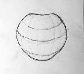
The surface of the apple is curved and quite smooth, and we can represent this curved surface using a technique called hatching. Hatching is a good technique for guiding the viewer's eye toward a particular direction. This technique involves sketching adjacent, repetitive lines lying in the same direction as one another. The eye naturally follows the direction of the individual pencil lines. To emphasize the curved surface, apply layers of shade by combining short strokes and adjusting the angle a little as you move around the surface of the apple.
The first thing you need to do is decide on the directions the strokes should follow. To do this, I find it helps to lightly sketch rough guides around the shape. To figure out where these should go, pretend you have stretched elastic bands around the apple and imagine how these would curve around the surface (Figure 1.15). If you can't picture how this would look, just get an apple or other spherical object and stretch elastic bands around it. Now study the shapes and directions they make.
Directional Lighting
To determine the positioning of the shading on the apple, you also need to decide where you think the light source will be. It takes a bit of thought and practice until you instinctively know where to add light and shade to your drawings. It sounds odd, but I find it helps to think about light in the same way that software applications think about it and break it down into individual components. Many software applications allow you to work in 3D. In these applications (and in some 2D applications, too) you can add lights to the scene. The main light types are directional, point, parallel, and ambient.
- Directional lights include spotlights, torches, floodlights, or any other light source that can be pointed in a particular direction. These tend to light a subject strongly from one particular direction, illuminating a small, concentrated area.
- Point lights shine light in all directions, such as with a naked lightbulb. The light tends to spread a little more in all directions, so the subject would usually be lit a little less and the illumination would spread out a little more.
- Parallel lights are distant light sources. They are also directional lights, but because they are so distant, their beams of light are infinitely wide, so the result of the light is spread over a wide distance. Light from these sources would be directional, but the illumination would spread across one whole side of an object.
- Ambient light refers to the environmental light hitting the object from nondirect sources. This is a harder light to understand, so let me give you an example of where you'd experience ambient light. Imagine you are sitting in a room in your house at night, and a spotlight is providing some directional light. If the spotlight is switched off, the room will darken, but as your eyes adjust to the dark, you'll gradually see that the room is not completely dark. A small amount of light may be shining into the room from under the door or through a crack in the curtains, which provides the room with an overall ambient light. When you're drawing, this light will affect the overall lightness of the object and therefore how much detail you'll see.
Unless you are living in outer space, in a vacuum, or in a place where all light sources have been completely blocked out, some ambient light is sure to exist in any space. The amount of ambient light depends on various factors: the time of day, the weather, and other activity.
When you draw using traditional methods, it can help to think about light in these terms, too. When you study a scene or an object, observe all of the possible sources of light and how much light is coming from the ambient light in the environment. Then think about other directional light sources, like lamps or spotlights, and distant light sources, like the sun. How much of their light is shining on them and from what direction is the light hitting the objects you are studying? There may be several different light sources coming from different directions, and each of these will impact the overall lighting of your scene. Thinking about light in this way will help you to decide where to put the shading and how light or dark it should be. Color is a product of light, so an object's color will appear duller in low-light conditions. (Chapter 6 discusses more about how we perceive color.)
Figures 1.16 and 1.17 show examples of how shading could be positioned on a sphere to represent different strong directional lights. Figure 1.16 shows the light coming from behind the object, and Figure 1.17 shows the light shining on the front of the object. The arrows represent the direction of the light.
In the case of our apple, we'll imagine an overall strong ambient light, but we will have most of the light shining on the object from behind it, above it, and slightly to the right as we look at it (Figure 1.18). For the shading I suggest using a dark, soft pencil—a 4B would work well if you have one. Make the circle darker on the right side than the left. Create the strokes in the direction of the curved surface. Use an eraser if necessary to lighten some of the strokes. This will give the impression that a light source is shining on your apple, giving the feeling of depth. Once you've finished hatching, you may want to smooth the pencil strokes to make the effect more subtle. To do this, rub the pencil marks with your finger, moving along in the direction of the lines.
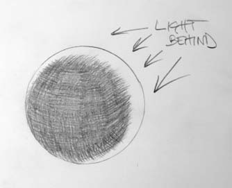
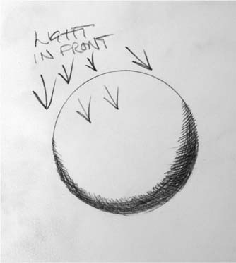
Figure 1.17 Light shining on an object from the top, front, and left.
Crosshatching
Crosshatching describes the process of drawing two or more “layers” of pencil strokes, each layer following a different direction, creating a kind of crisscross effect. This can be used to create a denser, and usually a darker, shading. The only problem with crosshatching is that it's quite rigid and flat. It also tends to stop the eye from moving freely across the picture. I use crosshatch-ing only for flat surfaces or for areas to which I deliberately want to draw the viewer's attention. We could use crosshatching to create shading on the flat surface the apple is sitting on; this would exaggerate the sense of depth. Think about the angle of the table when determining the angle of the strokes. They should follow the same direction as the line of the table edges.
Creating Texture
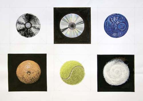
Texture is normally thought of as something that you feel, but it can also be described visually. It's really just depth on a smaller scale. In the same way as light and shadow can be added to primitive shapes to create a sense of depth, highlights and shadows can be added to the surface of objects to suggest different textures. Look at the tennis ball and the orange in Figure 1.19. Each individual, tiny
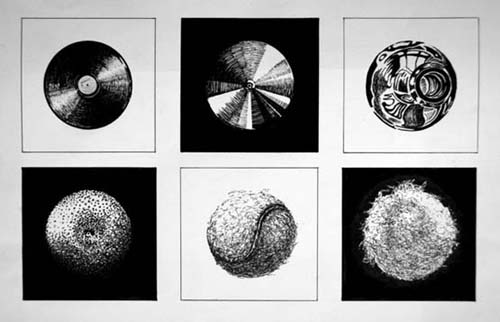
Figure 1.19 Notice the different textures of each circular object. © Angie Taylor, 1994.
fiber on the tennis ball reflects light and shadow in the same way the dimples in the orange do. Notice how I've used the same ink pen for both textures, but I have varied the texture by using different weights and shapes of strokes. By thinking about how the light plays with the surface material of an object and copying this, you can create the impressions of different textures.
A good exercise to explore different textures is to divide a sheet into six squares. In each square, draw a circle, and then use only depth and texture shading to make each into a different object. In Figure 1.20, I've included standard spherical objects such as a tennis ball, a CD, and an orange. But I've also tried to include objects that appear to be circular only from a particular angle, such as the top view of a bottle. I've used different materials to achieve the variety of textures. I like to use inks for shiny surfaces like glass, plastic, leather, and so on, and I use gouache for fluffy or furry textures like the tennis ball. Don't feel like you have to follow my lead, though. Use whatever inspires you.
If you don't feel that your skills are quite up to this exercise just yet, then find some images (look in magazines or online) that fit the specifications. Cut out or print out the pictures, and paste them onto a sheet of paper. Study them well, and try to
see if you can understand how the light reflects on the surface of the object to determine its visual texture. You can even try tracing over the images with some tracing paper and a pencil. This can be a valuable way of studying the shape and form of an object.
It will be more difficult to fully appreciate texture if you use only a computer for your design work. Drawing by hand is the best way to explore the composition of materials and their texture because you have to think about how the textured material is composed before you can recreate it. With computer software, the textures can be automatically generated or cloned from existing images. When drawing with software, you don't generally feel the vibrations or resistance of the pencil on the rough texture or grain of the paper you are drawing on. Graphic tablets tend to have very smooth, slippery surfaces that can be hard to adapt to, particularly if you press down hard with your drawing implements (as I tend to do).
Certain software applications (such as Corel Painter and, to a certain extent, Adobe Photoshop) allow for the simulation of textured materials such as canvas or rough paper. When you draw in these applications (using a graphics tablet and pen), it approximates the effect of drawing on the real thing, but nothing substitutes for the happy accidents you can stumble upon when using real, physical materials. When drawing on real paper, you don't have the option of undoing your changes (like you have with software). This forces you to be more careful in your design decisions and to plan changes a little more carefully. I see this as a good thing: Removing the option to undo is like adding another helpful limitation that will focus your attention, making it easier to make design decisions.
So although graphic tablets can approximate the feeling of drawing with a pen on paper fairly well, they can't exactly replicate the feeling of holding a piece of charcoal on its edge and dragging it across a rough, grainy-textured sugar-paper. Although traditional materials allow you to hone your craft and explore techniques so you can develop your own style, tablets are the best way to draw directly in the software. They provide you with much more freedom and versatility than a mouse. You might even find a new style that you wouldn't achieve from traditional drawing. If you want to find out about Wacom tablets (Figure 1.21), you can visit their website at www.wacom.com.
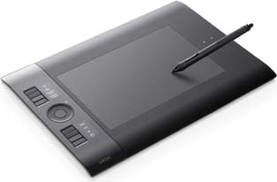
Figure 1.21 The wireless Intuous graphic tablet from Wacom.
Other Shapes
You've just practiced drawing an apple, which is a spherical object, but of course there are plenty of other shapes that you can practice drawing: ovals, squares, triangles, rectangles, cubes, and pyramids. Look around your home for objects that have obvious geometric shapes, such as your television or CD player, or the cooking utensils and appliances in your kitchen. Break them down into component shapes, and see if you can represent them on paper with a series of geometric shapes. This makes it much easier to concentrate on getting the underlying structure of the object right first and then adding the details later. Figure 1.22 was drawn freehand (without the use of proper guides), so the perspective is not 100 percent correct. Drawing cubes and other geometric shapes correctly using perspective guides is discussed later in this chapter.
Tone and Contrast
Using a variety of tonal qualities in your drawings will add strength and a sense of drama to your work. Tone refers to the lightness or darkness of a shade. Having a good balance of light and dark makes a drawing more powerful and interesting. Contrast is the distinction between the light and dark tonal areas in an image. Although the literal meaning of contrast is “difference,” in the context of art and design, contrast can be an ambiguous term. It is most commonly used to describe the difference between light and dark tones, but it can also be used to describe the differences between light strokes and heavy strokes, hot colors and cool colors, or rough textures and smooth textures.
A great way to learn about contrast and tone is to choose some objects to draw that possess no color but only black, white, and/or gray objects. Place them against a neutral surface, preferably gray. Color can distract you from seeing the tonal qualities of an object, but when you look at neutral objects, it forces you to focus on the tonal qualities without the confusion of color. If the objects are light, place them against a light background or on a piece of white paper. If they are dark, place them on a sheet of black paper. Make sure you have a strong light source that will accentuate the shadows and highlights. Alternatively, you can choose two objects that sit naturally together but are the same color. For my drawing I've chosen a white toilet with a roll of white toilet paper sitting on top of it (Figure 1.23). I chose these because they are both simple but interesting shapes, are the same color, and have different textural qualities.
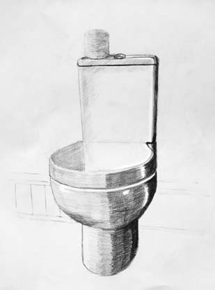
Figure 1.23 Toilet with roll of toilet paper on top. I used a very soft 6B pencil to recreate the shiny specular light on the toilet with very high-contrasted areas. The light hitting the roll of toilet paper is much softer, more diffuse, and requires much less contrast, and for this i used the edge of a solid graphite 4B pencil. © Angie Taylor, 2009.
Several factors determine an object's tonal quality. What is its underlying structure? What material is it made of? How strong is its structure? What qualities can you portray in your drawing? You may have chosen two objects with the same size, color, and shape, but each may be made of different materials, or one may be a more fragile material than the other. How can you convey this in your drawing?
Surface Quality and Tone
When we discussed directional lighting, we spoke a bit about computer software and how it can help you understand lighting. Software also provides surface controls to adjust the amount of diffuse and specular light the object reflects. Thinking about these can also help you understand how the surface quality of an object, combined with the lighting, can determine the tonal quality required in your drawings.
Consider the quality of the object's surface when deciding how much contrast to use in your representation. All surfaces reflect light in different ways, which creates different visual textures. Shiny surfaces reflect the light well, bouncing it directly back at the viewer. This means the light is strong and the edges of the illumination are crisp and clear. These shiny objects reflect more light and darkness than dull objects. This highly reflective light is known as specular light. You will need to use high levels of contrast to represent this.
Dull objects have rougher surfaces. These rough surfaces absorb much of the light when it hits the surface. The rough nature of the surface also breaks up the light and reflects it in multiple directions. This results in dulling the light and softening the edges of the illuminated area. This softer light is known as diffuse light.
In my example in Figure 1.23, although the objects are the same color, they have different textures. The toilet is shiny; notice the specular highlights on its surface. The toilet roll has a softer surface, which reflects a diffuse light. I used a variety of different pencils of varying hardness and blackness values to create different amounts of tone and texture in my shading.
Understanding Perspective
Perspective refers to a geometric technique used to add depth to otherwise flat artwork. Perspective techniques can be used to measure and represent three-dimensional qualities, depth, and distance in two-dimensional drawings. Artists working in 3D software don't need to worry about perspective because the computer works it all out for them, but when working in 2D you need to understand a few little tricks to make your drawings look convincing. Drawing correct perspective is a little tricky, so most artists use guides to help them out. I'll show how to create these in the following exercises.
Optical, linear perspective guides were devised during the great Renaissance in Italy in the fourteenth century. Architects and artists discovered that they could apply generic rules to make their paintings appear more three-dimensional. Filippo Brunelleschi is the man credited with the initial discovery of this perspective theory, but the rules were used more famously in paintings by other artists such as Leonardo da Vinci and Piero Della Francesca. You can see perspective in scenes all around you, and observing its effects is good practice, but first you need to understand what you're looking for.
Horizon Line
Take a look at the simple illustration of a beach scene in Figure 1.24. Notice the horizon—the horizontal line that separates the surface of the earth and the sky. Of course, the sea doesn't really touch the sky! It's just that we can see only as far as this point, since

the earth curves away from us, creating an apparent edge. In fact, if we were being technically correct, the horizontal line in the image should really be a curve, but the curve of the earth is so vast that we can't see it with the naked eye. So despite being technically incorrect, when we draw perspective guides, we tend to use straight lines to work out our grids.
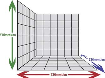
Figure 1.25 A 3D grid with the three dimensions clearly marked.
The Three Dimensions
I find it helps to fully understand the Cartesian system when thinking about perspective. It describes the three basic dimensions of 3D space, which are represented by the letters X, Y, and Z. The X dimension measures distances from left to right, Y represents distances from top to bottom, and Z represents distances between near and far (Figure 1.25).
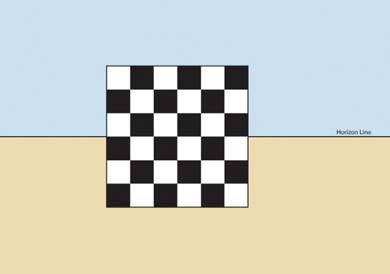
Figure 1.26 shows a flat chessboard. The background has been divided in half by a horizontal line that we will imagine is the horizon of this scene. Notice that all of the horizontal edges and lines on the chessboard are parallel with the horizon and can be measured using X coordinates (left to right). All vertical edges are perpendicular to the horizon and can be measured using the Y coordinates (top to bottom). The distance of the flat plane from the horizon can be measured using Z coordinates (near to far).
Can you imagine swiveling this chessboard around an imaginary axis? When this is done, the apparent angles of the edges will change. In Figure 1.27, you can see how I've swiveled the
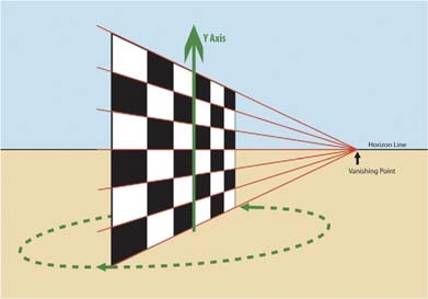
Figure 1.27 Rotated chessboard. I have rotated the chessboard around an imaginary Y-axis that runs through the center of the object.
chessboard around by rotating it on its Y-axis, which runs through the vertical center of the object (as highlighted by the green arrow). I've also highlighted the direction of rotation with a dotted line; this is the path that the edge of the chessboard follows as it's rotated.
When a plane is tilted away from the viewer in this way, the furthest edge appears to get smaller and the nearest edge gets bigger. The horizontal lines on the chessboard are no longer parallel to the horizon. They appear to converge, creating a connection between the nearest edge and the farthest edge of the chessboard. These lines point toward a point known as the vanishing point and are highlighted in red in Figure 1.27.
The Vanishing Point
The vanishing point is the point at which the lines that are projected from the edges of an object or series of objects meet together at a single point. This effect is known as convergence. In this example the vanishing point happens to be on the horizon, but this is not always the case, as we'll see later. We can use this phenomenon to create guides to help us draw two-dimensional drawings with convincing three-dimensional depth.
Figure 1.28 Beach scene with two figures added.
Notice that the right edge of the tilted chessboard has become smaller because it has moved further away from the viewer, while the left edge has become bigger as it's moved closer to the viewer. When objects are placed into a scene, their apparent size varies according to how near or far they are from the viewer. Objects closer to the viewer will appear to be bigger than objects positioned further away from the viewer. You can recreate the illusion of depth in your drawings by varying the size of characters and objects based upon what you perceive their distance from the viewer to be. You'll see later how you can use convergence lines as a guide to work out the sizes.
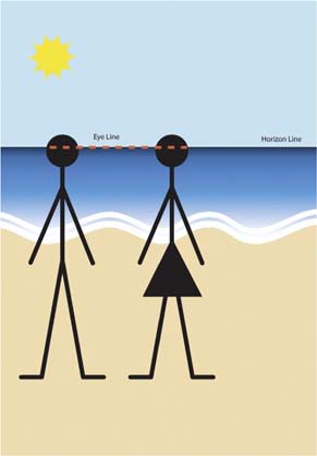
Eye Level
Figure 1.28 shows our beach scene with two figures added to it. Notice that the two figures appear to be standing next to each other and that they appear to be the same height. You may also notice that the eye levels of both characters in this picture are the same. By maintaining the same eye level, the viewer believes that the two characters are the same height as each other.
In Figure 1.29, I've made one of the figures smaller than the other but have maintained the same eye level. By doing this, I've made it appear as though the character on the right has moved farther away from the viewer than the figure on the left. As long as the same eye level is maintained, the viewer will believe these characters are the same height but are standing on different areas of the beach.
Watch what happens if I simply drag the “smaller” character on the right further down the frame so she is at a different eye level from the other character. In Figure 1.30, the same character now looks like a small child standing next to an adult. You may also feel as though you are looking down at the child from above. This is because the horizon is at the viewer's eye level, and when the eye
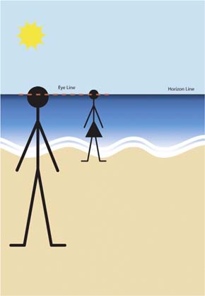
Figure 1.29 Making the figures different heights. One of the figures is made smaller, making it appear farther away from the viewer than the other.
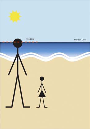
Figure 1.30 Moving one figure beneath eye level. By adjusting the character beneath the viewer's eye level, we can make her appear smaller than the other character.
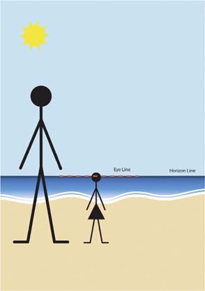
level of a character is the same as the horizon, it means they share the same eye level as you, the viewer.
Notice that in Figure 1.31 I have moved the horizon so it is in line with the child's eye level. Now the viewer is looking at the scene from the same height as the child. Notice how it now feels as though you are looking up at the adult from the same height as the child. When the point of view changes like this, it will also affect the view of the background elements. Compare Figure 1.30 and 1.31, and notice that the child doesn't see as much of the sea as the adult because her view is from a lower perspective.
Lower views are generally better for accentuating vertical elements in your design, so it is a good idea to draw from a low perspective to accentuate the drama of tall buildings or telegraph poles. Higher views are generally better for accentuating horizontal features such as horizontal railroad tracks or crowds of people.
Drawing in Perspective
In this section we'll look at how to draw a basic shape with perspective. Let's build a simple scene containing a box to get us used to the idea of drawing in perspective. Start with a blank piece of paper and draw a horizontal line about one-third of the way down the paper. This will be your horizon. Now draw a straight line (using a ruler as a guide) from the center of the line down to the bottom right corner of the page. Repeat this, drawing another line from the center to the bottom edge, as illustrated in Figure 1.32.
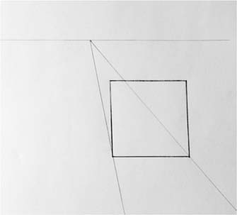
Figure 1.32 A basic square drawn between our converging lines.
The next step is to draw a square, using the two lines as a guide. Start by drawing a horizontal line between the lines to create the bottom edge of the square. Use a ruler to measure this, and write down the measurement so you can make sure the other edges are exactly the correct length. Use a set-square to make sure your angles are right angles, and draw the uprights the same length as the bottom edge (Figure 1.32). Next, draw another square using the same technique a little farther behind the first one, like the one in Figure 1.33.
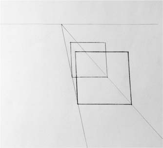
Figure 1.33 A second square drawn farther behind the first.
Foreshortening
As you've seen, things appear to get smaller the further they are from the viewer. Distances also get smaller as they move further away from the viewer, as shown in Figure 1.34.
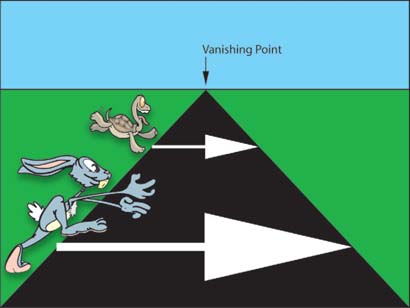
Figure 1.34 Moving objects away from the viewer. Distances appear to get shorter as objects move further from the viewer. In this diagram the tortoise has the same distance to travel as the hare; it just looks shorter. You need to keep this in mind when animating objects in 2D. Distant objects should be animated at a slower speed than foreground objects to create a sense of depth, known as parallax.
This causes an effect called foreshortening. The distance the tortoise has to travel appears shorter, but also notice that the distance between the tortoise and the hare appears shorter than it actually is. Figure 1.35 shows foreshortening in a figure drawing.
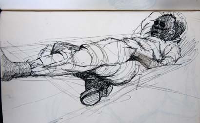
Figure 1.35 A figure drawing exhibiting foreshortening. Notice how the limbs look shorter than they actually are because of the angle of view. Observe foreshortening in real life, and apply what you observe in your drawings. © Angie Taylor, 1985.
Keeping in mind that we are supposed to be drawing a cube with equal sides, we'll create the second square about half the measurement of one of the sides (this would be its actual distance). Once you have the two squares, you can use them as a guide to create some new convergence lines to create the adjoining edges. Use the top corners of both squares and the vanishing point to determine where these should be drawn. Figure 1.36 shows how I did it.
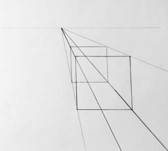
Figure 1.36 New guidelines are drawn using the top corners of the squares as guides.
Once you have these lines in place, you can start to erase any guidelines you don't need and add shading to the box. In Figure 1.37, I've erased the guides and added shading to make it look like an open box.
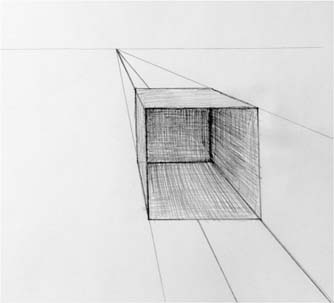
Figure 1.37 Shading is added to give the box depth.
Depth of Field
Another trick you can use to add depth to your drawings is to mimic the effect of depth of field by making distant objects more blurred than foreground objects. The term depth of field is a photography term that is used to describe the area of distance that a particular lens can focus on. Anything within this range will be in focus, and anything outside the range defined by the depth of field will be progressively more out of focus the further away it gets. The depth of field can be adjusted on a camera by increasing or decreasing the aperture. Low f-numbers will have a very narrow depth of field, meaning that a short range of distances will remain in focus. High f-numbers ensure that a wider range of distances remain in focus (Figure 1.38).
Figure 1.38 Depth of field. This picture was taken with the aperture set at f/5.6, giving a narrow depth of field. Notice how the main character is in focus, while the other characters blur into the distance.
This effect also occurs naturally in the human eye. If you look at any scene, you'll notice that things in the foreground are much more detailed than objects that are far away from you. We can shift our focus just like a camera can, but we do it without thinking. When creating drawings with depth—for example, landscapes—try mimicking the effect of depth of field. You'll be surprised at how effective this can be.
Don't See what You Draw; Draw what You See!
As I said earlier, drawing is an essential exercise for anyone who wants to follow a career in visual art or design. The exercise of drawing teaches you how to look, see, and understand the world around you. It helps you to develop as an artist in many unexpected ways. While I am drawing, my mind stops wandering and becomes completely enveloped within the moment. Drawing also helps you to experience different qualities like the softness of a material or the roundness of an object. One of the most useful exercises my art teachers taught me was to draw an object without looking at the paper. Looking at the paper while drawing something can distract you from your subject. By not doing this you become fully engaged with the object, with your hand simply reacting to the “feel” of the object.
This is an easy exercise; all you need to do is to set yourself up with the right materials and environment. It's best to use a large sketchbook or drawing board. A1 is a good choice because it allows lots of space for your drawing. When you don't look at the paper, you tend to wander a little, so it's important that you don't run out of space. I like to use an easel because it allows me to sit upright and position myself right in front of the object I'm drawing. If you don't have an easel, I recommend sitting with a sketchpad on your knee. Having the sketchpad on a flat table will make it harder for your arm to move freely.
Look at the object, and as you do, allow your hand to follow the edges and contours of it. Avoid the temptation to look down at your drawing until you've thoroughly examined the subject of your drawing and reacted with your hand. The object here is not to create a realistic representation of the object but to feel at one with it, learn to really look at it, and get good communication going between your eyes and your drawing hand. You can choose any subject that inspires you. People tend to be good subjects to draw, but if you'd prefer to draw a static object, that's fine, too. Figure 1.39 shows two life drawing examples by artist Sonia Watson.
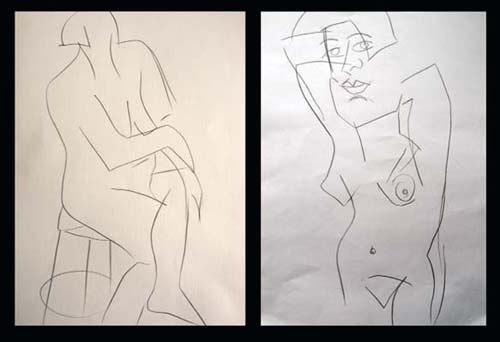
Figure 1.39 A life drawing. Sonia Watson created these drawings looking only at the subject and not at the drawing itself. Said Sonia, “I really enjoyed the exercise. it was a whole new experience. I loved it, as it introduced a whole new style to my work.” © Sonia Melitta Watson, 2010.
Reverse Drawing
Most of us tend to draw with a dark-colored drawing utensil on white paper, building up our drawing by adding darker strokes. It's also important to know where to leave light areas in your drawings. This exercise teaches you to think about the lightness as much as the darkness. You will need some special materials for this. The object of the exercise is to make your drawing by creating white strokes on a dark surface. You need to first decide how you are going to do this. You could buy some black paper and use chalk, white paint, or pastels to draw with. Alternatively you could take a white sheet of paper, cover it completely with charcoal, and then use erasers to actually create the drawing.
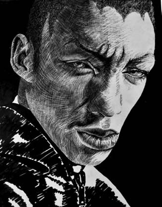
Figure 1.40 A reverse drawing done on scraperboard. © Angie Taylor, 2004.
My favorite technique for this exercise is to use scraperboard (also known as scratchboard). This is a china clay-coated board that comes ready-coated with a layer of India ink. The artist then uses scalpels, knives, and etching tools to scrape away the darkness to reveal a drawing of light. Figure 1.40 is an example of a drawing I did on a scraperboard. Notice how I've angled the strokes to follow the contours of the face. I've used heavier strokes in the lighter areas and have used cross-hatching techniques in flat areas like his forehead. When choosing a subject to draw in this way, look for a highly illuminated object and start with the lightest areas. Think of this like creating a sculpture, finding the form of the object inside the paper.
Still Life Drawing
Still life is a good way to practice your drawing skills, and it gives you the opportunity to mix objects of different sizes, shapes, and surface quality. Artists have used still life for years to practice their skills, arranging a few objects in a pleasing composition and drawing them. As the name suggests, static objects are usually chosen as a subject matter because they stay still, making it easy to study them for long intervals. You can take breaks whenever you need to and revisit the scene at any time. For this exercise, choose three or four objects that you would like to draw. Simple shapes like apples, oranges, or bananas are good subjects because they are soft, organic forms. Bottles, plates, and bowls also work well.
Still life doesn't always have to be about fruit. There's nothing to stop you from arranging a scene that includes a basketball, a Frisbee, and a sports drink bottle. Your still life can consist of whichever objects inspire you and that you feel confident drawing. When you position the elements for your still life, remember to consider the space around them as much as the objects themselves. You may want to make the shapes overlap, but make sure you can see the edges of each shape clearly enough to understand how to convey its form adequately. Chapter 3 provides techniques and rules that will help you to position the individual elements (Figure 1.41).
Figure 1.41 A still life drawing. © Murray Taylor, 2010.
Life Drawing
Life drawing (or figure drawing) is the art of drawing the human body. This is my favorite drawing exercise. I love to draw people because they are probably the most challenging forms to draw, and I enjoy the challenge. Here are a few examples of some life drawings I did when I was in college. Notice how I tried out different drawing styles (Figures 1.42 to 1.45).
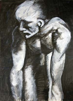
Figure 1.43 Life drawing with chinagraph pencil on cartridge paper. © Angie Taylor, 1982.
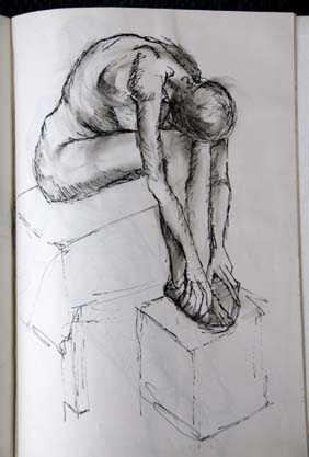
Figure 1.45 Life drawing with acrylic, pen, and ink and on cartridge paper. © Angie Taylor, 1985.
Life drawing classes are a very good way to learn how to study form and structure. The human body is notoriously difficult to master because it consists of so many different shapes and textures. It can also be posed in a never-ending combination of poses. This is what I love most about life drawing: You will never get bored by having to draw the same pose twice!
If you're not confident about drawing people, here's a tip that will help you work out the correct proportions of the human body. In Figure 1.46, the drawing on the left is a human body drawn face-on with no perspective. Notice that I've used a grid consisting of ten equal rows and two columns as a guide to help work out the size of the body parts in relation to one another (for example, the head is approximately 1.5 units, while the chest is 1 unit). You can use this example as a guide to help you work out the correct proportions of the human body.
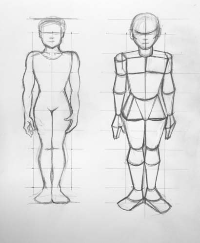
Figure 1.46 The human body broken down into basic shapes. © Angie Taylor, 2010.
The drawing on the right side of Figure 1.46 takes things a stage further. To add a little perspective to the drawing, I've broken down the body parts into basic geometric forms like cubes, spheres, and pyramids to help me build a more three-dimensional character. See how breaking down everything into simple shapes can help you to create more convincing drawings.
Drawing from Photographs or Other Artwork
People may tell you that it's wrong to draw from magazines or photographs, but I don't agree. Although it's always preferable to draw from real life, there's absolutely nothing wrong with copying other images. When I was learning to draw, I regularly copied from magazines and from other artists' work. If it inspires you, use it. Just remember to think about the form, depth, and texture as you're drawing, and you'll learn almost as much as from drawing the real thing. Copying other artists' work is a good way to explore new techniques. Just remember not to feel bad if your drawing doesn't end up looking as good as theirs, particularly if you decide to copy the drawings of a great draughtsman like Michelangelo! Even attempting to understand the processes of such a great artist will inform and inspire your work. Remember, it's not the end result that matters as much as the journey.
Using Photography and Clip Art
As I said earlier, if you feel you really can't draw but you need to create drawings as storyboards or rough sketches, you can use photomontage techniques to create your images. You can still practice some of the exercises in this chapter using these techniques. For example, the perspective lessons can be followed using cutouts in place of human characters. It's important that you still consider the principles of drawing when applying these techniques to make your composite images convincing.
Adobe Photoshop provides a few tools that can help you to work out things like perspective. The amazing Vanishing Point filter is a brilliant tool for creating scenes and placing objects in a scene while maintaining the correct perspective. Chapter 2 talks a little more about the Vanishing Point tool. Some great tutorials about the Vanishing Point tool and other Photoshop features are available on Deke McClelland's fantastically informative, yet compellingly entertaining website at www.deke.com. I'd recommend signing up to Deke.com for fabulous freebies, podcasts, and tutorials.
Recap: Practice Makes Perfect
If you've followed the exercises, you should now feel a little more confident about your drawing skills. If you haven't followed the exercises, then you may have imbibed a little knowledge by reading the text, but if you really want to convert that knowledge into drawing skill, you need to practice the techniques.
You should be fairly confident about choosing the correct materials to draw with. Remember to think about all of the things you learned here when choosing a subject. What's the lighting like? Should you draw from an unusual angle to exaggerate the perspective in the drawing? How will you create enough contrast and depth to the object? What kind of shading will you use?
But most important, don't give up! Even at your lowest moments, even if you feel you have created a substandard drawing, persevere! Your efforts will eventually pay off because frequent drawing will definitely help to make you a better designer.
Inspiration
Rachel Max, Designer and Animator
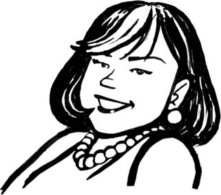
Rachel Max is a designer and an animator (and sometimes an engineer) who currently lives in San Francisco (Figure 1.47). She has also written and directed several short animated films that she has screened in film festivals all over the globe. Max is originally Irish, born and raised in Dublin, but she considers herself fully assimilated into American culture since watching Pee-Wee's Big Adventure on video in 1997. You can see Rachel's amazing work at www.rachelmax.com. Here is Rachel's story.
Figure 1.47 Rachel Max, self-portrait.
“I went to film school—and even that was sort of an accident, as I had chosen the college originally for its physical therapy program. I didn't realize you could study film, and it sounded great—it was great—hard but great.
“I took a computer animation class right before I graduated, and, oddly, that class had more of an effect on my life than any other class in college. We learned to animate using early frame-by-frame software, but after all I went through in film school with actors and securing locations and getting insurance, it was so refreshing to just be able to sit down at a computer and make something myself.
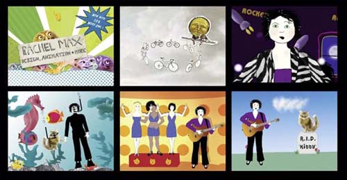
“When I graduated, I bought a G3 (and all the software I could afford) and made short animated films in my parents' basement. I figured that was better than running around getting coffee for people on set in L.A. It took a while, but I managed to get a job doing animation and some light broadcast design for a well-known corporation. Once I was in the postproduction environment, I was able to learn more and finally was able to move to New York and become a freelance animator and broadcast designer. I then moved to San Francisco in 2007 (Figure 1.48).
“Since moving to San Francisco, I really haven't had much time to indulge in creative pursuits, sadly. I suppose that's the price you pay for getting hired to do the work you like to do, and this industry is demanding on one's schedule. San Francisco is so beautiful, and the weather is generally nice, so I find it hard to be at my computer the way I used to. I'm in the process of exploring non-computer-related creative pursuits! I like to paint a little, and I'm involved with a comedy show called Mortified. People read their diaries, poems, and songs they wrote in their teens. Hilarious!
“I'm inspired by all sorts of things: www.motionographer.com is a site I check every day, and although not work-related, I always check www.cuteoverload.com because the power of the cute compels me! For some reason, the song“The Golden Path” by the
Figure 1.48 Some of Rachel Max's personal works.
Chemical Brothers often motivates me when I am feeling otherwise unmotivated. I think it's because the song is a lot of fun, and the associated video is awesome. Watching the video makes me feel lucky that I am designing and animating full time and not trapped making copies in a drab office setting (been there, done that!). And, of course, I love to read anything by Stefan Sagmeister, Mark Christiansen, or Douglas Adams.
“I haven't made a film in a while, but I'm really glad I drove myself to make the ones I did. I was learning AE at the time, and there's really no better way to learn a piece of software than to make something of your own. I am most happy with Dead Kitty because it played on Comedy Central. Also, I miss my dead cat, and it makes me feel like she's still around (a tiny bit). Tear, roll, splash! I was inspired by Terry Gilliam, I suppose. I love his cutout style of animation.
“Right before I left New York, I had the pleasure of working at Big Film Design (www.bigfilmdesign.com) on a proposed title sequence for the movie Failure to Launch (Figure 1.49). I worked with an extremely talented art director (J. John Corbett), and we built the animation using several different bird bodies with an elaborate mesh of expressions. This type of animation can be difficult because even though it's computer animated, it can be just as tedious as frame-by-frame stop motion. Using expressions alleviated some of the repetitious work. It was the first time I was working on an idea for a well-known feature, and I was super-excited. The client decided to go with another title sequence in the end, but I am super-happy with this one!
“This job was for the twenty-fifth anniversary of the Nike Air Force One Shoe, which first came out in 1982 and was the first Nike shoe to use air technology. I think the shoe may have also
Figure 1.49 Failure to Launch titles.
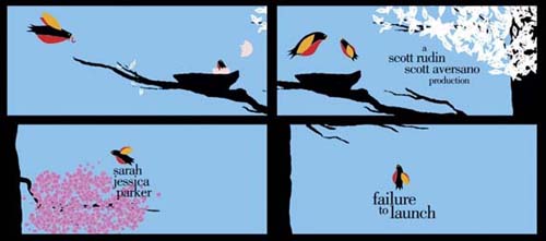
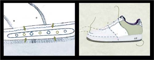
Figure 1.50 Nike Air Force One campaign.
started the whole sneaker-head phenomenon. I worked on this job with Chris Allingham and the crew at RelaTV (www.RelaTV.com). In the first part of the promo we dissected a shoe and focused on the various elements that made the Air Force One a whole new type of shoe (Figure 1.50). After zooming out from the air chamber, I used animated lines along the stitching to emphasize the elegant construction and the animation finishes with the Nike swish hitting the shoe—BAM! Awesome. I chose a muted green/blue color palette so the colors wouldn't detract from the animation. It was a lot of fun to work with an object that is so iconic.
“These (Figure 1.51) were two campaigns done for The History Channel at Cathode Ray Club (www.cathoderayclub.com). The Long March was for TV, and The Rewind animation was done for The History Channel website. The Long March involved a lot of
Figure 1.51 The History Channel stills.
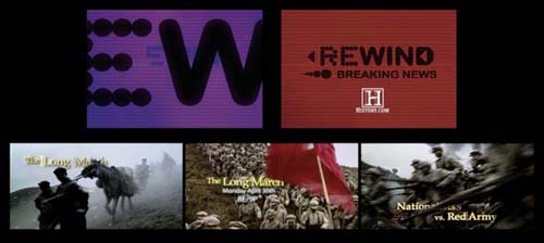
roto, and I loved seeing the result. It proves to me that hard work does pay off. The golden type stands out well against the muted colors of the video. We had a lot of fun with the Rewind feedback effect. Initially I thought we'd animate that, but sometimes it's easier to actually create or tape a real-life event than it is to animate it. We created several video feedback loops to create the bad TV feel and composited them in AE. The idea was to play the type against the jerkiness of the feedback. The type is black, so it is legible against the chaos, but it's animated with Hold Keyframes and reveals backward, which ties in with the unexpected behavior of feedback.”