Chapter 7: Enlivening Information: Establishing a Visual Hierarchy
The “compositions” that most of today’s designers work with are far more complex in information and clearer in objectives than a Renaissance sculpture or an Impressionist painting. If they’re designing an interface for a blog, for example, there are specific tasks and objectives for the user. The user needs to be able to navigate to any page that he wants, but at the same time, the articles on the blog need to be easy to read. Categories need to be easy to navigate to, and information about the blog and its authors need to be clearly accessible.
Making these compositions visually compelling is important for getting new users to stay and for conveying a mood to visitors. But a compelling composition is of little use if the user can’t find what she’s looking for. Many visual standards and user interface patterns have been established for designing on the web, and certain user expectations come along with them.
For a user to be able to navigate through all the information in a website or application, that information needs to be clearly presented and have a clear hierarchy.
What I Mean by “Hierarchy”
The term hierarchy implies that information has a linear progression of important to not important, but this isn’t precisely true. The importance of a piece of information in an interface can change according to the use case. If you see a new blog post on a site that you read frequently, you probably aren’t that concerned with the date of that blog post. If you’re reading a technical how-to about software that is frequently updated, though, the date of the blog post may be very important to you.
Although sometimes you can make some safe assumptions about the relative importance of pieces of information, visually organizing information is a much more nuanced process than simply ranking information by importance.
Take for example a standard blog layout, like the one shown in Figure 7-1. You’ve probably seen many blogs with a layout like this. The logo and title of the blog are at the top. Along with that is the navigation, and maybe even a logo for the name of the blog. In the HTML for the layout, this information is often encased in what is usually called the “header” of the blog.
Figure 7-1 Most blogs have a layout generally like this. The various sections are arranged to establish a hierarchy.
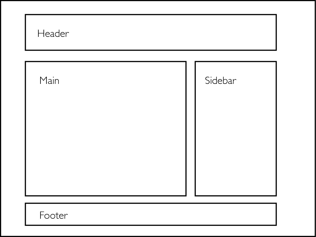
Below the header usually lies the main content area. Within this main content area, you’ll find the content of the blog post in question. This will include the title; the actual content of the blog post; and metadata such as the date of the post, the author, or what categories the post belongs to.
Below the blog post content are comments from readers of the blog. Each of these comments is accompanied, possibly, by a photo of its author and a date and time stamp for the comment.
To the side of the main content area is often a sidebar area, which typically lists categories, a function for searching content on the blog, information about subscribing to the blog, and maybe a few ads.
At the bottom of the page is often the footer. The footer usually repeats links that are in the navigation in the header but also often includes other links such as one to the particular content management system (CMS) the blog is written in or what copyrights the author of the blog reserves.
The various sections of a standard blog layout don’t so much rank things linearly by importance; instead, they express how the various sections differ.
Hierarchy is expressive
There is no way that you could accurately rank these pieces of information from most important to least important and have it apply to every situation. Establishing a visual hierarchy is much more expressive and less scientific than this. Pieces of information have personalities and relationships with one another.
HTML breaks up information into a sort of hierarchy. There are linear distinctions such as the header tags of H1, H2, H3, and so on, but there are other tags such as blockquote and code that simply call out that the nature of the information differs, rather than the rank of that information.
Establishing a visual hierarchy is somewhat congruent to HTML in this way. Sometimes user needs or marketing objectives make certain information indisputably rank higher than other information, but there are many other subtle differences between pieces of information that have to be expressed with more finesse.
Many visual factors can affect hierarchy
Many people who dive into trying to learn how to design make the mistake of trying to work with far too many visual factors when trying to establish a visual hierarchy. As I’ll demonstrate in this chapter, there are many different ways to differentiate different pieces of information and design elements from one another. You can alter the white space or make changes in size, typeface, or visual weight. You can change colors, or use ornamentation such as rules, icons, or solid blocks of color.
Unsure of how to proceed, many beginning designers try to change too many of these factors at once. Usually they change the factors that are the most visually obvious. If they’re creating a header in a blog post, they may change the font, make it larger, change the color, and add a rule or a background image to it. Usually the result isn’t satisfactory. The big secret is, some of the least obvious factors – such as use of proportion in white space – are the ones that have the most impact.
If you’ve never danced salsa in your life, and you were to try dancing to salsa music, what you’d come up with would probably not be pretty. Unless you have incredible natural talent (or lots of experience dancing in other styles), you’d probably look awful. Even if you first watched some skilled dancers, learning by seeing would be very tough. You might see them do a back break, a hammerlock turn, an in-and-out, followed by a double spin, but you wouldn’t know what to call it, and it would go by so quickly that you couldn’t parse it well enough to imitate.
But if you first learned to distinguish the beats of the music, and then learned the basic steps according to this beat, you’d have a good foundation on which to build your salsa-dancing skills. Everything you learned – and everything you saw – would fit within this framework. After learning a three-turn pattern and a cross-body lead, you’d probably look good enough to impress a complete novice. Many dances and lessons later, you’d be a good salsa dancer.
Learning to design – to express and differentiate pieces of information – is much like learning to dance. You have to learn the basic moves before you can tie them together with the more complex ones. But the basic moves of design aren’t as apparent and well known as the basic moves of dancing.
The visual factors that affect the hierarchy of information are like dance steps that fall on the beats of music. If you learn to observe and practice each of them in isolation, you can more easily tie them together.
Hierarchical Factors in Isolation
Even the basic blog layout that I’ve presented is too complex of a song with which to really begin learning to dance. The overall layout has a visual hierarchy: fields of information that differ from one another. These fields of information have hierarchical relationships with each other, but each is also full of hierarchical relationships.
To teach you the basics of creating a visual hierarchy, we need a more basic informational hierarchy with which to work. I’ll use text from a basic lead-in to a blog post, as it might look on the home page of a blog. It holds the title of the blog post, a sampling of the body of the blog post, and a lead-in to read more of the blog post. It also holds metadata about the blog post, such as the publication date, the category, the author, and the number of comments on the post.
It’s clear that some pieces of information here are more important than others. The title is the most important, because it tells you what the blog post is about. From there, depending on the situation, the body copy sampling of the blog post is probably the next most important. The relative importance of pieces of metadata such as the author name, post time, category, and comment count, however, are unclear.
Maybe these pieces of metadata share the same level of importance, but they definitely differ conceptually from one another, and have different conceptual relationships with the other pieces of information. You might say that the post is “by” the author’s name. You may say that the title of the post is “filed under” the category name. You may say that there are three comments “on” this post. You also may say that the post itself was posted “on” a particular date and time. The way that we talk about pieces of information speaks a bit to how those pieces of information differ conceptually.
White space
To really be skilled at expressing how these pieces of information differ, we need to isolate the variables with which we can make those expressions. One of the most important, and maybe the most fabled, is that of white space usage. The term white space is usually used to describe any area that doesn’t have information, or some other design element within it. You’ve probably heard someone say that you should “use more white space” or that something “has too much white space.” But what does all this really mean?
A piece of information with lots of white space around it will often look more important than other information. Two pieces of information that have very little white space between them will often appear to be related to one another.
To isolate and observe how use of white space affects hierarchy, you need to hold all other variables constant. So, I’ll present a composition with all the same font (Helvetica), all the same type size (12pt), and all in regular weight (no bold or italic).
Using a grid to manage white space
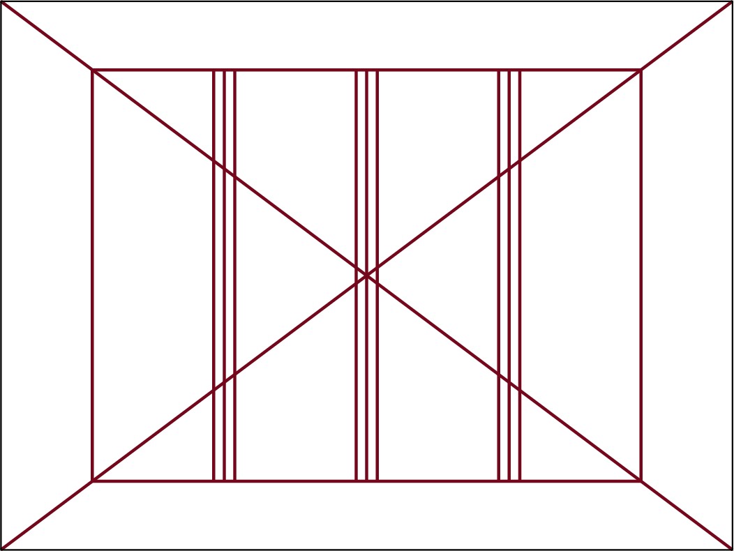
To make good use of the white space, I’ll employ some of the methods of working with geometry that I outlined in the last couple chapters. I’ll start with a canvas that has a 3:4 ratio and create a live area for content, centered within this canvas, that is a 3:4 ratio rectangle whose dimensions are a derivative of the dimensions of the main canvas (see Figure 7-2). So, since the canvas is 300pts tall, the live area will be 300pts wide and 300 × 0.75 = 225pts tall.
Figure 7-2 For my examples, I’ve created a canvas and live area according to the 3:4 ratio.

I’ll create a wide column on the right side of the live area by scaling down another 3:4 rectangle inside the live area. This will create a grid line that will divide the canvas. You could use a similar method to this when establishing a web page layout. By dividing up the live area in this way, you create a wide area for main content and a slimmer area for sidebar content.
Establishing a hierarchy with white space
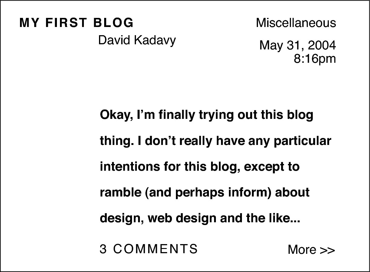
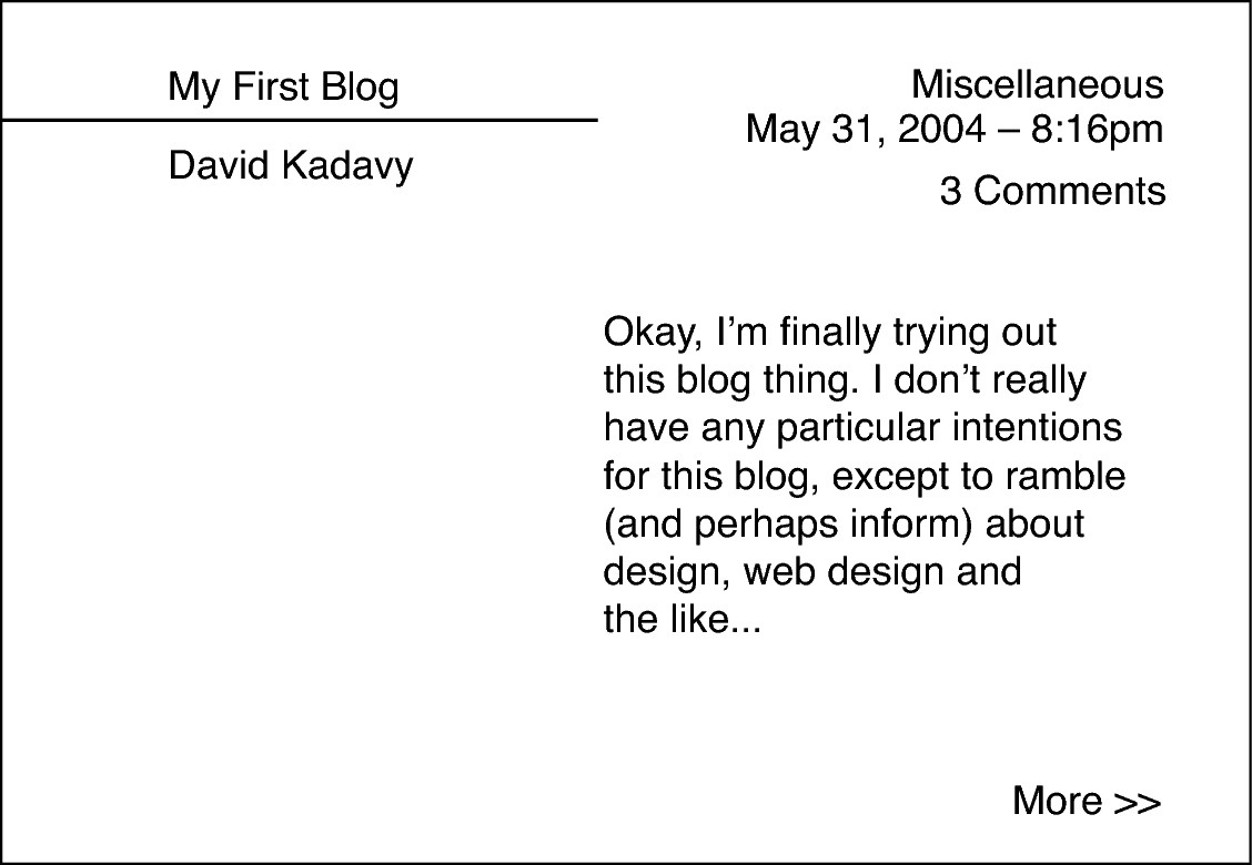
Figure 7-3 is my first attempt at establishing a hierarchy by using only white space. You can see that the methods available for differentiating pieces of information with these restrictions are pretty limited. Here are some of the things I did to make the best of it:
> I set the title of the blog post in all caps and spaced out the letters a bit to differentiate it and make it more prominent. I also placed the title at the top-left of the composition, because that’s where the eye is likely to enter. Notice that I’m avoiding the use of small caps (see Appendix B).
Figure 7-3 When restricted to one font, at one size, I have to rely on well-considered use of white space to establish a visual hierarchy.
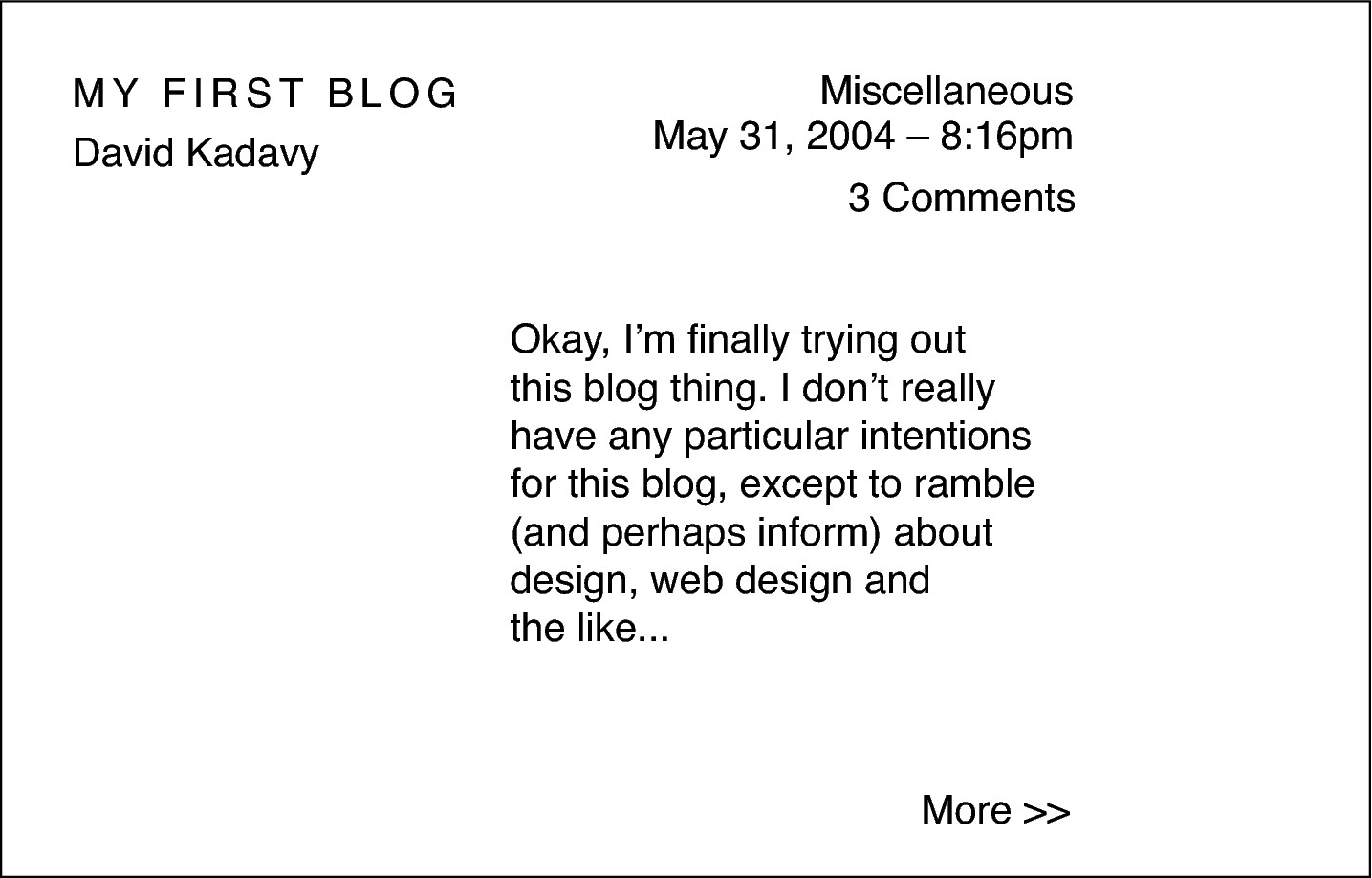
> The author name is close to the title of the post to imply a relationship between these two pieces of information.
> Other metadata, such as the publication date and category, are also placed at the top of the composition, but it’s all set all the way to the right. This horizontal relationship between the metadata and the title implies that these pieces of information are related, but because this information is all the way to the right, it’s less prominent.
> The body of the blog post is aligned along the dividing line that I created. Because it is relatively close to the center of the composition, is highlighted by a large expanse of white space to the left, and takes up a good amount of visual weight because of its sheer size, it takes a fairly prominent role in the composition.
> The “more >>” link is placed along the bottom-right of the live area. This position is a cognitive expression of the concept that it leads to “more.” It stands out fairly well because of the amount of white space there is around it.
Knowing how much white space to use
Just as geometric relationships affect the composition of a design, geometric relationships also affect how individual design elements interact with one another. For example, the amount of white space that I included between the title of the blog and the author name was not random. As you can see in Figure 7-4, the white space between these two elements is equal to the cap height of the text itself.
Figure 7-4 Geometric relationships are used to establish the amount of white space between elements, such as between the title of the blog post and the name of the post’s author.

This same method is used to separate the comment count from the other metadata on the top-right of the composition. The category name and the time stamp, however, are visually linked by having a smaller amount of white space separating them. They’re half the cap height away from each other.
Considering white space this way creates a sense of rhythm and order in the design, making it appear “clean.” Simply considering the amount of white space used between elements, and being consistent, can go a long way toward making a design look more clean.
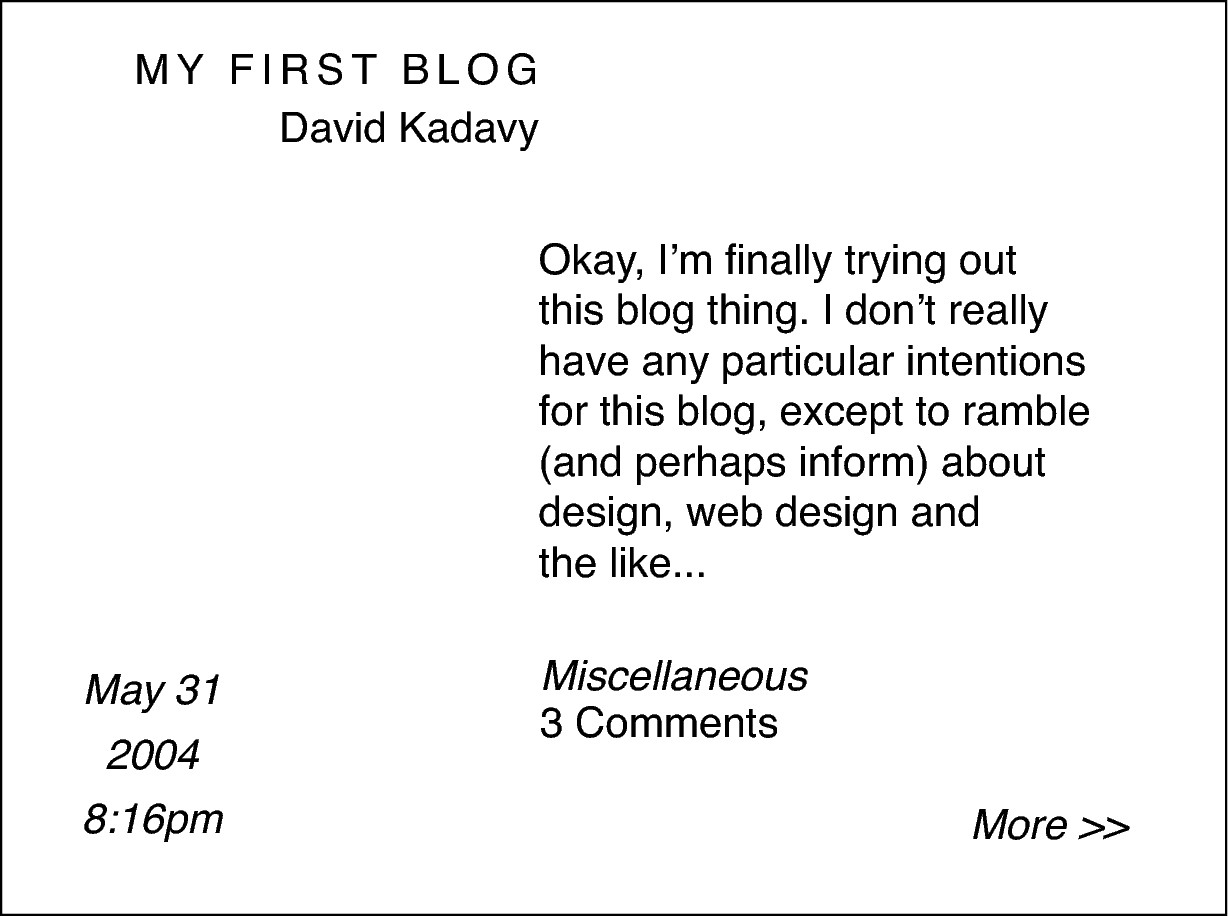
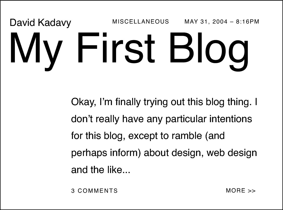
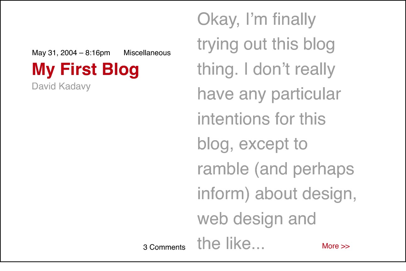
Considering white space and italic font style
Figure 7-5 tries once again to create a hierarchy using only white space, only this time I’ve added a little bit of italic font styling into the mix. This is a small factor to change, but it’s another way to differentiate pieces of information. In this composition, I’ve still put the title in all caps, but this time I’ve made it, along with the author name, flush-right on the dividing line, while the body of the post is flush-left on the opposite side of the dividing line. This creates a directional force that draws your eye to the body copy after reading the title.
The date and time stamp on this composition has been put in its own special area, so it isn’t grouped together with the other metadata such as the category and the comment count. Notice how this changes the way you perceive the date. It looks like a more important element in this iteration, which may or may not be appropriate, depending on how this content is really used.
Figure 7-5 Italics add another potential dimension with which to differentiate information.
Using a four-column grid
In my next composition, I’ll create a grid that is a little more standard than the grid I was using before. Very often, grids are created by dividing the live area of a design into a set number of columns. In this case, I’ll divide it into four columns (as shown in Figure 7-6).
Figure 7-6 For my next composition, I’ll divide the live area into four columns of equal width.
Note that the lines that flank either side of the main dividing lines indicate the “gutters” of each column, which I’ll use in a later composition. The gutter provides some padding between the columns so text elements don’t butt up against each other when they’re in opposite columns.
Grids that are evenly divided can add a little versatility to a design relatively simply. As shown in Figure 7-7, a four-column grid like this one can be used in a standard blog layout. Three of the columns can be filled with a main area of text, while one of the columns holds sidebar information. Or two columns can create an area for main content, while the other two columns – either right next to each other or flanking the main content area – can be dedicated to sidebar content.
Figure 7-7 A four-column grid can be used to organize content in a number of different ways.

Type weight and size
Aside from the careful management of white space, making adjustments in the weight and size of type can go a long way toward differentiating information in your designs. Many inexperienced designers are quick to attempt to use another typeface to try to create variety, but defaulting first to the factors of weight and size can improve your versatility and contribute to elegant designs.
Type weight
In Figure 7-8, I’ll be using the bold version of the font to further establish a hierarchy, but I’ll still be using only one size. I’ll avoid using italics at this point to really give you a feel for how weight changes affect the hierarchy.
Figure 7-8 Using a bold version of the font in my design allows me to make some elements stand out more strongly.
This composition looks pretty similar to the first one that I created, but there are a few differences. Here’s what I’ve done:
> I’ve bolded the title, in addition to using all caps. This should help the title pop out more. I’ve also bolded the body copy, which visually connects it to the title. To avoid the body text area dominating the composition too much, I’ve increased the leading (or line-height in CSS), to lighten up the texture a bit (see Appendix A for more on texture).
> I’ve separated the comment count from the rest of the metadata. Because it’s close to the body copy, this changes the way you perceive the information. It suggests a stronger relationship between the comments, and the actual content of the blog post. In the first composition, the comment count was grouped with the category and the time stamp, which made an almost dismissive statement about the comments submitted by the readers.
> I’ve lined up both the author name and the body copy with the first column grid line. This connects the two pieces of information. The author name is still close enough to the title to be connected to it, but the title extends all the way to the leftmost margin of the composition, elevating its importance.
Type size
On this same grid, I’ll create another composition (see Figure 7-9), but this time the only factor I can change is the size of the type. I won’t even be changing the weight. I’ve made the title so large that – even with the metadata above the title – the title still dominates the composition. I’ve placed the author name above the title, flush-left, and the category and date are in all caps, in a smaller type size, starting from the right-hand side of the composition.
Figure 7-9 The use of a drastic size change in the title of the blog post allows meto place the metadata above the title without superseding it in importance.
Though these three pieces of metadata are connected visually by being aligned with each other, the author name is different. It isn’t in small caps and is in a larger type, which is intended to express – in this context – that this is a person, not a chunk of data.
The comment count, and “more >>” link are differentiated from the body copy in that they are in slightly smaller type, but in all caps.
It’s clear that making size changes can have dramatic effects on hierarchy, but I haven’t chosen these type sizes haphazardly. Just as early printers were very restricted on how many different fonts they could use (because making new fonts was such an involved process), they were also very restricted in how many different type sizes they could use. In fact, a set scale of type sizes was usually produced when a new font was made.
This restriction was a blessing, because changes in size are best done with some proportional consideration. Since there are so many other ways to differentiate information, it’s best to make size changes that make a discernible difference. Using 13px type to differentiate from 14px type isn’t very effective or attractive.
This is why, just as the circles that make up the MailChimp logo (see Chapters 5 and 6) have a proportional relationship, it’s good practice to pick some proportional scale of type sizes to work with. For example, Figure 7-10 shows the type sizes that I typically work with.
Figure 7-10 These type sizes have a 3:4 proportional relationship.
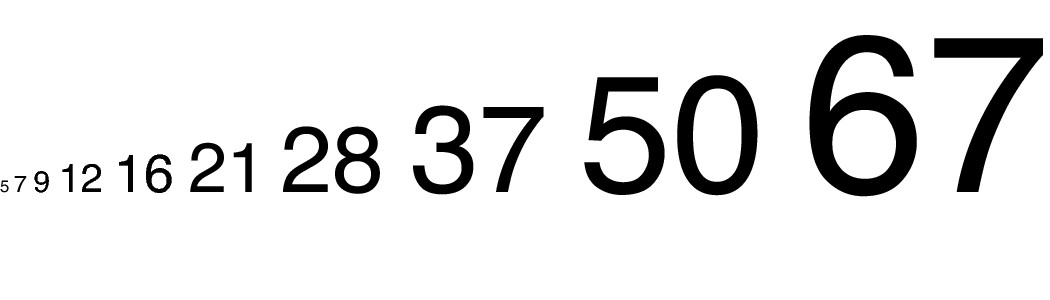
Type sizes such as 5 and 7 are pretty much reserved for print applications or for when I’m using all caps, but I built this scale by starting with the smallest size I might conceivably use, 5pts, and dividing it by 0.75 (and rounding) repeatedly. The result is a scale of type sizes that have a proportional relationship with each other.
Sometimes jumping directly from one of these sizes to the next highest or lowest doesn’t have as much impact as you might hope. For example, the size difference between 9pts and 12pts is pretty subtle. You can achieve a similar change in hierarchy by sticking with 9pts and simply making headers bold, instead of larger, as demonstrated in Figure 7-11.
Figure 7-11 Using factors such as font weight, or more dramatic size changes, to differentiate information is better than using subtle size changes.

Or sometimes it’s useful to just skip a step in the scale. The size difference between 9pts and 16pts, for example, can actually have a meaningful impact.
With the limitless choices in type sizes today, working with a scale such as this can simplify your choices, and remind you that there are other methods you can use to differentiate information.
Combining weight and size
While weight changes or size changes alone can produce dramatic effects, the two factors together can differentiate information even further. In Figure 7-12, I’ve bolded the title, the author name, the number of comments, and the date and time stamp. The combination of large size, all caps, and the bold weight of the font make the title dominate the composition. The fact that the title takes up most of the left half of the composition (the first part to be read) makes the title look about as important as it could.
Figure 7-12 Using size and weight changes in combination can produce an even wider range of visual importance.

Directly on the opposite side of the gutter (the padded space between the columns) are the category, the body copy, and the “more >>” link. It’s generally not polite to “scream” on the web, but the introductory piece of the body copy is short enough (and letterspaced enough) that using all caps is okay in this case.
Color
Adding color to the mix can make some hierarchical acrobatics possible, too. Notice in Figure 7-13 that even though the body copy and title are the same size in this composition, the title still stands out as much more important. Because the title is red and bold, it stands out much more than the gray body text does.
A red as intense as this naturally stands out more than a light gray and even contrasts strongly with a pure black. But the interactions between colors are often much more complex and nuanced. (I talk more about how colors interact with each other in Chapter 9.)
Figure 7-13 Making the title red makes it stand out, despite the fact that the light gray body text is the same size as the title.
Visual ornamentation
Even with all the various combinations of size, weight, and color that you can use to establish a visual hierarchy, chances are, most projects you work on will have much more to them than this. Iconography can be indispensable in helping to guide your user, and images are usually a requirement for communication at some point. Additionally, with the complexity of most layouts, vertical and horizontal rules, blocks of color, and even gradients can help to divide and enliven the page.
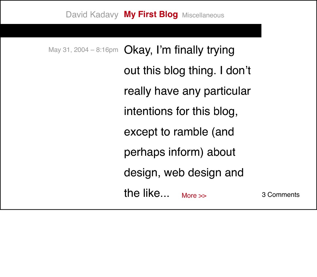
I’ve started with the simplest implementation of visual ornamentation possible in Figure 7-14. This composition is simply a revision of the first composition, which you saw back in Figure 7-3, but this time I’ve added a very thin horizontal rule underneath the title.
The rule “bleeds” all the way from the left edge of the composition, so your eye naturally enters on this rule. Because the title is so close to this rule, it’s one of the first things you notice. I’ve even changed the title from all caps to mixed lowercase and capital, and it still manages to be very prominent in the composition by virtue of its presence in the top-left (where reading begins) and its proximity to this horizontal rule.
Figure 7-14 A simple but strategically placed horizontal rule is enough to make the title prominent.
In Figure 7-15, I’ve mixed the use of visual ornamentation with other factors such as weight, size, and color. The only visual ornamentation that I’ve used here is a thick, black horizontal rule. Aside from its dominant presence – just by virtue of being large and dark – because it “bleeds” all the way from the left edge of the composition, your eye is naturally drawn to this bar.
Figure 7-15 The dark black bar helps the title stand out, despite actually being smaller than the body copy of the post.
To demonstrate the impact that visual ornamentation can have, I’ve made the title smaller than the actual body copy of the post. Because the title is red and bold, it contrasts sharply with this large black bar, and because your eye is naturally drawn to this bar, the title is easily noticed because of its proximity. The author name and category flank the title, each with its own styling.
As valuable as visual ornamentation is, it often gets overused. When a simple layout doesn’t quite look “clean,” many beginning designers instantly lean on the crutch of visual ornamentation. But, just like any other factor of visual differentiation, ornamentation can be used sparingly if other factors are used skillfully.
There is no more common example of overuse of ornamentation than in tabular data. Most people think that tables, constructed of columns and rows of data, need plenty of vertical and horizontal rules. The logic behind this for most people probably lies in how a table is read – the rules presumably help guide your eye to find the data in any specific column/row.
Figure 7-16 shows a typical application of tabular data. Each piece of information has been cordoned off into its own little box by having dark rule lines border all sides. This is ostensibly to help guide the eye, but it really just adds to the clutter of the design.
Figure 7-16 Data is often presented in tables such as this one, which is cluttered with unnecessary rule lines.

As Edward R. Tufte explained in his book Envisioning Information, attempting to further differentiate information in this way is an example of the concept of 1 + 1 = 3. What this means is that pieces of data arranged in a table such as this are already visually divided by virtue of the white space between them. When you interrupt this white space with a rule, you now have two areas of white space and a rule (three things) all with the purpose of separating these pieces of data. So, 1 + 1 = 3. To make matters worse, you also have entire elements (the rule lines) that don’t carry any information, thus cluttering the design.
Upon hearing this, you might argue that the rules are there to guide the eye. But, as I demonstrated in Chapter 6 when explaining the design principle of direction, the mere alignment of elements can be very powerful in guiding the eye.
Figure 7-17 shows the same tabular data, this time with no visual ornamentation at all. Instead, the title of the table has been bolded, and the numbered data is in italics. There is also more white space between the title and the first row of data than there is between the rows of data themselves.
Figure 7-17 Utilizing the principle of direction, by virtue of alignment of elements, can make tabular data much cleaner.

Admittedly, this is a very simple table. Sometimes tables with much more data points can be more difficult to navigate. Although you may surprise yourself with how little visual ornamentation you can get away with – whether you’re working with tabular data or a complex layout – sometimes a little more visual differentiation can be helpful. For example, Figure 7-18 shows the same table, this time with alternating highlighted rows. Highlights such as these can help the eye keep track of the row when tables of data are very wide. They also can make the table look more interesting (which, in itself, isn’t a great reason to use them).
Figure 7-18 Highlighted rows can sometimes assist in navigating a table, but other ornamentation can still be used sparingly.

Notice that there is still very little use of rule lines in this table. The highlights themselves are a good indicator to separate the various rows of data, and border lines are not necessary to signal the ends of those highlights. The outside edges of the table are clearly defined by the ends of the highlighted rows. The ends of the highlighted rows also line up with the ends of the horizontal rules that signal the top and bottom of the data rows. This conscientious use of visual ornamentation results in a table that is both easy to read and clean looking.
I’m using tabular data as an example to expose the logical justification for using visual ornamentation because tabular data has a clearer purpose than most information that you may encounter in your projects. This same thought process can be applied when designing a blog layout, an interface for a social application, or an interface for a mobile application. What’s most important is that every design element, every graphic or piece of ornamentation, and every expanse of white space – big and small – is at least considered.
Hierarchy at Work
Now that you’ve seen how all the different factors that can shape the hierarchy of information can work independently – and with one another – you’re better equipped to understand the thought process behind more complex designs.
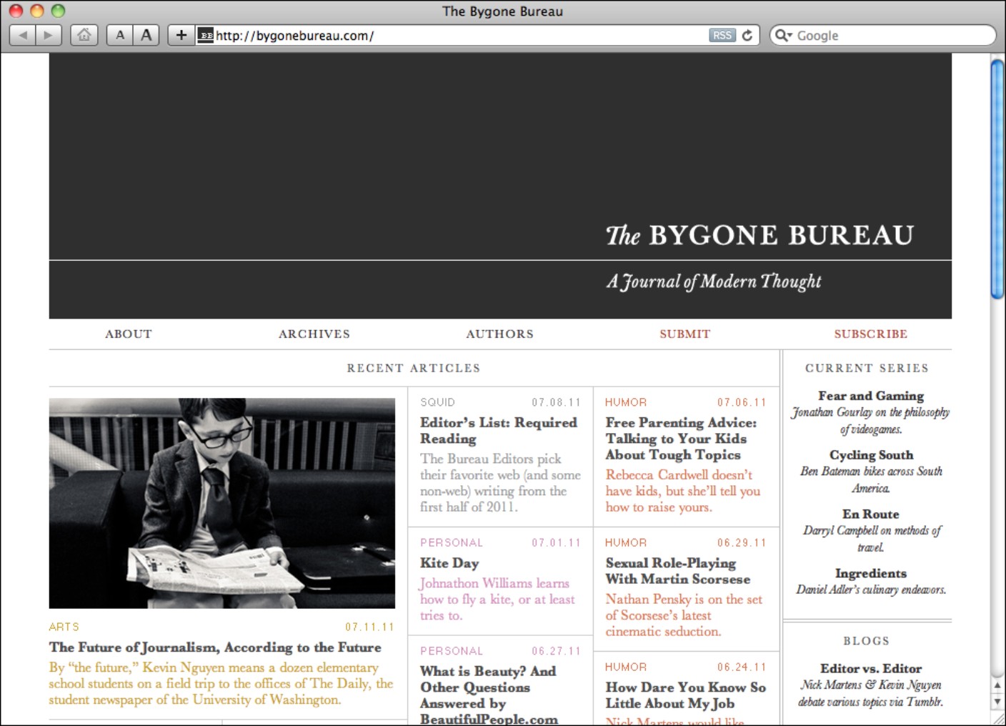
The online magazine The Bygone Bureau (http://bygonebureau.com), designed by the design firm Sleepover (http://sleepoversf.com), makes very good use of subtle manipulation of hierarchical factors (see Figure 7-19). The result is a design that is very simple and clean and that invites the reader to take his time with the content. This makes sense, because the site’s mission statement says that they “believe in publishing good ideas and polished prose.” They appreciate language, and the site’s design is all about the words.
Figure 7-19 The Bygone Bureau has a clean-looking layout and design because it uses typography elegantly.
Reproduced by permission of The Bygone Bureau
The Bygone Bureau uses typography elegantly in its design. Changes in fonts are very subtle and limited in the site’s design. The main font on the site is Baskerville, which is a classic and one of the first transitional fonts (see Chapter 3). Baskerville is used in the site’s masthead, in titles of articles, and anywhere else there is a small amount of text to be consumed.
Considerate of readability, they cleverly switch to the Georgia font for body text. Georgia is very similar to Baskerville, but because it’s specifically designed to be displayed on-screen, it’s much more readable in body text. Baskerville has some more subtle forms, though, and this is why it does very nicely as a titling font. (See Appendix B for more on pairing fonts).
NOTE
It’s normally poor form to work with two different serif, or two different sans-serif, typefaces. But because fonts that read well at body-copy sizes on the web don’t tend to look so good at header sizes, there are exceptions to this rule. (See “The exception to the rule” in Appendix A for more.)
Because Baskerville and Georgia are so similar to each other, carefully considered chunks of white space, and carefully considered size and weight changes are used to differentiate pieces of information from one another. Notice in Figure 7-20 that the distance between the title, subtitle, rule, and paragraphs are all the same.
Figure 7-20 The white space between elements is carefully considered.
As you can see in Figure 7-21 Helvetica is thrown in to separate informational chunks (such as category post and date) from the meatier content of the site.
Figure 7-21 Helvetica is used on some of the article metadata, which expresses the different nature of this information.
The overall layout of the home page gives the reader a sampling of some of the content. The site is laid out on a five-column grid. The very dark and heavy masthead of the site dominates the composition, but its design is still as simple as the design of the rest of the home page.
The most recent article is called out as the most important because it spans two columns of the layout, is accompanied by an image, and sits on the top-left, where the reader first starts reading. The rest of the excerpts take up one column each and are color-coded according to category. I should acknowledge that the pastel colors are, in fact, a little hard to read, but the elegant use of typography is nonetheless impressive.
The various article excerpts are separated with very thin and light vertical and horizontal rules. It’s possible that these rules may not be necessary, but they’re definitely less intrusive than the ones in my table description from earlier. Instead of using a thicker or darker rule to separate the final sidebar column from the rest of the layout, double rules have been used, which adds some sophisticated styling.
A really interesting decision has been made about the hierarchy of the layout on the post pages of The Bygone Bureau. Instead of placing the masthead at the top-left of the page, as is generally a website convention, they’ve placed the title of the article in the prime spot at the top-left of the page. This makes a statement about their belief in the importance of their content and calls into question this convention: Is the name of the website always more important than the content of the page? Prioritizing this information on the page also places the title of the article above the name of the site in the HTML code, which actually makes sense for search engine optimization (SEO).
The Bygone Bureau design makes some elegant use of typography through subtle hierarchical changes, while making a statement about the core beliefs behind the site.
Knowledge Applied
Today’s design challenges present very complex hierarchical relationships. At the same time, designers can work with a number of different factors to establish this hierarchy. Understanding how each of these factors works in isolation is critical in developing your design skills.
> The next time you see an interface – or even a poster – that you think is well designed, look carefully at how the designer has established a hierarchy of information. What factors has the designer worked with to differentiate pieces of information from each other?
> The next time you’re designing something, try stripping out all the excess visual ornamentation, using only one font, and starting with the same type size. See how well you can establish a hierarchy with these restrictions. When you’ve explored a bit, try adding in other factors such as bold type or size changes.
> Try working with a varied scale of type sizes like the ones I described in this chapter. You can work with the sizes that I provided, or experiment with building a scale of your own using the proportions in Chapter 5. Once you get accustomed to using a certain scale, choosing the right type size will become second nature to you.