Chapter 3. Determine Your Goals and Supporting Data
Knowledge Before Structure
OK, here we go, ready to build a visualization! And the first step is…step back and think. Successful products (and software) begin with well-thought-out designs, and spending time thinking before diving into implementation provides a huge return on the time invested up front.
The very first thing to think about is the goal of your visualization. To be useful, that goal must be defined before the implementation phase has started. The visualization (like any product or communication) must then be designed with that goal in mind.
The goal of your visualization is going to be informed by your own goals and motivations as well as the needs of your reader. A visualization’s goal is usually to satisfy a need for specific information on the part of your reader (an informative visualization, as discussed in Chapter 2). But the goal may also be to change the reader’s opinions or behavior in some way (a persuasive visualization, also covered in Chapter 2).
Examples of goals for visualizations include: to monitor systems, find bargains, compare company performances, select suitable solutions, track populations, tell stories, find specific data points, find outliers, show trends, support arguments, or simply give an overview of the data.
Note
Goals should be stated in terms of the knowledge that can be acquired from the visualization, and should avoid any references to specific content or implementation—don’t box yourself into a specific approach yet.
To begin defining the goal of your visualization, ask yourself, What information need am I attempting to satisfy with this visualization? Related questions include:
What values or data dimensions are relevant in this context?
Which of these dimensions matter; matter most; and matter least?
What are the key relationships that need to be communicated?
What properties or values would make some individual data points more interesting than the rest?
What actions might be taken once this information need is satisfied, and what values will justify that action?
You eventually should be able to concisely state the goal of the visualization in specific terms, and without motioning any details of implementation. The goal is a pure statement about function. Consider which statement in each pair below is the better statement.
Show the sales figures / Show which product lines are performing best and worst in each region, for each of the last five quarters
Compare the demographics of Twitter and Facebook users / Compare the ages, education, and income levels of Twitter and Facebook users
Show a timeline of the performance of every NFL team for the 2011 season / Allow users to compare individual performance metrics for any pair of teams or for the entire league for the 2011 season
While it’s obvious that the second statement in each pair is more specific, stop and think for a moment about why they’re also better goal statements. They indicate specific values and relationships that the visualization should make available to the reader. This level of specificity will directly guide the design process in a particular direction, indicating what data dimensions should be included, how they should be related to each other, and why.
In contrast, the first statement of each pair conveys a general intention, but no particular direction, and lends no specific guidance in determining what to include, how it should relate to anything else, or how to tell if and when you’ve achieved your goals.
Note
If some statements seem to have conflicts in priority, you may have defined your goals too broadly.
Note also that the better statements have no mention of particular implementations. They don’t specify using a timeline or bubble plot or pie graph. They talk about what knowledge is displayed, but not how it is structured.
As soon as your goal statement includes any detail of implementation, you’ve killed your own potential for creativity. You have preemptively selected one particular solution out of many that are possible, and constrained all of your future thinking to within the bounds of that box. If you want to be creative and innovative and come up with superior solutions, delay the decisions about implementation as long as possible, until you’ve really got a good handle on the function you want to provide and the goal you need to achieve. Then you can select (or invent!) the best solution for the parameters of each given situation. The easiest way to think outside the box is to not put your self into a box in the first place.
Note
Pro tip: this applies to programming (and relationships) as well. For best results, have a complete conversation about desired functionality before you’re allowed to discuss implementation.
Having a clear understanding of the goals for your visualization will help you achieve your overall communication goals as well.
Avoiding TMI
Look at your inbox. There are probably too many messages there. A few of them are really important. Some are probably somewhat useful. A lot of them are likely noise, and make finding the relevant messages more difficult. The data in a visualization works the same way. The more information that’s included, the harder it is to find the information that you (or your readers) care about.
Extraneous content will obscure the message and complicate the extraction of knowledge.
It is tempting to show as much data as possible. We have access to a lot of data, and it’s easy to be seduced into including more data because it would be cool, or because it’s more impressive that way, or simply because we can. But the choice of what to include must be based on the priorities we’ve discussed: your goals, the needs of your reader, and the shape of your data. It’s more powerful to reveal knowledge and facilitate insight than it is to overwhelm with sheer volume.
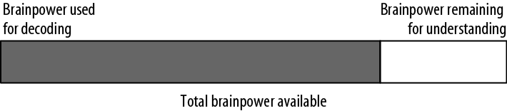
When reading a visualization (or any other kind of communication), your reader has a limited amount of brainpower to dedicate to the problem (Figure 3-1). Some of this brainpower will be dedicated to decoding the visualization; any brainpower that is left may then be used to understand the message (if the reader hasn’t yet given up in frustration).
In order to be successful, your job is to facilitate understanding by minimizing the amount of extraneous searching and decoding necessary to get the message.
One important way that you can limit the amount of extraneous searching and decoding your reader has to do is to choose encodings that most are easily decoded by the brain. This is the subject of Chapter 4 and Chapter 5, so we will cover it in much more detail shortly.
The other important way that you can limit the amount of extraneous searching and decoding your reader has to do is to be selective about the dimensions of data you choose to encode. Each one should contribute something directly to your message. If you’re adding labels or shading, or another full dimension of data, that doesn’t contribute to your main message, you’re just adding noise. We suggest, instead, embracing a clean, modern aesthetic, and making your important data easier to access.