
HOORAY, YOU HAVE GESTURES! But, um, do your users know it? Gestures are useful only if people can find them. Otherwise, they’re Easter eggs, hidden treats for the lucky or determined—and most users are neither. The challenge, of course, is that gestures are invisible, unlike buttons with their labeled invitations to action. If the interface doesn’t clearly suggest a gesture, you must help people discover it. This chapter explores the subtle craft of making gestures seem intuitive, even when they aren’t intrinsically obvious. We’ll look for the essentials of self-explanatory UI in sources as varied as magazines, ancient manuscripts, and video games. All demonstrate the gold standard for a discoverable interface: just-in-time education that reveals itself in context, no manual required.
UP-FRONT INSTRUCTIONS ARE NOT THE ANSWER
Designers too often turn to manuals, FAQs, and elaborate cheat-sheet overlays to explain the niceties of three-finger swipes and five-finger pinches. While these guides are valuable references, they’re terrible learning tools. When you present too much detail too soon, the result is overwhelming, giving the impression that your app or website is more complicated than it is (FIG 5.1).
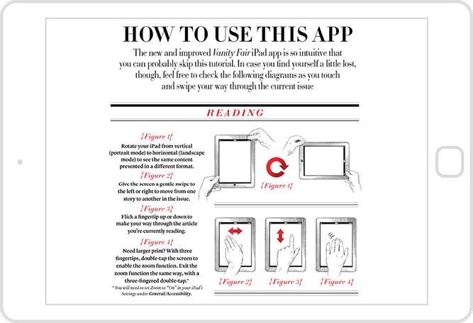
FIG 5.1: When Vanity Fair introduced an iPad app, its complex instructions suggested the app was anything but the “intuitive” experience they promised.
It isn’t only the volume of the instruction that puts people off, it’s also that it exists at all. Newcomers to your site or app are there to get something done, and instructions feel like a diversion. The rub is that reading them would almost always help us do that thing faster, but we’re too impatient to bother. Most of us have incomplete knowledge of the tools that we use every day because we never, ever RTFM (read the, ahem, freakin’ manual)—which is why strapping a tutorial or video onto the front of your user experience isn’t as valuable as letting people dive in and experiment. We’ll examine effective onboarding techniques later. But first: sometimes the right interface metaphor is all the instruction people need.

FIG 5.2: What if physical magazines had the same instructions as iPad magazine apps? This sendup by designer Khoi Vinh shows how complicated our most elegant interfaces become when we overload them with instructions.
SKEUOMORPHIC DESIGN: “I ALREADY KNOW HOW TO USE IT”
As we saw in the last chapter, if an interface element looks or behaves like a physical object, people will try to interact with it like one. And the less a gesture resembles a physical action, the harder it is to find. Those guidelines explain the effectiveness of skeuomorphic design, an approach that plays dress-up with digital interfaces, making them look (and hopefully act) like physical objects. If an interface looks like a book, it instantly suggests that we should use it like one by swiping through pages to advance through the content. The metaphor teaches simply by matching the visual design to the underlying interaction. “Hey, that’s a knob [or a book or a microphone or a bird-hurling slingshot]. I already know how to use that thing.”
Skeuomorphic design runs into trouble as a teaching device, however, when the designer doesn’t embrace the metaphor. For the iPad’s first eighteen months, the Calendar app’s leather-bound datebook didn’t behave like a datebook. It looked like the real deal, but when you tried to swipe at its pages, nothing happened. The same was true of the original Contacts app, only worse: swiping the screen to try to turn the address book’s pages actually deleted content (FIG 5.3).

FIG 5.3: The original Contacts app for iPad looked like an address book but didn’t act like one. When you swiped to turn the page you instead deleted contact info. Whoops!
Such dangerous misdirection shows the damage when visual design doesn’t match interaction design. Be aware not only of the interactive opportunities your interface metaphor proposes but the opportunities it promises. If your design promises that people can flip pages, then it must allow it. Don’t go for “looks like” if you can’t pull off “acts like.”
The “looks like”–“acts like” pairing at once departs and evolves from what artists and designers have playfully practiced for centuries. Monks etched three-dimensional trompe l’œil effects in illuminated manuscripts to create the illusion of scrolls, curled pages, or stacked sheets of paper (FIG 5.4). More recently, interactive designers of the 1980s faithfully reproduced calculators, calendars, and books as UI elements for the Macintosh and other graphical interfaces (FIG 5.5). Historically, we’ve understood these flourishes as ornamentation—harmless eye candy. We didn’t expect any direct interaction; we knew that a desktop interface that looked like a book would still be operated via desktop-style buttons. But when that visual prank hits the touchscreen, we’re taken in. Remember: the physicality of touch creates the illusion that there is no illusion. Touchscreen interfaces that look like physical objects will confuse and misdirect if they don’t also act like those objects.

FIG 5.4: The designer of this 15th-century Book of Hours drew its pages to make it look like they were written on scrolls of parchment—a playful throwback to an earlier era of reading technology. It’s fair to guess that nobody fell for the trick and tried to open the page like a scroll. That changes when you introduce a touchscreen. Image from the Bibliothèques de l’Université de Liège.

FIG 5.5: We’ve been playing the “looks-like” game on the desktop since the early 1980s.
WHEN DESIGN FALLS FLAT
If “looks like” can’t travel without “acts like,” what about the reverse? Does an interface work if it behaves like a physical element but doesn’t look like one? Many designers pooh-pooh the visual aping of real objects for aesthetic reasons, and skeuomorphic design can veer into kitsch. But removing all the “looks like” cues for touchscreen elements can flatten more than their looks. iOS provides a cautionary tale.
In 2013, Apple released iOS 7 in a redesign that followed the flat aesthetic popularized by Windows. The company ruthlessly slashed skeuomorphic elements: buttons morphed into unadorned text, sliders became flat blocks, and cards lost their borders and shadows. In doing so, the designers championed a focus on content and visual efficiency, eschewing “frivolous” decoration like shadows, glossy surfaces, or lighting effects—the trappings of the physical world. Though the goal was worthwhile, the implementation was tough to follow. Experienced Apple users knew how these flattened widgets functioned from past versions, but newcomers faced precious few visual clues. Widgets still behaved with physicality—sliders slid, cards flipped—but figuring out that they were sliders or cards was trial and error. Worse, the flattening of the interface also squashed the discoverability of basic elements, even buttons.
If you eliminate skeuomorphic cues, fill that vacuum with other instructions. They can be subtle suggestions like visual hints or animations. In Windows, the operating system proposes that panoramas, its horizontal tile grids, can be swiped and scrolled by dangling offscreen tiles in partial view (FIG 5.6). In iOS, the “slide to unlock” slider invites swipes by animating a glow from left to right across the text. As for Apple’s flat design, the company later retrofitted its operating system with an option to restore a faint outline to its otherwise naked buttons.

FIG 5.6: The clipped tiles at the right edge of Windows panoramas cue you to swipe or scroll.
These aesthetic interventions and motion cues hint at an element’s interactive role, so that it doesn’t have to look like an actual object. The sliding tiles in Windows, the list items in the Clear to-do app, the rubber-band bounce in iOS when you reach the end of a list—none of these digital elements pretend to look like a real-world thing, but they do behave according to physics. The illusion of physicality does not rely on things looking real, only acting real. In fact, there’s danger in making things look too real.
DON’T BE SO LITERAL
When a design becomes too tied to the physical “truth” of its interface, it risks losing digital opportunities. The magazine industry’s first generation of tablet apps, for instance, hewed so closely to the behavior of a paper magazine that they were little more than PDFs. They were dead simple to use—swipe forward and backward—but they didn’t take advantage of the most essential digital superpower: random access to content. In many apps, the table of contents was elusive, so you couldn’t just leap to the content you wanted to read. The overly literal embrace of the physical metaphor felt like a step backward.
Improve physical metaphors with digital-only enhancements
Let your interfaces do things humdrum physical objects cannot. The innovation of replacing hardware buttons with a touchscreen transformed our devices into shape-shifters, bending the traditional physics of industrial design. At first glance, the Sydney Morning Herald iPad app looks and behaves like the paper version. Tap the page-indicator dots at screen bottom, however, and you see a quick-reference list of every headline on that page. Slide your finger across the dots and you scan all the day’s stories for instant access to any article without swiping through the whole lot (FIG 5.7). The app pairs the familiarity of a paper newspaper with the digital efficiency of unshackling content from an analog page-by-page experience.

FIG 5.7: The Sydney Morning Herald’s iPad app puts a paged browsing experience front and center, but lets you rapidly browse headlines by sweeping across screen bottom.
The Herald app shows that effortless interfaces can draw on more than physical know-how. Mouse-driven experience informs expectations too. In Maps for iOS, newcomers easily discover that tapping twice zooms in—something they’ve gleaned from double-clicking in Google Maps. But you’re without a compass when you encounter gestures that have no context or history. Nobody ever fathoms that you can do a two-fingered single tap in iOS Maps to zoom out (that’s a real thing). Nothing from either physical or digital maps suggests to even try it. When gestures don’t match up with past experience, they become abstract and require explicit help to find.
Explicit help is okay, by the way. I’ve heard designers say, “If your interface needs explanation, you’ve failed.” It isn’t true. While basic features should be easy and obvious from the get-go, advanced features always need a little instruction, even in the most well-considered interface. The best learning takes place while doing, however, which is why help screens and FAQs let us down. A better way is to teach gradually and contextually, and lucky for us, we have a great way to learn how:
PLAY MORE VIDEO GAMES
Video game designers are pros at teaching unfamiliar interfaces. In many games, you don’t even know the goal, let alone your capabilities or the obstacles you might encounter. How do you learn this stuff as a player? Not by reading a manual or watching a screencast. You learn by playing the game. The game itself teaches you how to play, drawing you in and showing you expert moves once you’ve mastered the basics. Among other techniques, games lean on three tools to get this done: coaching, leveling up, and power-ups.
Coaching
You know the old saw: telling how to do something isn’t as effective as showing. Reading a book is not the best way to learn an instrument or serve a tennis ball. Instead someone shows you, and you imitate and practice. Every modern theory of learning emphasizes the importance of active participation and discovery, supplemented by mentoring. In other words, we learn by doing, and we learn best in the moment. That’s coaching, and that’s what the best self-teaching interfaces do. Games deploy this approach over and over. Coaching is the game riding along with the player (or your website riding along with the user), demonstrating useful techniques at appropriate moments.
In the iPad version of the game Dead Space, the first screen teaches you how to move, applying an overlay that demos what to do, then inviting you to try it yourself (FIG 5.8). Once you’ve traipsed across the room, the overlay disappears. One of the most crucial parts of coaching is knowing when a skill has been learned and when to move on to something new.

FIG 5.8: Learn to walk before you run: an overlay in Dead Space provides dead simple coaching to tell you how to move in the first screen of the game. The animated hand traces the cross shape, prompting you to do the same.
“Do, don’t read” is even better than “show, don’t tell.” Dead Space pairs instructions with action; you practice the skill at the same moment it’s taught. Compare that to the traditional tutorial that starts so many mobile apps. These tutorials are typically static screens that illustrate key features, controls, or gestures, isolated from the content or actual use of the app (FIG 5.9).

FIG 5.9: A simple tutorial for alarm clock app Rise shows static images of the gestures for setting alarms.
Tutorials ask you to commit gestures to visual memory. By making you do an action, Dead Space helps you commit the gesture to far more effective muscle memory. Again, the basis of learning physical actions is repetition: a loop of demonstration and practice. When teaching gestures, get people repeating moves early and often. The tutorials for Mailbox (FIG 5.10) and Dots (FIG 5.11) do just that, forcing you to perform each gesture to continue.

FIG 5.10: There’s no Continue button in the tutorial for iOS app Mailbox; you have to complete the described gesture to keep moving.

FIG 5.11: The tutorial for the game app Dots introduces you to the essential mechanic: connecting dots. To continue the tutorial, you have to complete each dot-connecting task.
Walkthroughs beat tutorials. While the Mailbox and Dots tutorials are effective at teaching controls, they also feel like stilted lessons, a series of hoops to hop through before you can use the app for real. Dead Space trumps both with its in-context walkthrough, a strictly choreographed tour of features in the actual working environment of an app or a site. It’s like training wheels: you’re moving on your own, but with a few supports to keep you from falling. Note-taking app Noted, for example, guides you through fixed steps for creating and editing your first note (FIG 5.12).

FIG 5.12: The walkthrough for Noted takes you on a predetermined path through the app, and you create your first document as you go. The dot animates to show you where to swipe and tap.
Facebook Paper grants you total freedom from a set path; you explore on your own, and Paper explains key interactions as you bump into them (FIG 5.13). Gestures are animated onscreen to show you how they work, encouraging you to mimic the motions. (Demonstration and practice!) You can follow the app’s cues or not—you stay in control. This is the most effective style of walkthrough, and the kind games most frequently deploy.
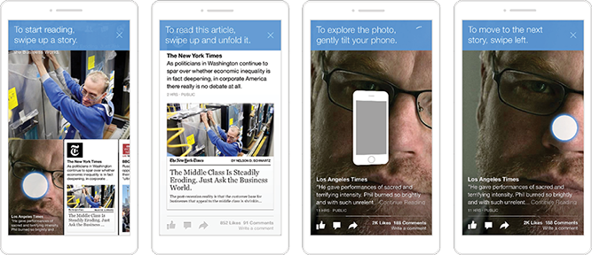
FIG 5.13: Paper prompts with animation, text, and speech to explain new features as you find them.
All of these coaching examples explain their gestures via text and labels, but you can also hint at features through subtler means, like animation. When the very first USA Today app for iPhone was released, it featured a dial at the top of the screen to navigate editorial channels. But many people didn’t realize the dial moved and thought the app had only a handful of sections. So the designers added an animation: every time you visited the main screen, the dial zipped in from the right (FIG 5.14). “Hey, that moves, maybe I can move it too.” It worked. With the app demonstrating the motion of the control, confusion melted away and visitors swiped the dial as intended. Once you moved the dial yourself, demonstrating you’d learned the trick, the animation stopped running.

FIG 5.14: Adding an animation to USA Today’s original dial-style navigation control dramatically improved user awareness of how the thing worked.
Mistakes are a teaching opportunity. Coaching isn’t only about observing what people do; it’s also what they fail to do. Smart teaching layers watch for mistakes and swoop in to offer instruction. Citia is a web-based platform that organizes content into a card format, and you flip cards to the right to motor through a stack of content. If you try to swipe in the wrong direction, the app simultaneously signals the mistake and offers a correction: the card follows the swipe in the “wrong” direction, then bounces back to the correct one. The app honors the user’s intent while course-correcting it.
When someone stops interacting, that’s another potential sign of trouble—or at least a sign it’s not clear to them what to do next. Here again, a gentle animation or other cue helps demonstrate what to do. In the kids’ storybook app The Fantastic Flying Books of Mr. Morris Lessmore, you get started by swiping open the book’s cover (FIG 5.15). If you don’t after the first several seconds, an animated image appears, telling you to swipe. The best teaching interfaces notice your activity, inactivity, and overall learning progress, and adapt their guidance accordingly. That’s where leveling up comes in.
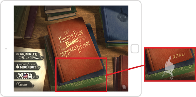
FIG 5.15: When a pause means puzzlement: if you don’t swipe to open the book after several seconds on the first screen, a ghostly hand appears to show you what to do.
Leveling up
Don’t teach everything at once. Modern education theory advocates teaching in doses, building on the basics and revealing more as the student gets better. Games often do this literally, dividing progress into explicit levels that focus on a new skill. Though most apps and sites aren’t as linear as games, the learning curves are similar. Teach the basic interactions first, as people encounter them, before introducing more complex or abstract gestures. (Let people use those advanced gestures if they discover them on their own. Levels aren’t about holding people back from new stuff, but rather when you decide to advertise it.)
We’re most motivated to pick up a new skill the second we find we need it—like when we run headlong into a terrifying giant wielding an enormous sword. Infinity Blade is an iOS game with a wildly sophisticated combat system, but they make it easy to learn by breaking down the elements, teaching one step at a time. Just when you’re about to get your head knocked off, the game stops the action in freeze-frame and demonstrates what you need to know to get through the crisis of the moment (FIG 5.16).

FIG 5.16: One skill at a time: Infinity Blade pauses at incredibly convenient times to offer training on a specific ability. Once you’ve mastered blocking (top) you’re ready to tackle dodging, etc.
Again, the emphasis is on demonstration and practice. The game shows you the gesture or control to use and then waits for you; when you use the new gesture, the action continues…and your first interaction is a success. When an interaction is important enough, it’s okay to pause and force people to try the gesture to continue.
Apple used this approach when it introduced OSX Lion, a software update that changed how scrolling works. They turned virtual gravity upside down, so that the mouse or trackpad moved in the reverse direction to what Mac users were accustomed to for decades. To teach this gesture, Apple showed a dialog box right when you installed the software, explaining what was different and inviting you to try scrolling to test it out. In fact, you had to scroll because that was the only way to get to the Continue button. Scroll, click the button, and BOOM: you just beat level one of Apple’s operating system.
Now you’re ready to try it out on your own; continue using your new skill in the current “level” until you encounter a fresh challenge and need fresh training. Think about your app as levels. You want to motivate and enable people to move from novice to expert to master. How do you teach the basics and, once that’s done, the advanced maneuvers? Too often we treat our apps and websites as just one level. We do a quick introduction and then release our users into the cold wilderness of our software. Embracing the concept of leveling up means you follow and teach people throughout their journey to mastery. And every so often, you should reward them for their progress.
Power-ups
In games, as you get better, you earn power-ups, little turbo-boosts to your play through some extra speed or special ability. If gestures are the shortcuts of touch, then power-ups are the shortcuts of video games—usable by anyone but especially efficient in the hands of an expert. They not only unlock new abilities but they’re also rewards, markers of your progress as you move through the game’s levels. Teaching an advanced or abstract gesture is like delivering a power-up, and it gives users a similar thrill of satisfaction.
When Twitter overhauled its iPhone app in late 2011, they missed a power-up opportunity to reveal an abstract gesture. The redesign moved access to direct messages (DMs) off of the main navigation, burying them a level deeper in the Me tab. For heavy DM users, that meant two taps every time they wanted to check direct messages. To ease this burden, Twitter helpfully provided a gesture for quicker access: swipe up from the Me tab to go directly to your messages. Trouble is, they never told anyone about it, so most people didn’t know the option existed.
It’s useful to let people learn the slow way before you teach shortcuts. In Twitter’s case, learning to tap the Me tab and then the Direct Messages button reinforced the app’s mental model, teaching people where DMs lived. But after doing that five or ten times, you’ve demonstrated that you’ve learned the route. What the interface should have done at that point is dispense a power-up—unveiling the gesture shortcut with an animated demonstration, and then requiring you to copy the gesture to move on (FIG 5.17).

FIG 5.17: This simple mock-up shows how Twitter could have improved discovery of its Direct Messages gesture shortcut. After tapping the DM button ten times, the app should have shown an instructional message with a gesture animation.
It might seem silly, but it’s true: there’s delight in learning a new skill like this, of being told a secret. The fun of video games is in the rush of getting better, of advancing the storyline. With more mundane apps, that storyline is the user’s work or career, and the reward in these advanced gestures and shortcuts is nothing less than becoming more awesome at what they do. Think like a game designer, and you’ll deliver the same endorphin boost to your “players.” A great discoverability strategy feels like a prize, not an instruction.
WE’RE JUST GETTING STARTED
The need to teach gestures in the first place only points up the fact that we don’t yet have many established standards. That makes this both an exciting and overwhelming time for designers and consumers alike. As designers, we need to talk to each other, examine each other’s work, share ideas for gestural conventions, and commit to codifying them. We have our own coaching and leveling up to do here.
Our job is getting harder. We have to design for a ton of platforms and, in doing so, juggle endless varieties of input methods. But difficult challenges often disguise remarkable opportunities. We have the chance right now to invent more humane ways to interact with information. In part, it’s a moment for study, for refining our technical know-how (44-pixel touch targets!). But perhaps more urgently, it’s also a moment to step back from crufty best practices and allow ourselves to imagine fresh possibilities in this developing medium. Take hold of your touchscreens, think big, and go make something amazing.