

Although there's a great deal of work to do during detailed design, the good news is that, with the exception of visual system development, it largely builds on the techniques used during framework definition. However, this is also the work that makes the difference between your design getting into the hands of users or gathering dust on a shelf, so your collaboration and time management skills and your ability to juggle a thousand details are just as important as your knowledge of detailed design principles and patterns.
This chapter describes techniques for evolving each aspect of the design, ways the disciplines can work together to ensure coherence and completeness, and some ideas for handling common difficulties.
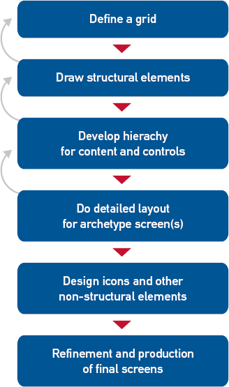
The interaction designers may begin the phase (or the work on a specific design topic) with a day or two of supplemental research, especially if the domain is complex. As shown in Figure 22.1, the ideal process then involves taking a first crack at the nearly complete behavioral design (whether for a whole interface or a discrete topic) at the whiteboard level, then reviewing it informally with design engineers and subject matter experts to get their initial feedback. By "nearly complete design," I mean that every widget, word on the screen, and likely scenario are all accounted for, but that you haven't spent time on the very finest details such as tool tips, detailed error handling, keyboard accelerators, or the number of characters each field takes.
After that first informal review, you'll ideally have a bit of time to adjust the design as needed, then develop a first draft of your documentation. That draft should provide most of what's needed for a typical paper-prototype test, if you're doing one, though some interactions benefit from higher fidelity. (See Chapter 23 for more on this.)
While subject matter experts, design engineers, and hopefully users are poring over the first draft of the design in detail, you can either move on to the next design topic or work on the very fine details for this topic, such as accelerators and (if you haven't addressed it yet) how the design works with assistive technologies.
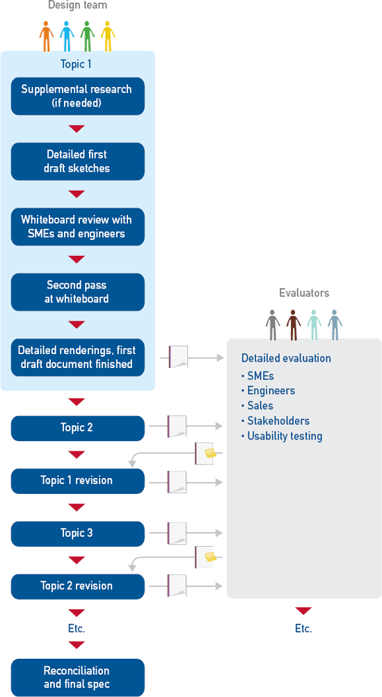
Once you've gotten detailed feedback, you're ready to make a "last" set of tweaks to the design and documentation. I say "last" because it's only the last in theory; there should be minimal change between spec and final product if you've worked with effective design engineers, but some little issues inevitably crop up along the way.
Your initial research should give you enough information to figure out the essential flow, but don't be too dismayed if you're not 100 percent certain what goes in every list box or how fast to accelerate a scrolling display using a jog dial. In a truly complex domain, such as financial portfolio management, radiology, or network administration, it's impossible to gather every tiny detail you'll need for design during up-front research. In these cases, you should build in a little supplemental research time with subject matter experts (SMEs).
This usually involves a couple of days at the beginning of detailed design or perhaps a half day at the beginning of each discrete design topic, depending on how you've structured your design time and how available your SMEs are. Two or even three SMEs are better than one; one expert may be idiosyncratic about something or even just plain wrong. More than two or three can get a bit hard to manage, however. Consider inviting your design engineer(s) to these meetings, as they may have related questions for the SMEs and might think of potential pitfalls that don't occur to non-engineers.
To prep for your meetings with SMEs, review the key path scenarios related to your design topics. Make a list of scenario variants you know you need to cover as well as any other questions you have. Send these to your SMEs ahead of time if you can to reduce the need for them to do further research after the meeting.
Lay out your agenda at the beginning of the meeting. Start by listing the key path variants and less common scenarios you know you'll need to cover; then ask the SMEs what you're forgetting. Once you've got a list, walk through each scenario in detail to fill in gaps and ensure that you understand the possible choices and bits of information necessary at each step. Here's an example of this sort of conversation:
Designer: So, after Rhonda specifies the medication name and form, she has to fill in the other details. Is there anything other than dosage and frequency?
SME #1: Yes, she also has to specify how the medication is to be administered.
Designer: Oh, right, like orally or intravenously. Could we review all of the forms a medication might come in and all of the relevant ways it can be administered? I know some of them are medication specific, but we need to know the range of what's possible.
SME #1: Sure. There are some that are only ever administered one way. OK, so medications can come in liquids, gels and creams, pills, capsules ... um ...
SME #2: There's also powder, spray, aerosol ...
You might also have questions about specific parts of the design or scenarios. For example, you may have envisioned a trend spotting and analysis tool that would show a handful of key indicators. You probably have a clear idea of what some of those are from your earlier research, but now is also a good time to ask, "Do we have the right trends shown in this preliminary sketch? What are we missing?" Detailed sequence is another common question: Does A have to be known before B can happen?
Don't be surprised if your SMEs sometimes disagree with each other; that's one reason to have two or three. If necessary, facilitate some discussion between them. Often, they don't actually disagree—they've just made different unspoken assumptions, so they wind up agreeing once these are surfaced. Other disagreements are usually differences in work style—which your personas have hopefully accommodated—or flawed recollection. In the rare case that your SMEs simply can't agree on something, get them to agree on what additional information they need to resolve their differences and when they'll get you an answer, and then move on.
Once you've got the information you need, you can start filling in more detail. Most design teams tackle the work screen by screen, focusing on the parts of scenarios that take place on a given screen, rather than trying to detail every screen for one scenario. However, you could certainly approach it that way.
At the beginning of detailed design, the interaction designers spend most of each day in meetings. These are much like design meetings during framework definition (see Chapter 16), but with a greater emphasis on keeping track of details. As the phase progresses, the proportion of time spent in meetings versus working at a computer shifts; late in the phase, meetings may only occupy a couple of hours a day. This is because drawing and documentation become an increasingly important part of the design process, with detailed pixel-level renderings and behavioral descriptions providing insight into the design's effectiveness.
However, you should avoid saving a lot of decisions for solo drawing and writing time. You'll make faster progress and better design decisions if the IxD synthesizer still has the opportunity to poke at the ideas and help improve them. Likewise, both the IxD generator (IxDG) and synthesizer (IxDS) will be more effective during solo work time if you're not trying to figure things out independently. Draw every widget on the whiteboard and figure out its behavior, contents, and states. Get as close to a realistic screen layout on the whiteboard as you can, then pause to capture detailed notes. However, don't spend too much time fussing over a detailed layout problem; these are usually best dealt with in pixels.
The detailed interaction design process looks much like the framework definition process described in Chapter 16, except that it happens at a greater level of detail. For each topic:
Develop more detailed scenarios if you haven't already done so with your SMEs; then focus on the scenarios and partial scenarios relevant to the current topic.
Extract the data and functional needs from your more detailed scenarios. In reality, you might also anticipate other needs from scenarios you haven't articulated yet; this is fine as long as they make sense in reasonable scenarios later on.
Determine what data and functional elements (such as widgets) will best meet the needs.
Use the primary persona's scenario to help you lay out the elements in a way that matches visual flow to workflow, at least in the more common cases.
Throw secondary persona scenarios and additional validation scenarios at the design to assess and adjust it as needed, just as in framework-level design.
Immediately after the meeting, the IxDG should draw the screens in pixels and the IxDS should document them, so issues are revealed as soon as possible.
To illustrate this, let's take a look at the first step of the veterinary application scenario from Chapter 16. Figure 22.2 shows the corresponding framework sketch.
Laura takes a call from Mr. Cowell, who needs to make an appointment for his cat to have a tumor removed. Laura finds him in the client list and opens his record to see detail in the client overview display area, which shows that one of his three cats, Xena, is flagged for follow-up because she needs a surgery appointment. She confirms with Mr. Cowell that the procedure is for Xena. She clicks to create a new appointment.

The functional needs listed in Chapter 16 were:
Look up callers among existing clients
See overview information about each client and pet
The functional elements were:
Area to view client list
Display of overview information for client
Display of overview information for multiple pets
A more detailed version of this scenario step might look like this:
Laura answers the phone. The caller says, "Hi, this is Tom Cowell. I need to make a surgery appointment for my cat." Laura says, "Sure thing, Mr. Cowell, let me just find your record." She types his last name into the client list and sees the list narrow as she types. By the time she enters the first three letters, she can see his name. She clicks on it to bring up his record in the client overview display area, and sees a follow-up flag on the client tab. She asks, "Is this for Xena to have a tumor removed from her left hind foot?" He says yes, and she clicks the flagged item to create a new appointment.
Challenge teammates to use suspect ideas in a scenario or justify them from the research.
As you can see, this isn't a lot more detail than the original scenario, and it's not going to be enough to design everything on the client overview tab. You'll need at least another scenario or two, such as:
Laura has a little time on her hands, so she decides to catch up on calling some clients with seriously overdue bills. In the client list, she selects "Show clients with bills outstanding for 60 days." She sees a list of a dozen people sorted by how long their bills are overdue. She clicks on Tom Cowell, who is at the top. The alert at the top of his client overview tab shows that he owes $32.60 for a medication that was mailed to him. She clicks on the alert to see detail. So far, he's received two automated e-mail notices. She looks at the list of next actions and selects "Call daytime phone number." The application automatically logs the phone call. When Mr. Cowell answers, she politely reminds him of the overdue bill. He apologizes and says he'll send a check the next day. Laura makes a note and asks if he received the notices sent to [email protected]. He says did not receive the notices because his e-mail address has changed. Laura enters the new one, says thanks and goodbye, and moves on to the next person on the list.
This adds a couple of useful data and functional needs, such as the ability to:
Use the client list to see clients matching various criteria, such as those with overdue bills
See overdue bills as soon as a client is selected
Get more detail about how much is owed and for what, what attempts at collection have been made via what avenues, and what next steps can be taken
Contact the client directly from the entry and have that action noted in the record
Annotate the entry
Edit contact information
You could take the time to detail every possible scenario in order to derive all of the screen's contents, but as you can see, this could take a very long time. You'll probably find yourself listing some data and functional needs without explicitly using a scenario. There's nothing wrong with this, since your brain is certainly capable of coming up with reasonable needs based on what you know from research. However, teammates should challenge one another to use suspect ideas in a scenario or justify them from the research. For example:
IxDG: I think it's safe to assume that Laura needs the usual contact information: name, mailing address, multiple phone numbers, and e-mail.
IxDS: Yes, and she'll need more than one client name in a lot of cases. And pet sitter information, too.
IxDG: Really? When would she use that?
IxDS: If someone comes in with a sick animal and says it belongs to so-and-so, Laura can immediately see whether that person is authorized to get care. Do you remember our interview with Marie the pet sitter? She talked about what a hassle it was for the vets to find that information.
IxDG: Oh, right! Yeah, Laura probably should be able to see that right away, though I wouldn't want to put the detail in her face all the time.
IxDS: That makes sense.
As with framework definition, it's very useful to list needs explicitly on the whiteboard (or in a spreadsheet if you have a lot to keep track of), then translate them into functional and data elements. Any physical controls are usually defined by now, so for the most part, this involves deciding what kind of widget would be best: Bounded or unbounded input? A list box or a set of radio buttons? (See Table 21.1 for an overview of common widget uses.) Experienced designers generally do this in their heads without articulating it explicitly, so teammates should keep their eyes open for bad widget choices. Once you've got a detailed list, you'll then use scenarios again to lay out the elements, assess the design, and tweak as necessary.
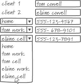
For the veterinary client overview, for example, the detailed list of elements would be something like this:
Client name field × 2
E-mail address × 2
Address field
Phone numbers × 3
Other authorized parties (probably collapsed by default)
Alerts with ability to expand detail and take action directly from the alert
Visit and billing history table (filter/sort controls, date, pet, total, details on demand, paid/unpaid status)
Figure 22.3 shows how an initial sketch might look. As you worked through additional scenarios, you would likely be adding more controls to the toolbar, client list, and other areas.
As in framework definition, the sketches evolve as you throw additional scenarios at them or simply have ideas for improving or enhancing your first take. Much of the discussion involves widget-level interactions, like what's outlined in Table 22.1.
Along with your various scenarios, the experience attributes are a useful check on your design. Imagine that you're designing an automated teller for a bank, and one of your experience attributes is "friendly." Take a look at your interaction and on-screen text. Does, "Transaction complete, remove card," sound friendly? Something more along the lines of, "Thanks for banking with us! Please take your card," would be a better fit.
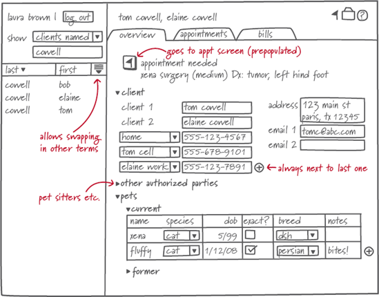
Table 22.1. Example detailed interaction design meeting discussion.
Sketch | Discussion |
|---|---|
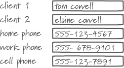 | IxDS: So you've got three phone number fields up there for home, work, and cell phone, but you've got two pet owners in the record. How do you know whose work or cell phone is whose? |
 | IxDG: Good point. It seems like there's probably just one home number, but we should associate the other numbers with each person. It's kind of awkward though. |
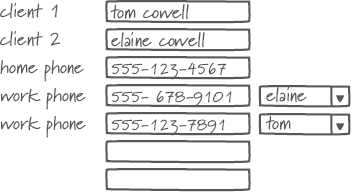
 | IxDS: Well, what does Laura care about most? Probably which number to call first. IxDG: Ah! So we could just have one list in order of preference. The labels could be dynamic, so they pick up the name of either person, like this. |
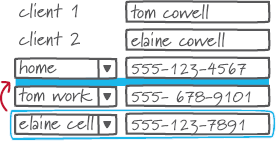 | IxDS: That works. How would Laura change the sequence, though, if it turns out that Tom's cell phone is better to use than his home phone? IxDG: If we give each number and label a little bit of an affordance to hint that they're drag-able, she can just reorder them any time. |
 | IxDS: Cool. We shouldn't put five fields there by default, though. IxDG: No, I was thinking we could just always add a blank one when she fills one in. |
 | IxDS: I like it for initial data entry, but I wonder if that clutters things up. She's looking at the screen a lot more often than she's adding new numbers. IxDG: True. Maybe an "add" button is the way to go. |
Once things appear to be working for a wide range of scenarios, your last, purely pragmatic step before a design review is to fill out what you know of each bounded-input widget's possible values (e.g., what the exact contents of each list box are) and states. In the veterinary application example, it might be fine to put off the alerts discussion if this is a separate topic on your project calendar, but otherwise, both the alerts and the table filtering and sorting should be addressed in more depth. The idea is to get to as much detail as possible in your design meetings, then go back to your desk and make sure it all works as it's explained in words and drawn in pixels.
I've described the process using a typical desktop application as an example. The approach works equally well for other kinds of design problems, but it's worth discussing the ways in which those are (or aren't) different.
Many Web sites these days are a lot like desktop applications: a small number of pages or screens with a lot of interactivity. Others such as news sites and many e-commerce sites have thousands of pages based on content slurped from a database, which makes it impossible to design every page a user sees.
In these cases, detailed design is really about identifying all the different types and attributes of content you expect, then designing page templates that will allow for automated production of most pages, perhaps with the flexibility to develop more customized layouts for special features. In that sense, you're designing for both the end-user personas and for a production designer who will be frustrated if your templates aren't flexible enough.
However, there are a limited number of templates to design, and once you understand the range of parameters in the data, you just have to account for the variability. This is similar to designing a report template for a productivity application; the designers may not develop every report, but need to explore the options enough to provide a basic structure with some rules for variation. The process is pretty much the same.
For any interaction design involving a novel hardware platform, you will likely have a meeting or two with the industrial designer about the exact behavior and hierarchy of physical controls. For example:
Is a function activated when the button is pressed or when it's released?
Are there circumstances in which physical controls are inactive? If so, how will you communicate about state?
What other states do physical controls need to communicate, and how will you express them?
Does a knob increase a value (such as stereo volume) in a continuous, smooth curve, or does it use detents? How many detents are there?
How quickly does a jog dial or a continuously pressed button accelerate scrolling? How long is a "continuous" button press?
Which physical controls need to be most visually prominent or easily accessible? Which need to be protected from accidental activation?
Do controls communicate with tactile clicks, audible electronic feedback, or using some other means?
When it comes to products that must function in ever-changing contexts, such as mobile devices and in-vehicle applications, the process isn't much different. However, be sure to consider environment changes in your scenarios. For example, what happens when your personas need to:
Use a Web-based mobile phone application in an area where there's no service?
Manage car dashboard controls wearing thick gloves due to cold weather?
Drive using a displayed map and directions both in the dark and in bright sun?
Consider these cases early enough that's it's not too difficult to adapt your design.
Interaction design for telephones—and especially for complex multi-line business systems—is in part an exercise in imagining all of the possible call states and figuring out what to do with potential collisions. More than most applications, call handling requires an exhaustive and detailed set of scenarios. For example, what happens if a user:
Has set calls to go to voicemail but sees an incoming call he wants to pick up?
Wants to merge two lines into one conference call?
Wants to pass control of a conference call to someone else?
Needs to barge into the boss's call in progress for something urgent?
These are mostly behavioral rather than visual problems in a typical phone UI; you have to figure out at what point the first call is on hold, whether the boss has to accept the barge-in or whether it just happens, and a dozen other nuances for the whole range of possible call states. Even on a touch screen, the details of sequence and timing are critical, so scenarios (at least in the informal, undocumented sense) are essential to figuring out desirable flow.
Audible and speech interfaces likewise require a heavy emphasis on scenarios. A first round of scenarios should help you detail out the contents of every menu or the set of possible actions from every prompt.
After that, you'll need to spend time fine-tuning the sequence of the dialogue. For example, here's how you might evolve part of a menu for a bank:
IxDG: So, let's talk through the flow for money transfer. Joan needs to specify an account to transfer money from, an account to transfer money to, and an amount. Anything else?
IxDS: She's trying to save money, remember, so she'd probably also want to do an automatic recurring transfer, like putting $500 a month in her savings account.
IxDG: Right, good thought. Well, it would be easy to say, "Would you like to make that recurring?" after she set up a transfer, but is that too hidden?
IxDS: I think Joan might be confused if she couldn't tell how to do that right away, so maybe we should ask that first.
IxDG: OK, so when Joan says she wants to transfer, our first question is whether it's one time or recurring. Should our second question be the account number or the amount?
IxDS: If she were talking to a human, she'd say, "I want to transfer $500 from checking to savings," so that seems like the right sequence.
IxDG: Yeah, and she wouldn't have to tell a human the account number. We can't just say "checking" or "savings," though, since she has multiple accounts. You know, it would be cool if we could pick up the account nicknames she's assigned on the Web site so the voice interface can just ask her if she wants to transfer to and from checking, college savings, or house savings.
IxDS: Great idea. I'll send [the design engineer and business analyst] a note and ask how painful that is to do. So, we'll ask for an amount, the account to transfer from, and the account to transfer to, right? And then repeat it back?
IxDG: That sounds right.
Next, develop and fine-tune the language of every prompt to ensure that each option is clear and concise. For voice input, you'll also need to provide options that sound distinct (to minimize errors in interpretation) and determine how to structure follow-up questions, such as, "You want to transfer $300 from checking to savings. Did you mean house savings or college savings?" Ultimately, you'll need to work with a voice actor (or with whoever is responsible for speech synthesis) to ensure that the words in each prompt and response have emphasis and inflections appropriate to natural human speech.
The approach to service design is still scenario driven, though you may not be drawing screens to go with the scenarios. Instead, you might be designing a merchandise return procedure, an envelope for receiving and returning DVDs, an airport check-in process from home to departure gate, or a hospital admissions procedure.
Start by identifying all of the details that must be designed. What will your personas see, hear, touch, smell, and taste in the course of the interaction? Determine whether there is an artifact to be designed, a policy or procedure to be developed, or a skill in which employees need to be trained. From there, you can use scenarios and goals to drive the design of each system component, or determine which components to outsource to experts in a particular area.
Although most decisions should be made in design meetings, both the IxDG and IxDS need to spend at least a couple of hours a day—and eventually more—on individual work. This work is not done in isolation, however; it needs to be reviewed by teammates on a regular basis, as discussed later in this chapter. It's meant both to capture what was discussed in the previous design meeting and to inform the next.
After each design meeting, the generative interaction designer's primary task is to translate whiteboard sketches into pixels, working within a visual system developed by the visual interface designer. In some organizations, interaction designers and information architects never touch pixels; they just hand the visual designers a series of wireframes drawn in a vector application like Illustrator or Visio. Unfortunately, this can lead to some things getting lost in translation, and it doesn't give IxDGs a chance to learn from working at the pixel level. Although experienced designers eventually get pretty good at estimating what can fit on a screen at a given resolution, sometimes things just don't turn out quite the same once they're rendered in a realistic way. Also, a "waterfall" approach to the relationship between interaction and visual design doesn't take full advantage of the visual designer's problem-solving skills and expertise, so your solution may suffer. The end result of this collaboration should look like the drawing in Figure 22.4, which is an iteration of Figure 19.2.
As the IxDG learns through this even finer level of sketching, he should keep a list of things to discuss with the IxDS or other teammates in the next meeting or, if seating arrangements and preferred work styles permit, just turn around and say, "Hey, you know that table on the client overview screen? It's not working in pixels the way I sketched it, so here's what I'm thinking ..."
The IxD synthesizer's work is likewise a learning process. Although it's beneficial to begin documentation early to ensure that details are captured and avoid a crunch at the end, documenting right away also provides another mechanism for reviewing the design. A missing decision or peculiar flow that isn't evident in the casual back-and-forth of a design meeting can become glaringly obvious in the documentation.
For this reason, as well as for the sake of efficiency, it's best to translate scribbled meeting notes and whiteboard photos directly into a rough draft of the final document, rather than spending a lot of time writing up detailed notes in some other format. Use whiteboard photos as placeholders for final art to help you plan your page layouts as well as to be thorough in your explanation. See Chapter 24 for more on developing documentation.
Although an experienced designer doesn't need a working prototype to visualize the behavior of standard forms and widgets, it's worthwhile to develop a behavioral prototype if you're designing custom widgets, interactive data visualizations, animated behaviors, and some hardware/software interactions. Such a prototype doesn't need to be complete—all it has to do is demonstrate the specific behavior you have questions about.
Some interaction designers who are technically inclined may prefer to develop prototype code of their own, but this is not an essential interaction design skill. A large enough design group may be able to employ a full-time prototype developer (with expertise in a tool such as Flash, HTML, or Expressions) to develop animations and clickable prototypes. Some visual designers have strong skills in this area. In other cases, the ID and design engineers may be your best resource, especially for working device prototypes.
The visual designer's work in this phase (or in the later part of framework definition, depending on how long that phase is) begins with settling on a single visual style and applying it to an archetype screen or two. After a review with stakeholders, she then begins turning the archetype(s) into a visual system that reduces complexity by minimizing arbitrariness, limiting the number of unique elements, and simplifying the relationships among elements. Ultimately, the visual system includes specifications for:
An overarching grid system
Images of every unique screen with layout specifications
Pixel-level specifications for controls and spacing
A library of illustrated states for every type of control or other dynamic element on the screen
A library of icons used on the screen and physical surfaces
Specifications for every color used on the screen
Type specifications including font, size, weight, color, and spacing
Photo treatment guidelines, if any
Use of the corporate identity (and product branding if applicable)
The first draft of the system is initially articulated in a drawing file to be shared with the IxDG. It might be accompanied by some very rough documentation describing intent, such as a screen printout with some notes scribbled on it. The visual system continues to evolve as the interaction design evolves. When not working on the major structural and layout elements, the visual designer works on icons, visual feedback, or other problems that aren't on the critical path for screen layout and begins documenting the on-screen visual system. Figure 22.5 summarizes this process. As with other aspects of design, this activity isn't strictly linear.
Although most of a visual designer's detailed design work is in front of a computer, he is also collaborating closely with others on the design team and outside it. He works with the:
Interaction designers to refine layout, hierarchy, information design, and widget-level interaction
Industrial designer to ensure the consistency and unity of the on-screen visual system and the hardware design language
IxDS to mesh visual style guidelines with behavioral description in the form and behavior specification
Design engineers to ensure that things are drawn in a way that's feasible to build and will result in a responsive UI
The design language studies are each meant to emphasize one strategy, usually represented by an emphasis on one of the experience attributes, so it's rare that subsequent work looks exactly like one of the studies. Stakeholders usually wind up saying that study number two is almost perfect, but the glossy highlights from study number one and the typeface in study number three are awfully nice. Handling this feedback can be one of the trickier parts of the visual and industrial design process. Taking it literally would mean treating the studies as an a la carte menu, but a peanut butter sandwich and a glass of sauvignon blanc together would be peculiar at best, and perhaps indigestible.
The visual designer's (and sometimes the industrial designer's) job is to figure out whether stakeholders are drawn to particular things due to personal taste or for other reasons, and what they're trying to accomplish by saying, "If you could just use this color scheme on that one over there ..." What is lacking in one study or the other? Does the comment about making things glossier mean the study is too plain, doesn't imply quality and specialness, or what? Once the intent behind the comment is clear, you can decide on the best way to address it.
For work done by experienced designers, the necessary tweaks are usually minor enough that you can proceed directly to developing one or two archetype screens. If the feedback was that all of the studies were way off, you'll need to figure out whether the problem is the quality and appropriateness of the studies, the effectiveness of your communication about them, or stakeholders who are determined to stick to their personal likes and dislikes. Get an opinion from another designer who can help you be objective about the problem, and then start over. If you're not accustomed to doing studies, you should probably plan on a second round as a matter of course.
Although design language studies are a great way to make visual concepts concrete enough for most people to discuss, they're not quite real enough to make a final assessment about how well a direction expresses the experience attributes or communicates the behavior. If you've ever had someone agree with you in conversation but react differently to the same thing in writing, you've had a similar experience. Seeing the visual choices applied to a complete, detailed screen or near-final form factor can highlight implications that weren't previously visible to the audience (and sometimes the designer). This is why industrial designers use more-realistic appearance models and visual designers use archetype screens.
The first step in translating a study into a system is selecting one or more archetype screens based on emblematic quality and interaction design completeness. By "emblematic quality," I mean the screen's contents should be fairly typical of the application, but should also include a wide range of the kinds of data and widgets you expect to represent. If your application includes a fair number of tables and charts, choose a screen with a table and chart on it, if at all possible. Sometimes it takes a couple of archetypes to cover a sufficient range of screen contents. This is analogous to selecting the right scenarios in interaction design.
Consider Microsoft Outlook (shown in Figure 22.6) as an example. E-mail is the core function of the application, so it would be a logical archetype candidate if you were designing the application. It doesn't seem tremendously complex from a visual standpoint, but there's a lot of visual hierarchy to work out with the text and other elements. The contacts and task views offer fairly similar visual problems, so they're not going to be that educational as archetypes. The calendar view, on the other hand, is visually rather different from the other screens, which means it would be ideal to develop that as an archetype, as well.
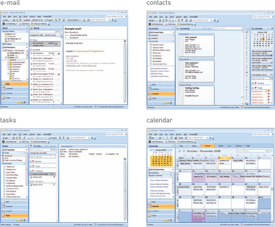
Figure 22.6. If you were designing Outlook, the e-mail and calendar views would make better archetypes than the contacts or to-do list views.
For visual design to be effective, it's important for the interaction design to be reasonably complete.
It's also important for the interaction design to be reasonably complete, at least as far as text, widgets, and anything else persistently visible on the screen; that said, it's fine if these things are close but not quite right—the essential thing is that the interaction design be at a realistic level of detail. There may be some tension between getting the best archetype candidate and working with fairly complete interaction design, since the archetype needs to happen as early as possible in detailed design. Along with interaction design and engineering dependencies, the whole team should consider the visual designer's need for a useful archetype when deciding which interaction design topics to schedule first.
For data-oriented applications, some amount of realistic data is also essential in order for the visual designer to judge field size, column spacing, and so forth; lorem ipsum and similar fake text don't help with detailed visual decisions such as field length or information hierarchy. It's also preferable to have rough-draft copy for Web sites with relatively fixed content.
Even with the best sketch, the visual designer and interaction designer need to have a conversation about the contents of the screen, including what each item is, why it's there, how it works, and what states it can be in. This usually looks something like an interview, such as:
VisD: Tell me about this graph.
IxDG: That's meant to help Claire understand her household water usage. She needs to see what her current usage is and how it compares to her target and her usage last year. She also needs to see where she's using the most water.
VisD: So, I'm guessing the difference between actual and target is the most important thing, right?
IxDG: Right. Although if she's using a lot more water on, say, laundry than comparable households, that should be prominent enough to make her think about it.
VisD: OK, so what we really need to communicate there is the exception.
This discussion is also an opportunity for the visual designer to contribute to the interaction design, either by identifying potential issues or offering ideas for improvement. As with documentation, visual design can also force clarity where, for example, the interaction designer's sketch is ambiguous about hierarchy, or the interaction designer has an inexplicable aversion to making things that act like tabs look like tabs. For example:
VisD: So, why does Claire need to see usage compared to last year? If the utility has set a conservation target of 10 percent versus the prior year, doesn't that tell her everything she needs to know? It would really help simplify the graph if we could drop that comparison and just focus on the target.
IxDG: Huh ... that's true. Yeah, I think we can drop that.
Clearly, these discussions can lead to minor changes in the design, so the IxDG should catch up with the IxDS if he's not present.
In the late 1940s and 1950s, a number of graphic designers began to use a rational, Constructivist layout approach based on a grid. Since the 1961 publication of Grid Systems in Graphic Design[63] by Swiss designer Josef Müller-Brockmann, the use of a flexible grid system as the basis for page layout has become a standard component of graphic design education. By providing an invisible but coherent structure, an effective grid improves the readability of content and makes the work of detailed layout easier. Grids have their uses in three dimensions, as well (see Figure 22.7). In the design of interactive systems, a grid allows other designers or even programmers to make good layout decisions as the design evolves.
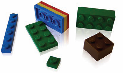
Figure 22.7. The LEGO System is an example of grid-based design in three dimensions. The base unit is a single-stud plate; everything is built up from there. Bricks are three plates tall and some number of studs long and wide. This ensures that everything fits together.
A layout grid is not simply a sheet of graph paper; it's a system of proportional spacing meant to guide the placement of type and other elements. There are very simple grids and very complex ones. Some are based on traditionally pleasing ratios such as phi—the classical "golden ratio" of 1:1.618—or the international paper standard's square-root-of-two ratio (1:1.414), which ensures that two halves retain the same proportions as the original. Others simply use whole number proportions (such as the 4:3 ratio of most older monitors, or the 1:3 composition ratio taught to most illustrators and photographers). Autodesk.com, shown in Figure 22.8, is a good example.
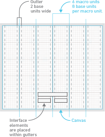
In interface layout, a grid consists of atomic base units and larger macro grid units that are divisible by the base unit. For many applications, this base unit is as small as three or four pixels square. Designers at Cooper usually refer to grids as "base-n," a shorthand that tells someone drawing widgets for a "base-four" grid, for example, that both height and width should be divisible by four pixels. Of course, the horizontal and vertical dimensions of the base unit can differ, but square units are often easiest to work with. Horizontal and vertical macro units usually do differ, for reasons you'll see below.
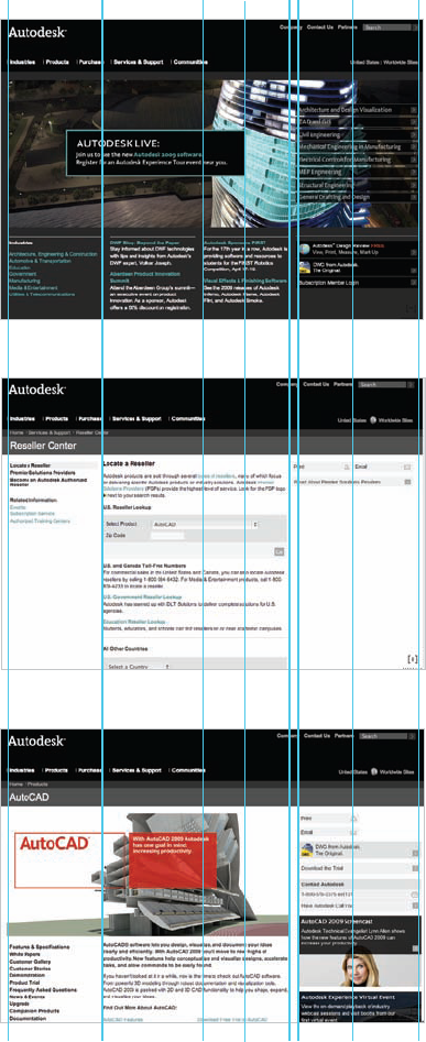
Figure 22.8. Autodesk.com uses a simple grid with pleasing proportions. Even the lines the eye follows down the sides of the building in the illustration are related to the grid.
In applications and Web sites, the layout of major components on every screen or page should be a variation on the same macro grid. Five to seven variations are plenty for most applications and sites; if you use too many variants, you start to lose the cohesiveness that consistency provides. The Autodesk page layouts in Figure 22.8 provide a good example of a simple yet flexible grid.
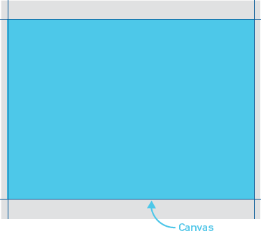
To develop a grid, you first need to determine the size of your available display area, or canvas. After that, you can work from what I think of as the "outside in"—meaning the size of your canvas drives the grid—or the "inside out," using your text or widget dimensions (your base unit) to build up your grid. In reality, you'll probably experiment a bit and wind up using some combination of both. Note that the following approach is a starting point, but won't always get you to exactly the "right" answer; some tweaking may still be necessary.
Resolution is a critical factor in determining your canvas size, of course. If the end user's screen resolution isn't something you can control, you need to work with stakeholders to determine the minimum resolution. Use the personas and market data to drive this. Although 800 × 600 may be the safest choice for most Web pages, highly paid stock market analysts, radiologists, and other information-dependent professionals aren't reluctant to use large, high-resolution monitors to run their critical, information-dense applications.
The canvas is often the entire screen on a handheld device. On a PC, operating system components such as the Windows task bar or Mac OS X dock-limit window size. Standard window title bars and borders—and in the case of Web sites, the usual browser controls—further limit the size of the canvas, as shown in Figure 22.9. The remaining dimensions are what you have left to work with for your grid. The canvas could extend beyond the bottom of the window on a Web site and in some applications, but don't worry about that for now.
Look at the interaction framework sketches and the detailed interaction design for your archetype screens, paying particular attention to the densest, most visually complex screen. How many panes appear across the width of the screen? What's the maximum number of widgets or text elements that appear in a row? This should give you an idea of how many horizontal macro units you need. Note that these aren't necessarily the same as visible columns, which can span multiple macro units as shown in Figure 22.10.
In Figure 22.11, you can see in the detailed sketch that there are up to seven elements laid out across the screen, which implies that you need at least seven horizontal units. Now look at the framework sketches for the rest of the screens, shown in Figure 22.12. Will that number of units work for these screens? If not, adjust the number and see if you can make it work. Most PC applications and Web sites require five to seven horizontal units; some require as many as 12 to 15. Much more than that will likely be too granular.
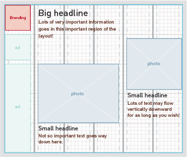
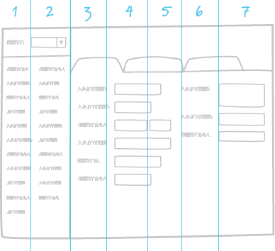
Figure 22.11. This screen has seven elements laid out across it, so chances are you'll need at least seven horizontal units.
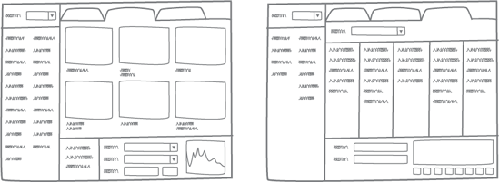
Figure 22.12. Look at the framework sketches for other screens to see how they'd translate into your potential number of columns.
On a technical note, all this is easier if the interaction design sketches already exist in your drawing tool. At Cooper, we use a sketchy house style template to develop interaction framework sketches, which we can then use to guide detailed design drawings right in the same file.
Before you commit yourself to a number of columns, though, consider the proportional relationships among any major divisions of the screen, such as an organizer and workspace or a Web site's left navigation and text. Look for a unit that allows these to occupy exactly some simple fraction of the canvas width, or to be related in one of the classical pleasing ratios. You can use quarters or sixths, but thirds, fifths, and even sevenths are generally more interesting to look at. If this isn't complicated enough, your macro unit should also allow columns of text (if applicable) to be 40 to 50 characters wide if you're using multiple columns or 45 to 75 characters for single columns.
Finally, make sure the pixel measurement of each unit is divisible by a small number you can use as your base unit, such as three to five pixels. Add an empty space the width of the base unit inside the edges of each column, as shown in Figure 22.13; this results in a gutter between columns that's twice your base unit, which is usually about right. You can, of course, add another unit to widen the gutter if that seems necessary. These gutters guide the placement of elements within the columns.
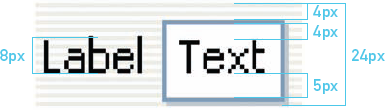
Vertical spacing should be in pleasing proportion to the horizontal spacing; widgets that are ten pixels high with a minimum horizontal unit of 100 pixels would look a little strange. Your vertical units, like the horizontal units, are determined partly by the need to divide the screen vertically and partly by the base units.
Let's assume, for example, that your base unit is four pixels square, and your predominant font is eight pixels tall as measured from the baseline (the invisible line upon which letters without descenders rest) to the top of the ascender. Within a text box, you'd want to leave perhaps four pixels above and five below, as shown in Figure 22.14; an optical illusion always makes the bottom edge look a bit smaller than it is, so it's usual to leave a bit of extra padding there. By the time you add a single-pixel border with a subtle, single-pixel drop shadow under the bottom edge, you've got 20 pixels. Add four pixels of padding either above or below for spacing with other widgets, and you've got a vertical macro unit of 24 pixels to use in creating rows of widgets.
As with horizontal units, you'll want to make sure your vertical units fit within your canvas (if it has a fixed vertical dimension) and allow for pleasing division of real estate. If you've got a couple extra pixels left over, you can put them in the margin at the bottom of the screen, which can always use a little extra. Don't worry if your vertical unit runs off the bottom of the page on a Web site or other application with scrolling content; the fact that something is split in half provides a visual clue that there's more stuff available.
Either using guides or in an empty layer of your drawing application—Fireworks or Photoshop—draw your grid, starting with the horizontal macro units; then add the gutters in another color or another layer. You'll mostly work with the gutters, so being able to turn off the original measurements unless you need them can clean up the view. Use colors that will contrast strongly with your design; hot pink, cyan, or lime green often work well. Add horizontal lines spaced according to your vertical units in the same color as the gutters. Now you're ready to lay out your visual elements according to the guides.
Your first take on a grid might not quite work as you begin laying out elements. Rather than ignoring the grid at whim, tweak the grid until you get it right, always ensuring that your adjustments come together in a coherent structure. A sufficiently flexible grid generally doesn't need to be broken, particularly in application design. In Web page design or playful applications, such as games for children, breaking the grid is sometimes necessary to provide a livelier or more brand-appropriate feel. Wise designers usually do this in a very judicious way, though; breaking the grid repeatedly simply creates a disorderly layout that's hard to read and use.
You may well be wondering what happens when a user resizes the type or adjusts the size of a window. Most interface elements shouldn't rearrange themselves based on window size, though there are times when scaling text columns up or down (to a minimum width) makes sense.
Theatrical set designers know that in order to showcase the action on stage, an effective backdrop must support the story without stealing the show.
However, it should generally be possible for accessibility reasons to increase the size of text. Assuming your engineers are willing and able, you can create dynamic grids based on percentages and proportional units, such as ems or dialog units, rather than pixels. If area A is set to be 33 percent of the width of area B, it doesn't matter what size each area is. If your base unit is one em (a distance equal to the type size as measured in points) for your predominant font, then everything can scale up in proportion to it as the type scales. This sounds easier than it is in reality; most implementations end up degrading in some way when text is scaled.
Theatrical set designers know that in order to showcase the action on stage, an effective backdrop must support the story without stealing the show. The same is true for interfaces: The actors (widgets and data) must exist on a background that makes them appropriately visible, helps make their relationships clear, gives them room to do their thing, and supports the overall visual language in an unobtrusive way. That backdrop is generally rendered in the form of surfaces and framing elements, such as those shown in Figure 22.15.
Look at the interaction framework sketches and any more-detailed interaction design sketches. Identify which elements are both static and shared across each screen. For applications, this often includes some sort of title area, a menu and/or toolbar, some sort of frame around the edges of the window, and possibly a persistent organizer pane or something similar. This is where you want to start.
Most visual interfaces include some sense of dimensionality: the illusion that widgets protrude from or are pressed into a surface, and that some surfaces are either above or below one another. Highlights and shading provide this illusion. When it comes to window frames and dividers, dimensionality either provides an affordance that something is dragable or establishes some layering relationship between the framing elements and the rest of the screen content.
Figure 22.15. The "backdrop" elements of the visual system, related to the grid and ready for widgets and content.
In both Windows and Mac operating systems, the imaginary light source that illuminates widgets and icons is above and to the left of the screen. This means users will find icons shaded differently subtly uncomfortable. It also means they're accustomed to interpreting anything highlighted along the top and left, and shaded along the bottom and right sides, as protruding from the surface, while anything with reversed shading is viewed as indented. Abrupt shading implies angularity, while gradients imply curvature. This convention is pretty straightforward, and most designers follow it without even thinking.
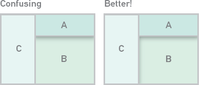
Where people sometimes run into trouble is in using dimensionality in the structural elements of an application. The two most common errors are inconsistency and complexity. Inconsistent or thoughtless use of dimensionality can hint that a layer is simultaneously on top and underneath, an impossibility in anything but an M.C. Escher drawing.[64] In Figure 22.16, you can see that along the top pane, A appears to be on top of B, which is on the same level as C, yet there is no layering implied between A and C.
Early on, you need to make a decision about whether the panes of each screen are sitting on top of the background like pieces of paper on a desk, or whether they're recessed in a frame or bezel, like a painting or LCD. Likewise, you'll need to decide whether any window dividers and scrollbars exist on the same plane as the content or are part of the interface structure.
Figure 22.17. A simple visual choice implies entirely different things about the relationship between the organizer and workspace.
Relatively subtle visual choices can make a significant difference in how relationships are interpreted. Consider the seemingly minor difference between the two screens in Figure 22.17. In the first one, the organizer appears to be part of the overall interface structure, implying that it will be persistent and that selection in the organizer might even result in different tabs appearing in the workspace. In the second, the organizer seems to be a peer with the workspace, hinting that other tabs might or might not have organizers within them.
As discussed in Chapter 21, a clear visual hierarchy clarifies and establishes relationships and helps users process the most important information first. The first draft of your visual system should include appropriate visual hierarchy. Because an effective visual system reduces arbitrariness and unnecessary variation, you should try to limit your hierarchy to a small number of levels. Four are sufficient for most design problems:
Urgent. Examples include the single most important item featured on a Web site or an urgent exception in a business system or medical device. Strong visual contrast (including illumination of physical controls) is appropriate for these situations; motion is occasionally warranted.
Important. There are usually several important things on a given display, including the information your personas are most interested in and any items (such as headers) used to organize other information or keep users oriented. Default actions (such as an OK button) are often appropriate at this level, as well. Larger or bolder type, brighter colors, heavier outlines, and imagery such as large icons are all common at this level.
Ordinary. Most content on a screen should be at this level, including most widgets, labels, and text. Regular type and limited contrast are appropriate. Small icons indicating object type are also common.
Less important. This content isn't entirely unimportant, or it wouldn't be on the screen; however, it's generally secondary information that's viewed only after someone has decided to look more closely. Relatively low contrast and small (but still readable) type are suited to this sort of content.
The sketches developed by the IxDG should include a clear indication of which information is at what level of importance, though a visual designer who has been closely involved in the project can probably figure this out. Some interaction designers tend to introduce too much nuance to the hierarchy; the visual system (and some vigilance on the part of the visual designer) helps keep this in check.
Type is usually a good starting point for establishing a hierarchy. A good type system for an application has one very readable, sans serif screen font, such as Tahoma, as the primary typeface for content. Headers can sometimes be rendered in a second face, such as a serif or humanist sans serif font, or one of the faces from the brand identity system. Some content-rich Web sites might make effective use of slightly more complex type systems, but most content still relies on just one or two faces. As you might expect from the general discussion of hierarchy above, most systems require three or four type sizes to provide a clear hierarchy. Three sizes can provide four levels of hierarchy through manipulation of weight and color. Make the sizes clearly distinct: at least two points or pixels should separate each size.
Expand on and refine the color palette used in the relevant design language study. Define colors for urgent, important, ordinary, and less important text and visual feedback. Define a set of highlight and shading colors. No doubt you'll end up evolving this, but taking a first crack at it in a systematic way will help ensure you're making deliberate choices that all fit together later on.
If your engineering team needs to use a standard widget library, the widgets and states may already be defined, and their dimensions may define your grid's base unit by default. For more novel designs or re-skinning of standard libraries, however, you may need to define everything from button size and shape to the exact colors used in every pixel in every widget state: when a control is unavailable, available, selected, and used as the default action (such as when the enter/return key is pressed). As noted above in the discussion of grids, use the base unit to define the scale of your widgets.
As you begin to develop the rest of the visual language of widgets, icons, and the like, use the squint test to assess where they stand in relation to the hierarchy established by your type. Things at an equal level of importance should stand out to about the same degree when you squint your eyes to blur the image.
Use the "squint test" to assess the effectiveness of your hierarchy.
Controls, interface objects, and data may all need to communicate a range of information, such as:
Selection state
Object type (documents, images, folders, etc.)
Actions taken (such as links that have been followed or messages that have been read, forwarded, or replied to)
Other types of status (available, unavailable, protected, offline, in need of attention, etc.)
Affordances for manipulation
Relationships to other objects
You can use color, line weight, size, texture, shape, type style, and icons to relay this information. It's best to follow existing conventions such as graying out text and controls to make them unavailable, or using a colored background behind text or objects to indicate selection. For any visual feedback not covered by convention, you'll need to develop a language that uses visual properties consistently. Use each specific visual property to mean only one thing. Certain colors in your system should be reserved for certain things; if you use red, yellow, and green in some places to indicate status, don't use them elsewhere (other than as incidental details in an icon) without attaching that same meaning. Likewise, use dimensional affordance, shape, and other properties in consistent ways. Using multiple properties will let you provide a great deal of information about each object.
As your archetype comes together, you'll find yourself refining various aspects of the visual system. However, the system doesn't need to be perfect yet, particularly since this activity generally takes only a couple of days. Just get things as close as you reasonably can, with particular attention to structural issues (such as the grid and standard widgets). New screens will inevitably "break" some part of the earlier design just as new scenarios can break interaction design. Tweaking widget styles and such isn't too difficult later on if you set up your files correctly (see the "Shared Image Files" section later in this chapter).
Once you've reviewed your archetypes with teammates and clients and set up a file to share with the generative interaction designer, you'll be dividing your time among several activities:
Working on icons and any other visual elements that aren't critical to initial screen layout
Designing any new widgets or information displays that weren't included in the archetype(s)
Beginning the first draft of the style guide documentation (see Chapter 24)
Tweaking screens rendered by the IxDG and adjusting the visual system as necessary
Reviewing interaction design work in progress and collaborating on solutions as needed
Working with engineers to determine exactly how elements will be rendered in code (such as how widgets are built, whether you'll have subpixel rendering available for text, and so forth)
The icon system
Not every visual designer excels at icon design, which is partly about choosing appropriate symbols and partly about being able to render clear and appropriate images with a limited number of pixels and colors. Fortunately, icons are the easiest part of the visual design to outsource to a second designer in your group or even to a contractor who specializes in them.
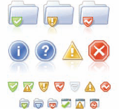
Good icons start with appropriate choices of symbols and images. Spend some time deciding what images will best represent each concept and reviewing them with your teammates and subject matter experts before you begin the time-consuming process of rendering. Icons for objects often need modifiers for various actions (such as creating a new object of that type, copying, forwarding, replying, and so on) or status indications (online, offline, or in need of attention, for example). For this reason, it can be easier to do most icons in the latter half of the phase, once you know what most of them are and can anticipate what elements will be shared across the system. See Figure 22.18 for examples of icons that relate well in a system.
You may notice that so far, the discussion of detailed visual design hasn't made much reference to personas and experience attributes. That's because work at this level is mostly about principles, clear communication, and consistency—the essence of the visual language, which is driven by the personas and experience attributes, has already been established. However, these tools remain essential in certain ways.
The personas play a role in icon design as the visual designer attempts to come up with imagery that will be familiar and understandable. Will a teenage persona understand an icon of a vinyl record, floppy disk, or roll of film? Will a non-technical user know that a cylinder represents a database?
To the extent that the desired hierarchy isn't supplied by the interaction designer's initial rendering, the visual designer must think through personas and scenarios to determine it if his teammates aren't readily available. He also relies on personas and scenarios to enhance the interaction design with modeless visual communication and to review and contribute to the interaction design work.
The experience attributes (and the related patterns discussed in Chapter 17) continue to drive the design and critique of individual widgets and icons. They even influence the grid; an open and spacious feel with plenty of padding between elements, for example, is usually essential in communicating simplicity or luxury. A clearly evident grid structure creates a sense of order, modernity, and rationality, whereas a playful Web site for children may need a grid that's less obvious.
Experience attributes are also indispensable for thinking about the way objects move. Should a window close with a businesslike snap or a more fanciful slurp? Should a movable element on a touch screen jiggle playfully, light up, or pulse when touched? Should any pop-ups fade in, unfurl, or simply appear? Due to the solo nature of most detailed visual design work, the personas and experience attributes are mostly things the designer keeps in mind, rather than tools used in an explicit process. However, they are a constant reference in discussion with other designers, such as:
Designer 1: What do you think of this icon for video?
Designer 2: Has Amanda ever even seen a film projector? Something like a photo with a play button might be better.
Or:
Designer 2: I think the concept works. If you're trying to convey playfulness, though, it's a little drab. Maybe it would help if you gave it a bit of a tilt or made the lines a little less precise.
Close collaboration between the generative interaction designer and visual designer is tricky but essential in this phase, since a product's behavior and how that behavior is communicated are often inseparable. This is why I find it surprising that so many interaction designers and information architects develop wireframes and hand them off to visual designers; in my experience, interaction designers who understand pixels and visual designers who can influence control selection and layout not only find the work more satisfying, but also achieve better results.
The tricky bit is that these two roles need to work in the same file—perhaps this is enough of a hassle to explain the wireframe handoff phenomenon. However, developing some shared conventions and good version control can make it work smoothly. At Cooper, we've found that using the same tools and work practices is essential, particularly since team membership is likely to change from one project to another, and teams can't afford to develop whole new ways of working on every project.
The same file gets handed back and forth as often as two or three times a day. The interaction designer generally sets up the first version of the file during framework definition. The visual designer then builds the archetype(s) and drafts a system, defining the grid and replacing sketchy elements with more polished styles. Common components are set up in a predefined place (such as an element library in Fireworks).
The interaction designer does the first draft layout of most screens using the structure and styles defined by the visual designer, inserting any new controls and elements. The idea is for the IxDG to get all of the necessary elements, including realistic data, into the file because the visual designer doesn't have the time to decipher meeting notes and fill in missing or ambiguous details. The visual designer then adjusts layouts, designs new elements as necessary, and fine-tunes the visual system as needed, reviewing each final image with his teammates. The visual designer generally works in the file when the interaction designer is in meetings, which is most of the day at the beginning of the phase. Individual elements (such as controls and icons) can be developed outside the primary file, which minimizes conflicts as the interaction designer works in the file.
In the early days at Cooper, most of us used Adobe Photoshop to do our screen renderings. We switched to Fireworks around 2001 because it had more sophisticated layering and allowed for faster production; even the couple of holdouts on our staff soon realized that even though it was geared toward designing for the Web, it was the better tool for most of what we do. Our visual designers still rely on Photoshop for a few things, such as sophisticated image editing and some kinds of icon work that are more difficult in Fireworks due to its blend of vector-based and raster-based drawing. While some of the following tips are specific to Fireworks,[65] many of them can be adapted to Photoshop if that's your preferred tool.
Use the same tool from framework through detail. Rendering your framework sketches in the same tool you'll use for detailed design makes it easy to refer to the original sketches in developing the grid and visual system.
Keep everything in as few files as possible. Splitting your images across multiple files might keep your computer from bogging down due to lack of memory, but it can make updates more difficult and makes errors more likely if, for example, you need to change the colors of an element you have treated as a symbol. Trust me; the hardware upgrade will more than pay for itself by increasing your productivity. That said, for truly massive projects, splitting files is sometimes worth the hassle. It's best to split the files along the lines of platforms (such as a kiosk and handheld) or by personas or scenarios.
Define repeated elements as symbols. Few things are more annoying than manually pasting over every instance of an icon or other element that you've used in 20 different places. Defining these elements as symbols allows you to update every instance at once and can make updates easier if you must split your work into multiple files.
Use states and layers to group elements. Put your various elements, such as an image of a button drawn as "available" and separately as "unavailable," into separate layers. Set up a state for each scenario step and share the necessary layers across the relevant states, then just turn them on and off as needed for each state. This also makes exporting images for documentation easy later on.
Keep unique elements separate from common elements. Put common elements in one layer so they're easy to track; then put varied elements in their own layers so they're easy to turn on and off. Keep related layers next to one another, with the varied layers on top of the shared layer. Items that appear in only one state need not be shared.
Working in the same file takes constant communication between the visual and interaction designers.
Use a consistent naming convention. If you follow the approach to states and layers above, it works well to label states by persona name and scenario step (e.g., kate_registration_02_enter address) and layers by element with any necessary status information (e.g., countrylist_expanded).
Use some form of version control. At its most basic, version control can consist of saving the file on a shared server location with the date, time, and the initials of whoever touched it last as part of the file name. Cooper teams have found that Adobe Bridge and Version Cue offer a somewhat better approach.
Even with all of these practices, working in the same file takes constant communication between the visual and interaction designers. However, I think you'll find the effort is worthwhile.
As with the visual system, there is variability in the degree of industrial design fidelity at the beginning of detailed design. If the industrial design problem is a simple restyling of an existing platform, it's entirely possible that the industrial design will be closer to completion than the interaction design will be. In many cases, however, and especially when there is a novel platform involved, the industrial design will be at the foam model stage when detailed design begins.
The platform—i.e., one of the basic form factor and input method combinations presented at the design vision meeting—should be agreed upon during or immediately following the design vision meeting with stakeholders. The input method(s), screen size, resolution, orientation, and color depth are essential to detailed interaction and visual design, so these need to be resolved immediately even if other aspects of the form are in flux.
The ID essentially has multiple detailed design partners depending on the activity. The ID and visual designer refine the design language based on stakeholder feedback, typically based primarily on one concept. The ID and mechanical engineer (ME) collaborate closely to make the form appropriately durable, sustainable, and cost effective to manufacture; in some cases, the design ME is largely focused on external surface engineering, part breaks, and assembly method, while a contracted manufacturer provides most of the internal engineering and final part design for tooling. The ID collaborates with the interaction designers on control placement, behavior and hierarchy. The ID also reviews and contributes to the work of the other design team members on a regular basis.
For the first one to three weeks of the phase, the ID is primarily focused on refining the form factor, assuming the components and the type and placement of physical controls are fairly well defined. This always involves work in a CAD application, such as the one in Figure 22.19; if there is much change to the form, it might also involve a round of physical models using machined foam or a 3D printer, which builds a prototype directly from a CAD file using layers of plastic. Even for IDs—who are accustomed to working in three dimensions—physical prototypes are necessary visualization and learning tools.
There are many considerations in optimizing a form, some of which may exist in tension with others:
Internal component fit. Although the initial concept should have had the internal components in mind, the ME probably still needs to finalize the layout of circuit boards and other internal parts. This may require some adjustment of the device's interior volume or overall size.
Ergonomics. A number of people with different physical characteristics should handle foam models to assess what fits comfortably in the hand, works well for seated or standing use, and so forth.
Context appropriateness. The design may need to be adjusted to enhance durability, reliability, or other necessary qualities.
Manufacturing cost. A large number of parts can increase the cost of assembly, but large, complex parts may be more difficult to mold without flaws. The ID must work with the ME and manufacturing expert to accomplish the design intent in the most economical and reliable way.
Sustainability. The way parts are assembled or painted can make them more or less difficult to recycle.
Design language effectiveness and consistency. The design language is an integral part of the form's evolution and no longer a separate consideration.
Integration with the interaction design. Scroll wheels, buttons used to activate soft keys, and other controls must relate appropriately to the screen.
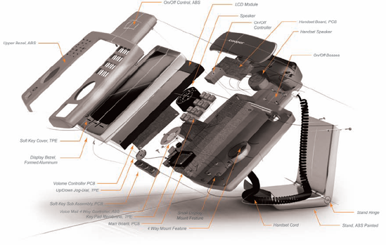
Internal components and parts such as those shown in Figure 22.20 need to be finalized as early as possible. The mechanical and electrical engineers drive most of this, though the design team expresses what's needed from the hardware in terms of weight, screen resolution and bit depth, battery life, and so forth. The ID and ME may purchase a number of off-the-shelf parts, such as hinges, to assess their function, look, and feel.
Decisions about materials are not simply cosmetic; they are critical to how the product will be manufactured. Material choices are driven by cost, functional suitability, and brand or aesthetic considerations. The ID typically starts with some idea of materials, color, and texture, which may be very specific or might be as general as "dark gray rubber" or "polished metal." The ME weighs in with specific materials based on engineering and manufacturing considerations; a completely metal enclosure, for example, can interfere with the function of a wireless antenna.
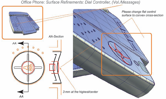
The ME imports the ID's database into his own application, such as Pro/ENGINEER, and creates a more precise 3D model using the ID file as a template. The ID and ME pass the file back and forth to ensure that it captures the design intent. The ID does not modify the ME's file, but may in essence draw on top of it to indicate, for instance, that a curve should be a little sharper, or a button profile should be a little different, as shown in Figure 22.21. Together, the ID and ME refine transitions and part breaks—the seams that indicate where two parts are joined. They then produce quick models to assess the impact of their changes. In the meantime, the ME works with other engineers and the manufacturer to develop thermal simulations as well as any necessary electrical shielding, moisture seals, and so forth.
The ID works with the visual designer to ensure that the grid used on-screen and the grid used on the device relate to one another, and that the alignment of physical controls and soft keys on the screen is just right. Also, it's often desirable for the visual style of soft keys to create a nearly seamless look with adjacent physical controls.
The ID also works with the VisD and IxDG to relate the visual hierarchy of physical controls to the visual hierarchy on the screen; an unimportant physical control should not, for example, stand out more than an important piece of information on the screen. With hardware as with on-screen elements, hierarchy is mostly determined by size, position, and color. Illumination can emphasize important physical elements; blinking illumination should be reserved only for critical failure indicators, such as a battery that will be running out in a few minutes.
Although the ID takes the lead on defining colors and surface textures, close involvement with the VisD is essential to ensuring a seamless look for the entire product. The visual designer typically develops the type and icons to be used on physical surfaces and provides these to the ID as vector images rendered in Adobe Illustrator. The ID or a model maker then applies these assets to the appearance model and adjusts them as necessary, since an icon or label designed for a 2D surface seldom looks quite right when applied to a curved surface. This treatment is generally sufficient if the icons or text are simply to be pad printed on the surface of the device. If the images or text are to be embossed or debossed, the ME must painstakingly model a 3D version of the asset so it will appear in the final mold. Similarly, the ME must model any custom surface textures or work with a texture vendor who can create custom-textured production mold parts.
Once the detailed industrial design is in good shape, the ID provides an in-house or external model shop with the ME's database and a set of color and material specifications in order to create an appearance model. This is a high-fidelity physical model that mimics the look and feel of the final product as closely as possible within the budget. Some appearance models may also provide a limited mock-up of a critical mechanical function, such as a hinge that opens and closes. An appearance model generally does not involve working electronics. If time and budget permit, the model can incorporate realistic materials, but it may simply be plastic that's painted to mimic some other material. Representative screen contents are typically printed and applied, and icons and text are applied to physical surfaces as decals. The model may also be weighted to simulate the correct materials and internal components.
Appearance models help stakeholders envision the final product in a way that machined foam and 2D renderings simply cannot accomplish.
Appearance models are important communication tools because they help stakeholders (and perhaps end users) envision the final product in a way that machined foam and 2D renderings simply cannot accomplish. A high-fidelity appearance model can also be used for product photography, which helps the marketing department get started on materials for the product release long before manufacturing has any functional products available.
However, an appearance model—like interaction and visual design documentation—is also an important design tool. Its physical nature and level of detail highlight shortcomings that aren't visible in 2D renderings or lower-fidelity foam models. A color that worked as a subtle accent on a computer screen might be too bright on the physical object, or a polished surface might feel too slippery. For this reason, it's wise to assemble the model's parts using some temporary technique, such as double-sided tape, that allows parts to be switched out for repainting or other adjustments. Appearance models are expensive—ranging from a few thousand dollars for a simple device with no moving parts and few part breaks, to perhaps $20,000 for a more complex model such as a laptop—and time-consuming to build, so it's far cheaper to replace one part than to redo the entire model.
For more on presenting an appearance model to stakeholders, see Chapter 24.
Regular reviews are an important practice during detailed design. Design team check-ins help ensure design quality and smooth collaboration. Reviews with design engineers—and sometimes with business analysts—are necessary to ensure feasibility and clear understanding for implementation. Scrutiny from subject matter experts (and anyone else, for that matter) helps find holes and flaws in the design.
Brief check-ins within the design team should be routine events. As during framework definition, these serve two purposes: keeping everyone on track and ensuring the quality and completeness of the design. A regular appointment with the full team, such as 20 minutes at the beginning or end of the day, gives everyone a chance to get immediate feedback on tough design problems, stay in sync as the design evolves, and exchange timely information, such as:
Requests, comments, or news from the project owner, engineers, or other stakeholders
Design changes that may affect anyone else's work, such as a physical button that needs to be moved slightly, an adjustment to the interaction framework that will affect the visual system, or a grid change that eliminates an unnecessary variation
Updates to the visual system that the interaction designer should use in rendering screens
Things you need to review with the design engineers, project owner, or subject matter experts
Often, these reviews are peripatetic, moving from one individual's desk to another's to look at the latest screen and hardware renderings or document draft. To allow for more detailed review, you can either extend these meetings to a half hour or build in an hour-long review session every few days. Which works better depends on individual team preferences and skills. Of course, this is not to say that designers don't talk to one another as the need arises—just that most people are more productive when not interrupted a dozen times a day for routine details.
The divide-and-conquer approach that's most effective for detailed design means that team members are making more individual decisions about how best to express the team's collective vision in pixels, words, and physical materials. This requires each team member to find a difficult balance between being a diligent reviewer of her teammates' efforts (since you succeed or fail as a team) and letting colleagues do what they do best. This takes practice!
Whether you're reviewing bitmap screens, animation, industrial design surface details, or documentation, keep your eyes open for:
Divergence from design intent. Does the artifact clearly communicate the necessary behavior, hierarchy, or information?
Oversights and bad assumptions. Does it seem like the solution fails to address part of the problem?
Inelegant solutions. Is the solution more awkward, complex, or inefficient than it could be?
Arbitrariness. Does it seem that some decision was made without good reason?
Inconsistency. Was a similar interaction or visual design situation in two places handled in two different ways when it could have been addressed with only one solution?
Unnecessary distinctions. Are there more levels of visual hierarchy than are really useful?
Divergence from principles and goals. Does the solution interfere with a persona or business goal, undermine the experience attributes, or violate some known principle of good design?
Unnecessary implementation difficulty. Does some decision make coding or manufacturing difficult without good reason?
Just plain great ideas. Not every comment should be constructive criticism; praise any great ideas you see, and don't hesitate to offer a brilliant solution if you see an opportunity to do something even better.
Although it's sometimes appropriate for a project lead or senior team member to provide specific direction, design reviews—like all design meetings—work best when people test one another's ideas with the intent of helping to improve them, rather than trying to "win" in some fashion. Your teammates are on the same side; you're trying to give them an assist, not score against them.
Here are some helpful hints for reviewing specific types of work in ways your teammates will appreciate.
Don't forget to say what's great. It will help teammates receive the rest of what you have to say in a better mood.
Ask first. Point out what you see and ask for more information about it before expressing your concern. There might be a good reason for the decision that you just don't know yet.
Explain what's wrong before offering solutions. This will allow the person receiving your feedback to decide whether they have a better answer than your suggestion.
Be specific. Don't just say it's no good; explain exactly what about the solution doesn't work.
Base your critique in something objective. Don't just pit your opinion against your colleague's; relate your critique to the personas, goals, scenarios, experience attributes, intended hierarchy, or accepted principles.
Remember that your suggestions are just that. Don't tell your colleague what to do about the concern; offer your suggestions as nothing more than ideas: "Maybe it would help if you did it this way ..."
Offer suggestions if asked. If someone asks how you would do it differently, at least make the attempt to help them solve the problem.
Involve the rest of the team. Don't turn it into a back-and-forth between two people; get the rest of the team to weigh in and see if you can reach a consensus.
The ability to accept and deliver constructive criticism is essential not only to the success of a particular project, but also to your development as a designer. None of us is perfect, no matter our seniority or experience. In my view, no designer is truly senior until he actively seeks feedback on his own—not because he lacks confidence in his skills, but because he knows collaboration makes his work better. Regardless of its source or style of delivery, you should learn to accept feedback as a gift and make the most of it.
Assume competence and good intent. None of us delivers feedback in a perfectly gracious manner every time, and not every piece of poorly articulated feedback is worthless. Look for what you can learn from it anyway.
Ask for the problem behind the suggestion. Maybe the suggestion is trying to solve a problem, and not just an instance of, "That's not how I would do it."
Ask for something constructive. If someone is just being negative, ask for specificity and constructive suggestions.
Ponder before defending. Understand the comment and sit with it for a minute before pushing back.
Write it down. Make a note of the comment so you don't forget it. This also tells your teammates you're taking them seriously.
Do something about it. Unless you can reach agreement as a team that the feedback was off base, try to address it. If it doesn't work, follow up and explain why. Don't just nod and ignore it.
Thank people for good feedback. Offering critical feedback is just as hard for some people as accepting it is for others. Appreciation now will get you more help later.
You'll find these skills useful in collaborating with the rest of the product team as well. Don't underestimate the importance of collaboration; most design leads I know would far rather have a team of solid but not brilliant designers who collaborate effectively (thereby elevating each other's skills) than individually brilliant designers who don't work well with others.
Close collaboration with engineers is critical to ensure the feasibility and thoroughness of your design, as well as a faithful translation from spec to finished product. For highly technical products or enterprise software, subject matter experts and business analysts may also be essential. It's often convenient if your project owner can attend these sessions, but not critical unless a significantly more desirable design solution will affect engineering or manufacturing costs or timelines. This kind of issue only arises a few times on each project, so it's usually possible to move on to some other topic while you find a time to talk with the project owner.
Meeting with these experts less than once a week is a sure way to waste time fumbling through incorrect or impractical solutions. Meeting for an hour every day or two gives you and the engineers chance to ask questions and review work in progress. Collaborating all day, every day would not be an effective use of anyone's time.
Although these collaborative meetings are informal working sessions, they'll be far more productive if you lay some groundwork. First, make sure you get the right people there—generally the design engineers, possibly a couple of SMEs and a business analyst. Avoid huge crowds; people with nothing to contribute belong in a more general stakeholder review rather than a working meeting.
Go to each meeting with an agenda in mind and a list in hand:
What do you need to ask about? Keep a running list of questions during design meetings so you don't forget any.
What do you need to show and get feedback on? Bring a set of the sketches, scenarios, CAD files, or other design details you need to review. Drawing on the whiteboard or bringing physical models sets an appropriate "work in progress" tone and invites others to engage with the design artifacts. Projecting pre-drawn sketches saves time, but can be less inviting unless you project them on a whiteboard where others can interact with them.
What do the engineers need from you? Give the engineers a chance to review what they're working on and ask questions of their own.
As you begin working through detailed design with this group, you'll probably need to be specific about the sort of feedback that's helpful. Most of what your design teammates are looking for is also good for this group to think about, but they should place special emphasis on oversights, bad assumptions, and implementation challenges. Some of this might happen via e-mail, especially if it's very detailed. For instance, a visual designer might get an e-mail like this from an engineer:
Remote collaboration is no problem at all for design reviews, but isn't entirely satisfactory for design creation.
The latest table images look great. Unfortunately, thanks to how Swing draws tables, I don't think we'll be able to achieve the look you're going for using these files. Swing assumes that all cells have single-pixel grid lines except headers, which don't have grid lines between the columns. We should be able to make it work or at least get pretty close if you can give us a separate file to use as a table header background that has the lines built into the image.
Periodic reviews with other stakeholders help ensure that they see the progress you're making, particularly on large projects for which the detailed design phase lasts several months. If you're delivering documentation for a few design topics at a time, use the first draft documentation of each design chunk as an opportunity to share your work with stakeholders who might be outside the day-to-day work of the project, such as the heads of marketing and sales. There shouldn't be any glaring holes in the design by that point if it's been reviewed at the whiteboard by engineers and SMEs, and the design is expressed in sufficiently concrete terms to be satisfying for stakeholders who are uncomfortable with sketches.
Remote collaboration is becoming increasingly common in today's world of teams distributed across continents as well as time zones. In my experience, remote collaboration is no problem at all for design reviews, but isn't entirely satisfactory for design creation. For one thing, designers in two different time zones may have difficulty finding enough meeting time together, and informal over-the-shoulder reviews at someone's desk are difficult to manage. For another, although remote-meeting technologies have come a long way, the need to deal with a system between you and your design partner can interfere with flow (see Chapter 14). I suspect it's possible to overcome this in time.
Design review meetings are less about creative flow because the acts of design creation are brief and intermittent. As long as you can see an idea in concrete form, converse about it, and ideally scribble on it together, you can be effective. Videoconferencing is getting more reasonable; you can install a basic system with HD video at both ends for around $15,000, and Skype (which is free) is tolerable for short chats. However, even the priciest videoconferencing system can't replace face-to-face contact. Spend the first few days of detailed design in the same location with your engineers and SMEs to build up rapport. After that, it generally doesn't matter if you don't even have video.
Perhaps the most annoying thing about remote collaboration is the inability to work at a whiteboard together. A tablet PC at either end connected with a desktop-sharing application will allow people in either room to "pick up the whiteboard marker." Attached to a projector, it still lets everyone see what's going on.
Even without these technology solutions, it's possible to review design by sending images or document pages electronically, then reviewing them over the phone. To make this work, you'll need to number the images or give them simple, distinctive names, and spend some time clearly labeling the components in the image.
Whether it's from an internal review or a usability test (discussed in Chapter 23), you will inevitably have to adjust your design to respond to feedback. Start by compiling a list of the issues and any good ideas you've heard. Spend a few minutes assessing each issue identified to determine whether you think it really needs to be addressed. Would your personas find it a problem, or is a stakeholder just making a comment based on personal tastes? Does the result of the usability test make sense, or do you suspect some problem with the test design or facilitation? I don't mean to imply that you should be dismissive of feedback—quite the opposite. Rather, you should examine it closely and figure out whether to take it at face value, or whether there's really something else underlying it.
Tackle the biggest, most difficult issues first. If you've used good process so far, a "difficult" issue might cause you to rearrange some screen components or adjust the design of a widget. Larger issues should be rare.
An iteration meeting is just like any other design meeting except that you probably have a list of small issues to work through rather than a couple of big topics. As always, rely on scenarios to help make sure your adjustments make sense.
Like every part of the process, detailed design has its potential pitfalls, some of which are within the design team's control and some of which are not. Most stem from a shortfall in skills or discipline on the part of one or more project participants or from insufficient time or diligence in earlier phases of the project. At least one of these things is likely to happen when key project participants are inexperienced either working as designers or working with designers. By watching out for these situations, you can catch them early and minimize problems.
Most framework-level design by experienced designers holds together surprisingly well. Sometimes, though, you'll learn that something about your hardware architecture, interaction framework, or design language simply doesn't work when it's translated into detail. This means you failed to anticipate something at the framework level. Framework adjustments don't usually involve starting over entirely; something like adding a screen or rearranging a couple of panes usually does the trick. It's unlikely to cost you more than a day, if that. It's worth examining your process and learning how you might have prevented it, but this is why design is iterative. You might find yourself needing to remind stakeholders of this, but most won't be too concerned if you treat it as a natural part of the process.
The success of detailed design is very much dependent on the level of cooperation you get from subject matter experts (if you have them) and engineers. If they're too busy with other priorities, they might not be available enough. It's also possible you've got the wrong people for the job if they can't answer most of your questions or aren't giving your work a thorough review. Start by having an honest conversation about what you need that you're not getting. Ask if the SME or engineer feels that he can provide it. Treat this as a partnership, however, and ask if there's something you could be doing differently. Be sure to establish specific deadlines for the information you need.
If this doesn't produce a satisfactory result, the best option is usually to continue designing based on your best guess and discuss the situation with your project owner, who might be able to get you better support. Whatever you do, don't stay silent about the issue; otherwise, any lack of progress or thoroughness in the design will be laid at your feet, regardless of its cause.
Few things are more frustrating to designers and engineers than constraints and assumptions that keep shifting. Good process prevents a fair amount of change by providing clarity and rationale, but even the best process can't account for changes in business conditions or (let's be honest) the occasional capricious executive. Changes in scope sometimes have a reasonable basis: a shift in a company's financial position requires a tighter scope or allows a larger investment, a new regulation requires some adjustment, or perhaps a desirable hardware component that looked too expensive has suddenly dropped in price. They may also occur because of a change in leadership; new executives often have different priorities.
Aside from these situations, people changing their minds about the target audience, feature set, or other project parameters are usually falling back on bad old habits. If possible, have a discussion with the relevant stakeholders about the decision-making process. If they're adamant about the change, your job is to help them understand its implications: how much additional design time it will take and how much cost it will add. Sometimes, helping people see that a change won't really save them money can keep things on track.
The members of the design team are always interdependent, but during detailed design, the dependencies are so numerous (especially among the visual designer and interaction designers) that any slippage on the part of one team member can have a cascading effect on the others. This makes day-by-day calendaring essential; each team member needs to know right away if she's running behind so she can catch up and not delay her teammates. Daily design team check-ins and regular internal milestones make progress (or lack of it) visible to everyone, so any team members who aren't successfully managing their time get immediate support.
Budget constraints often force designers to choose between breadth and depth.
Most companies make more than one product. Unfortunately, few companies do a good job of creating a consistent design language and predictable behavior across an entire product family; one company might have, for example, 20 different renderings of the icon for a power button, or two applications in the same software suite that handle cutting and pasting in different ways. It's impossible to tackle this kind of problem on a project-by-project basis; the best you can do is follow an existing style guide (if there is one) and avoid unnecessary differences between your design and closely related products. However, it's a good idea for each company or major division to establish a style guide (for use by designers, not engineers) and a shared repository of icons and other design language elements as well as interaction design patterns.
One challenge that's especially common for anyone designing software is a budget that's too small for complete design. This always results in some trade-offs between depth and breadth: Do you provide rough design for most of the screens, or do you provide deep design for the most important parts? On one hand, I've seen more companies successfully build upon the latter approach. On the other, the often complex relationships among parts of a system may lead to problems if you design screen A without considering what's going on in screen B.
Perhaps the most common example of this is related to system configuration. Because this is an infrequent task, it's often the first thing on the chopping block when a project plan has to be trimmed. However, the rest of your design might be dependent on the system having certain information, such as in a medical device that intelligently displays different things depending on whether it's in an oncology unit, operating room, or pediatric intensive care. Users won't take advantage of this helpful functionality if the configuration of this information is too difficult.
There's no easy solution to this problem, other than to explain how more design won't actually increase costs because without it, engineers will waste time struggling with undefined behaviors. If that's not an option, do your best to consider dependencies in prioritizing your topic list.
By the end of a detailed design phase, you will have made a multitude of small and large design decisions. Chances are that some of your later decisions were better than earlier ones because they were better informed—you learned from your earlier work. If you don't allow at least a couple of days at the end of a typical project to revise earlier visual and interaction design, your work may suffer from inconsistencies and may not give users the full advantage of what you've learned throughout the iterative design process.
A successful detailed design phase requires thoroughness, good time management, and close collaboration both within and outside of the design team. Day-by-day scheduling helps ensure smooth collaboration and makes all the detail seem manageable. Although months of detailed design may be less dramatic and exciting than earlier phases, there's something very satisfying about solving the hundreds of little (and sometimes big) intellectual puzzles involved in turning ideas into reality. Seeing your initial vision taking concrete, polished form is a reminder that the joy of design lies in creating beautiful, functional things that improve people's lives.
[63] Müller-Brockmann, J. Grid systems in graphic design. Arthur Niggli, 2001.
[64] Escher was best known for his drawings of impossible perspectives, such as a staircase that is a continuous loop. See particularly Convex and concave, 1955, Ascending and descending, 1960, and Waterfall, 1961. Images are available at www.mcescher.com.
[65] For additional Fireworks-specific tips, see "Designing interactive products with fireworks," an article Nick Myers wrote for the Adobe developer connection in June, 2008. http://www.adobe.com/devnet/fireworks/articles/cooper_interactive.html