

Although your personas' goals and mental models should still guide your decisions during detailed design, personas aren't the most useful tools for deciding whether to use a list box or radio buttons, how large a click target should be, or whether physical controls should be convex or concave. For this reason, principles and patterns play an increasingly large role in detailed design.
As discussed in Chapter 15, design principles are guidelines that help you choose the best way to organize and portray information and tools so users can take action with minimal time and effort. Patterns are types of solutions that tend to be useful for certain kinds of problems. The principles and patterns discussed in Chapters 15 and 17 still apply, but detailed design requires a larger vocabulary of both. As in those earlier chapters, I won't attempt to describe every useful tidbit, but will cover some highlights and offer additional resources. Experienced designers may wish to skip or skim this chapter; that said, it never hurts to revisit fundamentals.
Principles and patterns are not necessarily unique to one design discipline or another; Lidwell et al. illustrate this nicely in Universal Principles of Design.[43] This is particularly true of detailed design, where it becomes difficult to separate where one discipline stops and another begins. For example, information design—the presentation of data in the most understandable way—involves considerable overlap between interaction and visual interface design. For this reason, I have not attempted to describe principles and patterns for each discipline, but have instead focused on the issues they address.
Some principles are rooted in the scientific study of human cognition, vision, motor skills, and other capabilities, or are backed by a good bit of experimental data. It is useful for designers to understand the scientific underpinnings of our work in order to make use of their implications, though most of us will never have reason to employ the actual Fitts's Law[44] equation or worry overmuch about microsecond differences in mouse target acquisition. All we really need to know is that larger mouse or touch targets are easier to acquire, and that targets on the edges of the screen are "infinitely large" by virtue of having edges that stop the mouse cursor.
Deborah Mayhew's Principles and Guidelines in Software User Interface Design,[45] though dated, cites experimental data to provide a more science-based introduction to interface design principles than most. For those with more extensive curiosity or more esoteric needs, the academic literature is an excellent resource; along with texts on Gestalt and cognitive psychology, the ACM Digital Library[46] is a good starting point.
Products should be like good waiters: unassuming and unobtrusive, but always anticipating needs and learning preferences.
However, there are other useful principles that may not be based in science, but are simply about good manners and common sense. Many of these can essentially be summarized in a sentence: If the behavior would be rude or unhelpful from a human, it's at least as bad coming from a computer. Products should be like good waiters: unassuming and unobtrusive, but always anticipating needs and learning preferences. They should never interrupt or waste time with silly questions like whether your food is good or if you'd like to save that document you've been working on for the past hour.
For interaction design, being helpful could mean remembering and learning from previous user behavior or displaying related accessories on a shopping site. Mannerly visual design assumes the content is more important than its packaging; an operating system, for example, shouldn't call undue attention to window frames and such. Thoughtful industrial design might offer a place to wind a power cord for storage, a shelf for holding a purse or backpack at an automatic teller, or a stereo volume control in a convenient spot on a car steering wheel. Helpful service design might include home grocery delivery or a pre-paid product return label with every order. See Figures 21.1 and 21.2 for examples.

Figure 21.1. This design for an automated teller remembers each user's most common transaction and presents that as the first option.
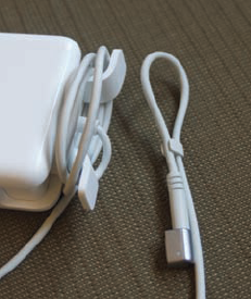
Figure 21.2. This laptop power adapter includes brackets for winding the power cord, as well as a small clasp for securing the cord's end.
You can find many specific principles of this sort in About Face 3.[47] However, you can derive many of these for yourself if you routinely consider what your personas would find helpful, and if you remember these key principles from Chapter 15:
Good design is ethical, purposeful, pragmatic, and elegant.
Good design nearly always minimizes unnecessary memory, motor, mental, and visual work.
The best solution is always appropriate to the user's context.
Much of the work in detailed design is focused on communication: what's important, what the personas want or need to know at various points in their tasks, and what input the system needs. Principles focused on effective visual communication are largely drawn from the fields of graphic design, semiotics, and cognitive and Gestalt psychology. These overlap the work of interaction designers, visual interface designers, and industrial designers alike. These principles outlined in Chapter 17 form a good basis for clear communication:
Visually communicate what elements do.
Use visual hierarchy to emphasize important information and controls.
Have a purpose for every element and a reason for every decision.
Repeat elements for unity.
Be decisive, but use the smallest effective difference.
Detailed design continues to rely on these ideas, as well as others that will help you reduce, prioritize, and organize tools and information to communicate in limited time and space. In addition to the key principles and patterns highlighted here, I recommend Designing Visual Interfaces: Communication Oriented Techniques by Kevin Mullet and Darrell Sano.[48]
Whether someone is cooking dinner, processing photographs, or doing brain surgery, it's possible to optimize workflow by making sure the right tools are available nearby and in the right sequence, so it seems like common sense that visual flow in a product should be mapped to workflow. In Western cultures, this means the tools and information used at the beginning of the scenario belong at the top left, while those used later belong at the bottom or toward the right. Surprisingly, this basic concept is often ignored.
Consider the photo in Figure 21.3, which shows a ticket kiosk for BART, a regional transit system serving the San Francisco Bay Area. Although locals can buy an electronic pass that automatically charges a credit card, infrequent riders and the area's many tourists buying single-trip tickets must first look at the screen, then at the printed fare list at the upper right to see what the one-way fare is to their destination (and do the mental math if they're taking a round trip). If they aren't familiar with the station names, they have to walk several steps to a printed route map on the wall, which still doesn't offer good information about what's near each station. Once they've figured out the fare, they then have to look below or to the right of the screen to insert cash or a card, then back to the screen to adjust the amount up or down. A better approach would be to integrate the route and fare information with the electronic tools, and to adjust the layout so there's a clean flow from top left to bottom right.
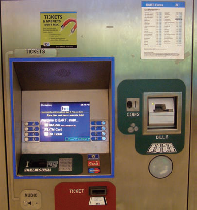
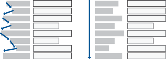
Figure 21.4. Scanning a complex form is much easier with left-aligned labels and fields than with right-aligned labels.
You may find that this basic application of visual flow breaks down somewhat as you apply multiple scenarios to a first draft of your design, but it's always a good starting point for laying out on-screen widgets and information as well as physical controls.
The alignment of elements contributes to readability and to an overall impression of order and simplicity. There are a couple of basic things anyone can do to maximize readability.
From a simple usability standpoint, you should right align currency and integers, but left align most labels and widgets, with the longest label ending within one or two characters of the widget. Although many graphic designers like the clean gutter formed between right-aligned text and left-aligned widgets, this makes text more difficult to scan, as shown in Figure 21.4.[49] It doesn't particularly matter for, say, a login screen, where there's little data entry and people won't refer back to it, but right-aligned text would slow down someone looking up information in a customer record. People generally do not have trouble associating labels and widgets unless there is an extreme difference in label lengths, as shown in Figure 21.5. If pressed for horizontal space, consider placing text labels directly above the input fields and aligned along the left edge.
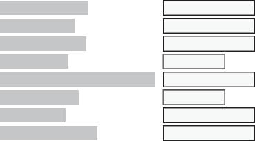
Figure 21.5. Extreme differences in label length can make left-aligned text awkward; ideally, adjust the length of the label rather than right aligning.
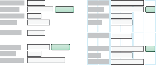
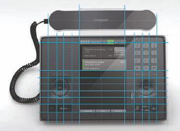
Beyond simple usability, you should look for opportunities to align elements along shared axes. Even without a good visual system, you can reduce the impression of clutter by, for example, making fields the same length or aligning a row of physical controls with the edges of a display bezel. Better yet, a deliberately designed grid system offers an invisible set of columns and rows to guide the placement of each element. Compare the layouts in Figure 21.6 to see what a difference the grid makes. Devices likewise benefit from a simple grid, as shown in Figure 21.7. Chapter 22 outlines how to develop an effective grid.
Good design makes it easy to find the most important information and controls by drawing attention to them and by downplaying less important items. Take the remote controls in Figure 21.8, for example. The one on the left has buttons that are all the same color and mostly the same shape, making it difficult to locate frequently used controls. Even though the color choices on the playback buttons are unfortunate (green means stop and yellow means play), the remote on the right is at least successful in drawing attention to frequently used controls.
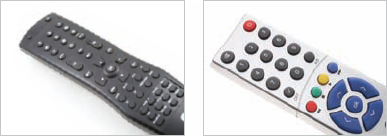
Figure 21.8. The remote control on the left does not have a clear visual hierarchy. The remote on the right at least highlights important functions with color, though the choice of green for a stop button is unfortunate.
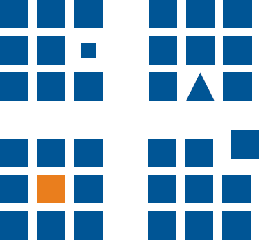
Figure 21.9. Manipulate visual properties such as size, position, shape, and color to create visual contrast.
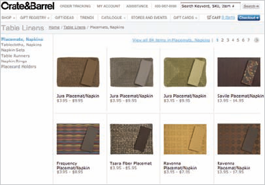
As shown in Figure 21.9, you can establish a clear visual hierarchy through contrast in visual properties such as size, shape, color, and position. Many e-mail applications, for example, use bold type to draw attention to unread messages, along with icons to indicate urgency. The stronger the contrast, the more clear the hierarchy; you can strengthen contrast by varying multiple properties. However, varying every property is likely to be overkill; remember to use the smallest effective difference to achieve your aims. Also be sure that any brand signature elements fit appropriately within the hierarchy. The Crate and Barrel Web site shown in Figure 21.10 makes good use of type size and weight, position, and color to keep users oriented. The products have the most visual weight—as they should—followed by the name of the store. The checkout button and the "Table Linens" category header are at about the same level, while the subcategory header is a notch lower in the hierarchy.
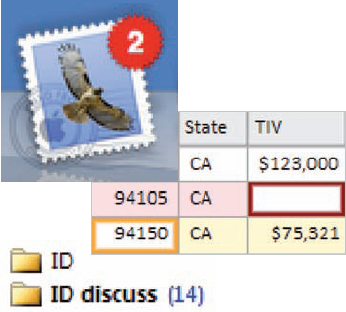
Although visual hierarchy is important to keep users oriented, a strong hierarchy can also help draw attention to exceptions without using offensive beeps and obnoxious pop-up messages. Modeless visual feedback such as highlights, icons, changes in color or weight, and illuminated physical parts are all visible but polite ways to indicate that something could use attention. Figure 21.11 shows several examples. Bold text and an icon or number on a tab or file can indicate that new items need attention. Red and yellow backgrounds or borders can indicate missing or problematic data.
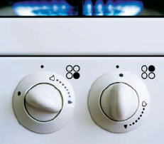
It's often important for users to understand associations within their data or among their tools. For example, it's helpful to know what other e-mail messages are related to the selected message, which files will open what applications, or which knob on the stovetop affects which burner. The two most effective ways to establish relationships are proximity and similarity.
It's often important for users to understand associations within their data or among their tools.
Whether we see two people walking side by side, a stack of documents on a desk, or several hardware or software controls in close proximity to one another, humans tend to assume that proximity equals relationship—imagine your surprise if the switch near the kitchen sink were for the lights and the one near the door were for the garbage disposal. In contrast, items with a fair amount of space between them tend not to be associated, as in Figure 21.12. You can also group items by putting them in some sort of container together, such as an inset with a different material for a physical product or a bounding box on the screen. However, this brute-force approach can be overdone; physical space is often the better option.

Items that look similar or have similar relationships are also seen as related; dissimilar things are harder to associate. The classic bad example is a stovetop: If the knobs and burners were arranged in the same pattern, it would be easy to figure out which knob affected which burner. Instead, many manufacturers attempt to convey this with a schematic next to each knob, as in Figure 21.13. Highway signage offers a better example: Within one country, navigation signs are generally one color (usually blue or green), caution signs are a different color (usually yellow or orange), and points of interest (such as rest stops or historical sites) are still other colors. On a remote control, playback buttons might be one shape while navigation controls, such as numbers and menu buttons, are another.
Nearly every desktop application, Web site, and interactive device communicates some amount of data. Even the simplest cell phone says what time it is, whether the signal is weak or strong, and how much juice (or better yet, time) is left in the battery. Complex analytical applications help users identify trends and relationships in enormous data sets.
Plain textual information is often not the most effective way to communicate data. Using numbers and equations, most of us would take a couple of minutes to predict where a thrown ball will land, if we could do it at all. In contrast, it takes less than a second for us to look at the ball, determine its speed and trajectory, and then reach out a hand to catch it. The human brain is an amazingly adept visual information processor, so designers should not be afraid to use it. Presenting data in visual terms often makes it more immediate and compelling. It usually takes up less space, too.
The effective visual presentation of data (also called information design) puts data integrity before all other considerations: Your representation of data should never be visually misleading, and cutesy or overly complex representations can obscure the data. As Edward Tufte puts it, keep your data-to-ink ratio high; see Figure 21.14.
Of course, good information design starts with your personas and scenarios: What information do your personas need immediately and at a glance? What do they need next? What do they need to see only when there's a problem? These priorities tell you what to emphasize and what to minimize in the visual hierarchy.
Though some information designers lament the relatively low density of digital displays versus paper, the one advantage of the digital display is the ability to do progressive disclosure: Make the critical information prominent, make the less=critical information visible, and show minor details only when someone hovers a mouse or clicks on something. Ben Shneiderman[50] refers to this as "details on demand." See Figure 21.15 for an example.
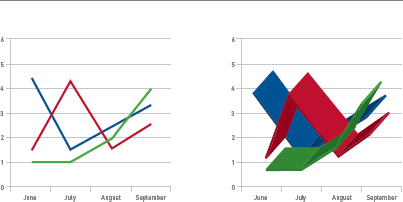
The best information design goes well beyond clear hierarchy, however. You should also help viewers put information in context. Show a meaningful comparison with something else, such as an industry average, a target, or the same data for a previous time period. Use multiple variables together to help viewers understand causality, especially for expert users who spend a lot of time with their data. Figure 21.16, for example, shows how a graph representing automobile accidents becomes increasingly useful as more variables are compared.
In interactive systems, a simple variety of information design is effective for communicating state and providing useful feedback in a modeless way.
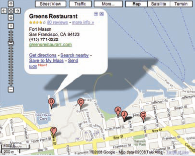
Figure 21.15. Google Maps offers several types of details on demand, and even offers multiple levels of drilldown.
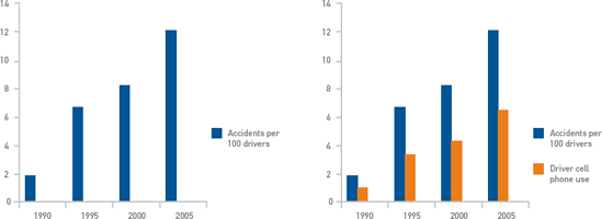
Figure 21.16. The chart on the left shows only an increase in automobile accidents, which might lead a viewer to conclude that driver safety programs were not working, but the second chart explains the trend.
On-screen indicators can hint that, for example, a user's instruction about a medication dosage exceeds a safety parameter, or that an entry is outside of certain preferred guidelines; Figure 21.11 shows several good examples of this. A physical switch could indicate by its position or LED color state that it's turned on. Figure 21.17 shows the problem with switches that don't indicate state, while Figure 21.18 shows a better example.
For more information design principles, The Visual Display of Quantitative Information and other books by Edward Tufte are informative and full of interesting examples. Though they emphasize print applications, many of the ideas can be adapted for on-screen display. Richard Saul Wurman's Information Anxiety[51] and Robert Jacobsen's Information Design[52] are also worth a look.
Although icons are seldom ideal for first-time use, they are helpful in file systems and lists for indicating object type and status. They're usually good choices for controls in productivity applications because they occupy less space than text labels. Sometimes, they're useful for communicating simple ideas to an international audience without a common language. They're almost always poor choices for any tool that should be instantly usable, such as a kiosk or Web site; good text labels are better because they're unambiguous. The exception is in applications that must be language independent, such as wayfinding in an airport full of international travelers.
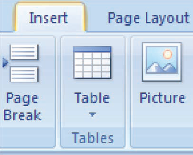
There's seldom a good reason to combine both text and icons in a toolbar; this punishes intermediate users by eating up precious screen space, and if you're catering to novices, the icons don't gain you much. Microsoft's execution of the "Ribbon" in Office 2007 (shown in Figure 21.19) is puzzling in this respect; although novices may have an easier time finding functions, the vast majority of users lose considerable screen space and immediate access to controls because the tools combine large and small icons with text.
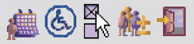
Icon style is an important part of the design language that communicates emotional qualities and reinforces brand attributes (see Chapter 17); the icons within an application should all have a family resemblance that reinforces the desired experience attributes. However, the way your icons are designed also has a significant impact on their usability. In addition to style considerations, effective icons are immediately recognizable, understandable within their context, and part of a coherent system. Figure 21.20 is an example of what not to do with icon design. As symbols, these icons from an online calendaring system are difficult to decipher; even the ones that seem predictable actually mean something different from what you'd expect. The low contrast and level of detail in some makes the images difficult to understand. They also lack a family resemblance, and the muddy yellow and purple—which are totally unrelated to the company's brand—don't make this application a place where users want to spend time.
If you'll recall the discussion of human perception from Chapter 17, we recognize shapes most quickly, followed by color and only much later by texture and other surface details. The implications of this are clear, and are borne out by experimental data:[53] simple, schematic icons with distinct shapes are more immediately recognizable than highly detailed, photorealistic ones. The more visual information there is in an icon, the longer it takes to decipher. Icons that have borders or are all the same shape require even more time to figure out. This is why road signs, which must be recognizable at 65 miles an hour, use simple schematic symbols. In Figure 21.21, you can compare these with Apple's nearly photographic application icons. Safari, iTunes, and iDVD all have very similar shapes and colors, as do iPhoto and iWeb; if I'm only half paying attention, I still sometimes click the wrong icon on the dock even after years of using these applications. Certainly there is a brand aesthetic value for Apple in these glossy illustrations, but there is also a significant usability trade-off. Particularly when speed and accuracy matter, keep your icons visually simple and use shapes that are distinct from one another. When representing an object, choose the most familiar outline of its shape; showing a telephone from above, for example, would be an unusual perspective that would make the object less familiar.
Also consider that icons usually have to be rendered at different sizes, often as little as 16"6 pixels, which doesn't allow for much visual information. The simpler your image, the easier it will be to render at low resolution or incised into a physical surface. Anti-aliasing doesn't always work well for icons that must look good on multiple backgrounds. Icons may also have to be legible printed in a black-and-white user manual, though this is becoming the exception rather than the norm.
As discussed in Chapter 17, humans derive meaning from both content and context. Much like an unfamiliar word used in a sentence, an icon that may not be clear by itself takes on meaning from other icons around it. The text-formatting controls shown in Figure 21.22 are classic examples of this. Of course, culture and experience provide their own sort of context, as well; the average teenager, for example, has never used a floppy disk or a roll of film, and a German driver flashing you the American "OK" sign on the autobahn is calling you something rude, not telling you how cool you are.
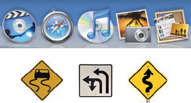
Figure 21.21. The human brain is quick to process simple, distinct shapes. Similar shapes and colors and excessive visual detail make icons harder to recognize.

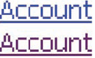
Icons may also take meaning from similar icons that aren't nearby. Repeating the same icon with slight differences, such as adding a plus or a star to a folder icon, can indicate actions or properties related to whatever the original icon represents. This is called inheritance. You can use the same concept to convey status, such as an e-mail icon that changes when you've replied to or forwarded the message. Figure 21.23 shows an example of inheritance.

Successful icons generally represent familiar objects, actions, or desired end results. Most data objects (see Chapter 16) can be represented by simple object images, such as a document, a folder, a person, or a computer. Tools and actions are often best represented by an image of an object plus an action, such as an arrow indicating an open folder, or by the desired end result, such as text shown in bold. Once in a while, it's possible to illustrate only an action without an object, generally because there is only one type of object to which the action could apply. Abstract symbols, such as a radiation hazard symbol or a cylinder to represent a database, are more difficult to learn unless they're already part of your personas' context. Figure 21.24 illustrates each of these icon types.

Figure 21.24. Objects, actions, objects plus actions, and abstract symbols can all make effective icons provided they are appropriate to the context of use.
Because icons take meaning from their context, it's preferable to use a consistent type of icon (such as combining object and action) when possible. Don't be too dismayed if it's not possible to be consistent, however; it's more important that each icon be recognizable and understandable on its own.
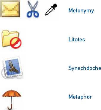
However, many actions can be tricky to represent with an object and indication of movement, and not all end results can be represented visually. In these cases, understanding how icon design patterns relate to literary figures of speech—which I bet you never thought you'd use outside of a classroom—can help you select images that are more likely to be successful. Figure 21.25 shows icons representing each of the following figures of speech.
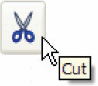
Metonymy is the use of one thing to represent a closely related thing, such as saying "the White House policy on immigration" to mean "the President's policy on immigration." In icons, metonymy generally involves either using a container to represent the thing it contains, as an envelope represents an e-mail message, or using a tool to represent the end result, such as a pair of scissors to mean "cut."
In synechdoche, a part is used to represent the whole. For example, if you say in a design meeting that you need to get another brain or another pair of hands, you're talking about another person. Highway signs that show a knife and fork to represent a restaurant are using synechdoche. This literary device can be a bit indirect, so use it with care. The icon for Mac Mail in Figure 21.25, for example, is a poor use of synechdoche, especially since a small version of the icon looks more like a photo than a stamp.
Litotes is used to convey an idea by negating an accomplishment, as in, "Winning an Olympic medal is no small feat." In icon design, this usually involves negating something represented through metonymy, such as by showing an X or circle and slash on top of an object icon to indicate deletion, or the use of a minus symbol inside a magnifying glass to indicate zooming out.
Use icons when space requires it, users need to differentiate objects in a list, or you need to communicate status.
Metaphor is the use of one unrelated object to represent another, as in "all the world's a stage." The relationship is distant enough that the connection can be difficult to make. The icon representing Apple's backup utility, for example, is an umbrella, presumably so you're prepared for a figurative rainy day. It's memorable enough for a frequent user once the mental connection is made, but difficult to decipher at first. It's usually best to minimize the use of metaphor.
Here's a summary of useful icon design guidelines to keep in mind:
Use icons only when users will have an opportunity to learn them and at least one of the following applies: space requires it, users need to differentiate objects in a list, or you need to communicate status.
Combine objects and actions when possible.
Use objects and symbols that are recognizable to your personas, and that will work internationally.
Avoid unnecessary realism, borders, colors, 3D treatment, or other visual complexity.
Make sure icons work with all possible resolutions, color depths, and backgrounds applicable to your application.
Make sure the icon can be rendered clearly at all applicable sizes.
Portray objects from the most recognizable point of view; avoid unusual angles.
Be consistent about perspective, lighting, style, and color palette for all icons within the application (and often the platform).
Relate the visual style of the icons to the style of the overall interface and to the experience attributes.
Make icons visually distinct (especially with respect to shape and color). Try the squint test—if you can't easily tell them apart with your eyes mostly shut, they're not distinct enough.
Reflect the appropriate hierarchy in your set of icons; make the most important icons more visually prominent than less-used icons, and make status indicators smaller than icons used as controls.
Make icons visually distinct, especially with respect to shape and color.
Text is an essential element of many systems, from wayfinding to controls, navigation, and content. Although Chapter 17 offers some advice on selecting appropriate screen fonts, you must also consider readability—how quickly someone can grasp your meaning—and legibility.
There are all sorts of guidelines for how large your type should be. The only truly reliable one is based on how many degrees of an arc the type fills in a reader's vision; this accounts for resolution and distance from the screen. Most designers rely on simple guidelines instead of painful calculation; unfortunately, such guidelines generally fail to consider several important factors:
Hierarchy. Critical information should be large; supplemental information can and should be smaller.
Typeface. Good screen fonts are legible at small sizes, whereas others must be large even on paper.
Context. Older populations, beginning readers, poorly lit environments, screens with protective coverings, large blocks of text, people working far from the display, and hazardous situations (such as driving) all call for larger type. Three-millimeter text may be tolerable on a portable music player if you have good eyesight, but would be dreadful for reading any amount of content.
Resolution. Pixels on the same screen are smaller at, say, 1024×68 than at 800×00, so it's entirely possible for text to become too small. Specifying type size in pixels provides greater control of the design, but specifying it in points allows an operating system to adjust the type based on resolution. For the sake of accessibility, users should be able to increase type size, so consider how your screen layout will degrade gracefully with large type.
Screen size. A resolution of 1024×68 on a 12-inch laptop screen will still render 10-point type much smaller than 1024×68 on a 20-inch desktop monitor.
Contrast. Type that doesn't contrast strongly with its background is harder to read.
All that being said, for most applications on most platforms, the right sizes for type are generally between about 9 and 24 points. Your best bet is to choose a size (or a range of sizes, in a hierarchy) that feels about right, then try it out on a range of screens of various sizes and resolutions. It's easy to simulate screen sizes and resolutions on paper by manipulating your print settings.
A few other guidelines will help you maximize legibility and readability:
Keep instructions and labels short and simple. Avoid unnecessarily repeating words in sets of multiple controls (such as checkboxes and radio buttons).
Use active voice in content and instructions.
Skip any jargon that isn't part of your personas' daily vocabulary.
Use enough words to make it clear what sort of content is behind a Web site link; single words are often insufficient.
For interfaces that will be translated into multiple languages, leave extra space between labels and controls—German and French, for example, take up more space than English—or find an intelligent way to adjust the screen layout for translated text.
Run translated text by at least one native speaker of each language. Poor translation can make an interface incomprehensible. At best, it erodes any impression of quality.
Avoid serif faces at small sizes.
Avoid traditional anti-aliasing; modern operating systems handle this automatically. Turn off even this at small sizes.
If using large blocks of content, as on a Web site, stick to an average line length of 10 to 12 words (65 to 70 characters).
Separate headings or subheadings from other text by a full line space or more.
Widget selection—sometimes even widget design—is a key part of detailed interaction design. A good widget choice minimizes errors and balances clarity and efficiency with effective use of screen space.
Whatever widgets you use should be suited to the primary input method, if not for the product, at least for the task at hand. Perhaps the most common problematic example is address entry on many e-commerce Web sites: Users must enter name, street, and city information using the keyboard, but are often forced to select a state or province from a drop-down list with a mouse. This interrupts flow and is inefficient. While there's nothing wrong with bounded input, such a list box should allow keyboard-based selection because the rest of the task involves the keyboard by necessity. Text fields, combo boxes, and radio buttons generally work fine with keyboard primary input; list boxes and spin buttons can work if implemented to accept typed input. Checkboxes tend to be difficult in keyboard-primary situations.
Also select widgets that are appropriate to the type of data your personas will be entering. Bounded input widgets prevent errors by allowing only certain values or types of data to be entered; this is better than letting someone enter invalid data and popping up an error dialog. Table 21.1 outlines effective uses for common widgets.
Table 21.1. Common interface widgets and their uses.


If a customer support agent on the phone asks for your name, you probably find it obnoxious if he insists on getting your last name first (at least if you're from a Western culture). It's equally obnoxious for applications to insist on having dates, phone numbers, and other common types of data formatted in rigid ways. It's not that hard to figure out that 415.267.3500 is the same as (415) 267-3500, or that 7/4/09 is July 4, 2009, in the U.S. and April 7, 2009, in Europe. It's not even particularly difficult to figure out that if I type "Kim Goodwin" into a name field, chances are good that "Kim" is my first name and "Goodwin" my last name.
Designers are inventive people, so we can be tempted to create new solutions just for the sake of doing so. However, novel controls require custom code or expensive hardware engineering and are generally more expensive to implement, so think long and hard about whether you really need to go beyond what standard libraries offer. Custom widgets are sometimes worthwhile for visual feedback, such as in the table shown in Figure 21.11, or for situations where some direct visualization of results makes actions more understandable. See the examples in Figures 21.26 and 21.27.
As with text size, you may read multiple guidelines for the size of widgets or other targets on a touch screen, ranging from about 9 mm to 20 mm or more. As with type, the right size depends on context:
A stylus is more precise than fingers and thumbs, so it makes small targets more manageable.
People with short fingernails tend to use the tips of their fingers, but people with long nails need to use the pads of the fingers (which are larger and less precise) unless the particular touch screen technology accepts fingernail input.
As with mouse target acquisition, people who are farther from the screen or trying to work quickly need larger targets to be accurate.
Sequential targets are slightly easier to hit.
Different ways of interpreting finger position allow for more or less accuracy; reading the center of the average finger position cuts down on errors.
Unless you have the luxury of doing a detailed study, you may want to try a quick and dirty method (literally) of figuring out how large your touch targets need to be. Draw your screens with a reasonable guess at target size and print them out at the correct size. Put them on a hard surface at the right height, distance, and angle. Swipe your finger across an ink pad (of the sort used with rubber stamps) and walk through several tasks at a realistic speed. Ask colleagues with large hands or long fingernails to do the same, and you'll get something like Figure 21.28. If there's ink slopped over onto adjacent targets, you'll either need to make your targets bigger or farther apart, or get the programmers to do some very smart interpretation.
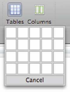
Figure 21.26. This "insert table" widget from Microsoft Word is a good use of a custom widget because it allows for easy visualization of results.
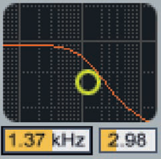
Figure 21.27. This reverb input processing widget from Ableton's Live sound editing application allows for direct manipulation of filter frequency using the yellow circle. A logarithmic scale in the background and colored bars on the numeric indicators provide feedback.
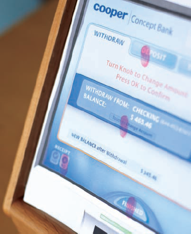
Figure 21.28. A paper prototype and ink pad provide a quick and dirty way to assess the size and spacing of your touch screen targets.
A few additional guidelines will help you minimize input errors:
Act on finger-up, not finger-down. As with a mouse, this provides the opportunity to cancel an action by moving off the target. It also makes target acquisition a bit more accurate. If targets must be small and close together, use a balloon or other indicator not covered by the fingertip to show which target is acquired, as in Figure 21.29.
Make the size of the touch target a little bigger than the visible target.
Replicate the experience of pressing a physical button to the extent possible. The experience is comprised of both sound and movement. A subtle, audible click for each button press can go a long way toward providing the illusion of movement. Haptic technology, which provides physical feedback, is starting to appear even in small devices. A display surface that moves even a fraction of a millimeter or provides a short, minute vibration can feel almost like the real thing.
Many applications—from CRM tools to digital music managers to e-commerce Web sites—involve finding one or several files among many thousands. The usual ways to handle this are with "simple" keyword search, more complex or detailed queries, and categories, which are each useful in different situations.
Search fields have become nearly ubiquitous on Web sites and in operating systems, but they're applied with varying degrees of success. Many search utilities simply look at document titles or don't make any effort to interpret users' imperfectly phrased or imperfectly spelled queries, but with smart technology to back them up, plain keyword searches can turn up surprisingly useful results (as any Google user will tell you).
Whether to employ search or categories as the primary mechanism for helping users find their way around isn't just about how much you can invest in technology, however. Search is very effective for people retrieving specific objects that are likely to have unique identifiers. For example, if you know you want to buy a copy of Designing for the Digital Age, you can type the title into the search field of your favorite online bookstore and get exactly the result you're looking for. On the other hand, if you're looking for a pair of shoes to wear to your sister's wedding, search is going to be much less successful; you'll have much better luck drilling through a series of categories, such as shoes > women > pumps > 2-3" heels.
Database administrators, financial analysts, and other technical types who need very specific things from their data learn how to write complex queries in SQL. For most users, though, merely mastering the correct use of Boolean and/or/not terminology is too much effort. To give ordinary mortals the power of very specific searches without the hard work, you can use a constrained query builder to assemble flexible, complex searches from more or less plain English. The pattern described below is also useful for constructing e-mail filtering rules, smart playlists, or any similar operation.
Though you can do all sorts of things with this pattern, a straightforward version typically contains an object type, a query type, and a specific value for the query, as shown in Figure 21.30. Together, the three widgets form something close to a coherent sentence, such as: "Show [movies] [that won awards for] [set design]."
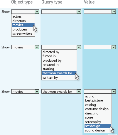
The object type is selected from a list box containing all of the available object types, such as actors, directors, movies, producers, and screenwriters. The types of queries available in the query type selector are based on the first selection; if the selection in the first box is "screenwriters," then "filmed in..." wouldn't make much sense. The third control is then driven by the second control; available values for "filmed in..." would include every applicable value available in the data set, such as Africa, Asia, Australia, Europe, North America, and South America.
Although the first two controls are usually list boxes, the third control (and perhaps subsequent controls) could be almost anything: a text field, a list or combo box, a set of two date controls, or even a color picker. The type of control can change depending on the selected query type. Here are some examples of queries that can be built with standard widgets:
Show [customers] [who have spent more than] [$10,000]
Show [claims] [filed between] [January 1, 2009] and [March 31, 2009]
Show [songs] [written by] <text entry field>
Show [photos] [with any of these tags:] [bird] [beach]
There are various ways to make setting up the search more efficient. You can offer an option to save a few commonly used queries as favorites, offer one-click shortcuts to the most common queries, or let users step through a history, as in a Web browser. Sometimes, it's even worth offering a series of checkboxes to narrow the results.
As discussed in Chapter 16, audible output may be combined with visual output and with input from on-screen interaction, physical controls such as a number pad, and speech input. Systems based on number pad input usually include some combination of directed dialogue (in which the system prompts users to enter specific bits of information in a sequence) and hub-and-spoke, hierarchical menu selection. Voice-activated systems may use these patterns, but may also use a mixed initiative approach, in which users provide information or a request and the system prompts for any missing pieces. Chapter 15 addresses when to use each of these.
Once you have identified your approach and overall structure, the details of voice interface design involve a complex combination of emotion and usability, along with a number of strategies for handling the shortcomings of both voice output and voice input technology.
If humans interact with computers as if they were also human, as discussed by Byron Reeves and Clifford Nass in The Media Equation,[54] then this seems even more true for computers and other software-powered devices with voice input and output; after all, if it talks, it must be able to think, right? Hearing a "smart" but stupid voice interface say, "I'm sorry, I didn't understand that" three or four times in a row is enough to inspire violent impulses in the most dedicated pacifist. In their very readable 2005 book, Wired for Speech, Nass and another colleague, Scott Brave, assert that, "People draw conclusions about technology-based voices and determine appropriate behavior by applying the same rules and shortcuts that they use when interacting with people."[55] In particular, they've studied how the linguistic and paralinguistic characteristics of both recorded and synthesized voices affect perception, attention, judgment, and performance.
The psychology and sociology literature is full of examples of how people tend to prefer others who are like them in gender, ethnicity, appearance, personality, and a wide range of other characteristics. Nass and Brave describe how this carries over to interaction with voice systems: Their experiments showed that people tend to perceive both real and synthesized voices that seem to share their gender, regional accent, age, and personality as more likeable, persuasive, and trustworthy.
Humans interact with computers as if they were also human; this seems even more true for systems with voice input and output.
People assign gender to voices based on their pitch, range of modulation (or "expressiveness"), and to some extent on word choice and inflection. According to Nass and Brave, both men and women tended to react more positively to voices perceived as their own gender, though women responded better to male voices than men did to female voices. Male voices were seen as more credible when discussing stereotypically masculine topics, such as technology and sports, while female voices got a better response when discussing stereotypically feminine topics, from relationships to sewing. Voices with ambiguous gender characteristics were widely viewed as unlikable and untrustworthy. If you're designing educational software, you might consider having a female voice teaching math and science and a male voice discussing literature to help children break away from these harmful stereotypes. If you're designing a voice system for investors, you might need to accept current reality and use a masculine voice.
Most people likewise appreciate a voice with an accent similar to their own (which you might be able to guess based on an address or a caller's area code). However, if you're using a single voice for everyone, consider what people associate with the accent you choose. Americans, for example, tend to attribute sophistication to certain accents from European countries and former colonies, and may be more likely to see accents from Australia and the southeastern U.S. as warm and approachable. Accents from some regions may also have negative stereotypes associated with them; in the U.S., for example, the elocution of people from the southeast and certain areas of the northeast can be viewed as uneducated. Again, as with gender, there is a difficult choice between not reinforcing a stereotype and dealing with the effects of its reality.
People ascribe personality partly based on volume, pitch, range, and speed; loud, fast, high-pitched, and highly modulated voices are seen as more extroverted. Quantity and content of speech also tend to indicate personality, as extroverts tend to talk at greater length, use more adjectives and adverbs, and use more first and second person pronouns ("I" and "you"). According to Nass and Brave, people generally responded best to voices that reflected their own personalities, but the best default would be no surprise to anyone in sales or advertising: Extroversion gets a better response from a mixed group.
Finally, any voice conveys some sort of emotion; even the lack of any particular intonation is viewed in an emotional light. Higher pitch, rising inflections, and a wide range of pitch and volume tend to come across as happy. Mild happiness is better received in most circumstances. An unhappy machine is noticeable; for several days after we installed a new phone system at Cooper's office in San Francisco, people commented on the doleful female voice that responded to deleted phone messages by saying "duuh-leted," dragging out the first syllable and drooping at the end, kind of like a mopey teenager asked to take out the garbage.
Nass et al.[56] found that in a simulated driving situation, drivers who got feedback from a voice matching their emotional state (either happy or subdued) had fewer than half the "accidents" of drivers whose feedback was delivered in a mismatched voice. While it's impractical to assess mood in the average human-technology interaction, this finding highlights just how distracting inappropriate affect can be; users can't help but find it puzzling because another human would sense what tone was appropriate to use. When it comes to identifying appropriate emotion to convey, your best bet is to consider your experience attributes and your personas and scenarios, then adopt a tone that seems most likely to fit. Also, remember that tone can vary: A voice that's otherwise cheery can adopt an apologetic tone when delivering bad news.
How human your system should sound might seem like purely a branding issue: If your brand is friendly or high-end, the more human the better, right? Yes and no. Bits of speech recorded or synthesized out of context inevitably sound not quite right due to odd pauses, emphasis on the wrong syllable, or lack of a rising inflection at the end of a question. More human speech patterns do seem warmer and more polished. One good strategy for accomplishing this is to use the context of the conversation to determine appropriate inflection.
However, a machine that claims humanity by referring to itself in the first person is potentially treading on a nerve. I know I want to smack my bank's voice system for its presumption when it says something like, "If you'd like to speak to an agent, say "Agent please.'" I believe in saying "please" to other humans, but I don't politely ask the cat to move off the couch, and I'm certainly not going to extend the courtesy to a computer (though I think it ought to apologize to me when it can't help). According to Nass and Brave, I'm not alone. Most people in their experiments had no problem with an obvious recording of a human saying "I," but were irritated by synthesized voices using the first person. Even the recorded voices didn't get a warm reception when using the first person to deliver bad news; it only increased the listener's perception of the system's incompetence.
Personality only goes so far in driving user satisfaction with voice systems. The errors and inconsistencies (as well as the poor navigation) in many voice systems drive users to sites like dialahuman.com, which offer tips for working around the voice systems to get to a human—not at all the outcome companies that install voice systems have in mind.
Perhaps the most interesting point Nass and Brave demonstrate is how contrast of any kind draws attention to system shortcomings. This makes intuitive sense from everyday life; you might be content driving your five-year-old economy car until you ride in a colleague's brand new sports car, or think Madonna sings well until you hear Ella Fitzgerald in her prime. In audible interfaces, the unfortunate contrasts underscore the ways in which the technology simply can't replace a human. Typical problematic contrasts include:
Inconsistency in personality and content. There's a reporter on one of my local TV news shows who has an irksome tendency to report on the death toll from the latest global catastrophe with a smile on her face, which always makes me wonder what kind of strange things are going on in her head. Similarly, people are less likely to enjoy or trust their interactions with a system that cheerfully reports an inability to help or that seems terse or unfriendly in the course of ordinary transactions.
Combining high-quality output with low-fidelity input. If a system talks in complete sentences using a recorded human voice but can't parse a simple request or recognize common words, it comes across not only as a technologically limited system, but as a deliberately obtuse and infuriating person. Clear but obviously synthesized speech leads to lower expectations of "intelligence."
Mixing recorded human voices with synthesized output. Dynamic content—such as e-mail, news, and Web site content—is difficult or impossible to construct from prerecorded bits of human voices, so synthesized output is sometimes necessary. Having a human voice speak part of the content while a synthesized voice speaks the rest is distracting.
Voice input systems can be tripped up by unexpected vocabulary, unclear or unfamiliar pronunciation, and ambient noise, so error prevention is a significant part of detailed design. Here are a few things that can help:
Encourage mimicry. Write prompts in a way that encourages people to use the system's vocabulary, such as, "Would you like to place an order, check order status, or return something?" Open-ended prompts such as "How can I help you?" elicit a wider range of responses and increase failure rates.
Prevent random input. In noisy environments, such as automobiles, where random input is likely to be a problem, use a button for intercom-style voice input. For a hands-free version of this, use a word that's unlikely to crop up in normal conversation to tell the system to listen to the next bit of input.
Escalate detail in prompts. It's fine to start with simple questions if the system can parse a wide range of answers, but subsequent prompts should ask for specific detail if the system doesn't understand the first response.
Confirm important transactional input. Although confirmations are usually a bad idea in GUIs, they're often a good idea in VUIs. However, don't confirm every bit of input—just repeat back what the system understood before you commit that flight reservation or bank transaction—and don't confirm non-transactional information.
Place blame appropriately when necessary. Anything that even implies blame to a user won't be well received. It's better for the system to accept responsibility and apologize for its failures, though this can lead to an impression of system incompetence according to Nass and Brave—they suggest blaming a third party, such as ambient noise. However, this does not always seem practical and could soon become tiresome.
A few other behaviors will help your system seem more like a reasonable human being or allow for some fudgeability, thereby preventing a good deal of user frustration:
Let users "barge in" on the computer. Repeat users learn menu options and other prompts over time, so the system should stop talking and act on user input whenever it happens.
Use progressively shorter prompts for multiple entries, like this:
What's the first e-mail address?
What's the next address? If you're finished, say, "Done."
What's the next one? Or, say, "Done."
Next?
Use nonverbal audio such as music to deal with system latency. Users confronted with long silences may assume the system has become nonresponsive and either start repeating themselves or pressing random buttons; worse, they may disengage entirely. However, pausing for a second or so to indicate that the system is "thinking" about a complex request seems less abrupt and more human.
If you're designing your first VUI, Voice User Interface Design[57] contains a good technical overview of how voice systems interpret input, as well as some useful tips on designing good prompts and working with voice actors on the right stress and inflections.
One 1999 report[58] estimated that in the United States alone, some 98,000 people die each year from hospital errors. It's difficult to estimate the role of design problems, but consider this: As many as half of FDA medical device recalls in the late 1980s were due to poor product design.[59] In 2005, the U.S. Department of Transportation estimated that motor vehicle crashes were the leading cause of death for adults under the age of 34.[60] How many deaths could design prevent? It's hard to say, but a 2006 study[61] by the Virginia Tech Transportation Institute found that drivers engaged in secondary tasks were two to three times more likely to have accidents or near misses; dialing a phone, for example, made an incident 2.8 times more likely.
Individual responsibility certainly plays a role, but clearly, safety is a critical factor in the design of medical devices, manufacturing systems, systems used in moving vehicles, and any other product that could increase the likelihood of injury or death. The challenges are exacerbated by the fact that medical residents work long shifts and drivers get behind the wheel under the influence of anything from a bad day to a controlled substance. It's also common to find nurses or other professionals who are working at a given facility temporarily and haven't received training in using every device on hand. Detailed design for any of these situations should absolutely include close scrutiny from experts in human factors and safety analysis, as well as extensive usability testing. However, it helps if you carefully consider these common possibilities for error when users are in a hurry, fatigued, or unfamiliar with equipment:
Unsafe defaults. Defaults are useful in most applications, but defaults in medical devices can cause tremendous problems. If a medical record includes a default number for a patient's weight, for example, it could lead to a medication dosing error. A dosing pump or radiation therapy device with a default setting for adults could severely overdose a child. A glucose meter that defaults to European measurements could cause a harmful misunderstanding for an American patient or physician.
Misread data. Similar words and small or illegible fonts are a problem in any design, but are even more likely to be misread by a driver or health care professional who's just glancing at them. Numbers can be misread if digits or parts of digits are obscured by a screen bezel when observed at an angle.
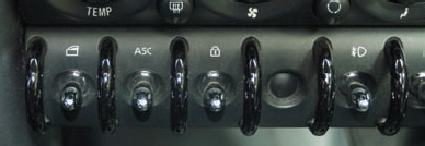
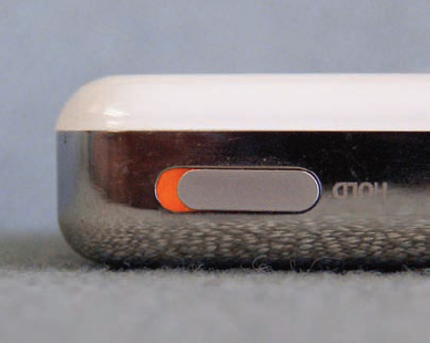
Invisible or misleading status. A life support system, factory power readout, or other critical system should make it glaringly obvious if it's turned on but not working.
Sticky keys. I once used a new office phone system that was overly sensitive to the slightest key jiggle. Dialing 9 (for an outside line) followed by 1 (for a long distance number) led the system to dial 911 (for an emergency) if a user faltered slightly in pressing the buttons. Now imagine that applied to a medication delivery device: pressing 5 delivers 55 units of medication, overdosing the patient by a factor of 11.
Improper component installation. If you have a few electronic devices, you probably have a whole collection of USB and other cables that are all similar but slightly different. Now imagine a setting in which you have to find the right cable among 20 or more, and someone's health or life depends on your speed and ability to plug it in correctly. Hazardous or life-saving devices should have distinctive components that can be installed in only one way.
Lack of protection on critical controls. There's a great Far Side comic by Gary Larson that shows someone sitting in an airplane seat with two identical controls on the arm: one says "recline" and the other says "eject." An emergency shutdown switch next to a routine control or a medication dosage button that's easily bumped by visiting family members is a recipe for disaster.
Inappropriate alarms. Constant beeping eventually gets ignored. In a health care setting, a dozen devices might all emit a similar alarm sound, so it's also difficult to identify the source of the alarm. Use alarms only when you really mean it, and make them distinct and loud enough to be identifiable.
Requiring unnecessary attention. Keeping a user's eyes, hands, and mind on the road (or the scalpel or whatever) is critical. Consider what you can do to require minimal attention and input, such as using the fewest possible words, using audible cues, and so forth.
Ability and disability are not binary states; each exists along a spectrum, from the person who has a more acute ability than most to the person for whom a particular ability is entirely absent. The U.S. Census Bureau[62] estimated in 2002 that more than one in five people in the United States had some degree of impairment, and nearly 14 percent had a severe disability of some sort. Some people are born with disabilities, but any of us can become temporarily or permanently disabled through accident or illness. As the population ages, the percentage of people with disabilities only increases; more than half of census respondents over 65 had a disability. Clearly, accessibility is an important consideration for design.
Most designers would agree that the ideal is universal design: a solution that can be used by anyone without the need for adaptation or compromise. Many of the keys to accessible design, such as legibility and simplicity, are good for everyone. There are, however, a few considerations that may not be obvious. Accessible systems should be:
Flexible. Allow for multiple input and output methods. Make devices and environments usable for people who are standing or sitting.
Patient. Allow plenty of time for someone who has difficulty with input before timing out a session or beeping for attention (mind you, this is often rude for any user).
Compatible. Make it possible to use typical assistive technologies, such as screen readers.
Forgiving. Although users shouldn't have to exert much force to operate controls, it shouldn't be too easy for unintentional movement to activate them, either.
Unfortunately, designers may face dilemmas when the universal design ideal is not achievable. For instance, what if you can make financial analysts more effective by providing interactive data visualization that would be difficult for a screen reader to interpret? Does this mean no financial analyst should have this tool? Few people would make that argument; it's not possible for every part of every product to be 100 percent usable for every person. However, every design decision of this sort has the potential to close a door for someone, and designers should endeavor to keep as many doors open as possible, especially when it comes to products and services used by the general public.
Here are a few useful resources with more detailed information on accessibility:
The W3C Web Accessibility Initiative:
http://www.w3.org/WAI/The Center for Universal Design at North Carolina State University:
http://www.design.ncsu.edu/cud/index.htmThe University of Wisconsin-Madison Trace Center:
http://trace.wisc.edu/Adaptive Environments universal design resource list:
http://www.adaptenv.org/index.php?option=Content&Itemid=294
A couple of weeks ago, I was talking with a senior executive who was trying to put his finger on what makes people loyal to products. He rightly identified that what makes people want to "date" a product isn't what makes them want to "marry" it, and that both impulses include pragmatic as well as emotional components. His conclusion was that products people love have "that little extra something," but he couldn't quite figure out what that was.
"That little extra something" is really a combination of many things, not all of which are little. People don't tend to love products unless they get the big stuff right: accomplishing goals. Many of the "little" touches, like getting a peel and stick return label in the box with your online purchase, are really operating at that goal level: Who wants to buy online if returns are a hassle?
Address goals first; then look for ways to add pure delight.
However, there are subtle touches that make a product more appealing and encourage ongoing interaction. Some of these contribute mostly to first impressions and are ignored thereafter, but others can provide pleasure for some time, much as beautifully designed furnishings and artwork do. In software design, many of these tiny delights come from graceful animation or from some aspect of behavior that provides a nearly physical sensation, such as a faint but satisfying sound that acknowledges input or task completion, or a touch screen interface that imitates physical inertia in scroll or drag operations. In physical product design, the design language, shape and texture can make something seem eminently touchable. Quality materials and precise engineering continue to make an impression, too; every time I close the hefty door of my MINI, for example, I'm reassured that there's plenty of solid metal between me and all those SUVs.
If you want your products to have "that little extra something," address the goals first, then look for ways to add pure delight in some subtle way that doesn't run counter to those goals.
If you get things right at the goal level, users will often forgive a multitude of tiny sins; many of today's most popular consumer products and Web sites are filled with low-level usability problems. However, too many minor issues—including poor performance due to an overly ambitious design—can become a major issue when they turn a solid design concept into a product only a mother could love. Products that users love generally show attention to detail along with good choices about the big issues.
Though principles and patterns play a large role in detailed design, context is, as always, critical to their application. Chapter 22 explains how personas and scenarios—along with extensive collaboration to ensure feasible and appropriate solutions—continue to guide design decisions down to the last detail.
[43] Lidwell, W., Holden, K., and Butler, J. Universal principles of design: 100 ways to enhance usability, influence perception, increase appeal, make better design decisions, and teach through design. Rockport Publishers, 2003.
[44] Fitts, P.M. "The information capacity of the human motor system in controlling the amplitude of movement." Journal of Experimental Psychology, June 1954.
[45] Mayhew, D.J. Principles and guidelines in software user interface design. Prentice Hall, 1991.
[46] Association for Computing Machinery, http://portal.acm.org/dl.cfm
[47] Cooper, A., Reimann, R., and Cronin, D. About face 3: The essentials of interaction design. John Wiley and Sons, 2007.
[48] Mullet, K., and Sano, D. Designing visual interfaces: Communication oriented techniques. Prentice Hall, 1994.
[49] Mayhew, D.J. Op. cit.
[50] Shneiderman, B. Designing the user interface: Strategies for effective human-computer interaction. Addison Wesley, 3rd edition, 1998.
[51] Wurman, R.S. Information anxiety 2. Que, 2001.
[52] Jacobson, R. (Ed.) Information design. The MIT Press, 2000.
[53] Mayhew, D.J. Op. cit.
[54] Reeves, B., & Nass, C. The media equation: How people treat computers, television, and new media like real people and places. Cambridge University Press, 1996.
[55] Nass, C., and Brave, S. Wired for speech: How the human voice activates and advances the human-computer relationship. The MIT Press, 2005.
[56] Nass, C., Jonsson, I-M., Reaves, B., Harris, H., Brave, S., and Takayama, L. "Increasing safety in cars by matching driver emotion and car voice emotion." Proceedings of the Portland CHI Conference, Portland, Oregon, 2005.
[57] Cohen, M., Giangola, J., and Balogh, J. Voice user interface design. Addison-Wesley, 2004.
[58] Kohn, L., and Corrigan, J., (eds.), "Building a safer health system." Institute of Medicine (IOM) Committee on Quality of Health Care in America. National Academy Press, 1999.
[59] United States Food and Drug Administration. "Human factors implications of the new GMP rule overall requirements of the new quality system regulation." http://www.fda.gov/cdrh/humfac/hufacimp.html
[60] Traffic Safety Facts Research Note, April 2008. "Motor vehicle traffic crashes as a leading cause of death in the United States, 2005." http://www-nrd.nhtsa.dot.gov/Pubs/810936.PDF
[61] Klauer, S.G., Dingus, T. A., Neale, V. L., Sudweeks, J.D., and Ramsey, D.J. "The impact of driver inattention on near-crash/crash risk: An analysis using the 100-car naturalistic driving study data." National Highway Traffic Safety Administration/ Virginia Tech Transportation Institute, April 2006.
[62] United States Census Bureau publication P70-107. "Americans with disabilities: 2002." http://www.census.gov/hhes/www/disability/sipp/disab02/ds02t2.html