
Contents
About This Chapter
Before you analyze your data, review the following information:
The rest of this chapter shows you how to use some basic analytical methods in JMP:
For a description of advanced modeling and analysis techniques, see Modeling and Multivariate Methods and Quality and Reliability Methods.
The Importance of Graphing Your Data
Graphing, or visualizing, your data is important to any data analysis, and should always occur before the use of statistical tests or model building. To illustrate why data visualization should be an early step in your data analysis process, consider the following example:
1. Open the Anscombe.jmp data table (F. J. Anscombe (1973), American Statistician, 27, 17-21). This data consists of four pairs of X and Y variables.
2. From the red triangle menu for the The Quartet script in the table panel, select Run Script.
The script creates a simple linear regression on each pair of variables using Fit Y by X. The Show Points option is turned off, so that none of the data can be seen on the scatterplots. Figure 4.2 shows the model fit and other summary information for each regression.
Figure 4.2 Four Models

Notice that all four models and the RSquare values are nearly identical. The fitted model in each case is essentially Y = 3 + 0.5X, and the RSquare value in each case is essentially 0.66. If your data analysis took into account only the above summary information, you would likely conclude that the relationship between X and Y is the same in each case. However, at this point, you have not visualized your data. Your conclusion might be wrong.
To Visualize the Data, Add the Points to All Four Scatterplots
1. Hold down the CTRL key.
2. From the red triangle menu for any one of the Bivariate Fits, select Show Points.
Figure 4.3 Scatterplots with Points Added

The scatterplots show that the relationship between X and Y is not the same for the four pairs, although the lines describing the relationships are the same:
• Plot 1 represents a linear relationship.
• Plot 2 represents a non-linear relationship.
• Plot 3 represents a linear relationship, except for one outlier.
• Plot 4 has all the data at x = 8, except for one point.
This example illustrates that conclusions that are based on statistics alone can be inadequate. A visual exploration of the data should be an early part of any data analysis.
Understanding Modeling Types
In JMP, data can be of different types. JMP refers to this as the modeling type of the data. Table 4.1 describes the three modeling types in JMP.
|
Modeling Type
|
Description
|
Examples
|
Specific Example
|
|
Continuous
|
Numeric data only. Used in operations like sums and means.
|
Height
Temperature
Time
|
The time to complete a test might be 2 hours, or 2.13 hours.
|
|
Ordinal
|
Numeric or character data. Values belong to ordered categories.
|
Month (1,2,...,12)
Letter grade (A, B,...F)
Size (small, medium, large)
|
The month of the year can be 2 (February) or 3 (March), but not 2.13. February comes before March.
|
|
Nominal
|
Numeric or character data. Values belong to categories, but the order is not important.
|
Gender (M or F)
Color
Test result (pass or fail)
|
The gender can be M or F, with no order. Gender categories can also be represented by a number (M=1 and F=2).
|
Example: Modeling Type Results
Different modeling types produce different results in JMP. To see an example of the differences, follow these steps:
1. Open the Linnerud.jmp sample data table.
2. Select Analyze > Distribution.
3. Select Age and Weight and click Y, Columns.
4. Click OK.
Figure 4.4 Distribution Results for Age and Weight

Although Age and Weight are both numeric variables, they are not treated the same. Table 4.2 compares the differences between the results for weight and age.
|
Variable
|
Modeling Type
|
Results
|
|
Weight
|
Continuous
|
Histogram, Quantiles, and Summary Statistics
|
|
Age
|
Ordinal
|
Bar chart and Frequencies
|
Changing the Modeling Type
To treat a variable differently, change the modeling type. For example, in Figure 4.4, the modeling type for Age is ordinal. Remember that for an ordinal variable, JMP calculates frequency counts. Suppose that you wanted to find the average age instead of frequency counts. Change the modeling type to continuous, which shows the mean age.
1. Double-click on the Age column heading. The Column Info window appears.
2. Change the Modeling Type to Continuous.
Figure 4.5 Column Info Window

3. Click OK.
4. Repeat the steps in the example (see Example: Modeling Type Results) to create the distribution. Figure 4.6 shows the distribution results when Age is ordinal and continuous.
Figure 4.6 Different Modeling Types for age

When age is ordinal, you can see the frequency counts for each age. For example, age 48 appears 2 times. When age is continuous, you can find the mean age, which is nearly 48 (47.677)
Analyzing Distributions
To analyze a single variable, you can examine the distribution of the variable, using the Distribution platform. Report content for each variable varies, depending on whether the variable is categorical (nominal or ordinal) or continuous.
Note: For complete details about the Distribution platform, see Basic Analysis and Graphing.
Distributions of Continuous Variables
Analyzing a continuous variable might include questions such as the following:
• Does the shape of the data match any known distributions?
• Are there any outliers in the data?
• What is the average of the data?
• Is the average statistically different from a target or historical value?
• How spread out are the data? In other words, what is the standard deviation?
• What are the minimum and maximum values?
You can answer these and other questions with graphs, summary statistics, and simple statistical tests.
Scenario
This example uses the Car Physical Data.jmp data table, which contains information about 116 different car models.
A planning specialist has been asked by a railroad company to determine the possible issues involved in transporting cars by train. Using the data, the planning specialist wants to explore the following questions:
• What is the average car weight?
• How spread out are the cars’ weights (standard deviation)?
• What are the minimum and maximum weights of cars?
• Are there any outliers in the data?
Use a histogram of weight to answer these questions.
Creating the Histogram
1. Open the Car Physical Data.jmp sample data table.
2. Select Analyze > Distribution.
3. Select Weight and click Y, Columns.
4. Click OK.
5. To rotate the report window, select Display Options > Horizontal Layout from the red triangle menu next to Weight.
Figure 4.7 Distribution of Weight

The report window contains three sections:
• A histogram and a box plot to visualize the data.
• A Quantiles report that shows the percentiles of the distribution.
• A Summary Statistics report that shows the mean, standard deviation, and other statistics.
Interpreting the Distribution Results
Using the results presented in Figure 4.7, the planning specialist can answer the questions.
1 A blank cell means not applicable.
The default report window in Figure 4.7 provides a minimal set of graphs and statistics. Additional graphs and statistics are available on the red triangle menu.
Drawing Conclusions
Based on other research, the railroad company has determined that an average weight of 3000 pounds is the most efficient to transport. Now, the planning specialist needs to find out whether the average car weight in the general population of cars that they might transport is 3000 pounds. Use a t-test to draw inferences about the broader population based on this sample of the population.
Testing Conclusions
1. From the red triangle menu for Weight, select Test Mean.
2. In the window that appears, type 3000 in the Specify Hypothesized Mean box.
3. Click OK.
Figure 4.8 Test Mean Results

Interpreting the t-Test
The primary result of a t-test is the p-value. In this example, the p-value is 0.396 and the analyst is using a significance level of 0.05. Since 0.396 is greater than 0.05, you cannot conclude that the average weight of car models in the broader population is significantly different from 3000 pounds. Had the p-value been lower than the significance level, the planning specialist would have concluded that the average car weight in the broader population is significantly different from 3000 pounds.
Distributions of Categorical Variables
Analyzing a categorical (ordinal or nominal) variable might include questions such as the following:
• How many levels does the variable have?
• How many data points does each level have?
• Is the data uniformly distributed?
• What proportions of the total do each level represent?
Scenario
See the scenario in Distributions of Continuous Variables.
Now that the railroad company has determined that the average weight of the cars is not significantly different from the target weight, there are more questions to address.
The planning specialist wants to answer these questions for the railroad company:
• What are the types of cars?
• What are the countries of origin?
To answer these questions, look at the distribution for Type and Country.
Creating the Distribution
1. Open the Car Physical Data.jmp sample data table.
2. Select Analyze > Distribution.
3. Select Country and Type and click Y, Columns.
4. Click OK.
Figure 4.9 Distribution for Country and Type

Interpreting the Distribution Results
The report window includes a bar chart and a Frequencies report for country and type. The bar chart is a graphical representation of the frequency information provided in the Frequencies report. The Frequencies report contains the following:
• Categories of data. For example, Japan is a category of Country, and Sporty is a category of Type.
• Total counts for each category.
• Proportion of the total each category represents.
For example, there are 22 compact cars, or about 19% of the 116 observations.
Interacting with the Distribution Results
Selecting a bar in one chart also selects the corresponding data in the other chart. For example, select the Japan bar in the Country bar chart to see that a large number of Japanese cars are sporty.
Figure 4.10 Japanese Cars

Select the Other category to see that a majority of these cars are small or compact, and almost none are large.
Figure 4.11 Other Cars

Analyzing Relationships
Scatterplots and other such graphs can help you visualize relationships between variables. Once you have visualized relationships, the next step is to analyze those relationships so that you can describe them numerically. That numerical description of the relationship between variables is called a model. Even more importantly, a model also predicts the average value of one variable (Y) from the value of another variable (X). The X variable is also called a predictor. Generally, this model is called a regression model.
With JMP, the Fit Y by X platform and the Fit Model platform creates regression models.
Note: Only the basic platforms and options are covered here. For complete details and explanations of all platform options, see Basic Analysis and Graphing, Modeling and Multivariate Methods, and Quality and Reliability Methods.
Table 4.4 shows the four primary types of relationships.
|
X
|
Y
|
Section
|
|
Continuous
|
Continuous
|
|
|
Categorical
|
Continuous
|
|
|
Categorical
|
Categorical
|
|
|
Continuous
|
Categorical
|
Logistic regression is an advanced topic. See Basic Analysis and Graphing.
|
Using Regression with One Predictor
Scenario
This example uses the Companies.jmp data table, which contains financial data for 32 companies from the pharmaceutical and computer industries.
Intuitively, it makes sense that companies with more employees can generate more sales revenue than companies with fewer employees. A data analyst wants to predict the overall sales revenue for each company based on the number of employees.
To accomplish this task, do the following:
Discovering the Relationship
First, create a scatterplot to see the relationship between the number of employees and the amount of sales revenue. This scatterplot was created in Creating the Scatterplot in Visualizing Your Data. After hiding and excluding one outlier (a company with significantly more employees and higher sales), the plot in Figure 4.12 shows the result.
Figure 4.12 Scatterplot of Sales ($M) versus # Employ

This scatterplot provides a clearer picture of the relationship between sales and the number of employees. As expected, the more employees a company has, the higher sales that it can generate. This visually confirms the data analyst’s guess, but it does not predict sales for a given number of employees.
Fitting the Regression Model
To predict the sales revenue from the number of employees, fit a regression model. From the red triangle for Bivariate Fit, select Fit Line. A regression line is added to the scatterplot and reports are added to the report window.
Figure 4.13 Regression Line

Within the reports, look at the following results:
• the p-value of <.0001
• the RSquare value of 0.618
From these results, the data analyst can conclude the following:
• The p-value is less than the significance level of 0.05. Therefore, including the number of employees in the prediction model significantly improves the ability to predict average sales.
• Since the RSquare value in this example is large, this confirms that a prediction model based on the number of employees can predict sales revenue. The RSquare value shows the strength of a relationship between variables, also called the correlation. A correlation of 0 indicates no relationship between the variables, and a correlation of 1 indicates a perfect linear relationship.
Predicting Average Sales
Use the regression model to predict the average sales a company might expect if they have a certain number of employees. The prediction equation for the model is included in the report:
Average sales = 1059.68 + 0.092*employees
For example, in a company with 70,000 employees, the equation is as follows:
$7,499.68 = 1059.68 + 0.092*70,000
In the lower right area of the current scatterplot, there is an outlier that does not follow the general pattern of the other companies. The data analyst wants to know whether the prediction model changes when this outlier is excluded.
Exclude the Outlier
1. Click on the outlier.
2. Select Rows > Exclude/Unexclude.
3. Fit this model by selecting Fit Line from the red triangle menu for Bivariate Fit.
The following are added to the report window (see Figure 4.14):
• a new regression line
• a new Linear Fit report, which includes:
– a new prediction equation
– a new RSquare value
Figure 4.14 Comparing the Models

Using the results in Figure 4.14, the data analyst can make the following conclusions:
• The outlier was pulling down the regression line for the larger companies, and pulling the line up for the smaller companies.
• The new model fits the data better, since the new RSquare value (0.88) is closer to 1 than the first RSquare value (0.618).
Using the new prediction equation, the predicted average sales for a company with 70,000 employees can be calculated as follows:
$8961.37 = 631.37 + 0.119*70,000
The prediction for the first model was $7499.68, so this model predicts a higher sales total by $1461.69.
The second model, after removing the outlier, describes and predicts sales totals based on the number of employees better than the first model. The data analyst now has a good model to use.
Comparing Averages for One Variable
If you have a continuous Y variable, and a categorical X variable, you can compare averages across the levels of the X variable.
Scenario
This example uses the Companies.jmp data table, which contains financial data for 32 companies from the pharmaceutical and computer industries.
A financial analyst wants to explore the following question:
• How do the profits of computer companies compare to the profits of pharmaceutical companies?
To answer this question, fit Profits ($M) by Type.
Discovering the Relationship
1. Open the Companies.jmp sample data table.
2. If you still have the Companies.jmp sample data table open, you might have rows that are excluded or hidden. To return the rows to the default state (all rows included and none hidden), select Rows > Clear Row States.
3. Select Analyze > Fit Y by X.
4. Select Profits ($M) and click Y, Response.
5. Select Type and click X, Factor.
6. Click OK.
Figure 4.15 Profits by Company Type

There is an outlier in the Computer Type. The outlier is stretching the scale of the plot and making it difficult to compare the profits. Exclude and hide the outlier:
1. Click on the outlier.
2. Select Rows > Exclude/Unexclude. The data point is no longer included in calculations.
3. Select Rows > Hide/Unhide. The data point is hidden from all graphs.
4. To recreate the plot without the outlier, select Script > Redo Analysis from the red triangle menu for Oneway Analysis. You can close the original Scatterplot window.
Figure 4.16 Updated Plot

Removing the outlier gives the financial analyst a clearer picture of the data.
5. To continue analyzing the relationship, select these options from the red triangle menu for Oneway Analysis:
– Display Options > Mean Lines. This adds mean lines to the scatterplot.
– Means and Std Dev. This displays a report that provides averages and standard deviations.
Figure 4.17 Mean Lines and Report

Interpreting the Results
The financial analyst wanted to know how the profits of computer companies compared to the profits of pharmaceutical companies. The updated scatterplot shows that pharmaceutical companies have higher average profits than computer companies. In the report, if you one subtract mean value from the other, the difference in profit is about $635 million. The plot also shows that some of the computer companies have negative profits and all of the pharmaceutical companies have positive profits.
Performing the T-test
The financial analyst has looked at only a sample of companies (the companies in the data table). The financial analyst now wants to examine these questions:
• Does a difference exist in the broader population, or is the difference of $635 million due to chance?
• If there is a difference, what is it?
To answer these questions, perform a two-sample t-test. A t-test lets you use data from a sample to make inferences about the larger population.
To perform the t-test, select Means/Anova/Pooled t from the red triangle for Oneway Analysis.
Figure 4.18 t Test Results

The p-value of 0.0001 is less than the significance level of 0.05, which indicates statistical significance. Therefore, the financial analyst can conclude that the difference in average profits for the sample data is not due to chance alone. This means that in the larger population, the average profits for pharmaceutical companies are different from the average profits for computer companies.
Use the confidence interval limits to determine how much difference exists in the profits of both types of companies. Look at the Upper CL Dif and Lower CL Dif values in Figure 4.18. Using these values, the financial analyst concludes that the average profit of pharmaceutical companies is between $343 million and $926 million higher than the average profit of computer companies.
Comparing Proportions
If you have categorical X and Y variables, you can compare the proportions of the levels within the Y variable to the levels within the X variable.
Scenario
This example continues to use the Companies.jmp data table. In Comparing Averages for One Variable, a financial analyst determined that pharmaceutical companies have higher profits on average than do computer companies.
The financial analyst wants to know whether the size of a company affects profits more for one type of company than the other? However, before examining this question, the financial analyst needs to know whether the populations of computer and pharmaceutical companies consist of the same proportions of small, medium, and big companies.
Discovering the Relationship
1. Open the Companies.jmp sample data table.
2. If you still have the Companies.jmp data file open from the previous example, you might have rows that are excluded or hidden. To return the rows to the default state (all rows included and none hidden), select Rows > Clear Row States.
3. Select Analyze > Fit Y by X.
4. Select Size Co and click Y, Response.
5. Select Type and click X, Factor.
6. Click OK.
Figure 4.19 Company Size by Company Type

The Contingency Table contains information that is not applicable for this example. From the red triangle menu for Contingency Table deselect Total % and Col % to remove that information. Figure 4.20 shows the updated table.
Figure 4.20 Updated Contingency Table

Interpreting the Results
The statistics in the Contingency Table are graphically represented in the Mosaic Plot. Together, the Mosaic Plot and the Contingency Table compare the percentages of small, medium, and big companies between the two industries. For example, the Mosaic Plot shows that the computer industry has a higher percentage of small companies compared to the pharmaceutical industry. The Contingency Table shows the exact statistics: 70% of computer companies are small, and about 17% of pharmaceutical companies are small.
Interpreting the Test
The financial analyst has looked at only a sample of companies (the companies in the data table). The financial analyst needs to know whether the percentages differ in the broader populations of all computer and pharmaceutical companies.
To answer this question, use the p-value from the Pearson test in the Tests report. See Figure 4.19. Since the p-value of 0.011 is less than the significance level of 0.05, the financial analyst concludes the following:
• The differences in the sample data are not due to chance alone.
• The percentages differ in the broader population.
Now the financial analyst knows that the proportions of small, medium, and big companies are different, and can answer the question: Does the size of company affect profits more for one type of company than the other?
Comparing Averages for Multiple Variables
The section Comparing Averages for One Variable, compared averages across the levels of a categorical variable. To compare averages across the levels of two or more variables at once, use the Analysis of Variance technique (or ANOVA).
Scenario
The financial analyst can answer the question that we started to work through in the Comparing Proportions section, which is: Does the size of the company have a larger effect on the company’s profits, based on type (pharmaceutical or computer)?
To answer this question, compare the company profits by these two variables:
• Type (pharmaceutical or computer)
• Size (small, medium, big)
Discovering the Relationship
To visualize the differences in profit for all of the combinations of type and size, use a graph:
1. Open the Companies.jmp sample data table.
2. Select Graph > Graph Builder. The Graph Builder window appears.
3. Click on Profits ($M) and drag and drop it into the Y zone.
4. Click on Size Co and drag and drop it into the X zone.
5. Click on Type and drag and drop it into the Group X zone.
Figure 4.21 Graph of Company Profits

The graph shows that one big computer company has very large profits. That outlier is stretching the scale of the graph, making it difficult to compare the other data points.
6. Click on the outlier to select it, and then select Rows > Exclude/Unexclude. The point is removed, and the scale of the graph automatically updates.
7. Click on the Bar  icon. Comparing mean profits is easier with bar charts than with points.
Figure 4.22 Graph with Outlier Removed

The updated graph shows that pharmaceutical companies have higher average profits. The graph also shows that profits differ between company sizes for only the pharmaceutical companies. When the effect of one variable (company size) changes for different levels of another variable (company type), this is called an interaction.
Quantifying the Relationship
Since this data is only a sample, the financial analyst needs to determine the following:
• if the differences are limited to this sample and due to chance
or
• if the same patterns exist in the broader population
1. Return to the Companies.jmp sample data table that has the data point excluded. See Discovering the Relationship.
2. Select Analyze > Fit Model.
3. Select Profits ($M) and click Y.
4. Select both Type and Size Co.
5. Click the Macros button and select Full Factorial.
6. From the Emphasis menu, select Effect Screening.
7. Select the Keep dialog open option.
Figure 4.23 Completed Fit Model Window

8. Click Run. The report window shows the model results.
To decide whether the differences in profits are real, or due to chance, examine the Effect Tests report.
Note: For complete details about all of the Fit Model results, see Modeling and Multivariate Methods.
Using Effect Tests
The Effect Tests report (see Figure 4.24) shows the results of the statistical tests. There is a test for each of the effects included in the model on the Fit Model window: Type, Size Co, and Type*Size Co.
Figure 4.24 Effect Tests Report

First, look at the test for the interaction in the model: the Type*Size Co effect. Figure 4.22 showed that the pharmaceutical companies appeared to have different profits between company sizes. However, the effect test indicates that there is no interaction between type and size as it relates to profit. The p-value of 0.218 is large (greater than the significance level of 0.05). Therefore, remove that effect from the model, and re-run the model.
1. Return to the Fit Model window.
2. In the Construct Model Effects box, select the Type*Size Co effect and click Remove.
3. Click Run.
Figure 4.25 Updated Effect Tests Report

The p-value for the Size Co effect is large, indicating that there are no differences based on size in the broader population. The p-value for the Type effect is small, indicating that the differences that you saw in the data between computer and pharmaceutical companies is not due to chance.
Conclusions
The financial analyst wanted to know whether the size of the company has a larger effect on the company’s profits, based on type (pharmaceutical or computer).The financial analyst can now answer the question as follows:
• There is a real difference in profits between computer and pharmaceutical companies in the broader population.
• There is no correlation between the company’s size and type and its profits.
Using Regression with Multiple Predictors
The section Using Regression with One Predictor showed you how to build simple regression models consisting of one predictor variable and one response variable. Multiple regression predicts the average response variable using two or more predictor variables.
Scenario
This example uses the Candy Bars.jmp data table, which contains nutrition information for candy bars.
A dietician wants to predict calories using the following information:
• Total fat
• Carbohydrates
• Protein
Use multiple regression to predict the average response variable using these three predictor variables.
Discovering the Relationship
To visualize the relationship between calories and total fat, carbohydrates, and protein, create a scatterplot matrix:
1. Open the Candy Bars.jmp sample data table.
2. Select Graph > Scatterplot Matrix.
3. Select Calories and click Y, Columns.
4. Select Total fat g, Carbohydrate g, and Protein g, and click X.
5. Click OK.
Figure 4.26 Scatterplot Matrix Results

The scatterplot matrix shows that there is a positive correlation between calories and all three variables. The correlation between calories and total fat is the strongest. Now that the dietician knows that there is a relationship, the dietician can build a multiple regression model to predict average calories.
Building the Multiple Regression Model
Continue to use the Candy Bars.jmp sample data table.
1. Select Analyze > Fit Model.
2. Select Calories and click Y.
3. Select Total Fat g, Carbohydrate g, and Protein g and click Add.
4. Next to Emphasis, select Effect Screening.
Figure 4.27 Fit Model Window

5. Click Run.
The report window shows the model results. To interpret the model results, focus on these areas:
Note: For complete details about all of the model results, see Modeling and Multivariate Methods.
Using the Actual by Predicted Plot
The Actual by Predicted Plot shows the actual calories versus the predicted calories. As the predicted values come closer to the actual values, the points on the scatterplot fall closer around the red line. See Figure 4.28. Because the points are all very close to the line, you can see that the model predicts calories based on the chosen factors well.
Figure 4.28 Actual by Predicted Plot

Another measure of model accuracy is the RSq value (which appears below the plot in Figure 4.28). The RSq value measures the percentage of variability in calories, as explained by the model. A value closer to 1 means a model is predicting well. In this example, the RSq value is 0.99.
Interpreting the Parameter Estimates
The Parameter Estimates report shows the following information:
• The model coefficients
• P-values for each parameter
Figure 4.29 Parameter Estimates Report
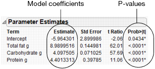
In this example, the p-values are all very small (<.0001). This indicates that all three effects (fat, carbohydrate, and protein) contribute significantly when predicting calories.
You can use the model coefficients to predict the value of calories for particular values of fat, carbohydrate, and protein. For example, suppose that you want to predict the average calories for any candy bar that has these characteristics:
• Fat = 11 g
• Carbohydrate = 43 g
• Protein = 2 g
Using these values, you can calculate the predicted average calories as follows:
277.92 = -5.9643 + 8.99*11 + 4.0975*43 + 4.4013*2
The characteristics in this example are the same as the Milky Way candy bar (on row 59 of the data table). The actual calories for the Milky Way are 280, showing that the model predicts well.
Using the Prediction Profiler
Use the Prediction Profiler to see how changes in the factors affect the predicted values. The profile lines show the magnitude of change in calories as the factor changes. The line for Total fat g is the steepest, meaning that changes in total fat have the largest effect on calories.
Figure 4.30 Prediction Profiler
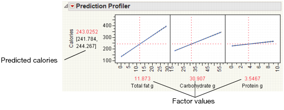
Click and drag the vertical line for each factor to see how the predicted value changes. You can also click the current factor values and change them. For example, click on the factor values and type the values for the Milky Way candy bar (row 59).
Figure 4.31 Factor Values for the Milky Way

Note: For complete details about the Prediction Profiler, see Modeling and Multivariate Methods.
Conclusion
The dietician now has a good model to predict calories of a candy bar based on its total fat, carbohydrates, and protein.
..................Content has been hidden....................
You can't read the all page of ebook, please click here login for view all page.