CHAPTER 2
How to Read Charts Like a Pro and Improve Your Selection and Timing
In the world of medicine, X-rays, MRIs, and brain scans are “pictures” that doctors study to help them diagnose what’s going on in the human body. EKGs and ultrasound waves are recorded on paper or shown on TV-like monitors to illustrate what’s happening to the human heart.
Similarly, maps are plotted and set to scale to help people understand exactly where they are and how to get to where they want to go. And seismic data are traced on charts to help geologists study which structures or patterns seem most likely to contain oil.
In almost every field, there are tools available to help people evaluate current conditions correctly and receive accurate information. The same is true in investing. Economic indicators are plotted on graphs to assist in their interpretation. A stock’s price and volume history are recorded on charts to help investors determine whether the stock is strong, healthy, and under accumulation or whether it’s weak and behaving abnormally.
Would you allow a doctor to open you up and perform heart surgery if he had not utilized the critical necessary tools? Of course not. That would be just plain irresponsible. However, many investors do exactly that when they buy and sell stocks without first consulting stock charts. Just as doctors would be irresponsible not to use X-rays, CAT scans, and EKGs on their patients, investors are just plain foolish if they don’t learn to interpret the price and volume patterns found on stock charts. If nothing else, charts can tell you when a stock is not acting right and should be sold.
Individual investors can lose a lot of money if they don’t know how to recognize when a stock tops and starts into a significant correction or if they have been depending on someone else who also doesn’t know this.
Chart Reading Basics
A chart records the factual price performance of a stock. Price changes are the result of daily supply and demand in the largest auction marketplace in the world. Investors who train themselves to decode price movements on charts have an enormous advantage over those who either refuse to learn, just don’t know any better, or are a bit lazy.
Would you fly in a plane without instruments or take a long cross-country trip in your car without a road map? Charts are your investment road map. In fact, the distinguished economists Milton and Rose Friedman devoted the first 28 pages of their excellent book Free to Choose to the power of market facts and the unique ability of prices to provide important and accurate information to decision makers.
Chart patterns, or “bases,” are simply areas of price correction and consolidation after an earlier price advance. Most of them (80% to 90%) are created and formed as a result of corrections in the general market. The skill you need to learn in order to analyze these bases is how to diagnose whether the price and volume movements are normal or abnormal. Do they signal strength or weakness?
Major advances occur off strong, recognizable price patterns (discussed later in this chapter). Failures can always be traced to bases that are faulty or too obvious to the typical investor.
Fortunes are made every year by those who take the time to learn to interpret charts properly. Professionals who don’t make use of charts are confessing their ignorance of highly valuable measurement and timing mechanisms. To further emphasize this point: I have seen many high-level investment professionals ultimately lose their jobs as a result of weak performance.
When this happens, their poor records are often a direct result of not knowing very much about market action and chart reading. Universities that teach finance or investment courses and dismiss charts as irrelevant or unimportant are demonstrating their complete lack of knowledge and understanding of how the market really works and how the best professionals operate.
As an individual investor, you too need to study and benefit from stock charts. It’s not enough to buy a stock simply because it has good fundamental characteristics, like strong earnings and sales. In fact, no Investor’s Business Daily® reader should ever buy a stock based solely on IBD’s proprietary SmartSelect® Ratings. A stock’s chart must always be checked to determine whether the stock is in a proper position to buy, or whether it is the stock of a sound, leading company but is too far extended in price above a solid basing area and thus should temporarily be avoided.
As the number of investors in the market has increased over recent years, simple price and volume charts have become more readily available. (Investor’s Business Daily subscribers have free access to 10,000 daily and weekly charts on the Web at Investors.com.) Chart books and online chart services can help you follow hundreds and even thousands of stocks in a highly organized, time-saving way. Some are more advanced than others, offering both fundamental and technical data in addition to price and volume movement. Subscribe to one of the better chart services, and you’ll have at your fingertips valuable information that is not easily available elsewhere.
History Repeats Itself: Learn to Use Historical Precedents
As mentioned in the introduction, and as shown on the annotated charts of history’s best winners in Chapter 1, our system for selecting winning stocks is based on how the market actually operates, not on my or anyone else’s personal opinions or academic theories. We analyzed the greatest winning stocks of the past and discovered they all had seven common characteristics, which can be summarized in the two easy-to-remember words CAN SLIM. We also discovered there were a number of successful price patterns and consolidation structures that repeated themselves over and over again. In the stock market, history repeats itself. This is because human nature doesn’t change. Neither does the law of supply and demand. Price patterns of the great stocks of the past can clearly serve as models for your future selections. There are several price patterns you’ll want to look for when you’re analyzing a stock for purchase. I’ll also go over some signals to watch out for that indicate that a price pattern may be faulty and unsound.
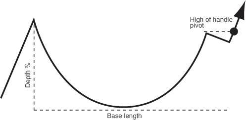
The Most Common Chart Pattern: “Cup with Handle”
One of the most important price patterns looks like a cup with a handle when the outline of the cup is viewed from the side. Cup patterns can last from 7 weeks to as long as 65 weeks, but most of them last for three to six months. The usual correction from the absolute peak (the top of the cup) to the low point (the bottom of the cup) of this price pattern varies from around the 12% to 15% range to upwards of 33%. A strong price pattern of any type should always have a clear and definite price uptrend prior to the beginning of its base pattern. You should look for at least a 30% increase in price in the prior uptrend, together with improving relative strength and a very substantial increase in trading volume at some points in the prior uptrend.
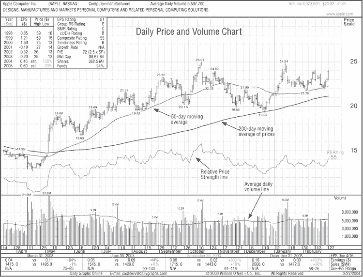
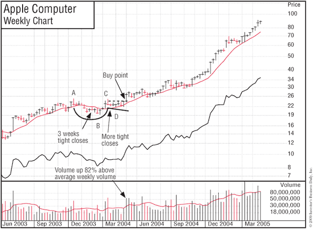
In most, but not all, cases, the bottom part of the cup should be rounded and give the appearance of a “U” rather than a very narrow “V.” This characteristic allows the stock time to proceed through a needed natural correction, with two or three final little weak spells around the lows of the cup. The “U” area is important because it scares out or wears out the remaining weak holders and takes other speculators’ attention away from the stock. A more solid foundation of strong owners who are much less apt to sell during the next advance is thereby established. The accompanying chart from Daily Graphs Online® shows the daily price and volume movements for Apple Computer in February 2004.
It’s normal for growth stocks to create cup patterns during intermediate declines in the general market and to correct 1½ to 2½ times the market averages. Your best choices are generally stocks with base patterns that deteriorate the least during an intermediate market decline. Whether you’re in a bull market or a bear market, stock downturns that exceed 2½ times the market averages are usually too wide and loose and must be regarded with suspicion. Dozens of former high-tech leaders, such as JDS Uniphase, formed wide, loose, and deep cup patterns in the second and third quarters of 2000. These were almost all faulty, failure-prone patterns signaling that the stocks should have been avoided when they attempted to break out to new highs.
A few volatile leaders can plunge 40% or 50% in a bull market. Chart patterns correcting more than this during bull markets have a higher failure rate if they try to make new highs and resume their advance. The reason? A downswing of over 50% from a peak to a low means a stock must increase more than 100% from its low to get back to its high. Historical research shows stocks that make new price highs after such huge moves tend to fail 5% to 15% beyond their breakout prices. Stocks that come straight off the bottom into new highs off cups can be more risky because they had no pullbacks. Deep 50% to 75% cup-with-handle bases worked in 2009 since they were made by a 58% drop in the S&P 500.
Sea Containers was a glowing exception. It descended about 50% during an intermediate decline in the 1975 bull market. It then formed a perfectly shaped cup-with-handle price structure and proceeded to increase 554% in the next 101 weeks. This stock, with its 54% earnings growth rate and its latest quarterly results up 192%, was one of several classic cup-with-handle stocks that I presented to Fidelity Research & Management in Boston during a monthly meeting in early June 1975. Upon seeing such big numbers, one of the portfolio managers was instantly interested.
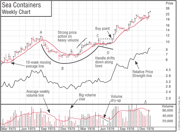
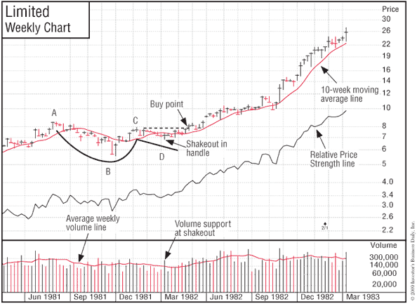
As you can see by this example, some patterns that have corrected 50% to 60% or more coming out of an intermediate bull market decline or a major bear market can succeed. (See the charts for Sea Containers and The Limited.) In most cases, the percent of decline is a function of the severity of the general market decline and the tremendous extent of the stock’s prior price run-up.
Basic Characteristics of a Cup’s Handle Area
The formation of the handle area generally takes more than one or two weeks and has a downward price drift or “shakeout” (where the price drops below a prior low point in the handle made a few weeks earlier), usually near the end of its down-drifting price movement. Volume may dry up noticeably near the lows in the handle’s price pullback phase. During a bull market, volume in the majority of cases should not pick up during a correction in the handle, although there have been some exceptions.
Although cups without handles have a somewhat higher failure rate, many stocks can advance successfully without forming a handle. Also, some of the more volatile technology names in 1999 formed handles of only one or two weeks before they began their major price advances.
When handles do occur, they almost always form in the upper half of the overall base structure, as measured from the absolute peak of the entire base to the absolute low of the cup. The handle should also be above the stock’s 10-week moving average price line. Handles that form in the lower half of an overall base or completely below the stock’s 10-week line are weak and failure-prone. Demand up to that point has not been strong enough to enable the stock to recover more than half its prior decline.
Additionally, handles that consistently wedge up (drift upward along their price lows or just go straight sideways along their lows rather than drifting down) have a much higher probability of failing when they break out to new highs. This upward-wedging behavior along low points in the handle doesn’t let the stock undergo the needed shakeout or sharp price pullback after having advanced from the low of the base into the upper half of the pattern. This high-risk trait tends to occur in third- or fourth-stage bases, in laggard stock bases, or in very active market leaders that become too widely followed and therefore too obvious. You should beware of wedging handles.
A price drop in a proper handle should be contained within 8% to 12% of its peak during bull markets unless the stock forms a very large cup, as in the rather unusual case of Sea Containers in 1975. Downturns in handles that exceed this percentage during bull markets look wide and erratic and in most cases are improper and risky. However, if you’re in the last shake-out area of a bear market bottom, the unusual general market weakness will cause some handle areas to quickly decline around 20% to 30%, but the price pattern can still be sound if the general market then follows through on the upside, creating a new major uptrend. (See Chapter 9, “M = Market Direction: How You Can Determine It.”)
Constructive Patterns Have Tight Price Areas
There should also be at least some tight areas in the price patterns of stocks under accumulation. On a weekly chart, tightness is defined as small price variations from high to low for the week, with several consecutive weeks’ prices closing unchanged or remarkably near the previous week’s close. If the base pattern has a wide spread between the week’s high and low points every week, it’s been constantly in the market’s eye and frequently will not succeed when it breaks out. However, amateur chartists typically will not notice the difference, and the stock can run up 5% to 15%, drawing in less-discriminating traders, before it breaks badly and fails.
Find Pivot Points and Watch “Volume Percent Change”
When a stock forms a proper cup-with-handle chart pattern and then charges through an upside buy point, which Jesse Livermore referred to as the “pivot point” or “line of least resistance,” the day’s volume should increase at least 40% to 50% above normal. During major breakouts, it’s not uncommon for new market leaders to show volume spikes 200%, 500%, or 1,000% greater than the average daily volume. In almost all cases, it’s professional institutional buying that causes the big, above-average volume increases in the better-priced, better-quality growth-oriented stocks at pivot breakouts. A full 95% of the general public is usually afraid to buy at such points because it’s scary and it seems risky and rather absurd to buy stocks at their highest prices.
Your objective isn’t to buy at the cheapest price or near the low, but to begin buying at exactly the right time, when your chances for success are greatest. This means that you have to learn to wait for a stock to move up and trade at your buy point before you make an initial commitment. If you work and cannot watch the market constantly, small quote devices or quotes available on cell phones and Web sites will help you stay on top of potential breakout points.
The winning individual investor waits to buy at these precise pivot points. This is where the real move generally starts and all the exciting action begins. If you try to buy before this point, you may be premature. In many cases the stock will never get to its breakout point, but rather will stall or actually decrease in price. You want a stock to prove its strength to you before you invest in it. Also, if you buy at more than 5% to 10% past the precise buy point, you are buying late and will more than likely get caught in the next price correction. Your automatic 8% loss-cutting rule (see Chapter 10, “When You Must Sell and Cut Every Loss . . . Without Exception”) will then force you to sell because the stock was extended in price and didn’t have enough room to go through a perfectly normal sharp but minor correction. So don’t get into the bad habit of chasing stocks up too high.
Pivot buy points in correct chart base patterns are not typically based on a stock’s old high price. Most of them occur at 5% to 10% below the prior peak. The peak price in the handle area is what determines most buy points, and this is almost always somewhat below the base’s actual high. This is very important to remember. If you wait for an actual new high price, you will often buy too late. Sometimes you can get a slight head start by drawing a downtrend line from the overall pattern’s absolute peak downward across the peak where the stock begins building the handle. Then begin your purchase when the trend line is broken on the upside a few weeks later. However, you have to be right in your chart and stock analysis to get away with this.
Look for Volume Dry-Ups Near the Lows of a Price Pattern
Nearly all proper bases will show a dramatic drying up of volume for one or two weeks along the very low of the base pattern and in the low area or few last weeks of the handle. This means that all of the selling has been exhausted and there is very little stock coming into the marketplace. Healthy stocks that are under accumulation almost always show this symptom. The combination of tightness in prices (daily or weekly price closes being very near each other) and dried-up volume at key points is generally quite constructive.
Big Volume Clues Are Valuable
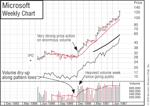
Another clue that is valuable to the trained chart specialist is the occurrence of big daily and weekly volume spikes. Microsoft is an example of an outstanding stock that flashed heavy accumulation just before a huge run-up.
Weeks of advancing prices on heavy volume, followed in other weeks by extreme volume dry-ups, are also a very constructive sign. If you use a Daily Graphs Online chart service in conjunction with the weekly graphs, you’ll be able to see unusual trading activity that sometimes happens on only one day. The day Microsoft broke out at its 31½ buy point, its volume was 545% above average, signaling really important institutional buying. It then had a 13-year bull run from a split-adjusted 10 cents to $53.98. How’s that for a big percentage move?
Volume is a remarkable subject that is worthy of careful study. It can help you recognize whether a stock is under accumulation (institutional buying) or distribution (institutional selling). Once you acquire this skill, you won’t have to rely on the personal opinions of analysts and supposed experts. Big volume at certain key points is indispensable.
Volume is your best measure of supply and demand and institutional sponsorship—two vital ingredients in successful stock analysis. Learn how to use charts to time your purchases correctly. Making buys at the wrong time or, worse, buying stocks that are not under accumulation or that have unsound, faulty price patterns is simply too costly.
The next time you consider buying a stock, check its weekly volume. It’s usually a constructive sign when the number of weeks that the stock closes up in price on above-average weekly volume outnumbers the number of weeks that it closes down in price on above-average volume while still in its chart base.
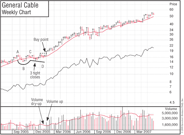
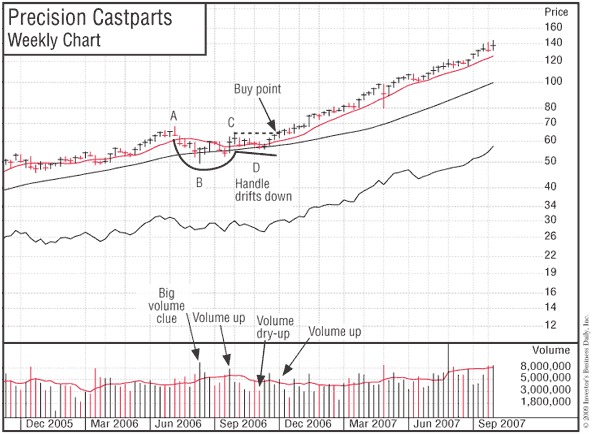
A Few Normal-Size Cups with Handles
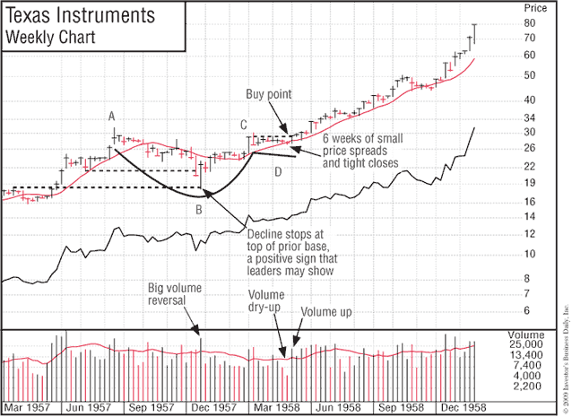
Texas Instruments, Apple, General Cable, and Precision Castparts were all similar-size patterns in length and depth. Can you recognize the similarity between Apple and Precision Castparts? As you learn to do this with greater skill, you will in the future be able to spot many cups with handles just like these past winners.
The Value of Market Corrections
Since 80% to 90% of price patterns are created during market corrections, you should never get discouraged and give up on the stock market’s potential during intermediate-term sell-offs or short or prolonged bear markets. America always comes back because of its inventors and entrepreneurs and the total freedom and unlimited opportunity that do not exist in communist or dictator-controlled countries.
Bear markets can last as little as three, six, or nine months or as long as two or, in very rare cases, three years. If you follow the sell rules in this book carefully, you will sell and nail down most of your profits, cut short any losses, raise significant cash, and move off margin (borrowed money) in the early stages of each new bear market (see the success stories at the end of the book).
In fact, Investor’s Business Daily conducted four surveys in late 2008 that indicated that about 60% of IBD subscribers used our rules to sell and raise cash in December 2007 or June 2008 and thereby preserved most of their capital prior to the more serious decline in late 2008 that resulted from the subprime loan debacle.
Even if you sell out completely and move to cash, you never want to throw in the towel on stock investing because bear markets create new bases in new stocks, some of which could be the next cycle’s 1,000% winners. You don’t foolishly give up while the greatest opportunities of a lifetime are setting up and may sooner or later be just around the corner.
A bear market is the time to do a postanalysis of your prior decisions. Plot on daily or weekly charts exactly where you bought and sold all the stocks you traded in the past year. Study your decisions and write out some new rules that will let you avoid the mistakes you made in the past cycle. Then study several of the biggest winners that you missed or mishandled. Develop some rules to make sure that you buy the real leaders and handle them right in the next bull market cycle. They will be there, and this is the time to be watching for them as they begin to form bases. The question is whether you will be there with a carefully thought-through game plan to totally capitalize on them.
Other Price Patterns to Look For
How to Spot a “Saucer-with-Handle” Price Pattern
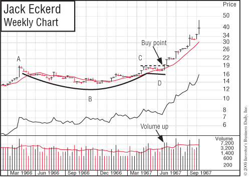
A “saucer with handle” is a price pattern similar to the cup with handle except that the saucer part tends to stretch out over a longer period of time, making the pattern shallower. (If the names “cup with handle” and “saucer with handle” sound unusual, consider that for years you have recognized and called certain constellations of stars the “Big Dipper” and the “Little Dipper.”) Jack Eckerd in April 1967 was an example of the saucer-with-handle base.
Recognizing a “Double-Bottom” Price Pattern
A “double-bottom” price pattern looks like the letter “W.” This pattern also doesn’t occur quite as often as the cup with handle, but it still occurs frequently. It is usually important that the second bottom of the W match the price level (low) of the first bottom or, as in almost all cases, clearly undercut it by one or two points, thereby creating a shakeout of weaker investors. Failure to undercut may create a faulty, more failure-prone “almost” double bottom. Double bottoms may also have handles, although this is not essential.
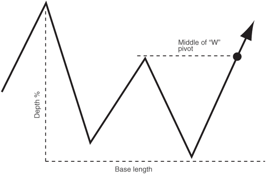
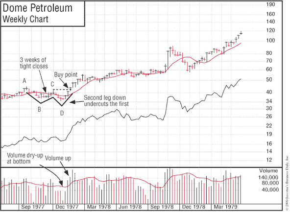
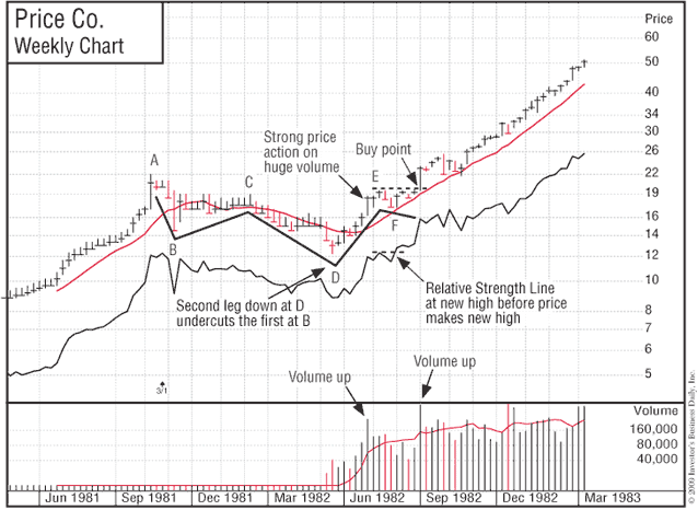
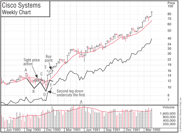
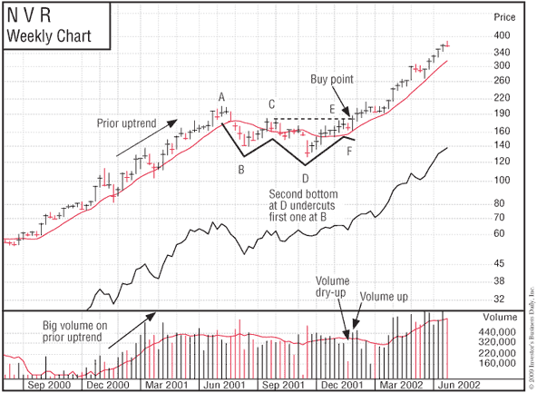
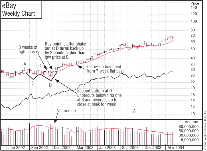
The depth and horizontal length of a double bottom are similar to those of the cup formation. The pivot buy point in a double bottom is located on the top right side of the W, where the stock is coming up after the second leg down. The pivot point should be equal in price to the top of the middle peak of the W, which should stop somewhere a little below the pattern’s peak price. If the double bottom has a handle, then the peak price of the handle determines the pivot buy point. See the accompanying charts for Dome Petroleum, Price Co., and Cisco Systems for outstanding examples of double-bottom price patterns found during 1977, 1982, and 1990. Some later examples are EMC, NVR, and eBay.
For double-bottom patterns, the following symbols apply: A = beginning of base; B = bottom of first leg; C = middle of W that sets the buy point; D = bottom of second leg. If the double-bottom pattern has a handle, then E = top of the handle (sets the price of the buy point that occurs several weeks later) and F = bottom of the handle.

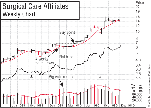
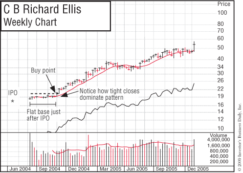
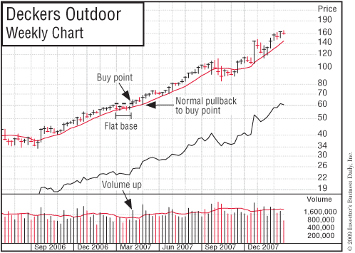
Definition of a “Flat-Base” Price Structure
A flat base is another rewarding price structure. It is usually a second-stage base that occurs after a stock has advanced 20% or more off a cup with handle, saucer with handle, or double bottom. The flat base moves straight sideways in a fairly tight price range for at least five or six weeks, and it does not correct more than 10% to 15%. Standard Oil of Ohio in May 1979, Smith-Kline in March 1978, and Dollar General in 1982 are good examples of flat bases. Pep Boys in March 1981 formed a longer flat base. If you miss a stock’s initial breakout from a cup with handle, you should keep your eye on it. In time it may form a flat base and give you a second opportunity to get on board. Here are a few more recent examples: Surgical Care Affiliates, CB Richard Ellis, and Deckers Outdoor.
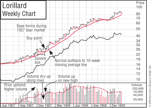
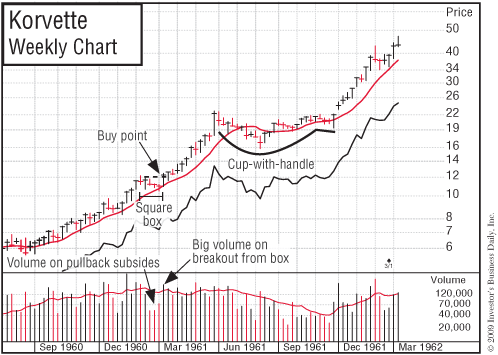
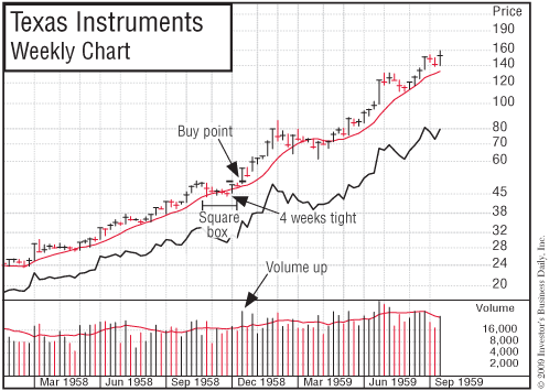
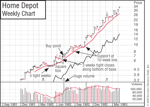
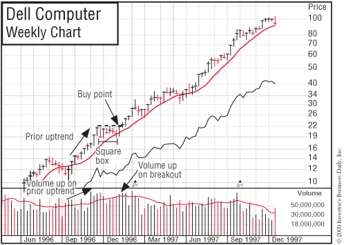
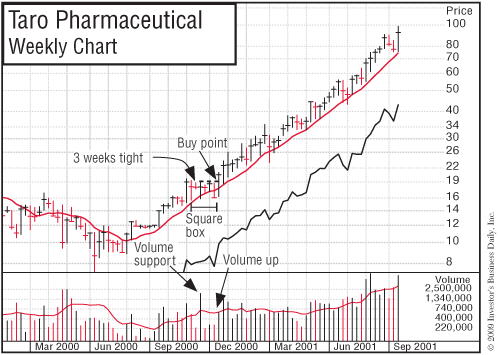
Here’s a New Base We’ve Dubbed a Square Box
After moving up from a cup with handle or double bottom, this formation typically lasts four to seven weeks; doesn’t correct too much, usually 10% to 15%; and has a square, boxy look. I’ve noted this over recent years, but finally we’ve studied, measured, and classified it. Here are some examples: Lorillard, Korvette, Texas Instruments, Home Depot, Dell, and Taro. The dashed line shows the buy point.
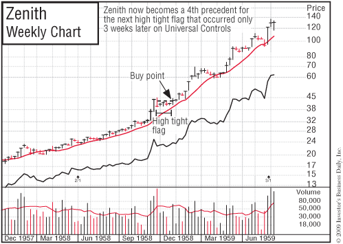
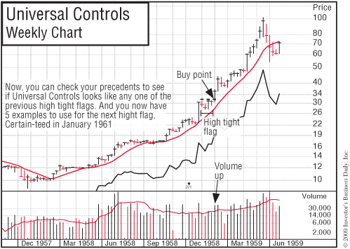
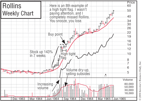
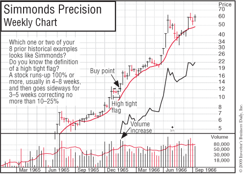
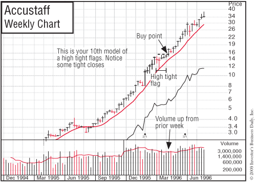
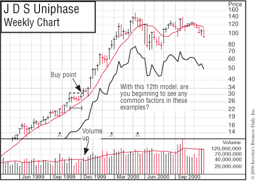
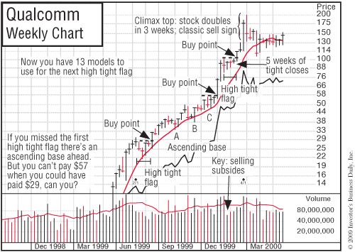
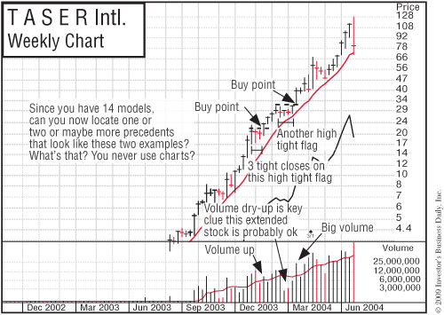
High, Tight Flags Are Rare
A “high, tight flag” price pattern is rare, occurring in no more than a few stocks during a bull market. It begins with the stock moving generally 100% to 120% in a very short period of time (four to eight weeks). It then corrects sideways no more than 10% to 25%, usually in three, four, or five weeks.
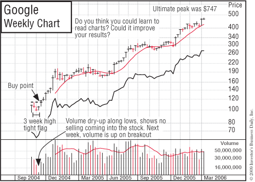
This is the strongest of patterns, but it’s also very risky and difficult to interpret correctly. Many stocks can skyrocket 200% or more off this formation. (See the charts for Bethlehem Steel, May 1915; American Chain & Cable, October 1935; E. L. Bruce, June 1958; Zenith, October 1958; Universal Controls, November 1958; Certain-teed, January 1961; Syntex, July 1963; Rollins, July 1964; Simmonds Precision, November 1965; Accustaff, January 1995; Emulex, October 1999; JDS Uniphase, October 1999; Qualcomm, December 1999; Taser International, November 2003; and Google, September 2004. Each earlier pattern serves as a precedent for each later pattern, so study them carefully.
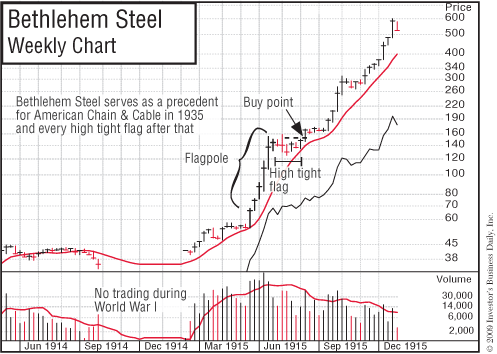
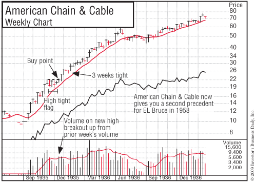
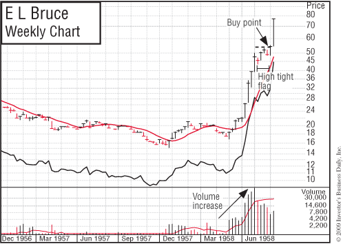
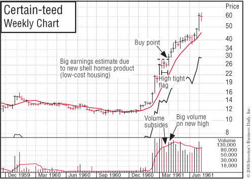
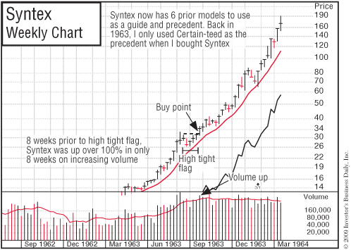
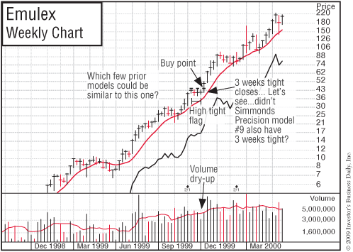
The E. L. Bruce pattern in the second quarter of 1958, at around $50, provided a perfect chart pattern precedent for the Certain-teed advance that occurred in 1961. Certain-teed, in turn, became the chart model that I used to buy my first super winner, Syntex, in July 1963.
What Is a Base on Top of a Base?
During the latter stages of a bear market, a seemingly negative condition flags what may be aggressive new leadership in the new bull phase. I call this unusual case a “base on top of a base.”
What happens is that a powerful stock breaks out of its base and advances, but is unable to increase a normal 20% to 30% because the general market begins another leg down. The stock therefore pulls back in price and builds a second back-and-forth price consolidation area just on top of its previous base while the general market averages keep making new lows.
When the bearish phase in the overall market ends, as it always does at some point, this stock is apt to be one of the first to emerge at a new high en route to a huge gain. It’s like a spring that is being held down by the pressure of a heavy object. Once the object (in this case, a bear market) is removed, the spring is free to do what it wanted to do all along. This is another example of why it’s foolhardy to get upset and emotional with the market or lose your confidence. The next big race could be just a few months away.
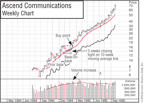
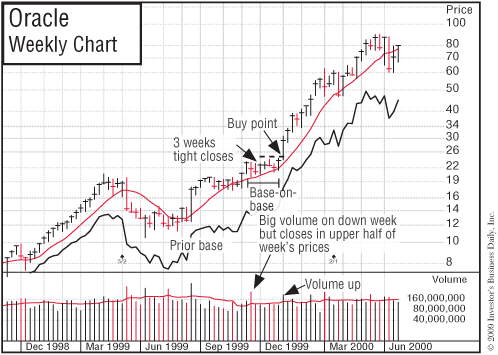
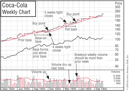
Two of our institutional services firm’s best ideas in 1978—M/A-Com and Boeing—showed base-on-top-of-a-base patterns. One advanced 180%, the other 950%. Ascend Communications and Oracle were other examples of a base on top of a base. After breaking out at the bear market bottom of December 1994, Ascend bolted almost 1,500% in 17 months. Oracle repeated the same base-on-base pattern in October 1999 and zoomed nearly 300%. Coming out of the Depression in 1934, Coca-Cola did the same thing.
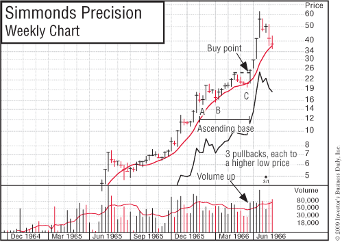
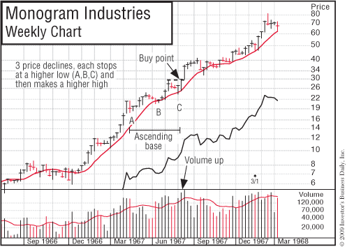
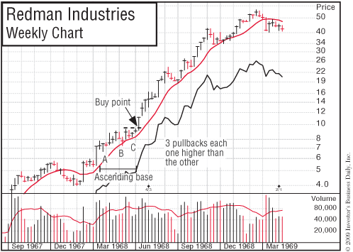
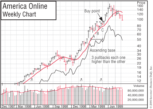
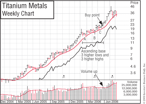
Ascending Bases
Ascending bases, like flat bases, occur midway along a move up after a stock has run up off an earlier base. They have three 10% to 20% pullbacks with each low in price during the sell-off being higher than the preceding one, which is why I call them ascending bases.
Each pullback occurs due to the general market declining at the time.
Boeing formed a 13-week ascending base in the second quarter of 1954 and then doubled in price. Redman Industries, a builder of mobile homes, had an 11-week ascending base in the first quarter of 1968 and proceeded to increase 500% in just 37 weeks. America Online created the same type of base in the first quarter of 1999 and resumed what turned out to be a 500% run-up from the breakout of a 14-week cup with handle in October 1998.
So you see, history does repeat itself. The more historical patterns you learn to recognize, the more money you should be able to make in future markets. (See chart examples in Chapter 1, and also Simmonds Precision, Monogram Industries, Redman Industries, America Online, and Titanium Metals.) The buy point is as soon as the stock makes a new price high after the third 10% to 20% pullback.
Wide-and-Loose Price Structures Are Failure Prone
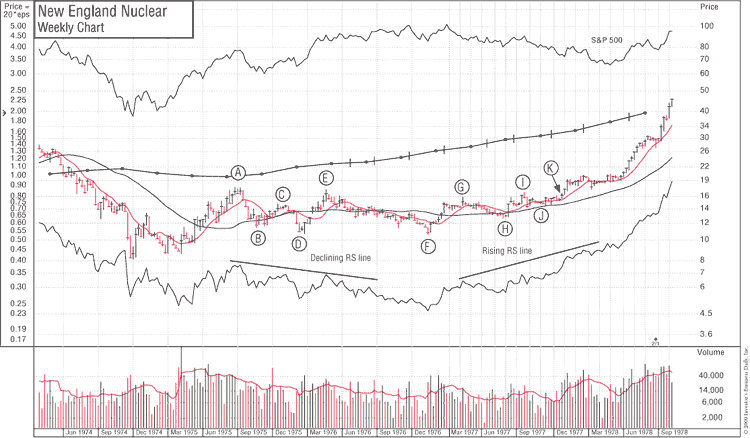
Wide-and-loose-looking charts usually fail but can tighten up later. New England Nuclear and Houston Oil & Minerals are two cases of stocks that tightened up following wide, loose, and erratic price movements. I cite them because I missed both of them at the time. It’s always wise to review big winners that you missed to find out why you didn’t recognize them when they were exactly right and ready to soar.
New England Nuclear formed a wide, loose, and faulty price pattern that looked like a double bottom from points A, B, C, D, and E. It declined about 40% from the beginning at point A to point D. That was excessive, and it took too much time—almost six months—to hit bottom. Note the additional clue provided by the declining trend of its relative strength line (RS) throughout the faulty pattern. Buying at point E was wrong. The handle was also too short and did not drift down to create a shakeout. It wedged up along its low points.
New England Nuclear then formed a second base from points E to F to G. But if you tried to buy at point G, you were wrong again. It was premature because the price pattern was still wide and loose. The move from point E to point F was a prolonged decline, with relative strength deteriorating badly. The rise straight up from the bottom at point F to the bogus breakout point G was too fast and erratic, taking only three months. Three months of improving relative strength versus the prior 17 months of decline weren’t enough to turn the previous poor trend into a positive one.
The stock then declined from point G to point H to form what appeared to be a handle area for the possible cup formation from points E to F to G. If you bought at point I on the breakout attempt, the stock failed again. Reason: the handle was too loose; it declined 20%. However, after failing that time, the stock at last tightened up its price structure from points I to J to K, and 15 weeks later, at point K, it broke out of a tight, sound base and nearly tripled in price afterwards. Note the stock’s strong uptrend and materially improved relative strength line for 11 months from point K back to point F.
So, there really is a right time and a wrong time to buy a stock, but understanding the difference requires some study. There’s no such thing as being an overnight success in the stock market, and success has nothing to do with listening to tips from other people or being lucky. You have to study and prepare yourself so that you can become successful on your own with your investing. So make yourself more knowledgeable. It isn’t easy at first, but it can be very rewarding. Anyone can learn to do it. You can do it. Believe in your ability to learn. Unlearn past assumptions that didn’t work.
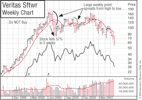
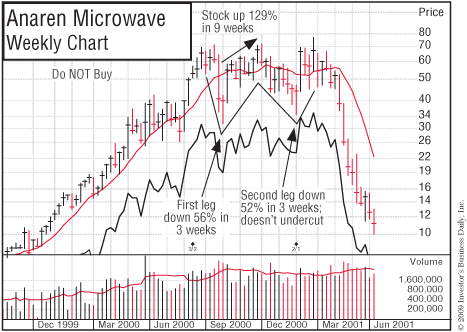
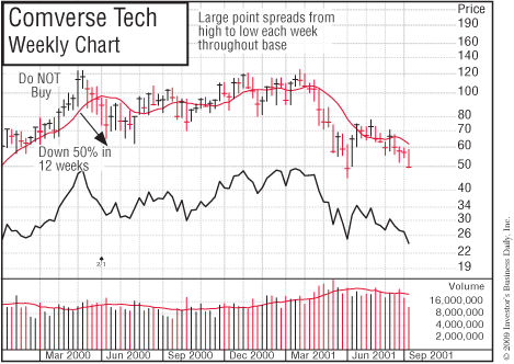
Here are some faulty wide-and-loose patterns that faked people into buying during the prolonged bear market that began in March 2000: Veritas Software on October 20, 2000; Anaren Microwave on December 28, 2000; and Comverse Technology on January 24, 2001.
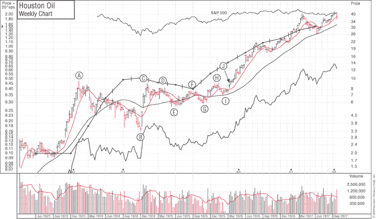
The aforementioned Houston Oil & Minerals is an even more dramatic example of the handle correction from point F to point G being a wide-and-loose pattern that later tightened up into a constructive price formation (see the accompanying chart). A to B to C was extremely wide, loose, and erratic (the percent decline was too great). B to C was straight up from the bottom without any pullback in price. Points C and D were false attempts to break out of a faulty price pattern, and so was point H, which tried to break out of a wide-and-loose cup with handle. Afterward, a tight nine-week base formed from points H to I to J. (Note the extreme volume dry-up along the December 1975 lows.)
An alert stockbroker in Hartford, Connecticut, called this structure to my attention. However, I’d been so conditioned by the two prior years of poor price patterns and less-than-desirable earnings that my mind was slow to change when the stock suddenly altered its behavior in only nine weeks. I was probably also intimidated by the tremendous price increase that had occurred in Houston Oil in the earlier 1973 bull market. This proves that opinions and feelings are frequently wrong, but markets rarely are.
It also points out a very important principle: it takes time for all of us to change opinions that we have built up over a substantial period. In this instance, even the current quarterly earnings turning up 357% after three down quarters didn’t change my incorrect bearish view of the stock to a bullish one. The right buy point was in January 1976.
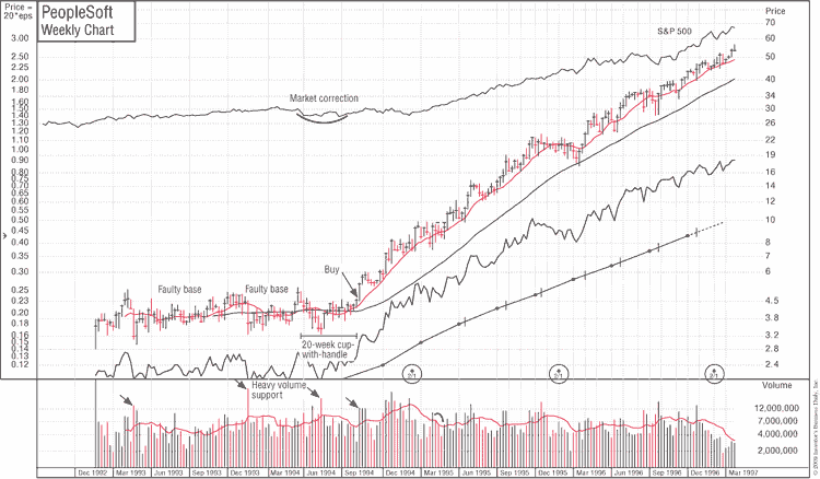
In August 1994, PeopleSoft repeated the New England Nuclear and Houston Oil patterns. It failed in its breakout attempt from a wide, loose, wedging-upward pattern in September 1993. It then failed a second time in its breakout attempt in March 1994, when its handle area formed in the lower half of its cup-with-handle pattern. Finally, when the chart pattern and the general market were right, PeopleSoft skyrocketed starting in August 1994.
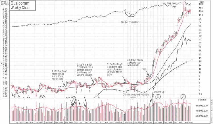
In the first week of January 1999, San Diego–based Qualcomm followed PeopleSoft’s three-phased precedent. In October 1997, Qualcomm charged into new-high ground straight up from a loose, faulty base with too much of its base in its lower half. It then built a second faulty base, broke out of a handle in the lower part, and failed. The third base was the charm: a properly formed cup with handle that worked in the first week in January 1999. Qualcomm went straight through the roof from a split-adjusted $7.50 to $200 in only one year. Maybe you should spend more time studying historical precedents. What do you think? If you had invested $7,500 in Qualcomm, a year later it would have been worth $200,000.
Detecting Faulty Price Patterns and Base Structures
Unfortunately, no original or thorough research on price pattern analysis has been done in the last 78 years. In 1930, Richard Schabacker, a financial editor of Forbes, wrote a book, Stock Market Theory and Practice. In it he discussed many patterns, including triangles, coils, and pennants. Our detailed model building and investigations of price structure over the years have shown these patterns to be unreliable and risky. They probably worked in the latter part of the “Roaring ’20s,” when most stocks ran up in a wild, climactic frenzy. Something similar happened in 1999 and the first quarter of 2000, when many loose, faulty patterns at first seemed to work, but then failed. These periods were just like the Dutch tulip bulb craze of the seventeenth century, during which rampant speculation caused varieties of tulip bulbs to skyrocket to astronomical prices and then crash.
Our studies show that, with the exception of high, tight flags, which are extremely rare and hard to interpret, flat bases of five or six weeks, and the square box of four to seven weeks, the most reliable base patterns must have a minimum of seven to eight weeks of price consolidation. Most coils, triangles, and pennants are simply weak foundations without sufficient time or price correction to become proper bases. One-, two-, and three-week bases are risky. In almost all cases, they should be avoided.
In 1948, John McGee and Robert D. Edwards wrote Technical Analysis of Stock Trends, a book that discusses many of the same faulty patterns presented in Schabacker’s earlier work.
In 1962, William Jiler wrote an easy-to-read book, How Charts Can Help You in the Stock Market, that explains many of the correct principles behind technical analysis. However, it too seems to have continued the display and discussion of certain failure-prone patterns of the pre-Depression era.
Triple bottoms and head-and-shoulders bottoms are patterns that are widely mentioned in several books on technical analysis. We have found these to be weaker patterns as well. A head-and-shoulders bottom may succeed in a few instances, but it has no strong prior uptrend, which is essential for most powerful market leaders.
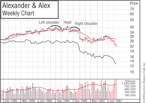
When it comes to signifying a top in a stock, however, head-and-shoulders top patterns are among the most reliable. Be careful: if you have only a little knowledge of charts, you can misinterpret what is a correct head-and-shoulders top. Many pros don’t interpret the pattern properly. The right (second) shoulder must be slightly below the left shoulder (see the chart for Alexander & Alexander).
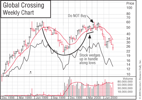
A triple bottom is a looser, weaker, and less-attractive base pattern than a double bottom. The reason is that the stock corrects and falls back sharply to its absolute low three times rather than twice, as with a double bottom, or once, as in the strong cup with handle. As mentioned earlier, a cup with a wedging handle is also usually a faulty, failure-prone pattern, as you can see in the Global Crossing Ltd. chart example. A competent chart reader would have avoided or sold Global Crossing, which later went bankrupt.
How to Use Relative Price Strength Correctly
Many fundamental securities analysts think that technical analysis means buying those stocks with the strongest relative price strength. Others think that technical research refers only to the buying of “high-momentum” stocks. Both views are incorrect.
It’s not enough to just buy stocks that show the highest relative price strength on some list of best performers. You should buy stocks that are performing better than the general market just as they are beginning to emerge from sound base-building periods. The time to sell is when the stock has advanced rapidly, is extended materially from its base, and is showing extremely high relative price strength. To recognize the difference, you have to use daily or weekly charts.
What Is Overhead Supply?
A critically important concept to learn in analyzing price movements is the principle of overhead supply. Overhead supply is when there are significant areas of price resistance in a stock as it moves up after experiencing a downtrend.
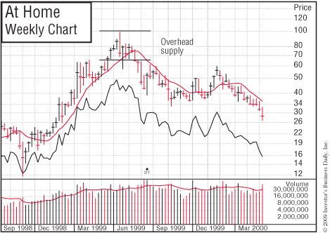
These areas of resistance represent prior purchases of a stock and serve to limit and frustrate its upward movement because the investors who made these purchases are motivated to sell when the price returns to their entry point. (See the chart for At Home.) For example, if a stock advances from $25 to $40, then declines back to $30, most of the people who bought it in the upper $30s and at $40 will have a loss in the stock unless they were quick to sell and cut their loss (which most people don’t do). If the stock later climbs back to the high $30s or $40 area, the investors who had losses can now get out and break even.
These are the holders who promised themselves: “If I can just get out even, I will sell.” Human nature doesn’t change. So it’s normal for a number of these people to sell when they see a chance to get their money back after having been down a large amount.
Good chartists know how to recognize the price zones that represent heavy areas of overhead supply. They will never make the fatal mistake of buying a stock that has a large amount of recent overhead supply. This is a serious mistake that many analysts who are concerned solely with fundamentals sometimes make.
A stock that’s able to fight its way through its overhead supply, however, may be safer to buy, even though the price is a little higher. It has proved to have sufficient demand to absorb the supply and move past its level of resistance. Supply areas more than two years old create less resistance. Of course, a stock that has just broken out into new high ground for the first time has no overhead supply to contend with, which adds to its appeal.
Excellent Opportunities in Unfamiliar, Newer Stocks
Alert investors should have a way of keeping track of all new stock issues that have emerged over the last 10 to 15 years. This is important because some of these newer and younger companies will be among the most stunning performers of the next year or two. Most of these issues trade on the Nasdaq market.
Some new issues move up a small amount and then retreat to new price lows during a bear market, making a poor initial impression. But when the next bull market begins, a few of these forgotten newcomers will sneak back up unnoticed, form base patterns, and suddenly take off and double or triple in price if they have earnings and sales that are good and improving.
Most investors miss these outstanding price moves because they occur in new names that are largely unknown to most people. A charting service can help you spot these unfamiliar, newer companies, but make sure that your service follows a large number of stocks (not just one or two thousand).
Successful, young growth stocks tend to enjoy their fastest earnings growth between their fifth and tenth years in business, so keep an eye on them during their early growth periods.
To summarize, dramatically improve your stock selection and overall portfolio performance by learning to read and use charts. They provide a gold mine of information. It will take some time and study on your part to become good at this, but it’s an invaluable skill you can learn. You may have to re-read this chapter several times in the first year or two if you really want to be good at chart reading. The big secret is for you to combine skillful chart reading with stocks that have outstanding earnings and sales growth, plus superior returns on equity or pre-tax profit margins. You need both fundamentals and chart reading, not just one or the other.
• A Loud Warning to the Wise about Bear Markets!!!
Let me offer one last bit of judicious guidance. If you are new to the stock market or the historically tested and proven strategies outlined in this book, or, more importantly, if you are reading this book for the first time near the beginning or middle of a bear market, do not expect the presumed buy patterns to work. Most of them will definitely be defective. You absolutely do not buy breakouts during a bear market. Most of them will fail.
The price patterns will be too deep, wide, and loose in appearance compared to earlier patterns. They will be third- and fourth-stage bases; have wedging or loose, sloppy handles; have handles in the lower half of the base; or show narrow “V” formations moving straight up from the bottom of a base into new highs, without any handle forming. Some patterns may show laggard stocks with declining relative strength lines and price patterns with too much adverse volume activity or every week’s price spread wide.
It isn’t that bases, breakouts, or the method isn’t working anymore; it’s that the timing and the stocks are simply all wrong. The price and volume patterns are phony, faulty, and unsound. The general market is turning negative. It is selling time. Be patient, keep studying, and be 100% prepared. Later, at the least expected time, when all the news is terrible, winter will ultimately pass and a great new bull market will suddenly spring to life. The practical techniques and proven disciplines discussed here should work for you for many, many future economic cycles. So get prepared and do your homework. Create your own buy and sell rules that you will constantly use.