Starting from scratch
This chapter shows how data should be structured to ensure the maximum amount of information can be wrung from your raw data. The chapter starts by using library examples to illustrate the type of useful information that can be gleaned from properly structured data. The author shows how variation can be hidden within aggregated data, and how a lack of understanding of variation can lead to poor decision making. This chapter then discusses the steps that need to be considered in creating a data structure that can produce useful information, both from a technical perspective of what needs to be done to create useful spreadsheets, and from the practical perspective of the things that need to be considered when interpreting the information in spreadsheets.
Keywords
Proper data structure; useful operational data; variation; systems analysis; value proposition; data granularity
There are two basic steps to creating data that can be sliced and diced very easily, and to a high level of granularity. The first step is to organize the data into a single table, in a certain structure. The second step is to run a pivot table over the data. Chances are you are not very familiar with pivots, so I have devoted Chapter 7 to them. For the moment you will just have to take it on faith when I say that they make life infinitely easier. The first step, organizing your data into a single table is by far the most difficult step. However, the catch is it can appear to be the easiest step.
The first step to creating a raw data table is to understand the data you are collecting. A good way to do this is to start at the very beginning, the point at which the data is first created. Try to conceptualize the data as a series of events, to which you can assign attributes. For example, if someone comes in to borrow a book, then that book being borrowed is a single event. From a practical point of view, it is not possible to break this down any further. The borrower might come toward the lending desk or machine, and change their mind. They might get the desk and find they cannot borrow as they have already borrowed the maximum number of loans. For any event, it is always theoretically possible to break the event down further. However, from a practical point of view, there is a point beyond which it would be silly to attempt further subdivision of an event. In this example, the “sensible” point to stop, the most granular level that we care about, is at the act of borrowing a specific item.
If the book is borrowed, then there are a whole heap of other things that can be attributed to that event. The event happens at a specific time, at a specific place, the book is borrowed by a specific client for a period, the borrower has attributes – such as their gender and age, the book has attributes – such as its authors and year of publication, the library has attributes – such as the size of its collection and its opening hours. And the list could go on and on. An event is both caused by and causes an infinite number of other events, all of which are set into motion by actors and objects that all have their own attributes.
You should be able to see very quickly how a simple event such as a specific book being borrowed occurs due to a complex chain of other events, and you can probably conceptualize that an infinite volume of data could never fully describe all those events and their attributes. It would be very easy to become overwhelmed, to become intellectually bogged in the complexity. Obviously, you need to avoid this.
The first step then to collecting the right data is to keep the business question in mind. There are many interesting detours and rabbit holes you can follow, but if they do not address a business question, then they are at best a distraction. You should be collecting data to either reveal an unknown that you need to know, or prove something that you need to prove. The big question then, is how much data do you need to achieve your goal, and from a cost perspective, what is the best compromise to ensure that the cost of collecting your data does not outweigh the benefits?
If you want to know how many people are using the collection, so as that you can show the accountants that you are busy, then you are not going to need very granular data. You will not care about who is borrowing (in relation to this question), you just want a total number for a quarter. In this instance, therefore, you will not need to know about most of the attributes associated with a borrowing event. If you have several libraries, you may wish to know how many items were borrowed at a specific location. Otherwise, it is most likely that you will only want to know how many books were borrowed per year.
In this example, there are only two attributes you need to worry about collecting data on in relation to a borrowing event, namely the year it happened in, and the location it occurred at. In almost all cases, I would expect that the library’s management system software would produce aggregated reports that would answer this question, so you almost certainly will not have to worry about separately collecting this data. However, for arguments sake, let’s say you did have to worry about this, and you are a small library, so you can use Excel to manage this.
So, theoretically assuming that you do have to manually record borrowing data, and you wanted to ensure you could easily run reports off your data, then how would you do this?
In this instance you would create a spreadsheet called “loans.xlsx,” save it to the same folder where all your other statistics are to be kept, then rename “sheet 1” as “RawData.” On the RawData tab you would type two headings, “Year,” “Location,” and “Number items borrowed.” Under this you would enter the total items borrowed for each location for each year. It might look like this:
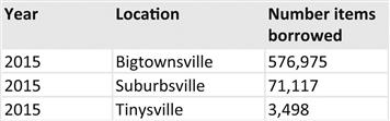
At any moment, if the Library Director wanted you do answer a question about how many items were borrowed in a year at a specific location, you could answer very quickly.
Now imagine the Library Director has come back to you and said, “I really need to know how many were borrowed in the last few years on a monthly basis. The Chief Administrator thinks even though our numbers are up for the year, that it was all due to the unusual influx of tourists in January. She claims she has been in the Library often, and is convinced that things are getting quieter. Now, this is obviously a silly scenario, but I am using it to convey an important point that might be lost in a more realistic, and therefore more complex scenario.
If the Library Director asked you this question, then you would not be able to answer it with the data at hand. If you could jump in a time machine and go back to when you first created the spreadsheet you could do one of two things. Firstly, you might create another spreadsheet, one for the month data, in addition to your spreadsheet for the year data. This is the stupid option. The other option is to redesign your raw data structure, so as that it can answer both questions from the one spreadsheet.
The purpose of this whole example is to get you to think about the how granular your data will need to be. If you aggregate up events, and enter them as a single number, then it becomes an omelet from which you will never be able to separate the yolk from the whites. Once you aggregated your borrowing events into a year, and entered that as a single number in your spreadsheet, then there is no way to disaggregate the data into months if the only data you have at your disposal is that spreadsheet into which you entered the yearly data. Consequently, when you are designing the structure of your RawData sheet, you need to think about the lowest possible level of data that your spreadsheet will need to report on, and ensure that level of data is captured. It is very easy to roll data up to a higher level – i.e., it is very easy to rollup monthly data into annual data. I will show you later how easy that is. However, it is impossible to drill down beyond your lowest level of data you have collected.
The “practical” lowest level of granularity you could possibly go to for a borrowing event is to have a row of data for each and every item borrowed. I put the work “practical” in quotation marks because it is not practical from a business perspective to manually collect this, but it is practical from a technical point of view. From a technical point of view, this would allow you to report on a whole host of things, such as the attributes of the borrower. How old was the person borrowing this book, have they borrowed in the past, if so how much. You could answer any question about the attributes of the borrower, if you collected that data. Of course, in practice, you could never enter this sort of information into a spreadsheet. However, this information is collected by your library management system, and depending upon its structure, it may or may not be accessible.
I have used the data automatically collected by the library management system at my institution to build a multidimensional data warehouse joining student usage of library resources, with student attributes such as their demographic profile and academic grades. To be clear, I did not actually create the cubes, this was done by the university’s Performance Indicators Unit. But I did tell them what to do! The pertinent matter here is that if you did want to report on the relationship between grades and library use, then you will need very high resolution data.
How low do you go?
The degree of granularity you will need in your data depends on your business needs. This is of course the most unhelpful answer I could possibly provide. So I will help to point you in the right direction, but please remember, you will still need to think about what you need to measure in the context of your library’s business needs. Also, personality invariably comes into play to some extent in every organization. What one Library Director considers important, another may not care about. The services provided by some libraries might be very different to others. And so on and so forth.
When it comes to collecting statistics, I gravitate toward the value proposition first, then consider the events associated with that value proposition, then consider the possible data needs in relation to that value proposition.
I am going to discuss borrowing, browsing, and visits, and for each discuss optimizing your data in the context of three important issues: variation; data structure; and avoiding false conclusions.
Measuring loans and accounting for variation
Unfortunately, in many cases there will be a limit on the amount of information you can extract from your library management system, so you might not be able to get all the information you need. Notwithstanding these limitations, you will probably need to answer a number of questions, such as:
• What areas of my collection are being heavily used – as I might want to extend this collection
• What areas of my collection are being under used – as I might want to try promoting these resources, or failing that weed them
• Did my promotion succeed in improving usage of library resources
• Is demand for my collection rising in general, or do I need to start to think about ways to add value
To answer these sort of questions you would need to collect data on:
Even though it is unlikely that you could capture data at the transaction level, you should be able to still collect data that is granular enough to be able to determine whether a large scale promotion has been successful. You will need quite granular data for a few reasons. Firstly, you cannot expect a single promotion to result in widespread change in client behavior. Secondly, borrowing will vary over time even if you do nothing. You cannot assume that just because something went up, that it was because of your promotion, and similarly, just because it went down does not mean it failed.
At the very least, if you want assess the success of your promotions; you will need to collect daily statistics. To illustrate this, consider Promo Chart 1:
Promo Chart 1

Imagine you ran a promotion on January 1, 2015. As you can see, the number of loans increased for several days after, almost by a whopping quarter by January 7, 2015. But what does that mean? It actually means nothing. You don’t have enough data to be able to identify whether this movement is part of the normal variation in loans, or whether it is unusual. Things invariably change, regardless of whether you do something or not. If you do not promote the Library, loans may go up anyway. Similarly, they may also go down. You need to know whether the thing you did to promote the library was successful, but before you can do this you need to assess the change in your loans after the promotion, in the context of the normal variation in loans. For example, imagine you collected data for a further 3 months, and plotted that onto a chart.
Promo Chart 2

Unlike Promo Chart 1, which only showed 7 days’ worth of data, the above chart shows 3 months’ worth of data. The above chart also shows the number of loans is very volatile. This means the numbers change a lot from one day to the next. However, there is still a clearly visible pattern in this data. It would be impossible to predict what the exact number of loans would be for the next day in the series. However, in this dataset, there have never been less than 400 loans per day, or more than 500 loans per day. There are also enough data points to show that this is likely to be a reliable floor and ceiling for the data, and therefore, for the short term at least, it appears that there is sufficient trend in place to be able to predict with a reasonable degree of confidence that the loans are likely to reside somewhere between 400 and 500 items for the next day in the data series.
Consequently, taken in the context of the natural variation in loans, the upward trend shown in Promo Chart 1 was not something unusual or special. There are many other periods where loans increased for several days in a row. Moreover, these increases occurred well after the promotion was run on January 1, 2015, after many instances when loans had declined for several consecutive days. The above chart shows that the increase that did occur in the days following the promotion was within the normal background variation of loans per day. Therefore, there is no evidence that the promotion was successful, as loans may have increased anyway in the absence of the promotion.
There is no way of knowing for certain whether a change in the number of loans was something that would have occurred anyway, without any promotional activities, or whether the promotion did have an impact. There is ultimately no way of scientifically proving causality. However, you can prove that something did not work. If you had no loans before, and no loans after a promotion, then it’s pretty safe to say it did not work. It is useful to know when something did not work, however, it’s not a very motivating use of statistics.
Although it is not possible to prove scientifically with the data at hand whether a promotion caused increased usage, it is possible to identify from a practical point of view that the promotion most likely worked. The key is to identify the natural level of variation in loans, and looks for changes outside that variation.
Promo Chart 3

For example, in the above chart, loans were continuing to fluctuate between 400 and 500 items per day over the previous 4 months. Then on 13 April, you ran a promotion. On the day of the promotion loans broke through the 500 loan ceiling, and stayed above that ceiling for a few days before returning to the normal variation. If the promotion had not been run would this chart still contain the same spike? Maybe, maybe not. While existence of the spike is not enough evidence to write a scientific paper, it is enough to make a business decision.
Leadership is about making decisions based on imperfect information. If you waited for 100% certainty, you would rarely make a decision. And if 100% certainty was always obtainable within a reasonable amount of time, there would be no need for leadership; you would just chuck all the data into a machine, and the correct path to take would be spat out the other end. From a business perspective, the above chart is sufficient evidence that your promotion was most likely successful.
If you only collected your data at the month level, then you would not have seen that spike. For example, the data I used to generate the above chart is exactly the same as the data I used to generate Promo Chart 4.
Promo Chart 4

How could it be that on the daily level there was an increase in loans, but at the monthly level there was no increase? The answer is that the relatively small and short lived increase was swallowed up by the random background variation in loans. The point I am trying to make here is that in order to be able to determine if an individual promotion was successful, you will need to have quite granular data, most likely daily level data. Otherwise, you are going to have to employ a marketing genius, one that can achieve broad scale changes in client behavior across your whole client base. Good luck finding a marketing genius that you can afford!
In the real world, the best you are likely to achieve with your promotions is small scale temporary changes in behavior. If you know what specific promotion did and did not work, then you can fine tune your efforts, and hopefully, over time, the smaller efforts will work collectively to produce a much larger change.
There is another relevant point raised by the data. Notice how the number of loans varies in the above chart from one month to the next. Once again, this chart is based on the same numbers used to create Promo Chart 3. I produced this data by using the random Excel function to generate a random number between 400 and 500. I then manually entered the numbers for the week following the promotion, to generate the spike shown in Promo Chart 3. Consequently, aside from the five numbers for the promotion, the remaining 146 numbers for the days between 1 January and 31 May are random numbers between 400 and 500. This randomness is apparent in Promo Chart 3, but it is not apparent in the above chart. It would be very easy to try to read a trend in the above chart, particularly if you made a big effort in February to try to improve loans. People often unconsciously pick the facts that support their predetermined views. However, this is not a luxury you can afford, and is something you have to actively and consciously take steps to avoid.
The movement you see from one month to the next in Promo Chart 4 is a function of two things, the difference in total number of days in the month, and pure chance. Firstly, there are different number of days in each month. March, for example, has three more days than February, so naturally, it will tend to have a larger number. So, how much of the monthly variation in loans is due to there being a different number of days per month. Not much. You can hold the difference in the number of days in the month constant, by calculating the average number of items borrowed per day for a month.
Promo Chart 5

I used exactly the same data to create all the promo charts. This chart shows that even when the difference in the number of days a month is held constant, there are still differences from one month to the next. Indeed, it looks very much like a trend, but it is not. It is just some months have randomly had more items borrowed than other months. It is like throwing a whole heap of coins in the air, and seeing that a couple of them land near each other as heads. It is just chance, there is no greater meaning behind the results. In this instance I know it’s chance, because I wrote the very simple Excel random formula. I did not know how the data would turn out, and the fact that this follows a nice curve is just luck, lucky in that it proves that randomness can generate patterns – which is the point I am trying to make.
So what do you do with this? Firstly, it shows that you need to ensure you at least look at the finest level of granular data before making decisions based on highly aggregated data. When you collect quite granular data (e.g., daily data), you will be able to see more easily the natural level of variation in whatever you are measuring. Since all the Promo Charts are created from the same raw dataset, you can deduce that the fluctuations in the monthly data are not significant. This also tells you that you need to collect data over a longer period, if you want to see the trends by month. I was curious to see just how many months’ worth of random data I would need to produce before I could see the patterns that were obviously present in Promo Chart 3 also appear in data aggregated by month. It turns out you need a lot of data. Even with 2 years’ worth of data, it is still not clearly obvious in the below chart that the loans data is simply based on a random value between 400 and 500. Now, imagine you are basing decisions on any of the charts other than Promo Chart 3, what is going to be the likely outcome?
Promo Chart 6

When the data is presented in this manner, the impact of the April 13, 2015 promotion is not visible either. However, there is much more to variability than just the mechanical fluctuations of numbers.
The world is full of fantastic books, and most of the good ones are in libraries. A good book that you should read is Edward Deming’s book “Out of the Crisis.” Yes, it was written in the 1980s, but it is still relevant. There are a lot of bread and butter basics that are still being ignored on a wide scale, and not just in the library sector. It is an easy read, and it is written by an internationally acclaimed author that is widely recognized as the father of modern quality management.
One of the key issues Deming discusses is variability in systems, and that if business decisions are to be driven by an informed understanding of your business, then understanding variability is essential. Unfortunately, I have not witnessed much focus on variability. Typically, many libraries tend to treat statistics as marketing fodder. Data is like a grab bag of goodies, from which the most positive stories are selected, and the less flattering statistics are pushed aside.
Of course, in the real world, marketing to stakeholders and clients is essential. If you don’t do this you will sink. When I say that the energy of many libraries is focused primarily on looking good, that is not a euphemism for saying many Library Directors are narcissistic! There are many potential motives you might have for focusing on looking good, none of which need to have anything to do with narcissism:
• You may have lost the “strategic initiative.” In other words, you may be so overwhelmed with the short term tactical issues, that you simply do not have the resources to dedicate to longer term real improvements. Obviously, if you are in this situation, you are in a downward spiral, and you need to find a way out no matter what it takes.
• You might be working in an organization or parent organization that has focused on looking good for decades. This long history might create the illusion that this sort of focus is productive and good management.
• You might believe so deeply in the value proposition of your library that you have an uncritical approach to your operations, and therefore your first instinct is to focus is on selling what you perceive as the clear and obvious benefits your organization provides to its clients.
• You might value strategy over operations. You might believe that process improvement is inward looking, and that the library needs to look outwards, to the new emerging technologies and opportunities. The first instinct of people with such a mindset will be to use operational data to showcase what the library has achieved, with the view to securing the political and resource capital for further expansion into new areas.
On this last point, a lot of staff that I have encountered tend to fall into one of three camps:
• The strategists. They give lip service to continuous improvement, but when they are being honest with themselves they consider it as inward looking, and antagonistic to innovation. They tend to always be looking around for the new technologies and options.
• The improvers. They tend to be inwardly focused, and look at refining their own processes, without lifting their head up for the broader view. When radical change does arrive, this group finds their whole world has been turned upside down.
• The “just get on with the job” crew. They are happy to continue with things exactly as they are, and sometimes can take an almost an anti-intellectual approach to strategy, and can be dismissive of process improvement. This can take many forms, and in libraries I have found it commonly expressed as a cottage industry type approach to work. They cannot conceive as their work as a process (even though they will admit that most their day is spent doing things they have done before), and place enormous value on individual skills and knowledge. Therefore these people tend to see both strategy and process improvement as irrelevant. Their closest historical cousins are the artisans prior to the industrial revolution.
Now all the people who populate these groups are wonderful people, but together they create a system that is inherently conservative. The division of work into these compartments of thinking creates a system that stifles creativity. Where innovation does occur, it is usually because individuals have taken heroic steps to overcome great barriers. The success has been despite the system, not because of it.
To make progress, staff need to be all three of these people. They need to understand that the environment in which they work is dynamic and changing, and that these changes need to be anticipated, and new and shifting paths will need to be created to navigate the best way through these changes. Staff also need to understand that this does not diminish the importance of what we are doing right now. The ultimate driver of cost is what we do in the here and now, and therefore to free up resources to do be able to do the new things that will need to be done, we need to look at the processes we doing right now. The cost of being inefficient now is a reduction in future choices. Lastly, staff need to be content in what they are doing – this does not mean enjoying doing the same thing for years, very few people enjoy that. It means finding value in the present, and using that to gain satisfaction, and invigorate ourselves.
If a library was populated with staff members who are able to have each of these three personalities living in each of them, then the possibilities will be great. However, if the library is populated by people that only possess one of these personalities, then the sum will be less than its parts. The strategic thinkers will ignore process, the process improvers will be disconnected with the strategists, and the bulk of people just trying to do their day-to-day work will see both camps as being irrelevant.
What has this got to do with variability? Firstly, variability can exist in many forms, and not just in things that are easy to count. People vary too, both between and within individuals. If you do not have systems in place to control variability, then it is likely that the variability in staff aptitude, expertise and knowledge, will also be reflected in the variability of the turnaround time, quality, and quantity of the services provided.
Deming argued that the key to improving many systems is to understand the nature of this variability, study potential root causes from a holistic perspective, and involve all staff in making experimental changes to workflow, procedures, training and so forth, in a collective attempt to improve quality and efficiency by reducing variability. Right now you might be thinking, who cares about variability with things like turnaround time if your overall average is fine, and has been improving. I would respond, sure, if you are 90% concerned about looking good, then there is no need to dig deeper. However, if you are 90% concerned about being good, and you know that if you look after the company the stock price will follow with minimal marketing effort, then the average figures are not good enough.
If you have a high level of variability in your system, this means you do not have the system under control, and therefore the results you are getting from the system have nothing to do with your management style, and everything to do with individual differences between your staff. For example, say you do a lot of original cataloging, and you are finding that there is a wide variation in turnaround time from one staff member to the next. Let’s also say that you accounted for the variation in complexity of jobs, and still found this high level of variation. What this probably means is that some staff are highly efficient, and others are not so efficient. This is to be expected, only one person can come first in a race, and you will always have staff ability distributed across a bell curve of productivity. It is also possible that the variation in turnaround time is a by-product of variation in the quality of outputs. In this case, the variation still exists, it just exists in a different form, i.e., quality instead of quantity. Now, under such a system, if it is performing well the manager might try to take credit. But what are they taking credit for? They have high levels of variation, which logically means that the performance difference is due to differences in staff ability, which in turn comes down to the natural variation in people. Under this situation, if you are performing well it is largely a product of luck, you have just been lucky enough to hire a few more people with aptitudes on the right side of the bell curve. At best you can thank your HR people, but if overall the aptitudes of people that they have recruited reflect the general population, then not even HR can take credit. It has just been luck, and you have been lucky. If you want to improve a system, the first step is to get it under control, which means reducing variation. Once you have reduced variation, then you can look at the next cycle of improvement.
Consequently, if you are in the camp of people that are 90% concerned about being good, and only 10% focused on looking good, then data is going to play a starring role in your library. Data will be center field, and you will collect data on all your processes, and use that data to understand variability, get your processes under control, and use the data to inform continuous improvement. Starting this journey requires highly focused and disciplined leadership. Sustaining this journey requires the leadership to grow their staff to the point where they can take ownership and control over continuous improvement.
On this last point, continuous improvement and strategy often compete in an antagonistic relationship. The truth is, however, it is not only possible, but necessary, to do both things simultaneously. To repeat myself, the cost of being inefficient now is a reduction in future choices. Inefficiency restricts strategic choice like cholesterol; thickening, hardening, and ultimately narrowing arteries.
Visits and how to organize the data into columns
It is no good having great granular data that you could use to answer pressing business questions, if you do not structure your data correctly. If the data is well structured, then it will be possible to slice and dice your data like a master chef.
Good data structure starts with columns. Do not enter your data into cross tabs, such as the below.

As discussed in the beginning of this chapter, this structure makes it impossible to report on anything but the most simple of things.
To structure your data properly you will need a column for each variable, and the header for that column will describe those variables. I could talk about not using variables as dimensions, but I don’t need to, as there is a much simpler solution. Always aim to have your raw data occupying as few columns as possible. Take the visit statistics. You could create a column for each location, as per the below table, which would in effect result in something looking very much like the above table.

This might be the most intuitive option, and one that many people gravitate toward. However, this will have four drawbacks. Say you open a new library, or close an existing location. What do you do with the data? If you added a location you would have to add a new column, which means you might have to rebuild your formulas, and the pivots. Secondly, you will need to create a column to sum all the locations, if you want to be able to easily create pivots that show the total number of visits across all locations. This might seem easy enough, but if you add a total column, then later when you build a pivot table you would also be creating measures that do not have scope over any of the locations, and the locations could not be used as filters for this measure (this will make sense after reading the Pivot chapter). Finally, you will end up with a messy and confusing spreadsheet, with way too many columns, with some of the column headings actually being variables, which will only confuse the users of the pivot tables. Moreover, these dimensions may be subject to change, only further compounding the confusion.
Adding each location as a new column is about as elegant as a hippo in a tutu. The best solution for capturing information on the various library site locations is to add a column, called for example, “Location,” and users enter the site location in that column. Using this approach you can add a new location without affecting the data structure at all.

In this example, the data has been taken to the day level of granularity. The day level of information will help you with identifying the success of promotions, rostering, and communication opportunities. Chances are the Director is only interested in the higher level data. However, it is very easy to roll this data up to the month, quarter, year, or whatever period you wish.
If the data has to be entered manually, there is a good chance that some of the staff responsible for data entry will make it clear that they are unhappy with the changes. The bottom line is it will require them to enter more data. For example, if Bigtownsville was in a column all by itself, then the staff entering data for Bigtownsville would only have to enter the number of visits. Under the revised structure they will have to enter the date and the location as well as the number of visits. Depending upon the outlook of the staff member, they might see this as managerial stupidity, and a waste of their time. However, if we cannot get data out, then it is a complete waste of their time no matter how efficiently they enter the data. Of course you can always get some data out, but the barriers and time involved in doing so will ensure that only the simplest of data is reported on, and being so simple it will not tell you anything you don’t already know. Your first job is to make the data usable, and only after you have done that can you focus on making data entry easy. It is a complete false economy to do things the other way around.
Most libraries should have a gate sensor that feeds information into a database. If this is the case, then you should be able to extract very granular data, right down to the hour of the visit, automatically, with very little manual data manipulation. Chances are it will not take much extra effort to export the most granular level of data available, in which case you should do so.
There is always a legitimate use for knowing what hours of the day the library is busier. For example, say you are considering changing opening hours or you wish to run an event and want to ensure that it is well attended; in both cases knowing the actual patterns of visits will help you to make more informed decisions.
Browsed items and avoiding false conclusions
If you can retrieve the bibliographic details of an item using a scanner, then it is possible that with little effort you could collect very granular data on browsed items. Remember, however, you do not want to add to the fog of irrelevant data. Just because you can collect that data, does not mean that you should. Unless it adequately addresses one of your data selection criteria, then it is wasteful to collect this data.
It is possible to conceive of some situations where a high level of granularity of browsing data might be useful. If your library is very much focused on delivering value through your monograph collection, and a lot of the material is very expensive reference material that is not available for loan, then you would probably want to know whether that collection is in demand. Scanners here could be used during the re-shelving process to collect data. In this case, you would need a spreadsheet that would contain a row for every instance where a book was re-shelved. The type of additional information you can collect will depend upon the attributes you can associate with the call number, and might potentially include the subject matter, the location of the item, and the cost of the item. The scanner should be driven off software that can automatically write other data to your table, such as the time/date the material was scanned. Scanners are inexpensive now, and the software to drive them is not that complex, so if this is something that would help you to answer critical business questions, then it would be worth at least exploring.
The information you collect from scanning browsed items could help you with things such as:
• identifying how much it costs to make these works accessible (i.e., this is one facet of effort)
• identifying trends in busy times, which may help with rostering (another facet of effort)
• identifying when there are higher levels of demand, which will be useful for marketing (see previous discussion on loans)
By themselves, the browsed statistics collected from the scanner can never tell you:
• the clients’ perceived value of that book
• whether the client objectively benefited from reading that book (obviously, this is an irrelevant question for fictional works)
These last points are important. I have found many people have difficulty differentiating between demand for a service and the value being delivered by that service. I think this probably stems from a deeply held belief that the library services are intrinsically valuable, therefore if someone uses it, it automatically follows that they are benefiting from using it. This is a fallacy. You can decide to ignore this fallacy when it comes to things like showcasing your library to stakeholders and administrators, and that is perfectly understandable in the context of limited information about value and outcomes. However, if you want to use demand type statistics convincingly, and you want to use them to inform strategic decisions and drive improvements, then you need to be conscious of their limitations, and understand the difference between demand and value.
Most people, including myself, can find it difficult to shift their thinking on matters that are based upon deeply held assumptions. The belief that demand and value are inseparable is one of those assumptions that I have encountered with many librarians over many years. It takes many forms, from the more obvious “they are attending our information literacy classes therefore they are benefiting” to the much more subtle “demand for library space is a reasonable proxy measure for the value of the space”. The best way to rattle these assumptions loose, so as that they can be examined critically, is to use analogies where the underlying logic is similar, but because the subject matter has been changed any emotional investment is removed. So, if you don’t like analogies, bad luck!
Let’s say there is a bookshop that is getting a lot of visitors, and for the sake of clarity let’s say this is happening in the 1980s, before visiting stores became a common foreplay prior to making online purchases. Let’s also say this bookstore never sells a single book. Their business model will float or swim based on their profitability, so it does not matter how many visits they get, if they do not sell books eventually they will end up having to permanently close shop. Now, you might think what sort of a bookshop could possibly be in that situation. If you think this, the likely culprit is that you consider books to have such intrinsic value, that you cannot possibly imagine a bookstore full of visitors but not making any sales. So, if this describes you, try imagining a different store, say one that sells brick-a-brack. I have seen plenty of these types of shops, having been dragged into them by my partner from time to time. She never purchases anything, does a quick loop and she’s out (thank god!). In all my years I have never seen anyone buy anything at these shops, and I have often seen them fold. Why? Because the people entering these stores don’t find anything of value. They might pick stuff up, turn it around in their hands, look at it closely, and then put it back on the shelf. The only value the shop provided was to satisfy a temporary curiosity for window shoppers; window shoppers who were only willing to pay for that value with a small amount of their time. Visits does not automatically equate to meaningful value.
As I discussed in the first chapter, this is not a book about what to measure, it’s a book about how to do it efficiently and effectively. But if you are going to measure efficiently and effectively, you cannot think you are measuring value when you are not. Why should you care about this? Your current performance measures may be marching in locked step with the value you perceive you are offering now, however, what happens if the two diverge at some point in the future?
Imagine a simple world were people believed that wearing larger shoes improved your IQ. This is a silly world to be sure, but sometimes a silly analogy is required to dislodge a deeply held belief. Imagine Jane owns a shoe shop, and Jane has based all her business decisions, including marketing, inventory, and training on the deeply and uncritically held belief that by selling a client larger shoes, she was helping to improve their IQ. One day, a competitor, Sally, realizes no one likes floppy ill-fitting shoes, and develops a line of comfortable shoes that fit properly. Before Sally attempts to sell the shoes, she starts a big marketing campaign, in which she demonstrates that the increase in IQ is not caused by wearing larger shoes, but by growing older. Imagine this marketing was very effective, and people suddenly realized that larger shoes did not help them to become smarter. The previous fashions that included huge shoes are now widely perceived to be ridiculous, and the rapidly diminishing number of people that continue to wear oversized shoes are subject to reactions ranging from pity to snide derision. The value Jane thought she was providing was not the value she actually did provide. She was not improving IQ, the value she was providing was enabling a misconception. Jane has two options, she can hang onto her old belief that big shoes contribute to improved IQ, or she can adjust her value proposition and performance measures accordingly.
The moral to the story is that if you are uncritical of your value proposition and you consume the performance indicators that fit the story of how you would like things to be, then you cannot complain if business circumstances change radically, and you are left behind. It would obviously be very silly for Jane to fail to recognize the changes around her, and grab onto any short term improvement in statistics as evidence that the change is a short lived fad. It would also be equally silly for Jane to put a positive spin on every bit of negative data, no amount of spin will save her situation in the long run. However, it is easy to be critical of Jane; we are emotionally removed from the situation. It is not so easy when you are living in the change, and are emotionally invested in the situation. Jane can only survive if she can look at the situation objectively, and not let her emotional investment in the history of her store slow her down. The same is true for everyone else, including librarians. To survive rapid change, Jane needs to understand the value proposition of her store in the context of social change, and base that understanding on objective data. The problem for libraries when it comes to measuring value is the lack of a price signal. When someone buys something, they are ascribing value; whether it is a conscious decision, or not, and whether it is rational, or not. Almost everyone on the planet has a very small pool of money, and so when they spend some of it, they are making choices. If they choose to buy one thing, then that’s less money available to spend on other things. From an economic perspective, this is called an opportunity cost. The amount of money individuals are willing to part with to get something gives a rough indication of the value of that thing to that person. I say rough, because most people are not “rational economic actors.” You might buy something on impulse and regret it later; because you failed to contemplate the full range of other commodities or services you could have procured for the same amount, and perhaps delivered more value for you. How is this relevant to libraries? Well, if the almost the entire planet’s resource allocation is being determined on the basis of the collective price signals sent by individual’s purchasing patterns; then libraries are operating in an orbit outside of that model. Aside from a membership fee, most libraries provide free access. This means users don’t have to make choices about their money, only their time. Consequently, when libraries talk about value they are talking in a different language to that being used globally to make decisions about resource allocation. You need to be conscious of this if you are to use your data effectively.
To illustrate just how different this language is, please indulge me with one more silly analogy, and imagine you have been teleported to an island where 99 people only speak mathematics, and you are the only person that speaks emotion. If you want to communicate with the mathematicians, then you will need to find a common language. But what are the chances that they will make the effort to learn emotion, after all there are 99 of them, and only one of you. Why should 99 people change to make one person happy? They are quite content speaking mathematics, it has served them well. Moreover, even if they could learn emotion, it is such a leap from what they are currently speaking, such a vast gulf between you, that they are unlikely to be able to speak it properly anyway. Meaning, for example, is a meaningless concept to the mathematicians; you might as well be trying to teach a person who has been blind from birth the meaning of color. The same applies to you. You might try to learn to speak mathematics, but if you have only ever spoken emotion, then it will be incredibly difficult, and there is such a big risk that if you get it wrong the mathematicians will not understand the difficulties and challenges you face in communicating, and simply write you off as being simple. The biggest risk though, is if you don’t understand how truly different the languages you speak are, and proceed as if there is no difference.
How you decide to measure value is up to you, but do not think for a moment that ascribing economic value is a matter of simply “translating” existing statistics into classic business terms, or that it is possible to artificially inject a price signal into your data. For example, if people had to pay for a library, then despite all the contingent valuations that have been in vogue, I honestly doubt many people would pay in practice. If people were willing to pay the full cost for using their libraries, then there would be a chain McLibraries around the world. If money can be made out of something, then that niche will be quickly filled. But there are no McLibraries. This is not surprising, when much of the value of the library is wrapped up it being free. Of course, someone has to pay, and in this instance it’s the taxpayer. From an economic rationalist’s point of view, that might be evidence that the library sector was not delivering value; if it could not succeed in getting its users to pay the costs of its services, then it cannot be delivering value to those users. And this is the key point. The language differences between public goods and the free market are so great that if you are to succeed in convincing decision makers on the value of libraries, it will be because you have succeed in shifting the way value is conceived by those decision makers, at least with respect to libraries. You cannot succeed at this by being oblivious to what your measures are actually counting, or by deluding yourself into believing that it is simply a matter of tweaking a few words, and the method of measurement.
When I visited Oxford University Library, to me the overwhelming sense of history instantly made any economic rationalist argument about the value of the space patently crude and irrelevant. Understanding such value required more than words on a page. I needed to experience Oxford University Library to understand its value. I needed to see it, to be there. Not everyone can be Oxford, so dragging decision makers into your library might not help you. However, you may well provide value that cannot be described in standard economic language. If you are in this situation, then how would you communicate that value to decision makers? This is the hard question you have to answer, and you will never be able to find that answer by blindly fumbling, grabbing at any and all data that comes within arm’s reach. Know your value proposition first, have a strategy to communicate that value proposition; then, and only then, focus on collecting the right data.