
Using Layout Managers
In Java, the placement of components within a container depends on the size of other components and the height and width of the container. The layout of buttons, text fields, and other components can be affected by the following things:
• The size of the container
• The size of other components and containers
• The layout manager that is being used
There are several layout managers you can use to affect how components are shown. The default manager for panels is the FlowLayout class in the java.awt package, which was used during the previous hour.
Under FlowLayout, components are dropped onto an area in the same way words are organized on a page in English—from left to right, and then down to the next line when there’s no more space.
The following example could be used in a frame so that it employs flow layout when components are added:
FlowLayout topLayout = new FlowLayout();
setLayout(topLayout);
You also can set up a layout manager to work within a specific container, such as a JPanel object. You can do this by using the setLayout() method of that container object.
The Crisis application has a GUI with five buttons. Create a new empty Java file for a class named Crisis. Enter text from Listing 14.1 into the file and save the file.
Listing 14.1. The Full Text of Crisis.java
1: import java.awt.*;
2: import javax.swing.*;
3:
4: public class Crisis extends JFrame {
5: JButton panicButton;
6: JButton dontPanicButton;
7: JButton blameButton;
8: JButton mediaButton;
9: JButton saveButton;
10:
11: public Crisis() {
12: super("Crisis");
13: setLookAndFeel();
14: setSize(348, 128);
15: setDefaultCloseOperation(JFrame.EXIT_ON_CLOSE);
16: FlowLayout flo = new FlowLayout();
17: setLayout(flo);
18: panicButton = new JButton("Panic");
19: dontPanicButton = new JButton("Don't Panic");
20: blameButton = new JButton("Blame Others");
21: mediaButton = new JButton("Notify the Media");
22: saveButton = new JButton("Save Yourself");
23: add(panicButton);
24: add(dontPanicButton);
25: add(blameButton);
26: add(mediaButton);
27: add(saveButton);
28: setVisible(true);
29: }
30:
31: private void setLookAndFeel() {
32: try {
33: UIManager.setLookAndFeel(
34: "com.sun.java.swing.plaf.nimbus.NimbusLookAndFeel"
35: );
36: } catch (Exception exc) {
37: // ignore error
38: }
39: }
40:
41: public static void main(String[] arguments) {
42: Crisis cr = new Crisis();
43: }
44: }
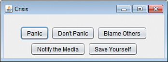
Figure 14.1 shows the application running.
Figure 14.1. Arranging components using flow layout.
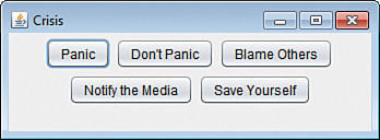
The FlowLayout class uses the dimensions of its container as the only guideline for how to lay out components. Resize the window of the application to see how components are instantly rearranged. Make the window twice as wide, and you see all of the JButton components are now shown on the same line.
The GridLayout Manager
The GridLayout class in the java.awt package organizes all components in a container into a specific number of rows and columns. All components are allocated the same amount of size in the display area, so if you specify a grid that is three columns wide and three rows tall, the container is divided into nine areas of equal size.
GridLayout places all components as they are added into a place on a grid. Components are added from left to right until a row is full, and then the leftmost column of the next grid is filled.
The following statements create a container and set it to use a grid layout that is two rows wide and three columns tall:
GridLayout grid = new GridLayout(2, 3);
setLayout(grid);
Figure 14.2 shows what the Crisis application would look like if it used grid layout.
Figure 14.2. Arranging components using grid layout.
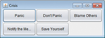
Some labels in Figure 14.2 display text that has been shortened. If the text is wider than the area available in the component, the label is shortened using ellipses (....).
The BorderLayout Manager
The BorderLayout class, also in java.awt, arranges components at specific positions within the container that are identified by one of five directions: north, south, east, west, or center.
The BorderLayout manager arranges components into five areas: four denoted by compass directions and one for the center area. When you add a component under this layout, the add() method includes a second argument to specify where the component should be placed. This argument should be one of five class variables of the BorderLayout class: NORTH, SOUTH, EAST, WEST, and CENTER are used for this argument.
Like the GridLayout class, BorderLayout devotes all available space to the components. The component placed in the center is given all the space that isn’t needed for the four border components, so it’s usually the largest.
The following statements create a container that uses border layout:
BorderLayout crisisLayout = new BorderLayout();
setLayout(crisisLayout);
add(panicButton, BorderLayout.NORTH);
add(dontPanicButton, BorderLayout.SOUTH);
add(blameButton, BorderLayout.EAST);
add(mediaButton, BorderLayout.WEST);
add(saveButton, BorderLayout.CENTER);
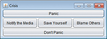
Figure 14.3 shows how this looks in the Crisis application.
Figure 14.3. Arranging components using border layout.
The BoxLayout Manager
Another handy layout manager, BoxLayout in the javax.swing package, makes it possible to stack components in a single row horizontally or vertically.
To employ this layout, create a panel to hold components, and then create a layout manager with two arguments:
• The component to organize in box layout
• The value BoxLayout.Y_AXIS for vertical alignment and BoxLayout.X_AXIS for horizontal alignment
Here’s code to stack the Crisis components:
JPanel pane = new JPanel();
BoxLayout box = new BoxLayout(pane, BoxLayout.Y_AXIS);
pane.setLayout(box);
pane.add(panicButton);
pane.add(dontPanicButton);
pane.add(blameButton);
pane.add(mediaButton);
pane.add(saveButton);
add(pane);
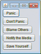
Figure 14.4 shows how this turns out.
Figure 14.4. Stacking components using box layout.
Separating Components with Insets
As you are arranging components within a container, you can move components away from the edges of the container using Insets, an object that represents the border area of a container.
The Insets class, which is part of the java.awt package, has a constructor that takes four arguments: the space to leave at the top, left, bottom, and right of the container. Each argument is specified using pixels, the same unit of measure employed when defining the size of a frame.
The following statement creates an Insets object:
Insets around = new Insets(10, 6, 10, 3);
The around object represents a container border that is 10 pixels inside the top edge, 6 pixels inside the left, 10 pixels inside the bottom, and 3 pixels inside the right.
To make use of an Insets object in a container, you must override the container’s getInsets() method. This method has no arguments and returns an Insets object, as in the following example:
public Insets getInsets() {
Insets squeeze = new Insets(50, 15, 10, 15);
return squeeze;
}
Figure 14.5 shows how this would change the FlowLayout-managed interface shown in Figure 14.1.
Figure 14.5. Using insets to add space around components.
A JFrame container has a built-in inset to make room for the frame’s title bar. When you override getInsets() and set your own values, a low inset value causes the container to display components underneath the title bar.
The container shown in Figure 14.5 has an empty border that’s 15 pixels from the left edge, 10 pixels from the bottom edge, 15 pixels from the right edge, and 50 pixels from the top edge.