10 Things You Need to Know About Compositing
I wanted to kick off the book with 10 tips, secrets, and overall things you should know about compositing before we get started.
1. Which Comes First, the Background or the Subject?
I get asked this one all the time. Unfortunately, it’s not a definite answer one way or the other. For me, I’d say that 75% of the time the subject usually comes first. Give me someone interesting to photograph, and I’ll find a fitting background for them. Most of the time, I don’t even know what that background is before I photograph the person. The other 25% of the time, I’ll have a background specifically in mind before the photo shoot. I’ll photograph the person in a way that I know will work for the background. Sometimes, I’ll even try a quick composite in Photoshop while they’re still in the studio.
2. Stock Photography
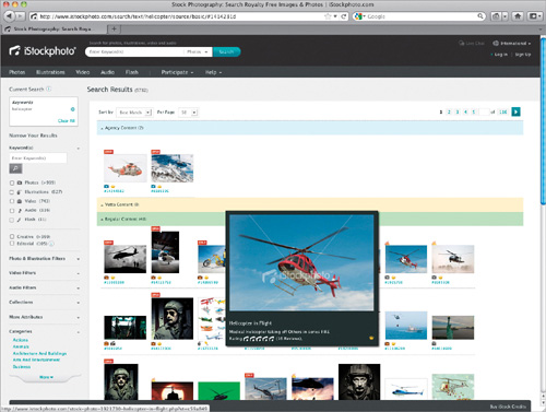
If you’re not a stock photographer, then you’re probably thinking that stock photography doesn’t play that important of a role in your work. In most cases, you’re probably right (as a photographer, that is). However, when it comes to compositing, you can use stock in a much different way. Chances are you’re going to want a certain element in the photo that you simply don’t have. That’s when stock photography becomes a supporting design element, an element to help add to the overall impact of your photo. Let’s say you want a helicopter in your photo. Most people don’t have the access to shoot a helicopter, so what do you do? Just go to a site like iStockphoto (www.istockphoto.com) and search for “helicopter.” You probably won’t find one isolated on a white background, but, hopefully, after reading this book and the selection secrets in Chapter 1, you won’t care, because you’ll know you can pull just about any image you want from its background.
3. Build a Background Image Library

Building on the previous tip of using stock photography is the use of backgrounds. If you’re compositing, the background is almost as important as anything else. And if you don’t have to go to a stock photo website to get one, that makes it all that much better. I know you always hear, “Keep your camera with you at all times.” But, before I started compositing, I never did. If I wasn’t someplace spectacular, or in good light, I just didn’t bother. But, since I’ve started creating more composites, I find that no matter where I am, it has potential. I literally take photos of everything, from clouds, to baseball fields, to streetlights, cars, doors, boats, old warehouses, alleyways, you name it. Anything you think you may one day use (and even if you think you’ll never use it) becomes fair game for a photo. Why not, right? That click doesn’t cost anything, so shoot it.
Once you start shooting backgrounds, make sure you organize them. I’ve created a Backgrounds folder, and in that folder are categorized subfolders. You don’t have to have an official cataloging system—it doesn’t have to be that sophisticated. As your collection grows, though, you may want to consider a program like Adobe Photoshop Lightroom (which I use for most of my photography), with all of its keywords and collections, but as you’re starting out, keep it simple.
4. Selections in Photoshop CS5 Rock!
Everything you do in compositing is based around one key part of Photoshop—selections. Without a good, clean selection, your composites will never look professional. And as you’ll see throughout this book, the selection technology in Photoshop CS5 absolutely rocks! Seriously, it has literally shaved hours off of compositing work and it has even made compositing attainable to people that simply didn’t have the patience or time to try it before. It’s leaps and bounds ahead of where it ever was before Photoshop CS5. So, the first secret is to make sure you have Photoshop CS5, if you want to make life easier. It all but eliminates the need for the old selection tricks using Channels, Calculations, and the Pen tool.
Now, if you’re wondering if there are third-party plug-ins out there that make selections easier for you, there are. But, they cost more money. Photoshop CS5 has all you need and Chapter 1 will teach you all about it.

5. Lighting Is Everything
Lighting is the key to compositing, and not only makes selections easier, but also makes the composite look real. You can learn all of the selection tricks and Photoshop effects you want, but if the lighting on your subject vs. the lighting in the environment in which you place them is different, it’ll never really look real. If you know the background up front, then you can plan ahead with your lighting. If not, using a setup similar to mine above gives you a lot of options later in Photoshop.
Most of the time, I use three lights: one main light up front to fill in the face and clothing, and then two lights on the sides that add a nice edge/accent light on the sides of the person. With two to three lights, you drastically increase your odds of getting a good selection from the background, as well as a head start to making the person fit into just about any other background. As for the backdrop, generally the lighter the better (make sure you check out Chapter 1 for more on the best color backdrop to use).
The Main Light: The main light source here is what fills in the face and front of the subject. The modifier you put on this light pretty much controls the mood of the light on your subject. I typically use one of two modifiers: The first is a beauty dish (as seen here) with diffusion material over it. It gives a slightly more contrasty look to your subject, because it produces harsher shadows on the face. The other is a small-to-medium-sized Rotalux Deep Octa softbox (as seen in the second setup photo on the next page), which I tend to use more when photographing families and kids. It tends to give a softer, flatter look vs. the contrasty look the beauty dish gives.
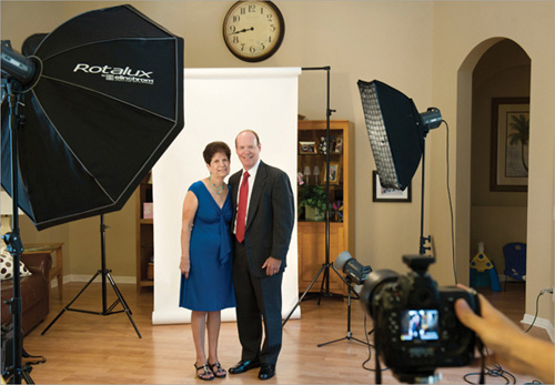
Edge Lights: This is the key to this lighting setup. The edge lights produce a fairly hard light right along the edge of the person. I’ve seen people go from using no lighting modifier at all on these (just the bare bulb) to using large softboxes. For me, the size of the modifier is important here, but not critical. The most critical part is that there is some sort of edge light on the person. Don’t overthink this part—just make sure there’s a light. Personally, I like to use a long strip bank softbox to get good coverage, from the subject’s face all the way down the side of their body. But, a small-to-medium-sized softbox, if you don’t have a strip light, can work really well, too. You’ll also notice that I use grids on these edge lights to help control the light and focus it where I want. Remember, we just want a hard edge light along the side of them. We don’t necessarily want that light to wrap around them and mix with the light coming from the front. With a grid, we can direct the light exactly where we want and get more controlled results.
Not every composite is going to start in the studio or be lit using a studio/off-camera lighting setup. As you flip through the book, you’ll notice that we’ll cover several natural-light composites. Natural-light portraits can work for lots of composites, but you’re limited by that light. If you photograph someone in broad daylight at noon, you’re probably not going to be able to place them in a dark alley, and make it look real. You’ll be able to place them on another background that was shot at noon, but that’s about it.
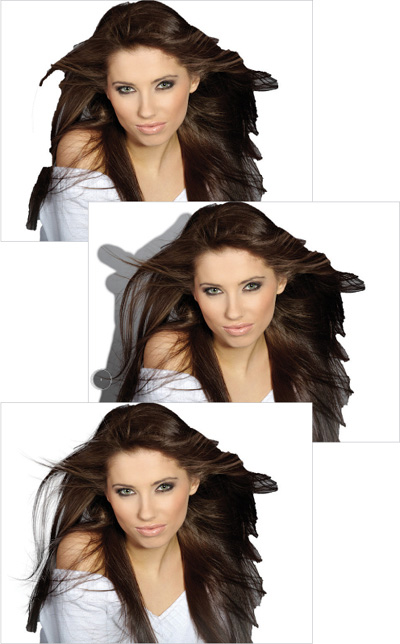
6. Don’t Kill Yourself on a Selection If the Detail Isn’t Important
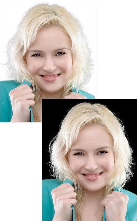
Here’s a good example: Jessica, here, was originally photographed on a gray background. After selecting her (and her hair), and placing her on a white background, the edges of her hair look horrible, right? If I plan on putting her on a bright background, then this is definitely a problem and something I’ll need to fix (I show you how, by the way, in Chapter 1). But, if I plan on putting her on a darker background, take a look. Perfect! I didn’t change one thing about the selection—only the color background that I placed her on. The point here is: don’t waste time where it isn’t needed or won’t be noticed.
7. Darken the Feet


This is one of the best-kept secrets in the compositing world. If you’ve got a full-body composite, and you place a person’s feet on the ground, one of the telltale signs that it’s fake is typically going to be around the feet. It’s really hard to get shadows and lighting to look perfect when the person wasn’t really standing there. We have tricks that we can do (and we will in the book), and one great way to hide what was done is to take people’s attention away from it. Since we’re drawn to looking at the brighter parts of a photo, darkening the feet helps keep people from focusing on them and the fact that something may not be quite right. Trust me, from this moment on, take a look at every ad or movie poster you see where you think something may be composited and look at the feet. Nine times out of 10, you’ll see it’s darker at the bottom.

8. Don’t Include the Feet
This is another great secret in the compositing world. If at all possible, create the image so that you don’t have the feet included. You’d be surprised at how much feeling, movement, and mood you can create in an image, even if you don’t see the person’s entire body. Again, keep an eye out for movie posters and magazine ads, and you’ll see that most of the images that seem like they must be a composite don’t even have the people’s feet in them.
9. Color Gives Everything a Common Theme
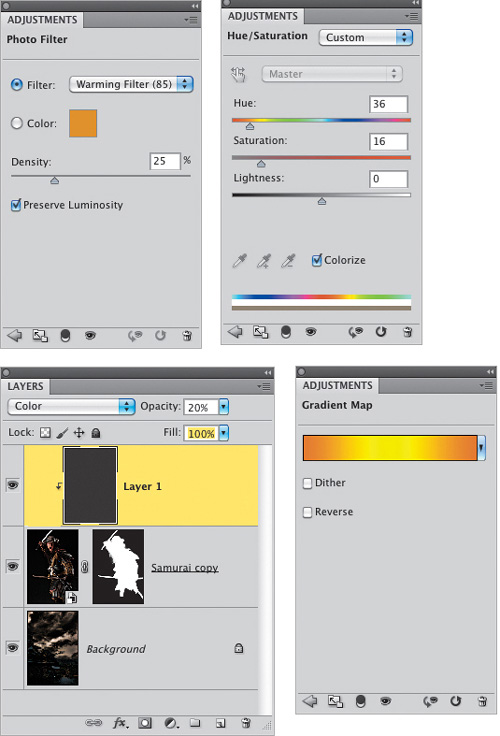
One of the hardest parts of compositing is not necessarily putting various photos together. As you’ll see, it’s not really hard to select a person from one background and place them on another. What is more difficult is getting both the person and the background to share the same overall mood and color temperature. Color really does tie everything together, and it gives everything in the photo a common link. As we work through the book, we’ll use a number of different tricks for this, like adjustment layers and blend modes, as well as a plug-in.
10. The Compositor’s Secret Weapon: Plug-ins
Let me be the first to say that I know plug-ins aren’t cheap. And I hate it when I read something that talks about all these third-party plug-ins you need in order to complete a tutorial. As if Photoshop isn’t expensive enough already, along with all the photography gear you need to take the photos. So, here’s what I’ve done: anyplace that I use a third-party plug-in, I first show you the free way to do something similar in Photoshop. You’ll find that the free way has two issues, though: (1) it typically doesn’t look as good as the effect we get with the plug-in and (2) it takes much longer than it does with a plug-in. If you’re into compositing, plug-ins will make your life easier, plain and simple. These are the plug-ins I use:
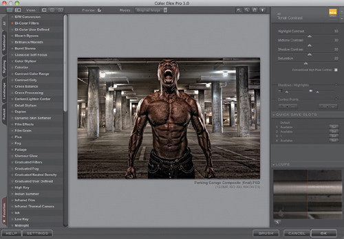
Nik Software’s Color Efex Pro Complete
This plug-in gets used just about every single day in my work. Whether I’m compositing or not, I use Color Efex Pro. But for compositing, it’s got so many filters that help finish your work. I swear by the Tonal Contrast filter, which I use to finish off just about every one of my composites and backgrounds. The Bi-Color filter adds some really nice color to your photos. I use the Brilliance/Warmth filter on every landscape photo I take. Bleach Bypass is a great effect for portraits. The list goes on. I think these effects should be included in Photoshop, but they’re not. Sure, you can go through a bunch of steps to create them in Photoshop, or you can just use the plug-in. At $199.95, it’s not cheap, but it’s the first one I’d buy.
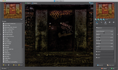
This one is another one of my must-have plug-ins. I use it to add an instant edgy/gritty look to my images. Plus, if I really want to add some mood and make a bright image look like it was taken at night, their Dark – Night preset (used in Chapter 10) is one of my favorites. And at $50, it’s pretty reasonable.
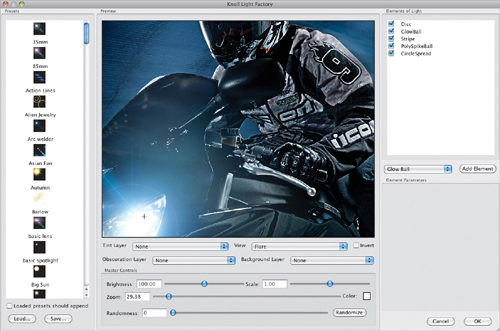
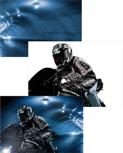
Knoll Light Factory for Photoshop by Red Giant Software
You’ll notice I use a lot of lighting effects in the book. Lens flares and light streaks come in really handy to bring your composites to that next level of professionalism—things like enhancing the headlights on a car or light on a building, or adding a light source based on the way light is hitting your subject. You can do all of these things with layers, layer styles, and filters in Photoshop (and I did them in Photoshop in the book), but none of them give you the professional quality light effects that Knoll Light Factory does. That said, this one is probably the last one on my must-have list. It’s not cheap, at $149, so you’d have to balance the good parts with how much you’d actually use it.