
3. Extensible Application Markup Language (XAML)
In the previous chapter, you developed an application with a simple user interface that was defined using a file that ended with a .xaml extension. XAML is the acronym for Extensible Application Markup Language. It was popularized through its use in Windows Presentation Foundation (WPF) and Silverlight applications. Using XAML for Windows 8 applications should feel very familiar for developers who have used it with other technologies in the past.
XAML is an XML-based declarative markup language that was developed by Microsoft. It is often mistakenly referred to as a user interface language and is compared to HTML. Although XAML is the key technology that drives the visual interface for Windows 8 applications, it is not limited to creating UI elements for platforms like Silverlight and WPF. In fact, XAML drives other technologies including Windows Workflow Foundation (WF).
XAML is defined as a system for representing structured information. XAML contains three distinct nodes: objects, members, and text. The objects in XAML reference either CLR types that are instanced by the XAML parser or WinRT component calls, whereas members reference properties on the types, and text is used to set values. The best way to think about XAML is as a rich object graph that is defined declaratively using XML. In the next section, you learn how XAML allows for declarative instantiation of objects.
The examples in this book are available online at the book source code website at http://windows8applications.codeplex.com/.
Declaring the UI
When using C#, VB, or C++ for your Windows 8 applications, you define the user interface using XAML. The XAML is really a set of declarations for objects that the Windows 8 application will parse and create to make the UI behave the way you want it to. Take a look at Listing 3.1. This is the XAML for the complete UI for the ImageHelper application.
Listing 3.1. Using XAML to Declare the UI
<Page
x:Class="ImageHelper.MainPage"
IsTabStop="false"
xmlns="http://schemas.microsoft.com/winfx/2006/xaml/presentation"
xmlns:x="http://schemas.microsoft.com/winfx/2006/xaml"
xmlns:local="using:ImageHelper"
xmlns:d="http://schemas.microsoft.com/expression/blend/2008"
xmlns:mc="http://schemas.openxmlformats.org/markup-compatibility/2006"
mc:Ignorable="d">
<Grid Background="{StaticResource ApplicationPageBackgroundThemeBrush}">
<Grid.RowDefinitions>
<RowDefinition Height="*"/>
<RowDefinition Height="Auto"/>
</Grid.RowDefinitions>
<Image x:Name="ImageTarget" Grid.Row="0"
HorizontalAlignment="Center" VerticalAlignment="Center"
Stretch="Uniform"/>
<StackPanel Grid.Row="1" Margin="10"
HorizontalAlignment="Center" Orientation="Horizontal">
<Button x:Name="CaptureButton"
Content="Capture New Image"
Click="CaptureButton_Click_1"/>
<Button x:Name="SaveButton" Content="Save Image"
Click="SaveButton_Click_1" Margin="20 0 0 0"/>
</StackPanel>
</Grid>
</Page>
The XAML instructs the parser to create a Page object. That object has certain properties. For example, it references the MainPage class to specify where the code for the page exists. The page has a child Grid object that defines how the elements will appear on the screen. The grid references a resource for the background color. Resources are introduced and explained later in this chapter. An Image object is used to host the snapshot or shared bitmap. The Button elements not only render buttons on the screen, but also specify how to connect the buttons to application code when they are clicked.
All of the items in the example in Listing 3.1 could have been created programmatically. You can create a new instance of a Page object, create a new Grid object and assign it to the page, and so forth. Using XAML makes it easy to declare the layout as well as provide a design-time view so you can see what the resulting user interface will look like.
The top of the declaration contains some important namespace declarations. In XAML and XML, namespaces are used to provide uniquely named elements and attributes by providing a scope. The x:Class attribute is a special attribute in the XAML namespace (defined by the x: portion of the attribute) that defines the declaration as a partial class so it can map to the code-behind file. The xmlns: namespace is the default XML namespace, and can be used to define your own scopes. The same way you provide a using statement at the top of a C# file to include a namespace, you can use xmlns: to define a scope for using other namespaces in XAML. To assign the MyApp.MyNamespace namespace to the local prefix, you simply add this to the declarations:
xmlns:local="using:MyApp.MyNamespace"
Then you can address a type called MyType in the MyApp.MyNamespace namespace like this:
<local:MyType/>
An assembly that contains the target namespace must be referenced to declare a scope for that namespace, and the assembly that contains the target type must be referenced by the project in order to successfully resolve that type from XAML.
You may notice that the elements after the XAML namespace declarations form a sort of hierarchy. There is a parent object with children, and each child may have their own children. Some elements may be disabled or set so they do not display. The elements that do display make up a special hierarchy. This hierarchy is referred to as the visual tree.
The Visual Tree
The visual tree describes the UI elements that are visible on the screen. The diagram in Figure 3.1 represents the visual tree for the very simple ImageHelper application.
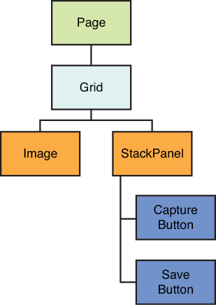
Figure 3.1. The visual tree
It is important to understand the visual tree because UI elements can raise special events called routed events. To understand why routed events are necessary, consider the act of a user touching a section of the screen. That area happens to be where one of the buttons is rendered. Which UI element should be responsible for the event? Technically, the button is part of the StackPanel, and the StackPanel is a child of the Grid. The user is really touching all three elements at the same time.
When this happens, an event is raised that bubbles up the visual tree. It fires in the inner-most (or lower-most) element of the tree. To see this in action, download the ImageHelper2 example from the book website for Chapter 3. This example adds a PointerPressed event to the Grid and StackPanel elements. It also adds a red Rectangle element between the two buttons:
<Rectangle Width="30" Height="30" Fill="Red"
Margin="20 0 0 0"
PointerPressed="Rectangle_PointerPressed_1"/>
When you add an event to a XAML element in the designer, you can simply press the Tab key to automatically generate the code-behind event handler for that event. The event “listens” for something to happen. When that event happens, it calls the handler for the event. The handler can then do something, such as open the web camera to capture a photo or open the dialog to save a file. The PointerPressed event is a special event that fires whether the user taps the screen with her finger or a stylus or left-clicks with a mouse. It is one of the ways Windows 8 simplifies your work as a developer by providing a way to easily handle multiple input devices.
The code that is called for the events simply writes some text to the debug window and appends it to a text block on the page:
private void ShowPointerPressed(string source)
{
var text = string.Format("Pointer pressed from {0}", source);
Events.Text = string.Format("{0} // {1}", Events.Text, text);
Debug.WriteLine(text);
}
Compile and run the application from the debugger (press F5). Click or tap the red rectangle. What happens? You should see three events appear on the screen and in the debug window (if you can’t see the debug window, press the following keys at the same time: Ctrl+Alt+O):
Pointer pressed from Rectangle // Pointer pressed from StackPanel // Pointer pressed from Grid
This is what is referred to as bubbling. The event traveled up the visual tree, traveling from the Rectangle to the host StackPanel and finally to the parent Grid. Next, click the space between the rectangle and one of the adjacent buttons. Do the results surprise you? You might expect to see the StackPanel fire the event, followed by the Grid, but only the Grid event appears in the debug window. Why is that?
The XAML engine is smart enough to recognize “empty space” and not fire an event. It assumes you don’t want the empty space in the StackPanel to respond to touch events. The StackPanel doesn’t specify a background, so it is transparent, and any empty spaces that are pressed will simply “pass through” to the parent element. The Grid element specifies a background, so it is able to process touch events. Update the StackPanel to have a gray background by adding the highlighted code:
<StackPanel Grid.Row="1" Margin="10"
Background="Gray"
PointerPressed="StackPanel_PointerPressed_1"
HorizontalAlignment="Center" Orientation="Horizontal">
If you would like the “empty space” to process events, you can set the background to Transparent. This has the same visual effect of not specifying a background, but with one key difference. The background will “exist” with a transparent surface that is available to process events, so that the empty space can register taps, holds, and other gestures.
Run the application again and tap on any of the gray space that is not part of a button or the rectangle. You should see that the StackPanel is now picking up the event. Now tap the Save Image button. What happens? Are you surprised again? (No event is generated.) One feature of bubbling is the ability to stop the event from bubbling further up the tree (yes, you can literally burst the bubble). The Click event on the button is really an alias for the PointerPressed event, and because it handles the event, it cancels the event to prevent it from bubbling further.
On Windows 8 slates and tablets, you have a variety of options to interact with Windows 8 applications. A button can be “pressed” by clicking it, tapping it with a finger, or touching it with a stylus. In this book, any time you read the word “click” or “tap,” assume you can achieve the same effect by using the left-button on your mouse, your finger, or your stylus. If I am expecting you to perform a specific gesture using a certain form of input, I’ll explicitly call that out in the text. Where possible, I will also include the relevant keyboard shortcuts and mouse gestures you can use that are equivalent to their touch-based counterparts.
In the code-behind file MainPage.xaml.cs, add the highlighted code to the event handler for the PointerPressed event in the StackPanel:
private void StackPanel_PointerPressed_1(object sender,
Windows.UI.Xaml.Input.PointerRoutedEventArgs e)
{
ShowPointerPressed("StackPanel");
e.Handled = true;
}
Compile and run the application again. Click either the rectangle itself or in the space around the rectangle. This time you should see the StackPanel event but no Grid event. This is because the StackPanel indicated it handled the event to prevent the event from bubbling further up the visual tree.
Dependency Properties
Most XAML objects derive from the base DependencyObject class. This is a special class that enables objects to participate in the dependency property system. The system enhances traditional properties and enables them to be inherited, to affect other classes, and to be manipulated in specified ways.
A dependency property is exposed internally as a static field that is registered with the dependency property system. By convention, the name of the field should end with Property. To register the property, you call the static Register method of the DependencyProperty type. To see this in action, open the DependencyProperties project. Take a look at the class called MyDependencyObject that inherits from DependencyObject:
public class MyDependencyObject : DependencyObject
The dependency property simply holds an integer. It is hosted using the static, read-only DependencyProperty like this:
public static readonly DependencyProperty
MyNumberProperty = DependencyProperty.Register(
"MyNumber",
typeof (int),
typeof (MyDependencyObject),
new PropertyMetadata(2, OnMyNumberPropertyChange));
The property is named by the property system convention of ending with Property. The first parameter is the name of the property itself (without the suffix). The next parameter is the type of the property, which for this example is an integer. The third parameter is the type of the owner—the class that the dependency property depends on. The last parameter is optional and can provide a default value for the property and/or a method to call whenever the property changes.
The property specifies a method that is called when the property changes. The implementation of this method simply writes the new value to the debug console:
private static void OnMyNumberPropertyChange(DependencyObject d,
DependencyPropertyChangedEventArgs e)
{
Debug.WriteLine("Property changed: {0}", e.NewValue);
}
The MainPage.xaml file references this new dependency object. The XAML contains a Slider control. The Slider is used to manipulate values on the dependency object. The dependency object is defined in data context of the grid:
<Grid.DataContext>
<local:MyDependencyObject/>
</Grid.DataContext>
Beneath the DataContext for the Grid is the definition for the Slider control. It is bound to the MyNumber property of the dependency object. This binding means that the Slider will get an initial value from the referenced object. When the Slider is moved, the binding will update the target property because the binding is specified as a two-way binding:
<Slider Minimum="1" Maximum="100" Height="20"
HorizontalAlignment="Stretch"
Value="{Binding Path=MyNumber,Mode=TwoWay}"
x:Name="Slider"/>
You learn more about data-binding later in this chapter.
The DataContext is a special dependency property you learn more about in the Data-Binding section of this chapter. The property can be any object but is most often a class that derives from DependencyObject or implements INotifyPropertyChanged. Both of these options provide property change notification that the data-binding system uses to know when to update values. The DataContext is unique not only because it specifies the base object for data-binding instructions, but also because it is inherited. When you set the DataContext at the root Grid level, all child controls will also use the same DataContext unless they specifically override the value.
Although the dependency property system is used to register the dependency properties, they must be exposed to the runtime as common CLR properties. This is referred to as “backing” the properties. The value can be exposed as an ordinary property, but the getter and setter methods will reach out to the dependency property system to determine and/or set their value. Here is the backing code:
public int MyNumber
{
get { return (int) GetValue(MyNumberProperty); }
set { SetValue(MyNumberProperty, value);}
}
The GetValue and SetValue methods are provided by the base DependencyObject class. They are used to query the active values to expose to or update from the backing CLR property. Run the program in debug mode and move the Slider. You should see the new values appear in the debug output window as the result of the property-changed callback you defined.
Dependency properties offer several benefits over regular CLR properties. These include the following
• Property change notification—Dependency properties automatically inform the data-binding system when an underlying value changes.
• Property change callbacks—Developers can specify a delegate to receive callbacks when dependency properties change and therefore can react to changes outside of the data-binding system.
• Default values—Dependency properties can be defined with a default value that can be primitive or complex based on the type of property.
• Value precedence—There are multiple ways to influence the actual value of a dependency property including data-binding, styles definitions, XAML literals, and animations.
• Inheritance—Child elements can inherit the values of dependency properties from their parent elements.
All of these attributes make dependency properties ideal for the data-binding system that is built into XAML.
Attached Properties
Attached properties are special types of dependency properties that do not belong to a specific dependency object. Instead, they are attached to existing objects. There are two main reasons you would want to use an attached property. First, attached properties are useful for providing additional attributes that are not specific to an element but are useful in the context of other elements. An example of this is the Grid.Row attached property. By itself, a TextBlock isn’t aware of the concept of a “row” because it may exist in any number of panels. When it is positioned within a Grid, it is useful to designate where the element should be placed. The attached property provides this additional information, and the parent Grid can query the attached property to lay out its children.
Querying an attached property is done through the special GetValue method. You must pass the class name that owns the attached property as well as the property name. For example, to query what row a TextBlock named ValueText is in, you can execute the following code:
var row = ValueText.GetValue(Grid.RowProperty);
The second common use for attached properties is for a reusable behavior. Attached properties are passed the element they attach to, allowing you to manipulate the element in code. As an example, assume you wanted to make certain buttons automatically open the sharing dialog to make it easy for the user to send data to other applications on their system. Instead of adding code to every page, you want to make it easy by providing a simple attribute. When the attribute is set to True, the button will automatically open the dialog for sharing when clicked.
In the DependencyProperties project, the MagicButton class makes this happen. Note that the class itself does not have to derive from DependencyObject. The attached property is defined almost the same way as the dependency property through a different method:
public static readonly DependencyProperty IsShareButtonProperty =
DependencyProperty.RegisterAttached(
"IsShareButton",
typeof(Boolean),
typeof(MagicButton),
new PropertyMetadata(false,
new PropertyChangedCallback(Changed)));
When the property is changed, the host object is first checked to ensure it is a Button. If it is, the Click event is intercepted and used to show the sharing dialog:
static void button_Click(object sender, RoutedEventArgs e)
{
DataTransferManager.ShowShareUI();
}
Finally, the attached property must provide a projection so that it can be used in XAML. The format is slightly different from a dependency property because the context is from a static reference rather than an instance of a dependency object. Instead of exposing a property, two static methods are provided. These are automatically parsed from XAML and modified to look like “natural” properties in the designer:
public static void SetIsShareButton(UIElement element, Boolean value)
{
element.SetValue(IsShareButtonProperty, value);
}
public static Boolean GetIsShareButton(UIElement element)
{
return (Boolean)element.GetValue(IsShareButtonProperty);
}
The verbs for Get and Set are not shown in the designer, so you can attach the property like this:
<Button Content="No Magic"/>
<Button Content="Magic"
local:MagicButton.IsShareButton="True"
Margin="20 0 0 0"/>
When you run the project, the first button does nothing. Clicking the second button will open the sharing dialog. This will have no effect because the application does not contain the code to satisfy the share contract. You’ll learn more about that in Chapter 8, Giving Your Applications Charm.
Although this example was simple and contrived, it should be obvious how flexible and powerful attached properties can be. Whenever you find yourself building a complex behavior that may be repeated for several controls in the system, consider refactoring it as a reusable attached property instead. Another benefit of attached properties is that their values can be enumerated by the designer, making it easy for users to understand how to use them from XAML.
To recap, the DependencyObject class is the base class for the dependency property system. This system provides the ability to compute the values of special extended properties and provide notifications when values have changed. This is the base class for most of the controls that exist in the framework. This allows the controls to expose their properties to allow data-binding and animations through storyboards (these are covered later in this chapter).
Data-Binding
Data-binding uses an object to synchronize information between a source and a target. The source is the underlying data element and is any type of CLR object, from Plain Old CLR Objects (POCOs) to dependency properties or other complex types. It can also be a WinRT object that has a BindableAttribute or implements ICustomPropertyProvider (the focus of this book is C#, but if you are building components using C++, you will need to understand these two approaches to expose your objects if you wish for them to participate in data-binding). The target must be the DependencyProperty of a FrameworkElement that the value is being synchronized with, such as the TextProperty of a TextBox or TextBlock. The data-binding object often references a type that implements IValueConverter to help transform the data from the source to the target and back again (you’ll learn about value converters later in this chapter). Figure 3.2 illustrates how the data-binding object brokers interactions between the source and the target.
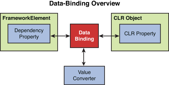
Figure 3.2. The data-binding system
Data-binding is specified declaratively by using the extension syntax with {Binding} as the keyword. The following example from DependencyProperties illustrates a simple binding:
<TextBlock Text="{Binding MyNumber}"/>
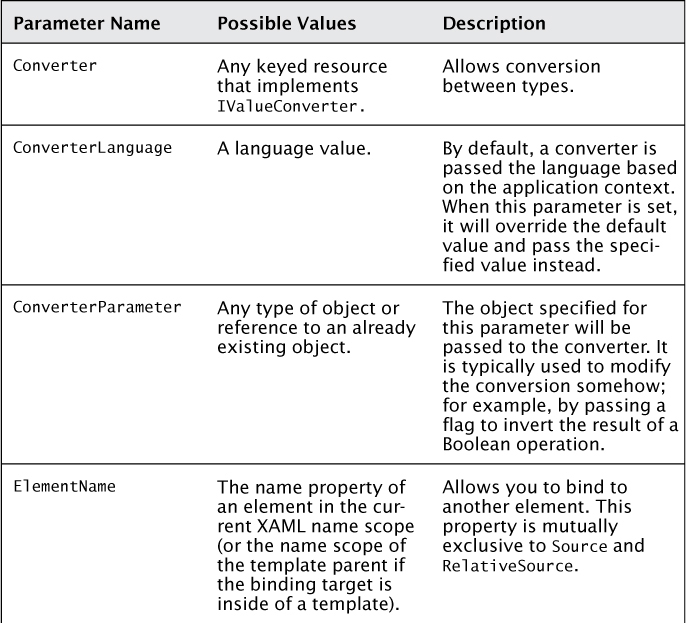
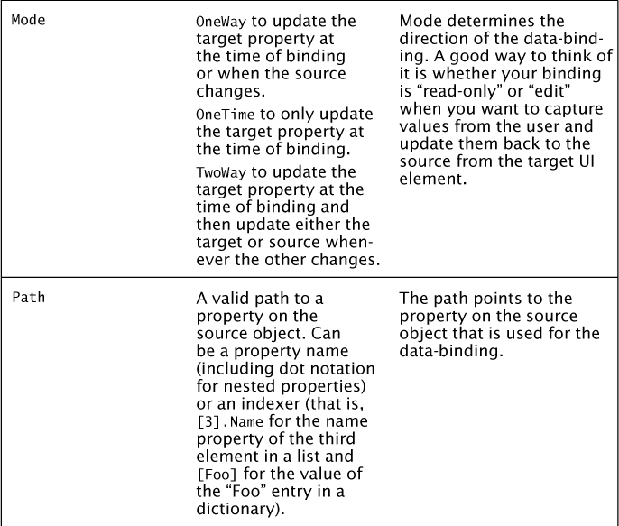
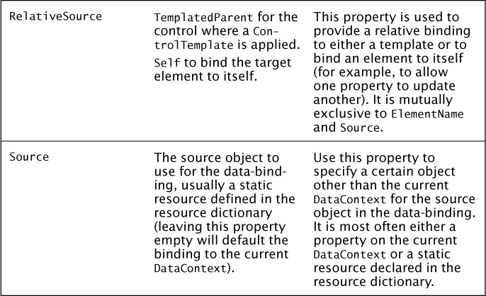
Unless overridden, the binding will always attach to the current object that is set to the DataContext. The next parameter by default is a path to a property on that object–in this case, the MyNumber property. You can pass a variety of parameters to the Binding object. Table 3.1 lists these parameters and their purpose.
You can see some examples of different types of bindings in the DependencyProperties project. The second value that is shown uses ElementName binding to bind directly to the Slider control:
<TextBlock Text="{Binding ElementName=Slider, Path=Value}"/>
There is also a binding that shows the size of the font of the text field by binding to itself:
<TextBlock Text="{Binding RelativeSource={RelativeSource Self}, Path=FontSize}"/>
For data-binding to work correctly, the host object must inform the data-binding system when any of the properties change. Without this notification, data-binding will never reflect the most recent value. There are two ways to raise this notification in C# code. The first is to use a dependency property. Dependency properties automatically participate in the data-binding system and provide the necessary property change notifications.
The second way is to implement INotifyPropertyChanged. The interface defines a single event called PropertyChanged. For anything but OneTime bindings, the Binding object will register to this event when present and listen for properties to change. Using this approach, you are responsible for raising the event whenever the values of properties change. Open the DataBinding project and view the DataBindingHost class, as shown in Listing 3.2. Notice that the class tracks the value of the IsOn property using a private field. The public property updates the field and raises the PropertyChanged event when a property is set. The helper method RaisePropertyChanged is used for this. Although it is not necessary for this simple example, on a larger object it will come in handy to manage notifications for several different properties.
Listing 3.2. Property Change Notification
public class DataBindingHost : INotifyPropertyChanged
{
private bool _isOn;
public bool IsOn
{
get
{
return _isOn;
}
set
{
_isOn = value;
RaisePropertyChanged();
}
}
protected void RaisePropertyChanged([CallerMemberName]
string caller = "")
{
PropertyChanged(this, new PropertyChangedEventArgs(caller));
}
public event PropertyChangedEventHandler PropertyChanged =
delegate { };
}
The helper method uses a special trick to raise the PropertyChanged event. If you are a Silverlight or WPF developer, you probably recall the various tricks developers had to use to call the event. These ranged from passing a hard-coded string to the method (a technique that can cause issues when the developer mistakenly misspells a property name) to passing a lambda expression and then walking the expression tree to extract the property name (this approach was strong-typed but resulted in an awkward syntax). With C# 5 you can simply tag a string parameter with the CallerMemberName attribute, and it will be set at compile-time to the calling method. In the case of a property, it is set to the property name, which makes it convenient to use for property change notification.
One thing you may ask is, “Why implement this interface when dependency objects do the same thing?” The answer is straightforward. The DependencyObject class is part of the presentation framework for XAML. It lives in Windows.UI.Xaml and makes the most sense to use when creating custom controls or objects that expose properties that need to be animated. The INotifyPropertyChanged interface is part of the core framework and does not require a dependency on XAML or the UI. It allows you to create lightweight objects that are referred to as Plain Old CLR Objects (POCO for short) that you can extend, test, and even share with code written for other systems that don’t use XAML. The interface can be used to provide property change notification anywhere, but a DependencyObject must work within the dependency property system.
In Listing 3.2, you may have noticed the practice of setting the event handler to an empty delegate. This helps simplify the code. In the rare case that an event is unregistered before calling the handler, the code could throw an exception. Typically, you would check for null before calling the handler. Setting an empty delegate ensures there will always be at least one event registered, even if it’s the “do nothing” default handler.
The main advantage for using data-binding is a clean separation between the UI concerns and the underlying data. A simple example is a Boolean value you would like to show as green for “true” and red for “false.” The data model should not have to be manipulated to generate the colors because those are a function of the UI. Instead, you can use data-binding to pull the value and a value converter to transform it.
Value Converters
Open the project DataBinding and take a look inside the Converters folder. There are three examples of value converters. Value converters all implement the IValueConverter interface, which defines two methods: Convert and ConvertBack. The first is almost always implemented and converts a source type on the data-binding object to a target type on the element it is bound to. The second method is used when you want to use the converter on a two-way binding. It is used to convert back from the type on the target element to the type on the source—for example, you might want to convert the text in a TextBox control to a number or color or other value on your binding source.
The visibility converter transforms a Boolean value to the enumeration used by XAML to show or hide a UI element:
return visible ? Visibility.Visible : Visibility.Collapsed;
If you bind the value directly to a text property, the data-binding system will call the ToString() method on the value and fallback to the type name. Using a converter, you can transform the value to more meaningful text:
return truth ?
"The truth will set you free." :
"Is falsehood so established?";
Finally, you can convert the value into more complex objects including a brush with a specific color:
return truth ? new SolidColorBrush(Colors.Green)
: new SolidColorBrush(Colors.Red);
Converters are stored as resources that can be reused in your XAML pages. You learn more about resources later in this chapter. The converters in this example are declared with a key to reference them by in the MainPage.xaml file, for example:
<converters:VisibilityConverter x:Key="CvtVisibility"/>
This creates what is known as a static resource because it is fixed and cannot be changed, although it can be referenced multiple times throughout XAML. The convention for referencing a static resource is obvious in the data-binding command (note the highlighted key):
Visibility="{Binding IsOn,Converter={StaticResource CvtVisibility}}"
Listing 3.3 shows the full set of bindings from the MainPage.xaml file.
<CheckBox IsChecked="{Binding IsOn, Mode=TwoWay}"/>
<TextBlock Text="Is On?" Grid.Column="1"/>
<TextBlock
Text="Now You See Me."
Visibility="{Binding IsOn, Converter={StaticResource CvtVisibility}}"
Grid.Row="1"/>
<TextBlock
Text="Now You Don't."
Visibility="{Binding IsOn,Converter= {StaticResource CvtVisibility},ConverterParameter=True}"
Grid.Row="1" Grid.Column="1"/>
<TextBlock Text="{Binding IsOn}" Grid.Row="2"/>
<TextBlock Text="{Binding IsOn, Converter= {StaticResource CvtText}}" Grid.Row="2" Grid.Column="1"/>
<Ellipse Grid.Row="3" Grid.ColumnSpan="2" Height="100" Width="100"
Fill="{Binding IsOn,Converter={StaticResource CvtColor}}"/>
You can run the example to see for yourself the variety of ways a single piece of data can be transformed into interactive information in your UI. Notice that the source DataBindingHost simply defines a single Boolean property and is completely decoupled from the UI. The two different states are shown in Figure 3.3.
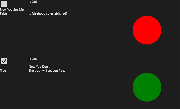
Figure 3.3. How data-binding and converters can change visuals
Using data-binding and value converters, you are able to transform that data into text and color and even use it to turn off elements on the display.
Storyboards
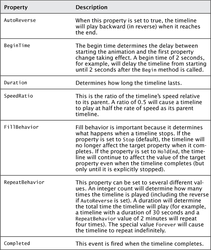
Storyboards affect dependency objects by updating their properties and impact the target values over a period of time. The most common application of this behavior is animations used for transitions between states and to emphasize certain actions to the user. Storyboards inherit from the Timeline object. Table 3.2 lists the various properties on the timeline and what they do.
Table 3.2. Properties of the Timeline Class
Take a moment to review the Storyboards project.
The project illustrates various uses of the timelines. Here is a sample storyboard definition from the project:
<Storyboard x:Name="FirstOneAnimation"
Storyboard.TargetName="FirstOne">
<DoubleAnimation Duration="0:0:5"
Storyboard.TargetProperty=
"(Rectangle.RenderTransform).(ScaleTransform.X)"
From="-300" To="300"/>
</Storyboard>
The target is a rectangle defined later in the XAML that is colored red due to an implicit style setting. You’ll learn more about styles in the next section. The storyboard can use the TargetName property to point to an element with that name or the Target property to point to a specific object such as a resource.
The target property can be the name of the property, or it can use what is called path notation. Path notation involves taking each object in the XAML hierarchy and enclosing it in parentheses, followed by a period and then the next property.
The pattern looks like this:
(object.property).(object.property)
In the example, the target is a rectangle, so the first portion of the property path indicates that it is the RenderTransform property of the Rectangle that is being targeted. This will contain a matrix transformation that can be used to manipulate the element. In this example, the transformation is a translation that will move the Rectangle along the X axis. The period indicates that the path should continue to the value assigned to the transformation, which in this case is a TranslateTransform class. Ultimately, it is the X property on the transformation class that is targeted for animation.
There are additional storyboards included in the example to show you a variety. The second example automatically repeats and reverses itself, so it will run until it is explicitly told to stop. It also contains an easing function that modifies the computations for the animation. Animations are frame-based. When a range is provided, the number frames the graphics card is capable of displaying for the duration is computed and used to derive how much offset should be applied per frame. You don’t have to worry about how fast the graphics display is rendering because the animation will handle that for you. You only need to specify the start and end values and the duration.
It is also possible to create discrete animations that abruptly change values. The third storyboard changes colors. Instead of fading between the colors over time, it will immediately switch the new color when the key time is reached—that is, the time within the duration the discrete value should change. The last animation also uses a discrete value but demonstrates the use of an object animation to hide the animation by applying a value of Visibility.Collapsed.
Every storyboard defines a “base timeline” that the children of the storyboard operate against. In addition to the base timeline, the storyboard can contain a collection of other timelines (or other storyboards and animations). Like all dependency objects, storyboards follow rules of inheritance. If you set the duration at the storyboard level, all child timelines will inherit that duration. If a child specifies the duration, this will override the parent setting.
Four animations are built into the framework. You can build your own, but the following will address most of your needs:
• ColorAnimation—This animates the color property of a dependency property and transitions between the “from color” and the “to color.”
• DoubleAnimation—This animates a double value across a range. Most properties in the runtime are doubles, so this animation addresses most use cases.
• PointAnimation—This animates between two points and is most often used to position geometry objects.
• ObjectAnimationUsingKeyFrames—This allows you to set discrete values at specific times.
The first three animations can also be specified as discrete animations using key frames. The basic animations move through a range of values over the specified duration. Discrete animations switch abruptly from one value to the next at a specified time or key frame in the animation. As an example, you might start an animation by setting the element to visible, move it across the screen, fade its opacity, and then end on a key frame that sets it to the collapsed state to remove it from the visual tree.
In addition to the methods and events described in Table 3.2, storyboards add the ability to begin, pause, resume, stop, and seek animations, as detailed here:
• Begin kicks off the animation.
• Stop ends the animation.
• Pause keeps the animation from playing further but maintains the current position in the timeline.
• Resume starts the animation from the paused position rather than starting over from the beginning.
• Seek allows you to skip ahead into the animation.
The storyboard example illustrates some simple animations. Animations become far more interesting when they are used with transformations, which can cause the elements to slide, rotate, expand, contract, and even appear to rotate away from the user in three dimensions using projections.
Animations may also be impacted by easing functions. By default, a timeline is linear, and the values change along the same velocity. An easing function changes the velocity to provide a more organic effect. There are many easy functions built into the framework. Two examples include
• A bounce ease can cause an element to oscillate between values faster and faster to give the same effect as a basketball settling on the court.
• A circle ease rapidly accelerates or decelerates to create the effect of an element sliding in quickly and then slowing down abruptly when it reaches its destination.
The ability to separate the behavior of the UI using storyboards from the functionality of the application is very important. Design is an important aspect of applications but is not the central focus of this book. Fortunately, as a developer, I can abstract the UI from the code. When a user selects a menu item, I can program the impact of that selection while the designer handles the UI event of the click and creates animations and other effects as needed. This abstraction will be explained in more detail later in this book. Storyboards are a powerful way to add subtle cues to the application that help the user understand when items are in focus, when actions need to be taken, and even to present toast notifications for the user to acknowledge. The Visual State Manager (VSM) works with storyboards to provide some valuable services that are visited in detail later in this chapter.
Styles and Resources
In the previous example, you might have noticed that the Grid element contained a Resources collection, and in that collection was a Style. Styles are a special type of dependency object. The content of a Style is a list of Setter elements. Setter elements provide a value for a property. What makes Style instances unique is that they can be defined once and then applied multiple times. They can implicitly affect any element of a given type and can be based on other styles to provide a hierarchy.
Style definitions are a key to success in Windows 8 applications because they provide a decoupled way to describe the look and feel. The developer doesn’t have to worry about nuances such as font sizes and complex color gradients when they can be defined separately by styles. The property for Style is defined on the FrameworkElement class and allows styles to be applied to any element that is a descendant of the framework element.
If you recall, DependencyObject is the base class for the dependency property system. This is extended by UIElement, a base class for objects that have a visual appearance and can process input. Events for keyboard, pointers, touch, manipulations, and focus are declared on the UIElement class. The UIElement class is extended by the FrameworkElement class. This class adds layout capabilities, object lifetime events (such as the Loaded and Unloaded events), support for data-binding, and support for Style instances.
Style instances are most often declared in resources. In XAML, UI elements can contain a collection of resources used by that UI element and its children. Resources are simply dictionaries that can contain reusable values. Each value is provided with a key that is used to reference the value. Examples of resources include storyboards, styles, and value converters. The main restriction for resources is that they cannot be items that exist in the visual tree. The reason for this is that any element may only exist exactly once in the visual tree. Resources can be reused, so this would potentially result in an element being reference more than once. This will result in an error that the element is already the child of another element.
Resources are scoped to the UI element and follow the inheritance you are probably used to now in XAML. A resource declared at the Page level will be available to all items in the page, while a resource declared for a specific Grid element is only available for the children of that Grid. You can also group resources together in easily referenced collections called resource dictionaries. In the StoryboardExamples project, open up App.xaml. Notice that there is a ResourceDictionary tag. Inside the dictionary, a file is referenced:
<ResourceDictionary Source="Common/StandardStyles.xaml"/>
The reference is at the highest level for the application, so it makes the resources available everywhere. This is why the button and text already had a distinct Windows 8 style even though you didn’t specify any special attributes. If you open the file that is referenced called StandardStyles.xaml, you will see the standard styles used within Windows 8 applications. Use this as a guide and reference it often because this will be important for keeping your applications fluid and consistent. You’ll find definitions for buttons, common icons, and even animations and transitions that are often used.
Resources can be accessed through code. The resource collection is a dictionary. In the example, the main grid for the application hosts the storyboards. You can access them through code like this:
var firstOne = (Storyboard)MainGrid.Resources["FirstOneAnimation"];
When you click the button for the application, the event handler filters the list of resources in the main grid down to any resources that are of type Storyboard and then calls the Begin method. This automatically starts all of the storyboards. If you add an additional storyboard to the collection, it will be automatically grabbed by the logic for the button click:
foreach (var storyboard in
MainGrid.Resources.Values.OfType<Storyboard>())
{
storyboard.Begin();
}
Although they are defined as resources, some styles will affect your controls even if they are not directly referenced because they are implicit styles. An implicit style is automatically applied to any instance of a type within the current scope automatically. Instead of having a key to reference the style explicitly, it targets a type and is applied implicitly. The Rectangle elements were colored using an implicit style:
<Style TargetType="Rectangle">
<Setter Property="Fill" Value="Red"/>
</Style>
An explicit style has a key associated with it and must be explicitly declared on the element that will use it. The background for the Windows 8 application is set using an explicit Style:
<Grid
x:Name="MainGrid"
Background="{StaticResource ApplicationPageBackgroundThemeBrush}">
Style instances can also handle complex, nested objects and attached properties. They can target attributes, nested properties, and define complex objects such as brushes. Any time you find yourself applying a margin or formatting, you should stop and reconsider applying the formatting through a Style. This moves it to a central location that keeps it consistent across your application and makes it easy to change when necessary. Many examples in this book provide inline formatting to keep the examples simple; later examples will use styles more often to define look and feel.
Style instances affect the theme of the application. This example demonstrated Style definitions embedded directly in a resources section on a control. It will be more common for your applications to define a separate dictionary of Style instances and reference it. The templates for C# and XAML automatically generate a place to define your common Style definitions..
Layout
Windows 8 applications must provide a fluid, responsive layout that works well in all form factors your application may be forced into. These include both portrait and landscape orientations with multiple dimensions as well as snapped views. XAML provides a number of UI elements to facilitate the layout for your application.
The standard application consists of a root visual or “master” UI element that represents the full surface area of the application. This is typically set to be a Frame element. This is a special container that supports navigation. The container is capable of swapping out Page elements that represent a logical page within your application. You will learn more about the navigation framework in Chapter 5, Application Lifecycle.
Inside of each logical page is a set of controls that provide formatting and layout for all of the elements you wish to display on that page. Layout elements range from simple surface areas used to place other elements on to lists and a special new set of controls that support grouping of data. You learn about these later. First you review a few simple panels that have been carried forward from Silverlight and WPF. You can see examples for most of these panels in the Layout project for Chapter 4.
Canvas
The canvas best accommodates a fixed surface. It is used when you need specific precision over the layout of your containers and are not building a fluid layout. The Canvas hosts other controls on a simple matrix, and you position children by specifying the offset from the top-left corner of the Canvas to the top-left corner of the element. The Canvas allows you to specify a ZIndex to control how elements are rendered relative to each other. Higher values cause the controls to render closer to the viewer or the top of the stack of controls.
The Canvas always provides a fixed layout. It does not respond to resize events and therefore will not flow children to fit smaller or larger screen sizes. It is the least flexible of all the built-in panel types.
Example code for the Canvas:
<Canvas Width="400" Height="400" Background="White">
<Rectangle Fill="Red" Width="200" Height="150"/>
<Rectangle Fill="Green" Width="150" Height="75"/>
<Ellipse Fill="Blue" Width="250" Height="250"
Canvas.Left="75" Canvas.Top="75" Canvas.ZIndex="-1"/>
</Canvas>
This will result in the layout shown in Figure 3.4.
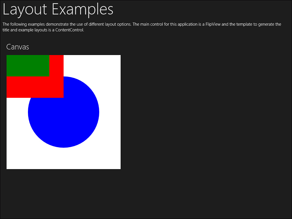
Figure 3.4. The Canvas layout
Grid
The Grid is by far the most common—and the most powerful—layout control. It is also the default layout control in the Visual Studio templates. The Grid is often compared to an HTML table because it allows specification of rows and columns. The layout system in XAML is very flexible. You can specify the size of cells based on pixels, based on automatically sizing to the cell contents, based on points, or based on a ratio relative to other cells. You may also nest controls inside of other controls. A common layout practice is to define an automatic or fixed height or width for the navigation or ribbon bar and then allow the remaining cells to expand to fit the available width.
One important feature of the Grid is that it participates well in fluid layouts. It is capable of stretching to fill the available space within the parent container as well as accommodating the varying size requirements of its contents. There are three ways to specify the GridLength property that determines the width of a column or the height of a row:
• Using points
• Using Auto to determine the size based on the dimensions of the child elements contained within the cell
• Using star notation, which represents a fraction of the remaining available space
The star notation is probably the trickiest to understand. The star modifier simply indicates the remaining space. The star modifier by itself represents one unit of the remaining available space. When you specify a different value, the proportion will change by that value. Table 3.3 illustrates how the star values are computed given a grid that is exactly 400 pixels wide.
Table 3.3. Grid Sizes Using the Star Notation for a 400-Pixel-Wide Grid
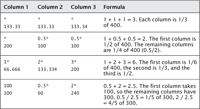
The way the grid handles arranging and measuring is important because it can impact how you design custom controls. Listing 3.4 shows a sample Grid layout.
Listing 3.4. XAML for the Grid Layout
<Grid Background="White" Width="400" Height="400">
<Grid.RowDefinitions>
<RowDefinition Height="1*"/>
<RowDefinition Height="2*"/>
</Grid.RowDefinitions>
<Grid.ColumnDefinitions>
<ColumnDefinition Width="1*"/>
<ColumnDefinition Width="2*"/>
</Grid.ColumnDefinitions>
<Rectangle Fill="Red" Width="250" Height="125"/>
<Rectangle Fill="Green" Width="150" Height="75"
Grid.Row="1"/>
<Ellipse Fill="Blue" Width="250" Height="250"
Grid.Row="1" Grid.Column="2"/>
</Grid>
This will result in the layout shown in Figure 3.5.
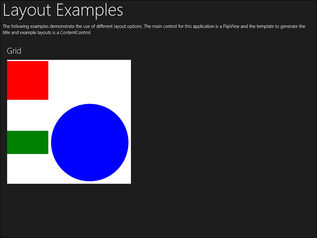
Figure 3.5. The Grid layout
StackPanel
The StackPanel is a special panel that stacks children either horizontally or vertically, depending on its orientation. It is a good choice when you don’t have the requirement to align columns or rows or have a dynamic list of items that you want to add without having to compute rows and columns beforehand. Based on the orientation, the StackPanel will automatically compute the height or width of the element and place it either to the right or bottom of the previous control.
The caveat to using the StackPanel is that it always provides infinite space in the orientation direction for its children. To view all items that are placed within a StackPanel, you will need to use a ScrollViewer to scroll the virtual pane. If you require a control to size based on available space, you’ll need to use a WrapGrid that will be described later. The stack panel is best suited to smaller lists of data that you know can size and fit within the available space.
Example code for the StackPanel:
<StackPanel Background="White" Width="400" Height="400">
<Rectangle Fill="Red" Width="250" Height="125"/>
<Rectangle Fill="Green" Width="150" Height="75"/>
<Ellipse Fill="Blue" Width="250" Height="250"/>
</StackPanel>
This will result in the layout shown in Figure 3.6.
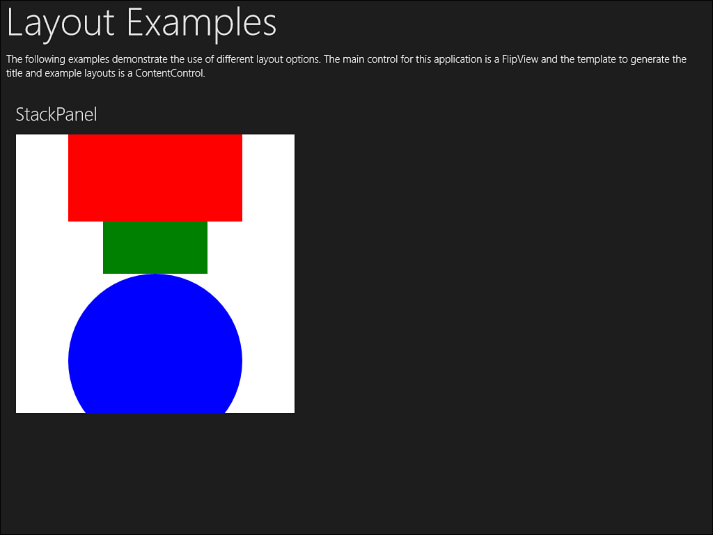
Figure 3.6. The StackPanel layout
VirtualizingPanel and VirtualizingStackPanel
A specialized panel, referred to as a virtualizing panel, helps you deal with large amounts of data. The ListBox control uses the virtualizing stack panel for the default container to lay out content. This can be overridden, but there is a good reason for using it.
The ordinary stack panel will take on an infinite number of items because it provides an infinite length for the orientation. If you provide 5,000 items, the stack panel will generate 5,000 items even if the display will only fit 10 of them. This can obviously lead to tremendous overhead when dealing with large datasets.
The virtualizing stack panel, on the other hand, will compute the required size for only the subset of data that is available to render on the display. If only ten items can fit, the virtualizing stack panel will only instantiate ten controls. When the user scrolls through the list, it will keep the same fixed number of controls but swap the content of the data. You will learn more about how data templates work in the next chapter.
The drawback to using a virtualizing stack panel is that the scrolling is not smooth. In the example for the layout engine, two list boxes are rendered, and one is overridden to use the base stack panel. You’ll find that the base stack panel allows for smooth scrolling—you can slide the thumb a few pixels and reveal only part of the control that is off the top or bottom of the scroll window. In the virtualized stack panel, you can only scroll one item at a time—there is not a partial scroll because the entire item is swapped into or out of view. This is the tradeoff between handling large amounts of data without degrading performance and providing a smooth UI. You can also build a custom control that provides the benefits of both, which is what many third-party control vendors have done and provided as part of their control suite.
WrapGrid
This control is a special type of grid that automatically handles rows and columns based on the data passed to it. Unlike a Grid control that requires you to specify a specific row or column, the WrapGrid does this for you. It will position the child elements sequentially from left to right or top to bottom based on an orientation and then wrap to the next row or column.
This is a powerful control you’ll see demonstrated in the Chapter3Panels application. It allows the data to flow and fill the available screen size by taking up as many rows and columns are available. The user can still swipe to view more items as needed. This keeps you from having to compute how much available space there is as the grid will resize based on the current resolution.
The WrapGrid is always defined as part of a template for a list control, as shown in Listing 3.5.
Listing 3.5. XAML for the WrapGrid Layout
<ItemsControl>
<ItemsControl.ItemsPanel>
<ItemsPanelTemplate>
<WrapGrid
ItemHeight="200"
ItemWidth="200"
MaximumRowsOrColumns="2"
Width="400"
Height="400"
Background="White"/>
</ItemsPanelTemplate>
</ItemsControl.ItemsPanel>
<ItemsControl.Items>
<Rectangle Fill="Red" Width="250" Height="125"/>
<Rectangle Fill="Green" Width="150" Height="75"/>
<Ellipse Fill="Blue" Width="250" Height="250"/>
</ItemsControl.Items>
</ItemsControl>
This will result in the layout shown in Figure 3.7.
Figure 3.7. The WrapGrid layout
VariableSizedWrapGrid
The Windows 8 Start Menu is a great example of what the VariableSized WrapGrid can do. You’ll notice that some tiles are longer than others, so elements in the grid take up different amounts of space. This is common when you want to display different types of elements in the grid, and some may have different orientations or dimensions.
There are two ways you can specify how many cells an item takes up in this grid. The first is to use the VariableSizedWrapGrid.ColumnSpan and the VariableSizedWrapGrid.RowSpan attached properties on a child element. This will instruct the host grid to span the required cells for that item.
If you are binding to a list of items, you will need to subclass the host object (typically a GridView) and override the PrepareContainerForItemsOverride method. You will learn more about this technique later in this chapter when you walk through the Panels example.
Listing 3.6 shows an example layout.
Listing 3.6. XAML for the VariableSizedWrapGrid Layout
<ItemsControl>
<ItemsControl.ItemsPanel>
<ItemsPanelTemplate>
<VariableSizedWrapGrid
MaximumRowsOrColumns="2"
ItemWidth="200"
ItemHeight="200"
Width="400"
Height="400"
Background="White"/>
</ItemsPanelTemplate>
</ItemsControl.ItemsPanel>
<ItemsControl.Items>
<Rectangle Fill="Red" Width="250" Height="125"
VariableSizedWrapGrid.ColumnSpan="2"/>
<Rectangle Fill="Green" Width="150" Height="75"/>
<Ellipse Fill="Blue" Width="250" Height="250"/>
</ItemsControl.Items>
</ItemsControl>
You can see the result of this layout in Figure 3.8. Note the variable size and spans allow the initial rectangle to display in its entirety. The circle is only cut off because the surface size is limited to 400 pixels by 400 pixels in this example.
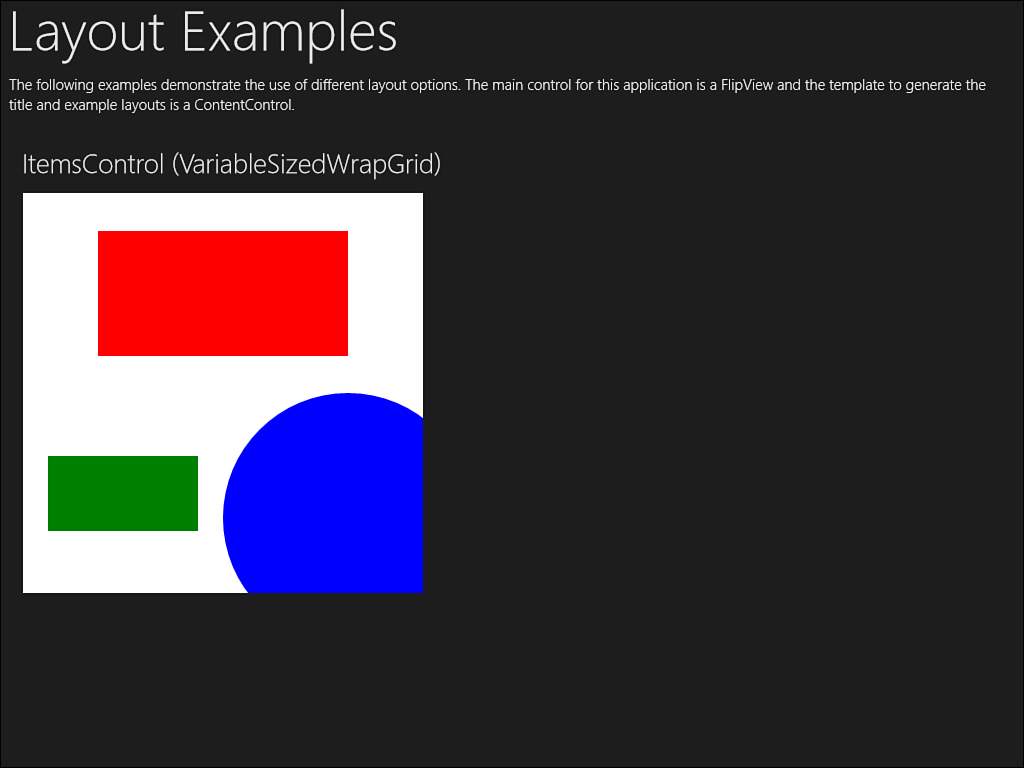
Figure 3.8. The VariableSizedWrapGrid layout
ContentControl
The ContentControl is the most basic container. It is simply a control with a single child element. It does not, by itself, specify any form of layout. The ContentControl is often used to mark a spot where a control (or controls) may render later or for controls that can have one content item to inherit from. It’s important to note that the default behavior of the ContentControl is to provide a best fit for the child control.
To see this behavior, you can create a grid with two evenly sized columns. Provide a default style for rectangles that will stretch to fill the space and are colored green with a blue stroke, as shown in Listing 3.7.
Listing 3.7. The Definition for a Grid to Hold Instances of the ContentControl
<Grid.Resources>
<Style TargetType="Rectangle">
<Setter Property="Fill" Value="Green"/>
<Setter Property="HorizontalAlignment" Value="Stretch"/>
<Setter Property="VerticalAlignment" Value="Stretch"/>
<Setter Property="Stroke" Value="Blue"/>
<Setter Property="StrokeThickness" Value="3"/>
<Setter Property="Margin" Value="2"/>
</Style>
</Grid.Resources>
Now add two ContentControls. Have both controls stretch to fill the available space. On the second control, add the special attached properties for HorizontalContentAlignment and VerticalContentAlignment. Set them both to "Stretch". The full code is shown in Listing 3.8.
Listing 3.8. The Instances of the ContentControl for the Grid
<ContentControl HorizontalAlignment="Stretch"
VerticalAlignment="Stretch">
<ContentControl.Content>
<Rectangle/>
</ContentControl.Content>
</ContentControl>
<ContentControl Grid.Column="1"
HorizontalAlignment="Stretch"
VerticalAlignment="Stretch"
HorizontalContentAlignment="Stretch"
VerticalContentAlignment="Stretch">
<ContentControl.Content>
<Rectangle/>
</ContentControl.Content>
</ContentControl>
You will notice that only the rightmost control actually renders. This is due to the behavior of the ContentControl. Even though the container has stretched to fill the available space, it does not provide that space to the child. Unless the child has a fixed height and width, the child will not be given any size to expand into, so Stretch ends up sizing the control to 0. When a HorizontalContentAlignment and/or VerticalContentAlignment is specified, the child can position itself relative to the parent container, and if the specification is Stretch, it will be given the entire space to expand into.
ItemsControl
The ItemsControl is a special container that allows for a collection of children. It is most often used with controls that require lists of data, such as list boxes and combo boxes. In addition to a panel that determines how to arrange the content, the items control provides an ItemsSource property. This property can be assigned any enumerable list (one that supports IEnumerable) that is used to generate the content for the control.
ScrollViewer
The ScrollViewer wraps a scrollable list of other UI elements. The ScrollViewer contains an extent that is a virtual surface as large as is needed to render all of the content. It contains only a single element that in turn can be anything from a control to a panel that has its own children. If the child item is a list that contains 1,000 items and each are 20 units high, the extent of the ScrollViewer will be 20,000 units high. The “view port” is the visible portion of the ScrollViewer and represents the subset of the full display that is scrolled into view. ScrollViewers can scroll horizontally, vertically, or both.
A major advantage of using the ScrollViewer control is the built-in support for touch and zoom. Touch is supported automatically by the control. In cases where you may be able to scroll in more than one direction, the control can implement the concept of “rails” or zones where the scroll is locked into a specific direction. This prevents the screen from wobbling due to slight variations in direction introduced by the user’s finger as they scroll. Pinch and zoom is also supported within the viewable area, and all of these settings are configurable through properties on the control.
Here is an example of the XAML used to define a ScrollViewer:
<ScrollViewer Width="400" Height="400" Background="White">
<StackPanel Background="White" Width="400" Height="500">
<Rectangle Fill="Red" Width="250" Height="125"/>
<Rectangle Fill="Green" Width="150" Height="75"/>
<Ellipse Fill="Blue" Width="250" Height="250"/>
</StackPanel>
</ScrollViewer>
The resulting scrollable layout is shown in Figure 3.9.
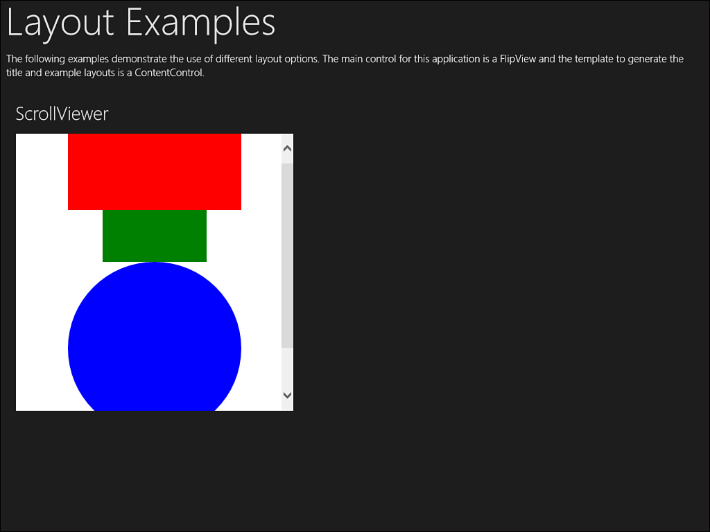
Figure 3.9. The scrollbar shown for a StackPanel inside a ScrollViewer
ViewBox
The ViewBox is a unique container. The sole purpose of the ViewBox is to resize content. You can create content that is a virtual size and then shape it to fit the visible screen. The ViewBox allows you to determine the method it uses to stretch the content to fill the available space. The different modes are as follows:
• None—The content is not resized and is simply clipped to fill the view box.
• Fill—The content is distorted to fill the space, and the aspect ratio is changed as needed.
• Uniform—The content is sized to fill the space as best as possible without changing the aspect ratio (“banding” may occur with additional white space to the top and bottom or sides of the content).
• UniformToFill—The content is sized to fill the maximum space possible while preserving the aspect ratio (the content will be clipped if the aspect ratios don’t match).
Listing 3.9 shows the full XAML for a grid that demonstrates the various options to stretch. Although many other containers and controls are available, these are the key ones to understand because they are the base classes and templates that the other controls derive from or use.
Listing 3.9. A Grid Set Up to Demonstrate the ViewBox Control
<Grid HorizontalAlignment="Right" VerticalAlignment="Top"
Margin="10" Width="400">
<Grid.Resources>
<Style TargetType="TextBlock">
<Setter Property="Text" Value="Viewbox"/>
<Setter Property="FontSize" Value="72"/>
<Setter Property="FontWeight" Value="Bold"/>
</Style>
<Style TargetType="Viewbox">
<Setter Property="Height" Value="50"/>
<Setter Property="Margin" Value="5"/>
</Style>
</Grid.Resources>
<Grid.ColumnDefinitions>
<ColumnDefinition Width="100"/>
<ColumnDefinition Width="100"/>
<ColumnDefinition Width="100"/>
<ColumnDefinition Width="100"/>
</Grid.ColumnDefinitions>
<Viewbox Stretch="None">
<TextBlock/>
</Viewbox>
<Viewbox Stretch="Fill" Grid.Column="1">
<TextBlock/>
</Viewbox>
<Viewbox Stretch="Uniform" Grid.Column="2">
<TextBlock/>
</Viewbox>
<Viewbox Stretch="UniformToFill" Grid.Column="3">
<TextBlock/>
</Viewbox>
</Grid>
When you finish the grid, you will see consistent results in both the designer and the application when you run it. The result looks like what’s shown in Figure 3.10.

Figure 3.10. The various stretch formats available
You can see the example for the Viewbox yourself by flipping to the last page of the Layout example. You can also open the ViewboxExample.xaml file in the designer in the Panels solution. When you run the solution for the Panels application, you will see a set of options for various layouts that manage lists of objects. The first example is the GridView control.
GridView
The GridView control is a powerful control that allows you to display a list of data in a format that is easy for the user to navigate. An important feature of the control is that it is able to handle grouped data. This means you can categorize long lists and provide subheaders to logically organize the data.
In the Panels project, a simple class is defined that describes a type of shape. The class includes definitions for red, green, and blue components to enable different colors. A second class called SimpleItemList provides a collection of SimpleItem instances. The ItemDisplay.xaml file defines a user control to represent the data. Think of a user control as a reusable collection of UI elements. In this case, it enables you to define the look and feel for an item once and then reuse that look and feel in other areas of the application.
The user control takes advantage of a ContentControl to render the actual shape represented by the data item. The container uses a Converter to transform the SimpleItem from the current DataContext into an actual filled shape. Instead of taking a single parameter, the converter takes the entire SimpleItem class. First, it defines a solid brush based on the color values:
var color = Color.FromArgb(0xff, (byte)item.Red,
(byte)item.Green, (byte)item.Blue);
var brush = new SolidColorBrush(color);
Next, it renders a shape based on the type of the item. For example, a circle is an ellipse with equal Height and Width properties:
case ItemType.Circle:
var circle = new Ellipse();
circle.Width = 200;
circle.Height = 200;
circle.Fill = brush;
retVal = circle;
break;
On the main page, a special element called a CollectionViewSource is declared. This is a simple proxy to collections that makes it easy to provide support for grouping and selection. The first collection supports grouping and is declared like this:
<CollectionViewSource x:Name="CVSGrouped"
IsSourceGrouped="True"/>
Setting up the collection is simple. The source is assigned to a query that groups the items by the shape they represent:
CVSGrouped.Source = from item in list
group item by item.Type into g
orderby g.Key
select g;
The query is formatted using Language Integrated Query or LINQ. This is a special feature that adds a standard method for querying data regardless of the data type—in this case, a simple list. If you are not familiar with LINQ, I recommend learning more. You can start with the book Essential LINQ available at http://www.informit.com/store/product.aspx?isbn=0321564162.
The GridView control is bound to the source list. The control itself has several parts that are completely customizable. For example, you can specify how to show a heading for each group:
<GroupStyle.HeaderTemplate>
<DataTemplate>
<TextBlock Text="{Binding Key}"/>
</DataTemplate>
</GroupStyle.HeaderTemplate>
Templates are reusable parts of XAML. A DataTemplate is a special template that provides a look and feel based on an underlying data source. In this example, the header is defined by a DataTemplate that contains a simple text element bound to the key for the group. From the query you saw earlier, that key is really the type of the shape so the heading will display a category like “Circle” or “Rectangle.”
Another template defines how the individual items in the group are arranged:
<GroupStyle.Panel>
<ItemsPanelTemplate>
<VariableSizedWrapGrid Orientation="Vertical"/>
</ItemsPanelTemplate>
</GroupStyle.Panel>
</GroupStyle>
You learned about the VariableSizedWrapGrid control earlier. You may recall that there is a special way to determine when an element needs to take up more space. In this example, rectangles and ellipses will span two columns, and circles and squares only span one. A new class called ShapeView is derived from the base GridView control:
public class ShapeView : GridView
Next, the PrepareContainerForItemOverride method is overridden. If the data item is a SimpleItem instance and the type is either Ellipse or Rectangle, the attached property for the ColumnSpan is set to 2:
if (itemdetail.Type.Equals(ItemType.Ellipse) ||
itemdetail.Type.Equals(ItemType.Rectangle))
{
element.SetValue(VariableSizedWrapGrid.ColumnSpanProperty, 2.0);
}
This defines how items are listed in a group, but there are also templates to define how groups are organized relative to each other. For this example, the groups are stacked horizontally in a VirtualizingStackPanel:
<GridView.ItemsPanel>
<ItemsPanelTemplate>
<VirtualizingStackPanel Orientation="Horizontal"/>
</ItemsPanelTemplate>
</GridView.ItemsPanel>
Finally, the individual data items are defined using a DataTemplate that simply reuses the ItemDisplay user control:
<GridView.ItemTemplate>
<DataTemplate>
<local:ItemDisplay/>
</DataTemplate>
</GridView.ItemTemplate>
The result is the layout you see in Figure 3.11. Note the elements are stacked in multiple rows and columns and that the ellipse group has wider space than the circles do. You can see the smaller group headings across the top and the default selection capabilities that are built into the GridView control.
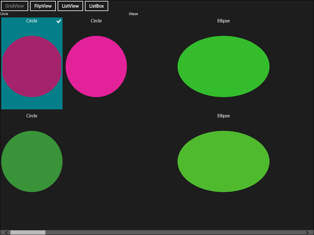
Figure 3.11. The GridView layout
ListView
The ListView control is similar to the GridView control. The main difference is that the default orientation is vertical instead of horizontal. It is designed for more narrow views, such as when the application is snapped.
You’ll learn about some more advanced layout features in Chapter 4, Windows 8 Applications. One example feature is the ability to switch between a full screen to a full window or a snap window. The snap window takes up a narrow strip on the display. It is a common practice to handle this special view by switching from a GridView implementation to a ListView implementation. You may also want to consider this type of transformation when the orientation of the display changes from portrait to landscape. The ability to adapt or tailor the application to the target device orientation and resolution is a fundamental trait of Windows 8 applications.
Figure 3.12 shows the same shapes in the ListView configuration.
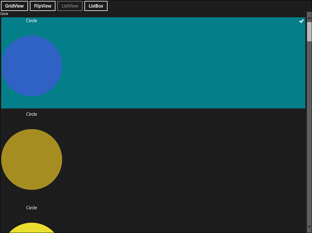
Figure 3.12. The list layout
FlipView
The FlipView is a unique new control for iterating through elements in list. It will display one item at a time and allow you to swipe left or right to navigate the list. It comes with a built-in animation that will automatically slide the current item off the screen while sliding the new item into the current display. It is useful for close-up navigation of individual items or for flipping through items rapidly to see detail.
ListBox
The ListBox control is included to provide a comparison with the newer controls. It is capable of listing items but lacks the more advanced features of the ListView control. It does not provide the enhanced selection capabilities and does not support grouped data. When you migrate legacy programs to the Windows 8 platform, you’ll likely want to replace any ListBox instances with the more feature-rich ListView control.
Common Controls
When you understand the layout capabilities of XAML, you can begin to build your UI using a variety of built-in controls. All of the controls that are supplied for Windows 8 exist in the Windows.UI.Xaml.Controls namespace. Although you can easily insert the element tags for these controls in your XAML like any other object, it is important to note that the majority of controls are native WinRT objects with XAML projections. This ensures high performance while still providing the flexibility of the XAML engine.
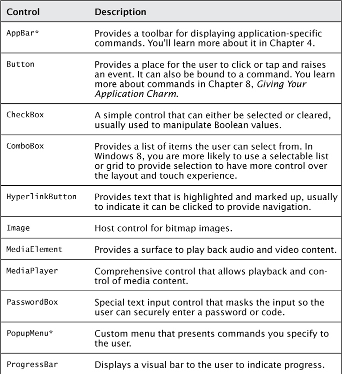
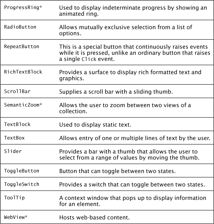
Table 3.4 provides an alphabetical list of common controls with a brief description. Many of these controls will be explored in greater detail in other chapters of this book.
Table 3.4. Common Controls (*Indicates New Controls in the Windows Runtime)
These controls are all available to drop onto a XAML surface and define your UI. It is also possible to create custom controls or to group existing controls together and reuse them using user controls and templates. Although this section provided a brief overview of controls, you will learn about specific controls in far greater detail in later chapters of this book.
Summary
In this chapter, you learned about XAML, the unique markup language used to declare the UI for Windows 8 applications. You explored dependency properties and attached properties and discovered how they extend the core CLR properties to enhance XAML capabilities. You then examined how data-binding provides a way to separate the UI and presentation logic from the underlying data of your application.
Storyboards provide a way to animate elements on the screen. Styles and resources provide central repositories for look and feel information or “themes” for the application. Finally, layout controls provide different ways you can organize elements and lists and populate them with the common controls supplied by the Windows Runtime.
In the next chapter, you will learn about the unique characteristics of Windows 8 applications. You’ll apply your knowledge of layouts and controls to build an application that responds to the orientation and screen resolution of the host device with help from a special class called the Visual State Manager. You’ll explore how to handle user input in Windows 8 applications, wire in an application bar, provide context menus, and build a special “About page.” Finally, you’ll build reusable WinRT components that serve as building blocks for larger applications.