
Hour 13. Graphical User Interfaces
What You’ll Learn in This Hour:
• Unity GUI basics
• How to use the different GUI controls
• How to customize a GUI
A Graphical User Interface (GUI) is a special set of components responsible for sending information to, and reading information from, the user. In this hour you will learn all about using Unity’s built in GUI system. You will start by examining the GUI basics. From there, you with get to try out the various GUI controls. You will finish by learning how to customize the look of the GUI using both styles and skins.
GUI Basics
As mentioned above, graphical user interfaces (commonly referred to as GUIs) are a special layer that sits between the player and the actual game. The role of the GUI is to display important information to the user and sometimes read data back from the user. In Unity, the GUI consists of several controls that are created in code. These controls are things like labels, buttons, textboxes, and sliders. The controls will be covered in greater detail later.
Tip: GUI Design
As a general rule, you will want to design your GUI ahead of time. A fair bit of thought needs to go into what data you display on the screen, where it will be displayed, and how. Too much information will cause the screen to feel cluttered. Too little information will leave the players confused or unsure. Always look for ways to condense information or make information more meaningful. Your players will thank you.
Caution: Creating the GUI
Since the GUI is created through code, it can be added to any script and any object. This can make for an organizational issue if you aren’t careful. Placing bits of the GUI code in multiple scripts can make finding the parts that you want difficult. Furthermore, bugs become harder to track down and fix. Placed GUI parts on multiple objects also makes it difficult to define what object is responsible for the GUI. A good way to handle this is to put all of your GUI code together is a specifically designated object. Putting all of your GUI stuff in the same spot makes for easier game development.
To add a GUI to your project, you will need to add a special function to a script in your scene. It doesn’t matter what script you put it in. As long as the script is active and on a game object in a running scene, you will see the GUI. The method that creates the GUI is OnGUI() and it looks like this:
void OnGUI()
{
//GUI code goes here
}
As you can see, the OnGUI() method takes no parameters and returns no data. The method gets called every frame, just like Update(), and draws your GUI components to the screen. As you will see later this hour, the GUI controls consist of simple lines of code. The code for those controls goes inside the OnGUI() method.
Let’s take a moment to draw a basic GUI controls to the screen. In this exercise you will be writing a message to the screen with a label. Don’t get too wrapped up in the label code as that will be covered in greater detail later. Instead, just make sure you can get a GUI to appear on your screen so you are ready for the next section.
1. Create a new project or scene. Create a new script called “BasicGUIScript” and attach it to the main camera.
2. Add the follow code outside of any method, but inside the class (see the book assets for Hour 13 if you need guidance):
void OnGUI()
{
GUI.Label(new Rect(0, 0, 80, 20), "Hello World");
}
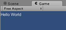
3. Run the scene. Notice how the words “Hello World” are printed on the screen (see Figure 13.1).
Figure 13.1. “Hello World” printed to the screen.
GUI Controls
In this section you will get a chance to work with the more common built in Unity GUI controls. Most of the controls are created and work in very similar ways. Before getting into the specific controls though, you will need to become familiar with the “rect” variable type. Rect is short for rectangle, and it is how all of the components know their position on the screen. As mentioned previously in this book, GUI elements work only with 2D coordinates. Therefore, the exact position and size of any GUI element can be specified with a rectangle. You will see many times in this hour the following code:
new Rect(<left>, <top>, <width>, <height>)
The above code creates a new rect variable that contains the value for the x axis position of the left side, the y axis position of the top side, and the width and height. Therefore, if you wanted to specify a rectangle that started in the upper left corner and was 100 units wide by 50 units tall, you could say:
new Rect(0, 0, 100, 50)
Aside from a rect containing a position, each control will require some additional information that will be covered separately.
The last thing you will need to know before working with each component is how the screen coordinates. Like mentioned previously, the screen is only two dimensions. The upper left corner is the origin (0, 0) and the lower right corner is the maximum screen size. Since Unity can work with many different screen sizes at the same time, it is hard to know exactly what the maximum screen size is. Therefore, you can use two built in variables, Screen.width and Screen.height to know what the maximum size is on any screen. For example, the code to create a rect with its upper left corner in the exact center of the screen looks like:
new Rect(Screen.width / 2, Screen.height / 2, 100, 50)
Tip: Centering a Control
Often you will want a control to be in the exact center of the screen. You may notice that creating a rect at the middle of the screen actually puts your rect a little lower and to the right of the middle. This is because the upper left corner of the rect is in the middle and the rest of it extends past. To place the control in the actual middle requires a little more math. Basically, you need to place the rect at the middle MINUS half of its width and height. This way, half is to the top left of the middle and half is to the lower right. Therefore, to place a rect that is 100 wide and 50 tall in the middle of the screen, you would write:
new Rect(Screen,width / 2 – 50, Screen.height / 2 – 25, 100, 50)
This may seem confusing at first, but play around with the numbers a bit and it will make sense in no time.
Label
The label control is the most basic control. Its job is only to display data to the string. The code to create a label looks like:
GUI.Label(new Rect(<x>, <y>, <w>, <h>), <Some String>);
Therefore, to create a label in the top left corner that says “Hello World”, you would write:
GUI.Label(new Rect(0, 0, 80, 20), "Hello World");
You can see this in action in the previous exercise.
Box
The box control is very similar to a label. The only difference is that a box also has a containing dark box around the label. The box is useful as a background for the various other controls. The syntax to create a box looks like:
GUI.Box(new Rect(<x>, <y>, <w>, <h>), <Some String>);
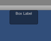
Thus, if you wanted a box at the middle-top of the screen that said “Box Label” you would write:
GUI.Box(new Rect(Screen.width / 2 - 50, 0, 100, 50), "Box Label");
If you wanted an empty box at the same position with no label, you could also write:
GUI.Box(new Rect(Screen.width / 2 - 50, 0, 100, 50), "");
Figure 13.2 illustrates the box created with the code above.
Button
The button is a simple control that works in conjunction with a conditional statement. The button can either be false (not pressed) or true (pressed). A button control can also only be pressed once at a time. Continuing to hold the button will have no additional effect. The syntax for a button looks like this:
if(GUI.Button(new Rect(<x>, <y>, <w>, <h>), <Some String>))
{
//whatever your button does when clicked.
}
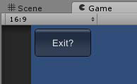
So to place a button in the upper left corner of the screen that sets a variables to false when clicked, you could type:
if(GUI.Button(new Rect(0, 0, 40, 20), "Exit ?"))
{
gameOver = true;
}
Note that if you actually try to run this it will fail because “gameOver” doesn’t exist. It was just thrown in there for example. Figure 13.3 shows the button created by the above code.
Figure 13.3. The button control
Repeat Button
The repeat button is nearly identical to the button accept that it can be pressed and held down. If you wanted to create a button that increased the value of some variable the whole time it was held down, you could type:
if(GUI.RepeatButton(new Rect(0, 0, 40, 20), "Increase"))
{
someValue += 1;
}
Again, the variable “someValue” was just added for the example’s sake.
Toggle
He toggle is what you call a “stated” button. That means that the buttons retains a state that is either clicked or unclick (think of a switch). The code for a toggle is the same as the other buttons with the exception that it takes in a Boolean parameter and returns a Boolean value. The parameter that it reads in determines if it is currently clicked. The Boolean it returns tells you whether it is clicked or not. The syntax for a toggle looks like this:
<Some Boolean> = GUI.Toggle(new Rect(<x>, <y>, <w>, <h>), <Some Boolean>, <Some String>);
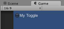
A good idea when making a toggle is to create a Boolean variable outside of the OnGUI() method to store the toggle’s state. To create a toggle then, you would say something like:
bool toggleState = false;
void OnGUI()
{
toggleState = GUI.Toggle(new Rect(5, 5, 80, 30), toggleState, "My Toggle");
}
Figure 13.4 illustrates a toggle button.
Figure 13.4. The toggle control.
Toolbar
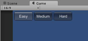
The toolbar is a row of buttons. The number of buttons that it contains is up to you. Just like a normal toolbar, only one button on the toolbar can be selected at a time and you will use an integer variable to keep track of which button is currently selected. The other new thing with toolbars is the use of an array of strings. However many items are in the array will determine how many buttons appear in the toolbar. The syntax for the toolbar control looks like this:
<Some int> = GUI.Toolbar(new Rect(<x>, <y>, <w>, <h>), <Some Int>, <Array>);
So if you wanted to make a toolbar with buttons that said “Easy”, “Medium”, and “Hard”, you could write:
int buttonInt = 0;
string[] list = {"Easy", "Medium", "Hard"};
void OnGUI()
{
buttonInt = GUI.Toolbar(new Rect(5, 5, 200, 30), buttonInt, list);
}
Let’s take a moment to try out a toolbar in Unity.
1. Create a new project or scene. Create a script called “GUIScript” and attach it to the main camera.
2. Add the toolbar code from above to the script. Be sure to place the code outside of any method but inside the class.
3. Run the scene. You should see three buttons (see Figure 13.5). Try clicking the buttons and seeing how they interact.
Figure 13.5. The toolbar control.
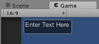
Textfield
The textfield control allows the user to type text into a scene. The control itself will appear as a box that can be selected and typed in. You have to option to put a string in the box as well. Just like with previous controls, you will need to pass in a string as well as accept a string from the textfield to keep track of the user’s interaction. The syntax for the textfield looks like:
<Some String> = GUI.TextField(new Rect(<x>, <y>, <w>, <h>), <Some String>);
So to create a textfield that said “Enter Text Here” you could write:
string textString = "Enter Text Here";
void OnGUI()
{
textString = GUI.TextField(new Rect(5, 5, 100, 30), textString);
}
Try it out! One thing to note is that no matter how tall the textfield is, it can only contains a single line of text. Figure 13.6 illustrates a textfield.
Figure 13.6. The textfield control
Textarea
The textarea is exactly like the textfield except that it can contain multiple lines. The syntax to create a textarea is:
<Some String> = GUI.TextArea(new Rect(<x>, <y>, <w>, <h>), <Some String>);
Note that since the textarea can contain multiple lines, it is possible for the user to enter so many lines that the text goes beyond the vertical space of the area.
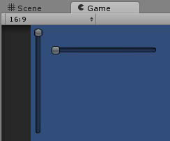
Sliders
Sliders are controls that allow the user to select between a range of values by “sliding” the control. There are two slider types in Unity: horizontal and vertical. Besides a position rect variable, sliders require three parameters. The slider reads in a float to denote the current value of the slider. The slider also reads in two additional parameters to denote the minimum and maximum slider value. The slider returns back a float containing the value of the slider. The syntax for the two sliders looks like:
<Value> = GUI.HorizontalSlider(new Rect(<x>, <y>, <w>, <h>), <Value>, <Min>, <Max>);
<Value> = GUI.HorizontalSlider(new Rect(<x>, <y>, <w>, <h>), <Value>, <Min>, <Max>);
So, to create two sliders, each with a range of 0 to 100, you could write:
float hValue = 0;
float vValue = 0;
void OnGUI()
{
vValue = GUI.VerticalSlider(new Rect(5, 5, 20, 150), vValue, 0, 100);
hValue = GUI.HorizontalSlider(new Rect(30, 30, 150, 20), hValue, 0, 100);
}
Figure 13.7 shows the two slider controls created by the above code.
Figure 13.7. The slider controls.
Customization
The GUI is a very important and prominent part of any game. While Unity’s built in GUI system is very powerful, you will often want a more custom look and feel. Thankfully, customizing the way GUI controls works is a very simple process. Controls can be changed using GUI styles and GUI skins.
GUI Styles
A GUI style is something that you add to a control that dictates how it looks. These styles in Unity are built to emulate the cascading stylesheets (CSS) used in web pages and allow you to change text color, background textures, font, and more.
Every GUI control already has a default GUI style applied to it. The name of the style is the same as the name for the control. For instance, a button has a style named “button” applied to it. This becomes interesting when you realize that you can apply one controls style to another type of control. If you were to apply the button style to a toggle, for instance, you would get a control that looked like a button, but acted like a toggle. Each of the controls you saw in the section above have the option of supplying an additional parameter. This parameter is the style parameter and it can be either a GUIStyle object or a string with the name of a style.
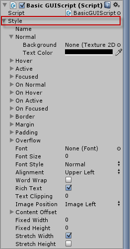
If you don’t want to reuse one of the built in control styles, you can create your own. There is a way to create build a style in code, but it is much easier to use the editor. To use the editor to build a style, you first must add a GUIStyle variable to a script. Here are the steps in detail:
1. Add a GUI script to your scene if you don’t already have one. If you do, you will want to just use that. Make sure the script is attached to an object.
2. Add a GUIStyle variable to your script. The syntax for doing this is:
public GUIStyle <variable name>;
This code goes inside the class, but outside of any methods.
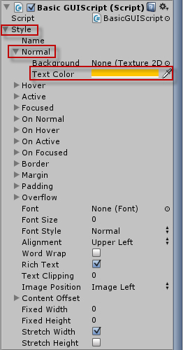
3. In Unity, select the object with the script attached to it and notice the “Style” property on the script component (see Figure 13.8). You can click through the different properties of the style and change them how you like.
Figure 13.8. The Style property.
In this exercise you will make a custom style and apply it to a button control.
1. Create a new project or scene. Add a script named “GUIScript” and attach it to the camera.
2. Add the following code to the script:
public GUIStyle style;
void OnGUI()
{
If(GUI.Button(new Rect(5, 5, 100, 30), "Hello World", style);
}
3. In Unity, expand the “Style” and “Normal” property in the inspector view and change the “Text Color” property to orange (see Figure 13.9). Run the scene and see how the label looks.
Figure 13.9. Changing the normal text color.
Caution: Style Complexity
As you experiment with styles, you may notice some of the features not having any effect. You may also notice that applying a style to a button (or any other control) makes it look just like a label. This is because styles have a lot of complexity to them. For instance, the graphic that makes a button look like a button is just that: a graphic. If you don’t supply a graphic in your style, your buttons won’t look like buttons. The same thing applies to the button being clicked. The “pressed button” image is, in fact, another image. Therefore, if you are planning on making your own styles for your controls, spend some time thinking about all of the assets you will need to make the controls look the way you want.
GUI Skins
The GUI style dictates how a control will look when it is rendered. This is nice if you only need to manage a few controls. If you need to build the “look and feel” for an entire GUI with many different controls, however, it can be difficult to maintain all of the different styles needed. That is where the GUI skin becomes useful. Basically, a GUI skin is just a collection of styles. By creating one skin, you have the ability to dictate how all of your various controls for a project will look.
To add a skin to your project simply click a folder in the project view and select “Create->GUI Skin”. Selecting the newly created skin will show you a list of styles in the inspector view. These are the styles for each of the GUI control. There are also a few extra options available such as a universal font for all controls. Linking a skin to the GUI is handled in script. You will need to create a GUI Skin variable in the script. The syntax to do that looks like:
public GUISkin <variable name>;
Once you have given the variable a value in the editor, you will simply assign it to the GUI. The syntax for the whole thing will look like:
public GUISkin skin;
void OnGUI()
{
GUI.skin = skin;
//GUI code goes here
}
Let’s take a moment to try out a GUI skin.
1. Create a new project or scene. Add a script named “GUIScript” and attach it to the camera.
2. Add the following code to the script:
public GUISkin skin;
void OnGUI()
{
GUI.skin = skin;
if(GUI.Button(new Rect(5, 5, 100, 30), "Hello World"))
{}
}
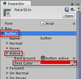
3. In Unity, create a GUI skin (right click assets folder and select “Create->GUI Skin”). Name the skin “NewSkin”. Expand the “Button” property, then the “Active” property, and change the “Text Color” property to red (see Figure 13.10).
Figure 13.10. Changing the active text color.
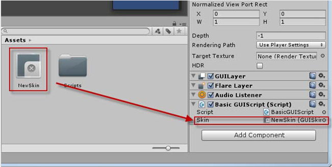
4. With the camera selected, click and drag the “NewSkin” asset onto the “Skin” property of the “GUI Script” component (see Figure 13.11). Run the scene and click the button. Notice how the text color changes to red.
Figure 13.11. Applying the GUI skin.
Note: A Word on Fonts
You can use both styles and skins to dictate fonts for your GUI controls. Font’s in Unity work just like any other asset. Simply drag the font you want into the assets folder and Unity will automatically recognize it. Then you can simply apply it to any font property. The only requirement for fonts is that they be .ttf or .dfont file types.
Summary
This hour you learned all about GUIs in Unity. You started by learning the basics of GUIs and how they are designed and created. From there you learned about positioning GUI controls. You examined many of the common GUI controls and got to try them out. You wrapped up the hour by learning about GUI styles and skins.
Q&A
Q. Does every game need a GUI?
A. Usually a game benefits from having a well thought out GUI. It is very rare for a game to have no GUI whatsoever. That being said, it is always a good idea to go light with a GUI. You definitely don’t want to overbear your players with too much clutter.
Q. Is there any performance considerations to using a GUI?
A. Yes there is. The GUI system in Unity can be a very inefficient system if used too much. This is especially true on mobile platforms. That is not to say that the GUI system should not be used. It should just be used sparingly and appropriately. Again, it all comes back to only using the GUI to display what is needed without trying to put too much on the screen.
Workshop
Take some time to work through the questions here to ensure you have a firm grasp on the material.
Quiz
1. What does GUI stand for?
2. What variable type stores an x and y position as well as a width and a height?
3. What is meant when it is said that a toggle is a “stated” button?
4. What is the difference between a GUI style and a GUI skin?
Answers
1. Graphical User Interface
2. A Rect.
3. The toggle maintains a state. That is to say that the toggle knows if it has been clicked or not.
4. A style dictates how one control looks. A skin is a collection of styles and is used for giving an entire GUI system a consistent look and feel.
Exercise
In this exercise you will get a chance to design your own GUI system. For the sake of creativity, you are allowed to style your GUI however you would like. The completed exercise example in the book assets for Hour 13 (named “Hour13_Exercise) uses only the default control styles. You will be tasked with giving it a unique style. The project itself is a simple program. See if you can figure it out for yourself. If you are having difficulty, be sure to check the example.
• Add a textfield to the scene. It should contain no text.
• Add a button to the scene. It should say “Click Me”.
• Add a label to the scene. It should contain no text.
• When the button is clicked, take the text from the textfield and put it in the label.
• Using a GUI skin, give your textfield, button, and label a unique look. They should have a consistent color scheme and font. Feel free to be very creative here. This is your chance to build something that is unique to you.