Chapter 6. Review of the Four Design Principles
There is one more general guiding principle of Design (and of Life): Don’t be a wimp.
Don’t be afraid to create your Design (or your Life) with plenty of blank space—it’s rest for the eyes (and the Soul).
Don’t be afraid to be asymmetrical, to uncenter your format—it often makes the effect stronger. It’s okay to do the unexpected.
Don’t be afraid to make words very large or very small; don’t be afraid to speak loudly or to speak in a whisper. Both can be effective in the right situation.
Don’t be afraid to make your graphics very bold or very minimal, as long as the result complements or reinforces your design or your attitude.
Let’s take the rather dull report cover you see below and apply each of the four design principles in turn.

typeface
This is typical but rather dull: centered, evenly spaced to fill the page. If you didn’t read English, you might think there are six separate topics on this page. Each line seems an element unto itself.
Proximity
If items are related to each other, group them into closer proximity. Separate items that are not directly related to each other. Vary the space between to indicate the closeness or the importance of the relationship. Besides creating a nicer look to the page, it also communicates more clearly.
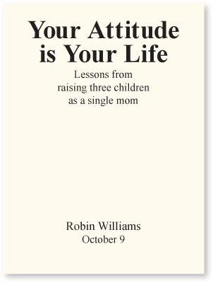
By putting the title and subtitle close to each other, we now have one well-defined unit rather than six apparently unrelated units. It is now clear that those two topics are closely related to each other.
When we move this byline and date farther away, it becomes instantly clear that although this is related information and possibly important, it is not part of the title.
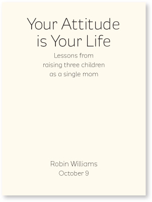
typeface
This is just an example of the huge difference a font can make in the visual impression of a piece. Everything else is exactly the same—size, spacing, etc.
Alignment
Be conscious about every element you place on the page. To keep the entire page unified, align every object with an edge of some other object. If your alignments are strong, then you can choose to break an alignment occasionally and it won’t look like a mistake.
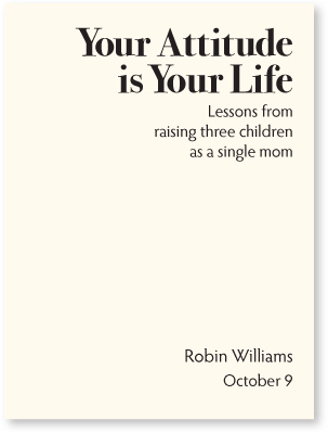
The example on the opposite page is also aligned—a centered alignment. As you can see, though, a flush left or flush right alignment (as shown here) gives a stronger edge, a stronger line for your eye to follow.
The tension created by a flush left or flush right alignment often tends to impart a more sophisticated look than does a centered alignment.
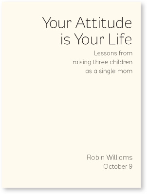
Even though the author’s name is far from the title, there is a visual connection, an invisible line, between the two elements because of the strong alignment to each other.
Repetition
Repetition is a stronger form of being consistent. Look at the elements you already repeat (bullets, typefaces, lines, colors, etc.); see if it might be appropriate to make one of these elements stronger and use it as a repetitive element. Repetition also helps strengthen the reader’s sense of recognition of the entity represented by the design.
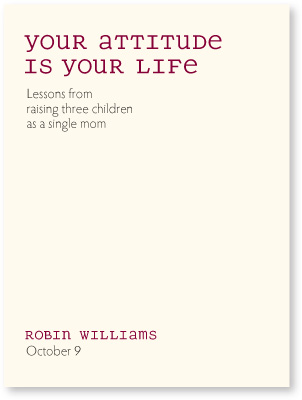
typeface
The typeface and color in the title is repeated in the author’s name, which strengthens their connection even though they are physically far apart on the page.
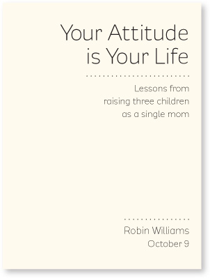
Here, the dotted rule becomes a repetitive element. Even though these are not the same length, a dotted line is distinct enough to be used in all sorts of ways throughout the document and still be seen as a repetitive element.
Contrast
Would you agree that the examples on this page attract your eye more than the examples on the opposite page? It’s the contrast, the strong black versus white, that does it. You can add contrast in many ways. The second half of this book discusses the specific topic of contrasting type, which is the basis of all great graphic design.
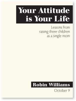
Adding contrast to this was simply a matter of adding the black boxes.
On the opposite page, the dark red font acts as a contrast as well as a repetition.

typeface
You can also add contrast through your font choice. Here the contrast is not just the heavy black face on the white paper, but also the contrast of a thick font versus its light version, as well as all caps versus lowercase.
In both of these versions, the heavy font and the caps also act as repetitions.
Little Quiz #1: Design principles
Find at least seven differences between the two pretend résumés below. Circle each difference and name the design principle it offends. State in words what the changes are. (Answers are on page 223.)
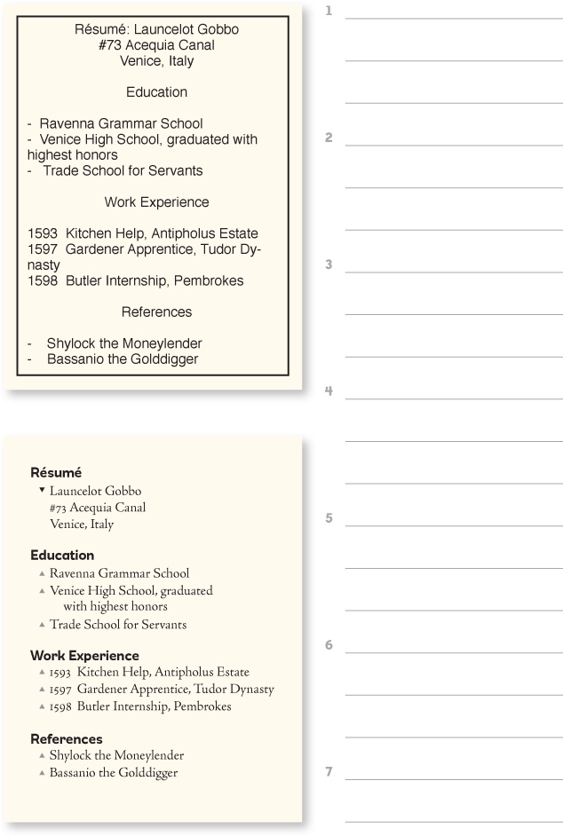
typefaces

Little Quiz #2: Redesign this ad
What are the problems with this advertisement? Name the problems so you can find the solutions.
Clues: Is there one main focal point? Why not, and how could you create one? DO YOU NEED ALL CAPS? Do you need the heavy border and the inner box? How many different typefaces are in this ad? How many different alignments? Are the logical elements grouped together into close proximity? What could you use as a repetitive element?
Take a piece of tracing paper and trace the outline of the ad. Then sketch in the individual elements, rearranging them into a more professional, clean, direct advertisement. Work your way through each principle: proximity, alignment, repetition, and contrast. Some suggestions as to where to begin are on the following pages.

Little Quiz #2 continued: Where to begin?
Knowing where to begin can sometimes seem overwhelming. So first of all, let’s clean it up.
Get rid of everything superfluous so you know what you’re working with. For instance, you don’t need “http://” in a web address. You don’t need the words “web site” or “email” because the format of the text and numbers tells you what the item is. You don’t need a box around the image. You don’t need ALL CAPS. You can perhaps edit the text.
The rounded edges of the border made this ad look wimpy. So make the border thinner and sharp. If your ad is in color, perhaps you could use a pale tint shape instead of any border at all. Choose a new typeface or two.
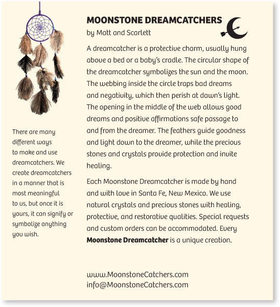
typefaces
Web and email addresses are easier to read if you cap the main words. Don’t worry—before the first slash in a web address, it doesn’t matter if you use caps or lowercase.
Now that you can see what you’re really working with, determine what should be the focal point. The focal point might be slightly different depending on where the ad is placed. That is, what is the purpose of this piece in this particular magazine (or wherever it is)? That will help you determine the hierarchy of the rest of the information. Which items should be grouped together into closer proximity?

These are just two of endless possibililties, of course.
Put into words where each of the principles has been used.
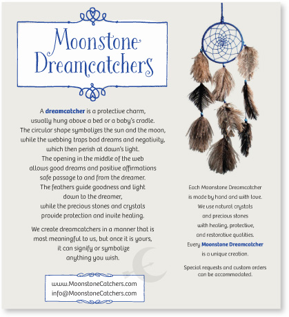
typefaces

Summary
This concludes the design portion of our presentation. You probably want more examples. Examples are all around you—what I most hope to have painlessly instilled in you is an increased visual awareness. And don’t forget to read about some great resources available to you on page 235, including thousands of templates for every project imaginable at CreativeMarket.com. Start with a template, begin the design process, and the template becomes uniquely your own.
Keep in mind that professional designers are always “stealing” other ideas; they are constantly looking around for inspiration. If you’re doing a flyer, find a flyer or template you really like and adapt the layout. Simply by using your own text and graphics, the original flyer turns into your own flyer. Find a business card you like and adapt it to your own. Find a newsletter masthead you like and adapt it to your own. It changes in the adaptation and becomes yours. We all do it.
For now, have fun. Lighten up. Don’t take all this design stuff too seriously. I guarantee that if you simply follow these Four Principles of Design, you will be creating dynamic, interesting, organized pages you will be proud of.
