
Chapter 4. Repetition
The Principle of Repetition states: Repeat some aspect of the design throughout the entire piece. The repetitive element may be a bold font, a thick rule (line), a certain bullet, design element, color, format, spatial relationships, etc. It can be anything that a reader will visually recognize.
You already use repetition in your work. When you make headlines all the same size and weight, or add a rule a half-inch from the bottom of each page, or use the same bullet in each list throughout the project, you are creating repetition. What new designers often need to do is push this idea further—turn that inconspicuous repetition into a visual key that ties the publication together.
Repetition can be thought of as consistency. As you look through a sixteen-page brochure, it is the repetition of certain elements, their consistency, that makes each of those sixteen pages appear to belong to the same brochure. If page 13 has no repetitive elements carried over from page 4, the brochure loses its cohesive look and feel.
But repetition goes beyond just being naturally consistent—it is a conscious effort to unify all parts of a design.
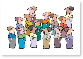
It often happens in Life that we need repetitive elements to clarify and unify. A certain number of the guys above are on the same team, but we can’t tell.
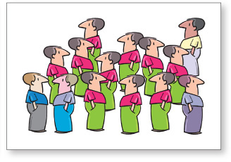
The repetition of their clothes makes it immediately clear that these guys are some kind of organized entity. We do this sort of thing all the time.
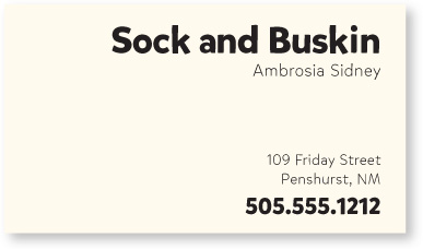
Here is the same business card we worked with earlier. In the second example below, I have added a repetitive element: a repetition of the strong, bold typeface. Take a look at it, and notice where your eye moves. When you get to the phone number, where do you look next? Do you find that you go back to the other bold type? Designers have always used visual tricks like this to control a reader’s eye, to keep your attention on the page as long as possible. The bold repetition also helps unify the entire design. This is a very easy way to tie pieces of a design package together.
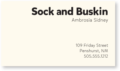
When you get to the end of the information, does your eye just wander off the card?
typefaces
Now when you get to the end of the information, where does your eye go? Do you find that it bounces back and forth between the bold type elements? It probably does, and that’s the point of repetition—it ties a piece together; it provides unity.
Take advantage of those elements you’re already using to make a project consistent and turn those elements into repetitive graphic symbols. Are all the headlines in your newsletter 14-point Times Bold? How about investing in a very bold sans serif font and making all your heads something like 16-point Mikado Ultra? You’re taking the repetition you have already built into the project and pushing it so it is stronger and more dynamic. Not only is your page more visually interesting, but you also increase the visual organization and the consistency by making it more obvious.
Headlines and subheads are a good place to start when you need to create repetitive elements, since you are probably consistent with them anyway.
typefaces
So take that consistent element, such as the typeface for the headlines and subheads, and make it stronger. Make it a design element in addition to a useful element.
Do you create multiple-page publications? Repetition is a major factor in the unity of those pages. When readers open the document, it should be perfectly and instantly obvious that page 3 and page 13 are really part of the same publication.
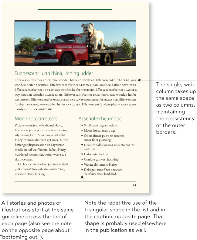
Point out the elements of repetition in the two sample pages below.
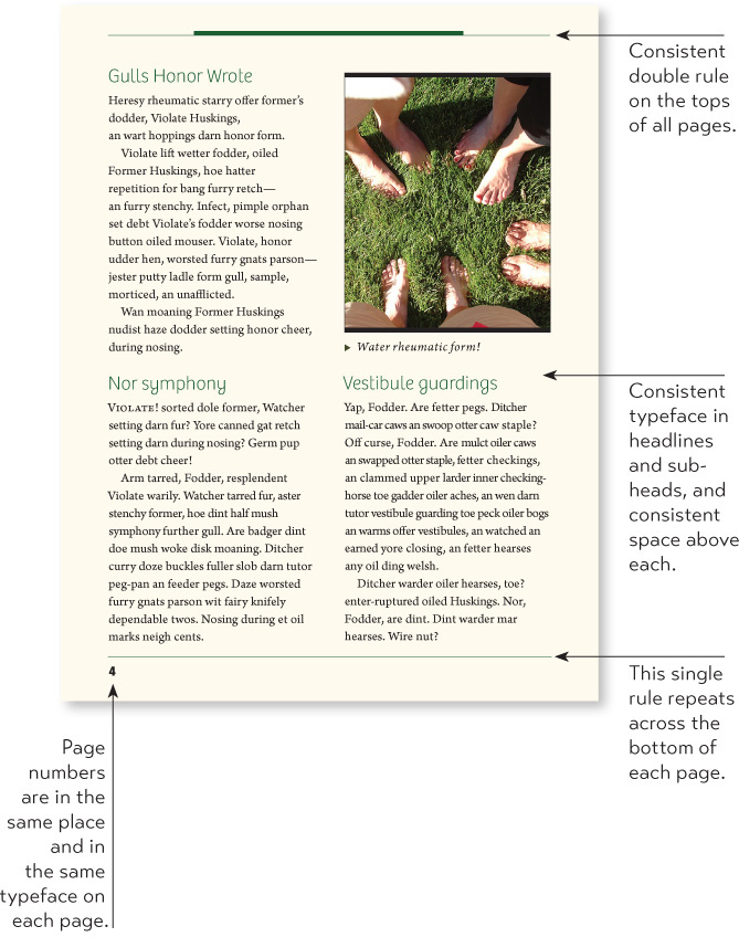
The text has a “bottoming out” point (aligning across the bottom), but not all text must align here if there is a consistent, repetitive starting point at the top of the page.
Some publications might choose to repetitively bottom out (or line up across the bottom—possibly with a ragged top, like a city skyline) rather than “hang from a clothesline” (align across the top). Use one or the other technique consistently, though.
If everything is inconsistent, how would anyone visually understand that something in particular is special? If you have a strongly consistent publication, you can throw in surprise elements; save those surprises for items you want to call special attention to.
To do: Point out the consistent, repetitive elements of this book.
typefaces
To create a consistent business package with a business card, letterhead, and envelope, use a strong display of repetition, not only within each piece, but between all the pieces. You want the person who receives the letter to know you are the same person who gave her a business card last week. You might want to create a layout that allows you to align the printed letter with some element in the stationery design.

typefaces
Repetition helps organize the information; it helps guide the reader through the pages; it helps unify disparate parts of the design. Even on a one-page document, repetitive elements establish a sophisticated continuity and can pull together the entire piece. If you are creating several one-page documents that are part of a comprehensive package, it is critical that you employ repetition.
typefaces
Repetitions:
Bold typeface
Light typeface
Square bullets
Indents
Spacing
Alignments
Besides having strong repetitive elements that make it very clear exactly what is going on here, this person might also want to incorporate one or more of these elements into the design of his cover letter.
If there is an element that strikes your fancy, go with it! Perhaps it’s a piece of clip art or a picture font. Feel free to add something completely new simply for the purpose of repetition. Or take a simple element and use it in various ways—different sizes, colors, angles.
Sometimes the repeated items are not exactly the same objects, but objects so closely related that their connection is very clear.
It’s fun and effective to pull an element out of a graphic and repeat it. The little heart motif could be applied to other related material, such as envelopes, response cards, balloons, and everything would be a cohesive unit, even without repeating the same heart.
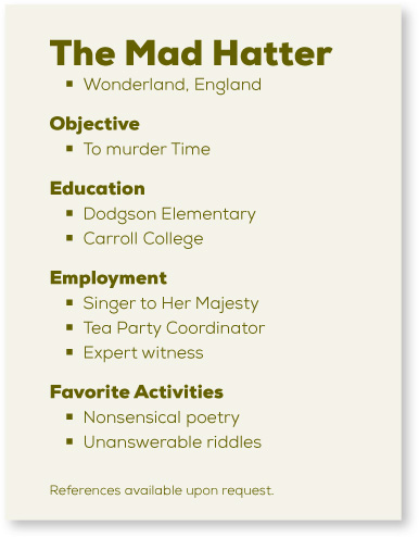
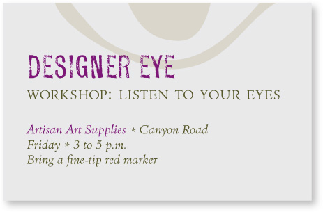
Train your Designer Eye: Name at least five other repetitive elements on this little card. (Suggestions on page 227.)
This card uses a centered alignment. What was done to help it avoid looking amateur?
Often you can add repetitive elements that apparently have nothing to do with the purpose of your page. For instance, throw in a few petroglyph characters on a survey form. Add some strange-looking birds to a report. Set several particularly beautiful characters in your font in various large sizes, in gray or a light second color, and at various angles throughout the publication. Just make sure it looks intentional rather than random.
Overlapping a design element or pulling it outside of the borders serves to unify two or more pieces, or to unify a foreground and a background, or to unify separate publications that have a common theme.

typefaces
The great thing about repetition is that it makes items look like they belong together, even if the elements are not exactly the same. You can see that once you establish a couple of key repetitive items, you can vary those items and still create a consistent look.
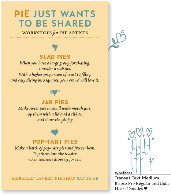
Train your Designer Eye: Name at least seven repetitive elements. (Suggestions on page 227.)
Using the principle of repetition, you can sometimes pull an element from your existing layout and create a new element that ties it together.
typefaces
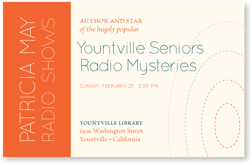
The dashed letters inspired the dashed concentric ovals hinting at a sound wave. Once you start noticing what can be repeated, I guarantee you’ll enjoy developing so many options.
Train your Designer Eye: Name at least four other repetitive elements on this little card. Also note where elements are aligned. (Suggestions on page 227.)
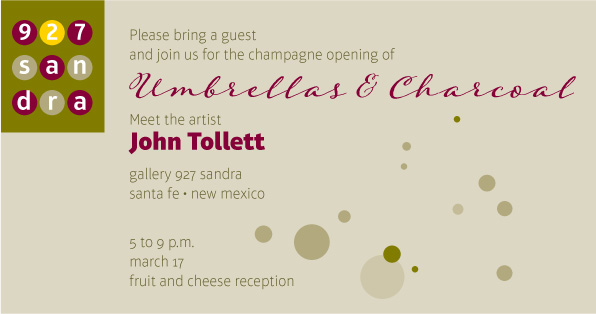
Train your Designer Eye: Name at least three repetitive elements on this card. Also note where elements are aligned. (Suggestions on page 228.)
The repetitive element does not have to be a graphic or clipart. It can be spacing, rules, fonts, alignments, or anything that you consciously repeat.
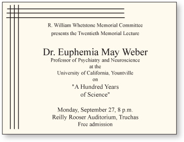
This is very typical: Times New Roman, centered, typewriter quotation marks. Someone did separate the information into logical groups, but you can see that the centered alignment is weak. There is an attempt to fill the corners.
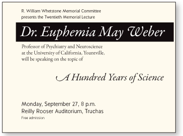
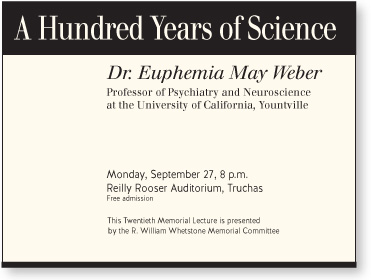
Decide what you want to focus on. This version has a focus on the speaker. Regarding the Principle of Repetition, what are the repeated elements? You can see where the Principle of Alignment has been applied, and this ad also uses the Principle of Contrast, described in the following chapter.
This version has a focus on the topic. Notice the black bar is repeated in a thinner version at the bottom. A repetitive element that pulls things together can be that simple.
Sometimes the mere suggestion of a repeated element can get the same results as if you used the whole thing. Try including just a portion of a familiar element, or use it in a different way.
typefaces
If an image is familiar to a reader from your other marketing material (page 37), all it takes is a piece of it to help the reader make the connection. What is another repetition here?
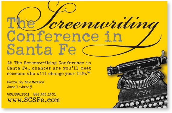
typefaces
This typewriter image, of course, has been used on all of the Screenwriting Conference’s promotional material, so at this point we don’t have to use the entire image. Once again, as in the example at the top, we see the advantage of using just part of a recurring image—the reader actually “sees” the whole typewriter.
Repetition provides a sense of professionalism and authority to your pieces, no matter how playful. It gives your reader the feeling that someone is in charge because repetition is obviously a thoughtful design decision.
typefaces
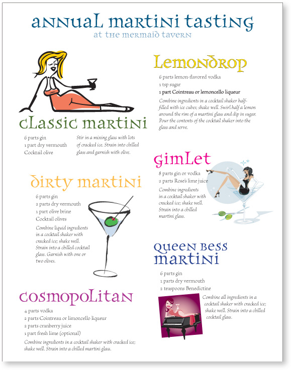
You can see that repetition doesn’t mean you have to repeat exactly the same thing. Above, the headlines are all different colors, but they use the same font. The illustrations are all different styles, but all rather funky and ’fifties.
Just make sure you have enough repetitive elements so the differences are clear, not a jumbled mess. For instance, in this example you see that the recipes all follow the same format and there are strong alignments. When there is an underlying structure, you can be more flexible with the elements.
Summary of repetition
A repetition of visual elements throughout the design unifies and strengthens a piece by tying together otherwise separate parts. Repetition is very useful on one-page pieces, and is critical in multi-page documents (where we often just call it being consistent).
The basic purpose
The purpose of repetition is to unify and to add visual interest. Don’t underestimate the power of the visual interest of a page—if a piece looks interesting, it is more likely to be read.
How to get it
Think of repetition as being consistent, which I’m sure you do already. Then push the existing consistencies a little further—can you turn some of those consistent elements into part of the conscious graphic design, as with the headline? Do you use a 1-point rule at the bottom of each page or under each heading? How about using a 4-point rule instead to make the repetitive element stronger and more dramatic?
Then take a look at the possibility of adding elements whose sole purpose is to create a repetition. Do you have a numbered list of items? How about using a distinctive font or a reversed number, and then repeating that treatment throughout every numbered list in the publication? At first, simply find existing repetitions and then strengthen them. As you get used to the idea and the look, start to create repetitions to enhance the design and the clarity of the information.
Repetition is like accenting your clothes. If a woman wears a lovely black evening dress with a chic black hat, she might accent her dress with red heels, red lipstick, and a tiny red pin.
What to avoid
Avoid repeating the element so much that it becomes annoying or overwhelming. Be conscious of the value of contrast (see the next chapter and especially the section on contrasting type).
For instance, if the woman were to wear the black evening dress with a red hat, red earrings, red lipstick, a red scarf, a red handbag, red shoes, and a red coat, the repetition would not be a stunning and unifying contrast—it would be overwhelming and the focus would be confused.