
Chapter 1. Introduction
This short chapter explains the four basic principles in general, each of which will be explained in detail in the following chapters. But first I want to tell you a little story that made me realize the importance of being able to name things, since naming these principles is the key to having power over them.
The Joshua tree epiphany
Many years ago I received a tree identification book for Christmas. I was at my parents’ home, and after all the gifts had been opened I decided I would identify the trees in the neighborhood. Before going out, I read through some of the identification clues and noticed that the first tree in the book was the Joshua tree because it only took two clues to identify it. Now, the Joshua tree is a really weird-looking tree and I looked at that picture and said to myself, “Oh, we don’t have that kind of tree in Northern California. That is a weird-looking tree. I would know if I saw that tree, and I’ve never seen one before.”
So I took my book and went outside. My parents lived in a cul-de-sac of six homes. Four of those homes had Joshua trees in the front yards. I had lived in that house for thirteen years, and I had never seen a Joshua tree. I took a walk around the block, and there must have been a sale at the nursery when everyone was landscaping their new homes—at least 80 percent of the homes had Joshua trees in the front yards. And I had never seen one before! Once I was conscious of the tree—once I could name it—I saw it everywhere. Which is exactly my point: Once you can name something, you’re conscious of it. You have power over it. You’re in control. You own it.

So now you’re going to learn the names of several design principles. And you are going to be in control of your pages.
typefaces
typefaces
Train your Designer Eye: Find at least five differences that help to make the second example communicate more clearly. (Suggestions on page 225.)
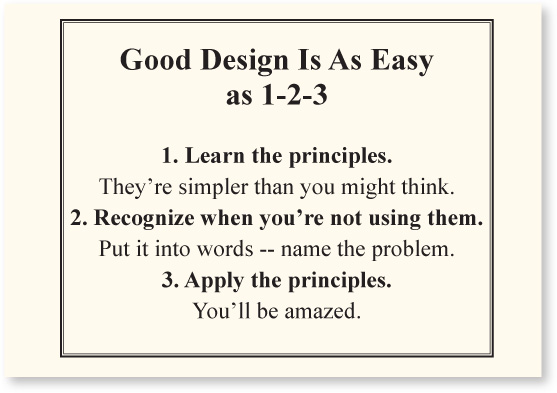
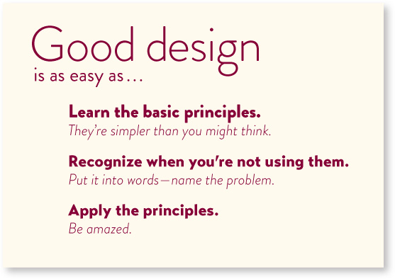
The four basic principles
The following is a brief overview of the basic principles of design that appear in every well-designed piece of work. Although I discuss each one of these principles separately, keep in mind they are really interconnected. Rarely will you apply only one principle.
Contrast
The idea behind contrast is to avoid elements on the page that are merely similar. If the elements (type, color, size, line thickness, shape, space, etc.) are not the same, then make them very different. Contrast is often the most important visual attraction on a page—it’s what makes a reader look at the page in the first place. It also clarifies the communication.
Repetition
Repeat visual elements of the design throughout the piece. You can repeat colors, shapes, textures, spatial relationships, line thicknesses, fonts, sizes, graphic concepts, etc. This develops the organization and strengthens the unity.
Alignment
Nothing should be placed on the page arbitrarily. Every element should have some visual connection with another element on the page. This creates a clean and sophisticated look.
Proximity
Items relating to each other should be grouped close together. When several items are in close proximity to each other, they become one visual unit rather than several separate units. This helps organize information, reduces clutter, and gives the reader a clear structure.
Umm . . .
When distilling these four principles from the vast maze of design theory, I thought there must be some appropriate and memorable acronym within these conceptual ideas that would help people remember them. Well, uh, there is a memorable—but rather inappropriate—acronym. Sorry.
Although you can now find this acronym in relation to design all over the web, this book is its origin.
typeface