
3. CSS Basics Bonus Online Lesson
Lesson overview
In this lesson, you will gain some valuable hands-on skills and experience writing and working with cascading style sheets to format your HTML structural elements.
Formatting objects
After the last few exercises, you may be thinking that styling text with CSS is perplexing and difficult to understand. But hold onto your hats. The next concept you’ll explore is even more complex and controversial: object formatting. Consider object formatting as specifications directed at modifying an element’s size, background, borders, margins, padding, and positioning. Since CSS can redefine any HTML element, object formatting can basically be applied to any tag, although it’s most commonly directed at HTML container elements like <div>, <header>, <article>, and <section>, among others.
By default, all elements start at the top of the browser screen and appear consecutively one after the other from left to right, top to bottom. Block elements generate their own line or paragraph breaks; inline elements appear at the point of insertion; hidden elements take up no space on the screen at all. CSS can control all these default constraints and lets you size, style, and position elements almost any way you want them.
Size is the most basic specification, and least problematic, for an HTML element. CSS can control both the width and the height of an element with varying degrees of success. All specifications can be expressed in absolute terms (pixels, inches, points, centimeters, and so on) or in relative terms (percentages, ems, or exs).
Width
As you should already be aware, all HTML block elements take up the entire width of the screen by default, but there are a variety of reasons why you’d want to set the width of an element to something less than that. For example, studies have shown that text is easier to read, and more understandable, if the length of a line of type is between 35 and 50 characters. This means that on a normal computer screen a line of type stretching across 1000 or more pixels could include easily 120 characters or more. That’s why most websites today break up their layouts and display text in two or more columns at a time.
CSS makes it a simple task to set the width of an element. In this exercise, we’ll experiment by applying different types of measurements to the various content elements on the page.
1. Open mycss_basics.html from the lesson03 folder.
2. View the page in Split view and observe the CSS code and HTML structure.
The file contains headings, paragraphs, and lists in several HTML5 semantic elements. The text is partially formatted by several CSS rules, but the structural elements display only default styling.
Fixed widths
The container elements, such as <div>, <header>, <article>, <section>, and <aside>, each currently occupy 100 percent of the width of the browser window or their parent element, by default. CSS allows you to control the width by applying absolute (fixed) or relative (flexible) measurements.
1. If necessary, open mycss_basics.html in Split view. In Code view, insert a new line after the last rule in the <style> section.
2. Type .sidebar1 { width:200px; } to create a new rule to style sidebar1.
3. Save the file and refresh the Live view display.
The sidebar1 element now occupies only 200 pixels in width; the other elements in the layout are unchanged.
By using pixels, you have set the width of this element, and its children, by an absolute, or fixed, measurement. This means sidebar1 will maintain its width regardless of changes to the browser window or screen orientation.
4. Select the Media Query Scrubber, drag it to the left and right, and observe how the different elements react.

As expected, the element sidebar1 displays at 200 pixels in width no matter what size the screen assumes. The other containers remain at full screen width. Fixed widths are still very popular all over the Internet, but in some cases, such as when designing for mobile devices, you’ll want elements to change or adapt to the screen size or user interaction. CSS provides three methods for setting widths, using relative, or flexible, measurements such as em, ex, and percentage (%).
Relative widths
Relative measurements set by percentage (%) are the easiest to define and understand. The width is set in relation to the size of the screen: 100% is the entire width of the screen, 50% is half, and so on. If the screen or browser window changes, so does the width of the element. Percentage-based designs are popular because they can adapt instantly to different displays and devices. But they are also problematic because changing the width of a page layout dramatically can also play havoc with your content and its layout.
1. If necessary, open mycss_basics.html in Split view. Add a new rule: article { width:50%; }
2. Save the file and refresh the Live view display.

 Tip
Tip
To test element widths, it may be easier to display Split view windows vertically. You can access this preference via the View menu.
The <article> element displays at 50 percent of the screen width. Widths set in percentage adapt automatically to any changes to the screen size.
3. Select the Media Query Scrubber in Live view, drag it to the left and right, and observe how the <article> element reacts.
While sidebar 1 remains at a fixed width, the article scales larger and smaller, continuing to occupy 50 percent of the width no matter what size the screen becomes.
Observe how the text wraps within the element as it changes in size. Note how it stops scaling when the frame shrinks to the size of the largest word and how the box model diagram juts out of the element below certain widths. Do you think these issues would affect the page’s readability or usability?
 Note
Note
Hyphenation is not currently supported in HTML. This functionality is under development and may be supported in the near future.
Many designers forgo the use of percentage-based settings for these reasons. Although they like that the containers scale to fit the browser window, they’d prefer that it would stop scaling before it affects the content detrimentally. This is one of the reasons for which the properties min-width and max-width were created.
4. Add the highlighted notation in the rule article { width:50%; min-width:400px; } and save the file.

The min-width property prevents the element from scaling smaller than 400 pixels. Note that the min-width specification unit is “pixels.” This is important, because when combining the width setting with min-width or max-width, you must use differing measurement units, or only one of the specifications will be applied. To see the effect of the min-width specification, you need to use the entire screen.
5. Switch to Live view and refresh the display, if necessary. Drag the Scrubber left and right. Observe how the <article> element reacts.
The <article> displays at 50 percent of the screen width as you scale it smaller. When the screen becomes narrower than 800 pixels, the <article> stops scaling and remains at a fixed width of 400 pixels. To limit scaling at the upper end, you can also add the max-width property.
6. In the rule article { width:50%; min-width:400px; max-width:700px; } insert the highlighted notation and save the file.
7. Refresh the Live view display and drag the Scrubber left and right.

The <article> displays at 50 percent of the screen only between the widths of 800 pixels to 1400 pixels, where it stops scaling at the dimensions specified.
It’s all relative, or not
Ems and exs are kind of a hybrid cross between fixed and relative systems. The em is a measurement that is more familiar to print designers. It’s based on the size of the typeface and font being used. In other words, use a large font and the em gets bigger; use a small font and the em gets smaller. It even changes based on whether the font is a condensed or expanded face.
This type of measurement is typically used to build text-based components, such as navigation menus where you want the structure to adapt to user actions that may increase or decrease the font size on a site but where you don’t want the text to reflow.
1. If necessary, open mycss_basics.html in Split view. Add the rule .sidebar2 { width:16em; } and save the page.
2. Refresh the Live view display.
The element sidebar2 displays at the width of 16 ems.
Although ems are considered a relative measure, they behave differently than widths set in percentages. Unfortunately, em measurements don’t display properly in Design view; to see the exact relationship, you’ll need to use Live view.
3. Switch to Live view, if necessary.
Scroll down to view sidebar2.

The “Browser Specific Prefixes” heading should exactly fit the width of the element without breaking to two lines or leaving any extra space.
4. Refresh the display if necessary and drag the Scrubber left and right.
The element seems to react like an element with a fixed measurement; it doesn’t change size as you make the screen bigger and smaller. That’s because the “relative” nature of ems isn’t based on screen size but on the font size.
5. Switch to Split view. Add the highlighted code to the rule body { font-family:Arial; color:gray; font-size:200%; } and refresh the display.

All the text on the page scales 200 percent. The text in sidebar1 and the <article> element has to wrap to fit within the container. On other hand, sidebar2 actually scales larger to accommodate the bigger text. Note how using ems also preserves the line endings in that element.
There’s one small caveat when you use ems: The measurement is based on the base font size of the nearest parent element, which means it can change any time the font size changes within the element’s HTML structure. And you always need to remember that the relative size of the em is influenced by inheritance.
6. Change the font-size property for body to 100% and save the file.
The text in the page returns to its previous size.
By assigning various widths to the containers, you’re setting up the basic structure for creating a multicolumn layout. The next step would be to start repositioning these containers on the page. But CSS positioning can be tricky; lots of factors can affect the display and interaction of these elements. Before you move the containers to their final positions, it may help you to understand these techniques better if we first apply some borders and background effects to make them easier to see.
Borders and backgrounds
Each element can feature four individually formatted borders (top, bottom, left, and right). These are handy for creating boxes around paragraphs, headings, or containers, but there’s no requirement to use all four borders on every element. For example, you can place them at the top or bottom (or both) of paragraphs in place of <hr /> (horizontal rule) elements, or to create custom bullet effects.
Borders
It’s easy to create different border effects using CSS.
1. If necessary, open mycss_basics.html in Split view and observe the CSS and HTML code.
You can assign borders to text or containers.
2. Add the following rule and properties to the <style> section:
article section {
border-top:solid 10px #000;
border-left:solid 2px #ccc; }
Note
Remember that you can add the CSS rules with or without the line breaks and indents.
3. Refresh the display.
A custom border appears at the top and left sides of each section in the <article> element. The border gives a visible indication of the width and height of the HTML section. At the moment, the borders sit uncomfortably close to the text, but don’t worry, we’ll address this issue later. Let’s apply borders to the other main containers now.
4. Add the following rule and properties:
article, footer, header, section { border:solid 1px #999; }
Note
By combining these tags in one selector and using CSS shorthand, this new rule saves at least 11 lines of code.
5. Refresh the display.
A 1-pixel gray border appears on the article, footer, header, and every section element on the page, including the ones already formatted in step 2.

As described earlier, it’s not unusual for an element to be formatted by two or more rules. Even though the <section> elements in the <article> were already styled with borders on the top and left, they have inherited the 1-pixel border from the second rule, for the right and bottom sides.
Tip
When an element inherits properties from another rule that are undesirable, you may need to add a new rule (or new property in an existing rule) specifically to turn off that styling.
It’s also important to point out that there is no extraneous markup within the actual content; all the effects are generated by CSS code alone. That means you can quickly adjust, turn on and off effects, and move the content easily without having to worry about graphical elements or extra code cluttering it up.
Now that you can see the outer boundaries of each container, keep a wary eye on each to see how they react to the CSS styling in the upcoming exercises.
Backgrounds
By default, all element backgrounds are transparent, but CSS lets you format them with colors, images, or both. If you use both, the image will appear above, or in front of, the color. This behavior allows you to use an image with a transparent background to create layered graphical effects. If the image fills the visible space or is set to repeat, it may obscure the color entirely.
1. Open mycss_basics.html from the lesson03 folder in Split view. Observe the CSS and HTML code.
Backgrounds can be assigned to any visible block or inline element. If you want the background to appear behind the entire webpage, assign it to the body element.
2. In the body rule, add background-color:#ccc; and refresh the display.

The background of the document window is now filled with light gray.
Background colors may make content hard to read. Studies show that white is still the best color on which to read text. Let’s fill the main text containers with a white background.
3. In the article, footer, header, section rule, add the property background-color:#fff; and refresh the display.

Each of the targeted containers now displays a white background.
Websites have been using graphical backgrounds for many years. In the beginning, images or icons were used to create wallpaper effects. Since the connection speeds of the Internet were much slower in those days, these images typically were very small. Today, large images are becoming a popular way to apply a custom look to websites everywhere. Let’s experiment with both types.
4. In the body rule, add the property background-image:url(images/street.jpg); and refresh the display.

Note
Background and background-image can both be declared at the same time. The background-image will appear above or in front of the background settings, but depending on the image, both settings may be visible at the same time.
A photograph of a street scene appears in the background of the page, the exact composition of which is determined by the width and height of your document window.
By default, background images display at 100 percent of their original size and attach at the upper-left corner of the screen. If you check the dimensions of the image, you’ll see that it’s 1900 pixels by 2500 pixels and nearly 4 MB in size. That’s big enough to fit almost any type of screen, but some aspects of a background image can’t be seen properly in Design view.
5. If necessary, activate Live view and click the button to fill the entire document window with the webpage display.
Live view renders web content for a browser-like environment.
6. Drag the Scrubber left and right and observe how the background image reacts to the changing window size.
The background image does not respond to the changing window. As the window narrows, the right side of the image is hidden and off-center. It would look better if the image scaled along with the window.
Note
Backgroundsize, like many CSS properties, can be specified in fixed or relative measurements. The specification can be expressed in one or two values. When you use two values, the first applies the width, the second the height.
7. Switch to Code view. Add the property background-size:100% auto; to the body rule and refresh the display.

Now the background image scales automatically to fit the width of the browser screen. But if you scroll down the page, you will notice that the image repeats vertically once you get to the bottom of the image. CSS allows you to control many aspects of the background image to make it look and respond better on a variety of devices. By adding another property, you can make the image stay fixed in one location.
8. Add the following properties to the body rule and switch to Live view:
background-position: center center;
background-attachment:fixed;
9. Drag the Scrubber left and right and scroll the screen down to view the page content.

The background image no longer scrolls along with the content and remains centered, regardless of how the window changes.
In the past, using such a large image on a webpage would have been avoided. But as more people access the Internet with high-speed connections, this type of large background image is becoming more popular. Although the user has to download an image that may be several megabytes, they have to do it only once, and the image will be cached on the visitor’s hard drive in most cases for those who regularly visit the site or visit multiple pages.
Yet for many designers, an image of this size will never be acceptable. They know how large images can cause undesirable delays as webpages and resources download. Instead, these designers resort to a method that is still very popular: creating a background pattern or wallpaper by using a simple, smaller graphic. Such graphics can be only a few kilobytes yet can produce beautiful, sophisticated effects.
10. Switch to Code view. Change the body rule in the following manner:
background-image:url(images/stripes.png);#acd8b6;
background-color:
This new graphic is 15 pixels by 100 pixels and only 2 KB. Even on a slow connection, this graphic will download almost instantly. However, its small size requires a few changes to the styling.
11. Delete the following properties from the body rule:

By default, background images are intended to repeat vertically and horizontally. But before you allow this to happen, make the following changes to get a better idea of what’s going to happen.
12. Add the following property to the body rule:
background-repeat:repeat-x;
13. Switch to Split view.

You can see the graphic repeating horizontally along the x-axis at the top of the page. To make the graphic repeat vertically you can make a simple change.
14. Edit the highlighted property in the body rule:
background-repeat:repeat-y;
The graphic now repeats vertically along the left edge of the screen. Background graphics repeat horizontally and vertically by default. If you delete the repeat property altogether, the wallpaper effect would be seamless.
15. Delete the  property from the
 body rule and refresh the display.

Without the repeat-y property, the background repeats vertically and horizontally by default; the graphic is now repeating across the entire page.
16. Save the file.
Combined with the right color or gradient, these types of backgrounds are both attractive and efficient in the use of resources. The choice is yours. No matter what type you choose, be sure to fully test any background treatments. In some applications, CSS background specifications are not fully supported or are supported inconsistently.
Positioning
As you have already learned, block elements generate their own line or paragraph breaks; inline elements appear at the point of insertion. CSS can break all these default constraints and let you place elements almost anywhere you want them to be.
As with other object formatting, positioning can be specified in relative terms (such as left, right, center, and so on) or by absolute coordinates measured in pixels, inches, centimeters, or other standard measurement systems. Using CSS, you can even layer one element above or below another to create amazing graphical effects. By using positioning commands carefully, you can create a variety of page layouts, including popular multicolumn designs.
1. If necessary, open mycss_basics.html in Split view. Observe the CSS and HTML code.
The file contains headings, paragraph text, and various HTML5 container elements partially formatted by CSS. The rules, created in previous exercises, set specific sizes on the main container’s sidebar1, sidebar2, and article elements so they no longer take up the entire width of the screen. In the same way—using only CSS—you can control the positioning of all these elements on the page. There are several ways to do this, but the float method is by far the most popular. The options for the float property are left, right, and none and can have a dramatic effect on the positioning of the targeted elements. If no property is actually set by CSS, the default styling is none.
2. Create the following rule:
.sidebar1, article, .sidebar2 { float:right; }
Note
The float property can also be applied individually to the existing rules for these elements. Using this method makes it easier to update the property by simply editing one value.
3. Save the file. If necessary, switch to Live view and refresh the display. Maximize the program window to the full size of the computer display.

Depending on the width of your screen, the sidebar and article elements now display horizontally, side by side from right to left in the document window. By using float:right, the elements display from right to left on the screen. Notice how sidebar1 appears on the far right, followed by article and then by sidebar2. If you change the float value, you can produce the opposite effect.
4. Change the property float:right to float:left and refresh the display.
All three elements reverse direction, now starting on the left.
As you can see, the float property takes an element out of the normal HTML flow. By setting widths smaller than the default 100 percent on the sidebars and the article, float allows these block elements to behave in a totally different manner and share the space with each other. And float is also a dynamic property; it reacts to the width of the document window.
5. Drag the Srubber left and right to change the width of the display.
As the window narrows, there’s no longer enough space to accommodate the widths of the individual elements. They are forced to move down into the open space below. When the window gets wider, the elements move up to share the space again. This type of behavior allows websites to display rows of items that adapt automatically to any type of screen, no matter how big or small. As you make the window larger and smaller you may notice that the footer element slips up into the row with the other elements.

You may be saying, “But the footer isn’t floated!” and you’d be right. This is one of the consequences of using float: The first subsequent non-floated element will share the space with any floated ones if it doesn’t have a specific width or other property that prevents it. The first non-floated block element will honor all the width, margin, and padding settings of any floated element and then occupy 100 percent of the space left over. At times you may take advantage of this behavior to create some multicolumn layouts. However, for this layout, we want the footer to stay at the bottom.
You can force an element to move, or position, itself differently by simply setting a specific width to the parent container, or to the children themselves, that will preclude them from sharing the available space. At the moment, the combined width of the three floated elements is less than the width of the whole screen, which allows the footer to sneak in if the screen is wide enough. To prevent this from happening, you need to limit the amount of space the floated elements can use.
6. Add a new rule .container { width:1050px; } and refresh the display. If necessary, switch to Live view.

The div element displays at a width of 1050 pixels.
Now there’s not enough room for the elements to float all the way across the screen, but the footer is still trying to sneak into the layout at the bottom of sidebar2. There is a CSS property specifically designed to keep this from happening.
7. Create a new rule footer { clear:both; } and refresh the display.

Note
For this current layout, the footer could suffice with clear:left. But the footer is an element that should clear all potential content elements on the page; therefore I chose to use clear:both.
The footer moves down to the bottom of the page again.
Although we fixed this situation with a single CSS property, it’s not always that easy. Unfortunately, as powerful as CSS positioning seems to be, it is the one aspect of CSS that is most prone to misinterpretation by the browsers in use today. Commands and formatting that work fine in one browser can be translated differently or totally ignored—with tragic results—in another. In fact, specifications that work fine on one page of your website can even fail on another page containing a different mix of code elements.
Height
Sidebar 1, sidebar 2, and article contain different amounts of content and display at different heights. We could set a fixed height for all three that would work on this page, but what dimension would work on the other pages of the site?
Height is not specified as frequently on the web as width is. That’s mainly because the height of an element or component is usually determined by the content contained within it, combined with any assigned margins and padding. Setting a fixed height can often result in undesirable effects, such as truncating, or clipping, text or pictures. If you must set a height, the safest way is to use the min-height property.
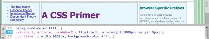
1. In the .sidebar1, article, .sidebar2 rule, add the min-height:1000px; property and refresh the display.
Sidebars 1 and 2 now display at a minimum height of 1000 pixels and will grow as needed to match the length of their content.
On a different page, setting a common element height might work, but with the amount of content in this article, a common element height isn’t really a solution to the problem at hand. The main issue is the graphical background on the page. It makes it pretty obvious that sidebars 1 and 2 are shorter than the article element.
One answer would be to ditch the page background graphic altogether and apply a background color that matches the one used in the elements. Or you could simply apply a matching background color to the <div> containing the layout itself.
2. In the rule .container add the property background-color:#fff; Save the file.
The background color for all the elements is now identical.
For all intents and purposes, the heights of sidebar 1, sidebar 2, and article are irrelevant. If not for the gray borders applied to each, you’d have no idea how tall the elements are at all. Problem solved.
Margins and padding
Margins control the space outside the boundaries, or borders, of an element; padding controls the space inside an element, between its content and its border. It doesn’t matter whether the borders are visible or not; the effective use of such spacing is vital in the overall design of your webpage.
1. If necessary, open mycss_basics.html.
Margins and padding don’t always render properly in Design view.
Note
In most cases, horizontal margins between two adjacent objects combine to increase the total spacing. On the other hand, only the larger of the two settings is honored for vertical margins between two adjacent elements.
2. If necessary, switch to the full Live view display.
Observe the page layout and styling.
The page displays a header, three columns, and a footer. The column elements are touching each other, and the text within each column is touching the edges of each container.
3. In the rule.sidebar1, article, .sidebar2 add the property margin:5px; and refresh the display.
The new property adds 5 pixels of spacing outside the borders of each targeted element. While Live view gives you a more accurate browser-like display, Design view still has a few tricks up its sleeve.
4. Switch to Design view.
Click an edge of the <article> element.

Design view highlights the element and displays a hashed pattern to provide a visual representation of the margin specifications. In HTML 4, the “align” attribute was used to align elements left, right, or center. This attribute was deprecated in HTML5, and CSS has no specific method for centering block elements. Until something better comes along, you can use margins to center content on the screen.
5. In the .container rule add the property margin: 20px auto; and refresh the display.

The element centers in the window. In this CSS shorthand notation, the auto value applies equal amounts of spacing to the left and right sides of the article.
You’ve added spacing between the elements. Now, let’s add some spacing inside the elements too.
Padding
The text inside the layout is touching the borders within the containers. Padding puts spacing between the content and an element’s border.
1. In the rule .sidebar1, article, .sidebar2 add the property padding: 5px;
2. In the rule footer add the property padding:10px;
3. Refresh the display, if necessary.
The text inside the targeted elements is now spaced away from all four element borders.
Did you notice that the subsections in the article element didn’t inherit the padding themselves? The text is still touching the border of its element. This may be confusing, because earlier we discussed how styling is inherited from a parent element. Although it works for many properties, inheritance isn’t a guarantee, for several reasons.
Inheriting text formatting from a parent element makes a lot of sense if you think about it. You would want the text to have the same font, size, and color. But is the same logic true for structural properties, like width, height, padding, and margins? For example, if you set a width of 300 pixels on the container div element, would you want all the child elements, such as sidebar 1 and 2 and article, to inherit the same width too? For this reason and others, padding and margins are a few of the properties that are not inherited via CSS.
4. In the rule article section add the property padding: 5px;
5. Click the edge of the Box Model <section> to select it.

Using Design view you can see 5 pixels of padding appear within it. Did you notice how the element grew slightly larger when you applied padding? Margins, padding, and even borders increase the width and height of an element. Add too much, and you might break your carefully constructed layout.
Tip
In Design view you may need to click in the document window to force Dreamweaver to refresh the display.
6. In the rule .sidebar1, article, .sidebar2 change the padding value to 15px; and refresh the display.

Increasing the padding has broken the layout. Sidebar 2 no longer fits beside the article element. It will move down the page until it can find enough space. This type of conflict happens frequently in web design. The constant interplay between the elements and the CSS can produce undesirable results like this. Luckily, in this case, the solution is as simple as the cause.
7. In the rule .sidebar1, article, .sidebar2 change the padding value back to 5px; and refresh the display.
Reducing the padding value has fixed the layout and allows sidebar 2 to display side by side with the other elements again.
Normalization
Now you know that margins and padding—among other things—affect the overall size of an element. You’ve got to factor these specifications into the design of your page components. But apart from the properties applied directly by the style sheet, don’t forget that some elements feature default margin specifications too. In fact, you can see these very settings in the extra space appearing above and below the headings and paragraphs on the current page.
Many designers abhor these default specifications, especially because they vary so much among browsers. They start off most projects by purposely removing, or resetting, these settings using a technique called normalization. In other words, they declare a list of common elements and reset their default specifications to more desirable, consistent settings.
1. In the CSS section of the page code, move the body rule to the top of the style sheet.
Since the styles in the body rule are inherited by all elements on the page, it should be placed as high as possible in the style sheet, if not in first position. Next should come rules designed to normalize basic elements.
2. Add the p, h1, h2, h3, h4, h5, h6, li { margin: 0px } rule directly after the body rule and save the file.
As you learned earlier, the comma (,) means “and” in CSS syntax, indicating that you want to format all the tags listed. This rule resets the default margin settings for all the listed elements. It’s important that this rule be placed as high in the style sheet as possible, typically after the body rule, if one exists. That way, you can still add margins to specific instances of any of the targeted elements later in the style sheet without worrying about conflicts with this rule.
3. Refresh the display.

The text elements now display without the default spacing.
Using zero margins may be a bit extreme for your tastes, but you get the picture. As you become more comfortable with CSS and webpage design, you can develop your own default specifications and implement them using CSS.
The page has come a long way from the beginning of this lesson. Let’s put some final tweaks on the design to match the original finished page.
Final touches
You’re nearly finished; the page needs only a few last touches to make it match the design you saw at the beginning of the lesson.
1. In the rule article, footer, header, section delete the property 
2. In the rule p, h1, h2, h3, h4, h5, h6, li add the highlighted value in the property: margin: 10px 0px;
header { padding:30px;
border-bottom:2px solid #000;
text-align:center; }
The final style we need to add is a new CSS3 feature.
4. Add the following properties to the .container rule:
-webkit-box-shadow: 0px 0px 20px 5px rgba(0,0,0,0.40);
box-shadow: 0px 0px 20px 5px rgba(0,0,0,0.40);
Advanced CSS properties cannot be seen in Design view.
5. Save the file. Switch to Live view and refresh the display.

The sample page is complete.
Congratulations! You styled an entire page with CSS.