
3. CSS Basics
Lesson overview
In this lesson, you’ll familiarize yourself with CSS and learn:
• CSS (cascading style sheets) terms and terminology
• The difference between HTML and CSS formatting
• How the cascade, inheritance, descendant, and specificity theories affect the way browsers apply CSS formatting
• New features and capabilities of CSS3
This lesson will take about 1 hour and 15 minutes to complete. If you have not already done so, download the project files for this lesson from the Lesson & Update Files tab on your Account page at www.peachpit.com, store them on your computer in a convenient location, and define a new site in Dreamweaver based on this folder, as described in the “Getting Started” section of this book. Your Account page is also where you’ll find any updates to the chapters or to the lesson files. Look on the Lesson & Update Files tab to access the most current content.

Cascading style sheets control the look and feel of a webpage. The language and syntax of CSS is complex, powerful, and endlessly adaptable. It takes time and dedication to learn and years to master, but a modern web designer can’t live without it.
What is CSS?
HTML was never intended to be a design medium. Other than allowing for bold and italic, version 1 lacked a standardized way to load fonts or format text. Formatting commands were added along the way—up to version 3 of HTML—to address these limitations, but these changes still weren’t enough. Designers resorted to various tricks to produce the desired results. For example, they used HTML tables to simulate multicolumn and complex layouts for text and graphics, and they used images when they wanted to display typefaces other than Times or Helvetica.
HTML-based formatting was so misguided a concept that it was deprecated from the language less than a year after it was formally adopted in favor of cascading style sheets (CSS). CSS avoids all the problems of HTML formatting, while saving time and money too. Using CSS lets you strip the HTML code down to its essential content and structure and then apply the formatting separately, so you can more easily tailor the webpage to specific applications.

By adding cell padding and margins to the table structure in Dreamweaver (left), you can see how this webpage relies on tables and images to produce the fi nal design (right).
HTML vs. CSS formatting
When comparing HTML-based formatting to CSS-based formatting, it’s easy to see how CSS produces vast efficiencies in time and effort. In the following exercise, you’ll explore the power and efficacy of CSS by editing two webpages, one formatted by HTML and the other by CSS.
1. Launch Dreamweaver, if it’s not currently running.
2. Create a new site based on the lesson03 folder, using instructions in the “Getting Started” section at the beginning of the book. Name the site lesson03.
 Note
Note
Dreamweaver usually defaults to Live view when you open or create a new page. If not, you may select it from the Document toolbar using the Live/Design drop-down menu.
3. Choose File > Open.
4. Navigate to the lesson03 folder, and open html_formatting.html.
5. Click the Split view button. If necessary, choose View > Split Vertically to split Code and Live view windows vertically, side by side.
Each element of the content is formatted individually using the deprecated <font> tag. Note the attribute color="blue" in each <h1> and <p> element.
Note
“Deprecated” means that the tag has been removed from future support in HTML but may still be honored by current browsers and HTML readers.
6. Replace the word "blue" with “green” in each line in which it appears. If necessary, click in the Live view window to update the display.

The text displays in green now in each line where you changed the color value. As you can see, formatting using the obsolete <font> tag is not only slow but prone to error too. Make a mistake, like typing greeen or geen, and the browser will ignore the color formatting entirely.
7. Open css_formatting.html from the lesson03 folder.
8. If it’s not currently selected, click the Split view button.
The content of the file is identical to the previous document, except that it’s formatted using CSS. The code that formats the HTML elements appears in the <head> section of this file. Note that the code contains only two color:blue; attributes.
9. In the code h1 { color: blue; } select the word blue and type green to replace it. If necessary, click in the Live view window to update the display.

In Live view, all the heading elements display in green. The paragraph elements remain blue.
10. Select the word blue in the code p { color: blue; } and type green to replace it. Click in the Live view window to update the display.
In Live view, all the paragraph elements have changed to green.
In this exercise, CSS accomplished the color change with two simple edits, whereas the HTML <font> tag required you to edit every line. Are you beginning to understand why the W3C deprecated the <font> tag and developed cascading style sheets? This exercise highlights just a small sampling of the formatting power and productivity enhancements offered by CSS that can’t be matched by HTML alone.
HTML defaults
Since the very beginning, HTML tags came right out of the box with one or more default formats, characteristics, or behaviors. So even if you did nothing, much of your text would already be formatted in a certain way in most browsers. One of the essential tasks in mastering CSS is learning and understanding these defaults. Let’s take a look.
1. Open html_defaults.html from the lesson03 folder. If necessary, select Live view to preview the contents of the file.
The file contains a range of HTML headings and text elements. Each element exhibits basic styling for traits such as size, font, and spacing, among others.
Note
The Code and Live view windows can be swapped top to bottom, left to right by selecting the option under the View menu. See Lesson 1, “Customizing Your Workspace,” for more information.
2. Switch to Split view. If necessary, choose View > Split Vertically to split Code and Live view windows side by side. In the Code view window, locate the <head> section and try to identify any code that may be formatting the HTML elements.

A quick look will tell you that there is no overt styling information in the file, yet the text still displays different kinds of formatting. So where does the formatting come from? And more importantly, what are the settings being used?
The answer is: It depends. In the past, HTML 4 elements drew characteristics from multiple sources. The W3C, the web standards organization that establishes Internet specifications and protocols, created a default style sheet. You can find this document at www.w3.org/TR/CSS21/sample.html. It defines the standard formatting and behaviors of all HTML elements. This was the style sheet that all browser vendors used to base their default rendering of HTML elements. But that was before HTML5.
HTML5 defaults?
The last decade has seen a consistent movement on the web to separate “content” from its “styling.” At the time of this writing, the concept of “default” formatting in HTML seems to be dead. According to specifications adopted by WC3 in 2014, there are no default styling standards for HTML5 elements. If you look for a default style sheet for HTML5 on w3.org, like the one noted for HTML 4, you won’t find one. There are no public moves to change this relationship, and for the time being, browser manufacturers are still honoring and applying HTML 4 default styling to HTML5-based webpages. Confused? Join the club.
Note
If the current trends continue, the lack of an HTML5 default style sheet makes the development of your own site standards even more important.
The ramifications could be dramatic and wide-reaching. Some day, in the not too distant future, HTML elements may not display any formatting at all by default. This doesn’t seem to be an imminent danger; HTML5-based webpages continue to display the same default styling we’ve come to expect from the HTML 4 defaults.
To save time and give you a bit of a head start, I pulled together the following table of some of the most common defaults:

Browser antics
The next task is to identify the browser (and its version) that is displaying the HTML. That’s because browsers frequently differ (sometimes dramatically) in the way they interpret, or render, HTML elements and CSS formatting. Unfortunately, even different versions of the same browser can produce wide variations from identical code.
The best practice is to build and test your webpages to make sure they work properly in the browsers employed by the majority of web users—especially the browsers preferred by your own visitors. The breakdown of browser use of your own visitors can differ quite a bit from the norm. They also change over time, especially now as more and more people abandon desktop computers in favor of tablets and smartphones. In July 2014, the W3C published the following statistics identifying the most popular browsers:

Although it’s nice to know which browsers are the most popular among the general public, it’s crucial that before you build and test your pages you identify the browsers your target audience uses.
Although this chart shows the basic breakdown in the browser world, it obscures the fact that multiple versions of each browser are still being used. This is important to know because older browser versions are less likely to support the latest HTML and CSS features and effects. To make matters more complicated, these statistics show trends for the Internet overall, but the statistics for your own site may vary wildly.
CSS box model
Browsers normally read the HTML code, interpret its structure and formatting, and then display the webpage. CSS does its work by stepping between HTML and the browser, redefining how each element should be rendered. It imposes an imaginary box around each element and then enables you to format almost every aspect of how that box and its contents are displayed.
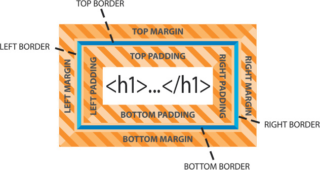
The box model is a programmatic construct imposed by HTML and CSS that enables you to format, or redefine, the default settings of any HTML element.
CSS permits you to specify fonts, line spacing, colors, borders, background shading and graphics, margins, and padding, among other things. Most of the time these boxes are invisible, and although CSS gives you the ability to format them it doesn’t require you to do so.
1. Launch Dreamweaver, if necessary.
Open boxmodel.html from the lesson03 folder.
2. If necessary, click the Split view button to divide the workspace between the Code view and Live view windows.

The file’s sample HTML code contains a heading and two paragraphs with sample text formatted to illustrate some of the properties of the CSS box model. The text displays visible borders, background colors, margins, and padding. To see the real power of CSS, sometimes it’s helpful to see what the page would look like without CSS.
Note
The style rendering command is only available in Design view.
3. Switch to Design view.
Choose View > Style Rendering > Display Styles to disable style rendering.

Dreamweaver now displays the page without any applied styling. A basic tenet in web standards today is the separation of the content (text, images, lists, and so on) from its presentation (formatting). Although the text now is not wholly unformatted, it’s easy to see the power of CSS to transform HTML code. Whether formatted or not, this illustrates the importance in the quality of your content. Will people still be enthralled by your website if all the wonderful formatting were pulled away?
4. Choose View > Style Rendering > Display Styles to enable the CSS rendering in Dreamweaver again.
The working specifications found at www.w3.org/TR/css3-box describe how the box model is supposed to render documents in various media.
Previewing the completed file
The best way to learn CSS is by creating your own. For the rest of this lesson, you’ll learn how CSS works by creating a complete style sheet for a sample HTML file. Let’s take a look at the final product of the upcoming exercises.
1. Open the css_basics_finished.html file from the site root.
2. If necessary, switch to Split view and observe the content and code in the two windows.
The file contains a complete HTML page with a variety of elements, including headings, paragraphs, lists, and links all fully formatted by CSS. Note the text styling, as well as the colors and borders assigned to other elements. The file should open with Live view active. This is important because some features may not display properly in Design view alone.
3. If necessary, switch to Live view only.

The document window now displays the entire webpage. Live view displays CSS styling more accurately than Design view. For example, in Live view you should see a drop shadow around the main content section. As before, the best way to see the true power of CSS is by shutting it off.
4. Switch to Design view.
Choose View > Style Rendering > Display Styles to toggle off the CSS rendering in Dreamweaver.
The page is no longer formatted by CSS and displays only the default styling you would expect on standard HTML elements. The text content now stacks vertically in a single column with no colors, borders, backgrounds, or shadows.
5. Choose View > Style Rendering > Display Styles to toggle on the CSS rendering in Dreamweaver again.
6. Choose File > Close All.
Close all sample files without saving them.
As you can see, CSS can style all aspects of a webpage with amazing variety and detail. First we’ll take a look at how you can use CSS to format text.
Formatting text
You can apply CSS formatting in three ways: inline, embedded (in an internal style sheet), or linked (via an external style sheet). A CSS formatting instruction is known as a rule. A rule consists of two parts—a selector and one or more declarations. The selector specifies what element, or combination of elements, is to be formatted; declarations contain the styling information. CSS rules can redefine any existing HTML element, as well as define two custom element modifiers, named “class” and “id.”
A rule can also combine selectors to target multiple elements at once or to target specific instances within a page where elements appear in unique ways, such as when one element is nested within another.

These sample rules demonstrate some typical constructions used in selectors and declarations. The way the selector is written determines how the styling is applied and how the rules interact with one another.
Applying a CSS rule is not a simple matter of selecting some text and applying a paragraph or character style, as in Adobe InDesign or Adobe Illustrator. CSS rules can affect single words, paragraphs of text, or combinations of text and objects. A single rule can affect an entire webpage, a single paragraph, or just a few words or letters. Basically, anything that has an HTML tag on it can be styled, and there is even an HTML tag specifically intended to style content that has no tag.
Many factors come into play in how a CSS rule performs its job. To help you better understand how it all works, the exercises in the following sections illustrate four main CSS concepts, which I’ll refer to as theories: cascade, inheritance, descendant, and specificity.
Cascade theory
The cascade theory describes how the order and placement of rules in the style sheet or on the page affects the application of styling. In other words, if two rules conflict, which one wins out? Let’s take a look at how cascade influences CSS formatting.
1. Open css_basics.html from the lesson03 folder in Split view.
The file contains a complete HTML page with various elements, headings, paragraphs, lists, and links that are currently formatted only by default HTML styling.
 Tip
Tip
Dreamweaver CC (2015.1 release) will open most files in Live view by default. In the following exercises be aware that certain commands will only function in Design view. Be prepared to switch between Live and Design view as necessary.
2. Save the file as mycss_basics.html in the site root folder.
Dreamweaver creates a copy of the file using the new name and displays two tabs at the top of the document window. Since the original file is still open it could cause confusion during the following exercises. Let’s close the original file.
3. Select the document tab for the css_basics.html file. Choose File > Close.
The mycss_basics.html file should be the only one open.
4. Click the Split view button, if necessary, and observe the <head> section in the Code view window for any CSS rules.
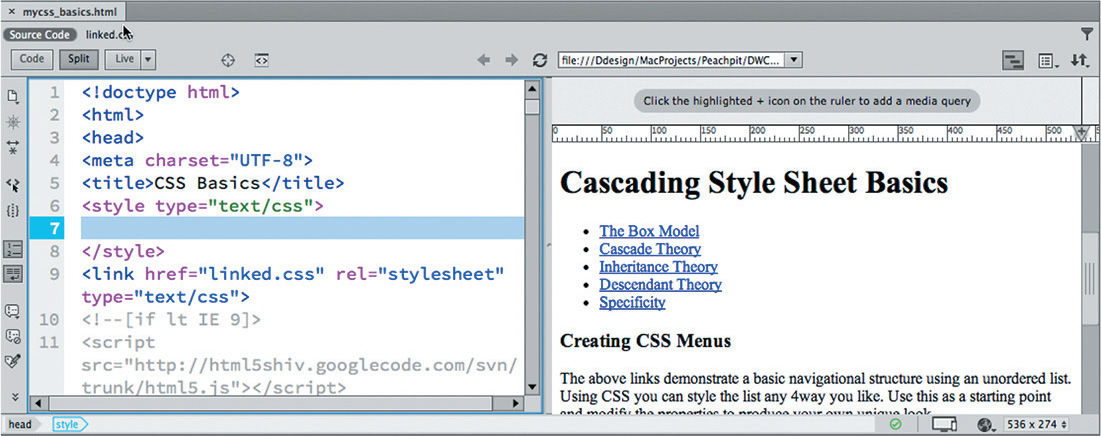
Note that the code contains a <style> section but no CSS rules.
5. Insert the cursor between the <style> and </style> tags.
Note
As you type the rule markup, Dreamweaver provides code hints as it did with the HTML code in Lesson 2. Feel free to use these hints to speed up your typing, or simply ignore them and continue typing.
6. Type h1 { color:gray; } and, if necessary, click in the Live view window to refresh the display.

The h1 headings throughout the page now display in gray. The rest of the text still displays the default formatting. Congratulations, you wrote your first CSS rule.
7. In Code view, insert the pointer at the end of the rule created in step 6. Press Enter/Return to create a new line.
Note
CSS does not require line breaks between rules, but it does make the code easier to read.
8. Type h1 { color:red; } and click in the Live view window, if necessary, to refresh the display.

The h1 headings now display in red. The styling of the new rule supersedes the formatting applied by the first. It’s important to understand that the two rules are identical except that they apply different colors: red or gray. Both rules want to format the same elements, but only one will be honored.
Tip
Live view should automatically refresh the display when you edit content in the Code window. But if you don’t see the display change as described, you may need to refresh the display manually.
It’s clear the second rule won, but why? In this case, the second rule is the last one declared, making it the closest one to the actual content. Whether intentional or not, a style applied by one rule may be overridden by declarations in a subsequent rule.
9. Select the rule h1 { color: gray; }
10. Choose Edit > Cut.
Tip
In Code view, you can also drag and drop code once it’s selected.
11. Insert the pointer at the end of the rule h1 { color: red; } and press Enter/Return to insert a new line.
12. Choose Edit > Paste or press Ctrl+V/Cmd+V.
The rule applying the gray color now appears last. You have switched the order of the rules.
13. If necessary, click in the Live view window to refresh the preview display.

The h1 headings display in gray again. Cascade applies to styles whether the rules are embedded in the webpage or located in a separate external, linked style sheet.
14. Select linked.css in the Related Files interface.

When you select the name of referenced file, the contents of that file appear in the Code view window. If the file is stored on a local hard drive, Dreamweaver allows you to edit the contents without actually opening the file itself.
15. Insert the pointer in line 2. Type h1 { color:orange; } and press Ctrl+S/Cmd+S to save the file. Click in the Design view window to refresh the display.

The h1 headings now display in orange.
16. Select Source Code in the Related Files interface. Locate the <link> reference for linked.css in the <head> section.
The <link> element appears after the <style> element. Based strictly on cascade, this means that any rule that appears in the linked file will supersede duplicate rules in the embedded sheet.
17. Click the line number for the external CSS <link> reference to select the entire reference. Drag the entire <link> reference above the <style> element. Click in the Live view window to refresh the display.

The headings revert to gray.
18. Select File > Save All.
As you can clearly see, the order and proximity of the rules within the markup are powerful factors in how CSS is applied. When you try to determine which CSS rule will be honored and which formatting will be applied, browsers typically honor the following order of hierarchy, with number 4 being the most powerful:
1. Browser defaults.
2. External or embedded style sheets. If both are present, the one declared last supersedes the earlier entry in conflicts.
3. Inline styles (within the HTML element itself).
4. Styles with the value attribute !important applied.
Note
!important is an attribute you can append to any CSS value to make it supersede values set by other equivalent rules. It can trump cascade, inheritance, and sometimes even more specific rules.
Inheritance theory
The inheritance theory describes how an element can be affected by one or more rules at the same time. Inheritance can affect rules of the same name as well as rules that format parent elements—ones that contain other elements. Let’s take a look at how inheritance influences CSS formatting.
1. If necessary, open mycss_basics.html from the lesson03 folder. In Split view, observe the HTML code.
The webpage contains headings, paragraphs, lists, and HTML5 semantic elements formatted by HTML defaults, as well as CSS rules created in the previous exercise.
2. Insert the pointer after the rule h1 { color: gray; } in the embedded style sheet. Press Enter/Return to insert a new line.
3. Type h1 { font-family:Arial; } and click in the Live view window to refresh the display.

The h1 elements appear in Arial and gray. The other content remains formatted by default styling.
Now there are four CSS rules that format <h1> elements. Can you tell, by looking at the Live view window, which of the rules is formatting the <h1> text? If you said two of them, you’re the winner.
At first glance, you may think that the rules formatting <h1> elements are separate from each other. And technically, that’s true. But if you look closer, you’ll see that the new rule doesn’t contradict the others. It’s not resetting the color attribute as you did in the previous exercise; it’s declaring a new, additional attribute. In other words, since both rules do something different, both will be honored, or inherited, by the h1 element. All <h1> elements will be formatted as gray and Arial.
Far from being a mistake or an unintended consequence, the ability to build rich and elaborate formatting using multiple rules is one of the most powerful and complex aspects of cascading style sheets.
4. Insert the pointer after the last h1 rule. Insert a new line in the code.
5. Type h2 { font-family:Arial; color:gray; } and click in the Live view window to refresh the display.
The h2 element appears in Arial and gray; it originally displayed in a serif font in black.
Tip
Rules typically contain multiple property declarations.
6. After the h2 rule, type the following code:
h3 { font-family:Arial; color:gray; }
p { font-family:Arial; color:gray; }
li { font-family:Arial; color:gray; }

7. If necessary, refresh the Live view window display by clicking in it or clicking the Refresh button in the Properties panel.
Note
There is no requirement to create rules in any specific order or hierarchy. You may order them any way you please, as long as you keep in mind how the application of styling is governed by cascade and inheritance.
All the elements now display the same styling, but it took six rules to format the entire page.
Although CSS styling is far more efficient than the obsolete HTML-based method, inheritance can help you optimize your styling chores even more. For example, all the rules include the statement { font-family:Arial; color:gray; }. Redundant code like this should be avoided whenever possible. It adds to the amount of code in each webpage as well as to the time it takes to download and process it. By using inheritance, sometimes you can create the same effect with a single rule. One way to make your styling more efficient is to apply formatting to a parent element instead of to the elements themselves.
8. Create a new line in the <style> section and type the following code:
article { font-family: Arial; color: gray; }
If you look through the code, you will see that the <article> tag contains much, but not all, of the webpage content. Let’s see what happens if we delete some of our CSS rules.
9. Select and delete the rule:
Refresh the Live view window display.

The h2 elements appearing within the <article> element remain formatted as gray Arial. The other h2 element down the page and outside the <article> now appears in HTML default styling.
10. Select and delete all h1 rules. Don’t forget the one in the linked.css file. Refresh the Live view display.
The h1 elements contained within the <article> element continue to be styled. Those outside the <article> element have also reverted to the HTML defaults. Since the rule targets only the <article> element, only the elements contained within it are styled.
11. Select and delete the rules formatting h3, p, and li.
Refresh the Live view display.

As in step 10, any content contained in the <article> tag remains formatted, while content elsewhere has reverted.
This is the way inheritance works. You could simply recreate the rules to format the other content, but there’s a simpler alternative. Instead of adding additional CSS rules, can you figure out a way to use inheritance to format all the content on the page the same way? A hint: Look carefully at the entire structure of the webpage.
Did you think about using the <body> element? If so, you win again. The <body> element contains all the visible content on the webpage and therefore is the parent of all of it.
12. Change the rule selector from article to body and delete any blank lines.
Choose File > Save All. Refresh the Live view display, if necessary.

Once again, all the text displays in gray Arial. By using inheritance, only one rule is needed to format all the content instead of six. You’ll find that the <body> element is a popular target for setting various default styles.
Tip
In this particular page, you could also use the <div> element to achieve the same result. But since <div> is a frequently used element, it might pose unpredictable conflicts in the future. Since webpages have only one <body> element, it is definitely the preferred target.
Note
Dreamweaver frequently edits externally linked files. Use Save All whenever changes on your page may affect multiple files in your site.
Descendant theory
Inheritance provides a means to apply styling to multiple elements at once, but CSS also provides the means to target styling to specific elements.
The descendant theory describes how formatting can target particular elements based on their position relative to others. This technique involves the creation of a selector name that identifies a specific element, or elements, by combining multiple tags, as well as id and class attributes. Let’s take a look at how descendant selectors influence CSS formatting.
1. If necessary, open mycss_basics.html from the lesson03 folder. In Split view, observe the structure of the HTML content.
The page contains headings and paragraphs in various HTML5 structural elements, such as article, section, and aside. The rule body {font-family:Arial; color: gray; } applies a default font and color to the entire page. In this exercise, you will learn how to create descendant CSS rules to target styling to specific elements in context.
2. In Code view, insert the pointer at the end of the body rule. Press Enter/Return to insert a new line.
3. Type p { font-family:Garamond; } and refresh the Live view display.

All p elements on the page display in Garamond. The rest of the page continues to be formatted as before.
Note
Step 3 assumes you have Garamond installed on your computer. If it is not, select another serif style font, like Times.
By creating a selector using the p tag, the font formatting has been overridden for all p elements no matter where they appear. You may be thinking that since the p rule appears after the body rule, this type of styling simply relates to the cascade order. Let’s try an experiment to see if that’s true.
4. Click the line number for the p rule.
Drag the p rule above the body rule.
Refresh the Live view display.

The p rule now appears above the body rule, but the styling did not change.
Note
We will examine the role of specificity later in this lesson.
If the styling of p elements were determined simply by cascade, you would expect the headings to revert to gray Arial. Yet here, the styling is unaffected by changing the order of the rules. Instead, by using a more specific tag name in the selector, the new p rule becomes more powerful than the generic body rule. By properly combining two or more tags in the selector, you can craft the CSS styling on the page in even more sophisticated ways.
5. Create a new line after the p rule.
On the new line, type:
article p { font-size:120%; color:darkblue; }
By adding a p tag immediately after article in the selector, you are telling the browser to format only p elements that are children, or descendants, of article elements. Remember, a child element is one contained or nested within another element.
6. If necessary, refresh the Live view display.
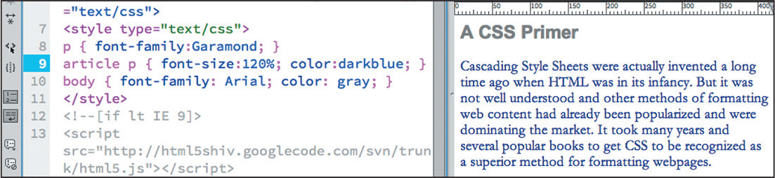
All paragraphs appearing within the <article> element now display in dark blue, 120 percent larger than the other paragraph text on the page.
7. Choose File > Save All.
Although it may be hard to understand at this moment, the styling in other rules—both body and p—are still being inherited by the newly formatted paragraphs. But wherever two or more rules conflict, a descendant selector will win over any less specific styling.
Using classes and ids
So far, you’ve learned that you can create CSS rules that format specific HTML elements and ones that can target specific HTML element structures or relationships. In some instances, you may want to apply unique formatting to an element that is already formatted by an existing rule. In such cases, you can use CSS classes or id attributes to target that element.
In mycss_basics.html, all h1 elements are formatted identically regardless of where they appear in the layout. In the following exercise, you’ll use classes and ids to differentiate the styling among the headings.
1. Insert a new line after the rule article p.
Type h1 { font-family:Tahoma; color:teal; } and refresh the display.

All h1 headings now display in the color teal and the font Tahoma.
Although it’s tagged identically to the other h1 headings, “A CSS Primer” is the main heading in the <article> element. To make it stand out from the other headings, you can use the class attribute assigned to its parent to target it for special formatting.
2. Create the following new rule:
.content h1 { color:red; font-size:300%; }
The heading “A CSS Primer” displays in red, 300 percent larger than the body text.
In CSS syntax, the period (.) refers to a class attribute, and the hash (#) means id. By adding .content to the selector, you have targeted the styling only to h1 elements in <article class="content">.
In the same way, you can assign custom styling to the subheadings (h2). You can use the id attributes of each <section>.
3. Create the following rules:
#box_model h2 { color:orange; }
#cascade h2 { color:purple; }
#inheritance h2 { color:darkred; }
#descendant h2 { color:navy; }
#specificity h2 { color:olive; }
4. Choose File > Save All.
If necessary, refresh the display.
All the h2 headings now display unique colors.
What’s important to understand here is that no formatting or additional attributes have been added to any of the headings themselves. They are being formatted based solely on their position within the structure of the code.
Understanding descendant selectors
CSS formatting can be very confusing for designers coming from the print world. Print designers are accustomed to applying styles directly to text and objects, one at a time. In some cases, styles can be based on one another, but this relationship is intentional. In print-based styling, it’s impossible for one paragraph or character style to affect another unintentionally. On the other hand, in CSS, the chance of one element’s formatting overlapping or influencing another’s happens all the time.
It may be helpful to think of it as if the elements were formatting themselves. When you use CSS properly, the formatting is not intrinsic to the element but to the entire page and to the way the code is structured. The following exercise will help you understand this concept.
1. In Code view, click the line number for the “The Box Model” heading (approximately line 50).
2. Choose Edit > Copy or press Ctrl+C/Cmd+C.
3. Insert the pointer at the end of the h2 element “Cascade Theory” (approximately line 81) and create a new line.
4. Choose Edit > Paste or press Ctrl+V/Cmd+V and then refresh the display.

The heading “The Box Model” appears following and formatted identically to the heading “Cascade Theory.”
5. Insert the pointer at the end of the “Inheritance Theory” heading and create a new line.
6. Press Ctrl+V/Cmd+V to paste the heading again.
The heading matches the styling of the “Inheritance Theory” heading.
As you can see, the formatting of the heading in the original instance does not travel with the text. That’s the point of separating content from presentation—you can insert the content anywhere and it will adopt the formatting native to that position. It even works in reverse.
7. In Code view, select and copy the “Inheritance Theory” heading.
8. Insert the pointer after the original “The Box Model” heading and press Ctrl+V/Cmd+V.
The heading appears and adopts the same styling as “The Box Model.”
Once again, the pasted text matches the formatting applied to the other h2 element within the <article>, ignoring its original styling altogether. Now that you’ve seen how descendant theory works there’s no need for the extra headings.
9. Choose File > Revert. Click Yes to revert the file to the previously saved version.
The ability to separate the content from its presentation is an important concept in modern web design. It allows you great freedom in moving content from page to page and structure to structure without worrying about the effects of residual or latent formatting. Since the formatting doesn’t reside with the element itself, the content is free to adapt instantly to its new surroundings.
Specificity theory
Conflicts between two or more rules are the bane of most web designers’ existence and can waste hours of time in troubleshooting CSS formatting errors. In the past, designers would have to spend hours manually scanning style sheets and rules one by one trying to track down the source of styling errors.
Specificity describes how browsers determine what formatting to apply when two or more rules conflict. Some refer to this as weight—giving certain rules higher priority based on order (cascade), proximity, inheritance, and descendant relationships. One way to make it easier to see a selector’s weight is by giving numeric values to each component of its name. For example, each HTML tag gets 1 point, each class gets 10 points, each id gets 100 points, and inline style attributes get 1000 points. By adding up the component values of one selector, its specificity can be calculated and compared to another. The higher specific weight wins.
As you have learned in this lesson, CSS rules often don’t work alone. They may style more than one HTML element at a time and may overlap or inherit styling from one another. Each of the theories described so far has a role to play in how CSS styling is applied through your webpage and across your site. When the style sheet is loaded, the browser will use the following hierarchy—with number 4 being the most powerful—to determine how the styles are applied, especially when rules conflict:
1. Cascade
2. Inheritance
3. Descendant structure
4. Specificity
Of course, knowing this hierarchy doesn’t help much when you are faced with a CSS conflict on a page with dozens or perhaps hundreds of rules and multiple style sheets. Luckily, Dreamweaver has several tools that can help you in this endeavor. The first one we’ll look at is named Code Navigator.

Code Navigator
Code Navigator is an editing tool within Dreamweaver that allows you to instantly inspect an HTML element and assess its CSS-based formatting. When activated, it displays all the embedded and externally linked CSS rules that have some role in formatting a selected element, and it lists them in the order of their cascade application and specificity. Code Navigator works in all Dreamweaver-based document views.
1. If necessary, open mycss_basics.html from the lesson03 folder. In Split view, observe the CSS code and the structure of the HTML content. Then, note the appearance of the text in the Live view window.
The page contains headings, paragraphs, and lists in various HTML5 structural elements, such as article, section, and aside, styled by CSS rules you created in the previous exercises.
2. In Live view, insert the pointer in the “A CSS Primer” heading.

When Code Navigator is enabled, after a moment, an icon that looks like a ship’s wheel appears. This icon provides access to Code Navigator.
3. Click the Code Navigator icon. If the Code Navigator does not appear automatically, right-click the heading and choose Code Navigator from the context menu or press Ctrl+Alt+N/Cmd+Opt+N.
Tip
Code Navigator may be disabled by default. To have it display automatically, deselect the Disable option in the Code Navigator window when it’s visible.
A small window appears, displaying a list of three CSS rules that apply to this heading.
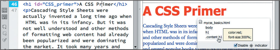
If you position the pointer over each rule in turn, Dreamweaver displays any properties formatted by the rule and their values. The rule with the highest specificity (most powerful) is at the bottom of the list.
Unfortunately, Code Navigator doesn’t show styling applied via inline styles, so you’ll have to check for these types of properties separately and calculate the effect of inline styles in your head. Otherwise, the sequence of rules in the list indicates both their cascade order and their specificity.
Note
Code Navigator doesn’t display inline CSS rules. Since most CSS styling is not applied this way, it’s not much of a limitation, but you should still be aware of this blind spot as you work with Code Navigator.
When rules conflict, rules farther down in the list override rules that are higher up. Remember that elements may inherit styling from one or more rules, and default styling—that is not overridden—may still play a role in the final presentation. Unfortunately, Code Navigator doesn’t display what, if any, default styling characteristics may still be in effect.
The .content h1 rule appears at the bottom of the Code Navigator window, indicating that its specifications are the most powerful ones styling this element. But many factors can influence which of the rules may win. Sometimes the specificity of two rules is identical; then, it’s simply the order (cascade) in which rules are declared in the style sheet that determines which one is actually applied.
As you saw earlier, changing the order of rules can often affect how the rules work. There’s a simple exercise you can perform to determine whether a rule is winning because of cascade or specificity.
4. In the Code view window, click the line number for the .content h1 rule.
5. Drag the rule to the top of the embedded style sheet.
6. Click in the Live view window to refresh the display.
The styling did not change.
7. Insert the pointer into the text of the <h1> element “A CSS Primer” and activate Code Navigator.

Although the rule was moved to the top of the style sheet, the order of the rules in Code Navigator did not change. The .content h1 selector has a specificity higher than either the body or h1 selectors. In this instance, it would win no matter where it was placed in the code. But specificity can change by simply modifying the selector.
8. Select and delete the  class notation from the
 .content h1 selector.
9. Click in the Live view window to refresh the display.
Did you notice how the styling changed? The “A CSS Primer” heading reverted to the color teal, and the other h1 headings scaled to 300 percent. Do you know why this happened?
10. Insert the pointer in the “A CSS Primer” heading and activate Code Navigator.

By removing the class notation from its selector, it now has equal value to the other h1 rule, but since it is the first one declared, it loses precedence by virtue of its cascade position.
11. Using Code Navigator, examine and compare the rules applied to the headings “A CSS Primer” and “Creating CSS Menus.”
The Code Navigator shows the same rules applied to both.
By removing the .content class from the selector, the rule no longer targets only h1 headings in the <article class="content"> element; it’s now styling all h1 elements on the page.
12. Choose Edit > Undo to restore the .content class to the h1 selector.
Refresh the Live view display.
All the headings return to their previous styling.
13. Insert the pointer in the heading “Creating CSS Menus” and activate Code Navigator.
The heading is no longer styled by the .content h1 rule.
14. Choose File > Save All.
Is it starting to make more sense? Don’t worry, it will—over time. Until that time, just remember that the rule appearing last in Code Navigator has the most influence on any particular element.
CSS Designer
Code Navigator was introduced in Dreamweaver CS4 and has been an invaluable aid for troubleshooting CSS formatting. Yet the latest tool in Dreamweaver’s CSS arsenal is much more than a good troubleshooting tool. CSS Designer not only displays all the rules that pertain to any selected element but also allows you to create and edit CSS rules at the same time.
When you use Code Navigator, it shows you the relative importance of each rule, but you still have to access and assess the effect of all the rules to determine the final effect. Since some elements can be affected by a dozen or more rules, this can be a daunting task for even a veteran web coder. CSS Designer eliminates this pressure altogether by providing a Properties window that computes the final CSS display for you. And best of all, unlike Code Navigator, CSS Designer can even compute the effects of inline styles too.
1. Open mycss_basics.html in Split view.
2. If necessary, choose Window > CSS Designer to display the panel.

The CSS Designer panel features four windows: Sources, @Media, Selectors, and Properties. Feel free to adjust the heights and widths of the windows as needed. The panel is also responsive: It will even take advantage of the extra screen space, if you drag out the edge, by splitting into two columns.
3. Insert the pointer in the heading “A CSS Primer.”
The CSS Designer has two basic modes: All and Current. When the All mode is engaged, the panel allows you to review and edit all existing CSS rules and create new rules. In Current mode, the panel allows you to identify and edit the rules and styling already applied to a selected element.

4. If necessary, click the Current button in the CSS Designer panel.
When the Current mode is active the panel displays the CSS rules that are affecting the heading. In the CSS Designer, the most powerful rules appear at the top of the Selectors window, the opposite of Code Navigator.
5. Click the rule.content h1 in the Selectors panel.

By default, the Properties window of CSS Designer displays a list of properties that you can style for this element. The list is not exhaustive, but it contains most of the properties you will need.
Showing a seemingly endless list of properties can be confusing as well as inefficient. For one thing, it makes it difficult to differentiate the properties assigned from those that aren’t. Luckily, CSS Designer allows you to limit the display to only the properties currently applied to the selected element.
6. Click the Show Set option in the CSS Designer panel menu to enable it, if necessary.
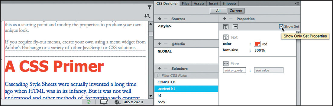
When Show Set is enabled, the Properties panel shows only the items that have been set in that rule.
7. Select each rule that appears in the Selectors window and observe the properties of each. To see the expected result of all the rules combined, select the COMPUTED option.
The COMPUTED option analyzes all the CSS rules affecting the element and generates a list of properties that should be displayed by browsers or HTML readers. By displaying a list of pertinent CSS rules and then computing how the CSS should render, the CSS Designer does Code Navigator one step better. But it doesn’t stop there. Whereas Code Navigator allows you to select a rule to edit it in Code view, the CSS Designer lets you edit the CSS properties right inside the panel itself. Best of all, CSS Designer can even compute and edit inline styles too.
8. Select COMPUTED in the Selectors window. In the Properties window, change the color property from red to purple. Press Enter/Return to complete the change.

Tip
Click to edit the text-based color name. You can also select colors by using the color picker.
The heading displays in purple. What you may not have noticed is that the change you made was actually entered directly in the rule that contributed the styling.
9. In the Code view window, scroll to the embedded style sheet and examine the .content h1 rule.

As you can see, the color was changed within the code and added to the proper rule.
10. Save all files.
The CSS Designer is like an amalgam of Code Navigator and Dreamweaver’s old CSS Styles panel. In upcoming exercises, you’ll get the chance to experience all aspects of the CSS Designer as you learn more about cascading style sheets.
Multiples, classes, and ids, oh my!
By taking advantage of the cascade, inheritance, descendant, and specificity theories, you can target formatting to almost any element anywhere on a webpage. But CSS offers a few more ways to optimize and customize the formatting and increase your productivity even further.
Applying formatting to multiple elements
To speed things up, CSS allows you to apply formatting to multiple elements at once by listing each in the selector, separated by commas. For example, the formatting in these rules:
h1 { font-family:Verdana; color:gray; }
h2 { font-family:Verdana; color:gray; }
h3 { font-family:Verdana; color:gray; }
can also be expressed like this:
h1, h2, h3 { font-family:Verdana; color:gray; }
CSS shorthand
Although Dreamweaver will write most of the CSS rules and properties for you, at times you will want, or need, to write your own. All properties can be written out fully, but many can also be written using a shorthand method. Shorthand does more than make the job of the web designer easier; it reduces the total amount of code that has to be downloaded and processed. For example, when all properties of margins or padding are identical, such as:
margin-top:10px;
margin-right:10px;
margin-bottom:10px;
margin-left:10px;
the rule can be shortened to margin:10px;
When the top and bottom and left and right margins or padding are identical, like this:
margin-top:0px;
margin-right:10px;
margin-bottom:0px;
margin-left:10px;
it can be shortened to margin:0px 10px;
But even when all four properties are different, like this:
margin-top:20px;
margin-right:15px;
margin-bottom:10px;
margin-left:5px;
they can be shortened to margin:20px 15px 10px 5px;
In these three examples, you can see clearly how much code can be saved using shorthand. There are way too many references and shorthand techniques to cover here. To get a full description, check out www.w3.org/community/webed/wiki/CSS_shorthand_reference.
In the following exercises, I’ll use common shorthand expressions wherever possible; see if you can identify them as we go.
Creating class attributes
Frequently, you will want to create unique formatting to apply to objects, paragraphs, phrases, words, or even individual characters appearing within a webpage. To accomplish this, CSS allows you make your own custom attributes, named class and id.
Class attributes may be applied to any number of elements on a page, whereas id attributes should appear only once per page. If you are a print designer, think of classes as being similar to a combination of Adobe InDesign’s paragraph, character, table, and object styles all rolled into one. Class and id names can be a single word, an abbreviation, any combination of letters and numbers, or almost anything, but they may not contain spaces. In HTML 4, ids could not start with a number. There don’t seem to be any similar restrictions in HTML5, but for backward compatibility you should probably avoid starting class and id names with numbers.
Although there’s no strict rule or guideline on how to create them, classes should be more general in nature, and ids should be more specific. Everyone seems to have an opinion, but at the moment there is no absolutely right or wrong answer. However, most agree that they should be descriptive, such as "co-address" or "author-bio" as opposed to "left-column" or "big-text". This will especially help to improve your site analytics. The more sense Google and other search engines can make of your site’s structure and organization, the higher your site will rank in the search results.
To declare a CSS class selector, insert a period before the name within the style sheet, like this:
.content
.sidebar1
Then, apply the CSS class to an entire HTML element as an attribute, like this:
<p class="intro">Type intro text here.</p>
Or to individual characters or words using the <span> tag, like this:
<p>Here is <span class="copyright">some text</span> formatted
differently.</p>
Creating id attributes
HTML designates id as a unique attribute. Therefore, any id should be assigned to no more than one element per page. In the past, many web designers used id attributes to style or identify specific components within the page, such as the header, the footer, or specific articles. With the advent of HTML5 elements—header, footer, aside, article, and so on—the use of id and class attributes for this purpose became less necessary. But ids can still be used to identify specific text elements, images, and tables to assist you in building powerful hypertext navigation within your page and site. You will learn more about using ids this way in Lesson 11, “Working with Navigation.”
To declare an id attribute in a CSS style sheet, insert a number sign, or hash mark, before the name, like this:
#cascade
#box_model
Here’s how you apply the CSS id to an entire HTML element as an attribute:
<div id="cascade">Content goes here.</div>
<div id="box_model">Content goes here.</div>
Or to a portion of an element:
<p>Here is <span id="copyright">some text</span> formatted
differently.</p>
Note
For the online bonus lesson, go to the book’s online resources at Peachpit.com for bonus hands-on exercises to gain some vital skills and experience writing and editing CSS code. See the “Getting Started” section at the beginning of the book for more details.
CSS3 overview and support
In the previous exercise, the last two properties both seemed to apply a drop shadow to the main content container. Did you notice that one used a -webkit- prefix? This notation is a temporary accommodation for certain browsers as they implement new CSS3 properties. The specifications provide some amazing, and long-needed, new features for styling the modern web.
The Internet doesn’t stand still for long. Technologies and standards are evolving and changing constantly. The members of the W3C have been working diligently to adapt the web to the latest realities, such as powerful mobile devices, large flat-panel displays, and HD images and video—all of which seem to get better and cheaper every day. This is the urgency that currently drove the development of HTML5 and CSS3.
Many of these new standards have not been officially defined yet and browser vendors are implementing them in varying ways. But don’t worry. The latest version of Dreamweaver has been updated to take advantage of the latest changes, and it provides many new features based on these evolving standards. This includes ample support for the current mix of HTML5 elements and CSS3 formatting. As new features and capabilities are developed, you can count on Adobe to add them to the program as quickly as possible using Creative Cloud.
As you work through the lessons that follow, you will be introduced to and actually implement many of these new and exciting techniques in your own sample pages.
CSS3 features and effects
CSS3 has over two dozen new features. Many are ready now and have been implemented in all the modern browsers; others are still experimental and are supported less fully. Among the new features, you will find
• Rounded corners and border effects
• Box and text shadows
• Transparency and translucency
• Gradient fills
• Multicolumn text elements
You can implement all these features and more via Dreamweaver today. The program will even assist you in building vendor-specific markup when necessary. To give you a quick tour of some of the coolest features and effects brewing, I’ve provided a sample of CSS3 styling in a separate file.
1. Open css3_demo.html from the lesson03 folder. Display the file in Split view and observe the CSS and HTML code.

Some of the new effects can’t be previewed directly in Design view. You’ll need to use Live view or an actual browser to get the full effect.
2. If necessary, activate Live view to preview all the CSS3 effects.
The file contains a hodgepodge of features and effects that may surprise and even delight you—but don’t get too excited. Although many of these features are already supported in Dreamweaver and will work fine in modern browsers, there’s still a lot of older hardware and software out there that can turn your dream site into a nightmare. And there’s at least one additional twist.
Some of the new CSS3 features have not been standardized, and certain browsers may not recognize the default markup generated by Dreamweaver. In these instances, you may have to include specific vendor commands to make them work properly. Like the box shadow in the previous exercise, these commands are preceded by a vendor prefix, such as –ms–, –moz–, and –webkit–. If you look carefully in the code of the demo file, you’ll be able to find examples of these within the CSS markup.

Additional CSS support
CSS formatting and application is so complex and powerful that this short lesson can’t cover all aspects of the subject. For a full examination of CSS, check out the following books:
• Bulletproof Web Design: Improving Flexibility and Protecting Against Worst-Case Scenarios with HTML5 and CSS3 (3rd edition), Dan Cederholm (New Riders Press, 2012) ISBN: 978-0-321-80835-6
• CSS3: The Missing Manual (3rd Edition), David Sawyer McFarland (O’Reilly Media, 2013) ISBN: 978-1-449-32594-7
• HTML5 & CSS3 for the Real World, Alexis Goldstein, Louis Lazaris, and Estelle Weyl (SitePoint Pty. Ltd, 2011) ISBN: 978-0-9808469-0-4
• Stylin’ with CSS: A Designer’s Guide (3rd edition), Charles Wyke-Smith (New Riders Press, 2012) ISBN: 978-0-321-85847-4
Review questions
1. Should you use HTML-based formatting?
2. What does CSS impose on each HTML element?
3. True or false? If you do nothing, HTML elements will feature no formatting or structure.
4. What four “theories” affect the application of CSS formatting?
5. What is the difference between block and inline elements?
6. True or false? CSS3 features are all experimental, and you shouldn’t use them at all.
Review answers
1. No. HTML-based formatting was deprecated in 1997 when HTML 4 was adopted. Industry best practices recommend using CSS-based formatting instead.
2. CSS imposes an imaginary box on each element. This box, and its content, can then be styled with borders, background colors and images, margins, padding, and other types of formatting.
3. False. Even if you do nothing, many HTML elements feature default formatting.
4. The four theories that affect CSS formatting are cascade, inheritance, descendant, and specificity.
5. Block elements create standalone structures; inline elements appear at the insertion point.
6. False. Many CSS3 features are already supported by modern browsers and can be used right now.